
Search results for "Range between windows" in Home Design Ideas
 Klopf Architecture
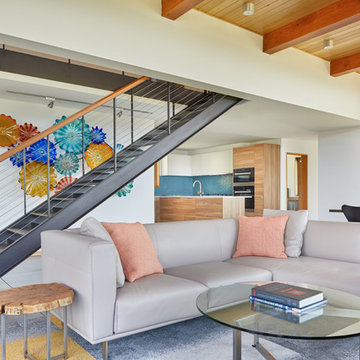
Klopf Architecture’s client, a family of four with young children, wanted to update their recently purchased home to meet their growing needs across generations. It was essential to maintain the mid-century modern style throughout the project but most importantly, they wanted more natural light brought into the dark kitchen and cramped bathrooms while creating a smoother connection between the kitchen, dining and family room.
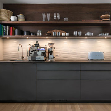
The kitchen was expanded into the dining area, using part of the original kitchen area as a butler's pantry. With the main kitchen brought out into an open space with new larger windows and two skylights the space became light, open, and airy. Custom cabinetry from Henrybuilt throughout the kitchen and butler's pantry brought functionality to the space. Removing the wall between the kitchen and dining room, and widening the opening from the dining room to the living room created a more open and natural flow between the spaces.
New redwood siding was installed in the entry foyer to match the original siding in the family room so it felt original to the house and consistent between the spaces. Oak flooring was installed throughout the house enhancing the movement between the new kitchen and adjacent areas.
The two original bathrooms felt dark and cramped so they were expanded and also feature larger windows, modern fixtures and new Heath tile throughout. Custom vanities also from Henrybuilt bring a unified look and feel from the kitchen into the new bathrooms. Designs included plans for a future in-law unit to accommodate the needs of an older generation.
The house is much brighter, feels more unified with wider open site lines that provide the family with a better transition and seamless connection between spaces.
This mid-century modern remodel is a 2,743 sf, 4 bedroom/3 bath home located in Lafayette, CA.
Klopf Architecture Project Team: John Klopf and Angela Todorova
Contractor: Don Larwood
Structural Engineer: Sezen & Moon Structural Engineering, Inc.
Landscape Designer: n/a
Photography ©2018 Scott Maddern
Location: Lafayette, CA
Year completed: 2018
Link to photos: https://www.dropbox.com/sh/aqxfwk7wdot9jja/AADWuIcsHHE-AGPfq13u5htda?dl=0
 Beechen & Dill Homes
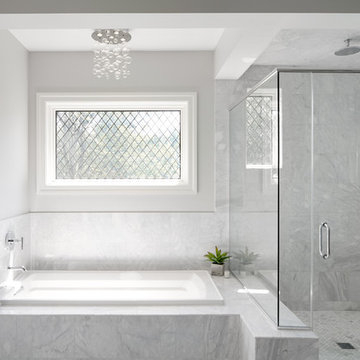
A custom home builder in Chicago's western suburbs, Summit Signature Homes, ushers in a new era of residential construction. With an eye on superb design and value, industry-leading practices and superior customer service, Summit stands alone. Custom-built homes in Clarendon Hills, Hinsdale, Western Springs, and other western suburbs.
 CONTENT Architecture
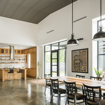
This project encompasses the renovation of two aging metal warehouses located on an acre just North of the 610 loop. The larger warehouse, previously an auto body shop, measures 6000 square feet and will contain a residence, art studio, and garage. A light well puncturing the middle of the main residence brightens the core of the deep building. The over-sized roof opening washes light down three masonry walls that define the light well and divide the public and private realms of the residence. The interior of the light well is conceived as a serene place of reflection while providing ample natural light into the Master Bedroom. Large windows infill the previous garage door openings and are shaded by a generous steel canopy as well as a new evergreen tree court to the west. Adjacent, a 1200 sf building is reconfigured for a guest or visiting artist residence and studio with a shared outdoor patio for entertaining. Photo by Peter Molick, Art by Karin Broker
Find the right local pro for your project
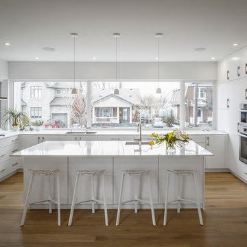
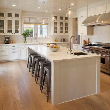
Example of a trendy medium tone wood floor kitchen design in Ottawa with flat-panel cabinets, white cabinets, granite countertops, an island, an undermount sink and stainless steel appliances
 Modern Organic Interiors
Photographer: Isabelle Eubanks
Interiors: Modern Organic Interiors, Architect: Simpson Design Group, Builder: Milne Design and Build
Inspiration for a cottage galley medium tone wood floor eat-in kitchen remodel in San Francisco with an undermount sink, shaker cabinets, white cabinets, white backsplash, subway tile backsplash, stainless steel appliances and an island
Inspiration for a cottage galley medium tone wood floor eat-in kitchen remodel in San Francisco with an undermount sink, shaker cabinets, white cabinets, white backsplash, subway tile backsplash, stainless steel appliances and an island

 Twelve Stones Designs, LLC
The owners of this kitchen had spent the money to upgrade the finishes in their kitchen upon building the home 12 years ago, but after living in the space for several years they realized how nonfunctional the layout really was. The (then) two preschool aged children had grown into busy, hungry teenagers with many friends who also liked to hang out at the house. So the family needed a more functional kitchen with better traffic flow, space for daily activities revolving around the kitchen at different times of day, and a kitchen that could accommodate cooking for and serving large groups. Furthermore, the dark, traditional finishes no longer reflected the homeowners’ style. They requested a brighter, more relaxed, coastal style that reflected their love of the seaside cities they like to visit.
Originally, the kitchen was U-shaped with a narrow island in the middle. The island created narrow aisles that bottle-necked at the dishwasher, refrigerator, and cooktop areas. There was a pass-through from the foyer into the kitchen, but the owners never liked that the pass-through was also located so close to the powder room. The awkward proximity was unappealing and made guests feel uncomfortable.
The kitchen’s storage was made up of lots of narrow cabinets, apothecary drawers, clipped corner units, and very few drawers. It lacked useful storage for the larger items the family used on a daily basis. And the kitchen’s only pantry was small closet that had only builder-grade, narrow shelving with no illumination to be able to see the contents inside.
Overall, the kitchen’s lighting plan was poorly executed. Only six recessed cans illuminated the entire kitchen and nook areas. The under cabinet lighting was not evenly distributed either. In fact, the builder had mis-placed the under cabinet lighting around the decorative pilasters which made for choppy, dark cubbies. Further, the builder didn’t include any lighting over the sink or the bar area, which meant whoever was doing the dishes was always in their own shadow. That, coupled with the steep overhang of the game room above made the bar area feel like a dim, cavernous space that wasn’t inviting or task oriented. The kitchen looked out into the main living space, but the raised bar and a narrow wall (which held the only large cabinet in the kitchen) created more of a barrier than a relationship to the living room or breakfast nook. In fact, one couldn’t even see the breakfast nook from the cooktop or sink areas due to its orientation. The raised bar top was too narrow to comfortably sit to either dine at or chat from due to the lack of knee space. The the homeowners confided that the kitchen felt more like a dark, dirty prison than place where the family, or their guests, wanted to gather and commune.
The clients' needs and desires were:
➢ to create a kitchen that would be a space the family loved to be in; to relate to the adjacent spaces all around, and to have better flow for entertaining large groups
➢ to remove the walls between the breakfast nook and living area and to be able to utilize the natural light from the windows in both those areas
➢ to incorporate a functional chopping block for prepping fresh food for home cooked meals, an island with a large sink and drain board, 2 pull out trash cans, and seating for at least the 2 teens to eat or do homework
➢ to design a kitchen and breakfast nook with an airy, coastal, relaxed vibe that blended with the rest of the house's coastal theme
➢ to integrate a layered lighting plan which would include ample general illumination, specific task lighting, decorative lighting, and lots of illuminated storage
➢ to design a kitchen with not only more storage for all the husband’s kitchen gadgets and collection of oils and spices, but smart storage, including a coffee/breakfast bar and a place to store and conceal the toaster oven and microwave
➢ to find a way to utilize the large open space between the kitchen, pantry area, and breakfast nook
Twelve Stones Designs achieved the owner's goals by:
➢ removing the walls between the kitchen and living room to allow the natural light to filter in from the adjacent rooms and to create a connection between the kitchen, nook, and living spaces for a sense of unity and communion
➢ removing the existing pantry and designing 3 large pantry style cabinets with LED tape lights and rollout drawers to house lots of kitchen appliances, gadgets, and tons of groceries. We also took the cabinets all the way up to the 9’ ceiling for additional storage for seasonal items and bulk storage.
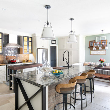
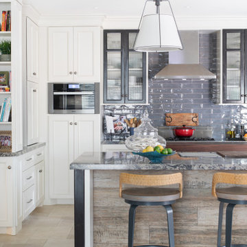
➢ designing 2 islands - 1 with a gorgeous black walnut chopping block that houses a drawer for chopping and carving knives and a custom double pull out trash unit for point of use utilization - and 1 that houses the dishwasher, a large Blanco Gourmet sink with integrated drain board, woven baskets for fresh root vegetables and kitchen towels, plenty of drawer storage for kitchen items, and bar seating for up to 4 diners.
➢ closing off the space between the kitchen and the powder room to create a beautiful new private alcove for the powder room as well as adding some decorative storage. This also gave us space to include more tall storage near the new range for precision placement of the husband’s extensive oil and spice collection as well as a location for a combo-steam oven the wife wanted for baking and cooking healthy meals.
The project is enhanced functionally by:
➢ incorporated USB and standard receptacles for the kids’ laptops and phone charging in the large island
➢ designing the small island to include additional open shelving for items used on a daily basis such as a variety of bowls, plates, and colanders. This set up also works well for the husband who prefers to “plate” his dinners in restaurant-style fashion before presenting them to the table.
➢ the integration of specific storage units, such as double stacked cutlery drawers, a custom spice pull-out, a Kuerig coffee and tea pod drawer, and custom double stacked utensil drawers
➢ moving the refrigerator to the old oven location - this eliminated the bottle neck as well as created a better relationship to the eating table. It also utilizes the floor space between the pantry, nook, and kitchen
➢ creating a banquet style breakfast nook - this banquette seating not only doubles the amount of seating for large gatherings but it better utilizes the odd space between the kitchen and the previous nook area. It also helps to create a distinct pathway from the mudroom room through the pantry area, kitchen, nook, and living room.
➢ the coffee/breakfast bar area which includes the perfect location for the concealed microwave and toaster oven, convenient storage for the coffee pods and tea accoutrements. Roll-out drawers below also house the smoothie maker, hot water kettle, and a plethora of smoothie-making ingredients such as protein powders, smoothie additives, etc. Furthermore, the drawers below the Keurig house measuring utensil, cutlery, baking supplies and tupperware storage.
➢ incorporating lots of wide drawers and pullouts to accommodate large cookware.
➢ utilizing as much vertical space as possible by building storage to the ceiling which accommodates the family’s abundant amount of serving platters, baking sheets, bakeware, casserole dishes, and additional cutting boards.
The project is enhanced aesthetically by:
➢ new 5-piece Versailles pattern porcelain tile that now seamlessly joins the entire down stairs area together creating a bright, cohesiveness feeling instead of choppy separated spaces - it also adds a coastal feeling
➢ designing a cabinet to conceal the microwave and toaster oven
➢ the coastal influenced light fixtures over the nook table and island
➢ the sandy colors of the Langdon Cambria countertops. The swirling pattern and sparkling quartz pieces remind the homeowner of black-and-tan sandy beaches
➢ the striped banquet seating whose creamy white background and blue-green stripes were the inspiration for the cabinet and wall colors.
➢ All the interior doors were painted black to coordinate with the blacks and grays in the backsplash tile and countertop. This also adds a hint of tailored formality to an otherwise casual space.
➢ the use of WAC's Oculux small aperture LED units for the overhead lighting complimented with Diode LED strips for task lighting under the cabinets and inside the pantry and glass wall cabinets. All of the lighting applications are on separate dimmer switches.
Innovative uses of materials or construction methods by Realty Restoration LLC:
➢ Each 1-1/2” x 3” block of reclaimed end-grain black walnut that makes up the center island chopping block was hand milled and built in the shop. It was designed to look substantial and proportional to the surrounding elements, executed by creating the 4 inch tall top with a solid wood chamfered edge band.
➢ The metal doors on either side of the vent hood were also custom designed for this project and built in the Realty Restoration LLC shop. They are made 1x2, 11-gauge mild steel with ribbed glass. Weighing 60 lbs a piece, heavy duty cabinet hinges were added to support the weight of the door and keep them from sagging.
➢ Under-cabinet receptacles were added along the range wall in order to have a clean, uninterrupted backsplash.
Design obstacles to overcome:
➢ Because we were removing the demising walls between the kitchen and living room, we had to find a way to plumb and vent the new island. We did this by tunneling through the slab (the slab had post tension cables which prevented us from just trenching) to run a new wet vent through a nearby structural wall. We pulled the existing hot and cold lines between upper floor joists and ran them down the structural wall as well and up through a conduit in the tunnel.
➢ Since we were converting from wall overs to a gas range it allowed us to utilize the 220 feed for the wall ovens to provide a new sub panel for all the new kitchen circuits
➢ Due to framing deficiencies inherited from the original build there was a 1-1/2” differential in the floor-to-ceiling height over a 20 foot span; by utilizing the process of cutting and furring coupled with the crown moulding details on the cabinet elevations we were able to mask the problem and provide seamless transitions between the cabinet components.
Evidence of superior craftsmanship:
➢ uniquely designed, one-of-a-kind metal “X” end panels on the large island. The end panels were custom made in the Realty Restoration LLC shop and fitted to the exact dimensions of the island. The welding seams are completely indistinguishable - the posts look like they are cut from a single sheet of metal
➢ square metal posts on the small island were also custom made and designed to compliment and carry through the metal element s throughout the kitchen
➢ the beautiful, oversized end panels on the pantry cabinets which give the breakfast nook a tailored look
➢ integrating a large format 5 piece Versailles tile pattern to seamlessly flow from the existing spaces into the new kitchen space
➢ By constructing a custom cabinet that jogged around a corner we could not remodel (housing the entry way coat closet) we were able to camouflage the adjacent wall offset within the upper and lower cabinets. By designing around the existing jog in the structural walls we accomplished a few things: we were able to find the space to house, and hide, the microwave and toaster oven yet still have a clean cohesive appearance from the kitchen side. Additionally, the owners were able to keep their much needed coat closet and we didn’t have to increase the budget with unnecessary structural work.
 Dura Supreme Cabinetry
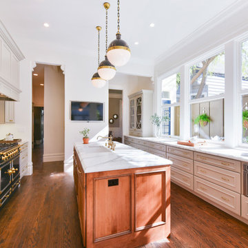
With an ideal location in the Pacific Heights neighborhood of San Francisco, this dated Victorian residence had "beautiful bones" but had been sitting on the market for a year before being purchased with plans to revitalize the interior. Interior designer, Noel Han, explained, "Historical Victorian homes in this area often have beautiful architectural elements that I aim to preserve, but the floor plan and layout tend to be stuffy, not live-able and not light filled. Modern families want bright, light-filled, spacious rooms that take advantage of outdoor views and living spaces, and function well for storage, meals and entertaining."
Preserving the architectural integrity and special features of the home was one of Han's goals but at the same time, she re-designed the space, moving walls and adding windows to create an open floorplan that flowed easily between the kitchen and outdoor living spaces. Where the range once stood in the original design, now an entire wall of windows provides panoramic views of the outdoors and fills the kitchen with light. Below the windows, Han designed a long bank of base cabinets with drawers to provide plenty of storage and work surface. Light now pours into the space even on foggy days. The range was moved to the opposite wall so that beautiful window views could be added to the kitchen.
Han selected a palette of finishes with an eye toward creating a "soft color aesthetic". "White painted finishes are very popular right now but would have felt stark and cold in this space," she explained. "The French grey paint from Dura Supreme was a perfect complement for this vintage Victorian home, to create a classic color scheme".
"This beautiful home already had hardware elements with a vintage brass finish, so I carefully selected antiqued, brushed brass hardware, plumbing and metal finishes to blend with the original elements," said Han. She continued, "The La Cornue French Range adds modern function with a French antique look."
"I appreciate working with Dura Supreme cabinetry because of the quality of the cabinetry, fast delivery and the custom options. I'm able to create beautiful architectural details like the pull-out columns on both sides of the range and the curved mullion doors on the furniture hutch, and they offer a stunning palette of finishes and styles," explained Han. For the bath cabinetry, Han created a similar palette of finishes and styles to create a complementary look throughout the entire home.
Product Details:
Perimeter: Dura Supreme Cabinetry shown in the St. Augustine door style and Mullion Pattern #15 door style with a “Zinc” painted finish.
Kitchen Island: Dura Supreme Cabinetry shown in the St. Augustine door style with a Clove stain and Black Accent finish on Cherry wood.
For more information about Noel Han, Interior Designer, click to her website here www.atelnoel.com.
For more information about Gilmans Kitchens and Baths, click to their website here www.gkandb.com.
Photography by: Ned Bonzi www.nedbonzi.com.
Request a FREE Dura Supreme Brochure Packet:
http://www.durasupreme.com/request-brochure
Sponsored
Sunbury, OH

J.Holderby - Renovations
Franklin County's Leading General Contractors - 2X Best of Houzz!
 Twelve Stones Designs, LLC
The owners of this kitchen had spent the money to upgrade the finishes in their kitchen upon building the home 12 years ago, but after living in the space for several years they realized how nonfunctional the layout really was. The (then) two preschool aged children had grown into busy, hungry teenagers with many friends who also liked to hang out at the house. So the family needed a more functional kitchen with better traffic flow, space for daily activities revolving around the kitchen at different times of day, and a kitchen that could accommodate cooking for and serving large groups. Furthermore, the dark, traditional finishes no longer reflected the homeowners’ style. They requested a brighter, more relaxed, coastal style that reflected their love of the seaside cities they like to visit.
Originally, the kitchen was U-shaped with a narrow island in the middle. The island created narrow aisles that bottle-necked at the dishwasher, refrigerator, and cooktop areas. There was a pass-through from the foyer into the kitchen, but the owners never liked that the pass-through was also located so close to the powder room. The awkward proximity was unappealing and made guests feel uncomfortable.
The kitchen’s storage was made up of lots of narrow cabinets, apothecary drawers, clipped corner units, and very few drawers. It lacked useful storage for the larger items the family used on a daily basis. And the kitchen’s only pantry was small closet that had only builder-grade, narrow shelving with no illumination to be able to see the contents inside.
Overall, the kitchen’s lighting plan was poorly executed. Only six recessed cans illuminated the entire kitchen and nook areas. The under cabinet lighting was not evenly distributed either. In fact, the builder had mis-placed the under cabinet lighting around the decorative pilasters which made for choppy, dark cubbies. Further, the builder didn’t include any lighting over the sink or the bar area, which meant whoever was doing the dishes was always in their own shadow. That, coupled with the steep overhang of the game room above made the bar area feel like a dim, cavernous space that wasn’t inviting or task oriented. The kitchen looked out into the main living space, but the raised bar and a narrow wall (which held the only large cabinet in the kitchen) created more of a barrier than a relationship to the living room or breakfast nook. In fact, one couldn’t even see the breakfast nook from the cooktop or sink areas due to its orientation. The raised bar top was too narrow to comfortably sit to either dine at or chat from due to the lack of knee space. The the homeowners confided that the kitchen felt more like a dark, dirty prison than place where the family, or their guests, wanted to gather and commune.
The clients' needs and desires were:
➢ to create a kitchen that would be a space the family loved to be in; to relate to the adjacent spaces all around, and to have better flow for entertaining large groups
➢ to remove the walls between the breakfast nook and living area and to be able to utilize the natural light from the windows in both those areas
➢ to incorporate a functional chopping block for prepping fresh food for home cooked meals, an island with a large sink and drain board, 2 pull out trash cans, and seating for at least the 2 teens to eat or do homework
➢ to design a kitchen and breakfast nook with an airy, coastal, relaxed vibe that blended with the rest of the house's coastal theme
➢ to integrate a layered lighting plan which would include ample general illumination, specific task lighting, decorative lighting, and lots of illuminated storage
➢ to design a kitchen with not only more storage for all the husband’s kitchen gadgets and collection of oils and spices, but smart storage, including a coffee/breakfast bar and a place to store and conceal the toaster oven and microwave
➢ to find a way to utilize the large open space between the kitchen, pantry area, and breakfast nook
Twelve Stones Designs achieved the owner's goals by:
➢ removing the walls between the kitchen and living room to allow the natural light to filter in from the adjacent rooms and to create a connection between the kitchen, nook, and living spaces for a sense of unity and communion
➢ removing the existing pantry and designing 3 large pantry style cabinets with LED tape lights and rollout drawers to house lots of kitchen appliances, gadgets, and tons of groceries. We also took the cabinets all the way up to the 9’ ceiling for additional storage for seasonal items and bulk storage.
➢ designing 2 islands - 1 with a gorgeous black walnut chopping block that houses a drawer for chopping and carving knives and a custom double pull out trash unit for point of use utilization - and 1 that houses the dishwasher, a large Blanco Gourmet sink with integrated drain board, woven baskets for fresh root vegetables and kitchen towels, plenty of drawer storage for kitchen items, and bar seating for up to 4 diners.
➢ closing off the space between the kitchen and the powder room to create a beautiful new private alcove for the powder room as well as adding some decorative storage. This also gave us space to include more tall storage near the new range for precision placement of the husband’s extensive oil and spice collection as well as a location for a combo-steam oven the wife wanted for baking and cooking healthy meals.
The project is enhanced functionally by:
➢ incorporated USB and standard receptacles for the kids’ laptops and phone charging in the large island
➢ designing the small island to include additional open shelving for items used on a daily basis such as a variety of bowls, plates, and colanders. This set up also works well for the husband who prefers to “plate” his dinners in restaurant-style fashion before presenting them to the table.
➢ the integration of specific storage units, such as double stacked cutlery drawers, a custom spice pull-out, a Kuerig coffee and tea pod drawer, and custom double stacked utensil drawers
➢ moving the refrigerator to the old oven location - this eliminated the bottle neck as well as created a better relationship to the eating table. It also utilizes the floor space between the pantry, nook, and kitchen
➢ creating a banquet style breakfast nook - this banquette seating not only doubles the amount of seating for large gatherings but it better utilizes the odd space between the kitchen and the previous nook area. It also helps to create a distinct pathway from the mudroom room through the pantry area, kitchen, nook, and living room.
➢ the coffee/breakfast bar area which includes the perfect location for the concealed microwave and toaster oven, convenient storage for the coffee pods and tea accoutrements. Roll-out drawers below also house the smoothie maker, hot water kettle, and a plethora of smoothie-making ingredients such as protein powders, smoothie additives, etc. Furthermore, the drawers below the Keurig house measuring utensil, cutlery, baking supplies and tupperware storage.
➢ incorporating lots of wide drawers and pullouts to accommodate large cookware.
➢ utilizing as much vertical space as possible by building storage to the ceiling which accommodates the family’s abundant amount of serving platters, baking sheets, bakeware, casserole dishes, and additional cutting boards.
The project is enhanced aesthetically by:
➢ new 5-piece Versailles pattern porcelain tile that now seamlessly joins the entire down stairs area together creating a bright, cohesiveness feeling instead of choppy separated spaces - it also adds a coastal feeling
➢ designing a cabinet to conceal the microwave and toaster oven
➢ the coastal influenced light fixtures over the nook table and island
➢ the sandy colors of the Langdon Cambria countertops. The swirling pattern and sparkling quartz pieces remind the homeowner of black-and-tan sandy beaches
➢ the striped banquet seating whose creamy white background and blue-green stripes were the inspiration for the cabinet and wall colors.
➢ All the interior doors were painted black to coordinate with the blacks and grays in the backsplash tile and countertop. This also adds a hint of tailored formality to an otherwise casual space.
➢ the use of WAC's Oculux small aperture LED units for the overhead lighting complimented with Diode LED strips for task lighting under the cabinets and inside the pantry and glass wall cabinets. All of the lighting applications are on separate dimmer switches.
Innovative uses of materials or construction methods by Realty Restoration LLC:
➢ Each 1-1/2” x 3” block of reclaimed end-grain black walnut that makes up the center island chopping block was hand milled and built in the shop. It was designed to look substantial and proportional to the surrounding elements, executed by creating the 4 inch tall top with a solid wood chamfered edge band.
➢ The metal doors on either side of the vent hood were also custom designed for this project and built in the Realty Restoration LLC shop. They are made 1x2, 11-gauge mild steel with ribbed glass. Weighing 60 lbs a piece, heavy duty cabinet hinges were added to support the weight of the door and keep them from sagging.
➢ Under-cabinet receptacles were added along the range wall in order to have a clean, uninterrupted backsplash.
Design obstacles to overcome:
➢ Because we were removing the demising walls between the kitchen and living room, we had to find a way to plumb and vent the new island. We did this by tunneling through the slab (the slab had post tension cables which prevented us from just trenching) to run a new wet vent through a nearby structural wall. We pulled the existing hot and cold lines between upper floor joists and ran them down the structural wall as well and up through a conduit in the tunnel.
➢ Since we were converting from wall overs to a gas range it allowed us to utilize the 220 feed for the wall ovens to provide a new sub panel for all the new kitchen circuits
➢ Due to framing deficiencies inherited from the original build there was a 1-1/2” differential in the floor-to-ceiling height over a 20 foot span; by utilizing the process of cutting and furring coupled with the crown moulding details on the cabinet elevations we were able to mask the problem and provide seamless transitions between the cabinet components.
Evidence of superior craftsmanship:
➢ uniquely designed, one-of-a-kind metal “X” end panels on the large island. The end panels were custom made in the Realty Restoration LLC shop and fitted to the exact dimensions of the island. The welding seams are completely indistinguishable - the posts look like they are cut from a single sheet of metal
➢ square metal posts on the small island were also custom made and designed to compliment and carry through the metal element s throughout the kitchen
➢ the beautiful, oversized end panels on the pantry cabinets which give the breakfast nook a tailored look
➢ integrating a large format 5 piece Versailles tile pattern to seamlessly flow from the existing spaces into the new kitchen space
➢ By constructing a custom cabinet that jogged around a corner we could not remodel (housing the entry way coat closet) we were able to camouflage the adjacent wall offset within the upper and lower cabinets. By designing around the existing jog in the structural walls we accomplished a few things: we were able to find the space to house, and hide, the microwave and toaster oven yet still have a clean cohesive appearance from the kitchen side. Additionally, the owners were able to keep their much needed coat closet and we didn’t have to increase the budget with unnecessary structural work.
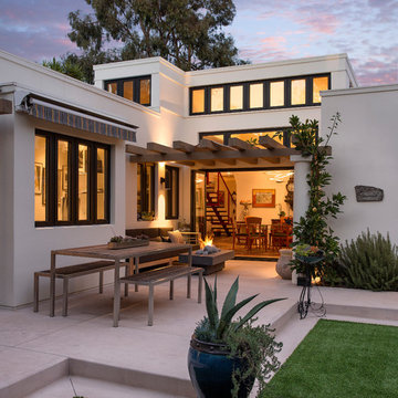
 Allen Construction
The goal for these clients was to build a new home with a transitional design that was large enough for their children and grandchildren to visit, but small enough to age in place comfortably with a budget they could afford on their retirement income. They wanted an open floor plan, with plenty of wall space for art and strong connections between indoor and outdoor spaces to maintain the original garden feeling of the lot. A unique combination of cultures is reflected in the home – the husband is from Haiti and the wife from Switzerland. The resulting traditional design aesthetic is an eclectic blend of Caribbean and Old World flair.
Jim Barsch Photography
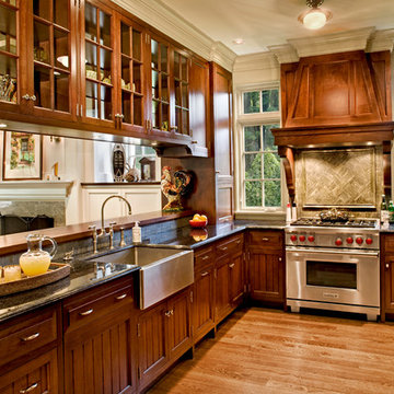
 Mockler Taylor Architects
4,000 square foot shingle style home in Greenwich, CT.
Photo Credit: Robert Benson
Kitchen - victorian u-shaped medium tone wood floor kitchen idea in Bridgeport with a farmhouse sink, recessed-panel cabinets, medium tone wood cabinets, stainless steel appliances and no island
Kitchen - victorian u-shaped medium tone wood floor kitchen idea in Bridgeport with a farmhouse sink, recessed-panel cabinets, medium tone wood cabinets, stainless steel appliances and no island
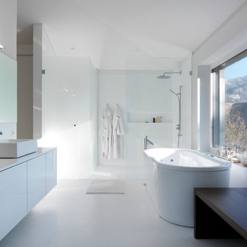
 LeichtUSA
clear and simple forms. The simplicity and architectural dialogue between form and function are the theme for inside and outside. Walnut bench that stretches under the wide windows along the entire length of the bath a, the window continues as a narrow band. The white high gloss acrylic surface of the Vanity. Leicht Program Luna-AG, with electrical drawers SensoMatic, Find a Leicht Showroom http://www.leicht.com/en-us/find-a-showroom/
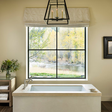
 Jada Windows
Custom thermally broken steel windows and doors for every environment. Experience the evolution! #JadaSteelWindows
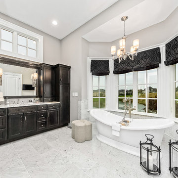
Huge transitional master dark wood floor freestanding bathtub photo in Sacramento with beige walls
Huge transitional master dark wood floor freestanding bathtub photo in Sacramento with beige walls
 Jordan Design Build Group
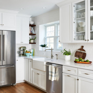
One small window, faux woodgrain cabinets and lots of doors made this closed-off Arlington kitchen feel dark and drab, the total opposite of the vibrant young family of four that lives here. To brighten and open up the small kitchen, we removed the wall separating the dining room, expanded the window above the sink and installed a French door to let even more light in from an adjoining sun room. Light now pours into the kitchen, making it feel welcoming, airy and bright. To accommodate the expanded kitchen, we removed a hulking set of built-ins from the dining room which provided two extra feet to work with. The larger footprint allowed us to relocate major appliances and provide a generous amount of storage and prep space including a food safe butcher block to the right of the range. Natural wood elements such as the chopping block, reclaimed shelves and beautiful new floors add character and warmth to the all-white kitchen.
One of the must-haves in this renovation was a farmhouse sink which is a great way to maximize function when a smaller sink base is used. We opted to take the tile backsplash all the way to the ceiling along the window wall, creating a more polished look with the added bonus of making the ceiling feel taller. The subway tiles’ subtle texture adds depth to the simple white-on-white motif and the change to a herringbone pattern behind the range adds visual interest without feeling too busy. A crisp white backdrop is perfect for adding pops of color with dishware, accessories and the family’s vintage stand mixer. The newly renovated kitchen-dining area is much better suited for this family’s active lifestyle and the updated design now complements the rest of their stylish home.
Photos by Stacy Zarin Goldberg
Sponsored
Fredericksburg, OH

High Point Cabinets
Columbus' Experienced Custom Cabinet Builder | 4x Best of Houzz Winner
 threshold interiors
Location: Nantucket, MA, USA
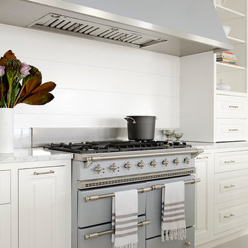
This classic Nantucket home had not been renovated in several decades and was in serious need of an update. The vision for this summer home was to be a beautiful, light and peaceful family retreat with the ability to entertain guests and extended family. The focal point of the kitchen is the La Canche Chagny Range in Faience with custom hood to match. We love how the tile backsplash on the Prep Sink wall pulls it all together and picks up on the spectacular colors in the White Princess Quartzite countertops. In a nod to traditional Nantucket Craftsmanship, we used Shiplap Panelling on many of the walls including in the Kitchen and Powder Room. We hope you enjoy the quiet and tranquil mood of these images as much as we loved creating this space. Keep your eye out for additional images as we finish up Phase II of this amazing project!
Photographed by: Jamie Salomon
 Bittoni Architects
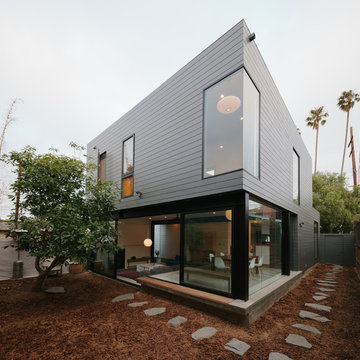
A radical remodel of a modest beach bungalow originally built in 1913 and relocated in 1920 to its current location, blocks from the ocean.
The exterior of the Bay Street Residence remains true to form, preserving its inherent street presence. The interior has been fully renovated to create a streamline connection between each interior space and the rear yard. A 2-story rear addition provides a master suite and deck above while simultaneously creating a unique space below that serves as a terraced indoor dining and living area open to the outdoors.
Photographer: Taiyo Watanabe
 MILLER + MILLER Architectural Photography
Miller + Miller Real Estate
Sun-filled kitchen + breakfast room. Large windows galore offer views of waterfalls trees + wildlife (including backless china cabinet + window over range to maintain view of gardens). Distressed white oak floor. Skylights. Faux finish walls/ceiling. Kitchen with expansive Island with 13-foot hardwood counter-top and second prep sink. Two dishwashers in Island, Two Subzero 36 inch fridge/freezers, plus Two refrigerator drawers. Fully Renovated. All indoor and outdoor appliances are new in ’09.
 YS BUILT, LLC
A new custom residence in the Harrison Views neighborhood of Issaquah Highlands.
The home incorporates high-performance envelope elements (a few of the strategies so far include alum-clad windows, rock wall house wrap insulation, green-roofs and provision for photovoltaic panels).
The building site has a unique upper bench and lower bench with a steep slope between them. The siting of the house takes advantage of this topography, creating a linear datum line that not only serves as a retaining wall but also as an organizing element for the home’s circulation.
The massing of the home is designed to maximize views, natural daylight and compliment the scale of the surrounding community. The living spaces are oriented to capture the panoramic views to the southwest and northwest, including Lake Washington and the Olympic mountain range as well as Seattle and Bellevue skylines.
A series of green roofs and protected outdoor spaces will allow the homeowners to extend their living spaces year-round.
With an emphasis on durability, the material palette will consist of a gray stained cedar siding, corten steel panels, cement board siding, T&G fir soffits, exposed wood beams, black fiberglass windows, board-formed concrete, glass railings and a standing seam metal roof.
A careful site analysis was done early on to suss out the best views and determine how unbuilt adjacent lots might be developed.
The total area is 3,425 SF of living space plus 575 SF for the garage.
Photos by Benjamin Benschneider. Architecture by Studio Zerbey Architecture + Design. Cabinets by LEICHT SEATTLE.
Sponsored
Fredericksburg, OH
High Point Cabinets
Columbus' Experienced Custom Cabinet Builder | 4x Best of Houzz Winner
 Soda Pop Design Inc.
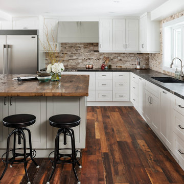
Custom design by Cynthia Soda of Soda Pop Design Inc. in Toronto, Canada. Photography by Stephani Buchman Photography.
Open concept kitchen - large transitional l-shaped dark wood floor open concept kitchen idea in Toronto with white cabinets, an island, recessed-panel cabinets, beige backsplash, stone tile backsplash and stainless steel appliances
Open concept kitchen - large transitional l-shaped dark wood floor open concept kitchen idea in Toronto with white cabinets, an island, recessed-panel cabinets, beige backsplash, stone tile backsplash and stainless steel appliances
 Twelve Stones Designs, LLC
The owners of this kitchen had spent the money to upgrade the finishes in their kitchen upon building the home 12 years ago, but after living in the space for several years they realized how nonfunctional the layout really was. The (then) two preschool aged children had grown into busy, hungry teenagers with many friends who also liked to hang out at the house. So the family needed a more functional kitchen with better traffic flow, space for daily activities revolving around the kitchen at different times of day, and a kitchen that could accommodate cooking for and serving large groups. Furthermore, the dark, traditional finishes no longer reflected the homeowners’ style. They requested a brighter, more relaxed, coastal style that reflected their love of the seaside cities they like to visit.
Originally, the kitchen was U-shaped with a narrow island in the middle. The island created narrow aisles that bottle-necked at the dishwasher, refrigerator, and cooktop areas. There was a pass-through from the foyer into the kitchen, but the owners never liked that the pass-through was also located so close to the powder room. The awkward proximity was unappealing and made guests feel uncomfortable.
The kitchen’s storage was made up of lots of narrow cabinets, apothecary drawers, clipped corner units, and very few drawers. It lacked useful storage for the larger items the family used on a daily basis. And the kitchen’s only pantry was small closet that had only builder-grade, narrow shelving with no illumination to be able to see the contents inside.
Overall, the kitchen’s lighting plan was poorly executed. Only six recessed cans illuminated the entire kitchen and nook areas. The under cabinet lighting was not evenly distributed either. In fact, the builder had mis-placed the under cabinet lighting around the decorative pilasters which made for choppy, dark cubbies. Further, the builder didn’t include any lighting over the sink or the bar area, which meant whoever was doing the dishes was always in their own shadow. That, coupled with the steep overhang of the game room above made the bar area feel like a dim, cavernous space that wasn’t inviting or task oriented. The kitchen looked out into the main living space, but the raised bar and a narrow wall (which held the only large cabinet in the kitchen) created more of a barrier than a relationship to the living room or breakfast nook. In fact, one couldn’t even see the breakfast nook from the cooktop or sink areas due to its orientation. The raised bar top was too narrow to comfortably sit to either dine at or chat from due to the lack of knee space. The the homeowners confided that the kitchen felt more like a dark, dirty prison than place where the family, or their guests, wanted to gather and commune.
The clients' needs and desires were:
➢ to create a kitchen that would be a space the family loved to be in; to relate to the adjacent spaces all around, and to have better flow for entertaining large groups
➢ to remove the walls between the breakfast nook and living area and to be able to utilize the natural light from the windows in both those areas
➢ to incorporate a functional chopping block for prepping fresh food for home cooked meals, an island with a large sink and drain board, 2 pull out trash cans, and seating for at least the 2 teens to eat or do homework
➢ to design a kitchen and breakfast nook with an airy, coastal, relaxed vibe that blended with the rest of the house's coastal theme
➢ to integrate a layered lighting plan which would include ample general illumination, specific task lighting, decorative lighting, and lots of illuminated storage
➢ to design a kitchen with not only more storage for all the husband’s kitchen gadgets and collection of oils and spices, but smart storage, including a coffee/breakfast bar and a place to store and conceal the toaster oven and microwave
➢ to find a way to utilize the large open space between the kitchen, pantry area, and breakfast nook
Twelve Stones Designs achieved the owner's goals by:
➢ removing the walls between the kitchen and living room to allow the natural light to filter in from the adjacent rooms and to create a connection between the kitchen, nook, and living spaces for a sense of unity and communion
➢ removing the existing pantry and designing 3 large pantry style cabinets with LED tape lights and rollout drawers to house lots of kitchen appliances, gadgets, and tons of groceries. We also took the cabinets all the way up to the 9’ ceiling for additional storage for seasonal items and bulk storage.
➢ designing 2 islands - 1 with a gorgeous black walnut chopping block that houses a drawer for chopping and carving knives and a custom double pull out trash unit for point of use utilization - and 1 that houses the dishwasher, a large Blanco Gourmet sink with integrated drain board, woven baskets for fresh root vegetables and kitchen towels, plenty of drawer storage for kitchen items, and bar seating for up to 4 diners.
➢ closing off the space between the kitchen and the powder room to create a beautiful new private alcove for the powder room as well as adding some decorative storage. This also gave us space to include more tall storage near the new range for precision placement of the husband’s extensive oil and spice collection as well as a location for a combo-steam oven the wife wanted for baking and cooking healthy meals.
The project is enhanced functionally by:
➢ incorporated USB and standard receptacles for the kids’ laptops and phone charging in the large island
➢ designing the small island to include additional open shelving for items used on a daily basis such as a variety of bowls, plates, and colanders. This set up also works well for the husband who prefers to “plate” his dinners in restaurant-style fashion before presenting them to the table.
➢ the integration of specific storage units, such as double stacked cutlery drawers, a custom spice pull-out, a Kuerig coffee and tea pod drawer, and custom double stacked utensil drawers
➢ moving the refrigerator to the old oven location - this eliminated the bottle neck as well as created a better relationship to the eating table. It also utilizes the floor space between the pantry, nook, and kitchen
➢ creating a banquet style breakfast nook - this banquette seating not only doubles the amount of seating for large gatherings but it better utilizes the odd space between the kitchen and the previous nook area. It also helps to create a distinct pathway from the mudroom room through the pantry area, kitchen, nook, and living room.
➢ the coffee/breakfast bar area which includes the perfect location for the concealed microwave and toaster oven, convenient storage for the coffee pods and tea accoutrements. Roll-out drawers below also house the smoothie maker, hot water kettle, and a plethora of smoothie-making ingredients such as protein powders, smoothie additives, etc. Furthermore, the drawers below the Keurig house measuring utensil, cutlery, baking supplies and tupperware storage.
➢ incorporating lots of wide drawers and pullouts to accommodate large cookware.
➢ utilizing as much vertical space as possible by building storage to the ceiling which accommodates the family’s abundant amount of serving platters, baking sheets, bakeware, casserole dishes, and additional cutting boards.
The project is enhanced aesthetically by:
➢ new 5-piece Versailles pattern porcelain tile that now seamlessly joins the entire down stairs area together creating a bright, cohesiveness feeling instead of choppy separated spaces - it also adds a coastal feeling
➢ designing a cabinet to conceal the microwave and toaster oven
➢ the coastal influenced light fixtures over the nook table and island
➢ the sandy colors of the Langdon Cambria countertops. The swirling pattern and sparkling quartz pieces remind the homeowner of black-and-tan sandy beaches
➢ the striped banquet seating whose creamy white background and blue-green stripes were the inspiration for the cabinet and wall colors.
➢ All the interior doors were painted black to coordinate with the blacks and grays in the backsplash tile and countertop. This also adds a hint of tailored formality to an otherwise casual space.
➢ the use of WAC's Oculux small aperture LED units for the overhead lighting complimented with Diode LED strips for task lighting under the cabinets and inside the pantry and glass wall cabinets. All of the lighting applications are on separate dimmer switches.
Innovative uses of materials or construction methods by Realty Restoration LLC:
➢ Each 1-1/2” x 3” block of reclaimed end-grain black walnut that makes up the center island chopping block was hand milled and built in the shop. It was designed to look substantial and proportional to the surrounding elements, executed by creating the 4 inch tall top with a solid wood chamfered edge band.
➢ The metal doors on either side of the vent hood were also custom designed for this project and built in the Realty Restoration LLC shop. They are made 1x2, 11-gauge mild steel with ribbed glass. Weighing 60 lbs a piece, heavy duty cabinet hinges were added to support the weight of the door and keep them from sagging.
➢ Under-cabinet receptacles were added along the range wall in order to have a clean, uninterrupted backsplash.
Design obstacles to overcome:
➢ Because we were removing the demising walls between the kitchen and living room, we had to find a way to plumb and vent the new island. We did this by tunneling through the slab (the slab had post tension cables which prevented us from just trenching) to run a new wet vent through a nearby structural wall. We pulled the existing hot and cold lines between upper floor joists and ran them down the structural wall as well and up through a conduit in the tunnel.
➢ Since we were converting from wall overs to a gas range it allowed us to utilize the 220 feed for the wall ovens to provide a new sub panel for all the new kitchen circuits
➢ Due to framing deficiencies inherited from the original build there was a 1-1/2” differential in the floor-to-ceiling height over a 20 foot span; by utilizing the process of cutting and furring coupled with the crown moulding details on the cabinet elevations we were able to mask the problem and provide seamless transitions between the cabinet components.
Evidence of superior craftsmanship:
➢ uniquely designed, one-of-a-kind metal “X” end panels on the large island. The end panels were custom made in the Realty Restoration LLC shop and fitted to the exact dimensions of the island. The welding seams are completely indistinguishable - the posts look like they are cut from a single sheet of metal
➢ square metal posts on the small island were also custom made and designed to compliment and carry through the metal element s throughout the kitchen
➢ the beautiful, oversized end panels on the pantry cabinets which give the breakfast nook a tailored look
➢ integrating a large format 5 piece Versailles tile pattern to seamlessly flow from the existing spaces into the new kitchen space
➢ By constructing a custom cabinet that jogged around a corner we could not remodel (housing the entry way coat closet) we were able to camouflage the adjacent wall offset within the upper and lower cabinets. By designing around the existing jog in the structural walls we accomplished a few things: we were able to find the space to house, and hide, the microwave and toaster oven yet still have a clean cohesive appearance from the kitchen side. Additionally, the owners were able to keep their much needed coat closet and we didn’t have to increase the budget with unnecessary structural work.
 Pineapple House Interior Design
CHALLENGE:
-Owners want easy to maintain (white) kitchen
-Must also serve as a workspace & accommodate three laptops & separate personal files
-Existing kitchen has odd, angled wall of cabinets due to configuration of stairs in foyer
SOLUTION:
-Expand space by removing wall between kitchen & dining room
-Relocate dining room into (rarely used) study
-Remove columns between kitchen & new dining
-Enlarge walk-in pantry by squaring off angles in stair wall
-Make pantry entry a camouflaged, surprising feature by creating doors out of cabinetry
-Add natural illumination with 6’ picture window
-Make ceiling one plane
-Add calculated runways of recessed LED lights on dimmers
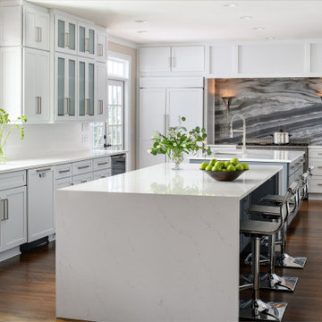
-Lighting leads to dynamic marble back splash behind range on back wall
-New double islands & ceiling-high cabinetry quadruple previous counter & storage space
-9’ island with seating includes three workstations
-Seating island offers under counter electronics charging ports & three shelves of storage per workstation in cabinets directly in front of stools
-Behind stools, lower cabinetry provides one drawer & two pull-out shelves per workstation
-7’ prep island services 48” paneled refrigerator & 48” gas range & includes 2nd sink, 2nd dishwasher & 2nd trash/recycling station
-Wine/beverage chiller located opposite island sink
-Both sink spigots are touch-less & are fed by whole-house water filtration system
-Independent non-leaching faucet delivers purified, double-pass reverse osmosis drinking water
-Exhaust fan for gas range is hidden inside bridge of upper cabinets
-Flat, easy-to-clean, custom, stainless-steel plate frames exhaust fan
-New built-in window seat in bay window increases seating for informal dining while reducing floor space needed for table and chairs
-New configuration allows unobstructed windows & French doors to flood space with natural light & enhances views
-Open the screened porch doors to circulate fresh air throughout the home
10