
Search results for "Reading reviews" in Home Design Ideas

 Jami Abbadessa
TEXTURAL VIBES
Time Frame: 2 Months // Design Fee: $1,875
Evan and his wife Karen were looking for professional help in designing/decorating their master bedroom in Rancho Cucamonga, CA. I was not referred to them, but they were impressed by my website, reviews and pictures of past projects. I’m always excited to work with new clients who were drawn to me by my style of past projects and online presence. When I first met with them, I immediately felt comfortable and knew this was going to be a great project. They were very open to suggestions and requested only a few things – TEXTURE, a seating area for TV viewing/gaming, a clean design without clutter and an overall well-put-together feeling. They told me not to hold back on my design vision, so we just went for it! I had a custom ceiling height headboard constructed in a velvet for drama. We splurged on luxurious bedding with tons of layers and texture. On that same wall I had shimmery, grey grass cloth installed for added texture. Custom, black out, silk Roman shades, layered with pleated sheers were hung. Grey-washed hardwood flooring was installed. I had a custom grey built-in installed in the niche to serve as a dresser and TV storage. Recessed lighting, reading lights and crystal pendants were added. A soft grey was painted on the walls with a contrasting darker slate on the ceiling. An over-sized wall mirror, wool rugs, metal-wrapped furniture, a custom sofa and ottoman with nailhead trim and professional photos of the couple framed in silver with linen mats tied everything together.

 Tiffany Brooks, HGTV Host & Interior Designer
Inquire About Our Design Services
When we first started talking in the spring of 2015, I was impressed. She was witty, realistic, and understood that as much as she loves my shows on HGTV, design does not does not happen in 43 minutes! She told me about her space, and how she felt that her bedroom seemed “blah” to her. She had no retreat. Molly desperately longed for a place that she could spend time in, read in, play in and above all, relax in.
What we did:
Many people are terrified of hiring a designer. Rightfully so, they are investing a pretty penny in their homes. They want to make sure that everything, down to the last floral arrangement, is to their liking, because they will have to live it (and pay for it). Unfortunately, a client can unintentionally stifle a designer’s creativity through micro-management. This can produce lackluster results and ultimately cause more time (and money) to be spent on a project than is really necessary.
With Molly, that was never an issue. Before she even showed me the room in question, she said that I could have full creative license to do what I needed to do to her bedroom. SAY WHAAH!?
With Molly giving me complete creative freedom, I planned everything out and got down to business. The result: Bite-your-bottom-lip sexy. I don’t get jealous of too many of my clients’ spaces, but this one still takes my breath away every time I look at the pics!
The craziest part was that by adding more furniture, it actually made the space feel larger.
Molly and her husband Patrick loved the finished space, and promised me I will be back to finish the rest of the house!
Here’s the highlights of the rest of the project:
I came up with a space plan with three options.
Next, we reviewed mood boards and fabric schemes that would work for both Molly and her hubby Patrick.
We started with the bed. My goal was to add edge to its otherwise traditional style.
We decided to spice things up by painting the trim work in the room black.
We built in layers of lighting with dimmers. In a bedroom everything should be on dimmers, right? Right.
We designed and customized bedding, chairs and window treatments.
Together with Molly, we selected the most perfect wallpaper. This geometric “grasscloth” adds so much depth and dimension that was just missing before.
What I love:
That light fixture. I mean it is really, really amazing in person.
The porcupine mirror. This thing came packaged like it was the hope diamond, and everyone was terrified to handle it. But it really became a highlight of the room.

 InnovationLand
This huge covered patio in Houston offers a warm, dry, beautiful gathering space for friends and family!
The clients, Tim and Julie Burke of Spring, TX wanted something more waterproof than the small gazebo where they often entertained friends and family.
The Burkes asked for a large, shingled roof extension that matched the existing house.
We gave them an 800-square-foot covered patio with a gabled roof and a gorgeous tongue-and-groove wooden ceiling. The hip roof on one one side covers the existing outdoor kitchen and the outdoor bathroom the Burkes want to build themselves.
On the other side is a sloped roof creating a breezeway and sitting area between the patio and house.
We also installed the best permanent outdoor heating system we could find – Solaira quartz infrared heating units. Able to throw more heat further and more evenly than portable units, these electric-powered heaters can be installed up and out of sight. You don’t have to lug them around, refuel them with propane and worry about storing them. When you need them, all you need to do is a push a button!
When heat strikes, however – as it does for any covered patio in Houston – the Burkes can cool off with two industrial-sized outdoor ceiling fans.
Two TVs were also added to the existing outdoor kitchen. The Burkes started enjoying those right away, using them to watch the NCAA Final Four basketball championship with their family.
We also built an addition onto the outdoor kitchen island that houses an ice maker and extra seating. We also replaced the countertops with new granite.
Very few times do you actually get the service you expect,” reads the Houzz review of this covered patio by the clients, Tim and Julie Burke. “But in this case, it went further than we had ever previously experienced.”
The computer drawings, they add, really helped them and the homeowners’ association visualize how the project would look when final and all that would be involved: “They really listened to what we needed and so far, it has surpassed our expectations.”
They also appreciated the constant communication, quality workmanship, last-minute accommodations and tidying up at the end of the day.
“Overall, this has been a great experience, and we love our outdoor space!”
Find the right local pro for your project
 InnovationLand
This mosaic art tile is from a Houston outdoor kitchen and entertaining area offering a modern take on Mediterranean style.
Designed and built by Outdoor Homescapes of Houston, this fully loaded family and entertaining space echoes the stucco, travertine tile patio and Mediterranean style of the existing home while exuding a more modern, transitional style.
“This was a high-profile client – both VPs of different oil and gas companies who entertain affluent guests on a regular basis – so they wanted to make sure they had high-end appliances and all the latest amenities they could order,” says Lisha Maxey, senior designer for Outdoor Homescapes and owner of LGH Design Services in Houston. “They also have two kids, ages 7 and 10, and wanted a family gathering space that better accompanied their new, luxurious pool.”
What really sets apart this outside kitchen design idea, however, is the way the elements are used throughout the space.
“Usually, outdoor kitchen designs for a backyard are grouped into one island or cabinet,” explains Outdoor Homescapes of Houston owner Wayne Franks. “But here, the patio, roof and fireplace were all in place, separated by stucco columns, and the outdoor kitchen elements had to work around them.”
A 14-foot-long cooking island houses a built-in Fire Magic grill with a Magic View Window (allows the chef to check on food without lifting the lid and losing valuable heat). The island, the countertop of which is "Carnaval" granite from Lackstone, also features a Fire Magic power burner, warming drawer and trash drawer. On one side of the fireplace, forming an “L” with the cooking island, sits a built-in Primo ceramic grill.
On the other side of the fireplace is a 3-foot-long cabinet housing a bar with a wine cooler, ice maker and upper cabinet. And finally, just outside the patio door is a 7-foot-long cabinet with a modern Kohler sink with a high-arc Moen faucet (sink and faucet from Faucets Direct), a trash drawer and another upper cabinet.
Outdoor Homescapes of Houston, by the way, outfitted both cabinets with glass inserts, custom pulls and three-way sensor lighting.
“At the beginning, this was basically a blank space with a fireplace in the middle,” says Maxey. So Outdoor Homescapes upgraded the fireplace with Austin Stack Stone in white (No. 401) from Colorstonescreenshot vickers mosaic tile rectangle. "The stone added that pop,” notes Maxey.
The fireplace’s espresso-colored, distressed wood mantel (from Mantels.com) and upper wood cabinets were both stained with the Minwax color Jacobean. The ceiling fans were also updated with ones featuring similarly espresso-colored, wooden fan blades, to match.
The table in the middle - a cast-iron, Mediterranean style gem with hand-forged scrollwork designs from Patio 1 in Houston – seats 10.
“We wanted this kind of Mediterranean feel,” says Maxey. “We wanted rustic, but the appliance package was so new, with all its stainless steel, so we kept a the cabinets and the columns stucco instead of stone for a more clean, modern look and then did the custom tile backsplash and mosaic in more of a rustic, Mediterranean look."
The backsplash is a 1-inch travertine tile background with 4-inch square metallic insets, both from Floor & Decor. The tile for the 18-by-24-inch rectangle mosaic came from Great Britain Tile Co. and included a Dianno Reale tumbled border and background. The bronze, diamond-shaped insets are tumbled Dark Emperdor tile and the scrolls are tumbled Noce tile.
The client, who admits they have high standards, was more than pleased with the project – especially browsing through Outdoor Homescapes’ vast library of patio kitchen design ideas, the 3D virtual video tour that let them preview the project from every angle before construction. They also liked the personalized design consultation.
"OH provides a very neat service where one of their designers will either shop/buy for you or shop with you for the more detailed pieces that will finish your home," reads the client's review on Houzz. "This was a very positive, personalized feature ... Lisha helped narrow down an enormous marketplace of materials and finishes to a few we could choose from."


 Agnieszka Jakubowicz PHOTOGRAPHY
Photography: Agnieszka Jakubowicz
Design: Mindi Kim
Kitchen - traditional kitchen idea in San Francisco
Kitchen - traditional kitchen idea in San Francisco

 LakeandMountainHome
Reclaimed Farm Tables are classic , family durable tables. These tables can be customized to look sleek or rustic but always are casually elegant. www.lakeandmountainhome.com 978-505-3222
Sponsored
Sunbury, OH

J.Holderby - Renovations
Franklin County's Leading General Contractors - 2X Best of Houzz!
 Tiffany Brooks, HGTV Host & Interior Designer
Inquire About Our Design Services
When we first started talking in the spring of 2015, I was impressed. She was witty, realistic, and understood that as much as she loves my shows on HGTV, design does not does not happen in 43 minutes! She told me about her space, and how she felt that her bedroom seemed “blah” to her. She had no retreat. Molly desperately longed for a place that she could spend time in, read in, play in and above all, relax in.
What we did:
Many people are terrified of hiring a designer. Rightfully so, they are investing a pretty penny in their homes. They want to make sure that everything, down to the last floral arrangement, is to their liking, because they will have to live it (and pay for it). Unfortunately, a client can unintentionally stifle a designer’s creativity through micro-management. This can produce lackluster results and ultimately cause more time (and money) to be spent on a project than is really necessary.
With Molly, that was never an issue. Before she even showed me the room in question, she said that I could have full creative license to do what I needed to do to her bedroom. SAY WHAAH!?
With Molly giving me complete creative freedom, I planned everything out and got down to business. The result: Bite-your-bottom-lip sexy. I don’t get jealous of too many of my clients’ spaces, but this one still takes my breath away every time I look at the pics!
The craziest part was that by adding more furniture, it actually made the space feel larger.
Molly and her husband Patrick loved the finished space, and promised me I will be back to finish the rest of the house!
Here’s the highlights of the rest of the project:
I came up with a space plan with three options.
Next, we reviewed mood boards and fabric schemes that would work for both Molly and her hubby Patrick.
We started with the bed. My goal was to add edge to its otherwise traditional style.
We decided to spice things up by painting the trim work in the room black.
We built in layers of lighting with dimmers. In a bedroom everything should be on dimmers, right? Right.
We designed and customized bedding, chairs and window treatments.
Together with Molly, we selected the most perfect wallpaper. This geometric “grasscloth” adds so much depth and dimension that was just missing before.
What I love:
That light fixture. I mean it is really, really amazing in person.
The porcupine mirror. This thing came packaged like it was the hope diamond, and everyone was terrified to handle it. But it really became a highlight of the room.
 Zepboo
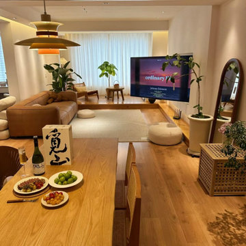
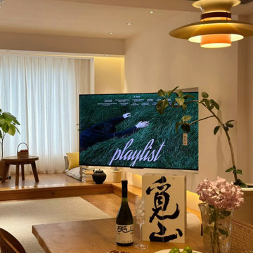
Presenting a case study of a client located in Nagoya, Japan. This client resides in an 85 square meter, two-bedroom, two-living room residence. The overall style of the house incorporates a blend of Japanese wooden and Nordic modern aesthetics. The client discovered us through a Google search and sought our expertise in recommending and selecting lighting fixtures suitable for their living room and dining area. The client expressed a preference for localized lighting, indicating a high requirement for accentuating specific areas. After reviewing the floor plans and renderings provided by the client, we assisted them in making their choices.
Starting with the dining area, which is a separate space occupying approximately 10 square meters, the client has a solid wood dining table measuring 1.8 meters in length. Their preference for warm lighting led us to recommend the PH5 Macaron Pendant Light in a Nordic modern style. This pendant light offers a wide range of color options, and the client personally selected a combination of white and orange, paired with warm light sources. The actual result of this combination is truly remarkable. As the client had additional auxiliary lighting such as light strips installed in the dining area, the pendant light primarily serves the purpose of focusing the light on the food, perfectly meeting the client's requirements.
Moving on to the living room, the client also has light strips installed on the ceiling and track lights in place. They expressed a need for a floor lamp beside the sofa to provide localized lighting, as they enjoy reading in the living room. Hence, we selected a unique umbrella-shaped wooden floor lamp that complements the pendant light in the dining area. This choice harmonizes well with the overall style of the dining area, which showcases a Japanese wooden aesthetic. When the client received the products, they expressed their complete satisfaction with how well the lighting fixtures aligned with their needs.
I am sharing this case study with everyone, hoping it will provide inspiration and ideas for your own home renovations.
 Zepboo
Presenting a case study of a client located in Nagoya, Japan. This client resides in an 85 square meter, two-bedroom, two-living room residence. The overall style of the house incorporates a blend of Japanese wooden and Nordic modern aesthetics. The client discovered us through a Google search and sought our expertise in recommending and selecting lighting fixtures suitable for their living room and dining area. The client expressed a preference for localized lighting, indicating a high requirement for accentuating specific areas. After reviewing the floor plans and renderings provided by the client, we assisted them in making their choices.
Starting with the dining area, which is a separate space occupying approximately 10 square meters, the client has a solid wood dining table measuring 1.8 meters in length. Their preference for warm lighting led us to recommend the PH5 Macaron Pendant Light in a Nordic modern style. This pendant light offers a wide range of color options, and the client personally selected a combination of white and orange, paired with warm light sources. The actual result of this combination is truly remarkable. As the client had additional auxiliary lighting such as light strips installed in the dining area, the pendant light primarily serves the purpose of focusing the light on the food, perfectly meeting the client's requirements.
Moving on to the living room, the client also has light strips installed on the ceiling and track lights in place. They expressed a need for a floor lamp beside the sofa to provide localized lighting, as they enjoy reading in the living room. Hence, we selected a unique umbrella-shaped wooden floor lamp that complements the pendant light in the dining area. This choice harmonizes well with the overall style of the dining area, which showcases a Japanese wooden aesthetic. When the client received the products, they expressed their complete satisfaction with how well the lighting fixtures aligned with their needs.
I am sharing this case study with everyone, hoping it will provide inspiration and ideas for your own home renovations.
 Tiffany Brooks, HGTV Host & Interior Designer
Inquire About Our Design Services
When we first started talking in the spring of 2015, I was impressed. She was witty, realistic, and understood that as much as she loves my shows on HGTV, design does not does not happen in 43 minutes! She told me about her space, and how she felt that her bedroom seemed “blah” to her. She had no retreat. Molly desperately longed for a place that she could spend time in, read in, play in and above all, relax in.
What we did:
Many people are terrified of hiring a designer. Rightfully so, they are investing a pretty penny in their homes. They want to make sure that everything, down to the last floral arrangement, is to their liking, because they will have to live it (and pay for it). Unfortunately, a client can unintentionally stifle a designer’s creativity through micro-management. This can produce lackluster results and ultimately cause more time (and money) to be spent on a project than is really necessary.
With Molly, that was never an issue. Before she even showed me the room in question, she said that I could have full creative license to do what I needed to do to her bedroom. SAY WHAAH!?
With Molly giving me complete creative freedom, I planned everything out and got down to business. The result: Bite-your-bottom-lip sexy. I don’t get jealous of too many of my clients’ spaces, but this one still takes my breath away every time I look at the pics!
The craziest part was that by adding more furniture, it actually made the space feel larger.
Molly and her husband Patrick loved the finished space, and promised me I will be back to finish the rest of the house!
Here’s the highlights of the rest of the project:
I came up with a space plan with three options.
Next, we reviewed mood boards and fabric schemes that would work for both Molly and her hubby Patrick.
We started with the bed. My goal was to add edge to its otherwise traditional style.
We decided to spice things up by painting the trim work in the room black.
We built in layers of lighting with dimmers. In a bedroom everything should be on dimmers, right? Right.
We designed and customized bedding, chairs and window treatments.
Together with Molly, we selected the most perfect wallpaper. This geometric “grasscloth” adds so much depth and dimension that was just missing before.
What I love:
That light fixture. I mean it is really, really amazing in person.
The porcupine mirror. This thing came packaged like it was the hope diamond, and everyone was terrified to handle it. But it really became a highlight of the room.
 Tile Doctor Ltd
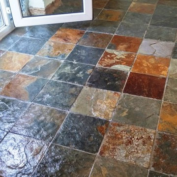
We recently deep cleaned two different tiled floors at a property in the village of Coningsby in the centre of Lincolnshire. The floor was split into two areas one laid with natural Sandstone and the other Riven Slate tiles. Both tiled areas had been sealed previously but the sealer was clearly not doing the job as the floor had a very dull finish due to dirt being absorbed into the tile.
The floors were in need of a deep clean to remove the ingrained dirt and remaining sealer so the first step was to soak the tiles in a strong dilution of Tile Doctor Pro-Clean and then work it in using a rotary machine fitted with a black pad and a stiff brush along the grout lines. This did the job and there’s a great photograph below that shows the difference this made.
To extract the now soiled cleaning solution the floor was rinsed using water which was then extracted using our wet pick up system. Once the floor was clear we were able to see where more work was required and the process was repeated until we were happy the floor was thoroughly clean and free of any remaining sealer.
To get the floor dry a number of turbo air dryers were setup around the floor and we left for the day to allow the floor to thoroughly dry off overnight.
The following morning we tested the tiles to make sure that both were dry which they were. We then applied Tile Doctor quality sealers to both floors; two different finishes were required for the different types of floor so we applied three coats of Colour Grow sealer to the Sandstone flooring as this impregnates the pores in the stone protecting it from staining and enhancing the natural colours to provide a natural look. We than applied four coats of Seal and Go sealer to the Slate floor, Seal and Go adds a nice subtle shine and works well on Riven Slate to highlight the different shades.
The customer was delighted with the results and left an excellent review which you can read below:
The floors look absolutely beautiful. I am very pleased with the service.
J. Gibbons, Coningsby
She wants us to return soon to seal the other stone areas in their property. As you can see from the photos the before and after is very striking. The floors were ready to take light use that same afternoon.
 Tiffany Brooks, HGTV Host & Interior Designer
Inquire About Our Design Services
When we first started talking in the spring of 2015, I was impressed. She was witty, realistic, and understood that as much as she loves my shows on HGTV, design does not does not happen in 43 minutes! She told me about her space, and how she felt that her bedroom seemed “blah” to her. She had no retreat. Molly desperately longed for a place that she could spend time in, read in, play in and above all, relax in.
What we did:
Many people are terrified of hiring a designer. Rightfully so, they are investing a pretty penny in their homes. They want to make sure that everything, down to the last floral arrangement, is to their liking, because they will have to live it (and pay for it). Unfortunately, a client can unintentionally stifle a designer’s creativity through micro-management. This can produce lackluster results and ultimately cause more time (and money) to be spent on a project than is really necessary.
With Molly, that was never an issue. Before she even showed me the room in question, she said that I could have full creative license to do what I needed to do to her bedroom. SAY WHAAH!?
With Molly giving me complete creative freedom, I planned everything out and got down to business. The result: Bite-your-bottom-lip sexy. I don’t get jealous of too many of my clients’ spaces, but this one still takes my breath away every time I look at the pics!
The craziest part was that by adding more furniture, it actually made the space feel larger.
Molly and her husband Patrick loved the finished space, and promised me I will be back to finish the rest of the house!
Here’s the highlights of the rest of the project:
I came up with a space plan with three options.
Next, we reviewed mood boards and fabric schemes that would work for both Molly and her hubby Patrick.
We started with the bed. My goal was to add edge to its otherwise traditional style.
We decided to spice things up by painting the trim work in the room black.
We built in layers of lighting with dimmers. In a bedroom everything should be on dimmers, right? Right.
We designed and customized bedding, chairs and window treatments.
Together with Molly, we selected the most perfect wallpaper. This geometric “grasscloth” adds so much depth and dimension that was just missing before.
What I love:
That light fixture. I mean it is really, really amazing in person.
The porcupine mirror. This thing came packaged like it was the hope diamond, and everyone was terrified to handle it. But it really became a highlight of the room.
Sponsored
Sunbury, OH
J.Holderby - Renovations
Franklin County's Leading General Contractors - 2X Best of Houzz!
 Zepboo
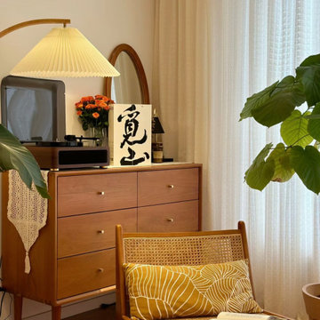
Presenting a case study of a client located in Nagoya, Japan. This client resides in an 85 square meter, two-bedroom, two-living room residence. The overall style of the house incorporates a blend of Japanese wooden and Nordic modern aesthetics. The client discovered us through a Google search and sought our expertise in recommending and selecting lighting fixtures suitable for their living room and dining area. The client expressed a preference for localized lighting, indicating a high requirement for accentuating specific areas. After reviewing the floor plans and renderings provided by the client, we assisted them in making their choices.
Starting with the dining area, which is a separate space occupying approximately 10 square meters, the client has a solid wood dining table measuring 1.8 meters in length. Their preference for warm lighting led us to recommend the PH5 Macaron Pendant Light in a Nordic modern style. This pendant light offers a wide range of color options, and the client personally selected a combination of white and orange, paired with warm light sources. The actual result of this combination is truly remarkable. As the client had additional auxiliary lighting such as light strips installed in the dining area, the pendant light primarily serves the purpose of focusing the light on the food, perfectly meeting the client's requirements.
Moving on to the living room, the client also has light strips installed on the ceiling and track lights in place. They expressed a need for a floor lamp beside the sofa to provide localized lighting, as they enjoy reading in the living room. Hence, we selected a unique umbrella-shaped wooden floor lamp that complements the pendant light in the dining area. This choice harmonizes well with the overall style of the dining area, which showcases a Japanese wooden aesthetic. When the client received the products, they expressed their complete satisfaction with how well the lighting fixtures aligned with their needs.
I am sharing this case study with everyone, hoping it will provide inspiration and ideas for your own home renovations.

 Zelaya Properties LLC
We used: Custom cherry cabinetry in Arts & Crafts Shaker style by Kabinart in Boulder and Espresso stains. Liberty Hardware Venetian bronze 1-1/2" cabinet knobs. KitchenAid Architect II Series 22 CF counter-depth French door refrigerator. KitchenAid Architect Series II 27" convection single wall oven. KitchenAid 36" 6-burner dual fuel freestanding commercial-style range. KitchenAid Architect II Series 24" dishwasher. Sharp Insight Pro Series 24" built-in microwave drawer (Model #KB6524PS). Crystorama Solaris 12" wide pendant lights in English bronze. Granite countertops in Brown Fantasy. 3"x6" polished marble backsplash.
Paint colors:
Walls: Glidden Silver Cloud 30YY 63/024
Ceilings/Trims/Doors: Glidden Swan White GLC23
Robert B. Narod Photography
 Zepboo
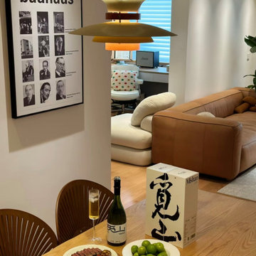
Presenting a case study of a client located in Nagoya, Japan. This client resides in an 85 square meter, two-bedroom, two-living room residence. The overall style of the house incorporates a blend of Japanese wooden and Nordic modern aesthetics. The client discovered us through a Google search and sought our expertise in recommending and selecting lighting fixtures suitable for their living room and dining area. The client expressed a preference for localized lighting, indicating a high requirement for accentuating specific areas. After reviewing the floor plans and renderings provided by the client, we assisted them in making their choices.
Starting with the dining area, which is a separate space occupying approximately 10 square meters, the client has a solid wood dining table measuring 1.8 meters in length. Their preference for warm lighting led us to recommend the PH5 Macaron Pendant Light in a Nordic modern style. This pendant light offers a wide range of color options, and the client personally selected a combination of white and orange, paired with warm light sources. The actual result of this combination is truly remarkable. As the client had additional auxiliary lighting such as light strips installed in the dining area, the pendant light primarily serves the purpose of focusing the light on the food, perfectly meeting the client's requirements.
Moving on to the living room, the client also has light strips installed on the ceiling and track lights in place. They expressed a need for a floor lamp beside the sofa to provide localized lighting, as they enjoy reading in the living room. Hence, we selected a unique umbrella-shaped wooden floor lamp that complements the pendant light in the dining area. This choice harmonizes well with the overall style of the dining area, which showcases a Japanese wooden aesthetic. When the client received the products, they expressed their complete satisfaction with how well the lighting fixtures aligned with their needs.
I am sharing this case study with everyone, hoping it will provide inspiration and ideas for your own home renovations.
 InnovationLand
This huge covered patio in Houston offers a warm, dry, beautiful gathering space for friends and family!
The clients, Tim and Julie Burke of Spring, TX wanted something more waterproof than the small gazebo where they often entertained friends and family.
The Burkes asked for a large, shingled roof extension that matched the existing house.
We gave them an 800-square-foot covered patio with a gabled roof and a gorgeous tongue-and-groove wooden ceiling. The hip roof on one one side covers the existing outdoor kitchen and the outdoor bathroom the Burkes want to build themselves.
On the other side is a sloped roof creating a breezeway and sitting area between the patio and house.
We also installed the best permanent outdoor heating system we could find – Solaira quartz infrared heating units. Able to throw more heat further and more evenly than portable units, these electric-powered heaters can be installed up and out of sight. You don’t have to lug them around, refuel them with propane and worry about storing them. When you need them, all you need to do is a push a button!
When heat strikes, however – as it does for any covered patio in Houston – the Burkes can cool off with two industrial-sized outdoor ceiling fans.
Two TVs were also added to the existing outdoor kitchen. The Burkes started enjoying those right away, using them to watch the NCAA Final Four basketball championship with their family.
We also built an addition onto the outdoor kitchen island that houses an ice maker and extra seating. We also replaced the countertops with new granite.
Very few times do you actually get the service you expect,” reads the Houzz review of this covered patio by the clients, Tim and Julie Burke. “But in this case, it went further than we had ever previously experienced.”
The computer drawings, they add, really helped them and the homeowners’ association visualize how the project would look when final and all that would be involved: “They really listened to what we needed and so far, it has surpassed our expectations.”
They also appreciated the constant communication, quality workmanship, last-minute accommodations and tidying up at the end of the day.
“Overall, this has been a great experience, and we love our outdoor space!”

 KellyBaron
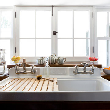
48" kohler farmhouse sink with wood wash board and dual faucets
Transitional dark wood floor kitchen photo in Los Angeles with a farmhouse sink, medium tone wood cabinets, wood countertops and no island
Transitional dark wood floor kitchen photo in Los Angeles with a farmhouse sink, medium tone wood cabinets, wood countertops and no island

 Metro Interiors
I first came to Mary Beth’s home to help with her living room. But that changed when we looked at the office, and started talking about how it wasn’t working. When I stepped it to take a look, I immediately noticed how heavy and cramped it felt. Too many large pieces and clutter created a feeling of overwhelm.
It needed to be redone. Since Mary Beth works full time from home, I wanted to help her make this a space where she could be productive, and feel good about being in for long periods of time.
The end result is an impressive transformation – and it was done very affordably. “Prior to the re-design, my office was a cluttered, disorganized mess that really said nothing about who I am. I tended to use it as a catch all for things I didn’t know where to put or what to do with,” tells Mary Beth. Now, she says it feels so much better working in there, and even got rave reviews from her family when they visited for the Holidays. “It’s now well-organized, bright and seems to flow in the way it’s laid out”.
To remove clutter and the “heavy” feeling, two large bookcases and the couch were removed, and lots of time was spent decluttering. A nicer bookcase was moved to a place that made more sense; together with a cozy rug and upholstered chair we created a lovely reading area, a place she can also relax.
A neutral green on the walls is also soothing, and brings an element of nature inside. Groupings of photos from her travels hang on the walls now, and a larger piece of art creates a focal point. A piece I was delighted to help her find – hand-painted but affordably priced – it makes Mary Beth feel happy, “The art above the desk is beautiful, and it showed me that big doesn’t have to be overwhelming”.
A new desk, relocated to the “command position” in the room (a more powerful placement) is also less weighty than what she had before, but functionally allows for more workspace. We upgraded her desk chair to a high-back leather one. In total, this setup was intentional, for an enhanced feeling of being in control. Mary Beth notes, “I love the desk and how it sits. I can either work by the window and look out at the garden and at the birds, which I love to do, or look out into the living room and be part of anything going on there”.
On the windows we replaced metal blinds with woven roman shades, also with a natural look. They’re cordless, so nothing hangs in front of the beautiful backyard view, and they feel lighter. With the new office design, we also gave Mary Beth plenty of places for storage. Now the things she does use and need don’t need to be out in plain sight, cluttering things up.
In the end, we accomplished our goal of creating a space for Mary Beth conducive to work and also enjoyable. She says, “My work attitude and feeling of what the office is has definitely changed – I like to be there even when I’m not working. It doesn’t feel only like an office but is actually a relaxing place to be”.

 Moderne Builders
Gorgeous master bath with dramatic retro "wave" tile. Peak Photography
Example of a 1950s bathroom design in Los Angeles
Example of a 1950s bathroom design in Los Angeles
14