
Search results for "Receive additional" in Home Design Ideas
 KURV Architecture DPC (Alex Hughes Architects)
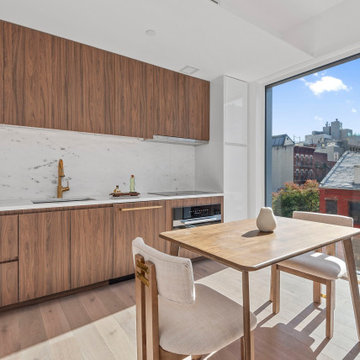
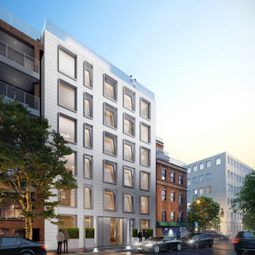
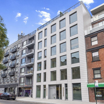
Located in the heart of Manhattan’s Lower East Side, the building was erected on a shallow commercial lot between two 120 year old masonry buildings and a new residential rental building. 330 Grand Street is a mix of 725 SF 1BRs and 1050 SF 2BR apartments. It also contains a 1100 SF two story duplex as well as private and public rooftop space, large private balconies for most units and two large private terraces for the ground floor units.
330 Grand Street was originally designed and approved at the NYC DOB as a prefabricated modular building. During the pandemic, as shipping costs skyrocketed putting the project at risk, we suggested redesigning the building as a reinforced cast-in-place concrete structure. Concrete was readily available and prices had not been affected by the demand increase that many other materials suffered in the pandemic. We took this opportunity to raise floor to ceiling heights, enlarge high performance windows and redistribute the buildings MEPFS and Structural Systems to create very open floor plans.
The challenge was to create a luxurious sensorial living experience with very limited means. In a city with very high construction costs, low cost residential buildings in the area are usually devoid of good quality, design and character. Our approach was to aim high for the end user, prioritizing natural light, open space with long visual perspectives, high ceilings and as always, rejecting the use of predefined building templates.
Our biggest challenge was to ensure that the small spaces feel as clean cut, large and bright as possible. Several unique design decisions were made to ensure low cost and high quality;
Floor plans were laid out so that spaces were wide open and free of clutter from mechanical or structural interruptions. Therefore all infrastructure was placed in lateral demising walls, which in turn act as the unit’s storage and kitchen. The apartments feel wide open, are super quiet and have more storage space than any other comparable apartment in the city.
To solve the problem of the site’s shallow commercial lot which is typically prone to dark interior spaces we focused our attention on the building’s envelope. Instead of the usual small punched window openings, oversized high performance windows were designed to ensure that light penetrated as far as possible into the units. In the smaller 1BR units, the full 50’ depth of the lot is perceived by partitioning spaces with sliding pocket doors that can be retracted to allow deep visual perspectives, making the sight lines in the space feel longer, larger, more ample than normal. In addition to the full height glazing, each unit above the 2nd floor receives a 7 foot covered balcony, adding 120 to 240 sf to each apartment, something unusual in New York City buildings. The space is large enough for a full size dining table, when the weather permits being outside.
We also worked hard to ensure modularity. For example, all kitchen units are all identical throughout the building. The idea of modularity and the economy of the repetitive unit is exercised to the maximum through the building.
Hardware, appliances, flooring, wall coverings and material finishes are all carefully selected to feel bespoke, high quality and unique.
It was important to KURV that the result of this work manifest into something that would deeply connect with the end user and sustain relationships with the consumers of this space.
All images by KURV Architecture ©
 KURV Architecture DPC (Alex Hughes Architects)
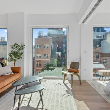
Located in the heart of Manhattan’s Lower East Side, the building was erected on a shallow commercial lot between two 120 year old masonry buildings and a new residential rental building. 330 Grand Street is a mix of 725 SF 1BRs and 1050 SF 2BR apartments. It also contains a 1100 SF two story duplex as well as private and public rooftop space, large private balconies for most units and two large private terraces for the ground floor units.
330 Grand Street was originally designed and approved at the NYC DOB as a prefabricated modular building. During the pandemic, as shipping costs skyrocketed putting the project at risk, we suggested redesigning the building as a reinforced cast-in-place concrete structure. Concrete was readily available and prices had not been affected by the demand increase that many other materials suffered in the pandemic. We took this opportunity to raise floor to ceiling heights, enlarge high performance windows and redistribute the buildings MEPFS and Structural Systems to create very open floor plans.
The challenge was to create a luxurious sensorial living experience with very limited means. In a city with very high construction costs, low cost residential buildings in the area are usually devoid of good quality, design and character. Our approach was to aim high for the end user, prioritizing natural light, open space with long visual perspectives, high ceilings and as always, rejecting the use of predefined building templates.
Our biggest challenge was to ensure that the small spaces feel as clean cut, large and bright as possible. Several unique design decisions were made to ensure low cost and high quality;
Floor plans were laid out so that spaces were wide open and free of clutter from mechanical or structural interruptions. Therefore all infrastructure was placed in lateral demising walls, which in turn act as the unit’s storage and kitchen. The apartments feel wide open, are super quiet and have more storage space than any other comparable apartment in the city.
To solve the problem of the site’s shallow commercial lot which is typically prone to dark interior spaces we focused our attention on the building’s envelope. Instead of the usual small punched window openings, oversized high performance windows were designed to ensure that light penetrated as far as possible into the units. In the smaller 1BR units, the full 50’ depth of the lot is perceived by partitioning spaces with sliding pocket doors that can be retracted to allow deep visual perspectives, making the sight lines in the space feel longer, larger, more ample than normal. In addition to the full height glazing, each unit above the 2nd floor receives a 7 foot covered balcony, adding 120 to 240 sf to each apartment, something unusual in New York City buildings. The space is large enough for a full size dining table, when the weather permits being outside.
We also worked hard to ensure modularity. For example, all kitchen units are all identical throughout the building. The idea of modularity and the economy of the repetitive unit is exercised to the maximum through the building.
Hardware, appliances, flooring, wall coverings and material finishes are all carefully selected to feel bespoke, high quality and unique.
It was important to KURV that the result of this work manifest into something that would deeply connect with the end user and sustain relationships with the consumers of this space.
All images by KURV Architecture ©
 KURV Architecture DPC (Alex Hughes Architects)
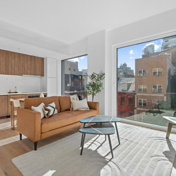
Located in the heart of Manhattan’s Lower East Side, the building was erected on a shallow commercial lot between two 120 year old masonry buildings and a new residential rental building. 330 Grand Street is a mix of 725 SF 1BRs and 1050 SF 2BR apartments. It also contains a 1100 SF two story duplex as well as private and public rooftop space, large private balconies for most units and two large private terraces for the ground floor units.
330 Grand Street was originally designed and approved at the NYC DOB as a prefabricated modular building. During the pandemic, as shipping costs skyrocketed putting the project at risk, we suggested redesigning the building as a reinforced cast-in-place concrete structure. Concrete was readily available and prices had not been affected by the demand increase that many other materials suffered in the pandemic. We took this opportunity to raise floor to ceiling heights, enlarge high performance windows and redistribute the buildings MEPFS and Structural Systems to create very open floor plans.
The challenge was to create a luxurious sensorial living experience with very limited means. In a city with very high construction costs, low cost residential buildings in the area are usually devoid of good quality, design and character. Our approach was to aim high for the end user, prioritizing natural light, open space with long visual perspectives, high ceilings and as always, rejecting the use of predefined building templates.
Our biggest challenge was to ensure that the small spaces feel as clean cut, large and bright as possible. Several unique design decisions were made to ensure low cost and high quality;
Floor plans were laid out so that spaces were wide open and free of clutter from mechanical or structural interruptions. Therefore all infrastructure was placed in lateral demising walls, which in turn act as the unit’s storage and kitchen. The apartments feel wide open, are super quiet and have more storage space than any other comparable apartment in the city.
To solve the problem of the site’s shallow commercial lot which is typically prone to dark interior spaces we focused our attention on the building’s envelope. Instead of the usual small punched window openings, oversized high performance windows were designed to ensure that light penetrated as far as possible into the units. In the smaller 1BR units, the full 50’ depth of the lot is perceived by partitioning spaces with sliding pocket doors that can be retracted to allow deep visual perspectives, making the sight lines in the space feel longer, larger, more ample than normal. In addition to the full height glazing, each unit above the 2nd floor receives a 7 foot covered balcony, adding 120 to 240 sf to each apartment, something unusual in New York City buildings. The space is large enough for a full size dining table, when the weather permits being outside.
We also worked hard to ensure modularity. For example, all kitchen units are all identical throughout the building. The idea of modularity and the economy of the repetitive unit is exercised to the maximum through the building.
Hardware, appliances, flooring, wall coverings and material finishes are all carefully selected to feel bespoke, high quality and unique.
It was important to KURV that the result of this work manifest into something that would deeply connect with the end user and sustain relationships with the consumers of this space.
All images by KURV Architecture ©
Find the right local pro for your project
 KURV Architecture DPC (Alex Hughes Architects)
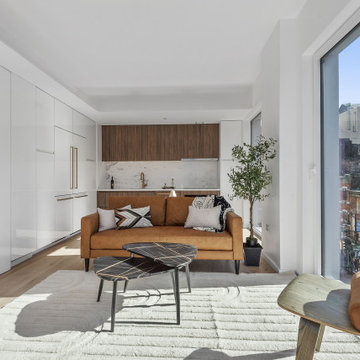
Located in the heart of Manhattan’s Lower East Side, the building was erected on a shallow commercial lot between two 120 year old masonry buildings and a new residential rental building. 330 Grand Street is a mix of 725 SF 1BRs and 1050 SF 2BR apartments. It also contains a 1100 SF two story duplex as well as private and public rooftop space, large private balconies for most units and two large private terraces for the ground floor units.
330 Grand Street was originally designed and approved at the NYC DOB as a prefabricated modular building. During the pandemic, as shipping costs skyrocketed putting the project at risk, we suggested redesigning the building as a reinforced cast-in-place concrete structure. Concrete was readily available and prices had not been affected by the demand increase that many other materials suffered in the pandemic. We took this opportunity to raise floor to ceiling heights, enlarge high performance windows and redistribute the buildings MEPFS and Structural Systems to create very open floor plans.
The challenge was to create a luxurious sensorial living experience with very limited means. In a city with very high construction costs, low cost residential buildings in the area are usually devoid of good quality, design and character. Our approach was to aim high for the end user, prioritizing natural light, open space with long visual perspectives, high ceilings and as always, rejecting the use of predefined building templates.
Our biggest challenge was to ensure that the small spaces feel as clean cut, large and bright as possible. Several unique design decisions were made to ensure low cost and high quality;
Floor plans were laid out so that spaces were wide open and free of clutter from mechanical or structural interruptions. Therefore all infrastructure was placed in lateral demising walls, which in turn act as the unit’s storage and kitchen. The apartments feel wide open, are super quiet and have more storage space than any other comparable apartment in the city.
To solve the problem of the site’s shallow commercial lot which is typically prone to dark interior spaces we focused our attention on the building’s envelope. Instead of the usual small punched window openings, oversized high performance windows were designed to ensure that light penetrated as far as possible into the units. In the smaller 1BR units, the full 50’ depth of the lot is perceived by partitioning spaces with sliding pocket doors that can be retracted to allow deep visual perspectives, making the sight lines in the space feel longer, larger, more ample than normal. In addition to the full height glazing, each unit above the 2nd floor receives a 7 foot covered balcony, adding 120 to 240 sf to each apartment, something unusual in New York City buildings. The space is large enough for a full size dining table, when the weather permits being outside.
We also worked hard to ensure modularity. For example, all kitchen units are all identical throughout the building. The idea of modularity and the economy of the repetitive unit is exercised to the maximum through the building.
Hardware, appliances, flooring, wall coverings and material finishes are all carefully selected to feel bespoke, high quality and unique.
It was important to KURV that the result of this work manifest into something that would deeply connect with the end user and sustain relationships with the consumers of this space.
All images by KURV Architecture ©
 Sosna Inc
The family's once-loved home had become a source of frustration. Their kitchen, a space meant for gathering and creating, felt cramped and outdated. Limited storage and poor organization made meal prep a tedious task, and entertaining guests a logistical nightmare. The laundry room, often overlooked, was equally problematic. Its cramped layout and lack of storage made laundry day a chore, and the noise of the washing machine echoed through the living room.
To compound the issue, the absence of dedicated office spaces made working from home a constant struggle. One makeshift office was squeezed into the dining room, while another was relegated to the basement.
The family was hesitant to embark on a major renovation, fearing the challenges and uncertainties that come with such a project. Finding a reliable contractor, ensuring timely completion, and worrying about potential shoddy workmanship were all valid concerns.
We understood their anxieties and were committed to providing a smooth and stress-free experience. Our team crafted a design that addressed each of their concerns, transforming their home into a functional and stylish space.
We reimagined the laundry room, creating a custom storage solution and incorporating a stackable washer and dryer. The open hallway to the living room was enclosed, creating a spacious closet with ample storage. The laundry room now seamlessly connected to the kitchen, simplifying the grocery unloading process.
A former juliette balcony was converted into a dedicated office space, providing a peaceful and productive work-from-home environment.
The dated and cluttered ensuite bathroom received a luxurious makeover. A clever pull-out storage system in the shower wall and a spacious niche provided much-needed organization.
While every renovation project has its challenges, this one was remarkably smooth. The only significant hurdle was some additional structural work required in the basement to support the new office space. Our experienced team handled this efficiently, minimizing any disruption.
The final result is a home that truly reflects the family's personality and lifestyle. The laundry room, now a cheerful and organized space with soft green cabinets, patterned floor tiles, and gold accents, showcases our attention to detail.
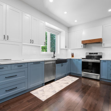
The kitchen is a stunning centerpiece, featuring a striking combination of blue and white cabinets, dark hardwood floors, and a sleek white backsplash. The adjacent beverage bar, with its glass-fronted upper cabinets, provides an elegant space for entertaining.
The ensuite bathroom is a spa-like retreat, with large-format marble tiles, a black vanity, and chrome fixtures creating an atmosphere of understated luxury.
The renovation has had a profound impact on the family's daily life. Ample storage throughout the house has banished clutter, making it easier to maintain a tidy home. The seamless flow from the laundry room to the kitchen has streamlined the grocery unloading process, and the dedicated office spaces have transformed the work-from-home experience.
Beyond the physical transformation, it was the shared moments and laughter that made this project truly special. The family's enthusiasm and good humor were contagious. One of the clients, with his big personality, even starred in a walk-through video of the finished project, showcasing his infectious joy.
From choosing tiles to navigating unexpected challenges, the entire process was filled with warmth and collaboration. Even their four-year-old son, initially shy, warmed up to our site leader, Gus, nicknaming him "Gus the Bus," a moniker that endeared him to the entire team.
 KURV Architecture DPC (Alex Hughes Architects)
Located in the heart of Manhattan’s Lower East Side, the building was erected on a shallow commercial lot between two 120 year old masonry buildings and a new residential rental building. 330 Grand Street is a mix of 725 SF 1BRs and 1050 SF 2BR apartments. It also contains a 1100 SF two story duplex as well as private and public rooftop space, large private balconies for most units and two large private terraces for the ground floor units.
330 Grand Street was originally designed and approved at the NYC DOB as a prefabricated modular building. During the pandemic, as shipping costs skyrocketed putting the project at risk, we suggested redesigning the building as a reinforced cast-in-place concrete structure. Concrete was readily available and prices had not been affected by the demand increase that many other materials suffered in the pandemic. We took this opportunity to raise floor to ceiling heights, enlarge high performance windows and redistribute the buildings MEPFS and Structural Systems to create very open floor plans.
The challenge was to create a luxurious sensorial living experience with very limited means. In a city with very high construction costs, low cost residential buildings in the area are usually devoid of good quality, design and character. Our approach was to aim high for the end user, prioritizing natural light, open space with long visual perspectives, high ceilings and as always, rejecting the use of predefined building templates.
Our biggest challenge was to ensure that the small spaces feel as clean cut, large and bright as possible. Several unique design decisions were made to ensure low cost and high quality;
Floor plans were laid out so that spaces were wide open and free of clutter from mechanical or structural interruptions. Therefore all infrastructure was placed in lateral demising walls, which in turn act as the unit’s storage and kitchen. The apartments feel wide open, are super quiet and have more storage space than any other comparable apartment in the city.
To solve the problem of the site’s shallow commercial lot which is typically prone to dark interior spaces we focused our attention on the building’s envelope. Instead of the usual small punched window openings, oversized high performance windows were designed to ensure that light penetrated as far as possible into the units. In the smaller 1BR units, the full 50’ depth of the lot is perceived by partitioning spaces with sliding pocket doors that can be retracted to allow deep visual perspectives, making the sight lines in the space feel longer, larger, more ample than normal. In addition to the full height glazing, each unit above the 2nd floor receives a 7 foot covered balcony, adding 120 to 240 sf to each apartment, something unusual in New York City buildings. The space is large enough for a full size dining table, when the weather permits being outside.
We also worked hard to ensure modularity. For example, all kitchen units are all identical throughout the building. The idea of modularity and the economy of the repetitive unit is exercised to the maximum through the building.
Hardware, appliances, flooring, wall coverings and material finishes are all carefully selected to feel bespoke, high quality and unique.
It was important to KURV that the result of this work manifest into something that would deeply connect with the end user and sustain relationships with the consumers of this space.
All images by KURV Architecture ©
 KURV Architecture DPC (Alex Hughes Architects)
Located in the heart of Manhattan’s Lower East Side, the building was erected on a shallow commercial lot between two 120 year old masonry buildings and a new residential rental building. 330 Grand Street is a mix of 725 SF 1BRs and 1050 SF 2BR apartments. It also contains a 1100 SF two story duplex as well as private and public rooftop space, large private balconies for most units and two large private terraces for the ground floor units.
330 Grand Street was originally designed and approved at the NYC DOB as a prefabricated modular building. During the pandemic, as shipping costs skyrocketed putting the project at risk, we suggested redesigning the building as a reinforced cast-in-place concrete structure. Concrete was readily available and prices had not been affected by the demand increase that many other materials suffered in the pandemic. We took this opportunity to raise floor to ceiling heights, enlarge high performance windows and redistribute the buildings MEPFS and Structural Systems to create very open floor plans.
The challenge was to create a luxurious sensorial living experience with very limited means. In a city with very high construction costs, low cost residential buildings in the area are usually devoid of good quality, design and character. Our approach was to aim high for the end user, prioritizing natural light, open space with long visual perspectives, high ceilings and as always, rejecting the use of predefined building templates.
Our biggest challenge was to ensure that the small spaces feel as clean cut, large and bright as possible. Several unique design decisions were made to ensure low cost and high quality;
Floor plans were laid out so that spaces were wide open and free of clutter from mechanical or structural interruptions. Therefore all infrastructure was placed in lateral demising walls, which in turn act as the unit’s storage and kitchen. The apartments feel wide open, are super quiet and have more storage space than any other comparable apartment in the city.
To solve the problem of the site’s shallow commercial lot which is typically prone to dark interior spaces we focused our attention on the building’s envelope. Instead of the usual small punched window openings, oversized high performance windows were designed to ensure that light penetrated as far as possible into the units. In the smaller 1BR units, the full 50’ depth of the lot is perceived by partitioning spaces with sliding pocket doors that can be retracted to allow deep visual perspectives, making the sight lines in the space feel longer, larger, more ample than normal. In addition to the full height glazing, each unit above the 2nd floor receives a 7 foot covered balcony, adding 120 to 240 sf to each apartment, something unusual in New York City buildings. The space is large enough for a full size dining table, when the weather permits being outside.
We also worked hard to ensure modularity. For example, all kitchen units are all identical throughout the building. The idea of modularity and the economy of the repetitive unit is exercised to the maximum through the building.
Hardware, appliances, flooring, wall coverings and material finishes are all carefully selected to feel bespoke, high quality and unique.
It was important to KURV that the result of this work manifest into something that would deeply connect with the end user and sustain relationships with the consumers of this space.
All images by KURV Architecture ©
Sponsored
Columbus, OH

Hope Restoration & General Contracting
Columbus Design-Build, Kitchen & Bath Remodeling, Historic Renovations
 KURV Architecture DPC (Alex Hughes Architects)
Located in the heart of Manhattan’s Lower East Side, the building was erected on a shallow commercial lot between two 120 year old masonry buildings and a new residential rental building. 330 Grand Street is a mix of 725 SF 1BRs and 1050 SF 2BR apartments. It also contains a 1100 SF two story duplex as well as private and public rooftop space, large private balconies for most units and two large private terraces for the ground floor units.
330 Grand Street was originally designed and approved at the NYC DOB as a prefabricated modular building. During the pandemic, as shipping costs skyrocketed putting the project at risk, we suggested redesigning the building as a reinforced cast-in-place concrete structure. Concrete was readily available and prices had not been affected by the demand increase that many other materials suffered in the pandemic. We took this opportunity to raise floor to ceiling heights, enlarge high performance windows and redistribute the buildings MEPFS and Structural Systems to create very open floor plans.
The challenge was to create a luxurious sensorial living experience with very limited means. In a city with very high construction costs, low cost residential buildings in the area are usually devoid of good quality, design and character. Our approach was to aim high for the end user, prioritizing natural light, open space with long visual perspectives, high ceilings and as always, rejecting the use of predefined building templates.
Our biggest challenge was to ensure that the small spaces feel as clean cut, large and bright as possible. Several unique design decisions were made to ensure low cost and high quality;
Floor plans were laid out so that spaces were wide open and free of clutter from mechanical or structural interruptions. Therefore all infrastructure was placed in lateral demising walls, which in turn act as the unit’s storage and kitchen. The apartments feel wide open, are super quiet and have more storage space than any other comparable apartment in the city.
To solve the problem of the site’s shallow commercial lot which is typically prone to dark interior spaces we focused our attention on the building’s envelope. Instead of the usual small punched window openings, oversized high performance windows were designed to ensure that light penetrated as far as possible into the units. In the smaller 1BR units, the full 50’ depth of the lot is perceived by partitioning spaces with sliding pocket doors that can be retracted to allow deep visual perspectives, making the sight lines in the space feel longer, larger, more ample than normal. In addition to the full height glazing, each unit above the 2nd floor receives a 7 foot covered balcony, adding 120 to 240 sf to each apartment, something unusual in New York City buildings. The space is large enough for a full size dining table, when the weather permits being outside.
We also worked hard to ensure modularity. For example, all kitchen units are all identical throughout the building. The idea of modularity and the economy of the repetitive unit is exercised to the maximum through the building.
Hardware, appliances, flooring, wall coverings and material finishes are all carefully selected to feel bespoke, high quality and unique.
It was important to KURV that the result of this work manifest into something that would deeply connect with the end user and sustain relationships with the consumers of this space.
All images by KURV Architecture ©
 KURV Architecture DPC (Alex Hughes Architects)
Located in the heart of Manhattan’s Lower East Side, the building was erected on a shallow commercial lot between two 120 year old masonry buildings and a new residential rental building. 330 Grand Street is a mix of 725 SF 1BRs and 1050 SF 2BR apartments. It also contains a 1100 SF two story duplex as well as private and public rooftop space, large private balconies for most units and two large private terraces for the ground floor units.
330 Grand Street was originally designed and approved at the NYC DOB as a prefabricated modular building. During the pandemic, as shipping costs skyrocketed putting the project at risk, we suggested redesigning the building as a reinforced cast-in-place concrete structure. Concrete was readily available and prices had not been affected by the demand increase that many other materials suffered in the pandemic. We took this opportunity to raise floor to ceiling heights, enlarge high performance windows and redistribute the buildings MEPFS and Structural Systems to create very open floor plans.
The challenge was to create a luxurious sensorial living experience with very limited means. In a city with very high construction costs, low cost residential buildings in the area are usually devoid of good quality, design and character. Our approach was to aim high for the end user, prioritizing natural light, open space with long visual perspectives, high ceilings and as always, rejecting the use of predefined building templates.
Our biggest challenge was to ensure that the small spaces feel as clean cut, large and bright as possible. Several unique design decisions were made to ensure low cost and high quality;
Floor plans were laid out so that spaces were wide open and free of clutter from mechanical or structural interruptions. Therefore all infrastructure was placed in lateral demising walls, which in turn act as the unit’s storage and kitchen. The apartments feel wide open, are super quiet and have more storage space than any other comparable apartment in the city.
To solve the problem of the site’s shallow commercial lot which is typically prone to dark interior spaces we focused our attention on the building’s envelope. Instead of the usual small punched window openings, oversized high performance windows were designed to ensure that light penetrated as far as possible into the units. In the smaller 1BR units, the full 50’ depth of the lot is perceived by partitioning spaces with sliding pocket doors that can be retracted to allow deep visual perspectives, making the sight lines in the space feel longer, larger, more ample than normal. In addition to the full height glazing, each unit above the 2nd floor receives a 7 foot covered balcony, adding 120 to 240 sf to each apartment, something unusual in New York City buildings. The space is large enough for a full size dining table, when the weather permits being outside.
We also worked hard to ensure modularity. For example, all kitchen units are all identical throughout the building. The idea of modularity and the economy of the repetitive unit is exercised to the maximum through the building.
Hardware, appliances, flooring, wall coverings and material finishes are all carefully selected to feel bespoke, high quality and unique.
It was important to KURV that the result of this work manifest into something that would deeply connect with the end user and sustain relationships with the consumers of this space.
All images by KURV Architecture ©

 Greatmats
Rubber Floor Mats Diamond Black are 4x6 feet and 3/4 inch thick. These mats have a straight edge. These mats are made with recycled rubber and are highly durable.
https://www.greatmats.com/rubber-floor-mats/4x6ft-fitness-rubber-mat-75b.php

 Cantoni Irvine
When Irvine designer, Richard Bustos’ client decided to remodel his Orange County 4,900 square foot home into a contemporary space, he immediately thought of Cantoni. His main concern though was based on the assumption that our luxurious modern furnishings came with an equally luxurious price tag. It was only after a visit to our Irvine store, where the client and Richard connected that the client realized our extensive collection of furniture and accessories was well within his reach.
“Richard was very thorough and straight forward as far as pricing,” says the client. "I became very intrigued that he was able to offer high quality products that I was looking for within my budget.”
The next phases of the project involved looking over floor plans and discussing the client’s vision as far as design. The goal was to create a comfortable, yet stylish and modern layout for the client, his wife, and their three kids. In addition to creating a cozy and contemporary space, the client wanted his home to exude a tranquil atmosphere. Drawing most of his inspiration from Houzz, (the leading online platform for home remodeling and design) the client incorporated a Zen-like ambiance through the distressed greyish brown flooring, organic bamboo wall art, and with Richard’s help, earthy wall coverings, found in both the master bedroom and bathroom.
Over the span of approximately two years, Richard helped his client accomplish his vision by selecting pieces of modern furniture that possessed the right colors, earthy tones, and textures so as to complement the home’s pre-existing features.
The first room the duo tackled was the great room, and later continued furnishing the kitchen and master bedroom. Living up to its billing, the great room not only opened up to a breathtaking view of the Newport coast, it also was one great space. Richard decided that the best option to maximize the space would be to break the room into two separate yet distinct areas for living and dining.
While exploring our online collections, the client discovered the Jasper Shag rug in a bold and vibrant green. The grassy green rug paired with the sleek Italian made Montecarlo glass dining table added just the right amount of color and texture to compliment the natural beauty of the bamboo sculpture. The client happily adds, “I’m always receiving complements on the green rug!”
Once the duo had completed the dining area, they worked on furnishing the living area, and later added pieces like the classic Renoir bed to the master bedroom and Crescent Console to the kitchen, which adds both balance and sophistication. The living room, also known as the family room was the central area where Richard’s client and his family would spend quality time. As a fellow family man, Richard understood that that meant creating an inviting space with comfortable and durable pieces of furniture that still possessed a modern flare. The client loved the look and design of the Mercer sectional. With Cantoni’s ability to customize furniture, Richard was able to special order the sectional in a fabric that was both durable and aesthetically pleasing.
Selecting the color scheme for the living room was also greatly influenced by the client’s pre-existing artwork as well as unique distressed floors. Richard recommended adding dark pieces of furniture as seen in the Mercer sectional along with the Viera area rug. He explains, “The darker colors and contrast of the rug’s material worked really well with the distressed wood floor.” Furthermore, the comfortable American Leather Recliner, which was customized in red leather not only maximized the space, but also tied in the client’s picturesque artwork beautifully. The client adds gratefully, “Richard was extremely helpful with color; He was great at seeing if I was taking it too far or not enough.”
It is apparent that Richard and his client made a great team. With the client’s passion for great design and Richard’s design expertise, together they transformed the home into a modern sanctuary. Working with this particular client was a very rewarding experience for Richard. He adds, “My client and his family were so easy and fun to work with. Their enthusiasm, focus, and involvement are what helped me bring their ideas to life. I think we created a unique environment that their entire family can enjoy for many years to come.”
https://www.cantoni.com/project/a-contemporary-sanctuary


 Cantoni Irvine
When Irvine designer, Richard Bustos’ client decided to remodel his Orange County 4,900 square foot home into a contemporary space, he immediately thought of Cantoni. His main concern though was based on the assumption that our luxurious modern furnishings came with an equally luxurious price tag. It was only after a visit to our Irvine store, where the client and Richard connected that the client realized our extensive collection of furniture and accessories was well within his reach.
“Richard was very thorough and straight forward as far as pricing,” says the client. "I became very intrigued that he was able to offer high quality products that I was looking for within my budget.”
The next phases of the project involved looking over floor plans and discussing the client’s vision as far as design. The goal was to create a comfortable, yet stylish and modern layout for the client, his wife, and their three kids. In addition to creating a cozy and contemporary space, the client wanted his home to exude a tranquil atmosphere. Drawing most of his inspiration from Houzz, (the leading online platform for home remodeling and design) the client incorporated a Zen-like ambiance through the distressed greyish brown flooring, organic bamboo wall art, and with Richard’s help, earthy wall coverings, found in both the master bedroom and bathroom.
Over the span of approximately two years, Richard helped his client accomplish his vision by selecting pieces of modern furniture that possessed the right colors, earthy tones, and textures so as to complement the home’s pre-existing features.
The first room the duo tackled was the great room, and later continued furnishing the kitchen and master bedroom. Living up to its billing, the great room not only opened up to a breathtaking view of the Newport coast, it also was one great space. Richard decided that the best option to maximize the space would be to break the room into two separate yet distinct areas for living and dining.
While exploring our online collections, the client discovered the Jasper Shag rug in a bold and vibrant green. The grassy green rug paired with the sleek Italian made Montecarlo glass dining table added just the right amount of color and texture to compliment the natural beauty of the bamboo sculpture. The client happily adds, “I’m always receiving complements on the green rug!”
Once the duo had completed the dining area, they worked on furnishing the living area, and later added pieces like the classic Renoir bed to the master bedroom and Crescent Console to the kitchen, which adds both balance and sophistication. The living room, also known as the family room was the central area where Richard’s client and his family would spend quality time. As a fellow family man, Richard understood that that meant creating an inviting space with comfortable and durable pieces of furniture that still possessed a modern flare. The client loved the look and design of the Mercer sectional. With Cantoni’s ability to customize furniture, Richard was able to special order the sectional in a fabric that was both durable and aesthetically pleasing.
Selecting the color scheme for the living room was also greatly influenced by the client’s pre-existing artwork as well as unique distressed floors. Richard recommended adding dark pieces of furniture as seen in the Mercer sectional along with the Viera area rug. He explains, “The darker colors and contrast of the rug’s material worked really well with the distressed wood floor.” Furthermore, the comfortable American Leather Recliner, which was customized in red leather not only maximized the space, but also tied in the client’s picturesque artwork beautifully. The client adds gratefully, “Richard was extremely helpful with color; He was great at seeing if I was taking it too far or not enough.”
It is apparent that Richard and his client made a great team. With the client’s passion for great design and Richard’s design expertise, together they transformed the home into a modern sanctuary. Working with this particular client was a very rewarding experience for Richard. He adds, “My client and his family were so easy and fun to work with. Their enthusiasm, focus, and involvement are what helped me bring their ideas to life. I think we created a unique environment that their entire family can enjoy for many years to come.”
https://www.cantoni.com/project/a-contemporary-sanctuary
Sponsored
Columbus, OH
Hope Restoration & General Contracting
Columbus Design-Build, Kitchen & Bath Remodeling, Historic Renovations
 Cantoni Irvine
When Irvine designer, Richard Bustos’ client decided to remodel his Orange County 4,900 square foot home into a contemporary space, he immediately thought of Cantoni. His main concern though was based on the assumption that our luxurious modern furnishings came with an equally luxurious price tag. It was only after a visit to our Irvine store, where the client and Richard connected that the client realized our extensive collection of furniture and accessories was well within his reach.
“Richard was very thorough and straight forward as far as pricing,” says the client. "I became very intrigued that he was able to offer high quality products that I was looking for within my budget.”
The next phases of the project involved looking over floor plans and discussing the client’s vision as far as design. The goal was to create a comfortable, yet stylish and modern layout for the client, his wife, and their three kids. In addition to creating a cozy and contemporary space, the client wanted his home to exude a tranquil atmosphere. Drawing most of his inspiration from Houzz, (the leading online platform for home remodeling and design) the client incorporated a Zen-like ambiance through the distressed greyish brown flooring, organic bamboo wall art, and with Richard’s help, earthy wall coverings, found in both the master bedroom and bathroom.
Over the span of approximately two years, Richard helped his client accomplish his vision by selecting pieces of modern furniture that possessed the right colors, earthy tones, and textures so as to complement the home’s pre-existing features.
The first room the duo tackled was the great room, and later continued furnishing the kitchen and master bedroom. Living up to its billing, the great room not only opened up to a breathtaking view of the Newport coast, it also was one great space. Richard decided that the best option to maximize the space would be to break the room into two separate yet distinct areas for living and dining.
While exploring our online collections, the client discovered the Jasper Shag rug in a bold and vibrant green. The grassy green rug paired with the sleek Italian made Montecarlo glass dining table added just the right amount of color and texture to compliment the natural beauty of the bamboo sculpture. The client happily adds, “I’m always receiving complements on the green rug!”
Once the duo had completed the dining area, they worked on furnishing the living area, and later added pieces like the classic Renoir bed to the master bedroom and Crescent Console to the kitchen, which adds both balance and sophistication. The living room, also known as the family room was the central area where Richard’s client and his family would spend quality time. As a fellow family man, Richard understood that that meant creating an inviting space with comfortable and durable pieces of furniture that still possessed a modern flare. The client loved the look and design of the Mercer sectional. With Cantoni’s ability to customize furniture, Richard was able to special order the sectional in a fabric that was both durable and aesthetically pleasing.
Selecting the color scheme for the living room was also greatly influenced by the client’s pre-existing artwork as well as unique distressed floors. Richard recommended adding dark pieces of furniture as seen in the Mercer sectional along with the Viera area rug. He explains, “The darker colors and contrast of the rug’s material worked really well with the distressed wood floor.” Furthermore, the comfortable American Leather Recliner, which was customized in red leather not only maximized the space, but also tied in the client’s picturesque artwork beautifully. The client adds gratefully, “Richard was extremely helpful with color; He was great at seeing if I was taking it too far or not enough.”
It is apparent that Richard and his client made a great team. With the client’s passion for great design and Richard’s design expertise, together they transformed the home into a modern sanctuary. Working with this particular client was a very rewarding experience for Richard. He adds, “My client and his family were so easy and fun to work with. Their enthusiasm, focus, and involvement are what helped me bring their ideas to life. I think we created a unique environment that their entire family can enjoy for many years to come.”
https://www.cantoni.com/project/a-contemporary-sanctuary

 Ehrlich Yanai Rhee Chaney Architects
The ground floor volumes wrapped in an elongated hand-fired brick, emphasizing the horizontality of the architecture that lays solidly on the land.
(Photography by: Matthew Millman)
 Cantoni Irvine
When Irvine designer, Richard Bustos’ client decided to remodel his Orange County 4,900 square foot home into a contemporary space, he immediately thought of Cantoni. His main concern though was based on the assumption that our luxurious modern furnishings came with an equally luxurious price tag. It was only after a visit to our Irvine store, where the client and Richard connected that the client realized our extensive collection of furniture and accessories was well within his reach.
“Richard was very thorough and straight forward as far as pricing,” says the client. "I became very intrigued that he was able to offer high quality products that I was looking for within my budget.”
The next phases of the project involved looking over floor plans and discussing the client’s vision as far as design. The goal was to create a comfortable, yet stylish and modern layout for the client, his wife, and their three kids. In addition to creating a cozy and contemporary space, the client wanted his home to exude a tranquil atmosphere. Drawing most of his inspiration from Houzz, (the leading online platform for home remodeling and design) the client incorporated a Zen-like ambiance through the distressed greyish brown flooring, organic bamboo wall art, and with Richard’s help, earthy wall coverings, found in both the master bedroom and bathroom.
Over the span of approximately two years, Richard helped his client accomplish his vision by selecting pieces of modern furniture that possessed the right colors, earthy tones, and textures so as to complement the home’s pre-existing features.
The first room the duo tackled was the great room, and later continued furnishing the kitchen and master bedroom. Living up to its billing, the great room not only opened up to a breathtaking view of the Newport coast, it also was one great space. Richard decided that the best option to maximize the space would be to break the room into two separate yet distinct areas for living and dining.
While exploring our online collections, the client discovered the Jasper Shag rug in a bold and vibrant green. The grassy green rug paired with the sleek Italian made Montecarlo glass dining table added just the right amount of color and texture to compliment the natural beauty of the bamboo sculpture. The client happily adds, “I’m always receiving complements on the green rug!”
Once the duo had completed the dining area, they worked on furnishing the living area, and later added pieces like the classic Renoir bed to the master bedroom and Crescent Console to the kitchen, which adds both balance and sophistication. The living room, also known as the family room was the central area where Richard’s client and his family would spend quality time. As a fellow family man, Richard understood that that meant creating an inviting space with comfortable and durable pieces of furniture that still possessed a modern flare. The client loved the look and design of the Mercer sectional. With Cantoni’s ability to customize furniture, Richard was able to special order the sectional in a fabric that was both durable and aesthetically pleasing.
Selecting the color scheme for the living room was also greatly influenced by the client’s pre-existing artwork as well as unique distressed floors. Richard recommended adding dark pieces of furniture as seen in the Mercer sectional along with the Viera area rug. He explains, “The darker colors and contrast of the rug’s material worked really well with the distressed wood floor.” Furthermore, the comfortable American Leather Recliner, which was customized in red leather not only maximized the space, but also tied in the client’s picturesque artwork beautifully. The client adds gratefully, “Richard was extremely helpful with color; He was great at seeing if I was taking it too far or not enough.”
It is apparent that Richard and his client made a great team. With the client’s passion for great design and Richard’s design expertise, together they transformed the home into a modern sanctuary. Working with this particular client was a very rewarding experience for Richard. He adds, “My client and his family were so easy and fun to work with. Their enthusiasm, focus, and involvement are what helped me bring their ideas to life. I think we created a unique environment that their entire family can enjoy for many years to come.”
https://www.cantoni.com/project/a-contemporary-sanctuary
 Cantoni Irvine
When Irvine designer, Richard Bustos’ client decided to remodel his Orange County 4,900 square foot home into a contemporary space, he immediately thought of Cantoni. His main concern though was based on the assumption that our luxurious modern furnishings came with an equally luxurious price tag. It was only after a visit to our Irvine store, where the client and Richard connected that the client realized our extensive collection of furniture and accessories was well within his reach.
“Richard was very thorough and straight forward as far as pricing,” says the client. "I became very intrigued that he was able to offer high quality products that I was looking for within my budget.”
The next phases of the project involved looking over floor plans and discussing the client’s vision as far as design. The goal was to create a comfortable, yet stylish and modern layout for the client, his wife, and their three kids. In addition to creating a cozy and contemporary space, the client wanted his home to exude a tranquil atmosphere. Drawing most of his inspiration from Houzz, (the leading online platform for home remodeling and design) the client incorporated a Zen-like ambiance through the distressed greyish brown flooring, organic bamboo wall art, and with Richard’s help, earthy wall coverings, found in both the master bedroom and bathroom.
Over the span of approximately two years, Richard helped his client accomplish his vision by selecting pieces of modern furniture that possessed the right colors, earthy tones, and textures so as to complement the home’s pre-existing features.
The first room the duo tackled was the great room, and later continued furnishing the kitchen and master bedroom. Living up to its billing, the great room not only opened up to a breathtaking view of the Newport coast, it also was one great space. Richard decided that the best option to maximize the space would be to break the room into two separate yet distinct areas for living and dining.
While exploring our online collections, the client discovered the Jasper Shag rug in a bold and vibrant green. The grassy green rug paired with the sleek Italian made Montecarlo glass dining table added just the right amount of color and texture to compliment the natural beauty of the bamboo sculpture. The client happily adds, “I’m always receiving complements on the green rug!”
Once the duo had completed the dining area, they worked on furnishing the living area, and later added pieces like the classic Renoir bed to the master bedroom and Crescent Console to the kitchen, which adds both balance and sophistication. The living room, also known as the family room was the central area where Richard’s client and his family would spend quality time. As a fellow family man, Richard understood that that meant creating an inviting space with comfortable and durable pieces of furniture that still possessed a modern flare. The client loved the look and design of the Mercer sectional. With Cantoni’s ability to customize furniture, Richard was able to special order the sectional in a fabric that was both durable and aesthetically pleasing.
Selecting the color scheme for the living room was also greatly influenced by the client’s pre-existing artwork as well as unique distressed floors. Richard recommended adding dark pieces of furniture as seen in the Mercer sectional along with the Viera area rug. He explains, “The darker colors and contrast of the rug’s material worked really well with the distressed wood floor.” Furthermore, the comfortable American Leather Recliner, which was customized in red leather not only maximized the space, but also tied in the client’s picturesque artwork beautifully. The client adds gratefully, “Richard was extremely helpful with color; He was great at seeing if I was taking it too far or not enough.”
It is apparent that Richard and his client made a great team. With the client’s passion for great design and Richard’s design expertise, together they transformed the home into a modern sanctuary. Working with this particular client was a very rewarding experience for Richard. He adds, “My client and his family were so easy and fun to work with. Their enthusiasm, focus, and involvement are what helped me bring their ideas to life. I think we created a unique environment that their entire family can enjoy for many years to come.”
https://www.cantoni.com/project/a-contemporary-sanctuary
Sponsored
Columbus, OH

Structural Remodeling
Franklin County's Heavy Timber Specialists | Best of Houzz 2020!
 Cantoni Irvine
When Irvine designer, Richard Bustos’ client decided to remodel his Orange County 4,900 square foot home into a contemporary space, he immediately thought of Cantoni. His main concern though was based on the assumption that our luxurious modern furnishings came with an equally luxurious price tag. It was only after a visit to our Irvine store, where the client and Richard connected that the client realized our extensive collection of furniture and accessories was well within his reach.
“Richard was very thorough and straight forward as far as pricing,” says the client. "I became very intrigued that he was able to offer high quality products that I was looking for within my budget.”
The next phases of the project involved looking over floor plans and discussing the client’s vision as far as design. The goal was to create a comfortable, yet stylish and modern layout for the client, his wife, and their three kids. In addition to creating a cozy and contemporary space, the client wanted his home to exude a tranquil atmosphere. Drawing most of his inspiration from Houzz, (the leading online platform for home remodeling and design) the client incorporated a Zen-like ambiance through the distressed greyish brown flooring, organic bamboo wall art, and with Richard’s help, earthy wall coverings, found in both the master bedroom and bathroom.
Over the span of approximately two years, Richard helped his client accomplish his vision by selecting pieces of modern furniture that possessed the right colors, earthy tones, and textures so as to complement the home’s pre-existing features.
The first room the duo tackled was the great room, and later continued furnishing the kitchen and master bedroom. Living up to its billing, the great room not only opened up to a breathtaking view of the Newport coast, it also was one great space. Richard decided that the best option to maximize the space would be to break the room into two separate yet distinct areas for living and dining.
While exploring our online collections, the client discovered the Jasper Shag rug in a bold and vibrant green. The grassy green rug paired with the sleek Italian made Montecarlo glass dining table added just the right amount of color and texture to compliment the natural beauty of the bamboo sculpture. The client happily adds, “I’m always receiving complements on the green rug!”
Once the duo had completed the dining area, they worked on furnishing the living area, and later added pieces like the classic Renoir bed to the master bedroom and Crescent Console to the kitchen, which adds both balance and sophistication. The living room, also known as the family room was the central area where Richard’s client and his family would spend quality time. As a fellow family man, Richard understood that that meant creating an inviting space with comfortable and durable pieces of furniture that still possessed a modern flare. The client loved the look and design of the Mercer sectional. With Cantoni’s ability to customize furniture, Richard was able to special order the sectional in a fabric that was both durable and aesthetically pleasing.
Selecting the color scheme for the living room was also greatly influenced by the client’s pre-existing artwork as well as unique distressed floors. Richard recommended adding dark pieces of furniture as seen in the Mercer sectional along with the Viera area rug. He explains, “The darker colors and contrast of the rug’s material worked really well with the distressed wood floor.” Furthermore, the comfortable American Leather Recliner, which was customized in red leather not only maximized the space, but also tied in the client’s picturesque artwork beautifully. The client adds gratefully, “Richard was extremely helpful with color; He was great at seeing if I was taking it too far or not enough.”
It is apparent that Richard and his client made a great team. With the client’s passion for great design and Richard’s design expertise, together they transformed the home into a modern sanctuary. Working with this particular client was a very rewarding experience for Richard. He adds, “My client and his family were so easy and fun to work with. Their enthusiasm, focus, and involvement are what helped me bring their ideas to life. I think we created a unique environment that their entire family can enjoy for many years to come.”
https://www.cantoni.com/project/a-contemporary-sanctuary
 Cantoni Irvine
When Irvine designer, Richard Bustos’ client decided to remodel his Orange County 4,900 square foot home into a contemporary space, he immediately thought of Cantoni. His main concern though was based on the assumption that our luxurious modern furnishings came with an equally luxurious price tag. It was only after a visit to our Irvine store, where the client and Richard connected that the client realized our extensive collection of furniture and accessories was well within his reach.
“Richard was very thorough and straight forward as far as pricing,” says the client. "I became very intrigued that he was able to offer high quality products that I was looking for within my budget.”
The next phases of the project involved looking over floor plans and discussing the client’s vision as far as design. The goal was to create a comfortable, yet stylish and modern layout for the client, his wife, and their three kids. In addition to creating a cozy and contemporary space, the client wanted his home to exude a tranquil atmosphere. Drawing most of his inspiration from Houzz, (the leading online platform for home remodeling and design) the client incorporated a Zen-like ambiance through the distressed greyish brown flooring, organic bamboo wall art, and with Richard’s help, earthy wall coverings, found in both the master bedroom and bathroom.
Over the span of approximately two years, Richard helped his client accomplish his vision by selecting pieces of modern furniture that possessed the right colors, earthy tones, and textures so as to complement the home’s pre-existing features.
The first room the duo tackled was the great room, and later continued furnishing the kitchen and master bedroom. Living up to its billing, the great room not only opened up to a breathtaking view of the Newport coast, it also was one great space. Richard decided that the best option to maximize the space would be to break the room into two separate yet distinct areas for living and dining.
While exploring our online collections, the client discovered the Jasper Shag rug in a bold and vibrant green. The grassy green rug paired with the sleek Italian made Montecarlo glass dining table added just the right amount of color and texture to compliment the natural beauty of the bamboo sculpture. The client happily adds, “I’m always receiving complements on the green rug!”
Once the duo had completed the dining area, they worked on furnishing the living area, and later added pieces like the classic Renoir bed to the master bedroom and Crescent Console to the kitchen, which adds both balance and sophistication. The living room, also known as the family room was the central area where Richard’s client and his family would spend quality time. As a fellow family man, Richard understood that that meant creating an inviting space with comfortable and durable pieces of furniture that still possessed a modern flare. The client loved the look and design of the Mercer sectional. With Cantoni’s ability to customize furniture, Richard was able to special order the sectional in a fabric that was both durable and aesthetically pleasing.
Selecting the color scheme for the living room was also greatly influenced by the client’s pre-existing artwork as well as unique distressed floors. Richard recommended adding dark pieces of furniture as seen in the Mercer sectional along with the Viera area rug. He explains, “The darker colors and contrast of the rug’s material worked really well with the distressed wood floor.” Furthermore, the comfortable American Leather Recliner, which was customized in red leather not only maximized the space, but also tied in the client’s picturesque artwork beautifully. The client adds gratefully, “Richard was extremely helpful with color; He was great at seeing if I was taking it too far or not enough.”
It is apparent that Richard and his client made a great team. With the client’s passion for great design and Richard’s design expertise, together they transformed the home into a modern sanctuary. Working with this particular client was a very rewarding experience for Richard. He adds, “My client and his family were so easy and fun to work with. Their enthusiasm, focus, and involvement are what helped me bring their ideas to life. I think we created a unique environment that their entire family can enjoy for many years to come.”
https://www.cantoni.com/project/a-contemporary-sanctuary
 Tile Doctor Ltd
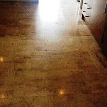
This customer from the historic city of Cardiff was keen to see what Tile Doctor could do to put some life back into their treasured Limestone kitchen floor that was laid in 2008. My first observations were mainly centred on the horrific condition of the surface which although adequately sealed initially the floor had not received any subsequent maintenance and its condition had deteriorated over time. The light shining in from the patio doors highlighted all the imperfections in the floor caused by surface wear and tear commonly seen in high traffic areas such as a kitchen.
Upon closer inspection, there were further problems: the floor was stained and scuffed, and in most places the sealer had worn off completely allowing the dirt to become ingrained into the pores of the Limestone. Additionally the grout was recessed but was now flush with the tile surface due to dirt build-up. There were also areas contaminated with grease and kitchen cooking oil.
The Limestone floor tiles were 20mm thick French Limestone, and had been laid very well so there was no requirement to do any tile or grout repairs however to get this floor back to its original condition the surface would need to be reconditioned using the Tile Doctor four stage burnishing system.
I started by giving the floor a wash with a medium dilution of Tile Doctor Pro-Clean, focusing mainly on the grout lines in order to remove the muck that had built-up there. I used a special stiff grout brush for this activity; it’s quite narrow and ideal for grout scrubbing.
This worked well, but the significant build-up of dirt along some of the grout lines meant more work was required. I tackled this problem with a hand scraper assisted with steam. At the end of this process, the whole floor was then rinsed down with water to remove any soil and the resulting slurry was then extracted using a wet vacuum.
The next step was to start the burnishing process, which basically involves applying four diamond encrusted floor pads in sequence over the floor. Each pad is a different grade, starting with the most abrasive coarse pad and moving through to the finer grades using a little water to lubricate and rinsing away any slurry between each pad.
I eventually finished with the extra fine pad which builds up shine and lustre on the tile; it had taken two days to clean the grout and burnish the Limestone but the floor was much improved and so after a final rinse down I left the floor to dry off overnight with the aid of the underfloor heating.
During this time, I also addressed the stained Limestone in the area of the kitchen where the dustbin was situated. This had been a major upset for the customer and I’m happy to report I managed to deal with it. However, it was quite an involved process, so I’ll write about this in a separate post.
On the third day I came back to seal the floor, checking first that it had dried sufficiently with a damp meter. Fortunately, the underfloor heating had done a great job of drying the stone and I was able to seal the floor using three coats of Tile Doctor Colour Grow sealant. This sealant not only provides a durable seal but also penetrates deep into the pores of the stone protecting it from within and enhancing the natural colours of the Limestone in the process.
After the final layer of sealant, I worked over the floor again with the extra fine burnishing pad both to add shine again following sealing, and to ensure that no smear marks were visible as the lighting conditions were unforgiving and highlighted any imperfections.
The customer was delighted with the results: so much so, in fact, that they booked me in to restore their Victorian hallway floor as well but that’s a story for another time!
Julian Iancono
SE Wales Tile Doctor
156