
Search results for "Reduce changed" in Home Design Ideas

 User
The new kitchen . . .
Sometimes, in remodel designs, it is best to keep things simple. Do small things to affect utility, flow and aesthetics. For this mid-century modern, for all their noted openness, the kitchen was closed off from the public, living areas. Hard to entertain to a wall. This we fixed. The other big flaw was the flow. While there was no way to economically change the path of travel through the kitchen. Nudging here and there could at least reduce the disruption at the core kitchen work areas. See the before and after plans and the photos:
Photo Credits - Beatrice McGinnis
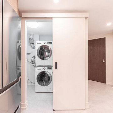
 Ke Design Collective Inc.
A complete two bath & kitchen renovation in a condo. Client wanted a larger kitchen area and better layout for bathrooms. We removed a wall near the entrance and extended the kitchen with additional cabinetry and storage area. Laundry room was reduced to accommodate the larger kitchen.
The shared and primary bathrooms were gutted and fully remodeled as well. Enlarged shower enclosure in shared bath for more space. Layout of primary bathroom was changed for better accessibility and flow in the area. Vanity and shower was relocated to create a more spacious and inviting environment.
Client didn’t like the current floors, we replaced it with luxury vinyl planks for durability.

 Nathan Taylor for Obelisk Home
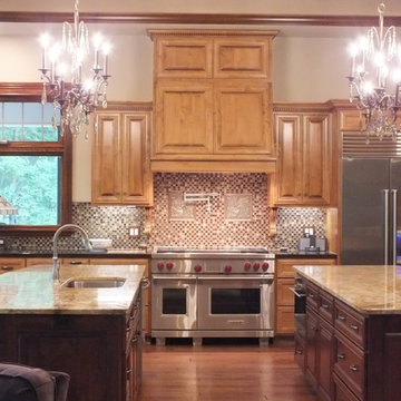
The interior of the home went from Colonial to Classic Lodge without changing the footprint of the home. Columns were removed, fur downs removed that defined space, fireplace relocated, kitchen layout and direction changed, breakfast room and sitting room flip flopped, study reduced in size, entry to master bedroom changed, master suite completely re-arranged and enlarged, custom hand railing designed to open up stairwell, hardwood added to stairs, solid knotty alder 8’ doors added, knotty alder crown moldings added, reclaimed beamed ceiling grid, tongue and groove ceiling in kitchen, knotty alder cabinetry, leather finish to granite, seeded glass insets, custom door to panty to showcase an antique stained glass window from childhood church, custom doors and handles made for study entry, shredded straw added to wall texture, custom glazing done to all walls, wood floor remnants created an antique quilt pattern for the back wall of the powder bath, custom wall treatment created by designer, and a mixture of new and antique furnishing were added, all to create a warm, yet lived in feeling for this special family.
A new central stone wall reversed with an over scaled fireplace and reclaimed flooring from the East became the anchor for this level of the home. Removing all the “divisions” of space and using a unified surface made unused rooms, part of the daily living for this family. The desire to entertain large group in a unified space, yet still feel like you are in a cozy environment was the driving force for removing divisions of space.
Photos by Randy Colwell
Find the right local pro for your project
 User
the new kitchen
Sometimes, in remodel designs, it is best to keep things simple. Do small things to affect utility, flow and aesthetics. For this mid-century modern, for all their noted openness, the kitchen was closed off from the public, living areas. Hard to entertain to a wall. This we fixed. The other big flaw was the flow. While there was no way to economically change the path of travel through the kitchen. Nudging here and there could at least reduce the disruption at the core kitchen work areas. See the before and after plans and the photos:
Photo Credits - Beatrice McGinnis
 User
the new kitchen
Sometimes, in remodel designs, it is best to keep things simple. Do small things to affect utility, flow and aesthetics. For this mid-century modern, for all their noted openness, the kitchen was closed off from the public, living areas. Hard to entertain to a wall. This we fixed. The other big flaw was the flow. While there was no way to economically change the path of travel through the kitchen. Nudging here and there could at least reduce the disruption at the core kitchen work areas. See the before and after plans and the photos:
Photo Credits - Beatrice McGinnis

 Kelly Scanlon Interior Design
a 1916 Craftsman in Oakland, CA gets new life. A complete overhaul of the original space while preserving all of the original detail in the casework and flooring. Overhead lighting (LED!) enhances the homeowners beautiful art collection, custom sized furniture provides increased seating and loads of texture and warmth, reducing any clutter. While remodeling the fireplace and adding period appropriate mantle detail, original windows were revealed, bringing more natural light into this illuminated living/family room.
Scott Hargis Photo

 ZeroEnergy Design
This renovated brick rowhome in Boston’s South End offers a modern aesthetic within a historic structure, creative use of space, exceptional thermal comfort, a reduced carbon footprint, and a passive stream of income.
DESIGN PRIORITIES. The goals for the project were clear - design the primary unit to accommodate the family’s modern lifestyle, rework the layout to create a desirable rental unit, improve thermal comfort and introduce a modern aesthetic. We designed the street-level entry as a shared entrance for both the primary and rental unit. The family uses it as their everyday entrance - we planned for bike storage and an open mudroom with bench and shoe storage to facilitate the change from shoes to slippers or bare feet as they enter their home. On the main level, we expanded the kitchen into the dining room to create an eat-in space with generous counter space and storage, as well as a comfortable connection to the living space. The second floor serves as master suite for the couple - a bedroom with a walk-in-closet and ensuite bathroom, and an adjacent study, with refinished original pumpkin pine floors. The upper floor, aside from a guest bedroom, is the child's domain with interconnected spaces for sleeping, work and play. In the play space, which can be separated from the work space with new translucent sliding doors, we incorporated recreational features inspired by adventurous and competitive television shows, at their son’s request.
MODERN MEETS TRADITIONAL. We left the historic front facade of the building largely unchanged - the security bars were removed from the windows and the single pane windows were replaced with higher performing historic replicas. We designed the interior and rear facade with a vision of warm modernism, weaving in the notable period features. Each element was either restored or reinterpreted to blend with the modern aesthetic. The detailed ceiling in the living space, for example, has a new matte monochromatic finish, and the wood stairs are covered in a dark grey floor paint, whereas the mahogany doors were simply refinished. New wide plank wood flooring with a neutral finish, floor-to-ceiling casework, and bold splashes of color in wall paint and tile, and oversized high-performance windows (on the rear facade) round out the modern aesthetic.
RENTAL INCOME. The existing rowhome was zoned for a 2-family dwelling but included an undesirable, single-floor studio apartment at the garden level with low ceiling heights and questionable emergency egress. In order to increase the quality and quantity of space in the rental unit, we reimagined it as a two-floor, 1 or 2 bedroom, 2 bathroom apartment with a modern aesthetic, increased ceiling height on the lowest level and provided an in-unit washer/dryer. The apartment was listed with Jackie O'Connor Real Estate and rented immediately, providing the owners with a source of passive income.
ENCLOSURE WITH BENEFITS. The homeowners sought a minimal carbon footprint, enabled by their urban location and lifestyle decisions, paired with the benefits of a high-performance home. The extent of the renovation allowed us to implement a deep energy retrofit (DER) to address air tightness, insulation, and high-performance windows. The historic front facade is insulated from the interior, while the rear facade is insulated on the exterior. Together with these building enclosure improvements, we designed an HVAC system comprised of continuous fresh air ventilation, and an efficient, all-electric heating and cooling system to decouple the house from natural gas. This strategy provides optimal thermal comfort and indoor air quality, improved acoustic isolation from street noise and neighbors, as well as a further reduced carbon footprint. We also took measures to prepare the roof for future solar panels, for when the South End neighborhood’s aging electrical infrastructure is upgraded to allow them.
URBAN LIVING. The desirable neighborhood location allows the both the homeowners and tenant to walk, bike, and use public transportation to access the city, while each charging their respective plug-in electric cars behind the building to travel greater distances.
OVERALL. The understated rowhouse is now ready for another century of urban living, offering the owners comfort and convenience as they live life as an expression of their values.
Eric Roth Photo
Sponsored
Fredericksburg, OH

High Point Cabinets
Columbus' Experienced Custom Cabinet Builder | 4x Best of Houzz Winner
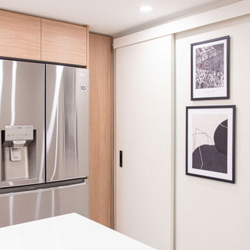 Ke Design Collective Inc.
A complete two bath & kitchen renovation in a condo. Client wanted a larger kitchen area and better layout for bathrooms. We removed a wall near the entrance and extended the kitchen with additional cabinetry and storage area. Laundry room was reduced to accommodate the larger kitchen.
The shared and primary bathrooms were gutted and fully remodeled as well. Enlarged shower enclosure in shared bath for more space. Layout of primary bathroom was changed for better accessibility and flow in the area. Vanity and shower was relocated to create a more spacious and inviting environment.
Client didn’t like the current floors, we replaced it with luxury vinyl planks for durability.
 TKS Design Group
Download our free ebook, Creating the Ideal Kitchen. DOWNLOAD NOW
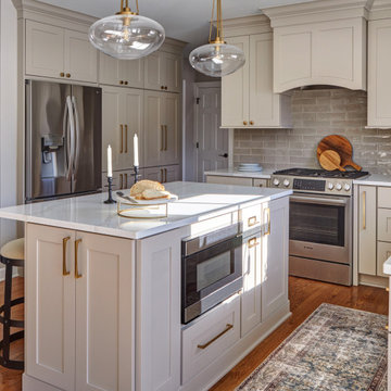
This family from Wheaton was ready to remodel their kitchen, dining room and powder room. The project didn’t call for any structural or space planning changes but the makeover still had a massive impact on their home. The homeowners wanted to change their dated 1990’s brown speckled granite and light maple kitchen. They liked the welcoming feeling they got from the wood and warm tones in their current kitchen, but this style clashed with their vision of a deVOL type kitchen, a London-based furniture company. Their inspiration came from the country homes of the UK that mix the warmth of traditional detail with clean lines and modern updates.
To create their vision, we started with all new framed cabinets with a modified overlay painted in beautiful, understated colors. Our clients were adamant about “no white cabinets.” Instead we used an oyster color for the perimeter and a custom color match to a specific shade of green chosen by the homeowner. The use of a simple color pallet reduces the visual noise and allows the space to feel open and welcoming. We also painted the trim above the cabinets the same color to make the cabinets look taller. The room trim was painted a bright clean white to match the ceiling.
In true English fashion our clients are not coffee drinkers, but they LOVE tea. We created a tea station for them where they can prepare and serve tea. We added plenty of glass to showcase their tea mugs and adapted the cabinetry below to accommodate storage for their tea items. Function is also key for the English kitchen and the homeowners. They requested a deep farmhouse sink and a cabinet devoted to their heavy mixer because they bake a lot. We then got rid of the stovetop on the island and wall oven and replaced both of them with a range located against the far wall. This gives them plenty of space on the island to roll out dough and prepare any number of baked goods. We then removed the bifold pantry doors and created custom built-ins with plenty of usable storage for all their cooking and baking needs.
The client wanted a big change to the dining room but still wanted to use their own furniture and rug. We installed a toile-like wallpaper on the top half of the room and supported it with white wainscot paneling. We also changed out the light fixture, showing us once again that small changes can have a big impact.
As the final touch, we also re-did the powder room to be in line with the rest of the first floor. We had the new vanity painted in the same oyster color as the kitchen cabinets and then covered the walls in a whimsical patterned wallpaper. Although the homeowners like subtle neutral colors they were willing to go a bit bold in the powder room for something unexpected. For more design inspiration go to: www.kitchenstudio-ge.com

 OLSON LEWIS + Architects
After decades of drastic alterations, and demolition of the second and third story, this grand estate was reduced to a pink Bermuda style ranch house. The current owners returned it to a suggestion of its original state. Beamed ceilings, working fireplace, period woodwork and historic finishes draw out the dignity of its past, and make them part of life in his century. The main house overlooks terraced yards, stonewalls and a landscaped pool area. The formal interiors frame sweeping views of treetops and seascapes.
Contractor: Precision Carpentry
Photographer: Dan Gair/ Blind Dog Photo INC.

 CMC Design Studio LLC
Newlyweds had just moved into their new home and immediately wanted to update their kitchen which is located in the center of the household, lacking any natural light source of its own. To make matters worse, the cabinets in place were dark red with black countertops. Not the picture of brightness they were looking for. To increase the amount of light reflected throughout the kitchen, we incorporated some of the following updates:
1. Replaced the solo ceiling light with 4 recessed cans
2. Updated the florescent undercabinet lights with new LED strips
3. Installed custom white cabinets topped with Silestone’s new Artic Ocean white countertops
4. Updated the dark glass pendants over the bar with larger, clear glass pendants that spoke more to the history of the home
5. Painted the walls a soft gray to compliment the palette
The original kitchen layout was updated to eliminate the existing soffits and open the visual feel of the space. A large white farm sink now centers the natural wood bar area, inviting guests to sit and gather for ballgames and celebrations. Glass tile and USB ports at charging sites complete the space for the family to grow over the years.
Photo by Stockwell Media
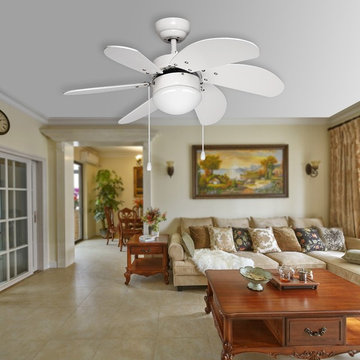
 Lighting EVER
FREE FROM NOISE: The qualified motor technology and hanging system ensure that the fan is well balanced and free from annoying sound. Please rest assure that your fan will remain quiet and wobble-free.
DELICATE ADDITION: The 6 elegant but sturdy wooden blades, perfectly fit your room style and decoration, offering a classical looking to your house.
PROPER HEIGHT: It fits close to the ceiling, so it does not reduce your headroom much at all, and perfectly fits a room of 10-13ft height.
LIGHT FIXTURE PROVIDED: It comes with a lampshade with an E12 base screw. You can have it fixed with a 60W incandescent bulbs which was recommended or a lower wattage LED bulb to meet your normal lighting needs.
TWO CONTROL MODES: There are two chains hang down with the shorter one to pull to turn on/off or change the fan speed, or to turn it on/off by a switch (not included) on wall which was installed with personal needs. It also has a reverse switch for winter and summer use.
 User
the new kitchen . . .
Sometimes, in remodel designs, it is best to keep things simple. Do small things to affect utility, flow and aesthetics. For this mid-century modern, for all their noted openness, the kitchen was closed off from the public, living areas. Hard to entertain to a wall. This we fixed. The other big flaw was the flow. While there was no way to economically change the path of travel through the kitchen. Nudging here and there could at least reduce the disruption at the core kitchen work areas. See the before and after plans and the photos:
Photo Credits - Beatrice McGinnis
 User
the new kitchen . . .
Sometimes, in remodel designs, it is best to keep things simple. Do small things to affect utility, flow and aesthetics. For this mid-century modern, for all their noted openness, the kitchen was closed off from the public, living areas. Hard to entertain to a wall. This we fixed. The other big flaw was the flow. While there was no way to economically change the path of travel through the kitchen. Nudging here and there could at least reduce the disruption at the core kitchen work areas. See the before and after plans and the photos:
Photo Credits - Beatrice McGinnis
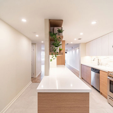 Ke Design Collective Inc.
A complete two bath & kitchen renovation in a condo. Client wanted a larger kitchen area and better layout for bathrooms. We removed a wall near the entrance and extended the kitchen with additional cabinetry and storage area. Laundry room was reduced to accommodate the larger kitchen.
The shared and primary bathrooms were gutted and fully remodeled as well. Enlarged shower enclosure in shared bath for more space. Layout of primary bathroom was changed for better accessibility and flow in the area. Vanity and shower was relocated to create a more spacious and inviting environment.
Client didn’t like the current floors, we replaced it with luxury vinyl planks for durability.
 User
from the great room . . .
Sometimes, in remodel designs, it is best to keep things simple. Do small things to affect utility, flow and aesthetics. For this mid-century modern, for all their noted openness, the kitchen was closed off from the public, living areas. Hard to entertain to a wall. This we fixed. The other big flaw was the flow. While there was no way to economically change the path of travel through the kitchen. Nudging here and there could at least reduce the disruption at the core kitchen work areas. See the before and after plans and the photos:
Photo Credits - Beatrice McGinnis

 Kohn Shnier architects
This single family home sits on a tight, sloped site. Within a modest budget, the goal was to provide direct access to grade at both the front and back of the house.
The solution is a multi-split-level home with unconventional relationships between floor levels. Between the entrance level and the lower level of the family room, the kitchen and dining room are located on an interstitial level. Within the stair space “floats” a small bathroom.
The generous stair is celebrated with a back-painted red glass wall which treats users to changing refractive ambient light throughout the house.
Black brick, grey-tinted glass and mirrors contribute to the reasonably compact massing of the home. A cantilevered upper volume shades south facing windows and the home’s limited material palette meant a more efficient construction process. Cautious landscaping retains water run-off on the sloping site and home offices reduce the client’s use of their vehicle.
The house achieves its vision within a modest footprint and with a design restraint that will ensure it becomes a long-lasting asset in the community.
Photo by Tom Arban
 Kohn Shnier architects
This single family home sits on a tight, sloped site. Within a modest budget, the goal was to provide direct access to grade at both the front and back of the house.
The solution is a multi-split-level home with unconventional relationships between floor levels. Between the entrance level and the lower level of the family room, the kitchen and dining room are located on an interstitial level. Within the stair space “floats” a small bathroom.
The generous stair is celebrated with a back-painted red glass wall which treats users to changing refractive ambient light throughout the house.
Black brick, grey-tinted glass and mirrors contribute to the reasonably compact massing of the home. A cantilevered upper volume shades south facing windows and the home’s limited material palette meant a more efficient construction process. Cautious landscaping retains water run-off on the sloping site and home offices reduce the client’s use of their vehicle.
The house achieves its vision within a modest footprint and with a design restraint that will ensure it becomes a long-lasting asset in the community.
Photo by Tom Arban
 Kohn Shnier architects
This single family home sits on a tight, sloped site. Within a modest budget, the goal was to provide direct access to grade at both the front and back of the house.
The solution is a multi-split-level home with unconventional relationships between floor levels. Between the entrance level and the lower level of the family room, the kitchen and dining room are located on an interstitial level. Within the stair space “floats” a small bathroom.
The generous stair is celebrated with a back-painted red glass wall which treats users to changing refractive ambient light throughout the house.
Black brick, grey-tinted glass and mirrors contribute to the reasonably compact massing of the home. A cantilevered upper volume shades south facing windows and the home’s limited material palette meant a more efficient construction process. Cautious landscaping retains water run-off on the sloping site and home offices reduce the client’s use of their vehicle.
The house achieves its vision within a modest footprint and with a design restraint that will ensure it becomes a long-lasting asset in the community.
Photo by Tom Arban
 ZeroEnergy Design
This renovated brick rowhome in Boston’s South End offers a modern aesthetic within a historic structure, creative use of space, exceptional thermal comfort, a reduced carbon footprint, and a passive stream of income.
DESIGN PRIORITIES. The goals for the project were clear - design the primary unit to accommodate the family’s modern lifestyle, rework the layout to create a desirable rental unit, improve thermal comfort and introduce a modern aesthetic. We designed the street-level entry as a shared entrance for both the primary and rental unit. The family uses it as their everyday entrance - we planned for bike storage and an open mudroom with bench and shoe storage to facilitate the change from shoes to slippers or bare feet as they enter their home. On the main level, we expanded the kitchen into the dining room to create an eat-in space with generous counter space and storage, as well as a comfortable connection to the living space. The second floor serves as master suite for the couple - a bedroom with a walk-in-closet and ensuite bathroom, and an adjacent study, with refinished original pumpkin pine floors. The upper floor, aside from a guest bedroom, is the child's domain with interconnected spaces for sleeping, work and play. In the play space, which can be separated from the work space with new translucent sliding doors, we incorporated recreational features inspired by adventurous and competitive television shows, at their son’s request.
MODERN MEETS TRADITIONAL. We left the historic front facade of the building largely unchanged - the security bars were removed from the windows and the single pane windows were replaced with higher performing historic replicas. We designed the interior and rear facade with a vision of warm modernism, weaving in the notable period features. Each element was either restored or reinterpreted to blend with the modern aesthetic. The detailed ceiling in the living space, for example, has a new matte monochromatic finish, and the wood stairs are covered in a dark grey floor paint, whereas the mahogany doors were simply refinished. New wide plank wood flooring with a neutral finish, floor-to-ceiling casework, and bold splashes of color in wall paint and tile, and oversized high-performance windows (on the rear facade) round out the modern aesthetic.
RENTAL INCOME. The existing rowhome was zoned for a 2-family dwelling but included an undesirable, single-floor studio apartment at the garden level with low ceiling heights and questionable emergency egress. In order to increase the quality and quantity of space in the rental unit, we reimagined it as a two-floor, 1 or 2 bedroom, 2 bathroom apartment with a modern aesthetic, increased ceiling height on the lowest level and provided an in-unit washer/dryer. The apartment was listed with Jackie O'Connor Real Estate and rented immediately, providing the owners with a source of passive income.
ENCLOSURE WITH BENEFITS. The homeowners sought a minimal carbon footprint, enabled by their urban location and lifestyle decisions, paired with the benefits of a high-performance home. The extent of the renovation allowed us to implement a deep energy retrofit (DER) to address air tightness, insulation, and high-performance windows. The historic front facade is insulated from the interior, while the rear facade is insulated on the exterior. Together with these building enclosure improvements, we designed an HVAC system comprised of continuous fresh air ventilation, and an efficient, all-electric heating and cooling system to decouple the house from natural gas. This strategy provides optimal thermal comfort and indoor air quality, improved acoustic isolation from street noise and neighbors, as well as a further reduced carbon footprint. We also took measures to prepare the roof for future solar panels, for when the South End neighborhood’s aging electrical infrastructure is upgraded to allow them.
URBAN LIVING. The desirable neighborhood location allows the both the homeowners and tenant to walk, bike, and use public transportation to access the city, while each charging their respective plug-in electric cars behind the building to travel greater distances.
OVERALL. The understated rowhouse is now ready for another century of urban living, offering the owners comfort and convenience as they live life as an expression of their values.
Eric Roth Photo
37