
Search results for "Reduce dark" in Home Design Ideas

 Crystal Kitchen + Bath
It shouldn’t be shocking that Mid-westerns are the last to experience the trends trickling in from the east and west coasts. While contemporary styles in white and grey have been flooding their homes over the past 3-5 years, homeowners in the Midwest seem to choose warmer hues in transitional styles.
When brainstorming what our next display should encompass, we decided to blend the trends we see emerging in the Midwest with a cool, fun edge. Transitioning modern to Minnesota involves warmer colors, texture and depth to design. Flat panel doors in an off-white paired with a rich and earthy textured melamine encompass just that. Mixing metals, especially with gold is becoming increasingly popular. The display is shown blending stainless steel with fun, accessories in gold.
Homeowners are beginning to like both the ease and the look of simplicity. As shown in our display, they are pairing flat-panel doors with a c-channel to take the place of knobs and pulls. Quartz countertops in a 2 cm (3/4”) thickness are almost always paired with this style, sometimes in a matte finish as they are a new trend and also reduce glare. This dark brown, almost black matte quartz top is shown contrasting against the glossy warm-white base cabinets in the display.
Who hasn’t been on their hands and knees digging countlessly for the matching container and lid? Interior cabinet accessories save time and energy. Some trends in kitchen organization that the display incorporates include hands-free waste bins, knife/utensil pull-outs, container organizers, corner pull-outs, pull-out towel bars, Keurig cup organizers and dishware drawers. Having an organized kitchen is an upgrade but it without a doubt keeps us sane.
What’s a space that doesn’t ignite a spark of interest? Have fun with it! In this space the existing circular soffit was designed around, yet celebrated. A bubble mosaic backsplash layered with bubble glass doors and decorative spheres are a fun way to play with shape. With bold light fixtures being a big trend for 2017, finding the perfect statement fixture for the space was the icing on the cake. Color can always personalize a space. In this case, the Pantone color of the year, Greenery #15-0343, became an inspiration when selecting accessories.
Anyone with a sense of humor will appreciate the golden “man handle”. After all, we all love a great conversation piece.
 Lincoln Lighthill Architect
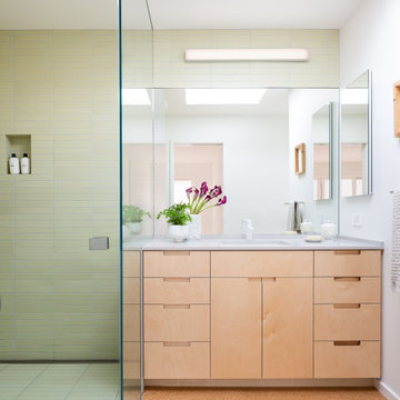
This Eichler-esque house, in a neighborhood known for its tracts of homes by the famous developer, was a little different from the rest- a one-off custom build from 1962 that had mid-century modern bones but funky, neo-traditional finishes in the worn-out, time capsule state that the new owners found it. This called for an almost-gut remodel to keep the good, upgrade the building’s envelope and MEP systems, and reimagine the home’s character. To create a home that feels of its times, both now and then- A mid-century for the 21st century.
At the center of the existing home was a long, slender rectangular form that contained a fireplace, an indoor BBQ, and kitchen storage, and on the other side an original, suspended wood and steel rod stair down to the bedroom level below. Under the carpeted treads we were sure we’d find beautiful oak, as this stair was identical to one at our earlier Clarendon heights mid-century project.
This elegant core was obscured by walls that enclosed the kitchen and breakfast areas and a jumble of aged finishes that hid the elegance of this defining element. Lincoln Lighthill Architect removed the walls and unified the core’s finishes with light grey ground-face concrete block on the upgraded fireplace and BBQ, lacquered cabinets, and chalkboard paint at the stair wall for the owners’ young children to decorate. A new skylight above the stair washes this wall with light and brightens up the formerly dark center of the house.
The rest of the interior is a combination of mid-century-inspired elements and modern updates. New finishes throughout- cork flooring, ground-face concrete block, Heath tile, and white birch millwork give the interior the mid-century character it never fully had, while modern, minimalist detailing gives it a timeless, serene simplicity.
New lighting throughout, mostly indirect and all warm-dim LED , subtly and efficiently lights the home. All new plumbing and fixtures similarly reduce the home’s use of precious resources. On the exterior, new windows, insulation, and roofing provide modern standards of comfort and efficiency, while a new paint job and brick stain give the house an elegant yet playful character, with the golden yellow Heath tile from the primary bathroom floor reappearing on the front door.

 Katie Hutchison Studio
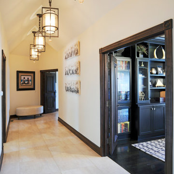
The new owners of this house in Harvard, Massachusetts loved its location and authentic Shaker characteristics, but weren’t fans of its curious layout. A dated first-floor full bathroom could only be accessed by going up a few steps to a landing, opening the bathroom door and then going down the same number of steps to enter the room. The dark kitchen faced the driveway to the north, rather than the bucolic backyard fields to the south. The dining space felt more like an enlarged hall and could only comfortably seat four. Upstairs, a den/office had a woefully low ceiling; the master bedroom had limited storage, and a sad full bathroom featured a cramped shower.
KHS proposed a number of changes to create an updated home where the owners could enjoy cooking, entertaining, and being connected to the outdoors from the first-floor living spaces, while also experiencing more inviting and more functional private spaces upstairs.
On the first floor, the primary change was to capture space that had been part of an upper-level screen porch and convert it to interior space. To make the interior expansion seamless, we raised the floor of the area that had been the upper-level porch, so it aligns with the main living level, and made sure there would be no soffits in the planes of the walls we removed. We also raised the floor of the remaining lower-level porch to reduce the number of steps required to circulate from it to the newly expanded interior. New patio door systems now fill the arched openings that used to be infilled with screen. The exterior interventions (which also included some new casement windows in the dining area) were designed to be subtle, while affording significant improvements on the interior. Additionally, the first-floor bathroom was reconfigured, shifting one of its walls to widen the dining space, and moving the entrance to the bathroom from the stair landing to the kitchen instead.
These changes (which involved significant structural interventions) resulted in a much more open space to accommodate a new kitchen with a view of the lush backyard and a new dining space defined by a new built-in banquette that comfortably seats six, and -- with the addition of a table extension -- up to eight people.
Upstairs in the den/office, replacing the low, board ceiling with a raised, plaster, tray ceiling that springs from above the original board-finish walls – newly painted a light color -- created a much more inviting, bright, and expansive space. Re-configuring the master bath to accommodate a larger shower and adding built-in storage cabinets in the master bedroom improved comfort and function. A new whole-house color palette rounds out the improvements.
Photos by Katie Hutchison
Find the right local pro for your project
 Katie Hutchison Studio
The new owners of this house in Harvard, Massachusetts loved its location and authentic Shaker characteristics, but weren’t fans of its curious layout. A dated first-floor full bathroom could only be accessed by going up a few steps to a landing, opening the bathroom door and then going down the same number of steps to enter the room. The dark kitchen faced the driveway to the north, rather than the bucolic backyard fields to the south. The dining space felt more like an enlarged hall and could only comfortably seat four. Upstairs, a den/office had a woefully low ceiling; the master bedroom had limited storage, and a sad full bathroom featured a cramped shower.
KHS proposed a number of changes to create an updated home where the owners could enjoy cooking, entertaining, and being connected to the outdoors from the first-floor living spaces, while also experiencing more inviting and more functional private spaces upstairs.
On the first floor, the primary change was to capture space that had been part of an upper-level screen porch and convert it to interior space. To make the interior expansion seamless, we raised the floor of the area that had been the upper-level porch, so it aligns with the main living level, and made sure there would be no soffits in the planes of the walls we removed. We also raised the floor of the remaining lower-level porch to reduce the number of steps required to circulate from it to the newly expanded interior. New patio door systems now fill the arched openings that used to be infilled with screen. The exterior interventions (which also included some new casement windows in the dining area) were designed to be subtle, while affording significant improvements on the interior. Additionally, the first-floor bathroom was reconfigured, shifting one of its walls to widen the dining space, and moving the entrance to the bathroom from the stair landing to the kitchen instead.
These changes (which involved significant structural interventions) resulted in a much more open space to accommodate a new kitchen with a view of the lush backyard and a new dining space defined by a new built-in banquette that comfortably seats six, and -- with the addition of a table extension -- up to eight people.
Upstairs in the den/office, replacing the low, board ceiling with a raised, plaster, tray ceiling that springs from above the original board-finish walls – newly painted a light color -- created a much more inviting, bright, and expansive space. Re-configuring the master bath to accommodate a larger shower and adding built-in storage cabinets in the master bedroom improved comfort and function. A new whole-house color palette rounds out the improvements.
Photos by Katie Hutchison
 Simply Home Decorating
The kitchen may be the heart of a home, but the dining room is where the family gathers to enjoy special occasions, create and pass on traditions, and savour each other’s company free from distractions. The family behind this particular dining room enjoys doing just that.
When they are not traveling the world, Matthew and Anna (names changed) love to cook meals at home with their teenage daughter, entertain family and friends, and live amongst their cherished travel souvenirs and heirlooms. Their dining room, however, was far from the perfect backdrop for these experiences.
Before: Dining Room:
When Matthew and Anna contacted us, they imagined a space that would comfortably seat 8 to 10 people and incorporate their beautiful inherited dining table and sideboard in a fresh, modern way. Above all, they wanted a dining room that they would feel proud to share.
They worked with us to design, lightly renovate, and furnish their dining room and adjacent living space. Now, the room is nothing short of inviting and elevated.
Classic Yet Contemporary Dining Room:
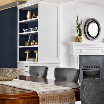
Viewed from the living area, the dining room is a hidden gem waiting to be discovered. Matthew and Anna wanted dark blue for the walls, and we couldn’t have been happier to find the perfect shade for them. By leaning darker, this rich blue creates the perception of depth, making the room feel enticing, comfortable and secluded.
The previous built-ins were underwhelming and lacked function, so we designed wider, taller, double sided cabinets that integrated the existing bulk-head, and then accessorized the shelves with the family’s travel finds, books, and decor. Topping these units with brass art lights not only blends contemporary and traditional styles, it also draws attention to the dining table’s modern show-stopping chandelier. You can’t miss it.
Inside the dining room, the effect is equally impressive: enveloping yet spacious, warm yet cool, classic yet contemporary. We incorporated their heirloom pieces seamlessly into the design thanks to the 1:2 ratio. For every traditional piece, we introduced two more modern or contemporary pieces — clean lines, subtle curves, and lustrous brass hardware. The result is a collected yet updated look.
In any room with dark walls, lighting is of the utmost importance. We placed a mirror adjacent to the window to reflect natural light throughout the room, and we kept the trim and ceiling white for brightness. To provide maximum versatility, we provided multiple light sources that can be adjusted to create different levels of light to suit any mood or occasion. These include: pot lights and a chandelier on dimmers, a sculptural trilight lamp on the sideboard, and art lights on the bookcases and above important art pieces.
The built-ins have another surprise waiting inside this special dining room:
Double-sided built-ins: dining room shelving and living room shelving.
Rather than keep them white like we did in the living room, we painted the back wall of the book cases the same dark blue as the walls in the rest of the room. This reduces the contrast with the surrounding walls and emphasizes the white outline of the cabinets. We also love the dark blue walls’ role as a beautiful backdrop for this family’s treasures. The brass accessories and hand-painted vases and bowls feel like part of the experience.
Of course, what is beauty without function? It may not look like it, but the base storage is only accessible from the dining room side. The units include deep cabinets for storing serving ware, as well as another delightful surprise: silverware drawers lined in luxurious navy velvet!
Lastly, we designed this beautiful nook for their heirloom sideboard. From afar, the wall looks as if it has texture and perhaps a touch of shine. Up close, you will notice that it is actually navy blue wallpaper with tiny golden dots. This unique touch accentuates the brass in the room touches throughout the space.. The room feels curated, contemporary, and full of character.
Words of Praise:
Anna and Matthew were thrilled with their new dining room and with the design process itself, which is always the highest compliment. They said:
“Working with Lori and her team at Simply Home Decorating was a great experience. The design they came up with was both beautiful and practical for our family. Renovations can be stressful but working with Simply Home made the process much more pleasant.
“Simply Home's project management and their longstanding relationships with reliable trades meant we could relax, knowing that everything was taken care of. If an issue arose, the entire Simply Home team was quick to address it. They were excellent at communicating with us—we never felt like we didn't know what was going on. We would highly recommend working with Simply Home Decorating.”
Thank you, Matthew and Anna! We are honoured to have been part of your journey and wish your family many happy memories in these new spaces.
Now, is it your turn? Are you ready to uncover the hidden potential in your home? If so, contact us here to start the conversation or download my guide Uncovering the Hidden Potential in Your Home below to learn more about what we can do for you.
 Crystal Kitchen + Bath
It shouldn’t be shocking that Mid-westerns are the last to experience the trends trickling in from the east and west coasts. While contemporary styles in white and grey have been flooding their homes over the past 3-5 years, homeowners in the Midwest seem to choose warmer hues in transitional styles.
When brainstorming what our next display should encompass, we decided to blend the trends we see emerging in the Midwest with a cool, fun edge. Transitioning modern to Minnesota involves warmer colors, texture and depth to design. Flat panel doors in an off-white paired with a rich and earthy textured melamine encompass just that. Mixing metals, especially with gold is becoming increasingly popular. The display is shown blending stainless steel with fun, accessories in gold.
Homeowners are beginning to like both the ease and the look of simplicity. As shown in our display, they are pairing flat-panel doors with a c-channel to take the place of knobs and pulls. Quartz countertops in a 2 cm (3/4”) thickness are almost always paired with this style, sometimes in a matte finish as they are a new trend and also reduce glare. This dark brown, almost black matte quartz top is shown contrasting against the glossy warm-white base cabinets in the display.
Who hasn’t been on their hands and knees digging countlessly for the matching container and lid? Interior cabinet accessories save time and energy. Some trends in kitchen organization that the display incorporates include hands-free waste bins, knife/utensil pull-outs, container organizers, corner pull-outs, pull-out towel bars, Keurig cup organizers and dishware drawers. Having an organized kitchen is an upgrade but it without a doubt keeps us sane.
What’s a space that doesn’t ignite a spark of interest? Have fun with it! In this space the existing circular soffit was designed around, yet celebrated. A bubble mosaic backsplash layered with bubble glass doors and decorative spheres are a fun way to play with shape. With bold light fixtures being a big trend for 2017, finding the perfect statement fixture for the space was the icing on the cake. Color can always personalize a space. In this case, the Pantone color of the year, Greenery #15-0343, became an inspiration when selecting accessories.
Anyone with a sense of humor will appreciate the golden “man handle”. After all, we all love a great conversation piece.
 Katie Hutchison Studio
The new owners of this house in Harvard, Massachusetts loved its location and authentic Shaker characteristics, but weren’t fans of its curious layout. A dated first-floor full bathroom could only be accessed by going up a few steps to a landing, opening the bathroom door and then going down the same number of steps to enter the room. The dark kitchen faced the driveway to the north, rather than the bucolic backyard fields to the south. The dining space felt more like an enlarged hall and could only comfortably seat four. Upstairs, a den/office had a woefully low ceiling; the master bedroom had limited storage, and a sad full bathroom featured a cramped shower.
KHS proposed a number of changes to create an updated home where the owners could enjoy cooking, entertaining, and being connected to the outdoors from the first-floor living spaces, while also experiencing more inviting and more functional private spaces upstairs.
On the first floor, the primary change was to capture space that had been part of an upper-level screen porch and convert it to interior space. To make the interior expansion seamless, we raised the floor of the area that had been the upper-level porch, so it aligns with the main living level, and made sure there would be no soffits in the planes of the walls we removed. We also raised the floor of the remaining lower-level porch to reduce the number of steps required to circulate from it to the newly expanded interior. New patio door systems now fill the arched openings that used to be infilled with screen. The exterior interventions (which also included some new casement windows in the dining area) were designed to be subtle, while affording significant improvements on the interior. Additionally, the first-floor bathroom was reconfigured, shifting one of its walls to widen the dining space, and moving the entrance to the bathroom from the stair landing to the kitchen instead.
These changes (which involved significant structural interventions) resulted in a much more open space to accommodate a new kitchen with a view of the lush backyard and a new dining space defined by a new built-in banquette that comfortably seats six, and -- with the addition of a table extension -- up to eight people.
Upstairs in the den/office, replacing the low, board ceiling with a raised, plaster, tray ceiling that springs from above the original board-finish walls – newly painted a light color -- created a much more inviting, bright, and expansive space. Re-configuring the master bath to accommodate a larger shower and adding built-in storage cabinets in the master bedroom improved comfort and function. A new whole-house color palette rounds out the improvements.
Photos by Katie Hutchison

 Katie Hutchison Studio
The new owners of this house in Harvard, Massachusetts loved its location and authentic Shaker characteristics, but weren’t fans of its curious layout. A dated first-floor full bathroom could only be accessed by going up a few steps to a landing, opening the bathroom door and then going down the same number of steps to enter the room. The dark kitchen faced the driveway to the north, rather than the bucolic backyard fields to the south. The dining space felt more like an enlarged hall and could only comfortably seat four. Upstairs, a den/office had a woefully low ceiling; the master bedroom had limited storage, and a sad full bathroom featured a cramped shower.
KHS proposed a number of changes to create an updated home where the owners could enjoy cooking, entertaining, and being connected to the outdoors from the first-floor living spaces, while also experiencing more inviting and more functional private spaces upstairs.
On the first floor, the primary change was to capture space that had been part of an upper-level screen porch and convert it to interior space. To make the interior expansion seamless, we raised the floor of the area that had been the upper-level porch, so it aligns with the main living level, and made sure there would be no soffits in the planes of the walls we removed. We also raised the floor of the remaining lower-level porch to reduce the number of steps required to circulate from it to the newly expanded interior. New patio door systems now fill the arched openings that used to be infilled with screen. The exterior interventions (which also included some new casement windows in the dining area) were designed to be subtle, while affording significant improvements on the interior. Additionally, the first-floor bathroom was reconfigured, shifting one of its walls to widen the dining space, and moving the entrance to the bathroom from the stair landing to the kitchen instead.
These changes (which involved significant structural interventions) resulted in a much more open space to accommodate a new kitchen with a view of the lush backyard and a new dining space defined by a new built-in banquette that comfortably seats six, and -- with the addition of a table extension -- up to eight people.
Upstairs in the den/office, replacing the low, board ceiling with a raised, plaster, tray ceiling that springs from above the original board-finish walls – newly painted a light color -- created a much more inviting, bright, and expansive space. Re-configuring the master bath to accommodate a larger shower and adding built-in storage cabinets in the master bedroom improved comfort and function. A new whole-house color palette rounds out the improvements.
Photos by Katie Hutchison
 Katie Hutchison Studio
The new owners of this house in Harvard, Massachusetts loved its location and authentic Shaker characteristics, but weren’t fans of its curious layout. A dated first-floor full bathroom could only be accessed by going up a few steps to a landing, opening the bathroom door and then going down the same number of steps to enter the room. The dark kitchen faced the driveway to the north, rather than the bucolic backyard fields to the south. The dining space felt more like an enlarged hall and could only comfortably seat four. Upstairs, a den/office had a woefully low ceiling; the master bedroom had limited storage, and a sad full bathroom featured a cramped shower.
KHS proposed a number of changes to create an updated home where the owners could enjoy cooking, entertaining, and being connected to the outdoors from the first-floor living spaces, while also experiencing more inviting and more functional private spaces upstairs.
On the first floor, the primary change was to capture space that had been part of an upper-level screen porch and convert it to interior space. To make the interior expansion seamless, we raised the floor of the area that had been the upper-level porch, so it aligns with the main living level, and made sure there would be no soffits in the planes of the walls we removed. We also raised the floor of the remaining lower-level porch to reduce the number of steps required to circulate from it to the newly expanded interior. New patio door systems now fill the arched openings that used to be infilled with screen. The exterior interventions (which also included some new casement windows in the dining area) were designed to be subtle, while affording significant improvements on the interior. Additionally, the first-floor bathroom was reconfigured, shifting one of its walls to widen the dining space, and moving the entrance to the bathroom from the stair landing to the kitchen instead.
These changes (which involved significant structural interventions) resulted in a much more open space to accommodate a new kitchen with a view of the lush backyard and a new dining space defined by a new built-in banquette that comfortably seats six, and -- with the addition of a table extension -- up to eight people.
Upstairs in the den/office, replacing the low, board ceiling with a raised, plaster, tray ceiling that springs from above the original board-finish walls – newly painted a light color -- created a much more inviting, bright, and expansive space. Re-configuring the master bath to accommodate a larger shower and adding built-in storage cabinets in the master bedroom improved comfort and function. A new whole-house color palette rounds out the improvements.
Photos by Katie Hutchison
 Katie Hutchison Studio
The new owners of this house in Harvard, Massachusetts loved its location and authentic Shaker characteristics, but weren’t fans of its curious layout. A dated first-floor full bathroom could only be accessed by going up a few steps to a landing, opening the bathroom door and then going down the same number of steps to enter the room. The dark kitchen faced the driveway to the north, rather than the bucolic backyard fields to the south. The dining space felt more like an enlarged hall and could only comfortably seat four. Upstairs, a den/office had a woefully low ceiling; the master bedroom had limited storage, and a sad full bathroom featured a cramped shower.
KHS proposed a number of changes to create an updated home where the owners could enjoy cooking, entertaining, and being connected to the outdoors from the first-floor living spaces, while also experiencing more inviting and more functional private spaces upstairs.
On the first floor, the primary change was to capture space that had been part of an upper-level screen porch and convert it to interior space. To make the interior expansion seamless, we raised the floor of the area that had been the upper-level porch, so it aligns with the main living level, and made sure there would be no soffits in the planes of the walls we removed. We also raised the floor of the remaining lower-level porch to reduce the number of steps required to circulate from it to the newly expanded interior. New patio door systems now fill the arched openings that used to be infilled with screen. The exterior interventions (which also included some new casement windows in the dining area) were designed to be subtle, while affording significant improvements on the interior. Additionally, the first-floor bathroom was reconfigured, shifting one of its walls to widen the dining space, and moving the entrance to the bathroom from the stair landing to the kitchen instead.
These changes (which involved significant structural interventions) resulted in a much more open space to accommodate a new kitchen with a view of the lush backyard and a new dining space defined by a new built-in banquette that comfortably seats six, and -- with the addition of a table extension -- up to eight people.
Upstairs in the den/office, replacing the low, board ceiling with a raised, plaster, tray ceiling that springs from above the original board-finish walls – newly painted a light color -- created a much more inviting, bright, and expansive space. Re-configuring the master bath to accommodate a larger shower and adding built-in storage cabinets in the master bedroom improved comfort and function. A new whole-house color palette rounds out the improvements.
Photos by Katie Hutchison
 Katie Hutchison Studio
The new owners of this house in Harvard, Massachusetts loved its location and authentic Shaker characteristics, but weren’t fans of its curious layout. A dated first-floor full bathroom could only be accessed by going up a few steps to a landing, opening the bathroom door and then going down the same number of steps to enter the room. The dark kitchen faced the driveway to the north, rather than the bucolic backyard fields to the south. The dining space felt more like an enlarged hall and could only comfortably seat four. Upstairs, a den/office had a woefully low ceiling; the master bedroom had limited storage, and a sad full bathroom featured a cramped shower.
KHS proposed a number of changes to create an updated home where the owners could enjoy cooking, entertaining, and being connected to the outdoors from the first-floor living spaces, while also experiencing more inviting and more functional private spaces upstairs.
On the first floor, the primary change was to capture space that had been part of an upper-level screen porch and convert it to interior space. To make the interior expansion seamless, we raised the floor of the area that had been the upper-level porch, so it aligns with the main living level, and made sure there would be no soffits in the planes of the walls we removed. We also raised the floor of the remaining lower-level porch to reduce the number of steps required to circulate from it to the newly expanded interior. New patio door systems now fill the arched openings that used to be infilled with screen. The exterior interventions (which also included some new casement windows in the dining area) were designed to be subtle, while affording significant improvements on the interior. Additionally, the first-floor bathroom was reconfigured, shifting one of its walls to widen the dining space, and moving the entrance to the bathroom from the stair landing to the kitchen instead.
These changes (which involved significant structural interventions) resulted in a much more open space to accommodate a new kitchen with a view of the lush backyard and a new dining space defined by a new built-in banquette that comfortably seats six, and -- with the addition of a table extension -- up to eight people.
Upstairs in the den/office, replacing the low, board ceiling with a raised, plaster, tray ceiling that springs from above the original board-finish walls – newly painted a light color -- created a much more inviting, bright, and expansive space. Re-configuring the master bath to accommodate a larger shower and adding built-in storage cabinets in the master bedroom improved comfort and function. A new whole-house color palette rounds out the improvements.
Photos by Katie Hutchison
 Katie Hutchison Studio
The new owners of this house in Harvard, Massachusetts loved its location and authentic Shaker characteristics, but weren’t fans of its curious layout. A dated first-floor full bathroom could only be accessed by going up a few steps to a landing, opening the bathroom door and then going down the same number of steps to enter the room. The dark kitchen faced the driveway to the north, rather than the bucolic backyard fields to the south. The dining space felt more like an enlarged hall and could only comfortably seat four. Upstairs, a den/office had a woefully low ceiling; the master bedroom had limited storage, and a sad full bathroom featured a cramped shower.
KHS proposed a number of changes to create an updated home where the owners could enjoy cooking, entertaining, and being connected to the outdoors from the first-floor living spaces, while also experiencing more inviting and more functional private spaces upstairs.
On the first floor, the primary change was to capture space that had been part of an upper-level screen porch and convert it to interior space. To make the interior expansion seamless, we raised the floor of the area that had been the upper-level porch, so it aligns with the main living level, and made sure there would be no soffits in the planes of the walls we removed. We also raised the floor of the remaining lower-level porch to reduce the number of steps required to circulate from it to the newly expanded interior. New patio door systems now fill the arched openings that used to be infilled with screen. The exterior interventions (which also included some new casement windows in the dining area) were designed to be subtle, while affording significant improvements on the interior. Additionally, the first-floor bathroom was reconfigured, shifting one of its walls to widen the dining space, and moving the entrance to the bathroom from the stair landing to the kitchen instead.
These changes (which involved significant structural interventions) resulted in a much more open space to accommodate a new kitchen with a view of the lush backyard and a new dining space defined by a new built-in banquette that comfortably seats six, and -- with the addition of a table extension -- up to eight people.
Upstairs in the den/office, replacing the low, board ceiling with a raised, plaster, tray ceiling that springs from above the original board-finish walls – newly painted a light color -- created a much more inviting, bright, and expansive space. Re-configuring the master bath to accommodate a larger shower and adding built-in storage cabinets in the master bedroom improved comfort and function. A new whole-house color palette rounds out the improvements.
Photos by Katie Hutchison
 HUNTER DOUGLAS-LNG BLINDS
DUETTE® Honeycomb Shades
THE ORIGINAL ENERGY-EFFICIENT HONEYCOMB SHADE
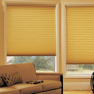
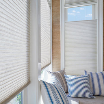
An innovative window treatment that looks beautiful and insulates your home all year round, Duette® Honeycomb Shades were the first cellular shades, specially engineered to provide energy efficiency at the window in both cold and warm climates. Their specially engineered honeycomb construction traps air in distinct pockets, which creates insulation that can help lower your energy consumption and energy bills.
Decorate every kind of window you have—even tricky skylights and unusually shaped panes—with Duette. Our signature honeycomb shades are one of our most versatile options and beautify every kind of interior.
KEY FEATURES
Premium Design & Style—Explore the richness of texture and warmth offered by The Alustra® Collection of Duette, a thoughtfully curated suite of exclusive design-inspired fabrics, textures, colors and hardware created to meet the expectations of leading designers and discerning consumers who seek the best in design.
Largest Selection in the Industry—Explore the widest selection of cellular pleat sizes, opacities, colors, textures and operating systems. Duette shades can also accommodate many specialty shaped windows, even tricky skylights.
Energy-Efficiency—Studies show that windows are responsible for up to 50% of your home’s energy losses. Duette shades trap air in distinct pockets, creating exceptional insulation. Our latest innovation, Duette Architella®, features a honeycomb-within-a-honeycomb design for even greater energy efficiency.
Room Darkening—The LightLock™ system, the newest iteration from Duette, is the first operating system of its kind to offer unparalleled darkness. The secret lies within the patent-pending side channel design, optimized to absorb or deflect nearly all incoming light.
Durability—All of our high-performing fabrics are resistant to fading and will maintain their crisp, neat pleats over time.
Vertical Application—For doors that need extra insulation, the Duette Vertiglide™ operating system is the ideal option. It’s designed for vertical applications and uses the same fabrics as your horizontal Duette shades. Use one shade to cover the entire expanse of a sliding door, or, cover the door with a split stack Vertiglide shade, with each side operating independently.
Sound Absorption—Improve your room’s acoustics while reducing the intensity of outside sound. Duette Honeycomb Shades absorb up to 70% of sound energy, creating a more quiet, tranquil room.
LNG Blinds
19 Addison Pl
Valley Stream, NY 11580
Call Us (516) 593-0044
#homesweethome #homedecor #lovemyhome #barenecessities #windows #instastyle #instadesign #interiordesign#blinds #privacy #embellishment #instahomes #propertyowner #renovation #customblindsbydesign #showcase #displays #windowtreatments #windowcoverings #shades #shutters #drapery #interiors #decor
Sponsored
Fredericksburg, OH

High Point Cabinets
Columbus' Experienced Custom Cabinet Builder | 4x Best of Houzz Winner
 Lincoln Lighthill Architect
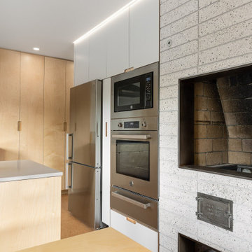
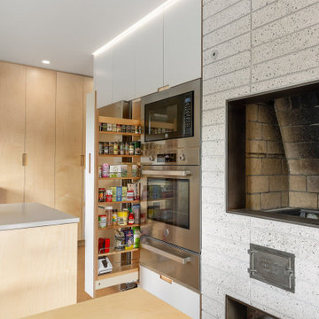
This Eichler-esque house, in a neighborhood known for its tracts of homes by the famous developer, was a little different from the rest- a one-off custom build from 1962 that had mid-century modern bones but funky, neo-traditional finishes in the worn-out, time capsule state that the new owners found it. This called for an almost-gut remodel to keep the good, upgrade the building’s envelope and MEP systems, and reimagine the home’s character. To create a home that feels of its times, both now and then- A mid-century for the 21st century.
At the center of the existing home was a long, slender rectangular form that contained a fireplace, an indoor BBQ, and kitchen storage, and on the other side an original, suspended wood and steel rod stair down to the bedroom level below. Under the carpeted treads we were sure we’d find beautiful oak, as this stair was identical to one at our earlier Clarendon heights mid-century project.
This elegant core was obscured by walls that enclosed the kitchen and breakfast areas and a jumble of aged finishes that hid the elegance of this defining element. Lincoln Lighthill Architect removed the walls and unified the core’s finishes with light grey ground-face concrete block on the upgraded fireplace and BBQ, lacquered cabinets, and chalkboard paint at the stair wall for the owners’ young children to decorate. A new skylight above the stair washes this wall with light and brightens up the formerly dark center of the house.
The rest of the interior is a combination of mid-century-inspired elements and modern updates. New finishes throughout- cork flooring, ground-face concrete block, Heath tile, and white birch millwork give the interior the mid-century character it never fully had, while modern, minimalist detailing gives it a timeless, serene simplicity.
New lighting throughout, mostly indirect and all warm-dim LED , subtly and efficiently lights the home. All new plumbing and fixtures similarly reduce the home’s use of precious resources. On the exterior, new windows, insulation, and roofing provide modern standards of comfort and efficiency, while a new paint job and brick stain give the house an elegant yet playful character, with the golden yellow Heath tile from the primary bathroom floor reappearing on the front door.
 Katie Hutchison Studio
The new owners of this house in Harvard, Massachusetts loved its location and authentic Shaker characteristics, but weren’t fans of its curious layout. A dated first-floor full bathroom could only be accessed by going up a few steps to a landing, opening the bathroom door and then going down the same number of steps to enter the room. The dark kitchen faced the driveway to the north, rather than the bucolic backyard fields to the south. The dining space felt more like an enlarged hall and could only comfortably seat four. Upstairs, a den/office had a woefully low ceiling; the master bedroom had limited storage, and a sad full bathroom featured a cramped shower.
KHS proposed a number of changes to create an updated home where the owners could enjoy cooking, entertaining, and being connected to the outdoors from the first-floor living spaces, while also experiencing more inviting and more functional private spaces upstairs.
On the first floor, the primary change was to capture space that had been part of an upper-level screen porch and convert it to interior space. To make the interior expansion seamless, we raised the floor of the area that had been the upper-level porch, so it aligns with the main living level, and made sure there would be no soffits in the planes of the walls we removed. We also raised the floor of the remaining lower-level porch to reduce the number of steps required to circulate from it to the newly expanded interior. New patio door systems now fill the arched openings that used to be infilled with screen. The exterior interventions (which also included some new casement windows in the dining area) were designed to be subtle, while affording significant improvements on the interior. Additionally, the first-floor bathroom was reconfigured, shifting one of its walls to widen the dining space, and moving the entrance to the bathroom from the stair landing to the kitchen instead.
These changes (which involved significant structural interventions) resulted in a much more open space to accommodate a new kitchen with a view of the lush backyard and a new dining space defined by a new built-in banquette that comfortably seats six, and -- with the addition of a table extension -- up to eight people.
Upstairs in the den/office, replacing the low, board ceiling with a raised, plaster, tray ceiling that springs from above the original board-finish walls – newly painted a light color -- created a much more inviting, bright, and expansive space. Re-configuring the master bath to accommodate a larger shower and adding built-in storage cabinets in the master bedroom improved comfort and function. A new whole-house color palette rounds out the improvements.
Photos by Katie Hutchison


 Katie Hutchison Studio
The new owners of this house in Harvard, Massachusetts loved its location and authentic Shaker characteristics, but weren’t fans of its curious layout. A dated first-floor full bathroom could only be accessed by going up a few steps to a landing, opening the bathroom door and then going down the same number of steps to enter the room. The dark kitchen faced the driveway to the north, rather than the bucolic backyard fields to the south. The dining space felt more like an enlarged hall and could only comfortably seat four. Upstairs, a den/office had a woefully low ceiling; the master bedroom had limited storage, and a sad full bathroom featured a cramped shower.
KHS proposed a number of changes to create an updated home where the owners could enjoy cooking, entertaining, and being connected to the outdoors from the first-floor living spaces, while also experiencing more inviting and more functional private spaces upstairs.
On the first floor, the primary change was to capture space that had been part of an upper-level screen porch and convert it to interior space. To make the interior expansion seamless, we raised the floor of the area that had been the upper-level porch, so it aligns with the main living level, and made sure there would be no soffits in the planes of the walls we removed. We also raised the floor of the remaining lower-level porch to reduce the number of steps required to circulate from it to the newly expanded interior. New patio door systems now fill the arched openings that used to be infilled with screen. The exterior interventions (which also included some new casement windows in the dining area) were designed to be subtle, while affording significant improvements on the interior. Additionally, the first-floor bathroom was reconfigured, shifting one of its walls to widen the dining space, and moving the entrance to the bathroom from the stair landing to the kitchen instead.
These changes (which involved significant structural interventions) resulted in a much more open space to accommodate a new kitchen with a view of the lush backyard and a new dining space defined by a new built-in banquette that comfortably seats six, and -- with the addition of a table extension -- up to eight people.
Upstairs in the den/office, replacing the low, board ceiling with a raised, plaster, tray ceiling that springs from above the original board-finish walls – newly painted a light color -- created a much more inviting, bright, and expansive space. Re-configuring the master bath to accommodate a larger shower and adding built-in storage cabinets in the master bedroom improved comfort and function. A new whole-house color palette rounds out the improvements.
Photos by Katie Hutchison

 Lincoln Lighthill Architect
This Eichler-esque house, in a neighborhood known for its tracts of homes by the famous developer, was a little different from the rest- a one-off custom build from 1962 that had mid-century modern bones but funky, neo-traditional finishes in the worn-out, time capsule state that the new owners found it. This called for an almost-gut remodel to keep the good, upgrade the building’s envelope and MEP systems, and reimagine the home’s character. To create a home that feels of its times, both now and then- A mid-century for the 21st century.
At the center of the existing home was a long, slender rectangular form that contained a fireplace, an indoor BBQ, and kitchen storage, and on the other side an original, suspended wood and steel rod stair down to the bedroom level below. Under the carpeted treads we were sure we’d find beautiful oak, as this stair was identical to one at our earlier Clarendon heights mid-century project.
This elegant core was obscured by walls that enclosed the kitchen and breakfast areas and a jumble of aged finishes that hid the elegance of this defining element. Lincoln Lighthill Architect removed the walls and unified the core’s finishes with light grey ground-face concrete block on the upgraded fireplace and BBQ, lacquered cabinets, and chalkboard paint at the stair wall for the owners’ young children to decorate. A new skylight above the stair washes this wall with light and brightens up the formerly dark center of the house.
The rest of the interior is a combination of mid-century-inspired elements and modern updates. New finishes throughout- cork flooring, ground-face concrete block, Heath tile, and white birch millwork give the interior the mid-century character it never fully had, while modern, minimalist detailing gives it a timeless, serene simplicity.
New lighting throughout, mostly indirect and all warm-dim LED , subtly and efficiently lights the home. All new plumbing and fixtures similarly reduce the home’s use of precious resources. On the exterior, new windows, insulation, and roofing provide modern standards of comfort and efficiency, while a new paint job and brick stain give the house an elegant yet playful character, with the golden yellow Heath tile from the primary bathroom floor reappearing on the front door.
 Katie Hutchison Studio
The new owners of this house in Harvard, Massachusetts loved its location and authentic Shaker characteristics, but weren’t fans of its curious layout. A dated first-floor full bathroom could only be accessed by going up a few steps to a landing, opening the bathroom door and then going down the same number of steps to enter the room. The dark kitchen faced the driveway to the north, rather than the bucolic backyard fields to the south. The dining space felt more like an enlarged hall and could only comfortably seat four. Upstairs, a den/office had a woefully low ceiling; the master bedroom had limited storage, and a sad full bathroom featured a cramped shower.
KHS proposed a number of changes to create an updated home where the owners could enjoy cooking, entertaining, and being connected to the outdoors from the first-floor living spaces, while also experiencing more inviting and more functional private spaces upstairs.
On the first floor, the primary change was to capture space that had been part of an upper-level screen porch and convert it to interior space. To make the interior expansion seamless, we raised the floor of the area that had been the upper-level porch, so it aligns with the main living level, and made sure there would be no soffits in the planes of the walls we removed. We also raised the floor of the remaining lower-level porch to reduce the number of steps required to circulate from it to the newly expanded interior. New patio door systems now fill the arched openings that used to be infilled with screen. The exterior interventions (which also included some new casement windows in the dining area) were designed to be subtle, while affording significant improvements on the interior. Additionally, the first-floor bathroom was reconfigured, shifting one of its walls to widen the dining space, and moving the entrance to the bathroom from the stair landing to the kitchen instead.
These changes (which involved significant structural interventions) resulted in a much more open space to accommodate a new kitchen with a view of the lush backyard and a new dining space defined by a new built-in banquette that comfortably seats six, and -- with the addition of a table extension -- up to eight people.
Upstairs in the den/office, replacing the low, board ceiling with a raised, plaster, tray ceiling that springs from above the original board-finish walls – newly painted a light color -- created a much more inviting, bright, and expansive space. Re-configuring the master bath to accommodate a larger shower and adding built-in storage cabinets in the master bedroom improved comfort and function. A new whole-house color palette rounds out the improvements.
Photos by Katie Hutchison
 HUNTER DOUGLAS-LNG BLINDS
DUETTE® Honeycomb Shades
The Original Energy-Efficient Honeycomb Shade
An innovative window treatment that looks beautiful and insulates your home all year round, Duette® Honeycomb Shades were the first cellular shades, specially engineered to provide energy efficiency at the window in both cold and warm climates. Their specially engineered honeycomb construction traps air in distinct pockets, which creates insulation that can help lower your energy consumption and energy bills.
Decorate every kind of window you have—even tricky skylights and unusually shaped panes—with Duette. Our signature honeycomb shades are one of our most versatile options and beautify every kind of interior.
Key Features
Premium Design & Style—Explore the richness of texture and warmth offered by The Alustra® Collection of Duette, a thoughtfully curated suite of exclusive design-inspired fabrics, textures, colors and hardware created to meet the expectations of leading designers and discerning consumers who seek the best in design.
Largest Selection in the Industry—Explore the widest selection of cellular pleat sizes, opacities, colors, textures and operating systems. Duette shades can also accommodate many specialty shaped windows, even tricky skylights.
Energy-Efficiency—Studies show that windows are responsible for up to 30% of your home’s energy losses. Duette shades trap air in distinct pockets, creating exceptional insulation. Our latest innovation, Duette Architella®, features a honeycomb-within-a-honeycomb design for even greater energy efficiency.
Room Darkening—The LightLock™ system, the newest iteration from Duette, is the first operating system of its kind to offer unparalleled darkness. The secret lies within the patent-pending side channel design, optimized to absorb or deflect nearly all incoming light.
Durability—All of our high-performing fabrics are resistant to fading and will maintain their crisp, neat pleats over time.
Vertical Application—For doors that need extra insulation, the Duette Vertiglide™ operating system is the ideal option. It’s designed for vertical applications and uses the same fabrics as your horizontal Duette shades. Use one shade to cover the entire expanse of a sliding door, or, cover the door with a split stack Vertiglide shade, with each side operating independently.
Sound Absorption—Improve your room’s acoustics while reducing the intensity of outside sound. Duette Honeycomb Shades absorb up to 70% of sound energy, creating a more quiet, tranquil room.
LNG Blinds
19 Addison Pl
Valley Stream, NY 11580
Call Us (516) 593-0044
#homesweethome #homedecor #lovemyhome #barenecessities #windows #instastyle #instadesign #interiordesign
#blinds #privacy #embellishment #instahomes #propertyowner #renovation #customblindsbydesign #hunterdouglas #showcase #displays #windowtreatments #windowcoverings #shades #shutters #drapery #interiors #decor
77