
Search results for "Reduce interactions" in Home Design Ideas
 Brooks + Scarpa Architects
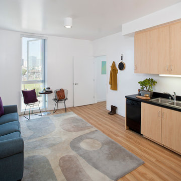
The SIX is a 52-unit affordable housing project provides a home, support services and rehabilitation for disabled veterans. It is located in the MacArthur Park area of Los Angeles. McArthur Park has one of the highest densities in the USA with over 38,000 people per square mile and a total population of 120,000 people in 2.72 square miles.
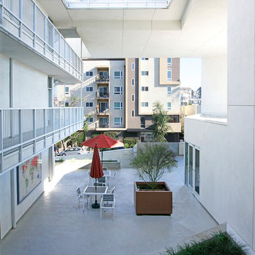
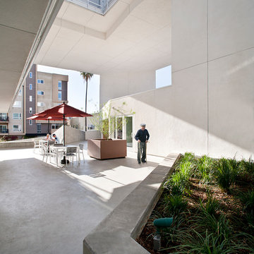
Offering shelter and comfort, the SIX breaks the prescriptive mold of the traditional shelter by creating public and private "zones" in which private space is deemphasized, in favor of large public areas. The organization of the space is intended to transform the way people live-away from a reclusive, isolating layout towards a community-oriented, interactive space.
The ground level contains offices, support spaces for the veterans, bike storage and parking while the second level has a large public courtyard. Surrounded by four levels of housing units with balconies wrapped with a wood screen made from recycle planking the courtyard has large openings with green roofs that visually connects the space to the street on the lower level beyond. This allows the tenants to enjoy a secured open space while still connecting to the larger community.
The uppermost level has a green roof, large public patio and edible garden with panoramic views of the area.
The SIX distinguishes itself from most conventionally developed projects in that it incorporates energy efficient measures that exceed standard practice, optimize building performance, and ensure reduced energy use during all phases of construction and occupancy. The planning and design emerged from close consideration and employment of passive design strategies. These strategies include: locating and orienting the building to control solar cooling loads; shaping and orienting the building for exposure to prevailing winds; shaping the building to induce buoyancy for natural ventilation; designing windows to maximize day lighting; shading south facing windows and minimizing west-facing glazing; designing windows to maximize natural ventilation; utilizing low flow fixtures and storm water management; shaping and planning the interior to enhance daylight and natural air flow distribution. These passive strategies alone make this building 50% more efficient than a conventionally designed structure.
 Brooks + Scarpa Architects
The SIX is a 52-unit affordable housing project provides a home, support services and rehabilitation for disabled veterans. It is located in the MacArthur Park area of Los Angeles. McArthur Park has one of the highest densities in the USA with over 38,000 people per square mile and a total population of 120,000 people in 2.72 square miles.
Offering shelter and comfort, the SIX breaks the prescriptive mold of the traditional shelter by creating public and private "zones" in which private space is deemphasized, in favor of large public areas. The organization of the space is intended to transform the way people live-away from a reclusive, isolating layout towards a community-oriented, interactive space.
The ground level contains offices, support spaces for the veterans, bike storage and parking while the second level has a large public courtyard. Surrounded by four levels of housing units with balconies wrapped with a wood screen made from recycle planking the courtyard has large openings with green roofs that visually connects the space to the street on the lower level beyond. This allows the tenants to enjoy a secured open space while still connecting to the larger community.
The uppermost level has a green roof, large public patio and edible garden with panoramic views of the area.
The SIX distinguishes itself from most conventionally developed projects in that it incorporates energy efficient measures that exceed standard practice, optimize building performance, and ensure reduced energy use during all phases of construction and occupancy. The planning and design emerged from close consideration and employment of passive design strategies. These strategies include: locating and orienting the building to control solar cooling loads; shaping and orienting the building for exposure to prevailing winds; shaping the building to induce buoyancy for natural ventilation; designing windows to maximize day lighting; shading south facing windows and minimizing west-facing glazing; designing windows to maximize natural ventilation; utilizing low flow fixtures and storm water management; shaping and planning the interior to enhance daylight and natural air flow distribution. These passive strategies alone make this building 50% more efficient than a conventionally designed structure.
 Brooks + Scarpa Architects
The SIX is a 52-unit affordable housing project provides a home, support services and rehabilitation for disabled veterans. It is located in the MacArthur Park area of Los Angeles. McArthur Park has one of the highest densities in the USA with over 38,000 people per square mile and a total population of 120,000 people in 2.72 square miles.
Offering shelter and comfort, the SIX breaks the prescriptive mold of the traditional shelter by creating public and private "zones" in which private space is deemphasized, in favor of large public areas. The organization of the space is intended to transform the way people live-away from a reclusive, isolating layout towards a community-oriented, interactive space.
The ground level contains offices, support spaces for the veterans, bike storage and parking while the second level has a large public courtyard. Surrounded by four levels of housing units with balconies wrapped with a wood screen made from recycle planking the courtyard has large openings with green roofs that visually connects the space to the street on the lower level beyond. This allows the tenants to enjoy a secured open space while still connecting to the larger community.
The uppermost level has a green roof, large public patio and edible garden with panoramic views of the area.
The SIX distinguishes itself from most conventionally developed projects in that it incorporates energy efficient measures that exceed standard practice, optimize building performance, and ensure reduced energy use during all phases of construction and occupancy. The planning and design emerged from close consideration and employment of passive design strategies. These strategies include: locating and orienting the building to control solar cooling loads; shaping and orienting the building for exposure to prevailing winds; shaping the building to induce buoyancy for natural ventilation; designing windows to maximize day lighting; shading south facing windows and minimizing west-facing glazing; designing windows to maximize natural ventilation; utilizing low flow fixtures and storm water management; shaping and planning the interior to enhance daylight and natural air flow distribution. These passive strategies alone make this building 50% more efficient than a conventionally designed structure.
Find the right local pro for your project
 Chapman Design Group, Inc.
Established in 2005, Stonebridge at Rankin’s Lake is proud to be Duke Energy’s “First All-Electric Energy Star Certified Community” in South Carolina. Each home has been constructed with strict guidelines to insure each individual home will receive it’s own Energy Star certificate which in turn results in a reduced rate from Duke Energy on the energy bill for the life of the home.
Through a partnership between the architecture firm, Chapman Design Group, Inc. and it’s construction arm, Icon Construction of South Carolina, Inc., special emphasis is placed on quality construction, methods and design details a well as a stringent construction quality control standard. The total efforts, skills, resources provide unyielding commitment directed toward building superior homes that will bring our homeowners many years of comfortable and carefree living.
This 107 home community was created on a 43 acre property that was planned into two phases. Approximately 17 of these acres are to be left natural, providing the feel of an established neighborhood from the very beginning. The featured attraction is Rankin’s Lake. It is approximately 4 acres in size and was once a well-known fishing lake in Anderson in the 1940s and 50s. A stone bridge will adorn its spillway and will be constructed during the second phase of the project.
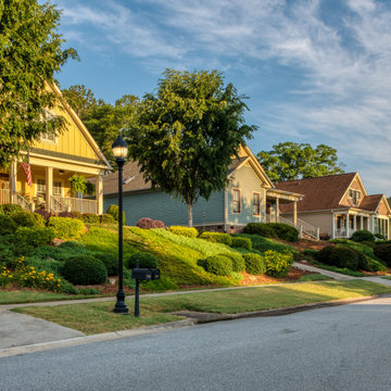
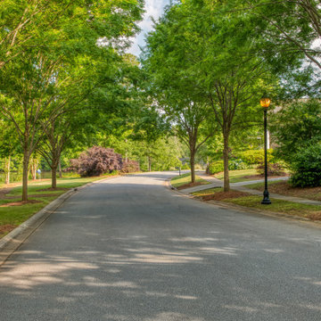
The traditional style streetscape is enhanced with grass medians separating curb lines and sidewalks. This feature is accentuated in intermittent Alee Elm Trees and decorative post streetlights throughout the neighborhood. Every front and side lawn as well as all common areas continue to be maintained on a weekly basis by a private landscape maintenance company. This perpetual maintenance provided through the Homeowner’s Association insures a constant harmonious look throughout the entire community.
From day one, several development principles were established and achieved:
• The development’s concept was designed with all water front lots facing into Rankin’s Lake to have the street running between the homes and the lake. With this concept, it allows all of the neighborhood residents and their guest to take advantage of the pathways as well as enjoy to natural scenery of the lake each time the upon entering and exiting the neighborhood. This became a positive selling point as it encouraged the selection of building sites deeper into the development once you passed the lake.
• The design concept of the development was to create a variation of the traditional home neighborhood where the homes, all with front porches are intentionally built closer to the sidewalk lined streets to encourage neighborly interaction.
• Plans were designed with the garages at the rear of the lot as to make the neighborhood less about cars and more about the home and it’s residents. This was prioritized due to many subdivisions today are designed in such a way the home’s primary feature is a front facing garage which often have two cars in the driveway… hence, Stonebridge at Rankin’s Lake want to provide an alternative.
• Each home design includes a spacious front porch, a screened porch and or a sunroom to encourage neighborly interaction and casual living.
• The floor plans include both 2 and 3 bedroom plans with 2 to 3.5 baths with all master suites remaining on the main level.
The entire development would have only Energy Star Certified homes.
 Chapman Design Group, Inc.
Established in 2005, Stonebridge at Rankin’s Lake is proud to be Duke Energy’s “First All-Electric Energy Star Certified Community” in South Carolina. Each home has been constructed with strict guidelines to insure each individual home will receive it’s own Energy Star certificate which in turn results in a reduced rate from Duke Energy on the energy bill for the life of the home.
Through a partnership between the architecture firm, Chapman Design Group, Inc. and it’s construction arm, Icon Construction of South Carolina, Inc., special emphasis is placed on quality construction, methods and design details a well as a stringent construction quality control standard. The total efforts, skills, resources provide unyielding commitment directed toward building superior homes that will bring our homeowners many years of comfortable and carefree living.
This 107 home community was created on a 43 acre property that was planned into two phases. Approximately 17 of these acres are to be left natural, providing the feel of an established neighborhood from the very beginning. The featured attraction is Rankin’s Lake. It is approximately 4 acres in size and was once a well-known fishing lake in Anderson in the 1940s and 50s. A stone bridge will adorn its spillway and will be constructed during the second phase of the project.
The traditional style streetscape is enhanced with grass medians separating curb lines and sidewalks. This feature is accentuated in intermittent Alee Elm Trees and decorative post streetlights throughout the neighborhood. Every front and side lawn as well as all common areas continue to be maintained on a weekly basis by a private landscape maintenance company. This perpetual maintenance provided through the Homeowner’s Association insures a constant harmonious look throughout the entire community.
From day one, several development principles were established and achieved:
• The development’s concept was designed with all water front lots facing into Rankin’s Lake to have the street running between the homes and the lake. With this concept, it allows all of the neighborhood residents and their guest to take advantage of the pathways as well as enjoy to natural scenery of the lake each time the upon entering and exiting the neighborhood. This became a positive selling point as it encouraged the selection of building sites deeper into the development once you passed the lake.
• The design concept of the development was to create a variation of the traditional home neighborhood where the homes, all with front porches are intentionally built closer to the sidewalk lined streets to encourage neighborly interaction.
• Plans were designed with the garages at the rear of the lot as to make the neighborhood less about cars and more about the home and it’s residents. This was prioritized due to many subdivisions today are designed in such a way the home’s primary feature is a front facing garage which often have two cars in the driveway… hence, Stonebridge at Rankin’s Lake want to provide an alternative.
• Each home design includes a spacious front porch, a screened porch and or a sunroom to encourage neighborly interaction and casual living.
• The floor plans include both 2 and 3 bedroom plans with 2 to 3.5 baths with all master suites remaining on the main level.
The entire development would have only Energy Star Certified homes.
 Brooks + Scarpa Architects
The SIX is a 52-unit affordable housing project provides a home, support services and rehabilitation for disabled veterans. It is located in the MacArthur Park area of Los Angeles. McArthur Park has one of the highest densities in the USA with over 38,000 people per square mile and a total population of 120,000 people in 2.72 square miles.
Offering shelter and comfort, the SIX breaks the prescriptive mold of the traditional shelter by creating public and private "zones" in which private space is deemphasized, in favor of large public areas. The organization of the space is intended to transform the way people live-away from a reclusive, isolating layout towards a community-oriented, interactive space.
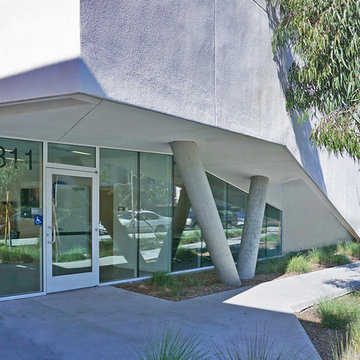
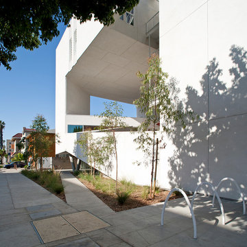
The ground level contains offices, support spaces for the veterans, bike storage and parking while the second level has a large public courtyard. Surrounded by four levels of housing units with balconies wrapped with a wood screen made from recycle planking the courtyard has large openings with green roofs that visually connects the space to the street on the lower level beyond. This allows the tenants to enjoy a secured open space while still connecting to the larger community.
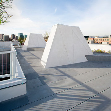
The uppermost level has a green roof, large public patio and edible garden with panoramic views of the area.
The SIX distinguishes itself from most conventionally developed projects in that it incorporates energy efficient measures that exceed standard practice, optimize building performance, and ensure reduced energy use during all phases of construction and occupancy. The planning and design emerged from close consideration and employment of passive design strategies. These strategies include: locating and orienting the building to control solar cooling loads; shaping and orienting the building for exposure to prevailing winds; shaping the building to induce buoyancy for natural ventilation; designing windows to maximize day lighting; shading south facing windows and minimizing west-facing glazing; designing windows to maximize natural ventilation; utilizing low flow fixtures and storm water management; shaping and planning the interior to enhance daylight and natural air flow distribution. These passive strategies alone make this building 50% more efficient than a conventionally designed structure.
 Brooks + Scarpa Architects
The SIX is a 52-unit affordable housing project provides a home, support services and rehabilitation for disabled veterans. It is located in the MacArthur Park area of Los Angeles. McArthur Park has one of the highest densities in the USA with over 38,000 people per square mile and a total population of 120,000 people in 2.72 square miles.
Offering shelter and comfort, the SIX breaks the prescriptive mold of the traditional shelter by creating public and private "zones" in which private space is deemphasized, in favor of large public areas. The organization of the space is intended to transform the way people live-away from a reclusive, isolating layout towards a community-oriented, interactive space.
The ground level contains offices, support spaces for the veterans, bike storage and parking while the second level has a large public courtyard. Surrounded by four levels of housing units with balconies wrapped with a wood screen made from recycle planking the courtyard has large openings with green roofs that visually connects the space to the street on the lower level beyond. This allows the tenants to enjoy a secured open space while still connecting to the larger community.
The uppermost level has a green roof, large public patio and edible garden with panoramic views of the area.
The SIX distinguishes itself from most conventionally developed projects in that it incorporates energy efficient measures that exceed standard practice, optimize building performance, and ensure reduced energy use during all phases of construction and occupancy. The planning and design emerged from close consideration and employment of passive design strategies. These strategies include: locating and orienting the building to control solar cooling loads; shaping and orienting the building for exposure to prevailing winds; shaping the building to induce buoyancy for natural ventilation; designing windows to maximize day lighting; shading south facing windows and minimizing west-facing glazing; designing windows to maximize natural ventilation; utilizing low flow fixtures and storm water management; shaping and planning the interior to enhance daylight and natural air flow distribution. These passive strategies alone make this building 50% more efficient than a conventionally designed structure.
 Brooks + Scarpa Architects
The SIX is a 52-unit affordable housing project provides a home, support services and rehabilitation for disabled veterans. It is located in the MacArthur Park area of Los Angeles. McArthur Park has one of the highest densities in the USA with over 38,000 people per square mile and a total population of 120,000 people in 2.72 square miles.
Offering shelter and comfort, the SIX breaks the prescriptive mold of the traditional shelter by creating public and private "zones" in which private space is deemphasized, in favor of large public areas. The organization of the space is intended to transform the way people live-away from a reclusive, isolating layout towards a community-oriented, interactive space.
The ground level contains offices, support spaces for the veterans, bike storage and parking while the second level has a large public courtyard. Surrounded by four levels of housing units with balconies wrapped with a wood screen made from recycle planking the courtyard has large openings with green roofs that visually connects the space to the street on the lower level beyond. This allows the tenants to enjoy a secured open space while still connecting to the larger community.
The uppermost level has a green roof, large public patio and edible garden with panoramic views of the area.
The SIX distinguishes itself from most conventionally developed projects in that it incorporates energy efficient measures that exceed standard practice, optimize building performance, and ensure reduced energy use during all phases of construction and occupancy. The planning and design emerged from close consideration and employment of passive design strategies. These strategies include: locating and orienting the building to control solar cooling loads; shaping and orienting the building for exposure to prevailing winds; shaping the building to induce buoyancy for natural ventilation; designing windows to maximize day lighting; shading south facing windows and minimizing west-facing glazing; designing windows to maximize natural ventilation; utilizing low flow fixtures and storm water management; shaping and planning the interior to enhance daylight and natural air flow distribution. These passive strategies alone make this building 50% more efficient than a conventionally designed structure.
 Brooks + Scarpa Architects
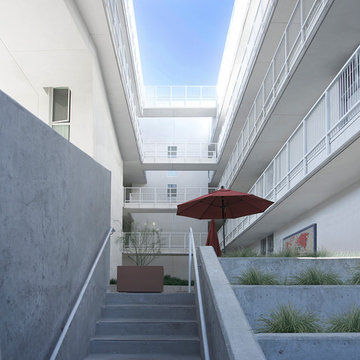
The SIX is a 52-unit affordable housing project provides a home, support services and rehabilitation for disabled veterans. It is located in the MacArthur Park area of Los Angeles. McArthur Park has one of the highest densities in the USA with over 38,000 people per square mile and a total population of 120,000 people in 2.72 square miles.
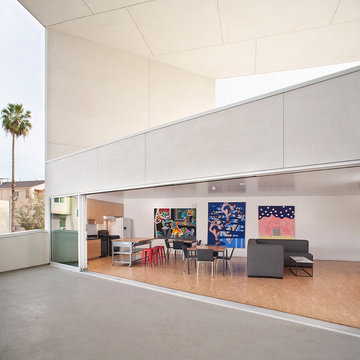
Offering shelter and comfort, the SIX breaks the prescriptive mold of the traditional shelter by creating public and private "zones" in which private space is deemphasized, in favor of large public areas. The organization of the space is intended to transform the way people live-away from a reclusive, isolating layout towards a community-oriented, interactive space.
The ground level contains offices, support spaces for the veterans, bike storage and parking while the second level has a large public courtyard. Surrounded by four levels of housing units with balconies wrapped with a wood screen made from recycle planking the courtyard has large openings with green roofs that visually connects the space to the street on the lower level beyond. This allows the tenants to enjoy a secured open space while still connecting to the larger community.
The uppermost level has a green roof, large public patio and edible garden with panoramic views of the area.
The SIX distinguishes itself from most conventionally developed projects in that it incorporates energy efficient measures that exceed standard practice, optimize building performance, and ensure reduced energy use during all phases of construction and occupancy. The planning and design emerged from close consideration and employment of passive design strategies. These strategies include: locating and orienting the building to control solar cooling loads; shaping and orienting the building for exposure to prevailing winds; shaping the building to induce buoyancy for natural ventilation; designing windows to maximize day lighting; shading south facing windows and minimizing west-facing glazing; designing windows to maximize natural ventilation; utilizing low flow fixtures and storm water management; shaping and planning the interior to enhance daylight and natural air flow distribution. These passive strategies alone make this building 50% more efficient than a conventionally designed structure.
 Brooks + Scarpa Architects
The SIX is a 52-unit affordable housing project provides a home, support services and rehabilitation for disabled veterans. It is located in the MacArthur Park area of Los Angeles. McArthur Park has one of the highest densities in the USA with over 38,000 people per square mile and a total population of 120,000 people in 2.72 square miles.
Offering shelter and comfort, the SIX breaks the prescriptive mold of the traditional shelter by creating public and private "zones" in which private space is deemphasized, in favor of large public areas. The organization of the space is intended to transform the way people live-away from a reclusive, isolating layout towards a community-oriented, interactive space.
The ground level contains offices, support spaces for the veterans, bike storage and parking while the second level has a large public courtyard. Surrounded by four levels of housing units with balconies wrapped with a wood screen made from recycle planking the courtyard has large openings with green roofs that visually connects the space to the street on the lower level beyond. This allows the tenants to enjoy a secured open space while still connecting to the larger community.
The uppermost level has a green roof, large public patio and edible garden with panoramic views of the area.
The SIX distinguishes itself from most conventionally developed projects in that it incorporates energy efficient measures that exceed standard practice, optimize building performance, and ensure reduced energy use during all phases of construction and occupancy. The planning and design emerged from close consideration and employment of passive design strategies. These strategies include: locating and orienting the building to control solar cooling loads; shaping and orienting the building for exposure to prevailing winds; shaping the building to induce buoyancy for natural ventilation; designing windows to maximize day lighting; shading south facing windows and minimizing west-facing glazing; designing windows to maximize natural ventilation; utilizing low flow fixtures and storm water management; shaping and planning the interior to enhance daylight and natural air flow distribution. These passive strategies alone make this building 50% more efficient than a conventionally designed structure.
 Drury Design
THE SETUP
Sam’s client had lived in her downtown townhome home for less than a year when she decided to remodel the spacious second level. This open area consisted of three sections: a TV and fireplace zone, a sparsely furnished dining area, and a dominant central kitchen. The kitchen featured a long back wall with three segmented sections and a massive island housing the cooktop. She found the kitchen’s functionality lacking and its presence overwhelming – it dominated the entire floor, regardless of where you stood.
Design objectives:
- Reconfigure key kitchen elements (sink, cooktop, oven) while minimizing the kitchen’s visual impact
- Optimize the kitchen’s back wall, eliminating existing dead space
- Create a purposeful, well-defined dining area
- Establish a distinct, comfortable living area
- Reuse existing appliances and flooring
- Maintain an overall modern design aesthetic
THE REMODEL
Design challenges to be solved:
- Redesign the island to reduce its overwhelming presence
- Create a comfortable, dedicated living room within the available space
- Establish a distinct, inviting dining area within spatial constraints
- Enhance kitchen functionality and style without dominating the entire floor
THE RENEWED SPACE
Design solutions:
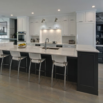
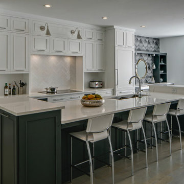
- Sam created raised end caps for the island. This separated the kitchen from adjacent living and dining areas while focusing the kitchen’s functionality. The new sink location offers ample workspace, allowing the cook to interact with guests seated at the island. The redesigned island also provides additional storage.
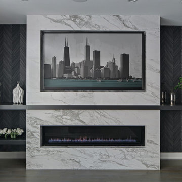
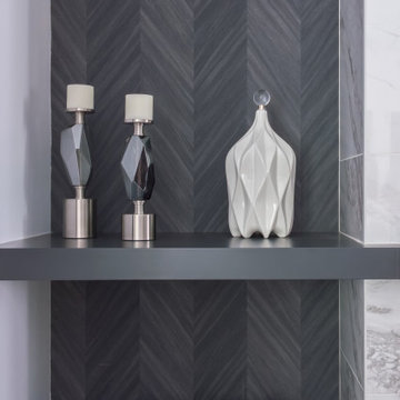
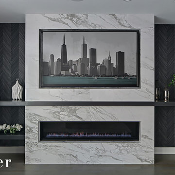
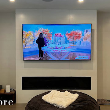
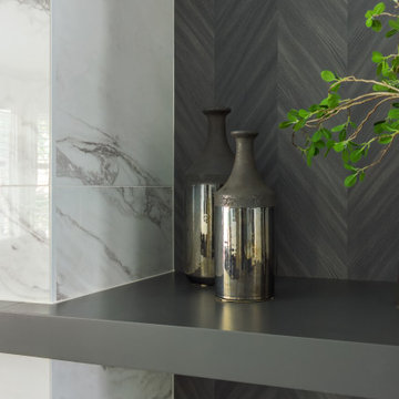
- For the living area, Sam opted for a functional-yet-minimalist approach. Large-format tile creates a natural stone look for the fireplace and TV wall. The recessed TV and extended fireplace shelf maintain a sleek profile. - Artistic wallpaper adds depth and texture, while the intentional lack of extensive shelving keeps the space open and distinct.
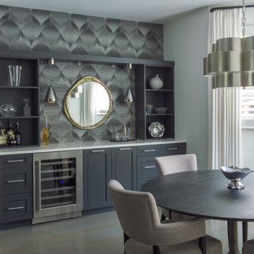
- Sam transformed the dining area’s blank wall into a feature, adding a unique dry bar with counter space, open shelves, cabinet storage and a beverage fridge. - - - Wallpaper behind and above the bar contributes to the area’s personality. A mirror adds depth while pendant lights add style and visual interest.
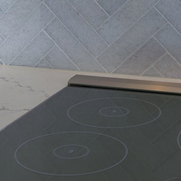
Relocating the cooktop to the back wall facilitates hidden ventilation, reducing visual clutter. Sam balanced transitional and modern elements for a contemporary yet comfortable feel. The digital control panel on the convection cooktop maintains a sleek look, while the wall oven is now at an easy-to-use height. ----- Mirrored base cabinet fronts and a paneled fridge prevent cabinetry monotony.
The redesign has delighted Sam’s client, achieving her main goal of creating a more inviting and visually appealing space. Each section now has its own visual personality and functionality while harmonizing within a monochromatic palette. The entire floor offers wow-factor pop upon first glance, with each area maintaining its distinct character while contributing to a cohesive, modern aesthetic.
 Drury Design
THE SETUP
Sam’s client had lived in her downtown townhome home for less than a year when she decided to remodel the spacious second level. This open area consisted of three sections: a TV and fireplace zone, a sparsely furnished dining area, and a dominant central kitchen. The kitchen featured a long back wall with three segmented sections and a massive island housing the cooktop. She found the kitchen’s functionality lacking and its presence overwhelming – it dominated the entire floor, regardless of where you stood.
Design objectives:
- Reconfigure key kitchen elements (sink, cooktop, oven) while minimizing the kitchen’s visual impact
- Optimize the kitchen’s back wall, eliminating existing dead space
- Create a purposeful, well-defined dining area
- Establish a distinct, comfortable living area
- Reuse existing appliances and flooring
- Maintain an overall modern design aesthetic
THE REMODEL
Design challenges to be solved:
- Redesign the island to reduce its overwhelming presence
- Create a comfortable, dedicated living room within the available space
- Establish a distinct, inviting dining area within spatial constraints
- Enhance kitchen functionality and style without dominating the entire floor
THE RENEWED SPACE
Design solutions:
- Sam created raised end caps for the island. This separated the kitchen from adjacent living and dining areas while focusing the kitchen’s functionality. The new sink location offers ample workspace, allowing the cook to interact with guests seated at the island. The redesigned island also provides additional storage.
- For the living area, Sam opted for a functional-yet-minimalist approach. Large-format tile creates a natural stone look for the fireplace and TV wall. The recessed TV and extended fireplace shelf maintain a sleek profile. - Artistic wallpaper adds depth and texture, while the intentional lack of extensive shelving keeps the space open and distinct.
- Sam transformed the dining area’s blank wall into a feature, adding a unique dry bar with counter space, open shelves, cabinet storage and a beverage fridge. - - - Wallpaper behind and above the bar contributes to the area’s personality. A mirror adds depth while pendant lights add style and visual interest.
Relocating the cooktop to the back wall facilitates hidden ventilation, reducing visual clutter. Sam balanced transitional and modern elements for a contemporary yet comfortable feel. The digital control panel on the convection cooktop maintains a sleek look, while the wall oven is now at an easy-to-use height. ----- Mirrored base cabinet fronts and a paneled fridge prevent cabinetry monotony.
The redesign has delighted Sam’s client, achieving her main goal of creating a more inviting and visually appealing space. Each section now has its own visual personality and functionality while harmonizing within a monochromatic palette. The entire floor offers wow-factor pop upon first glance, with each area maintaining its distinct character while contributing to a cohesive, modern aesthetic.
 Drury Design
THE SETUP
Sam’s client had lived in her downtown townhome home for less than a year when she decided to remodel the spacious second level. This open area consisted of three sections: a TV and fireplace zone, a sparsely furnished dining area, and a dominant central kitchen. The kitchen featured a long back wall with three segmented sections and a massive island housing the cooktop. She found the kitchen’s functionality lacking and its presence overwhelming – it dominated the entire floor, regardless of where you stood.
Design objectives:
- Reconfigure key kitchen elements (sink, cooktop, oven) while minimizing the kitchen’s visual impact
- Optimize the kitchen’s back wall, eliminating existing dead space
- Create a purposeful, well-defined dining area
- Establish a distinct, comfortable living area
- Reuse existing appliances and flooring
- Maintain an overall modern design aesthetic
THE REMODEL
Design challenges to be solved:
- Redesign the island to reduce its overwhelming presence
- Create a comfortable, dedicated living room within the available space
- Establish a distinct, inviting dining area within spatial constraints
- Enhance kitchen functionality and style without dominating the entire floor
THE RENEWED SPACE
Design solutions:
- Sam created raised end caps for the island. This separated the kitchen from adjacent living and dining areas while focusing the kitchen’s functionality. The new sink location offers ample workspace, allowing the cook to interact with guests seated at the island. The redesigned island also provides additional storage.
- For the living area, Sam opted for a functional-yet-minimalist approach. Large-format tile creates a natural stone look for the fireplace and TV wall. The recessed TV and extended fireplace shelf maintain a sleek profile. - Artistic wallpaper adds depth and texture, while the intentional lack of extensive shelving keeps the space open and distinct.
- Sam transformed the dining area’s blank wall into a feature, adding a unique dry bar with counter space, open shelves, cabinet storage and a beverage fridge. - - - Wallpaper behind and above the bar contributes to the area’s personality. A mirror adds depth while pendant lights add style and visual interest.
Relocating the cooktop to the back wall facilitates hidden ventilation, reducing visual clutter. Sam balanced transitional and modern elements for a contemporary yet comfortable feel. The digital control panel on the convection cooktop maintains a sleek look, while the wall oven is now at an easy-to-use height. ----- Mirrored base cabinet fronts and a paneled fridge prevent cabinetry monotony.
The redesign has delighted Sam’s client, achieving her main goal of creating a more inviting and visually appealing space. Each section now has its own visual personality and functionality while harmonizing within a monochromatic palette. The entire floor offers wow-factor pop upon first glance, with each area maintaining its distinct character while contributing to a cohesive, modern aesthetic.
 Matthew Giampietro Garden Design
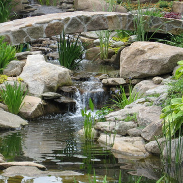
Waterfall and garden ponds in this backyard features a stone bridge and large koi pond. Backyard Waterfall, water garden, garden design by Matthew Giampietro of Waterfalls Fountains & Gardens Inc.
 Drury Design
THE SETUP
Sam’s client had lived in her downtown townhome home for less than a year when she decided to remodel the spacious second level. This open area consisted of three sections: a TV and fireplace zone, a sparsely furnished dining area, and a dominant central kitchen. The kitchen featured a long back wall with three segmented sections and a massive island housing the cooktop. She found the kitchen’s functionality lacking and its presence overwhelming – it dominated the entire floor, regardless of where you stood.
Design objectives:
- Reconfigure key kitchen elements (sink, cooktop, oven) while minimizing the kitchen’s visual impact
- Optimize the kitchen’s back wall, eliminating existing dead space
- Create a purposeful, well-defined dining area
- Establish a distinct, comfortable living area
- Reuse existing appliances and flooring
- Maintain an overall modern design aesthetic
THE REMODEL
Design challenges to be solved:
- Redesign the island to reduce its overwhelming presence
- Create a comfortable, dedicated living room within the available space
- Establish a distinct, inviting dining area within spatial constraints
- Enhance kitchen functionality and style without dominating the entire floor
THE RENEWED SPACE
Design solutions:
- Sam created raised end caps for the island. This separated the kitchen from adjacent living and dining areas while focusing the kitchen’s functionality. The new sink location offers ample workspace, allowing the cook to interact with guests seated at the island. The redesigned island also provides additional storage.
- For the living area, Sam opted for a functional-yet-minimalist approach. Large-format tile creates a natural stone look for the fireplace and TV wall. The recessed TV and extended fireplace shelf maintain a sleek profile. - Artistic wallpaper adds depth and texture, while the intentional lack of extensive shelving keeps the space open and distinct.
- Sam transformed the dining area’s blank wall into a feature, adding a unique dry bar with counter space, open shelves, cabinet storage and a beverage fridge. - - - Wallpaper behind and above the bar contributes to the area’s personality. A mirror adds depth while pendant lights add style and visual interest.
Relocating the cooktop to the back wall facilitates hidden ventilation, reducing visual clutter. Sam balanced transitional and modern elements for a contemporary yet comfortable feel. The digital control panel on the convection cooktop maintains a sleek look, while the wall oven is now at an easy-to-use height. ----- Mirrored base cabinet fronts and a paneled fridge prevent cabinetry monotony.
The redesign has delighted Sam’s client, achieving her main goal of creating a more inviting and visually appealing space. Each section now has its own visual personality and functionality while harmonizing within a monochromatic palette. The entire floor offers wow-factor pop upon first glance, with each area maintaining its distinct character while contributing to a cohesive, modern aesthetic.
 Drury Design
THE SETUP
Sam’s client had lived in her downtown townhome home for less than a year when she decided to remodel the spacious second level. This open area consisted of three sections: a TV and fireplace zone, a sparsely furnished dining area, and a dominant central kitchen. The kitchen featured a long back wall with three segmented sections and a massive island housing the cooktop. She found the kitchen’s functionality lacking and its presence overwhelming – it dominated the entire floor, regardless of where you stood.
Design objectives:
- Reconfigure key kitchen elements (sink, cooktop, oven) while minimizing the kitchen’s visual impact
- Optimize the kitchen’s back wall, eliminating existing dead space
- Create a purposeful, well-defined dining area
- Establish a distinct, comfortable living area
- Reuse existing appliances and flooring
- Maintain an overall modern design aesthetic
THE REMODEL
Design challenges to be solved:
- Redesign the island to reduce its overwhelming presence
- Create a comfortable, dedicated living room within the available space
- Establish a distinct, inviting dining area within spatial constraints
- Enhance kitchen functionality and style without dominating the entire floor
THE RENEWED SPACE
Design solutions:
- Sam created raised end caps for the island. This separated the kitchen from adjacent living and dining areas while focusing the kitchen’s functionality. The new sink location offers ample workspace, allowing the cook to interact with guests seated at the island. The redesigned island also provides additional storage.
- For the living area, Sam opted for a functional-yet-minimalist approach. Large-format tile creates a natural stone look for the fireplace and TV wall. The recessed TV and extended fireplace shelf maintain a sleek profile. - Artistic wallpaper adds depth and texture, while the intentional lack of extensive shelving keeps the space open and distinct.
- Sam transformed the dining area’s blank wall into a feature, adding a unique dry bar with counter space, open shelves, cabinet storage and a beverage fridge. - - - Wallpaper behind and above the bar contributes to the area’s personality. A mirror adds depth while pendant lights add style and visual interest.
Relocating the cooktop to the back wall facilitates hidden ventilation, reducing visual clutter. Sam balanced transitional and modern elements for a contemporary yet comfortable feel. The digital control panel on the convection cooktop maintains a sleek look, while the wall oven is now at an easy-to-use height. ----- Mirrored base cabinet fronts and a paneled fridge prevent cabinetry monotony.
The redesign has delighted Sam’s client, achieving her main goal of creating a more inviting and visually appealing space. Each section now has its own visual personality and functionality while harmonizing within a monochromatic palette. The entire floor offers wow-factor pop upon first glance, with each area maintaining its distinct character while contributing to a cohesive, modern aesthetic.
 Drury Design
THE SETUP
Sam’s client had lived in her downtown townhome home for less than a year when she decided to remodel the spacious second level. This open area consisted of three sections: a TV and fireplace zone, a sparsely furnished dining area, and a dominant central kitchen. The kitchen featured a long back wall with three segmented sections and a massive island housing the cooktop. She found the kitchen’s functionality lacking and its presence overwhelming – it dominated the entire floor, regardless of where you stood.
Design objectives:
- Reconfigure key kitchen elements (sink, cooktop, oven) while minimizing the kitchen’s visual impact
- Optimize the kitchen’s back wall, eliminating existing dead space
- Create a purposeful, well-defined dining area
- Establish a distinct, comfortable living area
- Reuse existing appliances and flooring
- Maintain an overall modern design aesthetic
THE REMODEL
Design challenges to be solved:
- Redesign the island to reduce its overwhelming presence
- Create a comfortable, dedicated living room within the available space
- Establish a distinct, inviting dining area within spatial constraints
- Enhance kitchen functionality and style without dominating the entire floor
THE RENEWED SPACE
Design solutions:
- Sam created raised end caps for the island. This separated the kitchen from adjacent living and dining areas while focusing the kitchen’s functionality. The new sink location offers ample workspace, allowing the cook to interact with guests seated at the island. The redesigned island also provides additional storage.
- For the living area, Sam opted for a functional-yet-minimalist approach. Large-format tile creates a natural stone look for the fireplace and TV wall. The recessed TV and extended fireplace shelf maintain a sleek profile. - Artistic wallpaper adds depth and texture, while the intentional lack of extensive shelving keeps the space open and distinct.
- Sam transformed the dining area’s blank wall into a feature, adding a unique dry bar with counter space, open shelves, cabinet storage and a beverage fridge. - - - Wallpaper behind and above the bar contributes to the area’s personality. A mirror adds depth while pendant lights add style and visual interest.
Relocating the cooktop to the back wall facilitates hidden ventilation, reducing visual clutter. Sam balanced transitional and modern elements for a contemporary yet comfortable feel. The digital control panel on the convection cooktop maintains a sleek look, while the wall oven is now at an easy-to-use height. ----- Mirrored base cabinet fronts and a paneled fridge prevent cabinetry monotony.
The redesign has delighted Sam’s client, achieving her main goal of creating a more inviting and visually appealing space. Each section now has its own visual personality and functionality while harmonizing within a monochromatic palette. The entire floor offers wow-factor pop upon first glance, with each area maintaining its distinct character while contributing to a cohesive, modern aesthetic.
 Drury Design
THE SETUP
Sam’s client had lived in her downtown townhome home for less than a year when she decided to remodel the spacious second level. This open area consisted of three sections: a TV and fireplace zone, a sparsely furnished dining area, and a dominant central kitchen. The kitchen featured a long back wall with three segmented sections and a massive island housing the cooktop. She found the kitchen’s functionality lacking and its presence overwhelming – it dominated the entire floor, regardless of where you stood.
Design objectives:
- Reconfigure key kitchen elements (sink, cooktop, oven) while minimizing the kitchen’s visual impact
- Optimize the kitchen’s back wall, eliminating existing dead space
- Create a purposeful, well-defined dining area
- Establish a distinct, comfortable living area
- Reuse existing appliances and flooring
- Maintain an overall modern design aesthetic
THE REMODEL
Design challenges to be solved:
- Redesign the island to reduce its overwhelming presence
- Create a comfortable, dedicated living room within the available space
- Establish a distinct, inviting dining area within spatial constraints
- Enhance kitchen functionality and style without dominating the entire floor
THE RENEWED SPACE
Design solutions:
- Sam created raised end caps for the island. This separated the kitchen from adjacent living and dining areas while focusing the kitchen’s functionality. The new sink location offers ample workspace, allowing the cook to interact with guests seated at the island. The redesigned island also provides additional storage.
- For the living area, Sam opted for a functional-yet-minimalist approach. Large-format tile creates a natural stone look for the fireplace and TV wall. The recessed TV and extended fireplace shelf maintain a sleek profile. - Artistic wallpaper adds depth and texture, while the intentional lack of extensive shelving keeps the space open and distinct.
- Sam transformed the dining area’s blank wall into a feature, adding a unique dry bar with counter space, open shelves, cabinet storage and a beverage fridge. - - - Wallpaper behind and above the bar contributes to the area’s personality. A mirror adds depth while pendant lights add style and visual interest.
Relocating the cooktop to the back wall facilitates hidden ventilation, reducing visual clutter. Sam balanced transitional and modern elements for a contemporary yet comfortable feel. The digital control panel on the convection cooktop maintains a sleek look, while the wall oven is now at an easy-to-use height. ----- Mirrored base cabinet fronts and a paneled fridge prevent cabinetry monotony.
The redesign has delighted Sam’s client, achieving her main goal of creating a more inviting and visually appealing space. Each section now has its own visual personality and functionality while harmonizing within a monochromatic palette. The entire floor offers wow-factor pop upon first glance, with each area maintaining its distinct character while contributing to a cohesive, modern aesthetic.
 Drury Design
THE SETUP
Sam’s client had lived in her downtown townhome home for less than a year when she decided to remodel the spacious second level. This open area consisted of three sections: a TV and fireplace zone, a sparsely furnished dining area, and a dominant central kitchen. The kitchen featured a long back wall with three segmented sections and a massive island housing the cooktop. She found the kitchen’s functionality lacking and its presence overwhelming – it dominated the entire floor, regardless of where you stood.
Design objectives:
- Reconfigure key kitchen elements (sink, cooktop, oven) while minimizing the kitchen’s visual impact
- Optimize the kitchen’s back wall, eliminating existing dead space
- Create a purposeful, well-defined dining area
- Establish a distinct, comfortable living area
- Reuse existing appliances and flooring
- Maintain an overall modern design aesthetic
THE REMODEL
Design challenges to be solved:
- Redesign the island to reduce its overwhelming presence
- Create a comfortable, dedicated living room within the available space
- Establish a distinct, inviting dining area within spatial constraints
- Enhance kitchen functionality and style without dominating the entire floor
THE RENEWED SPACE
Design solutions:
- Sam created raised end caps for the island. This separated the kitchen from adjacent living and dining areas while focusing the kitchen’s functionality. The new sink location offers ample workspace, allowing the cook to interact with guests seated at the island. The redesigned island also provides additional storage.
- For the living area, Sam opted for a functional-yet-minimalist approach. Large-format tile creates a natural stone look for the fireplace and TV wall. The recessed TV and extended fireplace shelf maintain a sleek profile. - Artistic wallpaper adds depth and texture, while the intentional lack of extensive shelving keeps the space open and distinct.
- Sam transformed the dining area’s blank wall into a feature, adding a unique dry bar with counter space, open shelves, cabinet storage and a beverage fridge. - - - Wallpaper behind and above the bar contributes to the area’s personality. A mirror adds depth while pendant lights add style and visual interest.
Relocating the cooktop to the back wall facilitates hidden ventilation, reducing visual clutter. Sam balanced transitional and modern elements for a contemporary yet comfortable feel. The digital control panel on the convection cooktop maintains a sleek look, while the wall oven is now at an easy-to-use height. ----- Mirrored base cabinet fronts and a paneled fridge prevent cabinetry monotony.
The redesign has delighted Sam’s client, achieving her main goal of creating a more inviting and visually appealing space. Each section now has its own visual personality and functionality while harmonizing within a monochromatic palette. The entire floor offers wow-factor pop upon first glance, with each area maintaining its distinct character while contributing to a cohesive, modern aesthetic.
 Drury Design
THE SETUP
Sam’s client had lived in her downtown townhome home for less than a year when she decided to remodel the spacious second level. This open area consisted of three sections: a TV and fireplace zone, a sparsely furnished dining area, and a dominant central kitchen. The kitchen featured a long back wall with three segmented sections and a massive island housing the cooktop. She found the kitchen’s functionality lacking and its presence overwhelming – it dominated the entire floor, regardless of where you stood.
Design objectives:
- Reconfigure key kitchen elements (sink, cooktop, oven) while minimizing the kitchen’s visual impact
- Optimize the kitchen’s back wall, eliminating existing dead space
- Create a purposeful, well-defined dining area
- Establish a distinct, comfortable living area
- Reuse existing appliances and flooring
- Maintain an overall modern design aesthetic
THE REMODEL
Design challenges to be solved:
- Redesign the island to reduce its overwhelming presence
- Create a comfortable, dedicated living room within the available space
- Establish a distinct, inviting dining area within spatial constraints
- Enhance kitchen functionality and style without dominating the entire floor
THE RENEWED SPACE
Design solutions:
- Sam created raised end caps for the island. This separated the kitchen from adjacent living and dining areas while focusing the kitchen’s functionality. The new sink location offers ample workspace, allowing the cook to interact with guests seated at the island. The redesigned island also provides additional storage.
- For the living area, Sam opted for a functional-yet-minimalist approach. Large-format tile creates a natural stone look for the fireplace and TV wall. The recessed TV and extended fireplace shelf maintain a sleek profile. - Artistic wallpaper adds depth and texture, while the intentional lack of extensive shelving keeps the space open and distinct.
- Sam transformed the dining area’s blank wall into a feature, adding a unique dry bar with counter space, open shelves, cabinet storage and a beverage fridge. - - - Wallpaper behind and above the bar contributes to the area’s personality. A mirror adds depth while pendant lights add style and visual interest.
Relocating the cooktop to the back wall facilitates hidden ventilation, reducing visual clutter. Sam balanced transitional and modern elements for a contemporary yet comfortable feel. The digital control panel on the convection cooktop maintains a sleek look, while the wall oven is now at an easy-to-use height. ----- Mirrored base cabinet fronts and a paneled fridge prevent cabinetry monotony.
The redesign has delighted Sam’s client, achieving her main goal of creating a more inviting and visually appealing space. Each section now has its own visual personality and functionality while harmonizing within a monochromatic palette. The entire floor offers wow-factor pop upon first glance, with each area maintaining its distinct character while contributing to a cohesive, modern aesthetic.
5