
Search results for "Reduce limits" in Home Design Ideas

 Diehl Concrete
Diehl Concrete is a local Denver business that prides itself in quality decorative work such as custom stamped concrete patios. The owner, Ryan Diehl, plays a hands-on part throughout the entire process. With over 15 years of experience in creating beautiful outdoor spaces, along with his un-compromised integrity, Diehl Concrete is a wise choice for your project.
There are countless examples of his work throughout Colorado, including Denver, Aurora, Brighton, Boulder, and Evergreen. Call today and Ryan Diehl will personally evaluate your project, answer your questions, and provide a free quote.
Benefits of Stamped Concrete Patios:
Affordability: Stamped concrete patios are much more affordable when compared to brick pavers or natural stone. Fortunately, This lower cost doesn’t lack durability or beauty.
Longevity: Concrete typically lasts longer than alternative patio materials. To ensure durability, Diehl Concrete will take the extra steps to reduce cracking. We will take great care in preparing your concrete sub-grade with proper compaction, and road base as well as rebar reinforcement within the concrete. Finally, expansion joints will be strategically placed to minimize and prevent cracking.
Color and Pattern Options: The sky is truly the limit on color choices and patterns for stamped concrete patios.
Shape: Due to its versatility of the substance, concrete offers homeowners the ability to create any type of shape they would like. Would you like curves, planting beds, or even a fire pit incorporated into your stamped concrete patio? No problem.
Low Maintenance: To maintain the look and uphold the durability, a once yearly sealer may be applied. This is something you can do yourself, or we can seal your patio for you.
Increased home resale value. Decorative concrete adds curb appeal and aesthetic value to your home, allowing you to maximize the return on your investment.
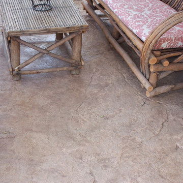 Diehl Concrete
Diehl Concrete is a local Denver business that prides itself in quality decorative work such as custom stamped concrete patios. The owner, Ryan Diehl, plays a hands-on part throughout the entire process. With over 15 years of experience in creating beautiful outdoor spaces, along with his un-compromised integrity, Diehl Concrete is a wise choice for your project.
There are countless examples of his work throughout Colorado, including Denver, Aurora, Brighton, Boulder, and Evergreen. Call today and Ryan Diehl will personally evaluate your project, answer your questions, and provide a free quote.
Benefits of Stamped Concrete Patios:
Affordability: Stamped concrete patios are much more affordable when compared to brick pavers or natural stone. Fortunately, This lower cost doesn’t lack durability or beauty.
Longevity: Concrete typically lasts longer than alternative patio materials. To ensure durability, Diehl Concrete will take the extra steps to reduce cracking. We will take great care in preparing your concrete sub-grade with proper compaction, and road base as well as rebar reinforcement within the concrete. Finally, expansion joints will be strategically placed to minimize and prevent cracking.
Color and Pattern Options: The sky is truly the limit on color choices and patterns for stamped concrete patios.
Shape: Due to its versatility of the substance, concrete offers homeowners the ability to create any type of shape they would like. Would you like curves, planting beds, or even a fire pit incorporated into your stamped concrete patio? No problem.
Low Maintenance: To maintain the look and uphold the durability, a once yearly sealer may be applied. This is something you can do yourself, or we can seal your patio for you.
Increased home resale value. Decorative concrete adds curb appeal and aesthetic value to your home, allowing you to maximize the return on your investment.
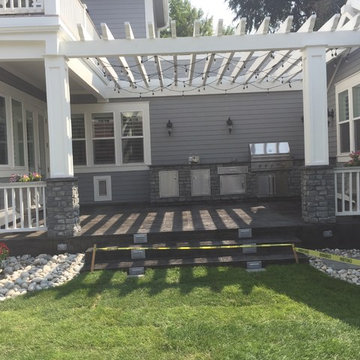 Diehl Concrete
Diehl Concrete is a local Denver business that prides itself in quality decorative work such as custom stamped concrete patios. The owner, Ryan Diehl, plays a hands-on part throughout the entire process. With over 15 years of experience in creating beautiful outdoor spaces, along with his un-compromised integrity, Diehl Concrete is a wise choice for your project.
There are countless examples of his work throughout Colorado, including Denver, Aurora, Brighton, Boulder, and Evergreen. Call today and Ryan Diehl will personally evaluate your project, answer your questions, and provide a free quote.
Benefits of Stamped Concrete Patios:
Affordability: Stamped concrete patios are much more affordable when compared to brick pavers or natural stone. Fortunately, This lower cost doesn’t lack durability or beauty.
Longevity: Concrete typically lasts longer than alternative patio materials. To ensure durability, Diehl Concrete will take the extra steps to reduce cracking. We will take great care in preparing your concrete sub-grade with proper compaction, and road base as well as rebar reinforcement within the concrete. Finally, expansion joints will be strategically placed to minimize and prevent cracking.
Color and Pattern Options: The sky is truly the limit on color choices and patterns for stamped concrete patios.
Shape: Due to its versatility of the substance, concrete offers homeowners the ability to create any type of shape they would like. Would you like curves, planting beds, or even a fire pit incorporated into your stamped concrete patio? No problem.
Low Maintenance: To maintain the look and uphold the durability, a once yearly sealer may be applied. This is something you can do yourself, or we can seal your patio for you.
Increased home resale value. Decorative concrete adds curb appeal and aesthetic value to your home, allowing you to maximize the return on your investment.
Find the right local pro for your project

 Universal Appliance and Kitchen Center
2- 8 3/4" INDUCTION ELEMENTS
6 3/4" & 5 1/2" INDUCTION ELEMENTS
ILLUMINATED TOUCH CONTROLS
TRUE SIMMER & MELT SETTINGS
CHILD SAFETY LOCK KEY
APPEARANCE:
Black Ceramic Cooktop
Flush Mount Option
Frameless Design
CONTROLS:
Illuminated Touch Controls w/ Graduated Lighting
CONVENIENCE FEATURES:
Child Safety Lock Key
Countdown Timer
Temperature Safety Limiter
Universal Off
COOKTOP FEATURES:
1- 6 3/4" 1200W Radiant Element
2- 8 3/4" 1800W Radiant Elements w/ 3000W Boost
4 Induction Elements
True Simmer Setting on Two Elements
Melt Setting on Two Elements
1- 5 1/2" 1200W Radiant Element
1- 6 3/4" 1200W Induction Element
2- 8 3/4" 1800W Induction Elements w/ 3000W Boost
1- 5 1/2" 1200W Induction Element
MANUFACTURERS WARRANTY:
2 Year Parts and Labor
5 Year Parts-Electric Elements
PRODUCT DIMENSIONS:
4" H x 21" D x 30" W
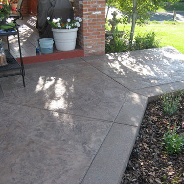 Diehl Concrete
Diehl Concrete is a local Denver business that prides itself in quality decorative work such as custom stamped concrete patios. The owner, Ryan Diehl, plays a hands-on part throughout the entire process. With over 15 years of experience in creating beautiful outdoor spaces, along with his un-compromised integrity, Diehl Concrete is a wise choice for your project.
There are countless examples of his work throughout Colorado, including Denver, Aurora, Brighton, Boulder, and Evergreen. Call today and Ryan Diehl will personally evaluate your project, answer your questions, and provide a free quote.
Benefits of Stamped Concrete Patios:
Affordability: Stamped concrete patios are much more affordable when compared to brick pavers or natural stone. Fortunately, This lower cost doesn’t lack durability or beauty.
Longevity: Concrete typically lasts longer than alternative patio materials. To ensure durability, Diehl Concrete will take the extra steps to reduce cracking. We will take great care in preparing your concrete sub-grade with proper compaction, and road base as well as rebar reinforcement within the concrete. Finally, expansion joints will be strategically placed to minimize and prevent cracking.
Color and Pattern Options: The sky is truly the limit on color choices and patterns for stamped concrete patios.
Shape: Due to its versatility of the substance, concrete offers homeowners the ability to create any type of shape they would like. Would you like curves, planting beds, or even a fire pit incorporated into your stamped concrete patio? No problem.
Low Maintenance: To maintain the look and uphold the durability, a once yearly sealer may be applied. This is something you can do yourself, or we can seal your patio for you.
Increased home resale value. Decorative concrete adds curb appeal and aesthetic value to your home, allowing you to maximize the return on your investment.
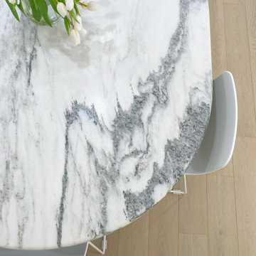
 Janvrin & Co.
A transformation of a modest raised ranch into a modern oasis. I was the interior designer and general contractor from mechanicals to finishing. It’s also my personal home.
The interior design style is that of modern minimalist meets organic modern. I wanted a space that reduced distractions and let the eyes, head, and soul rest. Where everything inside the home has a specific use and purpose. The objects in our home are fewer but each hold a great personal value. You might expect to see this airy aesthetic, with its gallery white walls, in California or New York. Not nestled in a modest 50 year old neighborhood in Omaha, Nebraska. Creating a minimal aesthetic is one of the trickiest design styles to pull off. It is more than just less stuff and lots of white. It means sticking to these design principals:
-weaving in an abundance of textures
-incorporating natural finishes
-keenly curating art
-giving extra attention to scale
-limiting purely decorative items
-maximizing natural light
This style is not to be confused with the frugality of reductive design. I have incorporated many elevated basics that create an aesthetic of quiet luxury:
-architectural bead for trim-less doors
-first-of-its kind interior door hardware made of terrazzo
-historical marble found in landmark interiors like the NY Public Library
-premium flush air vents that disappear out of site
-luxury appliances from GE Café and Signature
-elegant and resilient terrazzo field tiles
Ours was not a simple interior remodel and addition:
-gutted and remodeled the existing 2,000 SF
-added on approximately another 1,000 SF
-moved and installed all new major mechanicals i.e. heating, plumbing and electrical.
-knocked through foundation walls to extend the space back
-dug down and built up
 Diehl Concrete
Diehl Concrete is a local Denver business that prides itself in quality decorative work such as custom stamped concrete patios. The owner, Ryan Diehl, plays a hands-on part throughout the entire process. With over 15 years of experience in creating beautiful outdoor spaces, along with his un-compromised integrity, Diehl Concrete is a wise choice for your project.
There are countless examples of his work throughout Colorado, including Denver, Aurora, Brighton, Boulder, and Evergreen. Call today and Ryan Diehl will personally evaluate your project, answer your questions, and provide a free quote.
Benefits of Stamped Concrete Patios:
Affordability: Stamped concrete patios are much more affordable when compared to brick pavers or natural stone. Fortunately, This lower cost doesn’t lack durability or beauty.
Longevity: Concrete typically lasts longer than alternative patio materials. To ensure durability, Diehl Concrete will take the extra steps to reduce cracking. We will take great care in preparing your concrete sub-grade with proper compaction, and road base as well as rebar reinforcement within the concrete. Finally, expansion joints will be strategically placed to minimize and prevent cracking.
Color and Pattern Options: The sky is truly the limit on color choices and patterns for stamped concrete patios.
Shape: Due to its versatility of the substance, concrete offers homeowners the ability to create any type of shape they would like. Would you like curves, planting beds, or even a fire pit incorporated into your stamped concrete patio? No problem.
Low Maintenance: To maintain the look and uphold the durability, a once yearly sealer may be applied. This is something you can do yourself, or we can seal your patio for you.
Increased home resale value. Decorative concrete adds curb appeal and aesthetic value to your home, allowing you to maximize the return on your investment.
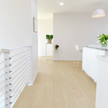 Janvrin & Co.
A transformation of a modest raised ranch into a modern oasis. I was the interior designer and general contractor from mechanicals to finishing. It’s also my personal home.
The interior design style is that of modern minimalist meets organic modern. I wanted a space that reduced distractions and let the eyes, head, and soul rest. Where everything inside the home has a specific use and purpose. The objects in our home are fewer but each hold a great personal value. You might expect to see this airy aesthetic, with its gallery white walls, in California or New York. Not nestled in a modest 50 year old neighborhood in Omaha, Nebraska. Creating a minimal aesthetic is one of the trickiest design styles to pull off. It is more than just less stuff and lots of white. It means sticking to these design principals:
-weaving in an abundance of textures
-incorporating natural finishes
-keenly curating art
-giving extra attention to scale
-limiting purely decorative items
-maximizing natural light
This style is not to be confused with the frugality of reductive design. I have incorporated many elevated basics that create an aesthetic of quiet luxury:
-architectural bead for trim-less doors
-first-of-its kind interior door hardware made of terrazzo
-historical marble found in landmark interiors like the NY Public Library
-premium flush air vents that disappear out of site
-luxury appliances from GE Café and Signature
-elegant and resilient terrazzo field tiles
Ours was not a simple interior remodel and addition:
-gutted and remodeled the existing 2,000 SF
-added on approximately another 1,000 SF
-moved and installed all new major mechanicals i.e. heating, plumbing and electrical.
-knocked through foundation walls to extend the space back
-dug down and built up
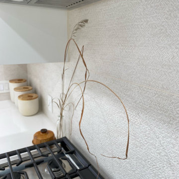 Janvrin & Co.
A transformation of a modest raised ranch into a modern oasis. I was the interior designer and general contractor from mechanicals to finishing. It’s also my personal home.
The interior design style is that of modern minimalist meets organic modern. I wanted a space that reduced distractions and let the eyes, head, and soul rest. Where everything inside the home has a specific use and purpose. The objects in our home are fewer but each hold a great personal value. You might expect to see this airy aesthetic, with its gallery white walls, in California or New York. Not nestled in a modest 50 year old neighborhood in Omaha, Nebraska. Creating a minimal aesthetic is one of the trickiest design styles to pull off. It is more than just less stuff and lots of white. It means sticking to these design principals:
-weaving in an abundance of textures
-incorporating natural finishes
-keenly curating art
-giving extra attention to scale
-limiting purely decorative items
-maximizing natural light
This style is not to be confused with the frugality of reductive design. I have incorporated many elevated basics that create an aesthetic of quiet luxury:
-architectural bead for trim-less doors
-first-of-its kind interior door hardware made of terrazzo
-historical marble found in landmark interiors like the NY Public Library
-premium flush air vents that disappear out of site
-luxury appliances from GE Café and Signature
-elegant and resilient terrazzo field tiles
Ours was not a simple interior remodel and addition:
-gutted and remodeled the existing 2,000 SF
-added on approximately another 1,000 SF
-moved and installed all new major mechanicals i.e. heating, plumbing and electrical.
-knocked through foundation walls to extend the space back
-dug down and built up
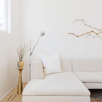 Janvrin & Co.
A transformation of a modest raised ranch into a modern oasis. I was the interior designer and general contractor from mechanicals to finishing. It’s also my personal home.
The interior design style is that of modern minimalist meets organic modern. I wanted a space that reduced distractions and let the eyes, head, and soul rest. Where everything inside the home has a specific use and purpose. The objects in our home are fewer but each hold a great personal value. You might expect to see this airy aesthetic, with its gallery white walls, in California or New York. Not nestled in a modest 50 year old neighborhood in Omaha, Nebraska. Creating a minimal aesthetic is one of the trickiest design styles to pull off. It is more than just less stuff and lots of white. It means sticking to these design principals:
-weaving in an abundance of textures
-incorporating natural finishes
-keenly curating art
-giving extra attention to scale
-limiting purely decorative items
-maximizing natural light
This style is not to be confused with the frugality of reductive design. I have incorporated many elevated basics that create an aesthetic of quiet luxury:
-architectural bead for trim-less doors
-first-of-its kind interior door hardware made of terrazzo
-historical marble found in landmark interiors like the NY Public Library
-premium flush air vents that disappear out of site
-luxury appliances from GE Café and Signature
-elegant and resilient terrazzo field tiles
Ours was not a simple interior remodel and addition:
-gutted and remodeled the existing 2,000 SF
-added on approximately another 1,000 SF
-moved and installed all new major mechanicals i.e. heating, plumbing and electrical.
-knocked through foundation walls to extend the space back
-dug down and built up

 Katie Hutchison Studio
The new owners of this house in Harvard, Massachusetts loved its location and authentic Shaker characteristics, but weren’t fans of its curious layout. A dated first-floor full bathroom could only be accessed by going up a few steps to a landing, opening the bathroom door and then going down the same number of steps to enter the room. The dark kitchen faced the driveway to the north, rather than the bucolic backyard fields to the south. The dining space felt more like an enlarged hall and could only comfortably seat four. Upstairs, a den/office had a woefully low ceiling; the master bedroom had limited storage, and a sad full bathroom featured a cramped shower.
KHS proposed a number of changes to create an updated home where the owners could enjoy cooking, entertaining, and being connected to the outdoors from the first-floor living spaces, while also experiencing more inviting and more functional private spaces upstairs.
On the first floor, the primary change was to capture space that had been part of an upper-level screen porch and convert it to interior space. To make the interior expansion seamless, we raised the floor of the area that had been the upper-level porch, so it aligns with the main living level, and made sure there would be no soffits in the planes of the walls we removed. We also raised the floor of the remaining lower-level porch to reduce the number of steps required to circulate from it to the newly expanded interior. New patio door systems now fill the arched openings that used to be infilled with screen. The exterior interventions (which also included some new casement windows in the dining area) were designed to be subtle, while affording significant improvements on the interior. Additionally, the first-floor bathroom was reconfigured, shifting one of its walls to widen the dining space, and moving the entrance to the bathroom from the stair landing to the kitchen instead.
These changes (which involved significant structural interventions) resulted in a much more open space to accommodate a new kitchen with a view of the lush backyard and a new dining space defined by a new built-in banquette that comfortably seats six, and -- with the addition of a table extension -- up to eight people.
Upstairs in the den/office, replacing the low, board ceiling with a raised, plaster, tray ceiling that springs from above the original board-finish walls – newly painted a light color -- created a much more inviting, bright, and expansive space. Re-configuring the master bath to accommodate a larger shower and adding built-in storage cabinets in the master bedroom improved comfort and function. A new whole-house color palette rounds out the improvements.
Photos by Katie Hutchison

 J. Brandon Jones
This is an example of a small rustic shade side yard vegetable garden landscape in New York.
 Katie Hutchison Studio
The new owners of this house in Harvard, Massachusetts loved its location and authentic Shaker characteristics, but weren’t fans of its curious layout. A dated first-floor full bathroom could only be accessed by going up a few steps to a landing, opening the bathroom door and then going down the same number of steps to enter the room. The dark kitchen faced the driveway to the north, rather than the bucolic backyard fields to the south. The dining space felt more like an enlarged hall and could only comfortably seat four. Upstairs, a den/office had a woefully low ceiling; the master bedroom had limited storage, and a sad full bathroom featured a cramped shower.
KHS proposed a number of changes to create an updated home where the owners could enjoy cooking, entertaining, and being connected to the outdoors from the first-floor living spaces, while also experiencing more inviting and more functional private spaces upstairs.
On the first floor, the primary change was to capture space that had been part of an upper-level screen porch and convert it to interior space. To make the interior expansion seamless, we raised the floor of the area that had been the upper-level porch, so it aligns with the main living level, and made sure there would be no soffits in the planes of the walls we removed. We also raised the floor of the remaining lower-level porch to reduce the number of steps required to circulate from it to the newly expanded interior. New patio door systems now fill the arched openings that used to be infilled with screen. The exterior interventions (which also included some new casement windows in the dining area) were designed to be subtle, while affording significant improvements on the interior. Additionally, the first-floor bathroom was reconfigured, shifting one of its walls to widen the dining space, and moving the entrance to the bathroom from the stair landing to the kitchen instead.
These changes (which involved significant structural interventions) resulted in a much more open space to accommodate a new kitchen with a view of the lush backyard and a new dining space defined by a new built-in banquette that comfortably seats six, and -- with the addition of a table extension -- up to eight people.
Upstairs in the den/office, replacing the low, board ceiling with a raised, plaster, tray ceiling that springs from above the original board-finish walls – newly painted a light color -- created a much more inviting, bright, and expansive space. Re-configuring the master bath to accommodate a larger shower and adding built-in storage cabinets in the master bedroom improved comfort and function. A new whole-house color palette rounds out the improvements.
Photos by Katie Hutchison

 Accent Window Fashions LLC
ALUSTRA® SILHOUETTE® Window Shadings
Explore exclusive textures
Our Alustra® Silhouette® window shadings are beautifully crafted from an exclusive selection of uniquely colored sheers and metallic hardware finishes from around the world to elevate your style.
Light Control SUPERVISE THE SUN
Our Signature S-Vane™ is designed to put you in control of the amount of natural light that comes in, with beautiful effects.
Transform harsh exterior light by diffusing it, spreading it evenly throughout your room, so you can maximize daylight hours and reduce your need for artificial light.
Our beautiful sheer fabrics also softly filter out brightness, glare, and UV rays —protecting your furniture and flooring from fading.
View-Through DRAMATIC SOFTNESS
With no cords or tapes, the sheer facings allow you to view through the vanes to the outside, while maintaining a discreet level of privacy. For the most impactful view, choose our Quartette™ 4" vane size.
Design Inspiration EXCLUSIVE FABRICS AND FINISHES
Our handpicked, premium fabrics turn ordinary rooms into ones of beauty and distinction. When framed with our exclusive metallic hardware finishes which reflect light in numerous ways, these fabrics create window fashions that can complement your décor and create welcoming, comfortable spaces.
Platinum™ Technology CONTROL FROM YOUR PHONE OR TABLET
Controlling your window treatments with a mobile device means you can set your blinds to movie mode, work mode, or 8 a.m. mode with the touch of a button, without leaving your seat. It’s effortless, fun and smart—with perfectly smooth operation.
Lifetime Guarantee FOR LIFE
Hunter Douglas products are designed and custom-assembled in the U.S. with the highest level of quality. But just in case, every window treatment from Hunter Douglas is covered by our lifetime limited guarantee. Read the Hunter Douglas Warranty to learn more.
Alustra® Silhouette® Window Shadings PowerRise® 2.1 with Platinum™ Technology
Alustra® Silhouette®
Fabric/Material: French Linen
Color: Soft White
Alustra® Silhouette® Window Shadings PowerRise® 2.1 with Platinum™ Technology
Operating Systems: PowerRise 2.1 with Platinum Technology
Room: Kitchen
Room Styles: Transitional
Available from Accent Window Fashions LLC
Hunter Douglas Showcase Priority Dealer
Hunter Douglas Certified Installer
Hunter Douglas Certified Professional Dealer
#Hunter_Douglas #Alustra #Silhouette #Window_Shadings #PowerRise #Kitchen
#Transitional #Window_Treatments #HunterDouglas #Accent_Window_Fashions
Copyright 2001-2014 Hunter Douglas, Inc. All rights reserved.
 Katie Hutchison Studio
The new owners of this house in Harvard, Massachusetts loved its location and authentic Shaker characteristics, but weren’t fans of its curious layout. A dated first-floor full bathroom could only be accessed by going up a few steps to a landing, opening the bathroom door and then going down the same number of steps to enter the room. The dark kitchen faced the driveway to the north, rather than the bucolic backyard fields to the south. The dining space felt more like an enlarged hall and could only comfortably seat four. Upstairs, a den/office had a woefully low ceiling; the master bedroom had limited storage, and a sad full bathroom featured a cramped shower.
KHS proposed a number of changes to create an updated home where the owners could enjoy cooking, entertaining, and being connected to the outdoors from the first-floor living spaces, while also experiencing more inviting and more functional private spaces upstairs.
On the first floor, the primary change was to capture space that had been part of an upper-level screen porch and convert it to interior space. To make the interior expansion seamless, we raised the floor of the area that had been the upper-level porch, so it aligns with the main living level, and made sure there would be no soffits in the planes of the walls we removed. We also raised the floor of the remaining lower-level porch to reduce the number of steps required to circulate from it to the newly expanded interior. New patio door systems now fill the arched openings that used to be infilled with screen. The exterior interventions (which also included some new casement windows in the dining area) were designed to be subtle, while affording significant improvements on the interior. Additionally, the first-floor bathroom was reconfigured, shifting one of its walls to widen the dining space, and moving the entrance to the bathroom from the stair landing to the kitchen instead.
These changes (which involved significant structural interventions) resulted in a much more open space to accommodate a new kitchen with a view of the lush backyard and a new dining space defined by a new built-in banquette that comfortably seats six, and -- with the addition of a table extension -- up to eight people.
Upstairs in the den/office, replacing the low, board ceiling with a raised, plaster, tray ceiling that springs from above the original board-finish walls – newly painted a light color -- created a much more inviting, bright, and expansive space. Re-configuring the master bath to accommodate a larger shower and adding built-in storage cabinets in the master bedroom improved comfort and function. A new whole-house color palette rounds out the improvements.
Photos by Katie Hutchison
 Katie Hutchison Studio
The new owners of this house in Harvard, Massachusetts loved its location and authentic Shaker characteristics, but weren’t fans of its curious layout. A dated first-floor full bathroom could only be accessed by going up a few steps to a landing, opening the bathroom door and then going down the same number of steps to enter the room. The dark kitchen faced the driveway to the north, rather than the bucolic backyard fields to the south. The dining space felt more like an enlarged hall and could only comfortably seat four. Upstairs, a den/office had a woefully low ceiling; the master bedroom had limited storage, and a sad full bathroom featured a cramped shower.
KHS proposed a number of changes to create an updated home where the owners could enjoy cooking, entertaining, and being connected to the outdoors from the first-floor living spaces, while also experiencing more inviting and more functional private spaces upstairs.
On the first floor, the primary change was to capture space that had been part of an upper-level screen porch and convert it to interior space. To make the interior expansion seamless, we raised the floor of the area that had been the upper-level porch, so it aligns with the main living level, and made sure there would be no soffits in the planes of the walls we removed. We also raised the floor of the remaining lower-level porch to reduce the number of steps required to circulate from it to the newly expanded interior. New patio door systems now fill the arched openings that used to be infilled with screen. The exterior interventions (which also included some new casement windows in the dining area) were designed to be subtle, while affording significant improvements on the interior. Additionally, the first-floor bathroom was reconfigured, shifting one of its walls to widen the dining space, and moving the entrance to the bathroom from the stair landing to the kitchen instead.
These changes (which involved significant structural interventions) resulted in a much more open space to accommodate a new kitchen with a view of the lush backyard and a new dining space defined by a new built-in banquette that comfortably seats six, and -- with the addition of a table extension -- up to eight people.
Upstairs in the den/office, replacing the low, board ceiling with a raised, plaster, tray ceiling that springs from above the original board-finish walls – newly painted a light color -- created a much more inviting, bright, and expansive space. Re-configuring the master bath to accommodate a larger shower and adding built-in storage cabinets in the master bedroom improved comfort and function. A new whole-house color palette rounds out the improvements.
Photos by Katie Hutchison
 Katie Hutchison Studio
The new owners of this house in Harvard, Massachusetts loved its location and authentic Shaker characteristics, but weren’t fans of its curious layout. A dated first-floor full bathroom could only be accessed by going up a few steps to a landing, opening the bathroom door and then going down the same number of steps to enter the room. The dark kitchen faced the driveway to the north, rather than the bucolic backyard fields to the south. The dining space felt more like an enlarged hall and could only comfortably seat four. Upstairs, a den/office had a woefully low ceiling; the master bedroom had limited storage, and a sad full bathroom featured a cramped shower.
KHS proposed a number of changes to create an updated home where the owners could enjoy cooking, entertaining, and being connected to the outdoors from the first-floor living spaces, while also experiencing more inviting and more functional private spaces upstairs.
On the first floor, the primary change was to capture space that had been part of an upper-level screen porch and convert it to interior space. To make the interior expansion seamless, we raised the floor of the area that had been the upper-level porch, so it aligns with the main living level, and made sure there would be no soffits in the planes of the walls we removed. We also raised the floor of the remaining lower-level porch to reduce the number of steps required to circulate from it to the newly expanded interior. New patio door systems now fill the arched openings that used to be infilled with screen. The exterior interventions (which also included some new casement windows in the dining area) were designed to be subtle, while affording significant improvements on the interior. Additionally, the first-floor bathroom was reconfigured, shifting one of its walls to widen the dining space, and moving the entrance to the bathroom from the stair landing to the kitchen instead.
These changes (which involved significant structural interventions) resulted in a much more open space to accommodate a new kitchen with a view of the lush backyard and a new dining space defined by a new built-in banquette that comfortably seats six, and -- with the addition of a table extension -- up to eight people.
Upstairs in the den/office, replacing the low, board ceiling with a raised, plaster, tray ceiling that springs from above the original board-finish walls – newly painted a light color -- created a much more inviting, bright, and expansive space. Re-configuring the master bath to accommodate a larger shower and adding built-in storage cabinets in the master bedroom improved comfort and function. A new whole-house color palette rounds out the improvements.
Photos by Katie Hutchison

 Cadorin Group | Top Quality Wooden Flooring
Photo: Private ville
When wood takes on the warm colour of chocolate, we get Wengè-effect Oak, a new parquet from the Cadorin Group. Elegant and essential, this plank reflects the exclusive style of the Elite Collection, perfect for those with an eye to detail and wanting to play with different colour combinations.
The planks are made from three layers of solid wood, where the top layer is Select European Oak (one the most popular timbers for its fine flamed and streaked texture), with a brushed surface and finished with a varnish in a new colour: Wengè - the African black wood.
The planks are produced as both large planks and smaller blocks suitable for herringbone laying.
The intense and expressive black hue gives the parquet particularly warm nuances, making it perfect for both idiosyncratic ethnic interior décor and for more contemporary minimalist environments.
Wengè Oak is a beautiful “healthy” plank. Respect for the environment has always been a top priority for Cadorin, a Venetian company: the Select European Oak used is a select wood that Cadorin favours with its MORE WOOD - FEWER KM logo. This means that the timber is sourced within a relatively short distance from the Cadorin production site (300-700 km), thus helping to reduce the company’s carbon footprint by limiting the emission of CO2 from its means of transport.
THREE TOP-LAYER PLANKS
Cadorin planks are 100% made in Italy (the entire production cycle takes place in Cadorin’s production site in Possagno) and are Three Top-Layer planks (three layers of solid wood): the top layer is a single strip of solid wood some 5 mm thick; the core is formed using solid strips of Fir, laid crossways; the bottom layer is made from the same noble timber as that used for the top, visible layer. This crossed three-layer structure guarantees perfect plank balance even when produced in large dimensions (16 - 21mm thick, 14 - 33cm wide and up to 3m long as standard; also available in lengths of up 4 - 5 metres), as well as in the smaller format (10.5-12cm x 60-80cm) normally used for herringbone pattern parquet floors.
 Katie Hutchison Studio
The new owners of this house in Harvard, Massachusetts loved its location and authentic Shaker characteristics, but weren’t fans of its curious layout. A dated first-floor full bathroom could only be accessed by going up a few steps to a landing, opening the bathroom door and then going down the same number of steps to enter the room. The dark kitchen faced the driveway to the north, rather than the bucolic backyard fields to the south. The dining space felt more like an enlarged hall and could only comfortably seat four. Upstairs, a den/office had a woefully low ceiling; the master bedroom had limited storage, and a sad full bathroom featured a cramped shower.
KHS proposed a number of changes to create an updated home where the owners could enjoy cooking, entertaining, and being connected to the outdoors from the first-floor living spaces, while also experiencing more inviting and more functional private spaces upstairs.
On the first floor, the primary change was to capture space that had been part of an upper-level screen porch and convert it to interior space. To make the interior expansion seamless, we raised the floor of the area that had been the upper-level porch, so it aligns with the main living level, and made sure there would be no soffits in the planes of the walls we removed. We also raised the floor of the remaining lower-level porch to reduce the number of steps required to circulate from it to the newly expanded interior. New patio door systems now fill the arched openings that used to be infilled with screen. The exterior interventions (which also included some new casement windows in the dining area) were designed to be subtle, while affording significant improvements on the interior. Additionally, the first-floor bathroom was reconfigured, shifting one of its walls to widen the dining space, and moving the entrance to the bathroom from the stair landing to the kitchen instead.
These changes (which involved significant structural interventions) resulted in a much more open space to accommodate a new kitchen with a view of the lush backyard and a new dining space defined by a new built-in banquette that comfortably seats six, and -- with the addition of a table extension -- up to eight people.
Upstairs in the den/office, replacing the low, board ceiling with a raised, plaster, tray ceiling that springs from above the original board-finish walls – newly painted a light color -- created a much more inviting, bright, and expansive space. Re-configuring the master bath to accommodate a larger shower and adding built-in storage cabinets in the master bedroom improved comfort and function. A new whole-house color palette rounds out the improvements.
Photos by Katie Hutchison
 Katie Hutchison Studio
The new owners of this house in Harvard, Massachusetts loved its location and authentic Shaker characteristics, but weren’t fans of its curious layout. A dated first-floor full bathroom could only be accessed by going up a few steps to a landing, opening the bathroom door and then going down the same number of steps to enter the room. The dark kitchen faced the driveway to the north, rather than the bucolic backyard fields to the south. The dining space felt more like an enlarged hall and could only comfortably seat four. Upstairs, a den/office had a woefully low ceiling; the master bedroom had limited storage, and a sad full bathroom featured a cramped shower.
KHS proposed a number of changes to create an updated home where the owners could enjoy cooking, entertaining, and being connected to the outdoors from the first-floor living spaces, while also experiencing more inviting and more functional private spaces upstairs.
On the first floor, the primary change was to capture space that had been part of an upper-level screen porch and convert it to interior space. To make the interior expansion seamless, we raised the floor of the area that had been the upper-level porch, so it aligns with the main living level, and made sure there would be no soffits in the planes of the walls we removed. We also raised the floor of the remaining lower-level porch to reduce the number of steps required to circulate from it to the newly expanded interior. New patio door systems now fill the arched openings that used to be infilled with screen. The exterior interventions (which also included some new casement windows in the dining area) were designed to be subtle, while affording significant improvements on the interior. Additionally, the first-floor bathroom was reconfigured, shifting one of its walls to widen the dining space, and moving the entrance to the bathroom from the stair landing to the kitchen instead.
These changes (which involved significant structural interventions) resulted in a much more open space to accommodate a new kitchen with a view of the lush backyard and a new dining space defined by a new built-in banquette that comfortably seats six, and -- with the addition of a table extension -- up to eight people.
Upstairs in the den/office, replacing the low, board ceiling with a raised, plaster, tray ceiling that springs from above the original board-finish walls – newly painted a light color -- created a much more inviting, bright, and expansive space. Re-configuring the master bath to accommodate a larger shower and adding built-in storage cabinets in the master bedroom improved comfort and function. A new whole-house color palette rounds out the improvements.
Photos by Katie Hutchison
24