
Search results for "Reduce projects" in Home Design Ideas

 Cure Design Group
KITCHEN RENOVATION CURRENT CRAFTSMAN
This client started off just being curious about our services - what we could do, and if we could even help her update her kitchen. She and her husband with their two teenage kids have lived in their home for several years without updating anything since the house was originally built. They didn’t quite have a budget in mind yet. They didn’t know their style, or even if they had one. Their timeline was simple, “as fast as you can so we’re not without a kitchen for very long” (usually what we hear for kitchen updates).
After a very productive consultation: determining the scope of work and zeroing in on a budget, I was very excited to update this underwhelming space to something that is modern but timeless, something that is theirs. And, it was easy to see what type of design style they gravitated toward looking at the pieces they already own: Craftsman/Prairie Style. I left the meeting so excited to weave in yet another genre of design to my CDG portfolio! We circled in our contractor to discuss the changes they were looking to make and the scope of work that would be theirs. Then I was off to get designing:
// Because the kitchen’s footprint and the defined breakfast space delineated by the bay, we kept the perimeter cabinetry as it was originally laid out. We updated these cabinets to a beautiful soft Alabaster White with a Barn Wood Glaze to highlight the simplicity of the shaker style doors. We added transom cabinets above the uppers, with only the back wall having seeded glass inserts to highlight some of their collectables.
// The original shaped island was counter-productive (See what I did there?) in functionality and design. We squared this off to reduce some of the angles and gain more storage. We highlighted the new island with a contrasting oak cabinet in a dark finish, to pay our respects to the craftsman style, and topped with a concrete-like countertop as a nod to the Prairie Style, allowing the homeowners to gain two extra seats and a massive -uninterrupted- work surface.
// The small section of cabinetry between the garage entry and fridge now is the perfect dump-station for mail, electronics, whatever is in their hands when they come into the house; and completely hidden by the refrigerator.
// The disconnected cabinetry in the breakfast area makes for a great place to have a working office. Accessible from the kitchen or the adjacent great room, this is the perfect place for the kids to do their homework while mom and dad are putting together dinner. The base cabinets are built out for office-type storage: paper and pencil drawers, filing systems, and cord management. Additionally, the long counter provides a ton of worksurface to spread out.
// The largest transformation was the pantry. We raised the height of the doorway and added huge custom designed bypass sliding barndoors. Finished with a dark stain to compliment the island and cut to inset 4 stained glass windows, typical of this style of design, and driving home the concept for the whole space.
// They were desperate to replace their flooring with something extremely durable to flow throughout the kitchen and the whole main level. This beautiful new flooring is actually a textured LVT(!) Which allowed them to save on overall cost and extend the life of their new flooring purchase.
// They loved their copper table, so we kept it and added new simple, mid-century modern chairs around it and a shiny new craftsman-style chandelier above. We added bright barstools in a burnt orange-red accent, and a bright woven rug to tie it all together.
// Because the kitchen renovation was shaping up to be pretty spectacular, they decided they needed to now replace their ‘now-these-look-a-little-too-old’ upholstered seating in the neighboring great room with 2 new sofas. We found the perfect sage-y-grey fabric which we covered on sofa frames that have and exposed oak-wood base, which we finished in a warm weathered grey.
// As every designer knows, a room isn’t finished until there’s something on the windows. Now that the new flooring was installed and every other room on the main level ‘seemed’ to be updated, we needed to update the window treatments in the dining, and great rooms to reflect their new design concept.
I hope you find the ‘after’ photos refreshing (as refreshing as it was for me to work on something that’s not a “Farm House” style that’s saturating the industry right now!) This was such a fun project and a great collaboration with our contractor.


 KINGDOM WOODWORKS
Collaboration with Canonbury Homes and Frank Neely Design Associates.
Inspiration for a timeless open concept kitchen remodel in Atlanta with beaded inset cabinets and two islands
Inspiration for a timeless open concept kitchen remodel in Atlanta with beaded inset cabinets and two islands
Find the right local pro for your project
 Cure Design Group
KITCHEN RENOVATION CURRENT CRAFTSMAN
This client started off just being curious about our services - what we could do, and if we could even help her update her kitchen. She and her husband with their two teenage kids have lived in their home for several years without updating anything since the house was originally built. They didn’t quite have a budget in mind yet. They didn’t know their style, or even if they had one. Their timeline was simple, “as fast as you can so we’re not without a kitchen for very long” (usually what we hear for kitchen updates).
After a very productive consultation: determining the scope of work and zeroing in on a budget, I was very excited to update this underwhelming space to something that is modern but timeless, something that is theirs. And, it was easy to see what type of design style they gravitated toward looking at the pieces they already own: Craftsman/Prairie Style. I left the meeting so excited to weave in yet another genre of design to my CDG portfolio! We circled in our contractor to discuss the changes they were looking to make and the scope of work that would be theirs. Then I was off to get designing:
// Because the kitchen’s footprint and the defined breakfast space delineated by the bay, we kept the perimeter cabinetry as it was originally laid out. We updated these cabinets to a beautiful soft Alabaster White with a Barn Wood Glaze to highlight the simplicity of the shaker style doors. We added transom cabinets above the uppers, with only the back wall having seeded glass inserts to highlight some of their collectables.
// The original shaped island was counter-productive (See what I did there?) in functionality and design. We squared this off to reduce some of the angles and gain more storage. We highlighted the new island with a contrasting oak cabinet in a dark finish, to pay our respects to the craftsman style, and topped with a concrete-like countertop as a nod to the Prairie Style, allowing the homeowners to gain two extra seats and a massive -uninterrupted- work surface.
// The small section of cabinetry between the garage entry and fridge now is the perfect dump-station for mail, electronics, whatever is in their hands when they come into the house; and completely hidden by the refrigerator.
// The disconnected cabinetry in the breakfast area makes for a great place to have a working office. Accessible from the kitchen or the adjacent great room, this is the perfect place for the kids to do their homework while mom and dad are putting together dinner. The base cabinets are built out for office-type storage: paper and pencil drawers, filing systems, and cord management. Additionally, the long counter provides a ton of worksurface to spread out.
// The largest transformation was the pantry. We raised the height of the doorway and added huge custom designed bypass sliding barndoors. Finished with a dark stain to compliment the island and cut to inset 4 stained glass windows, typical of this style of design, and driving home the concept for the whole space.
// They were desperate to replace their flooring with something extremely durable to flow throughout the kitchen and the whole main level. This beautiful new flooring is actually a textured LVT(!) Which allowed them to save on overall cost and extend the life of their new flooring purchase.
// They loved their copper table, so we kept it and added new simple, mid-century modern chairs around it and a shiny new craftsman-style chandelier above. We added bright barstools in a burnt orange-red accent, and a bright woven rug to tie it all together.
// Because the kitchen renovation was shaping up to be pretty spectacular, they decided they needed to now replace their ‘now-these-look-a-little-too-old’ upholstered seating in the neighboring great room with 2 new sofas. We found the perfect sage-y-grey fabric which we covered on sofa frames that have and exposed oak-wood base, which we finished in a warm weathered grey.
// As every designer knows, a room isn’t finished until there’s something on the windows. Now that the new flooring was installed and every other room on the main level ‘seemed’ to be updated, we needed to update the window treatments in the dining, and great rooms to reflect their new design concept.
I hope you find the ‘after’ photos refreshing (as refreshing as it was for me to work on something that’s not a “Farm House” style that’s saturating the industry right now!) This was such a fun project and a great collaboration with our contractor.

 Wood & Iron Lamps
Beautiful suspended Wooden beam lamp with chains.
Available in any size and many different finishes.
Inspiration for a rustic kitchen remodel in Montreal
Inspiration for a rustic kitchen remodel in Montreal
 Cure Design Group
KITCHEN RENOVATION CURRENT CRAFTSMAN
This client started off just being curious about our services - what we could do, and if we could even help her update her kitchen. She and her husband with their two teenage kids have lived in their home for several years without updating anything since the house was originally built. They didn’t quite have a budget in mind yet. They didn’t know their style, or even if they had one. Their timeline was simple, “as fast as you can so we’re not without a kitchen for very long” (usually what we hear for kitchen updates).
After a very productive consultation: determining the scope of work and zeroing in on a budget, I was very excited to update this underwhelming space to something that is modern but timeless, something that is theirs. And, it was easy to see what type of design style they gravitated toward looking at the pieces they already own: Craftsman/Prairie Style. I left the meeting so excited to weave in yet another genre of design to my CDG portfolio! We circled in our contractor to discuss the changes they were looking to make and the scope of work that would be theirs. Then I was off to get designing:
// Because the kitchen’s footprint and the defined breakfast space delineated by the bay, we kept the perimeter cabinetry as it was originally laid out. We updated these cabinets to a beautiful soft Alabaster White with a Barn Wood Glaze to highlight the simplicity of the shaker style doors. We added transom cabinets above the uppers, with only the back wall having seeded glass inserts to highlight some of their collectables.
// The original shaped island was counter-productive (See what I did there?) in functionality and design. We squared this off to reduce some of the angles and gain more storage. We highlighted the new island with a contrasting oak cabinet in a dark finish, to pay our respects to the craftsman style, and topped with a concrete-like countertop as a nod to the Prairie Style, allowing the homeowners to gain two extra seats and a massive -uninterrupted- work surface.
// The small section of cabinetry between the garage entry and fridge now is the perfect dump-station for mail, electronics, whatever is in their hands when they come into the house; and completely hidden by the refrigerator.
// The disconnected cabinetry in the breakfast area makes for a great place to have a working office. Accessible from the kitchen or the adjacent great room, this is the perfect place for the kids to do their homework while mom and dad are putting together dinner. The base cabinets are built out for office-type storage: paper and pencil drawers, filing systems, and cord management. Additionally, the long counter provides a ton of worksurface to spread out.
// The largest transformation was the pantry. We raised the height of the doorway and added huge custom designed bypass sliding barndoors. Finished with a dark stain to compliment the island and cut to inset 4 stained glass windows, typical of this style of design, and driving home the concept for the whole space.
// They were desperate to replace their flooring with something extremely durable to flow throughout the kitchen and the whole main level. This beautiful new flooring is actually a textured LVT(!) Which allowed them to save on overall cost and extend the life of their new flooring purchase.
// They loved their copper table, so we kept it and added new simple, mid-century modern chairs around it and a shiny new craftsman-style chandelier above. We added bright barstools in a burnt orange-red accent, and a bright woven rug to tie it all together.
// Because the kitchen renovation was shaping up to be pretty spectacular, they decided they needed to now replace their ‘now-these-look-a-little-too-old’ upholstered seating in the neighboring great room with 2 new sofas. We found the perfect sage-y-grey fabric which we covered on sofa frames that have and exposed oak-wood base, which we finished in a warm weathered grey.
// As every designer knows, a room isn’t finished until there’s something on the windows. Now that the new flooring was installed and every other room on the main level ‘seemed’ to be updated, we needed to update the window treatments in the dining, and great rooms to reflect their new design concept.
I hope you find the ‘after’ photos refreshing (as refreshing as it was for me to work on something that’s not a “Farm House” style that’s saturating the industry right now!) This was such a fun project and a great collaboration with our contractor.
 Cure Design Group
KITCHEN RENOVATION CURRENT CRAFTSMAN
This client started off just being curious about our services - what we could do, and if we could even help her update her kitchen. She and her husband with their two teenage kids have lived in their home for several years without updating anything since the house was originally built. They didn’t quite have a budget in mind yet. They didn’t know their style, or even if they had one. Their timeline was simple, “as fast as you can so we’re not without a kitchen for very long” (usually what we hear for kitchen updates).
After a very productive consultation: determining the scope of work and zeroing in on a budget, I was very excited to update this underwhelming space to something that is modern but timeless, something that is theirs. And, it was easy to see what type of design style they gravitated toward looking at the pieces they already own: Craftsman/Prairie Style. I left the meeting so excited to weave in yet another genre of design to my CDG portfolio! We circled in our contractor to discuss the changes they were looking to make and the scope of work that would be theirs. Then I was off to get designing:
// Because the kitchen’s footprint and the defined breakfast space delineated by the bay, we kept the perimeter cabinetry as it was originally laid out. We updated these cabinets to a beautiful soft Alabaster White with a Barn Wood Glaze to highlight the simplicity of the shaker style doors. We added transom cabinets above the uppers, with only the back wall having seeded glass inserts to highlight some of their collectables.
// The original shaped island was counter-productive (See what I did there?) in functionality and design. We squared this off to reduce some of the angles and gain more storage. We highlighted the new island with a contrasting oak cabinet in a dark finish, to pay our respects to the craftsman style, and topped with a concrete-like countertop as a nod to the Prairie Style, allowing the homeowners to gain two extra seats and a massive -uninterrupted- work surface.
// The small section of cabinetry between the garage entry and fridge now is the perfect dump-station for mail, electronics, whatever is in their hands when they come into the house; and completely hidden by the refrigerator.
// The disconnected cabinetry in the breakfast area makes for a great place to have a working office. Accessible from the kitchen or the adjacent great room, this is the perfect place for the kids to do their homework while mom and dad are putting together dinner. The base cabinets are built out for office-type storage: paper and pencil drawers, filing systems, and cord management. Additionally, the long counter provides a ton of worksurface to spread out.
// The largest transformation was the pantry. We raised the height of the doorway and added huge custom designed bypass sliding barndoors. Finished with a dark stain to compliment the island and cut to inset 4 stained glass windows, typical of this style of design, and driving home the concept for the whole space.
// They were desperate to replace their flooring with something extremely durable to flow throughout the kitchen and the whole main level. This beautiful new flooring is actually a textured LVT(!) Which allowed them to save on overall cost and extend the life of their new flooring purchase.
// They loved their copper table, so we kept it and added new simple, mid-century modern chairs around it and a shiny new craftsman-style chandelier above. We added bright barstools in a burnt orange-red accent, and a bright woven rug to tie it all together.
// Because the kitchen renovation was shaping up to be pretty spectacular, they decided they needed to now replace their ‘now-these-look-a-little-too-old’ upholstered seating in the neighboring great room with 2 new sofas. We found the perfect sage-y-grey fabric which we covered on sofa frames that have and exposed oak-wood base, which we finished in a warm weathered grey.
// As every designer knows, a room isn’t finished until there’s something on the windows. Now that the new flooring was installed and every other room on the main level ‘seemed’ to be updated, we needed to update the window treatments in the dining, and great rooms to reflect their new design concept.
I hope you find the ‘after’ photos refreshing (as refreshing as it was for me to work on something that’s not a “Farm House” style that’s saturating the industry right now!) This was such a fun project and a great collaboration with our contractor.
Sponsored
Columbus, OH
Free consultation for landscape design!

Peabody Landscape Group
Franklin County's Reliable Landscape Design & Contracting
 Cure Design Group
KITCHEN RENOVATION CURRENT CRAFTSMAN
This client started off just being curious about our services - what we could do, and if we could even help her update her kitchen. She and her husband with their two teenage kids have lived in their home for several years without updating anything since the house was originally built. They didn’t quite have a budget in mind yet. They didn’t know their style, or even if they had one. Their timeline was simple, “as fast as you can so we’re not without a kitchen for very long” (usually what we hear for kitchen updates).
After a very productive consultation: determining the scope of work and zeroing in on a budget, I was very excited to update this underwhelming space to something that is modern but timeless, something that is theirs. And, it was easy to see what type of design style they gravitated toward looking at the pieces they already own: Craftsman/Prairie Style. I left the meeting so excited to weave in yet another genre of design to my CDG portfolio! We circled in our contractor to discuss the changes they were looking to make and the scope of work that would be theirs. Then I was off to get designing:
// Because the kitchen’s footprint and the defined breakfast space delineated by the bay, we kept the perimeter cabinetry as it was originally laid out. We updated these cabinets to a beautiful soft Alabaster White with a Barn Wood Glaze to highlight the simplicity of the shaker style doors. We added transom cabinets above the uppers, with only the back wall having seeded glass inserts to highlight some of their collectables.
// The original shaped island was counter-productive (See what I did there?) in functionality and design. We squared this off to reduce some of the angles and gain more storage. We highlighted the new island with a contrasting oak cabinet in a dark finish, to pay our respects to the craftsman style, and topped with a concrete-like countertop as a nod to the Prairie Style, allowing the homeowners to gain two extra seats and a massive -uninterrupted- work surface.
// The small section of cabinetry between the garage entry and fridge now is the perfect dump-station for mail, electronics, whatever is in their hands when they come into the house; and completely hidden by the refrigerator.
// The disconnected cabinetry in the breakfast area makes for a great place to have a working office. Accessible from the kitchen or the adjacent great room, this is the perfect place for the kids to do their homework while mom and dad are putting together dinner. The base cabinets are built out for office-type storage: paper and pencil drawers, filing systems, and cord management. Additionally, the long counter provides a ton of worksurface to spread out.
// The largest transformation was the pantry. We raised the height of the doorway and added huge custom designed bypass sliding barndoors. Finished with a dark stain to compliment the island and cut to inset 4 stained glass windows, typical of this style of design, and driving home the concept for the whole space.
// They were desperate to replace their flooring with something extremely durable to flow throughout the kitchen and the whole main level. This beautiful new flooring is actually a textured LVT(!) Which allowed them to save on overall cost and extend the life of their new flooring purchase.
// They loved their copper table, so we kept it and added new simple, mid-century modern chairs around it and a shiny new craftsman-style chandelier above. We added bright barstools in a burnt orange-red accent, and a bright woven rug to tie it all together.
// Because the kitchen renovation was shaping up to be pretty spectacular, they decided they needed to now replace their ‘now-these-look-a-little-too-old’ upholstered seating in the neighboring great room with 2 new sofas. We found the perfect sage-y-grey fabric which we covered on sofa frames that have and exposed oak-wood base, which we finished in a warm weathered grey.
// As every designer knows, a room isn’t finished until there’s something on the windows. Now that the new flooring was installed and every other room on the main level ‘seemed’ to be updated, we needed to update the window treatments in the dining, and great rooms to reflect their new design concept.
I hope you find the ‘after’ photos refreshing (as refreshing as it was for me to work on something that’s not a “Farm House” style that’s saturating the industry right now!) This was such a fun project and a great collaboration with our contractor.
 Cure Design Group
KITCHEN RENOVATION CURRENT CRAFTSMAN
This client started off just being curious about our services - what we could do, and if we could even help her update her kitchen. She and her husband with their two teenage kids have lived in their home for several years without updating anything since the house was originally built. They didn’t quite have a budget in mind yet. They didn’t know their style, or even if they had one. Their timeline was simple, “as fast as you can so we’re not without a kitchen for very long” (usually what we hear for kitchen updates).
After a very productive consultation: determining the scope of work and zeroing in on a budget, I was very excited to update this underwhelming space to something that is modern but timeless, something that is theirs. And, it was easy to see what type of design style they gravitated toward looking at the pieces they already own: Craftsman/Prairie Style. I left the meeting so excited to weave in yet another genre of design to my CDG portfolio! We circled in our contractor to discuss the changes they were looking to make and the scope of work that would be theirs. Then I was off to get designing:
// Because the kitchen’s footprint and the defined breakfast space delineated by the bay, we kept the perimeter cabinetry as it was originally laid out. We updated these cabinets to a beautiful soft Alabaster White with a Barn Wood Glaze to highlight the simplicity of the shaker style doors. We added transom cabinets above the uppers, with only the back wall having seeded glass inserts to highlight some of their collectables.
// The original shaped island was counter-productive (See what I did there?) in functionality and design. We squared this off to reduce some of the angles and gain more storage. We highlighted the new island with a contrasting oak cabinet in a dark finish, to pay our respects to the craftsman style, and topped with a concrete-like countertop as a nod to the Prairie Style, allowing the homeowners to gain two extra seats and a massive -uninterrupted- work surface.
// The small section of cabinetry between the garage entry and fridge now is the perfect dump-station for mail, electronics, whatever is in their hands when they come into the house; and completely hidden by the refrigerator.
// The disconnected cabinetry in the breakfast area makes for a great place to have a working office. Accessible from the kitchen or the adjacent great room, this is the perfect place for the kids to do their homework while mom and dad are putting together dinner. The base cabinets are built out for office-type storage: paper and pencil drawers, filing systems, and cord management. Additionally, the long counter provides a ton of worksurface to spread out.
// The largest transformation was the pantry. We raised the height of the doorway and added huge custom designed bypass sliding barndoors. Finished with a dark stain to compliment the island and cut to inset 4 stained glass windows, typical of this style of design, and driving home the concept for the whole space.
// They were desperate to replace their flooring with something extremely durable to flow throughout the kitchen and the whole main level. This beautiful new flooring is actually a textured LVT(!) Which allowed them to save on overall cost and extend the life of their new flooring purchase.
// They loved their copper table, so we kept it and added new simple, mid-century modern chairs around it and a shiny new craftsman-style chandelier above. We added bright barstools in a burnt orange-red accent, and a bright woven rug to tie it all together.
// Because the kitchen renovation was shaping up to be pretty spectacular, they decided they needed to now replace their ‘now-these-look-a-little-too-old’ upholstered seating in the neighboring great room with 2 new sofas. We found the perfect sage-y-grey fabric which we covered on sofa frames that have and exposed oak-wood base, which we finished in a warm weathered grey.
// As every designer knows, a room isn’t finished until there’s something on the windows. Now that the new flooring was installed and every other room on the main level ‘seemed’ to be updated, we needed to update the window treatments in the dining, and great rooms to reflect their new design concept.
I hope you find the ‘after’ photos refreshing (as refreshing as it was for me to work on something that’s not a “Farm House” style that’s saturating the industry right now!) This was such a fun project and a great collaboration with our contractor.
 Electronic Design & Consulting, Inc.
This article is posted here with the consent of the author. The views and opinions expressed in this article are those of the author and do not necessarily reflect the official policy, position, view, or opinion of Crestron Electronics, Inc., or of any of its employees. Crestron Electronics is not responsible for, and does not verify the accuracy of, any of the information contained in this article.
By Jeff Singer
The “smart” revolution began several years ago with smartphones (a.k.a phones) and has extended in recent years to thermostats, doorbells, alarm systems, and kitchen appliances. Smart devices are so ubiquitous that the term “smart” is overused to the point that it is almost meaningless. Companies are eager to jump on the bandwagon and claim their products are “smart,” and consumers proudly claim they have a smart home because they have lighting control. Misconceptions about smart homes are prevalent and create confusion in the marketplace. This can have deleterious effects on businesses and underserve consumers. Here are seven of the most popular misconceptions about smart homes:
1. Apps are smart
Apps are convenient and easy to use. Yes, it seems there’s an app for everything. People expect to be able to download an app and do just about anything. App developers and many companies do not disavow consumers of this myth. On the contrary, they promote this idea with carefully worded descriptions. The promise of having the world at your fingertips for $1.99 is very enticing. Although it sounds too good to be true, it is also too good to pass up for many people. This leads to undervaluing home control and disappointment when the apps don’t work, which undermines confidence in our industry. The fact is that apps are not smart. They do not control anything. They must connect to and communicate with a control system or cloud service that processes, prioritizes, and executes commands. That’s the real magic and what most people do not understand.
2. Smart devices work together
With so many smart appliances and devices on the market today, it’s understandable that the average consumer might think that they actually communicate and work together. This is simply not the case. Smart devices are not that smart. They are designed and manufactured by different, often competing, companies. There are no national or industry standards governing these products. Even if they all operate using Wi-Fi® communications, that doesn’t mean they work together. Some companies promote a home control platform, which unites different devices from different companies – in theory. The platform is yet another third-party software totally dependent on other companies developing APIs and writing control modules for their hardware to run on that piece of software. The devices are not independently compatible. Also, when updates are made to either the hardware or the software, functionality may be affected for some period. That’s a nice way of saying the device or system won’t work and there’s no way of knowing for how long.
3. It’s a DIY project
Which brings us to the next myth, which is that the average person can do it themselves. Unless you are a skilled professional, I would not advise taking on a smart home project. You want to make a light turn on and off with your Alexa® or Google Assistant™ virtual assistant software, go for it. A smart home takes much more planning and expertise. I have no problem changing a light bulb or hanging a light fixture in my dining room; however, I am not going to rewire my house. I may change the flush valve in my toilet, but I’m not going to replace the pipes in my house. You get it. Integrating devices and systems, establishing different zones, creating scenes, designing the UI with a balance between control, feedback, and simplicity – all takes experience and skill.
4. Need a programmer to make changes
Early adopters may have experienced the pain of trying to make a simple change or update to their home control system. Years ago, if the cable provider changed the channel line-up, the homeowner would have to call the dealer or programmer to make an appointment for them to come out to the house to reprogram the system. The system wouldn’t work as expected until it was updated, which often took several days and beaucoup bucks. Not anymore. Technology has evolved so now it’s easy for system owners to change favorite channels, create scenes, rename buttons, update images, and more. While a professional is needed for the initial installation and setup, the system is easy to manage once it’s up and running. This makes life so much easier for both dealer and customer.
5. Tech becomes obsolete quickly
Similar to updating the UI, updating firmware or hardware used to be a stressful process. A smart home should be intelligent enough to update itself. Apps don’t become obsolete. Updates are constantly pushed out from the cloud, making them better all the time. The same is true for a good smart home system. New features, functions, and device support gets added in the background consistently, so the system you installed (or purchased) yesterday gets better over time. Swapping out decorative elements, such as keypads, dimmers, and touch screens is also seamless. When a new device is added, all the settings are pulled down from the cloud and it just works. No system interruptions. No sunk costs. No imposing house calls. No surprise bills.
6. Lighting control saves energy and money
Lighting control is one of the most popular smart systems, but it takes more than just one system to make a home smart. On the surface, it makes sense that if you dim the lights ten percent, then you save ten percent of energy costs. If the shades are raised during the day to take advantage of sunlight so the lights don’t need to be on (or at least not 100%), but that causes the room temperature to rise a few degrees, which triggers the air conditioner to run longer and more often, was energy usage (or cost) reduced? A smart home integrates all the various systems and technology to optimize comfort, convenience, safety, and sometimes energy.
7. Home technology is easy to hack
Security is at the forefront of people’s minds these days. Personal identities are stolen; email accounts hacked; private photos publicized; and more. A smart home must outsmart those who don’t respect privacy. Crestron control systems adhere to the strictest security standards. The same Crestron control system that goes into a home is also installed in secure government and military facilities, global banking institutions, hospitals, and other mission critical applications. When installed correctly by a trained professional, a Crestron smart home is the gold standard for security, comfort, and convenience.


 Simply Home Decorating
The kitchen may be the heart of a home, but the dining room is where the family gathers to enjoy special occasions, create and pass on traditions, and savour each other’s company free from distractions. The family behind this particular dining room enjoys doing just that.
When they are not traveling the world, Matthew and Anna (names changed) love to cook meals at home with their teenage daughter, entertain family and friends, and live amongst their cherished travel souvenirs and heirlooms. Their dining room, however, was far from the perfect backdrop for these experiences.
Before: Dining Room:
When Matthew and Anna contacted us, they imagined a space that would comfortably seat 8 to 10 people and incorporate their beautiful inherited dining table and sideboard in a fresh, modern way. Above all, they wanted a dining room that they would feel proud to share.
They worked with us to design, lightly renovate, and furnish their dining room and adjacent living space. Now, the room is nothing short of inviting and elevated.
Classic Yet Contemporary Dining Room:
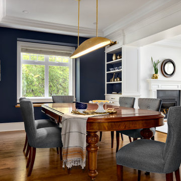
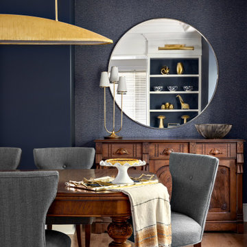
Viewed from the living area, the dining room is a hidden gem waiting to be discovered. Matthew and Anna wanted dark blue for the walls, and we couldn’t have been happier to find the perfect shade for them. By leaning darker, this rich blue creates the perception of depth, making the room feel enticing, comfortable and secluded.
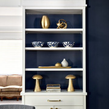
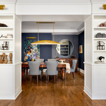
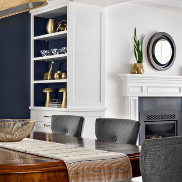
The previous built-ins were underwhelming and lacked function, so we designed wider, taller, double sided cabinets that integrated the existing bulk-head, and then accessorized the shelves with the family’s travel finds, books, and decor. Topping these units with brass art lights not only blends contemporary and traditional styles, it also draws attention to the dining table’s modern show-stopping chandelier. You can’t miss it.
Inside the dining room, the effect is equally impressive: enveloping yet spacious, warm yet cool, classic yet contemporary. We incorporated their heirloom pieces seamlessly into the design thanks to the 1:2 ratio. For every traditional piece, we introduced two more modern or contemporary pieces — clean lines, subtle curves, and lustrous brass hardware. The result is a collected yet updated look.
In any room with dark walls, lighting is of the utmost importance. We placed a mirror adjacent to the window to reflect natural light throughout the room, and we kept the trim and ceiling white for brightness. To provide maximum versatility, we provided multiple light sources that can be adjusted to create different levels of light to suit any mood or occasion. These include: pot lights and a chandelier on dimmers, a sculptural trilight lamp on the sideboard, and art lights on the bookcases and above important art pieces.
The built-ins have another surprise waiting inside this special dining room:
Double-sided built-ins: dining room shelving and living room shelving.
Rather than keep them white like we did in the living room, we painted the back wall of the book cases the same dark blue as the walls in the rest of the room. This reduces the contrast with the surrounding walls and emphasizes the white outline of the cabinets. We also love the dark blue walls’ role as a beautiful backdrop for this family’s treasures. The brass accessories and hand-painted vases and bowls feel like part of the experience.
Of course, what is beauty without function? It may not look like it, but the base storage is only accessible from the dining room side. The units include deep cabinets for storing serving ware, as well as another delightful surprise: silverware drawers lined in luxurious navy velvet!
Lastly, we designed this beautiful nook for their heirloom sideboard. From afar, the wall looks as if it has texture and perhaps a touch of shine. Up close, you will notice that it is actually navy blue wallpaper with tiny golden dots. This unique touch accentuates the brass in the room touches throughout the space.. The room feels curated, contemporary, and full of character.
Words of Praise:
Anna and Matthew were thrilled with their new dining room and with the design process itself, which is always the highest compliment. They said:
“Working with Lori and her team at Simply Home Decorating was a great experience. The design they came up with was both beautiful and practical for our family. Renovations can be stressful but working with Simply Home made the process much more pleasant.
“Simply Home's project management and their longstanding relationships with reliable trades meant we could relax, knowing that everything was taken care of. If an issue arose, the entire Simply Home team was quick to address it. They were excellent at communicating with us—we never felt like we didn't know what was going on. We would highly recommend working with Simply Home Decorating.”
Thank you, Matthew and Anna! We are honoured to have been part of your journey and wish your family many happy memories in these new spaces.
Now, is it your turn? Are you ready to uncover the hidden potential in your home? If so, contact us here to start the conversation or download my guide Uncovering the Hidden Potential in Your Home below to learn more about what we can do for you.
 Simply Home Decorating
The kitchen may be the heart of a home, but the dining room is where the family gathers to enjoy special occasions, create and pass on traditions, and savour each other’s company free from distractions. The family behind this particular dining room enjoys doing just that.
When they are not traveling the world, Matthew and Anna (names changed) love to cook meals at home with their teenage daughter, entertain family and friends, and live amongst their cherished travel souvenirs and heirlooms. Their dining room, however, was far from the perfect backdrop for these experiences.
Before: Dining Room:
When Matthew and Anna contacted us, they imagined a space that would comfortably seat 8 to 10 people and incorporate their beautiful inherited dining table and sideboard in a fresh, modern way. Above all, they wanted a dining room that they would feel proud to share.
They worked with us to design, lightly renovate, and furnish their dining room and adjacent living space. Now, the room is nothing short of inviting and elevated.
Classic Yet Contemporary Dining Room:
Viewed from the living area, the dining room is a hidden gem waiting to be discovered. Matthew and Anna wanted dark blue for the walls, and we couldn’t have been happier to find the perfect shade for them. By leaning darker, this rich blue creates the perception of depth, making the room feel enticing, comfortable and secluded.
The previous built-ins were underwhelming and lacked function, so we designed wider, taller, double sided cabinets that integrated the existing bulk-head, and then accessorized the shelves with the family’s travel finds, books, and decor. Topping these units with brass art lights not only blends contemporary and traditional styles, it also draws attention to the dining table’s modern show-stopping chandelier. You can’t miss it.
Inside the dining room, the effect is equally impressive: enveloping yet spacious, warm yet cool, classic yet contemporary. We incorporated their heirloom pieces seamlessly into the design thanks to the 1:2 ratio. For every traditional piece, we introduced two more modern or contemporary pieces — clean lines, subtle curves, and lustrous brass hardware. The result is a collected yet updated look.
In any room with dark walls, lighting is of the utmost importance. We placed a mirror adjacent to the window to reflect natural light throughout the room, and we kept the trim and ceiling white for brightness. To provide maximum versatility, we provided multiple light sources that can be adjusted to create different levels of light to suit any mood or occasion. These include: pot lights and a chandelier on dimmers, a sculptural trilight lamp on the sideboard, and art lights on the bookcases and above important art pieces.
The built-ins have another surprise waiting inside this special dining room:
Double-sided built-ins: dining room shelving and living room shelving.
Rather than keep them white like we did in the living room, we painted the back wall of the book cases the same dark blue as the walls in the rest of the room. This reduces the contrast with the surrounding walls and emphasizes the white outline of the cabinets. We also love the dark blue walls’ role as a beautiful backdrop for this family’s treasures. The brass accessories and hand-painted vases and bowls feel like part of the experience.
Of course, what is beauty without function? It may not look like it, but the base storage is only accessible from the dining room side. The units include deep cabinets for storing serving ware, as well as another delightful surprise: silverware drawers lined in luxurious navy velvet!
Lastly, we designed this beautiful nook for their heirloom sideboard. From afar, the wall looks as if it has texture and perhaps a touch of shine. Up close, you will notice that it is actually navy blue wallpaper with tiny golden dots. This unique touch accentuates the brass in the room touches throughout the space.. The room feels curated, contemporary, and full of character.
Words of Praise:
Anna and Matthew were thrilled with their new dining room and with the design process itself, which is always the highest compliment. They said:
“Working with Lori and her team at Simply Home Decorating was a great experience. The design they came up with was both beautiful and practical for our family. Renovations can be stressful but working with Simply Home made the process much more pleasant.
“Simply Home's project management and their longstanding relationships with reliable trades meant we could relax, knowing that everything was taken care of. If an issue arose, the entire Simply Home team was quick to address it. They were excellent at communicating with us—we never felt like we didn't know what was going on. We would highly recommend working with Simply Home Decorating.”
Thank you, Matthew and Anna! We are honoured to have been part of your journey and wish your family many happy memories in these new spaces.
Now, is it your turn? Are you ready to uncover the hidden potential in your home? If so, contact us here to start the conversation or download my guide Uncovering the Hidden Potential in Your Home below to learn more about what we can do for you.

 Simply Home Decorating
The kitchen may be the heart of a home, but the dining room is where the family gathers to enjoy special occasions, create and pass on traditions, and savour each other’s company free from distractions. The family behind this particular dining room enjoys doing just that.
When they are not traveling the world, Matthew and Anna (names changed) love to cook meals at home with their teenage daughter, entertain family and friends, and live amongst their cherished travel souvenirs and heirlooms. Their dining room, however, was far from the perfect backdrop for these experiences.
Before: Dining Room:
When Matthew and Anna contacted us, they imagined a space that would comfortably seat 8 to 10 people and incorporate their beautiful inherited dining table and sideboard in a fresh, modern way. Above all, they wanted a dining room that they would feel proud to share.
They worked with us to design, lightly renovate, and furnish their dining room and adjacent living space. Now, the room is nothing short of inviting and elevated.
Classic Yet Contemporary Dining Room:
Viewed from the living area, the dining room is a hidden gem waiting to be discovered. Matthew and Anna wanted dark blue for the walls, and we couldn’t have been happier to find the perfect shade for them. By leaning darker, this rich blue creates the perception of depth, making the room feel enticing, comfortable and secluded.
The previous built-ins were underwhelming and lacked function, so we designed wider, taller, double sided cabinets that integrated the existing bulk-head, and then accessorized the shelves with the family’s travel finds, books, and decor. Topping these units with brass art lights not only blends contemporary and traditional styles, it also draws attention to the dining table’s modern show-stopping chandelier. You can’t miss it.
Inside the dining room, the effect is equally impressive: enveloping yet spacious, warm yet cool, classic yet contemporary. We incorporated their heirloom pieces seamlessly into the design thanks to the 1:2 ratio. For every traditional piece, we introduced two more modern or contemporary pieces — clean lines, subtle curves, and lustrous brass hardware. The result is a collected yet updated look.
In any room with dark walls, lighting is of the utmost importance. We placed a mirror adjacent to the window to reflect natural light throughout the room, and we kept the trim and ceiling white for brightness. To provide maximum versatility, we provided multiple light sources that can be adjusted to create different levels of light to suit any mood or occasion. These include: pot lights and a chandelier on dimmers, a sculptural trilight lamp on the sideboard, and art lights on the bookcases and above important art pieces.
The built-ins have another surprise waiting inside this special dining room:
Double-sided built-ins: dining room shelving and living room shelving.
Rather than keep them white like we did in the living room, we painted the back wall of the book cases the same dark blue as the walls in the rest of the room. This reduces the contrast with the surrounding walls and emphasizes the white outline of the cabinets. We also love the dark blue walls’ role as a beautiful backdrop for this family’s treasures. The brass accessories and hand-painted vases and bowls feel like part of the experience.
Of course, what is beauty without function? It may not look like it, but the base storage is only accessible from the dining room side. The units include deep cabinets for storing serving ware, as well as another delightful surprise: silverware drawers lined in luxurious navy velvet!
Lastly, we designed this beautiful nook for their heirloom sideboard. From afar, the wall looks as if it has texture and perhaps a touch of shine. Up close, you will notice that it is actually navy blue wallpaper with tiny golden dots. This unique touch accentuates the brass in the room touches throughout the space.. The room feels curated, contemporary, and full of character.
Words of Praise:
Anna and Matthew were thrilled with their new dining room and with the design process itself, which is always the highest compliment. They said:
“Working with Lori and her team at Simply Home Decorating was a great experience. The design they came up with was both beautiful and practical for our family. Renovations can be stressful but working with Simply Home made the process much more pleasant.
“Simply Home's project management and their longstanding relationships with reliable trades meant we could relax, knowing that everything was taken care of. If an issue arose, the entire Simply Home team was quick to address it. They were excellent at communicating with us—we never felt like we didn't know what was going on. We would highly recommend working with Simply Home Decorating.”
Thank you, Matthew and Anna! We are honoured to have been part of your journey and wish your family many happy memories in these new spaces.
Now, is it your turn? Are you ready to uncover the hidden potential in your home? If so, contact us here to start the conversation or download my guide Uncovering the Hidden Potential in Your Home below to learn more about what we can do for you.
 Simply Home Decorating
The kitchen may be the heart of a home, but the dining room is where the family gathers to enjoy special occasions, create and pass on traditions, and savour each other’s company free from distractions. The family behind this particular dining room enjoys doing just that.
When they are not traveling the world, Matthew and Anna (names changed) love to cook meals at home with their teenage daughter, entertain family and friends, and live amongst their cherished travel souvenirs and heirlooms. Their dining room, however, was far from the perfect backdrop for these experiences.
Before: Dining Room:
When Matthew and Anna contacted us, they imagined a space that would comfortably seat 8 to 10 people and incorporate their beautiful inherited dining table and sideboard in a fresh, modern way. Above all, they wanted a dining room that they would feel proud to share.
They worked with us to design, lightly renovate, and furnish their dining room and adjacent living space. Now, the room is nothing short of inviting and elevated.
Classic Yet Contemporary Dining Room:
Viewed from the living area, the dining room is a hidden gem waiting to be discovered. Matthew and Anna wanted dark blue for the walls, and we couldn’t have been happier to find the perfect shade for them. By leaning darker, this rich blue creates the perception of depth, making the room feel enticing, comfortable and secluded.
The previous built-ins were underwhelming and lacked function, so we designed wider, taller, double sided cabinets that integrated the existing bulk-head, and then accessorized the shelves with the family’s travel finds, books, and decor. Topping these units with brass art lights not only blends contemporary and traditional styles, it also draws attention to the dining table’s modern show-stopping chandelier. You can’t miss it.
Inside the dining room, the effect is equally impressive: enveloping yet spacious, warm yet cool, classic yet contemporary. We incorporated their heirloom pieces seamlessly into the design thanks to the 1:2 ratio. For every traditional piece, we introduced two more modern or contemporary pieces — clean lines, subtle curves, and lustrous brass hardware. The result is a collected yet updated look.
In any room with dark walls, lighting is of the utmost importance. We placed a mirror adjacent to the window to reflect natural light throughout the room, and we kept the trim and ceiling white for brightness. To provide maximum versatility, we provided multiple light sources that can be adjusted to create different levels of light to suit any mood or occasion. These include: pot lights and a chandelier on dimmers, a sculptural trilight lamp on the sideboard, and art lights on the bookcases and above important art pieces.
The built-ins have another surprise waiting inside this special dining room:
Double-sided built-ins: dining room shelving and living room shelving.
Rather than keep them white like we did in the living room, we painted the back wall of the book cases the same dark blue as the walls in the rest of the room. This reduces the contrast with the surrounding walls and emphasizes the white outline of the cabinets. We also love the dark blue walls’ role as a beautiful backdrop for this family’s treasures. The brass accessories and hand-painted vases and bowls feel like part of the experience.
Of course, what is beauty without function? It may not look like it, but the base storage is only accessible from the dining room side. The units include deep cabinets for storing serving ware, as well as another delightful surprise: silverware drawers lined in luxurious navy velvet!
Lastly, we designed this beautiful nook for their heirloom sideboard. From afar, the wall looks as if it has texture and perhaps a touch of shine. Up close, you will notice that it is actually navy blue wallpaper with tiny golden dots. This unique touch accentuates the brass in the room touches throughout the space.. The room feels curated, contemporary, and full of character.
Words of Praise:
Anna and Matthew were thrilled with their new dining room and with the design process itself, which is always the highest compliment. They said:
“Working with Lori and her team at Simply Home Decorating was a great experience. The design they came up with was both beautiful and practical for our family. Renovations can be stressful but working with Simply Home made the process much more pleasant.
“Simply Home's project management and their longstanding relationships with reliable trades meant we could relax, knowing that everything was taken care of. If an issue arose, the entire Simply Home team was quick to address it. They were excellent at communicating with us—we never felt like we didn't know what was going on. We would highly recommend working with Simply Home Decorating.”
Thank you, Matthew and Anna! We are honoured to have been part of your journey and wish your family many happy memories in these new spaces.
Now, is it your turn? Are you ready to uncover the hidden potential in your home? If so, contact us here to start the conversation or download my guide Uncovering the Hidden Potential in Your Home below to learn more about what we can do for you.
 Simply Home Decorating
The kitchen may be the heart of a home, but the dining room is where the family gathers to enjoy special occasions, create and pass on traditions, and savour each other’s company free from distractions. The family behind this particular dining room enjoys doing just that.
When they are not traveling the world, Matthew and Anna (names changed) love to cook meals at home with their teenage daughter, entertain family and friends, and live amongst their cherished travel souvenirs and heirlooms. Their dining room, however, was far from the perfect backdrop for these experiences.
Before: Dining Room:
When Matthew and Anna contacted us, they imagined a space that would comfortably seat 8 to 10 people and incorporate their beautiful inherited dining table and sideboard in a fresh, modern way. Above all, they wanted a dining room that they would feel proud to share.
They worked with us to design, lightly renovate, and furnish their dining room and adjacent living space. Now, the room is nothing short of inviting and elevated.
Classic Yet Contemporary Dining Room:
Viewed from the living area, the dining room is a hidden gem waiting to be discovered. Matthew and Anna wanted dark blue for the walls, and we couldn’t have been happier to find the perfect shade for them. By leaning darker, this rich blue creates the perception of depth, making the room feel enticing, comfortable and secluded.
The previous built-ins were underwhelming and lacked function, so we designed wider, taller, double sided cabinets that integrated the existing bulk-head, and then accessorized the shelves with the family’s travel finds, books, and decor. Topping these units with brass art lights not only blends contemporary and traditional styles, it also draws attention to the dining table’s modern show-stopping chandelier. You can’t miss it.
Inside the dining room, the effect is equally impressive: enveloping yet spacious, warm yet cool, classic yet contemporary. We incorporated their heirloom pieces seamlessly into the design thanks to the 1:2 ratio. For every traditional piece, we introduced two more modern or contemporary pieces — clean lines, subtle curves, and lustrous brass hardware. The result is a collected yet updated look.
In any room with dark walls, lighting is of the utmost importance. We placed a mirror adjacent to the window to reflect natural light throughout the room, and we kept the trim and ceiling white for brightness. To provide maximum versatility, we provided multiple light sources that can be adjusted to create different levels of light to suit any mood or occasion. These include: pot lights and a chandelier on dimmers, a sculptural trilight lamp on the sideboard, and art lights on the bookcases and above important art pieces.
The built-ins have another surprise waiting inside this special dining room:
Double-sided built-ins: dining room shelving and living room shelving.
Rather than keep them white like we did in the living room, we painted the back wall of the book cases the same dark blue as the walls in the rest of the room. This reduces the contrast with the surrounding walls and emphasizes the white outline of the cabinets. We also love the dark blue walls’ role as a beautiful backdrop for this family’s treasures. The brass accessories and hand-painted vases and bowls feel like part of the experience.
Of course, what is beauty without function? It may not look like it, but the base storage is only accessible from the dining room side. The units include deep cabinets for storing serving ware, as well as another delightful surprise: silverware drawers lined in luxurious navy velvet!
Lastly, we designed this beautiful nook for their heirloom sideboard. From afar, the wall looks as if it has texture and perhaps a touch of shine. Up close, you will notice that it is actually navy blue wallpaper with tiny golden dots. This unique touch accentuates the brass in the room touches throughout the space.. The room feels curated, contemporary, and full of character.
Words of Praise:
Anna and Matthew were thrilled with their new dining room and with the design process itself, which is always the highest compliment. They said:
“Working with Lori and her team at Simply Home Decorating was a great experience. The design they came up with was both beautiful and practical for our family. Renovations can be stressful but working with Simply Home made the process much more pleasant.
“Simply Home's project management and their longstanding relationships with reliable trades meant we could relax, knowing that everything was taken care of. If an issue arose, the entire Simply Home team was quick to address it. They were excellent at communicating with us—we never felt like we didn't know what was going on. We would highly recommend working with Simply Home Decorating.”
Thank you, Matthew and Anna! We are honoured to have been part of your journey and wish your family many happy memories in these new spaces.
Now, is it your turn? Are you ready to uncover the hidden potential in your home? If so, contact us here to start the conversation or download my guide Uncovering the Hidden Potential in Your Home below to learn more about what we can do for you.
 Simply Home Decorating
The kitchen may be the heart of a home, but the dining room is where the family gathers to enjoy special occasions, create and pass on traditions, and savour each other’s company free from distractions. The family behind this particular dining room enjoys doing just that.
When they are not traveling the world, Matthew and Anna (names changed) love to cook meals at home with their teenage daughter, entertain family and friends, and live amongst their cherished travel souvenirs and heirlooms. Their dining room, however, was far from the perfect backdrop for these experiences.
Before: Dining Room:
When Matthew and Anna contacted us, they imagined a space that would comfortably seat 8 to 10 people and incorporate their beautiful inherited dining table and sideboard in a fresh, modern way. Above all, they wanted a dining room that they would feel proud to share.
They worked with us to design, lightly renovate, and furnish their dining room and adjacent living space. Now, the room is nothing short of inviting and elevated.
Classic Yet Contemporary Dining Room:
Viewed from the living area, the dining room is a hidden gem waiting to be discovered. Matthew and Anna wanted dark blue for the walls, and we couldn’t have been happier to find the perfect shade for them. By leaning darker, this rich blue creates the perception of depth, making the room feel enticing, comfortable and secluded.
The previous built-ins were underwhelming and lacked function, so we designed wider, taller, double sided cabinets that integrated the existing bulk-head, and then accessorized the shelves with the family’s travel finds, books, and decor. Topping these units with brass art lights not only blends contemporary and traditional styles, it also draws attention to the dining table’s modern show-stopping chandelier. You can’t miss it.
Inside the dining room, the effect is equally impressive: enveloping yet spacious, warm yet cool, classic yet contemporary. We incorporated their heirloom pieces seamlessly into the design thanks to the 1:2 ratio. For every traditional piece, we introduced two more modern or contemporary pieces — clean lines, subtle curves, and lustrous brass hardware. The result is a collected yet updated look.
In any room with dark walls, lighting is of the utmost importance. We placed a mirror adjacent to the window to reflect natural light throughout the room, and we kept the trim and ceiling white for brightness. To provide maximum versatility, we provided multiple light sources that can be adjusted to create different levels of light to suit any mood or occasion. These include: pot lights and a chandelier on dimmers, a sculptural trilight lamp on the sideboard, and art lights on the bookcases and above important art pieces.
The built-ins have another surprise waiting inside this special dining room:
Double-sided built-ins: dining room shelving and living room shelving.
Rather than keep them white like we did in the living room, we painted the back wall of the book cases the same dark blue as the walls in the rest of the room. This reduces the contrast with the surrounding walls and emphasizes the white outline of the cabinets. We also love the dark blue walls’ role as a beautiful backdrop for this family’s treasures. The brass accessories and hand-painted vases and bowls feel like part of the experience.
Of course, what is beauty without function? It may not look like it, but the base storage is only accessible from the dining room side. The units include deep cabinets for storing serving ware, as well as another delightful surprise: silverware drawers lined in luxurious navy velvet!
Lastly, we designed this beautiful nook for their heirloom sideboard. From afar, the wall looks as if it has texture and perhaps a touch of shine. Up close, you will notice that it is actually navy blue wallpaper with tiny golden dots. This unique touch accentuates the brass in the room touches throughout the space.. The room feels curated, contemporary, and full of character.
Words of Praise:
Anna and Matthew were thrilled with their new dining room and with the design process itself, which is always the highest compliment. They said:
“Working with Lori and her team at Simply Home Decorating was a great experience. The design they came up with was both beautiful and practical for our family. Renovations can be stressful but working with Simply Home made the process much more pleasant.
“Simply Home's project management and their longstanding relationships with reliable trades meant we could relax, knowing that everything was taken care of. If an issue arose, the entire Simply Home team was quick to address it. They were excellent at communicating with us—we never felt like we didn't know what was going on. We would highly recommend working with Simply Home Decorating.”
Thank you, Matthew and Anna! We are honoured to have been part of your journey and wish your family many happy memories in these new spaces.
Now, is it your turn? Are you ready to uncover the hidden potential in your home? If so, contact us here to start the conversation or download my guide Uncovering the Hidden Potential in Your Home below to learn more about what we can do for you.
Sponsored
Delaware, OH

Buckeye Basements, Inc.
Central Ohio's Basement Finishing ExpertsBest Of Houzz '13-'21
 LOREC Ranch Home Furnishings
Cowboy Kitchen
LOREC Ranch is renowned for its artisanal approach to creating cowboy kitchen table cabinets, a tradition deeply rooted in both craftsmanship and rustic charm. The ranch’s approach to woodworking melds time-honored techniques with innovative methods, producing cabinets that epitomize the rugged elegance of cowboy culture.
Selecting the Wood
The process begins with the selection of high-quality wood. At LOREC Ranch, the choice of lumber is critical to the final product. They use a variety of hardwoods such as oak, pine, and walnut. Each type of wood offers unique characteristics—oak for its strength and durability, pine for its workability and warm hue, and walnut for its rich, dark tones. The wood is carefully sourced from sustainable forests, ensuring both environmental responsibility and superior quality. Once procured, the wood undergoes a thorough drying process to reduce moisture content, which is crucial for preventing future warping or cracking.
Design and Craftsmanship
Design is a pivotal stage in the creation of cowboy kitchen table cabinets. LOREC Ranch's designs often draw inspiration from traditional cowboy aesthetics, incorporating elements like sturdy, rugged lines and intricate detailing that reflects the essence of Western life. The design phase involves detailed planning and sketching, ensuring that the cabinets not only serve their functional purpose but also enhance the rustic charm of any kitchen. Cowboy Kitchens are a stable of the American Midwest.
The next step is crafting the cabinet frames. Skilled artisans at LOREC Ranch use a combination of modern and traditional techniques. While some aspects of the construction process involve high-tech machinery for precision cutting and joining, much of the fine detailing is done by hand. This includes hand-carving and finishing touches that give each cabinet a unique, handcrafted feel. The artisans' expertise ensures that every joint is perfectly aligned and every surface is smooth and ready for finishing.
Assembly and Finishing
Once the components are cut and shaped, they are assembled using time-tested joinery techniques. LOREC Ranch favors methods such as dovetail and mortise-and-tenon joints, which not only enhance the strength and durability of the cabinets but also align with the traditional craftsmanship that defines their products of the Cowboys Kitchen. The assembly process is meticulous, ensuring that each piece fits together seamlessly and stands the test of time.
Finishing is where the cabinets truly come to life. LOREC Ranch uses a range of techniques to achieve a finish that complements the wood’s natural beauty while providing protection against wear and tear. This often involves multiple coats of stain or varnish, each applied with care to enhance the wood’s grain and texture. The finishing process is both art and science, requiring a delicate balance to ensure the cabinets not only look beautiful but are also resistant to daily use.
Quality Control and Delivery
Before any cabinet leaves the workshop, it undergoes rigorous quality control. Every detail is inspected to ensure that the cabinet meets LOREC Ranch’s high standards. This includes checking for structural integrity, finish consistency, and overall craftsmanship. Only after passing this thorough inspection are the Cowboys Kitchens cabinets prepared for delivery.
At LOREC Ranch, the journey of creating cowboy kitchen cabinets is a blend of tradition and innovation. From selecting the finest wood to the final touches of finishing, every step is executed with precision and care. The result is a product that is not only a testament to the rich heritage of cowboy craftsmanship but also a functional and stylish addition to any kitchen.
The Cowboy Kitchen by LOREC Ranch Home Furnishings is a celebration of the rustic, western lifestyle, offering a unique blend of rugged charm and modern practicality. Designed for those who appreciate the simplicity and warmth of western living, the Cowboy Kitchen collection includes a variety of furniture and decor that can transform any kitchen into a western oasis. Central to this collection are the cowboy kitchen tables and cowboy kitchen cabinets, which feature solid wood construction, intricate detailing, and finishes that reflect the natural beauty of the materials used. These pieces are ideal for creating a western style kitchen that feels both authentic and welcoming.
LOREC Ranch's cowboy kitchen tables are crafted with both functionality and style in mind. Whether you’re looking for a cowboy dining table for family meals or a cowboy kitchen fold-up table for smaller spaces, these pieces are designed to meet a variety of needs. The hideaway kitchen tables and Murphy kitchen tables offer innovative solutions for maximizing space without sacrificing the rustic aesthetic. For those interested in DIY projects, cowboy kitchen table plans are available, allowing you to customize your table to suit your specific preferences and space requirements.
In addition to tables, the cowboy kitchen cabinets and cowboy kitchen armoires are key elements in creating a cohesive western style kitchen. These cowboy cabinets are made from high-quality wood and feature designs that are both practical and decorative, with ample storage space and a style that echoes the rugged charm of the American frontier. The western style kitchen cabinets are perfect for those who want to bring a touch of the wild west into their home while ensuring their kitchen remains functional and organized.
To complete the look, cowboy kitchen decor items, such as western-themed accents and accessories, are available to enhance the overall atmosphere of the western kitchens. These decor pieces complement the larger furniture items, tying together the rustic aesthetic and creating a warm, inviting space that feels like a true cowboy's kitchen. Whether you’re looking to create a completely western-themed kitchen or just want to add a few rustic touches, LOREC Ranch’s Cowboy Kitchen collection offers everything you need to bring your vision to life
 highland
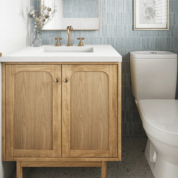
Renovating a bathroom is one of the most rewarding home improvement projects you can undertake. It adds immediate value to your property and elevates your daily routine. However, designing the perfect space requires balancing aesthetics with practical utility. At the heart of this balance is the vanity — it is the functional hub where you get ready each morning, a vital storage unit, and the visual centerpiece of the room.
To ensure you make the right investment, here is an in-depth look at choosing a bathroom vanity that blends style, longevity, and everyday functionality.
1. Assessing the Layout and Space Constraints
Before you fall in love with a specific design or finish, you must determine what your bathroom can physically handle. Scale is everything. A vanity that is too large disrupts traffic flow, while one that is too small gets lost visually and lacks adequate storage.
The next major step is determining the scale of your plumbing fixtures. Understanding how to choose a bathroom sink and vanity setup comes down to a simple choice: single or double sinks. Your choice will depend on who uses the bathroom and the overall footprint of the space.
Single Sink Vanities
Typically ranging from 20 to 48 inches (50–120 cm) in width, single vanities are the ideal choice for powder rooms, guest bathrooms, or small master suites. For very compact spaces, you can find narrower options starting around 16 inches (40 cm). The major advantage of a single-sink layout is that it provides more usable countertop space for cosmetics, toiletries, and decorative items. If you want to skip the guesswork and invest in a premium, beautifully handcrafted fixture, explore the luxury collections at Willow Bath and Vanity. From elegant single vanities to spacious double setups, their masterfully built furniture combines solid wood construction with elite styling to transform any bathroom into a spa-like retreat.
Double Sink Vanities
Usually starting at 48 inches (120 cm) and extending up to 72 inches (180 cm) or more, double vanities are a lifesaver for shared master bathrooms. They allow two people to get ready simultaneously without fighting for sink space. Keep in mind that a double vanity naturally reduces both cabinet storage space and countertop real estate since a second sink basin and plumbing lines take up substantial interior room.
Sink Types to Consider
The countertop is the workhorse of the bathroom. It regularly comes into contact with running water, toothpaste, soapy residue, and high-heat styling tools. Knowing how to choose a bathroom vanity top requires evaluating how much maintenance you are willing to perform against the look you want to achieve. Material Pros Cons Maintenance Level Quartz Highly durable, non-porous, stain and scratch-resistant. Offers the look of stone without the hassle. Premium pricing; can show seams on very large custom layouts. Low (No sealing required) Marble Timeless, elegant, and luxurious. Every slab features a completely unique veining pattern. Porous; prone to scratching, etching from acids, and water stains. Requires careful daily use. High (Requires regular sealing) Granite Naturally strong, heat-resistant, and chemically stable. Unique earthy patterns. Porous; can chip if subjected to heavy impacts. Medium (Requires occasional sealing) When coordinating your countertop, ensure it complements your bathroom’s floor tiles, shower surround, and plumbing hardware to maintain visual harmony.
4. Selecting the Core Vanity Style and Finish
Once the functional components are locked in, you can focus on the architectural style of the vanity base. The base dictates the design theme of the entire room.
Conclusion
Choosing the perfect vanity is a step-by-step process that combines precise measurements with your personal design taste. By taking careful measurements, choosing between a single- or double-sink setup, and picking a durable counter material like quartz or granite, you can transform your bathroom into a beautiful, organized retreat. Prioritize high-quality materials and smart craftsmanship, and your new vanity will look spectacular and serve your household reliably for years to come.
1. Assessing the Layout and Space Constraints
Before you fall in love with a specific design or finish, you must determine what your bathroom can physically handle. Scale is everything. A vanity that is too large disrupts traffic flow, while one that is too small gets lost visually and lacks adequate storage.
- Take Precise Measurements: measure the available width, depth, and height. Remember to account for surrounding fixtures.
- Check Clearance Zones: ensure there is enough clearance for the bathroom door to swing open, for shower glass doors to clear the vanity, and for drawers and cabinet doors to extend fully without hitting the toilet or walls.
-
Locate Existing Plumbing: moving pipes can significantly increase renovation costs. If you want a seamless installation, look for a vanity configuration that aligns easily with your current plumbing setup.
The next major step is determining the scale of your plumbing fixtures. Understanding how to choose a bathroom sink and vanity setup comes down to a simple choice: single or double sinks. Your choice will depend on who uses the bathroom and the overall footprint of the space.
Single Sink Vanities
Typically ranging from 20 to 48 inches (50–120 cm) in width, single vanities are the ideal choice for powder rooms, guest bathrooms, or small master suites. For very compact spaces, you can find narrower options starting around 16 inches (40 cm). The major advantage of a single-sink layout is that it provides more usable countertop space for cosmetics, toiletries, and decorative items. If you want to skip the guesswork and invest in a premium, beautifully handcrafted fixture, explore the luxury collections at Willow Bath and Vanity. From elegant single vanities to spacious double setups, their masterfully built furniture combines solid wood construction with elite styling to transform any bathroom into a spa-like retreat.
Double Sink Vanities
Usually starting at 48 inches (120 cm) and extending up to 72 inches (180 cm) or more, double vanities are a lifesaver for shared master bathrooms. They allow two people to get ready simultaneously without fighting for sink space. Keep in mind that a double vanity naturally reduces both cabinet storage space and countertop real estate since a second sink basin and plumbing lines take up substantial interior room.
Sink Types to Consider
- Undermount: installed beneath the counter for a smooth, seamless surface that is incredibly easy to wipe down.
- Vessel: sits atop the counter like a decorative bowl. It makes a bold style statement but raises the overall height of the counter surface.
- Drop-In: features a lip that rests on the counter cutout. It is easier to install, but its edges can catch dirt.
-
The countertop is the workhorse of the bathroom. It regularly comes into contact with running water, toothpaste, soapy residue, and high-heat styling tools. Knowing how to choose a bathroom vanity top requires evaluating how much maintenance you are willing to perform against the look you want to achieve. Material Pros Cons Maintenance Level Quartz Highly durable, non-porous, stain and scratch-resistant. Offers the look of stone without the hassle. Premium pricing; can show seams on very large custom layouts. Low (No sealing required) Marble Timeless, elegant, and luxurious. Every slab features a completely unique veining pattern. Porous; prone to scratching, etching from acids, and water stains. Requires careful daily use. High (Requires regular sealing) Granite Naturally strong, heat-resistant, and chemically stable. Unique earthy patterns. Porous; can chip if subjected to heavy impacts. Medium (Requires occasional sealing) When coordinating your countertop, ensure it complements your bathroom’s floor tiles, shower surround, and plumbing hardware to maintain visual harmony.
4. Selecting the Core Vanity Style and Finish
Once the functional components are locked in, you can focus on the architectural style of the vanity base. The base dictates the design theme of the entire room.
- Freestanding vanities: sit directly on the floor, supported by legs or a solid kickboard base. This is a traditional, stable configuration that offers the maximum hidden cabinet and drawer storage space.
- Wall-Mounted (Floating) vanities: anchored directly onto the wall studs, leaving the floor underneath completely clear. Floating vanities are staples of modern, minimalist design. They create an illusion of space, making small rooms look larger, and make cleaning the bathroom floor incredibly easy.
- Console vanities: feature an open shelving design supported by a metal or wood frame. It offers a light, airy look reminiscent of a boutique hotel, though it sacrifices hidden storage.
Conclusion
Choosing the perfect vanity is a step-by-step process that combines precise measurements with your personal design taste. By taking careful measurements, choosing between a single- or double-sink setup, and picking a durable counter material like quartz or granite, you can transform your bathroom into a beautiful, organized retreat. Prioritize high-quality materials and smart craftsmanship, and your new vanity will look spectacular and serve your household reliably for years to come.

 Centre Sky Architecture Ltd
Ryan Day Thompson
Inspiration for a contemporary wooden u-shaped staircase remodel with wooden risers
Inspiration for a contemporary wooden u-shaped staircase remodel with wooden risers
135