Search results for "Reduce real time" in Home Design Ideas
This renovated brick rowhome in Boston’s South End offers a modern aesthetic within a historic structure, creative use of space, exceptional thermal comfort, a reduced carbon footprint, and a passive stream of income.
DESIGN PRIORITIES. The goals for the project were clear - design the primary unit to accommodate the family’s modern lifestyle, rework the layout to create a desirable rental unit, improve thermal comfort and introduce a modern aesthetic. We designed the street-level entry as a shared entrance for both the primary and rental unit. The family uses it as their everyday entrance - we planned for bike storage and an open mudroom with bench and shoe storage to facilitate the change from shoes to slippers or bare feet as they enter their home. On the main level, we expanded the kitchen into the dining room to create an eat-in space with generous counter space and storage, as well as a comfortable connection to the living space. The second floor serves as master suite for the couple - a bedroom with a walk-in-closet and ensuite bathroom, and an adjacent study, with refinished original pumpkin pine floors. The upper floor, aside from a guest bedroom, is the child's domain with interconnected spaces for sleeping, work and play. In the play space, which can be separated from the work space with new translucent sliding doors, we incorporated recreational features inspired by adventurous and competitive television shows, at their son’s request.
MODERN MEETS TRADITIONAL. We left the historic front facade of the building largely unchanged - the security bars were removed from the windows and the single pane windows were replaced with higher performing historic replicas. We designed the interior and rear facade with a vision of warm modernism, weaving in the notable period features. Each element was either restored or reinterpreted to blend with the modern aesthetic. The detailed ceiling in the living space, for example, has a new matte monochromatic finish, and the wood stairs are covered in a dark grey floor paint, whereas the mahogany doors were simply refinished. New wide plank wood flooring with a neutral finish, floor-to-ceiling casework, and bold splashes of color in wall paint and tile, and oversized high-performance windows (on the rear facade) round out the modern aesthetic.
RENTAL INCOME. The existing rowhome was zoned for a 2-family dwelling but included an undesirable, single-floor studio apartment at the garden level with low ceiling heights and questionable emergency egress. In order to increase the quality and quantity of space in the rental unit, we reimagined it as a two-floor, 1 or 2 bedroom, 2 bathroom apartment with a modern aesthetic, increased ceiling height on the lowest level and provided an in-unit washer/dryer. The apartment was listed with Jackie O'Connor Real Estate and rented immediately, providing the owners with a source of passive income.
ENCLOSURE WITH BENEFITS. The homeowners sought a minimal carbon footprint, enabled by their urban location and lifestyle decisions, paired with the benefits of a high-performance home. The extent of the renovation allowed us to implement a deep energy retrofit (DER) to address air tightness, insulation, and high-performance windows. The historic front facade is insulated from the interior, while the rear facade is insulated on the exterior. Together with these building enclosure improvements, we designed an HVAC system comprised of continuous fresh air ventilation, and an efficient, all-electric heating and cooling system to decouple the house from natural gas. This strategy provides optimal thermal comfort and indoor air quality, improved acoustic isolation from street noise and neighbors, as well as a further reduced carbon footprint. We also took measures to prepare the roof for future solar panels, for when the South End neighborhood’s aging electrical infrastructure is upgraded to allow them.
URBAN LIVING. The desirable neighborhood location allows the both the homeowners and tenant to walk, bike, and use public transportation to access the city, while each charging their respective plug-in electric cars behind the building to travel greater distances.
OVERALL. The understated rowhouse is now ready for another century of urban living, offering the owners comfort and convenience as they live life as an expression of their values.
Eric Roth Photo

Timber frame homes offer unique challenges during a remodel. What often makes them beautiful and attractive to most homeowners, also makes them challenging for space requirements.
Context: The lovely couple that owned this home were struggling with some interesting floor plan challenges that just didn't work for their family. The loved the beautiful timbers and woodwork of their home, but the dramatically sloping ceilings on the second floor, particularly in the bathroom, just didn't work for this 1 1/2 bath home. Needing to use the skylight to approach the toilet was a less then ideal scenario. Although the bathroom footprint was more then adequate, the sloped ceiling only made half of the space useable. Check out the Before/After post on our blog to see the photos of the house pre-renovation. As much as they loved all the wood features in their home, another challenge they had was light. The wood ceiling made everything inside the house darker, even with a fantastic array of south facing windows, there were spaces in the home that felt dark and small. When they contacted us they wanted to know how could they make their brighter and more inviting, were there solutions to the 2nd floor sloped ceiling issues, and if they were going to do all of this work, how could they make their home more comfortable and efficient. A nagging water leak in the upstairs bathroom spurred them into action and here is how we solved their dilemma.
Conclusion: First, we added a little dormer to the rear of the house so we could get full headroom in nearly all of the upstairs bathroom! Then we decided to extend that dormer one more timber bay over to create a walk in closet with natural light and plenty of space. Since we were contemplating energy efficiency, we resolved a nagging issue that is present in a lot of timber frame construction, air tightness. Commonly found in timber frame construction, fiberglass insulation is installed in the rafter bays and board ceilings are installed over top. Unfortunately, board ceilings are anything but air tight, and fiberglass insulation needs to be in an airtight cavity for maximum effectiveness. So we were able to solve two issues at the same time for this homeowner. We removed the board ceiling and fiberglass insulation, we dense packed the rafter bays with cellulose insulation, and installed sheetrock in place of the boards. The boards were salvaged for re-use by the homeowner, and the space and light quality was dramatically improved. Some may think that losing the board ceiling took something away from the space, but what you'll see in the pictures is that it highly accentuates the heavy timbers and really makes them stand out in a beautiful way. Now with this added airtightness, better insulation, and brighter space, the homeowner hardly runs their wood stove, and it's so quiet in the space, an added bonus from changing the insulation. It became necessary to also add a sheetrock ceiling to the living room to hide the plumbing from the new bathroom layout above. Changing this ceiling gave the homeowner some real quality lighting that was lacking in the living room before. The brighter ceiling and new lighting layout completely transforms the living room into a space you want to hang out, even though the layout didn't change at all. When the homeowner saw the finished spaces she said "I can't believe this is my house, I want to live in this house"
Energy Efficiency: I touched a little on the efficiency above, but like all projects done with Mottram Architecture, we always want to leave you with a little extra. Timber frame construction with board ceilings and fiberglass insulation are notoriously leaky! If you want to know what we think about fiberglass insulation, check our our blog post on Why Fiberglass Insulation Sucks. By installing cellulose insulation and covering it with sheetrock we were able to greatly reduce the heat flowing out of this home. It not only improves cashflow it improves the comfort level in the space. Who wants to sit in their living room and feel a draft? Let us remind you, we are not saying cellulose insulation is an air barrier, we use the sheetrock to help with that, but it does significantly reduce the air flow over fiberglass insulation. And when we reduce the airflow, we reduce the heat flow. And when we reduce the heat flow, we reduce the need to re-heat that drafty air from outside. When it comes to energy efficiency the first and best place to start is air infiltration. We greatly reduced the air infiltration with the new insulation, but we also added a hat and warm boots. What I mean by that is, we improved the insulation in the roof, and we installed insulation in the basement. Maybe it's a silly analogy, but when you think about keeping warm, we always start with the hat and boots! With sustainability in mind, the next project will be to add a deck to the front of this house with rain catchment barrels from the metal roof. They are planning to plant a garden in the spring and the rain catchment system will help to irrigate the new garden.
Builder: East Shore Builders
Photographer: Michael Eric Berube

u2014 ALE: Wayne Rain Garden
Pennsylvania Landscape & Nursery Association
u2014 ALE: Wayne Rain Garden
Terren Landscapes http://www.terrenlandscapes.com
2014 PLNA Awards for Landscape Excellence winner
Category: Residential Up to $15,000
Award Level: Gold
Project Description:
Our company was contracted by the client to provide a creative solution to an ongoing drainage problem. Their property is located within 30 feet of a local stream that collects storm water from the surrounding area. The nearby stream and high water table caused the lawn area at the side of their home to flood and to remain waterlogged for a few days after each storm. The client not only had difficulty growing plants in the existing conditions, but also had a problem with mosquitoes due to standing water.
Our goal was to design a self-contained, naturalistic rain garden that slowed storm water runoff, allowed for percolation, and promoted infiltration while permitting excess clean water to enter the nearby stream with diminished force. As designed, the rain garden allows the earth to slowly and more naturally
absorb excess storm water while filtering out toxins such as excess nitrogen and phosphorous which are frequently found in the landscape, therefore reducing the contaminants entering the stream.
A percolation test was conducted with criteria of absorbing a one-inch rainstorm within four hours without overflow. The one-inch storm calculation included an existing downspout from the home, which would be piped into the rain garden to reduce roof runoff. The first test failed due to a deep layer of high clay-content soil. Excavation continued until a layer of sandy loam was reached, the percolation test was repeated, and a successful test result was achieved. Next, the entire rain garden basin was excavated to the sandy loam layer and the soil amended with compost and sand to create a highly porous planting media.
Geotextile fabric was placed to help reduce migration of the surface stone into the soil and allow for minimal maintenance. Gravel, river stone and small boulders were carefully placed to achieve the look of a natural streambed.
A palette of mostly native plants with a few non-invasive ornamentals were chosen for their ability to survive in extreme conditions ranging from floods to drought and were placed according to their specific preferences.
Wetland plants were chosen for the lowest portion of the rain garden as that area remains saturated for longer periods of time, with a Chionanthus virginicus as a focal point surrounded by irises and ferns at the lowest depth.
Plants tolerant of drier conditions were chosen for the upper edges of the garden. The beautiful colors of Monarda, Ligularia, Eupatorium, Solidago, Chelone, and Rudbeckia were scattered within the upper edge, while movement and softness were incorporated by use of the graceful Nassella that lines the border. Finally, winter interest was provided with a backdrop of Cornus sericea.
As built, this small rain garden creates tremendous impact by decreasing the amount of storm water runoff not only on our client's property, but also in the neighboring stream. It serves as a means of slowing the water and providing an area for infiltration back into the earth. The plants provide a habitat for birds, butterflies, and insects, working in harmony with nature and providing beautiful visual interest year-round.
Photo Credit:
Lisa C. Falls
Find the right local pro for your project
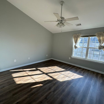
I did some interior remodeling a year or two ago on this house, going to do some more in 2014. The original part of the house was built in 1928 and has been added on to several times over the years. It's a real "storybook" kind of house!

© Jason Parker, Emerald Coast Real Estate Photography, LLC
Trendy concrete floor entryway photo in Miami

This old 1920's home is thought to be an original George Washington Smith home, has now been updated and extended by Architect Bob Easton of Santa Barbara.
Arched walls over stairs, plaster fireplaces, and very simple, comfortable design make for a very livable home for this family with multiple pets. Leather sofas for an easy feel, over antique hand knotted rugs and old world furniture show off this old Spanish home in the Ojai Valley. The Designers used periwinkle colored windows and doors to play off the black iron windows, and real Malibu tile with white marble tile surrounds around a blue granite kitchen island. The living room ceiling is completely original, and is the inspiration for the new exposed beam master suite ceilings. All the lighting is custom wrought iron fixtures, made especially for this home. A powder room features deep blue tiles and Malibu tile wainscot, the paintings are all of simple early California scenes which all make for an earthy, simple old time style, Project Location: Ojai, California. Project designed by Maraya Interior Design. From their beautiful resort town of Ojai, they serve clients in Montecito, Hope Ranch, Malibu, Westlake and Calabasas, across the tri-county areas of Santa Barbara, Ventura and Los Angeles, south to Hidden Hills- north through Solvang and more.

Tommy Daspit Photographer
Rear of house
Tommy Daspit offers the very best in architectural, commercial and real estate photography for the Birmingham, Alabama metro area.
If you are looking for high quality real estate photography, with a high level of professionalism, and fast turn around, contact Tommy Daspit Photographer (205) 516-6993 tommy@tommydaspit.com
You can view more of his work on this website: http://tommydaspit.com

Sponsored
Sunbury, OH
J.Holderby - Renovations
Franklin County's Leading General Contractors - 2X Best of Houzz!
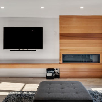
Fairfield, Iowa Modern Farmhouse Kitchen Design by Jim and Teresa Huffman
#JCHuffmanCabinetry
https://jchuffman.com/
Here is the design collaboration of two professionals – the homeowner, who is also a Real Estate Broker with a talent for design and the kitchen designer. The captivating result of their talent features a chef’s dream kitchen. Family and guests can join in the activities with island seating while everything is readily accessible for the cook in the cabinetry surrounding the multi-purpose island. This house remodel was designed with Modern Farmhouse style; warm, relaxing and full of charm delivering the feeling of a simpler time.

Download our free ebook, Creating the Ideal Kitchen. DOWNLOAD NOW
For many, extra time at home during COVID left them wanting more from their homes. Whether you realized the shortcomings of your space or simply wanted to combat boredom, a well-designed and functional home was no longer a want, it became a need. Tina found herself wanting more from her Old Irving Park home and reached out to The Kitchen Studio about adding function to her kitchen to make the most of the available real estate.
At the end of the day, there is nothing better than returning home to a bright and happy space you love. And this kitchen wasn’t that for Tina. Dark and dated, with a palette from the past and features that didn’t make the most of the available square footage, this remodel required vision and a fresh approach to the space. Lead designer, Stephanie Cole’s main design goal was better flow, while adding greater functionality with organized storage, accessible open shelving, and an overall sense of cohesion with the adjoining family room.
The original kitchen featured a large pizza oven, which was rarely used, yet its footprint limited storage space. The nearby pantry had become a catch-all, lacking the organization needed in the home. The initial plan was to keep the pizza oven, but eventually Tina realized she preferred the design possibilities that came from removing this cumbersome feature, with the goal of adding function throughout the upgraded and elevated space. Eliminating the pantry added square footage and length to the kitchen for greater function and more storage. This redesigned space reflects how she lives and uses her home, as well as her love for entertaining.
The kitchen features a classic, clean, and timeless palette. White cabinetry, with brass and bronze finishes, contrasts with rich wood flooring, and lets the large, deep blue island in Woodland’s custom color Harbor – a neutral, yet statement color – draw your eye.
The kitchen was the main priority. In addition to updating and elevating this space, Tina wanted to maximize what her home had to offer. From moving the location of the patio door and eliminating a window to removing an existing closet in the mudroom and the cluttered pantry, the kitchen footprint grew. Once the floorplan was set, it was time to bring cohesion to her home, creating connection between the kitchen and surrounding spaces.
The color palette carries into the mudroom, where we added beautiful new cabinetry, practical bench seating, and accessible hooks, perfect for guests and everyday living. The nearby bar continues the aesthetic, with stunning Carrara marble subway tile, hints of brass and bronze, and a design that further captures the vibe of the kitchen.
Every home has its unique design challenges. But with a fresh perspective and a bit of creativity, there is always a way to give the client exactly what they want [and need]. In this particular kitchen, the existing soffits and high slanted ceilings added a layer of complexity to the lighting layout and upper perimeter cabinets.
While a space needs to look good, it also needs to function well. This meant making the most of the height of the room and accounting for the varied ceiling features, while also giving Tina everything she wanted and more. Pendants and task lighting paired with an abundance of natural light amplify the bright aesthetic. The cabinetry layout and design compliments the soffits with subtle profile details that bring everything together. The tile selections add visual interest, drawing the eye to the focal area above the range. Glass-doored cabinets further customize the space and give the illusion of even more height within the room.
While her family may be grown and out of the house, Tina was focused on adding function without sacrificing a stunning aesthetic and dreamy finishes that make the kitchen the gathering place of any home. It was time to love her kitchen again, and if you’re wondering what she loves most, it’s the niche with glass door cabinetry and open shelving for display paired with the marble mosaic backsplash over the range and complimenting hood. Each of these features is a stunning point of interest within the kitchen – both brag-worthy additions to a perimeter layout that previously felt limited and lacking.
Whether your remodel is the result of special needs in your home or simply the excitement of focusing your energy on creating a fun new aesthetic, we are here for it. We love a good challenge because there is always a way to make a space better – adding function and beauty simultaneously.

The existing U-shaped kitchen was tucked away in a small corner while the dining table was swimming in a room much too large for its size. The client’s needs and the architecture of the home made it apparent that the perfect design solution for the home was to swap the spaces.
The homeowners entertain frequently and wanted the new layout to accommodate a lot of counter seating, a bar/buffet for serving hors d’oeuvres, an island with prep sink, and all new appliances. They had a strong preference that the hood be a focal point and wanted to go beyond a typical white color scheme even though they wanted white cabinets.
While moving the kitchen to the dining space gave us a generous amount of real estate to work with, two of the exterior walls are occupied with full-height glass creating a challenge how best to fulfill their wish list. We used one available wall for the needed tall appliances, taking advantage of its height to create the hood as a focal point. We opted for both a peninsula and island instead of one large island in order to maximize the seating requirements and create a barrier when entertaining so guests do not flow directly into the work area of the kitchen. This also made it possible to add a second sink as requested. Lastly, the peninsula sets up a well-defined path to the new dining room without feeling like you are walking through the kitchen. We used the remaining fourth wall for the bar/buffet.
Black cabinetry adds strong contrast in several areas of the new kitchen. Wire mesh wall cabinet doors at the bar and gold accents on the hardware, light fixtures, faucets and furniture add further drama to the concept. The focal point is definitely the black hood, looking both dramatic and cohesive at the same time.

© Erin Parker, Emerald Coast real Estate Photography, LLC
Bedroom - coastal bedroom idea in Miami with beige walls

Download our free ebook, Creating the Ideal Kitchen. DOWNLOAD NOW
For many, extra time at home during COVID left them wanting more from their homes. Whether you realized the shortcomings of your space or simply wanted to combat boredom, a well-designed and functional home was no longer a want, it became a need. Tina found herself wanting more from her Old Irving Park home and reached out to The Kitchen Studio about adding function to her kitchen to make the most of the available real estate.
At the end of the day, there is nothing better than returning home to a bright and happy space you love. And this kitchen wasn’t that for Tina. Dark and dated, with a palette from the past and features that didn’t make the most of the available square footage, this remodel required vision and a fresh approach to the space. Lead designer, Stephanie Cole’s main design goal was better flow, while adding greater functionality with organized storage, accessible open shelving, and an overall sense of cohesion with the adjoining family room.
The original kitchen featured a large pizza oven, which was rarely used, yet its footprint limited storage space. The nearby pantry had become a catch-all, lacking the organization needed in the home. The initial plan was to keep the pizza oven, but eventually Tina realized she preferred the design possibilities that came from removing this cumbersome feature, with the goal of adding function throughout the upgraded and elevated space. Eliminating the pantry added square footage and length to the kitchen for greater function and more storage. This redesigned space reflects how she lives and uses her home, as well as her love for entertaining.
The kitchen features a classic, clean, and timeless palette. White cabinetry, with brass and bronze finishes, contrasts with rich wood flooring, and lets the large, deep blue island in Woodland’s custom color Harbor – a neutral, yet statement color – draw your eye.
The kitchen was the main priority. In addition to updating and elevating this space, Tina wanted to maximize what her home had to offer. From moving the location of the patio door and eliminating a window to removing an existing closet in the mudroom and the cluttered pantry, the kitchen footprint grew. Once the floorplan was set, it was time to bring cohesion to her home, creating connection between the kitchen and surrounding spaces.
The color palette carries into the mudroom, where we added beautiful new cabinetry, practical bench seating, and accessible hooks, perfect for guests and everyday living. The nearby bar continues the aesthetic, with stunning Carrara marble subway tile, hints of brass and bronze, and a design that further captures the vibe of the kitchen.
Every home has its unique design challenges. But with a fresh perspective and a bit of creativity, there is always a way to give the client exactly what they want [and need]. In this particular kitchen, the existing soffits and high slanted ceilings added a layer of complexity to the lighting layout and upper perimeter cabinets.
While a space needs to look good, it also needs to function well. This meant making the most of the height of the room and accounting for the varied ceiling features, while also giving Tina everything she wanted and more. Pendants and task lighting paired with an abundance of natural light amplify the bright aesthetic. The cabinetry layout and design compliments the soffits with subtle profile details that bring everything together. The tile selections add visual interest, drawing the eye to the focal area above the range. Glass-doored cabinets further customize the space and give the illusion of even more height within the room.
While her family may be grown and out of the house, Tina was focused on adding function without sacrificing a stunning aesthetic and dreamy finishes that make the kitchen the gathering place of any home. It was time to love her kitchen again, and if you’re wondering what she loves most, it’s the niche with glass door cabinetry and open shelving for display paired with the marble mosaic backsplash over the range and complimenting hood. Each of these features is a stunning point of interest within the kitchen – both brag-worthy additions to a perimeter layout that previously felt limited and lacking.
Whether your remodel is the result of special needs in your home or simply the excitement of focusing your energy on creating a fun new aesthetic, we are here for it. We love a good challenge because there is always a way to make a space better – adding function and beauty simultaneously.

Sponsored
Sunbury, OH
J.Holderby - Renovations
Franklin County's Leading General Contractors - 2X Best of Houzz!
Product: Authentic Limestone for Exterior Living Spaces.
Ancient Surfaces
Contacts: (212) 461-0245
Email: Sales@ancientsurfaces.com
Website: www.AncientSurfaces.com
The design of external living spaces is known as the 'Al Fresco' design style as it is called in Italian. 'Al Fresco' translates into 'the open' or 'the cool/fresh exterior'. Customizing a fully functional outdoor kitchen, pizza oven, BBQ, fireplace or Jacuzzi pool spa all out of old reclaimed Mediterranean stone pieces is no easy task and shouldn’t be created out of the lowest common denominator of building materials such as concrete, Indian slates or Turkish travertine.
The one thing you can bet the farmhouse on is that when the entire process unravels and when your outdoor living space materializes from the architects rendering to real life, you will be guaranteed a true Mediterranean living experience if your choice of construction material was as authentic and possible to the Southern Mediterranean regions.
We believe that the coziness of your surroundings brought about by the creative usage of our antique stone elements will only amplify that authenticity.
whether you are enjoying a relaxing time soaking the sun inside one of our Jacuzzi spa stone fountains or sharing unforgettable memories with family and friends while baking your own pizzas in one of our outdoor BBQ pizza ovens, our stone designs will always evoke in most a feeling of euphoria and exultation that one only gets while being on vacation is some exotic European island surrounded with the pristine beauty of indigenous nature and ancient architecture...

After. Oversaw complete renovation of this house from design concept, through plans, to selection of finishes, surfaces and furnishings and fixtures. I'm proud to share that this renovation was featured in the New York Times Real Estate Section in January of 2017.

This sweet creekside retreat has a little bit of everything. Rustic, refined, quaint, clean, sweet, crisp & lovely. Time for a snooze... Silk and fur bedding with a view onto the master deck overlooking the creek.

Miller + Miller Real Estate |
The home features a heated outdoor second kitchen with multiple grills, stainless steel appliances, a stone fireplace, party area, reclaimed stone edifice, custom Mexican stone sink and cooking island which overlook the pool. Under the pergola, the outdoor second heated kitchen has an additional gas oven, built-in Viking grill with side sear burner, smoke drawer + rotisserie. High BTU Wok burner. PRIMO charcoal grill for precise grilling/smoking. Authentic MUGNAINI pizza oven great for entertaining ( cooks 2-3 pizzas at a time. ) Tumbled marble stone floors + a wood burning stone fireplace. The luxury home’s backyard patio and outdoor kitchen features multiple grills, stainless steel appliances, a stone fireplace, heaters, party area, reclaimed stone edifice, custom Mexican stone sink and cooking island which overlook the pool.
Photographed by MILLER+MILLER Architectural Photography

Photography by Matthew Momberger
Home theater - large contemporary enclosed carpeted and gray floor home theater idea in Los Angeles with a projector screen and gray walls

Stuart Wade, Envision Virtual Tours, Inc.
Envision Virtual Tours and High Resolution Photography is your best choice to find just what you are looking for in the Lake Burton Area . Knowing the areas and resources of Lake Burton is our specialty
Lake Burton is a 2,775 acre man-made lake with 62 miles of shoreline located in the northeastern corner of Georgia in Rabun County. It is the first lake in a five-lake series called the Tallulah River Watershed that follows the original course of the Tallulah River. The series of lakes starts with Lake Burton as the northernmost lake followed by Lake Seed, Lake Rabun, Lake Tallulah Falls and the eastern arm of Lake Tugalo (the western arm is formed by the Chattooga River. The lakes are owned and operated by the Georgia Power Company to generate hydroelectric energy for Georgia's largest city, Atlanta. At one time these lakes were the largest producers of electricity in the state of Georgia. Now, they only provide peak power supply.
The lake was built in a deep valley located along a 10 mile section of the Tallulah River. The Lake Burton Dam was closed on December 22, 1919 and the lake started to fill. The dam is a gravity concrete dam, with a height of 128 feet and a span of 1,100 feet. The spillway is equipped with eight gates 22 feet wide by 6.6 feet high. The total capacity at an elevation of 1,866.6 feet is 108,000 acre-ft, of which 106,000 acre-ft is usable storage. The generating capacity of the dam is 6,120 kilowatts (two units).Lake Burton is the highest Georgia Power lake in Georgia.
Lake Burton gets its named from the town of Burton, which was the second largest town in Rabun County with a population of approximately 200 but now lies below the lake's surface. The town (and the lake) was named after local prominent citizen Jeremiah Burton and was situated along the road from Clayton, Georgia to the Nacoochee Valley. Andrew Jackson Ritchie served as the postmaster for the area for several years. Gold was first discovered in Rabun County where Dicks Creek and the Tallulah River come together and was the reason for the town's founding in the early 1800s.
The Lake Burton Fish Hatchery and Moccasin Creek State Park are located on the western side of the lake. Lake Burton is home to several species of fish, including Spotted Bass, Largemouth Bass, White Bass, Black Crappie, Bluegill, Redear Sunfish, White Catfish, Walleye, Brown Trout, Rainbow Trout, and Yellow Perch.
The residents of Lake Burton are a mix of permanent residents and seasonal vacationers who together make-up the Lake Burton Civic Association, a local organization who goal is to maintain the lake through volunteer clean-ups and other such events. Let a Lake Burton resident and expert show you the way
The Lake Burton Civic Association is an active homeowners association for residents of the Lake Burton area and sponsors many events throughout the year such as:
burton, custom, envision, georgia, lake, mountain, nc, north, photography, web, western, Lake Burton, Lake Rabun, Seed Lake,Virtual Tours.

When my client had to move from her company office to work at home, she set up in the dining room. Despite her best efforts, this was not the long-term solution she was looking for. My client realized she needed a dedicated space not on the main floor of the home. On one hand, having your office space right next to the kitchen is handy. On the other hand, it made separating work and home life was not that easy.
The house was a ranch. In essence, the basement would run entire length of the home. As we came down the steps, we entered a time capsule. The house was built in the 1950’s. The walls were covered with original knotty pine paneling. There was a wood burning fireplace and considering this was a basement, high ceilings. In addition, there was everything her family could not store at their own homes. As we wound though the space, I though “wow this has potential”, Eventually, after walking through the laundry room we came to a small nicely lit room. This would be the office.
My client looked at me and asked what I thought. Undoubtedly, I said, this can be a great workspace, but do you really want to walk through this basement and laundry to get here? Without reservation, my client said where do we start?
Once the design was in place, we started the renovation. The knotty pine paneling had to go. Specifically, to add some insulation and control the dampness and humidity. The laundry room wall was relocated to create a hallway to the office.
At the far end of the room, we designated a workout zone. Weights, mats, exercise bike and television are at the ready for morning or afternoon workouts. The space can be concealed by a folding screen for party time. Doors to an old closet under the stairs were relocated to the workout area for hidden storage. Now we had nice wall for a beautiful console and mirror for storage and serving during parties.
In order to add architectural details, we covered the old ugly support columns with simple recessed millwork panels. This detail created a visual division between the bar area and the seating area in front of the fireplace. The old red brick on the fireplace surround was replaced with stack stone. A mantle was made from reclaimed wood. Additional reclaimed wood floating shelves left and right of the fireplace provides decorative display while maintaining a rustic element balancing the copper end table and leather swivel rocker.
We found an amazing rug which tied all of the colors together further defining the gathering space. Russet and burnt orange became the accent color unifying each space. With a bit of whimsy, a rather unusual light fixture which looks like roots from a tree growing through the ceiling is a conversation piece.
The office space is quite and removed from the main part of the basement. There is a desk large enough for multiple screens, a small bookcase holding office supplies and a comfortable chair for conference calls. Because working from home requires many online meetings, we added a shiplap wall painted in Hale Navy to contrast with the orange fabric on the chair. We finished the décor with a painting from my client’s father. This is the background online visitors will see.
The last and best part of the renovation is the beautiful bar. My client is an avid collector of wine. She already had the EuroCave refrigerator, so I incorporated it into the design. The cabinets are painted Temptation Grey from Benjamin Moore. The counter tops are my favorite hard working quartzite Brown Fantasy. The backsplash is a combination of rustic wood and old tin ceiling like porcelain tiles. Together with the textures of the reclaimed wood and hide poofs balanced against the smooth finish of the cabinets, we created a comfortable luxury for relaxing.
There is ample storage for bottles, cans, glasses, and anything else you can think of for a great party. In addition to the wine storage, we incorporated a beverage refrigerator, an ice maker, and a sink. Floating shelves with integrated lighting illuminate the back bar. The raised height of the front bar provides the perfect wine tasting and paring spot. I especially love the pendant lights which look like wine glasses.
Finally, I selected carpet for the stairs and office. It is perfect for noise reduction. Meanwhile for the overall flooring, I specifically selected a high-performance vinyl plank floor. We often use this product as it is perfect to install on a concrete floor. It is soft to walk on, easy to clean and does not reduce the overall height of the space.
1