
Search results for "Reduce same" in Home Design Ideas
 Designs by KS
Project: Pelton Avenue - Coquitlam
Builder: Furtado Contracting
About this Project
We partnered up with Furtado Contracting to transform the main floor and foyer of this Greater Vancouver classic home. Also referred to as the “Vancouver Special” this style of home was popular in the 60’s-80’s and has been re-decorated and renovated ever since.
Layout Details:
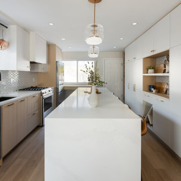
By eliminating the wall between the dining room and kitchen, and reducing the length of the hallway wall, we were able to create a large open concept space.
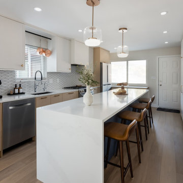
The previous u-shape kitchen turned into a large galley kitchen, which allowed us to incorporate an island with seating for four.
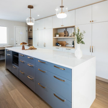
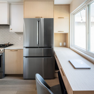
With the major appliances being housed on the window wall, we designed a large pantry space spanning from wall-to-wall to store all the necessities from food to cleaning supplies. Its niche not only breaks up the cabinets to add some personality but can be used as a wine/coffee area. On the far end of the kitchen, the pantry wall extends to a narrow cabinet that has been designed to act as a mudroom; a place for shoes and jackets near the back door. At the back of the kitchen you will also find a working space, that has been tied into the fridge area with some careful space planning.
Material Details:
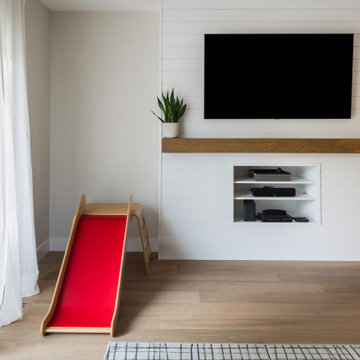
The living room and foyer received an upgrade with new flooring, light fixtures, paint, and a converted fireplace to A/V wall with a rustic wooden mantle.
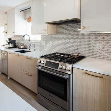
In the kitchen, woodgrain cabinets made from durable laminate are paired with painted materials. A 1” shaker door painted in our favourite Benjamin Moore “Silver Satin” is seen on the upper cabinets only. This special detail is complimented with bronze knobs by Marathon Hardware. The same colour is seen on the pantry wall in a slab door, making it sleeker. The island is painted in Benjamin Moore “Black Pepper”, is paired with bronze hardware by Marathon Hardware and is clad in quartz, Silestone’s “Calcatta Gold” to be specific. Quartz is a go-to material if maintenance is not your thing!
Special Mentions:
There are so many amazing things about this project. All the light fixtures were supplied by Robinson Lighting, and include Canadian company Kuzco Lighting, as seen in the kitchen, entry and foyer. The black accents on the sink by Blanco and faucet by Grohe added some contrast against the backsplash by Julian Tile.
 Designs by KS
Project: Pelton Avenue - Coquitlam
Builder: Furtado Contracting
About this Project
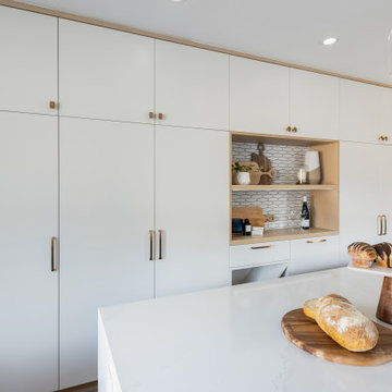
We partnered up with Furtado Contracting to transform the main floor and foyer of this Greater Vancouver classic home. Also referred to as the “Vancouver Special” this style of home was popular in the 60’s-80’s and has been re-decorated and renovated ever since.
Layout Details:
By eliminating the wall between the dining room and kitchen, and reducing the length of the hallway wall, we were able to create a large open concept space.
The previous u-shape kitchen turned into a large galley kitchen, which allowed us to incorporate an island with seating for four.
With the major appliances being housed on the window wall, we designed a large pantry space spanning from wall-to-wall to store all the necessities from food to cleaning supplies. Its niche not only breaks up the cabinets to add some personality but can be used as a wine/coffee area. On the far end of the kitchen, the pantry wall extends to a narrow cabinet that has been designed to act as a mudroom; a place for shoes and jackets near the back door. At the back of the kitchen you will also find a working space, that has been tied into the fridge area with some careful space planning.
Material Details:
The living room and foyer received an upgrade with new flooring, light fixtures, paint, and a converted fireplace to A/V wall with a rustic wooden mantle.
In the kitchen, woodgrain cabinets made from durable laminate are paired with painted materials. A 1” shaker door painted in our favourite Benjamin Moore “Silver Satin” is seen on the upper cabinets only. This special detail is complimented with bronze knobs by Marathon Hardware. The same colour is seen on the pantry wall in a slab door, making it sleeker. The island is painted in Benjamin Moore “Black Pepper”, is paired with bronze hardware by Marathon Hardware and is clad in quartz, Silestone’s “Calcatta Gold” to be specific. Quartz is a go-to material if maintenance is not your thing!
Special Mentions:
There are so many amazing things about this project. All the light fixtures were supplied by Robinson Lighting, and include Canadian company Kuzco Lighting, as seen in the kitchen, entry and foyer. The black accents on the sink by Blanco and faucet by Grohe added some contrast against the backsplash by Julian Tile.

 Chester County Kitchen & Bath
Three projects at once?! Why not? These were some brave customers! We started by gutting the kitchen and the master bathroom at the same time. By the time the master was in working order, we tackled the hall bathroom. A succinct and perfectly timed series of projects.
John Noland expertly designed this roomy kitchen to create better flow for cooking and entertaining. He used Fieldstone Bainbridge cabinets in Butterscotch. The new speed oven and wall oven were moved conveniently to the other side of the bar, giving more room for the refrigerator, and a large induction cooktop. The kitchen now had the practicality it was missing. Other features include the natural stone tile floor in a pin wheel design, the large island for seating and storage and all topped by peacock green granite. The homeowners provided a reception at the completion of the project which was much appreciated by all of the contractors working on the job!
Find the right local pro for your project
 Designs by KS
Project: Pelton Avenue - Coquitlam
Builder: Furtado Contracting
About this Project
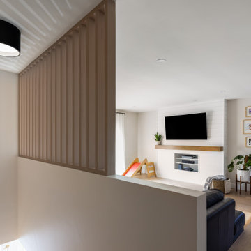
We partnered up with Furtado Contracting to transform the main floor and foyer of this Greater Vancouver classic home. Also referred to as the “Vancouver Special” this style of home was popular in the 60’s-80’s and has been re-decorated and renovated ever since.
Layout Details:
By eliminating the wall between the dining room and kitchen, and reducing the length of the hallway wall, we were able to create a large open concept space.
The previous u-shape kitchen turned into a large galley kitchen, which allowed us to incorporate an island with seating for four.
With the major appliances being housed on the window wall, we designed a large pantry space spanning from wall-to-wall to store all the necessities from food to cleaning supplies. Its niche not only breaks up the cabinets to add some personality but can be used as a wine/coffee area. On the far end of the kitchen, the pantry wall extends to a narrow cabinet that has been designed to act as a mudroom; a place for shoes and jackets near the back door. At the back of the kitchen you will also find a working space, that has been tied into the fridge area with some careful space planning.
Material Details:
The living room and foyer received an upgrade with new flooring, light fixtures, paint, and a converted fireplace to A/V wall with a rustic wooden mantle.
In the kitchen, woodgrain cabinets made from durable laminate are paired with painted materials. A 1” shaker door painted in our favourite Benjamin Moore “Silver Satin” is seen on the upper cabinets only. This special detail is complimented with bronze knobs by Marathon Hardware. The same colour is seen on the pantry wall in a slab door, making it sleeker. The island is painted in Benjamin Moore “Black Pepper”, is paired with bronze hardware by Marathon Hardware and is clad in quartz, Silestone’s “Calcatta Gold” to be specific. Quartz is a go-to material if maintenance is not your thing!
Special Mentions:
There are so many amazing things about this project. All the light fixtures were supplied by Robinson Lighting, and include Canadian company Kuzco Lighting, as seen in the kitchen, entry and foyer. The black accents on the sink by Blanco and faucet by Grohe added some contrast against the backsplash by Julian Tile.
 Ellen Farber Strategic Design
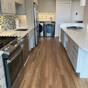
The kitchen was originally planned to mimic the location of appliances in her current kitchen to minimize re-learning of appliance locations. The only change was adding a trash cabinet between the fridge and the sink. A french door fridge allows someone in a wheelchair to easily access frozen and cold foods, while the water and ice dispenser on the outside of the door make it easy to stay hydrated rather than using the sink each time. She can roll up to the kitchen sink or stand at counter height to put away dishes from the dishwasher. The dishwasher is ADA and very simple to use , and is raised off the floor so whether she is sitting or standing it's easier to reach. The gas cooktop has controls at the front making it easy to reach from the wheelchair and the exhaust fan above also has a control at the front. All cabinet door handles are D-shape, which makes them easy to grasp and there is plenty of electric outlets for charging phones, computers and small appliances. The kitchen island is table height at 30" so meal prep can be easily done in a wheelchair while guests and can be seated in a chair or wheelchair around the island. The dining chairs can also be turned around to add extra seating in the living room area. Pendant lights above the kitchen island light up the space, while recessed lighting in the kitchen and living room provide overall room lighting. There is also under cabinet lighting which makes the room glow at night! Wainscoting made of commercial grade material is strategically placed on sharp corners and exposed walls to reduce and minimize damage from the wheel chair, while creating a finished and complete look! We selected a free standing microwave to sit below the island, which is easy to use and is the same style as in her previous apartment. The island is 48" from the appliance wall, leaving ample space to open doors and maneuver around in the wheelchair and has easy access to the laundry area as well. We eliminated the pocket doors that had been in front of the laundry area for easy access, and since it was exposed, dressed it up with coordinating tile to the kitchen with additional cabinets above. There is a coordinating quartz counter on top of the washer and dryer for folding laundry or storing additional supplies.
 Designs by KS
Project: Pelton Avenue - Coquitlam
Builder: Furtado Contracting
About this Project
We partnered up with Furtado Contracting to transform the main floor and foyer of this Greater Vancouver classic home. Also referred to as the “Vancouver Special” this style of home was popular in the 60’s-80’s and has been re-decorated and renovated ever since.
Layout Details:
By eliminating the wall between the dining room and kitchen, and reducing the length of the hallway wall, we were able to create a large open concept space.
The previous u-shape kitchen turned into a large galley kitchen, which allowed us to incorporate an island with seating for four.
With the major appliances being housed on the window wall, we designed a large pantry space spanning from wall-to-wall to store all the necessities from food to cleaning supplies. Its niche not only breaks up the cabinets to add some personality but can be used as a wine/coffee area. On the far end of the kitchen, the pantry wall extends to a narrow cabinet that has been designed to act as a mudroom; a place for shoes and jackets near the back door. At the back of the kitchen you will also find a working space, that has been tied into the fridge area with some careful space planning.
Material Details:
The living room and foyer received an upgrade with new flooring, light fixtures, paint, and a converted fireplace to A/V wall with a rustic wooden mantle.
In the kitchen, woodgrain cabinets made from durable laminate are paired with painted materials. A 1” shaker door painted in our favourite Benjamin Moore “Silver Satin” is seen on the upper cabinets only. This special detail is complimented with bronze knobs by Marathon Hardware. The same colour is seen on the pantry wall in a slab door, making it sleeker. The island is painted in Benjamin Moore “Black Pepper”, is paired with bronze hardware by Marathon Hardware and is clad in quartz, Silestone’s “Calcatta Gold” to be specific. Quartz is a go-to material if maintenance is not your thing!
Special Mentions:
There are so many amazing things about this project. All the light fixtures were supplied by Robinson Lighting, and include Canadian company Kuzco Lighting, as seen in the kitchen, entry and foyer. The black accents on the sink by Blanco and faucet by Grohe added some contrast against the backsplash by Julian Tile.
 Designs by KS
Project: Pelton Avenue - Coquitlam
Builder: Furtado Contracting
About this Project
We partnered up with Furtado Contracting to transform the main floor and foyer of this Greater Vancouver classic home. Also referred to as the “Vancouver Special” this style of home was popular in the 60’s-80’s and has been re-decorated and renovated ever since.
Layout Details:
By eliminating the wall between the dining room and kitchen, and reducing the length of the hallway wall, we were able to create a large open concept space.
The previous u-shape kitchen turned into a large galley kitchen, which allowed us to incorporate an island with seating for four.
With the major appliances being housed on the window wall, we designed a large pantry space spanning from wall-to-wall to store all the necessities from food to cleaning supplies. Its niche not only breaks up the cabinets to add some personality but can be used as a wine/coffee area. On the far end of the kitchen, the pantry wall extends to a narrow cabinet that has been designed to act as a mudroom; a place for shoes and jackets near the back door. At the back of the kitchen you will also find a working space, that has been tied into the fridge area with some careful space planning.
Material Details:
The living room and foyer received an upgrade with new flooring, light fixtures, paint, and a converted fireplace to A/V wall with a rustic wooden mantle.
In the kitchen, woodgrain cabinets made from durable laminate are paired with painted materials. A 1” shaker door painted in our favourite Benjamin Moore “Silver Satin” is seen on the upper cabinets only. This special detail is complimented with bronze knobs by Marathon Hardware. The same colour is seen on the pantry wall in a slab door, making it sleeker. The island is painted in Benjamin Moore “Black Pepper”, is paired with bronze hardware by Marathon Hardware and is clad in quartz, Silestone’s “Calcatta Gold” to be specific. Quartz is a go-to material if maintenance is not your thing!
Special Mentions:
There are so many amazing things about this project. All the light fixtures were supplied by Robinson Lighting, and include Canadian company Kuzco Lighting, as seen in the kitchen, entry and foyer. The black accents on the sink by Blanco and faucet by Grohe added some contrast against the backsplash by Julian Tile.
Sponsored
Sunbury, OH

J.Holderby - Renovations
Franklin County's Leading General Contractors - 2X Best of Houzz!
 Ellen Farber Strategic Design
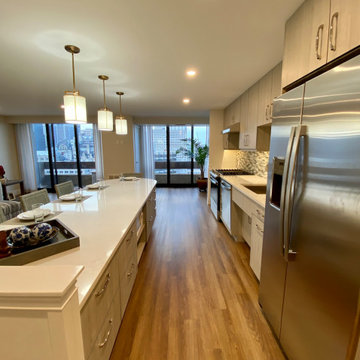
The kitchen was originally planned to mimic the location of appliances in her current kitchen to minimize re-learning of appliance locations. The only change was adding a trash cabinet between the fridge and the sink. A french door fridge allows someone in a wheelchair to easily access frozen and cold foods, while the water and ice dispenser on the outside of the door make it easy to stay hydrated rather than using the sink each time. She can roll up to the kitchen sink due to the recessed cabinetry under the sink or stand at counter height to put away dishes from the dishwasher. The dishwasher is ADA and very simple to use , and is raised off the floor so whether she is sitting or standing it's easier to reach. The gas cooktop has controls at the front making it easy to reach from the wheelchair and the exhaust fan above also has a control at the front. All cabinet door handles are D-shape, which makes them easy to grasp and there is plenty of electric outlets for charging phones, computers and small appliances. The kitchen island is table height at 30" so meal prep can be easily done in a wheelchair while guests and can be seated in a chair or wheelchair around the island. The dining chairs can also be turned around to add extra seating in the living room area. Pendant lights above the kitchen island light up the space, while recessed lighting in the kitchen and living room provide overall room lighting. There is also under cabinet lighting which makes the room glow at night! Wainscoting made of commercial grade material is strategically placed on sharp corners and exposed walls to reduce and minimize damage from the wheel chair, while creating a finished and complete look! We selected a free standing microwave to sit below the island, which is easy to use and is the same style as in her previous apartment. The island is 48" from the appliance wall, leaving ample space to open doors and maneuver around in the wheelchair and has easy access to the laundry area as well. We eliminated the pocket doors that had been in front of the laundry area for easy access, and since it was exposed, dressed it up with coordinating tile to the kitchen with additional cabinets above. There is a coordinating quartz counter on top of the washer and dryer for folding laundry or storing additional supplies.
 Designs by KS
Project: Pelton Avenue - Coquitlam
Builder: Furtado Contracting
About this Project
We partnered up with Furtado Contracting to transform the main floor and foyer of this Greater Vancouver classic home. Also referred to as the “Vancouver Special” this style of home was popular in the 60’s-80’s and has been re-decorated and renovated ever since.
Layout Details:
By eliminating the wall between the dining room and kitchen, and reducing the length of the hallway wall, we were able to create a large open concept space.
The previous u-shape kitchen turned into a large galley kitchen, which allowed us to incorporate an island with seating for four.
With the major appliances being housed on the window wall, we designed a large pantry space spanning from wall-to-wall to store all the necessities from food to cleaning supplies. Its niche not only breaks up the cabinets to add some personality but can be used as a wine/coffee area. On the far end of the kitchen, the pantry wall extends to a narrow cabinet that has been designed to act as a mudroom; a place for shoes and jackets near the back door. At the back of the kitchen you will also find a working space, that has been tied into the fridge area with some careful space planning.
Material Details:
The living room and foyer received an upgrade with new flooring, light fixtures, paint, and a converted fireplace to A/V wall with a rustic wooden mantle.
In the kitchen, woodgrain cabinets made from durable laminate are paired with painted materials. A 1” shaker door painted in our favourite Benjamin Moore “Silver Satin” is seen on the upper cabinets only. This special detail is complimented with bronze knobs by Marathon Hardware. The same colour is seen on the pantry wall in a slab door, making it sleeker. The island is painted in Benjamin Moore “Black Pepper”, is paired with bronze hardware by Marathon Hardware and is clad in quartz, Silestone’s “Calcatta Gold” to be specific. Quartz is a go-to material if maintenance is not your thing!
Special Mentions:
There are so many amazing things about this project. All the light fixtures were supplied by Robinson Lighting, and include Canadian company Kuzco Lighting, as seen in the kitchen, entry and foyer. The black accents on the sink by Blanco and faucet by Grohe added some contrast against the backsplash by Julian Tile.
 Designs by KS
Project: Pelton Avenue - Coquitlam
Builder: Furtado Contracting
About this Project
We partnered up with Furtado Contracting to transform the main floor and foyer of this Greater Vancouver classic home. Also referred to as the “Vancouver Special” this style of home was popular in the 60’s-80’s and has been re-decorated and renovated ever since.
Layout Details:
By eliminating the wall between the dining room and kitchen, and reducing the length of the hallway wall, we were able to create a large open concept space.
The previous u-shape kitchen turned into a large galley kitchen, which allowed us to incorporate an island with seating for four.
With the major appliances being housed on the window wall, we designed a large pantry space spanning from wall-to-wall to store all the necessities from food to cleaning supplies. Its niche not only breaks up the cabinets to add some personality but can be used as a wine/coffee area. On the far end of the kitchen, the pantry wall extends to a narrow cabinet that has been designed to act as a mudroom; a place for shoes and jackets near the back door. At the back of the kitchen you will also find a working space, that has been tied into the fridge area with some careful space planning.
Material Details:
The living room and foyer received an upgrade with new flooring, light fixtures, paint, and a converted fireplace to A/V wall with a rustic wooden mantle.
In the kitchen, woodgrain cabinets made from durable laminate are paired with painted materials. A 1” shaker door painted in our favourite Benjamin Moore “Silver Satin” is seen on the upper cabinets only. This special detail is complimented with bronze knobs by Marathon Hardware. The same colour is seen on the pantry wall in a slab door, making it sleeker. The island is painted in Benjamin Moore “Black Pepper”, is paired with bronze hardware by Marathon Hardware and is clad in quartz, Silestone’s “Calcatta Gold” to be specific. Quartz is a go-to material if maintenance is not your thing!
Special Mentions:
There are so many amazing things about this project. All the light fixtures were supplied by Robinson Lighting, and include Canadian company Kuzco Lighting, as seen in the kitchen, entry and foyer. The black accents on the sink by Blanco and faucet by Grohe added some contrast against the backsplash by Julian Tile.
 Designs by KS
Project: Pelton Avenue - Coquitlam
Builder: Furtado Contracting
About this Project
We partnered up with Furtado Contracting to transform the main floor and foyer of this Greater Vancouver classic home. Also referred to as the “Vancouver Special” this style of home was popular in the 60’s-80’s and has been re-decorated and renovated ever since.
Layout Details:
By eliminating the wall between the dining room and kitchen, and reducing the length of the hallway wall, we were able to create a large open concept space.
The previous u-shape kitchen turned into a large galley kitchen, which allowed us to incorporate an island with seating for four.
With the major appliances being housed on the window wall, we designed a large pantry space spanning from wall-to-wall to store all the necessities from food to cleaning supplies. Its niche not only breaks up the cabinets to add some personality but can be used as a wine/coffee area. On the far end of the kitchen, the pantry wall extends to a narrow cabinet that has been designed to act as a mudroom; a place for shoes and jackets near the back door. At the back of the kitchen you will also find a working space, that has been tied into the fridge area with some careful space planning.
Material Details:
The living room and foyer received an upgrade with new flooring, light fixtures, paint, and a converted fireplace to A/V wall with a rustic wooden mantle.
In the kitchen, woodgrain cabinets made from durable laminate are paired with painted materials. A 1” shaker door painted in our favourite Benjamin Moore “Silver Satin” is seen on the upper cabinets only. This special detail is complimented with bronze knobs by Marathon Hardware. The same colour is seen on the pantry wall in a slab door, making it sleeker. The island is painted in Benjamin Moore “Black Pepper”, is paired with bronze hardware by Marathon Hardware and is clad in quartz, Silestone’s “Calcatta Gold” to be specific. Quartz is a go-to material if maintenance is not your thing!
Special Mentions:
There are so many amazing things about this project. All the light fixtures were supplied by Robinson Lighting, and include Canadian company Kuzco Lighting, as seen in the kitchen, entry and foyer. The black accents on the sink by Blanco and faucet by Grohe added some contrast against the backsplash by Julian Tile.

 Katie Hutchison Studio
The new owners of this house in Harvard, Massachusetts loved its location and authentic Shaker characteristics, but weren’t fans of its curious layout. A dated first-floor full bathroom could only be accessed by going up a few steps to a landing, opening the bathroom door and then going down the same number of steps to enter the room. The dark kitchen faced the driveway to the north, rather than the bucolic backyard fields to the south. The dining space felt more like an enlarged hall and could only comfortably seat four. Upstairs, a den/office had a woefully low ceiling; the master bedroom had limited storage, and a sad full bathroom featured a cramped shower.
KHS proposed a number of changes to create an updated home where the owners could enjoy cooking, entertaining, and being connected to the outdoors from the first-floor living spaces, while also experiencing more inviting and more functional private spaces upstairs.
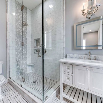
On the first floor, the primary change was to capture space that had been part of an upper-level screen porch and convert it to interior space. To make the interior expansion seamless, we raised the floor of the area that had been the upper-level porch, so it aligns with the main living level, and made sure there would be no soffits in the planes of the walls we removed. We also raised the floor of the remaining lower-level porch to reduce the number of steps required to circulate from it to the newly expanded interior. New patio door systems now fill the arched openings that used to be infilled with screen. The exterior interventions (which also included some new casement windows in the dining area) were designed to be subtle, while affording significant improvements on the interior. Additionally, the first-floor bathroom was reconfigured, shifting one of its walls to widen the dining space, and moving the entrance to the bathroom from the stair landing to the kitchen instead.
These changes (which involved significant structural interventions) resulted in a much more open space to accommodate a new kitchen with a view of the lush backyard and a new dining space defined by a new built-in banquette that comfortably seats six, and -- with the addition of a table extension -- up to eight people.
Upstairs in the den/office, replacing the low, board ceiling with a raised, plaster, tray ceiling that springs from above the original board-finish walls – newly painted a light color -- created a much more inviting, bright, and expansive space. Re-configuring the master bath to accommodate a larger shower and adding built-in storage cabinets in the master bedroom improved comfort and function. A new whole-house color palette rounds out the improvements.
Photos by Katie Hutchison
 Katie Hutchison Studio
The new owners of this house in Harvard, Massachusetts loved its location and authentic Shaker characteristics, but weren’t fans of its curious layout. A dated first-floor full bathroom could only be accessed by going up a few steps to a landing, opening the bathroom door and then going down the same number of steps to enter the room. The dark kitchen faced the driveway to the north, rather than the bucolic backyard fields to the south. The dining space felt more like an enlarged hall and could only comfortably seat four. Upstairs, a den/office had a woefully low ceiling; the master bedroom had limited storage, and a sad full bathroom featured a cramped shower.
KHS proposed a number of changes to create an updated home where the owners could enjoy cooking, entertaining, and being connected to the outdoors from the first-floor living spaces, while also experiencing more inviting and more functional private spaces upstairs.
On the first floor, the primary change was to capture space that had been part of an upper-level screen porch and convert it to interior space. To make the interior expansion seamless, we raised the floor of the area that had been the upper-level porch, so it aligns with the main living level, and made sure there would be no soffits in the planes of the walls we removed. We also raised the floor of the remaining lower-level porch to reduce the number of steps required to circulate from it to the newly expanded interior. New patio door systems now fill the arched openings that used to be infilled with screen. The exterior interventions (which also included some new casement windows in the dining area) were designed to be subtle, while affording significant improvements on the interior. Additionally, the first-floor bathroom was reconfigured, shifting one of its walls to widen the dining space, and moving the entrance to the bathroom from the stair landing to the kitchen instead.
These changes (which involved significant structural interventions) resulted in a much more open space to accommodate a new kitchen with a view of the lush backyard and a new dining space defined by a new built-in banquette that comfortably seats six, and -- with the addition of a table extension -- up to eight people.
Upstairs in the den/office, replacing the low, board ceiling with a raised, plaster, tray ceiling that springs from above the original board-finish walls – newly painted a light color -- created a much more inviting, bright, and expansive space. Re-configuring the master bath to accommodate a larger shower and adding built-in storage cabinets in the master bedroom improved comfort and function. A new whole-house color palette rounds out the improvements.
Photos by Katie Hutchison
Sponsored
Fredericksburg, OH

High Point Cabinets
Columbus' Experienced Custom Cabinet Builder | 4x Best of Houzz Winner

 ZeroEnergy Design
This LEED Platinum certified house reflects the homeowner's desire for an exceptionally healthy and comfortable living environment, within a traditional neighborhood.
INFILL SITE. The family, who moved from another area of Wellesley, sought out this property to be within walking distance of the high school and downtown area. An existing structure on the tight lot was removed to make way for the new home. 84% of the construction waste, from both the previous structure and the new home, was diverted from a landfill. ZED designed to preserve the existing mature trees on the perimeter of the property to minimize site impacts, and to maintain the character of the neighborhood as well as privacy on the site.
EXTERIOR EXPRESSION. The street facade of the home relates to the local New England vernacular. The rear uses contemporary language, a nod to the family’s Californian roots, to incorporate a roof deck, solar panels, outdoor living space, and the backyard swimming pool. ZED’s careful planning avoided to the need to face the garage doors towards the street, a common syndrome of a narrow lot.
THOUGHTFUL SPACE. Homes with dual entries can often result in duplicate and unused spaces. In this home, the everyday and formal entry areas are one and the same; the front and garage doors share the entry program of coat closets, mudroom storage with bench for removing your shoes, and a laundry room with generous closets for the children's sporting equipment. The entry area leads directly to the living space, encompassing the kitchen, dining and sitting area areas in an L-shaped open plan arrangement. The kitchen is placed at the south-west corner of the space to allow for a strong connection to the dining, sitting and outdoor living spaces. A fire pit on the deck satisfies the family’s desire for an open flame while a sealed gas fireplace is used indoors - ZED’s preference after omitting gas burning appliances completely from an airtight home. A small study, with a window seat, is conveniently located just off of the living space. A first floor guest bedroom includes an accessible bathroom for aging visitors and can be used as a master suite to accommodate aging in place.
HEALTHY LIVING. The client requested a home that was easy to clean and would provide a respite from seasonal allergies and common contaminants that are found in many indoor spaces. ZED selected easy to clean solid surface flooring throughout, provided ample space for cleaning supplies on each floor, and designed a mechanical system with ventilation that provides a constant supply of fresh outdoor air. ZED selected durable materials, finishes, cabinetry, and casework with low or no volatile organic compounds (VOCs) and no added urea formaldehyde.
YEAR-ROUND COMFORT. The home is super insulated and air-tight, paired with high performance triple-paned windows, to ensure it is draft-free throughout the winter (even when in front of the large windows and doors). ZED designed a right-sized heating and cooling system to pair with the thermally improved building enclosure to ensure year-round comfort. The glazing on the home maximizes passive solar gains, and facilitates cross ventilation and daylighting.
ENERGY EFFICIENT. As one of the most energy efficient houses built to date in Wellesley, the home highlights a practical solution for Massachusetts. First, the building enclosure reduces the largest energy requirement for typical houses (heating). Super-insulation, exceptional air sealing, a thermally broken wall assembly, triple pane windows, and passive solar gain combine for a sizable heating load reduction. Second, within the house only efficient systems consume energy. These include an air source heat pump for heating & cooling, a heat pump hot water heater, LED lighting, energy recovery ventilation, and high efficiency appliances. Lastly, photovoltaics provide renewable energy help offset energy consumption. The result is an 89% reduction in energy use compared to a similar brand new home built to code requirements.
RESILIENT. The home will fare well in extreme weather events. During a winter power outage, heat loss will be very slow due to the super-insulated and airtight envelope– taking multiple days to drop to 60 degrees even with no heat source. An engineered drainage system, paired with careful the detailing of the foundation, will help to keep the finished basement dry. A generator will provide full operation of the all-electric house during a power outage.
OVERALL. The home is a reflection of the family goals and an expression of their values, beautifully enabling health, comfort, safety, resilience, and utility, all while respecting the planet.
ZED - Architect & Mechanical Designer
Bevilacqua Builders Inc - Contractor
Creative Land & Water Engineering - Civil Engineering
Barbara Peterson Landscape - Landscape Design
Nest & Company - Interior Furnishings
Eric Roth Photography - Photography
 Katie Hutchison Studio
The new owners of this house in Harvard, Massachusetts loved its location and authentic Shaker characteristics, but weren’t fans of its curious layout. A dated first-floor full bathroom could only be accessed by going up a few steps to a landing, opening the bathroom door and then going down the same number of steps to enter the room. The dark kitchen faced the driveway to the north, rather than the bucolic backyard fields to the south. The dining space felt more like an enlarged hall and could only comfortably seat four. Upstairs, a den/office had a woefully low ceiling; the master bedroom had limited storage, and a sad full bathroom featured a cramped shower.
KHS proposed a number of changes to create an updated home where the owners could enjoy cooking, entertaining, and being connected to the outdoors from the first-floor living spaces, while also experiencing more inviting and more functional private spaces upstairs.
On the first floor, the primary change was to capture space that had been part of an upper-level screen porch and convert it to interior space. To make the interior expansion seamless, we raised the floor of the area that had been the upper-level porch, so it aligns with the main living level, and made sure there would be no soffits in the planes of the walls we removed. We also raised the floor of the remaining lower-level porch to reduce the number of steps required to circulate from it to the newly expanded interior. New patio door systems now fill the arched openings that used to be infilled with screen. The exterior interventions (which also included some new casement windows in the dining area) were designed to be subtle, while affording significant improvements on the interior. Additionally, the first-floor bathroom was reconfigured, shifting one of its walls to widen the dining space, and moving the entrance to the bathroom from the stair landing to the kitchen instead.
These changes (which involved significant structural interventions) resulted in a much more open space to accommodate a new kitchen with a view of the lush backyard and a new dining space defined by a new built-in banquette that comfortably seats six, and -- with the addition of a table extension -- up to eight people.
Upstairs in the den/office, replacing the low, board ceiling with a raised, plaster, tray ceiling that springs from above the original board-finish walls – newly painted a light color -- created a much more inviting, bright, and expansive space. Re-configuring the master bath to accommodate a larger shower and adding built-in storage cabinets in the master bedroom improved comfort and function. A new whole-house color palette rounds out the improvements.
Photos by Katie Hutchison
 Katie Hutchison Studio
The new owners of this house in Harvard, Massachusetts loved its location and authentic Shaker characteristics, but weren’t fans of its curious layout. A dated first-floor full bathroom could only be accessed by going up a few steps to a landing, opening the bathroom door and then going down the same number of steps to enter the room. The dark kitchen faced the driveway to the north, rather than the bucolic backyard fields to the south. The dining space felt more like an enlarged hall and could only comfortably seat four. Upstairs, a den/office had a woefully low ceiling; the master bedroom had limited storage, and a sad full bathroom featured a cramped shower.
KHS proposed a number of changes to create an updated home where the owners could enjoy cooking, entertaining, and being connected to the outdoors from the first-floor living spaces, while also experiencing more inviting and more functional private spaces upstairs.
On the first floor, the primary change was to capture space that had been part of an upper-level screen porch and convert it to interior space. To make the interior expansion seamless, we raised the floor of the area that had been the upper-level porch, so it aligns with the main living level, and made sure there would be no soffits in the planes of the walls we removed. We also raised the floor of the remaining lower-level porch to reduce the number of steps required to circulate from it to the newly expanded interior. New patio door systems now fill the arched openings that used to be infilled with screen. The exterior interventions (which also included some new casement windows in the dining area) were designed to be subtle, while affording significant improvements on the interior. Additionally, the first-floor bathroom was reconfigured, shifting one of its walls to widen the dining space, and moving the entrance to the bathroom from the stair landing to the kitchen instead.
These changes (which involved significant structural interventions) resulted in a much more open space to accommodate a new kitchen with a view of the lush backyard and a new dining space defined by a new built-in banquette that comfortably seats six, and -- with the addition of a table extension -- up to eight people.
Upstairs in the den/office, replacing the low, board ceiling with a raised, plaster, tray ceiling that springs from above the original board-finish walls – newly painted a light color -- created a much more inviting, bright, and expansive space. Re-configuring the master bath to accommodate a larger shower and adding built-in storage cabinets in the master bedroom improved comfort and function. A new whole-house color palette rounds out the improvements.
Photos by Katie Hutchison
 Hubley Painting & Remodeling
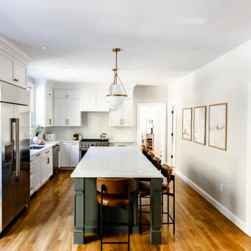
The long view shows how the remodel turned a closed cherry kitchen into a bright, open space for the whole family.
Inspiration for a transitional l-shaped medium tone wood floor and brown floor kitchen remodel in Boston with an undermount sink, shaker cabinets, white cabinets, white backsplash, subway tile backsplash, stainless steel appliances, an island and white countertops
Inspiration for a transitional l-shaped medium tone wood floor and brown floor kitchen remodel in Boston with an undermount sink, shaker cabinets, white cabinets, white backsplash, subway tile backsplash, stainless steel appliances, an island and white countertops
Sponsored
Plain City, OH

The Creative Kitchen Company
Columbus Area Kitchen Remodeling and Refacing Professional
 Ellen Farber Strategic Design
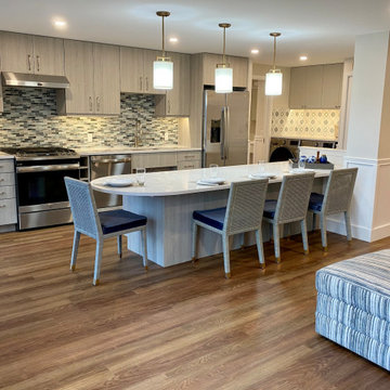
The kitchen was originally planned to mimic the location of appliances in her current kitchen to minimize re-learning of appliance locations. The only change was adding a trash cabinet between the fridge and the sink. A french door fridge allows someone in a wheelchair to easily access frozen and cold foods, while the water and ice dispenser on the outside of the door make it easy to stay hydrated rather than using the sink each time. She can roll up to the kitchen sink due to the recessed cabinetry under the sink or stand at counter height to put away dishes from the dishwasher. The dishwasher is ADA and very simple to use , and is raised off the floor so whether she is sitting or standing it's easier to reach. The gas cooktop has controls at the front making it easy to reach from the wheelchair and the exhaust fan above also has a control at the front. All cabinet door handles are D-shape, which makes them easy to grasp and there is plenty of electric outlets for charging phones, computers and small appliances. The kitchen island is table height at 30" so meal prep can be easily done in a wheelchair while guests and can be seated in a chair or wheelchair around the island. The dining chairs can also be turned around to add extra seating in the living room area. Pendant lights above the kitchen island light up the space, while recessed lighting in the kitchen and living room provide overall room lighting. There is also under cabinet lighting which makes the room glow at night! Wainscoting made of commercial grade material is strategically placed on sharp corners and exposed walls to reduce and minimize damage from the wheel chair, while creating a finished and complete look! We selected a free standing microwave to sit below the island, which is easy to use and is the same style as in her previous apartment. The island is 48" from the appliance wall, leaving ample space to open doors and maneuver around in the wheelchair and has easy access to the laundry area as well. We eliminated the pocket doors that had been in front of the laundry area for easy access, and since it was exposed, dressed it up with coordinating tile to the kitchen with additional cabinets above. There is a coordinating quartz counter on top of the washer and dryer for folding laundry or storing additional supplies.
 Katie Hutchison Studio
The new owners of this house in Harvard, Massachusetts loved its location and authentic Shaker characteristics, but weren’t fans of its curious layout. A dated first-floor full bathroom could only be accessed by going up a few steps to a landing, opening the bathroom door and then going down the same number of steps to enter the room. The dark kitchen faced the driveway to the north, rather than the bucolic backyard fields to the south. The dining space felt more like an enlarged hall and could only comfortably seat four. Upstairs, a den/office had a woefully low ceiling; the master bedroom had limited storage, and a sad full bathroom featured a cramped shower.
KHS proposed a number of changes to create an updated home where the owners could enjoy cooking, entertaining, and being connected to the outdoors from the first-floor living spaces, while also experiencing more inviting and more functional private spaces upstairs.
On the first floor, the primary change was to capture space that had been part of an upper-level screen porch and convert it to interior space. To make the interior expansion seamless, we raised the floor of the area that had been the upper-level porch, so it aligns with the main living level, and made sure there would be no soffits in the planes of the walls we removed. We also raised the floor of the remaining lower-level porch to reduce the number of steps required to circulate from it to the newly expanded interior. New patio door systems now fill the arched openings that used to be infilled with screen. The exterior interventions (which also included some new casement windows in the dining area) were designed to be subtle, while affording significant improvements on the interior. Additionally, the first-floor bathroom was reconfigured, shifting one of its walls to widen the dining space, and moving the entrance to the bathroom from the stair landing to the kitchen instead.
These changes (which involved significant structural interventions) resulted in a much more open space to accommodate a new kitchen with a view of the lush backyard and a new dining space defined by a new built-in banquette that comfortably seats six, and -- with the addition of a table extension -- up to eight people.
Upstairs in the den/office, replacing the low, board ceiling with a raised, plaster, tray ceiling that springs from above the original board-finish walls – newly painted a light color -- created a much more inviting, bright, and expansive space. Re-configuring the master bath to accommodate a larger shower and adding built-in storage cabinets in the master bedroom improved comfort and function. A new whole-house color palette rounds out the improvements.
Photos by Katie Hutchison
 Katie Hutchison Studio
The new owners of this house in Harvard, Massachusetts loved its location and authentic Shaker characteristics, but weren’t fans of its curious layout. A dated first-floor full bathroom could only be accessed by going up a few steps to a landing, opening the bathroom door and then going down the same number of steps to enter the room. The dark kitchen faced the driveway to the north, rather than the bucolic backyard fields to the south. The dining space felt more like an enlarged hall and could only comfortably seat four. Upstairs, a den/office had a woefully low ceiling; the master bedroom had limited storage, and a sad full bathroom featured a cramped shower.
KHS proposed a number of changes to create an updated home where the owners could enjoy cooking, entertaining, and being connected to the outdoors from the first-floor living spaces, while also experiencing more inviting and more functional private spaces upstairs.
On the first floor, the primary change was to capture space that had been part of an upper-level screen porch and convert it to interior space. To make the interior expansion seamless, we raised the floor of the area that had been the upper-level porch, so it aligns with the main living level, and made sure there would be no soffits in the planes of the walls we removed. We also raised the floor of the remaining lower-level porch to reduce the number of steps required to circulate from it to the newly expanded interior. New patio door systems now fill the arched openings that used to be infilled with screen. The exterior interventions (which also included some new casement windows in the dining area) were designed to be subtle, while affording significant improvements on the interior. Additionally, the first-floor bathroom was reconfigured, shifting one of its walls to widen the dining space, and moving the entrance to the bathroom from the stair landing to the kitchen instead.
These changes (which involved significant structural interventions) resulted in a much more open space to accommodate a new kitchen with a view of the lush backyard and a new dining space defined by a new built-in banquette that comfortably seats six, and -- with the addition of a table extension -- up to eight people.
Upstairs in the den/office, replacing the low, board ceiling with a raised, plaster, tray ceiling that springs from above the original board-finish walls – newly painted a light color -- created a much more inviting, bright, and expansive space. Re-configuring the master bath to accommodate a larger shower and adding built-in storage cabinets in the master bedroom improved comfort and function. A new whole-house color palette rounds out the improvements.
Photos by Katie Hutchison
54