
Search results for "Reduce table" in Home Design Ideas

 User
Anchored by the homeowner’s 42-foot-long painting, the interiors of this Palm Springs residence were designed to showcase the owner’s art collection, and create functional spaces for daily living that can be easily adapted for large social gatherings.
Referencing the environment and architecture in both form and material, the finishes and custom furnishings bring the interior to life. Alluding to the roofs that suspend over the building, the sofas seem to hover above the carpets while the knife-edge table top appears to float above a metal base. Bleached and cerused wood mimic the “desert effect” that would naturally occur in this environment, while the textiles on the sofa are the same shade as the rocks of the landscape.
Monolithic concrete floors connect all of the spaces while concealing mechanical systems, and stone thresholds signal vertical level changes and exterior transitions. Large wall masses provide the optimal backdrop for the homeowner’s oversized art. The wall structures ground the interior, while the opposing expanses of glass frame the desert views. The location and use of operable doors and windows allows the house to naturally ventilate, reducing cooling loads. The furnishings create spaces in an architectural fashion.
Designed and fabricated for flexibility, the pieces easily accommodate the owners’ large social gatherings. The dining table can be split into two and the sofas can be pushed out along the walls, opening the center of the space to entertain. The design of the interior spaces and furnishings seamlessly integrates the setting, architecture, artwork and spaces into a cohesive whole.

 Nathan Taylor for Obelisk Home
The interior of the home went from Colonial to Classic Lodge without changing the footprint of the home. Columns were removed, fur downs removed that defined space, fireplace relocated, kitchen layout and direction changed, breakfast room and sitting room flip flopped, study reduced in size, entry to master bedroom changed, master suite completely re-arranged and enlarged, custom hand railing designed to open up stairwell, hardwood added to stairs, solid knotty alder 8’ doors added, knotty alder crown moldings added, reclaimed beamed ceiling grid, tongue and groove ceiling in kitchen, knotty alder cabinetry, leather finish to granite, seeded glass insets, custom door to panty to showcase an antique stained glass window from childhood church, custom doors and handles made for study entry, shredded straw added to wall texture, custom glazing done to all walls, wood floor remnants created an antique quilt pattern for the back wall of the powder bath, custom wall treatment created by designer, and a mixture of new and antique furnishing were added, all to create a warm, yet lived in feeling for this special family.
A new central stone wall reversed with an over scaled fireplace and reclaimed flooring from the East became the anchor for this level of the home. Removing all the “divisions” of space and using a unified surface made unused rooms, part of the daily living for this family. The desire to entertain large group in a unified space, yet still feel like you are in a cozy environment was the driving force for removing divisions of space.
Photos by Randy Colwell
 User
Anchored by the homeowner’s 42-foot-long painting, the interiors of this Palm Springs residence were designed to showcase the owner’s art collection, and create functional spaces for daily living that can be easily adapted for large social gatherings.
Referencing the environment and architecture in both form and material, the finishes and custom furnishings bring the interior to life. Alluding to the roofs that suspend over the building, the sofas seem to hover above the carpets while the knife-edge table top appears to float above a metal base. Bleached and cerused wood mimic the “desert effect” that would naturally occur in this environment, while the textiles on the sofa are the same shade as the rocks of the landscape.
Monolithic concrete floors connect all of the spaces while concealing mechanical systems, and stone thresholds signal vertical level changes and exterior transitions. Large wall masses provide the optimal backdrop for the homeowner’s oversized art. The wall structures ground the interior, while the opposing expanses of glass frame the desert views. The location and use of operable doors and windows allows the house to naturally ventilate, reducing cooling loads. The furnishings create spaces in an architectural fashion.
Designed and fabricated for flexibility, the pieces easily accommodate the owners’ large social gatherings. The dining table can be split into two and the sofas can be pushed out along the walls, opening the center of the space to entertain. The design of the interior spaces and furnishings seamlessly integrates the setting, architecture, artwork and spaces into a cohesive whole.
Find the right local pro for your project

 Land Studio C
Darren M. Reynolds
Example of a large tuscan backyard water fountain deck design in San Francisco with a pergola
Example of a large tuscan backyard water fountain deck design in San Francisco with a pergola

 Rosenberg Kolb Architects
 is proud to announce our renovation of a 1747 timber frame house on Nantucket Island, completed in 2011. The first historic renovation project in Nantucket to receive LEED Gold status. The project was given a Grand Award by Eco Home Magazine in July, 2011.
The project included:
Restructuring the foundations to align and stabilize the structure in addition to providing for a new insulated crawl space;
A 260 square foot addition for a kitchen, bath, and new entry;
New cedar shingles, roof shingles, and restored historic windows;
The house met the strict regulations of Nantucket's Historic District.
On the inside, LEED Gold certification was met through:
High R-value insulation and reduced air leakage;
High efficiency heating, air conditioning, plumbing fixtures, and appliances;
Low-emission paints and finishes as well as a clay wall finish;
Using reclaimed materials from the original house and other sites.
The project has been published in:
N Magazine July 2011
Eco Home Magazine July 2011
New England Home June 2011

 Tomecek Studio Architecture
Project by Studio H:T principal in charge Brad Tomecek (now with Tomecek Studio Architecture). This project tests the theory of bringing high quality design to a prefabricated factory setting. Enrolled in the LEED-Home Pilot, this residence completed certification. The modular home was conceived as two boxes that slide above one another to create outdoor living space and a lower covered rear entry. The passive solar design invites large amounts of light from the south while minimizing openings to the east and west. Factory construction saves both time and costs while reducing waste and using a controlled labor force.
Built in a factory north of Denver, the home arrived by flatbed truck in two pieces and was craned into place in about 4 hours providing a fast, sustainable, cost effective alternative to traditional homebuilding techniques. Upgraded lighting fixtures, plumbing fixtures, doors, door hardware, windows, tile and bamboo flooring were incorporated into the design. 80% of the residence was completed in the factory in less than 3 weeks and other items were finished on site including the exterior stucco, garage, metal railing and stair.
Stack-Slide-Stitch describes the conceptual process of how to tie together two distinct modular boxes. Stack refers to setting one modular directly on top of the other. Slide refers to the action that creates an upper southern deck area while simultaneously providing a covered rear entry area. The stitching or interlocking occurs with the upward extension of the lower volume with the front deck walls and with the rear two story vertical.

 Margaret Wilson & Company Inc.
Classic design. Graceful, elegant, refined.
Living / Music Room.
Photo Credit: Laura S. Wilson http://lauraswilson.com
Sponsored
Delaware, OH

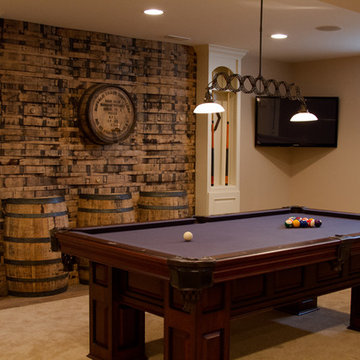
Buckeye Basements, Inc.
Central Ohio's Basement Finishing ExpertsBest Of Houzz '13-'21
 Nathan Taylor for Obelisk Home
The interior of the home went from Colonial to Classic Lodge without changing the footprint of the home. Columns were removed, fur downs removed that defined space, fireplace relocated, kitchen layout and direction changed, breakfast room and sitting room flip flopped, study reduced in size, entry to master bedroom changed, master suite completely re-arranged and enlarged, custom hand railing designed to open up stairwell, hardwood added to stairs, solid knotty alder 8’ doors added, knotty alder crown moldings added, reclaimed beamed ceiling grid, tongue and groove ceiling in kitchen, knotty alder cabinetry, leather finish to granite, seeded glass insets, custom door to panty to showcase an antique stained glass window from childhood church, custom doors and handles made for study entry, shredded straw added to wall texture, custom glazing done to all walls, wood floor remnants created an antique quilt pattern for the back wall of the powder bath, custom wall treatment created by designer, and a mixture of new and antique furnishing were added, all to create a warm, yet lived in feeling for this special family.
A new central stone wall reversed with an over scaled fireplace and reclaimed flooring from the East became the anchor for this level of the home. Removing all the “divisions” of space and using a unified surface made unused rooms, part of the daily living for this family. The desire to entertain large group in a unified space, yet still feel like you are in a cozy environment was the driving force for removing divisions of space.
Photos by Randy Colwell

 Pugliese Interiors
The bedroom floor shown here is from the Dixie Home "Bonterra" collection, in the "Cream Puff" color. The carpet is crafted from 100% STAINMASTER® Luxerell™ BCF nylon, which makes it the perfect choice for active households. Every STAINMASTER® carpet has a lifetime warranty, and is made with cutting edge fiber technology that provides anti-static protection, resistance to abrasive wear, and texture retention, allowing the carpet to retain its beautiful appearance up to 50% longer than other carpets. Plus, the Luxerell™ fiber shield offers stain resistance, reducing the ability of soil to stick to the carpet, allowing easy release during normal vacuuming and cleaning. This technology will allow your floor to stay 30% cleaner than any other carpet.

 Katie Postel Interiors
Sunroom - mid-sized eclectic light wood floor and beige floor sunroom idea in Austin with a standard ceiling
 Veronica Sanders, Allied ASID
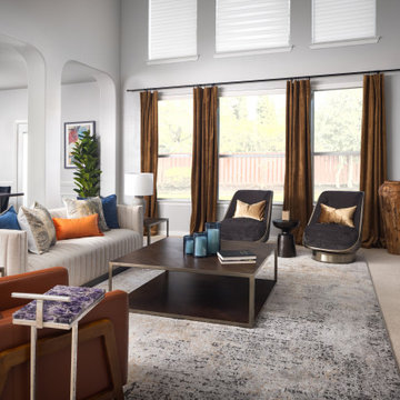
This client prefers a minimal approach, which we accommodated by providing reduced visual clutter with strategically placed wall art and large furnishings to fill the space. This includes the sculptural pieces styled in the custom-built bookcases. This 9ft tall custom feature was then styled in pieces that aligned with the client’s aesthetic.
Due to our client’s hindrances in physical capabilities with his hands, we changed out many of the window blinds to cordless and easy pull-downs as well as replaced tassels for ease of function and reach. The double-height ceilings in this space pose a challenge when it comes to accessing the upper windows. To address this issue, we have installed automated shades for our client. These shades not only filter light to protect our client's delicate skin but also provide a practical solution for controlling the lighting in this newly renovated area.
 Everything Home
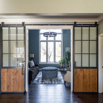
We closed off the open formal dining room, so it became a den with artistic barn doors, which created a more private entrance/foyer. We removed the wall between the kitchen and living room, including the fireplace, to create a great room. We also closed off an open staircase to build a wall with a dual focal point — it accommodates the TV and fireplace. We added a double-wide slider to the sunroom turning it into a happy play space that connects indoor and outdoor living areas.
We reduced the size of the entrance to the powder room to create mudroom lockers. The kitchen was given a double island to fit the family’s cooking and entertaining needs, and we used a balance of warm (e.g., beautiful blue cabinetry in the kitchen) and cool colors to add a happy vibe to the space. Our design studio chose all the furnishing and finishes for each room to enhance the space's final look.
Builder Partner – Parsetich Custom Homes
Photographer - Sarah Shields
---
Project completed by Wendy Langston's Everything Home interior design firm, which serves Carmel, Zionsville, Fishers, Westfield, Noblesville, and Indianapolis.
For more about Everything Home, click here: https://everythinghomedesigns.com/
To learn more about this project, click here:
https://everythinghomedesigns.com/portfolio/hard-working-haven/
 Veronica Sanders, Allied ASID
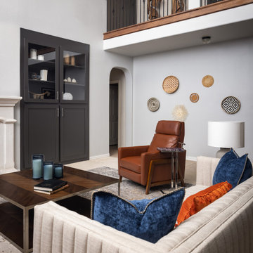
This client prefers a minimal approach, which we accommodated by providing reduced visual clutter with strategically placed wall art and large furnishings to fill the space. This includes the sculptural pieces styled in the custom-built bookcases. This 9ft tall custom feature was then styled in pieces that aligned with the client’s aesthetic.
Due to our client’s hindrances in physical capabilities with his hands, we changed out many of the window blinds to cordless and easy pull-downs as well as replaced tassels for ease of function and reach. The double-height ceilings in this space pose a challenge when it comes to accessing the upper windows. To address this issue, we have installed automated shades for our client. These shades not only filter light to protect our client's delicate skin but also provide a practical solution for controlling the lighting in this newly renovated area.
Sponsored
Columbus, OH

Wannemacher Interiors
Customized Award-Winning Interior Design Solutions in Franklin Cnty OH

 JLC Architecture
Located at a prominent corner on one of the few undeveloped residential sites left in Solana Beach, this project is important not only for the homeowner, but for the community as well. A rigorous site analysis laid the groundwork for a design response which took into account the homeowner’s program, input from the neighbors, and the scale of the project and the character of the neighborhood. The end result is a design that is well set into the existing grade, a move which preserves adjacent views and reduces the visual impact of the structure from the street; all while graciously meeting the desires of the owner.
The plan is broken into six unique floor plates. The bottom four of which tie together along the gradually sloping site. An intentionally long southern exposure implements the basics of passive solar design: large amounts of glass bring in abundant light and warmth in the winter, while deep overhangs protect from unwanted summer heat gain. Ocean views to the west are selectively framed throughout the house without compromising privacy from the busy street corner. Public functions within the house flow seamlessly between indoor and outdoor living spaces. JLC Architecture was responsible for a full architecture and interior package as well as exterior hardscape design.

 Kitchens by Good Guys
In order to make this kitchen more functional we had to play with the layout. We decided to switch the range and the fridge to better balance the space. We reduced the size of the bulky soffit to allow for taller cabinets and make the space feel more open. We shifted all the appliances down and added a built-in coffee machine & ice maker.
In choosing the finishes, our client decided to go with an accent island. The white perimeter and gray stained island really updated this kitchen. Previously, the back half of the island sat at bar height. To make efficient use of space, we made it all one height. Since we extended the entire kitchen, this deleted the dining table. To accommodate for this, the large island seats six & has additional storage underneath! We used a beautiful quartz throughout the kitchen and bar area.
We used a gray glass subway tile for the backsplash with an accent tile in a similar color over the range. We used that same accent tile for the bar adjacent to the kitchen. This area was previously a blank wall that our client didn't know what to do with. We added some storage, 2 wine fridges, and floating shelves with lighting to brighten up the space.

 JWH Design and Cabinetry LLC
A lot of function fits on the main wall, while still maintaining natural light. The 36" Sub Zero is closest to the Walk-in Pantry, and anchored with a desk area closest to the table.
Space planning and custom cabinetry by Jennifer Howard, JWH
Photography by Mick Hales, Greenworld Productions
 Kitchens by Good Guys
In order to make this kitchen more functional we had to play with the layout. We decided to switch the range and the fridge to better balance the space. We reduced the size of the bulky soffit to allow for taller cabinets and make the space feel more open. We shifted all the appliances down and added a built-in coffee machine & ice maker.
In choosing the finishes, our client decided to go with an accent island. The white perimeter and gray stained island really updated this kitchen. Previously, the back half of the island sat at bar height. To make efficient use of space, we made it all one height. Since we extended the entire kitchen, this deleted the dining table. To accommodate for this, the large island seats six & has additional storage underneath! We used a beautiful quartz throughout the kitchen and bar area.
We used a gray glass subway tile for the backsplash with an accent tile in a similar color over the range. We used that same accent tile for the bar adjacent to the kitchen. This area was previously a blank wall that our client didn't know what to do with. We added some storage, 2 wine fridges, and floating shelves with lighting to brighten up the space.
Sponsored
Sunbury, OH

J.Holderby - Renovations
Franklin County's Leading General Contractors - 2X Best of Houzz!

 Studio Dearborn
A colonial waterfront home in Mamaroneck was renovated to add this expansive, light filled kitchen with a rustic modern vibe. Solid maple cabinetry with inset slab doors color matched to Benjamin Moore Super White. Brick backsplash with white cabinetry adds warmth to the cool tones in this kitchen.
A rift sawn oak island features plank style doors and drawers is a rustic contrast to the clean white perimeter cabinetry. Perimeter countertops in Caesarstone are complimented by the White Macauba island top with mitered edge.
Concrete look porcelain tiles are low maintenance and sleek. Copper pendants from Blu Dot mix in warm metal tones. Cabinetry and design by Studio Dearborn. Appliances--Wolf, refrigerator/freezer columns Thermador; Bar stools Emeco; countertops White Macauba. Photography Tim Lenz.

 LeichtCA / Architectural Kitchens Inc
www.LeichtCA.com
Concrete, a very special material for people who want to reduce their living environment to essentials - both in terms of the architecture of their houses and interior design. With the new CONCRETE range, a kitchen front of true craftsmanship made of fine concrete in three blended colors, LEICHT is looking back to the classic Bauhaus tradition and thus providing this target group with new inspiration for interior design.
Concrete surfaces have a characteristic expression that is always entirely unique. It is precisely these characteristics that make the timeless material so precious for the design of individual kitchens. By applying concrete to the kitchen front by hand using the putty technique you get a unique surface structure with varying light refraction. The kitchen front comes alive.

 Whistler Builder
Our client planned to spend more time in this home and wanted to increase its livability. The project was complicated by the strata-specified deadline for exterior work, the logistics of working in an occupied strata complex, and the need to minimize the impact on surrounding neighbours.
By reducing the deck space, removing the hot tub, and moving out the dining room wall, we were able to add important livable space inside. Our homeowners were thrilled to have a larger kitchen. The additional 500 square feet of living space integrated seamlessly into the existing architecture.
This award-winning home features reclaimed fir flooring (from the Stanley Park storm), and wood-cased sliding doors in the dining room, that allow full access to the outdoor balcony with its exquisite views.
Green building products and processes were used extensively throughout the renovation, which resulted in a modern, highly-efficient, and beautiful home.
51