
Search results for "Reduced extra fat" in Home Design Ideas
 EmV Design Build
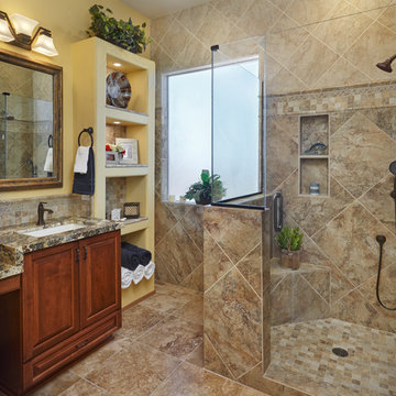
Robin Stancliff photo credits.My goal with this project was to create a glamorous, luxurious bathroom with plenty of space and a Mediterranean-inspired aesthetic. My client felt as though her old bathroom was constantly cluttered and filled with wasted space. As a dancer, she
wanted her bathroom to be a place where she could prepare for her performances, and also relax and unwind after her performances. Since she never used her tub, I removed it and expanded the shower, providing an extra foot of shower space. Because she
loves the travertine floor that was already in the bathroom, I found a porcelain look-
alike to include in the shower, and for the shower bench. The original travertine in the
bathroom was impossible to find, but locating the porcelain look-alike was a worthwhile challenge which resulted in a budget-friendly shower that is beautiful and easy to clean at the same time. This remodeled bathroom also includes open shelving to display artwork and store items, as well as a special vanity designed with makeup application in mind. The height of the vanity was increased to executive height, adding
custom convenience for the client. I also increased lighting throughout the bathroom, replacing the original lighting with LED, and adding light into the center tower of the vanity as well as the display shelving. The new design of the vanity added extra space for storing makeup and toiletries to reduce clutter, and it also helped my client ergonomically. By blending unique textures and warm colors, I was able to create a
gorgeous bathroom evocative of a Tuscan home with a spa-like feel.
 EmV Design Build
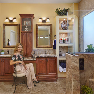
Robin Stancliff photo credits.My goal with this project was to create a glamorous, luxurious bathroom with plenty of space and a Mediterranean-inspired aesthetic. My client felt as though her old bathroom was constantly cluttered and filled with wasted space. As a dancer, she
wanted her bathroom to be a place where she could prepare for her performances, and also relax and unwind after her performances. Since she never used her tub, I removed it and expanded the shower, providing an extra foot of shower space. Because she
loves the travertine floor that was already in the bathroom, I found a porcelain look-alike to include in the shower, and for the shower bench. The original travertine in the bathroom was impossible to find, but locating the porcelain look-alike was a worthwhile challenge which resulted in a budget-friendly shower that is beautiful and easy to clean at the same time. This remodeled bathroom also includes open shelving
to display artwork and store items, as well as a special vanity designed with makeup application in mind. The height of the vanity was increased to executive height, adding custom convenience for the client. I also increased lighting throughout the bathroom,
replacing the original lighting with LED, and adding light into the center tower of the vanity as well as the display shelving. The new design of the vanity added extra space for storing makeup and toiletries to reduce clutter, and it also helped my client ergonomically. By blending unique textures and warm colors, I was able to create a
gorgeous bathroom evocative of a Tuscan home with a spa-like feel.

 Ursus Homes, Inc
Inspiration for a contemporary white tile mosaic tile floor, gray floor and single-sink alcove bathtub remodel in Seattle with a wall-mount toilet, a wall-mount sink and a niche
Find the right local pro for your project

 Meyer Design
Stunning wide farmhouse door provides a warm greeting for guests. Signature black large windows let in lots of natural light.
Large cottage white two-story brick gable roof photo in Chicago with a shingle roof
Large cottage white two-story brick gable roof photo in Chicago with a shingle roof

 Blossom US
❤ Furniture grade polyvinyl chloride board plus 5 layers paint provides extra waterproof and resistance to moisture and humidity.
❤ Classic Transitional Loft Design with Frosted Glass Inserts Doors.
❤ Anti-fog, Color Temp Change, Brightness Adjustable Smart LED Mirror.
❤ High-quality easy cleanup and maintenance-free ACRYLIC SINK.
❤ EASY CLEAN & Maintenance free consistent finishes surfaces.
❤ FULL EXTENSION DRAWERS offers you spacious storage space.
❤ TEMPERED GLASS Drawer Organizer keeps all daily items well organized.
❤ SOFT CLOSE prevents cracks and reduces friction on the hardware.
❤ U SHAPE & OPEN BACK for easy plumbing installation.
❤ ONE YEAR WARRANTY with top-level customer service.




 Reform inc.
www.terrygreenephotography.com
Elegant l-shaped medium tone wood floor enclosed kitchen photo in Atlanta with a farmhouse sink, shaker cabinets, white cabinets, white backsplash, subway tile backsplash, stainless steel appliances, gray walls and an island
Elegant l-shaped medium tone wood floor enclosed kitchen photo in Atlanta with a farmhouse sink, shaker cabinets, white cabinets, white backsplash, subway tile backsplash, stainless steel appliances, gray walls and an island

 Mottram Architecture
Timber frame homes offer unique challenges during a remodel. What often makes them beautiful and attractive to most homeowners, also makes them challenging for space requirements.
Context: The lovely couple that owned this home were struggling with some interesting floor plan challenges that just didn't work for their family. The loved the beautiful timbers and woodwork of their home, but the dramatically sloping ceilings on the second floor, particularly in the bathroom, just didn't work for this 1 1/2 bath home. Needing to use the skylight to approach the toilet was a less then ideal scenario. Although the bathroom footprint was more then adequate, the sloped ceiling only made half of the space useable. Check out the Before/After post on our blog to see the photos of the house pre-renovation. As much as they loved all the wood features in their home, another challenge they had was light. The wood ceiling made everything inside the house darker, even with a fantastic array of south facing windows, there were spaces in the home that felt dark and small. When they contacted us they wanted to know how could they make their brighter and more inviting, were there solutions to the 2nd floor sloped ceiling issues, and if they were going to do all of this work, how could they make their home more comfortable and efficient. A nagging water leak in the upstairs bathroom spurred them into action and here is how we solved their dilemma.
Conclusion: First, we added a little dormer to the rear of the house so we could get full headroom in nearly all of the upstairs bathroom! Then we decided to extend that dormer one more timber bay over to create a walk in closet with natural light and plenty of space. Since we were contemplating energy efficiency, we resolved a nagging issue that is present in a lot of timber frame construction, air tightness. Commonly found in timber frame construction, fiberglass insulation is installed in the rafter bays and board ceilings are installed over top. Unfortunately, board ceilings are anything but air tight, and fiberglass insulation needs to be in an airtight cavity for maximum effectiveness. So we were able to solve two issues at the same time for this homeowner. We removed the board ceiling and fiberglass insulation, we dense packed the rafter bays with cellulose insulation, and installed sheetrock in place of the boards. The boards were salvaged for re-use by the homeowner, and the space and light quality was dramatically improved. Some may think that losing the board ceiling took something away from the space, but what you'll see in the pictures is that it highly accentuates the heavy timbers and really makes them stand out in a beautiful way. Now with this added airtightness, better insulation, and brighter space, the homeowner hardly runs their wood stove, and it's so quiet in the space, an added bonus from changing the insulation. It became necessary to also add a sheetrock ceiling to the living room to hide the plumbing from the new bathroom layout above. Changing this ceiling gave the homeowner some real quality lighting that was lacking in the living room before. The brighter ceiling and new lighting layout completely transforms the living room into a space you want to hang out, even though the layout didn't change at all. When the homeowner saw the finished spaces she said "I can't believe this is my house, I want to live in this house"
Energy Efficiency: I touched a little on the efficiency above, but like all projects done with Mottram Architecture, we always want to leave you with a little extra. Timber frame construction with board ceilings and fiberglass insulation are notoriously leaky! If you want to know what we think about fiberglass insulation, check our our blog post on Why Fiberglass Insulation Sucks. By installing cellulose insulation and covering it with sheetrock we were able to greatly reduce the heat flowing out of this home. It not only improves cashflow it improves the comfort level in the space. Who wants to sit in their living room and feel a draft? Let us remind you, we are not saying cellulose insulation is an air barrier, we use the sheetrock to help with that, but it does significantly reduce the air flow over fiberglass insulation. And when we reduce the airflow, we reduce the heat flow. And when we reduce the heat flow, we reduce the need to re-heat that drafty air from outside. When it comes to energy efficiency the first and best place to start is air infiltration. We greatly reduced the air infiltration with the new insulation, but we also added a hat and warm boots. What I mean by that is, we improved the insulation in the roof, and we installed insulation in the basement. Maybe it's a silly analogy, but when you think about keeping warm, we always start with the hat and boots! With sustainability in mind, the next project will be to add a deck to the front of this house with rain catchment barrels from the metal roof. They are planning to plant a garden in the spring and the rain catchment system will help to irrigate the new garden.
Builder: East Shore Builders
Photographer: Michael Eric Berube

 SGDI - Sarah Gallop Design Inc.
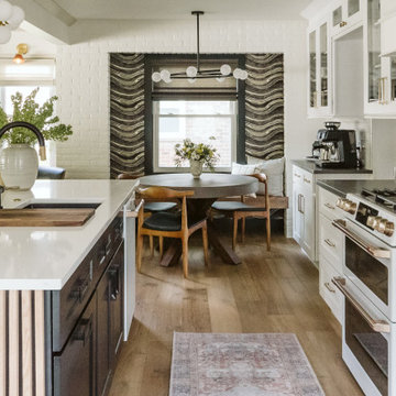
This whole home reno involved creating a kitchen greatroom on the main floor and significantly re configuring the upper floor including making a full master bathroom and converting an extra bedroom into walk in closet.
An old family home transformed into a modern home for a great young family home of busy professionals.


 Dawson & Clinton
The Scott Street renovation is a restoration and contemporary update of a traditional Victorian in San Francisco.
The formal layout remained as a gesture to the home's historicity, while the basement level was extended significantly to provide more space to suit the client's needs. Modern fixtures, cabinetry, and finishes complemented the traditional aesthetic.

 Friel Lumber Company
The homeowners chose to install perimeter cabinets using Dynasty by Omega. They chose the Madrid door style, Cherry wood, and a truffle stain. As for the island cabinets, they wanted the Madrid door style and Maple wood and then opted for the Pearl paint. The countertops are quartz and the island is granite.
Before the renovation started, the homeowners selected Jenn-Air appliances, including an induction cooktop and built-in microwave oven with speed cook. Once the construction was underway, we removed the bulkheads to allow new cabinets that extended to the ceiling with two PC crown molding. This provided a cleaner, more modern look along with added storage for items that are occasionally used.
We also swapped the pantry and refrigerator location to open up space as you enter the kitchen from the garage. The redesign also gave the refrigerator a built-in look. Then, we moved the cooktop to the corner and installed stainless steel Zephyr range hood and beveled subway tile in a herringbone pattern. The backsplash and new cooktop turned the most used area of the kitchen into a design feature.
The addition of an enlarged island allows extra seating for up to four people. Moreover, island cabinets include two full-sized waste baskets for recycling and standard waste. The new farmhouse sink from Kohler not only looks and functions well but the drain is positioned at the rear corner. The plumbing in the cabinet below is consolidated to the back corner providing much more storage. Last, the built-in TV not only looks great but also reduces counter clutter. Plus, the drawer below the TV contains USB outlet for small personal device charging.

 Brett King Builder
All stair trends were replaced with authentic floor boards located on site in the storage attic. Approaching the second floor up the first set of stairs, the bedroom doorway is to the left and the gutted, future en-suite bathroom and study to the right.
The aged plaster on the fireplace chimney was painstakingly removed, exposing authentic stone.
Nearing the top of the second set of pie-shaped stairs leading to the third floor attic, a photo was taken that looks into the ceiling of the second floor bedroom.
A glance through the angled attic doorway (on right) reveals extra storage space and the future HVAC equipment location. This is the concealed location of additional pine floor boards. Plywood replaced the valued, sought-after wood as shown.

 John Lum Architecture, Inc. AIA
Photos Courtesy of Paul Dyer
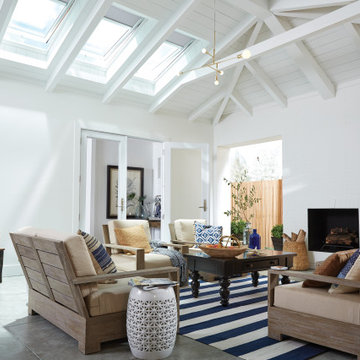
Inspiration for a contemporary family room remodel in San Francisco
Inspiration for a contemporary family room remodel in San Francisco

 Nar Design Group
Creating this open airy master retreat involved removing a space consuming corner W.C. and an awkwardly deep linen closet. Using tall glass panels to separate the shower and toilet gives privacy while maintaining the newly acquired spaciousness. The glass panels transition from frosted around the toilet to clear around the roomy barrier free shower. By reducing the original closet opening, we gained necessary wall space for a modern freestanding tub. Tall cabinets provide plenty of storage space for linens and toiletries. A pair of pull-out cabinets – one on each side of the sink – conceal convenient grooming stations. An extra wide sink can easily accommodate two and still leaves plenty of counterspace on either side. The large mirror is mounted to a shallow framework concealing recessed lighting and softly illuminating the wall behind. The faucets and hand-held shower feature a knurled detail lending a bit of biker industrial to the modern surroundings. Access to the walk-in-closet is through a clean open doorway, while a wide modern style barn door slides open on the master bedroom side.
Photo credit: Fred Donham of Photographerlink

 ZeroEnergy Design
 (ZED) created this modern home for a progressive family in the desirable community of Lexington.
Thoughtful Land Connection. The residence is carefully sited on the infill lot so as to create privacy from the road and neighbors, while cultivating a side yard that captures the southern sun. The terraced grade rises to meet the house, allowing for it to maintain a structured connection with the ground while also sitting above the high water table. The elevated outdoor living space maintains a strong connection with the indoor living space, while the stepped edge ties it back to the true ground plane. Siting and outdoor connections were completed by ZED in collaboration with landscape designer Soren Deniord Design Studio.
Exterior Finishes and Solar. The exterior finish materials include a palette of shiplapped wood siding, through-colored fiber cement panels and stucco. A rooftop parapet hides the solar panels above, while a gutter and site drainage system directs rainwater into an irrigation cistern and dry wells that recharge the groundwater.
Cooking, Dining, Living. Inside, the kitchen, fabricated by Henrybuilt, is located between the indoor and outdoor dining areas. The expansive south-facing sliding door opens to seamlessly connect the spaces, using a retractable awning to provide shade during the summer while still admitting the warming winter sun. The indoor living space continues from the dining areas across to the sunken living area, with a view that returns again to the outside through the corner wall of glass.
Accessible Guest Suite. The design of the first level guest suite provides for both aging in place and guests who regularly visit for extended stays. The patio off the north side of the house affords guests their own private outdoor space, and privacy from the neighbor. Similarly, the second level master suite opens to an outdoor private roof deck.
Light and Access. The wide open interior stair with a glass panel rail leads from the top level down to the well insulated basement. The design of the basement, used as an away/play space, addresses the need for both natural light and easy access. In addition to the open stairwell, light is admitted to the north side of the area with a high performance, Passive House (PHI) certified skylight, covering a six by sixteen foot area. On the south side, a unique roof hatch set flush with the deck opens to reveal a glass door at the base of the stairwell which provides additional light and access from the deck above down to the play space.
Energy. Energy consumption is reduced by the high performance building envelope, high efficiency mechanical systems, and then offset with renewable energy. All windows and doors are made of high performance triple paned glass with thermally broken aluminum frames. The exterior wall assembly employs dense pack cellulose in the stud cavity, a continuous air barrier, and four inches exterior rigid foam insulation. The 10kW rooftop solar electric system provides clean energy production. The final air leakage testing yielded 0.6 ACH 50 - an extremely air tight house, a testament to the well-designed details, progress testing and quality construction. When compared to a new house built to code requirements, this home consumes only 19% of the energy.
Architecture & Energy Consulting: ZeroEnergy Design
Landscape Design: Soren Deniord Design
Paintings: Bernd Haussmann Studio
Photos: Eric Roth Photography
 Mottram Architecture
Timber frame homes offer unique challenges during a remodel. What often makes them beautiful and attractive to most homeowners, also makes them challenging for space requirements.
Context: The lovely couple that owned this home were struggling with some interesting floor plan challenges that just didn't work for their family. The loved the beautiful timbers and woodwork of their home, but the dramatically sloping ceilings on the second floor, particularly in the bathroom, just didn't work for this 1 1/2 bath home. Needing to use the skylight to approach the toilet was a less then ideal scenario. Although the bathroom footprint was more then adequate, the sloped ceiling only made half of the space useable. Check out the Before/After post on our blog to see the photos of the house pre-renovation. As much as they loved all the wood features in their home, another challenge they had was light. The wood ceiling made everything inside the house darker, even with a fantastic array of south facing windows, there were spaces in the home that felt dark and small. When they contacted us they wanted to know how could they make their brighter and more inviting, were there solutions to the 2nd floor sloped ceiling issues, and if they were going to do all of this work, how could they make their home more comfortable and efficient. A nagging water leak in the upstairs bathroom spurred them into action and here is how we solved their dilemma.
Conclusion: First, we added a little dormer to the rear of the house so we could get full headroom in nearly all of the upstairs bathroom! Then we decided to extend that dormer one more timber bay over to create a walk in closet with natural light and plenty of space. Since we were contemplating energy efficiency, we resolved a nagging issue that is present in a lot of timber frame construction, air tightness. Commonly found in timber frame construction, fiberglass insulation is installed in the rafter bays and board ceilings are installed over top. Unfortunately, board ceilings are anything but air tight, and fiberglass insulation needs to be in an airtight cavity for maximum effectiveness. So we were able to solve two issues at the same time for this homeowner. We removed the board ceiling and fiberglass insulation, we dense packed the rafter bays with cellulose insulation, and installed sheetrock in place of the boards. The boards were salvaged for re-use by the homeowner, and the space and light quality was dramatically improved. Some may think that losing the board ceiling took something away from the space, but what you'll see in the pictures is that it highly accentuates the heavy timbers and really makes them stand out in a beautiful way. Now with this added airtightness, better insulation, and brighter space, the homeowner hardly runs their wood stove, and it's so quiet in the space, an added bonus from changing the insulation. It became necessary to also add a sheetrock ceiling to the living room to hide the plumbing from the new bathroom layout above. Changing this ceiling gave the homeowner some real quality lighting that was lacking in the living room before. The brighter ceiling and new lighting layout completely transforms the living room into a space you want to hang out, even though the layout didn't change at all. When the homeowner saw the finished spaces she said "I can't believe this is my house, I want to live in this house"
Energy Efficiency: I touched a little on the efficiency above, but like all projects done with Mottram Architecture, we always want to leave you with a little extra. Timber frame construction with board ceilings and fiberglass insulation are notoriously leaky! If you want to know what we think about fiberglass insulation, check our our blog post on Why Fiberglass Insulation Sucks. By installing cellulose insulation and covering it with sheetrock we were able to greatly reduce the heat flowing out of this home. It not only improves cashflow it improves the comfort level in the space. Who wants to sit in their living room and feel a draft? Let us remind you, we are not saying cellulose insulation is an air barrier, we use the sheetrock to help with that, but it does significantly reduce the air flow over fiberglass insulation. And when we reduce the airflow, we reduce the heat flow. And when we reduce the heat flow, we reduce the need to re-heat that drafty air from outside. When it comes to energy efficiency the first and best place to start is air infiltration. We greatly reduced the air infiltration with the new insulation, but we also added a hat and warm boots. What I mean by that is, we improved the insulation in the roof, and we installed insulation in the basement. Maybe it's a silly analogy, but when you think about keeping warm, we always start with the hat and boots! With sustainability in mind, the next project will be to add a deck to the front of this house with rain catchment barrels from the metal roof. They are planning to plant a garden in the spring and the rain catchment system will help to irrigate the new garden.
Builder: East Shore Builders
Photographer: Michael Eric Berube
Michael Eric Berube, Maine Virtual Home Tours
29