
Search results for "Remembering" in Home Design Ideas

 RAJ Kitchen and Bath, LLC
There were a few difficulties in making this kitchen any better than how it was. There was a separate staircase that had access to the second floor which was located in the kitchen. This left just enough room to push the dining room to one side. Then, there was the porch. A really nice panoramic view of the back, but was somehow under-used by the family during the summer months. Then, it was the size of the kitchen. It simply was way too small for a growing family, and while it had a peninsular in place, the flow just didn’t work. I remember watching them one day demonstrating how awkward it was using the kitchen. We got it! We had our marching orders to go and figure out how to make this kitchen work for this family.
Everything in the room was fair play. The design was done to make the kitchen very open. For a few ideas, we incorporated the porch in the kitchen by using the nana wall idea but it ended up being too cost prohibitive to do so. We then decided to do a permanent fix by using a commercial glass wall application. Once we figured that out, we moved back inside and removed the staircase. This gave us two added benefits. One allowed us to really reconfigure the kitchen and the other opened up the second floor for a huge built in closet system.
We relocated the windows, added a fire place with a built In TV above. From there, it was onto the kitchen itself which contained a huge Island with seating, large kitchen sink and built in appliances which was set up in a way to take advantage of the new layout. We re-positioned the kitchen facing the beautiful views outside rather than looking towards a wall. Now, when you enter the house up the entry stairs, the kitchen now draws you into the magnificent new open space. This is now setup for entertaining, relaxation, hanging out and most of all, preparing meals in a room where you only have to leave if you want to.
This one was all about the design. Design was what made this space. Setting this space up for success was crucial, and this kitchen is a great example of how design can cover a multitude of sins in Kitchen designs.
… Just close your eyes for a second and imagine waking up one winter morning and having a cup of coffee and watching the snow fall through those huge windows, leaning up against those 3D feature walls while watching the kids sitting around the table enjoying those warm radiant heated floors in this spacious kitchen…..

 Flooring Supply Shop
SERENE STEAM SHOWER SPA SENSORY SPLASH MODEL COMPLETE UNIT
NO Generators - NO Electrical Required!
Install the world’s first Eco Friendly Steam Spa in your home shower enclosure.
The Sensory Splash model is our latest, signature spa system, including our exclusive steam/hot vapor feature, Bluetooth audio and an Essential Oils mechanism. This model also includes a full shower feature described as a pressure balanced, hot and cold mixing valve with a two function diverter for switching between a shower head and a hand held shower for regular shower use, and incorporates a pressure balanced mixing valve system for optimum performance.
Steam/hot vapor is our patented, signature feature.
Available finishes are: Brushed Satin - Polished Mirror
An impressive alternative to regular steam generators
With a Serene Steam system you can enjoy all the benefits of a personal spa in the comfort of your home. Rejuvenate your senses and relax with a hot and humid spa session.
Most people would jump at an opportunity like this and Serene Steam has invented and designed innovative methods to create a complete wellness environment producing heat, steam/hot vapor infused with your choice of Essential Oils for the ultimate relaxation and rejuvenation as an elegant stand-alone unit installed in your shower enclosure .
Serene Steam is bringing innovation to the wellness culture. The way we perceive and gauge relaxation is about to change with a Serene Steam spa system. Now you have the perfect opportunity to pamper yourself in your personal shower enclosure with a beautifully designed spa system which produces a hot and humid spa environment.
Benefits - A hot steam spa, or steam shower environment has a physiological effect on the body which is very similar to that of a sauna. The hot vapors and heat may open up the pores, increases the metabolism, elevates the heart rate, and the body begins to sweat. This can result in health benefits, especially when a hot steamy environment is used safely and frequently (please read precautions). Some spas have also introduced the use of Aromatherapy in their systems to provide additional health benefits and relax clients. Enjoy a Serene Steam Spa system in your own shower enclosure.
Clearer skin - May improve the clarity of their skin over time.
Stress relief - One of the most powerful benefits may be the ability to reduce both physical and mental stress.
Metabolism and weight loss - In some instances, a hot steamy environment can even assist with weight management due to heavier perspiration.
WHY CONSIDER A SERENE STEAM SPA SYSTEM?
The fundamental reason among others, is that Serene Steam does not require any generators, nor any electricity at all. Rather, It is an impressive alternative to bulky electrical generators and has been certified by IAPMO for easy installation by a qualified plumber or contractor. A Serene Steam Spa system brings a moist heat, Essential Oils infused steam/Spa experience into your existing shower enclosure and generally requires basic installation.
Unlike competitors who require generators and an electrical supply to create a hot spa environment, (also known as a steam shower, wet sauna and alike), Serene Steam only requires the two primary connections which already exist in every bathroom - A water supply, and a drain, that's it. There are also no extra "a la carte" expenses required (other than basic plumbing parts) after you have purchased a Serene Steam Spa system. Everything is ready out of the box and only requires basic off the shelf plumbing fittings to install. You may require an additional spa bench for your new spa (not included).
All models are inclusive of our patented steam/hot vapor feature, a Bluetooth Audio system for music and phone calls, and a dedicated Aromatherapy feature for using Essential oils . When constructing a shower enclosure to use with any steam product, or alike, the type of wall materials which you use may also have an impact on the shower enclosure temperature and the time required to reach optimal comfort, please check with your local contractor. Remember, regardless of which steam system you use, all shower enclosures must be steam ready, and your local contractor or plumber should know how to seal your shower enclosure correctly to avoid the hot water vapors from exiting your shower enclosure during use.
PREFERRED SHOWER SIZE:
During use, Serene Steam provides an impressive amount of steam/hot vapor to occupy most standard shower enclosures, However, as with most steam shower enclosures, the smaller the area, the more effective the heat will feel.
With Serene Steam there is no specific size shower required due to the way it functions, also bearing in mind that with a movable spa bench (not included) it is possible to position yourself within any desired location should you have an extra-large/nonstandard shower enclosure. The diagram below should be a good indication of the preferred size of your shower enclosure. Please note that not all shower enclosures will provide the exact same results.
Certifications: cUPC - IAPMO certified, meets all local and federal ASTM standards ICG-54-2019 for shower panels and steam showers. Green Business Bureau Certified.
Product Specifications
Constructed from 16 gauge, 304 Stainless Steel.
The main body panel and mixing valve panel are designed to appear as one-themed unit for a beautiful flush wall mount.
Main hot & cold mixing valve
Aromatherapy Feature
Main body panel
Height: 27 inches
Width: 6 inches
Depth: 3.5 inches - Flush mount
Mixing valve panel
Height: 9 inches
Width: 6 inches
Depth: based on construction parameters
Total height and width of the installed unit is approximately: 38 x 6 inches (flush with wall).
Patented and IAPMO certified.
Disclaimer
The content on this site is not a substitute for a qualified physician, pharmacist, or other healthcare professionals. All content regarding benefits of a hot spa, or steam environment on this site is opinion, and is based entirely on ubiquitous publications supporting the opinion. Content is also gathered from public, & known sources & is as accurate as the general information provided & is opinion only, and not claimed by Serene Steam in any way whatsoever.
MADE IN USA
Join us at flooringsupplyshop.com for this product and many others
Patent U.S.A. & INTERNATIONAL

 Sherri Blum | Jack and Jill Interiors, Inc.
Children’s waiting room interior design project at Princeton University. I was beyond thrilled when contacted by a team of scientists ( psychologists and neurologists ) at Princeton University. This group of professors and graduate students from the Turk-Brown Laboratory are conducting research on the infant’s brain by using functional magnetic resonance imaging (or fMRI), to see how they learn, remember and think. My job was to turn a tiny 7’x10′ windowless study room into an inviting but not too “clinical” waiting room for the mothers or fathers and siblings of the babies being studied.
We needed to ensure a comfortable place for parents to rock and feed their babies while waiting their turn to go back to the laboratory, as well as a place to change the babies if needed. We wanted to stock some shelves with good books and while the room looks complete, we’re still sourcing something interactive to mount to the wall to help entertain toddlers who want something more active than reading or building blocks.
Since there are no windows, I wanted to bring the outdoors inside. Princeton University‘s colors are orange, gray and black and the history behind those colors is very interesting. It seems there are a lot of squirrels on campus and these colors were selected for the three colors of squirrels often seem scampering around the university grounds. The orange squirrels are now extinct, but the gray and black squirrels are abundant, as I found when touring the campus with my son on installation day. Therefore we wanted to reflect this history in the room and decided to paint silhouettes of squirrels in these three colors throughout the room.
While the ceilings are 10′ high in this tiny room, they’re very drab and boring. Given that it’s a drop ceiling, we can’t paint it a fun color as I typically do in my nurseries and kids’ rooms. To distract from the ugly ceiling, I contacted My Custom Creation through their Etsy shop and commissioned them to create a custom butterfly mobile to suspend from the ceiling to create a swath of butterflies moving across the room. Their customer service was impeccable and the end product was exactly what we wanted!
The flooring in the space was simply coated concrete so I decided to use Flor carpet tiles to give it warmth and a grass-like appeal. These tiles are super easy to install and can easily be removed without any residual on the floor. I’ll be using them more often for sure!
See more photos of our commercial interior design job below and contact us if you need a unique space designed for children. We don’t just design nurseries and bedrooms! We’re game for anything!
Find the right local pro for your project

 Paintzen, Inc.
As the saying goes, “It’s what inside that counts.” But sometimes, what’s on the outside is just as important… especially the exterior of your house.
Homeowners planning renovations often spend most of their time focusing on their interior space. There are countless design decisions to be made – from kitchen cabinets and countertops to bathroom tile and plumbing, paint colors and wall coverings to carpets and other flooring options. But to really boost your “curb appeal,” it’s important to remember your home’s exterior.
Two years ago, we were connected with bloggers Kelly and Mitch Larkin, founders of Kelly in the City. “Kelly in the City is a blog where we document our lives from family to friends, New York to Chicago, fashion, traveling…and our miniature dachshund, Noodle,” Mitch described. “Our dream has always been to have a little home in a big city and we pulled it off! We bought the tiniest half a house in Lincoln Park, Chicago… but man was it ugly! We’ve been working since move in day to bring it up to speed.” Back in 2016, Paintzen helped Mitch and Kelly with the master bedroom of their new home, adding some color to brighten up the space. Two years later, the Larkins (who are now a family of three with the addition of their adorable daughter, Emma!) were tackling a different project – their exterior trim, doors, and railings.
“After all the hard work, expense, and trips to Home Depot to make the inside of our place water tight and up to snuff, we had a surprising revelation on a family walk this past year: ‘Woah. The outside of our house is really ugly.’” Mitch shared on the blog, describing the moment they realized the exterior of their house needed some TLC. “But as you might imagine, life with a toddler at home leaves little time for painting.” The Larkins’ townhouse railings were previously painted a dark teal color – the aesthetic felt a bit dated to them. And after all the hard work spent updating the interior, Kelly and Mitch wanted their house to be perfect, inside and out.
Paintzen was thrilled to help “turn everything from ‘1960s ugh’ to ‘timeless’.” They chose a glossy black paint for their front door and to replace the dark teal railings, and a soft white for window trim and front door frames. The final result was classically beautiful.
Mitch shared, “Things went amazingly well with the exterior project, too. [Paintzen] worked on the house for three days, but it was as if they weren’t even here! They tried SO hard not to interrupt our day-to-day lives, yet did an absolutely perfect job. My wife is a tough lady to please, and Kelly loved the result.”
“Thank god for Paintzen! Thanks to their hard work and incredible craftsmanship our place is ready for prime time. We can even have friends over during the day now!”

 The White Pear LLC, Design & Build
Saucer Magnolia / Magnolia x soulangiana
Photo by Holly@StickleyCreative.com

 Robin's Nest Interiors
Updated Spec Home: Foyer and Great Room
In our last post, we introduced you to my mom and sister’s Updated Spec Home; the Foyer and Great Room will be featured in this post.
Foyer
As you enter their home, to the right is a hall closet and a french door which leads to the Basement. To the left is a long wall which was perfect for an extra long console table in a rustic finish that served as a sofa table in their previous home. I love repositioning furniture, and by using this table in the entry, it makes it feel new.
Additionally, we placed a vibrant piece of art previously used in my sister’s Bedroom above the table. This piece not only sets the tone for our color palette, it also makes the kind of statement you want in your Foyer – Wow! We added accessories and an unique lamp to complete the space.
Great Room
In the Great Room which is open to the Foyer, we installed our inspiration artwork in the place of honor over the mantel. Since the piece was vertical, it did not take up enough space. I do not like a “fussy” mantel with lots of accessories so we found these two vases in a silver leaf finish. They were perfect because they were large enough, but not too deep. Accessorizing mantels can be tricky because the majority of them are not deep. We went to Jan’s Floral Design to add vibrant color and interesting textures to the vases.
The original mantel was too small and uninspired. Therefore, we had our contractor Brad Anderson built a new one based on a photo of a mantel we liked. The new mantel has lots of great detail and is the appropriate proportion for the fireplace. We replaced beige 12×12 ceramic tiles with gorgeous large pieces of smoked carrara marble for a striking fireplace surround. Check out this other mantel that we updated.
For furniture, we purchased a shorter sofa in a gray tweed fabric. Typically, two throw pillows come with a sofa.We added a fun fringe to the pillows that came with the sofa. I recommend ordering pillows that match your sofa fabric and layering with custom pillows that support your color palette. We added a patterned custom pillow and a striped throw.
Next, we got a small scale recliner in a yummy gray leather for my mom and a chair and ottoman in a small scale mint and gray geometric pattern for my sister. We added an accent chair in a fun small scale stripe to fill a corner and add additional seating – which is always a good thing.
Remember that this was a Spec Home so there were no built-ins. As a result, we needed a media cabinet for the television and some bookcases to display my mom’s decorative box collection and my sister’s collection of blown colored glass. This set from Ballard Designs fit the bill perfectly. The back is open and airy with nice detail. The wood finish also adds a richness to the space.
My mom needed a space for her computer, and this small writing desk fit the space perfectly.
Finally, for finishing touches, we added a patterned rug, cornice boards in a mint leaf fabric, and great lamps for ambient lighting. These two rooms are stunning, vibrant and livable. Can’t wait to show you more in our next post! Enjoy!
Photo by Tim Furlong Jr.

 The Iron Studio
The homeowner brought her love for painted horses into the dining room. We incorporated three hand blown and painted glass shades into our forged log tiered chandelier.
It's hard to focus on the food when the lighting in the room demands your full attention. Photo: Kevin Johnson

 PPG PROLUXE Wood Finishes
Escape to the mountains with this rustic yet modern cabin home. The exterior wood of this luxury log cabin features PPG ProLuxe Cetol Log & Siding wood stain in Natural Oak. The siding is pine and the trim is cedar. It was finished by Ramiro Ponce of Absolute Quality Painting.
 RAJ Kitchen and Bath, LLC
There were a few difficulties in making this kitchen any better than how it was. There was a separate staircase that had access to the second floor which was located in the kitchen. This left just enough room to push the dining room to one side. Then, there was the porch. A really nice panoramic view of the back, but was somehow under-used by the family during the summer months. Then, it was the size of the kitchen. It simply was way too small for a growing family, and while it had a peninsular in place, the flow just didn’t work. I remember watching them one day demonstrating how awkward it was using the kitchen. We got it! We had our marching orders to go and figure out how to make this kitchen work for this family.
Everything in the room was fair play. The design was done to make the kitchen very open. For a few ideas, we incorporated the porch in the kitchen by using the nana wall idea but it ended up being too cost prohibitive to do so. We then decided to do a permanent fix by using a commercial glass wall application. Once we figured that out, we moved back inside and removed the staircase. This gave us two added benefits. One allowed us to really reconfigure the kitchen and the other opened up the second floor for a huge built in closet system.
We relocated the windows, added a fire place with a built In TV above. From there, it was onto the kitchen itself which contained a huge Island with seating, large kitchen sink and built in appliances which was set up in a way to take advantage of the new layout. We re-positioned the kitchen facing the beautiful views outside rather than looking towards a wall. Now, when you enter the house up the entry stairs, the kitchen now draws you into the magnificent new open space. This is now setup for entertaining, relaxation, hanging out and most of all, preparing meals in a room where you only have to leave if you want to.
This one was all about the design. Design was what made this space. Setting this space up for success was crucial, and this kitchen is a great example of how design can cover a multitude of sins in Kitchen designs.
… Just close your eyes for a second and imagine waking up one winter morning and having a cup of coffee and watching the snow fall through those huge windows, leaning up against those 3D feature walls while watching the kids sitting around the table enjoying those warm radiant heated floors in this spacious kitchen…..
 Sherri Blum | Jack and Jill Interiors, Inc.
Children’s waiting room interior design project at Princeton University. I was beyond thrilled when contacted by a team of scientists ( psychologists and neurologists ) at Princeton University. This group of professors and graduate students from the Turk-Brown Laboratory are conducting research on the infant’s brain by using functional magnetic resonance imaging (or fMRI), to see how they learn, remember and think. My job was to turn a tiny 7’x10′ windowless study room into an inviting but not too “clinical” waiting room for the mothers or fathers and siblings of the babies being studied.
We needed to ensure a comfortable place for parents to rock and feed their babies while waiting their turn to go back to the laboratory, as well as a place to change the babies if needed. We wanted to stock some shelves with good books and while the room looks complete, we’re still sourcing something interactive to mount to the wall to help entertain toddlers who want something more active than reading or building blocks.
Since there are no windows, I wanted to bring the outdoors inside. Princeton University‘s colors are orange, gray and black and the history behind those colors is very interesting. It seems there are a lot of squirrels on campus and these colors were selected for the three colors of squirrels often seem scampering around the university grounds. The orange squirrels are now extinct, but the gray and black squirrels are abundant, as I found when touring the campus with my son on installation day. Therefore we wanted to reflect this history in the room and decided to paint silhouettes of squirrels in these three colors throughout the room.
While the ceilings are 10′ high in this tiny room, they’re very drab and boring. Given that it’s a drop ceiling, we can’t paint it a fun color as I typically do in my nurseries and kids’ rooms. To distract from the ugly ceiling, I contacted My Custom Creation through their Etsy shop and commissioned them to create a custom butterfly mobile to suspend from the ceiling to create a swath of butterflies moving across the room. Their customer service was impeccable and the end product was exactly what we wanted!
The flooring in the space was simply coated concrete so I decided to use Flor carpet tiles to give it warmth and a grass-like appeal. These tiles are super easy to install and can easily be removed without any residual on the floor. I’ll be using them more often for sure!
See more photos of our commercial interior design job below and contact us if you need a unique space designed for children. We don’t just design nurseries and bedrooms! We’re game for anything!
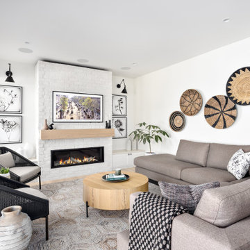
 Simply Home Decorating
This beautiful North Vancouver home belongs to a nature-loving and health-conscious couple, Emma and Vince (names changed), their two young children, and their dog, Jasper. When they contacted us about renovating and furnishing their kitchen and family room, we walked in and saw a world of potential waiting to be uncovered.
Before: Larkhall Crescent Home:
Like many original North Vancouver homes, the interior was definitely dated. We encountered late ‘80s finishes in powder pink and teal green, old carpet, and a kitchen that wasn’t maximized to suit this family’s modern-day lifestyle. However, the size of the rooms offered us a ton of space with which to get creative.
Knowing our clients’ love of cooking, need for work spaces (Emma and Vince both work remotely), and growing family, we developed a design concept that would increase usable space, optimize storage, and create intimacy in this large area. As for the style, we were inspired by their European roots, inventing a new and modern take on “Belgian Farmhouse” style. Now, the home is truly one-of-a-kind.
After: Warm & Cozy Family Room:
Fresh, bright, and comfortable, this living area has been transformed! We started with the fireplace as a focal point, selecting aged brick tiles for added texture and a crisp wood mantle. The taupe-coloured sectional infuses the room with visual warmth and serves the added purpose of separating the family room from the kitchen.
Emma and Vince were also keen on using non-toxic materials in their home, and we were happy to oblige. To meet their needs, we sourced natural wood elements and sought out Canadian-made products - that adhere to high health standards - whenever possible.
Look closer at the elements of this space, and you will find this stunning, honeycomb-patterned rug in earthy gold, beige, and charcoal tones. It’s plush to the touch and full of visual texture that brings this room’s colour palette together. We sourced these two-tone chairs with caning, petrified wood side table, black sconces, and botanical prints in greyscale from local artist, Heather Johnston.
We topped off the space with this dark wood and rattan console that offers storage facing the kitchen and presents an opportunity to display cherished items. The result is a cozy lounging space brimming with comfort and functionality. It’s perfect for enjoying quality family time, or Emma can simply slide the coffee table away to make room for her morning yoga practice.
Now, let’s turn around and give some attention to the kitchen. Do you remember what the original kitchen looked like? If not, scroll back up, because the transformation is shocking…
Moody & Welcoming Kitchen for Healthy Living:
This kitchen looks very different from how it started, right? Though we didn’t touch any walls, the kitchen has almost doubled in usable space! We created a long, extended island with storage, an outlet for small appliances, and seating for comfortable prep, after-school snacking, or mingling among friends.
On the other side of the island, the family has even more storage and an integrated dishwasher within easy reach of the sink, perfect for quick clean-up. From this angle, you can also see the expansive custom Shaker cabinetry in white and the integrated double ovens. These facilitate their cooking experience and gave us the opportunity to add an additional surprise…
A coffee garage station and more hidden storage! Keeping these items located along the perimeter allows them to be accessed by the family or their guests without someone getting under the cook’s feet. These are the little details that make everyday life easier and more enjoyable.
Moving deeper into the kitchen, the seamless induction cooktop topped with a freestanding concealed hood fan commands attention in a soft yet prominent way. The natural wood accent mirrors the fireplace mantle, and the choice of off-black wood-grain cabinets not only continues our black-and-white colour palette but adds a sense of depth and contrast. The corner sink is located to the right and perfectly positioned with a view of their thriving backyard.
To invite more of this family’s character into the space, we mixed metals for interest — matte black, dark pewter, and warm brass — and created open shelves in white oak for their plants and decor. You can also glimpse the tumbled edge of the backsplash tile, which echoes the rustic brick of the fireplace. It adds that farmhouse charm while still feeling timeless and sophisticated.
Last but not least, we designed this dining banquette in the bay window (with integrated bench storage, of course), where the family can share a meal together, the kids can do homework, or Emma and Vince can work and enjoy a change of scenery from their offices. Like the other spaces in the home, it was designed to be beautiful, multi-functional, and long-lasting.
Praise from Our Clients:
It is clear that we love this home, but what did our clients have to say?
“Lori is a visionary and masters execution to the finest detail all at the same time. When she first met us to know more about who we are and how we live, she could right away envision how we could use the space in our kitchen and living room…The results exceeded our expectations.
Lori and her team were also a delight to work with — coordination with all the trades, fast problem-solving, regular updates, professional and friendly attitude of her entire team — made it the dream team. Thank you SHD for making our space so beautiful!”
In turn, we are so grateful for this family’s trust, their open communication, and for being wonderful people with whom to work. (So, thank you!)
 Sherri Blum | Jack and Jill Interiors, Inc.
Children’s waiting room interior design project at Princeton University. I was beyond thrilled when contacted by a team of scientists ( psychologists and neurologists ) at Princeton University. This group of professors and graduate students from the Turk-Brown Laboratory are conducting research on the infant’s brain by using functional magnetic resonance imaging (or fMRI), to see how they learn, remember and think. My job was to turn a tiny 7’x10′ windowless study room into an inviting but not too “clinical” waiting room for the mothers or fathers and siblings of the babies being studied.
We needed to ensure a comfortable place for parents to rock and feed their babies while waiting their turn to go back to the laboratory, as well as a place to change the babies if needed. We wanted to stock some shelves with good books and while the room looks complete, we’re still sourcing something interactive to mount to the wall to help entertain toddlers who want something more active than reading or building blocks.
Since there are no windows, I wanted to bring the outdoors inside. Princeton University‘s colors are orange, gray and black and the history behind those colors is very interesting. It seems there are a lot of squirrels on campus and these colors were selected for the three colors of squirrels often seem scampering around the university grounds. The orange squirrels are now extinct, but the gray and black squirrels are abundant, as I found when touring the campus with my son on installation day. Therefore we wanted to reflect this history in the room and decided to paint silhouettes of squirrels in these three colors throughout the room.
While the ceilings are 10′ high in this tiny room, they’re very drab and boring. Given that it’s a drop ceiling, we can’t paint it a fun color as I typically do in my nurseries and kids’ rooms. To distract from the ugly ceiling, I contacted My Custom Creation through their Etsy shop and commissioned them to create a custom butterfly mobile to suspend from the ceiling to create a swath of butterflies moving across the room. Their customer service was impeccable and the end product was exactly what we wanted!
The flooring in the space was simply coated concrete so I decided to use Flor carpet tiles to give it warmth and a grass-like appeal. These tiles are super easy to install and can easily be removed without any residual on the floor. I’ll be using them more often for sure!
See more photos of our commercial interior design job below and contact us if you need a unique space designed for children. We don’t just design nurseries and bedrooms! We’re game for anything!
 RAJ Kitchen and Bath, LLC
There were a few difficulties in making this kitchen any better than how it was. There was a separate staircase that had access to the second floor which was located in the kitchen. This left just enough room to push the dining room to one side. Then, there was the porch. A really nice panoramic view of the back, but was somehow under-used by the family during the summer months. Then, it was the size of the kitchen. It simply was way too small for a growing family, and while it had a peninsular in place, the flow just didn’t work. I remember watching them one day demonstrating how awkward it was using the kitchen. We got it! We had our marching orders to go and figure out how to make this kitchen work for this family.
Everything in the room was fair play. The design was done to make the kitchen very open. For a few ideas, we incorporated the porch in the kitchen by using the nana wall idea but it ended up being too cost prohibitive to do so. We then decided to do a permanent fix by using a commercial glass wall application. Once we figured that out, we moved back inside and removed the staircase. This gave us two added benefits. One allowed us to really reconfigure the kitchen and the other opened up the second floor for a huge built in closet system.
We relocated the windows, added a fire place with a built In TV above. From there, it was onto the kitchen itself which contained a huge Island with seating, large kitchen sink and built in appliances which was set up in a way to take advantage of the new layout. We re-positioned the kitchen facing the beautiful views outside rather than looking towards a wall. Now, when you enter the house up the entry stairs, the kitchen now draws you into the magnificent new open space. This is now setup for entertaining, relaxation, hanging out and most of all, preparing meals in a room where you only have to leave if you want to.
This one was all about the design. Design was what made this space. Setting this space up for success was crucial, and this kitchen is a great example of how design can cover a multitude of sins in Kitchen designs.
… Just close your eyes for a second and imagine waking up one winter morning and having a cup of coffee and watching the snow fall through those huge windows, leaning up against those 3D feature walls while watching the kids sitting around the table enjoying those warm radiant heated floors in this spacious kitchen…..
 RAJ Kitchen and Bath, LLC
There were a few difficulties in making this kitchen any better than how it was. There was a separate staircase that had access to the second floor which was located in the kitchen. This left just enough room to push the dining room to one side. Then, there was the porch. A really nice panoramic view of the back, but was somehow under-used by the family during the summer months. Then, it was the size of the kitchen. It simply was way too small for a growing family, and while it had a peninsular in place, the flow just didn’t work. I remember watching them one day demonstrating how awkward it was using the kitchen. We got it! We had our marching orders to go and figure out how to make this kitchen work for this family.
Everything in the room was fair play. The design was done to make the kitchen very open. For a few ideas, we incorporated the porch in the kitchen by using the nana wall idea but it ended up being too cost prohibitive to do so. We then decided to do a permanent fix by using a commercial glass wall application. Once we figured that out, we moved back inside and removed the staircase. This gave us two added benefits. One allowed us to really reconfigure the kitchen and the other opened up the second floor for a huge built in closet system.
We relocated the windows, added a fire place with a built In TV above. From there, it was onto the kitchen itself which contained a huge Island with seating, large kitchen sink and built in appliances which was set up in a way to take advantage of the new layout. We re-positioned the kitchen facing the beautiful views outside rather than looking towards a wall. Now, when you enter the house up the entry stairs, the kitchen now draws you into the magnificent new open space. This is now setup for entertaining, relaxation, hanging out and most of all, preparing meals in a room where you only have to leave if you want to.
This one was all about the design. Design was what made this space. Setting this space up for success was crucial, and this kitchen is a great example of how design can cover a multitude of sins in Kitchen designs.
… Just close your eyes for a second and imagine waking up one winter morning and having a cup of coffee and watching the snow fall through those huge windows, leaning up against those 3D feature walls while watching the kids sitting around the table enjoying those warm radiant heated floors in this spacious kitchen…..
 RAJ Kitchen and Bath, LLC
There were a few difficulties in making this kitchen any better than how it was. There was a separate staircase that had access to the second floor which was located in the kitchen. This left just enough room to push the dining room to one side. Then, there was the porch. A really nice panoramic view of the back, but was somehow under-used by the family during the summer months. Then, it was the size of the kitchen. It simply was way too small for a growing family, and while it had a peninsular in place, the flow just didn’t work. I remember watching them one day demonstrating how awkward it was using the kitchen. We got it! We had our marching orders to go and figure out how to make this kitchen work for this family.
Everything in the room was fair play. The design was done to make the kitchen very open. For a few ideas, we incorporated the porch in the kitchen by using the nana wall idea but it ended up being too cost prohibitive to do so. We then decided to do a permanent fix by using a commercial glass wall application. Once we figured that out, we moved back inside and removed the staircase. This gave us two added benefits. One allowed us to really reconfigure the kitchen and the other opened up the second floor for a huge built in closet system.
We relocated the windows, added a fire place with a built In TV above. From there, it was onto the kitchen itself which contained a huge Island with seating, large kitchen sink and built in appliances which was set up in a way to take advantage of the new layout. We re-positioned the kitchen facing the beautiful views outside rather than looking towards a wall. Now, when you enter the house up the entry stairs, the kitchen now draws you into the magnificent new open space. This is now setup for entertaining, relaxation, hanging out and most of all, preparing meals in a room where you only have to leave if you want to.
This one was all about the design. Design was what made this space. Setting this space up for success was crucial, and this kitchen is a great example of how design can cover a multitude of sins in Kitchen designs.
… Just close your eyes for a second and imagine waking up one winter morning and having a cup of coffee and watching the snow fall through those huge windows, leaning up against those 3D feature walls while watching the kids sitting around the table enjoying those warm radiant heated floors in this spacious kitchen…..
 RAJ Kitchen and Bath, LLC
There were a few difficulties in making this kitchen any better than how it was. There was a separate staircase that had access to the second floor which was located in the kitchen. This left just enough room to push the dining room to one side. Then, there was the porch. A really nice panoramic view of the back, but was somehow under-used by the family during the summer months. Then, it was the size of the kitchen. It simply was way too small for a growing family, and while it had a peninsular in place, the flow just didn’t work. I remember watching them one day demonstrating how awkward it was using the kitchen. We got it! We had our marching orders to go and figure out how to make this kitchen work for this family.
Everything in the room was fair play. The design was done to make the kitchen very open. For a few ideas, we incorporated the porch in the kitchen by using the nana wall idea but it ended up being too cost prohibitive to do so. We then decided to do a permanent fix by using a commercial glass wall application. Once we figured that out, we moved back inside and removed the staircase. This gave us two added benefits. One allowed us to really reconfigure the kitchen and the other opened up the second floor for a huge built in closet system.
We relocated the windows, added a fire place with a built In TV above. From there, it was onto the kitchen itself which contained a huge Island with seating, large kitchen sink and built in appliances which was set up in a way to take advantage of the new layout. We re-positioned the kitchen facing the beautiful views outside rather than looking towards a wall. Now, when you enter the house up the entry stairs, the kitchen now draws you into the magnificent new open space. This is now setup for entertaining, relaxation, hanging out and most of all, preparing meals in a room where you only have to leave if you want to.
This one was all about the design. Design was what made this space. Setting this space up for success was crucial, and this kitchen is a great example of how design can cover a multitude of sins in Kitchen designs.
… Just close your eyes for a second and imagine waking up one winter morning and having a cup of coffee and watching the snow fall through those huge windows, leaning up against those 3D feature walls while watching the kids sitting around the table enjoying those warm radiant heated floors in this spacious kitchen…..
 RAJ Kitchen and Bath, LLC
There were a few difficulties in making this kitchen any better than how it was. There was a separate staircase that had access to the second floor which was located in the kitchen. This left just enough room to push the dining room to one side. Then, there was the porch. A really nice panoramic view of the back, but was somehow under-used by the family during the summer months. Then, it was the size of the kitchen. It simply was way too small for a growing family, and while it had a peninsular in place, the flow just didn’t work. I remember watching them one day demonstrating how awkward it was using the kitchen. We got it! We had our marching orders to go and figure out how to make this kitchen work for this family.
Everything in the room was fair play. The design was done to make the kitchen very open. For a few ideas, we incorporated the porch in the kitchen by using the nana wall idea but it ended up being too cost prohibitive to do so. We then decided to do a permanent fix by using a commercial glass wall application. Once we figured that out, we moved back inside and removed the staircase. This gave us two added benefits. One allowed us to really reconfigure the kitchen and the other opened up the second floor for a huge built in closet system.
We relocated the windows, added a fire place with a built In TV above. From there, it was onto the kitchen itself which contained a huge Island with seating, large kitchen sink and built in appliances which was set up in a way to take advantage of the new layout. We re-positioned the kitchen facing the beautiful views outside rather than looking towards a wall. Now, when you enter the house up the entry stairs, the kitchen now draws you into the magnificent new open space. This is now setup for entertaining, relaxation, hanging out and most of all, preparing meals in a room where you only have to leave if you want to.
This one was all about the design. Design was what made this space. Setting this space up for success was crucial, and this kitchen is a great example of how design can cover a multitude of sins in Kitchen designs.
… Just close your eyes for a second and imagine waking up one winter morning and having a cup of coffee and watching the snow fall through those huge windows, leaning up against those 3D feature walls while watching the kids sitting around the table enjoying those warm radiant heated floors in this spacious kitchen…..
 RAJ Kitchen and Bath, LLC
There were a few difficulties in making this kitchen any better than how it was. There was a separate staircase that had access to the second floor which was located in the kitchen. This left just enough room to push the dining room to one side. Then, there was the porch. A really nice panoramic view of the back, but was somehow under-used by the family during the summer months. Then, it was the size of the kitchen. It simply was way too small for a growing family, and while it had a peninsular in place, the flow just didn’t work. I remember watching them one day demonstrating how awkward it was using the kitchen. We got it! We had our marching orders to go and figure out how to make this kitchen work for this family.
Everything in the room was fair play. The design was done to make the kitchen very open. For a few ideas, we incorporated the porch in the kitchen by using the nana wall idea but it ended up being too cost prohibitive to do so. We then decided to do a permanent fix by using a commercial glass wall application. Once we figured that out, we moved back inside and removed the staircase. This gave us two added benefits. One allowed us to really reconfigure the kitchen and the other opened up the second floor for a huge built in closet system.
We relocated the windows, added a fire place with a built In TV above. From there, it was onto the kitchen itself which contained a huge Island with seating, large kitchen sink and built in appliances which was set up in a way to take advantage of the new layout. We re-positioned the kitchen facing the beautiful views outside rather than looking towards a wall. Now, when you enter the house up the entry stairs, the kitchen now draws you into the magnificent new open space. This is now setup for entertaining, relaxation, hanging out and most of all, preparing meals in a room where you only have to leave if you want to.
This one was all about the design. Design was what made this space. Setting this space up for success was crucial, and this kitchen is a great example of how design can cover a multitude of sins in Kitchen designs.
… Just close your eyes for a second and imagine waking up one winter morning and having a cup of coffee and watching the snow fall through those huge windows, leaning up against those 3D feature walls while watching the kids sitting around the table enjoying those warm radiant heated floors in this spacious kitchen…..
 RAJ Kitchen and Bath, LLC
There were a few difficulties in making this kitchen any better than how it was. There was a separate staircase that had access to the second floor which was located in the kitchen. This left just enough room to push the dining room to one side. Then, there was the porch. A really nice panoramic view of the back, but was somehow under-used by the family during the summer months. Then, it was the size of the kitchen. It simply was way too small for a growing family, and while it had a peninsular in place, the flow just didn’t work. I remember watching them one day demonstrating how awkward it was using the kitchen. We got it! We had our marching orders to go and figure out how to make this kitchen work for this family.
Everything in the room was fair play. The design was done to make the kitchen very open. For a few ideas, we incorporated the porch in the kitchen by using the nana wall idea but it ended up being too cost prohibitive to do so. We then decided to do a permanent fix by using a commercial glass wall application. Once we figured that out, we moved back inside and removed the staircase. This gave us two added benefits. One allowed us to really reconfigure the kitchen and the other opened up the second floor for a huge built in closet system.
We relocated the windows, added a fire place with a built In TV above. From there, it was onto the kitchen itself which contained a huge Island with seating, large kitchen sink and built in appliances which was set up in a way to take advantage of the new layout. We re-positioned the kitchen facing the beautiful views outside rather than looking towards a wall. Now, when you enter the house up the entry stairs, the kitchen now draws you into the magnificent new open space. This is now setup for entertaining, relaxation, hanging out and most of all, preparing meals in a room where you only have to leave if you want to.
This one was all about the design. Design was what made this space. Setting this space up for success was crucial, and this kitchen is a great example of how design can cover a multitude of sins in Kitchen designs.
… Just close your eyes for a second and imagine waking up one winter morning and having a cup of coffee and watching the snow fall through those huge windows, leaning up against those 3D feature walls while watching the kids sitting around the table enjoying those warm radiant heated floors in this spacious kitchen…..
 Sherri Blum | Jack and Jill Interiors, Inc.
Children’s waiting room interior design project at Princeton University. I was beyond thrilled when contacted by a team of scientists ( psychologists and neurologists ) at Princeton University. This group of professors and graduate students from the Turk-Brown Laboratory are conducting research on the infant’s brain by using functional magnetic resonance imaging (or fMRI), to see how they learn, remember and think. My job was to turn a tiny 7’x10′ windowless study room into an inviting but not too “clinical” waiting room for the mothers or fathers and siblings of the babies being studied.
We needed to ensure a comfortable place for parents to rock and feed their babies while waiting their turn to go back to the laboratory, as well as a place to change the babies if needed. We wanted to stock some shelves with good books and while the room looks complete, we’re still sourcing something interactive to mount to the wall to help entertain toddlers who want something more active than reading or building blocks.
Since there are no windows, I wanted to bring the outdoors inside. Princeton University‘s colors are orange, gray and black and the history behind those colors is very interesting. It seems there are a lot of squirrels on campus and these colors were selected for the three colors of squirrels often seem scampering around the university grounds. The orange squirrels are now extinct, but the gray and black squirrels are abundant, as I found when touring the campus with my son on installation day. Therefore we wanted to reflect this history in the room and decided to paint silhouettes of squirrels in these three colors throughout the room.
While the ceilings are 10′ high in this tiny room, they’re very drab and boring. Given that it’s a drop ceiling, we can’t paint it a fun color as I typically do in my nurseries and kids’ rooms. To distract from the ugly ceiling, I contacted My Custom Creation through their Etsy shop and commissioned them to create a custom butterfly mobile to suspend from the ceiling to create a swath of butterflies moving across the room. Their customer service was impeccable and the end product was exactly what we wanted!
The flooring in the space was simply coated concrete so I decided to use Flor carpet tiles to give it warmth and a grass-like appeal. These tiles are super easy to install and can easily be removed without any residual on the floor. I’ll be using them more often for sure!
See more photos of our commercial interior design job below and contact us if you need a unique space designed for children. We don’t just design nurseries and bedrooms! We’re game for anything!
224