
Search results for "Remembering" in Home Design Ideas
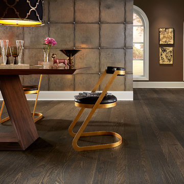


 RAJ Kitchen and Bath, LLC
There were a few difficulties in making this kitchen any better than how it was. There was a separate staircase that had access to the second floor which was located in the kitchen. This left just enough room to push the dining room to one side. Then, there was the porch. A really nice panoramic view of the back, but was somehow under-used by the family during the summer months. Then, it was the size of the kitchen. It simply was way too small for a growing family, and while it had a peninsular in place, the flow just didn’t work. I remember watching them one day demonstrating how awkward it was using the kitchen. We got it! We had our marching orders to go and figure out how to make this kitchen work for this family.
Everything in the room was fair play. The design was done to make the kitchen very open. For a few ideas, we incorporated the porch in the kitchen by using the nana wall idea but it ended up being too cost prohibitive to do so. We then decided to do a permanent fix by using a commercial glass wall application. Once we figured that out, we moved back inside and removed the staircase. This gave us two added benefits. One allowed us to really reconfigure the kitchen and the other opened up the second floor for a huge built in closet system.
We relocated the windows, added a fire place with a built In TV above. From there, it was onto the kitchen itself which contained a huge Island with seating, large kitchen sink and built in appliances which was set up in a way to take advantage of the new layout. We re-positioned the kitchen facing the beautiful views outside rather than looking towards a wall. Now, when you enter the house up the entry stairs, the kitchen now draws you into the magnificent new open space. This is now setup for entertaining, relaxation, hanging out and most of all, preparing meals in a room where you only have to leave if you want to.
This one was all about the design. Design was what made this space. Setting this space up for success was crucial, and this kitchen is a great example of how design can cover a multitude of sins in Kitchen designs.
… Just close your eyes for a second and imagine waking up one winter morning and having a cup of coffee and watching the snow fall through those huge windows, leaning up against those 3D feature walls while watching the kids sitting around the table enjoying those warm radiant heated floors in this spacious kitchen…..
 Simply Home Decorating
This beautiful North Vancouver home belongs to a nature-loving and health-conscious couple, Emma and Vince (names changed), their two young children, and their dog, Jasper. When they contacted us about renovating and furnishing their kitchen and family room, we walked in and saw a world of potential waiting to be uncovered.
Before: Larkhall Crescent Home:
Like many original North Vancouver homes, the interior was definitely dated. We encountered late ‘80s finishes in powder pink and teal green, old carpet, and a kitchen that wasn’t maximized to suit this family’s modern-day lifestyle. However, the size of the rooms offered us a ton of space with which to get creative.
Knowing our clients’ love of cooking, need for work spaces (Emma and Vince both work remotely), and growing family, we developed a design concept that would increase usable space, optimize storage, and create intimacy in this large area. As for the style, we were inspired by their European roots, inventing a new and modern take on “Belgian Farmhouse” style. Now, the home is truly one-of-a-kind.
After: Warm & Cozy Family Room:
Fresh, bright, and comfortable, this living area has been transformed! We started with the fireplace as a focal point, selecting aged brick tiles for added texture and a crisp wood mantle. The taupe-coloured sectional infuses the room with visual warmth and serves the added purpose of separating the family room from the kitchen.
Emma and Vince were also keen on using non-toxic materials in their home, and we were happy to oblige. To meet their needs, we sourced natural wood elements and sought out Canadian-made products - that adhere to high health standards - whenever possible.
Look closer at the elements of this space, and you will find this stunning, honeycomb-patterned rug in earthy gold, beige, and charcoal tones. It’s plush to the touch and full of visual texture that brings this room’s colour palette together. We sourced these two-tone chairs with caning, petrified wood side table, black sconces, and botanical prints in greyscale from local artist, Heather Johnston.
We topped off the space with this dark wood and rattan console that offers storage facing the kitchen and presents an opportunity to display cherished items. The result is a cozy lounging space brimming with comfort and functionality. It’s perfect for enjoying quality family time, or Emma can simply slide the coffee table away to make room for her morning yoga practice.
Now, let’s turn around and give some attention to the kitchen. Do you remember what the original kitchen looked like? If not, scroll back up, because the transformation is shocking…
Moody & Welcoming Kitchen for Healthy Living:
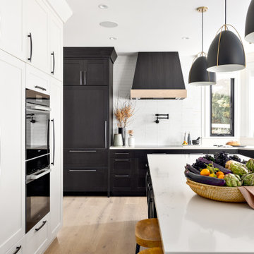
This kitchen looks very different from how it started, right? Though we didn’t touch any walls, the kitchen has almost doubled in usable space! We created a long, extended island with storage, an outlet for small appliances, and seating for comfortable prep, after-school snacking, or mingling among friends.
On the other side of the island, the family has even more storage and an integrated dishwasher within easy reach of the sink, perfect for quick clean-up. From this angle, you can also see the expansive custom Shaker cabinetry in white and the integrated double ovens. These facilitate their cooking experience and gave us the opportunity to add an additional surprise…
A coffee garage station and more hidden storage! Keeping these items located along the perimeter allows them to be accessed by the family or their guests without someone getting under the cook’s feet. These are the little details that make everyday life easier and more enjoyable.
Moving deeper into the kitchen, the seamless induction cooktop topped with a freestanding concealed hood fan commands attention in a soft yet prominent way. The natural wood accent mirrors the fireplace mantle, and the choice of off-black wood-grain cabinets not only continues our black-and-white colour palette but adds a sense of depth and contrast. The corner sink is located to the right and perfectly positioned with a view of their thriving backyard.
To invite more of this family’s character into the space, we mixed metals for interest — matte black, dark pewter, and warm brass — and created open shelves in white oak for their plants and decor. You can also glimpse the tumbled edge of the backsplash tile, which echoes the rustic brick of the fireplace. It adds that farmhouse charm while still feeling timeless and sophisticated.
Last but not least, we designed this dining banquette in the bay window (with integrated bench storage, of course), where the family can share a meal together, the kids can do homework, or Emma and Vince can work and enjoy a change of scenery from their offices. Like the other spaces in the home, it was designed to be beautiful, multi-functional, and long-lasting.
Praise from Our Clients:
It is clear that we love this home, but what did our clients have to say?
“Lori is a visionary and masters execution to the finest detail all at the same time. When she first met us to know more about who we are and how we live, she could right away envision how we could use the space in our kitchen and living room…The results exceeded our expectations.
Lori and her team were also a delight to work with — coordination with all the trades, fast problem-solving, regular updates, professional and friendly attitude of her entire team — made it the dream team. Thank you SHD for making our space so beautiful!”
In turn, we are so grateful for this family’s trust, their open communication, and for being wonderful people with whom to work. (So, thank you!)
Find the right local pro for your project
 RAJ Kitchen and Bath, LLC
There were a few difficulties in making this kitchen any better than how it was. There was a separate staircase that had access to the second floor which was located in the kitchen. This left just enough room to push the dining room to one side. Then, there was the porch. A really nice panoramic view of the back, but was somehow under-used by the family during the summer months. Then, it was the size of the kitchen. It simply was way too small for a growing family, and while it had a peninsular in place, the flow just didn’t work. I remember watching them one day demonstrating how awkward it was using the kitchen. We got it! We had our marching orders to go and figure out how to make this kitchen work for this family.
Everything in the room was fair play. The design was done to make the kitchen very open. For a few ideas, we incorporated the porch in the kitchen by using the nana wall idea but it ended up being too cost prohibitive to do so. We then decided to do a permanent fix by using a commercial glass wall application. Once we figured that out, we moved back inside and removed the staircase. This gave us two added benefits. One allowed us to really reconfigure the kitchen and the other opened up the second floor for a huge built in closet system.
We relocated the windows, added a fire place with a built In TV above. From there, it was onto the kitchen itself which contained a huge Island with seating, large kitchen sink and built in appliances which was set up in a way to take advantage of the new layout. We re-positioned the kitchen facing the beautiful views outside rather than looking towards a wall. Now, when you enter the house up the entry stairs, the kitchen now draws you into the magnificent new open space. This is now setup for entertaining, relaxation, hanging out and most of all, preparing meals in a room where you only have to leave if you want to.
This one was all about the design. Design was what made this space. Setting this space up for success was crucial, and this kitchen is a great example of how design can cover a multitude of sins in Kitchen designs.
… Just close your eyes for a second and imagine waking up one winter morning and having a cup of coffee and watching the snow fall through those huge windows, leaning up against those 3D feature walls while watching the kids sitting around the table enjoying those warm radiant heated floors in this spacious kitchen…..

 Kashmir Fine Arts & Crafts
Klimt Cushion Cover Signs of Spring modern abstract pillow hand embroidered - Seeds, seed pods, tree of life symbols all speak of Gustav Klimt's symbolist paintings. Chaotic colors give it an spirited essence similar to jazz album covers of the 50s (compare Dave Brubeck's 'Take 5' album cover). A 15th century handcraft based on 19th century painting reminiscent of 20th century album covers done by 21st century handcrafters. What could be more perfect? The hand-dyed Kashmir wool embroidery on a cotton back and base makes a durable and easy care cover to update the old or accentuate the new.
Composition: 70% Soft Wool, 30% Cotton
Size: 18' x 18' (45 cms x 45 cms)
Pillow Insert not Included (Only Cover is on Sale)
Hand embroidered in Village Cottage Units
Backing: Canvas (See the Last Picture)
These modern pillow covers are handcrafted by Kashmiri artisans, and are of the finest chain-stitch embroidery in the world.Created of soft Kashmir wool over cotton, this all-natural cover makes an enduring impression. A close-up view of this abstract pillow cover allows you to see the amazing chain-stitch embroidery work of master artisans who have practiced this art their entire lives.This abstract decorative pillow cover could grace the cabin of your boat or the chair in your solarium and yet be equally as comfortable in your den. The eye-popping color and pattern of this modern throw pillow is just what the designer ordered to create a fiery focal point in your decor. Perfect wherever you need a splash of color, this art work pillow creation is as durable as it is beautiful. Easy to care for, this cushion cover could spark up an old throw pillow or grace a new pillow form. Gustav Klimt is remembered as one of the greatest decorative painters of the twentieth century, and also produced one of the century's most significant bodies of erotic art. Initially successful as a conventional academic painter, his encounter with more modern trends in European art encouraged him to develop his own eclectic and often unique style.Klimt believed in the equality of fine and decorative art, and was one of the most influential exponents of Art Nouveau, the movement that spread throughout Europe in the late 19th century.

 Ocean Blu Designs
Miles from New York City, Mahopac is a quiet lakefront community. We had the privilege to work with our amazing clients on house design and interior design. We worked on their first floor and 2nd floor living spaces. Check out our blog to see more details. www.oceanbludesigns.com

 Kari P
When I bought my house in May 2014, there was one thing I really didn’t like about it – the 1950s bathroom complete with pink tile and mismatched gaudy fixtures was absolutely hideous. I knew redoing the bathroom would be a big, expensive project, so I vowed to just live with it while I fixed up parts of the house that were easier to update, such as putting a fresh coat of paint on the walls and updating the curtains (which I still haven’t done, by the way). Well my first winter in the new house turned out to be a bad one, and in February 2015, I noticed water stains on the walls and ceiling of the second bedroom that only got worse and worse each day. The water damage quickly spread to other rooms, and when contractors came to the house to access and fix the damage, they discovered moisture behind the pink tiled walls of my bathroom. And so started the bathroom remodel.
Start to finish, this project took close to six months, due to going back and forth with insurance and difficulty finding a contractor I liked. I lived without a shower for at least four of those months, showering at the gym where I worked or in a pop-up tent in my backyard once it was warm enough out. My friend Eric and I demoed the bathroom and for the remodel, I picked out all of the design components and had a local contractor, Fred Haas do the work. I kept the original layout – as my bathroom was small to begin with and it was both impractical and expensive to start moving things around – but just about everything else about the bathroom is new, except for maybe the window and door. New tub, sink, and toilet, new tile floor and shower surround, new walls and ceiling, fresh paint, new fixtures and mirror, updated lighting, and a better ventilation system were all added.
Tub – Sterling Vikrell
Toilet – Kohler Wellworth® two-piece round-front dual-flush toilet
Sink – Kohler Veer™ 21" pedestal bathroom sink
Fixtures – Kohler Alteo® line
Tile floor and shower surround – American Olean Laurel Heights ceramic tile in Summit Gray
Lighting – I don't remember... will have to see if I can find it
Ventilation system – NuTone
Mirror – Ikea
Paint – Behr
Here are photos of my project from start to finish. As you can see, I probably still need a thing or two (a toilet paper holder, mini storage shelf, and some art wouldn’t hurt, nor would replacing the door or painting it white), but overall I’m really happy with how my new bathroom came out. I LOVE it, which is the exact opposite of how I felt about the original bathroom.
Photos © Kari Post
 RAJ Kitchen and Bath, LLC
There were a few difficulties in making this kitchen any better than how it was. There was a separate staircase that had access to the second floor which was located in the kitchen. This left just enough room to push the dining room to one side. Then, there was the porch. A really nice panoramic view of the back, but was somehow under-used by the family during the summer months. Then, it was the size of the kitchen. It simply was way too small for a growing family, and while it had a peninsular in place, the flow just didn’t work. I remember watching them one day demonstrating how awkward it was using the kitchen. We got it! We had our marching orders to go and figure out how to make this kitchen work for this family.
Everything in the room was fair play. The design was done to make the kitchen very open. For a few ideas, we incorporated the porch in the kitchen by using the nana wall idea but it ended up being too cost prohibitive to do so. We then decided to do a permanent fix by using a commercial glass wall application. Once we figured that out, we moved back inside and removed the staircase. This gave us two added benefits. One allowed us to really reconfigure the kitchen and the other opened up the second floor for a huge built in closet system.
We relocated the windows, added a fire place with a built In TV above. From there, it was onto the kitchen itself which contained a huge Island with seating, large kitchen sink and built in appliances which was set up in a way to take advantage of the new layout. We re-positioned the kitchen facing the beautiful views outside rather than looking towards a wall. Now, when you enter the house up the entry stairs, the kitchen now draws you into the magnificent new open space. This is now setup for entertaining, relaxation, hanging out and most of all, preparing meals in a room where you only have to leave if you want to.
This one was all about the design. Design was what made this space. Setting this space up for success was crucial, and this kitchen is a great example of how design can cover a multitude of sins in Kitchen designs.
… Just close your eyes for a second and imagine waking up one winter morning and having a cup of coffee and watching the snow fall through those huge windows, leaning up against those 3D feature walls while watching the kids sitting around the table enjoying those warm radiant heated floors in this spacious kitchen…..
 RAJ Kitchen and Bath, LLC
There were a few difficulties in making this kitchen any better than how it was. There was a separate staircase that had access to the second floor which was located in the kitchen. This left just enough room to push the dining room to one side. Then, there was the porch. A really nice panoramic view of the back, but was somehow under-used by the family during the summer months. Then, it was the size of the kitchen. It simply was way too small for a growing family, and while it had a peninsular in place, the flow just didn’t work. I remember watching them one day demonstrating how awkward it was using the kitchen. We got it! We had our marching orders to go and figure out how to make this kitchen work for this family.
Everything in the room was fair play. The design was done to make the kitchen very open. For a few ideas, we incorporated the porch in the kitchen by using the nana wall idea but it ended up being too cost prohibitive to do so. We then decided to do a permanent fix by using a commercial glass wall application. Once we figured that out, we moved back inside and removed the staircase. This gave us two added benefits. One allowed us to really reconfigure the kitchen and the other opened up the second floor for a huge built in closet system.
We relocated the windows, added a fire place with a built In TV above. From there, it was onto the kitchen itself which contained a huge Island with seating, large kitchen sink and built in appliances which was set up in a way to take advantage of the new layout. We re-positioned the kitchen facing the beautiful views outside rather than looking towards a wall. Now, when you enter the house up the entry stairs, the kitchen now draws you into the magnificent new open space. This is now setup for entertaining, relaxation, hanging out and most of all, preparing meals in a room where you only have to leave if you want to.
This one was all about the design. Design was what made this space. Setting this space up for success was crucial, and this kitchen is a great example of how design can cover a multitude of sins in Kitchen designs.
… Just close your eyes for a second and imagine waking up one winter morning and having a cup of coffee and watching the snow fall through those huge windows, leaning up against those 3D feature walls while watching the kids sitting around the table enjoying those warm radiant heated floors in this spacious kitchen…..
 RAJ Kitchen and Bath, LLC
There were a few difficulties in making this kitchen any better than how it was. There was a separate staircase that had access to the second floor which was located in the kitchen. This left just enough room to push the dining room to one side. Then, there was the porch. A really nice panoramic view of the back, but was somehow under-used by the family during the summer months. Then, it was the size of the kitchen. It simply was way too small for a growing family, and while it had a peninsular in place, the flow just didn’t work. I remember watching them one day demonstrating how awkward it was using the kitchen. We got it! We had our marching orders to go and figure out how to make this kitchen work for this family.
Everything in the room was fair play. The design was done to make the kitchen very open. For a few ideas, we incorporated the porch in the kitchen by using the nana wall idea but it ended up being too cost prohibitive to do so. We then decided to do a permanent fix by using a commercial glass wall application. Once we figured that out, we moved back inside and removed the staircase. This gave us two added benefits. One allowed us to really reconfigure the kitchen and the other opened up the second floor for a huge built in closet system.
We relocated the windows, added a fire place with a built In TV above. From there, it was onto the kitchen itself which contained a huge Island with seating, large kitchen sink and built in appliances which was set up in a way to take advantage of the new layout. We re-positioned the kitchen facing the beautiful views outside rather than looking towards a wall. Now, when you enter the house up the entry stairs, the kitchen now draws you into the magnificent new open space. This is now setup for entertaining, relaxation, hanging out and most of all, preparing meals in a room where you only have to leave if you want to.
This one was all about the design. Design was what made this space. Setting this space up for success was crucial, and this kitchen is a great example of how design can cover a multitude of sins in Kitchen designs.
… Just close your eyes for a second and imagine waking up one winter morning and having a cup of coffee and watching the snow fall through those huge windows, leaning up against those 3D feature walls while watching the kids sitting around the table enjoying those warm radiant heated floors in this spacious kitchen…..
 RAJ Kitchen and Bath, LLC
There were a few difficulties in making this kitchen any better than how it was. There was a separate staircase that had access to the second floor which was located in the kitchen. This left just enough room to push the dining room to one side. Then, there was the porch. A really nice panoramic view of the back, but was somehow under-used by the family during the summer months. Then, it was the size of the kitchen. It simply was way too small for a growing family, and while it had a peninsular in place, the flow just didn’t work. I remember watching them one day demonstrating how awkward it was using the kitchen. We got it! We had our marching orders to go and figure out how to make this kitchen work for this family.
Everything in the room was fair play. The design was done to make the kitchen very open. For a few ideas, we incorporated the porch in the kitchen by using the nana wall idea but it ended up being too cost prohibitive to do so. We then decided to do a permanent fix by using a commercial glass wall application. Once we figured that out, we moved back inside and removed the staircase. This gave us two added benefits. One allowed us to really reconfigure the kitchen and the other opened up the second floor for a huge built in closet system.
We relocated the windows, added a fire place with a built In TV above. From there, it was onto the kitchen itself which contained a huge Island with seating, large kitchen sink and built in appliances which was set up in a way to take advantage of the new layout. We re-positioned the kitchen facing the beautiful views outside rather than looking towards a wall. Now, when you enter the house up the entry stairs, the kitchen now draws you into the magnificent new open space. This is now setup for entertaining, relaxation, hanging out and most of all, preparing meals in a room where you only have to leave if you want to.
This one was all about the design. Design was what made this space. Setting this space up for success was crucial, and this kitchen is a great example of how design can cover a multitude of sins in Kitchen designs.
… Just close your eyes for a second and imagine waking up one winter morning and having a cup of coffee and watching the snow fall through those huge windows, leaning up against those 3D feature walls while watching the kids sitting around the table enjoying those warm radiant heated floors in this spacious kitchen…..
 RAJ Kitchen and Bath, LLC
There were a few difficulties in making this kitchen any better than how it was. There was a separate staircase that had access to the second floor which was located in the kitchen. This left just enough room to push the dining room to one side. Then, there was the porch. A really nice panoramic view of the back, but was somehow under-used by the family during the summer months. Then, it was the size of the kitchen. It simply was way too small for a growing family, and while it had a peninsular in place, the flow just didn’t work. I remember watching them one day demonstrating how awkward it was using the kitchen. We got it! We had our marching orders to go and figure out how to make this kitchen work for this family.
Everything in the room was fair play. The design was done to make the kitchen very open. For a few ideas, we incorporated the porch in the kitchen by using the nana wall idea but it ended up being too cost prohibitive to do so. We then decided to do a permanent fix by using a commercial glass wall application. Once we figured that out, we moved back inside and removed the staircase. This gave us two added benefits. One allowed us to really reconfigure the kitchen and the other opened up the second floor for a huge built in closet system.
We relocated the windows, added a fire place with a built In TV above. From there, it was onto the kitchen itself which contained a huge Island with seating, large kitchen sink and built in appliances which was set up in a way to take advantage of the new layout. We re-positioned the kitchen facing the beautiful views outside rather than looking towards a wall. Now, when you enter the house up the entry stairs, the kitchen now draws you into the magnificent new open space. This is now setup for entertaining, relaxation, hanging out and most of all, preparing meals in a room where you only have to leave if you want to.
This one was all about the design. Design was what made this space. Setting this space up for success was crucial, and this kitchen is a great example of how design can cover a multitude of sins in Kitchen designs.
… Just close your eyes for a second and imagine waking up one winter morning and having a cup of coffee and watching the snow fall through those huge windows, leaning up against those 3D feature walls while watching the kids sitting around the table enjoying those warm radiant heated floors in this spacious kitchen…..

 Guru Of Luxury | Yvonne Roberts
FROM THE DESK OF YVONNE ROBERTS
'Connecting our Built & Unbuilt Worlds.'
As an innovator of lifestyle design, to include more than 20 years’ experience in the luxury hotel segment, Guru of Luxury is focused on creating a unique, sustainable ambiance, further ensuring a memorable guest experience. The setting should be immersive, transformative and deeply engaging. The goal is to create a vibe that captivates guests – whom we refer to as Global Citizens – by feeling the environment beyond the visual surroundings.
 Adobe Interiors
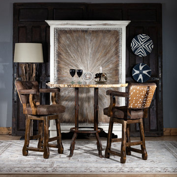
Bring a piece of nature into your entertaining area with our rustic elegant Chisum Axis Barstool. Let your retreat become an adventure in its own right. Featuring genuine axis deer hide, this 360 degree swivel stool brings an authenticity to your space that cannot be duplicated. The axis deer hide backing seamlessly transitions to a hand-tufted leather seat and back cushion, to create a unique experience that pairs the wild with the refined in this high-end leather barstool. Comfort, quality and tasteful design come together to create this fine leather barstool. 100% American Made to the highest standards of quality and craftsmanship.
Overall Barstool Dimensions: 43" H x 26" W x 22" D
Seat Height: 30"
Top of Arm Height: 40"
Overall Counter Stool Dimension: 38" H x 26" W x 22" D
Seat Height: 25"
Top of Arm Height: 35"
Leather Description: A fully drum dyed top grain cowhide on European raw material. This leather is lightly ironed and then milled extensively for a unique distressed appearance. This is a natural full grain leather. The hides have not been altered in any way during the tanning process. Shade variation is normal and areas of hides absorb dyes differently, so natural dye lot variations will occur. Remember that a swatch is a general representation of the leather's color and texture, not an exact match. Scars, marks, and branding are not flaws but rather are proof of authenticity, what we call "hallmarks of the trail". Leathers will fade if exposed to direct sunlight. This is a pull up leather which means color diffusion and "burst" will occur when worked by hand. If any of these characteristics is a problem please consider a "painted" leather. One that has been corrected and heavily pigmented.
100% top grain cowhide leather is characterized by variations in shade, texture, color and grain. Healed marks and scars are to be expected and enhance the natural beauty of the hides. These variations should not be considered defects as they are normal and unique features of genuine 100% top grain cowhide leather.
Frame Construction: Made with American Alder Wood, our frames are glued, screwed and dowelled at the joints. Two coats of high quality stain is hand rubbed on the wood finish and then sealed with industrial grade clear coat.
 Paver House
This Tampa Bay homeowner was looking into complete change his backyard. Most pools in Tampa are built with a connected spa. To increase his pool size, he ended up deciding for not to build spa, however, he still wanted an appealing focal point to his pool. To contrast with the beautiful green landscape around the backyard, our customer wanted to add color and movement to his outdoor area.
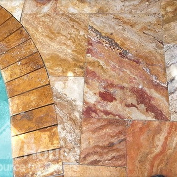
For the main pool deck area, our customer felt in love with the french pattern autumn blend tumbled travertine pavers. French Pattern Tumbled Autumn Blend Travertine Pavers contain a mixture of mostly red and gold, with some white, dark and light brown tones. Autumn Blend added the perfect amount of color and movement our customer wanted.
Travertine pavers offer a few unique color mixtures that make any outdoor space pops up from others.
A great accent color solution for the coping was the Desert Gold color on the 4×9 tumbled travertine copings. The beautifully blended Desert Gold may be bright and striking but does not lack for warmth and richness as well. To not compete with the strong colors of the pool deck, we advised our customer to add a lighter and more neutral pool tile: 2×2 autumn blend tumbled travertine tiles brought the perfect combination of contrast and harmony we were looking to achieve.
CREATIVITY ON YOUR POOL REMODEL WITH TRAVERTINE PAVER.
Pool remodel with travertine paver does not need to represent neutral colors only. Different than what most people believe, travertine pavers offer a few unique color mixtures that make any outdoor space pop up from others. Don’t be afraid of mixing different patterns, colors and textures to add more character to your outdoor space. Remember that, travertine pavers will display better their color when sealed, like the pictures from this pool remodel. If you are not sure if you would like your paver with the enhanced color, spray the sample with water first.
PREMIUM TRAVERTINE FRENCH PATTERN PAVERS
Pool remodel with travertine paver
POOL REMODEL WITH TRAVERTINE PAVERS
This Tampa Bay homeowner was looking into complete change his backyard. Most pools in Tampa are built with a connected spa. To increase his pool size, he ended up deciding for not to build spa, however, he still wanted an appealing focal point to his pool. To contrast with the beautiful green landscape around the backyard, our customer wanted to add color and movement to his outdoor area.
For the main pool deck area, our customer felt in love with the french pattern autumn blend tumbled travertine pavers. French Pattern Tumbled Autumn Blend Travertine Pavers contain a mixture of mostly red and gold, with some white, dark and light brown tones. Autumn Blend added the perfect amount of color and movement our customer wanted.
pool remodel with travertine paverpool remodel with travertine paverpool remodel with travertine paverpool remodel with travertine paverpool remodel with travertine paver
Previous
Next
Travertine pavers offer a few unique color mixtures that make any outdoor space pops up from others.
A great accent color solution for the coping was the Desert Gold color on the 4×9 tumbled travertine copings. The beautifully blended Desert Gold may be bright and striking but does not lack for warmth and richness as well. To not compete with the strong colors of the pool deck, we advised our customer to add a lighter and more neutral pool tile: 2×2 autumn blend tumbled travertine tiles brought the perfect combination of contrast and harmony we were looking to achieve.
CREATIVITY ON YOUR POOL REMODEL WITH TRAVERTINE PAVER.
Pool remodel with travertine paver does not need to represent neutral colors only. Different than what most people believe, travertine pavers offer a few unique color mixtures that make any outdoor space pop up from others. Don’t be afraid of mixing different patterns, colors and textures to add more character to your outdoor space. Remember that, travertine pavers will display better their color when sealed, like the pictures from this pool remodel. If you are not sure if you would like your paver with the enhanced color, spray the sample with water first.
PREMIUM TRAVERTINE FRENCH PATTERN PAVERS
On this pool remodel project, our customer preferred to use the French Pattern design, which is a good way to break up the monotony of the typical geometric or square appearance of large areas. Just like this outstanding pool deck remodel, patios and walkways will appear more fluid and mosaic by eliminating grout lines and the usual linear effect as well as the need for constant maintenance of the typical square or rectangular paver.
A French Pattern or a Versailles pattern is a paver pattern made up of four different sized tiles. Most French patterns are laid in stone, and nearly all are sold in “bundles” of tile that will cover 16 square feet.
Travertine pavers on your pool deck will reflect heat on hot days, remaining cool to the touch, unlike concrete surface options. Travertine does not discolor or become chalky after installation. The texture of travertine ensures that the stone remains slip resistant for wet feet, while its cool feel prevents burns. Another great advantage of travertine pavers is that there will be no visible grout lines; grout can be a source of both installation problems and added cost for future removal / replacement or up-keep.
 Pro-Roofing
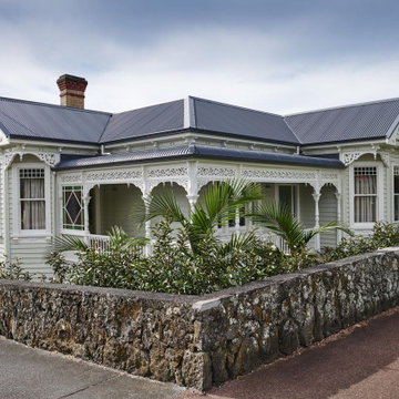
The standard duration of a roof is roughly many years. If the roof is under few years old yet you are having problems, it will probably be able to get repaired instead of being forced to put up a brand-new roof. Even so, if your roof exceeds this age it usually is recommended to put in a new roof. To complete both fixes and new installs, a roofing contractor should be employed. A roofing contractor will be able to perfectly put in or service roofing components to make certain a good quality end product.
Before employing a residential roofing Auckland contractor it's always a good idea to get recommendations from family or friends. No matter whether you have recommendations, acquire several bids prior to figuring out the roofing company to hire. A bid ought to be thorough and encompass the work to be conducted, expense, and time-frame to finish. Make certain clean up is included in the offered cost. If you would like save money, offer to complete the cleanup yourself.
Ask the roofer for how long they've been in business. Roofing contractors with numerous years experience are preferred. Additionally, make certain they have a physical address. Many roofing rip-offs are carried out by folks operating out of a truck without any legitimate business licenses or permanent street address. Obtain recommendations and verify them. Roofers should be properly insured. Request verification of insurance coverage to be certain you are shielded from any damage to your house.
The residential roofing Auckland repairs and new roofs may require particular building permits. Make sure the enterprise you deal with knows community building regulations and that they acquire the right licenses or permits. Many cities also need to have inspections during particular stages of construction and a final inspection when the work is complete. Examine your community building codes to be sure the roofer is adhering to all codes. You may be liable if this does not occur.
Before starting the task get a contract. This would include every detail of the project, period of time to finish, and cost. It needs to clearly define payment procedures and warranties. Furthermore, make certain the contract declares they are liable for clean up. Roof elements can be very messy and you should not need to clean up and dispose of waste yourself. However remember you can save a little money if you choose to take on the cleanup process yourself. Don't be rushed into choosing a residential roofing Auckland contractor. Take time to talk to prospective roofers and check out expertise and recommendations. Roof maintenance can be costly and a new roof is really a major investment. Protect your house through doing a bit of analysis. Hire the roofing contractor that has the best mix of expertise and expense and with which you feel most confident.
For More Info:- https://www.proroofing.co.nz/
https://classifiedsfree.nz/new-zealand-classifieds/www_9_208_710990/central-auckland-roofing
https://www.okidoki.co.nz/item/commercial-roofing-in-auckland/8598537/
https://www.directorytogoto.com/new-zealand/auckland/professional-services/pro-roofing

 John Webb Construction and Design
This countryside farmhouse was remodeled and added on to by removing an interior wall separating the kitchen from the dining/living room, putting an addition at the porch to extend the kitchen by 10', installing an IKEA kitchen cabinets and custom built island using IKEA boxes, custom IKEA fronts, panels, trim, copper and wood trim exhaust wood, wolf appliances, apron front sink, and quartz countertop. The bathroom was redesigned with relocation of the walk-in shower, and installing a pottery barn vanity. the main space of the house was completed with luxury vinyl plank flooring throughout. A beautiful transformation with gorgeous views of the Willamette Valley.
 mollieQUINN Rad Rooms for Baby & Kids
www.LauraChristinPhotography.com
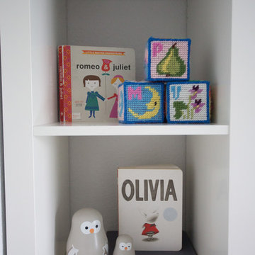
Example of a bedroom and small eclectic girl carpeted home design design in San Diego with gray walls
Example of a bedroom and small eclectic girl carpeted home design design in San Diego with gray walls

 Ash Pierce Design, LLC
Extra storage in the corner toe-kick. The breakfast bar provides an additional eating area, work/serving surface, and hides the counters from the main living space.

 The Fabricsmith
The kitchen has stationary rod pocket panels on metal rod to frame the large windows and french doors.
Note how the large roman is 3 separate romans under one long valance. There is a 3" gap between the bulkhead on left and the window frame. Metal rod is mounted just below bulkhead and the rod pocket panel follows the line down from the bulkhead. Design by Brittany Bowser from South Eastern Galleries in Charleston, SC
225