
Search results for "Remove popular" in Home Design Ideas
 Melissa Hardwick Design
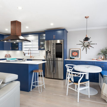
A gorgeous kitchen remodeled from a builder’s basic, incorporating a palette of bright blue, soft grey and pops of warm copper. As a multi-generational home, it was really important to create smooth transitions, allowing ease of accessibility, and the client’s favourite colour, blue! We started, with removing a wall in the kitchen, that opened up the space to the much-used family room. We created an island with overhang for conversations with the cook, and a rest stop for Grandma. As all three adults have different dietary demands, a set of wall ovens was added, and a commercial grade range hood for lots of yummy food prep.
Additional functional design features a new built-in buffet with storage, and a window bench seat. By adding a pendant light over the kitchen table, along with the beautiful big window, this space has been lovingly updated, showcasing the family’s personality and has now earned the most popular spot in the house.
Designed by Melissa Hardwick Design serving Vancouver, and the Lower Mainland. For more information about Melissa Hardwick Design, click here: https://www.melissahardwick.com/
 Powell Construction
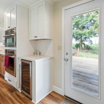
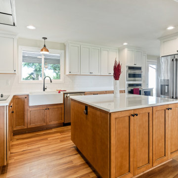
When we first began the design of this project, the clients’ main priority was to get more room in their kitchen. The wall that separated the kitchen and dining space was load bearing and spanned the living room space as well, so rather than removing it the way we might in some floorplans, we left a header and created a large opening to help the flow between the spaces. When it came to the style of the kitchen, the ranch-style home was well suited for a classic, transitional style with farmhouse details such as a white apron-front sink.
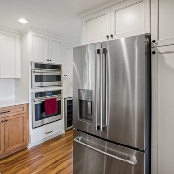
We decided on the two-toned cabinetry after originally discussing the idea of white, but realizing that with grandkids and dogs, having white cabinetry so near exterior doors might not be the best option. The lower cabinets are maple stained with a color called “Coffee” and the white upper cabinets feature a similar colored glaze in the detailing to help tie them together. The floor is a popular CoreTEC product called “Red River Hickory”. The overall tone matches that of the lower cabinets for a seamless look. The white backsplash tile and countertop with simple veining continue the two-toned look.
The range hood is a new Zephyr fixture originally designed for commercial kitchens, but became a good choice for homes with low ceilings, as the high suction power allows us to meet building codes without obstructing any views. The other appliances are from the GE Café line – these pieces feature copper accents on the handles, which gave us a great place to start when choosing the showstopping copper pendant over the sink.
The redesigned space gives more room for multiple cooks and the removal of the wall allows in tons of extra light from the dining room – without moving or replacing a single window or exterior door. There is ample prep room, storage space, and seating for visitors to the kitchen. The homeowners love their new space, and we are sure they will continue to love it for years to come.
 Powell Construction
When we first began the design of this project, the clients’ main priority was to get more room in their kitchen. The wall that separated the kitchen and dining space was load bearing and spanned the living room space as well, so rather than removing it the way we might in some floorplans, we left a header and created a large opening to help the flow between the spaces. When it came to the style of the kitchen, the ranch-style home was well suited for a classic, transitional style with farmhouse details such as a white apron-front sink.
We decided on the two-toned cabinetry after originally discussing the idea of white, but realizing that with grandkids and dogs, having white cabinetry so near exterior doors might not be the best option. The lower cabinets are maple stained with a color called “Coffee” and the white upper cabinets feature a similar colored glaze in the detailing to help tie them together. The floor is a popular CoreTEC product called “Red River Hickory”. The overall tone matches that of the lower cabinets for a seamless look. The white backsplash tile and countertop with simple veining continue the two-toned look.
The range hood is a new Zephyr fixture originally designed for commercial kitchens, but became a good choice for homes with low ceilings, as the high suction power allows us to meet building codes without obstructing any views. The other appliances are from the GE Café line – these pieces feature copper accents on the handles, which gave us a great place to start when choosing the showstopping copper pendant over the sink.
The redesigned space gives more room for multiple cooks and the removal of the wall allows in tons of extra light from the dining room – without moving or replacing a single window or exterior door. There is ample prep room, storage space, and seating for visitors to the kitchen. The homeowners love their new space, and we are sure they will continue to love it for years to come.
Find the right local pro for your project
 Powell Construction
When we first began the design of this project, the clients’ main priority was to get more room in their kitchen. The wall that separated the kitchen and dining space was load bearing and spanned the living room space as well, so rather than removing it the way we might in some floorplans, we left a header and created a large opening to help the flow between the spaces. When it came to the style of the kitchen, the ranch-style home was well suited for a classic, transitional style with farmhouse details such as a white apron-front sink.
We decided on the two-toned cabinetry after originally discussing the idea of white, but realizing that with grandkids and dogs, having white cabinetry so near exterior doors might not be the best option. The lower cabinets are maple stained with a color called “Coffee” and the white upper cabinets feature a similar colored glaze in the detailing to help tie them together. The floor is a popular CoreTEC product called “Red River Hickory”. The overall tone matches that of the lower cabinets for a seamless look. The white backsplash tile and countertop with simple veining continue the two-toned look.
The range hood is a new Zephyr fixture originally designed for commercial kitchens, but became a good choice for homes with low ceilings, as the high suction power allows us to meet building codes without obstructing any views. The other appliances are from the GE Café line – these pieces feature copper accents on the handles, which gave us a great place to start when choosing the showstopping copper pendant over the sink.
The redesigned space gives more room for multiple cooks and the removal of the wall allows in tons of extra light from the dining room – without moving or replacing a single window or exterior door. There is ample prep room, storage space, and seating for visitors to the kitchen. The homeowners love their new space, and we are sure they will continue to love it for years to come.
 Powell Construction
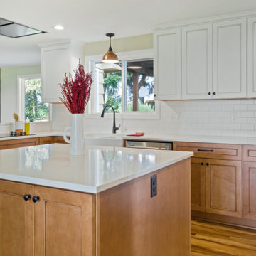
When we first began the design of this project, the clients’ main priority was to get more room in their kitchen. The wall that separated the kitchen and dining space was load bearing and spanned the living room space as well, so rather than removing it the way we might in some floorplans, we left a header and created a large opening to help the flow between the spaces. When it came to the style of the kitchen, the ranch-style home was well suited for a classic, transitional style with farmhouse details such as a white apron-front sink.
We decided on the two-toned cabinetry after originally discussing the idea of white, but realizing that with grandkids and dogs, having white cabinetry so near exterior doors might not be the best option. The lower cabinets are maple stained with a color called “Coffee” and the white upper cabinets feature a similar colored glaze in the detailing to help tie them together. The floor is a popular CoreTEC product called “Red River Hickory”. The overall tone matches that of the lower cabinets for a seamless look. The white backsplash tile and countertop with simple veining continue the two-toned look.
The range hood is a new Zephyr fixture originally designed for commercial kitchens, but became a good choice for homes with low ceilings, as the high suction power allows us to meet building codes without obstructing any views. The other appliances are from the GE Café line – these pieces feature copper accents on the handles, which gave us a great place to start when choosing the showstopping copper pendant over the sink.
The redesigned space gives more room for multiple cooks and the removal of the wall allows in tons of extra light from the dining room – without moving or replacing a single window or exterior door. There is ample prep room, storage space, and seating for visitors to the kitchen. The homeowners love their new space, and we are sure they will continue to love it for years to come.
 Powell Construction
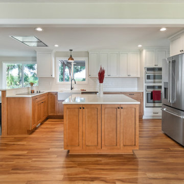
When we first began the design of this project, the clients’ main priority was to get more room in their kitchen. The wall that separated the kitchen and dining space was load bearing and spanned the living room space as well, so rather than removing it the way we might in some floorplans, we left a header and created a large opening to help the flow between the spaces. When it came to the style of the kitchen, the ranch-style home was well suited for a classic, transitional style with farmhouse details such as a white apron-front sink.
We decided on the two-toned cabinetry after originally discussing the idea of white, but realizing that with grandkids and dogs, having white cabinetry so near exterior doors might not be the best option. The lower cabinets are maple stained with a color called “Coffee” and the white upper cabinets feature a similar colored glaze in the detailing to help tie them together. The floor is a popular CoreTEC product called “Red River Hickory”. The overall tone matches that of the lower cabinets for a seamless look. The white backsplash tile and countertop with simple veining continue the two-toned look.
The range hood is a new Zephyr fixture originally designed for commercial kitchens, but became a good choice for homes with low ceilings, as the high suction power allows us to meet building codes without obstructing any views. The other appliances are from the GE Café line – these pieces feature copper accents on the handles, which gave us a great place to start when choosing the showstopping copper pendant over the sink.
The redesigned space gives more room for multiple cooks and the removal of the wall allows in tons of extra light from the dining room – without moving or replacing a single window or exterior door. There is ample prep room, storage space, and seating for visitors to the kitchen. The homeowners love their new space, and we are sure they will continue to love it for years to come.
 Powell Construction
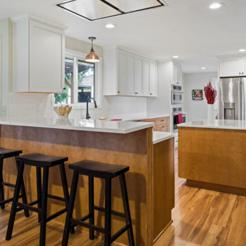
When we first began the design of this project, the clients’ main priority was to get more room in their kitchen. The wall that separated the kitchen and dining space was load bearing and spanned the living room space as well, so rather than removing it the way we might in some floorplans, we left a header and created a large opening to help the flow between the spaces. When it came to the style of the kitchen, the ranch-style home was well suited for a classic, transitional style with farmhouse details such as a white apron-front sink.
We decided on the two-toned cabinetry after originally discussing the idea of white, but realizing that with grandkids and dogs, having white cabinetry so near exterior doors might not be the best option. The lower cabinets are maple stained with a color called “Coffee” and the white upper cabinets feature a similar colored glaze in the detailing to help tie them together. The floor is a popular CoreTEC product called “Red River Hickory”. The overall tone matches that of the lower cabinets for a seamless look. The white backsplash tile and countertop with simple veining continue the two-toned look.
The range hood is a new Zephyr fixture originally designed for commercial kitchens, but became a good choice for homes with low ceilings, as the high suction power allows us to meet building codes without obstructing any views. The other appliances are from the GE Café line – these pieces feature copper accents on the handles, which gave us a great place to start when choosing the showstopping copper pendant over the sink.
The redesigned space gives more room for multiple cooks and the removal of the wall allows in tons of extra light from the dining room – without moving or replacing a single window or exterior door. There is ample prep room, storage space, and seating for visitors to the kitchen. The homeowners love their new space, and we are sure they will continue to love it for years to come.


 Fort Worth Wallpaper Installer
Upgrade your laundry space with our wallpaper installation services, designed to combine functionality with beautiful design for Garland homes. Our expert wallpaper installers specialize in moisture-resistant, easy-to-clean wallcoverings that brighten your daily chores.
Laundry Room Wallpaper Features
✔️ Humidity-Resistant Vinyls – Handles steam from washers/dryers
✔️ Peel-and-Stick Options – Easy updates for rental homes
✔️ Cheerful Patterns – Brightens windowless utility spaces
✔️ Faux Tile & Shiplap – Stylish alternatives to traditional backsplashes
✔️ Stain-Repellent Finishes – Wipes clean from detergent splashes
The Garland Advantage
✅ Appliance-Smart Installation – Perfect cuts around hookups and vents
✅ 1-Day Refresh – Minimal disruption to laundry routines
✅ Texas-Tough Materials – Withstands garage conversion heat
✅ Free Material Samples – Test how patterns work in your lighting
✅ Shelving Integration – Seamless wallpaper behind built-ins
Popular Laundry Room Styles
• Modern Farmhouse – Subtle stripes and galvanized metal looks
• Spa Fresh – Soothing aqua tones and wave patterns
• Retro Fun – Playful 1950s-inspired prints
• Industrial Chic – Concrete-look textures with pops of color
Serving Garland Homes – From Firewheel to Duck Creek. Transform your laundry room today – contact us for a quick quote!
 Tile Doctor Ltd
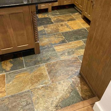
This Multi-Coloured Slate floor looks nice in the Kitchen of this property in Hythe, however due to the riven surface of the tile and the deep grout lines my customer had struggled to keep it clean. Additionally, the Slate has lost all of its lustre over the years since it had been installed and it was now due a deep clean and reseal.
The combination of durability and price makes Slate a popular choice for floor covering, it is also available in a number of colours, ranging from plain black to a more diverse array of shades. Like any natural stone floor though it need sealing to keep the dirt out of the pores of the stone however sealers wear off with use
Hythe by the way is a lovely medieval coastal market town with its own beach on the edge of Romney Marsh and close to Folkestone.
Before starting I removed the kickboards underneath the kitchen units and protected the exposed woodwork with a thin film. To deep clean the Slate floor and remove any remaining sealer I applied Tile Doctor Remove and Go and left it to soak in for ten minutes before scrubbing it in with a light carbide brush. As well as removing the old sealer this process releases the dirt from the pores of the stone and brings it to the surface where it can be extracted.
I have probably mentioned this before, but I’ve invested in a powerful van mounted pressure extraction system for removing the dirt, old sealer and emulsified soils released from the stone. The system works by applying water at high pressure on the floor via a spinner tool and then simultaneously extracts the waste under suction back to a grey water tank on the van. From the customers point of view, it makes light work of cleaning the floor and more importantly leaves the floor dry and leaves no mess.
Having a dry floor at this stage is important as it means I can usually seal the floor on the same day. Its not a good idea to apply a sealer to damp floor as it will affect the way it cures and lead to an undesirable finish. The way to make sure the floor its dry is to use a moisture meter and take readings in several places around the floor. You can use an air mover to improve drying times however older floors can take a very long time to dry and for those I tend to book another day to apply the sealer.
With the floor dry I set about applying the first of two coats of Tile Doctor X-Tra Seal which provides both a hardwearing sheen to the slate as well as enhancing its natural colourings. It has strong water repellency characteristics which makes it ideal for use in a kitchen where spillages are quite common.
This was quite a small kitchen, so the work was completed in one day. My client was amazed at the transformation and grateful for our advice on continued maintenance which for this floor I recommended the use of Tile Doctor Stone Soap for daily cleaning.
Michael Conlon
South Kent Tile Doctor

 Cassoni Furniture & Accessories
- GLOW IN SOFA. Warm as modern sofas oversize mats timeless and territorial boundaries find their ideal habitat modern houses and places of our most popular today. Sessions with large soft feather padding in the two versions of 39''3/8 and 51''1/8. Combined in a wide range of solutions. Islands, peninsulas, central and lateral elements with and without armrests on which throw large pillows from the original fabrics and colors. Decorative elements that enhance the smooth lines of these sofas with removable covers that can change appearance with our creativity.
96''W x 39''D x 26''H.
- GLOW IN COFFEE TABLE. All the natural beauty of wood tables from geometry and material by the strong.
41''W x 22''D x 12''H.
35''W x 18''D x 10''H.
- STRIPE OTTOMAN. Maxipouf original leather and fabric with ornamental ribbon with convenient zipper to view.
30''W x 21''D x 10''H.
 Tile Doctor Ltd
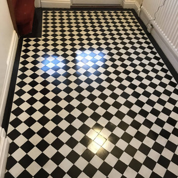
This is a great example of a Victorian Tiled floor refurbishment which I recently completed at a property in Stoke-on-Trent. If you look closely at the photographs below you will see the white tiles are looking grubby and paint splash staining from decorating. The owner was unhappy with how the floor now looked and wanted it refurbished.
Black and White Victorian tiles laid in a chequered diamond pattern is a classic style and a very popular choice for hallways at the turn of the 20th century. Over the years many have been replaced or covered up with carpet and those that survived are now a sought-after period feature that adds value to your property.
I initially cleaned the floor by applying a strong dilution of Tile Doctor Pro-Clean which was sprayed onto the floor and then left to soak in for ten minutes. Pro-Clean is our goto tile and grout cleaning product that is designed to break down dirt and remove old sealers. After ten minutes the solution was scrubbed in with a rotary machine fitted with a coarse 200-grit pad. The soil generated was rinsed off the tiles and extracted with a wet vacuum and the floor inspected.
I would see more work was needed to get the floor clean and free of staining, so I spot treated the problem areas with Tile Doctor Remove and Go which is a coatings remover. I worked in small sections leaving the product to dwell as before for 10 minutes, I then used a wallpaper steamer with handheld diamond blocks to get the ingrained dirt out of the floor. After a final rinse and extraction, the floor looked clean so, so much better than when I started.
I then left the floor to dry off overnight and came back the second day to seal the tiles first checking the moisture levels with a damp meter. Applying sealer to a damp floor will result in the floor looking patchy when it dries so I always check first. The readings were good, so I started to apply the first of five coats of sealer which for this floor I chose Tile Doctor Seal and Go Extra.
Old Victorian floors do not have a damp-proof membrane installed under the floor so its important to select a sealer that will allow moisture to rise through the tiles and evaporate on the surface, Seal and Go Extra allows for this. Choosing a non-breathable sealer can result in moisture being trapped under the floor where it can reach out to the walls leading to rising damp.
Once the floor dried it looked fantastic. In fact, my customer was so happy with the transformation she was taking pictures and sending them to her daughters as I worked; she couldn’t believe how well it was turning out.
Trevor Preece
Staffordshire Tile Doctor
 Melissa Hardwick Design
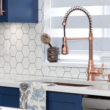
A gorgeous kitchen remodeled from a builder’s basic, incorporating a palette of bright blue, soft grey and pops of warm copper. As a multi-generational home, it was really important to create smooth transitions, allowing ease of accessibility, and the client’s favourite colour, blue! We started, with removing a wall in the kitchen, that opened up the space to the much-used family room. We created an island with overhang for conversations with the cook, and a rest stop for Grandma. As all three adults have different dietary demands, a set of wall ovens was added, and a commercial grade range hood for lots of yummy food prep.
Additional functional design features a new built-in buffet with storage, and a window bench seat. By adding a pendant light over the kitchen table, along with the beautiful big window, this space has been lovingly updated, showcasing the family’s personality and has now earned the most popular spot in the house.
Designed by Melissa Hardwick Design serving Vancouver, and the Lower Mainland. For more information about Melissa Hardwick Design, click here: https://www.melissahardwick.com/
 Tile Doctor Ltd
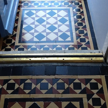
When you discover an old Victorian tiled floor underneath carpet, the first question that will probably pop into your mind is: can it be restored?
The answer, in the majority of cases, is yes. In fact, Tile Doctor has completed hundreds of Victorian tiled floor restorations. Victorian tiles have a timeless quality about them and are still popular for residential use even in the twenty first century.
What you can usually expect upon lifting your carpet is for the tiles to be covered in carpet adhesives and grippers, as was the case with this particular example of a Victorian Tiles hallway floor at a property in Bedford. Sometimes you might also find paint splashes or other staining left over from decoration work. And, of course, the tiles will be dirty and in much need of a deep clean. These issues spoil the original appearance of the tiles, but with the right methods and products, a complete restoration can be achieved quickly and cost-effectively.
My first task upon arriving at the proper was to carry out a site survey to address the condition of the tiles, before running a quick test clean on a small area of the floor. The result was good and so I was confident that I could achieve a high-quality restoration for the client.
A quote was issued and accepted, and the work was booked in at a date that was convenient for the customer.
Returning to the property, my first course of action was to mix a strong dilution of Tile Doctor Pro Clean, which is a powerful alkaline cleaner safe to use on natural stone, with hot water. This cleaning solution was sprayed along all edges of the floor loosen the glue securing the carpet grippers. I then successfully removed the adhesive carefully using handheld tools to avoid damaging any tiles.
Once this was done, I applied Tile Doctor Remove and Go, scrubbing it into the tiles with a rotary machine. This product is designed to remove heavy soiling, paint splashes and old waxes and sealers. The soiled solution was then extracted using a wet vacuum and stubborn areas re-treated until I was satisfied the floor was clean.
The entire floor was then given a thorough rinse with water to remove any trace of cleaning products and extracted using a wet vax machine.
The floor was allowed to dry for several days before I was able to return to seal the tiles. It’s always important to leave significant time for the floor to dry because any moisture left over can impact the performance of the sealer.
The choice of sealer was Tile Doctor Seal and Go Extra, which provides robust protection against dirt and stains, with a light sheen finish. I chose this sealer not only because the customer wanted a light sheen finish, but also because this particular sealer is fully breathable. Dampness can sometimes be an issue with old Victorian and Quarry tiles which were installed before damp proof membranes became standard.
The transformation achieved within the space of a week was quite incredible and the colours in the tile have really come through.
Another satisfied customer!
David Vissian
Bedfordshire Tile Doctor
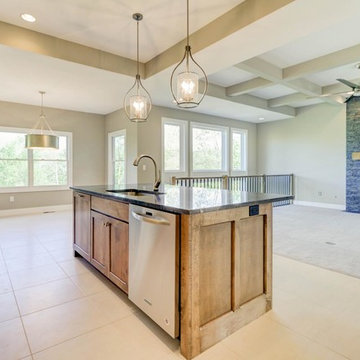
Sponsored
Fredericksburg, OH

High Point Cabinets
Columbus' Experienced Custom Cabinet Builder | 4x Best of Houzz Winner

 Claire Cavalieri
Danish Modern is one of the several types of Modern design style. Popularized in Denmark from the 1940s-1970s, Danish modern furniture design was a collaboration between the principles of modern architecture and the high-quality cabinetmaking for which the Danes were known. Simple, elegant, airy, and featuring clean, sweeping lines, the furnishings are inherently warm and beautiful.
This open dining room is a collection of vintage Danish modern furniture dating from the early 1970s. The authentic pieces were located at different auction houses and specialty consigners around the country to create a cohesive look the homeowners were seeking.
The solid teak sideboard features a lighted upper display cabinet (removable) showcasing the homeowners’ collection of art including Nambé, Murano, Vietri sul Mare, and Blenko.
The lower cabinet consists of two sliding doors on either end offering plentiful storage. In between are a bank of five felt-lined drawers for items such as silverware, trays and linens.
With graceful rounded corners and rich, warm teak woodgrain, the dining room table is a perfect match to the sideboard. Two leaves tightly drop in and enable expansion with seating capacity for 14 people.
Mixing up dining chairs adds interest and variety. The curvaceous and timeless Arne Jacobsen (the Danish designer) Series 7 chair in black is the perfect pairing for this dynamic design.
Crowning the space is the airy, translucent classic Nelson bubble lamp, keeping in line with the Modernist theme.
 Melissa Hardwick Design
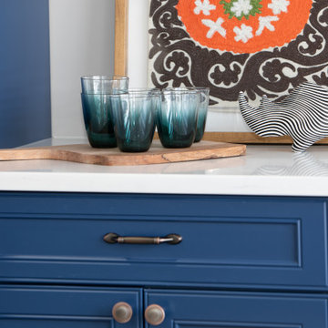
A gorgeous kitchen remodeled from a builder’s basic, incorporating a palette of bright blue, soft grey and pops of warm copper. As a multi-generational home, it was really important to create smooth transitions, allowing ease of accessibility, and the client’s favourite colour, blue! We started, with removing a wall in the kitchen, that opened up the space to the much-used family room. We created an island with overhang for conversations with the cook, and a rest stop for Grandma. As all three adults have different dietary demands, a set of wall ovens was added, and a commercial grade range hood for lots of yummy food prep.
Additional functional design features a new built-in buffet with storage, and a window bench seat. By adding a pendant light over the kitchen table, along with the beautiful big window, this space has been lovingly updated, showcasing the family’s personality and has now earned the most popular spot in the house.
Designed by Melissa Hardwick Design serving Vancouver, and the Lower Mainland. For more information about Melissa Hardwick Design, click here: https://www.melissahardwick.com/
 Claire Cavalieri
Danish Modern is one of the several types of Modern design style. Popularized in Denmark from the 1940s-1970s, Danish modern furniture design was a collaboration between the principles of modern architecture and the high-quality cabinetmaking for which the Danes were known. Simple, elegant, airy, and featuring clean, sweeping lines, the furnishings are inherently warm and beautiful.
This open dining room is a collection of vintage Danish modern furniture dating from the early 1970s. The authentic pieces were located at different auction houses and specialty consigners around the country to create a cohesive look the homeowners were seeking.
The solid teak sideboard features a lighted upper display cabinet (removable) showcasing the homeowners’ collection of art including Nambé, Murano, Vietri sul Mare, and Blenko.
The lower cabinet consists of two sliding doors on either end offering plentiful storage. In between are a bank of five felt-lined drawers for items such as silverware, trays and linens.
With graceful rounded corners and rich, warm teak woodgrain, the dining room table is a perfect match to the sideboard. Two leaves tightly drop in and enable expansion with seating capacity for 14 people.
Mixing up dining chairs adds interest and variety. The curvaceous and timeless Arne Jacobsen (the Danish designer) Series 7 chair in black is the perfect pairing for this dynamic design.
Crowning the space is the airy, translucent classic Nelson bubble lamp, keeping in line with the Modernist theme.
 Tile Doctor Ltd
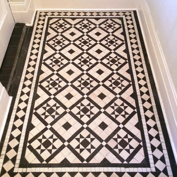
This job was at a house in near Windermere in South Cumbria, a place which is very popular amongst tourists to the Lake District. My client had a Black and White Victorian tiled floor in dire need of a clean and re-seal.
Prior to the application of any cleaning products, my first task was to run damp tests to make sure there were no inherent damp problems. With old floors of this type it’s good to know if there is a damp problem as this will affect the choice of sealer and also the length of time the floor requires to dry.
Fortunately, there were no damp issues present, and I was able to proceed however had the floor been damp and being December I would have offered to carry out the clean and seal in the Summer, when the water tables were lower and the damp levels would be more settled, thus creating a better environment for the sealer to operate in.
I started cleaning the Victorian tiles with Tile Doctor Remove & Go, a product which breaks down old sealers in preparation for a fresh seal to be applied. The product is diluted with water and then scrubbed into the floor with a scrubbing pad fitted to rotary machine; the resulting slurry is then removed using a wet vacuum.
Next step was to apply Tile Doctor Pro-Clean which was applied liberally to the floor, left to dwell for a short period and then agitated with a black scrubbing pad to lift out the ingrained dirt. I also paid special attention to cleaning the grout lines with a stiff scrubbing brush. The floor was then rinsed with clean water, and the resulting residue was extracted using a wet-vac machine.
After the cleaning was completed, the tiles were left for a couple of days to allow them ample time to dry. Upon my return to the house I checked the damp levels again and then applied two coats of the impregnating, colour enhancing sealer Tile Doctor Colour Grow which gives the black tiles more depth of colour, along with the robust surface seal and Matt finish my client had requested.
My client was exceptionally pleased the results – but really, the photographs speak for themselves.
Heidi Taylor
South Cumbria
Sponsored
Fredericksburg, OH
High Point Cabinets
Columbus' Experienced Custom Cabinet Builder | 4x Best of Houzz Winner
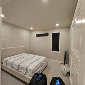
 LA Wallcovering
Transform your bedroom into a sophisticated retreat with custom wallpaper installation from Henderson most trusted wallcovering experts. We specialize in creating elegant, durable designs that reflect your unique style while complementing Henderson architectural charm.
Premium Bedroom Wallpaper Services
✔ Custom Feature Walls – create a stunning headboard backdrop
✔ Historic Home Expertise – perfect for Glendale’s classic craftsman and Spanish-style homes
✔ Sound-Absorbing Textures – grasscloth and fabric-backed options for urban quiet
✔ Peel-and-Stick Luxury – ideal for apartments and rentals
✔ Designer Collaboration – work with your interior decorator
Why Glendale Homeowners Choose Us
✅ 30+ Years Serving the Foothills
✅ Precision Laser Alignment – flawless pattern matching
✅ Dust-Free Installation – keeps your home immaculate
✅ 1-Day Makeovers – wake up to a transformed space
✅ Free In-Home Consultations – see samples in your lighting
Popular Henderson Bedroom Styles
• Hollywood Regency glamour
• Mediterranean-inspired designs
• Modern minimalist geometrics
• Custom Armenian cultural motifs

 Beacon Rock Custom Builders
This budget-conscious kitchen renovation turned out great! We were getting burned out on the white shaker kitchen with white subway tile and instead opted to go with a transitional style that plays off of those trendy materials.
We selected a wood stained, shaker cabinet that had gray undertones. This gave us the clean, modern lines that are trending, but in a different finish. We went with 36" tall upper cabinets that allowed us to install crown molding.
We also opted to go with a 3x6 marble subway backsplash. This was playing off of the white ceramic subway tile that is popular, but making it just different enough to feel fresh. In addition to removing the soffit and raising the ceilings, the element that makes this kitchen pop is the wall of marble backsplash tile that runs all the way to the ceiling.
If the homeowner wanted to go all out, we would have repainted the walls with a cooler tone and updated the floor tile (probably with a larger format, rectangular tile that also had cool tones). But nonetheless, we're happy with how it turned out.


21