
Search results for "Repetitive" in Home Design Ideas
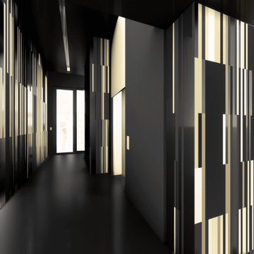
 KURV Architecture DPC (Alex Hughes Architects)
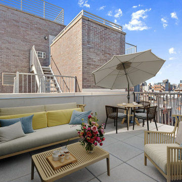
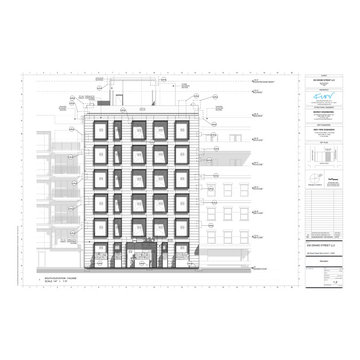
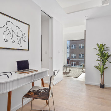
Located in the heart of Manhattan’s Lower East Side, the building was erected on a shallow commercial lot between two 120 year old masonry buildings and a new residential rental building. 330 Grand Street is a mix of 725 SF 1BRs and 1050 SF 2BR apartments. It also contains a 1100 SF two story duplex as well as private and public rooftop space, large private balconies for most units and two large private terraces for the ground floor units.
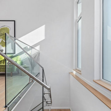
330 Grand Street was originally designed and approved at the NYC DOB as a prefabricated modular building. During the pandemic, as shipping costs skyrocketed putting the project at risk, we suggested redesigning the building as a reinforced cast-in-place concrete structure. Concrete was readily available and prices had not been affected by the demand increase that many other materials suffered in the pandemic. We took this opportunity to raise floor to ceiling heights, enlarge high performance windows and redistribute the buildings MEPFS and Structural Systems to create very open floor plans.
The challenge was to create a luxurious sensorial living experience with very limited means. In a city with very high construction costs, low cost residential buildings in the area are usually devoid of good quality, design and character. Our approach was to aim high for the end user, prioritizing natural light, open space with long visual perspectives, high ceilings and as always, rejecting the use of predefined building templates.
Our biggest challenge was to ensure that the small spaces feel as clean cut, large and bright as possible. Several unique design decisions were made to ensure low cost and high quality;
Floor plans were laid out so that spaces were wide open and free of clutter from mechanical or structural interruptions. Therefore all infrastructure was placed in lateral demising walls, which in turn act as the unit’s storage and kitchen. The apartments feel wide open, are super quiet and have more storage space than any other comparable apartment in the city.
To solve the problem of the site’s shallow commercial lot which is typically prone to dark interior spaces we focused our attention on the building’s envelope. Instead of the usual small punched window openings, oversized high performance windows were designed to ensure that light penetrated as far as possible into the units. In the smaller 1BR units, the full 50’ depth of the lot is perceived by partitioning spaces with sliding pocket doors that can be retracted to allow deep visual perspectives, making the sight lines in the space feel longer, larger, more ample than normal. In addition to the full height glazing, each unit above the 2nd floor receives a 7 foot covered balcony, adding 120 to 240 sf to each apartment, something unusual in New York City buildings. The space is large enough for a full size dining table, when the weather permits being outside.
We also worked hard to ensure modularity. For example, all kitchen units are all identical throughout the building. The idea of modularity and the economy of the repetitive unit is exercised to the maximum through the building.
Hardware, appliances, flooring, wall coverings and material finishes are all carefully selected to feel bespoke, high quality and unique.
It was important to KURV that the result of this work manifest into something that would deeply connect with the end user and sustain relationships with the consumers of this space.
All images by KURV Architecture ©

 Simply Perfect
Advice on interior design is available everywhere—from TV shows and websites to books, magazines and apps.
We love seeing people become engaged in design and educated on the wide range of possibilities. But we hope you’ll proceed with caution.
It’s not that style errors are a matter of life and death. It’s just that it’s easy to choose designs that aren’t necessarily reflective of your own personality and character. And since you’re typically stuck with your interior design decisions for years, styles that don’t quite fit can tend to grate on you.
Interiors that give one person comfort may unleash chaos in someone else. This goes beyond favorite colors or hot trends, right to the heart of interior design, where you find questions of composition, balance, repetition, space and more.
The goal is to find that unique combination of design elements that gives you comfort, support and balance.
In one home, that perfect balance was struck through the use of symmetry. A pair of comfortable swivel chairs sit beneath matching indigo patterned paintings. Matching bookcases below the paintings contain similar, but not identical, arrangements of books, vases and bowls. Woods and bronzes help warm up the simple white bookcase shelving.
Two matching poufs in front of the fireplace provide additional seating. The sofa is accented with a pair of pillows with a blue pattern that echoes the artwork.
The effect of the symmetry is to achieve order and simplicity, which I promote at every opportunity. After all, your home interiors should be the setting or the backdrop of your life—not center stage.
Antique bronze and blue are complementary colors. Together, they offer a rich palette of richness and depth, which brings out the beauty of wood and stone.
In the home office, a unique, whitewash-stained wooden desk rests on metal, Sawhorse-inspired legs for a warm, rustic look. The black leather chair features a contemporary silhouette with an antique brass frame. An adjustable desk lamp has bronze accents.
The bookcase combines a sleek, black metal frame with concrete shelves, for another unusual pairing. It’s kept uncluttered for an orderly, peaceful look. Items on the shelves include a bronze-accented lamp and a pair
of high gloss-finished wooden bookends.
The elegant artwork behind the desk is a simple midnight-blue and bronze with mottled white. Deep blues are again picked up in the rug, which adds a stately vibe with a modern pattern and satisfying texture.
Within the framework of symmetry, the living room repeats the blue-and-bronze color scheme.
A large midcentury brass clock above the fireplace keeps the natural stone visible, rather than hidden behind a painting or television, while its straight lines and color create a beautiful contrast.
The sofa is a soft, neutral blue. The pattern on the round brass side table features echoes the darker blue-patterned rug, as well as the rug in the office, tying the rooms together.
Indigo blue books adjacent to bronze vases on the shelves repeat the color scheme. The soapstone-topped coffee table echoes the shape of the fireplace. A pair of tall, matching floor lamps with long wooden bases, brass pulls and simple linen shades combine both the colors and symmetry found throughout the home.
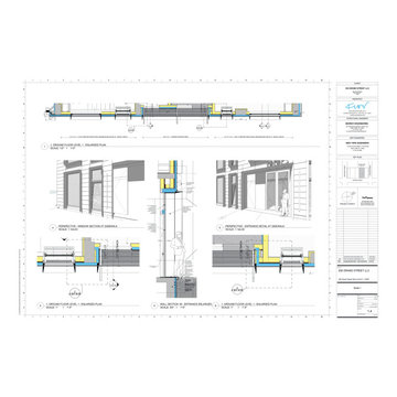 KURV Architecture DPC (Alex Hughes Architects)
Located in the heart of Manhattan’s Lower East Side, the building was erected on a shallow commercial lot between two 120 year old masonry buildings and a new residential rental building. 330 Grand Street is a mix of 725 SF 1BRs and 1050 SF 2BR apartments. It also contains a 1100 SF two story duplex as well as private and public rooftop space, large private balconies for most units and two large private terraces for the ground floor units.
330 Grand Street was originally designed and approved at the NYC DOB as a prefabricated modular building. During the pandemic, as shipping costs skyrocketed putting the project at risk, we suggested redesigning the building as a reinforced cast-in-place concrete structure. Concrete was readily available and prices had not been affected by the demand increase that many other materials suffered in the pandemic. We took this opportunity to raise floor to ceiling heights, enlarge high performance windows and redistribute the buildings MEPFS and Structural Systems to create very open floor plans.
The challenge was to create a luxurious sensorial living experience with very limited means. In a city with very high construction costs, low cost residential buildings in the area are usually devoid of good quality, design and character. Our approach was to aim high for the end user, prioritizing natural light, open space with long visual perspectives, high ceilings and as always, rejecting the use of predefined building templates.
Our biggest challenge was to ensure that the small spaces feel as clean cut, large and bright as possible. Several unique design decisions were made to ensure low cost and high quality;
Floor plans were laid out so that spaces were wide open and free of clutter from mechanical or structural interruptions. Therefore all infrastructure was placed in lateral demising walls, which in turn act as the unit’s storage and kitchen. The apartments feel wide open, are super quiet and have more storage space than any other comparable apartment in the city.
To solve the problem of the site’s shallow commercial lot which is typically prone to dark interior spaces we focused our attention on the building’s envelope. Instead of the usual small punched window openings, oversized high performance windows were designed to ensure that light penetrated as far as possible into the units. In the smaller 1BR units, the full 50’ depth of the lot is perceived by partitioning spaces with sliding pocket doors that can be retracted to allow deep visual perspectives, making the sight lines in the space feel longer, larger, more ample than normal. In addition to the full height glazing, each unit above the 2nd floor receives a 7 foot covered balcony, adding 120 to 240 sf to each apartment, something unusual in New York City buildings. The space is large enough for a full size dining table, when the weather permits being outside.
We also worked hard to ensure modularity. For example, all kitchen units are all identical throughout the building. The idea of modularity and the economy of the repetitive unit is exercised to the maximum through the building.
Hardware, appliances, flooring, wall coverings and material finishes are all carefully selected to feel bespoke, high quality and unique.
It was important to KURV that the result of this work manifest into something that would deeply connect with the end user and sustain relationships with the consumers of this space.
All images by KURV Architecture ©
Find the right local pro for your project
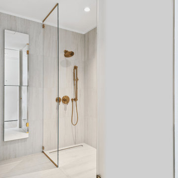 KURV Architecture DPC (Alex Hughes Architects)
Located in the heart of Manhattan’s Lower East Side, the building was erected on a shallow commercial lot between two 120 year old masonry buildings and a new residential rental building. 330 Grand Street is a mix of 725 SF 1BRs and 1050 SF 2BR apartments. It also contains a 1100 SF two story duplex as well as private and public rooftop space, large private balconies for most units and two large private terraces for the ground floor units.
330 Grand Street was originally designed and approved at the NYC DOB as a prefabricated modular building. During the pandemic, as shipping costs skyrocketed putting the project at risk, we suggested redesigning the building as a reinforced cast-in-place concrete structure. Concrete was readily available and prices had not been affected by the demand increase that many other materials suffered in the pandemic. We took this opportunity to raise floor to ceiling heights, enlarge high performance windows and redistribute the buildings MEPFS and Structural Systems to create very open floor plans.
The challenge was to create a luxurious sensorial living experience with very limited means. In a city with very high construction costs, low cost residential buildings in the area are usually devoid of good quality, design and character. Our approach was to aim high for the end user, prioritizing natural light, open space with long visual perspectives, high ceilings and as always, rejecting the use of predefined building templates.
Our biggest challenge was to ensure that the small spaces feel as clean cut, large and bright as possible. Several unique design decisions were made to ensure low cost and high quality;
Floor plans were laid out so that spaces were wide open and free of clutter from mechanical or structural interruptions. Therefore all infrastructure was placed in lateral demising walls, which in turn act as the unit’s storage and kitchen. The apartments feel wide open, are super quiet and have more storage space than any other comparable apartment in the city.
To solve the problem of the site’s shallow commercial lot which is typically prone to dark interior spaces we focused our attention on the building’s envelope. Instead of the usual small punched window openings, oversized high performance windows were designed to ensure that light penetrated as far as possible into the units. In the smaller 1BR units, the full 50’ depth of the lot is perceived by partitioning spaces with sliding pocket doors that can be retracted to allow deep visual perspectives, making the sight lines in the space feel longer, larger, more ample than normal. In addition to the full height glazing, each unit above the 2nd floor receives a 7 foot covered balcony, adding 120 to 240 sf to each apartment, something unusual in New York City buildings. The space is large enough for a full size dining table, when the weather permits being outside.
We also worked hard to ensure modularity. For example, all kitchen units are all identical throughout the building. The idea of modularity and the economy of the repetitive unit is exercised to the maximum through the building.
Hardware, appliances, flooring, wall coverings and material finishes are all carefully selected to feel bespoke, high quality and unique.
It was important to KURV that the result of this work manifest into something that would deeply connect with the end user and sustain relationships with the consumers of this space.
All images by KURV Architecture ©
 Simply Perfect
Advice on interior design is available everywhere—from TV shows and websites to books, magazines and apps.
We love seeing people become engaged in design and educated on the wide range of possibilities. But we hope you’ll proceed with caution.
It’s not that style errors are a matter of life and death. It’s just that it’s easy to choose designs that aren’t necessarily reflective of your own personality and character. And since you’re typically stuck with your interior design decisions for years, styles that don’t quite fit can tend to grate on you.
Interiors that give one person comfort may unleash chaos in someone else. This goes beyond favorite colors or hot trends, right to the heart of interior design, where you find questions of composition, balance, repetition, space and more.
The goal is to find that unique combination of design elements that gives you comfort, support and balance.
In one home, that perfect balance was struck through the use of symmetry. A pair of comfortable swivel chairs sit beneath matching indigo patterned paintings. Matching bookcases below the paintings contain similar, but not identical, arrangements of books, vases and bowls. Woods and bronzes help warm up the simple white bookcase shelving.
Two matching poufs in front of the fireplace provide additional seating. The sofa is accented with a pair of pillows with a blue pattern that echoes the artwork.
The effect of the symmetry is to achieve order and simplicity, which I promote at every opportunity. After all, your home interiors should be the setting or the backdrop of your life—not center stage.
Antique bronze and blue are complementary colors. Together, they offer a rich palette of richness and depth, which brings out the beauty of wood and stone.
In the home office, a unique, whitewash-stained wooden desk rests on metal, Sawhorse-inspired legs for a warm, rustic look. The black leather chair features a contemporary silhouette with an antique brass frame. An adjustable desk lamp has bronze accents.
The bookcase combines a sleek, black metal frame with concrete shelves, for another unusual pairing. It’s kept uncluttered for an orderly, peaceful look. Items on the shelves include a bronze-accented lamp and a pair
of high gloss-finished wooden bookends.
The elegant artwork behind the desk is a simple midnight-blue and bronze with mottled white. Deep blues are again picked up in the rug, which adds a stately vibe with a modern pattern and satisfying texture.
Within the framework of symmetry, the living room repeats the blue-and-bronze color scheme.
A large midcentury brass clock above the fireplace keeps the natural stone visible, rather than hidden behind a painting or television, while its straight lines and color create a beautiful contrast.
The sofa is a soft, neutral blue. The pattern on the round brass side table features echoes the darker blue-patterned rug, as well as the rug in the office, tying the rooms together.
Indigo blue books adjacent to bronze vases on the shelves repeat the color scheme. The soapstone-topped coffee table echoes the shape of the fireplace. A pair of tall, matching floor lamps with long wooden bases, brass pulls and simple linen shades combine both the colors and symmetry found throughout the home.
 KURV Architecture DPC (Alex Hughes Architects)
Located in the heart of Manhattan’s Lower East Side, the building was erected on a shallow commercial lot between two 120 year old masonry buildings and a new residential rental building. 330 Grand Street is a mix of 725 SF 1BRs and 1050 SF 2BR apartments. It also contains a 1100 SF two story duplex as well as private and public rooftop space, large private balconies for most units and two large private terraces for the ground floor units.
330 Grand Street was originally designed and approved at the NYC DOB as a prefabricated modular building. During the pandemic, as shipping costs skyrocketed putting the project at risk, we suggested redesigning the building as a reinforced cast-in-place concrete structure. Concrete was readily available and prices had not been affected by the demand increase that many other materials suffered in the pandemic. We took this opportunity to raise floor to ceiling heights, enlarge high performance windows and redistribute the buildings MEPFS and Structural Systems to create very open floor plans.
The challenge was to create a luxurious sensorial living experience with very limited means. In a city with very high construction costs, low cost residential buildings in the area are usually devoid of good quality, design and character. Our approach was to aim high for the end user, prioritizing natural light, open space with long visual perspectives, high ceilings and as always, rejecting the use of predefined building templates.
Our biggest challenge was to ensure that the small spaces feel as clean cut, large and bright as possible. Several unique design decisions were made to ensure low cost and high quality;
Floor plans were laid out so that spaces were wide open and free of clutter from mechanical or structural interruptions. Therefore all infrastructure was placed in lateral demising walls, which in turn act as the unit’s storage and kitchen. The apartments feel wide open, are super quiet and have more storage space than any other comparable apartment in the city.
To solve the problem of the site’s shallow commercial lot which is typically prone to dark interior spaces we focused our attention on the building’s envelope. Instead of the usual small punched window openings, oversized high performance windows were designed to ensure that light penetrated as far as possible into the units. In the smaller 1BR units, the full 50’ depth of the lot is perceived by partitioning spaces with sliding pocket doors that can be retracted to allow deep visual perspectives, making the sight lines in the space feel longer, larger, more ample than normal. In addition to the full height glazing, each unit above the 2nd floor receives a 7 foot covered balcony, adding 120 to 240 sf to each apartment, something unusual in New York City buildings. The space is large enough for a full size dining table, when the weather permits being outside.
We also worked hard to ensure modularity. For example, all kitchen units are all identical throughout the building. The idea of modularity and the economy of the repetitive unit is exercised to the maximum through the building.
Hardware, appliances, flooring, wall coverings and material finishes are all carefully selected to feel bespoke, high quality and unique.
It was important to KURV that the result of this work manifest into something that would deeply connect with the end user and sustain relationships with the consumers of this space.
All images by KURV Architecture ©
 KURV Architecture DPC (Alex Hughes Architects)
Located in the heart of Manhattan’s Lower East Side, the building was erected on a shallow commercial lot between two 120 year old masonry buildings and a new residential rental building. 330 Grand Street is a mix of 725 SF 1BRs and 1050 SF 2BR apartments. It also contains a 1100 SF two story duplex as well as private and public rooftop space, large private balconies for most units and two large private terraces for the ground floor units.
330 Grand Street was originally designed and approved at the NYC DOB as a prefabricated modular building. During the pandemic, as shipping costs skyrocketed putting the project at risk, we suggested redesigning the building as a reinforced cast-in-place concrete structure. Concrete was readily available and prices had not been affected by the demand increase that many other materials suffered in the pandemic. We took this opportunity to raise floor to ceiling heights, enlarge high performance windows and redistribute the buildings MEPFS and Structural Systems to create very open floor plans.
The challenge was to create a luxurious sensorial living experience with very limited means. In a city with very high construction costs, low cost residential buildings in the area are usually devoid of good quality, design and character. Our approach was to aim high for the end user, prioritizing natural light, open space with long visual perspectives, high ceilings and as always, rejecting the use of predefined building templates.
Our biggest challenge was to ensure that the small spaces feel as clean cut, large and bright as possible. Several unique design decisions were made to ensure low cost and high quality;
Floor plans were laid out so that spaces were wide open and free of clutter from mechanical or structural interruptions. Therefore all infrastructure was placed in lateral demising walls, which in turn act as the unit’s storage and kitchen. The apartments feel wide open, are super quiet and have more storage space than any other comparable apartment in the city.
To solve the problem of the site’s shallow commercial lot which is typically prone to dark interior spaces we focused our attention on the building’s envelope. Instead of the usual small punched window openings, oversized high performance windows were designed to ensure that light penetrated as far as possible into the units. In the smaller 1BR units, the full 50’ depth of the lot is perceived by partitioning spaces with sliding pocket doors that can be retracted to allow deep visual perspectives, making the sight lines in the space feel longer, larger, more ample than normal. In addition to the full height glazing, each unit above the 2nd floor receives a 7 foot covered balcony, adding 120 to 240 sf to each apartment, something unusual in New York City buildings. The space is large enough for a full size dining table, when the weather permits being outside.
We also worked hard to ensure modularity. For example, all kitchen units are all identical throughout the building. The idea of modularity and the economy of the repetitive unit is exercised to the maximum through the building.
Hardware, appliances, flooring, wall coverings and material finishes are all carefully selected to feel bespoke, high quality and unique.
It was important to KURV that the result of this work manifest into something that would deeply connect with the end user and sustain relationships with the consumers of this space.
All images by KURV Architecture ©
 KURV Architecture DPC (Alex Hughes Architects)
Located in the heart of Manhattan’s Lower East Side, the building was erected on a shallow commercial lot between two 120 year old masonry buildings and a new residential rental building. 330 Grand Street is a mix of 725 SF 1BRs and 1050 SF 2BR apartments. It also contains a 1100 SF two story duplex as well as private and public rooftop space, large private balconies for most units and two large private terraces for the ground floor units.
330 Grand Street was originally designed and approved at the NYC DOB as a prefabricated modular building. During the pandemic, as shipping costs skyrocketed putting the project at risk, we suggested redesigning the building as a reinforced cast-in-place concrete structure. Concrete was readily available and prices had not been affected by the demand increase that many other materials suffered in the pandemic. We took this opportunity to raise floor to ceiling heights, enlarge high performance windows and redistribute the buildings MEPFS and Structural Systems to create very open floor plans.
The challenge was to create a luxurious sensorial living experience with very limited means. In a city with very high construction costs, low cost residential buildings in the area are usually devoid of good quality, design and character. Our approach was to aim high for the end user, prioritizing natural light, open space with long visual perspectives, high ceilings and as always, rejecting the use of predefined building templates.
Our biggest challenge was to ensure that the small spaces feel as clean cut, large and bright as possible. Several unique design decisions were made to ensure low cost and high quality;
Floor plans were laid out so that spaces were wide open and free of clutter from mechanical or structural interruptions. Therefore all infrastructure was placed in lateral demising walls, which in turn act as the unit’s storage and kitchen. The apartments feel wide open, are super quiet and have more storage space than any other comparable apartment in the city.
To solve the problem of the site’s shallow commercial lot which is typically prone to dark interior spaces we focused our attention on the building’s envelope. Instead of the usual small punched window openings, oversized high performance windows were designed to ensure that light penetrated as far as possible into the units. In the smaller 1BR units, the full 50’ depth of the lot is perceived by partitioning spaces with sliding pocket doors that can be retracted to allow deep visual perspectives, making the sight lines in the space feel longer, larger, more ample than normal. In addition to the full height glazing, each unit above the 2nd floor receives a 7 foot covered balcony, adding 120 to 240 sf to each apartment, something unusual in New York City buildings. The space is large enough for a full size dining table, when the weather permits being outside.
We also worked hard to ensure modularity. For example, all kitchen units are all identical throughout the building. The idea of modularity and the economy of the repetitive unit is exercised to the maximum through the building.
Hardware, appliances, flooring, wall coverings and material finishes are all carefully selected to feel bespoke, high quality and unique.
It was important to KURV that the result of this work manifest into something that would deeply connect with the end user and sustain relationships with the consumers of this space.
All images by KURV Architecture ©
 KURV Architecture DPC (Alex Hughes Architects)
Located in the heart of Manhattan’s Lower East Side, the building was erected on a shallow commercial lot between two 120 year old masonry buildings and a new residential rental building. 330 Grand Street is a mix of 725 SF 1BRs and 1050 SF 2BR apartments. It also contains a 1100 SF two story duplex as well as private and public rooftop space, large private balconies for most units and two large private terraces for the ground floor units.
330 Grand Street was originally designed and approved at the NYC DOB as a prefabricated modular building. During the pandemic, as shipping costs skyrocketed putting the project at risk, we suggested redesigning the building as a reinforced cast-in-place concrete structure. Concrete was readily available and prices had not been affected by the demand increase that many other materials suffered in the pandemic. We took this opportunity to raise floor to ceiling heights, enlarge high performance windows and redistribute the buildings MEPFS and Structural Systems to create very open floor plans.
The challenge was to create a luxurious sensorial living experience with very limited means. In a city with very high construction costs, low cost residential buildings in the area are usually devoid of good quality, design and character. Our approach was to aim high for the end user, prioritizing natural light, open space with long visual perspectives, high ceilings and as always, rejecting the use of predefined building templates.
Our biggest challenge was to ensure that the small spaces feel as clean cut, large and bright as possible. Several unique design decisions were made to ensure low cost and high quality;
Floor plans were laid out so that spaces were wide open and free of clutter from mechanical or structural interruptions. Therefore all infrastructure was placed in lateral demising walls, which in turn act as the unit’s storage and kitchen. The apartments feel wide open, are super quiet and have more storage space than any other comparable apartment in the city.
To solve the problem of the site’s shallow commercial lot which is typically prone to dark interior spaces we focused our attention on the building’s envelope. Instead of the usual small punched window openings, oversized high performance windows were designed to ensure that light penetrated as far as possible into the units. In the smaller 1BR units, the full 50’ depth of the lot is perceived by partitioning spaces with sliding pocket doors that can be retracted to allow deep visual perspectives, making the sight lines in the space feel longer, larger, more ample than normal. In addition to the full height glazing, each unit above the 2nd floor receives a 7 foot covered balcony, adding 120 to 240 sf to each apartment, something unusual in New York City buildings. The space is large enough for a full size dining table, when the weather permits being outside.
We also worked hard to ensure modularity. For example, all kitchen units are all identical throughout the building. The idea of modularity and the economy of the repetitive unit is exercised to the maximum through the building.
Hardware, appliances, flooring, wall coverings and material finishes are all carefully selected to feel bespoke, high quality and unique.
It was important to KURV that the result of this work manifest into something that would deeply connect with the end user and sustain relationships with the consumers of this space.
All images by KURV Architecture ©
 KURV Architecture DPC (Alex Hughes Architects)
Located in the heart of Manhattan’s Lower East Side, the building was erected on a shallow commercial lot between two 120 year old masonry buildings and a new residential rental building. 330 Grand Street is a mix of 725 SF 1BRs and 1050 SF 2BR apartments. It also contains a 1100 SF two story duplex as well as private and public rooftop space, large private balconies for most units and two large private terraces for the ground floor units.
330 Grand Street was originally designed and approved at the NYC DOB as a prefabricated modular building. During the pandemic, as shipping costs skyrocketed putting the project at risk, we suggested redesigning the building as a reinforced cast-in-place concrete structure. Concrete was readily available and prices had not been affected by the demand increase that many other materials suffered in the pandemic. We took this opportunity to raise floor to ceiling heights, enlarge high performance windows and redistribute the buildings MEPFS and Structural Systems to create very open floor plans.
The challenge was to create a luxurious sensorial living experience with very limited means. In a city with very high construction costs, low cost residential buildings in the area are usually devoid of good quality, design and character. Our approach was to aim high for the end user, prioritizing natural light, open space with long visual perspectives, high ceilings and as always, rejecting the use of predefined building templates.
Our biggest challenge was to ensure that the small spaces feel as clean cut, large and bright as possible. Several unique design decisions were made to ensure low cost and high quality;
Floor plans were laid out so that spaces were wide open and free of clutter from mechanical or structural interruptions. Therefore all infrastructure was placed in lateral demising walls, which in turn act as the unit’s storage and kitchen. The apartments feel wide open, are super quiet and have more storage space than any other comparable apartment in the city.
To solve the problem of the site’s shallow commercial lot which is typically prone to dark interior spaces we focused our attention on the building’s envelope. Instead of the usual small punched window openings, oversized high performance windows were designed to ensure that light penetrated as far as possible into the units. In the smaller 1BR units, the full 50’ depth of the lot is perceived by partitioning spaces with sliding pocket doors that can be retracted to allow deep visual perspectives, making the sight lines in the space feel longer, larger, more ample than normal. In addition to the full height glazing, each unit above the 2nd floor receives a 7 foot covered balcony, adding 120 to 240 sf to each apartment, something unusual in New York City buildings. The space is large enough for a full size dining table, when the weather permits being outside.
We also worked hard to ensure modularity. For example, all kitchen units are all identical throughout the building. The idea of modularity and the economy of the repetitive unit is exercised to the maximum through the building.
Hardware, appliances, flooring, wall coverings and material finishes are all carefully selected to feel bespoke, high quality and unique.
It was important to KURV that the result of this work manifest into something that would deeply connect with the end user and sustain relationships with the consumers of this space.
All images by KURV Architecture ©

 User
Took an old outdated bathroom and turned it into this sleek, bright bathroom. Notice all the natural light and clean lines.
Freestanding bathtub - mid-sized contemporary master white tile and ceramic tile porcelain tile freestanding bathtub idea in Nashville with an undermount sink, shaker cabinets, white cabinets, concrete countertops, a one-piece toilet and white walls
Freestanding bathtub - mid-sized contemporary master white tile and ceramic tile porcelain tile freestanding bathtub idea in Nashville with an undermount sink, shaker cabinets, white cabinets, concrete countertops, a one-piece toilet and white walls

 Carpet and Flooring Centers Of NJ, Inc.
Mid-sized elegant carpeted straight staircase photo in New York with carpeted risers
 HAUS | Architecture For Modern Lifestyles
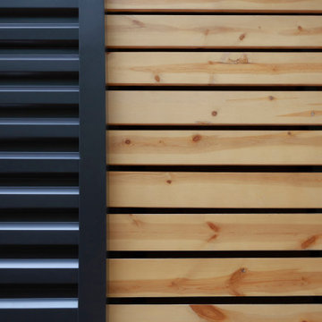
Exterior siding deails contrasts metal and wood - Bridge House - Fenneville, Michigan - Lake Michigan - HAUS | Architecture For Modern Lifestyles, Christopher Short, Indianapolis Architect, Tom Rigney, TR Builders

 Cure Design Group
The furniture was recently purchased so we really needed to get the job done in bedding, color, patterns, and infusing some key pieces/accessories to work in conjunction with the youthful furniture selection.
The inspiration to her design came from a Designers Guild wallpaper that resembled the color of the sky…from there we changed the wall color to a soft gray, added new bedding and pillows, gave the window treatments a neutral texture, changed out overhead lighting and lamps and infused some current accessories.
The change was exactly what was needed! But….we weren’t quite finished. We decided at that point that some extra storage was needed as well as an opportunity to bring that outdoor woodsy feeling into her room. We then changed her nightstand to more of a dresser wrapped in the gloss white and drawers in reclaimed wood.
What a difference!!! But, collectively we still I felt we needed one more change to give her room that “wow” factor. I then decided to change the drama of her existing headboard to one that was spectacular!! And it worked!!!
We are still in the process of changing out her desk, but for the most part we are there!!!
Cure Design Group (636) 294-2343
website https://curedesigngroup.com/
portfolio https://curedesigngroup.com/wordpress/interior-design-portfolio.html
 Southern Pro-Vision Landscape Construction
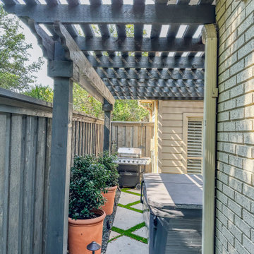
This project focuses on a complete transformation of a narrow outdoor space into a functional, modern retreat. The centerpiece is a custom hardscape featuring large-format concrete pavers set in a striking diagonal grid, accented with high-quality synthetic turf strips for a lush, low-maintenance look year-round.
We addressed the side yard with a functional, aesthetically pleasing walkway using square pavers nestled in river rock, guided by professional low-voltage path lighting. The design is rounded out with a custom dark-stained pergola that provides architectural interest over the spa area and a comprehensive lighting package that highlights the home’s brickwork and mature trees, ensuring the space is just as inviting at night as it is during the day.
 THE Remodel Group
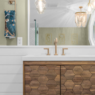
A luxurious en suite bath was created within this classic 1925 Portland bungalow by reconfiguring the second story’s original small bedrooms and tiny half bath. In this welcoming new urban boho space, eclectic finishes mingle harmoniously, integrated through subtle repetition of shapes and materials.
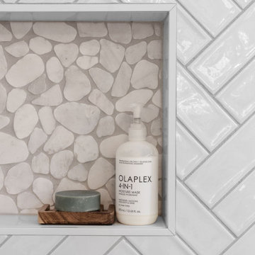
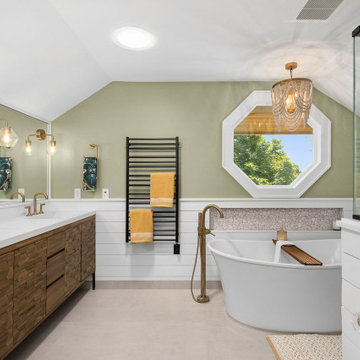
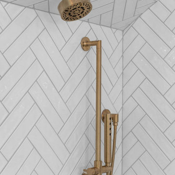
A furniture-style vanity sets the tone for this luxurious space, introducing materials, colors, shapes, and textures that repeat throughout. Individual walnut hexagons join to create distinctive vanity doors, offset beautifully by horizontal-grain drawers. Topping the cabinetry is a simple concrete countertop with integral sinks. An expansive framed mirror above enlarges and brightens the room. Within the mirror, sconces float, their globes a nod to the hexagons below. Champagne bronze fixtures reflect the warm walnut glow. Nestled into the back corner, a stunning shower features waterjet tiles in a double herringbone pattern, each precisely cut and laid to maintain design integrity at every surface transition. Teak floor tiles and a pebbled niche hint at the classic spa experience. Across from the shower, a large hexagonal window provides a treetop view from the free-standing tub below. The gentle oval of the tub and the beaded chandelier above provide a pleasing contrast to the strong lines surrounding it, as do the softly-shaded pebbles in the full-length niche. Shiplap wainscotting wraps the room, creating an illusion of height in the compact space. Subtle flooring and soft green walls create an understated backdrop for the bold mix of materials, unifying them into a serene oasis.
Asking a century-old home to accommodate a modern luxury bath is a tall order. Asbestos-laden plaster and flooring had to be abated. The subfloor had to be leveled and reinforced to increase strength and prevent deflection. Water lines and multiple electrical circuits had to be brought across and up without disturbing a beautifully-paneled ceiling, something we accomplished by firring out stair walls to hide the chases. Our client had visions of a leafy view from her tub, but the new layout eliminated existing windows. Placing a new window was complicated by deep eaves and flat soffits. By pushing the header into the roofline, however, we were able to accommodate a picture window. The flat soffit was replaced by an inverse hip lined with stained tongue and groove cedar, tying it to the bathroom finishes. Bringing materials up a narrow staircase became truly challenging when it was time to install the big items. However, strategic removal of drywall around the landing got the job done. Our attention to detail is showcased in the shower tile, where precise cuts were required at surface transitions to maintain the integrity of a complex double herringbone lay. The project was delivered on time.
Savvy layout choices minimized spending on structural changes. Because we were dealing with dormer space, head height was an issue. Raising the ceiling would have been complex and expensive so our design accommodated the constraints – tub on the low outside wall, shower on the full-height interior wall. The vanity spanned the spread, accommodating our petite client on the exterior side and her taller husband on the interior side. An under-eave closet was closed off to create room for both a freestanding tub and a separate shower. Rather than building replacement storage elsewhere, we simply added a new door into the closet from the primary bedroom. This was made possible by absorbing the short hallway separating the existing bed and bathroom into the primary bedroom. This new layout also created an en suite relationship between the primary bedroom and the new bath. We saved additional dollars by selecting a furniture-style vanity rather than using custom cabinetry, and the countertop with integral sinks provided a cost savings over a more traditional quartz countertop with undermount sinks. Affordable shower tiles allowed us to put more money into a dynamic tile layout. The project was delivered within budget.
 THE Remodel Group
A luxurious en suite bath was created within this classic 1925 Portland bungalow by reconfiguring the second story’s original small bedrooms and tiny half bath. In this welcoming new urban boho space, eclectic finishes mingle harmoniously, integrated through subtle repetition of shapes and materials.
A furniture-style vanity sets the tone for this luxurious space, introducing materials, colors, shapes, and textures that repeat throughout. Individual walnut hexagons join to create distinctive vanity doors, offset beautifully by horizontal-grain drawers. Topping the cabinetry is a simple concrete countertop with integral sinks. An expansive framed mirror above enlarges and brightens the room. Within the mirror, sconces float, their globes a nod to the hexagons below. Champagne bronze fixtures reflect the warm walnut glow. Nestled into the back corner, a stunning shower features waterjet tiles in a double herringbone pattern, each precisely cut and laid to maintain design integrity at every surface transition. Teak floor tiles and a pebbled niche hint at the classic spa experience. Across from the shower, a large hexagonal window provides a treetop view from the free-standing tub below. The gentle oval of the tub and the beaded chandelier above provide a pleasing contrast to the strong lines surrounding it, as do the softly-shaded pebbles in the full-length niche. Shiplap wainscotting wraps the room, creating an illusion of height in the compact space. Subtle flooring and soft green walls create an understated backdrop for the bold mix of materials, unifying them into a serene oasis.
Asking a century-old home to accommodate a modern luxury bath is a tall order. Asbestos-laden plaster and flooring had to be abated. The subfloor had to be leveled and reinforced to increase strength and prevent deflection. Water lines and multiple electrical circuits had to be brought across and up without disturbing a beautifully-paneled ceiling, something we accomplished by firring out stair walls to hide the chases. Our client had visions of a leafy view from her tub, but the new layout eliminated existing windows. Placing a new window was complicated by deep eaves and flat soffits. By pushing the header into the roofline, however, we were able to accommodate a picture window. The flat soffit was replaced by an inverse hip lined with stained tongue and groove cedar, tying it to the bathroom finishes. Bringing materials up a narrow staircase became truly challenging when it was time to install the big items. However, strategic removal of drywall around the landing got the job done. Our attention to detail is showcased in the shower tile, where precise cuts were required at surface transitions to maintain the integrity of a complex double herringbone lay. The project was delivered on time.
Savvy layout choices minimized spending on structural changes. Because we were dealing with dormer space, head height was an issue. Raising the ceiling would have been complex and expensive so our design accommodated the constraints – tub on the low outside wall, shower on the full-height interior wall. The vanity spanned the spread, accommodating our petite client on the exterior side and her taller husband on the interior side. An under-eave closet was closed off to create room for both a freestanding tub and a separate shower. Rather than building replacement storage elsewhere, we simply added a new door into the closet from the primary bedroom. This was made possible by absorbing the short hallway separating the existing bed and bathroom into the primary bedroom. This new layout also created an en suite relationship between the primary bedroom and the new bath. We saved additional dollars by selecting a furniture-style vanity rather than using custom cabinetry, and the countertop with integral sinks provided a cost savings over a more traditional quartz countertop with undermount sinks. Affordable shower tiles allowed us to put more money into a dynamic tile layout. The project was delivered within budget.

 Shuler Architecture
This 3 BR, 3 1/2 bath home allows the owners to live on one level most of the time. The Master Suite is on the main level along with the Living Room, Kitchen, Dining, pantries, Sun Room and service areas. The upper level houses two ample bedrooms while the lower level supports a rec center, media room, wine cellar, shop and full wet bar. Conceived as a Great Room house, the main level is designed as one seamless space that flows onto an ample deck overlooking the rear yard.
We also incorporated a variety of green building techniques - photo-voltaic shingles on the roof of the garage to generate a portion of the home's energy, a super insulated building envelope, rain water harvesting, high performance windows and doors, a high efficiency heat pump, low flow bath & kitchen fixtures, Energy Star appliances and LED lighting - that greatly reduced this structure's carbon footprint. All of the strategies amounted to a 30% reduction in the energy consumption in this home relative to comparable structures.
 THE Remodel Group
A luxurious en suite bath was created within this classic 1925 Portland bungalow by reconfiguring the second story’s original small bedrooms and tiny half bath. In this welcoming new urban boho space, eclectic finishes mingle harmoniously, integrated through subtle repetition of shapes and materials.
A furniture-style vanity sets the tone for this luxurious space, introducing materials, colors, shapes, and textures that repeat throughout. Individual walnut hexagons join to create distinctive vanity doors, offset beautifully by horizontal-grain drawers. Topping the cabinetry is a simple concrete countertop with integral sinks. An expansive framed mirror above enlarges and brightens the room. Within the mirror, sconces float, their globes a nod to the hexagons below. Champagne bronze fixtures reflect the warm walnut glow. Nestled into the back corner, a stunning shower features waterjet tiles in a double herringbone pattern, each precisely cut and laid to maintain design integrity at every surface transition. Teak floor tiles and a pebbled niche hint at the classic spa experience. Across from the shower, a large hexagonal window provides a treetop view from the free-standing tub below. The gentle oval of the tub and the beaded chandelier above provide a pleasing contrast to the strong lines surrounding it, as do the softly-shaded pebbles in the full-length niche. Shiplap wainscotting wraps the room, creating an illusion of height in the compact space. Subtle flooring and soft green walls create an understated backdrop for the bold mix of materials, unifying them into a serene oasis.
Asking a century-old home to accommodate a modern luxury bath is a tall order. Asbestos-laden plaster and flooring had to be abated. The subfloor had to be leveled and reinforced to increase strength and prevent deflection. Water lines and multiple electrical circuits had to be brought across and up without disturbing a beautifully-paneled ceiling, something we accomplished by firring out stair walls to hide the chases. Our client had visions of a leafy view from her tub, but the new layout eliminated existing windows. Placing a new window was complicated by deep eaves and flat soffits. By pushing the header into the roofline, however, we were able to accommodate a picture window. The flat soffit was replaced by an inverse hip lined with stained tongue and groove cedar, tying it to the bathroom finishes. Bringing materials up a narrow staircase became truly challenging when it was time to install the big items. However, strategic removal of drywall around the landing got the job done. Our attention to detail is showcased in the shower tile, where precise cuts were required at surface transitions to maintain the integrity of a complex double herringbone lay. The project was delivered on time.
Savvy layout choices minimized spending on structural changes. Because we were dealing with dormer space, head height was an issue. Raising the ceiling would have been complex and expensive so our design accommodated the constraints – tub on the low outside wall, shower on the full-height interior wall. The vanity spanned the spread, accommodating our petite client on the exterior side and her taller husband on the interior side. An under-eave closet was closed off to create room for both a freestanding tub and a separate shower. Rather than building replacement storage elsewhere, we simply added a new door into the closet from the primary bedroom. This was made possible by absorbing the short hallway separating the existing bed and bathroom into the primary bedroom. This new layout also created an en suite relationship between the primary bedroom and the new bath. We saved additional dollars by selecting a furniture-style vanity rather than using custom cabinetry, and the countertop with integral sinks provided a cost savings over a more traditional quartz countertop with undermount sinks. Affordable shower tiles allowed us to put more money into a dynamic tile layout. The project was delivered within budget.
 THE Remodel Group
A luxurious en suite bath was created within this classic 1925 Portland bungalow by reconfiguring the second story’s original small bedrooms and tiny half bath. In this welcoming new urban boho space, eclectic finishes mingle harmoniously, integrated through subtle repetition of shapes and materials.
A furniture-style vanity sets the tone for this luxurious space, introducing materials, colors, shapes, and textures that repeat throughout. Individual walnut hexagons join to create distinctive vanity doors, offset beautifully by horizontal-grain drawers. Topping the cabinetry is a simple concrete countertop with integral sinks. An expansive framed mirror above enlarges and brightens the room. Within the mirror, sconces float, their globes a nod to the hexagons below. Champagne bronze fixtures reflect the warm walnut glow. Nestled into the back corner, a stunning shower features waterjet tiles in a double herringbone pattern, each precisely cut and laid to maintain design integrity at every surface transition. Teak floor tiles and a pebbled niche hint at the classic spa experience. Across from the shower, a large hexagonal window provides a treetop view from the free-standing tub below. The gentle oval of the tub and the beaded chandelier above provide a pleasing contrast to the strong lines surrounding it, as do the softly-shaded pebbles in the full-length niche. Shiplap wainscotting wraps the room, creating an illusion of height in the compact space. Subtle flooring and soft green walls create an understated backdrop for the bold mix of materials, unifying them into a serene oasis.
Asking a century-old home to accommodate a modern luxury bath is a tall order. Asbestos-laden plaster and flooring had to be abated. The subfloor had to be leveled and reinforced to increase strength and prevent deflection. Water lines and multiple electrical circuits had to be brought across and up without disturbing a beautifully-paneled ceiling, something we accomplished by firring out stair walls to hide the chases. Our client had visions of a leafy view from her tub, but the new layout eliminated existing windows. Placing a new window was complicated by deep eaves and flat soffits. By pushing the header into the roofline, however, we were able to accommodate a picture window. The flat soffit was replaced by an inverse hip lined with stained tongue and groove cedar, tying it to the bathroom finishes. Bringing materials up a narrow staircase became truly challenging when it was time to install the big items. However, strategic removal of drywall around the landing got the job done. Our attention to detail is showcased in the shower tile, where precise cuts were required at surface transitions to maintain the integrity of a complex double herringbone lay. The project was delivered on time.
Savvy layout choices minimized spending on structural changes. Because we were dealing with dormer space, head height was an issue. Raising the ceiling would have been complex and expensive so our design accommodated the constraints – tub on the low outside wall, shower on the full-height interior wall. The vanity spanned the spread, accommodating our petite client on the exterior side and her taller husband on the interior side. An under-eave closet was closed off to create room for both a freestanding tub and a separate shower. Rather than building replacement storage elsewhere, we simply added a new door into the closet from the primary bedroom. This was made possible by absorbing the short hallway separating the existing bed and bathroom into the primary bedroom. This new layout also created an en suite relationship between the primary bedroom and the new bath. We saved additional dollars by selecting a furniture-style vanity rather than using custom cabinetry, and the countertop with integral sinks provided a cost savings over a more traditional quartz countertop with undermount sinks. Affordable shower tiles allowed us to put more money into a dynamic tile layout. The project was delivered within budget.
137