
Search results for "Resolved" in Home Design Ideas
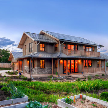
 Rodwin Architecture & Skycastle Construction
Rodwin Architecture and Skycastle Homes
Location: Boulder, CO, United States
This LEED Platinum certified modern farmhouse is our first “regenerative home,” producing more energy than it consumes. This 3,900 s.f. custom home uses passive solar design, 10.2kW of solar photovoltaics, a ground source heat pump, double wall well-insulated exterior envelope, high performance doors and windows, to achieve a HERS negative 8 rating and Energy Star v.3.0 certification. The interior has low-VOC finishes and custom built-in FSC-certified wood and beetle kill pine cabinets throughout. The site is designed to be very low water use, incorporating permaculture and urban farming, with raised planting beds and a passive solar chicken coop/greenhouse. What makes this project special is its combination of extraordinary sustainability with conventionally attractive, cost-effective design tailored to the owner’s needs.
 Michael Nash Design, Build & Homes
This four-story townhome in the heart of old town Alexandria, was recently purchased by a family of four.
The outdated galley kitchen with confined spaces, lack of powder room on main level, dropped down ceiling, partition walls, small bathrooms, and the main level laundry were a few of the deficiencies this family wanted to resolve before moving in.
Starting with the top floor, we converted a small bedroom into a master suite, which has an outdoor deck with beautiful view of old town. We reconfigured the space to create a walk-in closet and another separate closet.
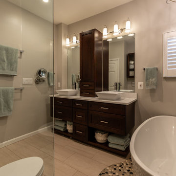
We took some space from the old closet and enlarged the master bath to include a bathtub and a walk-in shower. Double floating vanities and hidden toilet space were also added.
The addition of lighting and glass transoms allows light into staircase leading to the lower level.
On the third level is the perfect space for a girl’s bedroom. A new bathroom with walk-in shower and added space from hallway makes it possible to share this bathroom.
A stackable laundry space was added to the hallway, a few steps away from a new study with built in bookcase, French doors, and matching hardwood floors.
The main level was totally revamped. The walls were taken down, floors got built up to add extra insulation, new wide plank hardwood installed throughout, ceiling raised, and a new HVAC was added for three levels.
The storage closet under the steps was converted to a main level powder room, by relocating the electrical panel.
The new kitchen includes a large island with new plumbing for sink, dishwasher, and lots of storage placed in the center of this open kitchen. The south wall is complete with floor to ceiling cabinetry including a home for a new cooktop and stainless-steel range hood, covered with glass tile backsplash.
The dining room wall was taken down to combine the adjacent area with kitchen. The kitchen includes butler style cabinetry, wine fridge and glass cabinets for display. The old living room fireplace was torn down and revamped with a gas fireplace wrapped in stone.
Built-ins added on both ends of the living room gives floor to ceiling space provides ample display space for art. Plenty of lighting fixtures such as led lights, sconces and ceiling fans make this an immaculate remodel.
We added brick veneer on east wall to replicate the historic old character of old town homes.
The open floor plan with seamless wood floor and central kitchen has added warmth and with a desirable entertaining space.
 Crystal Kitchen + Bath
The goal for this 1939 Tudor-style story-and-a-half home was to create a kitchen that offered the conveniences, storage, and performance of a modern workspace while preserving the warmth, craftsmanship, and vintage charm that made the home special. The client, an avid home cook, wanted the room to feel as though it had always belonged to the house, with thoughtful upgrades that respected the original architecture rather than competing with it. Just as important, she needed a more efficient layout with enough storage for small appliances, so everyday cooking would no longer require carrying items up from the lower level.
Several existing conditions shaped the design approach. The kitchen retained original, amber-stained birch woodwork that the client wished to keep, and the compact footprint was interrupted by six doorways and two windows, none of which were to be moved, altered, or replaced. A previous flooring update had left the door casings undercut too short, creating visible gaps where the casing met the floor. The existing vintage 40-inch range also lacked proper ventilation, yet the client wished to accommodate a refrigerator, dishwasher, cooktop, double ovens, built-in microwave, and effective venting above the cooktop into the new kitchen layout.
To honor the original millwork, beaded inset-style cherry cabinetry was selected in a soft, hand-rubbed finish that will deepen over time and develop a natural patina. Charcoal-gray soapstone countertops complement the cabinetry while reinforcing the historic character of the home with an organic, timeworn texture. The former breakfast nook was transformed into a butler’s pantry, adding valuable base cabinet storage and expanded work surfaces for frequently used small appliances. Also in the butler’s pantry, a single upper cabinet was paired with open shelves to give an open, airy feeling while adding character and practical storage. A classic single-bowl apron-front workstation sink contributes both period-appropriate character and practical prep and cleanup function.
Because the home’s openings were such a defining feature, the design worked within the existing architecture instead of altering it. Custom plinth blocks were created for each doorway to extend the original casing gracefully down to the new natural red oak flooring, resolving the earlier construction issue while adding a detail that feels authentic to the age of the house. Despite the number of door and window openings, the new layout provides a significantly more functional, built-in kitchen with an improved work triangle for serious cooking.
Appliance placement was carefully planned to deliver the requested performance without overwhelming the small room. Three cooking functions (double ovens & microwave) were consolidated into one location with a GE Café double oven featuring Advantium Technology, while the client’s compact 31-inch refrigerator was reused to preserve space. A sleek 30-inch induction cooktop provides efficient cooking, and a Vent-A-Hood ARS ductless vent hood supplies needed ventilation without requiring a duct run to the exterior.
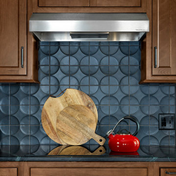
The finish palette balances richness, texture, and historical sensitivity. A deeply textured navy backsplash tile adds depth and dramatic shadow play against the soapstone, while wallpaper in the back entry echoes the tile’s geometric pattern to visually connect the adjoining spaces. Oil-rubbed bronze cabinet hardware and light fixtures enhance the warmth of the cherry cabinetry and complete the antique-inspired feel.
Lighting was layered to make the compact kitchen brighter, more useful, and more inviting. Vintage-style semi-flush ceiling fixtures establish the overall tone, while dimmable puck lights highlight select areas and undercabinet task lighting keeps work surfaces well illuminated.
The completed kitchen now feels both highly functional and deeply rooted in the home’s history. Rich cherry cabinetry, velvety soapstone, natural red oak flooring, navy tile, bronze accents, and carefully preserved birch trim work together to create a warm, cohesive space that celebrates timeless craftsmanship. By increasing storage, improving workflow, integrating modern appliances, and respecting the Tudor home’s original character, the design achieves the client’s vision: a kitchen that feels personal, practical, historically appropriate, and as though it has always been there.
Find the right local pro for your project
 Cerno
CernoCerno’s mission is to design and build original products in California. To make this possible we advocate for creativity and ingenuity in every step of the process. Our philosophy is grounded in the utmost respect for the materials, the craftsmanship and our entire team.
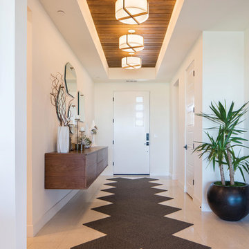
The Plura is a simple, straight forward fixture that is excellently executed. With the Plura it was about resolving the seams and edges and their relationships to one another. The result is a scalable fixture that has a sharp, sophisticated feel.
Features:
Wood Grain Will Vary
Energy Efficient LED Light Source
Handmade
Eco-Friendly
Switch Location: Hardwired
Damp Location rated to accommodate any room in the home including bathrooms, kitchens, covered patios, dining rooms, living rooms, bedrooms, hallways, entryways, foyers, and everything in between.
Specifications:
Included canopy measures as 5"" Width x 0.3"" Thick
Voltage: 120-277V AC
Requires 1 x 32.5-Watt LED Module (Integrated)
2815 Lumes, 90 CRI, 2700K (Warm) Color Temperature
Compatible with TRIAC / ELV Dimmer / 0-10V Dimmers
 Tile Doctor Ltd
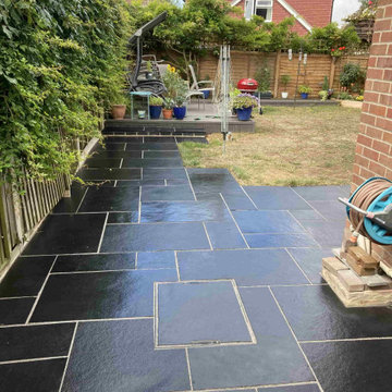
We were called out to look at this new Black Limestone patio in Ashford which was not looking as it should. The client had laid it himself but unfortunately had not managed to polish off all the grout from the surface of the Limestone thereby degrading the appearance of the stone.
Grout Smearing or Grout Haze is a common problem when it comes to tiling and this problem seems to be on the increase due to new grout formula’s which are tougher but dry a lot faster. Usually, the excess grout can be removed using a mild acid however it is not possible to do that on Limestone as this Stone is acid sensitive and as well as etching the stone can cause it to turn white. I know Tile Doctor has resolved a few jobs like this in the past for builders who do not always understand the unique characteristics of the stone.
I discussed with the client how Tile Doctor could help and gave him a quote for the work to be carried out. He was happy to go ahead so having consulted the weather forecast for a couple of dry days we agreed a date to return.
To remove the Grout Haze and clean the appearance of the Limestone I applied a Tile Doctor Brick and Patio Cleaner and worked it in with a coarse 400 grit diamond encrusted burnishing pad. The coarse pad does leave the stone looking a little rough, so the surface was then renovated using the finer burnishing pads of 800 and 1500 grit using water for lubrication. By using the pads in sequence, it gradually smooths the surface of the stone. Once done the tiles were rinsed with water and the soil removed with an industrial wet vacuum. The patio was looking good, the day was nice and bright, so we left the patio for a few hours to dry in the sun.
Once the stone was dry the patio was sealed with single coat of Tile Doctor Stone Oil which is an impregnating sealer that improves strength and restores colour to the stone.
Once dry the Stone Oil was followed by a coat of Tile Doctor Colour Grow sealer which like the Stone Oil penetrates the pores of the stone improving colour and adding protection. The treatment and combination of products transformed the appearance of the patio and provided the client with exactly the look he required.
As you can see from the after pictures the patio had a rich black colour and looked as it should. The client was over the moon with the result and was thankful that we had managed to rescue his work. Lesson learned for any future project he might take on, beware of grout haze!
Michael Conlon
South Kent Tile Doctor
 Renovisions
This client requested that we design her new kitchen space to look and function with her and her family’s usage in mind. She was not happy with her existing kitchen due to builder-grade ceramic flooring, lack of countertop space, poor lighting, inadequate and unorganized storage and the closed off feel of the area. Renovisions resolved all of these issues by designing and building an impressive, transitional styled kitchen; delivering a beautifully well thought-out space that provides a multi-functional approach and meets the needs of this busy and dynamic household.
Typically, we encounter challenges in every project, and this was no different. The upstairs bathroom plumbing ran across the entire length of the kitchen sink wall and it was necessary to work with it by moving the plumbing as far up as possible and then building a soffit to hide it.
Creating a space that has a more open feel was top of mind for our client. Installing a new wood floor that matched the existing dining room floor helped with this and in addition, warmed up the room. By relocating the refrigerator to the opposite wall and adding a bar area at the end toward the family room, the flow of traffic for family members and guests became more managed.
The open floor plan allowed for additional island cabinets to accommodate smart storage and better functionality when prepping meals, sitting to eat or gathering with friends and family. We believe having ample countertop surface space is a critical improvement in any renovation and this particular project now boasts a large countertop area with a stunning wide vein pattern that accentuates the design instead of overpowering it. The soft look of the Blanco Arabescato quartz enhances the space and looks lovely with the white inset styled cabinetry.
Beauty and function go hand-in-hand in this kitchen with several exceptional elements such as under-cabinet lighting with dimmers to control the mood light. Glass doors were added to the wall cabinets which flank the wine rack for displaying their decorative glassware and a beverage cooler below provided added convenience and access to cold beverages. The GE Café line of appliances in ‘Slate’ and ‘Stainless Steel’ finishes are a stunning contrast here.
The sensational looking decorative marble 6”x6” backsplash tile over the gas range and in the bar area creates nice focal points by creating a unique look for her that family and guests love.
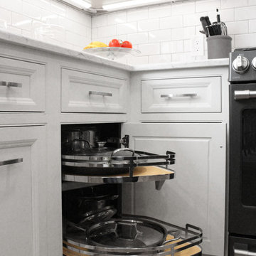
Convenient and functional elements were added such as a blind corner pull-out for easier pot/pan storage, a sweep-o-vac under cabinet vacuum system for those constant quick clean-ups, a pull-out caddy under the sink base for storage of cleaning products and a protective mat to collect potential spills.
Our client let us know it was time for a change and we listened. She shared a few pictures she loved from a home magazine, we shared our insight and then designed/built the kitchen of her dreams! … A fabulous and functional space.
 New Explode Construction
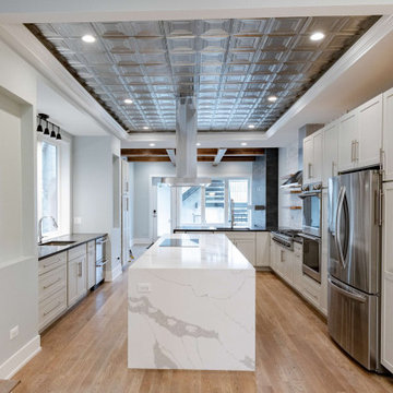
This custom kitchen remodel in Chicago was designed to create a stronger connection between architecture, function, and everyday living. At the center of the space is a dramatic quartz waterfall island, surrounded by full-height custom cabinetry, integrated appliances, and a statement ceiling detail that adds depth and character to the entire room.
The open layout improves circulation and creates a seamless transition between the kitchen, dining, and living areas, while exposed wood beams and clean architectural lines bring warmth and structure to the design. Every finish was selected to balance durability with timeless appeal.
This project reflects a design-build approach where layout, systems, and execution are resolved early, ensuring the finished space feels intentional, functional, and built to last.
 Saikley Architects
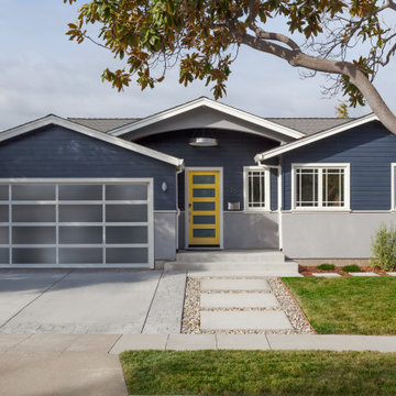
Our busy Silicon Valley clients asked us to convert their tight-quartered 1960’s ranch house to a gracious family home that would meet their long term needs. Ease of living was paramount, both in functionality and in ordered design.
The project was completed on a moderate budget.While retaining most of the structure of the existing house to avoid costly structural changes, we opened walls to improve the sight lines and flow of the house and bring in more light. We made small additions at the front and back bedrooms to gain space for the family and relatives. An existing underused patio area was improved with a simple outdoor kitchen and overhang to extend the living space to the outside. Costs were kept down with choices of modest materials.
Everything was made to be functional. Ample storage has been built into the right places. The details of the kitchen were carefully worked out to accommodate all the wishes of the various cooks in the family. The house is set up to be easy to keep clean. Acoustic walls separate living from bedroom spaces so adults can enjoy time together while children sleep. The outdoor kitchen has easy access to the indoor kitchen and the garage, and its setup promotes socializing while cooking outdoors.
A large part of the narrow back yard was previously unusable space due to a steep slope up to a neighbor’s higher fence. With a new retaining wall and some re-grading we took back more of the yard for the patio and play space on a new lawn.
The remodeled house is a mix of contemporary and traditional elements. Cool colors have a calming effect. Traditional items such as prairie style windows, trellis, mosaic tiles, and Shaker style cabinets, break down the scale in an otherwise streamlined, contemporary design. A new gabled roof with a broad arch at the front of the house marks the entry and resolves a challenging form where the central entry is set back from walls on both sides.
Photography: Kurt Manley
https://saikleyarchitects.com/portfolio/modern-ranch/
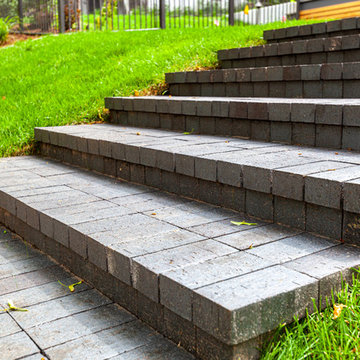
 Castle Building & Remodeling
This modern home, near Cedar Lake, built in 1900, was originally a corner store. A massive conversion transformed the home into a spacious, multi-level residence in the 1990’s.
However, the home’s lot was unusually steep and overgrown with vegetation. In addition, there were concerns about soil erosion and water intrusion to the house. The homeowners wanted to resolve these issues and create a much more useable outdoor area for family and pets.
Castle, in conjunction with Field Outdoor Spaces, designed and built a large deck area in the back yard of the home, which includes a detached screen porch and a bar & grill area under a cedar pergola.
The previous, small deck was demolished and the sliding door replaced with a window. A new glass sliding door was inserted along a perpendicular wall to connect the home’s interior kitchen to the backyard oasis.
The screen house doors are made from six custom screen panels, attached to a top mount, soft-close track. Inside the screen porch, a patio heater allows the family to enjoy this space much of the year.
Concrete was the material chosen for the outdoor countertops, to ensure it lasts several years in Minnesota’s always-changing climate.
Trex decking was used throughout, along with red cedar porch, pergola and privacy lattice detailing.
The front entry of the home was also updated to include a large, open porch with access to the newly landscaped yard. Cable railings from Loftus Iron add to the contemporary style of the home, including a gate feature at the top of the front steps to contain the family pets when they’re let out into the yard.
Tour this project in person, September 28 – 29, during the 2019 Castle Home Tour!
 Michael Nash Design, Build & Homes
This four-story townhome in the heart of old town Alexandria, was recently purchased by a family of four.
The outdated galley kitchen with confined spaces, lack of powder room on main level, dropped down ceiling, partition walls, small bathrooms, and the main level laundry were a few of the deficiencies this family wanted to resolve before moving in.
Starting with the top floor, we converted a small bedroom into a master suite, which has an outdoor deck with beautiful view of old town. We reconfigured the space to create a walk-in closet and another separate closet.
We took some space from the old closet and enlarged the master bath to include a bathtub and a walk-in shower. Double floating vanities and hidden toilet space were also added.
The addition of lighting and glass transoms allows light into staircase leading to the lower level.
On the third level is the perfect space for a girl’s bedroom. A new bathroom with walk-in shower and added space from hallway makes it possible to share this bathroom.
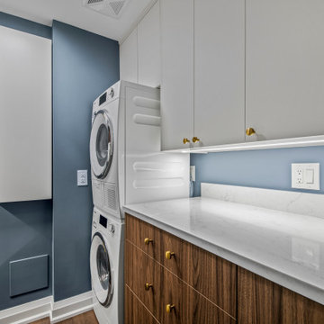
A stackable laundry space was added to the hallway, a few steps away from a new study with built in bookcase, French doors, and matching hardwood floors.
The main level was totally revamped. The walls were taken down, floors got built up to add extra insulation, new wide plank hardwood installed throughout, ceiling raised, and a new HVAC was added for three levels.
The storage closet under the steps was converted to a main level powder room, by relocating the electrical panel.
The new kitchen includes a large island with new plumbing for sink, dishwasher, and lots of storage placed in the center of this open kitchen. The south wall is complete with floor to ceiling cabinetry including a home for a new cooktop and stainless-steel range hood, covered with glass tile backsplash.
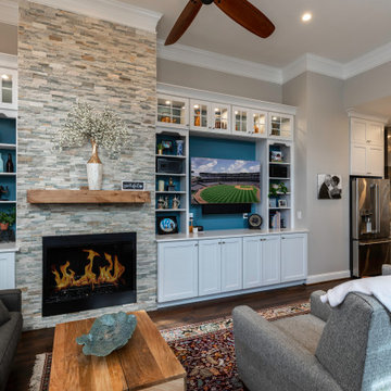
The dining room wall was taken down to combine the adjacent area with kitchen. The kitchen includes butler style cabinetry, wine fridge and glass cabinets for display. The old living room fireplace was torn down and revamped with a gas fireplace wrapped in stone.
Built-ins added on both ends of the living room gives floor to ceiling space provides ample display space for art. Plenty of lighting fixtures such as led lights, sconces and ceiling fans make this an immaculate remodel.
We added brick veneer on east wall to replicate the historic old character of old town homes.
The open floor plan with seamless wood floor and central kitchen has added warmth and with a desirable entertaining space.
 Sosna Inc
This project centered on helping a wonderful client and her equally fantastic dog transform her condo into a space that truly reflected her style and simplified her life. Eager to create a home that was both beautiful and functional, she envisioned a haven in the heart of the city.
Before: Feeling Disconnected
Before the renovation, our client felt disconnected from her condo. The builder-grade kitchen was a constant source of frustration, with an awkward peninsula that hindered the flow of the space. The condo overall felt outdated and no longer captured her vibrant personality. The foyer and laundry areas were cramped and lacked organization, while the mismatched hardwood flooring only added to the disjointed atmosphere. As for the bathrooms, they felt frozen in time, desperately needing an update.
Worries and Concerns
Like many homeowners, our client had heard her fair share of renovation horror stories—tales of projects gone awry and the frustrations of managing multiple contractors. She was understandably cautious and needed a trustworthy, experienced team she could rely on to handle the project with care and expertise.
The Solution: A Personalized Transformation
We took the time to listen carefully to our client’s needs and concerns and developed a tailored plan to address each of her pain points. For the kitchen, we preserved the existing layout but reimagined the space entirely. The awkward peninsula was redesigned to improve traffic flow and provide much-needed storage and counter space. Clever storage solutions, such as pull-outs, shelving, concealed drawers in the toe kicks, and an appliance garage, were incorporated. The kitchen now boasts a warm and inviting atmosphere, with light wood-tone lower cabinetry, off-white upper cabinets, and brushed nickel hardware that ties it all together.
The laundry room, once cramped and chaotic, was transformed into an organized, efficient space. We added custom cabinetry with pull-outs for hanging clothes, open storage above, a laundry sink, and a spacious counter for folding—no more piles of laundry!
Both the en-suite and shared bathrooms underwent complete renovations. Custom cabinetry was installed, including a floor-to-ceiling linen closet, and light grey and brown-toned tiles were selected, with contrasting hexagonal tiles for the shower floor. A heated flooring system was added for luxury and comfort year-round.
The mismatched flooring throughout the condo was replaced with cohesive vinyl and porcelain tiles, creating a seamless, modern aesthetic throughout the space.
Overcoming Challenges
As with any renovation, there were challenges to navigate. One of the key obstacles was managing the condo board’s renovation rules and policies while coordinating the delivery schedules for finishes and fixtures, especially during the busy holiday season. With careful planning, we ensured the project stayed on track. Additionally, we encountered a height variation between the tile and vinyl flooring. To resolve this, we used self-leveling material under the vinyl, ensuring a smooth and seamless transition between the two flooring types.
The Grand Reveal: A Dream Come True
The final result is simply stunning. The kitchen is now a chef’s dream, with custom-built cabinets, smooth quartz countertops, and a matching stone backsplash. Brushed nickel and stainless steel plumbing fixtures, elegant cabinet hardware, and LED lighting under the upper cabinets add the perfect finishing touches. Custom organizers in the foyer and laundry closets provide ample storage and keep everything neatly in place. The bathrooms have been transformed into spa-like retreats, with beautiful porcelain tiles and custom cabinetry. The new vinyl flooring throughout the main living areas and bedroom unifies the space, creating a cohesive and modern atmosphere.
Life Transformed
Our client’s life has been completely transformed. As a passionate cook, she now relishes spending time in her beautiful and functional kitchen. The single-bowl sink makes cleanup a breeze, and the thoughtfully designed storage solutions have brought a sense of calm and order to her home. The refreshed flooring and neutral paint palette have created a relaxing, comfortable environment she truly loves.
A Memorable Journey
This project was more than just a renovation—it was a collaboration. Our client valued our guidance throughout the design process, particularly when faced with the overwhelming number of decisions. We built a strong relationship with her, and we are immensely grateful for the trust she placed in our team.
 Mottram Architecture
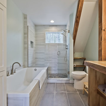
Timber frame homes offer unique challenges during a remodel. What often makes them beautiful and attractive to most homeowners, also makes them challenging for space requirements.
Context: The lovely couple that owned this home were struggling with some interesting floor plan challenges that just didn't work for their family. The loved the beautiful timbers and woodwork of their home, but the dramatically sloping ceilings on the second floor, particularly in the bathroom, just didn't work for this 1 1/2 bath home. Needing to use the skylight to approach the toilet was a less then ideal scenario. Although the bathroom footprint was more then adequate, the sloped ceiling only made half of the space useable. Check out the Before/After post on our blog to see the photos of the house pre-renovation. As much as they loved all the wood features in their home, another challenge they had was light. The wood ceiling made everything inside the house darker, even with a fantastic array of south facing windows, there were spaces in the home that felt dark and small. When they contacted us they wanted to know how could they make their brighter and more inviting, were there solutions to the 2nd floor sloped ceiling issues, and if they were going to do all of this work, how could they make their home more comfortable and efficient. A nagging water leak in the upstairs bathroom spurred them into action and here is how we solved their dilemma.
Conclusion: First, we added a little dormer to the rear of the house so we could get full headroom in nearly all of the upstairs bathroom! Then we decided to extend that dormer one more timber bay over to create a walk in closet with natural light and plenty of space. Since we were contemplating energy efficiency, we resolved a nagging issue that is present in a lot of timber frame construction, air tightness. Commonly found in timber frame construction, fiberglass insulation is installed in the rafter bays and board ceilings are installed over top. Unfortunately, board ceilings are anything but air tight, and fiberglass insulation needs to be in an airtight cavity for maximum effectiveness. So we were able to solve two issues at the same time for this homeowner. We removed the board ceiling and fiberglass insulation, we dense packed the rafter bays with cellulose insulation, and installed sheetrock in place of the boards. The boards were salvaged for re-use by the homeowner, and the space and light quality was dramatically improved. Some may think that losing the board ceiling took something away from the space, but what you'll see in the pictures is that it highly accentuates the heavy timbers and really makes them stand out in a beautiful way. Now with this added airtightness, better insulation, and brighter space, the homeowner hardly runs their wood stove, and it's so quiet in the space, an added bonus from changing the insulation. It became necessary to also add a sheetrock ceiling to the living room to hide the plumbing from the new bathroom layout above. Changing this ceiling gave the homeowner some real quality lighting that was lacking in the living room before. The brighter ceiling and new lighting layout completely transforms the living room into a space you want to hang out, even though the layout didn't change at all. When the homeowner saw the finished spaces she said "I can't believe this is my house, I want to live in this house"
Energy Efficiency: I touched a little on the efficiency above, but like all projects done with Mottram Architecture, we always want to leave you with a little extra. Timber frame construction with board ceilings and fiberglass insulation are notoriously leaky! If you want to know what we think about fiberglass insulation, check our our blog post on Why Fiberglass Insulation Sucks. By installing cellulose insulation and covering it with sheetrock we were able to greatly reduce the heat flowing out of this home. It not only improves cashflow it improves the comfort level in the space. Who wants to sit in their living room and feel a draft? Let us remind you, we are not saying cellulose insulation is an air barrier, we use the sheetrock to help with that, but it does significantly reduce the air flow over fiberglass insulation. And when we reduce the airflow, we reduce the heat flow. And when we reduce the heat flow, we reduce the need to re-heat that drafty air from outside. When it comes to energy efficiency the first and best place to start is air infiltration. We greatly reduced the air infiltration with the new insulation, but we also added a hat and warm boots. What I mean by that is, we improved the insulation in the roof, and we installed insulation in the basement. Maybe it's a silly analogy, but when you think about keeping warm, we always start with the hat and boots! With sustainability in mind, the next project will be to add a deck to the front of this house with rain catchment barrels from the metal roof. They are planning to plant a garden in the spring and the rain catchment system will help to irrigate the new garden.
Builder: East Shore Builders
Photographer: Michael Eric Berube
Michael Eric Berube, Maine Virtual Home Tours
 Renovisions
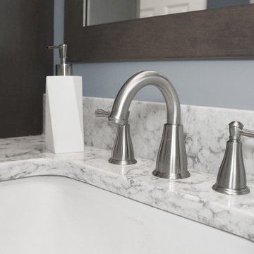
This master bath ‘Renovision’ came with three main requests from the homeowner: more storage, a larger shower and a luxurious look that feels like being at an upscale hotel. The Renovisions team accomplished these wishes and exceeded the clients expectations.
Request number 1: more storage. The existing closet was reconfigured to accommodate better storage for towels and bath supplies making it both functional and attractive. The custom built pull-out hamper was perfect. The long vanity and center tower offers much more cabinet space and drawer storage compared to what they had, especially with the increased vanity height.
Request number 2: A larger shower. Working within the existing footprint we were able to build a shower that is nearly a foot deeper as space was available. Creating a large rectangular cubby provides plenty of space for shampoos and soaps. The frameless sliding glass shower enclosure keeps the space open and airy while allowing the beautiful Carrera-look porcelain wall tiles to be the focus of this master bath.
Request number 3: a luxurious look. Turning their once boring, builder grade bathroom into an upscale hotel-like space was challenging, however, not a problem for the Renovisions team and their creative ways of resolving design snags along the way. Re-locating the doorway to the bathroom was one way to create a more spacious flow in and out of the space. Having the right design to start was half the battle – installing the beautiful products right the first time to ensure a proper fit and finish worthy of the upscale feel is the other half. The delicate tile detail in the shower cubby is the ‘jewelry’ in the room – the soft curves of this 2-tone wave design tile adds a dramatic feel and enlightened mood this client loves.
Overall, the homeowner was happy with every solution-based approach to all requests – their once dated builders bath is now bright, open and airy with a soft grey wall color adding to the soothing feel of this master bath.
 MW Design Workshop
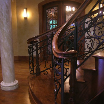
View of the stair beginning from the basement, featuring custom, hand-turned newel posts, and hand-carved volutes on both sides. The radical curve and geometry of the railing requires these pieces to be completely handmade. This requires a craftsman with years of skill and experience to accurately trace the profile and resolve the curve in a beautiful manner. Photo credit - Josiah Zukowski
 Crystal Kitchen + Bath
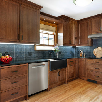
The goal for this 1939 Tudor-style story-and-a-half home was to create a kitchen that offered the conveniences, storage, and performance of a modern workspace while preserving the warmth, craftsmanship, and vintage charm that made the home special. The client, an avid home cook, wanted the room to feel as though it had always belonged to the house, with thoughtful upgrades that respected the original architecture rather than competing with it. Just as important, she needed a more efficient layout with enough storage for small appliances, so everyday cooking would no longer require carrying items up from the lower level.
Several existing conditions shaped the design approach. The kitchen retained original, amber-stained birch woodwork that the client wished to keep, and the compact footprint was interrupted by six doorways and two windows, none of which were to be moved, altered, or replaced. A previous flooring update had left the door casings undercut too short, creating visible gaps where the casing met the floor. The existing vintage 40-inch range also lacked proper ventilation, yet the client wished to accommodate a refrigerator, dishwasher, cooktop, double ovens, built-in microwave, and effective venting above the cooktop into the new kitchen layout.
To honor the original millwork, beaded inset-style cherry cabinetry was selected in a soft, hand-rubbed finish that will deepen over time and develop a natural patina. Charcoal-gray soapstone countertops complement the cabinetry while reinforcing the historic character of the home with an organic, timeworn texture. The former breakfast nook was transformed into a butler’s pantry, adding valuable base cabinet storage and expanded work surfaces for frequently used small appliances. Also in the butler’s pantry, a single upper cabinet was paired with open shelves to give an open, airy feeling while adding character and practical storage. A classic single-bowl apron-front workstation sink contributes both period-appropriate character and practical prep and cleanup function.
Because the home’s openings were such a defining feature, the design worked within the existing architecture instead of altering it. Custom plinth blocks were created for each doorway to extend the original casing gracefully down to the new natural red oak flooring, resolving the earlier construction issue while adding a detail that feels authentic to the age of the house. Despite the number of door and window openings, the new layout provides a significantly more functional, built-in kitchen with an improved work triangle for serious cooking.
Appliance placement was carefully planned to deliver the requested performance without overwhelming the small room. Three cooking functions (double ovens & microwave) were consolidated into one location with a GE Café double oven featuring Advantium Technology, while the client’s compact 31-inch refrigerator was reused to preserve space. A sleek 30-inch induction cooktop provides efficient cooking, and a Vent-A-Hood ARS ductless vent hood supplies needed ventilation without requiring a duct run to the exterior.
The finish palette balances richness, texture, and historical sensitivity. A deeply textured navy backsplash tile adds depth and dramatic shadow play against the soapstone, while wallpaper in the back entry echoes the tile’s geometric pattern to visually connect the adjoining spaces. Oil-rubbed bronze cabinet hardware and light fixtures enhance the warmth of the cherry cabinetry and complete the antique-inspired feel.
Lighting was layered to make the compact kitchen brighter, more useful, and more inviting. Vintage-style semi-flush ceiling fixtures establish the overall tone, while dimmable puck lights highlight select areas and undercabinet task lighting keeps work surfaces well illuminated.
The completed kitchen now feels both highly functional and deeply rooted in the home’s history. Rich cherry cabinetry, velvety soapstone, natural red oak flooring, navy tile, bronze accents, and carefully preserved birch trim work together to create a warm, cohesive space that celebrates timeless craftsmanship. By increasing storage, improving workflow, integrating modern appliances, and respecting the Tudor home’s original character, the design achieves the client’s vision: a kitchen that feels personal, practical, historically appropriate, and as though it has always been there.
 Clark Richardson Architects
Ramsey Residence
New Construction
FEATURED ON THE 2021 AIA AUSTIN HOMES TOUR!
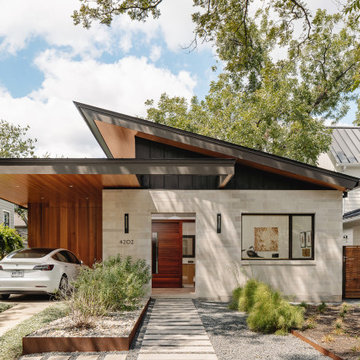
The Ramsey Residence contemplates a simple plan in an exuberant manner. An orthogonally refined frontage composing spatial depth and materiality is capped by a sharply projected eave. This cues the organization of the home along a tall, clerestory-lit spine running the length of the home. A formal entry and foyer lead to the main living room and spacious kitchen flanking the axis. Support spaces are discretely tucked away to allow marble slab and wood trim finishes to delineate the spaces. The axis continues as a tall glazed corridor cleaving two outdoor courtyards: ‘fire’ for entertainment, and ‘water’ for contemplation. Private spaces depart the axis to resolve the ensemble with the same attention to material detail and spatial poise as discovered upon first sight.
 VORBILD Architecture
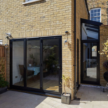
The rear extension of this Bethnal Green home is clad in warm yellow stock brickwork that complements the surrounding traditional architecture while adding a distinctly contemporary note through its crisp black-framed glazing. Slim-profile bifold doors and a tall corner window maximise transparency and connection to the courtyard, enhancing indoor-outdoor flow and drawing in generous natural light. The angled roofline and neat planting details make the modest footprint feel both refined and thoughtfully resolved—a perfect blend of functionality and understated style.
 Michael Nash Design, Build & Homes
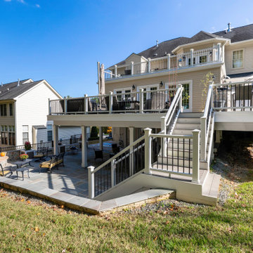
This couple desired to expand their horizon and maximize their outdoor living space. Their back yard was part of a big hill and a major amount of excavation needed to level up the ground for any kind of flat space use
• The homeowner’s goals where to have a big lower level patio to be able to walk out of their basement into stone patio
• Space for outdoor jacuzzi
• Space for outdoor wood burning fireplace and seating wall
• Outdoor lower bar
• Second floor large scale deck with a cooking bar
• A walkway ramp for wheelchair access (covered with roof)
• Lots of seating and entertainment space
Challenges:
The big backyard hill and big ground.
Big stone retaining walls needed.
Major excavation.
Run utilities, such as gas and water and sewer for bar area.
Resolve drainage.
The project started with breaking ground, and haul away major amount of dirt from back yard, implementing over 300 ft of retaining wall covered in stone to sunk in the patio
Cutting concrete walls in basement to create walk out into new patio
New flagstone patio over concrete slab was designed with outer radius to own a wood burning fireplace and seating walls. Right side was covered with tall stone wall and raining to adjacent neighbors
Under the deck area is a covered area for bar with stool seating wrapped with ledger stone and granite top and a secluded area for jacuzzi away from neighbors’ view
A double-sided staircase was built connecting lower patio to wrapped around upper deck,
The new Azak covered deck with listed rail system was equipped with cooking island, natural gas grill, sink and faucet, microwave and outdoor beverage center.
A covered walkway ramp has given an opportunity for elder mother in wheelchair to be able to visit them and spend time outdoor with them.
Beaded ceiling panels and hanging chandeliers has lid up this veranda.
This three-story addition into back of this dwelling stand tall in this community and now more than ever this family get to enjoy their backyard and outdoors with friends and family
The harmonizing choice of decking colors with ledger stone, granite tops, flagstone and veneer wall stones has given this outdoor project a standing ovation.
 Tile Doctor Ltd
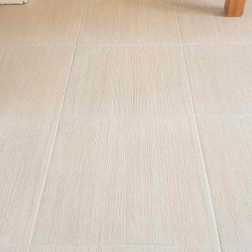
Recently it seems I am getting called out to an increasing number of new builds to sort out patchy grout issues. The reason why there have been so many issues arising is a bit of a mystery, but I put it down to a combination of things like poor quality grout, rushed installations, wet subfloors and the use of different batches.
This recently built house in the village of Darton is a great example and in this case, I suspect two different batches of the same grout had been applied. Darton by the way is a small village in the Borough of Barnsley.
Invariably these problems are picked up by the new owner on their snagging list, with the tiler long gone and the builder keen to get their final payment it is always a tricky situation to resolve. I find the best solution is to apply a Tile Doctor Grout Colourant, it’s a much quicker process than removing the old grout and replacing with new. Most new homeowners would not appreciate us ripping up their brand-new rooms and generating lots of dust in the process! Also, by using the Tile Doctor Grout Colourant it adds a barrier of the grout preventing dirt from discolouring it further down the line.
Even though the house was brand new, the Porcelain Tiled floor was not looking great. The client was happy for me to go ahead and would take up the bill with the housebuilder. I first pre-treated it with Tile Doctors Grout Colourant Pre-Treatment. This removes any contamination from the grout which might affect the adhesion of the colourant and being an acid, it also etches the surface of the grout to ensure a superior bond with the colourant.
The client chose our Light Grey colour which is one of 10 colours we offer. Once the pre-treatment had been applied, scrubbed, rinsed, and vacuumed away the floor was left to dry. Once dry we started applying the colourant, this is done with a small brush (a toothbrush is ideal) carefully scrubbing colourant into each grout joint and wiping off any excess that gets on the tiles before it is able to dry.
Once complete the newly coloured grout lines totally transformed the floor and because the grout colorant is epoxy based the grout lines will stay stain free and never get dirty.
The porcelain tiles were factory sealed so there is no need to apply a seal to the floor.
I recommended the use of Tile Doctor Neutral Tile Cleaner to keep the floor in the best condition. It is pH neutral so is far less harsh on the surface than the everyday household cleaners available. It has a minty fragrance and is mild enough to use daily. They were very happy that the floor now looked as it should have from the start and was the finishing touch to their beautiful new home.
Matthew Lovett
South Yorkshire Tile Doctor
 Wanda Ely Architect Inc.
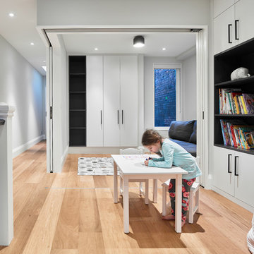
The client's request for both a larger family room and guest bedroom was resolved in the use of triple-folding doors, which allows for flexibility when a private room is needed for guests, as well as a large flex space that functions as a play room and den.
Photo by Scott Norsworthy
44