
Search results for "Respective" in Home Design Ideas
 Sustain Design Architects Inc.
This 1900s Georgian home underwent a dramatic transformation to become a comfortable, modern family residence.
Respecting the heritage character of the neighbourhood and the architecture of the original home, the front façade was meticulously restored. Windows were replaced with matching triple-pane, double-hung windows and divided lights. Trim and moldings were restored, masonry cleaned, and chimneys rebuilt using brick from the rear of the property.
On the inside, however, the home was upgraded and completely transformed into a clean, bright, comfortable space for modern living.
The building enclosure was stripped down to the brick shell and upgraded with new high-performance insulation, an energy-efficient mechanical system, an electrical system including home automation, plumbing, and interior finishes.
Floors were levelled and structure upgraded to ensure even, squeak-free floors.
A large array of operable skylights were added above the central staircase on the third floor to provide natural ventilation, and bring a flood of natural light to the centre of the home.
The existing home had been renovated in the 1980s with a rear addition that created a sunken living room and multi-level second floor. The addition was rebuilt to create level space throughout, allowing for simple flow between living areas, and levelling the second floor to unify the space.
Formal living and dining areas were maintained at the front of the home, while the new kitchen, eating area and family room connect to a large terrace at the back.
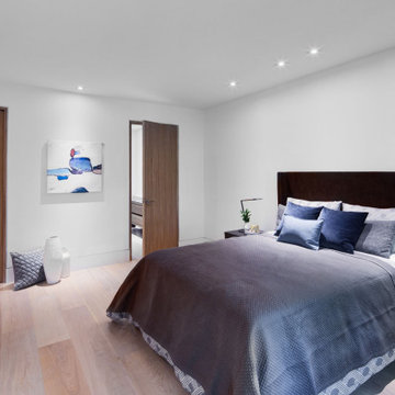
Four bedroom suites, including the master, were created on the second floor, each with their own ensuite bathroom and walk-in closet.
The third floor, with rain sensor skylights, locates two additional guest suites and a home office with a large roof terrace overlooking the rear yard.
While the new home is modest with modern detailing, the centre hall plan was respected with a design created to acknowledge the past.
Wood-burning fireplaces in the formal living and dining rooms were rebuilt and refinished. The principal staircase and banister were rebuilt, maintaining the proportion and quality of the original. Flush baseboards (with a reveal detail) mimic the height of the old wood trim, and eight-foot interior doors maintain the proportion of the original.
The material palette is tempered with cream-coloured stone floors in the hall that transition to white oak throughout the home. This is endowed by crisp white walls and classic stone fireplaces.
The Bulthaup kitchen embodies the philosophy behind the whole design: the complex storage and functional spaces are hidden behind simple oak and graphite doors. Artwork and furniture provide colour, style and grace in each room.
The home provides the family with a respite from the hustle and bustle of their busy professional lives, and a place to host and entertain friends and family: a true oasis in the city.
 Alair Homes Regina
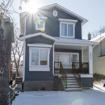
This Infill home is in one of Regina’s oldest neighbourhoods. It was extremely important to both the client and ourselves to respect the character of the neighbourhood. We came up with a design that both respected the heritage as well as provide a much needed upgrade and modernization for the homeowner. The interior is inspired by a mixture of modern farmhouse and South African. The barn-style doors in the kitchen leading to the mudroom, as well as the doors in the master suite leading into the ensuite, were repurposed from the home that was previously on the lot.
 Klopf Architecture
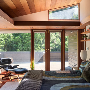
Nestled in the hills of Orinda, California, this 1951 residence is one of only seven extant homes, now known as “The Magnificent Seven”, designed by architect Olof Dahlstrand, a protégé of Frank Lloyd Wright. With its low-slung rooflines, natural materials, and deep integration with the sloping landscape, the home is a pristine example of mid-century modern design inspired by Wright’s organic principles. Over the years, prior homeowners have emphasized preservation, ensuring that the house remained relatively untouched. Each owner has respected the original architecture and stayed true to Dahlstrand’s intent. When a family of five—two college-aged sons and a middle school-aged daughter—acquired the property, they were captivated by its history, legacy of care, and architectural significance. While they appreciated Dahlstrand’s original vision, they also recognized the need to adapt the home for contemporary living while preserving its design integrity.
The remodel was conceived as a thoughtful response to the past—an effort to bring the house into the 21st century without compromising its soul. The primary mandate was to maintain architectural continuity while improving the functionality, comfort, and livability for a modern family. The design team—architects and contractor alike—worked with a shared reverence for the original architecture, allowing that mindset to guide even the most technical or pragmatic decisions.
A key objective was to increase natural light in the kitchen—a departure from Wrightian principles of enclosed, intimate cooking spaces—while maintaining the home’s architectural language. The kitchen was reconfigured to foster a stronger connection to adjacent living spaces while retaining the underlying concept of spatial separation. One of the most transformative architectural changes was the removal of a ridge beam that was originally planned to remain visible through the kitchen. During construction, the team collaborated on a better solution: a wide-flanged steel beam concealed within the roof envelope. This subtle move preserved the clean lines and ceiling continuity, a modern update carried out with utmost respect for the existing framework.
The home’s original powder room, previously accessible only through the kitchen, was relocated for better flow and privacy. A new powder room was carved out of former kitchen cabinetry—a narrow, interior space that could have felt dark and enclosed. To avoid this, the design extended the line of original transom windows into the new powder room and added a skylight above the vanity. The result is a bright and airy space that feels consistent with the rest of the home. Other updates included the installation of new solid-core interior doors with veneers carefully matched to the original mahogany, enhancing the continuity of the interiors. Even smaller decisions, such as placing the door knobs at 42 inches high, mirrored the original proportions. Every choice reflected a shared belief between the architect, contractor, and client: that new work should serve the integrity of the old.
The home’s extensive interior redwood millwork and paneling was meticulously restored. Where new materials were introduced—such as the replacement redwood soffit paneling—the contractor took pains to find finish nails that matched the original, rather than using modern equivalents. This level of craftsmanship and collaboration defined the project. It extended even to the detailing of a blind door to the new powder room, which had to disappear into the existing redwood board-and-batten wall. It was a team effort: the owner found a suitable handle, the architects devised the custom in-swing mechanism, and the contractor executed it so the door aligned precisely with the battens. Throughout, the homeowners were deeply engaged in the design process. One, a meticulous design enthusiast, focused on aesthetic integrity and historic detail. The other brought a practical and function-driven perspective, ensuring that new fixtures and materials would be durable and require minimal maintenance.
While the home’s location posed no major site challenges, sustainability was a key concern. The team upgraded the roof insulation, installed solar panels with battery storage, and added ductless mini-split cooling systems. Lighting was another area where modern technology was woven into a historic framework: new square LED fixtures echo the original custom perimeter soffit lights, maintaining the design language while offering advanced performance.
A planned expansion of a bedroom into suite with a bathroom had to be shelved due to budget constraints and the high cost of below-grade foundation work. Still, the team focused their efforts on making the most of the existing footprint, resolving constraints through design ingenuity rather than adding square footage. This renovation represents a collaborative achievement in preserving and evolving a historically significant home. Every decision was shaped by a shared ethos among clients, architects, and contractor: to maintain the home’s architectural soul while updating it for contemporary life. The result is a timeless modernist residence that continues Olof Dahlstrand’s legacy, remaining grounded in nature, craftsmanship, and human-scale design.
Klopf Architecture Team: John Klopf, AIA, Klara Kevane, Fernanda Bernardes
Interior Architectural Design: Klopf Architecture
Structural Engineer: Daniel Bastiao
Contractor: Don Larwood, Larwood Construction
Photography: Mariko Reed
Year Completed: 2022
Find the right local pro for your project
 Klopf Architecture
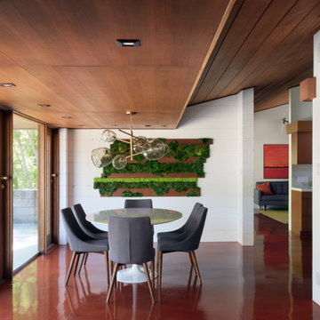
Nestled in the hills of Orinda, California, this 1951 residence is one of only seven extant homes, now known as “The Magnificent Seven”, designed by architect Olof Dahlstrand, a protégé of Frank Lloyd Wright. With its low-slung rooflines, natural materials, and deep integration with the sloping landscape, the home is a pristine example of mid-century modern design inspired by Wright’s organic principles. Over the years, prior homeowners have emphasized preservation, ensuring that the house remained relatively untouched. Each owner has respected the original architecture and stayed true to Dahlstrand’s intent. When a family of five—two college-aged sons and a middle school-aged daughter—acquired the property, they were captivated by its history, legacy of care, and architectural significance. While they appreciated Dahlstrand’s original vision, they also recognized the need to adapt the home for contemporary living while preserving its design integrity.
The remodel was conceived as a thoughtful response to the past—an effort to bring the house into the 21st century without compromising its soul. The primary mandate was to maintain architectural continuity while improving the functionality, comfort, and livability for a modern family. The design team—architects and contractor alike—worked with a shared reverence for the original architecture, allowing that mindset to guide even the most technical or pragmatic decisions.
A key objective was to increase natural light in the kitchen—a departure from Wrightian principles of enclosed, intimate cooking spaces—while maintaining the home’s architectural language. The kitchen was reconfigured to foster a stronger connection to adjacent living spaces while retaining the underlying concept of spatial separation. One of the most transformative architectural changes was the removal of a ridge beam that was originally planned to remain visible through the kitchen. During construction, the team collaborated on a better solution: a wide-flanged steel beam concealed within the roof envelope. This subtle move preserved the clean lines and ceiling continuity, a modern update carried out with utmost respect for the existing framework.
The home’s original powder room, previously accessible only through the kitchen, was relocated for better flow and privacy. A new powder room was carved out of former kitchen cabinetry—a narrow, interior space that could have felt dark and enclosed. To avoid this, the design extended the line of original transom windows into the new powder room and added a skylight above the vanity. The result is a bright and airy space that feels consistent with the rest of the home. Other updates included the installation of new solid-core interior doors with veneers carefully matched to the original mahogany, enhancing the continuity of the interiors. Even smaller decisions, such as placing the door knobs at 42 inches high, mirrored the original proportions. Every choice reflected a shared belief between the architect, contractor, and client: that new work should serve the integrity of the old.
The home’s extensive interior redwood millwork and paneling was meticulously restored. Where new materials were introduced—such as the replacement redwood soffit paneling—the contractor took pains to find finish nails that matched the original, rather than using modern equivalents. This level of craftsmanship and collaboration defined the project. It extended even to the detailing of a blind door to the new powder room, which had to disappear into the existing redwood board-and-batten wall. It was a team effort: the owner found a suitable handle, the architects devised the custom in-swing mechanism, and the contractor executed it so the door aligned precisely with the battens. Throughout, the homeowners were deeply engaged in the design process. One, a meticulous design enthusiast, focused on aesthetic integrity and historic detail. The other brought a practical and function-driven perspective, ensuring that new fixtures and materials would be durable and require minimal maintenance.
While the home’s location posed no major site challenges, sustainability was a key concern. The team upgraded the roof insulation, installed solar panels with battery storage, and added ductless mini-split cooling systems. Lighting was another area where modern technology was woven into a historic framework: new square LED fixtures echo the original custom perimeter soffit lights, maintaining the design language while offering advanced performance.
A planned expansion of a bedroom into suite with a bathroom had to be shelved due to budget constraints and the high cost of below-grade foundation work. Still, the team focused their efforts on making the most of the existing footprint, resolving constraints through design ingenuity rather than adding square footage. This renovation represents a collaborative achievement in preserving and evolving a historically significant home. Every decision was shaped by a shared ethos among clients, architects, and contractor: to maintain the home’s architectural soul while updating it for contemporary life. The result is a timeless modernist residence that continues Olof Dahlstrand’s legacy, remaining grounded in nature, craftsmanship, and human-scale design.
Klopf Architecture Team: John Klopf, AIA, Klara Kevane, Fernanda Bernardes
Interior Architectural Design: Klopf Architecture
Structural Engineer: Daniel Bastiao
Contractor: Don Larwood, Larwood Construction
Photography: Mariko Reed
Year Completed: 2022
 Gutter Innovations, LLC
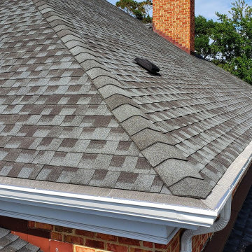
This stunning home is located in the Hampton area Virginia, 23664. The well respected Dr. W. Randolph Rylander gave Gutter Innovations the opportunity to remove all aged 5" guttering product from the home. Our team cleaned all existing fascia while replacing areas of need. We installed all new 6" seamless K-style gutter on the whole home and garage. 6" LeafBlaster Pro leaf guard protection was installed to protect the new guttering system from unwanted clogging and debris. This was yet another excited and proud moment for Gutter Innovations. Dr. Rylander is a well respected pastor with New Mount Olive Baptist Church. He has been pictured with the President, Mrs. Michelle Obama and other exciting famous faces.
 Danielle Rose Design Co.
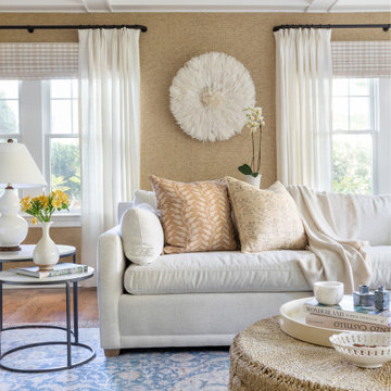
We are honored to work on many homes that are over 100 years old, and this classic center hall colonial home was no different. It was built in 1921 and is located on a beautiful corner lot in the heart of Rockville Centre, NY. Our goal was to pay respect to the stately architectural details throughout the house, while creating a vibrant and colorful home that was well suited for family living. We focused on modernizing, updating, and furnishing this beautiful space for our clients, a young family of four, who moved out of the city during the pandemic and purchased their forever home. We incorporated bold wallpaper, a rich color palette, and custom furniture that expertly fit their home and captured our clients spirit.
 Monroe Glass & Mirror
HIGH-IMPACT HURRICANE WINDOWS FOR FLORIDA KEYS HOMES AND BUSINESSES
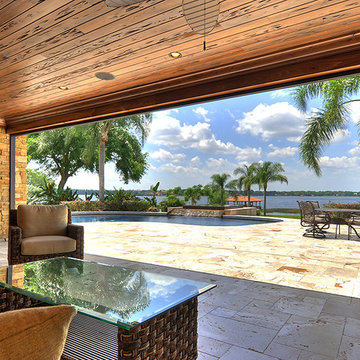
Whether you are building a new home or renovating an existing commercial space with replacement windows and doors, Monroe Glass & Mirror is one of Florida Keys’ most respected names. For over 50 years, we have specialized in high-impact hurricane windows in the Florida Keys, and we would be happy to show you how these types of products can be cost-effective for you in the long term. From single, double-hung, sliding, and picture windows to awning, and casement windows, we offer a huge selection of window styles in many sizes and shapes to uniquely complement your home or commercial storefront.

Sponsored
Columbus, OH

Wannemacher Interiors
Customized Award-Winning Interior Design Solutions in Franklin Cnty OH
 McCabe By Design LLC
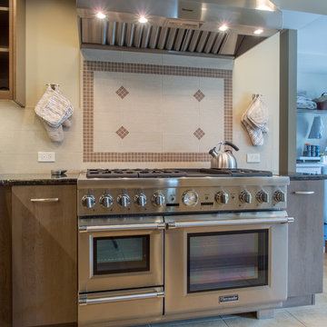
Mid-sized trendy l-shaped porcelain tile and beige floor open concept kitchen photo in Seattle with a double-bowl sink, flat-panel cabinets, medium tone wood cabinets, granite countertops, beige backsplash, porcelain backsplash, stainless steel appliances, an island and black countertops
 Architectural Resource LLC
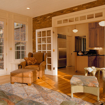
Our Clients, the proud owners of a landmark 1860’s era Italianate home, desired to greatly improve their daily ingress and egress experience. With a growing young family, the lack of a proper entry area and attached garage was something they wanted to address. They also needed a guest suite to accommodate frequent out-of-town guests and visitors. But in the homeowner’s own words, “He didn’t want to be known as the guy who ‘screwed up’ this beautiful old home”. Our design challenge was to provide the needed space of a significant addition, but do so in a manner that would respect the historic home. Our design solution lay in providing a “hyphen”: a multi-functional daily entry breezeway connector linking the main house with a new garage and in-law suite above.
 Fowler Outdoor Co
Project Description (for Houzz):
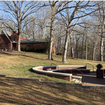
We recently completed a thoughtful hardscaping project at New Hope Presbyterian Church in Hillsborough, North Carolina, featuring a custom low retaining wall and a matching brick ash garden.
The church faced ongoing sediment runoff from the upper parking lot that was washing onto the brick walkway and patio below. To resolve this, we designed and built a low retaining wall that effectively regrades the slope, prevents erosion, and protects the lower hardscape areas from future water damage and debris. The wall provides both practical drainage solutions and a clean, structural enhancement to the grounds.
Complementing the wall, we created a custom brick ash garden that seamlessly integrates with the church’s existing columbarium. Using carefully selected brick to match the surrounding architecture, the new garden offers a respectful, peaceful space for memorialization while maintaining visual and stylistic harmony across the property.
This project highlights our expertise in combining functionality with respectful design—delivering durable solutions that solve site challenges while honoring the character and purpose of sacred spaces. From erosion control and grade correction to beautiful, cohesive memorial areas, every element was crafted for longevity and aesthetic unity.
Project Highlights:
Custom low retaining wall for erosion control and grade adjustment
Matching brick ash garden integrated with existing columbarium
Improved drainage and protection for lower-level walkways and patios
Thoughtful hardscaping that enhances both beauty and functionality
A meaningful collaboration that improves the church grounds for years to come.
 Crystal Kitchen + Bath
The goal for this 1939 Tudor-style story-and-a-half home was to create a kitchen that offered the conveniences, storage, and performance of a modern workspace while preserving the warmth, craftsmanship, and vintage charm that made the home special. The client, an avid home cook, wanted the room to feel as though it had always belonged to the house, with thoughtful upgrades that respected the original architecture rather than competing with it. Just as important, she needed a more efficient layout with enough storage for small appliances, so everyday cooking would no longer require carrying items up from the lower level.
Several existing conditions shaped the design approach. The kitchen retained original, amber-stained birch woodwork that the client wished to keep, and the compact footprint was interrupted by six doorways and two windows, none of which were to be moved, altered, or replaced. A previous flooring update had left the door casings undercut too short, creating visible gaps where the casing met the floor. The existing vintage 40-inch range also lacked proper ventilation, yet the client wished to accommodate a refrigerator, dishwasher, cooktop, double ovens, built-in microwave, and effective venting above the cooktop into the new kitchen layout.
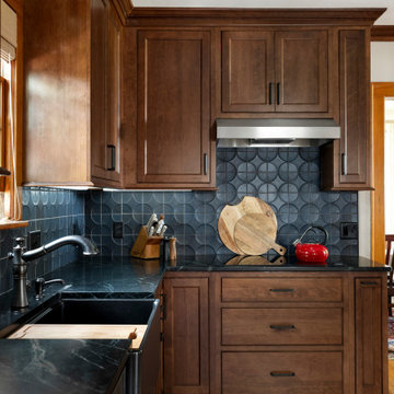
To honor the original millwork, beaded inset-style cherry cabinetry was selected in a soft, hand-rubbed finish that will deepen over time and develop a natural patina. Charcoal-gray soapstone countertops complement the cabinetry while reinforcing the historic character of the home with an organic, timeworn texture. The former breakfast nook was transformed into a butler’s pantry, adding valuable base cabinet storage and expanded work surfaces for frequently used small appliances. Also in the butler’s pantry, a single upper cabinet was paired with open shelves to give an open, airy feeling while adding character and practical storage. A classic single-bowl apron-front workstation sink contributes both period-appropriate character and practical prep and cleanup function.
Because the home’s openings were such a defining feature, the design worked within the existing architecture instead of altering it. Custom plinth blocks were created for each doorway to extend the original casing gracefully down to the new natural red oak flooring, resolving the earlier construction issue while adding a detail that feels authentic to the age of the house. Despite the number of door and window openings, the new layout provides a significantly more functional, built-in kitchen with an improved work triangle for serious cooking.
Appliance placement was carefully planned to deliver the requested performance without overwhelming the small room. Three cooking functions (double ovens & microwave) were consolidated into one location with a GE Café double oven featuring Advantium Technology, while the client’s compact 31-inch refrigerator was reused to preserve space. A sleek 30-inch induction cooktop provides efficient cooking, and a Vent-A-Hood ARS ductless vent hood supplies needed ventilation without requiring a duct run to the exterior.
The finish palette balances richness, texture, and historical sensitivity. A deeply textured navy backsplash tile adds depth and dramatic shadow play against the soapstone, while wallpaper in the back entry echoes the tile’s geometric pattern to visually connect the adjoining spaces. Oil-rubbed bronze cabinet hardware and light fixtures enhance the warmth of the cherry cabinetry and complete the antique-inspired feel.
Lighting was layered to make the compact kitchen brighter, more useful, and more inviting. Vintage-style semi-flush ceiling fixtures establish the overall tone, while dimmable puck lights highlight select areas and undercabinet task lighting keeps work surfaces well illuminated.
The completed kitchen now feels both highly functional and deeply rooted in the home’s history. Rich cherry cabinetry, velvety soapstone, natural red oak flooring, navy tile, bronze accents, and carefully preserved birch trim work together to create a warm, cohesive space that celebrates timeless craftsmanship. By increasing storage, improving workflow, integrating modern appliances, and respecting the Tudor home’s original character, the design achieves the client’s vision: a kitchen that feels personal, practical, historically appropriate, and as though it has always been there.
 Danielle Rose Design Co.
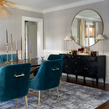
We are honored to work on many homes that are over 100 years old, and this classic center hall colonial home was no different. It was built in 1921 and is located on a beautiful corner lot in the heart of Rockville Centre, NY. Our goal was to pay respect to the stately architectural details throughout the house, while creating a vibrant and colorful home that was well suited for family living. We focused on modernizing, updating, and furnishing this beautiful space for our clients, a young family of four, who moved out of the city during the pandemic and purchased their forever home. We incorporated bold wallpaper, a rich color palette, and custom furniture that expertly fit their home and captured our clients spirit.
 Carlton Edwards
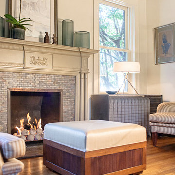
The interior was primarily a cosmetic renovation. So, the idea was to be very respectful of the original architectural details. The detailing was updated still respectful of the original architecture, but fresher approach.
There are custom design steel radiator covers that flank the fireplace and double as side tables for this sitting area. They are steel with a natural wax finish on them.
The cover is more architectural and decorative and becomes useful as a table. since it's steel it just continues ... They actually float over the radiators, and they continue to conduct the heat.

Sponsored
Columbus, OH
Wannemacher Interiors
Customized Award-Winning Interior Design Solutions in Franklin Cnty OH
 Flavin Architects
Modern Row House
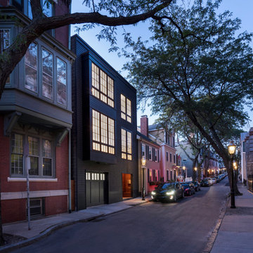
For this new home in Boston’s oldest neighborhood, Flavin Architects imagined an elegant structure that capitalizes on the natural light and beautiful views abundant in Charlestown. Our firm sought to respect the historic fabric of the city while designing for the 21st century.
The façade, with its projecting two-story bay, divided windows and vertical proportions respect the adjacent urban pattern. Stripped down and elegant detailing, devoid of ornament, connects the structure to today’s modern Boston. The exterior combines cedar shingles and shiplap boards with jet mist granite. This dark grey exterior contrasts with a bright white interior washed with sunlight.
Each floor is accessed by a stairwell illuminated by a Wasco skylight. Sunlight pours down and refracts through glass paneling run underneath a natural wood handrail down the stairwell. The dining room and adjacent sitting room are bathed in warmth and light from a double-sided fireplace. In the dining room, floor-to-ceiling windows open to the street, and frame a view of the stained glass windows in St. Mary’s Church. Above the bedrooms and master suite on the third floor, a rooftop deck provides our client with views of Charlestown, Boston, and the Bunker Hill Monument.
 Architectural Resource LLC
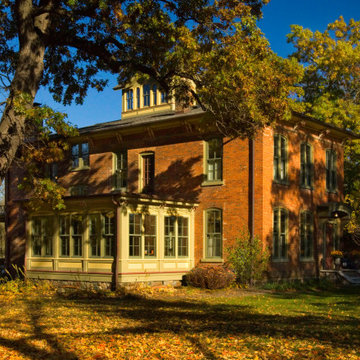
Our Clients, the proud owners of a landmark 1860’s era Italianate home, desired to greatly improve their daily ingress and egress experience. With a growing young family, the lack of a proper entry area and attached garage was something they wanted to address. They also needed a guest suite to accommodate frequent out-of-town guests and visitors. But in the homeowner’s own words, “He didn’t want to be known as the guy who ‘screwed up’ this beautiful old home”. Our design challenge was to provide the needed space of a significant addition, but do so in a manner that would respect the historic home. Our design solution lay in providing a “hyphen”: a multi-functional daily entry breezeway connector linking the main house with a new garage and in-law suite above.
 Fergus Garber Architects
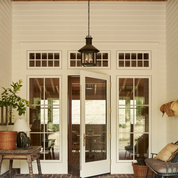
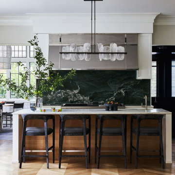
Inspiration for a country brick floor, brown floor, exposed beam and wood wall entryway remodel in San Francisco with white walls and a white front door

Sponsored
Columbus, OH
Wannemacher Interiors
Customized Award-Winning Interior Design Solutions in Franklin Cnty OH
 Klopf Architecture
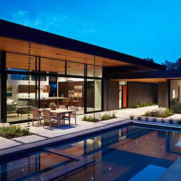
Klopf Architecture, Arterra Landscape Architects and Henry Calvert of Calvert Ventures Designed and built a new warm, modern, Eichler-inspired, open, indoor-outdoor home on a deeper-than-usual San Mateo Highlands property where an original Eichler house had burned to the ground.
The owners wanted multi-generational living and larger spaces than the original home offered, but all parties agreed that the house should respect the neighborhood and blend in stylistically with the other Eichlers. At first the Klopf team considered re-using what little was left of the original home and expanding on it. But after discussions with the owner and builder, all parties agreed that the last few remaining elements of the house were not practical to re-use, so Klopf Architecture designed a new home that pushes the Eichler approach in new directions.
One disadvantage of Eichler production homes is that the house designs were not optimized for each specific lot. A new custom home offered the team a chance to start over. In this case, a longer house that opens up sideways to the south fit the lot better than the original square-ish house that used to open to the rear (west). Accordingly, the Klopf team designed an L-shaped “bar” house with a large glass wall with large sliding glass doors that faces sideways instead of to the rear like a typical Eichler. This glass wall opens to a pool and landscaped yard designed by Arterra Landscape Architects.
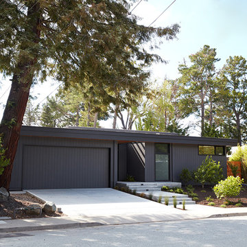
Driving by the house, one might assume at first glance it is an Eichler because of the horizontality, the overhanging flat roof eaves, the dark gray vertical siding, and orange solid panel front door, but the house is designed for the 21st Century and is not meant to be a “Likeler.” You won't see any posts and beams in this home. Instead, the ceiling decking is a western red cedar that covers over all the beams. Like Eichlers, this cedar runs continuously from inside to out, enhancing the indoor / outdoor feeling of the house, but unlike Eichlers it conceals a cavity for lighting, wiring, and insulation. Ceilings are higher, rooms are larger and more open, the master bathroom is light-filled and more generous, with a separate tub and shower and a separate toilet compartment, and there is plenty of storage. The garage even easily fits two of today's vehicles with room to spare.
A massive 49-foot by 12-foot wall of glass and the continuity of materials from inside to outside enhance the inside-outside living concept, so the owners and their guests can flow freely from house to pool deck to BBQ to pool and back.
During construction in the rough framing stage, Klopf thought the front of the house appeared too tall even though the house had looked right in the design renderings (probably because the house is uphill from the street). So Klopf Architecture paid the framer to change the roofline from how we had designed it to be lower along the front, allowing the home to blend in better with the neighborhood. One project goal was for people driving up the street to pass the home without immediately noticing there is an "imposter" on this lot, and making that change was essential to achieve that goal.
This 2,606 square foot, 3 bedroom, 3 bathroom Eichler-inspired new house is located in San Mateo in the heart of the Silicon Valley.
Klopf Architecture Project Team: John Klopf, AIA, Klara Kevane
Landscape Architect: Arterra Landscape Architects
Contractor: Henry Calvert of Calvert Ventures
Photography ©2016 Mariko Reed
Location: San Mateo, CA
Year completed: 2016
 Klopf Architecture
Klopf Architecture, Arterra Landscape Architects and Henry Calvert of Calvert Ventures Designed and built a new warm, modern, Eichler-inspired, open, indoor-outdoor home on a deeper-than-usual San Mateo Highlands property where an original Eichler house had burned to the ground.
The owners wanted multi-generational living and larger spaces than the original home offered, but all parties agreed that the house should respect the neighborhood and blend in stylistically with the other Eichlers. At first the Klopf team considered re-using what little was left of the original home and expanding on it. But after discussions with the owner and builder, all parties agreed that the last few remaining elements of the house were not practical to re-use, so Klopf Architecture designed a new home that pushes the Eichler approach in new directions.
One disadvantage of Eichler production homes is that the house designs were not optimized for each specific lot. A new custom home offered the team a chance to start over. In this case, a longer house that opens up sideways to the south fit the lot better than the original square-ish house that used to open to the rear (west). Accordingly, the Klopf team designed an L-shaped “bar” house with a large glass wall with large sliding glass doors that faces sideways instead of to the rear like a typical Eichler. This glass wall opens to a pool and landscaped yard designed by Arterra Landscape Architects.
Driving by the house, one might assume at first glance it is an Eichler because of the horizontality, the overhanging flat roof eaves, the dark gray vertical siding, and orange solid panel front door, but the house is designed for the 21st Century and is not meant to be a “Likeler.” You won't see any posts and beams in this home. Instead, the ceiling decking is a western red cedar that covers over all the beams. Like Eichlers, this cedar runs continuously from inside to out, enhancing the indoor / outdoor feeling of the house, but unlike Eichlers it conceals a cavity for lighting, wiring, and insulation. Ceilings are higher, rooms are larger and more open, the master bathroom is light-filled and more generous, with a separate tub and shower and a separate toilet compartment, and there is plenty of storage. The garage even easily fits two of today's vehicles with room to spare.
A massive 49-foot by 12-foot wall of glass and the continuity of materials from inside to outside enhance the inside-outside living concept, so the owners and their guests can flow freely from house to pool deck to BBQ to pool and back.
During construction in the rough framing stage, Klopf thought the front of the house appeared too tall even though the house had looked right in the design renderings (probably because the house is uphill from the street). So Klopf Architecture paid the framer to change the roofline from how we had designed it to be lower along the front, allowing the home to blend in better with the neighborhood. One project goal was for people driving up the street to pass the home without immediately noticing there is an "imposter" on this lot, and making that change was essential to achieve that goal.
This 2,606 square foot, 3 bedroom, 3 bathroom Eichler-inspired new house is located in San Mateo in the heart of the Silicon Valley.
Klopf Architecture Project Team: John Klopf, AIA, Klara Kevane
Landscape Architect: Arterra Landscape Architects
Contractor: Henry Calvert of Calvert Ventures
Photography ©2016 Mariko Reed
Location: San Mateo, CA
Year completed: 2016
 Cynthia Weber Design
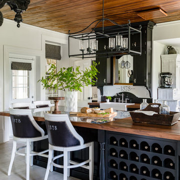
The ceiling is the only feature we kept during this renovation. The kitchen space had been done several times over the generations and when we purchased the property in 2014 renovating the main floor of the house became our priority. I wanted to design a space that fit our style and needs but also respected and paid homage to the history of the house.
41