
Search results for "Respond" in Home Design Ideas
 Robert Miller FAIA Architects
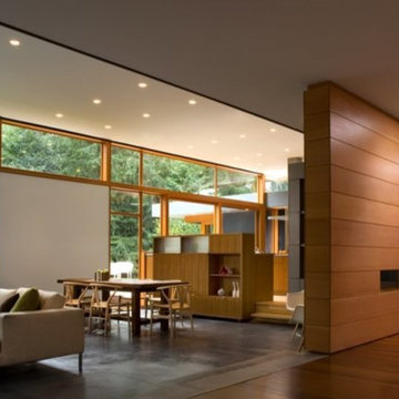
Located on a wooded site, a single-story 1950s house with an awkward floor plan was strategically remodeled to provide living spaces that connect to the outdoors and respond to the needs of a young family.
This home had undergone successive alterations over the years, resulting in a fragmented, confusing layout. With only minor changes to the footprint, the architects redesigned this midcentury home to blur the boundary between indoor living and the landscape beyond. The new design effects a dramatic change by reorganizing the space into linear zones, raising the roof in key places, and making two small additions.
A concrete wall links a new music studio and detached garage to the main house, forming an entry court that welcomes visitors and screens the private bedroom spaces nearby. The entry is marked by a series of round skylights, while the living room has been opened up with taller ceilings, a new fireplace and walls of glass. A series of long colored boxes provides storage and utility spaces, while planar elements draw the eye through the house to the landscape beyond. Teak cabinets, blackened steel and Douglas fir contrast with more modest materials such as painted MDF panels, fiber-cement siding and painted gypsum wallboard. These spaces are designed to accommodate both intimate family gatherings and large parties.
Select Furnishings provided by INForm
Image by Nic LeHoux
 Advance Design Studio, Ltd.
After six years of living in their Huntley IL home, Chris and Meghan were tired of their dark, dingy, outdated kitchen and it was finally time for a long-anticipated change. “The kitchen is the place where we live, it’s where we do everything,” Meghan said. “It was important that it be a space where we wanted to be.” Meghan loves cooking and enjoys including their girls in healthy meal prepping, this led them to want a brighter, more enjoyable kitchen with increased functionality and improved storage.
For Chris especially, the laundry room was an entirely dysfunctional eyesore. “We had a washer and a dryer, but it was all kind-of cobbled together!” Chris said. “There were always laundry piles everywhere, we weren’t really sure what we wanted to do in there, but it was time for us to make a change.” The mess of the space was stressful every time they walked in the door from the garage each day. Kids’ backpacks and shoes piled up haphazardly in the makeshift boot-bench closet left the family feeling disorganized and stressed. They needed space for folding clothes and locker cubbies to help keep the family organized.
Having known Christine and Todd in the Huntley community for years, Chris and Meghan were familiar with their work. “We already trusted them personally and having seen their projects for years we knew they did top notch work. After we reviewed the initial round of designs, we knew that hiring them was definitely the right choice,” Meghan and Chris said. Although Chris had done a lot of work in their home himself, the kitchen and laundry room renovation was such a large undertaking that he didn’t want to steal time away from his family to spend what would surely be many long weekends doing the job himself. “That would not have been a wise choice for us,” Chris laughed.
“Our designer, Michelle was very, very, easy to work with; anything we wanted to see or weren’t sure about, she went above and beyond to make this easy for us. She was easy to get hold of and always quick to respond,” the couple said. Michelle pulled ideas that mirrored the couple’s taste and style and was adept at directing the couple to limited choices that didn’t overwhelm them and kept the process moving. “I have a hard time making decisions. Michelle made the decision-making process so easy. I loved how she listened to what I liked and then presented three great options for me to choose from,” Meghan said.
The main objectives for the kitchen were better storage solutions, they wanted the space to reflect their lifestyle and taste, and they wanted it to last for years with low maintenance. One of the first steps in creating a more functional kitchen was relocating the refrigerator, creating an improved workflow for the busy family.
“We didn’t know that we could even move the refrigerator to a new location where it is now, that was something that we never would have thought of,” Chris said. “The new refrigerator location makes the kitchen feel so much bigger. We didn’t add any space, but our whole kitchen with the new design just seems like it’s so much larger than before!” Meghan said.
The perimeter mist colored cabinets helped warm and brighten the entire room, while the graphite colored cabinets on the island added contrast. Using this fresh, clean color palette satisfied the couple’s desire for a bright space that was the exact opposite of what they had before. Organization accessories were also added to the cabinets such as a spice drawer tray and roll outs to create hidden convenience.
“I absolutely love the hidden spices – it makes cooking so much more enjoyable!” Chris said. “And all the pull outs, and the double trash bin, who would think you could get so excited about organization!” the couple said in unison.
One thing they hated in their original kitchen was how dark the space felt. Added lighting on the ceiling with the new light fixtures combined with the lighter cabinetry colors throughout solved this problem. “Our new kitchen has this warm, almost cozy feeling that our old kitchen never had, it’s just a space that I love spending my time in now,” Meghan said. The light airy feeling was accentuated with the use of floating white shelves on either side of the decorative range hood. “We have so much cabinetry space, the new design is amazing we actually have more storage space than we will ever need,” Meghan said.
The island was extended to create more work surface and added space for stool seating. “The new island changes how we live. Now the kids can be in the kitchen with us, doing homework, eating breakfast, and the three of us have special dinners there when Chris is working late,” Meghan said.
The Carrara Marmi Quartz countertops were chosen because they are, not only beautiful, but are made from hard-working material that doesn’t require maintenance. The white subway tile backsplash that wraps to the ceiling behind the focal point cooktop range/hood compliments the crisp white countertops perfectly, while brushed brass hardware and light fixtures keep the design fresh and new.
The couple had a few fears at the beginning of the project, as most homeowners do. Their biggest fear was being out of their kitchen and laundry room for an extended time. The crew made it very easy for the family to work in a limited space keeping the washer and dryer hooked up the majority of the time, and also getting appliances working with minimal downtime.
“They above and beyond accommodated us to get us through the process,” Meghan said. “They did a great job making sure we were as comfortable as possible throughout the process,” Chris added.
“Our project manager DJ did a great job. He was very good at updating us on schedule changes, getting guys in as quickly as possible. Everyone that stepped in the house was nice and did great work,” said Chris. They thought Advance’s carpenter was phenomenal and were impressed when he took a conceptual idea from a photograph and worked with designer Michelle to create a one of a kind range/hood that has become the topic of conversation with friends and family who visit the new kitchen. “He was in our house literally every day for several weeks. He was easy to work with and good at what he did,” Meghan and Chris said.
The focal point of the kitchen; a hand-crafted, custom-built ventilation hood was clad with handpicked reclaimed barnwood. Advance Design’s carpenter built the framework and the cladding to create a one-of-a-kind design element that the couple loves.
“I think it was especially fun for him to create something unique from scratch, showcasing his talent in this area,” Meghan said. “I love that my kitchen is not like everyone else’s. I got to pick out the wood on my hood and watch it being built and was able to choose what pieces of wood went where on it. It’s totally unique.”
Red Oak flooring was toothed-in throughout the kitchen and the rest of the first floor anywhere changes were made. Then the whole floor was refinished to tone down the orange undertones in the existing floor stain, ultimately changing the color complexion of the entire first floor. The result is a completely new feeling to the entire home.
Renovating the laundry room was extremely important to Meghan and Chris, but they had trouble visualizing what the possibilities were for the seemingly small space. Michelle produced beautiful 3D illustrations that helped them envision the space in a whole new way.
“I must have told Michelle 100 times that I am a visual person, seeing the designs in 3D made it so easy to make decisions and see what we could really do with our space,” Meghan said.
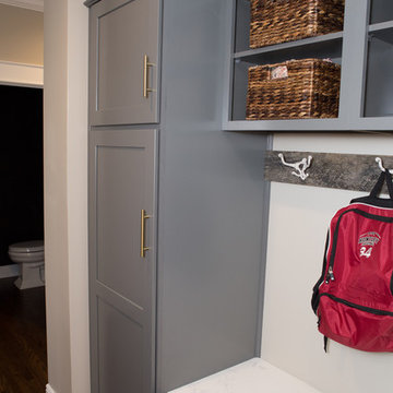
A dividing wall and doorway were removed between the existing laundry room and hallway formerly containing a coat closet, providing space to design specialized graphite colored cabinetry matching the kitchen island to house custom storage cubbies for each family member. Adding the tall utility cabinetry in the new laundry area helped solve the storage issue, tucking away cleaning supplies, household items, and even the cat got its own cubby.
“I love how everything is now hidden in its own space. I can’t tell you how much I hated coming home and seeing everything sitting around on counters,” Chris said.
Electrical outlets were planned for the inside of utility cabinets, so devices could charge in hidden locations. Stacking the washer and dryer allowed for wider countertop space to provide a folding area and a special space for clothes to hang. “The way I do laundry has been completely transformed! I can actually fold clothes and hang them now right out of the washer and dryer,” Meghan said.
“The end result in the kitchen and the laundry/mud room was an updated light and bright space, with a smarter work flow that better meets the needs of this family,” Michelle said.
“I would totally recommend Advance Design,” Meghan said. “Sometimes I sit and just look at my kitchen and laundry room and think ‘Wow, I can’t believe I get to live here!’ It’s an understatement to say we love our new space.”
 Robert Miller FAIA Architects
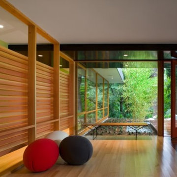
Located on a wooded site, a single-story 1950s house with an awkward floor plan was strategically remodeled to provide living spaces that connect to the outdoors and respond to the needs of a young family.
This home had undergone successive alterations over the years, resulting in a fragmented, confusing layout. With only minor changes to the footprint, the architects redesigned this midcentury home to blur the boundary between indoor living and the landscape beyond. The new design effects a dramatic change by reorganizing the space into linear zones, raising the roof in key places, and making two small additions.
A concrete wall links a new music studio and detached garage to the main house, forming an entry court that welcomes visitors and screens the private bedroom spaces nearby. The entry is marked by a series of round skylights, while the living room has been opened up with taller ceilings, a new fireplace and walls of glass. A series of long colored boxes provides storage and utility spaces, while planar elements draw the eye through the house to the landscape beyond. Teak cabinets, blackened steel and Douglas fir contrast with more modest materials such as painted MDF panels, fiber-cement siding and painted gypsum wallboard. These spaces are designed to accommodate both intimate family gatherings and large parties.
Select Furnishings provided by INForm
Image by Nic LeHoux
Find the right local pro for your project
 Axis Mundi Design
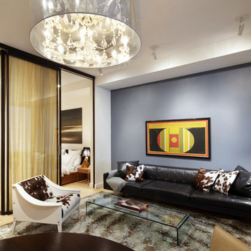
Good design must reflect the personality of the client. So when siblings purchased studios in Downtown by Philippe Starck, one of the first buildings to herald the revitalization of Manhattan’s Financial District, the aim was to create environments that were truly bespoke. The brother’s tastes jibed synchronously with the insouciant idea of France’s most popular prankster converting a building that once housed the buttoned-up offices of JP Morgan Chase. His collection of Takashi Murakami works, the gallery-like centerpiece of the main area, announces his boldness and flair up front, as do furnishings by Droog, Moooi and, of course Starck, as well as hide rugs and upholstery, and a predominantly red palette. His sister was after something soothing and discreet. So Axis Mundi responded with a neutrals and used glass to carve out a bedroom surrounded by drapes that transform it into a golden cocoon. Hide (albeit less flamboyantly applied) evokes a familial commonality, and built-in furniture and cabinetry optimize space restrictions inherent in studio apartments.
Design Team: John Beckmann, with Richard Rosenbloom
Photography: Mikiko Kikuyama
© Axis Mundi Design LLC
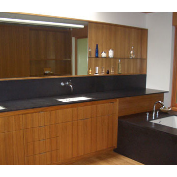 Robert Miller FAIA Architects
Located on a wooded site, a single-story 1950s house with an awkward floor plan was strategically remodeled to provide living spaces that connect to the outdoors and respond to the needs of a young family.
This home had undergone successive alterations over the years, resulting in a fragmented, confusing layout. With only minor changes to the footprint, the architects redesigned this midcentury home to blur the boundary between indoor living and the landscape beyond. The new design effects a dramatic change by reorganizing the space into linear zones, raising the roof in key places, and making two small additions.
A concrete wall links a new music studio and detached garage to the main house, forming an entry court that welcomes visitors and screens the private bedroom spaces nearby. The entry is marked by a series of round skylights, while the living room has been opened up with taller ceilings, a new fireplace and walls of glass. A series of long colored boxes provides storage and utility spaces, while planar elements draw the eye through the house to the landscape beyond. Teak cabinets, blackened steel and Douglas fir contrast with more modest materials such as painted MDF panels, fiber-cement siding and painted gypsum wallboard. These spaces are designed to accommodate both intimate family gatherings and large parties.
Select Furnishings provided by INForm
Image by Bellan Construcution
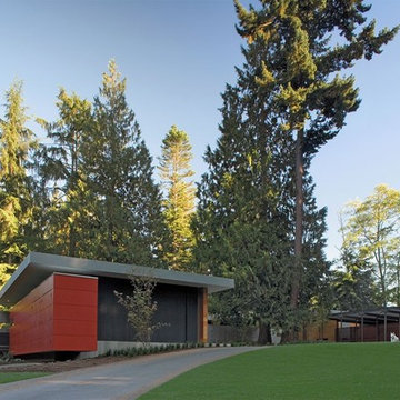 Robert Miller FAIA Architects
Located on a wooded site, a single-story 1950s house with an awkward floor plan was strategically remodeled to provide living spaces that connect to the outdoors and respond to the needs of a young family.
This home had undergone successive alterations over the years, resulting in a fragmented, confusing layout. With only minor changes to the footprint, the architects redesigned this midcentury home to blur the boundary between indoor living and the landscape beyond. The new design effects a dramatic change by reorganizing the space into linear zones, raising the roof in key places, and making two small additions.
A concrete wall links a new music studio and detached garage to the main house, forming an entry court that welcomes visitors and screens the private bedroom spaces nearby. The entry is marked by a series of round skylights, while the living room has been opened up with taller ceilings, a new fireplace and walls of glass. A series of long colored boxes provides storage and utility spaces, while planar elements draw the eye through the house to the landscape beyond. Teak cabinets, blackened steel and Douglas fir contrast with more modest materials such as painted MDF panels, fiber-cement siding and painted gypsum wallboard. These spaces are designed to accommodate both intimate family gatherings and large parties.
Select Furnishings provided by INForm
Images by Nic LeHoux Photography
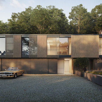
 Strom Architects
Waystation is a new-build family home that replaces a dilapidated 1960’s modernist house in Kent. The existing house has some architectural merit but fails to respond to the family’s needs. The entrance level and bedrooms are disconnected from the living space which makes for torturous circulation and a lack of connection with the garden. After full evaluation, it has proved to be too expensive to adapt and repair the existing house.
Starting from scratch gave us the opportunity to develop a detailed brief with our client, to create a warm and open family home that maximises the site’s potential and forms a meaningful connection to the garden.
The design of the proposed house seeks to acknowledge the legacy of the existing with a clarity of form and elegant use of natural materials. The horizontal design respects the form and ethos of the existing house, with the timber cladding providing a warm and contemporary aesthetic. The upper and lower forms are proposed in a contrasting black render.
The design concept seeks to create a building with a deliberately lightweight appearance which floats above the landscape and sits harmoniously in the wooded setting.
The lower ground floor contains garage, entrance, guest rooms and ancillary spaces. The upper ground floor comprises the children’s bedrooms and the open plan living spaces which connect seamlessly to the outdoor terrace and garden. The master bedroom suite at first floor is orientated south and designed with an intimate terrace that enjoys panoramic views of the countryside.
For the external spaces, the design intention is to create a sense of space and elegance, allowing light to penetrate the areas around the house but also to create a great sense of privacy and calm. Thus, architecture and landscape combine to create a place for the family to come together and enjoy.
The house is scheduled to start on site late spring 2020.

 Kansas City landscape and Design Contractor
Kansas City Landscape is one of kansas city best Kansas City landscaping companies / Kansas City Landscape Design is a Kansas City Area Landscape Company that continues to develop as a design discipline, and to respond to the various movements in architecture / design throughout Kansas City and the 20th and 21st centuries. Our goal is to create a sense of bliss around your KANSAS CITY metro home, starting at the entrance to your front door and leading to your own special place in your backyard. We are here to complete the vision you have always dreamed of in landscape design with Kansas City landscaping companies. We offer quality and craftsmanship that stand the test of time. We are specializing in all types of brickwork ,Stone Landscape, landscape fountains ,Hardscape, Landscape design, Landscape patio, Landscape Company Installation, Paver Patio Company Kansas City /Brick Paver Patio, Masonry services . From small renovations to multi-million dollar new construction, we handle commercial LANDSCAPE Kansas City, industrial and institutional work for clients seeking a KANSAS CITY landscape partner they can trust. Our final product is always beautifully constructed, fairly priced and delivered on time and on schedule
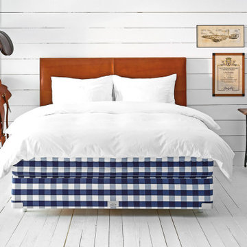
 Hastens & American Mattress
The Hästens Vividus® is not just a bed — it is a profound expression of perfection in craftsmanship, comfort, and design. As our second most exclusive model, Vividus is handcrafted by a dedicated team of master artisans in a private atelier in Köping, Sweden, where time and care are never compromised.
Every detail — from the hand-stretched horsehair to the individually placed stitches and the finest natural materials — is meticulously chosen to deliver a sleep experience that borders on the sublime. The Vividus responds to your every movement with precision, gently embracing the body while offering unshakable support.
Built to perform for generations, the Vividus is an heirloom of wellness, elegance, and engineering — for those who demand nothing less than the extraordinary.
Key Features:
Individually handcrafted in Hästens' most exclusive atelier
Built with the highest-grade horsehair, cotton, wool, and flax
Double-spring system for dynamic support and responsiveness
Deep tufting, intricate hand-stitching, and luxurious fabric options
Fully customizable in size, firmness, and upholstery
Includes exclusive care and setup by a certified Hästens expert team
Second only to the Hästens Grand Vividus — yet in a class all its own.
✨ Experience Vividus for yourself.
Visit our private showroom in Birmingham, MI and feel the difference of truly uncompromising sleep.
33495 Woodward Ave., Birmingham, MI 48009
Sarah Kubis | Hästens Manager
Office: (248) 530-5204 | Mobile: (313) 706-8125
Email: sarahk@hastensdetroit.com
 George Ocampo
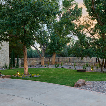
Upper Valley Estate Curb Appeal – El Paso, Texas
This curb appeal transformation was conceived as a deliberate sequence—an arrival experience where architecture, landscape, and lighting work together as one. Every element was designed to honor the home’s stone construction, turreted forms, and Old World character while responding precisely to the Upper Valley climate and lifestyle.
By day, the experience is grounded and composed. Brick-edged concrete drives establish order and permanence, guiding movement through the property with clarity and intention. Natural stone walls and columns anchor the architecture, while layered gravel beds, drought-tolerant plantings, and manicured turf soften transitions and connect the home to its desert setting. Mature trees were preserved and carefully integrated, providing scale, shade, and a sense of continuity.
As afternoon shifts toward sunset, the materials begin to speak differently. Stone warms, textures deepen, and sightlines subtly draw the eye toward the front entry. The landscape narrows the focus, creating a moment of pause before arrival—calm, quiet, and refined.
At night, the design reveals its final layer. Low-voltage lighting is integrated with precision, washing stone surfaces, tracing architectural curves, and uplighting specimen trees to create depth without glare. The drive, walkways, and entry feel safe, legible, and inviting, while the home itself glows with a restrained elegance. Coming home after dark feels intentional—protected, welcoming, and unmistakably yours.
What was created is more than curb appeal. It is a cohesive design-build solution where nothing is ornamental without purpose and nothing is built without intention. A daily experience of arrival that reflects craftsmanship, care, and the enduring character of the Upper Valley.
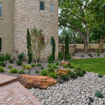 George Ocampo
Upper Valley Estate Curb Appeal – El Paso, Texas
This curb appeal transformation was conceived as a deliberate sequence—an arrival experience where architecture, landscape, and lighting work together as one. Every element was designed to honor the home’s stone construction, turreted forms, and Old World character while responding precisely to the Upper Valley climate and lifestyle.
By day, the experience is grounded and composed. Brick-edged concrete drives establish order and permanence, guiding movement through the property with clarity and intention. Natural stone walls and columns anchor the architecture, while layered gravel beds, drought-tolerant plantings, and manicured turf soften transitions and connect the home to its desert setting. Mature trees were preserved and carefully integrated, providing scale, shade, and a sense of continuity.
As afternoon shifts toward sunset, the materials begin to speak differently. Stone warms, textures deepen, and sightlines subtly draw the eye toward the front entry. The landscape narrows the focus, creating a moment of pause before arrival—calm, quiet, and refined.
At night, the design reveals its final layer. Low-voltage lighting is integrated with precision, washing stone surfaces, tracing architectural curves, and uplighting specimen trees to create depth without glare. The drive, walkways, and entry feel safe, legible, and inviting, while the home itself glows with a restrained elegance. Coming home after dark feels intentional—protected, welcoming, and unmistakably yours.
What was created is more than curb appeal. It is a cohesive design-build solution where nothing is ornamental without purpose and nothing is built without intention. A daily experience of arrival that reflects craftsmanship, care, and the enduring character of the Upper Valley.
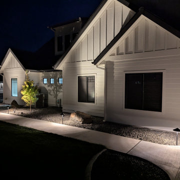
 Timber Drift LLC
This modern farmhouse landscape project in Cheney, Washington was designed to create a cohesive, durable outdoor environment that complements the architecture while responding to Inland Northwest climate conditions.
Phase One included full site grading, irrigation installation, topsoil placement, and hydroseed to establish a healthy, resilient lawn. Planting areas were thoughtfully designed to provide structure, seasonal interest, and long-term performance while maintaining defensible space principles for improved wildfire resilience. Existing Ponderosa pines were preserved to retain the character and scale of the property, and hardscape materials were selected for durability and low maintenance.
Concrete curbing defines clean transitions between lawn and planting beds, while strategically placed landscape boulders anchor the design within the site’s natural context. Low voltage landscape lighting was integrated to enhance safety, highlight architectural elements, and extend usability into the evening hours.
This project was intentionally designed with future phases in mind, including a detached shop, expanded driveway improvements, additional deciduous tree plantings along the drive, and expanded planting areas. By establishing a strong foundational layout in Phase One, the property can evolve over time while maintaining design cohesion.
The result is a refined farmhouse landscape that feels intentional, regionally appropriate, and built to perform through wind, snow, summer heat, and seasonal change.
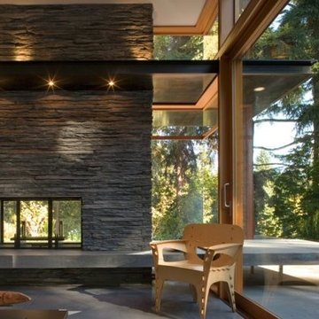 Robert Miller FAIA Architects
Located on a wooded site, a single-story 1950s house with an awkward floor plan was strategically remodeled to provide living spaces that connect to the outdoors and respond to the needs of a young family.
This home had undergone successive alterations over the years, resulting in a fragmented, confusing layout. With only minor changes to the footprint, the architects redesigned this midcentury home to blur the boundary between indoor living and the landscape beyond. The new design effects a dramatic change by reorganizing the space into linear zones, raising the roof in key places, and making two small additions.
A concrete wall links a new music studio and detached garage to the main house, forming an entry court that welcomes visitors and screens the private bedroom spaces nearby. The entry is marked by a series of round skylights, while the living room has been opened up with taller ceilings, a new fireplace and walls of glass. A series of long colored boxes provides storage and utility spaces, while planar elements draw the eye through the house to the landscape beyond. Teak cabinets, blackened steel and Douglas fir contrast with more modest materials such as painted MDF panels, fiber-cement siding and painted gypsum wallboard. These spaces are designed to accommodate both intimate family gatherings and large parties.
Select Furnishings provided by INForm
Image by Nic LeHoux
 George Ocampo
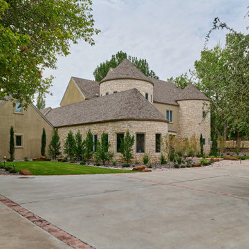
Upper Valley Estate Curb Appeal – El Paso, Texas
This curb appeal transformation was conceived as a deliberate sequence—an arrival experience where architecture, landscape, and lighting work together as one. Every element was designed to honor the home’s stone construction, turreted forms, and Old World character while responding precisely to the Upper Valley climate and lifestyle.
By day, the experience is grounded and composed. Brick-edged concrete drives establish order and permanence, guiding movement through the property with clarity and intention. Natural stone walls and columns anchor the architecture, while layered gravel beds, drought-tolerant plantings, and manicured turf soften transitions and connect the home to its desert setting. Mature trees were preserved and carefully integrated, providing scale, shade, and a sense of continuity.
As afternoon shifts toward sunset, the materials begin to speak differently. Stone warms, textures deepen, and sightlines subtly draw the eye toward the front entry. The landscape narrows the focus, creating a moment of pause before arrival—calm, quiet, and refined.
At night, the design reveals its final layer. Low-voltage lighting is integrated with precision, washing stone surfaces, tracing architectural curves, and uplighting specimen trees to create depth without glare. The drive, walkways, and entry feel safe, legible, and inviting, while the home itself glows with a restrained elegance. Coming home after dark feels intentional—protected, welcoming, and unmistakably yours.
What was created is more than curb appeal. It is a cohesive design-build solution where nothing is ornamental without purpose and nothing is built without intention. A daily experience of arrival that reflects craftsmanship, care, and the enduring character of the Upper Valley.
 SoCal Closets
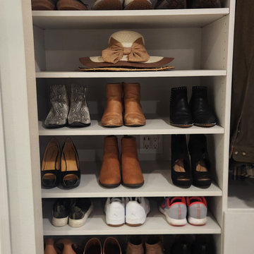
A Modern Farmhouse remodel that involved a master closet overhaul, encompassing wall adjustments and space optimization, turning a dream into reality.
In response to a client's request to revamp their closet during a comprehensive home renovation, we embraced the challenge with our five core values at the forefront. As stewards of quality, we committed to the redesign with a focus on enhancing functionality, maintaining durability, and ensuring aesthetic appeal. Amidst the client's expansive home transformation, which included the expansion of their Master Closet by removing a wall, we encountered a unique situation—losing a built-in dresser. We approached the task with flexibility, aiming not only to replace the missing storage but also to reorganize the existing space efficiently. Our commitment to client-centric solutions led us to assess the current hanging space and storage needs. By understanding the baseline functional requirements of the client, we could tailor our design to meet their specific needs effectively. Utilizing premium Cleef material, we elevated the project luxury and feel. We were able to introduce additional drawer space seamlessly, optimizing the shelving area for maximum utility. The result was a modern, premium feel. Responding to the client's desire for a contemporary touch, we integrated energy-efficient LED lighting into each bay, providing a practical solution for easy identification of clothing within the closet. In essence, our approach to this project was guided by our core values—adaptability, customer focus, quality craftsmanship, innovation, and environmental responsibility. The end result is a redesigned closet that not only meets the functional needs of the client but also embodies our commitment to excellence in every detail.
 George Ocampo
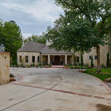
Upper Valley Estate Curb Appeal – El Paso, Texas
This curb appeal transformation was conceived as a deliberate sequence—an arrival experience where architecture, landscape, and lighting work together as one. Every element was designed to honor the home’s stone construction, turreted forms, and Old World character while responding precisely to the Upper Valley climate and lifestyle.
By day, the experience is grounded and composed. Brick-edged concrete drives establish order and permanence, guiding movement through the property with clarity and intention. Natural stone walls and columns anchor the architecture, while layered gravel beds, drought-tolerant plantings, and manicured turf soften transitions and connect the home to its desert setting. Mature trees were preserved and carefully integrated, providing scale, shade, and a sense of continuity.
As afternoon shifts toward sunset, the materials begin to speak differently. Stone warms, textures deepen, and sightlines subtly draw the eye toward the front entry. The landscape narrows the focus, creating a moment of pause before arrival—calm, quiet, and refined.
At night, the design reveals its final layer. Low-voltage lighting is integrated with precision, washing stone surfaces, tracing architectural curves, and uplighting specimen trees to create depth without glare. The drive, walkways, and entry feel safe, legible, and inviting, while the home itself glows with a restrained elegance. Coming home after dark feels intentional—protected, welcoming, and unmistakably yours.
What was created is more than curb appeal. It is a cohesive design-build solution where nothing is ornamental without purpose and nothing is built without intention. A daily experience of arrival that reflects craftsmanship, care, and the enduring character of the Upper Valley.
 George Ocampo
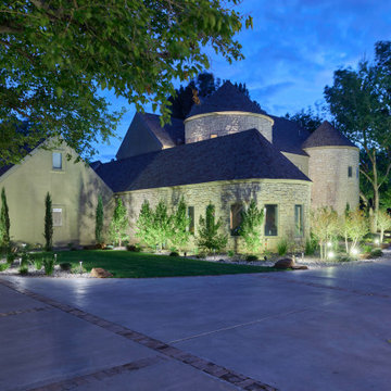
Upper Valley Estate Curb Appeal – El Paso, Texas
This curb appeal transformation was conceived as a deliberate sequence—an arrival experience where architecture, landscape, and lighting work together as one. Every element was designed to honor the home’s stone construction, turreted forms, and Old World character while responding precisely to the Upper Valley climate and lifestyle.
By day, the experience is grounded and composed. Brick-edged concrete drives establish order and permanence, guiding movement through the property with clarity and intention. Natural stone walls and columns anchor the architecture, while layered gravel beds, drought-tolerant plantings, and manicured turf soften transitions and connect the home to its desert setting. Mature trees were preserved and carefully integrated, providing scale, shade, and a sense of continuity.
As afternoon shifts toward sunset, the materials begin to speak differently. Stone warms, textures deepen, and sightlines subtly draw the eye toward the front entry. The landscape narrows the focus, creating a moment of pause before arrival—calm, quiet, and refined.
At night, the design reveals its final layer. Low-voltage lighting is integrated with precision, washing stone surfaces, tracing architectural curves, and uplighting specimen trees to create depth without glare. The drive, walkways, and entry feel safe, legible, and inviting, while the home itself glows with a restrained elegance. Coming home after dark feels intentional—protected, welcoming, and unmistakably yours.
What was created is more than curb appeal. It is a cohesive design-build solution where nothing is ornamental without purpose and nothing is built without intention. A daily experience of arrival that reflects craftsmanship, care, and the enduring character of the Upper Valley.
 Rochman Design Build
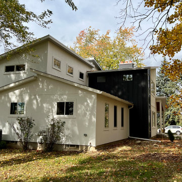
Situated on a large, picturesque lot surrounded by lush, mature trees, this project in Ann Arbor, MI, aimed to create a multi-generational home designed for family members of all ages to live harmoniously under one roof. Primary and secondary spaces were carefully planned and added to support the evolving needs of the household, creating separate wings in response to the different ages and lifestyles; Aging in place on the 1st floor, children and private office spaces on the 2nd floor to respond to the clients working from home.
Key modifications to the first-floor layout were made to alleviate congestion, support the concept of “aging in place” and improve circulation in high-traffic areas, ensuring comfort and ease of movement throughout the home.
The project included enlarging the existing garage, adding a new family room on the first floor, adding a new formal entry and mudroom, enlarging the living room, renovating the current 1st-floor en-suite for Aging in place, and adding a modern stair tower to the newly added 2nd-floor. The 2nd floor has 3 bedrooms, a home office and a fully new en-suite that accentuates the views from the backyard.
An abundance of expansive windows helps to blur the line between the natural and built environments, pulling in lots of natural light through the house. To help with the transformation from a traditional ranch to a modern 2-story, the roof line was designed as an abstraction of the original roof elements/slopes. The clients’ “new” home embodies both function and beauty, offering flexibility for future growth while creating a visually stunning composition of spaces.
 George Ocampo
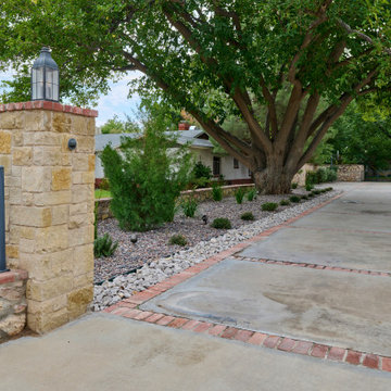
Upper Valley Estate Curb Appeal – El Paso, Texas
This curb appeal transformation was conceived as a deliberate sequence—an arrival experience where architecture, landscape, and lighting work together as one. Every element was designed to honor the home’s stone construction, turreted forms, and Old World character while responding precisely to the Upper Valley climate and lifestyle.
By day, the experience is grounded and composed. Brick-edged concrete drives establish order and permanence, guiding movement through the property with clarity and intention. Natural stone walls and columns anchor the architecture, while layered gravel beds, drought-tolerant plantings, and manicured turf soften transitions and connect the home to its desert setting. Mature trees were preserved and carefully integrated, providing scale, shade, and a sense of continuity.
As afternoon shifts toward sunset, the materials begin to speak differently. Stone warms, textures deepen, and sightlines subtly draw the eye toward the front entry. The landscape narrows the focus, creating a moment of pause before arrival—calm, quiet, and refined.
At night, the design reveals its final layer. Low-voltage lighting is integrated with precision, washing stone surfaces, tracing architectural curves, and uplighting specimen trees to create depth without glare. The drive, walkways, and entry feel safe, legible, and inviting, while the home itself glows with a restrained elegance. Coming home after dark feels intentional—protected, welcoming, and unmistakably yours.
What was created is more than curb appeal. It is a cohesive design-build solution where nothing is ornamental without purpose and nothing is built without intention. A daily experience of arrival that reflects craftsmanship, care, and the enduring character of the Upper Valley.
 Rochman Design Build
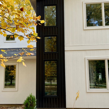
Situated on a large, picturesque lot surrounded by lush, mature trees, this project in Ann Arbor, MI, aimed to create a multi-generational home designed for family members of all ages to live harmoniously under one roof. Primary and secondary spaces were carefully planned and added to support the evolving needs of the household, creating separate wings in response to the different ages and lifestyles; Aging in place on the 1st floor, children and private office spaces on the 2nd floor to respond to the clients working from home.
Key modifications to the first-floor layout were made to alleviate congestion, support the concept of “aging in place” and improve circulation in high-traffic areas, ensuring comfort and ease of movement throughout the home.
The project included enlarging the existing garage, adding a new family room on the first floor, adding a new formal entry and mudroom, enlarging the living room, renovating the current 1st-floor en-suite for Aging in place, and adding a modern stair tower to the newly added 2nd-floor. The 2nd floor has 3 bedrooms, a home office and a fully new en-suite that accentuates the views from the backyard.
An abundance of expansive windows helps to blur the line between the natural and built environments, pulling in lots of natural light through the house. To help with the transformation from a traditional ranch to a modern 2-story, the roof line was designed as an abstraction of the original roof elements/slopes. The clients’ “new” home embodies both function and beauty, offering flexibility for future growth while creating a visually stunning composition of spaces.
74