
Search results for "Restricted" in Home Design Ideas
 Walczak Design And Build
What once felt dark, segmented, and inefficient is now a bright, connected, and highly functional first floor designed for real family living.
Our clients, Terry and Lou, came to us with a home that simply wasn’t keeping up with their growing family. The kitchen was cramped, with tight working lanes and limited light. The laundry room doubled as a powder room—yet functioned poorly as both. Sightlines between spaces were cut off, making it difficult to stay connected to their young children throughout the day. Across the board, the home felt dated and disconnected.
Through thoughtful planning and strategic structural changes, we reimagined the entire first floor to better support how this family truly lives.
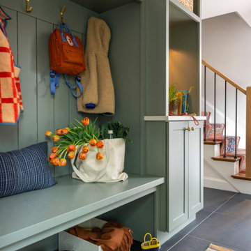
We began by redefining the entry experience—creating a true foyer complete with a dedicated drop zone and custom cubby storage. This space now acts as a natural landing point, bringing order and intention to everyday comings and goings.
Adjacent to the new entry, we relocated and redesigned the laundry room. Now positioned exactly where it needs to be, it functions as a hardworking utility space with countertops for folding, a utility sink for immediate stain treatment, and the ability to be closed off—keeping daily life contained when needed.
Separating the previous shared function allowed us to carve out a distinct, personality-filled powder room. Wrapped in a bold wave-patterned wallpaper and grounded by a custom reeded oak vanity with warm brass accents, this space delivers a moment of delight and individuality within the home.
The kitchen transformation is where the impact is felt most deeply.
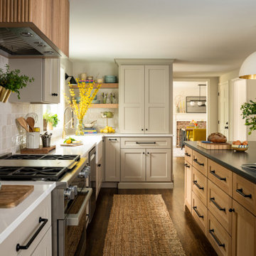
What was once a dark, restrictive layout has been opened into a spacious, highly efficient U-shaped kitchen with generous clearances and an oversized island for gathering. A thoughtful mix of painted cabinetry and rift white oak introduces warmth and balance, while the custom reeded hood becomes a sculptural focal point. Open shelving, integrated pantry storage, and layered lighting ensure the space is as functional as it is beautiful.
Beyond aesthetics, the redesign prioritizes flow—both in movement and in connection. Sightlines between the kitchen, dining, and living areas were intentionally opened, allowing for ease of interaction and visibility throughout the main living spaces.
To unify the home, existing hardwood floors were refinished and extended, creating continuity and a seamless visual experience from one space to the next.
The result is a home that feels lighter, more open, and deeply aligned with how this family lives day to day—designed not just to look beautiful, but to support everything from busy mornings to slow, shared evenings.
 Walczak Design And Build
What once felt dark, segmented, and inefficient is now a bright, connected, and highly functional first floor designed for real family living.
Our clients, Terry and Lou, came to us with a home that simply wasn’t keeping up with their growing family. The kitchen was cramped, with tight working lanes and limited light. The laundry room doubled as a powder room—yet functioned poorly as both. Sightlines between spaces were cut off, making it difficult to stay connected to their young children throughout the day. Across the board, the home felt dated and disconnected.
Through thoughtful planning and strategic structural changes, we reimagined the entire first floor to better support how this family truly lives.
We began by redefining the entry experience—creating a true foyer complete with a dedicated drop zone and custom cubby storage. This space now acts as a natural landing point, bringing order and intention to everyday comings and goings.
Adjacent to the new entry, we relocated and redesigned the laundry room. Now positioned exactly where it needs to be, it functions as a hardworking utility space with countertops for folding, a utility sink for immediate stain treatment, and the ability to be closed off—keeping daily life contained when needed.
Separating the previous shared function allowed us to carve out a distinct, personality-filled powder room. Wrapped in a bold wave-patterned wallpaper and grounded by a custom reeded oak vanity with warm brass accents, this space delivers a moment of delight and individuality within the home.
The kitchen transformation is where the impact is felt most deeply.
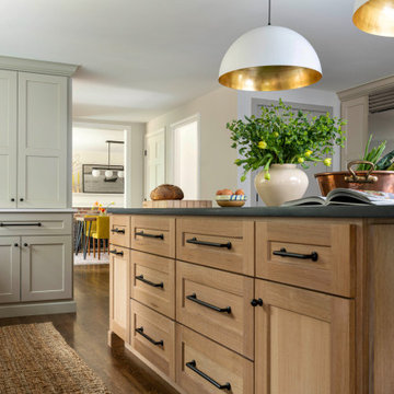
What was once a dark, restrictive layout has been opened into a spacious, highly efficient U-shaped kitchen with generous clearances and an oversized island for gathering. A thoughtful mix of painted cabinetry and rift white oak introduces warmth and balance, while the custom reeded hood becomes a sculptural focal point. Open shelving, integrated pantry storage, and layered lighting ensure the space is as functional as it is beautiful.
Beyond aesthetics, the redesign prioritizes flow—both in movement and in connection. Sightlines between the kitchen, dining, and living areas were intentionally opened, allowing for ease of interaction and visibility throughout the main living spaces.
To unify the home, existing hardwood floors were refinished and extended, creating continuity and a seamless visual experience from one space to the next.
The result is a home that feels lighter, more open, and deeply aligned with how this family lives day to day—designed not just to look beautiful, but to support everything from busy mornings to slow, shared evenings.
 Walczak Design And Build
What once felt dark, segmented, and inefficient is now a bright, connected, and highly functional first floor designed for real family living.
Our clients, Terry and Lou, came to us with a home that simply wasn’t keeping up with their growing family. The kitchen was cramped, with tight working lanes and limited light. The laundry room doubled as a powder room—yet functioned poorly as both. Sightlines between spaces were cut off, making it difficult to stay connected to their young children throughout the day. Across the board, the home felt dated and disconnected.
Through thoughtful planning and strategic structural changes, we reimagined the entire first floor to better support how this family truly lives.
We began by redefining the entry experience—creating a true foyer complete with a dedicated drop zone and custom cubby storage. This space now acts as a natural landing point, bringing order and intention to everyday comings and goings.
Adjacent to the new entry, we relocated and redesigned the laundry room. Now positioned exactly where it needs to be, it functions as a hardworking utility space with countertops for folding, a utility sink for immediate stain treatment, and the ability to be closed off—keeping daily life contained when needed.
Separating the previous shared function allowed us to carve out a distinct, personality-filled powder room. Wrapped in a bold wave-patterned wallpaper and grounded by a custom reeded oak vanity with warm brass accents, this space delivers a moment of delight and individuality within the home.
The kitchen transformation is where the impact is felt most deeply.
What was once a dark, restrictive layout has been opened into a spacious, highly efficient U-shaped kitchen with generous clearances and an oversized island for gathering. A thoughtful mix of painted cabinetry and rift white oak introduces warmth and balance, while the custom reeded hood becomes a sculptural focal point. Open shelving, integrated pantry storage, and layered lighting ensure the space is as functional as it is beautiful.
Beyond aesthetics, the redesign prioritizes flow—both in movement and in connection. Sightlines between the kitchen, dining, and living areas were intentionally opened, allowing for ease of interaction and visibility throughout the main living spaces.
To unify the home, existing hardwood floors were refinished and extended, creating continuity and a seamless visual experience from one space to the next.
The result is a home that feels lighter, more open, and deeply aligned with how this family lives day to day—designed not just to look beautiful, but to support everything from busy mornings to slow, shared evenings.
Find the right local pro for your project
 Modern Citi Group: Renovations & Remodeling
We helped Miki and David successfully execute a bathroom and kitchen remodel for their Co-op in New York City. The primary objective was to enhance the sense of space, functionality, and style while keeping the project on track and on budget.
To kickstart the project, Anna, the highly skilled project planner, conducted a thorough walkthrough with Miki and David. During the meeting, she captured their vision, outlined a realistic timeline, and carefully considered their budgetary restrictions.
Anna made sure to grasp their aspirations of modernizing the kitchen and bathroom, aiming to elevate both the aesthetics and practicality while incorporating a bespoke design tailored to their desires.
The design challenge was to modernize the outdated kitchen and bathroom while maintaining a budget-friendly approach. The clients opted for a Scandinavian style, featuring neutral olive green colors, stone, and natural wood materials. The designers explored various layouts to maximize functionality and accommodate the clients' preferences, providing Miki and David with multiple options. Eventually, the family made their design choices and felt assured as they entered the construction phase.
During the building phase, the construction team completed a gut renovation of the kitchen and bathroom, replacing ceilings, walls, floors, and all fixtures. The result was a stunning custom kitchen designed in the Scandinavian style featuring matte grey-green cabinetry, natural wood open shelving, a built-in pantry and appliances, and Vivid White Quartz countertops. The combination of sage base cabinets with grey undertones and modern, natural wood structures created a neutral and earthy impression, while the smooth white wall cabinets and countertops added a sleek and airy touch to the space.
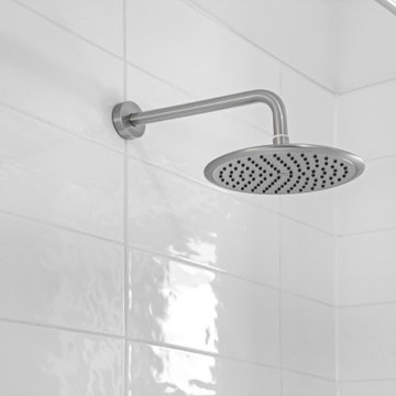
The bathroom renovation encompassed a full remodel, with all fixtures being replaced. A custom-ordered vanity in a matching grey-green shade was installed, along with the Maiolica White Polished Ceramic Wall Tile and Kohler and Delta fixtures. Within a few short weeks, Miki and David's new kitchen and bathroom were transformed to align perfectly with their style and vision, while significantly enhancing functionality.
 Walczak Design And Build
What once felt dark, segmented, and inefficient is now a bright, connected, and highly functional first floor designed for real family living.
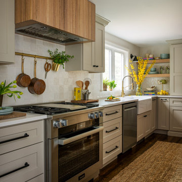
Our clients, Terry and Lou, came to us with a home that simply wasn’t keeping up with their growing family. The kitchen was cramped, with tight working lanes and limited light. The laundry room doubled as a powder room—yet functioned poorly as both. Sightlines between spaces were cut off, making it difficult to stay connected to their young children throughout the day. Across the board, the home felt dated and disconnected.
Through thoughtful planning and strategic structural changes, we reimagined the entire first floor to better support how this family truly lives.
We began by redefining the entry experience—creating a true foyer complete with a dedicated drop zone and custom cubby storage. This space now acts as a natural landing point, bringing order and intention to everyday comings and goings.
Adjacent to the new entry, we relocated and redesigned the laundry room. Now positioned exactly where it needs to be, it functions as a hardworking utility space with countertops for folding, a utility sink for immediate stain treatment, and the ability to be closed off—keeping daily life contained when needed.
Separating the previous shared function allowed us to carve out a distinct, personality-filled powder room. Wrapped in a bold wave-patterned wallpaper and grounded by a custom reeded oak vanity with warm brass accents, this space delivers a moment of delight and individuality within the home.
The kitchen transformation is where the impact is felt most deeply.
What was once a dark, restrictive layout has been opened into a spacious, highly efficient U-shaped kitchen with generous clearances and an oversized island for gathering. A thoughtful mix of painted cabinetry and rift white oak introduces warmth and balance, while the custom reeded hood becomes a sculptural focal point. Open shelving, integrated pantry storage, and layered lighting ensure the space is as functional as it is beautiful.
Beyond aesthetics, the redesign prioritizes flow—both in movement and in connection. Sightlines between the kitchen, dining, and living areas were intentionally opened, allowing for ease of interaction and visibility throughout the main living spaces.
To unify the home, existing hardwood floors were refinished and extended, creating continuity and a seamless visual experience from one space to the next.
The result is a home that feels lighter, more open, and deeply aligned with how this family lives day to day—designed not just to look beautiful, but to support everything from busy mornings to slow, shared evenings.

 Advance Design Studio, Ltd.
After living in this home for a decade, Crystal Lake residents Ken & Bonnie needed an update to their tired original kitchen to meet the needs of their busy family. Together with the expertise of designer Scott Christensen at Advance Design Studio they planned to completely reconfigure the entire space. They began by removing the restrictive peninsula and replaced it with a generous island designed to house an expansive farmhouse sink, convenient pull out trash receptacles, and a hidden dishwasher. Now there was ample room to add island seating to accommodate family gatherings, or for just “hanging out” with teenagers.
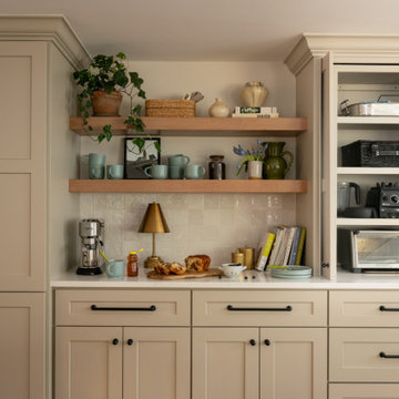
A dramatic new focal point was created with the design of an elegant range area featuring a beautiful custom wood mantle hood detailed with crushed glass handmade tile. Hidden storage houses every spice imaginable right at the cook’s fingertips. Double-stacked glass cabinetry emphasizes the impressive height of the room that was a wonderful architectural element that previously went unnoticed in the original kitchen.
The entire kitchen and breakfast nook was opened up to the 2 story family room by integrating enlarged arched openings. An outdated desk area was transformed into a beautiful breakfront bar with beverage refrigeration, glass display cabinets and plenty of new storage for entertainment pieces. An espresso nook was tucked neatly between tall cabinetry, and an old fashioned closet with shelves was converted into an efficient chef’s dream of organized custom pull out pantries.
“I am the leader of the Scott Christensen fan club,” says Bonnie. “With my busy family and a full time career, Scott made the process of designing this space so easy for me. He didn’t overwhelm me, but carefully determined what I liked and offered me two thoughtful solutions for just about everything - complete with his expert opinion that I really respected.”
Bright white Jay Rambo custom made maple cabinets are accented by Cambria quartz counter tops and simple subway tiles. Original hardwood floors were refinished and stained a darker shade, and stair risers and balusters were painted white to coordinate with the smart wainscot details throughout the first floor. The end effect is a cohesive first floor that flows together with grace and a level of elegance perfectly suitable for this stately Crystal Lake home.
Designer: Scott Christensen
Photographer: Joe Nowak
 Walczak Design And Build
What once felt dark, segmented, and inefficient is now a bright, connected, and highly functional first floor designed for real family living.
Our clients, Terry and Lou, came to us with a home that simply wasn’t keeping up with their growing family. The kitchen was cramped, with tight working lanes and limited light. The laundry room doubled as a powder room—yet functioned poorly as both. Sightlines between spaces were cut off, making it difficult to stay connected to their young children throughout the day. Across the board, the home felt dated and disconnected.
Through thoughtful planning and strategic structural changes, we reimagined the entire first floor to better support how this family truly lives.
We began by redefining the entry experience—creating a true foyer complete with a dedicated drop zone and custom cubby storage. This space now acts as a natural landing point, bringing order and intention to everyday comings and goings.
Adjacent to the new entry, we relocated and redesigned the laundry room. Now positioned exactly where it needs to be, it functions as a hardworking utility space with countertops for folding, a utility sink for immediate stain treatment, and the ability to be closed off—keeping daily life contained when needed.
Separating the previous shared function allowed us to carve out a distinct, personality-filled powder room. Wrapped in a bold wave-patterned wallpaper and grounded by a custom reeded oak vanity with warm brass accents, this space delivers a moment of delight and individuality within the home.
The kitchen transformation is where the impact is felt most deeply.
What was once a dark, restrictive layout has been opened into a spacious, highly efficient U-shaped kitchen with generous clearances and an oversized island for gathering. A thoughtful mix of painted cabinetry and rift white oak introduces warmth and balance, while the custom reeded hood becomes a sculptural focal point. Open shelving, integrated pantry storage, and layered lighting ensure the space is as functional as it is beautiful.
Beyond aesthetics, the redesign prioritizes flow—both in movement and in connection. Sightlines between the kitchen, dining, and living areas were intentionally opened, allowing for ease of interaction and visibility throughout the main living spaces.
To unify the home, existing hardwood floors were refinished and extended, creating continuity and a seamless visual experience from one space to the next.
The result is a home that feels lighter, more open, and deeply aligned with how this family lives day to day—designed not just to look beautiful, but to support everything from busy mornings to slow, shared evenings.

 Michael Nash Design, Build & Homes
For this couple, planning to move back to their rambler home in Arlington after living overseas for few years, they were ready to get rid of clutter, clean up their grown-up kids’ boxes, and transform their home into their dream home for their golden years.
The old home included a box-like 8 feet x 10 feet kitchen, no family room, three small bedrooms and two back to back small bathrooms. The laundry room was located in a small dark space of the unfinished basement.
This home is located in a cul-de-sac, on an uphill lot, of a very secluded neighborhood with lots of new homes just being built around them.
The couple consulted an architectural firm in past but never were satisfied with the final plans. They approached Michael Nash Custom Kitchens hoping for fresh ideas.
The backyard and side yard are wooded and the existing structure was too close to building restriction lines. We developed design plans and applied for special permits to achieve our client’s goals.
The remodel includes a family room, sunroom, breakfast area, home office, large master bedroom suite, large walk-in closet, main level laundry room, lots of windows, front porch, back deck, and most important than all an elevator from lower to upper level given them and their close relative a necessary easier access.
The new plan added extra dimensions to this rambler on all four sides. Starting from the front, we excavated to allow a first level entrance, storage, and elevator room. Building just above it, is a 12 feet x 30 feet covered porch with a leading brick staircase. A contemporary cedar rail with horizontal stainless steel cable rail system on both the front porch and the back deck sets off this project from any others in area. A new foyer with double frosted stainless-steel door was added which contains the elevator.
The garage door was widened and a solid cedar door was installed to compliment the cedar siding.
The left side of this rambler was excavated to allow a storage off the garage and extension of one of the old bedrooms to be converted to a large master bedroom suite, master bathroom suite and walk-in closet.
We installed matching brick for a seam-less exterior look.
The entire house was furnished with new Italian imported highly custom stainless-steel windows and doors. We removed several brick and block structure walls to put doors and floor to ceiling windows.
A full walk in shower with barn style frameless glass doors, double vanities covered with selective stone, floor to ceiling porcelain tile make the master bathroom highly accessible.
The other two bedrooms were reconfigured with new closets, wider doorways, new wood floors and wider windows. Just outside of the bedroom, a new laundry room closet was a major upgrade.
A second HVAC system was added in the attic for all new areas.
The back side of the master bedroom was covered with floor to ceiling windows and a door to step into a new deck covered in trex and cable railing. This addition provides a view to wooded area of the home.
By excavating and leveling the backyard, we constructed a two story 15’x 40’ addition that provided the tall ceiling for the family room just adjacent to new deck, a breakfast area a few steps away from the remodeled kitchen. Upscale stainless-steel appliances, floor to ceiling white custom cabinetry and quartz counter top, and fun lighting improved this back section of the house with its increased lighting and available work space. Just below this addition, there is extra space for exercise and storage room. This room has a pair of sliding doors allowing more light inside.
The right elevation has a trapezoid shape addition with floor to ceiling windows and space used as a sunroom/in-home office. Wide plank wood floors were installed throughout the main level for continuity.
The hall bathroom was gutted and expanded to allow a new soaking tub and large vanity. The basement half bathroom was converted to a full bathroom, new flooring and lighting in the entire basement changed the purpose of the basement for entertainment and spending time with grandkids.
Off white and soft tone were used inside and out as the color schemes to make this rambler spacious and illuminated.
Final grade and landscaping, by adding a few trees, trimming the old cherry and walnut trees in backyard, saddling the yard, and a new concrete driveway and walkway made this home a unique and charming gem in the neighborhood.
 Modern Citi Group: Renovations & Remodeling
We helped Miki and David successfully execute a bathroom and kitchen remodel for their Co-op in New York City. The primary objective was to enhance the sense of space, functionality, and style while keeping the project on track and on budget.
To kickstart the project, Anna, the highly skilled project planner, conducted a thorough walkthrough with Miki and David. During the meeting, she captured their vision, outlined a realistic timeline, and carefully considered their budgetary restrictions.
Anna made sure to grasp their aspirations of modernizing the kitchen and bathroom, aiming to elevate both the aesthetics and practicality while incorporating a bespoke design tailored to their desires.
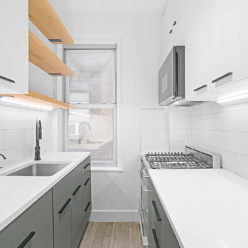
The design challenge was to modernize the outdated kitchen and bathroom while maintaining a budget-friendly approach. The clients opted for a Scandinavian style, featuring neutral olive green colors, stone, and natural wood materials. The designers explored various layouts to maximize functionality and accommodate the clients' preferences, providing Miki and David with multiple options. Eventually, the family made their design choices and felt assured as they entered the construction phase.
During the building phase, the construction team completed a gut renovation of the kitchen and bathroom, replacing ceilings, walls, floors, and all fixtures. The result was a stunning custom kitchen designed in the Scandinavian style featuring matte grey-green cabinetry, natural wood open shelving, a built-in pantry and appliances, and Vivid White Quartz countertops. The combination of sage base cabinets with grey undertones and modern, natural wood structures created a neutral and earthy impression, while the smooth white wall cabinets and countertops added a sleek and airy touch to the space.
The bathroom renovation encompassed a full remodel, with all fixtures being replaced. A custom-ordered vanity in a matching grey-green shade was installed, along with the Maiolica White Polished Ceramic Wall Tile and Kohler and Delta fixtures. Within a few short weeks, Miki and David's new kitchen and bathroom were transformed to align perfectly with their style and vision, while significantly enhancing functionality.
 Irene Designs
Mudroom — Project Description (Bolton, CT)
(Reconfiguration • Custom Storage • Functional Entry Design)
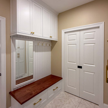
The original mudroom layout was cramped and inefficient, offering minimal storage and poor traffic flow. The garage door opened directly into a wall, the single corner closet provided limited accessibility to its sides, and there was no place for shoes, coats, or everyday landing items. The space lacked both organization and visual appeal.
Key Issues in the Old Layout
Garage door swung into a side wall, restricting movement
Small corner closet with poor left/right access and inadequate capacity
No dedicated shoe storage
No seating or landing surface
No mirror, making the space feel smaller and less functional
Overall layout did not support daily use or family workflow
New Layout & Built-In Storage Solutions
The mudroom was completely reconfigured to create a balanced, efficient, and visually cohesive entry zone that supports everyday routines and maximizes available space.
Wall-to-Wall Back Closet
Full-width custom closet spans the entire back wall
Equipped with double pocket doors for effortless access without blocking circulation
Interior fitted with coat hanging space and top shelving for seasonal items
Full-Height Shoe & Accessory Storage
A dedicated tall cabinet provides:
Bottom half: organized shoe storage
Top half: adjustable shelves for accessories, baskets, or household essentials
Built-In Combo Opposite the Closet
A custom multifunctional unit includes:
Walnut bench top for warmth, texture, and a natural design element
Two deep drawers beneath the bench for gloves, hats, pet items, etc.
Full-height mirror strategically placed to visually expand the room
Open hanging storage for quick-access items
Upper enclosed cabinet with adjustable shelving for concealed storage
Additional Enhancements
The garage door swing was reversed for proper ergonomics and easier entry
Added crown molding throughout the space for a cohesive, finished look consistent with the rest of the renovation
Upgraded lighting brightens the room and enhances the sense of cleanliness and order
 Michael Nash Design, Build & Homes
This 1975 split-level home in a wooded area of Reston, Virginia, is home to a growing family of six. Needless to say, space was at a premium and they needed more of it. So they turned to Michael Nash Design, Build & Homes to create a second-story expansion.
With limited ability to expand the footprint of the home due to lot restrictions, the design team created a 25’ x 35’ master suite addition to be placed over the existing first floor. The space would be located above the living room, dining room and kitchen, creating a private and secluded oasis for mom and dad. The children would have the home’s three middle level bedrooms and a bath of their own.
A New Master Suite
A new custom wooden staircase leads the homeowner to the doorstep of what she now calls her “heavenly space.” It’s a large master bedroom complete with a seating area, vaulted ceiling and skylights, and a beautiful Bordeaux-finish maple wood floor. Bright color paint was selected for the walls to complement the wood flooring and bedroom furniture.
The new 11’x12’ master bathroom offers a spa-like experience. The new bath touts a large shower stall with a built-in bench and storage niches covered with flagstone tiles; a soaking whirlpool tub; and a long double vanity with granite top and fancy fixtures.
Exterior Ties It Together
Like any large addition, this one required exterior renovation to make the addition look like the rest of the home. New vinyl siding and architectural shingles replaced the old cedar siding and run down shingles on the original structure.
A new front porch with half-stone columns and pillars maintains the home’s cottage look. A new double car garage replaces the original carport. Both are a big part of the home’s new front elevation which greatly improves its curbside appeal.
The end result of this project offers everyone in the family a place of their own. The children have new bedrooms and the parents have their sanctuary in their new master suite.
 Michael Nash Design, Build & Homes
This 1975 split-level home in a wooded area of Reston, Virginia, is home to a growing family of six. Needless to say, space was at a premium and they needed more of it. So they turned to Michael Nash Design, Build & Homes to create a second-story expansion.
With limited ability to expand the footprint of the home due to lot restrictions, the design team created a 25’ x 35’ master suite addition to be placed over the existing first floor. The space would be located above the living room, dining room and kitchen, creating a private and secluded oasis for mom and dad. The children would have the home’s three middle level bedrooms and a bath of their own.
A New Master Suite
A new custom wooden staircase leads the homeowner to the doorstep of what she now calls her “heavenly space.” It’s a large master bedroom complete with a seating area, vaulted ceiling and skylights, and a beautiful Bordeaux-finish maple wood floor. Bright color paint was selected for the walls to complement the wood flooring and bedroom furniture.
The new 11’x12’ master bathroom offers a spa-like experience. The new bath touts a large shower stall with a built-in bench and storage niches covered with flagstone tiles; a soaking whirlpool tub; and a long double vanity with granite top and fancy fixtures.
Exterior Ties It Together
Like any large addition, this one required exterior renovation to make the addition look like the rest of the home. New vinyl siding and architectural shingles replaced the old cedar siding and run down shingles on the original structure.
A new front porch with half-stone columns and pillars maintains the home’s cottage look. A new double car garage replaces the original carport. Both are a big part of the home’s new front elevation which greatly improves its curbside appeal.
The end result of this project offers everyone in the family a place of their own. The children have new bedrooms and the parents have their sanctuary in their new master suite.

 Brooks + Scarpa Architects
Description: In early 1994, the architects began work on the project and while in construction (demolition, grading and foundations) the owner, due to circumstances beyond his control, halted all construction of the project. Seven years later the owner returned to the architects and asked them to complete the partially constructed house. Due to code changes, city ordinances and a wide variety of obstacles it was determined that the house was unable to be completed as originally designed.
After much consideration the client asked the architect if it were possible to alter/remodel the partially constructed house, which was a remodel/addition to a 1970’s ranch style house, into a project that fit into current zoning and structural codes. The owner also requested that the house’s footprint and partially constructed foundations remain to avoid the need for further entitlements and delays on an already long overdue and difficult hillside site.
The architects’ main challenge was how to alter the design that reflected an outdated philosophical approach to architecture that was nearly a decade old. How could the house be re-conceived reflecting the architect and client’s maturity on a ten-year-old footprint?
The answer was to remove almost all of the previously proposed existing interior walls and transform the existing footprint into a pavilion-like structure that allows the site to in a sense “pass through the house”. This allowed the client to take better advantage of a limited and restricted building area while capturing extraordinary panoramic views of the San Fernando Valley and Hollywood Hills. Large 22-foot high custom sliding glass doors allow the interior and exterior to become one. Even the studio is separated from the house and connected only by an exterior bridge. Private spaces are treated as loft-like spaces capturing volume and views while maintaining privacy.
Limestone floors extend from inside to outside and into the lap pool that runs the entire length of the house creating a horizon line at the edge of the view. Other natural materials such as board formed concrete, copper, steel and cherry provides softness to the objects that seem to float within the interior volume. By placing objects and materials "outside the frame," a new frame of reference deepens our sense of perception. Art does not reproduce what we see; rather it makes us see.
 Brooks + Scarpa Architects
Description: In early 1994, the architects began work on the project and while in construction (demolition, grading and foundations) the owner, due to circumstances beyond his control, halted all construction of the project. Seven years later the owner returned to the architects and asked them to complete the partially constructed house. Due to code changes, city ordinances and a wide variety of obstacles it was determined that the house was unable to be completed as originally designed.
After much consideration the client asked the architect if it were possible to alter/remodel the partially constructed house, which was a remodel/addition to a 1970’s ranch style house, into a project that fit into current zoning and structural codes. The owner also requested that the house’s footprint and partially constructed foundations remain to avoid the need for further entitlements and delays on an already long overdue and difficult hillside site.
The architects’ main challenge was how to alter the design that reflected an outdated philosophical approach to architecture that was nearly a decade old. How could the house be re-conceived reflecting the architect and client’s maturity on a ten-year-old footprint?
The answer was to remove almost all of the previously proposed existing interior walls and transform the existing footprint into a pavilion-like structure that allows the site to in a sense “pass through the house”. This allowed the client to take better advantage of a limited and restricted building area while capturing extraordinary panoramic views of the San Fernando Valley and Hollywood Hills. Large 22-foot high custom sliding glass doors allow the interior and exterior to become one. Even the studio is separated from the house and connected only by an exterior bridge. Private spaces are treated as loft-like spaces capturing volume and views while maintaining privacy.
Limestone floors extend from inside to outside and into the lap pool that runs the entire length of the house creating a horizon line at the edge of the view. Other natural materials such as board formed concrete, copper, steel and cherry provides softness to the objects that seem to float within the interior volume. By placing objects and materials "outside the frame," a new frame of reference deepens our sense of perception. Art does not reproduce what we see; rather it makes us see.
 MIDWEST CONSTRUCTION & SUPPLY INC
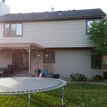
Paul Despenas: Mason City, Iowa: Homeowners in Asbury Neighborhood see new type of siding being installed.
Since the neighborhood was built from the late 1970’s through the late 1980’s homeowners were restricted to using only wood or masonry products on their homes.
This meant, homeowners were stuck with painting, staining and constant repairing of the wood trims, siding and window sills and casings. If you have ever owned a home with wood siding you know what kind of maintenance needs to be done with the type of weather conditions Iowa delivers. On an average those homeowners could realistically spend $1,000.00 per year maintaining the home.
Back in the early 2000’s this neighborhood accepted the installation of fiber cement siding. Little did homeowners realize, they still had to maintain the home, painting, and constant caulking of the siding joints and around the trim boards to prevent any water and /or air infiltration.
After many homeowners from this neighborhood inquired about American Classic Cedar Grain Polymeric Siding and 2 years of working with the neighborhood association, American Classic Cedar Grain Polymeric Siding has been approved for installation.
American Classic Polymeric Cladding was designed for those home owners who were considering a fiber cement product on their home. They liked the appearance not because it was energy efficient or maintenance free they just liked the plank appearance.
American Classic Polymeric Cladding exhibits the perfect blend of natural beauty and rugged construction. It combines a resilient polymer base with an inorganic mineral to yield performance and long lasting good looks, And, unlike wood cladding and fiber cement, it won’t absorb moisture that can lead to warping, swelling and rotting.
American Classic Polymeric Cladding is available in 2 different profiles and colors ranging from bold to subtle, striking to soothing.
American Classic Cedar Grain Plank Polymeric Siding carries a Life Time Limited Warranty with Lifetime Fade Protection. Midwest Construction is a Progressive Foam Platinum Dealer and that allows use to issue a Lifetime Warranty on the Thermal Performance of the insulation used and 10 year labor warranty.
You siding project will be done in a timely professional manner by our VSI trained siding crews. The job site is cleaned up daily and all tools secured. All of our crews are insured for your peace of mind and comfort
 Brooks + Scarpa Architects
Description: In early 1994, the architects began work on the project and while in construction (demolition, grading and foundations) the owner, due to circumstances beyond his control, halted all construction of the project. Seven years later the owner returned to the architects and asked them to complete the partially constructed house. Due to code changes, city ordinances and a wide variety of obstacles it was determined that the house was unable to be completed as originally designed.
After much consideration the client asked the architect if it were possible to alter/remodel the partially constructed house, which was a remodel/addition to a 1970’s ranch style house, into a project that fit into current zoning and structural codes. The owner also requested that the house’s footprint and partially constructed foundations remain to avoid the need for further entitlements and delays on an already long overdue and difficult hillside site.
The architects’ main challenge was how to alter the design that reflected an outdated philosophical approach to architecture that was nearly a decade old. How could the house be re-conceived reflecting the architect and client’s maturity on a ten-year-old footprint?
The answer was to remove almost all of the previously proposed existing interior walls and transform the existing footprint into a pavilion-like structure that allows the site to in a sense “pass through the house”. This allowed the client to take better advantage of a limited and restricted building area while capturing extraordinary panoramic views of the San Fernando Valley and Hollywood Hills. Large 22-foot high custom sliding glass doors allow the interior and exterior to become one. Even the studio is separated from the house and connected only by an exterior bridge. Private spaces are treated as loft-like spaces capturing volume and views while maintaining privacy.
Limestone floors extend from inside to outside and into the lap pool that runs the entire length of the house creating a horizon line at the edge of the view. Other natural materials such as board formed concrete, copper, steel and cherry provides softness to the objects that seem to float within the interior volume. By placing objects and materials "outside the frame," a new frame of reference deepens our sense of perception. Art does not reproduce what we see; rather it makes us see.
 Walczak Design And Build
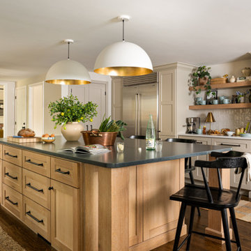
What once felt dark, segmented, and inefficient is now a bright, connected, and highly functional first floor designed for real family living.
Our clients, Terry and Lou, came to us with a home that simply wasn’t keeping up with their growing family. The kitchen was cramped, with tight working lanes and limited light. The laundry room doubled as a powder room—yet functioned poorly as both. Sightlines between spaces were cut off, making it difficult to stay connected to their young children throughout the day. Across the board, the home felt dated and disconnected.
Through thoughtful planning and strategic structural changes, we reimagined the entire first floor to better support how this family truly lives.
We began by redefining the entry experience—creating a true foyer complete with a dedicated drop zone and custom cubby storage. This space now acts as a natural landing point, bringing order and intention to everyday comings and goings.
Adjacent to the new entry, we relocated and redesigned the laundry room. Now positioned exactly where it needs to be, it functions as a hardworking utility space with countertops for folding, a utility sink for immediate stain treatment, and the ability to be closed off—keeping daily life contained when needed.
Separating the previous shared function allowed us to carve out a distinct, personality-filled powder room. Wrapped in a bold wave-patterned wallpaper and grounded by a custom reeded oak vanity with warm brass accents, this space delivers a moment of delight and individuality within the home.
The kitchen transformation is where the impact is felt most deeply.
What was once a dark, restrictive layout has been opened into a spacious, highly efficient U-shaped kitchen with generous clearances and an oversized island for gathering. A thoughtful mix of painted cabinetry and rift white oak introduces warmth and balance, while the custom reeded hood becomes a sculptural focal point. Open shelving, integrated pantry storage, and layered lighting ensure the space is as functional as it is beautiful.
Beyond aesthetics, the redesign prioritizes flow—both in movement and in connection. Sightlines between the kitchen, dining, and living areas were intentionally opened, allowing for ease of interaction and visibility throughout the main living spaces.
To unify the home, existing hardwood floors were refinished and extended, creating continuity and a seamless visual experience from one space to the next.
The result is a home that feels lighter, more open, and deeply aligned with how this family lives day to day—designed not just to look beautiful, but to support everything from busy mornings to slow, shared evenings.
 Modern Citi Group: Renovations & Remodeling
We helped Miki and David successfully execute a bathroom and kitchen remodel for their Co-op in New York City. The primary objective was to enhance the sense of space, functionality, and style while keeping the project on track and on budget.
To kickstart the project, Anna, the highly skilled project planner, conducted a thorough walkthrough with Miki and David. During the meeting, she captured their vision, outlined a realistic timeline, and carefully considered their budgetary restrictions.
Anna made sure to grasp their aspirations of modernizing the kitchen and bathroom, aiming to elevate both the aesthetics and practicality while incorporating a bespoke design tailored to their desires.
The design challenge was to modernize the outdated kitchen and bathroom while maintaining a budget-friendly approach. The clients opted for a Scandinavian style, featuring neutral olive green colors, stone, and natural wood materials. The designers explored various layouts to maximize functionality and accommodate the clients' preferences, providing Miki and David with multiple options. Eventually, the family made their design choices and felt assured as they entered the construction phase.
During the building phase, the construction team completed a gut renovation of the kitchen and bathroom, replacing ceilings, walls, floors, and all fixtures. The result was a stunning custom kitchen designed in the Scandinavian style featuring matte grey-green cabinetry, natural wood open shelving, a built-in pantry and appliances, and Vivid White Quartz countertops. The combination of sage base cabinets with grey undertones and modern, natural wood structures created a neutral and earthy impression, while the smooth white wall cabinets and countertops added a sleek and airy touch to the space.
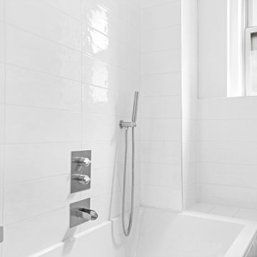
The bathroom renovation encompassed a full remodel, with all fixtures being replaced. A custom-ordered vanity in a matching grey-green shade was installed, along with the Maiolica White Polished Ceramic Wall Tile and Kohler and Delta fixtures. Within a few short weeks, Miki and David's new kitchen and bathroom were transformed to align perfectly with their style and vision, while significantly enhancing functionality.
 MIDWEST CONSTRUCTION & SUPPLY INC
Paul Despenas: Mason City, Iowa: Homeowners in Asbury Neighborhood see new type of siding being installed.
Since the neighborhood was built from the late 1970’s through the late 1980’s homeowners were restricted to using only wood or masonry products on their homes.
This meant, homeowners were stuck with painting, staining and constant repairing of the wood trims, siding and window sills and casings. If you have ever owned a home with wood siding you know what kind of maintenance needs to be done with the type of weather conditions Iowa delivers. On an average those homeowners could realistically spend $1,000.00 per year maintaining the home.
Back in the early 2000’s this neighborhood accepted the installation of fiber cement siding. Little did homeowners realize, they still had to maintain the home, painting, and constant caulking of the siding joints and around the trim boards to prevent any water and /or air infiltration.
After many homeowners from this neighborhood inquired about American Classic Cedar Grain Polymeric Siding and 2 years of working with the neighborhood association, American Classic Cedar Grain Polymeric Siding has been approved for installation.
American Classic Polymeric Cladding was designed for those home owners who were considering a fiber cement product on their home. They liked the appearance not because it was energy efficient or maintenance free they just liked the plank appearance.
American Classic Polymeric Cladding exhibits the perfect blend of natural beauty and rugged construction. It combines a resilient polymer base with an inorganic mineral to yield performance and long lasting good looks, And, unlike wood cladding and fiber cement, it won’t absorb moisture that can lead to warping, swelling and rotting.
American Classic Polymeric Cladding is available in 2 different profiles and colors ranging from bold to subtle, striking to soothing.
American Classic Cedar Grain Plank Polymeric Siding carries a Life Time Limited Warranty with Lifetime Fade Protection. Midwest Construction is a Progressive Foam Platinum Dealer and that allows use to issue a Lifetime Warranty on the Thermal Performance of the insulation used and 10 year labor warranty.
You siding project will be done in a timely professional manner by our VSI trained siding crews. The job site is cleaned up daily and all tools secured. All of our crews are insured for your peace of mind and comfort
 Modern Citi Group: Renovations & Remodeling
We helped Miki and David successfully execute a bathroom and kitchen remodel for their Co-op in New York City. The primary objective was to enhance the sense of space, functionality, and style while keeping the project on track and on budget.
To kickstart the project, Anna, the highly skilled project planner, conducted a thorough walkthrough with Miki and David. During the meeting, she captured their vision, outlined a realistic timeline, and carefully considered their budgetary restrictions.
Anna made sure to grasp their aspirations of modernizing the kitchen and bathroom, aiming to elevate both the aesthetics and practicality while incorporating a bespoke design tailored to their desires.
The design challenge was to modernize the outdated kitchen and bathroom while maintaining a budget-friendly approach. The clients opted for a Scandinavian style, featuring neutral olive green colors, stone, and natural wood materials. The designers explored various layouts to maximize functionality and accommodate the clients' preferences, providing Miki and David with multiple options. Eventually, the family made their design choices and felt assured as they entered the construction phase.
During the building phase, the construction team completed a gut renovation of the kitchen and bathroom, replacing ceilings, walls, floors, and all fixtures. The result was a stunning custom kitchen designed in the Scandinavian style featuring matte grey-green cabinetry, natural wood open shelving, a built-in pantry and appliances, and Vivid White Quartz countertops. The combination of sage base cabinets with grey undertones and modern, natural wood structures created a neutral and earthy impression, while the smooth white wall cabinets and countertops added a sleek and airy touch to the space.
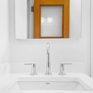
The bathroom renovation encompassed a full remodel, with all fixtures being replaced. A custom-ordered vanity in a matching grey-green shade was installed, along with the Maiolica White Polished Ceramic Wall Tile and Kohler and Delta fixtures. Within a few short weeks, Miki and David's new kitchen and bathroom were transformed to align perfectly with their style and vision, while significantly enhancing functionality.
132