
Search results for "Resultant listing" in Home Design Ideas
 User
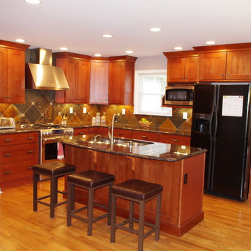
UserTo move or not to move: This 1970's ranch style home was in the perfect location and the perfect size for this family but the layout didn't work. This family did their homework by pricing what it would cost to transform this home into one they would love for years to come. The prices helped them make the decision to stay and remodel.
An open floor plan was at the top of their design wish list. To create it, they were pleased to find out that the walls they wanted to remove were not load bearing. Walls that originally separated the Kitchen, Dining Room and Great Room quickly became history as this project progressed. The result was dramatic and with each stage this family fell more in love with the home they really didn't want to leave in the first place.
PHOTOGRAPHER: SHANNON NICHOLSON
 Amazing Spaces
This project incorporated the main floor of the home. The existing kitchen was narrow and dated, and closed off from the rest of the common spaces. The client’s wish list included opening up the space to combine the dining room and kitchen, create a more functional entry foyer, and update the dark sunporch to be more inviting.
The concept resulted in swapping the kitchen and dining area, creating a perfect flow from the entry through to the sunporch.
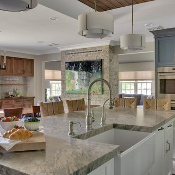
The new kitchen features blue-gray cabinets with polished white countertops and a white island with a dramatic Cielo Quartzite countertop. The soffit above features stained shiplap, helping to create the boundary of the kitchen. Custom window treatments and rattan chairs make the space feel casual and sophisticated.
The new dining room features a family heirloom dining table and includes updated lighting and accessories, new upholstery for all chairs, custom window treatments, built-in cabinetry in white and walnut with zinc countertops and a stainless steel penny tile backsplash to add some sparkle.
A double-sided stone-clad fireplace divides the great room and sunporch.
 Amazing Spaces
This project incorporated the main floor of the home. The existing kitchen was narrow and dated, and closed off from the rest of the common spaces. The client’s wish list included opening up the space to combine the dining room and kitchen, create a more functional entry foyer, and update the dark sunporch to be more inviting.
The concept resulted in swapping the kitchen and dining area, creating a perfect flow from the entry through to the sunporch.
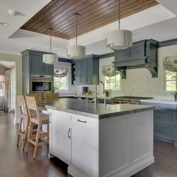
The new kitchen features blue-gray cabinets with polished white countertops and a white island with a dramatic Cielo Quartzite countertop. The soffit above features stained shiplap, helping to create the boundary of the kitchen. Custom window treatments and rattan chairs make the space feel casual and sophisticated.
Find the right local pro for your project
 User
UserPhilip Crocker
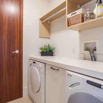
Collaborative design work between our clients and ourselves incorporating their own tastes, furniture and artwork as they downsized from a large home to an almost new condo. As with many of our projects we brought in our core group of trade specialists to consult and advise so that we could guide our clients through an easy process of option selections to meet their standards, timeline and budget. A very smooth project from beginning to end that included removal of the existing hardwood and carpet throughout, new painting throughout, some new lighting and detailed art glass work as well as custom metal and millwork. A successful project with excellent results and happy clients!
Do you want to renovate your condo?
Showcase Interiors Ltd. specializes in condo renovations. As well as thorough planning assistance including feasibility reviews and inspections, we can also provide permit acquisition services. We also possess Advanced Clearance through Worksafe BC and all General Liability Insurance for Strata Approval required for your proposed project.
Showcase Interiors Ltd. is a trusted, fully licensed and insured renovations firm offering exceptional service and high quality workmanship. We work with home and business owners to develop, manage and execute small to large renovations and unique installations. We work with accredited interior designers, engineers and authorities to deliver special projects from concept to completion on time & on budget. Our loyal clients love our integrity, reliability, level of service and depth of experience. Contact us today about your project and join our long list of satisfied clients!
We are a proud family business!
 Alloy Architecture & Construction
Originally built in 1859 by Justice William J. Robertson and listed on the National Register of Historic Places in 1999, this home has elements of both the Italianate and Gothic Revival styles which were taken into consideration during the design process.
The project consisted of three main components: a basement renovation, a new screened in porch and a new two car garage.
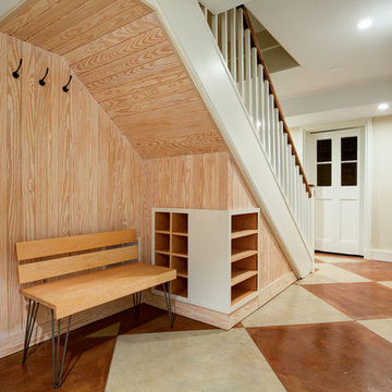
For the basement renovation we removed the original brick floor which was causing moisture issues and replaced them with an insulated, colored concrete slab. The end result: a previously unusable space was transformed into a family room with a complete guest suite and an exercise room.
In the guest bedroom, low ceilings due to existing duct work were strategically wrapped with stained pine tongue and groove creating a cozy sleeping nook. In the bathroom, subway tiles and lightly stained wood are the background to a livelier tile accent in the shower and around the vanity.
The family room features floor to ceiling millwork piece that has several storage cubbies; some with doors to conceal and others open for display.
The screened porch is located at the back of the house overlooking a new stone patio at the lower level yard. The new porch takes cues from the existing sun room by matching materials, colors, and proportion. The new porch off the living room allows the clients to sit and relax while staying close to their children when inside or playing in the yard.
The garage was built using the same material palette and style of the house but set back so as to not to detract from the main house. With large sliding barn doors on the back, it opens up to a manicured lawn allowing the garage to double as a pavilion for outdoor entertaining and yard parties. Alloy worked with Water Street Studio, a local architectural landscaping firm, to create more inviting and usable spaces for the children and adults to enjoy.
Andrea Hubbel Photography
 Décor Aid
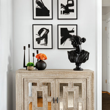
Having an eye for great interior design yet no clue on where to start or how to narrow down their aesthetic vision, a young family turned to Décor Aid to bring their drab pre-war Upper West Side apartment to life. With two young daughters in tow, our clients were looking for high style décor grounded in practicality and function – namely for their foyer, living room, dining room, and den.
Armed with a variety of inspiration from traditional to ultra-modern, they knew that they wanted their apartment’s interior design to look put together and thought through, but were short on a concise design direction.
In comes Décor Aid interior designer Gabrielle G. to revive their stark home with inspired design. After their initial in-home consultation, Gabrielle honed in on key decorative touchstones the couple had interest in and compiled a list of must-haves as an aesthetic foundation for the home.
Starting with fresh coats of pure white paint to liven up and brighten each room, Gabrielle took advantage of the apartments closed floor plan and gave each room it’s own design signature rather than having to ensure that everything flowed together – in turn, giving her more freedom.
Save for a china cabinet and formal dining table, Gabrielle was tasked with sourcing furnishings and accessories and went for clean simplicity as the couple also expressed that they’d like to have pieces that can move with them as their family grows while also being conducive for family life.
As you can see, the space is grounded with soothing neutrals so Gabrielle brought in pops of color and texture through accessories and abstract art for a sophisticated yet casual vibe.
The end result boasts concise design and pulled together everyday glamor for this modern family home that our clients adore, and so do we.
 Décor Aid
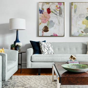
Having an eye for great interior design yet no clue on where to start or how to narrow down their aesthetic vision, a young family turned to Décor Aid to bring their drab pre-war Upper West Side apartment to life. With two young daughters in tow, our clients were looking for high style décor grounded in practicality and function – namely for their foyer, living room, dining room, and den.
Armed with a variety of inspiration from traditional to ultra-modern, they knew that they wanted their apartment’s interior design to look put together and thought through, but were short on a concise design direction.
In comes Décor Aid interior designer Gabrielle G. to revive their stark home with inspired design. After their initial in-home consultation, Gabrielle honed in on key decorative touchstones the couple had interest in and compiled a list of must-haves as an aesthetic foundation for the home.
Starting with fresh coats of pure white paint to liven up and brighten each room, Gabrielle took advantage of the apartments closed floor plan and gave each room it’s own design signature rather than having to ensure that everything flowed together – in turn, giving her more freedom.
Save for a china cabinet and formal dining table, Gabrielle was tasked with sourcing furnishings and accessories and went for clean simplicity as the couple also expressed that they’d like to have pieces that can move with them as their family grows while also being conducive for family life.
As you can see, the space is grounded with soothing neutrals so Gabrielle brought in pops of color and texture through accessories and abstract art for a sophisticated yet casual vibe.
The end result boasts concise design and pulled together everyday glamor for this modern family home that our clients adore, and so do we.


 Susan Yeley Homes
Two years before this photo shoot, a Bloomington couple came to SYI wondering whether to renovate their dated bi-level or upgrade to a new house entirely: the classic love-it-or-list-it dilemma. The whole house needed to be touched, really: bathrooms and kitchen, lighting and flooring and paint everywhere, not to mention new furniture to fill in and improve the living spaces. We spent a year with this family, considering options that were less transformative but allowed for the whole house to be upgraded, as well as options that dramatically changed the main living space but meant the rest of the house would have to wait. Meanwhile, they kept an eye out for better digs in town: a house at their price point, that met their family's needs and matched their aesthetic without major construction.
After a year of hunting, hemming and hawing: they pulled the trigger. Give us the whole enchilada in the kitchen and main living space, they said. There's no other house for us. The bathrooms and basement can wait. Make this space, where we spend all our time, a place we love to be.
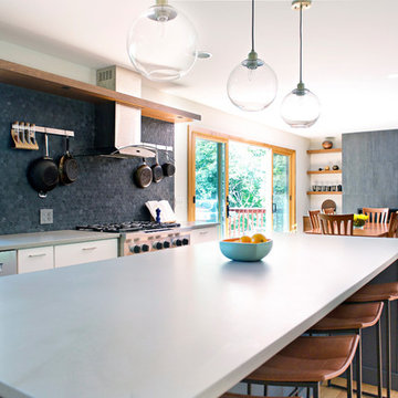
Walls and ceilings came down; clerestory windows went in. A stunning 4-panel sliding door-cum-window wall replaced two separate doors in two separate rooms, and the sun streaming in now gives this house in Indiana a California-like access to the outdoors. The central custom screen does triple duty: displaying the client's objets d'art, hiding an HVAC chase, and holding up the ceiling. The gas fireplace is completely new, with custom shelving on either side. Of course, in 2017, the kitchen anchors everything. Family Central, it features custom cabinetry, honed quartz, a new window wall, and a huge island. Materials are earthy and natural, lending a warm modern effect to the space. The medium stain of the wood and overall horizontality of the design are a nod to the home's era (1967), while white cabinetry and charcoal tile provide a neutral but crisp backdrop for the family's stunning and colorful art collection.
The result: an ordinary bi-level is now an extraordinary home, unlike any other in Bloomington.
Contractor: Rusty Peterson Construction
Cabinetry: Tim Graber Furniture
Photography: Gina Rogers
 Randy Angell Designs
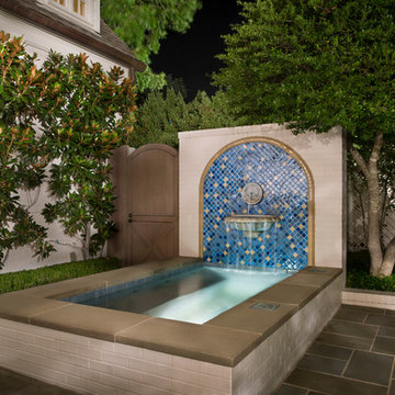
The subtle changes begin as soon as you walk out the back door of the house. The existing decking had a lot of what we call "tweeners"; areas that are overly generous walkways, yet not large enough to house furniture. The awkwardly small bluestone patio was expanded to accommodate a generous seating area. This was done by pushing the step-down closer to the pool.
Our talented stone mason carefully married the new bluestone into the existing portion of the patio, resulting in an imperceptible difference between the two.
As you descend the new bluestone steps to the pool level, your bare feet will be thankful for the new smooth-finished, limestone-colored concrete, with a hand cut pattern carefully etched into it's surface.
The old red brick decking was so hot that the owners could not walk around the pool with their bare feet. The brick coping was also replaced with an eased edge, Pennsylvania Premier Stone which matches the new step treads throughout the project.
Between the house and the pool, a large raised planter was reconfigured, giving additional space to the pool deck for a shaded lounge chair area. Across the pool, a bank of rather tall painted brick retaining walls were cut down, shortened and moved. This lessened the visual impact of the walls (which were overwhelming in the space) and also opened up a new seating area, nestled under the arms of the massive Pecan tree at the back of the property.
Rather than continuing solid decking around the entire pool, the area near these walls has been transformed to large stone stepper pads set in a sea of beautiful St. Augustine lawn. This creates a visually softened area that is still suited to setting tables and chairs when the guest list calls for additional seating.
The spa area is possibly the most dramatic change on this project. Yet more raised planter walls divided this area into awkward spaces, unsuited for proper furniture placement. The planters were removed, new stone decks added, and once again expertly married into the existing decks, opening the area to house a large dining table and a newly built-in BBQ area.
The spa itself was re-imagined with the bluestone coping and painted brick veneer. The most impressive addition though is the new handmade glazed tiles that surround the existing cast stone water feature. This water feature was almost unnoticeable against the painted brick wall, but now the dramatic arch and pop of color draw the eye to this quaint little corner of the property.
Originally designed by one of the most notable landscape architects in town, this once impressive project had faltered in recent years. The pool and spa still functioned well, and the client wanted to keep it intact. In addition, they wanted to keep as much of the existing landscape as possible. But, the surrounding decks, walls and steps were fair game.
At first glance, one might think that our changes were simple material changes. However, upon closer inspection, one can see the subtle-yet-transformative changes that came together to update this classic pool in a tasteful, timeless manner, as well as to improve the flow and usability of the deck areas, while softening the feel of this massive hardscape.
 Habitation Solutions
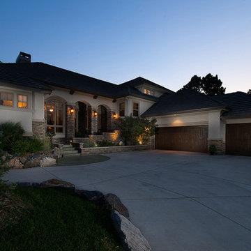
The steeply sloped site resulted in a compact entrance and drive. The entry court is well landscaped; the entry location is obvious and the entry is welcoming.
Good landscaping nestled this Denver-area, Colorado house into the hillside while creating spaces for outdoor living space. An open floor plan accommodated the owner’s lifestyle goals while tying all public living spaces together.
Natural material selections of rough, natural stone and textured stucco, a concrete tile roof, along with natural, earthy colors, accentuate the hilly terrain and reflect the regional environment. Work completed while at SBA.
 Housetrends Magazine
Since moving into her Dublin home two and a half years ago, Nancy Sanford has been peeling off the decades—quite literally. Built in the 1980s, the home was “very well-maintained, but very little had been done to it” in terms of updating the finishes or style, Sanford says. Plush white carpet ran from wall-to-wall-to-wall, almond-colored laminate coated the kitchen cabinets and wallpaper ran rampant—even covering some ceilings.
Despite her efforts, Sanford knew it was going to take more than cosmetic editing to shake the ‘80s and make the home her own. Although she lives in the traditional-leaning Muirfield community, Sanford adores a minimalist, contemporary style—and admits to devouring design magazines “ad nauseam.”
To implement her thoroughly modern vision, Sanford turned to Brigid Norton, an interior designer and family friend, and Kristi Youles, a kitchen designer with The JAE Company. Working together, the trio created a carefully considered contemporary design that’s easy on the eyes, and the body.
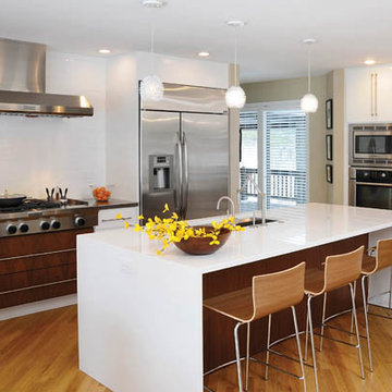
In addition to improving the flow of the kitchen—by removing a V-shaped peninsula that angled out into the room—and adding appliances like a stainless steel refrigerator, Sanford’s short list of must-haves included clean, uncluttered lines and no wall cabinets over the countertops. “I’ve found as I’ve aged, I’ve gotten shorter and just don’t use the upper cabinets,” Sanford explains.
Easy-access, smooth-slide drawers with clean slab fronts were the answer—resulting in strong visual lines, an open, airy feel and enhanced ergonomics. Starting with a “needs assessment,” Youles and Norton designed the space quite literally around Nancy. By looking at factors such as her height and which items she uses most frequently, they were able to determine the optimum placement for everything from canned goods in the pantry to cutlery, pans and plates in the customized drawers, all of which helped to achieve the ultimate kitchen organization.
But there’s more to the kitchen cabinets smooth façade than clean-lined storage. Walnut drawer fronts—found on the oven and the base of the island—are book-matched, allowing the grain to continue from drawer to drawer. And even in spaces where drawers weren’t feasible, beneath the sink and in a desk area, the designers continued the look with cabinet doors crafted to resemble drawers.
The visual continuity of these lines might not be as impactful if it weren’t for the careful selection of contrasting finishes. The designers filled the space with pure, glossy white—using a specific type of quartz, White Cliff by Cambria, to accent the bold rectangular design of the island. Then, to break up the expanse of accompanying white painted drawers, walnut was selected to bring the contrasting warmth and grain of wood without red undertones. It is commonly found in modern furniture design, as well as current productions of mid-century designs like the iconic Eames Lounge Chair from Herman Miller, Youles says.


 Hawaii Life
213 FEET OF PRIME BEACHFRONT PROPERTY ON HANALEI BAY.
*The Faye property at Hanalei was purchased by Hans Peter Faye in 1915. Faye was a prominent Kauai sugar plantation manager and a member of the elite society of the day. He and a few others were privileged with the opportunity to purchase prime Hanalei beachfront lots at auction. The intention was to build summer beach houses on the best section of the Bay.
*In 1915, H.P. Faye cleverly combined two of the original Hanalei Beach Lots, resulting in twice the land area and beach frontage of current comparables. Skillfully selected by Hans Peter Faye in 1915 at a time when Hanalei Bay was wide open. The location offers shelter, consistent offshore trade winds, sandbars, and amazing views. H.P. Faye had the vision and the finances to purchase not one but two lots in the best part of the Bay. The property has views both mauka and makai, and is perfect for swimming, parties and the beach lifestlye.
*Building on the property may be permitted for up to 9,000 sf, allowing for additional structures, pool, & larger buildings(compared to average 4,500 sf on other Hanalei beachfront lots).
*Today, almost all of the lots on Hanalei Bay have been subdivided and many of the original large estates are gone. Gone are the days of expansive,open spaces at Hanalei. The Faye property is one of a few parcels that retain the large, open feel and the ONLY ONE THAT IS AVAILABLE FOR SALE. Listed by Neal Norman, REALTOR (B) neal@hawaiilife.com - (808) 651-1777
 Truitt and White Window and Door Showroom
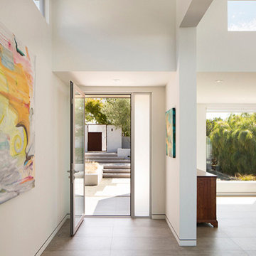
This hillside home in Piedmont, CA was remodeled to change the style from a 1940's rancher with eight foot ceilings and dark interiors, into a modern geometric composition with vast white interiors for casual living and generous daylighting for displaying the artist-owner's works.
In a city known for rigorous and difficult design review, an addition, two variances, and a full stylistic change were unanimously approved on the first round. All sloped roofs and attics were eliminated and replaced by a series of stacked and overlapping flat roofs. This made the house taller on the inside and shorter on the outside, which helped earn design review cooperation in the community. Windows were concentrated toward the rear yard views or moved up high on the side walls for daylight and privacy, benefitting the owners as well as the neighbors.
At the start, the owner husband was so enthusiastic and engaged in transforming his house into something modern that he presented the architect with a scaled foamcore model, rather than the usual magazine clippings and wish list. He participated in the design decisions throughout the process. The owner wife is the artist who did all the artwork in the house. She had been craving a display space with large walls and good natural light. Both of them loved the location and great views.
The project was an opportunity to transform the style of an older traditional home into a modern one, while solving numerous problems. By rebuilding the 1800 ft2 top of the 3-story home it was possible to change the style of the whole building, since the lower floors were a neutral base, and also to change the lifestyle of the owners, who wanted to move their master suite upstairs and live primarily on the top floor as empty nesters.
Going into the project, the architect knew there were multiple encroachments into the setbacks and potential privacy issues with close by neighbors. He approached this as a complex puzzle made up of architectural and political pieces which all had to fit together elegantly. It took many careful moves, small and large, to arrive at a serene and cohesive result that tied old and new together seamlessly.
The design-build contractor worked closely with the owners and handled all of the construction phase documents and design adjustments, adding ideas of their own to make the project really sing.
The project was a collaboration in three acts. The owner had a strong design concept from the start. The architect developed it into a realistic project and garnered the design approvals. Then the contractor executed brilliantly
 Alair Homes Milwaukee
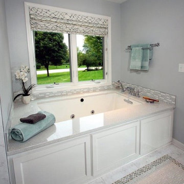
This Master Suite Addition project was initiated by our Clients’ desire to stay in their family home well into their golden years. Their wish list included a master suite and large open space for entertaining. With “Aging in Place” a main objective, our goal was to move all essential tasks to the first floor. Our design created a smooth transition between old house and new by expanding their dining room and adding a vestibule between the two spaces. This resulted in a much larger dining space and the larger entertaining area they were seeking. The master bedroom’s floor to ceiling windows on two of the walls frames picturesque views of their beloved garden outside. Vaulted ceilings, French doors to the bathroom with a transom window above express class and grandeur. Through the French doors the elegant master bathroom shines with reflections from the decorative crystal chandelier, white and grey tile, polished chrome fixtures and lighted glass bowls. A double headed shower, with dual temperature controls, and the air-jetted tub provide a true sanctuary for a relaxed bathing experience. “His and Her” elements are also fulfilled with dual vanities, and dual toilet areas. Upon completion, the homeowners passionately stated that this project turned out even better than they could have imagined. They truly love their new space in their long loved home and look forward to many more years in their new haven.
 Renovisions
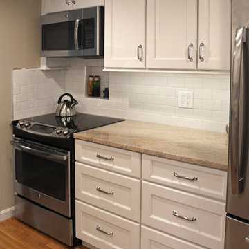
The owners of this outdated 1960’s kitchen were ready for a change and sought out Renovisions after seeing one of their eye-catching ads in South Shore Living Magazine. It was time to start fresh with a cleaner and brighter look with more functional storage. The professionals at Renovisions worked as a team to accommodate their wishes while being mindful of their existing traditional styled furnishings.
Keeping a similar layout, the old cabinets, flooring, countertops, door, window and appliances were removed as well as the wall between the kitchen and dining room to accommodate additional cabinets while creating an L for more useful countertop space. Replacing the worn stained wooden door and double hung window with a new prairie-style window and breezeway door in white finish was the first order of business. By replacing the tired vinyl floor with new oak wood floors the space became warm & inviting. The beautiful new white painted shaker-style cabinets look fabulous with the natural ivory-tan blend granite countertops and sleek stainless steel appliances. Simple, yet elegant white subway tiles provide a serene and open feel to the space. Creating a small niche area behind the slide-in range was also at the top of our clients list to accommodate the spices they use daily, turning an ordinary look to extraordinary.
Pesto change-o, as if by magic Renovisions transformed this dated tight-fit kitchen into a warm and inviting better functioning space that is definitely pleasing to the eyes of these homeowners who are thrilled with the end result and grateful for the high quality work along with the professional manner in which their project was completed.
“Thanks to you, Ed, Mike, and Liz for all your hard work. The kitchen is beautiful and I love the backsplash! The whole room looks beautiful, I'm so glad that we went with the white subway tiles in the end. They're light and clean and really pretty. Thanks for everything, Cathy. Your team has done a wonderful job! We appreciate all your help and hard work.”
- Bea R. (Hanson)
 yardscapes Inc.
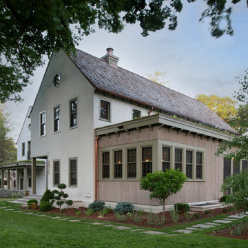
I was initially contacted by the builder and architect working on this Modern European Cottage to review the property and home design before construction began. Once the clients and I had the opportunity to meet and discuss what their visions were for the property, I started working on their wish list of items, which included a custom concrete pool, concrete spa, patios/walkways, custom fencing, and wood structures.
One of the largest challenges was that this property had a 30% (or less) hardcover surface requirement for the city location. With the lot size and square footage of the home I had limits to how much hardcover we could add to property. So, I had to get creative. We presented to the city the usage of the Live Green Roof plantings that would reduce the hardcover calculations for the site. Also, if we kept space between the Laurel Sandstones walkways, using them as steppers and planting groundcover or lawn between the stones that would also reduce the hard surface calculations. We continued that theme with the back patio as well. The client’s esthetic leaned towards the minimal style, so by adding greenery between stones work esthetically.
I chose the Laurel Tumbled Sandstone for the charm and character and thought it would lend well to the old world feel of this Modern European Cottage. We installed it on all the stone walkways, steppers, and patios around the home and pool.
I had several meetings with the client to discuss/review perennials, shrubs, and tree selections. Plant color and texture of the planting material were equally important to the clients when choosing. We grouped the plantings together and did not over-mix varieties of plants. Ultimately, we chose a variety of styles from natural groups of plantings to a touch of formal style, which all work cohesively together.
The custom fence design and installation was designed to create a cottage “country” feel. They gave us inspiration of a country style fence that you may find on a farm to keep the animals inside. We took those photos and ideas and elevated the design. We used a combination of cedar wood and sandwich the galvanized mesh between it. The fence also creates a space for the clients two dogs to roam freely around their property. We installed sod on the inside of the fence to the home and seeded the remaining areas with a Low Gro Fescue grass seed with a straw blanket for protection.
The minimal European style custom concrete pool was designed to be lined up in view from the porch and inside the home. The client requested the lawn around the edge of the pool, which helped reduce the hardcover calculations. The concrete spa is open year around. Benches are on all four sides of the spa to create enough seating for the whole family to use at the same time. Mortared field stone on the exterior of the spa mimics the stone on the exterior of the home. The spa equipment is installed in the lower level of the home to protect it from the cold winter weather.
Between the garage and the home’s entry is a pea rock sitting area and is viewed from several windows. I wanted it to be a quiet escape from the rest of the house with the minimal design. The Skyline Locust tree planted in the center of the space creates a canopy and softens the side of garage wall from the window views. The client will be installing a small water feature along the garage for serene noise ambience.
The client had very thoughtful design ideas styles, and our collaborations all came together and worked well to create the landscape design/installation. The result was everything they had dreamed of and more for their Modern European Cottage home and property.
 Amazing Spaces
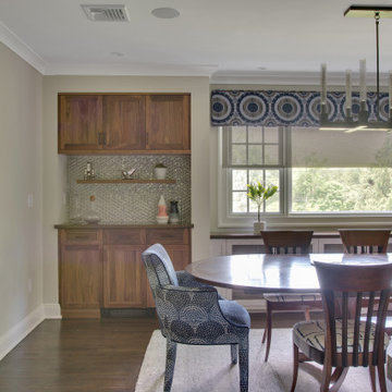
This project incorporated the main floor of the home. The existing kitchen was narrow and dated, and closed off from the rest of the common spaces. The client’s wish list included opening up the space to combine the dining room and kitchen, create a more functional entry foyer, and update the dark sunporch to be more inviting.
The concept resulted in swapping the kitchen and dining area, creating a perfect flow from the entry through to the sunporch.
The new dining room features a family heirloom dining table and includes updated lighting and accessories, new upholstery for all chairs, custom window treatments, built-in cabinetry in white and walnut with zinc countertops and a stainless steel penny tile backsplash to add some sparkle.
Built-in cabinets in the foyer help keep things neat and tidy.
 Lenore Frances Home Interiors
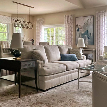
Lenore Frances Home Interiors was brought in to complete this Medford, NJ home after the client realized they couldn’t achieve the warm, cohesive look they envisioned on their own. With beautiful neutral foundational pieces already in place, the combined living and dining room still felt unfinished and a bit cold.
The client wanted a softer, more inviting atmosphere—subtle color (with an emphasis on blues), elegant window treatments without visible rods, layered pillows, greenery, table lamps, and a statement art piece that would draw the eye without overpowering the room.
We transformed the space by thoughtfully integrating every element on their wish list, balancing comfort, color, and sophistication. The result is a harmonious, welcoming environment that feels complete, curated, and unmistakably personal to the homeowner.
Another project finished with intention, expertise, and a client thrilled to finally see their vision fully realized.
Service Provided: Designer on Call with Procurement
 Stephanie Charest Interior Design
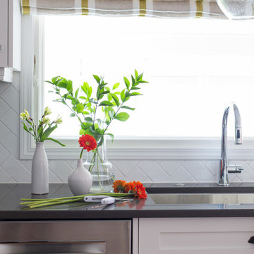
We completed this kitchen renovation for a SW. Calgary couple and as you’ll see, it was a much needed update after their 20+ years in the home.
Clearly the look of the cabinets needed to be brought up to date, but function was on the top of the list for this client. She enjoys cooking and often hosts several friends over for canning and other big cooking parties so countertop space was a priority. Seeing as they also host large family gatherings, the cook didn’t want to feel abandoned in the kitchen when everyone else was in the next room so opening up the space was crucial.
Here is what we did to change the way this space works for them…
We revised the layout of the appliances and cabinets and relocated the plumbing so she could look out the window while she stood at the sink. Taking the cabinets up to the ceiling also gave them more storage as does the large pantry next to the fridge. An island wouldn’t fit, so we added a peninsula which gave them a spot to sit to have their morning coffee and a significant amount of additional counter space. By removing the walls between the kitchen and dining room it eliminated a small hallway that separated the kitchen and dining room and allowed for an open concept in their 1960’s home.
To add visual interest to the space and to define the dining room, we added a coffered celing. Now, typically a coffered ceiling is done when you have three or four walls to anchor it in. It was a bit of a risk to add a “floating” coffered ceiling! However, it turned out beautifully. It wasn’t without it issues but I’m glad we added this element as it wouldn’t have been as interesting with a typical flat ceiling.
In the dining room, a buffet was added for additional storage as well as new drapery panels, lighting and furniture. The peacock blue end chairs are stunning! Without that punch of color the dining room just wouldn’t be as outstanding. They are so lovely and really pushed the client out of her comfort zone – but she loves them and is glad she trusted us with that design decision.
The result is a much more usable space that is also classic in style and just darn pretty to look at and be in! And I know this client is enjoying her new kitchen day to day and on special family occasions.
Adrian Shellard Photography
29