
Search results for "Satisfying opportunities" in Home Design Ideas
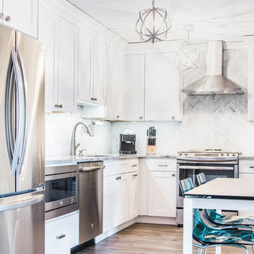
 RAJ Kitchen and Bath, LLC
 “Full apartment design”.
IF you have not yet seen this apartment conversion before, we strongly urge you to go to the bottom left of this page and click on the short 2-minutes video. It would put a lot of things into perspective when you come back and continue reading this.
It is true we were literally handed the keys and told a list of things that they wanted to have happen and we were to go into the apartment, look at the space and come up with a design that would satisfy all of that need. UNTIL we showed up! The unit had really seen some better days but we knew we had to look past that and come up with a concept that would work for them.
The immediate challenges were centered around 3 big ideas:
1. Adding a second bedroom to the already small footprint
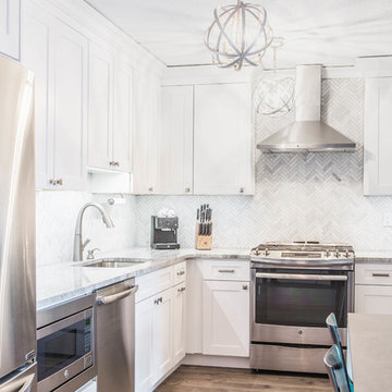
2. Figuring out a way to make the kitchen bigger, better and brighter
3. Creating a master room walk in closet
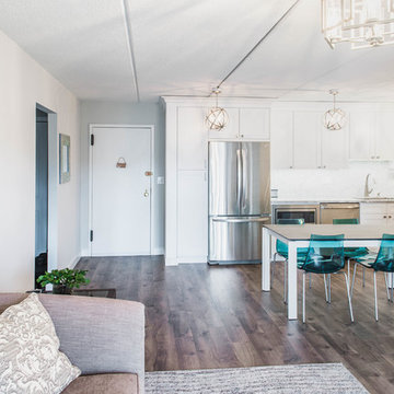
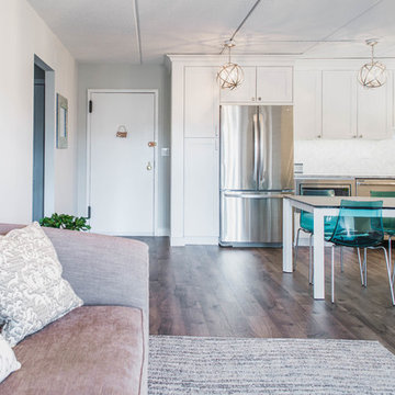
It’s always difficult to add new rooms into existing footprint without expanding out or up and not incurring any opportunity cost. In this case, that was exactly what we had to do. Item one and two above had to be tackled as one. We went ahead and switched out the location of the dining room and eliminating an area where there was a “nook” type eat-in area. By doing so, we were able to cut right into that footprint and change the layout of the kitchen.
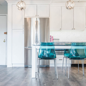
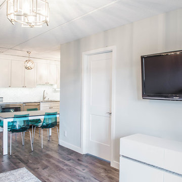
That one move allowed us to dig into the kitchen design because it was now the main focal point in the apartment. It was no longer an option to keep it in that tiny hole where it was, so we had to ensure that this design was functional and aesthetically pleasing at the same time. By adding the table into the space where an Island typically would go, we were able to both cut cost and still provide a dining experience. The Table serves as an Island as well when cooking.
We then proceeded to block in the existing doorway to the dining room. By doing this, we were able to create a full room which allowed us to put a door on the other side and called that room Bedroom #2. This was easier to do because all of the mechanicals were already in that space (light, heater and windows). By shifting things around, we also achieved a huge wall to wall closet from inside. PERFECT!
Then we moved into the Single bedroom. We thought it was a big room with a small closet, so by creatively adding an L shaped wall and steal some footprint into the bedroom side, we were able to put a door on that new room and design it for the walk-in closet. Even after this, the bedroom still holds a queen size bed with 2 night stands, a TV on the wall, a sitting chair and plenty of room to walk around. This was done by rethinking the location for the bed and night stands.
The bathroom was gutted to make sure there was no leaks and rebuild from the ground up. We kept all of the plumbing where it was, added a new vanity, medicine cabinet, tiles and lighting and it was done.
From there, the rest of the unit had new flooring all throughout, paint, and lighting. After completion and walk through, this project was handed over back to the clients.
Execution and collaboration between all the trades were: Reggie and his team from Premier Interiors and Rohan from RD Mechanical Services.
p.s. Please see our website to see the video.
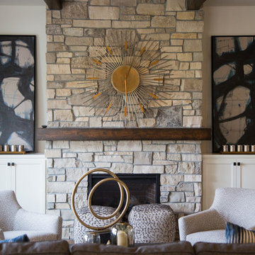
 Simply Perfect
Advice on interior design is available everywhere—from TV shows and websites to books, magazines and apps.
We love seeing people become engaged in design and educated on the wide range of possibilities. But we hope you’ll proceed with caution.
It’s not that style errors are a matter of life and death. It’s just that it’s easy to choose designs that aren’t necessarily reflective of your own personality and character. And since you’re typically stuck with your interior design decisions for years, styles that don’t quite fit can tend to grate on you.
Interiors that give one person comfort may unleash chaos in someone else. This goes beyond favorite colors or hot trends, right to the heart of interior design, where you find questions of composition, balance, repetition, space and more.
The goal is to find that unique combination of design elements that gives you comfort, support and balance.
In one home, that perfect balance was struck through the use of symmetry. A pair of comfortable swivel chairs sit beneath matching indigo patterned paintings. Matching bookcases below the paintings contain similar, but not identical, arrangements of books, vases and bowls. Woods and bronzes help warm up the simple white bookcase shelving.
Two matching poufs in front of the fireplace provide additional seating. The sofa is accented with a pair of pillows with a blue pattern that echoes the artwork.
The effect of the symmetry is to achieve order and simplicity, which I promote at every opportunity. After all, your home interiors should be the setting or the backdrop of your life—not center stage.
Antique bronze and blue are complementary colors. Together, they offer a rich palette of richness and depth, which brings out the beauty of wood and stone.
In the home office, a unique, whitewash-stained wooden desk rests on metal, Sawhorse-inspired legs for a warm, rustic look. The black leather chair features a contemporary silhouette with an antique brass frame. An adjustable desk lamp has bronze accents.
The bookcase combines a sleek, black metal frame with concrete shelves, for another unusual pairing. It’s kept uncluttered for an orderly, peaceful look. Items on the shelves include a bronze-accented lamp and a pair
of high gloss-finished wooden bookends.
The elegant artwork behind the desk is a simple midnight-blue and bronze with mottled white. Deep blues are again picked up in the rug, which adds a stately vibe with a modern pattern and satisfying texture.
Within the framework of symmetry, the living room repeats the blue-and-bronze color scheme.
A large midcentury brass clock above the fireplace keeps the natural stone visible, rather than hidden behind a painting or television, while its straight lines and color create a beautiful contrast.
The sofa is a soft, neutral blue. The pattern on the round brass side table features echoes the darker blue-patterned rug, as well as the rug in the office, tying the rooms together.
Indigo blue books adjacent to bronze vases on the shelves repeat the color scheme. The soapstone-topped coffee table echoes the shape of the fireplace. A pair of tall, matching floor lamps with long wooden bases, brass pulls and simple linen shades combine both the colors and symmetry found throughout the home.
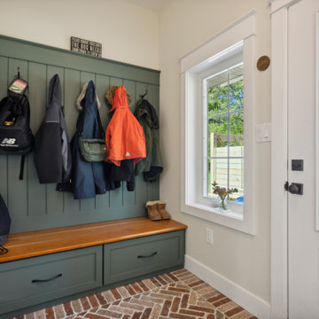
 Hillcrest Construction
These clients reached out to Hillcrest Construction when their family began out-growing their Phoenixville-area home. Through a comprehensive design phase, opportunities to add square footage were identified along with a reorganization of the typical traffic flow throughout the house.
All household traffic into the hastily-designed, existing family room bump-out addition was funneled through a 3’ berth within the kitchen making meal prep and other kitchen activities somewhat similar to a shift at a PA turnpike toll booth. In the existing bump-out addition, the family room was relatively tight and the dining room barely fit the 6-person dining table. Access to the backyard was somewhat obstructed by the necessary furniture and the kitchen alone didn’t satisfy storage needs beyond a quick trip to the grocery store. The home’s existing front door was the only front entrance, and without a foyer or mudroom, the front formal room often doubled as a drop-zone for groceries, bookbags, and other on-the-go items.
Hillcrest Construction designed a remedy to both address the function and flow issues along with adding square footage via a 150 sq ft addition to the family room and converting the garage into a mudroom entry and walk-through pantry.
-
The project’s addition was not especially large but was able to facilitate a new pathway to the home’s rear family room. The existing brick wall at the bottom of the second-floor staircase was opened up and created a new, natural flow from the second-floor bedrooms to the front formal room, and into the rear family hang-out space- all without having to cut through the often busy kitchen. The dining room area was relocated to remove it from the pathway to the door to the backyard. Additionally, free and clear access to the rear yard was established for both two-legged and four-legged friends.
The existing chunky slider door was removed and in its place was fabricated and installed a custom centerpiece that included a new gas fireplace insert with custom brick surround, two side towers for display items and choice vinyl, and two base cabinets with metal-grated doors to house a subwoofer, wifi equipment, and other stow-away items. The black walnut countertops and mantle pop from the white cabinetry, and the wall-mounted TV with soundbar complete the central A/V hub. The custom cabs and tops were designed and built at Hillcrest’s custom shop.
The farmhouse appeal was completed with distressed engineered hardwood floors and craftsman-style window and door trim throughout.
-
Another major component of the project was the conversion of the garage into a pantry+mudroom+everyday entry.
The clients had used their smallish garage for storage of outdoor yard and recreational equipment. With those storage needs being addressed at the exterior, the space was transformed into a custom pantry and mudroom. The floor level within the space was raised to meet the rest of the house and insulated appropriately. A newly installed pocket door divided the dining room area from the designed-to-spec pantry/beverage center. The pantry was designed to house dry storage, cleaning supplies, and dry bar supplies when the cleaning and shopping are complete. A window seat with doggie supply storage below was worked into the design to accommodate the existing elevation of the original garage window.
A coat closet and a small set of steps divide the pantry from the mudroom entry. The mudroom entry is marked with a striking combo of the herringbone thin-brick flooring and a custom hutch. Kids returning home from school have a designated spot to hang their coats and bookbags with two deep drawers for shoes. A custom cherry bench top adds a punctuation of warmth. The entry door and window replaced the old overhead garage doors to create the daily-used informal entry off the driveway.
With the house being such a favorable area, and the clients not looking to pull up roots, Hillcrest Construction facilitated a collaborative experience and comprehensive plan to change the house for the better and make it a home to grow within.
Find the right local pro for your project
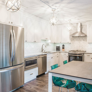 RAJ Kitchen and Bath, LLC
 “Full apartment design”.
IF you have not yet seen this apartment conversion before, we strongly urge you to go to the bottom left of this page and click on the short 2-minutes video. It would put a lot of things into perspective when you come back and continue reading this.
It is true we were literally handed the keys and told a list of things that they wanted to have happen and we were to go into the apartment, look at the space and come up with a design that would satisfy all of that need. UNTIL we showed up! The unit had really seen some better days but we knew we had to look past that and come up with a concept that would work for them.
The immediate challenges were centered around 3 big ideas:
1. Adding a second bedroom to the already small footprint
2. Figuring out a way to make the kitchen bigger, better and brighter
3. Creating a master room walk in closet
It’s always difficult to add new rooms into existing footprint without expanding out or up and not incurring any opportunity cost. In this case, that was exactly what we had to do. Item one and two above had to be tackled as one. We went ahead and switched out the location of the dining room and eliminating an area where there was a “nook” type eat-in area. By doing so, we were able to cut right into that footprint and change the layout of the kitchen.
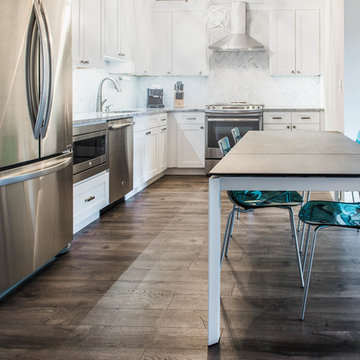
That one move allowed us to dig into the kitchen design because it was now the main focal point in the apartment. It was no longer an option to keep it in that tiny hole where it was, so we had to ensure that this design was functional and aesthetically pleasing at the same time. By adding the table into the space where an Island typically would go, we were able to both cut cost and still provide a dining experience. The Table serves as an Island as well when cooking.
We then proceeded to block in the existing doorway to the dining room. By doing this, we were able to create a full room which allowed us to put a door on the other side and called that room Bedroom #2. This was easier to do because all of the mechanicals were already in that space (light, heater and windows). By shifting things around, we also achieved a huge wall to wall closet from inside. PERFECT!
Then we moved into the Single bedroom. We thought it was a big room with a small closet, so by creatively adding an L shaped wall and steal some footprint into the bedroom side, we were able to put a door on that new room and design it for the walk-in closet. Even after this, the bedroom still holds a queen size bed with 2 night stands, a TV on the wall, a sitting chair and plenty of room to walk around. This was done by rethinking the location for the bed and night stands.
The bathroom was gutted to make sure there was no leaks and rebuild from the ground up. We kept all of the plumbing where it was, added a new vanity, medicine cabinet, tiles and lighting and it was done.
From there, the rest of the unit had new flooring all throughout, paint, and lighting. After completion and walk through, this project was handed over back to the clients.
Execution and collaboration between all the trades were: Reggie and his team from Premier Interiors and Rohan from RD Mechanical Services.
p.s. Please see our website to see the video.
 RAJ Kitchen and Bath, LLC
 “Full apartment design”.
IF you have not yet seen this apartment conversion before, we strongly urge you to go to the bottom left of this page and click on the short 2-minutes video. It would put a lot of things into perspective when you come back and continue reading this.
It is true we were literally handed the keys and told a list of things that they wanted to have happen and we were to go into the apartment, look at the space and come up with a design that would satisfy all of that need. UNTIL we showed up! The unit had really seen some better days but we knew we had to look past that and come up with a concept that would work for them.
The immediate challenges were centered around 3 big ideas:
1. Adding a second bedroom to the already small footprint
2. Figuring out a way to make the kitchen bigger, better and brighter
3. Creating a master room walk in closet
It’s always difficult to add new rooms into existing footprint without expanding out or up and not incurring any opportunity cost. In this case, that was exactly what we had to do. Item one and two above had to be tackled as one. We went ahead and switched out the location of the dining room and eliminating an area where there was a “nook” type eat-in area. By doing so, we were able to cut right into that footprint and change the layout of the kitchen.
That one move allowed us to dig into the kitchen design because it was now the main focal point in the apartment. It was no longer an option to keep it in that tiny hole where it was, so we had to ensure that this design was functional and aesthetically pleasing at the same time. By adding the table into the space where an Island typically would go, we were able to both cut cost and still provide a dining experience. The Table serves as an Island as well when cooking.
We then proceeded to block in the existing doorway to the dining room. By doing this, we were able to create a full room which allowed us to put a door on the other side and called that room Bedroom #2. This was easier to do because all of the mechanicals were already in that space (light, heater and windows). By shifting things around, we also achieved a huge wall to wall closet from inside. PERFECT!
Then we moved into the Single bedroom. We thought it was a big room with a small closet, so by creatively adding an L shaped wall and steal some footprint into the bedroom side, we were able to put a door on that new room and design it for the walk-in closet. Even after this, the bedroom still holds a queen size bed with 2 night stands, a TV on the wall, a sitting chair and plenty of room to walk around. This was done by rethinking the location for the bed and night stands.
The bathroom was gutted to make sure there was no leaks and rebuild from the ground up. We kept all of the plumbing where it was, added a new vanity, medicine cabinet, tiles and lighting and it was done.
From there, the rest of the unit had new flooring all throughout, paint, and lighting. After completion and walk through, this project was handed over back to the clients.
Execution and collaboration between all the trades were: Reggie and his team from Premier Interiors and Rohan from RD Mechanical Services.
p.s. Please see our website to see the video.
 RAJ Kitchen and Bath, LLC
 “Full apartment design”.
IF you have not yet seen this apartment conversion before, we strongly urge you to go to the bottom left of this page and click on the short 2-minutes video. It would put a lot of things into perspective when you come back and continue reading this.
It is true we were literally handed the keys and told a list of things that they wanted to have happen and we were to go into the apartment, look at the space and come up with a design that would satisfy all of that need. UNTIL we showed up! The unit had really seen some better days but we knew we had to look past that and come up with a concept that would work for them.
The immediate challenges were centered around 3 big ideas:
1. Adding a second bedroom to the already small footprint
2. Figuring out a way to make the kitchen bigger, better and brighter
3. Creating a master room walk in closet
It’s always difficult to add new rooms into existing footprint without expanding out or up and not incurring any opportunity cost. In this case, that was exactly what we had to do. Item one and two above had to be tackled as one. We went ahead and switched out the location of the dining room and eliminating an area where there was a “nook” type eat-in area. By doing so, we were able to cut right into that footprint and change the layout of the kitchen.
That one move allowed us to dig into the kitchen design because it was now the main focal point in the apartment. It was no longer an option to keep it in that tiny hole where it was, so we had to ensure that this design was functional and aesthetically pleasing at the same time. By adding the table into the space where an Island typically would go, we were able to both cut cost and still provide a dining experience. The Table serves as an Island as well when cooking.
We then proceeded to block in the existing doorway to the dining room. By doing this, we were able to create a full room which allowed us to put a door on the other side and called that room Bedroom #2. This was easier to do because all of the mechanicals were already in that space (light, heater and windows). By shifting things around, we also achieved a huge wall to wall closet from inside. PERFECT!
Then we moved into the Single bedroom. We thought it was a big room with a small closet, so by creatively adding an L shaped wall and steal some footprint into the bedroom side, we were able to put a door on that new room and design it for the walk-in closet. Even after this, the bedroom still holds a queen size bed with 2 night stands, a TV on the wall, a sitting chair and plenty of room to walk around. This was done by rethinking the location for the bed and night stands.
The bathroom was gutted to make sure there was no leaks and rebuild from the ground up. We kept all of the plumbing where it was, added a new vanity, medicine cabinet, tiles and lighting and it was done.
From there, the rest of the unit had new flooring all throughout, paint, and lighting. After completion and walk through, this project was handed over back to the clients.
Execution and collaboration between all the trades were: Reggie and his team from Premier Interiors and Rohan from RD Mechanical Services.
p.s. Please see our website to see the video.
 RAJ Kitchen and Bath, LLC
 “Full apartment design”.
IF you have not yet seen this apartment conversion before, we strongly urge you to go to the bottom left of this page and click on the short 2-minutes video. It would put a lot of things into perspective when you come back and continue reading this.
It is true we were literally handed the keys and told a list of things that they wanted to have happen and we were to go into the apartment, look at the space and come up with a design that would satisfy all of that need. UNTIL we showed up! The unit had really seen some better days but we knew we had to look past that and come up with a concept that would work for them.
The immediate challenges were centered around 3 big ideas:
1. Adding a second bedroom to the already small footprint
2. Figuring out a way to make the kitchen bigger, better and brighter
3. Creating a master room walk in closet
It’s always difficult to add new rooms into existing footprint without expanding out or up and not incurring any opportunity cost. In this case, that was exactly what we had to do. Item one and two above had to be tackled as one. We went ahead and switched out the location of the dining room and eliminating an area where there was a “nook” type eat-in area. By doing so, we were able to cut right into that footprint and change the layout of the kitchen.
That one move allowed us to dig into the kitchen design because it was now the main focal point in the apartment. It was no longer an option to keep it in that tiny hole where it was, so we had to ensure that this design was functional and aesthetically pleasing at the same time. By adding the table into the space where an Island typically would go, we were able to both cut cost and still provide a dining experience. The Table serves as an Island as well when cooking.
We then proceeded to block in the existing doorway to the dining room. By doing this, we were able to create a full room which allowed us to put a door on the other side and called that room Bedroom #2. This was easier to do because all of the mechanicals were already in that space (light, heater and windows). By shifting things around, we also achieved a huge wall to wall closet from inside. PERFECT!
Then we moved into the Single bedroom. We thought it was a big room with a small closet, so by creatively adding an L shaped wall and steal some footprint into the bedroom side, we were able to put a door on that new room and design it for the walk-in closet. Even after this, the bedroom still holds a queen size bed with 2 night stands, a TV on the wall, a sitting chair and plenty of room to walk around. This was done by rethinking the location for the bed and night stands.
The bathroom was gutted to make sure there was no leaks and rebuild from the ground up. We kept all of the plumbing where it was, added a new vanity, medicine cabinet, tiles and lighting and it was done.
From there, the rest of the unit had new flooring all throughout, paint, and lighting. After completion and walk through, this project was handed over back to the clients.
Execution and collaboration between all the trades were: Reggie and his team from Premier Interiors and Rohan from RD Mechanical Services.
p.s. Please see our website to see the video.
 RAJ Kitchen and Bath, LLC
 “Full apartment design”.
IF you have not yet seen this apartment conversion before, we strongly urge you to go to the bottom left of this page and click on the short 2-minutes video. It would put a lot of things into perspective when you come back and continue reading this.
It is true we were literally handed the keys and told a list of things that they wanted to have happen and we were to go into the apartment, look at the space and come up with a design that would satisfy all of that need. UNTIL we showed up! The unit had really seen some better days but we knew we had to look past that and come up with a concept that would work for them.
The immediate challenges were centered around 3 big ideas:
1. Adding a second bedroom to the already small footprint
2. Figuring out a way to make the kitchen bigger, better and brighter
3. Creating a master room walk in closet
It’s always difficult to add new rooms into existing footprint without expanding out or up and not incurring any opportunity cost. In this case, that was exactly what we had to do. Item one and two above had to be tackled as one. We went ahead and switched out the location of the dining room and eliminating an area where there was a “nook” type eat-in area. By doing so, we were able to cut right into that footprint and change the layout of the kitchen.
That one move allowed us to dig into the kitchen design because it was now the main focal point in the apartment. It was no longer an option to keep it in that tiny hole where it was, so we had to ensure that this design was functional and aesthetically pleasing at the same time. By adding the table into the space where an Island typically would go, we were able to both cut cost and still provide a dining experience. The Table serves as an Island as well when cooking.
We then proceeded to block in the existing doorway to the dining room. By doing this, we were able to create a full room which allowed us to put a door on the other side and called that room Bedroom #2. This was easier to do because all of the mechanicals were already in that space (light, heater and windows). By shifting things around, we also achieved a huge wall to wall closet from inside. PERFECT!
Then we moved into the Single bedroom. We thought it was a big room with a small closet, so by creatively adding an L shaped wall and steal some footprint into the bedroom side, we were able to put a door on that new room and design it for the walk-in closet. Even after this, the bedroom still holds a queen size bed with 2 night stands, a TV on the wall, a sitting chair and plenty of room to walk around. This was done by rethinking the location for the bed and night stands.
The bathroom was gutted to make sure there was no leaks and rebuild from the ground up. We kept all of the plumbing where it was, added a new vanity, medicine cabinet, tiles and lighting and it was done.
From there, the rest of the unit had new flooring all throughout, paint, and lighting. After completion and walk through, this project was handed over back to the clients.
Execution and collaboration between all the trades were: Reggie and his team from Premier Interiors and Rohan from RD Mechanical Services.
p.s. Please see our website to see the video.
 Simply Perfect
Advice on interior design is available everywhere—from TV shows and websites to books, magazines and apps.
We love seeing people become engaged in design and educated on the wide range of possibilities. But we hope you’ll proceed with caution.
It’s not that style errors are a matter of life and death. It’s just that it’s easy to choose designs that aren’t necessarily reflective of your own personality and character. And since you’re typically stuck with your interior design decisions for years, styles that don’t quite fit can tend to grate on you.
Interiors that give one person comfort may unleash chaos in someone else. This goes beyond favorite colors or hot trends, right to the heart of interior design, where you find questions of composition, balance, repetition, space and more.
The goal is to find that unique combination of design elements that gives you comfort, support and balance.
In one home, that perfect balance was struck through the use of symmetry. A pair of comfortable swivel chairs sit beneath matching indigo patterned paintings. Matching bookcases below the paintings contain similar, but not identical, arrangements of books, vases and bowls. Woods and bronzes help warm up the simple white bookcase shelving.
Two matching poufs in front of the fireplace provide additional seating. The sofa is accented with a pair of pillows with a blue pattern that echoes the artwork.
The effect of the symmetry is to achieve order and simplicity, which I promote at every opportunity. After all, your home interiors should be the setting or the backdrop of your life—not center stage.
Antique bronze and blue are complementary colors. Together, they offer a rich palette of richness and depth, which brings out the beauty of wood and stone.
In the home office, a unique, whitewash-stained wooden desk rests on metal, Sawhorse-inspired legs for a warm, rustic look. The black leather chair features a contemporary silhouette with an antique brass frame. An adjustable desk lamp has bronze accents.
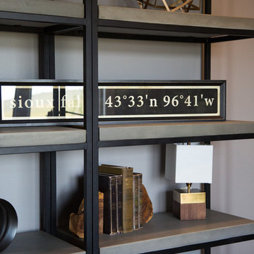
The bookcase combines a sleek, black metal frame with concrete shelves, for another unusual pairing. It’s kept uncluttered for an orderly, peaceful look. Items on the shelves include a bronze-accented lamp and a pair
of high gloss-finished wooden bookends.
The elegant artwork behind the desk is a simple midnight-blue and bronze with mottled white. Deep blues are again picked up in the rug, which adds a stately vibe with a modern pattern and satisfying texture.
Within the framework of symmetry, the living room repeats the blue-and-bronze color scheme.
A large midcentury brass clock above the fireplace keeps the natural stone visible, rather than hidden behind a painting or television, while its straight lines and color create a beautiful contrast.
The sofa is a soft, neutral blue. The pattern on the round brass side table features echoes the darker blue-patterned rug, as well as the rug in the office, tying the rooms together.
Indigo blue books adjacent to bronze vases on the shelves repeat the color scheme. The soapstone-topped coffee table echoes the shape of the fireplace. A pair of tall, matching floor lamps with long wooden bases, brass pulls and simple linen shades combine both the colors and symmetry found throughout the home.
 RAJ Kitchen and Bath, LLC
 “Full apartment design”.
IF you have not yet seen this apartment conversion before, we strongly urge you to go to the bottom left of this page and click on the short 2-minutes video. It would put a lot of things into perspective when you come back and continue reading this.
It is true we were literally handed the keys and told a list of things that they wanted to have happen and we were to go into the apartment, look at the space and come up with a design that would satisfy all of that need. UNTIL we showed up! The unit had really seen some better days but we knew we had to look past that and come up with a concept that would work for them.
The immediate challenges were centered around 3 big ideas:
1. Adding a second bedroom to the already small footprint
2. Figuring out a way to make the kitchen bigger, better and brighter
3. Creating a master room walk in closet
It’s always difficult to add new rooms into existing footprint without expanding out or up and not incurring any opportunity cost. In this case, that was exactly what we had to do. Item one and two above had to be tackled as one. We went ahead and switched out the location of the dining room and eliminating an area where there was a “nook” type eat-in area. By doing so, we were able to cut right into that footprint and change the layout of the kitchen.
That one move allowed us to dig into the kitchen design because it was now the main focal point in the apartment. It was no longer an option to keep it in that tiny hole where it was, so we had to ensure that this design was functional and aesthetically pleasing at the same time. By adding the table into the space where an Island typically would go, we were able to both cut cost and still provide a dining experience. The Table serves as an Island as well when cooking.
We then proceeded to block in the existing doorway to the dining room. By doing this, we were able to create a full room which allowed us to put a door on the other side and called that room Bedroom #2. This was easier to do because all of the mechanicals were already in that space (light, heater and windows). By shifting things around, we also achieved a huge wall to wall closet from inside. PERFECT!
Then we moved into the Single bedroom. We thought it was a big room with a small closet, so by creatively adding an L shaped wall and steal some footprint into the bedroom side, we were able to put a door on that new room and design it for the walk-in closet. Even after this, the bedroom still holds a queen size bed with 2 night stands, a TV on the wall, a sitting chair and plenty of room to walk around. This was done by rethinking the location for the bed and night stands.
The bathroom was gutted to make sure there was no leaks and rebuild from the ground up. We kept all of the plumbing where it was, added a new vanity, medicine cabinet, tiles and lighting and it was done.
From there, the rest of the unit had new flooring all throughout, paint, and lighting. After completion and walk through, this project was handed over back to the clients.
Execution and collaboration between all the trades were: Reggie and his team from Premier Interiors and Rohan from RD Mechanical Services.
p.s. Please see our website to see the video.
 Mark Mobley Architecture
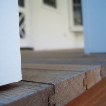
Mid-sized arts and crafts front porch idea in Baltimore with decking and a roof extension
 Simply Perfect
Advice on interior design is available everywhere—from TV shows and websites to books, magazines and apps.
We love seeing people become engaged in design and educated on the wide range of possibilities. But we hope you’ll proceed with caution.
It’s not that style errors are a matter of life and death. It’s just that it’s easy to choose designs that aren’t necessarily reflective of your own personality and character. And since you’re typically stuck with your interior design decisions for years, styles that don’t quite fit can tend to grate on you.
Interiors that give one person comfort may unleash chaos in someone else. This goes beyond favorite colors or hot trends, right to the heart of interior design, where you find questions of composition, balance, repetition, space and more.
The goal is to find that unique combination of design elements that gives you comfort, support and balance.
In one home, that perfect balance was struck through the use of symmetry. A pair of comfortable swivel chairs sit beneath matching indigo patterned paintings. Matching bookcases below the paintings contain similar, but not identical, arrangements of books, vases and bowls. Woods and bronzes help warm up the simple white bookcase shelving.
Two matching poufs in front of the fireplace provide additional seating. The sofa is accented with a pair of pillows with a blue pattern that echoes the artwork.
The effect of the symmetry is to achieve order and simplicity, which I promote at every opportunity. After all, your home interiors should be the setting or the backdrop of your life—not center stage.
Antique bronze and blue are complementary colors. Together, they offer a rich palette of richness and depth, which brings out the beauty of wood and stone.
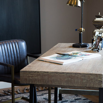
In the home office, a unique, whitewash-stained wooden desk rests on metal, Sawhorse-inspired legs for a warm, rustic look. The black leather chair features a contemporary silhouette with an antique brass frame. An adjustable desk lamp has bronze accents.
The bookcase combines a sleek, black metal frame with concrete shelves, for another unusual pairing. It’s kept uncluttered for an orderly, peaceful look. Items on the shelves include a bronze-accented lamp and a pair
of high gloss-finished wooden bookends.
The elegant artwork behind the desk is a simple midnight-blue and bronze with mottled white. Deep blues are again picked up in the rug, which adds a stately vibe with a modern pattern and satisfying texture.
Within the framework of symmetry, the living room repeats the blue-and-bronze color scheme.
A large midcentury brass clock above the fireplace keeps the natural stone visible, rather than hidden behind a painting or television, while its straight lines and color create a beautiful contrast.
The sofa is a soft, neutral blue. The pattern on the round brass side table features echoes the darker blue-patterned rug, as well as the rug in the office, tying the rooms together.
Indigo blue books adjacent to bronze vases on the shelves repeat the color scheme. The soapstone-topped coffee table echoes the shape of the fireplace. A pair of tall, matching floor lamps with long wooden bases, brass pulls and simple linen shades combine both the colors and symmetry found throughout the home.
 Care Free Homes, Inc.
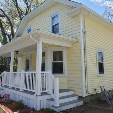
CertainTeed vinyl siding, GAF roofing, and a TimberTech AZEK farmer’s porch look great on this New Bedford, MA home!
The homeowner chose to use a combination of CertainTeed Cedar Impressions and Restoration Classic vinyl siding in the color, Autumn Yellow. Cedar Impressions, installed on the front of the home, are molded to match the shape and texture of real cedar shingles. Restoration Classic vinyl siding replicates the look of painted cedar clapboard siding. Both collections of vinyl siding styles are offered in CertainTeed’s industry-leading, fade-resistant color collection. From deep hues of blue and red to subtle shades of gray and taupe, homeowners can find a siding color that suits their personal style. With custom vinyl siding, homeowners will eliminate worries about rot, insect damage, peeling, chipping, and the expensive costs associated with painting their home every 5-7 years! We’re proud to be a CertainTeed 5 Star Contractor who can offer CertainTeed’s limited lifetime warranty plus our own 10 year workmanship guarantee.
We’re the area’s only Platinum TimberTech AZEK Contractor! The home’s original porch was dated and failing structurally so the homeowner chose to rebuild with a AZEK farmer’s porch with white rails and decking in the color, Slate Gray. This capped polymer decking has a realistic wood grain texture and is rot, insect, fade, dent, and scratch resistant! No more sanding, staining, and splintering wood boards! Slate Gray is a popular color choice for homeowners because it offers classic style and is up to 30 degrees cooler and has 40% better slip resistance than other competitive composite decking products.
We stripped the original roof and replaced it with a North America’s top-selling GAF Timberline HDZ roofing system in the color, Hunter Green. These architectural shingles come in a gorgeous collection of color blends and 130 mph wind rating. GAF’s newest engineering also gives homeowners the opportunity to upgrade to their WindProven Limited Wind Warranty which is the industry’s only wind warranty with no maximum wind speed limitation. Thanks to our award-winning GAF MasterElite Contractor status, our customers also enjoy a GAF factory-registered, 50 Year non-prorated, transferable roof warranty. This industry-leading warranty adds value to the home because it can be transfered to the next homeowner!
Give your home a top to bottom makeover with CertainTeed vinyl siding, GAF Roofing, and TimberTech AZEK Decking! Trust your home to a professional home improvement contractor with over 40 years of satisfied customers. In addition to an extensive list of industry awards and credentials, we’ve been an A+ accredited member of the Better Business Bureau for over 25 years! We ask for no money down until your project is completed and offer financing options to qualified homeowners. Get your free quote by calling 508-997-1111 or by filling out our online form. Make your house a Care Free home!
 Simply Perfect
Advice on interior design is available everywhere—from TV shows and websites to books, magazines and apps.
We love seeing people become engaged in design and educated on the wide range of possibilities. But we hope you’ll proceed with caution.
It’s not that style errors are a matter of life and death. It’s just that it’s easy to choose designs that aren’t necessarily reflective of your own personality and character. And since you’re typically stuck with your interior design decisions for years, styles that don’t quite fit can tend to grate on you.
Interiors that give one person comfort may unleash chaos in someone else. This goes beyond favorite colors or hot trends, right to the heart of interior design, where you find questions of composition, balance, repetition, space and more.
The goal is to find that unique combination of design elements that gives you comfort, support and balance.
In one home, that perfect balance was struck through the use of symmetry. A pair of comfortable swivel chairs sit beneath matching indigo patterned paintings. Matching bookcases below the paintings contain similar, but not identical, arrangements of books, vases and bowls. Woods and bronzes help warm up the simple white bookcase shelving.
Two matching poufs in front of the fireplace provide additional seating. The sofa is accented with a pair of pillows with a blue pattern that echoes the artwork.
The effect of the symmetry is to achieve order and simplicity, which I promote at every opportunity. After all, your home interiors should be the setting or the backdrop of your life—not center stage.
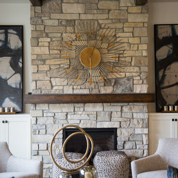
Antique bronze and blue are complementary colors. Together, they offer a rich palette of richness and depth, which brings out the beauty of wood and stone.
In the home office, a unique, whitewash-stained wooden desk rests on metal, Sawhorse-inspired legs for a warm, rustic look. The black leather chair features a contemporary silhouette with an antique brass frame. An adjustable desk lamp has bronze accents.
The bookcase combines a sleek, black metal frame with concrete shelves, for another unusual pairing. It’s kept uncluttered for an orderly, peaceful look. Items on the shelves include a bronze-accented lamp and a pair
of high gloss-finished wooden bookends.
The elegant artwork behind the desk is a simple midnight-blue and bronze with mottled white. Deep blues are again picked up in the rug, which adds a stately vibe with a modern pattern and satisfying texture.
Within the framework of symmetry, the living room repeats the blue-and-bronze color scheme.
A large midcentury brass clock above the fireplace keeps the natural stone visible, rather than hidden behind a painting or television, while its straight lines and color create a beautiful contrast.
The sofa is a soft, neutral blue. The pattern on the round brass side table features echoes the darker blue-patterned rug, as well as the rug in the office, tying the rooms together.
Indigo blue books adjacent to bronze vases on the shelves repeat the color scheme. The soapstone-topped coffee table echoes the shape of the fireplace. A pair of tall, matching floor lamps with long wooden bases, brass pulls and simple linen shades combine both the colors and symmetry found throughout the home.
 Simply Perfect
Advice on interior design is available everywhere—from TV shows and websites to books, magazines and apps.
We love seeing people become engaged in design and educated on the wide range of possibilities. But we hope you’ll proceed with caution.
It’s not that style errors are a matter of life and death. It’s just that it’s easy to choose designs that aren’t necessarily reflective of your own personality and character. And since you’re typically stuck with your interior design decisions for years, styles that don’t quite fit can tend to grate on you.
Interiors that give one person comfort may unleash chaos in someone else. This goes beyond favorite colors or hot trends, right to the heart of interior design, where you find questions of composition, balance, repetition, space and more.
The goal is to find that unique combination of design elements that gives you comfort, support and balance.
In one home, that perfect balance was struck through the use of symmetry. A pair of comfortable swivel chairs sit beneath matching indigo patterned paintings. Matching bookcases below the paintings contain similar, but not identical, arrangements of books, vases and bowls. Woods and bronzes help warm up the simple white bookcase shelving.
Two matching poufs in front of the fireplace provide additional seating. The sofa is accented with a pair of pillows with a blue pattern that echoes the artwork.
The effect of the symmetry is to achieve order and simplicity, which I promote at every opportunity. After all, your home interiors should be the setting or the backdrop of your life—not center stage.
Antique bronze and blue are complementary colors. Together, they offer a rich palette of richness and depth, which brings out the beauty of wood and stone.
In the home office, a unique, whitewash-stained wooden desk rests on metal, Sawhorse-inspired legs for a warm, rustic look. The black leather chair features a contemporary silhouette with an antique brass frame. An adjustable desk lamp has bronze accents.
The bookcase combines a sleek, black metal frame with concrete shelves, for another unusual pairing. It’s kept uncluttered for an orderly, peaceful look. Items on the shelves include a bronze-accented lamp and a pair
of high gloss-finished wooden bookends.
The elegant artwork behind the desk is a simple midnight-blue and bronze with mottled white. Deep blues are again picked up in the rug, which adds a stately vibe with a modern pattern and satisfying texture.
Within the framework of symmetry, the living room repeats the blue-and-bronze color scheme.
A large midcentury brass clock above the fireplace keeps the natural stone visible, rather than hidden behind a painting or television, while its straight lines and color create a beautiful contrast.
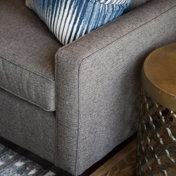
The sofa is a soft, neutral blue. The pattern on the round brass side table features echoes the darker blue-patterned rug, as well as the rug in the office, tying the rooms together.
Indigo blue books adjacent to bronze vases on the shelves repeat the color scheme. The soapstone-topped coffee table echoes the shape of the fireplace. A pair of tall, matching floor lamps with long wooden bases, brass pulls and simple linen shades combine both the colors and symmetry found throughout the home.
 RAJ Kitchen and Bath, LLC
 “Full apartment design”.
IF you have not yet seen this apartment conversion before, we strongly urge you to go to the bottom left of this page and click on the short 2-minutes video. It would put a lot of things into perspective when you come back and continue reading this.
It is true we were literally handed the keys and told a list of things that they wanted to have happen and we were to go into the apartment, look at the space and come up with a design that would satisfy all of that need. UNTIL we showed up! The unit had really seen some better days but we knew we had to look past that and come up with a concept that would work for them.
The immediate challenges were centered around 3 big ideas:
1. Adding a second bedroom to the already small footprint
2. Figuring out a way to make the kitchen bigger, better and brighter
3. Creating a master room walk in closet
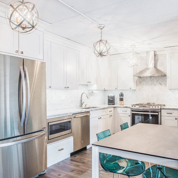
It’s always difficult to add new rooms into existing footprint without expanding out or up and not incurring any opportunity cost. In this case, that was exactly what we had to do. Item one and two above had to be tackled as one. We went ahead and switched out the location of the dining room and eliminating an area where there was a “nook” type eat-in area. By doing so, we were able to cut right into that footprint and change the layout of the kitchen.
That one move allowed us to dig into the kitchen design because it was now the main focal point in the apartment. It was no longer an option to keep it in that tiny hole where it was, so we had to ensure that this design was functional and aesthetically pleasing at the same time. By adding the table into the space where an Island typically would go, we were able to both cut cost and still provide a dining experience. The Table serves as an Island as well when cooking.
We then proceeded to block in the existing doorway to the dining room. By doing this, we were able to create a full room which allowed us to put a door on the other side and called that room Bedroom #2. This was easier to do because all of the mechanicals were already in that space (light, heater and windows). By shifting things around, we also achieved a huge wall to wall closet from inside. PERFECT!
Then we moved into the Single bedroom. We thought it was a big room with a small closet, so by creatively adding an L shaped wall and steal some footprint into the bedroom side, we were able to put a door on that new room and design it for the walk-in closet. Even after this, the bedroom still holds a queen size bed with 2 night stands, a TV on the wall, a sitting chair and plenty of room to walk around. This was done by rethinking the location for the bed and night stands.
The bathroom was gutted to make sure there was no leaks and rebuild from the ground up. We kept all of the plumbing where it was, added a new vanity, medicine cabinet, tiles and lighting and it was done.
From there, the rest of the unit had new flooring all throughout, paint, and lighting. After completion and walk through, this project was handed over back to the clients.
Execution and collaboration between all the trades were: Reggie and his team from Premier Interiors and Rohan from RD Mechanical Services.
p.s. Please see our website to see the video.
 RAJ Kitchen and Bath, LLC
 “Full apartment design”.
IF you have not yet seen this apartment conversion before, we strongly urge you to go to the bottom left of this page and click on the short 2-minutes video. It would put a lot of things into perspective when you come back and continue reading this.
It is true we were literally handed the keys and told a list of things that they wanted to have happen and we were to go into the apartment, look at the space and come up with a design that would satisfy all of that need. UNTIL we showed up! The unit had really seen some better days but we knew we had to look past that and come up with a concept that would work for them.
The immediate challenges were centered around 3 big ideas:
1. Adding a second bedroom to the already small footprint
2. Figuring out a way to make the kitchen bigger, better and brighter
3. Creating a master room walk in closet
It’s always difficult to add new rooms into existing footprint without expanding out or up and not incurring any opportunity cost. In this case, that was exactly what we had to do. Item one and two above had to be tackled as one. We went ahead and switched out the location of the dining room and eliminating an area where there was a “nook” type eat-in area. By doing so, we were able to cut right into that footprint and change the layout of the kitchen.
That one move allowed us to dig into the kitchen design because it was now the main focal point in the apartment. It was no longer an option to keep it in that tiny hole where it was, so we had to ensure that this design was functional and aesthetically pleasing at the same time. By adding the table into the space where an Island typically would go, we were able to both cut cost and still provide a dining experience. The Table serves as an Island as well when cooking.
We then proceeded to block in the existing doorway to the dining room. By doing this, we were able to create a full room which allowed us to put a door on the other side and called that room Bedroom #2. This was easier to do because all of the mechanicals were already in that space (light, heater and windows). By shifting things around, we also achieved a huge wall to wall closet from inside. PERFECT!
Then we moved into the Single bedroom. We thought it was a big room with a small closet, so by creatively adding an L shaped wall and steal some footprint into the bedroom side, we were able to put a door on that new room and design it for the walk-in closet. Even after this, the bedroom still holds a queen size bed with 2 night stands, a TV on the wall, a sitting chair and plenty of room to walk around. This was done by rethinking the location for the bed and night stands.
The bathroom was gutted to make sure there was no leaks and rebuild from the ground up. We kept all of the plumbing where it was, added a new vanity, medicine cabinet, tiles and lighting and it was done.
From there, the rest of the unit had new flooring all throughout, paint, and lighting. After completion and walk through, this project was handed over back to the clients.
Execution and collaboration between all the trades were: Reggie and his team from Premier Interiors and Rohan from RD Mechanical Services.
p.s. Please see our website to see the video.
 Motawi Tileworks
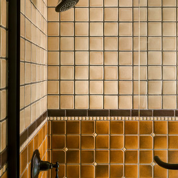
Shower tile installation by Motawi Tileworks featuring warm earth tones and Owl relief tile
Inspiration for a craftsman bathroom remodel in Detroit
Inspiration for a craftsman bathroom remodel in Detroit

 Simply Perfect
Advice on interior design is available everywhere—from TV shows and websites to books, magazines and apps.
We love seeing people become engaged in design and educated on the wide range of possibilities. But we hope you’ll proceed with caution.
It’s not that style errors are a matter of life and death. It’s just that it’s easy to choose designs that aren’t necessarily reflective of your own personality and character. And since you’re typically stuck with your interior design decisions for years, styles that don’t quite fit can tend to grate on you.
Interiors that give one person comfort may unleash chaos in someone else. This goes beyond favorite colors or hot trends, right to the heart of interior design, where you find questions of composition, balance, repetition, space and more.
The goal is to find that unique combination of design elements that gives you comfort, support and balance.
In one home, that perfect balance was struck through the use of symmetry. A pair of comfortable swivel chairs sit beneath matching indigo patterned paintings. Matching bookcases below the paintings contain similar, but not identical, arrangements of books, vases and bowls. Woods and bronzes help warm up the simple white bookcase shelving.
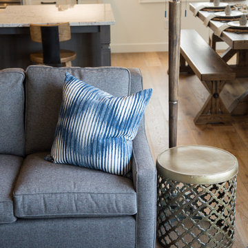
Two matching poufs in front of the fireplace provide additional seating. The sofa is accented with a pair of pillows with a blue pattern that echoes the artwork.
The effect of the symmetry is to achieve order and simplicity, which I promote at every opportunity. After all, your home interiors should be the setting or the backdrop of your life—not center stage.
Antique bronze and blue are complementary colors. Together, they offer a rich palette of richness and depth, which brings out the beauty of wood and stone.
In the home office, a unique, whitewash-stained wooden desk rests on metal, Sawhorse-inspired legs for a warm, rustic look. The black leather chair features a contemporary silhouette with an antique brass frame. An adjustable desk lamp has bronze accents.
The bookcase combines a sleek, black metal frame with concrete shelves, for another unusual pairing. It’s kept uncluttered for an orderly, peaceful look. Items on the shelves include a bronze-accented lamp and a pair
of high gloss-finished wooden bookends.
The elegant artwork behind the desk is a simple midnight-blue and bronze with mottled white. Deep blues are again picked up in the rug, which adds a stately vibe with a modern pattern and satisfying texture.
Within the framework of symmetry, the living room repeats the blue-and-bronze color scheme.
A large midcentury brass clock above the fireplace keeps the natural stone visible, rather than hidden behind a painting or television, while its straight lines and color create a beautiful contrast.
The sofa is a soft, neutral blue. The pattern on the round brass side table features echoes the darker blue-patterned rug, as well as the rug in the office, tying the rooms together.
Indigo blue books adjacent to bronze vases on the shelves repeat the color scheme. The soapstone-topped coffee table echoes the shape of the fireplace. A pair of tall, matching floor lamps with long wooden bases, brass pulls and simple linen shades combine both the colors and symmetry found throughout the home.
10