
Search results for "Satisfying opportunities" in Home Design Ideas
 Sarah Seung-McFarland
Photo: Sarah Seung-McFarland © 2017 Houzz
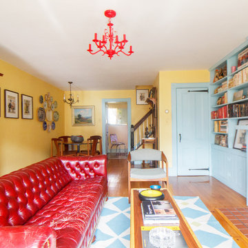
Inspiration for an eclectic living room remodel in New York
Inspiration for an eclectic living room remodel in New York
 Nicole Arnold Interiors
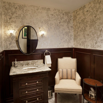
This home, located in a historic area of Dallas, was an opportunity to satisfy a client with very discerning taste. To suit his level of entertaining, he desired a sophisticated, old NY lounge style, powder room for guests. The bathroom was completely gutted except for the 48” tall wainscoting that remains an important element of the room’s ambiance. The stall shower in the room was removed and the commode relocated in its place, out of the direct line of vision. All fixtures are custom pieces, including a vanity with semi-precious stone counter. Exquisite custom Sherle Wagner fixtures were selected for the sink and faucet along with the vanity drawer pulls, towel ring, toilet paper holder and grab bar. A burled wood, antique-inspired accent table beautifully complements the custom upholstered chair. The outdoor area is decadent with lots of amenities. Travertine flooring, A/C and heated pool cabana boasts a custom onyx underlit table and folding glass doors, outdoor glass rock fireplace ensures the beautiful light stucco does not get dirty from wood burning. It’s the perfect spot for lounging! The lap pool is specially designed with a resistance pump for swimming in backyard with a limited pool space.
 Greg Perry Design
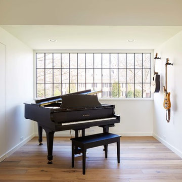
An extraordinary opportunity taken, applying a client driven design concept into a residence surpassing all expectations. Client collaboration and pursuant work combine to satisfy requirements of modernism, respect of streetscape, family privacy, and applications of art and function. Interior Furnishings by Client. Exclusive Photography and Videography by Michael Blevins of MB Productions.
Find the right local pro for your project
 Simply Perfect
Advice on interior design is available everywhere—from TV shows and websites to books, magazines and apps.
We love seeing people become engaged in design and educated on the wide range of possibilities. But we hope you’ll proceed with caution.
It’s not that style errors are a matter of life and death. It’s just that it’s easy to choose designs that aren’t necessarily reflective of your own personality and character. And since you’re typically stuck with your interior design decisions for years, styles that don’t quite fit can tend to grate on you.
Interiors that give one person comfort may unleash chaos in someone else. This goes beyond favorite colors or hot trends, right to the heart of interior design, where you find questions of composition, balance, repetition, space and more.
The goal is to find that unique combination of design elements that gives you comfort, support and balance.
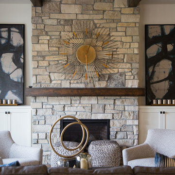
In one home, that perfect balance was struck through the use of symmetry. A pair of comfortable swivel chairs sit beneath matching indigo patterned paintings. Matching bookcases below the paintings contain similar, but not identical, arrangements of books, vases and bowls. Woods and bronzes help warm up the simple white bookcase shelving.
Two matching poufs in front of the fireplace provide additional seating. The sofa is accented with a pair of pillows with a blue pattern that echoes the artwork.
The effect of the symmetry is to achieve order and simplicity, which I promote at every opportunity. After all, your home interiors should be the setting or the backdrop of your life—not center stage.
Antique bronze and blue are complementary colors. Together, they offer a rich palette of richness and depth, which brings out the beauty of wood and stone.
In the home office, a unique, whitewash-stained wooden desk rests on metal, Sawhorse-inspired legs for a warm, rustic look. The black leather chair features a contemporary silhouette with an antique brass frame. An adjustable desk lamp has bronze accents.
The bookcase combines a sleek, black metal frame with concrete shelves, for another unusual pairing. It’s kept uncluttered for an orderly, peaceful look. Items on the shelves include a bronze-accented lamp and a pair
of high gloss-finished wooden bookends.
The elegant artwork behind the desk is a simple midnight-blue and bronze with mottled white. Deep blues are again picked up in the rug, which adds a stately vibe with a modern pattern and satisfying texture.
Within the framework of symmetry, the living room repeats the blue-and-bronze color scheme.
A large midcentury brass clock above the fireplace keeps the natural stone visible, rather than hidden behind a painting or television, while its straight lines and color create a beautiful contrast.
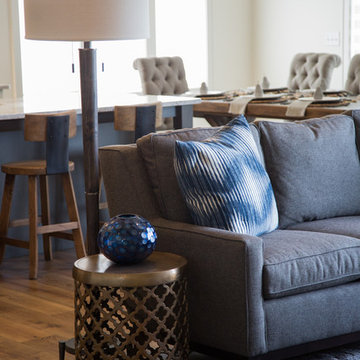
The sofa is a soft, neutral blue. The pattern on the round brass side table features echoes the darker blue-patterned rug, as well as the rug in the office, tying the rooms together.
Indigo blue books adjacent to bronze vases on the shelves repeat the color scheme. The soapstone-topped coffee table echoes the shape of the fireplace. A pair of tall, matching floor lamps with long wooden bases, brass pulls and simple linen shades combine both the colors and symmetry found throughout the home.
 Hillcrest Construction
These clients reached out to Hillcrest Construction when their family began out-growing their Phoenixville-area home. Through a comprehensive design phase, opportunities to add square footage were identified along with a reorganization of the typical traffic flow throughout the house.
All household traffic into the hastily-designed, existing family room bump-out addition was funneled through a 3’ berth within the kitchen making meal prep and other kitchen activities somewhat similar to a shift at a PA turnpike toll booth. In the existing bump-out addition, the family room was relatively tight and the dining room barely fit the 6-person dining table. Access to the backyard was somewhat obstructed by the necessary furniture and the kitchen alone didn’t satisfy storage needs beyond a quick trip to the grocery store. The home’s existing front door was the only front entrance, and without a foyer or mudroom, the front formal room often doubled as a drop-zone for groceries, bookbags, and other on-the-go items.
Hillcrest Construction designed a remedy to both address the function and flow issues along with adding square footage via a 150 sq ft addition to the family room and converting the garage into a mudroom entry and walk-through pantry.
-
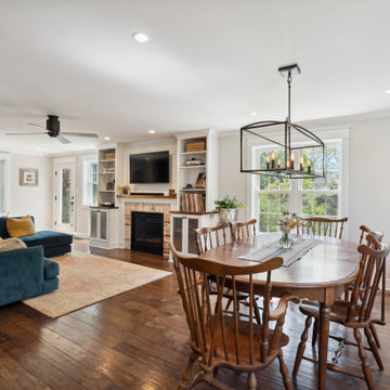
The project’s addition was not especially large but was able to facilitate a new pathway to the home’s rear family room. The existing brick wall at the bottom of the second-floor staircase was opened up and created a new, natural flow from the second-floor bedrooms to the front formal room, and into the rear family hang-out space- all without having to cut through the often busy kitchen. The dining room area was relocated to remove it from the pathway to the door to the backyard. Additionally, free and clear access to the rear yard was established for both two-legged and four-legged friends.
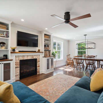
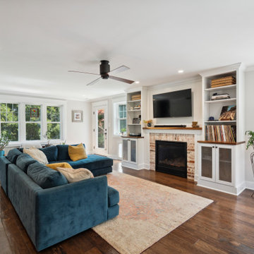
The existing chunky slider door was removed and in its place was fabricated and installed a custom centerpiece that included a new gas fireplace insert with custom brick surround, two side towers for display items and choice vinyl, and two base cabinets with metal-grated doors to house a subwoofer, wifi equipment, and other stow-away items. The black walnut countertops and mantle pop from the white cabinetry, and the wall-mounted TV with soundbar complete the central A/V hub. The custom cabs and tops were designed and built at Hillcrest’s custom shop.
The farmhouse appeal was completed with distressed engineered hardwood floors and craftsman-style window and door trim throughout.
-
Another major component of the project was the conversion of the garage into a pantry+mudroom+everyday entry.
The clients had used their smallish garage for storage of outdoor yard and recreational equipment. With those storage needs being addressed at the exterior, the space was transformed into a custom pantry and mudroom. The floor level within the space was raised to meet the rest of the house and insulated appropriately. A newly installed pocket door divided the dining room area from the designed-to-spec pantry/beverage center. The pantry was designed to house dry storage, cleaning supplies, and dry bar supplies when the cleaning and shopping are complete. A window seat with doggie supply storage below was worked into the design to accommodate the existing elevation of the original garage window.
A coat closet and a small set of steps divide the pantry from the mudroom entry. The mudroom entry is marked with a striking combo of the herringbone thin-brick flooring and a custom hutch. Kids returning home from school have a designated spot to hang their coats and bookbags with two deep drawers for shoes. A custom cherry bench top adds a punctuation of warmth. The entry door and window replaced the old overhead garage doors to create the daily-used informal entry off the driveway.
With the house being such a favorable area, and the clients not looking to pull up roots, Hillcrest Construction facilitated a collaborative experience and comprehensive plan to change the house for the better and make it a home to grow within.
 Greg Perry Design
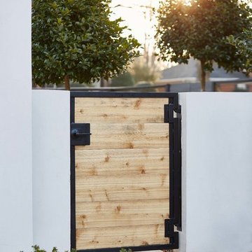
An extraordinary opportunity taken, applying a client driven design concept into a residence surpassing all expectations. Client collaboration and pursuant work combine to satisfy requirements of modernism, respect of streetscape, family privacy, and applications of art and function. Interior Furnishings by Client. Exclusive Photography and Videography by Michael Blevins of MB Productions.
 Simply Perfect
Advice on interior design is available everywhere—from TV shows and websites to books, magazines and apps.
We love seeing people become engaged in design and educated on the wide range of possibilities. But we hope you’ll proceed with caution.
It’s not that style errors are a matter of life and death. It’s just that it’s easy to choose designs that aren’t necessarily reflective of your own personality and character. And since you’re typically stuck with your interior design decisions for years, styles that don’t quite fit can tend to grate on you.
Interiors that give one person comfort may unleash chaos in someone else. This goes beyond favorite colors or hot trends, right to the heart of interior design, where you find questions of composition, balance, repetition, space and more.
The goal is to find that unique combination of design elements that gives you comfort, support and balance.
In one home, that perfect balance was struck through the use of symmetry. A pair of comfortable swivel chairs sit beneath matching indigo patterned paintings. Matching bookcases below the paintings contain similar, but not identical, arrangements of books, vases and bowls. Woods and bronzes help warm up the simple white bookcase shelving.
Two matching poufs in front of the fireplace provide additional seating. The sofa is accented with a pair of pillows with a blue pattern that echoes the artwork.
The effect of the symmetry is to achieve order and simplicity, which I promote at every opportunity. After all, your home interiors should be the setting or the backdrop of your life—not center stage.
Antique bronze and blue are complementary colors. Together, they offer a rich palette of richness and depth, which brings out the beauty of wood and stone.
In the home office, a unique, whitewash-stained wooden desk rests on metal, Sawhorse-inspired legs for a warm, rustic look. The black leather chair features a contemporary silhouette with an antique brass frame. An adjustable desk lamp has bronze accents.
The bookcase combines a sleek, black metal frame with concrete shelves, for another unusual pairing. It’s kept uncluttered for an orderly, peaceful look. Items on the shelves include a bronze-accented lamp and a pair
of high gloss-finished wooden bookends.
The elegant artwork behind the desk is a simple midnight-blue and bronze with mottled white. Deep blues are again picked up in the rug, which adds a stately vibe with a modern pattern and satisfying texture.
Within the framework of symmetry, the living room repeats the blue-and-bronze color scheme.
A large midcentury brass clock above the fireplace keeps the natural stone visible, rather than hidden behind a painting or television, while its straight lines and color create a beautiful contrast.
The sofa is a soft, neutral blue. The pattern on the round brass side table features echoes the darker blue-patterned rug, as well as the rug in the office, tying the rooms together.
Indigo blue books adjacent to bronze vases on the shelves repeat the color scheme. The soapstone-topped coffee table echoes the shape of the fireplace. A pair of tall, matching floor lamps with long wooden bases, brass pulls and simple linen shades combine both the colors and symmetry found throughout the home.
 RAJ Kitchen and Bath, LLC
 “Full apartment design”.
IF you have not yet seen this apartment conversion before, we strongly urge you to go to the bottom left of this page and click on the short 2-minutes video. It would put a lot of things into perspective when you come back and continue reading this.
It is true we were literally handed the keys and told a list of things that they wanted to have happen and we were to go into the apartment, look at the space and come up with a design that would satisfy all of that need. UNTIL we showed up! The unit had really seen some better days but we knew we had to look past that and come up with a concept that would work for them.
The immediate challenges were centered around 3 big ideas:
1. Adding a second bedroom to the already small footprint
2. Figuring out a way to make the kitchen bigger, better and brighter
3. Creating a master room walk in closet
It’s always difficult to add new rooms into existing footprint without expanding out or up and not incurring any opportunity cost. In this case, that was exactly what we had to do. Item one and two above had to be tackled as one. We went ahead and switched out the location of the dining room and eliminating an area where there was a “nook” type eat-in area. By doing so, we were able to cut right into that footprint and change the layout of the kitchen.
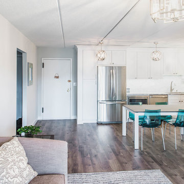
That one move allowed us to dig into the kitchen design because it was now the main focal point in the apartment. It was no longer an option to keep it in that tiny hole where it was, so we had to ensure that this design was functional and aesthetically pleasing at the same time. By adding the table into the space where an Island typically would go, we were able to both cut cost and still provide a dining experience. The Table serves as an Island as well when cooking.
We then proceeded to block in the existing doorway to the dining room. By doing this, we were able to create a full room which allowed us to put a door on the other side and called that room Bedroom #2. This was easier to do because all of the mechanicals were already in that space (light, heater and windows). By shifting things around, we also achieved a huge wall to wall closet from inside. PERFECT!
Then we moved into the Single bedroom. We thought it was a big room with a small closet, so by creatively adding an L shaped wall and steal some footprint into the bedroom side, we were able to put a door on that new room and design it for the walk-in closet. Even after this, the bedroom still holds a queen size bed with 2 night stands, a TV on the wall, a sitting chair and plenty of room to walk around. This was done by rethinking the location for the bed and night stands.
The bathroom was gutted to make sure there was no leaks and rebuild from the ground up. We kept all of the plumbing where it was, added a new vanity, medicine cabinet, tiles and lighting and it was done.
From there, the rest of the unit had new flooring all throughout, paint, and lighting. After completion and walk through, this project was handed over back to the clients.
Execution and collaboration between all the trades were: Reggie and his team from Premier Interiors and Rohan from RD Mechanical Services.
p.s. Please see our website to see the video.
 Simply Perfect
Advice on interior design is available everywhere—from TV shows and websites to books, magazines and apps.
We love seeing people become engaged in design and educated on the wide range of possibilities. But we hope you’ll proceed with caution.
It’s not that style errors are a matter of life and death. It’s just that it’s easy to choose designs that aren’t necessarily reflective of your own personality and character. And since you’re typically stuck with your interior design decisions for years, styles that don’t quite fit can tend to grate on you.
Interiors that give one person comfort may unleash chaos in someone else. This goes beyond favorite colors or hot trends, right to the heart of interior design, where you find questions of composition, balance, repetition, space and more.
The goal is to find that unique combination of design elements that gives you comfort, support and balance.
In one home, that perfect balance was struck through the use of symmetry. A pair of comfortable swivel chairs sit beneath matching indigo patterned paintings. Matching bookcases below the paintings contain similar, but not identical, arrangements of books, vases and bowls. Woods and bronzes help warm up the simple white bookcase shelving.
Two matching poufs in front of the fireplace provide additional seating. The sofa is accented with a pair of pillows with a blue pattern that echoes the artwork.
The effect of the symmetry is to achieve order and simplicity, which I promote at every opportunity. After all, your home interiors should be the setting or the backdrop of your life—not center stage.
Antique bronze and blue are complementary colors. Together, they offer a rich palette of richness and depth, which brings out the beauty of wood and stone.
In the home office, a unique, whitewash-stained wooden desk rests on metal, Sawhorse-inspired legs for a warm, rustic look. The black leather chair features a contemporary silhouette with an antique brass frame. An adjustable desk lamp has bronze accents.
The bookcase combines a sleek, black metal frame with concrete shelves, for another unusual pairing. It’s kept uncluttered for an orderly, peaceful look. Items on the shelves include a bronze-accented lamp and a pair
of high gloss-finished wooden bookends.
The elegant artwork behind the desk is a simple midnight-blue and bronze with mottled white. Deep blues are again picked up in the rug, which adds a stately vibe with a modern pattern and satisfying texture.
Within the framework of symmetry, the living room repeats the blue-and-bronze color scheme.
A large midcentury brass clock above the fireplace keeps the natural stone visible, rather than hidden behind a painting or television, while its straight lines and color create a beautiful contrast.
The sofa is a soft, neutral blue. The pattern on the round brass side table features echoes the darker blue-patterned rug, as well as the rug in the office, tying the rooms together.
Indigo blue books adjacent to bronze vases on the shelves repeat the color scheme. The soapstone-topped coffee table echoes the shape of the fireplace. A pair of tall, matching floor lamps with long wooden bases, brass pulls and simple linen shades combine both the colors and symmetry found throughout the home.
 Hillcrest Construction
These clients reached out to Hillcrest Construction when their family began out-growing their Phoenixville-area home. Through a comprehensive design phase, opportunities to add square footage were identified along with a reorganization of the typical traffic flow throughout the house.
All household traffic into the hastily-designed, existing family room bump-out addition was funneled through a 3’ berth within the kitchen making meal prep and other kitchen activities somewhat similar to a shift at a PA turnpike toll booth. In the existing bump-out addition, the family room was relatively tight and the dining room barely fit the 6-person dining table. Access to the backyard was somewhat obstructed by the necessary furniture and the kitchen alone didn’t satisfy storage needs beyond a quick trip to the grocery store. The home’s existing front door was the only front entrance, and without a foyer or mudroom, the front formal room often doubled as a drop-zone for groceries, bookbags, and other on-the-go items.
Hillcrest Construction designed a remedy to both address the function and flow issues along with adding square footage via a 150 sq ft addition to the family room and converting the garage into a mudroom entry and walk-through pantry.
-
The project’s addition was not especially large but was able to facilitate a new pathway to the home’s rear family room. The existing brick wall at the bottom of the second-floor staircase was opened up and created a new, natural flow from the second-floor bedrooms to the front formal room, and into the rear family hang-out space- all without having to cut through the often busy kitchen. The dining room area was relocated to remove it from the pathway to the door to the backyard. Additionally, free and clear access to the rear yard was established for both two-legged and four-legged friends.
The existing chunky slider door was removed and in its place was fabricated and installed a custom centerpiece that included a new gas fireplace insert with custom brick surround, two side towers for display items and choice vinyl, and two base cabinets with metal-grated doors to house a subwoofer, wifi equipment, and other stow-away items. The black walnut countertops and mantle pop from the white cabinetry, and the wall-mounted TV with soundbar complete the central A/V hub. The custom cabs and tops were designed and built at Hillcrest’s custom shop.
The farmhouse appeal was completed with distressed engineered hardwood floors and craftsman-style window and door trim throughout.
-
Another major component of the project was the conversion of the garage into a pantry+mudroom+everyday entry.
The clients had used their smallish garage for storage of outdoor yard and recreational equipment. With those storage needs being addressed at the exterior, the space was transformed into a custom pantry and mudroom. The floor level within the space was raised to meet the rest of the house and insulated appropriately. A newly installed pocket door divided the dining room area from the designed-to-spec pantry/beverage center. The pantry was designed to house dry storage, cleaning supplies, and dry bar supplies when the cleaning and shopping are complete. A window seat with doggie supply storage below was worked into the design to accommodate the existing elevation of the original garage window.
A coat closet and a small set of steps divide the pantry from the mudroom entry. The mudroom entry is marked with a striking combo of the herringbone thin-brick flooring and a custom hutch. Kids returning home from school have a designated spot to hang their coats and bookbags with two deep drawers for shoes. A custom cherry bench top adds a punctuation of warmth. The entry door and window replaced the old overhead garage doors to create the daily-used informal entry off the driveway.
With the house being such a favorable area, and the clients not looking to pull up roots, Hillcrest Construction facilitated a collaborative experience and comprehensive plan to change the house for the better and make it a home to grow within.
 Bellingham Bay Builders
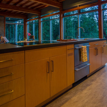
We feel fortunate to have had the opportunity to work on this clean NW Contemporary home. Due to its remote location, our goal was to pre-fabricate as much as possible and shorten the installation time on site. We were able to cut and pre-fit all the glue-laminated timber frame structural elements, the Douglas Fir tongue and groove ceilings, and even the open riser Maple stair.
The pictures mostly speak for themselves; but it is worth noting, we were very pleased with the final result. Despite its simple modern aesthetic with exposed concrete walls and miles of glass on the view side, the wood ceilings and the warm lighting give a cozy, comfy feel to the spaces.
The owners were very involved with the design and build, including swinging hammers with us, so it was a real labor of love. The owners, and ourselves, walked away from the project with a great pride and deep feeling of satisfied accomplishment.
Design by Level Design
Photography by C9 Photography
 Hillcrest Construction
These clients reached out to Hillcrest Construction when their family began out-growing their Phoenixville-area home. Through a comprehensive design phase, opportunities to add square footage were identified along with a reorganization of the typical traffic flow throughout the house.
All household traffic into the hastily-designed, existing family room bump-out addition was funneled through a 3’ berth within the kitchen making meal prep and other kitchen activities somewhat similar to a shift at a PA turnpike toll booth. In the existing bump-out addition, the family room was relatively tight and the dining room barely fit the 6-person dining table. Access to the backyard was somewhat obstructed by the necessary furniture and the kitchen alone didn’t satisfy storage needs beyond a quick trip to the grocery store. The home’s existing front door was the only front entrance, and without a foyer or mudroom, the front formal room often doubled as a drop-zone for groceries, bookbags, and other on-the-go items.
Hillcrest Construction designed a remedy to both address the function and flow issues along with adding square footage via a 150 sq ft addition to the family room and converting the garage into a mudroom entry and walk-through pantry.
-
The project’s addition was not especially large but was able to facilitate a new pathway to the home’s rear family room. The existing brick wall at the bottom of the second-floor staircase was opened up and created a new, natural flow from the second-floor bedrooms to the front formal room, and into the rear family hang-out space- all without having to cut through the often busy kitchen. The dining room area was relocated to remove it from the pathway to the door to the backyard. Additionally, free and clear access to the rear yard was established for both two-legged and four-legged friends.
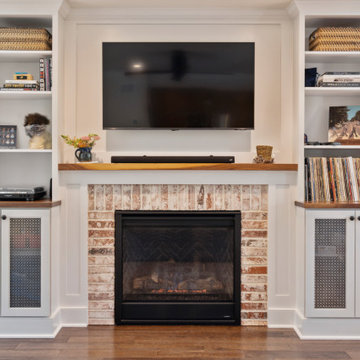
The existing chunky slider door was removed and in its place was fabricated and installed a custom centerpiece that included a new gas fireplace insert with custom brick surround, two side towers for display items and choice vinyl, and two base cabinets with metal-grated doors to house a subwoofer, wifi equipment, and other stow-away items. The black walnut countertops and mantle pop from the white cabinetry, and the wall-mounted TV with soundbar complete the central A/V hub. The custom cabs and tops were designed and built at Hillcrest’s custom shop.
The farmhouse appeal was completed with distressed engineered hardwood floors and craftsman-style window and door trim throughout.
-
Another major component of the project was the conversion of the garage into a pantry+mudroom+everyday entry.
The clients had used their smallish garage for storage of outdoor yard and recreational equipment. With those storage needs being addressed at the exterior, the space was transformed into a custom pantry and mudroom. The floor level within the space was raised to meet the rest of the house and insulated appropriately. A newly installed pocket door divided the dining room area from the designed-to-spec pantry/beverage center. The pantry was designed to house dry storage, cleaning supplies, and dry bar supplies when the cleaning and shopping are complete. A window seat with doggie supply storage below was worked into the design to accommodate the existing elevation of the original garage window.
A coat closet and a small set of steps divide the pantry from the mudroom entry. The mudroom entry is marked with a striking combo of the herringbone thin-brick flooring and a custom hutch. Kids returning home from school have a designated spot to hang their coats and bookbags with two deep drawers for shoes. A custom cherry bench top adds a punctuation of warmth. The entry door and window replaced the old overhead garage doors to create the daily-used informal entry off the driveway.
With the house being such a favorable area, and the clients not looking to pull up roots, Hillcrest Construction facilitated a collaborative experience and comprehensive plan to change the house for the better and make it a home to grow within.
 Hillcrest Construction
These clients reached out to Hillcrest Construction when their family began out-growing their Phoenixville-area home. Through a comprehensive design phase, opportunities to add square footage were identified along with a reorganization of the typical traffic flow throughout the house.
All household traffic into the hastily-designed, existing family room bump-out addition was funneled through a 3’ berth within the kitchen making meal prep and other kitchen activities somewhat similar to a shift at a PA turnpike toll booth. In the existing bump-out addition, the family room was relatively tight and the dining room barely fit the 6-person dining table. Access to the backyard was somewhat obstructed by the necessary furniture and the kitchen alone didn’t satisfy storage needs beyond a quick trip to the grocery store. The home’s existing front door was the only front entrance, and without a foyer or mudroom, the front formal room often doubled as a drop-zone for groceries, bookbags, and other on-the-go items.
Hillcrest Construction designed a remedy to both address the function and flow issues along with adding square footage via a 150 sq ft addition to the family room and converting the garage into a mudroom entry and walk-through pantry.
-
The project’s addition was not especially large but was able to facilitate a new pathway to the home’s rear family room. The existing brick wall at the bottom of the second-floor staircase was opened up and created a new, natural flow from the second-floor bedrooms to the front formal room, and into the rear family hang-out space- all without having to cut through the often busy kitchen. The dining room area was relocated to remove it from the pathway to the door to the backyard. Additionally, free and clear access to the rear yard was established for both two-legged and four-legged friends.
The existing chunky slider door was removed and in its place was fabricated and installed a custom centerpiece that included a new gas fireplace insert with custom brick surround, two side towers for display items and choice vinyl, and two base cabinets with metal-grated doors to house a subwoofer, wifi equipment, and other stow-away items. The black walnut countertops and mantle pop from the white cabinetry, and the wall-mounted TV with soundbar complete the central A/V hub. The custom cabs and tops were designed and built at Hillcrest’s custom shop.
The farmhouse appeal was completed with distressed engineered hardwood floors and craftsman-style window and door trim throughout.
-
Another major component of the project was the conversion of the garage into a pantry+mudroom+everyday entry.
The clients had used their smallish garage for storage of outdoor yard and recreational equipment. With those storage needs being addressed at the exterior, the space was transformed into a custom pantry and mudroom. The floor level within the space was raised to meet the rest of the house and insulated appropriately. A newly installed pocket door divided the dining room area from the designed-to-spec pantry/beverage center. The pantry was designed to house dry storage, cleaning supplies, and dry bar supplies when the cleaning and shopping are complete. A window seat with doggie supply storage below was worked into the design to accommodate the existing elevation of the original garage window.
A coat closet and a small set of steps divide the pantry from the mudroom entry. The mudroom entry is marked with a striking combo of the herringbone thin-brick flooring and a custom hutch. Kids returning home from school have a designated spot to hang their coats and bookbags with two deep drawers for shoes. A custom cherry bench top adds a punctuation of warmth. The entry door and window replaced the old overhead garage doors to create the daily-used informal entry off the driveway.
With the house being such a favorable area, and the clients not looking to pull up roots, Hillcrest Construction facilitated a collaborative experience and comprehensive plan to change the house for the better and make it a home to grow within.
 Simply Perfect
Advice on interior design is available everywhere—from TV shows and websites to books, magazines and apps.
We love seeing people become engaged in design and educated on the wide range of possibilities. But we hope you’ll proceed with caution.
It’s not that style errors are a matter of life and death. It’s just that it’s easy to choose designs that aren’t necessarily reflective of your own personality and character. And since you’re typically stuck with your interior design decisions for years, styles that don’t quite fit can tend to grate on you.
Interiors that give one person comfort may unleash chaos in someone else. This goes beyond favorite colors or hot trends, right to the heart of interior design, where you find questions of composition, balance, repetition, space and more.
The goal is to find that unique combination of design elements that gives you comfort, support and balance.
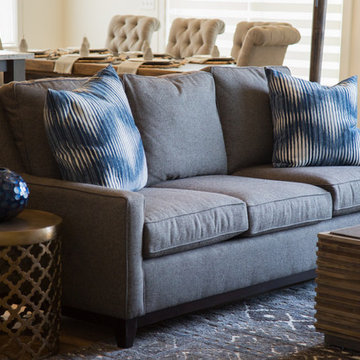
In one home, that perfect balance was struck through the use of symmetry. A pair of comfortable swivel chairs sit beneath matching indigo patterned paintings. Matching bookcases below the paintings contain similar, but not identical, arrangements of books, vases and bowls. Woods and bronzes help warm up the simple white bookcase shelving.
Two matching poufs in front of the fireplace provide additional seating. The sofa is accented with a pair of pillows with a blue pattern that echoes the artwork.
The effect of the symmetry is to achieve order and simplicity, which I promote at every opportunity. After all, your home interiors should be the setting or the backdrop of your life—not center stage.
Antique bronze and blue are complementary colors. Together, they offer a rich palette of richness and depth, which brings out the beauty of wood and stone.
In the home office, a unique, whitewash-stained wooden desk rests on metal, Sawhorse-inspired legs for a warm, rustic look. The black leather chair features a contemporary silhouette with an antique brass frame. An adjustable desk lamp has bronze accents.
The bookcase combines a sleek, black metal frame with concrete shelves, for another unusual pairing. It’s kept uncluttered for an orderly, peaceful look. Items on the shelves include a bronze-accented lamp and a pair
of high gloss-finished wooden bookends.
The elegant artwork behind the desk is a simple midnight-blue and bronze with mottled white. Deep blues are again picked up in the rug, which adds a stately vibe with a modern pattern and satisfying texture.
Within the framework of symmetry, the living room repeats the blue-and-bronze color scheme.
A large midcentury brass clock above the fireplace keeps the natural stone visible, rather than hidden behind a painting or television, while its straight lines and color create a beautiful contrast.
The sofa is a soft, neutral blue. The pattern on the round brass side table features echoes the darker blue-patterned rug, as well as the rug in the office, tying the rooms together.
Indigo blue books adjacent to bronze vases on the shelves repeat the color scheme. The soapstone-topped coffee table echoes the shape of the fireplace. A pair of tall, matching floor lamps with long wooden bases, brass pulls and simple linen shades combine both the colors and symmetry found throughout the home.
 RAJ Kitchen and Bath, LLC
 “Full apartment design”.
IF you have not yet seen this apartment conversion before, we strongly urge you to go to the bottom left of this page and click on the short 2-minutes video. It would put a lot of things into perspective when you come back and continue reading this.
It is true we were literally handed the keys and told a list of things that they wanted to have happen and we were to go into the apartment, look at the space and come up with a design that would satisfy all of that need. UNTIL we showed up! The unit had really seen some better days but we knew we had to look past that and come up with a concept that would work for them.
The immediate challenges were centered around 3 big ideas:
1. Adding a second bedroom to the already small footprint
2. Figuring out a way to make the kitchen bigger, better and brighter
3. Creating a master room walk in closet
It’s always difficult to add new rooms into existing footprint without expanding out or up and not incurring any opportunity cost. In this case, that was exactly what we had to do. Item one and two above had to be tackled as one. We went ahead and switched out the location of the dining room and eliminating an area where there was a “nook” type eat-in area. By doing so, we were able to cut right into that footprint and change the layout of the kitchen.
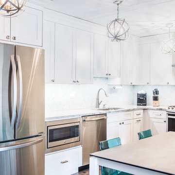
That one move allowed us to dig into the kitchen design because it was now the main focal point in the apartment. It was no longer an option to keep it in that tiny hole where it was, so we had to ensure that this design was functional and aesthetically pleasing at the same time. By adding the table into the space where an Island typically would go, we were able to both cut cost and still provide a dining experience. The Table serves as an Island as well when cooking.
We then proceeded to block in the existing doorway to the dining room. By doing this, we were able to create a full room which allowed us to put a door on the other side and called that room Bedroom #2. This was easier to do because all of the mechanicals were already in that space (light, heater and windows). By shifting things around, we also achieved a huge wall to wall closet from inside. PERFECT!
Then we moved into the Single bedroom. We thought it was a big room with a small closet, so by creatively adding an L shaped wall and steal some footprint into the bedroom side, we were able to put a door on that new room and design it for the walk-in closet. Even after this, the bedroom still holds a queen size bed with 2 night stands, a TV on the wall, a sitting chair and plenty of room to walk around. This was done by rethinking the location for the bed and night stands.
The bathroom was gutted to make sure there was no leaks and rebuild from the ground up. We kept all of the plumbing where it was, added a new vanity, medicine cabinet, tiles and lighting and it was done.
From there, the rest of the unit had new flooring all throughout, paint, and lighting. After completion and walk through, this project was handed over back to the clients.
Execution and collaboration between all the trades were: Reggie and his team from Premier Interiors and Rohan from RD Mechanical Services.
p.s. Please see our website to see the video.
 Teakwoodcentral
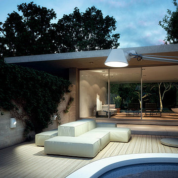
Light fixture with direct emission, with fluorescent sources
• Available with base or fixed support (pivot) made up of mass-coloured concrete
• Diffuser in mass-pigmented polypropylene, screen in light-diffusing silkscreened methacrylate, reflector in painted aluminum
• Mobile-arm structure in extruded EN-AW-6060 aluminum with bright anodizing treat¬ment
• Polished-painted articulations in die-cast EN-AB 46100 aluminum
• Adjustment system in AISI 316 stainless steel
• Silicone seal gaskets
• Suitable for watertight connection
• Electronic ballast
• c.UL.us listed
Lead time: 2 - 4 weeks
Lamping explanation:
INC = incandescent FLU = fluorescent HAL = 120V halogen LV HAL = 12V halogen
MH = metal halide SBF = self-ballasted fluorescent LED = light emitting diode
All lamps are included with the fixtures
Artemide's design and research team focuses on developing quality and long-lasting products.
Utilization of recyclable materials is high priority in our process of conceiving new design.
80% of our lights are energy efficient fluorescent or LED lighting.
But what's more green than having a beautifully crafted light that continues to function well and looks stunning decades from now
The Artemide light has never been solely a function of seeing, or an opportunity for formal experimentation with lamps as objects. For more than forty years, Artemide has aimed to propose light as a companion to people, as a source of physical pleasure and mental comfort. Artemide has done so, with different work groups, searching through the whole design process, starting with a declaration of values - The human light.
Beyond the definition, the human light is intelligent light. A light that knows it has to relate to people, accompanying them in their daily activities. That is why Artemide's attention today is concentrated on the concept of the context of life, understood as a specific microenvironment in which an event occurs where one or more persons are the protagonist, every context of life can be associated with different light contexts, or the different atmospheres of light characterized by the activities that, at various moments of the day, have us as protagonists, starting from these contexts and the lighting conditions that characterize them, Artemide proposes products capable of meeting people's multiple needs and offering the light performance characteristics most suited to each moment of life, it is light that is flexible and adaptable, which produces the optimum visual precision, and consumes the minimum environmental resources, it is Artemide light.
The Artemide group, founded by Ernesto Gismondi in 1959, today operates throughout the world, with 16 subsidiaries and affiliated companies, and 35 exclusive distributors. They have production centers in Italy, France, Germany, the USA, Hungary and the Czech Republic. In a policy aimed at satisfying all lighting needs, the Artemide group has recently acquired companies that reinforce its position as a world leader and further diversifies the offerings. For contexts of life, Artemide offers not only lamps for moments of relaxation at home, but also large sophisticated installations for lighting public and private professional activities.
Technological and productive expertise is achieved through research and development centers, with the product planning and engineering section, laboratories for technical conformity and self-certification tests, and production units equipped with avant-garde processes. A production structure that can offer expertise in the processing of traditional materials such as glass, as well as the capacity for innovation with recently introduced materials such as titanium. Lighting performance characteristics extend from a light with atmosphere, variable, colored, to the most precise of lights for community environments. The vast range of options reflects the commitment of the whole organization to provide a product guaranteed by the Artemide brand, throughout the world, with an image that is strong and consistent - That of a leader in the lighting industry.
Rezek, an Artemide brand, with product development and manufacturing in the United States. Founded by designer Ron Rezek in 1978, the Rezek company has gained strong recognition and appreciation among the architectural and interior design community for the distinctly creative design and quality construction of its American made lighting products for residential and commercial applications.
 Simply Perfect
Advice on interior design is available everywhere—from TV shows and websites to books, magazines and apps.
We love seeing people become engaged in design and educated on the wide range of possibilities. But we hope you’ll proceed with caution.
It’s not that style errors are a matter of life and death. It’s just that it’s easy to choose designs that aren’t necessarily reflective of your own personality and character. And since you’re typically stuck with your interior design decisions for years, styles that don’t quite fit can tend to grate on you.
Interiors that give one person comfort may unleash chaos in someone else. This goes beyond favorite colors or hot trends, right to the heart of interior design, where you find questions of composition, balance, repetition, space and more.
The goal is to find that unique combination of design elements that gives you comfort, support and balance.
In one home, that perfect balance was struck through the use of symmetry. A pair of comfortable swivel chairs sit beneath matching indigo patterned paintings. Matching bookcases below the paintings contain similar, but not identical, arrangements of books, vases and bowls. Woods and bronzes help warm up the simple white bookcase shelving.
Two matching poufs in front of the fireplace provide additional seating. The sofa is accented with a pair of pillows with a blue pattern that echoes the artwork.
The effect of the symmetry is to achieve order and simplicity, which I promote at every opportunity. After all, your home interiors should be the setting or the backdrop of your life—not center stage.
Antique bronze and blue are complementary colors. Together, they offer a rich palette of richness and depth, which brings out the beauty of wood and stone.
In the home office, a unique, whitewash-stained wooden desk rests on metal, Sawhorse-inspired legs for a warm, rustic look. The black leather chair features a contemporary silhouette with an antique brass frame. An adjustable desk lamp has bronze accents.
The bookcase combines a sleek, black metal frame with concrete shelves, for another unusual pairing. It’s kept uncluttered for an orderly, peaceful look. Items on the shelves include a bronze-accented lamp and a pair
of high gloss-finished wooden bookends.
The elegant artwork behind the desk is a simple midnight-blue and bronze with mottled white. Deep blues are again picked up in the rug, which adds a stately vibe with a modern pattern and satisfying texture.
Within the framework of symmetry, the living room repeats the blue-and-bronze color scheme.
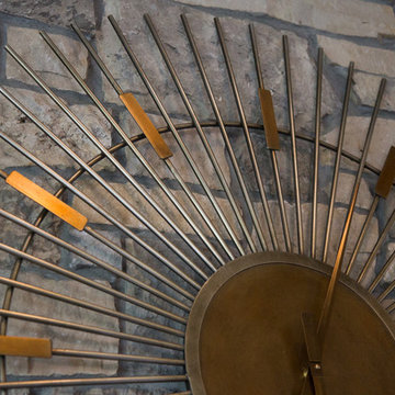
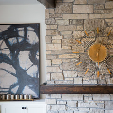
A large midcentury brass clock above the fireplace keeps the natural stone visible, rather than hidden behind a painting or television, while its straight lines and color create a beautiful contrast.
The sofa is a soft, neutral blue. The pattern on the round brass side table features echoes the darker blue-patterned rug, as well as the rug in the office, tying the rooms together.
Indigo blue books adjacent to bronze vases on the shelves repeat the color scheme. The soapstone-topped coffee table echoes the shape of the fireplace. A pair of tall, matching floor lamps with long wooden bases, brass pulls and simple linen shades combine both the colors and symmetry found throughout the home.
 LandStudio360
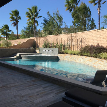
Despite the challenge of a limited lot size, property setbacks, and strict lot coverage requirements, LandStudio360 designed a space for this new Baker Ranch home that complied with the HOA Design Guidelines yet pushed the design to the limits which satisfied the homeowners' desires. The custom shaped contemporary pool and spa fit set the tone of the yard as the primary view feature from inside the home. The expansive sideyard provided opportunity to expand the living space to the outdoors with the addition of a covered great room warm enough to spend winter evenings snuggled up by the fire or hosting large family gatherings. This yard has become the hangout spot for all friends and family.
 Simply Perfect
Advice on interior design is available everywhere—from TV shows and websites to books, magazines and apps.
We love seeing people become engaged in design and educated on the wide range of possibilities. But we hope you’ll proceed with caution.
It’s not that style errors are a matter of life and death. It’s just that it’s easy to choose designs that aren’t necessarily reflective of your own personality and character. And since you’re typically stuck with your interior design decisions for years, styles that don’t quite fit can tend to grate on you.
Interiors that give one person comfort may unleash chaos in someone else. This goes beyond favorite colors or hot trends, right to the heart of interior design, where you find questions of composition, balance, repetition, space and more.
The goal is to find that unique combination of design elements that gives you comfort, support and balance.
In one home, that perfect balance was struck through the use of symmetry. A pair of comfortable swivel chairs sit beneath matching indigo patterned paintings. Matching bookcases below the paintings contain similar, but not identical, arrangements of books, vases and bowls. Woods and bronzes help warm up the simple white bookcase shelving.
Two matching poufs in front of the fireplace provide additional seating. The sofa is accented with a pair of pillows with a blue pattern that echoes the artwork.
The effect of the symmetry is to achieve order and simplicity, which I promote at every opportunity. After all, your home interiors should be the setting or the backdrop of your life—not center stage.
Antique bronze and blue are complementary colors. Together, they offer a rich palette of richness and depth, which brings out the beauty of wood and stone.
In the home office, a unique, whitewash-stained wooden desk rests on metal, Sawhorse-inspired legs for a warm, rustic look. The black leather chair features a contemporary silhouette with an antique brass frame. An adjustable desk lamp has bronze accents.
The bookcase combines a sleek, black metal frame with concrete shelves, for another unusual pairing. It’s kept uncluttered for an orderly, peaceful look. Items on the shelves include a bronze-accented lamp and a pair
of high gloss-finished wooden bookends.
The elegant artwork behind the desk is a simple midnight-blue and bronze with mottled white. Deep blues are again picked up in the rug, which adds a stately vibe with a modern pattern and satisfying texture.
Within the framework of symmetry, the living room repeats the blue-and-bronze color scheme.
A large midcentury brass clock above the fireplace keeps the natural stone visible, rather than hidden behind a painting or television, while its straight lines and color create a beautiful contrast.
The sofa is a soft, neutral blue. The pattern on the round brass side table features echoes the darker blue-patterned rug, as well as the rug in the office, tying the rooms together.
Indigo blue books adjacent to bronze vases on the shelves repeat the color scheme. The soapstone-topped coffee table echoes the shape of the fireplace. A pair of tall, matching floor lamps with long wooden bases, brass pulls and simple linen shades combine both the colors and symmetry found throughout the home.
 Kim Teron Design Studio
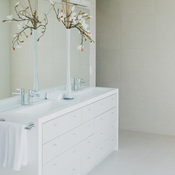
This project was an extravagant space planning opportunity: A merger of three suites on the 12th floor of one of Ottawa’s newest skyline additions - Cathedral Hill. There is nothing more satisfying than being able to design a custom luxury home from the ground up, and with the ample square footage we had to play with, this project was an absolute dream.
We took full of advantage of the endless protected vistas of the Ottawa River and Gatineau Hills beyond by using minimalist design to let the views sing. For a luxurious, yet understated touch, we sourced superior materials like Corian, white oak engineered hardwood and Italian-imported porcelain.
In keeping with worry-free condo living, we included features like integrated drape pockets, and utilities like laundry and pantry situated near the kitchen for easy, hidden accessibility. In the 2,400 + square foot space, we created 2 bedrooms; completely autonomous from each other and divided by common living space that is open, airy, yet easy to delineate into entertaining and lounge-ready spaces. Scroll down to see the final product!
8