
Search results for "Saturation levels" in Home Design Ideas
 Berghuis Construction LLC
Photos by Kaity
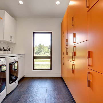
Inspiration for a mid-sized contemporary galley slate floor dedicated laundry room remodel in Grand Rapids with flat-panel cabinets, quartz countertops, a side-by-side washer/dryer and white walls
Inspiration for a mid-sized contemporary galley slate floor dedicated laundry room remodel in Grand Rapids with flat-panel cabinets, quartz countertops, a side-by-side washer/dryer and white walls
 SabaRehman Abdulrehman
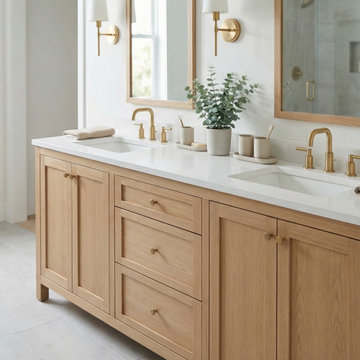
Morning routines shouldn’t involve a traffic jam at the sink. The 2025 Houzz Bathroom Trends Study found that 65 percent of U.S. renovators now choose a double-sink vanity to skip the wait. Designers agree: Titan Builders dubbed 2025 “the year of bigger, storage-packed double vanities,” forecasting dual-basin setups in family, guest, and even powder baths. As KBIS 2025 launches land, prototypes for 2026 layer in spa-grade wood, built-in outlets, and planet-friendly finishes. In this guide, we rank six standout models and show you how to size, install, and enjoy a clutter-free, two-sink future.
Methodology and selection criteria
A well-planned double-sink vanity keeps busy morning routines calm and clutter-free.
Before we crowned any winners, we mapped the entire 2024–2026 double-sink (dual-basin) market. That meant parsing KBIS exhibitor releases, scraping bestseller lists from Home Depot, Lowe’s, and Wayfair, and reviewing designer short lists in trade magazines. The sweep produced 110 candidate vanities, giving us visibility into every style, price tier, and material in play.
We then scored each model against six weighted factors that continue to matter long after installers leave:
- Build quality – 25 percent.Solid hardwood frames, dovetail drawers, and furniture-grade plywood backs, never particleboard in disguise.
- Design versatility – 20 percent.Lines and finishes that suit modern, classic, or farmhouse baths without dating quickly.
- Sustainability – 15 percent.FSC-certified wood, CARB 2 compliance, and low-VOC finishes for healthier air.
- Storage efficiency – 15 percent.Deep drawers, tilt-outs, or power cubbies that corral countertop clutter.
- Value for money – 15 percent.Fair street price for the materials, stone tops, sinks, and soft-close hardware included.
- Brand reputation and warranty – 10 percent.Manufacturers with responsive support and at least a one-year parts guarantee.
- Footprint: 72 W × 22 D × 36 H in. (183 × 56 × 91 cm)
- Crated weight: 506 lb / 230 kg
- Street price: about $2,575 with marble top and basins, Q4 2025
- Footprint: 48 W × 22 D in. (122 × 56 cm)
- Height: 34.8 in. (88 cm) with backsplash
- Sliding barn door plus 3 drawers
- Pre-drilled 8-in. faucet spacing, sinks included
- Footprint: 60 W × 21 D × 34 H in. (152 × 53 × 86 cm)
- Integrated power: 4 AC + 2 USB, UL-listed
- Crated weight: 300 lb / 136 kg
- Street price: about $2,349 at Home Depot, Q4 2025
- Footprint: 72 W × 22 D in. (183 × 56 cm)
- Height: 34 in. (86 cm) plus 4 in. backsplash
- Counter: 1 in. Carrara marble, apron-front sinks included
- Hardware: oil-rubbed bronze, soft-close doors and drawers
- Footprint: 60 W × 22 D × 34 H in. (152 × 56 × 86 cm)
- Construction: solid poplar and plywood, waterfall quartz top
- Integrated slim power bank, soft-close doors and drawers
- Target price: just under $2,300 with top and basins
 CJS Woodworking & Design
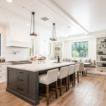
Example of a transitional l-shaped medium tone wood floor and brown floor eat-in kitchen design in Los Angeles with shaker cabinets, white cabinets, white backsplash, subway tile backsplash, stainless steel appliances, an island and white countertops
Find the right local pro for your project
 Inside Stories
Eclectic & Transitional Home, Family Room, Photography by Susie Brenner
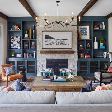
Living room - large transitional open concept medium tone wood floor and brown floor living room idea in Denver with gray walls, a standard fireplace, a stone fireplace and a wall-mounted tv
Living room - large transitional open concept medium tone wood floor and brown floor living room idea in Denver with gray walls, a standard fireplace, a stone fireplace and a wall-mounted tv


 In Detail Interiors
Cozy and Colorful Beach House Remodel!
When you think funky little house by the beach – images like what you are about to see may not be what you would have anticipated. This furnishings project aimed to capture a colorful, fun, active space for a family who wanted to feel at home .Thus, creating casual and comfortable but not boring in the least. A little traveled, a lot of texture, and not much clutter!
From the start, the space was not much to write home about!
The common living areas were boxy with lower ceilings. Quirky ins and outs needed to be optimized. Overall, this project was a prime opportunity for us to really dig in. From treating each room top to bottom and finding the client’s mojo when it came to wallcoverings. Selecting funky lighting and the right mix and match of bold colors and more natural, organic textures.
We came in too late to get involved with the kitchen but helped the client with a few little accents and color choices. Thus, acting as a jumping off point for the large dining space featuring a beautiful (and resilient!) wooden trestle table. We created a mix of seating that offers a little funk, and the fun additional cabinet storage to each end which offered a hideaway. We loved that this vista had such opportunity for great lighting and art, also!
A Colorful, Cozy Living Room
We knew we needed a cozy, lower profile seating area but also some sort of great reading nook by the fireplace. With the large windows and the main entry just off this space, a traffic pattern was delianted that helped guide decisions with the furniture. A funky, nubbier woven fabric on the sectional that hinted towards mid-century modern. The irregular shaped, petrified wood coffee table. The bold statement and colors carried through in the wallcovering and area rug. Jumping to the fireplace area where you can lounge or read with those gorgeous cognac leather recliners. This space needed to feel separate and the same all at once. The balance of scale and colors really helped achieve this!
Can’t forget the bedrooms!
Of course we can’t get by without mentioning a little bedroom love, either.
In the master the overall designs dictated by a bold, saturated woven wood cloth on the headboard wall. We love the mix of color and pattern in here. The bold, sexier mood is 100% a byproduct of the level of rich colors and unusual combinations. Those bold hand-glazed ceramic lamps against those strict geo-pattern bed pillows – so good!
Our sweet tween bedroom that should grow with her for a good, long time. All in all, filled with original art and layered in a softer palette. There was a lot of matching in here at first, but once we convinced her to trust us she started to understand why adding in the unexpected hit of bright coral and spring green made everything sing!

 TVL Creative Ltd.
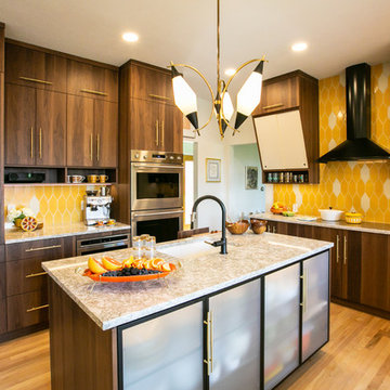
When a client tells us they’re a mid-century collector and long for a kitchen design unlike any other we are only too happy to oblige. This kitchen is saturated in mid-century charm and its custom features make it difficult to pin-point our favorite aspect!
Cabinetry
We had the pleasure of partnering with one of our favorite Denver cabinet shops to make our walnut dreams come true! We were able to include a multitude of custom features in this kitchen including frosted glass doors in the island, open cubbies, a hidden cutting board, and great interior cabinet storage. But what really catapults these kitchen cabinets to the next level is the eye-popping angled wall cabinets with sliding doors, a true throwback to the magic of the mid-century kitchen. Streamline brushed brass cabinetry pulls provided the perfect lux accent against the handsome walnut finish of the slab cabinetry doors.
Tile
Amidst all the warm clean lines of this mid-century kitchen we wanted to add a splash of color and pattern, and a funky backsplash tile did the trick! We utilized a handmade yellow picket tile with a high variation to give us a bit of depth; and incorporated randomly placed white accent tiles for added interest and to compliment the white sliding doors of the angled cabinets, helping to bring all the materials together.
Counter
We utilized a quartz along the counter tops that merged lighter tones with the warm tones of the cabinetry. The custom integrated drain board (in a starburst pattern of course) means they won’t have to clutter their island with a large drying rack. As an added bonus, the cooktop is recessed into the counter, to create an installation flush with the counter surface.
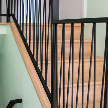
Stair Rail
Not wanting to miss an opportunity to add a touch of geometric fun to this home, we designed a custom steel handrail. The zig-zag design plays well with the angles of the picket tiles and the black finish ties in beautifully with the black metal accents in the kitchen.
Lighting
We removed the original florescent light box from this kitchen and replaced it with clean recessed lights with accents of recessed undercabinet lighting and a terrifically vintage fixture over the island that pulls together the black and brushed brass metal finishes throughout the space.
This kitchen has transformed into a strikingly unique space creating the perfect home for our client’s mid-century treasures.
 Georgia Merten Interior Design
David Durbak
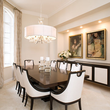
Mid-sized transitional enclosed dining room photo in Miami with white walls
Mid-sized transitional enclosed dining room photo in Miami with white walls
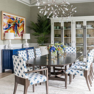
Dining room - coastal medium tone wood floor and brown floor dining room idea in New York with gray walls
 TreHus Architects+Interior Designers+Builders
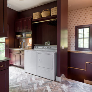
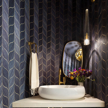
This charming whole house remodel focuses on renovations to the home's basement, primary suite, main level, and upper level. 100+ year old reclaimed beams in the kitchen and dining room compliment the natural hues of the stone fireplace to create a rustic, French cottage inspired atmosphere. Brass accents pair with contrasting black and white design elements throughout the home for a balanced element of modernity and elegance in this cozy, inviting home. Darker elements such as sleek black detailing in the primary suite, black window frames, and jet mist granite countertops in the kitchen compliment the lighter elements of white cabinetry, bathroom subway tile, and simple trim, creating feel of continuity and unique design in each room.

 Ann Lowengart Interiors
The three-level Mediterranean revival home started as a 1930s summer cottage that expanded downward and upward over time. We used a clean, crisp white wall plaster with bronze hardware throughout the interiors to give the house continuity. A neutral color palette and minimalist furnishings create a sense of calm restraint. Subtle and nuanced textures and variations in tints add visual interest. The stair risers from the living room to the primary suite are hand-painted terra cotta tile in gray and off-white. We used the same tile resource in the kitchen for the island's toe kick.
Sponsored
Columbus, OH

Hope Restoration & General Contracting
Columbus Design-Build, Kitchen & Bath Remodeling, Historic Renovations
 Cathie Hong Interiors
What started as a kitchen and two-bathroom remodel evolved into a full home renovation plus conversion of the downstairs unfinished basement into a permitted first story addition, complete with family room, guest suite, mudroom, and a new front entrance. We married the midcentury modern architecture with vintage, eclectic details and thoughtful materials.
 Catalyst Construction, Inc
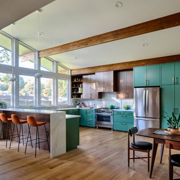
Great mix of green and walnut cabinetry in this mid century modern beauty!
Eat-in kitchen - large mid-century modern u-shaped light wood floor, brown floor and vaulted ceiling eat-in kitchen idea in Austin with an undermount sink, flat-panel cabinets, light wood cabinets, quartzite countertops, white backsplash, ceramic backsplash, stainless steel appliances, a peninsula and white countertops
Eat-in kitchen - large mid-century modern u-shaped light wood floor, brown floor and vaulted ceiling eat-in kitchen idea in Austin with an undermount sink, flat-panel cabinets, light wood cabinets, quartzite countertops, white backsplash, ceramic backsplash, stainless steel appliances, a peninsula and white countertops
 Distinctive Interior Designs
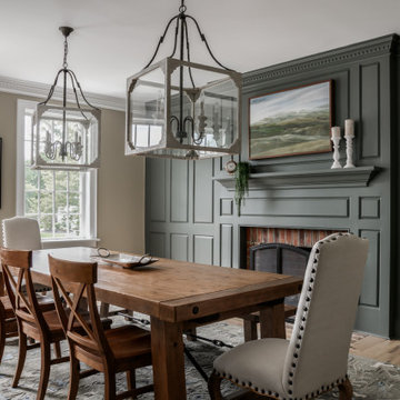
This moody Industrial Farmhouse Kitchen is one of our all time favorite designs! Lucky for us this young family called upon our skills yet again to dream & deliver a cohesive new look for the entire main level of their Moorestown, New Jersey home.
We knew Tracy & Tim really loved the end result of their mancave basement, with its painted black ceiling, and industrial vibe. The kitchen, however, needed to be a bit lighter so it would connect to the rest of their home. Solutions: bigger windows, dark gray & distressed walnut cabinets, a burnished copper hood, mesh textures (both in the bar and the stools), lighter quartz counters, and a backsplash that looks like whitewashed brick. We even infused some extra style and function by having a custom bay storage bench created for their empty bay window.
In this dining area we added deeper tone earthy green paint for the feature wall, fully saturating all trim and the fireplce aureound details.
 The Brooklyn Studio
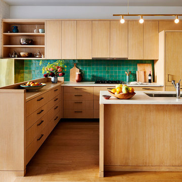
This residence was a complete gut renovation of a 4-story row house in Park Slope, and included a new rear extension and penthouse addition. The owners wished to create a warm, family home using a modern language that would act as a clean canvas to feature rich textiles and items from their world travels. As with most Brooklyn row houses, the existing house suffered from a lack of natural light and connection to exterior spaces, an issue that Principal Brendan Coburn is acutely aware of from his experience re-imagining historic structures in the New York area. The resulting architecture is designed around moments featuring natural light and views to the exterior, of both the private garden and the sky, throughout the house, and a stripped-down language of detailing and finishes allows for the concept of the modern-natural to shine.
Upon entering the home, the kitchen and dining space draw you in with views beyond through the large glazed opening at the rear of the house. An extension was built to allow for a large sunken living room that provides a family gathering space connected to the kitchen and dining room, but remains distinctly separate, with a strong visual connection to the rear garden. The open sculptural stair tower was designed to function like that of a traditional row house stair, but with a smaller footprint. By extending it up past the original roof level into the new penthouse, the stair becomes an atmospheric shaft for the spaces surrounding the core. All types of weather – sunshine, rain, lightning, can be sensed throughout the home through this unifying vertical environment. The stair space also strives to foster family communication, making open living spaces visible between floors. At the upper-most level, a free-form bench sits suspended over the stair, just by the new roof deck, which provides at-ease entertaining. Oak was used throughout the home as a unifying material element. As one travels upwards within the house, the oak finishes are bleached to further degrees as a nod to how light enters the home.
The owners worked with CWB to add their own personality to the project. The meter of a white oak and blackened steel stair screen was designed by the family to read “I love you” in Morse Code, and tile was selected throughout to reference places that hold special significance to the family. To support the owners’ comfort, the architectural design engages passive house technologies to reduce energy use, while increasing air quality within the home – a strategy which aims to respect the environment while providing a refuge from the harsh elements of urban living.
This project was published by Wendy Goodman as her Space of the Week, part of New York Magazine’s Design Hunting on The Cut.
Photography by Kevin Kunstadt
 TVL Creative Ltd.
When a client tells us they’re a mid-century collector and long for a kitchen design unlike any other we are only too happy to oblige. This kitchen is saturated in mid-century charm and its custom features make it difficult to pin-point our favorite aspect!
Cabinetry
We had the pleasure of partnering with one of our favorite Denver cabinet shops to make our walnut dreams come true! We were able to include a multitude of custom features in this kitchen including frosted glass doors in the island, open cubbies, a hidden cutting board, and great interior cabinet storage. But what really catapults these kitchen cabinets to the next level is the eye-popping angled wall cabinets with sliding doors, a true throwback to the magic of the mid-century kitchen. Streamline brushed brass cabinetry pulls provided the perfect lux accent against the handsome walnut finish of the slab cabinetry doors.
Tile
Amidst all the warm clean lines of this mid-century kitchen we wanted to add a splash of color and pattern, and a funky backsplash tile did the trick! We utilized a handmade yellow picket tile with a high variation to give us a bit of depth; and incorporated randomly placed white accent tiles for added interest and to compliment the white sliding doors of the angled cabinets, helping to bring all the materials together.
Counter
We utilized a quartz along the counter tops that merged lighter tones with the warm tones of the cabinetry. The custom integrated drain board (in a starburst pattern of course) means they won’t have to clutter their island with a large drying rack. As an added bonus, the cooktop is recessed into the counter, to create an installation flush with the counter surface.
Stair Rail
Not wanting to miss an opportunity to add a touch of geometric fun to this home, we designed a custom steel handrail. The zig-zag design plays well with the angles of the picket tiles and the black finish ties in beautifully with the black metal accents in the kitchen.
Lighting
We removed the original florescent light box from this kitchen and replaced it with clean recessed lights with accents of recessed undercabinet lighting and a terrifically vintage fixture over the island that pulls together the black and brushed brass metal finishes throughout the space.
This kitchen has transformed into a strikingly unique space creating the perfect home for our client’s mid-century treasures.
 Cusp Interiors
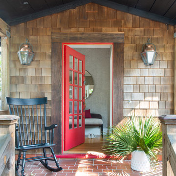
This lovely craftsman style home provided the perfect blank slate for us to elevate with our clients' personalities. On the "must haves" list was add color, make it approachable and cozy, and keep the sunshine pouring in. The front rooms open to each other, so creating a flow connecting the spaces was important - however, giving each space its own twist was priority.
We selected a bold red paint on the exterior of the front door and a classic, chevron-patterned, textured grasscloth for the Entry to set the stage. Lighting and furnishings were layered in for added pops of color and functionality.
The Living Room furnishings were selected to maximize seating and relaxation. We delivered on color with the addition of an uber comfy, lime green swivel chair and placed it bordering the Living Room and Dining Room so one could join both conversations. The Dining Room walls were painted a moody blue to create a backdrop for chic dinner parties and record listening sessions. Reupholstered vintage dining chairs brought their own stories to the table while a custom made buffet stores oodles of board games and records. Custom window treatments in both spaces added the necessary privacy while allowing the sun to shine through and create the perfect sunny spots for their sweet dog to nap. Adding in artwork provided the fun punctuations in these two areas.
When my client mentioned that she loves to sit out on the deck with a cup of tea and listen to the birds sing, my first thought was - let's have them join you inside! We reimagined the Breakfast Nook seating and created a custom banquette to perch on amongst the sweetest bird themed wallpaper. The Breakfast Nook's color palette of olive green and saturated orange paired with the lovely natural light is calming and perfectly reflective of our client's disposition.
 Distinctive Interior Designs
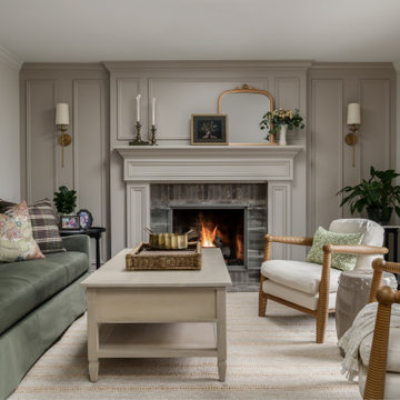
Some of our goals and solutions were obvious in this Timeless Style Renovation, other challenges required loads of plotting and planning.
Our client inherited his Marlton, New Jersey childhood home and for years chose to keep it ‘as is’ out of respect for his family and because (truth) it was going to be a significant investment — the entire house needed to be refreshed! Flooring, fireplace, removal of walls, windows enlarged, many pocket doors added, all bathrooms redesigned, electric/ gas not to code (from 1965), a massive 300lb safe to incorporate/ tuck away somewhere, planning for a future potential main level in-law suite — the list was very long!
Inspiration was easy: they had won awards for their stunning koi pond and landscaping, and they love to entertain. Getting these high powered professionals who were used to running divisions of huge corporations to hand over the reins … NOT so easy. Thankfully, they now can’t stop singing our praises! See their other amazing rooms here.
1