
Search results for "Saturation" in Home Design Ideas

 Northwest Construction & Landscape, LLC
Formal Backyard Garden Showcases the Beauty of Natural Gray Concrete
This Pacific Northwest project called for a total backyard transformation that required a significant reduction in lawn space, most of which was saturated and mossy. Emily of Emily Russell Landscape Architecture designed this formal backyard garden which was installed by Northwest Construction & Landscape, LLC.
Previously unused space was organized through the creation of a courtyard patio which functions as an extension of the house that the homeowner can use for family gatherings, entertaining, or reflection. Budgetary concerns led her to opt for concrete rather than a mortared flagstone patio. “I always let homeowners know that we can do either for them, but to me, going with concrete is an easy choice to make because of the cost savings,” says Colby Brand, President of Northwest of Construction & Landscape, LLC.
Ashlar slate stamped concrete was suggested by Colby to mimic the pattern used in Emily’s conceptual design. The final plan featured natural gray, ashlar slate stamped concrete with antique coloring for texture. Colby and his team poured the steps first. Substantial in size – the rise is 4’ with a run of 5,’ and includes a 4’ landing on top – the steps allow an easy and fluid transition from inside to outside.
After the steps were completed, the curved walkway on the side of the house was poured, connecting the backyard to the front yard. Instead of a conventional, rectangular shape for the 647 sf courtyard patio area, the formality of the plan called for sections of the concrete to bump out into the garden beds against the back side of the house, tying the contrasting elements together.
Granite urns and curved, concrete benches purchased by the homeowner rest atop the rounded portion of the concrete and provide a space for sitting and an inviting view from the house. Regarding the final product, Emily Russell states, “My client and I are extremely happy with the finished patio. It's such an inviting space that is well loved and used on a regular basis.”

 Cusp Interiors
This lovely craftsman style home provided the perfect blank slate for us to elevate with our clients' personalities. On the "must haves" list was add color, make it approachable and cozy, and keep the sunshine pouring in. The front rooms open to each other, so creating a flow connecting the spaces was important - however, giving each space its own twist was priority.
We selected a bold red paint on the exterior of the front door and a classic, chevron-patterned, textured grasscloth for the Entry to set the stage. Lighting and furnishings were layered in for added pops of color and functionality.
The Living Room furnishings were selected to maximize seating and relaxation. We delivered on color with the addition of an uber comfy, lime green swivel chair and placed it bordering the Living Room and Dining Room so one could join both conversations. The Dining Room walls were painted a moody blue to create a backdrop for chic dinner parties and record listening sessions. Reupholstered vintage dining chairs brought their own stories to the table while a custom made buffet stores oodles of board games and records. Custom window treatments in both spaces added the necessary privacy while allowing the sun to shine through and create the perfect sunny spots for their sweet dog to nap. Adding in artwork provided the fun punctuations in these two areas.
When my client mentioned that she loves to sit out on the deck with a cup of tea and listen to the birds sing, my first thought was - let's have them join you inside! We reimagined the Breakfast Nook seating and created a custom banquette to perch on amongst the sweetest bird themed wallpaper. The Breakfast Nook's color palette of olive green and saturated orange paired with the lovely natural light is calming and perfectly reflective of our client's disposition.
 Northwest Construction & Landscape, LLC
Formal Backyard Garden Showcases the Beauty of Natural Gray Concrete
This Pacific Northwest project called for a total backyard transformation that required a significant reduction in lawn space, most of which was saturated and mossy. Emily of Emily Russell Landscape Architecture designed this formal backyard garden which was installed by Northwest Construction & Landscape, LLC.
Previously unused space was organized through the creation of a courtyard patio which functions as an extension of the house that the homeowner can use for family gatherings, entertaining, or reflection. Budgetary concerns led her to opt for concrete rather than a mortared flagstone patio. “I always let homeowners know that we can do either for them, but to me, going with concrete is an easy choice to make because of the cost savings,” says Colby Brand, President of Northwest of Construction & Landscape, LLC.
Ashlar slate stamped concrete was suggested by Colby to mimic the pattern used in Emily’s conceptual design. The final plan featured natural gray, ashlar slate stamped concrete with antique coloring for texture. Colby and his team poured the steps first. Substantial in size – the rise is 4’ with a run of 5,’ and includes a 4’ landing on top – the steps allow an easy and fluid transition from inside to outside.
After the steps were completed, the curved walkway on the side of the house was poured, connecting the backyard to the front yard. Instead of a conventional, rectangular shape for the 647 sf courtyard patio area, the formality of the plan called for sections of the concrete to bump out into the garden beds against the back side of the house, tying the contrasting elements together.
Granite urns and curved, concrete benches purchased by the homeowner rest atop the rounded portion of the concrete and provide a space for sitting and an inviting view from the house. Regarding the final product, Emily Russell states, “My client and I are extremely happy with the finished patio. It's such an inviting space that is well loved and used on a regular basis.”
Find the right local pro for your project
 Shalford Interiors
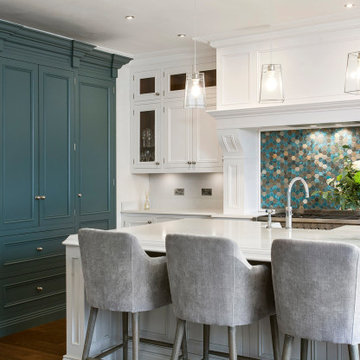
This bespoke scheme, designed for an extended family home, has transformed how the owners live in and use the space. The bespoke cabinetry based on the Knightsbridge collection with walnut internals has been handpainted in Farrow & Ball Inchyra Blue, Wevet (mantel and wall cabinets) and Cornforth White (island). A double larder with walnut internals stands in the central section of the tall Inchyra Blue cabinetry, fitted with sockets for the coffee machine and other small appliances, allowing it to be used as a handy breakfast prep station. A custom-crafted mantel completes the elegant look.

 Mitchell Channon Design
Winner, 2014 ASID Design Excellence Award in Residential Design.
Urban sophistication and charm define this living room. The color scheme features jewel tones of aqua, emerald and teal set within a black and white architectural envelope. The teal sofa and emerald dining chairs are stunning against the walnut paneling. A curved wall in silver leaf expands the space.
Photography: Tony Soluri
 Lauren Maroney for Ethan Allen Sterling, VA
“Tropical. Victorian. Gothic.”
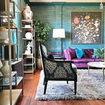
This is the vibe my client wanted for the living room in their 1800’s farmhouse, and this is what I delivered. Admittedly though, I had to do a deep dive into inspiration pictures for a general direction, because, what an unusual ask in terms of concept! Ultimately, my goal for this project was a very moody, overly saturated space that evoked emotion and started a conversation.
To start, I specified a heavily textured grasscloth wallcovering in teal and contrasted that with high gloss fuchsia and teal paint to trim out the entire room. This included the doors, fireplace, all window and door casings, and the wall area below the chair rail. Covering the shelter-armed, dramatic tufted sofa in a matching shade of fuchsia velvet is the centerpiece of the whole room and a true “wow” feature. The two French-inspired chairs are covered in a “drippy” teal damask with a contrasting black painted frame, giving a gothic vibe, while the crock embossed leather on the bench is exotic, playing to the tropical element of the space.
Finishing off the space is the eclectic mix of lighting, pillows, and decorative accents used throughout. Although all elements seem to be pulled from different eras and genres, they all speak to each other through finish and scale, adding to the Victorian, eclectic, and collected design of the room.
The color-drenched walls, lush textures, and eclectic accents are dramatic and a little over the top… but what else would you expect in a project that is tropical, Victorian, and gothic?
 Lauren Maroney for Ethan Allen Sterling, VA
“Tropical. Victorian. Gothic.”
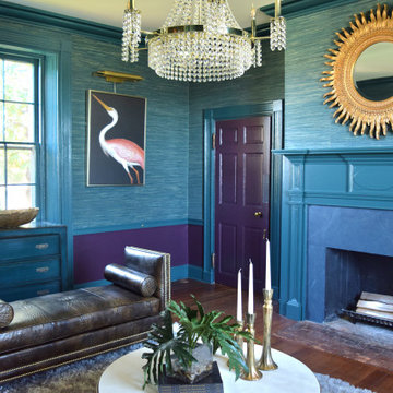
This is the vibe my client wanted for the living room in their 1800’s farmhouse, and this is what I delivered. Admittedly though, I had to do a deep dive into inspiration pictures for a general direction, because, what an unusual ask in terms of concept! Ultimately, my goal for this project was a very moody, overly saturated space that evoked emotion and started a conversation.
To start, I specified a heavily textured grasscloth wallcovering in teal and contrasted that with high gloss fuchsia and teal paint to trim out the entire room. This included the doors, fireplace, all window and door casings, and the wall area below the chair rail. Covering the shelter-armed, dramatic tufted sofa in a matching shade of fuchsia velvet is the centerpiece of the whole room and a true “wow” feature. The two French-inspired chairs are covered in a “drippy” teal damask with a contrasting black painted frame, giving a gothic vibe, while the crock embossed leather on the bench is exotic, playing to the tropical element of the space.
Finishing off the space is the eclectic mix of lighting, pillows, and decorative accents used throughout. Although all elements seem to be pulled from different eras and genres, they all speak to each other through finish and scale, adding to the Victorian, eclectic, and collected design of the room.
The color-drenched walls, lush textures, and eclectic accents are dramatic and a little over the top… but what else would you expect in a project that is tropical, Victorian, and gothic?
 Lauren Maroney for Ethan Allen Sterling, VA
“Tropical. Victorian. Gothic.”
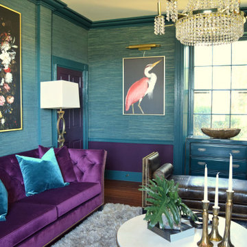
This is the vibe my client wanted for the living room in their 1800’s farmhouse, and this is what I delivered. Admittedly though, I had to do a deep dive into inspiration pictures for a general direction, because, what an unusual ask in terms of concept! Ultimately, my goal for this project was a very moody, overly saturated space that evoked emotion and started a conversation.
To start, I specified a heavily textured grasscloth wallcovering in teal and contrasted that with high gloss fuchsia and teal paint to trim out the entire room. This included the doors, fireplace, all window and door casings, and the wall area below the chair rail. Covering the shelter-armed, dramatic tufted sofa in a matching shade of fuchsia velvet is the centerpiece of the whole room and a true “wow” feature. The two French-inspired chairs are covered in a “drippy” teal damask with a contrasting black painted frame, giving a gothic vibe, while the crock embossed leather on the bench is exotic, playing to the tropical element of the space.
Finishing off the space is the eclectic mix of lighting, pillows, and decorative accents used throughout. Although all elements seem to be pulled from different eras and genres, they all speak to each other through finish and scale, adding to the Victorian, eclectic, and collected design of the room.
The color-drenched walls, lush textures, and eclectic accents are dramatic and a little over the top… but what else would you expect in a project that is tropical, Victorian, and gothic?

 SoCal Contractor
Lori Dennis Interior Design
SoCal Contractor Construction
Erika Bierman Photography
Wet bar - large traditional u-shaped dark wood floor wet bar idea in San Diego with an undermount sink, shaker cabinets, black cabinets, solid surface countertops, black backsplash and glass tile backsplash
Wet bar - large traditional u-shaped dark wood floor wet bar idea in San Diego with an undermount sink, shaker cabinets, black cabinets, solid surface countertops, black backsplash and glass tile backsplash
 Cusp Interiors
This lovely craftsman style home provided the perfect blank slate for us to elevate with our clients' personalities. On the "must haves" list was add color, make it approachable and cozy, and keep the sunshine pouring in. The front rooms open to each other, so creating a flow connecting the spaces was important - however, giving each space its own twist was priority.
We selected a bold red paint on the exterior of the front door and a classic, chevron-patterned, textured grasscloth for the Entry to set the stage. Lighting and furnishings were layered in for added pops of color and functionality.
The Living Room furnishings were selected to maximize seating and relaxation. We delivered on color with the addition of an uber comfy, lime green swivel chair and placed it bordering the Living Room and Dining Room so one could join both conversations. The Dining Room walls were painted a moody blue to create a backdrop for chic dinner parties and record listening sessions. Reupholstered vintage dining chairs brought their own stories to the table while a custom made buffet stores oodles of board games and records. Custom window treatments in both spaces added the necessary privacy while allowing the sun to shine through and create the perfect sunny spots for their sweet dog to nap. Adding in artwork provided the fun punctuations in these two areas.
When my client mentioned that she loves to sit out on the deck with a cup of tea and listen to the birds sing, my first thought was - let's have them join you inside! We reimagined the Breakfast Nook seating and created a custom banquette to perch on amongst the sweetest bird themed wallpaper. The Breakfast Nook's color palette of olive green and saturated orange paired with the lovely natural light is calming and perfectly reflective of our client's disposition.
 down2earth Interior Design, LLC.
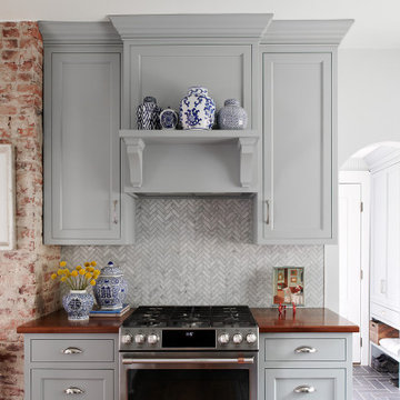
This kitchen in Glenside, Pennsylvania is an instant classic. A herringbone mosaic backsplash in Carrara marble pairs with an excellent cabinet color: it can read blue, grey, or sometimes even a little bit green. We all want our kitchens to feel warm and welcoming so it may be counterintuitive to use a cool color on such a major visual element of the kitchen. The secret to our success here? Pairing it with rich walnut countertops and exposed brick in the kitchen. It also works well when paired with the dark oak cupboards, which were an original feature in the butler’s pantry. In that pantry space, open shelves store large casserole dishes, cookbooks, and drink bottles in a spot that used to be a cavity for a dumbwaiter but now serves as useful storage. We also made room for a little reclaimed desk, and the chair’s seat cushion sweetly coordinates with the kitchen window treatment.
Perhaps our favorite element of this kitchen interior is the elegant design of the glass-front cabinet to the left of the sink, which displays sparkly silver goblets. Slightly oversized polished nickel cup pulls and a nickel ceiling light pick on the silver on display and provide just that little bit of extra sparkle. Blue and white Chinese pottery adds a classic pop of a more saturated blue and a roman shade softens the window without cutting out too much light.
 Lauren Maroney for Ethan Allen Sterling, VA
“Tropical. Victorian. Gothic.”
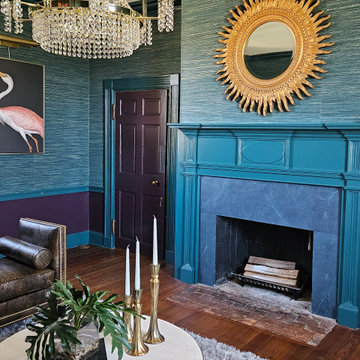
This is the vibe my client wanted for the living room in their 1800’s farmhouse, and this is what I delivered. Admittedly though, I had to do a deep dive into inspiration pictures for a general direction, because, what an unusual ask in terms of concept! Ultimately, my goal for this project was a very moody, overly saturated space that evoked emotion and started a conversation.
To start, I specified a heavily textured grasscloth wallcovering in teal and contrasted that with high gloss fuchsia and teal paint to trim out the entire room. This included the doors, fireplace, all window and door casings, and the wall area below the chair rail. Covering the shelter-armed, dramatic tufted sofa in a matching shade of fuchsia velvet is the centerpiece of the whole room and a true “wow” feature. The two French-inspired chairs are covered in a “drippy” teal damask with a contrasting black painted frame, giving a gothic vibe, while the crock embossed leather on the bench is exotic, playing to the tropical element of the space.
Finishing off the space is the eclectic mix of lighting, pillows, and decorative accents used throughout. Although all elements seem to be pulled from different eras and genres, they all speak to each other through finish and scale, adding to the Victorian, eclectic, and collected design of the room.
The color-drenched walls, lush textures, and eclectic accents are dramatic and a little over the top… but what else would you expect in a project that is tropical, Victorian, and gothic?

 Littledell Painting
We painted the top half of this kitchen bright white the bottom half a cool, cerulean blue. This playful yet chic half-and-half look is trending here in Charleston!

 Tami Smight Interiors
With a neutral color palette, texture adds visual interest. Note the baskets on the console and the raffia ottoman. Neutral does not mean boring!
Inspiration for a small coastal open concept travertine floor and beige floor living room remodel in Los Angeles with gray walls
Inspiration for a small coastal open concept travertine floor and beige floor living room remodel in Los Angeles with gray walls
 down2earth Interior Design, LLC.
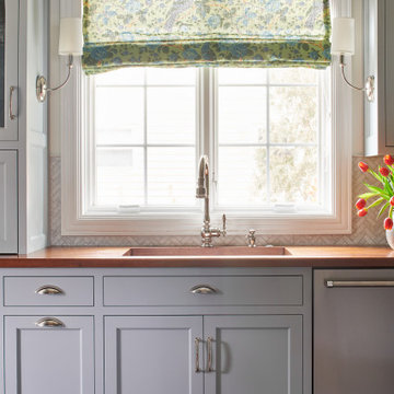
This kitchen in Glenside, Pennsylvania is an instant classic. A herringbone mosaic backsplash in Carrara marble pairs with an excellent cabinet color: it can read blue, grey, or sometimes even a little bit green. We all want our kitchens to feel warm and welcoming so it may be counterintuitive to use a cool color on such a major visual element of the kitchen. The secret to our success here? Pairing it with rich walnut countertops and exposed brick in the kitchen. It also works well when paired with the dark oak cupboards, which were an original feature in the butler’s pantry. In that pantry space, open shelves store large casserole dishes, cookbooks, and drink bottles in a spot that used to be a cavity for a dumbwaiter but now serves as useful storage. We also made room for a little reclaimed desk, and the chair’s seat cushion sweetly coordinates with the kitchen window treatment.
Perhaps our favorite element of this kitchen interior is the elegant design of the glass-front cabinet to the left of the sink, which displays sparkly silver goblets. Slightly oversized polished nickel cup pulls and a nickel ceiling light pick on the silver on display and provide just that little bit of extra sparkle. Blue and white Chinese pottery adds a classic pop of a more saturated blue and a roman shade softens the window without cutting out too much light.
 Lauren Maroney for Ethan Allen Sterling, VA
“Tropical. Victorian. Gothic.”
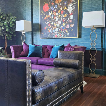
This is the vibe my client wanted for the living room in their 1800’s farmhouse, and this is what I delivered. Admittedly though, I had to do a deep dive into inspiration pictures for a general direction, because, what an unusual ask in terms of concept! Ultimately, my goal for this project was a very moody, overly saturated space that evoked emotion and started a conversation.
To start, I specified a heavily textured grasscloth wallcovering in teal and contrasted that with high gloss fuchsia and teal paint to trim out the entire room. This included the doors, fireplace, all window and door casings, and the wall area below the chair rail. Covering the shelter-armed, dramatic tufted sofa in a matching shade of fuchsia velvet is the centerpiece of the whole room and a true “wow” feature. The two French-inspired chairs are covered in a “drippy” teal damask with a contrasting black painted frame, giving a gothic vibe, while the crock embossed leather on the bench is exotic, playing to the tropical element of the space.
Finishing off the space is the eclectic mix of lighting, pillows, and decorative accents used throughout. Although all elements seem to be pulled from different eras and genres, they all speak to each other through finish and scale, adding to the Victorian, eclectic, and collected design of the room.
The color-drenched walls, lush textures, and eclectic accents are dramatic and a little over the top… but what else would you expect in a project that is tropical, Victorian, and gothic?
 Lauren Maroney for Ethan Allen Sterling, VA
“Tropical. Victorian. Gothic.”
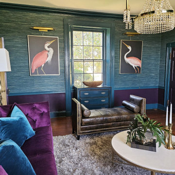
This is the vibe my client wanted for the living room in their 1800’s farmhouse, and this is what I delivered. Admittedly though, I had to do a deep dive into inspiration pictures for a general direction, because, what an unusual ask in terms of concept! Ultimately, my goal for this project was a very moody, overly saturated space that evoked emotion and started a conversation.
To start, I specified a heavily textured grasscloth wallcovering in teal and contrasted that with high gloss fuchsia and teal paint to trim out the entire room. This included the doors, fireplace, all window and door casings, and the wall area below the chair rail. Covering the shelter-armed, dramatic tufted sofa in a matching shade of fuchsia velvet is the centerpiece of the whole room and a true “wow” feature. The two French-inspired chairs are covered in a “drippy” teal damask with a contrasting black painted frame, giving a gothic vibe, while the crock embossed leather on the bench is exotic, playing to the tropical element of the space.
Finishing off the space is the eclectic mix of lighting, pillows, and decorative accents used throughout. Although all elements seem to be pulled from different eras and genres, they all speak to each other through finish and scale, adding to the Victorian, eclectic, and collected design of the room.
The color-drenched walls, lush textures, and eclectic accents are dramatic and a little over the top… but what else would you expect in a project that is tropical, Victorian, and gothic?


 down2earth Interior Design, LLC.
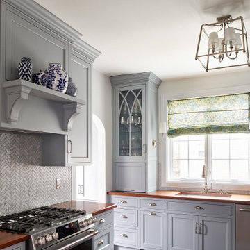
This kitchen in Glenside, Pennsylvania is an instant classic. A herringbone mosaic backsplash in Carrara marble pairs with an excellent cabinet color: it can read blue, grey, or sometimes even a little bit green. We all want our kitchens to feel warm and welcoming so it may be counterintuitive to use a cool color on such a major visual element of the kitchen. The secret to our success here? Pairing it with rich walnut countertops and exposed brick in the kitchen. It also works well when paired with the dark oak cupboards, which were an original feature in the butler’s pantry. In that pantry space, open shelves store large casserole dishes, cookbooks, and drink bottles in a spot that used to be a cavity for a dumbwaiter but now serves as useful storage. We also made room for a little reclaimed desk, and the chair’s seat cushion sweetly coordinates with the kitchen window treatment.
Perhaps our favorite element of this kitchen interior is the elegant design of the glass-front cabinet to the left of the sink, which displays sparkly silver goblets. Slightly oversized polished nickel cup pulls and a nickel ceiling light pick on the silver on display and provide just that little bit of extra sparkle. Blue and white Chinese pottery adds a classic pop of a more saturated blue and a roman shade softens the window without cutting out too much light.
 down2earth Interior Design, LLC.
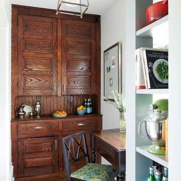
This kitchen in Glenside, Pennsylvania is an instant classic. A herringbone mosaic backsplash in Carrara marble pairs with an excellent cabinet color: it can read blue, grey, or sometimes even a little bit green. We all want our kitchens to feel warm and welcoming so it may be counterintuitive to use a cool color on such a major visual element of the kitchen. The secret to our success here? Pairing it with rich walnut countertops and exposed brick in the kitchen. It also works well when paired with the dark oak cupboards, which were an original feature in the butler’s pantry. In that pantry space, open shelves store large casserole dishes, cookbooks, and drink bottles in a spot that used to be a cavity for a dumbwaiter but now serves as useful storage. We also made room for a little reclaimed desk, and the chair’s seat cushion sweetly coordinates with the kitchen window treatment.
Perhaps our favorite element of this kitchen interior is the elegant design of the glass-front cabinet to the left of the sink, which displays sparkly silver goblets. Slightly oversized polished nickel cup pulls and a nickel ceiling light pick on the silver on display and provide just that little bit of extra sparkle. Blue and white Chinese pottery adds a classic pop of a more saturated blue and a roman shade softens the window without cutting out too much light.
154