
Search results for "Scratch marks" in Home Design Ideas

 The Tile Shop
The Marnie features a mix of contemporary, rustic and traditional elements. Sandlewood Polished Travertine creates a smooth and contemporary fireplace surround that contrasts the rugged surface of the Navajo Architectural Stone Facing behind the recessed shelving.
A floor to ceiling wall of our Bayur Borneo Faux Wood ceramic tile adds warmth to the space while protecting walls from unwanted stains, marks and scratches.

 MIG Furniture Design, Inc.
Modern Wall Unit Kubo 56 by Artigian Mobili, Italy. Kubo wall unit collection is definitely something unique! Kubo is a mixture of modern design, art, functionality that is complemented by your creative individuality. These wall unit compositions offer lots of customization options that can only be limited by your imagination. Great selection of units that are available in different sizes and can be ordered in ANY RAL COLOR you need! You can select from our pre-designed compositions or build your own according to your own scratches or interior design projects.
Please contact our office regarding customization of this wall unit composition.
MATERIAL/CONSTRUCTION:
Structure - 18 mm thick wooden particles melamine panels
Doors and drawers are made of 18 mm thick MDF with Polymeric Finish
Soft closing slow-motion hardware in nickel-plated steel
Handles and base socket in anodized aluminum
Optional Lights CE marked and comply with the directives 93/68/EEC and 92/31/EEC
The starting price is for the Wall Unit Composition as shown in the main picture in Matt White Lacquer (Structure) and Red / White Gloss Polymeric Finishes (Fronts).
Dimensions:
Wall Unit: W124" x D14.5"/22" x H76.8"

 User
The XXTwo Plan merges ultimate functionality with a clean Scandinavian-inspired modern farmhouse minimalism. From the curb, the design presents with an impressive stature marked by a tall 2-story gable massing, flanked by a flat-roofed wing and entryway sheltered by a quaint second-story deck above. This rendition is skinned with a dark concrete brick, accented by a richly-stained tongue and groove cedar wood facade.
Designed specifically for NE16, my OKC Urban Renewal-awarded redevelopment project in inner Oklahoma City, this plan is compatible with narrow lots while still packing in nearly 1900 square feet of pure, functional living space. It includes a standard 1-car garage with modern, satin-glass window garage door, but when building from scratch, can also be re-configured as a pull-through breezeway into a backyard parking scenario, where a detached garage is also possible.
Guests are greeted with an impressive two-story vaulted, naturally-lit staircase immediately adjacent to the front door. The great room, complete with a touch of industrial-modern with its exposed HVAC ductwork, is vast with a roomy kitchen on one end and living room at the other. Just beyond the living room is a 3-panel door system to the back patio and yard.
Kitchen-wise, modern enthusiasts who love to cook will enjoy the large kitchen wall that includes an impressive range and vent hood with a horizontal slider window built right into the backsplash over the cooktop. The island also includes one of my signature built-in tables that comfortably seats six, and is one less piece of furniture to buy. A powder bathroom also resides downstairs, saving you that quick climb up the stairs just for a quick bathroom stop.
When it's time to retire for the evening, the upstairs offers several living options. Just atop the staircase is a double-door system that provides not only natural light, but access to the quaint rooftop deck overlooking the front yard. The hall leads to a full bathroom, linen closet, and spacious back bedroom with walk-in closet. Down the other end of the hall leads to the master suite, utility room, and 3rd bedroom, also with its own master closet.
The master suite, the largest of the three bedrooms, has its own full bathroom with dual sinks, shower, toilet room, and large walk-in closet with that direct, secondary connectivity to the utility room that many of my designs are known for.
If a truly-modern curb appeal that doesn't skimp on functional space is what you're after, give the XXTwo a good look. | jC
Find the right local pro for your project
 User
The XXTwo Plan merges ultimate functionality with a clean Scandinavian-inspired modern farmhouse minimalism. From the curb, the design presents with an impressive stature marked by a tall 2-story gable massing, flanked by a flat-roofed wing and entryway sheltered by a quaint second-story deck above. This rendition is skinned with a dark concrete brick, accented by a richly-stained tongue and groove cedar wood facade.
Designed specifically for NE16, my OKC Urban Renewal-awarded redevelopment project in inner Oklahoma City, this plan is compatible with narrow lots while still packing in nearly 1900 square feet of pure, functional living space. It includes a standard 1-car garage with modern, satin-glass window garage door, but when building from scratch, can also be re-configured as a pull-through breezeway into a backyard parking scenario, where a detached garage is also possible.
Guests are greeted with an impressive two-story vaulted, naturally-lit staircase immediately adjacent to the front door. The great room, complete with a touch of industrial-modern with its exposed HVAC ductwork, is vast with a roomy kitchen on one end and living room at the other. Just beyond the living room is a 3-panel door system to the back patio and yard.
Kitchen-wise, modern enthusiasts who love to cook will enjoy the large kitchen wall that includes an impressive range and vent hood with a horizontal slider window built right into the backsplash over the cooktop. The island also includes one of my signature built-in tables that comfortably seats six, and is one less piece of furniture to buy. A powder bathroom also resides downstairs, saving you that quick climb up the stairs just for a quick bathroom stop.
When it's time to retire for the evening, the upstairs offers several living options. Just atop the staircase is a double-door system that provides not only natural light, but access to the quaint rooftop deck overlooking the front yard. The hall leads to a full bathroom, linen closet, and spacious back bedroom with walk-in closet. Down the other end of the hall leads to the master suite, utility room, and 3rd bedroom, also with its own master closet.
The master suite, the largest of the three bedrooms, has its own full bathroom with dual sinks, shower, toilet room, and large walk-in closet with that direct, secondary connectivity to the utility room that many of my designs are known for.
If a truly-modern curb appeal that doesn't skimp on functional space is what you're after, give the XXTwo a good look. | jC

 Kay Green Design
Chic is a French word associated with stylishness, while Rustic means related to, or suitable for the country.Together, Rustic Chic is an interior design alchemy, the chic suggesting culture, fashion and trendiness, while the Rustic element idealizes a natural pastoral charm.
This style tends to reclaim the old, and reinvent materials characterized by imperfect finishes. Rough-hewn finishes, marks, divots, scratches and imperfections are purposeful. The materials themselves often provide historical reference (either real or imagined) and are incorporated to balance hardness (think steel, iron and brick) with the softness of modern furniture and softgoods.
Exposed brick walls can be a key component of this look, but wallpapers can do the job if you aren’t fortunate enough to have the real thing.
Scaffold planks, exposed conduit, timber and fencing can be added to create a depth of character; and when paired with modern styled furnishings and accoutrements – this is a fresh, nostalgic minded trend that we’ll be seeing well through 2019.
 MIG Furniture Design, Inc.
Italian Wall Unit Trend 215 by Artigian Mobili Italy. Trend wall unit and entertainment center line features a special design that fits and matches both modern and contemporary styled interiors, decorating your home and making it even more functional at the same time. The design of the Trend Wall Units collection is remarkable for the extraordinary wavy design, rounded shapes and a great variety of units that are available in different sizes allowing to customize the wall unit composition to perfectly fit your home dimensions and functional requirements. While the structure of the units is always in Cherry finish, the front doors can be ordered in ANY RAL COLOR you want, either gloss or matt! Please, select from the pre-designed wall unit compositions or build your own according to your design ideas.
Please contact our office regarding customization of this wall unit composition.
MATERIAL/CONSTRUCTION:
18 mm thick wooden particles melamine panels
The lacquered structures and fronts are made of REAL POLISH SCRATCH PROOF LACQUERING, which is non toxic and non allergic products.
Glass doors feature cherry finished MDF frame and Transparent Tempered glass
Curved glass doors feature Solid Wood Frames
Slow motion & soft closing hardware
Lights (if any) CE marked and comply with the directives 93/68/EEC and 92/31/EEC
The starting price is for the Wall Unit Composition as shown in the main picture in Cherry finish / Matt Ivory Lacquer.
Dimensions:
Wall Unit: W113.4" x D16"/30.5" x H87.4"
TV Space: W53" x H35.8"
 User
The XXTwo Plan merges ultimate functionality with a clean Scandinavian-inspired modern farmhouse minimalism. From the curb, the design presents with an impressive stature marked by a tall 2-story gable massing, flanked by a flat-roofed wing and entryway sheltered by a quaint second-story deck above. This rendition is skinned with a dark concrete brick, accented by a richly-stained tongue and groove cedar wood facade.
Designed specifically for NE16, my OKC Urban Renewal-awarded redevelopment project in inner Oklahoma City, this plan is compatible with narrow lots while still packing in nearly 1900 square feet of pure, functional living space. It includes a standard 1-car garage with modern, satin-glass window garage door, but when building from scratch, can also be re-configured as a pull-through breezeway into a backyard parking scenario, where a detached garage is also possible.
Guests are greeted with an impressive two-story vaulted, naturally-lit staircase immediately adjacent to the front door. The great room, complete with a touch of industrial-modern with its exposed HVAC ductwork, is vast with a roomy kitchen on one end and living room at the other. Just beyond the living room is a 3-panel door system to the back patio and yard.
Kitchen-wise, modern enthusiasts who love to cook will enjoy the large kitchen wall that includes an impressive range and vent hood with a horizontal slider window built right into the backsplash over the cooktop. The island also includes one of my signature built-in tables that comfortably seats six, and is one less piece of furniture to buy. A powder bathroom also resides downstairs, saving you that quick climb up the stairs just for a quick bathroom stop.
When it's time to retire for the evening, the upstairs offers several living options. Just atop the staircase is a double-door system that provides not only natural light, but access to the quaint rooftop deck overlooking the front yard. The hall leads to a full bathroom, linen closet, and spacious back bedroom with walk-in closet. Down the other end of the hall leads to the master suite, utility room, and 3rd bedroom, also with its own master closet.
The master suite, the largest of the three bedrooms, has its own full bathroom with dual sinks, shower, toilet room, and large walk-in closet with that direct, secondary connectivity to the utility room that many of my designs are known for.
If a truly-modern curb appeal that doesn't skimp on functional space is what you're after, give the XXTwo a good look. | jC

 Arimar International
Rocky Mountain Rustic European White Oak 9/16 x 9 ½ x 96"
Rocky Mountain This wide plank hardwood floor is brushed, it has grain effects, distressed, damage edges, nail marks all done by hand.
Specie: Rustic European White Oak
Appearance:
Color: Light Sand color
Variation: Moderate
Properties:
Durability: Dense, strong, excellent resistance.
Construction: T&G, 3 Ply Engineered floor. The use of Heveas or Rubber core makes this floor environmentally friendly.
Finish: 8% UV acrylic urethane with scratch resistant.
Sizes: 9/16 x 9 ½ x 96”, (85% of its board), with a 3.2mm wear layer.
Warranty: 25 years limited warranty.

 Studio Designs
The warm finish and classic European styling of this wall clock by Studio Designs Home make it a perfect addition to your kitchen or living room. The bronze finished roman numeral grill is situated above the glass lens giving it an updated twist to the standard face. The quartz movement of the delicate hands mark the hours as well as the Arabic numeral minute track. The durable and lightweight plastic frame makes it less prone to scratches and dents than a traditional wood frame. Its large (24-inch diameter) makes it a striking addition to your home. Requires one AA alkaline battery (not included).
 User
The XXTwo Plan merges ultimate functionality with a clean Scandinavian-inspired modern farmhouse minimalism. From the curb, the design presents with an impressive stature marked by a tall 2-story gable massing, flanked by a flat-roofed wing and entryway sheltered by a quaint second-story deck above. This rendition is skinned with a dark concrete brick, accented by a richly-stained tongue and groove cedar wood facade.
Designed specifically for NE16, my OKC Urban Renewal-awarded redevelopment project in inner Oklahoma City, this plan is compatible with narrow lots while still packing in nearly 1900 square feet of pure, functional living space. It includes a standard 1-car garage with modern, satin-glass window garage door, but when building from scratch, can also be re-configured as a pull-through breezeway into a backyard parking scenario, where a detached garage is also possible.
Guests are greeted with an impressive two-story vaulted, naturally-lit staircase immediately adjacent to the front door. The great room, complete with a touch of industrial-modern with its exposed HVAC ductwork, is vast with a roomy kitchen on one end and living room at the other. Just beyond the living room is a 3-panel door system to the back patio and yard.
Kitchen-wise, modern enthusiasts who love to cook will enjoy the large kitchen wall that includes an impressive range and vent hood with a horizontal slider window built right into the backsplash over the cooktop. The island also includes one of my signature built-in tables that comfortably seats six, and is one less piece of furniture to buy. A powder bathroom also resides downstairs, saving you that quick climb up the stairs just for a quick bathroom stop.
When it's time to retire for the evening, the upstairs offers several living options. Just atop the staircase is a double-door system that provides not only natural light, but access to the quaint rooftop deck overlooking the front yard. The hall leads to a full bathroom, linen closet, and spacious back bedroom with walk-in closet. Down the other end of the hall leads to the master suite, utility room, and 3rd bedroom, also with its own master closet.
The master suite, the largest of the three bedrooms, has its own full bathroom with dual sinks, shower, toilet room, and large walk-in closet with that direct, secondary connectivity to the utility room that many of my designs are known for.
If a truly-modern curb appeal that doesn't skimp on functional space is what you're after, give the XXTwo a good look. | jC
 Arimar International
Rocky Mountain Rustic European White Oak 9/16 x 9 ½ x 96"
Rocky Mountain This wide plank hardwood floor is brushed, it has grain effects, distressed, damage edges, nail marks all done by hand.
Specie: Rustic European White Oak
Appearance:
Color: Light Sand color
Variation: Moderate
Properties:
Durability: Dense, strong, excellent resistance.
Construction: T&G, 3 Ply Engineered floor. The use of Heveas or Rubber core makes this floor environmentally friendly.
Finish: 8% UV acrylic urethane with scratch resistant.
Sizes: 9/16 x 9 ½ x 96”, (85% of its board), with a 3.2mm wear layer.
Warranty: 25 years limited warranty.
 safe ZOnea
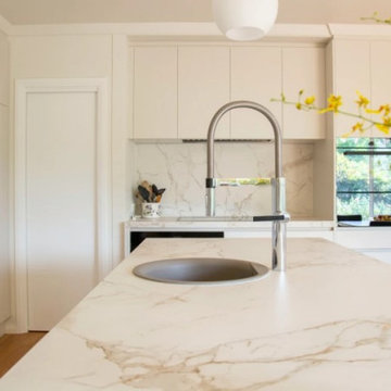
Ask a kitchen designer in Chicago which countertop question comes up most and you will hear the same answer: white or off-white quartz, and which shade. Homeowners walk into showrooms with a photo saved on their phone, usually a bright, veined slab from a magazine spread, and leave an hour later realizing there are a dozen versions of that same look. The confusion is not about taste. It is about the fact that "white quartz" covers a huge range of patterns, undertones, and price points, and nobody explains the differences before the sale.
Older bungalows and newer builds alike are getting stripped of their dated laminate and butcher block in favor of quartz, and the reasons are practical rather than trendy. Quartz does not need sealing, resists the kind of staining that granite can suffer over decades, and holds up to the freeze-thaw humidity swings that Chicago basements and kitchens go through every year. Once a homeowner commits to quartz, though, the real decision starts: which white, and does the pattern justify the difference in cost.
This piece walks through three specific slabs that keep showing up in Chicago renovation projects, why designers reach for them in different rooms, and what actually separates a flat white surface from one with real depth. None of this requires a design background to follow. It is mostly about paying attention to how a slab behaves under kitchen lighting, how busy the vending gets, and how it photographs versus how it looks in person.
Why White Quartz Took Over Chicago Kitchens
Ten years ago, granite dominated Chicago kitchen remodels almost by default. It was durable, it looked expensive, and every fabricator in the metro area carried a wide range of colors. Quartz has since taken over that position, and the shift happened faster than most contractors expected. Engineered stone gave homeowners a more predictable surface, since natural granite varies slab to slab while quartz is manufactured to a consistent pattern batch after batch.
The other driver is light. Chicago winters are long and gray, and a lot of kitchens, especially in older two-flats and courtyard buildings, do not get much direct sun. A dark granite countertop in a dim kitchen can make the whole room feel smaller. White and light-toned quartz reflects what little natural light comes through the windows, and it makes a galley kitchen or a north-facing space feel noticeably brighter without touching the cabinetry or the layout.
There is also a resale argument that local real estate agents bring up constantly. White quartz photographs well for listings, reads as updated and low-maintenance to buyers touring in person, and does not compete visually with whatever cabinet color the next owner might prefer. It is a safer bet than a bold veined marble look or a colored quartz that might feel dated in five years.
Arctic White and the Cost Question
Among the flatter, more uniform whites, arctic white quartz price comes up constantly in budget conversations because the slab sits at a more approachable point than the heavily veined Italian-marble-inspired patterns. It reads as clean and bright without the busy movement that some homeowners find overwhelming in a small kitchen. Fabricators in the Chicago area tend to keep it in stock precisely because demand stays steady across both new construction and remodel projects.
Part of what keeps this slab affordable relative to its heavily patterned cousins comes down to manufacturing complexity. A quartz surface with minimal veining and a consistent white base is simpler to produce at scale than one that mimics the irregular, high-contrast movement of natural Calacatta marble. That production difference shows up directly in what a homeowner pays per square foot, and it is worth asking a fabricator to walk through that pricing before assuming every white quartz costs the same.
Homeowners planning a full kitchen, including an island, backsplash, and perimeter counters, often use a flatter white like this specifically because it lets other elements carry the visual interest. A patterned tile backsplash or a bold cabinet color reads more clearly against a calm countertop than against one already fighting for attention with heavy veining. Designers frequently pair simpler whites with statement lighting fixtures for exactly this reason.
What Makes Calacatta Patterns Different
Calacatta refers to a family of marble originally quarried in Italy, known for a bright white background broken up by bold, often gold-toned veining that moves in thick, dramatic streaks rather than thin gray lines. Natural Calacatta marble is soft, porous, and expensive to maintain, which is exactly why quartz manufacturers spent years developing engineered versions that replicate the look without the upkeep headaches.
The challenge with any Calacatta-style quartz is getting the veining to look organic instead of printed. Early generations of engineered stone struggled with repetitive patterns that gave away the fact the slab was manufactured rather than cut from actual marble. Modern digital printing and layering techniques have closed that gap considerably, and the better Calacatta-inspired quartz lines now vary the veining across each slab batch so two counters in the same kitchen do not look identical.
Chicago designers gravitate toward Calacatta patterns for kitchens that function as the visual centerpiece of an open floor plan, which describes a large share of the gut renovations happening in neighborhoods like Lincoln Park, Roscoe Village, and the North Shore suburbs. When the kitchen island is visible from the living room and dining area, a dramatic veined surface becomes part of the home's overall design language rather than a purely functional work surface.
Calacatta Arno Under Kitchen Lighting
One of the more popular options in this category, calacatta arno quartz, balances a warm white base with soft gray and gold veining that avoids looking too stark under the cooler LED lighting common in newer Chicago builds. Homeowners touring showrooms sometimes make the mistake of judging a slab entirely under warm incandescent lighting, then get surprised when the same surface looks slightly different once installed under their kitchen's actual fixtures.
What separates this particular pattern from flatter competitors is how the veining clusters rather than spreading evenly across the slab. That clustering mimics the way real quarried marble forms, with denser mineral deposits in some sections and cleaner stretches in others. Fabricators cutting a large island slab from a single piece will often orient the pattern intentionally so the busiest veining lands somewhere visually interesting rather than getting cut off at an edge.
Because the background reads warmer than a stark white, this pattern tends to pair well with brass or matte gold hardware, a combination that has been showing up repeatedly in Chicago kitchen remodels over the past few renovation seasons. Cabinet painters report a similar trend, with more clients requesting warm white or greige cabinet colors specifically because they complement this kind of veined quartz better than a cooler, blue-toned white would.
Silestone's Version of the Calacatta Look
Manufacturers compete directly in this Calacatta-inspired category, and silestone eternal calacatta gold represents one brand's specific take on the pattern, distinguished by richer gold veining set against a brighter white base than some competing slabs in the same family. Silestone has built a reputation around anti-bacterial surface treatments in addition to the standard quartz durability, a detail some homeowners specifically ask about for kitchens used heavily by families with young children.
The veining in this particular slab tends to run in longer, more continuous lines compared to the clustered pattern found in some other Calacatta-style options, which gives large island surfaces a sense of visual flow from one end to the other. Fabricators working with bigger islands, the kind increasingly common in open-concept Chicago remodels, often favor patterns like this because there is less need to worry about seams interrupting a busy, disconnected pattern.
Price positioning for this slab tends to sit toward the upper end of the engineered quartz category, reflecting both the brand's manufacturing process and the complexity of replicating that continuous gold veining consistently across production batches. Homeowners weighing this option against other Calacatta-style quartz should ask their fabricator directly about batch availability, since premium patterns sometimes have longer lead times than standard stock colors.
Living With Quartz Day to Day
Beyond how a slab looks in a showroom or a listing photo, the daily experience of owning quartz countertops matters more once the renovation dust settles. Quartz resists scratching far better than laminate and holds up to the acidic spills, hot pans, and general abuse of an active kitchen without the sealing maintenance that natural stone requires every year or two. That low-maintenance reputation is a large part of why quartz overtook granite in the first place.
Heat resistance is a detail that gets less attention than it should. While quartz handles moderate heat well, manufacturers generally recommend using a trivet or pad for very hot pots straight off the stove, since sudden temperature shock can occasionally cause stress marks in the resin binder that holds the engineered stone together. This is a minor precaution rather than a major limitation, but it is worth mentioning to anyone assuming quartz is entirely indestructible.
Cleaning routines stay simple across almost every pattern in this category. A damp cloth and mild soap handle daily messes, and the nonporous surface means wine, coffee, and tomato-based sauces do not soak in the way they can with unsealed granite or marble. Homeowners moving from an older stone counter often mention how much less they worry about everyday spills once quartz is installed, which is a quality-of-life change that rarely makes it into the initial design conversation.
Choosing Between the Three
There is no single correct answer among these three slabs, and that is exactly why they keep coming up together in the same design conversations across Chicago renovation projects. A flatter white with minimal veining suits kitchens where other elements need to carry the visual interest, while a bolder Calacatta-inspired pattern makes sense when the countertop itself is meant to be the centerpiece of an open floor plan.
Budget matters too, and it is worth having a direct conversation with a fabricator about where each option lands before falling in love with a specific slab in a showroom. Lighting, cabinet color, and how the kitchen connects to the rest of the home all play into which pattern will actually look right once installation is finished rather than just in a photo.
Whatever direction a homeowner leans, seeing a full slab in person under actual kitchen lighting remains the single most useful step before signing off. Photos only go so far once the countertop is sitting in the room it will live in for years.
 User
The XXTwo Plan merges ultimate functionality with a clean Scandinavian-inspired modern farmhouse minimalism. From the curb, the design presents with an impressive stature marked by a tall 2-story gable massing, flanked by a flat-roofed wing and entryway sheltered by a quaint second-story deck above. This rendition is skinned with a dark concrete brick, accented by a richly-stained tongue and groove cedar wood facade.
Designed specifically for NE16, my OKC Urban Renewal-awarded redevelopment project in inner Oklahoma City, this plan is compatible with narrow lots while still packing in nearly 1900 square feet of pure, functional living space. It includes a standard 1-car garage with modern, satin-glass window garage door, but when building from scratch, can also be re-configured as a pull-through breezeway into a backyard parking scenario, where a detached garage is also possible.
Guests are greeted with an impressive two-story vaulted, naturally-lit staircase immediately adjacent to the front door. The great room, complete with a touch of industrial-modern with its exposed HVAC ductwork, is vast with a roomy kitchen on one end and living room at the other. Just beyond the living room is a 3-panel door system to the back patio and yard.
Kitchen-wise, modern enthusiasts who love to cook will enjoy the large kitchen wall that includes an impressive range and vent hood with a horizontal slider window built right into the backsplash over the cooktop. The island also includes one of my signature built-in tables that comfortably seats six, and is one less piece of furniture to buy. A powder bathroom also resides downstairs, saving you that quick climb up the stairs just for a quick bathroom stop.
When it's time to retire for the evening, the upstairs offers several living options. Just atop the staircase is a double-door system that provides not only natural light, but access to the quaint rooftop deck overlooking the front yard. The hall leads to a full bathroom, linen closet, and spacious back bedroom with walk-in closet. Down the other end of the hall leads to the master suite, utility room, and 3rd bedroom, also with its own master closet.
The master suite, the largest of the three bedrooms, has its own full bathroom with dual sinks, shower, toilet room, and large walk-in closet with that direct, secondary connectivity to the utility room that many of my designs are known for.
If a truly-modern curb appeal that doesn't skimp on functional space is what you're after, give the XXTwo a good look. | jC
 Rocky Tops Granite & Marble LLC
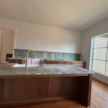
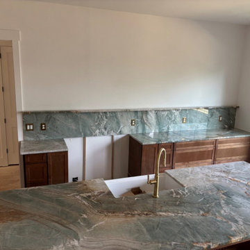
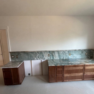
Tiffany Crystal quartzite is one of those stones that earns its keep in a kitchen. It's got that cool, crystalline background, whites and grays moving quietly across the surface with enough sparkle in the light to keep it from feeling flat. It reads clean and bright without going stark, which is why it works so well in a kitchen where people actually cook and gather, not just admire counters from across the room.
Quartzite is real stone, not engineered, so it comes with natural hardness that holds up to daily kitchen abuse. It resists scratching and handles heat well, though we still tell folks to use a trivet, because no counter needs a hot pan set straight on it just to prove a point. Sealing it right after install and keeping up with it over the years keeps the surface performing the way it should, and Tiffany Crystal takes a seal well because of its tight, dense structure.
Fabricating a slab like this takes some care in the layout. We spend real time bookmatching and dry-fitting pieces so the movement in the stone flows across seams instead of fighting itself at the corners. On a kitchen island or a run of perimeter counters, getting that continuity right is what separates a good installation from one that just gets the measurements correct. We kept the edge eased here, which is the right call on a stone with this much personality. It doesn't need extra shaping to draw the eye, the stone's already doing that work.
Day to day, this is a kitchen counter that's going to live hard and look good doing it. Quartzite shrugs off knife marks, stands up to acidic spills, and cleans up with regular dish soap and water. It's the kind of surface you stop babying after the first few months because it simply holds up.
Jobs like this one in Lexington are what we like seeing come through the shop. It's a straightforward kitchen application done with a stone that's got real depth to it, installed by people who care about how the seams and the veining line up when the job's done. That's the kind of work that keeps the Midlands trade honest.
 Rocky Tops Granite & Marble LLC
Tiffany Crystal quartzite is one of those stones that earns its keep in a kitchen. It's got that cool, crystalline background, whites and grays moving quietly across the surface with enough sparkle in the light to keep it from feeling flat. It reads clean and bright without going stark, which is why it works so well in a kitchen where people actually cook and gather, not just admire counters from across the room.
Quartzite is real stone, not engineered, so it comes with natural hardness that holds up to daily kitchen abuse. It resists scratching and handles heat well, though we still tell folks to use a trivet, because no counter needs a hot pan set straight on it just to prove a point. Sealing it right after install and keeping up with it over the years keeps the surface performing the way it should, and Tiffany Crystal takes a seal well because of its tight, dense structure.
Fabricating a slab like this takes some care in the layout. We spend real time bookmatching and dry-fitting pieces so the movement in the stone flows across seams instead of fighting itself at the corners. On a kitchen island or a run of perimeter counters, getting that continuity right is what separates a good installation from one that just gets the measurements correct. We kept the edge eased here, which is the right call on a stone with this much personality. It doesn't need extra shaping to draw the eye, the stone's already doing that work.
Day to day, this is a kitchen counter that's going to live hard and look good doing it. Quartzite shrugs off knife marks, stands up to acidic spills, and cleans up with regular dish soap and water. It's the kind of surface you stop babying after the first few months because it simply holds up.
Jobs like this one in Lexington are what we like seeing come through the shop. It's a straightforward kitchen application done with a stone that's got real depth to it, installed by people who care about how the seams and the veining line up when the job's done. That's the kind of work that keeps the Midlands trade honest.
 User
The XXTwo Plan merges ultimate functionality with a clean Scandinavian-inspired modern farmhouse minimalism. From the curb, the design presents with an impressive stature marked by a tall 2-story gable massing, flanked by a flat-roofed wing and entryway sheltered by a quaint second-story deck above. This rendition is skinned with a dark concrete brick, accented by a richly-stained tongue and groove cedar wood facade.
Designed specifically for NE16, my OKC Urban Renewal-awarded redevelopment project in inner Oklahoma City, this plan is compatible with narrow lots while still packing in nearly 1900 square feet of pure, functional living space. It includes a standard 1-car garage with modern, satin-glass window garage door, but when building from scratch, can also be re-configured as a pull-through breezeway into a backyard parking scenario, where a detached garage is also possible.
Guests are greeted with an impressive two-story vaulted, naturally-lit staircase immediately adjacent to the front door. The great room, complete with a touch of industrial-modern with its exposed HVAC ductwork, is vast with a roomy kitchen on one end and living room at the other. Just beyond the living room is a 3-panel door system to the back patio and yard.
Kitchen-wise, modern enthusiasts who love to cook will enjoy the large kitchen wall that includes an impressive range and vent hood with a horizontal slider window built right into the backsplash over the cooktop. The island also includes one of my signature built-in tables that comfortably seats six, and is one less piece of furniture to buy. A powder bathroom also resides downstairs, saving you that quick climb up the stairs just for a quick bathroom stop.
When it's time to retire for the evening, the upstairs offers several living options. Just atop the staircase is a double-door system that provides not only natural light, but access to the quaint rooftop deck overlooking the front yard. The hall leads to a full bathroom, linen closet, and spacious back bedroom with walk-in closet. Down the other end of the hall leads to the master suite, utility room, and 3rd bedroom, also with its own master closet.
The master suite, the largest of the three bedrooms, has its own full bathroom with dual sinks, shower, toilet room, and large walk-in closet with that direct, secondary connectivity to the utility room that many of my designs are known for.
If a truly-modern curb appeal that doesn't skimp on functional space is what you're after, give the XXTwo a good look. | jC
 Rocky Tops Granite & Marble LLC
Tiffany Crystal quartzite is one of those stones that earns its keep in a kitchen. It's got that cool, crystalline background, whites and grays moving quietly across the surface with enough sparkle in the light to keep it from feeling flat. It reads clean and bright without going stark, which is why it works so well in a kitchen where people actually cook and gather, not just admire counters from across the room.
Quartzite is real stone, not engineered, so it comes with natural hardness that holds up to daily kitchen abuse. It resists scratching and handles heat well, though we still tell folks to use a trivet, because no counter needs a hot pan set straight on it just to prove a point. Sealing it right after install and keeping up with it over the years keeps the surface performing the way it should, and Tiffany Crystal takes a seal well because of its tight, dense structure.
Fabricating a slab like this takes some care in the layout. We spend real time bookmatching and dry-fitting pieces so the movement in the stone flows across seams instead of fighting itself at the corners. On a kitchen island or a run of perimeter counters, getting that continuity right is what separates a good installation from one that just gets the measurements correct. We kept the edge eased here, which is the right call on a stone with this much personality. It doesn't need extra shaping to draw the eye, the stone's already doing that work.
Day to day, this is a kitchen counter that's going to live hard and look good doing it. Quartzite shrugs off knife marks, stands up to acidic spills, and cleans up with regular dish soap and water. It's the kind of surface you stop babying after the first few months because it simply holds up.
Jobs like this one in Lexington are what we like seeing come through the shop. It's a straightforward kitchen application done with a stone that's got real depth to it, installed by people who care about how the seams and the veining line up when the job's done. That's the kind of work that keeps the Midlands trade honest.
 Rose Restoration
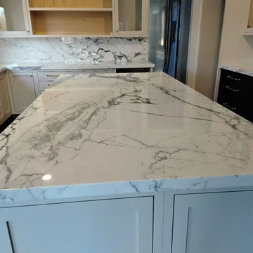
Calacatta marble island and backsplash after restoration. We cleaned the stone, removed etch marks and light scratching by honing, brought the surface back to an even polish and then sealed it. No replacement, all work done in place.
 Tile Doctor Ltd
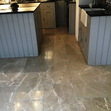
This Limestone tiled floor installed in a kitchen and family room at a property in Wellingborough is a great example of how this material can lose its appearance without a regular maintenance plan in place.
The customer called me as not only was she concerned that the floor had lost its lustre the grey grout had become very stained and almost black in heavy traffic areas, in fact my customer had originally asked about re-grouting but I was confident it could be cleaned.
I provided a quote which they were happy to accept.
The area was a nice wide 6 metre by 5 metre space and except for a few items of furniture that would need moving around there were relatively few obstacles. I reasoned the most efficient way to restore the polished appearance of the Limestone would be to use a set of diamond encrusted Burnishing Pads. These are fitted to a rotary machine and applied to the stone in sequence from coarse to smooth. It’s an effective process that cuts back the layer of dirt on the floor and then we build back up the polish.
We started burnishing the Limestone with a coarse 400-grit pad fitted to a rotary machine and applied with a little water for lubrication. The coarse pad is very good at removing dirt and old sealers from stone and once completed the resultant surface water and loose dirt is removed using a wet vacuum.
At this point I turned my attention to the badly stained grout lines, and applied a strong solution of Tile Doctor Pro-Clean which was scrubbed in along the grout lines using a stiff grout brush, this is necessary as the recessed nature of the grout makes it difficult for the rotary pads to reach it.
I then repeated the burnishing process with the medium 800-grit pad and fine 1500-grit pad, the 800-grit pad removes any small surface scratches and the 1500-grit further refines the look of the Limestone slowly restoring its polished appearance.
After the whole floor had been burnished in this way it was given a further rinse with water and the soil extracted as before. I then inspected the floor to see if more work would be needed.
I was not fully happy with how some of the grout lines had responded, some were still slightly stained, and some marks were visible in the high traffic areas. I had already discussed on my initial visit with the client that this might be the case and it was agreed between us that should this be the case I would apply a Tile Doctor Grout Colourant in Light Grey to recolour all the grout lines and achieve a uniform finish.
The stone and grout was still damp from cleaning and polishing, so I decided to leave the grout colouring until the following day.
On day two I started by grout recolouring all the grout lines, it’s a straight forward process but can be a little tedious where there is a lot of grout to cover. Once complete I allowed the grout colour to dry for a couple of hours before moving onto the next step.
The last pad to be applied in the stone burnishing process is the very fine 3000-grit polishing pad which is applied dry to the tiles using a small amount of water sprayed onto the floor and leaves the stone dry and with a polished silk finish.
The floor was then sealed using two coats of Tile Doctor Ultra Seal Sealant allowing the first coat to dry before applying the second. Ultra-Seal is an impregnating sealer that works by occupying the pores in the stone thereby preventing dirt from becoming ingrained there. It’s also a natural look sealer that doesn’t affect the appearance of the stone.
My customer was very happy with the transformation of her floor and provided the feedback copies below. In-fact she was so impressed with the results that she also used our services to restore the grout and silicon in one of her bathrooms.
“Phil was on time & easy to deal with and did an amazing job on my kitchen and bathroom floors and the carpets & sofa. No fuss, just a great job. Liz O.”
Phil Vissian
Northamptonshire Tile Doctor

 LEICHT Turkey by Tekart Koleksiyon
The most beautiful way to show colours in a kitchen. The collection consists of a range of modern, fashionable colours as well as more than 5 000 colours from the RAL and NCS ranges. With silky matt or high gloss surface. Flawless thanks to the use of premium carrier materials, outstanding pre-treatment and special multi-layer lacquer finishing. Incidentally, LEICHT already manufactures around 90 % of all matt lacquer kitchens solvent-free. Good to know: modern, environmentally-friendly water-based paints also get top marks when it comes to scratch resistance, abrasion resistance and light fastness.
7