
Search results for "Sets creative" in Home Design Ideas
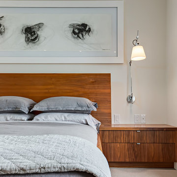

 Simply Home Decorating
This beautiful North Vancouver home belongs to a nature-loving and health-conscious couple, Emma and Vince (names changed), their two young children, and their dog, Jasper. When they contacted us about renovating and furnishing their kitchen and family room, we walked in and saw a world of potential waiting to be uncovered.
Before: Larkhall Crescent Home:
Like many original North Vancouver homes, the interior was definitely dated. We encountered late ‘80s finishes in powder pink and teal green, old carpet, and a kitchen that wasn’t maximized to suit this family’s modern-day lifestyle. However, the size of the rooms offered us a ton of space with which to get creative.
Knowing our clients’ love of cooking, need for work spaces (Emma and Vince both work remotely), and growing family, we developed a design concept that would increase usable space, optimize storage, and create intimacy in this large area. As for the style, we were inspired by their European roots, inventing a new and modern take on “Belgian Farmhouse” style. Now, the home is truly one-of-a-kind.
After: Warm & Cozy Family Room:
Fresh, bright, and comfortable, this living area has been transformed! We started with the fireplace as a focal point, selecting aged brick tiles for added texture and a crisp wood mantle. The taupe-coloured sectional infuses the room with visual warmth and serves the added purpose of separating the family room from the kitchen.
Emma and Vince were also keen on using non-toxic materials in their home, and we were happy to oblige. To meet their needs, we sourced natural wood elements and sought out Canadian-made products - that adhere to high health standards - whenever possible.
Look closer at the elements of this space, and you will find this stunning, honeycomb-patterned rug in earthy gold, beige, and charcoal tones. It’s plush to the touch and full of visual texture that brings this room’s colour palette together. We sourced these two-tone chairs with caning, petrified wood side table, black sconces, and botanical prints in greyscale from local artist, Heather Johnston.
We topped off the space with this dark wood and rattan console that offers storage facing the kitchen and presents an opportunity to display cherished items. The result is a cozy lounging space brimming with comfort and functionality. It’s perfect for enjoying quality family time, or Emma can simply slide the coffee table away to make room for her morning yoga practice.
Now, let’s turn around and give some attention to the kitchen. Do you remember what the original kitchen looked like? If not, scroll back up, because the transformation is shocking…
Moody & Welcoming Kitchen for Healthy Living:
This kitchen looks very different from how it started, right? Though we didn’t touch any walls, the kitchen has almost doubled in usable space! We created a long, extended island with storage, an outlet for small appliances, and seating for comfortable prep, after-school snacking, or mingling among friends.
On the other side of the island, the family has even more storage and an integrated dishwasher within easy reach of the sink, perfect for quick clean-up. From this angle, you can also see the expansive custom Shaker cabinetry in white and the integrated double ovens. These facilitate their cooking experience and gave us the opportunity to add an additional surprise…
A coffee garage station and more hidden storage! Keeping these items located along the perimeter allows them to be accessed by the family or their guests without someone getting under the cook’s feet. These are the little details that make everyday life easier and more enjoyable.
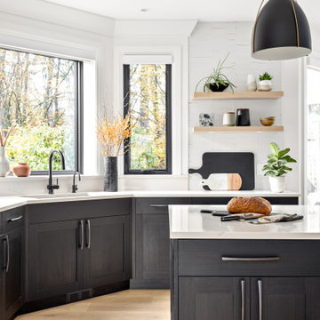
Moving deeper into the kitchen, the seamless induction cooktop topped with a freestanding concealed hood fan commands attention in a soft yet prominent way. The natural wood accent mirrors the fireplace mantle, and the choice of off-black wood-grain cabinets not only continues our black-and-white colour palette but adds a sense of depth and contrast. The corner sink is located to the right and perfectly positioned with a view of their thriving backyard.
To invite more of this family’s character into the space, we mixed metals for interest — matte black, dark pewter, and warm brass — and created open shelves in white oak for their plants and decor. You can also glimpse the tumbled edge of the backsplash tile, which echoes the rustic brick of the fireplace. It adds that farmhouse charm while still feeling timeless and sophisticated.
Last but not least, we designed this dining banquette in the bay window (with integrated bench storage, of course), where the family can share a meal together, the kids can do homework, or Emma and Vince can work and enjoy a change of scenery from their offices. Like the other spaces in the home, it was designed to be beautiful, multi-functional, and long-lasting.
Praise from Our Clients:
It is clear that we love this home, but what did our clients have to say?
“Lori is a visionary and masters execution to the finest detail all at the same time. When she first met us to know more about who we are and how we live, she could right away envision how we could use the space in our kitchen and living room…The results exceeded our expectations.
Lori and her team were also a delight to work with — coordination with all the trades, fast problem-solving, regular updates, professional and friendly attitude of her entire team — made it the dream team. Thank you SHD for making our space so beautiful!”
In turn, we are so grateful for this family’s trust, their open communication, and for being wonderful people with whom to work. (So, thank you!)
 Design Harmony
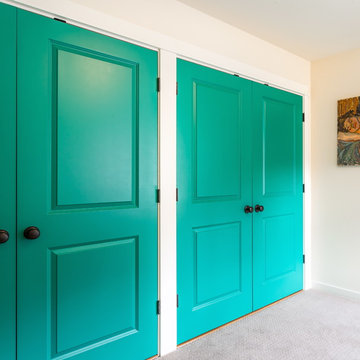
Here we transformed a guest bedroom into a home office. By adding two sets of double doors we hid the washer, dryer & all miscellaneous office equipment.
Using the clients' existing artwork as a basis for our palette, we incorporated color into the room by painting the doors this lush green.
Reupholstered chairs, sheer curtains and
Holland Photography - Cory Holland - HollandPhotography.biz
Find the right local pro for your project
 Joan Bigg Design LLC
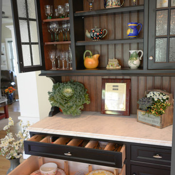
Working within a set of constraints, whether of space or budget, challenges my creativity and leads to a beautiful end result. The old kitchen used the space very poorly. The intent was just to replace the countertop. But once we investigated, the inferior cabinets needed replacing, too, so a rethink of space usage created a small and stylish kitchen of lasting quality.
 Amy Hilliker Certified Designer-The Design Project
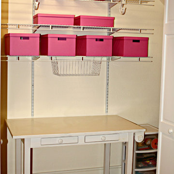
This cluttered storage closet gets a makeover and it turned into a fun craft closet for creative client.
Small trendy women's medium tone wood floor walk-in closet photo in Other
Small trendy women's medium tone wood floor walk-in closet photo in Other

 ROAM Architecture
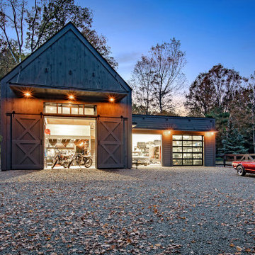
A new workshop and build space for a fellow creative!
Seeking a space to enable this set designer to work from home, this homeowner contacted us with an idea for a new workshop. On the must list were tall ceilings, lit naturally from the north, and space for all of those pet projects which never found a home. Looking to make a statement, the building’s exterior projects a modern farmhouse and rustic vibe in a charcoal black. On the interior, walls are finished with sturdy yet beautiful plywood sheets. Now there’s plenty of room for this fun and energetic guy to get to work (or play, depending on how you look at it)!


 TKS Design Group
Download our free ebook, Creating the Ideal Kitchen. DOWNLOAD NOW
This client was referred to us from a past client. They are a busy 2-career household with young children and enjoy entertaining friends and family in their home. They have a beautiful open concept home but unfortunately the kitchen was not fitting for the rest of the home. They were not quite sure what to do with the space. We talked about trying to refresh it or do more of a minor remodel, but in the end they decided a full gut would get them to where they wanted to be.
One problem was there was no place for guests to hang out other than the large and awkward banquette area. The brick wall and tiled hood area were feeling a bit dated and tired. The space was just not functional for their lifestyle. There was no prep space near the cooktop and no landing area for items coming out of the ovens or refrigerator, plus a big dead zone in the center of the room.
Banquettes, like the one they previously had in the space, are great for small spaces, but when they get really large like this one, it makes getting in and out of the seating area awkward and uncomfortable. Plus, there was room for a large table, so we eliminated the awkward built in.
We started by removing the faux brick wall between the kitchen and back entry. We relocated the entry to the garage over a couple feet in order to get every last inch out of the new kitchen. We also made the decision to close up the primary window that faced the pretty ho hum brick wall of the neighbor’s house. There was plenty of light coming in from the seating area, so we just didn’t feel the window was adding much to the room.
Construction went smoothy. There was a bit of rework with electrical, flooring and HVAC, but in the end, we think it was well worth it.
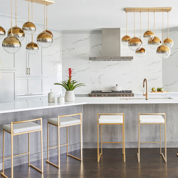
The clients really wanted a sleek contemporary look, and we originally had planned for a full height slab backsplash, but due to it’s size, it was a budget buster. Instead, we got creative and settled on large format porcelain tiles that have a similar feel but were a fraction of the cost. We made sure the wall was plumb and level so that the fit and finish would mimic that of slab material.
The final space was quite a change. A large prep sink sits directly across from the new pro-style range with plenty additional prep space on the large island. The refrigerator and ovens now have miles of landing space, and a nice tight work triangle makes cooking a breeze.
Since we wanted a more contemporary feel, not many wall cabinets were included. Instead, we outfitted some of the drawers for dish storage with a peg system. Two large pantries flanking the refrigerator hold baking supplies and small appliances. Large drawers by the cooktop hold pots and pans, and an appliance garage tucked away to the left of the range hides away miscellaneous items. The large island also houses a microwave drawer and tons of storage, most of which is drawers offering maximum convenience.
The island now seats 5-6 people comfortably along with the new table in the seating area which can seat up to 8. Entertaining will be a breeze in this space. With such a clean backdrop, we knew we would need some drama with the lighting, so we chose two sets of staggered pendants, which we adjusted for the right visual balance above the island.
We also included a small coffee station to the right of the main kitchen, which helps keep the coffee clutter out of the kitchen proper. Two tones of complimentary gray are featured in this kitchen. The perimeter is a light gray that reads almost white. The island is a gray stain that adds some depth and interest with the visible wood texture. The countertops are clean white quartz, and the hardware, barstools and light fixtures add warm brass tones. I see lots of cooking and entertaining with family and friends in the near future in this bright and airy new space.
Designed by: Susan Klimala, CKD, CBD
Photography by: Michael Kaskel
For more information on kitchen and bath design ideas go to: www.kitchenstudio-ge.com
 Chris Earl
Apartment Therapy: Monica Wang
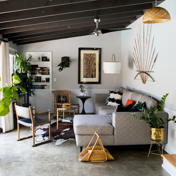
Large eclectic enclosed concrete floor family room photo in Los Angeles with gray walls, no fireplace and a corner tv
Large eclectic enclosed concrete floor family room photo in Los Angeles with gray walls, no fireplace and a corner tv
 Garden Gate Landscaping
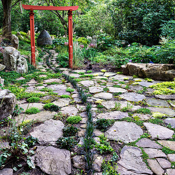
A complete and eclectic rear garden renovation with a creative blend of formal and natural elements. Formal lawn panel and rose garden, craftsman style wood deck and trellis, homages to Goldsworthy and Stonehenge with large boulders and a large stone cairn, several water features, a Japanese Torii gate, rock walls and steps, vegetables and herbs in containers and a new parking area paved with permeable pavers that feed an underground storage area that in turns irrigates the garden. All this blends into a diverse but cohesive garden.
Designed by Charles W Bowers, Built by Garden Gate Landscaping, Inc. © Garden Gate Landscaping, Inc./Charles W. Bowers
 Nar Design Group
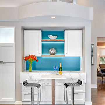
This home remodel is a celebration of curves and light. Starting from humble beginnings as a basic builder ranch style house, the design challenge was maximizing natural light throughout and providing the unique contemporary style the client’s craved.
The Entry offers a spectacular first impression and sets the tone with a large skylight and an illuminated curved wall covered in a wavy pattern Porcelanosa tile.
The chic entertaining kitchen was designed to celebrate a public lifestyle and plenty of entertaining. Celebrating height with a robust amount of interior architectural details, this dynamic kitchen still gives one that cozy feeling of home sweet home. The large “L” shaped island accommodates 7 for seating. Large pendants over the kitchen table and sink provide additional task lighting and whimsy. The Dekton “puzzle” countertop connection was designed to aid the transition between the two color countertops and is one of the homeowner’s favorite details. The built-in bistro table provides additional seating and flows easily into the Living Room.
A curved wall in the Living Room showcases a contemporary linear fireplace and tv which is tucked away in a niche. Placing the fireplace and furniture arrangement at an angle allowed for more natural walkway areas that communicated with the exterior doors and the kitchen working areas.
The dining room’s open plan is perfect for small groups and expands easily for larger events. Raising the ceiling created visual interest and bringing the pop of teal from the Kitchen cabinets ties the space together. A built-in buffet provides ample storage and display.
The Sitting Room (also called the Piano room for its previous life as such) is adjacent to the Kitchen and allows for easy conversation between chef and guests. It captures the homeowner’s chic sense of style and joie de vivre.
 Lauren King Interior Design
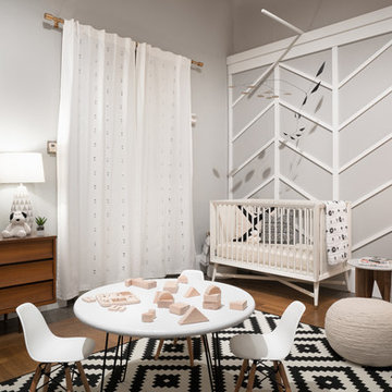
This project was a part of the 2017 Decorators' Showhouse in Columbus, Ohio. Twelve designers each created a room within the Columbus Museum of Art, making this the first showhouse to take place within a museum. Each designer was allowed to use a piece of artwork from the museum's collection in their space.
The intent of this design was to create a contemporary, gender-neutral nursery with touches of mid-century modern style. Mid-century modern design is sleek, simple, functional and bright. Here, the combination of vintage and contemporary furnishings and accessories all come together to create a space that is calm, yet inspires creative play.
The artwork, California Landscape by Stanton Macdonald-Wright, sets this tone. His modern abstract, devoid of illustration uses blocks of color to create space and form. This idea of geometric abstracts is repeated throughout the design of the room. Interesting shapes that can be manipulated with eye or hand are very fitting for a nursery. This is a space where a child can dream and play, grow and learn, and also rest. It is a room that could evolve over time while continuing to inspire a child for many years.
“I strive to divest my work of all anecdote and illustration and to purify it to the point where the emotions of the spectator will be wholly aesthetic, as when listening to good music…”
- Stanton Macdonald-Wright, circa 1915
Photo Credit: Marshall Evan Photography
Construction: Jameson Building Co.


Sponsored
Columbus, OH

Hope Restoration & General Contracting
Columbus Design-Build, Kitchen & Bath Remodeling, Historic Renovations
 Carol's Interior Fashions
ehlen creative communications
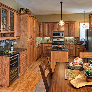
Inspiration for a large timeless u-shaped light wood floor and beige floor eat-in kitchen remodel in Minneapolis with an undermount sink, raised-panel cabinets, light wood cabinets, quartz countertops, multicolored backsplash, mosaic tile backsplash, stainless steel appliances and an island
Inspiration for a large timeless u-shaped light wood floor and beige floor eat-in kitchen remodel in Minneapolis with an undermount sink, raised-panel cabinets, light wood cabinets, quartz countertops, multicolored backsplash, mosaic tile backsplash, stainless steel appliances and an island

 BarkClad
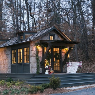
We Are Extremely Proud That Designer Cottages A Berkshire Hathaway Company Has Chosen to Use Our Exterior Poplar Bark For Their Low Country Cottage
Designer Cottages feature floor plans that maximize every inch. Fashionably integrated storage options. A classic design from a leading architect. Whether you seek a primary residence, leisurely getaway home, a deluxe mother-in-law suite or a downsize with hand-picked amenities, Designer Cottages is the choice for world-class, luxury living.
All Designer Cottages are designed by Architect Jeffrey Dungan. Jeff’s discovered a love for art and drawing at a young age while growing up on his family farm in rural Alabama. Dungan’s creative work can be seen throughout North and Central America.
 Inchoate
Photos by Brian Reitz, Creative Vision Studios
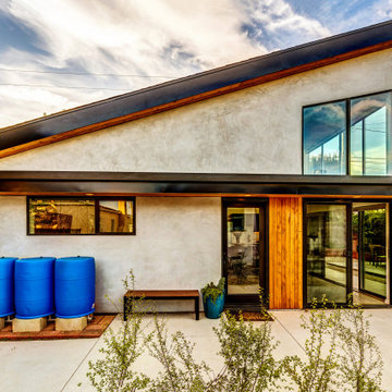
Example of a small trendy gray one-story stucco house exterior design in Los Angeles with a shed roof
Example of a small trendy gray one-story stucco house exterior design in Los Angeles with a shed roof
 TriplePoint Design Build
Flawless craftsmanship, creative storage solutions, angled cabinets, efficient work triangle, elevated ceilings and lots of natural light bring this contemporary kitchen to life.
 Little Dragon Decor
Modern great room overlooking White Rock Lake in Dallas, Texas.
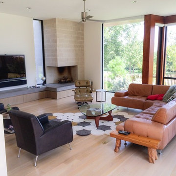
Example of a huge minimalist open concept light wood floor living room design in Boston with white walls, a corner fireplace and a wall-mounted tv
Example of a huge minimalist open concept light wood floor living room design in Boston with white walls, a corner fireplace and a wall-mounted tv
150