
Search results for "Short elegance" in Home Design Ideas
 Drury Design
THE SETUP
Multiple ovens, multiple workspaces, multiple sinks – when you think about it, non-jewish kitchens have been adapting the criteria of kosher kitchens for years.
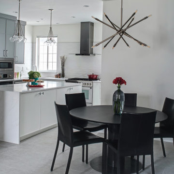
Gladys’ clients in West Rogers Park are Orthodox Jewish. The house they bought already had a kosher kitchen – it just wasn’t done that well. It needed some more things to be duplicated for the dairy side and the meat side. Plus, it was dark and the configuration wasn’t very conducive for a family of eight.
It was time for a remodel.
Design Objectives
Improve kosher kitchen
Add more storage in the island
Better lighting
More open, lighter feel
Change the wood floor in the kitchen to tile
THE REMODEL
Design Challenges
- We had originally planned on removing a wing wall by the breakfast area. During demolition, we learned it contained a support beam.
- The kitchen is a substantial size, but having two sinks, dishwashers, and ovens presented a challenge – how do we fit it all in and make it flow with the storage still accessible near the work areas?
Where do you stop the materials for the new space? - -- The right tile, paint, lighting, etc. would be needed to make the remodeled area cohesive with the rest of the main floor.
- An existing column limited cabinet options and thus, storage capacity. Could we conceal it without disrupting the cabinetry flow?
Design Solutions
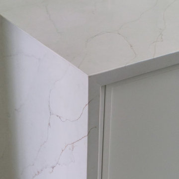
- We had to keep the wing wall, but decided to continue the tile on the sides of the cabinets and maintain the height of the tile to line up with the rest of the backsplash. This actually presented a very nice and cohesive look, especially since the opposite side has a wing wall to the left of the refrigerator.
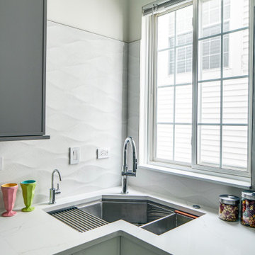
- We used “L-shaped” corner sinks instead of the rectangular ones set on an angle. This gave us more of the legs of the triangles versus the hypotenuse, which allowed for the two dishwashers, and the pullout utensil canisters and spice pullouts while still keeping the 3-drawer cabinets on either side of the range (by the sinks). The old island had the recess for stools which the family never used. By extending the width of the island 6” and utilizing this leg space, we were able to fit 18”-deep cabinets on this side – adding lots of accessible storage. The family can now work simultaneously on the dairy side (the side with the fridge) and the meat side (opposite) without getting in each other’s way. We separated the cooking by using the range oven for the meat and a built-in microwave in the base cabinet. The wall oven with built-in microwave on top is for dairy.
- Corner sinks opened up the middle area for a wider range – we went from a 30” to a 36”. Removing all the wall cabinets (on the range wall) made a big difference. That opened up the entire space while adding some visual impact. (Not pictured: We also made the cabinets directly opposite the range wall tall and removed the countertop, resulting in more room for rollouts and even more storage!) The kitchen now has more storage than it did before.
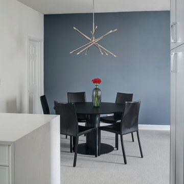
- We ended up painting the ceiling of the kitchen into the hallway that leads to the foyer. The living and dining rooms were separated by a soffit, so that became a natural boundary. We kept the tile in the kitchen by stopping it short of the hallway and lining it up with the pantry wall. This creates a border between the breakfast area and family room. The rest of the existing wood floors were refinished to refresh and make the hue darker. We also painted a dark accent wall and carried it into the breakfast area to make the rooms look deeper.
- The in-the-way column housed plumbing and couldn’t be moved. We still built cabinets in that spot – we just had to build a chase inside it to conceal the pipes. There was still plenty of room for new storage. We also took the cabinets all the way to the ceiling. The continuous tall cabinets added a functional elegance to the space.
THE RENEWED SPACE
The client’s long-awaited dream of a better kosher kitchen has finally been achieved, beautifully combining enhanced storage solutions with adherence to the family’s orthodox dietary laws. The kitchen’s standout feature, an expanded island, now offers a spacious and efficient workspace. This allows several family members to cook together comfortably, without the inconvenience of bumping into each other, ensuring a harmonious and productive cooking environment.

 OC Dutch Doors - By Creative Co.
Inspiration for a mid-sized transitional front door remodel in Orange County with a blue front door
 Drury Design
THE SETUP
Multiple ovens, multiple workspaces, multiple sinks – when you think about it, non-jewish kitchens have been adapting the criteria of kosher kitchens for years.
Gladys’ clients in West Rogers Park are Orthodox Jewish. The house they bought already had a kosher kitchen – it just wasn’t done that well. It needed some more things to be duplicated for the dairy side and the meat side. Plus, it was dark and the configuration wasn’t very conducive for a family of eight.
It was time for a remodel.
Design Objectives
Improve kosher kitchen
Add more storage in the island
Better lighting
More open, lighter feel
Change the wood floor in the kitchen to tile
THE REMODEL
Design Challenges
- We had originally planned on removing a wing wall by the breakfast area. During demolition, we learned it contained a support beam.
- The kitchen is a substantial size, but having two sinks, dishwashers, and ovens presented a challenge – how do we fit it all in and make it flow with the storage still accessible near the work areas?
Where do you stop the materials for the new space? - -- The right tile, paint, lighting, etc. would be needed to make the remodeled area cohesive with the rest of the main floor.
- An existing column limited cabinet options and thus, storage capacity. Could we conceal it without disrupting the cabinetry flow?
Design Solutions
- We had to keep the wing wall, but decided to continue the tile on the sides of the cabinets and maintain the height of the tile to line up with the rest of the backsplash. This actually presented a very nice and cohesive look, especially since the opposite side has a wing wall to the left of the refrigerator.
- We used “L-shaped” corner sinks instead of the rectangular ones set on an angle. This gave us more of the legs of the triangles versus the hypotenuse, which allowed for the two dishwashers, and the pullout utensil canisters and spice pullouts while still keeping the 3-drawer cabinets on either side of the range (by the sinks). The old island had the recess for stools which the family never used. By extending the width of the island 6” and utilizing this leg space, we were able to fit 18”-deep cabinets on this side – adding lots of accessible storage. The family can now work simultaneously on the dairy side (the side with the fridge) and the meat side (opposite) without getting in each other’s way. We separated the cooking by using the range oven for the meat and a built-in microwave in the base cabinet. The wall oven with built-in microwave on top is for dairy.
- Corner sinks opened up the middle area for a wider range – we went from a 30” to a 36”. Removing all the wall cabinets (on the range wall) made a big difference. That opened up the entire space while adding some visual impact. (Not pictured: We also made the cabinets directly opposite the range wall tall and removed the countertop, resulting in more room for rollouts and even more storage!) The kitchen now has more storage than it did before.
- We ended up painting the ceiling of the kitchen into the hallway that leads to the foyer. The living and dining rooms were separated by a soffit, so that became a natural boundary. We kept the tile in the kitchen by stopping it short of the hallway and lining it up with the pantry wall. This creates a border between the breakfast area and family room. The rest of the existing wood floors were refinished to refresh and make the hue darker. We also painted a dark accent wall and carried it into the breakfast area to make the rooms look deeper.
- The in-the-way column housed plumbing and couldn’t be moved. We still built cabinets in that spot – we just had to build a chase inside it to conceal the pipes. There was still plenty of room for new storage. We also took the cabinets all the way to the ceiling. The continuous tall cabinets added a functional elegance to the space.
THE RENEWED SPACE
The client’s long-awaited dream of a better kosher kitchen has finally been achieved, beautifully combining enhanced storage solutions with adherence to the family’s orthodox dietary laws. The kitchen’s standout feature, an expanded island, now offers a spacious and efficient workspace. This allows several family members to cook together comfortably, without the inconvenience of bumping into each other, ensuring a harmonious and productive cooking environment.
Find the right local pro for your project

 TVL Creative Ltd.
This project is an incredible transformation and the perfect example of successful style mixing! This client, and now a good friend of TVL (as they all become), is a wonderfully eclectic and adventurous one with immense interest in texture play, pops of color, and unique applications. Our scope in this home included a full kitchen renovation, main level powder room renovation, and a master bathroom overhaul. Taking just over a year to complete from the first design phases to final photos, this project was so insanely fun and packs an amazing amount of fun details and lively surprises. The original kitchen was large and fairly functional. However, the cabinetry was dated, the lighting was inefficient and frankly ugly, and the space was lacking personality in general. Our client desired maximized storage and a more personalized aesthetic. The existing cabinets were short and left the nice height of the space under-utilized. We integrated new gray shaker cabinets from Waypoint Living Spaces and ran them to the ceiling to really exaggerate the height of the space and to maximize usable storage as much as possible. The upper cabinets are glass and lit from within, offering display space or functional storage as the client needs. The central feature of this space is the large cobalt blue range from Viking as well as the custom made reclaimed wood range hood floating above. The backsplash along this entire wall is vertical slab of marble look quartz from Pental Surfaces. This matches the expanse of the same countertop that wraps the room. Flanking the range, we installed cobalt blue lantern penny tile from Merola Tile for a playful texture that adds visual interest and class to the entire room. We upgraded the lighting in the ceiling, under the cabinets, and within cabinets--we also installed accent sconces over each window on the sink wall to create cozy and functional illumination. The deep, textured front Whitehaven apron sink is a dramatic nod to the farmhouse aesthetic from KOHLER, and it's paired with the bold and industrial inspired Tournant faucet, also from Kohler. We finalized this space with other gorgeous appliances, a super sexy dining table and chair set from Room & Board, the Paxton dining light from Pottery Barn and a small bar area and pantry on the far end of the space. In the small powder room on the main level, we converted a drab builder-grade space into a super cute, rustic-inspired washroom. We utilized the Bonner vanity from Signature Hardware and paired this with the cute Ashfield faucet from Pfister. The most unique statements in this room include the water-drop light over the vanity from Shades Of Light, the copper-look porcelain floor tile from Pental Surfaces and the gorgeous Cashmere colored Tresham toilet from Kohler. Up in the master bathroom, elegance abounds. Using the same footprint, we upgraded everything in this space to reflect the client's desire for a more bright, patterned and pretty space. Starting at the entry, we installed a custom reclaimed plank barn door with bold large format hardware from Rustica Hardware. In the bathroom, the custom slate blue vanity from Tharp Cabinet Company is an eye catching statement piece. This is paired with gorgeous hardware from Amerock, vessel sinks from Kohler, and Purist faucets also from Kohler. We replaced the old built-in bathtub with a new freestanding soaker from Signature Hardware. The floor tile is a bold, graphic porcelain tile with a classic color scheme. The shower was upgraded with new tile and fixtures throughout: new clear glass, gorgeous distressed subway tile from the Castle line from TileBar, and a sophisticated shower panel from Vigo. We finalized the space with a small crystal chandelier and soft gray paint. This project is a stunning conversion and we are so thrilled that our client can enjoy these personalized spaces for years to come.
 StoneUnlimited Kitchen and Bath Remodeling
Sip into Style: Maple Latte Remodel
Kitchens are often the centerpiece of our homes, a place where culinary creativity meets family gatherings. Yet, many kitchens fall victim to outdated designs and worn-out finishes. If you’re feeling uninspired by your current space, it’s time to consider a remodel that can elevate your kitchen from drab to fab.
Let’s explore how we transformed this client’s kitchen into a posh, stylish retreat that featured a combination of stunning materials and thoughtful design choices that truly elevated the space.
Creating an Open Concept
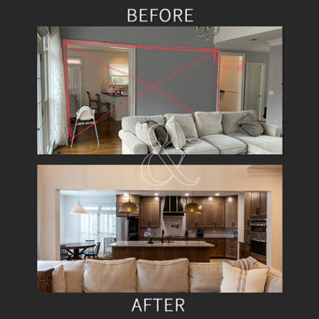
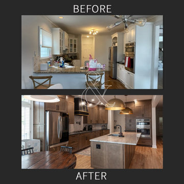
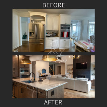
One of the most significant changes anyone can make in a home remodel is to modify or remove walls. Even though there were two points of entry into this client’s kitchen, the space was closed off. Opening up the wall instantly created a more open and inviting layout that allowed for the installation of a large island. Eliminating the barrier between the kitchen and the adjacent living area, provides a seamless flow that is perfect for entertaining guests or simply keeping an eye on the kids while cooking dinner.
A Showstopping Island
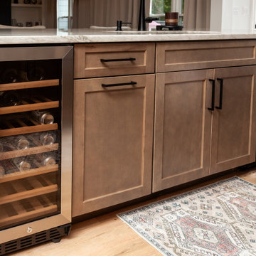
At the heart of this kitchen remodel is an expansive 9 ft. island, designed to be both functional and aesthetically pleasing. The island features a stunning White Pearl natural quartzite countertop that radiates elegance. With its unique veining and shimmering finish, this stone serves as a beautiful focal point and adds a touch of luxury to the space. A beverage cooler and dishwasher are tucked underneath, concealed from the view of the living area. Three 12” deep and 36” wide cabinets line the front of the island providing additional hidden storage. This multifunctional design makes the island an essential part of daily life in the kitchen, making it a cozy spot for casual dining or morning coffee.
Complementary Perimeter Countertops
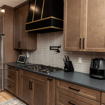
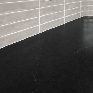
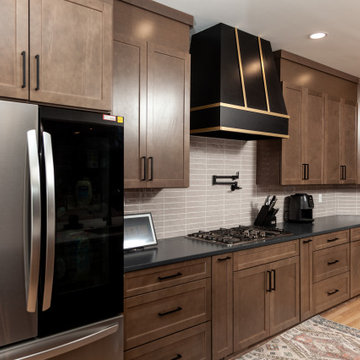
To enhance the overall look, the perimeter countertops are topped with Silestone Eternal Charcoal. This material offers a striking contrast to the lighter island, featuring rich, dark hues that ground the space and create depth. The durability and easy maintenance of Silestone make it an ideal choice for busy kitchens, ensuring that the surfaces remain beautiful and functional for years to come.
Beautiful Cabinetry
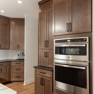
The cabinetry in this remodel plays a pivotal role in both style and storage. We opted for Waypoint Cabinetry in a Maple Latte finish, which adds warmth and sophistication to the kitchen. The soft, neutral tones of the cabinetry complement the countertops beautifully and create a cohesive look throughout the space. The cabinets are thoughtfully designed to provide ample storage, with pull-out shelves and organizers that maximize accessibility.
Finishing Touches
No remodel is complete without the right finishing touches. We chose sleek, modern matte black Top Knobs hardware that enhances the cabinetry's clean lines while adding a touch of contemporary flair. The 2 ½” x 10” San Marcos Tortora stylish backsplash tile, a striking black hood with brushed gold accents and brushed gold large pendant lighting tie together the colors and textures of the room, adding visual interest.
The Result: A Dream Kitchen
The result of this kitchen remodel is nothing short of spectacular. The combination of the open layout, stunning island, and thoughtful materials creates a space that is both functional and beautiful.
Whether you’re considering a full kitchen remodel or simply looking for inspiration, this project highlights the transformative power of thoughtful design and quality materials. If you’re ready to create your dream kitchen, don’t hesitate to contact us so that we can help bring your vision to life. Happy remodeling!
Cabinetry: Waypoint Living Spaces: Maple Latte Stain Finish
Countertops: Stone Showcase - Atlanta Natural Quartzite White Pearl &
Engineered Quart Silestone by Cosentino Eternal Charcoal
Tile: San Marcos Tortora B&F Ceramics Design Showroom Inc.
Faucets: Delta Faucet
 Drury Design
THE SETUP
Multiple ovens, multiple workspaces, multiple sinks – when you think about it, non-jewish kitchens have been adapting the criteria of kosher kitchens for years.
Gladys’ clients in West Rogers Park are Orthodox Jewish. The house they bought already had a kosher kitchen – it just wasn’t done that well. It needed some more things to be duplicated for the dairy side and the meat side. Plus, it was dark and the configuration wasn’t very conducive for a family of eight.
It was time for a remodel.
Design Objectives
Improve kosher kitchen
Add more storage in the island
Better lighting
More open, lighter feel
Change the wood floor in the kitchen to tile
THE REMODEL
Design Challenges
- We had originally planned on removing a wing wall by the breakfast area. During demolition, we learned it contained a support beam.
- The kitchen is a substantial size, but having two sinks, dishwashers, and ovens presented a challenge – how do we fit it all in and make it flow with the storage still accessible near the work areas?
Where do you stop the materials for the new space? - -- The right tile, paint, lighting, etc. would be needed to make the remodeled area cohesive with the rest of the main floor.
- An existing column limited cabinet options and thus, storage capacity. Could we conceal it without disrupting the cabinetry flow?
Design Solutions
- We had to keep the wing wall, but decided to continue the tile on the sides of the cabinets and maintain the height of the tile to line up with the rest of the backsplash. This actually presented a very nice and cohesive look, especially since the opposite side has a wing wall to the left of the refrigerator.
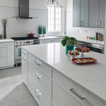
- We used “L-shaped” corner sinks instead of the rectangular ones set on an angle. This gave us more of the legs of the triangles versus the hypotenuse, which allowed for the two dishwashers, and the pullout utensil canisters and spice pullouts while still keeping the 3-drawer cabinets on either side of the range (by the sinks). The old island had the recess for stools which the family never used. By extending the width of the island 6” and utilizing this leg space, we were able to fit 18”-deep cabinets on this side – adding lots of accessible storage. The family can now work simultaneously on the dairy side (the side with the fridge) and the meat side (opposite) without getting in each other’s way. We separated the cooking by using the range oven for the meat and a built-in microwave in the base cabinet. The wall oven with built-in microwave on top is for dairy.
- Corner sinks opened up the middle area for a wider range – we went from a 30” to a 36”. Removing all the wall cabinets (on the range wall) made a big difference. That opened up the entire space while adding some visual impact. (Not pictured: We also made the cabinets directly opposite the range wall tall and removed the countertop, resulting in more room for rollouts and even more storage!) The kitchen now has more storage than it did before.
- We ended up painting the ceiling of the kitchen into the hallway that leads to the foyer. The living and dining rooms were separated by a soffit, so that became a natural boundary. We kept the tile in the kitchen by stopping it short of the hallway and lining it up with the pantry wall. This creates a border between the breakfast area and family room. The rest of the existing wood floors were refinished to refresh and make the hue darker. We also painted a dark accent wall and carried it into the breakfast area to make the rooms look deeper.
- The in-the-way column housed plumbing and couldn’t be moved. We still built cabinets in that spot – we just had to build a chase inside it to conceal the pipes. There was still plenty of room for new storage. We also took the cabinets all the way to the ceiling. The continuous tall cabinets added a functional elegance to the space.
THE RENEWED SPACE
The client’s long-awaited dream of a better kosher kitchen has finally been achieved, beautifully combining enhanced storage solutions with adherence to the family’s orthodox dietary laws. The kitchen’s standout feature, an expanded island, now offers a spacious and efficient workspace. This allows several family members to cook together comfortably, without the inconvenience of bumping into each other, ensuring a harmonious and productive cooking environment.
 Drury Design
THE SETUP
Multiple ovens, multiple workspaces, multiple sinks – when you think about it, non-jewish kitchens have been adapting the criteria of kosher kitchens for years.
Gladys’ clients in West Rogers Park are Orthodox Jewish. The house they bought already had a kosher kitchen – it just wasn’t done that well. It needed some more things to be duplicated for the dairy side and the meat side. Plus, it was dark and the configuration wasn’t very conducive for a family of eight.
It was time for a remodel.
Design Objectives
Improve kosher kitchen
Add more storage in the island
Better lighting
More open, lighter feel
Change the wood floor in the kitchen to tile
THE REMODEL
Design Challenges
- We had originally planned on removing a wing wall by the breakfast area. During demolition, we learned it contained a support beam.
- The kitchen is a substantial size, but having two sinks, dishwashers, and ovens presented a challenge – how do we fit it all in and make it flow with the storage still accessible near the work areas?
Where do you stop the materials for the new space? - -- The right tile, paint, lighting, etc. would be needed to make the remodeled area cohesive with the rest of the main floor.
- An existing column limited cabinet options and thus, storage capacity. Could we conceal it without disrupting the cabinetry flow?
Design Solutions
- We had to keep the wing wall, but decided to continue the tile on the sides of the cabinets and maintain the height of the tile to line up with the rest of the backsplash. This actually presented a very nice and cohesive look, especially since the opposite side has a wing wall to the left of the refrigerator.
- We used “L-shaped” corner sinks instead of the rectangular ones set on an angle. This gave us more of the legs of the triangles versus the hypotenuse, which allowed for the two dishwashers, and the pullout utensil canisters and spice pullouts while still keeping the 3-drawer cabinets on either side of the range (by the sinks). The old island had the recess for stools which the family never used. By extending the width of the island 6” and utilizing this leg space, we were able to fit 18”-deep cabinets on this side – adding lots of accessible storage. The family can now work simultaneously on the dairy side (the side with the fridge) and the meat side (opposite) without getting in each other’s way. We separated the cooking by using the range oven for the meat and a built-in microwave in the base cabinet. The wall oven with built-in microwave on top is for dairy.
- Corner sinks opened up the middle area for a wider range – we went from a 30” to a 36”. Removing all the wall cabinets (on the range wall) made a big difference. That opened up the entire space while adding some visual impact. (Not pictured: We also made the cabinets directly opposite the range wall tall and removed the countertop, resulting in more room for rollouts and even more storage!) The kitchen now has more storage than it did before.
- We ended up painting the ceiling of the kitchen into the hallway that leads to the foyer. The living and dining rooms were separated by a soffit, so that became a natural boundary. We kept the tile in the kitchen by stopping it short of the hallway and lining it up with the pantry wall. This creates a border between the breakfast area and family room. The rest of the existing wood floors were refinished to refresh and make the hue darker. We also painted a dark accent wall and carried it into the breakfast area to make the rooms look deeper.
- The in-the-way column housed plumbing and couldn’t be moved. We still built cabinets in that spot – we just had to build a chase inside it to conceal the pipes. There was still plenty of room for new storage. We also took the cabinets all the way to the ceiling. The continuous tall cabinets added a functional elegance to the space.
THE RENEWED SPACE
The client’s long-awaited dream of a better kosher kitchen has finally been achieved, beautifully combining enhanced storage solutions with adherence to the family’s orthodox dietary laws. The kitchen’s standout feature, an expanded island, now offers a spacious and efficient workspace. This allows several family members to cook together comfortably, without the inconvenience of bumping into each other, ensuring a harmonious and productive cooking environment.

 Drury Design
THE SETUP
Multiple ovens, multiple workspaces, multiple sinks – when you think about it, non-jewish kitchens have been adapting the criteria of kosher kitchens for years.
Gladys’ clients in West Rogers Park are Orthodox Jewish. The house they bought already had a kosher kitchen – it just wasn’t done that well. It needed some more things to be duplicated for the dairy side and the meat side. Plus, it was dark and the configuration wasn’t very conducive for a family of eight.
It was time for a remodel.
Design Objectives
Improve kosher kitchen
Add more storage in the island
Better lighting
More open, lighter feel
Change the wood floor in the kitchen to tile
THE REMODEL
Design Challenges
- We had originally planned on removing a wing wall by the breakfast area. During demolition, we learned it contained a support beam.
- The kitchen is a substantial size, but having two sinks, dishwashers, and ovens presented a challenge – how do we fit it all in and make it flow with the storage still accessible near the work areas?
Where do you stop the materials for the new space? - -- The right tile, paint, lighting, etc. would be needed to make the remodeled area cohesive with the rest of the main floor.
- An existing column limited cabinet options and thus, storage capacity. Could we conceal it without disrupting the cabinetry flow?
Design Solutions
- We had to keep the wing wall, but decided to continue the tile on the sides of the cabinets and maintain the height of the tile to line up with the rest of the backsplash. This actually presented a very nice and cohesive look, especially since the opposite side has a wing wall to the left of the refrigerator.
- We used “L-shaped” corner sinks instead of the rectangular ones set on an angle. This gave us more of the legs of the triangles versus the hypotenuse, which allowed for the two dishwashers, and the pullout utensil canisters and spice pullouts while still keeping the 3-drawer cabinets on either side of the range (by the sinks). The old island had the recess for stools which the family never used. By extending the width of the island 6” and utilizing this leg space, we were able to fit 18”-deep cabinets on this side – adding lots of accessible storage. The family can now work simultaneously on the dairy side (the side with the fridge) and the meat side (opposite) without getting in each other’s way. We separated the cooking by using the range oven for the meat and a built-in microwave in the base cabinet. The wall oven with built-in microwave on top is for dairy.
- Corner sinks opened up the middle area for a wider range – we went from a 30” to a 36”. Removing all the wall cabinets (on the range wall) made a big difference. That opened up the entire space while adding some visual impact. (Not pictured: We also made the cabinets directly opposite the range wall tall and removed the countertop, resulting in more room for rollouts and even more storage!) The kitchen now has more storage than it did before.
- We ended up painting the ceiling of the kitchen into the hallway that leads to the foyer. The living and dining rooms were separated by a soffit, so that became a natural boundary. We kept the tile in the kitchen by stopping it short of the hallway and lining it up with the pantry wall. This creates a border between the breakfast area and family room. The rest of the existing wood floors were refinished to refresh and make the hue darker. We also painted a dark accent wall and carried it into the breakfast area to make the rooms look deeper.
- The in-the-way column housed plumbing and couldn’t be moved. We still built cabinets in that spot – we just had to build a chase inside it to conceal the pipes. There was still plenty of room for new storage. We also took the cabinets all the way to the ceiling. The continuous tall cabinets added a functional elegance to the space.
THE RENEWED SPACE
The client’s long-awaited dream of a better kosher kitchen has finally been achieved, beautifully combining enhanced storage solutions with adherence to the family’s orthodox dietary laws. The kitchen’s standout feature, an expanded island, now offers a spacious and efficient workspace. This allows several family members to cook together comfortably, without the inconvenience of bumping into each other, ensuring a harmonious and productive cooking environment.
 TVL Creative Ltd.
This project is an incredible transformation and the perfect example of successful style mixing! This client, and now a good friend of TVL (as they all become), is a wonderfully eclectic and adventurous one with immense interest in texture play, pops of color, and unique applications. Our scope in this home included a full kitchen renovation, main level powder room renovation, and a master bathroom overhaul. Taking just over a year to complete from the first design phases to final photos, this project was so insanely fun and packs an amazing amount of fun details and lively surprises. The original kitchen was large and fairly functional. However, the cabinetry was dated, the lighting was inefficient and frankly ugly, and the space was lacking personality in general. Our client desired maximized storage and a more personalized aesthetic. The existing cabinets were short and left the nice height of the space under-utilized. We integrated new gray shaker cabinets from Waypoint Living Spaces and ran them to the ceiling to really exaggerate the height of the space and to maximize usable storage as much as possible. The upper cabinets are glass and lit from within, offering display space or functional storage as the client needs. The central feature of this space is the large cobalt blue range from Viking as well as the custom made reclaimed wood range hood floating above. The backsplash along this entire wall is vertical slab of marble look quartz from Pental Surfaces. This matches the expanse of the same countertop that wraps the room. Flanking the range, we installed cobalt blue lantern penny tile from Merola Tile for a playful texture that adds visual interest and class to the entire room. We upgraded the lighting in the ceiling, under the cabinets, and within cabinets--we also installed accent sconces over each window on the sink wall to create cozy and functional illumination. The deep, textured front Whitehaven apron sink is a dramatic nod to the farmhouse aesthetic from KOHLER, and it's paired with the bold and industrial inspired Tournant faucet, also from Kohler. We finalized this space with other gorgeous appliances, a super sexy dining table and chair set from Room & Board, the Paxton dining light from Pottery Barn and a small bar area and pantry on the far end of the space. In the small powder room on the main level, we converted a drab builder-grade space into a super cute, rustic-inspired washroom. We utilized the Bonner vanity from Signature Hardware and paired this with the cute Ashfield faucet from Pfister. The most unique statements in this room include the water-drop light over the vanity from Shades Of Light, the copper-look porcelain floor tile from Pental Surfaces and the gorgeous Cashmere colored Tresham toilet from Kohler. Up in the master bathroom, elegance abounds. Using the same footprint, we upgraded everything in this space to reflect the client's desire for a more bright, patterned and pretty space. Starting at the entry, we installed a custom reclaimed plank barn door with bold large format hardware from Rustica Hardware. In the bathroom, the custom slate blue vanity from Tharp Cabinet Company is an eye catching statement piece. This is paired with gorgeous hardware from Amerock, vessel sinks from Kohler, and Purist faucets also from Kohler. We replaced the old built-in bathtub with a new freestanding soaker from Signature Hardware. The floor tile is a bold, graphic porcelain tile with a classic color scheme. The shower was upgraded with new tile and fixtures throughout: new clear glass, gorgeous distressed subway tile from the Castle line from TileBar, and a sophisticated shower panel from Vigo. We finalized the space with a small crystal chandelier and soft gray paint. This project is a stunning conversion and we are so thrilled that our client can enjoy these personalized spaces for years to come.
 StoneUnlimited Kitchen and Bath Remodeling
Sip into Style: Maple Latte Remodel
Kitchens are often the centerpiece of our homes, a place where culinary creativity meets family gatherings. Yet, many kitchens fall victim to outdated designs and worn-out finishes. If you’re feeling uninspired by your current space, it’s time to consider a remodel that can elevate your kitchen from drab to fab.
Let’s explore how we transformed this client’s kitchen into a posh, stylish retreat that featured a combination of stunning materials and thoughtful design choices that truly elevated the space.
Creating an Open Concept
One of the most significant changes anyone can make in a home remodel is to modify or remove walls. Even though there were two points of entry into this client’s kitchen, the space was closed off. Opening up the wall instantly created a more open and inviting layout that allowed for the installation of a large island. Eliminating the barrier between the kitchen and the adjacent living area, provides a seamless flow that is perfect for entertaining guests or simply keeping an eye on the kids while cooking dinner.
A Showstopping Island
At the heart of this kitchen remodel is an expansive 9 ft. island, designed to be both functional and aesthetically pleasing. The island features a stunning White Pearl natural quartzite countertop that radiates elegance. With its unique veining and shimmering finish, this stone serves as a beautiful focal point and adds a touch of luxury to the space. A beverage cooler and dishwasher are tucked underneath, concealed from the view of the living area. Three 12” deep and 36” wide cabinets line the front of the island providing additional hidden storage. This multifunctional design makes the island an essential part of daily life in the kitchen, making it a cozy spot for casual dining or morning coffee.
Complementary Perimeter Countertops
To enhance the overall look, the perimeter countertops are topped with Silestone Eternal Charcoal. This material offers a striking contrast to the lighter island, featuring rich, dark hues that ground the space and create depth. The durability and easy maintenance of Silestone make it an ideal choice for busy kitchens, ensuring that the surfaces remain beautiful and functional for years to come.
Beautiful Cabinetry
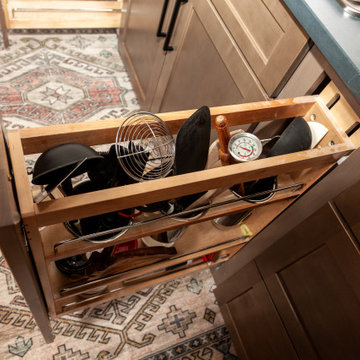
The cabinetry in this remodel plays a pivotal role in both style and storage. We opted for Waypoint Cabinetry in a Maple Latte finish, which adds warmth and sophistication to the kitchen. The soft, neutral tones of the cabinetry complement the countertops beautifully and create a cohesive look throughout the space. The cabinets are thoughtfully designed to provide ample storage, with pull-out shelves and organizers that maximize accessibility.
Finishing Touches
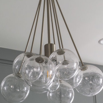
No remodel is complete without the right finishing touches. We chose sleek, modern matte black Top Knobs hardware that enhances the cabinetry's clean lines while adding a touch of contemporary flair. The 2 ½” x 10” San Marcos Tortora stylish backsplash tile, a striking black hood with brushed gold accents and brushed gold large pendant lighting tie together the colors and textures of the room, adding visual interest.
The Result: A Dream Kitchen
The result of this kitchen remodel is nothing short of spectacular. The combination of the open layout, stunning island, and thoughtful materials creates a space that is both functional and beautiful.
Whether you’re considering a full kitchen remodel or simply looking for inspiration, this project highlights the transformative power of thoughtful design and quality materials. If you’re ready to create your dream kitchen, don’t hesitate to contact us so that we can help bring your vision to life. Happy remodeling!
Cabinetry: Waypoint Living Spaces: Maple Latte Stain Finish
Countertops: Stone Showcase - Atlanta Natural Quartzite White Pearl &
Engineered Quart Silestone by Cosentino Eternal Charcoal
Tile: San Marcos Tortora B&F Ceramics Design Showroom Inc.
Faucets: Delta Faucet
 Drury Design
THE SETUP
Multiple ovens, multiple workspaces, multiple sinks – when you think about it, non-jewish kitchens have been adapting the criteria of kosher kitchens for years.
Gladys’ clients in West Rogers Park are Orthodox Jewish. The house they bought already had a kosher kitchen – it just wasn’t done that well. It needed some more things to be duplicated for the dairy side and the meat side. Plus, it was dark and the configuration wasn’t very conducive for a family of eight.
It was time for a remodel.
Design Objectives
Improve kosher kitchen
Add more storage in the island
Better lighting
More open, lighter feel
Change the wood floor in the kitchen to tile
THE REMODEL
Design Challenges
- We had originally planned on removing a wing wall by the breakfast area. During demolition, we learned it contained a support beam.
- The kitchen is a substantial size, but having two sinks, dishwashers, and ovens presented a challenge – how do we fit it all in and make it flow with the storage still accessible near the work areas?
Where do you stop the materials for the new space? - -- The right tile, paint, lighting, etc. would be needed to make the remodeled area cohesive with the rest of the main floor.
- An existing column limited cabinet options and thus, storage capacity. Could we conceal it without disrupting the cabinetry flow?
Design Solutions
- We had to keep the wing wall, but decided to continue the tile on the sides of the cabinets and maintain the height of the tile to line up with the rest of the backsplash. This actually presented a very nice and cohesive look, especially since the opposite side has a wing wall to the left of the refrigerator.
- We used “L-shaped” corner sinks instead of the rectangular ones set on an angle. This gave us more of the legs of the triangles versus the hypotenuse, which allowed for the two dishwashers, and the pullout utensil canisters and spice pullouts while still keeping the 3-drawer cabinets on either side of the range (by the sinks). The old island had the recess for stools which the family never used. By extending the width of the island 6” and utilizing this leg space, we were able to fit 18”-deep cabinets on this side – adding lots of accessible storage. The family can now work simultaneously on the dairy side (the side with the fridge) and the meat side (opposite) without getting in each other’s way. We separated the cooking by using the range oven for the meat and a built-in microwave in the base cabinet. The wall oven with built-in microwave on top is for dairy.
- Corner sinks opened up the middle area for a wider range – we went from a 30” to a 36”. Removing all the wall cabinets (on the range wall) made a big difference. That opened up the entire space while adding some visual impact. (Not pictured: We also made the cabinets directly opposite the range wall tall and removed the countertop, resulting in more room for rollouts and even more storage!) The kitchen now has more storage than it did before.
- We ended up painting the ceiling of the kitchen into the hallway that leads to the foyer. The living and dining rooms were separated by a soffit, so that became a natural boundary. We kept the tile in the kitchen by stopping it short of the hallway and lining it up with the pantry wall. This creates a border between the breakfast area and family room. The rest of the existing wood floors were refinished to refresh and make the hue darker. We also painted a dark accent wall and carried it into the breakfast area to make the rooms look deeper.
- The in-the-way column housed plumbing and couldn’t be moved. We still built cabinets in that spot – we just had to build a chase inside it to conceal the pipes. There was still plenty of room for new storage. We also took the cabinets all the way to the ceiling. The continuous tall cabinets added a functional elegance to the space.
THE RENEWED SPACE
The client’s long-awaited dream of a better kosher kitchen has finally been achieved, beautifully combining enhanced storage solutions with adherence to the family’s orthodox dietary laws. The kitchen’s standout feature, an expanded island, now offers a spacious and efficient workspace. This allows several family members to cook together comfortably, without the inconvenience of bumping into each other, ensuring a harmonious and productive cooking environment.
 StoneUnlimited Kitchen and Bath Remodeling
Sip into Style: Maple Latte Remodel
Kitchens are often the centerpiece of our homes, a place where culinary creativity meets family gatherings. Yet, many kitchens fall victim to outdated designs and worn-out finishes. If you’re feeling uninspired by your current space, it’s time to consider a remodel that can elevate your kitchen from drab to fab.
Let’s explore how we transformed this client’s kitchen into a posh, stylish retreat that featured a combination of stunning materials and thoughtful design choices that truly elevated the space.
Creating an Open Concept
One of the most significant changes anyone can make in a home remodel is to modify or remove walls. Even though there were two points of entry into this client’s kitchen, the space was closed off. Opening up the wall instantly created a more open and inviting layout that allowed for the installation of a large island. Eliminating the barrier between the kitchen and the adjacent living area, provides a seamless flow that is perfect for entertaining guests or simply keeping an eye on the kids while cooking dinner.
A Showstopping Island
At the heart of this kitchen remodel is an expansive 9 ft. island, designed to be both functional and aesthetically pleasing. The island features a stunning White Pearl natural quartzite countertop that radiates elegance. With its unique veining and shimmering finish, this stone serves as a beautiful focal point and adds a touch of luxury to the space. A beverage cooler and dishwasher are tucked underneath, concealed from the view of the living area. Three 12” deep and 36” wide cabinets line the front of the island providing additional hidden storage. This multifunctional design makes the island an essential part of daily life in the kitchen, making it a cozy spot for casual dining or morning coffee.
Complementary Perimeter Countertops
To enhance the overall look, the perimeter countertops are topped with Silestone Eternal Charcoal. This material offers a striking contrast to the lighter island, featuring rich, dark hues that ground the space and create depth. The durability and easy maintenance of Silestone make it an ideal choice for busy kitchens, ensuring that the surfaces remain beautiful and functional for years to come.
Beautiful Cabinetry
The cabinetry in this remodel plays a pivotal role in both style and storage. We opted for Waypoint Cabinetry in a Maple Latte finish, which adds warmth and sophistication to the kitchen. The soft, neutral tones of the cabinetry complement the countertops beautifully and create a cohesive look throughout the space. The cabinets are thoughtfully designed to provide ample storage, with pull-out shelves and organizers that maximize accessibility.
Finishing Touches
No remodel is complete without the right finishing touches. We chose sleek, modern matte black Top Knobs hardware that enhances the cabinetry's clean lines while adding a touch of contemporary flair. The 2 ½” x 10” San Marcos Tortora stylish backsplash tile, a striking black hood with brushed gold accents and brushed gold large pendant lighting tie together the colors and textures of the room, adding visual interest.
The Result: A Dream Kitchen
The result of this kitchen remodel is nothing short of spectacular. The combination of the open layout, stunning island, and thoughtful materials creates a space that is both functional and beautiful.
Whether you’re considering a full kitchen remodel or simply looking for inspiration, this project highlights the transformative power of thoughtful design and quality materials. If you’re ready to create your dream kitchen, don’t hesitate to contact us so that we can help bring your vision to life. Happy remodeling!
Cabinetry: Waypoint Living Spaces: Maple Latte Stain Finish
Countertops: Stone Showcase - Atlanta Natural Quartzite White Pearl &
Engineered Quart Silestone by Cosentino Eternal Charcoal
Tile: San Marcos Tortora B&F Ceramics Design Showroom Inc.
Faucets: Delta Faucet
 StoneUnlimited Kitchen and Bath Remodeling
Sip into Style: Maple Latte Remodel
Kitchens are often the centerpiece of our homes, a place where culinary creativity meets family gatherings. Yet, many kitchens fall victim to outdated designs and worn-out finishes. If you’re feeling uninspired by your current space, it’s time to consider a remodel that can elevate your kitchen from drab to fab.
Let’s explore how we transformed this client’s kitchen into a posh, stylish retreat that featured a combination of stunning materials and thoughtful design choices that truly elevated the space.
Creating an Open Concept
One of the most significant changes anyone can make in a home remodel is to modify or remove walls. Even though there were two points of entry into this client’s kitchen, the space was closed off. Opening up the wall instantly created a more open and inviting layout that allowed for the installation of a large island. Eliminating the barrier between the kitchen and the adjacent living area, provides a seamless flow that is perfect for entertaining guests or simply keeping an eye on the kids while cooking dinner.
A Showstopping Island
At the heart of this kitchen remodel is an expansive 9 ft. island, designed to be both functional and aesthetically pleasing. The island features a stunning White Pearl natural quartzite countertop that radiates elegance. With its unique veining and shimmering finish, this stone serves as a beautiful focal point and adds a touch of luxury to the space. A beverage cooler and dishwasher are tucked underneath, concealed from the view of the living area. Three 12” deep and 36” wide cabinets line the front of the island providing additional hidden storage. This multifunctional design makes the island an essential part of daily life in the kitchen, making it a cozy spot for casual dining or morning coffee.
Complementary Perimeter Countertops
To enhance the overall look, the perimeter countertops are topped with Silestone Eternal Charcoal. This material offers a striking contrast to the lighter island, featuring rich, dark hues that ground the space and create depth. The durability and easy maintenance of Silestone make it an ideal choice for busy kitchens, ensuring that the surfaces remain beautiful and functional for years to come.
Beautiful Cabinetry
The cabinetry in this remodel plays a pivotal role in both style and storage. We opted for Waypoint Cabinetry in a Maple Latte finish, which adds warmth and sophistication to the kitchen. The soft, neutral tones of the cabinetry complement the countertops beautifully and create a cohesive look throughout the space. The cabinets are thoughtfully designed to provide ample storage, with pull-out shelves and organizers that maximize accessibility.
Finishing Touches
No remodel is complete without the right finishing touches. We chose sleek, modern matte black Top Knobs hardware that enhances the cabinetry's clean lines while adding a touch of contemporary flair. The 2 ½” x 10” San Marcos Tortora stylish backsplash tile, a striking black hood with brushed gold accents and brushed gold large pendant lighting tie together the colors and textures of the room, adding visual interest.
The Result: A Dream Kitchen
The result of this kitchen remodel is nothing short of spectacular. The combination of the open layout, stunning island, and thoughtful materials creates a space that is both functional and beautiful.
Whether you’re considering a full kitchen remodel or simply looking for inspiration, this project highlights the transformative power of thoughtful design and quality materials. If you’re ready to create your dream kitchen, don’t hesitate to contact us so that we can help bring your vision to life. Happy remodeling!
Cabinetry: Waypoint Living Spaces: Maple Latte Stain Finish
Countertops: Stone Showcase - Atlanta Natural Quartzite White Pearl &
Engineered Quart Silestone by Cosentino Eternal Charcoal
Tile: San Marcos Tortora B&F Ceramics Design Showroom Inc.
Faucets: Delta Faucet
Sponsored
Columbus, OH
Free consultation for landscape design!

Peabody Landscape Group
Columbus' Reliable Landscape Design & Contracting
 Drury Design
THE SETUP
Multiple ovens, multiple workspaces, multiple sinks – when you think about it, non-jewish kitchens have been adapting the criteria of kosher kitchens for years.
Gladys’ clients in West Rogers Park are Orthodox Jewish. The house they bought already had a kosher kitchen – it just wasn’t done that well. It needed some more things to be duplicated for the dairy side and the meat side. Plus, it was dark and the configuration wasn’t very conducive for a family of eight.
It was time for a remodel.
Design Objectives
Improve kosher kitchen
Add more storage in the island
Better lighting
More open, lighter feel
Change the wood floor in the kitchen to tile
THE REMODEL
Design Challenges
- We had originally planned on removing a wing wall by the breakfast area. During demolition, we learned it contained a support beam.
- The kitchen is a substantial size, but having two sinks, dishwashers, and ovens presented a challenge – how do we fit it all in and make it flow with the storage still accessible near the work areas?
Where do you stop the materials for the new space? - -- The right tile, paint, lighting, etc. would be needed to make the remodeled area cohesive with the rest of the main floor.
- An existing column limited cabinet options and thus, storage capacity. Could we conceal it without disrupting the cabinetry flow?
Design Solutions
- We had to keep the wing wall, but decided to continue the tile on the sides of the cabinets and maintain the height of the tile to line up with the rest of the backsplash. This actually presented a very nice and cohesive look, especially since the opposite side has a wing wall to the left of the refrigerator.
- We used “L-shaped” corner sinks instead of the rectangular ones set on an angle. This gave us more of the legs of the triangles versus the hypotenuse, which allowed for the two dishwashers, and the pullout utensil canisters and spice pullouts while still keeping the 3-drawer cabinets on either side of the range (by the sinks). The old island had the recess for stools which the family never used. By extending the width of the island 6” and utilizing this leg space, we were able to fit 18”-deep cabinets on this side – adding lots of accessible storage. The family can now work simultaneously on the dairy side (the side with the fridge) and the meat side (opposite) without getting in each other’s way. We separated the cooking by using the range oven for the meat and a built-in microwave in the base cabinet. The wall oven with built-in microwave on top is for dairy.
- Corner sinks opened up the middle area for a wider range – we went from a 30” to a 36”. Removing all the wall cabinets (on the range wall) made a big difference. That opened up the entire space while adding some visual impact. (Not pictured: We also made the cabinets directly opposite the range wall tall and removed the countertop, resulting in more room for rollouts and even more storage!) The kitchen now has more storage than it did before.
- We ended up painting the ceiling of the kitchen into the hallway that leads to the foyer. The living and dining rooms were separated by a soffit, so that became a natural boundary. We kept the tile in the kitchen by stopping it short of the hallway and lining it up with the pantry wall. This creates a border between the breakfast area and family room. The rest of the existing wood floors were refinished to refresh and make the hue darker. We also painted a dark accent wall and carried it into the breakfast area to make the rooms look deeper.
- The in-the-way column housed plumbing and couldn’t be moved. We still built cabinets in that spot – we just had to build a chase inside it to conceal the pipes. There was still plenty of room for new storage. We also took the cabinets all the way to the ceiling. The continuous tall cabinets added a functional elegance to the space.
THE RENEWED SPACE
The client’s long-awaited dream of a better kosher kitchen has finally been achieved, beautifully combining enhanced storage solutions with adherence to the family’s orthodox dietary laws. The kitchen’s standout feature, an expanded island, now offers a spacious and efficient workspace. This allows several family members to cook together comfortably, without the inconvenience of bumping into each other, ensuring a harmonious and productive cooking environment.
 StoneUnlimited Kitchen and Bath Remodeling
Sip into Style: Maple Latte Remodel
Kitchens are often the centerpiece of our homes, a place where culinary creativity meets family gatherings. Yet, many kitchens fall victim to outdated designs and worn-out finishes. If you’re feeling uninspired by your current space, it’s time to consider a remodel that can elevate your kitchen from drab to fab.
Let’s explore how we transformed this client’s kitchen into a posh, stylish retreat that featured a combination of stunning materials and thoughtful design choices that truly elevated the space.
Creating an Open Concept
One of the most significant changes anyone can make in a home remodel is to modify or remove walls. Even though there were two points of entry into this client’s kitchen, the space was closed off. Opening up the wall instantly created a more open and inviting layout that allowed for the installation of a large island. Eliminating the barrier between the kitchen and the adjacent living area, provides a seamless flow that is perfect for entertaining guests or simply keeping an eye on the kids while cooking dinner.
A Showstopping Island
At the heart of this kitchen remodel is an expansive 9 ft. island, designed to be both functional and aesthetically pleasing. The island features a stunning White Pearl natural quartzite countertop that radiates elegance. With its unique veining and shimmering finish, this stone serves as a beautiful focal point and adds a touch of luxury to the space. A beverage cooler and dishwasher are tucked underneath, concealed from the view of the living area. Three 12” deep and 36” wide cabinets line the front of the island providing additional hidden storage. This multifunctional design makes the island an essential part of daily life in the kitchen, making it a cozy spot for casual dining or morning coffee.
Complementary Perimeter Countertops
To enhance the overall look, the perimeter countertops are topped with Silestone Eternal Charcoal. This material offers a striking contrast to the lighter island, featuring rich, dark hues that ground the space and create depth. The durability and easy maintenance of Silestone make it an ideal choice for busy kitchens, ensuring that the surfaces remain beautiful and functional for years to come.
Beautiful Cabinetry
The cabinetry in this remodel plays a pivotal role in both style and storage. We opted for Waypoint Cabinetry in a Maple Latte finish, which adds warmth and sophistication to the kitchen. The soft, neutral tones of the cabinetry complement the countertops beautifully and create a cohesive look throughout the space. The cabinets are thoughtfully designed to provide ample storage, with pull-out shelves and organizers that maximize accessibility.
Finishing Touches
No remodel is complete without the right finishing touches. We chose sleek, modern matte black Top Knobs hardware that enhances the cabinetry's clean lines while adding a touch of contemporary flair. The 2 ½” x 10” San Marcos Tortora stylish backsplash tile, a striking black hood with brushed gold accents and brushed gold large pendant lighting tie together the colors and textures of the room, adding visual interest.
The Result: A Dream Kitchen
The result of this kitchen remodel is nothing short of spectacular. The combination of the open layout, stunning island, and thoughtful materials creates a space that is both functional and beautiful.
Whether you’re considering a full kitchen remodel or simply looking for inspiration, this project highlights the transformative power of thoughtful design and quality materials. If you’re ready to create your dream kitchen, don’t hesitate to contact us so that we can help bring your vision to life. Happy remodeling!
Cabinetry: Waypoint Living Spaces: Maple Latte Stain Finish
Countertops: Stone Showcase - Atlanta Natural Quartzite White Pearl &
Engineered Quart Silestone by Cosentino Eternal Charcoal
Tile: San Marcos Tortora B&F Ceramics Design Showroom Inc.
Faucets: Delta Faucet
 StoneUnlimited Kitchen and Bath Remodeling
Sip into Style: Maple Latte Remodel
Kitchens are often the centerpiece of our homes, a place where culinary creativity meets family gatherings. Yet, many kitchens fall victim to outdated designs and worn-out finishes. If you’re feeling uninspired by your current space, it’s time to consider a remodel that can elevate your kitchen from drab to fab.
Let’s explore how we transformed this client’s kitchen into a posh, stylish retreat that featured a combination of stunning materials and thoughtful design choices that truly elevated the space.
Creating an Open Concept
One of the most significant changes anyone can make in a home remodel is to modify or remove walls. Even though there were two points of entry into this client’s kitchen, the space was closed off. Opening up the wall instantly created a more open and inviting layout that allowed for the installation of a large island. Eliminating the barrier between the kitchen and the adjacent living area, provides a seamless flow that is perfect for entertaining guests or simply keeping an eye on the kids while cooking dinner.
A Showstopping Island
At the heart of this kitchen remodel is an expansive 9 ft. island, designed to be both functional and aesthetically pleasing. The island features a stunning White Pearl natural quartzite countertop that radiates elegance. With its unique veining and shimmering finish, this stone serves as a beautiful focal point and adds a touch of luxury to the space. A beverage cooler and dishwasher are tucked underneath, concealed from the view of the living area. Three 12” deep and 36” wide cabinets line the front of the island providing additional hidden storage. This multifunctional design makes the island an essential part of daily life in the kitchen, making it a cozy spot for casual dining or morning coffee.
Complementary Perimeter Countertops
To enhance the overall look, the perimeter countertops are topped with Silestone Eternal Charcoal. This material offers a striking contrast to the lighter island, featuring rich, dark hues that ground the space and create depth. The durability and easy maintenance of Silestone make it an ideal choice for busy kitchens, ensuring that the surfaces remain beautiful and functional for years to come.
Beautiful Cabinetry
The cabinetry in this remodel plays a pivotal role in both style and storage. We opted for Waypoint Cabinetry in a Maple Latte finish, which adds warmth and sophistication to the kitchen. The soft, neutral tones of the cabinetry complement the countertops beautifully and create a cohesive look throughout the space. The cabinets are thoughtfully designed to provide ample storage, with pull-out shelves and organizers that maximize accessibility.
Finishing Touches
No remodel is complete without the right finishing touches. We chose sleek, modern matte black Top Knobs hardware that enhances the cabinetry's clean lines while adding a touch of contemporary flair. The 2 ½” x 10” San Marcos Tortora stylish backsplash tile, a striking black hood with brushed gold accents and brushed gold large pendant lighting tie together the colors and textures of the room, adding visual interest.
The Result: A Dream Kitchen
The result of this kitchen remodel is nothing short of spectacular. The combination of the open layout, stunning island, and thoughtful materials creates a space that is both functional and beautiful.
Whether you’re considering a full kitchen remodel or simply looking for inspiration, this project highlights the transformative power of thoughtful design and quality materials. If you’re ready to create your dream kitchen, don’t hesitate to contact us so that we can help bring your vision to life. Happy remodeling!
Cabinetry: Waypoint Living Spaces: Maple Latte Stain Finish
Countertops: Stone Showcase - Atlanta Natural Quartzite White Pearl &
Engineered Quart Silestone by Cosentino Eternal Charcoal
Tile: San Marcos Tortora B&F Ceramics Design Showroom Inc.
Faucets: Delta Faucet
 StoneUnlimited Kitchen and Bath Remodeling
Sip into Style: Maple Latte Remodel
Kitchens are often the centerpiece of our homes, a place where culinary creativity meets family gatherings. Yet, many kitchens fall victim to outdated designs and worn-out finishes. If you’re feeling uninspired by your current space, it’s time to consider a remodel that can elevate your kitchen from drab to fab.
Let’s explore how we transformed this client’s kitchen into a posh, stylish retreat that featured a combination of stunning materials and thoughtful design choices that truly elevated the space.
Creating an Open Concept
One of the most significant changes anyone can make in a home remodel is to modify or remove walls. Even though there were two points of entry into this client’s kitchen, the space was closed off. Opening up the wall instantly created a more open and inviting layout that allowed for the installation of a large island. Eliminating the barrier between the kitchen and the adjacent living area, provides a seamless flow that is perfect for entertaining guests or simply keeping an eye on the kids while cooking dinner.
A Showstopping Island
At the heart of this kitchen remodel is an expansive 9 ft. island, designed to be both functional and aesthetically pleasing. The island features a stunning White Pearl natural quartzite countertop that radiates elegance. With its unique veining and shimmering finish, this stone serves as a beautiful focal point and adds a touch of luxury to the space. A beverage cooler and dishwasher are tucked underneath, concealed from the view of the living area. Three 12” deep and 36” wide cabinets line the front of the island providing additional hidden storage. This multifunctional design makes the island an essential part of daily life in the kitchen, making it a cozy spot for casual dining or morning coffee.
Complementary Perimeter Countertops
To enhance the overall look, the perimeter countertops are topped with Silestone Eternal Charcoal. This material offers a striking contrast to the lighter island, featuring rich, dark hues that ground the space and create depth. The durability and easy maintenance of Silestone make it an ideal choice for busy kitchens, ensuring that the surfaces remain beautiful and functional for years to come.
Beautiful Cabinetry
The cabinetry in this remodel plays a pivotal role in both style and storage. We opted for Waypoint Cabinetry in a Maple Latte finish, which adds warmth and sophistication to the kitchen. The soft, neutral tones of the cabinetry complement the countertops beautifully and create a cohesive look throughout the space. The cabinets are thoughtfully designed to provide ample storage, with pull-out shelves and organizers that maximize accessibility.
Finishing Touches
No remodel is complete without the right finishing touches. We chose sleek, modern matte black Top Knobs hardware that enhances the cabinetry's clean lines while adding a touch of contemporary flair. The 2 ½” x 10” San Marcos Tortora stylish backsplash tile, a striking black hood with brushed gold accents and brushed gold large pendant lighting tie together the colors and textures of the room, adding visual interest.
The Result: A Dream Kitchen
The result of this kitchen remodel is nothing short of spectacular. The combination of the open layout, stunning island, and thoughtful materials creates a space that is both functional and beautiful.
Whether you’re considering a full kitchen remodel or simply looking for inspiration, this project highlights the transformative power of thoughtful design and quality materials. If you’re ready to create your dream kitchen, don’t hesitate to contact us so that we can help bring your vision to life. Happy remodeling!
Cabinetry: Waypoint Living Spaces: Maple Latte Stain Finish
Countertops: Stone Showcase - Atlanta Natural Quartzite White Pearl &
Engineered Quart Silestone by Cosentino Eternal Charcoal
Tile: San Marcos Tortora B&F Ceramics Design Showroom Inc.
Faucets: Delta Faucet
Sponsored
Columbus, OH

Hope Restoration & General Contracting
Columbus Design-Build, Kitchen & Bath Remodeling, Historic Renovations
 Drury Design
THE SETUP
Multiple ovens, multiple workspaces, multiple sinks – when you think about it, non-jewish kitchens have been adapting the criteria of kosher kitchens for years.
Gladys’ clients in West Rogers Park are Orthodox Jewish. The house they bought already had a kosher kitchen – it just wasn’t done that well. It needed some more things to be duplicated for the dairy side and the meat side. Plus, it was dark and the configuration wasn’t very conducive for a family of eight.
It was time for a remodel.
Design Objectives
Improve kosher kitchen
Add more storage in the island
Better lighting
More open, lighter feel
Change the wood floor in the kitchen to tile
THE REMODEL
Design Challenges
- We had originally planned on removing a wing wall by the breakfast area. During demolition, we learned it contained a support beam.
- The kitchen is a substantial size, but having two sinks, dishwashers, and ovens presented a challenge – how do we fit it all in and make it flow with the storage still accessible near the work areas?
Where do you stop the materials for the new space? - -- The right tile, paint, lighting, etc. would be needed to make the remodeled area cohesive with the rest of the main floor.
- An existing column limited cabinet options and thus, storage capacity. Could we conceal it without disrupting the cabinetry flow?
Design Solutions
- We had to keep the wing wall, but decided to continue the tile on the sides of the cabinets and maintain the height of the tile to line up with the rest of the backsplash. This actually presented a very nice and cohesive look, especially since the opposite side has a wing wall to the left of the refrigerator.
- We used “L-shaped” corner sinks instead of the rectangular ones set on an angle. This gave us more of the legs of the triangles versus the hypotenuse, which allowed for the two dishwashers, and the pullout utensil canisters and spice pullouts while still keeping the 3-drawer cabinets on either side of the range (by the sinks). The old island had the recess for stools which the family never used. By extending the width of the island 6” and utilizing this leg space, we were able to fit 18”-deep cabinets on this side – adding lots of accessible storage. The family can now work simultaneously on the dairy side (the side with the fridge) and the meat side (opposite) without getting in each other’s way. We separated the cooking by using the range oven for the meat and a built-in microwave in the base cabinet. The wall oven with built-in microwave on top is for dairy.
- Corner sinks opened up the middle area for a wider range – we went from a 30” to a 36”. Removing all the wall cabinets (on the range wall) made a big difference. That opened up the entire space while adding some visual impact. (Not pictured: We also made the cabinets directly opposite the range wall tall and removed the countertop, resulting in more room for rollouts and even more storage!) The kitchen now has more storage than it did before.
- We ended up painting the ceiling of the kitchen into the hallway that leads to the foyer. The living and dining rooms were separated by a soffit, so that became a natural boundary. We kept the tile in the kitchen by stopping it short of the hallway and lining it up with the pantry wall. This creates a border between the breakfast area and family room. The rest of the existing wood floors were refinished to refresh and make the hue darker. We also painted a dark accent wall and carried it into the breakfast area to make the rooms look deeper.
- The in-the-way column housed plumbing and couldn’t be moved. We still built cabinets in that spot – we just had to build a chase inside it to conceal the pipes. There was still plenty of room for new storage. We also took the cabinets all the way to the ceiling. The continuous tall cabinets added a functional elegance to the space.
THE RENEWED SPACE
The client’s long-awaited dream of a better kosher kitchen has finally been achieved, beautifully combining enhanced storage solutions with adherence to the family’s orthodox dietary laws. The kitchen’s standout feature, an expanded island, now offers a spacious and efficient workspace. This allows several family members to cook together comfortably, without the inconvenience of bumping into each other, ensuring a harmonious and productive cooking environment.
 StoneUnlimited Kitchen and Bath Remodeling
Sip into Style: Maple Latte Remodel
Kitchens are often the centerpiece of our homes, a place where culinary creativity meets family gatherings. Yet, many kitchens fall victim to outdated designs and worn-out finishes. If you’re feeling uninspired by your current space, it’s time to consider a remodel that can elevate your kitchen from drab to fab.
Let’s explore how we transformed this client’s kitchen into a posh, stylish retreat that featured a combination of stunning materials and thoughtful design choices that truly elevated the space.
Creating an Open Concept
One of the most significant changes anyone can make in a home remodel is to modify or remove walls. Even though there were two points of entry into this client’s kitchen, the space was closed off. Opening up the wall instantly created a more open and inviting layout that allowed for the installation of a large island. Eliminating the barrier between the kitchen and the adjacent living area, provides a seamless flow that is perfect for entertaining guests or simply keeping an eye on the kids while cooking dinner.
A Showstopping Island
At the heart of this kitchen remodel is an expansive 9 ft. island, designed to be both functional and aesthetically pleasing. The island features a stunning White Pearl natural quartzite countertop that radiates elegance. With its unique veining and shimmering finish, this stone serves as a beautiful focal point and adds a touch of luxury to the space. A beverage cooler and dishwasher are tucked underneath, concealed from the view of the living area. Three 12” deep and 36” wide cabinets line the front of the island providing additional hidden storage. This multifunctional design makes the island an essential part of daily life in the kitchen, making it a cozy spot for casual dining or morning coffee.
Complementary Perimeter Countertops
To enhance the overall look, the perimeter countertops are topped with Silestone Eternal Charcoal. This material offers a striking contrast to the lighter island, featuring rich, dark hues that ground the space and create depth. The durability and easy maintenance of Silestone make it an ideal choice for busy kitchens, ensuring that the surfaces remain beautiful and functional for years to come.
Beautiful Cabinetry
The cabinetry in this remodel plays a pivotal role in both style and storage. We opted for Waypoint Cabinetry in a Maple Latte finish, which adds warmth and sophistication to the kitchen. The soft, neutral tones of the cabinetry complement the countertops beautifully and create a cohesive look throughout the space. The cabinets are thoughtfully designed to provide ample storage, with pull-out shelves and organizers that maximize accessibility.
Finishing Touches
No remodel is complete without the right finishing touches. We chose sleek, modern matte black Top Knobs hardware that enhances the cabinetry's clean lines while adding a touch of contemporary flair. The 2 ½” x 10” San Marcos Tortora stylish backsplash tile, a striking black hood with brushed gold accents and brushed gold large pendant lighting tie together the colors and textures of the room, adding visual interest.
The Result: A Dream Kitchen
The result of this kitchen remodel is nothing short of spectacular. The combination of the open layout, stunning island, and thoughtful materials creates a space that is both functional and beautiful.
Whether you’re considering a full kitchen remodel or simply looking for inspiration, this project highlights the transformative power of thoughtful design and quality materials. If you’re ready to create your dream kitchen, don’t hesitate to contact us so that we can help bring your vision to life. Happy remodeling!
Cabinetry: Waypoint Living Spaces: Maple Latte Stain Finish
Countertops: Stone Showcase - Atlanta Natural Quartzite White Pearl &
Engineered Quart Silestone by Cosentino Eternal Charcoal
Tile: San Marcos Tortora B&F Ceramics Design Showroom Inc.
Faucets: Delta Faucet
 StoneUnlimited Kitchen and Bath Remodeling
Sip into Style: Maple Latte Remodel
Kitchens are often the centerpiece of our homes, a place where culinary creativity meets family gatherings. Yet, many kitchens fall victim to outdated designs and worn-out finishes. If you’re feeling uninspired by your current space, it’s time to consider a remodel that can elevate your kitchen from drab to fab.
Let’s explore how we transformed this client’s kitchen into a posh, stylish retreat that featured a combination of stunning materials and thoughtful design choices that truly elevated the space.
Creating an Open Concept
One of the most significant changes anyone can make in a home remodel is to modify or remove walls. Even though there were two points of entry into this client’s kitchen, the space was closed off. Opening up the wall instantly created a more open and inviting layout that allowed for the installation of a large island. Eliminating the barrier between the kitchen and the adjacent living area, provides a seamless flow that is perfect for entertaining guests or simply keeping an eye on the kids while cooking dinner.
A Showstopping Island
At the heart of this kitchen remodel is an expansive 9 ft. island, designed to be both functional and aesthetically pleasing. The island features a stunning White Pearl natural quartzite countertop that radiates elegance. With its unique veining and shimmering finish, this stone serves as a beautiful focal point and adds a touch of luxury to the space. A beverage cooler and dishwasher are tucked underneath, concealed from the view of the living area. Three 12” deep and 36” wide cabinets line the front of the island providing additional hidden storage. This multifunctional design makes the island an essential part of daily life in the kitchen, making it a cozy spot for casual dining or morning coffee.
Complementary Perimeter Countertops
To enhance the overall look, the perimeter countertops are topped with Silestone Eternal Charcoal. This material offers a striking contrast to the lighter island, featuring rich, dark hues that ground the space and create depth. The durability and easy maintenance of Silestone make it an ideal choice for busy kitchens, ensuring that the surfaces remain beautiful and functional for years to come.
Beautiful Cabinetry
The cabinetry in this remodel plays a pivotal role in both style and storage. We opted for Waypoint Cabinetry in a Maple Latte finish, which adds warmth and sophistication to the kitchen. The soft, neutral tones of the cabinetry complement the countertops beautifully and create a cohesive look throughout the space. The cabinets are thoughtfully designed to provide ample storage, with pull-out shelves and organizers that maximize accessibility.
Finishing Touches
No remodel is complete without the right finishing touches. We chose sleek, modern matte black Top Knobs hardware that enhances the cabinetry's clean lines while adding a touch of contemporary flair. The 2 ½” x 10” San Marcos Tortora stylish backsplash tile, a striking black hood with brushed gold accents and brushed gold large pendant lighting tie together the colors and textures of the room, adding visual interest.
The Result: A Dream Kitchen
The result of this kitchen remodel is nothing short of spectacular. The combination of the open layout, stunning island, and thoughtful materials creates a space that is both functional and beautiful.
Whether you’re considering a full kitchen remodel or simply looking for inspiration, this project highlights the transformative power of thoughtful design and quality materials. If you’re ready to create your dream kitchen, don’t hesitate to contact us so that we can help bring your vision to life. Happy remodeling!
Cabinetry: Waypoint Living Spaces: Maple Latte Stain Finish
Countertops: Stone Showcase - Atlanta Natural Quartzite White Pearl &
Engineered Quart Silestone by Cosentino Eternal Charcoal
Tile: San Marcos Tortora B&F Ceramics Design Showroom Inc.
Faucets: Delta Faucet
111