
Search results for "Simple gaming" in Home Design Ideas
 Kaleidoscope Design Studio
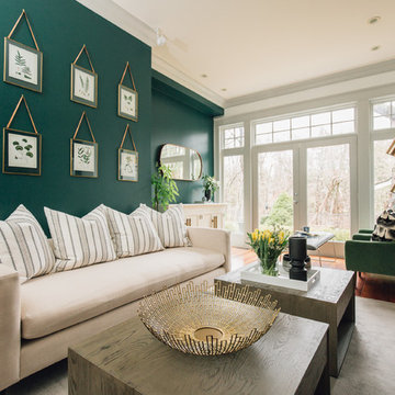
Simple doesn’t have to be boring, especially when your backyard is a lush ravine. This was the name of the game when it came to this traditional cottage-style house, with a contemporary flare. Emphasizing the great bones of the house with a simple pallet and contrasting trim helps to accentuate the high ceilings and classic mouldings, While adding saturated colours, and bold graphic wall murals brings lots of character to the house. This growing family now has the perfectly layered home, with plenty of their personality shining through.
 Dream Kitchens
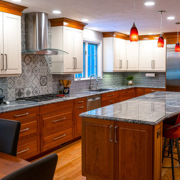
This two-toned white kitchen remodel includes brand new white cabinets, a large kitchen island with pop-up electrical outlets and extra storage, a lift cabinet to store small kitchen appliances with ease, glass cabinets, wine racks, a wet bar, and a beautiful light blue and grey backsplash that perfectly complements the white and brown cabinets.
First, let's talk about the new white cabinets. The white cabinets give the kitchen a fresh and modern look, while also providing a blank canvas to mix with other colors and decor. The cabinet doors have a simple design, but with the right hardware they can look more ornate. Plus, white cabinets are timeless and will never go out of style.
Now, let's dive into the large kitchen island. This island has pop-up electrical outlets, which adds convenience and ease to your cooking experience. No more struggling to find an outlet to plug in your mixer! The extra storage and prep space provided by the island is invaluable in the kitchen. It gives you the added counter space needed to spread out and really execute those complex recipes, or to have multiple people working in the kitchen at once.
The lift cabinet is also a game changer. Tired of pulling out your mixer or other kitchen appliances from a dark cabinet and struggling to get it back in, or even worse, struggling to get it out? With the simple press of a button, the cabinet will lift your appliance with ease and keep it at the perfect height for use.
Now, let's talk about storage. There are glass cabinets to perfectly display your favorite kitchen items and a wine rack to store your favorite bottles. The wet bar is perfect for entertaining guests, with a place to chill your bottles and serve up drinks. Overall, the storage options in this kitchen remodel are endless and perfectly designed to meet your everyday needs and lifestyle.
Lastly, the light blue and grey backsplash and countertop perfectly complement the white and brown cabinets. The backsplash adds a pop of color to your kitchen, while the countertop matches the backsplash and completes the whole look. This kitchen remodel is sure to make a statement and catch your guests' attention.
 J Design Group - Interior Designers Miami - Modern
Memorabilia Room
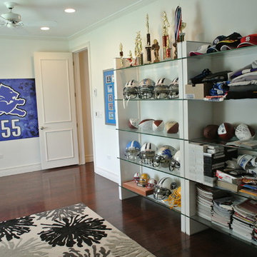
At the far end of the memorabilia room, poles used to hang cleats from significant games flank a Fathead poster of two “Tulloch” poses. Trophies are showcased and footballs line the walls, while a spirited area rug reminiscent of cheerleaders’ pom-poms adds a touch of whimsy.
A TOUCHDOWN BY DESIGN
Interior design by Jennifer Corredor, J Design Group, Coral Gables, Florida
Text by Christine Davis
Photography by Pablo Corredor Miami, Florida
What did Detroit Lions linebacker, Stephen Tulloch, do when he needed a decorator for his new Miami 10,000-square-foot home? He tackled the situation by hiring interior designer Jennifer Corredor. Never defensive, he let her have run of the field. “He’d say, ‘Jen, do your thing,’” she says. And she did it well.
The first order of the day was to get a lay of the land and a feel for what he wanted. For his primary residence, Tulloch chose a home in Pinecrest, Florida. — a great family neighborhood known for its schools and ample lot sizes. “His lot is huge,” Corredor says. “He could practice his game there if he wanted.”
A laidback feeling permeates the suburban village, where mostly Mediterranean homes intermix with a few modern styles. With views toward the pool and a landscaped yard, Tulloch’s 10,000-square-foot home touches on both, a Mediterranean exterior with chic contemporary interiors.
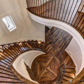
Step inside, where high ceilings and a sculptural stairway with oak treads and linear spindles immediately capture the eye. “Knowing he was more inclined toward an uncluttered look, and taking into consideration his age and lifestyle, I naturally took the path of choosing more modern furnishings,” the designer says.
In the dining room, Tulloch specifically asked for a round table and Corredor found “Xilos Simplice” by Maxalto, a table that seats six to eight and has a Lazy Susan.
And just past the stairway, two armless chairs from Calligaris and a semi-round sofa shape the living room. In keeping with Tulloch’s desire for a simple no-fuss lifestyle, leather is often used for upholstery. “He preferred wipe-able areas,” she says. “Nearly everything in the living room is clad in leather.”
An architecturally striking, oak-coffered ceiling warms the family room, while Saturnia marble flooring grounds the space in cool comfort. “Since it’s just off the kitchen, this relaxed space provides the perfect place for family and friends to congregate — somewhere to hang out,” Corredor says. The deep-seated sofa wrapped in tan leather and Minotti armchairs in white join a pair of linen-clad ottomans for ample seating.
With eight bedrooms in the home, there was “plenty of space to repurpose,” Corredor says. “Five are used for sleeping quarters, but the others have been converted into a billiard room, a home office and the memorabilia room.” On the first floor, the billiard room is set for fun and entertainment with doors that open to the pool area.
The memorabilia room presented quite a challenge. Undaunted, Corredor delved into a seemingly never-ending collection of mementos to create a tribute to Tulloch’s career. “His team colors are blue and white, so we used those colors in this space,” she says.
In a nod to Tulloch’s career on and off the field, his home office displays awards, recognition plaques and photos from his foundation. A Copenhagen desk, Herman Miller chair and leather-topped credenza further an aura of masculinity.
All about relaxation, the master bedroom would not be complete without its own sitting area for viewing sports updates or late-night movies. Here, lounge chairs recline to create the perfect spot for Tulloch to put his feet up and watch TV. “He wanted it to be really comfortable,” Corredor says
A total redo was required in the master bath, where the now 12-foot-long shower is a far cry from those in a locker room. “This bath is more like a launching pad to get you going in the morning,” Corredor says.
“All in all, it’s a fun, warm and beautiful environment,” the designer says. “I wanted to create something unique, that would make my client proud and happy.” In Tulloch’s world, that’s a touchdown.
Your friendly Interior design firm in Miami at your service.
Contemporary - Modern Interior designs.
Top Interior Design Firm in Miami – Coral Gables.
Office,
Offices,
Kitchen,
Kitchens,
Bedroom,
Bedrooms,
Bed,
Queen bed,
King Bed,
Single bed,
House Interior Designer,
House Interior Designers,
Home Interior Designer,
Home Interior Designers,
Residential Interior Designer,
Residential Interior Designers,
Modern Interior Designers,
Miami Beach Designers,
Best Miami Interior Designers,
Miami Beach Interiors,
Luxurious Design in Miami,
Top designers,
Deco Miami,
Luxury interiors,
Miami modern,
Interior Designer Miami,
Contemporary Interior Designers,
Coco Plum Interior Designers,
Miami Interior Designer,
Sunny Isles Interior Designers,
Pinecrest Interior Designers,
Interior Designers Miami,
J Design Group interiors,
South Florida designers,
Best Miami Designers,
Miami interiors,
Miami décor,
Miami Beach Luxury Interiors,
Miami Interior Design,
Miami Interior Design Firms,
Beach front,
Top Interior Designers,
top décor,
Top Miami Decorators,
Miami luxury condos,
Top Miami Interior Decorators,
Top Miami Interior Designers,
Modern Designers in Miami,
modern interiors,
Modern,
Pent house design,
white interiors,
Miami, South Miami, Miami Beach, South Beach, Williams Island, Sunny Isles, Surfside, Fisher Island, Aventura, Brickell, Brickell Key, Key Biscayne, Coral Gables, CocoPlum, Coconut Grove, Pinecrest, Miami Design District, Golden Beach, Downtown Miami, Miami Interior Designers, Miami Interior Designer, Interior Designers Miami, Modern Interior Designers, Modern Interior Designer, Modern interior decorators, Contemporary Interior Designers, Interior decorators, Interior decorator, Interior designer, Interior designers, Luxury, modern, best, unique, real estate, decor
J Design Group – Miami Interior Design Firm – Modern – Contemporary
Contact us: (305) 444-4611 http://www.JDesignGroup.com
Find the right local pro for your project

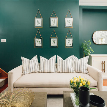 Kaleidoscope Design Studio
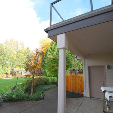
Simple doesn’t have to be boring, especially when your backyard is a lush ravine. This was the name of the game when it came to this traditional cottage-style house, with a contemporary flare. Emphasizing the great bones of the house with a simple pallet and contrasting trim helps to accentuate the high ceilings and classic mouldings, While adding saturated colours, and bold graphic wall murals brings lots of character to the house. This growing family now has the perfectly layered home, with plenty of their personality shining through.
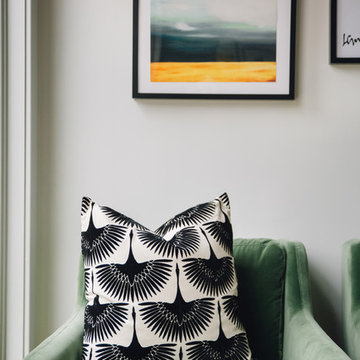 Kaleidoscope Design Studio
Simple doesn’t have to be boring, especially when your backyard is a lush ravine. This was the name of the game when it came to this traditional cottage-style house, with a contemporary flare. Emphasizing the great bones of the house with a simple pallet and contrasting trim helps to accentuate the high ceilings and classic mouldings, While adding saturated colours, and bold graphic wall murals brings lots of character to the house. This growing family now has the perfectly layered home, with plenty of their personality shining through.

 safe ZOnea
If you’re active on GardenWeb sharing plant photos, asking for advice, tracking seasonal progress you already understand how much detail goes into gardening. Soil pH, rainfall, emerging leaves, bloom counts, fertilizer schedules it adds up fast. But all that rich information often remains buried in posts, lists or memory. What if you could visualize that data and turn it into clear quick insights? That’s where a graph maker becomes a game-changer for your gardening workflow.
1. Why garden data belongs on a graph
On GardenWeb, you’ll find forums for everything from perennial care, vegetable gardening, patios, herbs, even cooking and craft projects. While plant lovers share observations and ask questions, many track progress manually in spreadsheets or memory. A graph maker flips that around:
Instead of a list of numbers (e.g., “Soil test: pH 6.4 in May, 6.1 in October”), you get a line graph showing the decline over time.
Instead of guessing which plant bloomed most, you see a bar chart comparing counts across plants.
Instead of manually calculating average rainfall effect, you plot scatter points of bloom count vs. rainfall.
By turning your data into visuals, you’re not just recording—you’re analysing, learning and improving. For GardenWeb users this means smarter decisions: Which fertilizer actually improves bloom count? Which shady spot recovers slower? A graph maker gives clarity.
2. What is a graph maker and how to use one
A graph maker is a web tool or software that lets you input raw data (numbers, dates, categories) and output visual charts like line graphs, bar charts, scatter plots, etc. It might allow you to import a spreadsheet, select chart type, customize colours, label axes, and export the image for your blog, forum post or personal log.
Here’s how you could apply it for gardening:
Log blooms per week for each rose plant.
Using the graph maker, choose line graph to track changes over weeks.
Label your y-axis “Number of Blooms”, x-axis “Week of Year”.
Add colour lines for each plant for easy comparison.
Export as PNG and embed it in a GardenWeb forum post: “See bloom trend for my ‘Peace’ vs ‘Knock Out’ roses”.
This isn’t just pretty-to-look-at: it makes the trend obvious, invites discussion (“Hey, your ‘Knock Out’ line dips after week 28—what changed?”) and helps you refine your routine.
3. Use these specific scenarios on GardenWeb
A. Soil pH and plant health tracking
After multiple tests you have pH values over time and bloom results. Upload both datasets into the graph maker, produce a dual-axis line graph: soil pH on one axis, bloom count on the other. Post your findings in the “Soil, Fertility & Nutrients” forum and get feedback.
B. Seasonal pest or disease appearance
Record number of aphids spotted each month and whether you used treatment. A bar chart via the graph maker can show pre- and post-treatment figures. Then ask the “Insect & Disease Control” forum for advice based on your visual data.
C. Yield comparison between varieties
You grow two zucchini varieties. You keep weekly yield in pounds. Use the graph maker for a side-by-side bar chart. Share in the “Vegetable Gardening” forum: “Which was better this year? See the chart”.
D. Rainfall vs growth rate
You log weekly rainfall and growth (in cm) of your tomato plants. Use scatter plot in graph maker. If a pattern emerges, you’re ready to post: “Is my growth plateau due to drought? Chart shows a clear correlation.”
4. Why this elevates your GardenWeb contributions
When you post with a chart made by a graph maker, you’re doing more than asking or showing off. You’re investigating. You’re analysing. You invite the community to give feedback on data, not just anecdotes. That elevates the discussion. Instead of “My plant died, any ideas?” you post “See this graph of pH drop and bloom count—what might be the limiting factor?” High-quality visuals raise your post’s value and garner more thoughtful responses.
Plus, your posts become useful references for others: someone else can say, “Cool graphic, can you share your data sheet?” You build credibility and help the forum become a learning hub—not just a Q&A board.
5. Tips for using a graph maker effectively in the GardenWeb context
Keep it simple: One chart, one insight. Don’t overcrowd.
Label clearly: Titles, axis labels, units (e.g., cm/week, mg/L, °F).
Use readable colours: Avoid faint tones that vanish on mobile.
Annotate when needed: Add notes like “Fertiliser switched week 12” or “Shade cloth added”.
Provide context in your post: Don’t leave the chart alone—write a few sentences explaining what it shows and what you’re seeking.
Embed carefully: Make sure your image displays properly in GardenWeb; check mobile view.
Share raw data: If possible link to your spreadsheet so others can replicate or comment.
Be open to feedback: The chart invites questions; embrace them.
6. Possible pitfalls and how to avoid them
Bad data = bad chart: If your measurements aren’t consistent, your graph will mislead. Use standardized data collection.
Too much complexity: Multi-axis charts, too many variables—confusing. Stick to one or two variables.
Overlooking mobile viewers: Many GardenWeb users browse via phones. Use large fonts and simple visuals.
Ignoring the narrative: Chart alone won’t answer. Explain what it means and what you need.
Outdated charts: If you update your data annually, keep your visuals current or label them clearly as “2024 data”.
7. Final thoughts
On GardenWeb you’ll find a vibrant community of gardeners, DIYers, cooks and design lovers.Using a graph maker for your posts and progress turns your experience from casual hobby-logging into smart data-driven gardening. You’ll not only learn more—your peers will learn more, too.
So next time you log your plant growth, record your yield, test your soil or track pests—don’t just note it. Plot it. Use a graph maker. Share it in the forum. Let your garden tell the story, and let the community help you write the next chapter.

Sponsored
Delaware, OH

Buckeye Basements, Inc.
Central Ohio's Basement Finishing ExpertsBest Of Houzz '13-'21
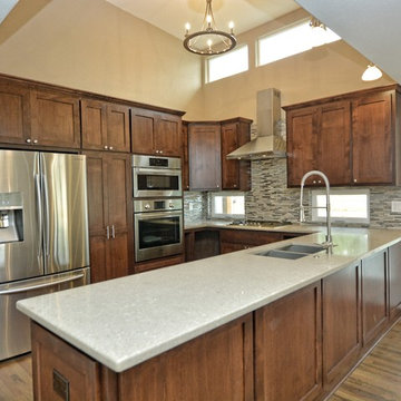
 Kinney and Associates
Photo by Mike Force.
A first time residential developer approa-ched Kinney & Associates to help him design an addition and remodel to an existing 1100-square-foot residence in East Austin. The program was simple -- he wanted a 3 bedroom, 2.5 bath house that could be sold easily or lived in should he decide to keep it for a while. Kinney & Associates endeavored to keep as much of the existing structure as feasible while delivering a very marketable product that would appeal to a wide range of potential buyers. The final product included a Game/Media Room adjacent a courtyard space that can be used for entertaining or for kids. The Master Bedroom atop the Game/Media lends itself to privacy and seclusion so that the owners can use it as a retreat. The final product is a 2400-square-foot residence that appears to be a small bungalow from the street, but lends itself to downtown views in the rear.
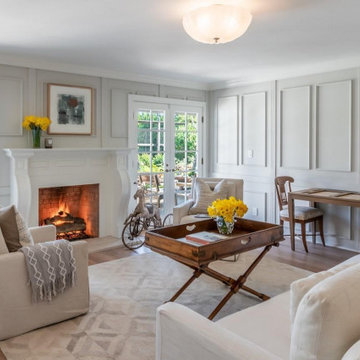
 DTM INTERIORS
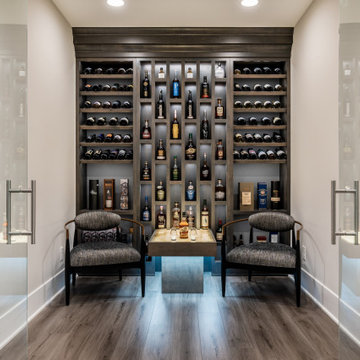
Center of the home, a small intimate game room to gather for drinks and games. Turn the tv off and connect.
Example of a farmhouse home design design in Santa Barbara
Example of a farmhouse home design design in Santa Barbara
 Kaleidoscope Design Studio
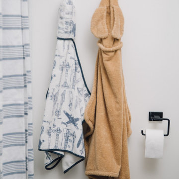
Simple doesn’t have to be boring, especially when your backyard is a lush ravine. This was the name of the game when it came to this traditional cottage-style house, with a contemporary flare. Emphasizing the great bones of the house with a simple pallet and contrasting trim helps to accentuate the high ceilings and classic mouldings, While adding saturated colours, and bold graphic wall murals brings lots of character to the house. This growing family now has the perfectly layered home, with plenty of their personality shining through.

 Red Dot Studio
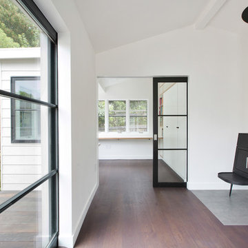
A place to relax, read and play games and a little office space is how our outbuilding in Mill Valley was described. It added an extra living room and some coveted square footage to a hard to add onto home in a desirable part of town. The outbuilding was placed on axis with the main house, connected by a deck with a view to the yard in between. To keep all the books and games in order, the main room was lined with fin-ply cabinetry. The floor is an engineered wide plank rustic oak. A simple clean burning wood fireplace will provide heat when needed. The outbuilding has the feel of a classic summer cabin, only with better insulation for year round use.
PHOTOGRAPHER JOSEPH SCHELL
CONTRACTOR ABACUS BUILDERS
 Sativa McGee Designs
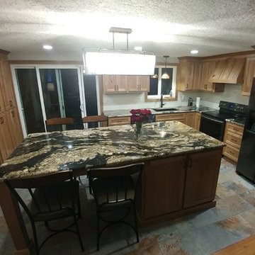
Kitchen Renovation: layout modification and aesthetic upgrades.
Cabinets: Rustic Cherry Natural
Counter tops: Golden Supreme Granite
Back splash: Rittenhouse square bisquit
Appliances: Samsung Black Stainless
This was a traditional ranch style home with a small kitchen that lacked counter top space and had a cramped dining room that blocked access to the garage and back patio. The renovation focused on creating better flow, opening up the walkways, increasing storage and was upgraded to our aesthetic taste.
The island incorporates dining seating for up to 5 while also providing storage for the Microwave, Trash/Recycling and Storage for dog food/board games. We designed a custom hood surround to fit within our limited ceiling height. This simple design added character and visual interest to a simple space plan. Full height pantry storage was added on the end of the kitchen by the patio doors, leaving just enough room before the garage door for the dog food bowls.
Electrical was upgraded for the whole space, going from 2 outlets in the kitchen to 7 has increased the usability of the space. A USB outlet was added to the end of the island so that people can charge their phones. Prior to the renovation there was a lack of lighting, we added can lights and an island pendant to increase visibility for prep.
Sponsored
Columbus, OH

Hope Restoration & General Contracting
Columbus Design-Build, Kitchen & Bath Remodeling, Historic Renovations
 Jackson & Perkins
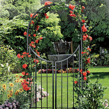
Create a grand garden entryway in minutes with our stately garden arbor. Its simple lines fit any style garden and create a decorative focal point to your landscape, whether covered in summer blooms or silhouetted against a winter sky. Strong, powder-coated steel tube construction is rustproof and tolerates weather extremes. Simple assembly. 90" H x 50" W x 18" D.
 Kaleidoscope Design Studio
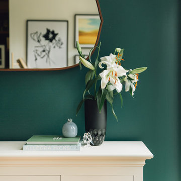
Simple doesn’t have to be boring, especially when your backyard is a lush ravine. This was the name of the game when it came to this traditional cottage-style house, with a contemporary flare. Emphasizing the great bones of the house with a simple pallet and contrasting trim helps to accentuate the high ceilings and classic mouldings, While adding saturated colours, and bold graphic wall murals brings lots of character to the house. This growing family now has the perfectly layered home, with plenty of their personality shining through.
 Kinney and Associates
Photo by Mike Force.
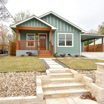
A first time residential developer approa-ched Kinney & Associates to help him design an addition and remodel to an existing 1100-square-foot residence in East Austin. The program was simple -- he wanted a 3 bedroom, 2.5 bath house that could be sold easily or lived in should he decide to keep it for a while. Kinney & Associates endeavored to keep as much of the existing structure as feasible while delivering a very marketable product that would appeal to a wide range of potential buyers. The final product included a Game/Media Room adjacent a courtyard space that can be used for entertaining or for kids. The Master Bedroom atop the Game/Media lends itself to privacy and seclusion so that the owners can use it as a retreat. The final product is a 2400-square-foot residence that appears to be a small bungalow from the street, but lends itself to downtown views in the rear.
 Red Dot Studio
A place to relax, read and play games and a little office space is how our outbuilding in Mill Valley was described. It added an extra living room and some coveted square footage to a hard to add onto home in a desirable part of town. The outbuilding was placed on axis with the main house, connected by a deck with a view to the yard in between. To keep all the books and games in order, the main room was lined with fin-ply cabinetry. The floor is an engineered wide plank rustic oak. A simple clean burning wood fireplace will provide heat when needed. The outbuilding has the feel of a classic summer cabin, only with better insulation for year round use.
PHOTOGRAPHER JOSEPH SCHELL
CONTRACTOR ABACUS BUILDERS
Sponsored
Delaware, OH
Buckeye Basements, Inc.
Central Ohio's Basement Finishing ExpertsBest Of Houzz '13-'21
 Kaleidoscope Design Studio
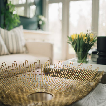
Simple doesn’t have to be boring, especially when your backyard is a lush ravine. This was the name of the game when it came to this traditional cottage-style house, with a contemporary flare. Emphasizing the great bones of the house with a simple pallet and contrasting trim helps to accentuate the high ceilings and classic mouldings, While adding saturated colours, and bold graphic wall murals brings lots of character to the house. This growing family now has the perfectly layered home, with plenty of their personality shining through.
 Two Navy Lane
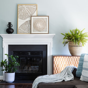
The Family Room included a sofa, coffee table, and piano that the family wanted to keep. We wanted to ensure that this space worked with higher volumes of foot traffic, more frequent use, and of course… the occasional spills. We used an indoor/outdoor rug that is soft underfoot and brought in the beautiful coastal aquas and blues with it. A sturdy oak cabinet atop brass metal legs makes for an organized place to stash games, art supplies, and toys to keep the family room neat and tidy, while still allowing for a space to live.
Even the remotes and video game controllers have their place. Behind the media stand is a feature wall, done by our contractor per our design, which turned out phenomenally! It features an exaggerated and unique diamond pattern.
We love to design spaces that are just as functional, as they are beautiful.
 Kaleidoscope Design Studio
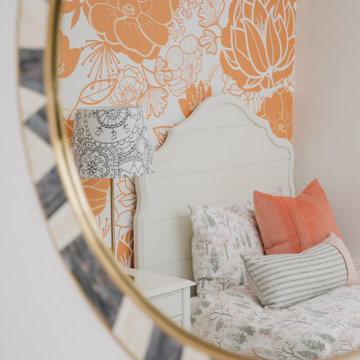
Simple doesn’t have to be boring, especially when your backyard is a lush ravine. This was the name of the game when it came to this traditional cottage-style house, with a contemporary flare. Emphasizing the great bones of the house with a simple pallet and contrasting trim helps to accentuate the high ceilings and classic mouldings, While adding saturated colours, and bold graphic wall murals brings lots of character to the house. This growing family now has the perfectly layered home, with plenty of their personality shining through.
43