
Search results for "Simplification" in Home Design Ideas
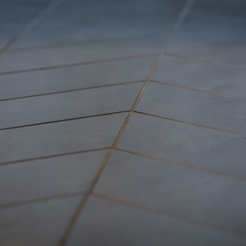
 Level Plane Tile and Stone
Photo by www.mattswainphoto.com
Example of a classic home design design in Portland
Example of a classic home design design in Portland

 Welcome Home Design Group
Jennifer Mayo Studios
Small beach style l-shaped vinyl floor and gray floor eat-in kitchen photo with an undermount sink, flat-panel cabinets, turquoise cabinets, quartz countertops, white backsplash, ceramic backsplash, stainless steel appliances and an island
Small beach style l-shaped vinyl floor and gray floor eat-in kitchen photo with an undermount sink, flat-panel cabinets, turquoise cabinets, quartz countertops, white backsplash, ceramic backsplash, stainless steel appliances and an island


Find the right local pro for your project
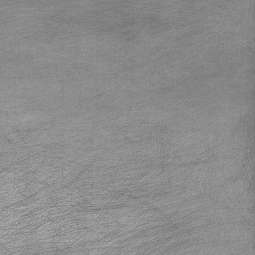
 Ollin Stone
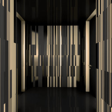
Seta was coined with the desire to experiment and the intention of astounding the end users as they observe and touch it. Its name is due to a thread which is repeated on all the surfaces, to produce the perception of scratches on plain-coloured slabs. The concept is very similar to that of the Collection line, but in this case the material involvement is different.




 Ben Gebo Photography
Art Direction, Styling and Photography by Ben Gebo.
Trendy home design photo in Boston
Trendy home design photo in Boston

 Blinds.com
Shelley of Crazy Wonderful chose Blinds.com Budget Woven Wood Shades and Easy Pinch Pleat Drapery Panels to complete the window coverings in here master bedroom.
To learn more about this makeover, check out her post, http://westermanfam.blogspot.com/2015/12/master-bedroom-updates.html


 Nathan Fell Architecture
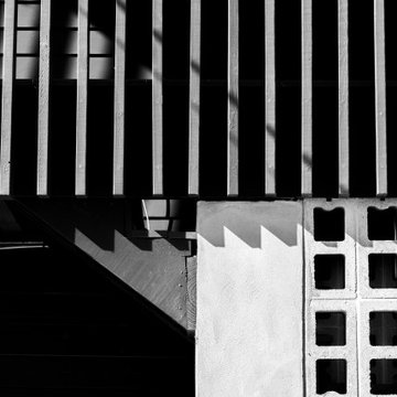
Inspiration for a mid-sized modern gray two-story gable roof remodel in New Orleans with a shingle roof and a gray roof

 RINEKWALL
Rinekwall-
RINEKWALL designer, Dana Agamalian, passed out twenty-two white pieces of paper and black pens to her son's 3rd grade class. She told them to draw peace signs, anyway they wanted. A barrage of questions ensued. Maybe kids are used to more instructions, but that was it from Dana. "I wanted them to draw from their hearts and enjoy themselves. It was magic! Each and every paper a masterpiece!" A smaller group of neighborhood kids drew the PEOPLE design. Dana's instructions were equally open-ended: draw happy faces. Notice the clock faces, a great example of how original art can be interpreted ad infinitum.
These bold designs bring a smile to your face as you contemplate the hope and unity they embody. Through the innnocence of the children's drawings, the viewer is transported to a place where no dream seems impossible. RINEKWALL hopes that we are showing respect and support to these artists' dreams. In presenting PEACE and PEOPLE, two cutting-edge designs, we are proud to assist in spreading the childrens' message of peace and unity for the world.
 KURV Architecture DPC (Alex Hughes Architects)
Located in the heart of Manhattan’s Lower East Side, the building was erected on a shallow commercial lot between two 120 year old masonry buildings and a new residential rental building. 330 Grand Street is a mix of 725 SF 1BRs and 1050 SF 2BR apartments. It also contains a 1100 SF two story duplex as well as private and public rooftop space, large private balconies for most units and two large private terraces for the ground floor units.
330 Grand Street was originally designed and approved at the NYC DOB as a prefabricated modular building. During the pandemic, as shipping costs skyrocketed putting the project at risk, we suggested redesigning the building as a reinforced cast-in-place concrete structure. Concrete was readily available and prices had not been affected by the demand increase that many other materials suffered in the pandemic. We took this opportunity to raise floor to ceiling heights, enlarge high performance windows and redistribute the buildings MEPFS and Structural Systems to create very open floor plans.
The challenge was to create a luxurious sensorial living experience with very limited means. In a city with very high construction costs, low cost residential buildings in the area are usually devoid of good quality, design and character. Our approach was to aim high for the end user, prioritizing natural light, open space with long visual perspectives, high ceilings and as always, rejecting the use of predefined building templates.
Our biggest challenge was to ensure that the small spaces feel as clean cut, large and bright as possible. Several unique design decisions were made to ensure low cost and high quality;
Floor plans were laid out so that spaces were wide open and free of clutter from mechanical or structural interruptions. Therefore all infrastructure was placed in lateral demising walls, which in turn act as the unit’s storage and kitchen. The apartments feel wide open, are super quiet and have more storage space than any other comparable apartment in the city.
To solve the problem of the site’s shallow commercial lot which is typically prone to dark interior spaces we focused our attention on the building’s envelope. Instead of the usual small punched window openings, oversized high performance windows were designed to ensure that light penetrated as far as possible into the units. In the smaller 1BR units, the full 50’ depth of the lot is perceived by partitioning spaces with sliding pocket doors that can be retracted to allow deep visual perspectives, making the sight lines in the space feel longer, larger, more ample than normal. In addition to the full height glazing, each unit above the 2nd floor receives a 7 foot covered balcony, adding 120 to 240 sf to each apartment, something unusual in New York City buildings. The space is large enough for a full size dining table, when the weather permits being outside.
We also worked hard to ensure modularity. For example, all kitchen units are all identical throughout the building. The idea of modularity and the economy of the repetitive unit is exercised to the maximum through the building.
Hardware, appliances, flooring, wall coverings and material finishes are all carefully selected to feel bespoke, high quality and unique.
It was important to KURV that the result of this work manifest into something that would deeply connect with the end user and sustain relationships with the consumers of this space.
All images by KURV Architecture ©

 JM Kitchen & Bath Design
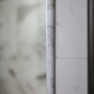
This gorgeous Main Bathroom starts with a sensational entryway a chandelier and black & white statement-making flooring. The soaking tub is on a raised platform below shuttered windows allowing a ton of natural light as well as privacy. The giant shower is a show stopper with a seat and walk-in entry.

 MODRA Studio Textiles & Wallcoverings
Arc wallcovering is organic yet polished. Available in Navy, Black and Emerald (shown).
Home design - contemporary home design idea in San Diego
Home design - contemporary home design idea in San Diego
 Skelly Build
Bath 3
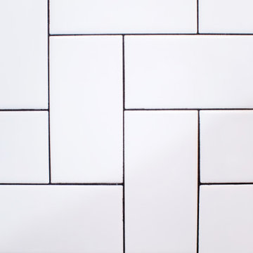
For the downstairs third bath, the first step was deoming out the flooring, shower, vanity area and electrical. After that, new framing was done for the expansion of the shower. A new shower niche and shower curb were tiled in a black and white mosaic, above that the shower walls were made up of ceramic tiles that connected to the half tile walls in the overall bathroom. The bathroom floor was made up of matte black hex tile. Electrically, all the light fixtures were replaced with sconce lights. A pony wall was built to separate the vanity and toilet. The last installation was the new custom-built oak vanity. After being sealed, a new granite countertop was installed above.



 Olympia Tile
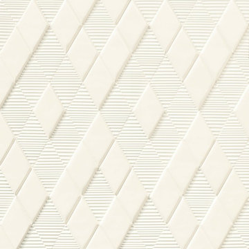
Our New Panal series is a beautiful collection of various sizes, shapes and colors, where all can be mixed and matched to create beautiful designs for any environment; residential and commercial.
40