
Search results for "Simply remove" in Home Design Ideas
 Reborn Cabinets Inc.
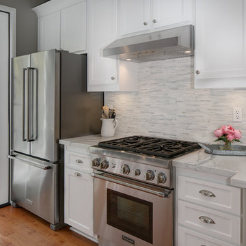
“We want to redo our cabinets…but my kitchen is so small!” We hear this a lot here at Reborn Cabinets. You might be surprised how many people put off refreshing their kitchen simply because homeowners can’t see beyond their own square footage. Not all of us can live in a big, sprawling ranch house, but that doesn’t mean that a small kitchen can’t be polished into a real gem! This project is a great example of how dramatic the difference can be when we rethink our space—even just a little! By removing hanging cabinets, this kitchen opened-up very nicely. The light from the preexisting French doors could flow wonderfully into the adjacent family room. The finishing touches were made by transforming a very small “breakfast nook” into a clean and useful storage space.
 Drury Design
THE SETUP
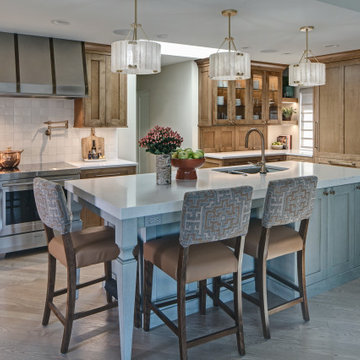
Senior Designer Diana Burton’s client loved her sixties-era home – it just needed some work. The cozy galley kitchen was narrow and mostly closed off from the family room. A pass-through window served as a limited pipeline for treats and chatter. The appliances were failing, too. It was simply time for an overhaul.
Design Objectives:
Remove load bearing wall and open kitchen to the family room
Omit large unused fireplace in family room
Increase work surfaces and overall storage solutions
Dedicated small countertop appliance storage
Seating for 3 or 4 at island
Add pantry storage
Offer solution for lack of mudroom
Upgrade all appliances
THE REMODEL
Design Challenges:
Finding a location to hide structural support for new beam
Reworking awkward configuration of existing walls
Adding a walk-in pantry
Creating mudroom storage
Allowing room for large sectional in family room
Design Solutions:
Add a discreet column by the fridge to hide essential support
Flush out wall by bath to be even with the range wall, where the new walk in pantry exists
Use void space behind new wall for large appliance garage
Create combination walk in pantry/mudroom by adding bench with shoe storage and hooks
Maintain island depth for comfortable seating without infringing on space for the sectional
THE RENEWED SPACE
This cramped, dated kitchen has a new lease on life! Opening it to the family room dramatically transformed the space. Diana’s client now has plenty of storage, a big island for food prep, and an open-concept space that’s perfect for entertaining and hanging out with friends and family.
 USI Design & Remodeling
This master bathroom renovation in Frisco was completed for a repeat USI Design & Remodeling client as part of a larger first-floor transformation of the home. The original bathroom reflected a very typical North Texas layout of its era — dark stained cabinetry, granite countertops, compartmentalized vanities, a built-in tub adjoining a framed shower, and separated spaces that no longer aligned with how the homeowners wanted to live. As their aesthetic evolved toward a more transitional and contemporary direction, the goal became less about replacing finishes and more about redefining the experience of the room itself. The project needed to feel calmer, more architectural, and far more intentional in how the space functioned visually and emotionally.
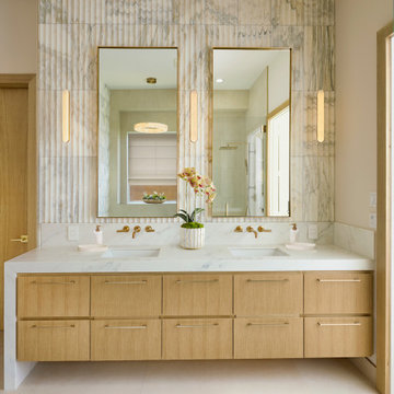
One of the most important changes was removing the original shower curb and pony wall in favor of a fully open curbless shower with ultra-clear ½-inch heavy glass. Achieving that look required recessing the slab, re-floating the shower floor toward a linear drain, and engineering the space so the room would read as visually uninterrupted from end to end. Throughout the project, many of the design decisions were rooted in restraint rather than excess. The oversized 24x48 Porcelanosa flooring carries very little shade variation, creating a quieter visual field, while the cabinetry was executed in rift-sawn white oak specifically because it produces a far more controlled and consistent finish outcome than more common cuts of wood. In luxury projects, consistency itself becomes part of the refinement.
The floating vanity was designed more like custom furniture than traditional cabinetry, utilizing waterfall mitered edges and fully reworked plumbing locations so both homeowners could share in having generous functional countertop space. The original makeup station was repurposed into integrated storage with powered drawers and concealed organization for everyday items such as blow dryers and flat irons. Along the vanity wall, wall-mounted plumbing fixtures were paired with ribbed natural marble surfaces — a detail that required intentional planning long before construction began. Rather than allowing the ribbed material to terminate awkwardly behind the fixtures, the backsplash and stone transitions were specifically designed to resolve those conditions cleanly. Those are the types of details that distinguish highly coordinated design-build work from projects that simply assemble materials together.
While the room contains a significant amount of luxury detailing — from the freestanding tub and geoprism marble focal wall to the custom rift-sawn white oak closet doors and elongated mirrors that leverage the 11-foot ceiling heights — the project was always guided by quiet luxury rather than visual competition. Even the water closet enclosure was handled with restraint through the use of a satin-etched glass door rather than another heavy solid opening. The intent throughout was to create a bathroom that feels restorative and serene rather than overdesigned. In our view, the best luxury spaces are the ones that feel composed long after the initial impression wears off.
Find the right local pro for your project
 Ralene Simmons Interiors
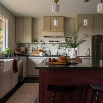
Kitchen with painted cabinets, traditional lighting, backsplash and unlacquered brass hardware and brass plumbing. New homeowners wanted to remove the modern. In the kitchen, we kept the cabinetry and countertops, simply painted the cabinets with softer contrasting colors, and changed all the other finishes.
 Sutherland Design Home, LLC
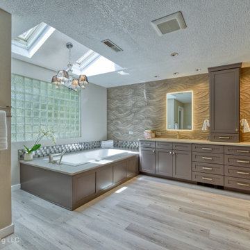
We removed the long wall of mirrors and moved the tub into the empty space at the left end of the vanity. We replaced the carpet with a beautiful and durable Luxury Vinyl Plank. We simply refaced the double vanity with a shaker style.
 Sutherland Design Home, LLC
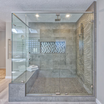
We removed the long wall of mirrors and moved the tub into the empty space at the left end of the vanity. We replaced the carpet with a beautiful and durable Luxury Vinyl Plank. We simply refaced the double vanity with a shaker style.


 Court Designs
John Ellis
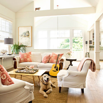
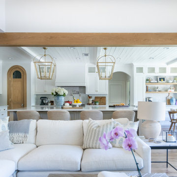
Living room - mid-sized coastal formal and open concept light wood floor and brown floor living room idea in Los Angeles with white walls and no fireplace
Living room - mid-sized coastal formal and open concept light wood floor and brown floor living room idea in Los Angeles with white walls and no fireplace

 Randy Angell Designs
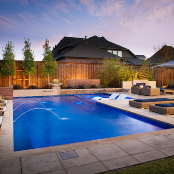
This organic modern design is built in an area known for having notable issues with ground movement. After speaking with the developer and reviewing the soil report with our Structural Engineer, we made our recommendations to the client.
Since the budget for a full-blown pier and beam structure with void boxes under the pool was well beyond the comfort level of our client, they elected to have us utilize a float shell construction method.
For this, we over-excavated the hole and placed a 12" layer of gravel beneath the shell of the pool. Drain lines lead from the deepest point under the pool down into a culvert, placed off to the side of the pool. A sump pump removes any excess water from the culvert as it accumulates.
For the shell of the pool, we utilized a double matt of steel and increased the wall thickness to a minimum of 12". This gave added strength to withstand the volatile soil.
The elements of fire, water, wood and stone were very important in creating the organic modern feel of this design. The layered effect along the back wall creates a visual stimulation across the length of the yard, without overwhelming the senses.
Rather than creating walls only of hard materials, we used Ipe wood to create horizontal screen walls of a more organic nature. At either end, the raised wall and the fire feature are finished in a large-scale porcelain tile, with the look of stained concrete.
Custom stainless steel scuppers, made by a local fabricator, create a soothing sound of falling water. The low wall at the center of the project is faced in natural ledgestone, and carries a color palette that set the tone for the entire project.
Behind this wall and in front of one of the Ipe screens are three Desert Steel Giant Agave sculptures. The unique fire feature isn't quite a fire place, nor is it a fire pit. It is a linear fire burner, surrounded by a 4" thick cantilevered Leuder limestone hearth, with a backdrop wall of blue glazed clay tile.
Although the pool was initially planned as a plaster pool, as the project began to take shape, the client elected to go all the way and finish it in a beautiful blue glass mosaic.
Custom fabricated stainless steel cannon jets send a delicate arch of water over this deep blue, and draw attention to the three square wok planters on the far side of the yard.
For the decking on this project, we elected to work with Mother Nature rather than against her. Two and a half inch thick concrete pavers, set on a bed of compacted, decomposed granite allow for movement around the pool that is easily fixed. If an area of deck moves around, we can simply lift the affected areas, re-level with DG bed, and re-set the pavers.
 ZeroEnergy Design
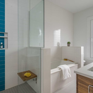
This renovated brick rowhome in Boston’s South End offers a modern aesthetic within a historic structure, creative use of space, exceptional thermal comfort, a reduced carbon footprint, and a passive stream of income.
DESIGN PRIORITIES. The goals for the project were clear - design the primary unit to accommodate the family’s modern lifestyle, rework the layout to create a desirable rental unit, improve thermal comfort and introduce a modern aesthetic. We designed the street-level entry as a shared entrance for both the primary and rental unit. The family uses it as their everyday entrance - we planned for bike storage and an open mudroom with bench and shoe storage to facilitate the change from shoes to slippers or bare feet as they enter their home. On the main level, we expanded the kitchen into the dining room to create an eat-in space with generous counter space and storage, as well as a comfortable connection to the living space. The second floor serves as master suite for the couple - a bedroom with a walk-in-closet and ensuite bathroom, and an adjacent study, with refinished original pumpkin pine floors. The upper floor, aside from a guest bedroom, is the child's domain with interconnected spaces for sleeping, work and play. In the play space, which can be separated from the work space with new translucent sliding doors, we incorporated recreational features inspired by adventurous and competitive television shows, at their son’s request.
MODERN MEETS TRADITIONAL. We left the historic front facade of the building largely unchanged - the security bars were removed from the windows and the single pane windows were replaced with higher performing historic replicas. We designed the interior and rear facade with a vision of warm modernism, weaving in the notable period features. Each element was either restored or reinterpreted to blend with the modern aesthetic. The detailed ceiling in the living space, for example, has a new matte monochromatic finish, and the wood stairs are covered in a dark grey floor paint, whereas the mahogany doors were simply refinished. New wide plank wood flooring with a neutral finish, floor-to-ceiling casework, and bold splashes of color in wall paint and tile, and oversized high-performance windows (on the rear facade) round out the modern aesthetic.
RENTAL INCOME. The existing rowhome was zoned for a 2-family dwelling but included an undesirable, single-floor studio apartment at the garden level with low ceiling heights and questionable emergency egress. In order to increase the quality and quantity of space in the rental unit, we reimagined it as a two-floor, 1 or 2 bedroom, 2 bathroom apartment with a modern aesthetic, increased ceiling height on the lowest level and provided an in-unit washer/dryer. The apartment was listed with Jackie O'Connor Real Estate and rented immediately, providing the owners with a source of passive income.
ENCLOSURE WITH BENEFITS. The homeowners sought a minimal carbon footprint, enabled by their urban location and lifestyle decisions, paired with the benefits of a high-performance home. The extent of the renovation allowed us to implement a deep energy retrofit (DER) to address air tightness, insulation, and high-performance windows. The historic front facade is insulated from the interior, while the rear facade is insulated on the exterior. Together with these building enclosure improvements, we designed an HVAC system comprised of continuous fresh air ventilation, and an efficient, all-electric heating and cooling system to decouple the house from natural gas. This strategy provides optimal thermal comfort and indoor air quality, improved acoustic isolation from street noise and neighbors, as well as a further reduced carbon footprint. We also took measures to prepare the roof for future solar panels, for when the South End neighborhood’s aging electrical infrastructure is upgraded to allow them.
URBAN LIVING. The desirable neighborhood location allows the both the homeowners and tenant to walk, bike, and use public transportation to access the city, while each charging their respective plug-in electric cars behind the building to travel greater distances.
OVERALL. The understated rowhouse is now ready for another century of urban living, offering the owners comfort and convenience as they live life as an expression of their values.
Eric Roth Photo
 Rochman Design Build
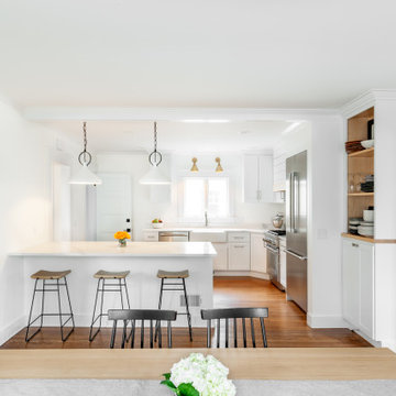
Inspiration for a large transitional l-shaped medium tone wood floor eat-in kitchen remodel in Detroit with a farmhouse sink, shaker cabinets, white cabinets, quartz countertops, white backsplash, quartz backsplash, stainless steel appliances, an island and white countertops
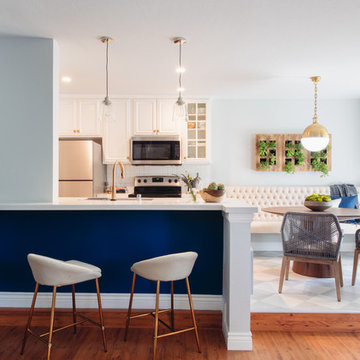


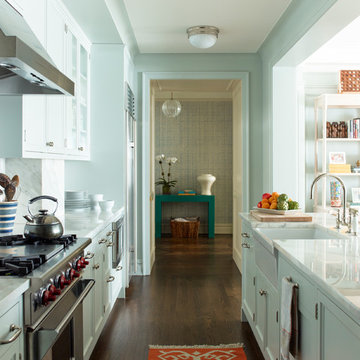
 Anik Pearson Architect, P.C.
This serenely monochromatic kitchen features a Wolf range with red knobs, a farmhouse sink, a stainless steel microwave drawer, and polished Calacatta counters and backsplash.
Photograph: Eric Piasecki
 Signature Designs Kitchen | Bath | Interiors
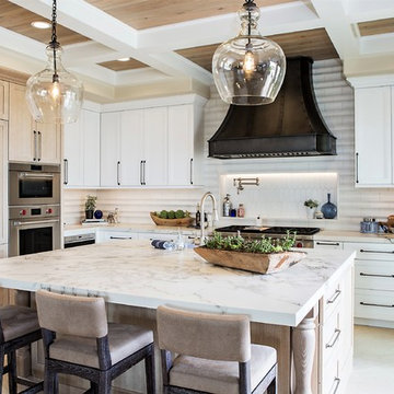
Our client desired a bespoke farmhouse kitchen and sought unique items to create this one of a kind farmhouse kitchen their family. We transformed this kitchen by changing the orientation, removed walls and opened up the exterior with a 3 panel stacking door.
The oversized pendants are the subtle frame work for an artfully made metal hood cover. The statement hood which I discovered on one of my trips inspired the design and added flare and style to this home.
Nothing is as it seems, the white cabinetry looks like shaker until you look closer it is beveled for a sophisticated finish upscale finish.
The backsplash looks like subway until you look closer it is actually 3d concave tile that simply looks like it was formed around a wine bottle.
We added the coffered ceiling and wood flooring to create this warm enhanced featured of the space. The custom cabinetry then was made to match the oak wood on the ceiling. The pedestal legs on the island enhance the characterizes for the cerused oak cabinetry.
Fabulous clients make fabulous projects.
 Corinthian Fine Homes
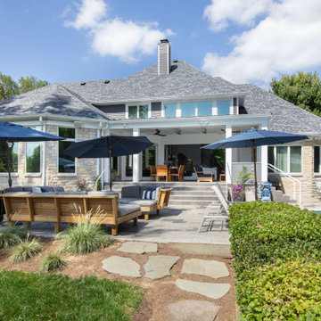
These homeowners are well known to our team as repeat clients and asked us to convert a dated deck overlooking their pool and the lake into an indoor/outdoor living space. A new footer foundation with tile floor was added to withstand the Indiana climate and to create an elegant aesthetic. The existing transom windows were raised and a collapsible glass wall with retractable screens was added to truly bring the outdoor space inside. Overhead heaters and ceiling fans now assist with climate control and a custom TV cabinet was built and installed utilizing motorized retractable hardware to hide the TV when not in use.
As the exterior project was concluding we additionally removed 2 interior walls and french doors to a room to be converted to a game room. We removed a storage space under the stairs leading to the upper floor and installed contemporary stair tread and cable handrail for an updated modern look. The first floor living space is now open and entertainer friendly with uninterrupted flow from inside to outside and is simply stunning.
 Sutherland Design Home, LLC
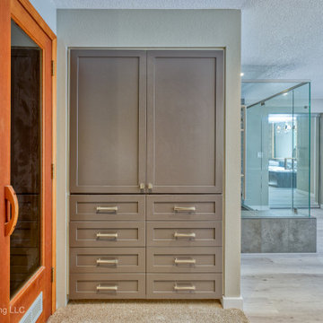
We removed the long wall of mirrors and moved the tub into the empty space at the left end of the vanity. We replaced the carpet with a beautiful and durable Luxury Vinyl Plank. We simply refaced the double vanity with a shaker style.
 Forward Design Build Remodel
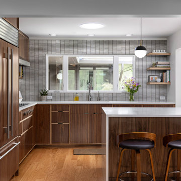
The goal of this project was to create an updated, brighter, and larger kitchen for the whole family to enjoy. This new kitchen also needed to seamlessly integrate with the rest of the home both functionally and aesthetically. The laundry room also needed an aesthetic refresh. What sets this kitchen apart is the laminated plywood edging between walnut cabinetry and the door handle detail integrated within those boundaries.
 SH interiors
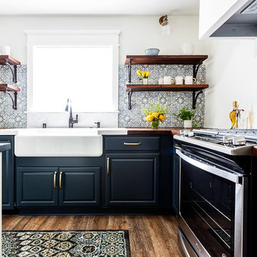
We completely renovated this space for an episode of HGTV House Hunters Renovation. The kitchen was originally a galley kitchen. We removed a wall between the DR and the kitchen to open up the space. We used a combination of countertops in this kitchen. To give a buffer to the wood counters, we used slabs of marble each side of the sink. This adds interest visually and helps to keep the water away from the wood counters. We used blue and cream for the cabinetry which is a lovely, soft mix and wood shelving to match the wood counter tops. To complete the eclectic finishes we mixed gold light fixtures and cabinet hardware with black plumbing fixtures and shelf brackets.

30