
Search results for "Single missing" in Home Design Ideas

 Revive Kitchen and Bath
Honed limestone tile is a nice contrast to the glossy wall cabinets and shiny quartz counter. Honed simply means that the stone is not highly polished. It has a matte finish. Photo/Design by Will Gowdy for Sunday Kitchen & Bath Rockville, MD 240 314-7011.

 CLASS DESIGN HOME
Amazing and very decorative led mirror with sanblasted edge and touch switch.
Bright White light.
Designed and manufactured in Spain. Available in stock. Delivery time: 3 to 5 labor days.
Measures: 28 x 28 x 1 : $749.00
36 x 28 x 1: $799.00
Free shipping into USA Continental.
For more information please contact us by pone or by email.
Find the right local pro for your project


 Southeastern Interiors
After a flood forced a complete basement renovation, the homeowner wanted an easy-to-maintain floor without spending a lot of money. Armstrong's FlexStep Value Covingtion Oak in Dovetail was the perfect choice for her. Complementing the Purple and Gold color scheme, the warm gray of the vinyl is the perfect neutral for this space. Carpet was removed, the floor was leveled, and vinyl installed with white shoe molding to finish off the trim. Southeastern Interiors

 Floor Coverings International Central Westchester
Inspiration for a rustic basement remodel in New York

 User
The house gallery hedge was adorned with Asparagus Aethiopicus; Schefflera arboricola 'Variegata'; Ixoras (varied colors: pink, yellow and white).
Mid-sized island style home design photo
Mid-sized island style home design photo


 Chicology
 Room Darkening Eclipse Privacy Adjustable Cordless Sliding Panels are timeless and ideal for bringing stunning modern style and design into any home as well as being a safer solution for homes with children and pets. These versatile blackout blinds create an ideal solution to blocking out all light and it gives you 100% protection from harmful UV rays. The Eclipse Privacy Adjustable Cordless Sliding Panels block out glare and virtually all light. Control solar heat and create a sunscreen to protect your furniture, flooring as well as protecting artwork from fading. Chicology's Eclipse Privacy Cordless Adjustable Sliding Panels also help insulate homes from harsh winter tempatures making our privacy panels the best energy-efficient window treatments. The Eclipse Privacy Adjustable Cordless Sliding Panels are today's number one solution to creating a darker space. Highly versatile, effortless operated, sleek styled, energy-efficient, eco-friendly Eclipse Privacy Adjustable Cordless Sliding Panels are ideal for all window coverings from patio and French doors to contemporary stunning room dividers and closet doors. Create modern drama to any room with these versatile solid color privacy blackout cordless sliding panels.
Available in a wide variety of durable and modern natural woven materials with bold vibrant colors and fabrics, they are sleek, elegant, energy-efficient, cost effective, child and pet friendly. Pick a modern elegant material rich in texture that comes alive and hangs beautifully. Chicology Eclipse Room Darkening Adjustable Sliding Panels inspire a feeling of peace and harmony while also becoming an exploration or opt for a sleek, smooth, flowing, elegant fabric perfect for a ideal minimalist design. They are a designed to compliment your home decor and become a modern day solution to vertical blinds, with color-coordinated wider fabric panels, free of clacking sounds.
Designed with the customer in mind, we made installation a breeze. Included in the packing is all the hardware for ceiling and wall installation, and inside and outside frame mounts. The versatile telescopic gliding track is adjustable anywhere from 44 to 80-inches wide. For wider needs, two tracks can be installed next to each other for a unique and seamless appearance. Each of the four panels are 22-inches wide and 96 inches tall. Simply trim the panel height to what you need and install the bottom rails to coordinate with your panels and create a custom-look finish. Eliminate operating cords with our child and pet safe wand control. Slide the panels gracefully with effortless operation on a smooth durable track, these panels can open from right to left, left to right, and right down the center. Our safety features include the feature wand which make this an modern cordless panel system that is safe for young children and pets.
Measurement: Customizable Size. This product is adjustable in both Width and Height. Width is adjustable from 44" to 80". Height is trimmable up to a maximum of 96"".

 Tonic Interiors
Original tile with pinstripe detail and original sink.
Mosaic hex porcelain floor tile.
Vintage-style mirror.
Art deco wallpaper.
Crystal globe light fixture.
Marble threshold.

 BRC Remodeling Group
A close up of the 9x36 Porcelain tile from Marazzi's Lounge 14 line in Martini. Gray grout broken joint pattern
Hallway - huge contemporary porcelain tile hallway idea in Austin with gray walls
Hallway - huge contemporary porcelain tile hallway idea in Austin with gray walls

 Skill Construction & Design, LLC
There are so many design elements to this kitchen, I almost don’t know where to start. Bright and airy with crisp clean white cabinets, the kitchen is open and welcoming. Still crisp but gently contrasting, the stainless steel appliance add depth amid the white. To keep this kitchen warm, natural oak covers the floors and a toasted wheat color washes the walls. And then there is the architectural elements. You know. That post and beam in the middle of the room. It’s the center of attention.
When you walk into a room your eyes roam around, establishing the size and shape of the room as your feet take you forward. From the front door of this home straight ahead you encountered this wall. The dining area to the right gives you a glimpse of things to come. Where there is a dining room you will usually find a kitchen.
The architecture of years gone by consistently hides the kitchen, the heart of the home, behind walls. I sympathize with my Mom, and all the other Moms, who have had to spend so much time tucked into a tight kitchen, away from the family. This wall had to go, but it was structural. We needed its support but not its bulk.
So we got rid of the bulk and only the bulk. Instead of a wall we have a post and beam, offering all of the structure we need. We could have installed a huge steel beam and reconfigure the joists to upset the beam, but why? The small beam and post add an incredible architectural element. It’s turning lemons into lemon, we simply made the most of what we had. It may be functional but it’s so fantastic. It looks like we created the effect just for the drama.
The original kitchen may have had a working triangle and some counter space, but it was fairly small, with each area only a step or two away. The dark cabinets made the space feel even smaller and the butcher block patterned laminate counter tops were very dated. The appliances were feeling their age as well, from a coil burner electric stove to a top freezer refrigerator. To keep this kitchen within its space, a half wall separated it from the dining area.
With the wall gone we borrowed some space from the living room and extended what was a U shaped kitchen into an L. At the living room window we start our new kitchen. We kept a small part of the wall to support the other end of our decorative beam. Sandwiched between a large pantry and our new French door refrigerator, the wall disappears. With our new open floor plan a sizable island was in order.
We split our cooking areas and installed a continuous grill gas cooktop into the island. A sleek island hood takes care of exhaust and adds an extra element to our architectural feature. Under the cooktop we added over-sized drawers for pots and pan storage. The frameless cabinets from New River Cabinetry are maple, painted white, with the Herndon door style. With the cooktop safely nestled into our island, we still had to add an oven.
We used the space where the old range sat for a large single oven of stainless steel and glass. If it worked for one, why not two? We created a home for a microwave in the wall cabinets. It’s perfect for heating leftovers so close to the refrigerator.
An important consideration for hot spots in your kitchen is landing zones. Each of our cooking areas have generous landing zones, one on each side of the cooktop and an entire counter area above or below the ovens, depending on which one you’re using.
We wanted to give the sink area more room so the half wall had to come out. We moved the trash and recycle cans into a cabinet, removed the heavy soffits and kept the sink under the window.
With that little bit of extra space we were able to add a larger cabinet above the dishwasher and slide it all down. This used to be where the carpeting met the vinyl floor, but all of it is gone. Long oak planks eliminate that final divide between the kitchen and the dining area, while adding visual length to the area. White wall cabinets on each side of the window reflect the sunlight for a brighter view.
With all of the darker cabinetry the backsplash walls had been painted white. Even still, there was a darkness in the corners and it wasn’t very exciting. We wanted to add visual interest and reflect the new under-cabinet lighting, eliminating the shadows in this corner.
With 1″x 2″ Arabescato Honed marble mosaics and those under-cabinet lights, we achieved the perfect balance. The marble has subtle swirls in gray and beige on a clean white background, but with the honed finish the light is softly reflected instead of glaring. For granite, we chose the soft gray tones of Luna Pearl. The speckles of gray and beige are a gentle contrast to the white cabinets and emulate the color of the stainless steel.
Between the carpet, red half wall, dark railing and dated light fixture, the dining area felt tired. Since the kitchen lacked sufficient storage, a large utility cabinet crowded the table space without adding any decorate elements.
Although it didn’t get any bigger, our dining area feels fresher and more open too. With the oak flooring joining the area to the rest of our space and the toasted wheat on the walls, the white table and chairs compliment the cabinetry while contrasting the warmer colors. We replaced the chandelier with recessed lighting and changed that railing too.
With our new open floor plan, we ended up with a fairly open area in between our foyer closet and the living room window. Not one to miss an opportunity, we filled the space with a multi-functional work space.
With the sunlight streaming in this bright corner works for anything this family needs.
There’s plenty of space for a chair under this large desk drawer. A closed cabinet below, glass doors above and lots of open shelving let you store and or showcase your belongings. We added a lite area at the top to keep away the darker corners.
The transformation is complete. This kitchen and all of its features are truly the center of attention in this home.
http://www.designsbyskill.com/
http://www.rjkconstructioninc.com/


Sponsored
Delaware, OH

Buckeye Basements, Inc.
Central Ohio's Basement Finishing ExpertsBest Of Houzz '13-'21

 Gezit Inc.
CPL collection is created for those, who value practicality and functionality in their Interior. CPL finish makes perfect for homes with children and for places with a high traffic like hotels and offices. CPL is an innovative, high-quality decorative material, which is manufactured according to a Japanese technology. As a result, we get a dense material with a sealed surface, which can be easily exposed to intensive stresses with no damage to the surface. CPL is represented by various extremely realistic natural wood texture. High-quality surface properties make doors with CPL finish a perfect addition to any Interior style.


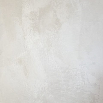
 Shoofly Design
A relatively new product from Ralph Lauren, this is Polished Patina in "Old Rock Crystal". It is a troweled finish that has a lovely pearlized effect and looks beautiful in any room.


 Skill Construction & Design, LLC
There are so many design elements to this kitchen, I almost don’t know where to start. Bright and airy with crisp clean white cabinets, the kitchen is open and welcoming. Still crisp but gently contrasting, the stainless steel appliance add depth amid the white. To keep this kitchen warm, natural oak covers the floors and a toasted wheat color washes the walls. And then there is the architectural elements. You know. That post and beam in the middle of the room. It’s the center of attention.
When you walk into a room your eyes roam around, establishing the size and shape of the room as your feet take you forward. From the front door of this home straight ahead you encountered this wall. The dining area to the right gives you a glimpse of things to come. Where there is a dining room you will usually find a kitchen.
The architecture of years gone by consistently hides the kitchen, the heart of the home, behind walls. I sympathize with my Mom, and all the other Moms, who have had to spend so much time tucked into a tight kitchen, away from the family. This wall had to go, but it was structural. We needed its support but not its bulk.
So we got rid of the bulk and only the bulk. Instead of a wall we have a post and beam, offering all of the structure we need. We could have installed a huge steel beam and reconfigure the joists to upset the beam, but why? The small beam and post add an incredible architectural element. It’s turning lemons into lemon, we simply made the most of what we had. It may be functional but it’s so fantastic. It looks like we created the effect just for the drama.
The original kitchen may have had a working triangle and some counter space, but it was fairly small, with each area only a step or two away. The dark cabinets made the space feel even smaller and the butcher block patterned laminate counter tops were very dated. The appliances were feeling their age as well, from a coil burner electric stove to a top freezer refrigerator. To keep this kitchen within its space, a half wall separated it from the dining area.
With the wall gone we borrowed some space from the living room and extended what was a U shaped kitchen into an L. At the living room window we start our new kitchen. We kept a small part of the wall to support the other end of our decorative beam. Sandwiched between a large pantry and our new French door refrigerator, the wall disappears. With our new open floor plan a sizable island was in order.
We split our cooking areas and installed a continuous grill gas cooktop into the island. A sleek island hood takes care of exhaust and adds an extra element to our architectural feature. Under the cooktop we added over-sized drawers for pots and pan storage. The frameless cabinets from New River Cabinetry are maple, painted white, with the Herndon door style. With the cooktop safely nestled into our island, we still had to add an oven.
We used the space where the old range sat for a large single oven of stainless steel and glass. If it worked for one, why not two? We created a home for a microwave in the wall cabinets. It’s perfect for heating leftovers so close to the refrigerator.
An important consideration for hot spots in your kitchen is landing zones. Each of our cooking areas have generous landing zones, one on each side of the cooktop and an entire counter area above or below the ovens, depending on which one you’re using.
We wanted to give the sink area more room so the half wall had to come out. We moved the trash and recycle cans into a cabinet, removed the heavy soffits and kept the sink under the window.
With that little bit of extra space we were able to add a larger cabinet above the dishwasher and slide it all down. This used to be where the carpeting met the vinyl floor, but all of it is gone. Long oak planks eliminate that final divide between the kitchen and the dining area, while adding visual length to the area. White wall cabinets on each side of the window reflect the sunlight for a brighter view.
With all of the darker cabinetry the backsplash walls had been painted white. Even still, there was a darkness in the corners and it wasn’t very exciting. We wanted to add visual interest and reflect the new under-cabinet lighting, eliminating the shadows in this corner.
With 1″x 2″ Arabescato Honed marble mosaics and those under-cabinet lights, we achieved the perfect balance. The marble has subtle swirls in gray and beige on a clean white background, but with the honed finish the light is softly reflected instead of glaring. For granite, we chose the soft gray tones of Luna Pearl. The speckles of gray and beige are a gentle contrast to the white cabinets and emulate the color of the stainless steel.
Between the carpet, red half wall, dark railing and dated light fixture, the dining area felt tired. Since the kitchen lacked sufficient storage, a large utility cabinet crowded the table space without adding any decorate elements.
Although it didn’t get any bigger, our dining area feels fresher and more open too. With the oak flooring joining the area to the rest of our space and the toasted wheat on the walls, the white table and chairs compliment the cabinetry while contrasting the warmer colors. We replaced the chandelier with recessed lighting and changed that railing too.
With our new open floor plan, we ended up with a fairly open area in between our foyer closet and the living room window. Not one to miss an opportunity, we filled the space with a multi-functional work space.
With the sunlight streaming in this bright corner works for anything this family needs.
There’s plenty of space for a chair under this large desk drawer. A closed cabinet below, glass doors above and lots of open shelving let you store and or showcase your belongings. We added a lite area at the top to keep away the darker corners.
The transformation is complete. This kitchen and all of its features are truly the center of attention in this home.
http://www.designsbyskill.com/
http://www.rjkconstructioninc.com/
30