
Search results for "Singles connection" in Home Design Ideas
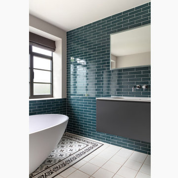
 Granit Architects + Interiors
We helped our clients to create a practical, modern and beautiful family home in Putney, South West London.
The Brief
The brief from our clients was to amalgamate an annex and original house building to create one practical family home. It was important the annex did not feel like an add-on, but rather as part of the original property.
The Solution
The design solution is to feature a series of new openings between the two buildings to provide subtle connections and routes between spaces throughout the house.
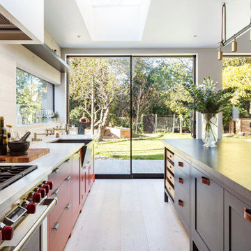
The whole footprint was utilised and spaces were carefully arranged to maximise light and provide a more functional family home. Glass doors with steel frames were used in the hallway to open up sight-lines to the large rear garden and provide flexibility to the use of the space.
The dining room features a hidden door into a secret lounge space that plays on the idea of there previously being a sense of separation. The Kitchen was made bespoke by Higham Furniture, a supplier we have worked with many times before and who are in our supplier directory.
All the original external walls and ground floor construction have been insulated to exceed building regulation standards, creating a highly sustainable building. This is great for our clients carbon footprint and for keeping their running costs low.
Externally, corner glazed full height sliding doors were added to provide a seamless transition between the lounge and garden. At roof level, a series of dormers were added to the master suite that help draw breathtaking views towards the London skyline.
The rear garden was landscaped by Patios, Pots and Pergolas.
The Result
We are delighted with the outcome, which is a sustainable and functional single family home that responds well to our clients brief.
 Rochelle Cote Interior Design
Located in North West Calgary and built in collaboration with Legacy Kitchens, the bathroom designs blend organic warmth with sleek, modern functionality to create a serene, spa-like sanctuary. A warm neutral palette is layered with natural materials, subtle textures, and considered details, establishing an interior that feels elevated yet deeply welcoming. By focusing on longevity for the space, the design focuses on comfort, accessibility, and luxury.
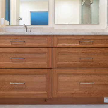
A natural oak vanity anchors the primary ensuite, its warm grain illuminated by soft ambient toe-kick lighting that emphasizes the large-format floor tiles below. Dual frameless mirrors are paired with brushed metal lighting fixtures, introducing balance and layered illumination. The flooring flows seamlessly into a frameless shower enclosure featuring a built-in bench, double showerheads, a rainfall feature, and a recessed storage niche for a spa-like experience.
The secondary bathroom continues the same palette with a single-sink vanity and medicine cabinet, offering ample storage in a refined, uncluttered layout. A curbed walk-in shower is clad in large-format wall tiles and a coordinating floor mosaic, complete with a recessed niche, built-in bench, safety grab bar, and a combination rainfall and handheld showerhead assembly. Around the corner, a white soaking tub is framed by variated white wall tiles and finished with a contemporary brushed metal wall-mounted faucet and hand shower, creating a serene retreat within the home.
This double-height foyer has been envisioned as a tranquil and welcoming point of arrival. Its design balances classic elegance with contemporary comfort, creating an immediate sense of home. The grand curve of the light wood staircase serves as a sculpted focal point, with light gray tile floors and warm, plush carpeting. A modern chandelier adds a layer of sophisticated texture while balancing new with existing. From the open balcony to the filtered light passing through the glass-paneled door, the space creates a visual connection and a sense of inviting flow.
 Rochelle Cote Interior Design
Located in North West Calgary and built in collaboration with Legacy Kitchens, the bathroom designs blend organic warmth with sleek, modern functionality to create a serene, spa-like sanctuary. A warm neutral palette is layered with natural materials, subtle textures, and considered details, establishing an interior that feels elevated yet deeply welcoming. By focusing on longevity for the space, the design focuses on comfort, accessibility, and luxury.
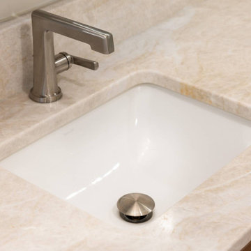
A natural oak vanity anchors the primary ensuite, its warm grain illuminated by soft ambient toe-kick lighting that emphasizes the large-format floor tiles below. Dual frameless mirrors are paired with brushed metal lighting fixtures, introducing balance and layered illumination. The flooring flows seamlessly into a frameless shower enclosure featuring a built-in bench, double showerheads, a rainfall feature, and a recessed storage niche for a spa-like experience.
The secondary bathroom continues the same palette with a single-sink vanity and medicine cabinet, offering ample storage in a refined, uncluttered layout. A curbed walk-in shower is clad in large-format wall tiles and a coordinating floor mosaic, complete with a recessed niche, built-in bench, safety grab bar, and a combination rainfall and handheld showerhead assembly. Around the corner, a white soaking tub is framed by variated white wall tiles and finished with a contemporary brushed metal wall-mounted faucet and hand shower, creating a serene retreat within the home.
This double-height foyer has been envisioned as a tranquil and welcoming point of arrival. Its design balances classic elegance with contemporary comfort, creating an immediate sense of home. The grand curve of the light wood staircase serves as a sculpted focal point, with light gray tile floors and warm, plush carpeting. A modern chandelier adds a layer of sophisticated texture while balancing new with existing. From the open balcony to the filtered light passing through the glass-paneled door, the space creates a visual connection and a sense of inviting flow.
Find the right local pro for your project
 Granit Architects + Interiors
We are delighted to have completed the radical transformation of a tired detached property in South Croydon.
When they appointed Granit, our clients were living in the property which had previously been divided into a number of flats.
The historic sub-division had resulted in an extremely poor use of space with redundant staircases, kitchens and bathrooms throughout.
Our clients sought to reconfigure the property back into a single dwelling for his growing family.
Our client had an eye for design and was keen to balance contemporary design whilst maintaining as much of the character of the original house.
Maximising natural light, space and establishing a visual and physical connection were also key drivers for the design. Owing to the size of the property, it became apparent that reconfiguration rather than extension provided the solution to meet the brief.
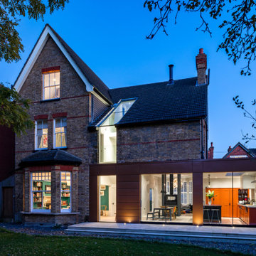
A metal clad ‘intervention’ was introduced to the rear facade. This created a strong horizontal element creating a visual balance with the vertical nature of the three storey gable.
The metal cladding specified echoed the colour of the red brick string courses tying old with new. Slender frame sliding doors provide access and views of the large garden.
The central circulation space was transformed by the introduction of a double height glazed slot wrapping up the rear facade and onto the roof. This allows daylight to permeate into the heart of the otherwise dark deep floor plan. The staircase was reconfigured into a series of landings looking down over the main void space below and out towards the tree canopies at the rear of the garden.
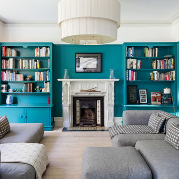
The introduction of double pocket doors throughout the ground floor creates a series of interconnected spaces and the whitewashed Larch flooring flows seamlessly from room to room. A bold palette of colours and materials lends character and texture throughout the property.
The end result is a spacious yet cosy environment for the family to inhabit for years to come.
 Granit Architects + Interiors
We are delighted to have completed the radical transformation of a tired detached property in South Croydon.
When they appointed Granit, our clients were living in the property which had previously been divided into a number of flats.
The historic sub-division had resulted in an extremely poor use of space with redundant staircases, kitchens and bathrooms throughout.
Our clients sought to reconfigure the property back into a single dwelling for his growing family.
Our client had an eye for design and was keen to balance contemporary design whilst maintaining as much of the character of the original house.
Maximising natural light, space and establishing a visual and physical connection were also key drivers for the design. Owing to the size of the property, it became apparent that reconfiguration rather than extension provided the solution to meet the brief.
A metal clad ‘intervention’ was introduced to the rear facade. This created a strong horizontal element creating a visual balance with the vertical nature of the three storey gable.
The metal cladding specified echoed the colour of the red brick string courses tying old with new. Slender frame sliding doors provide access and views of the large garden.
The central circulation space was transformed by the introduction of a double height glazed slot wrapping up the rear facade and onto the roof. This allows daylight to permeate into the heart of the otherwise dark deep floor plan. The staircase was reconfigured into a series of landings looking down over the main void space below and out towards the tree canopies at the rear of the garden.
The introduction of double pocket doors throughout the ground floor creates a series of interconnected spaces and the whitewashed Larch flooring flows seamlessly from room to room. A bold palette of colours and materials lends character and texture throughout the property.
The end result is a spacious yet cosy environment for the family to inhabit for years to come.

 Custom Surface Solutions
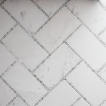
 (www.css-tile.com) - Owner Craig Thompson (512) 430-1215. This project shows the remodel of a small 1950's vintage home master bathroom. 8"" x 18" Calcutta gold marble tile was used on the shower walls and floor wall base and ceramic gray penny tile on the floor. Shower includes curbless pan / floor, dual shower boxes, frameless glass slider, trough duel fixture sink and chrome fixtures.

 Crystal Kitchen + Bath
When Lisa told me she loved midcentury modern design, we instantly connected! I love bringing homes up-to-date while keeping a sense of midcentury style. This kitchen needed an improved layout and, by simply moving the refrigerator, we achieved a more open space with added storage, including a banquette for sipping morning coffee. Warm wood tones are true to the style. The cabinetry, paired with creamy Cambria countertops and gold hardware, creates a warm and inviting space.


 Cabinet-S-Top
This was a major remodel where the kitchen was completely gutted, flooring and soffits were removed and all the electrical in the kitchen had to be reworked and brought up to code. We used Waypoint Living Spaces for the perimeter cabinets and used a riser and crown molding to connect the cabinets to the ceiling. We chose Medallion Cabinetry for the island because the customer had her heart set on a green painted island. The hardware we used is from the Mulholland collection by Amerock. The customers have large family gathers and it was very important for them to have an island that was moveable. We used casters from Richelieu to create and island that could move easily, as well as having brakes to keep the island in place when they wanted.
Giallo Traversella granite was used on the perimeter countertops to tie together the greens and beige tones of the cabinetry and we used John Boos, walnut butcher block countertop for the island to compliment wood tones from the existing millwork in the home. The customer provided me with an inspiration picture for a backsplash, she knew she wanted a glass patterned backsplash. Ceramic Tiles International had released their Debut Petal mosaic tile and the customer loved it.
Prior to the remodel, the kitchen was very dark and very crowded, it did not function in a way that worked for my customer. We added under cabinet LED lights, one general ceiling fixture and LED Brio Disc lights with dimming capabilities so the customers could adjust the lighting to their specific needs.
Light fixtures were updated in the hallways as well as the kitchen.
My customer didn’t know exactly what they wanted as far as plumbing was concerned. They wanted products that were durable and easy to maintain. I chose the Blanco Performa undermount sink in the Truffle color due to is durability and the color complimented the other materials. We used Moen’s Arbor single handle pull down spray faucet and transitional soap dispenser due to its simplistic design, functionality and warranty. We used a ¾ horsepower Insinkerator disposal and a deluxe Steamball strainer basket.
The customer originally had Parquet flooring and they liked the look of real hardwood. Madeira 5” planks in Dark Gunstock oak was chosen for its color and durability. The flooring brought in warm neutral tones to compliment other materials. My customer wanted a larger window, but they had some safety concerns. We addressed their concerns by providing a larger Awning style window, using tempered glass and double locks.
 TreHus Architects+Interior Designers+Builders
Example of a large classic u-shaped dark wood floor eat-in kitchen design in Minneapolis with a double-bowl sink, recessed-panel cabinets, white cabinets, white backsplash, stainless steel appliances, an island and black countertops
 Cabinet-S-Top
This was a major remodel where the kitchen was completely gutted, flooring and soffits were removed and all the electrical in the kitchen had to be reworked and brought up to code. We used Waypoint Living Spaces for the perimeter cabinets and used a riser and crown molding to connect the cabinets to the ceiling. We chose Medallion Cabinetry for the island because the customer had her heart set on a green painted island. The hardware we used is from the Mulholland collection by Amerock. The customers have large family gathers and it was very important for them to have an island that was moveable. We used casters from Richelieu to create and island that could move easily, as well as having brakes to keep the island in place when they wanted.
Giallo Traversella granite was used on the perimeter countertops to tie together the greens and beige tones of the cabinetry and we used John Boos, walnut butcher block countertop for the island to compliment wood tones from the existing millwork in the home. The customer provided me with an inspiration picture for a backsplash, she knew she wanted a glass patterned backsplash. Ceramic Tiles International had released their Debut Petal mosaic tile and the customer loved it.
Prior to the remodel, the kitchen was very dark and very crowded, it did not function in a way that worked for my customer. We added under cabinet LED lights, one general ceiling fixture and LED Brio Disc lights with dimming capabilities so the customers could adjust the lighting to their specific needs.
Light fixtures were updated in the hallways as well as the kitchen.
My customer didn’t know exactly what they wanted as far as plumbing was concerned. They wanted products that were durable and easy to maintain. I chose the Blanco Performa undermount sink in the Truffle color due to is durability and the color complimented the other materials. We used Moen’s Arbor single handle pull down spray faucet and transitional soap dispenser due to its simplistic design, functionality and warranty. We used a ¾ horsepower Insinkerator disposal and a deluxe Steamball strainer basket.
The customer originally had Parquet flooring and they liked the look of real hardwood. Madeira 5” planks in Dark Gunstock oak was chosen for its color and durability. The flooring brought in warm neutral tones to compliment other materials. My customer wanted a larger window, but they had some safety concerns. We addressed their concerns by providing a larger Awning style window, using tempered glass and double locks.

 threshold interiors
Location: New York, NY, United States
This Loft was tastefully renovated back in the '90s, but was due for an update and an expansion of the kitchen and dining areas to accommodate the client's cooking skills and entertaining needs. EnlargIing the island and adding cabinetry to delineate the office, bar and dining areas was a priority. The bathroom was updated to feel like a tranquil spa with beautiful new tile, plumbing fixtures and cabinets. Our biggest challenge was coordinating the entire renovation while our client was out of town for the Summer!
Photographed by: James Salomon
 Granit Architects + Interiors
We are delighted to have completed the radical transformation of a tired detached property in South Croydon.
When they appointed Granit, our clients were living in the property which had previously been divided into a number of flats.
The historic sub-division had resulted in an extremely poor use of space with redundant staircases, kitchens and bathrooms throughout.
Our clients sought to reconfigure the property back into a single dwelling for his growing family.
Our client had an eye for design and was keen to balance contemporary design whilst maintaining as much of the character of the original house.
Maximising natural light, space and establishing a visual and physical connection were also key drivers for the design. Owing to the size of the property, it became apparent that reconfiguration rather than extension provided the solution to meet the brief.
A metal clad ‘intervention’ was introduced to the rear facade. This created a strong horizontal element creating a visual balance with the vertical nature of the three storey gable.
The metal cladding specified echoed the colour of the red brick string courses tying old with new. Slender frame sliding doors provide access and views of the large garden.
The central circulation space was transformed by the introduction of a double height glazed slot wrapping up the rear facade and onto the roof. This allows daylight to permeate into the heart of the otherwise dark deep floor plan. The staircase was reconfigured into a series of landings looking down over the main void space below and out towards the tree canopies at the rear of the garden.
The introduction of double pocket doors throughout the ground floor creates a series of interconnected spaces and the whitewashed Larch flooring flows seamlessly from room to room. A bold palette of colours and materials lends character and texture throughout the property.
The end result is a spacious yet cosy environment for the family to inhabit for years to come.




 Vetter Architects
The owners requested a Private Resort that catered to their love for entertaining friends and family, a place where 2 people would feel just as comfortable as 42. Located on the western edge of a Wisconsin lake, the site provides a range of natural ecosystems from forest to prairie to water, allowing the building to have a more complex relationship with the lake - not merely creating large unencumbered views in that direction. The gently sloping site to the lake is atypical in many ways to most lakeside lots - as its main trajectory is not directly to the lake views - allowing for focus to be pushed in other directions such as a courtyard and into a nearby forest.
The biggest challenge was accommodating the large scale gathering spaces, while not overwhelming the natural setting with a single massive structure. Our solution was found in breaking down the scale of the project into digestible pieces and organizing them in a Camp-like collection of elements:
- Main Lodge: Providing the proper entry to the Camp and a Mess Hall
- Bunk House: A communal sleeping area and social space.
- Party Barn: An entertainment facility that opens directly on to a swimming pool & outdoor room.
- Guest Cottages: A series of smaller guest quarters.
- Private Quarters: The owners private space that directly links to the Main Lodge.
These elements are joined by a series green roof connectors, that merge with the landscape and allow the out buildings to retain their own identity. This Camp feel was further magnified through the materiality - specifically the use of Doug Fir, creating a modern Northwoods setting that is warm and inviting. The use of local limestone and poured concrete walls ground the buildings to the sloping site and serve as a cradle for the wood volumes that rest gently on them. The connections between these materials provided an opportunity to add a delicate reading to the spaces and re-enforce the camp aesthetic.
The oscillation between large communal spaces and private, intimate zones is explored on the interior and in the outdoor rooms. From the large courtyard to the private balcony - accommodating a variety of opportunities to engage the landscape was at the heart of the concept.
Overview
Chenequa, WI
Size
Total Finished Area: 9,543 sf
Completion Date
May 2013
Services
Architecture, Landscape Architecture, Interior Design
 Glenview Haus – Custom Doors & Wine Cellars
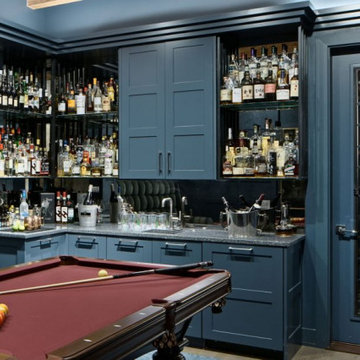
On this ultra-custom pool hall design, we had the pleasure of working with Lonnie Unger, currently with Stones Throw Interiors. Our team worked closely with Lonnie to come up with the custom design for the wall paneling, custom cabinetry, as well as the wine cellar door. This project allowed us to showcase our many different design skills and expertise. Our collaborative design work created this beautiful speak-easy style pool room and lounge. From sleek and classic shaker style paneling, to dramatic 3-step crown molding, this project makes a theatrical statement that is sure to impress all guests.
Custom Design Application
A modern design element that we utilized, was carrying over the wall paneling design to the cabinetry. This design element creates a continuous appearance that ties together the entire room, making the pool table and accessories stand out. The same paint for the walls and cabinets was also used for the custom wine cellar door. One special feature that is important to notice, is the wood threshold at the bottom of the wine cellar door. This piece is crucial for maintaining a temperature-controlled wine cellar. Without this piece, there would be a dramatic increase in temperature within the wine cellar. Wine cellars are recommended to be kept at a strict 55 degrees to ensure wine preservation. The threshold stops the air from escaping.
Collaboration with Designers
With a showroom in River North, Chicago, we pride ourselves on being in the middle of the River North Design District. We are lucky to have the opportunity to collaborate with top Designers and Professional Individuals in Downtown Chicago. We cherish our connections and are always pleased to combine efforts to create a beautiful outcome. Working together on projects in high rises, or in single family homes, we can provide a solution for any request.
 Granit Architects + Interiors
We are delighted to have completed the radical transformation of a tired detached property in South Croydon.
When they appointed Granit, our clients were living in the property which had previously been divided into a number of flats.
The historic sub-division had resulted in an extremely poor use of space with redundant staircases, kitchens and bathrooms throughout.
Our clients sought to reconfigure the property back into a single dwelling for his growing family.
Our client had an eye for design and was keen to balance contemporary design whilst maintaining as much of the character of the original house.
Maximising natural light, space and establishing a visual and physical connection were also key drivers for the design. Owing to the size of the property, it became apparent that reconfiguration rather than extension provided the solution to meet the brief.
A metal clad ‘intervention’ was introduced to the rear facade. This created a strong horizontal element creating a visual balance with the vertical nature of the three storey gable.
The metal cladding specified echoed the colour of the red brick string courses tying old with new. Slender frame sliding doors provide access and views of the large garden.
The central circulation space was transformed by the introduction of a double height glazed slot wrapping up the rear facade and onto the roof. This allows daylight to permeate into the heart of the otherwise dark deep floor plan. The staircase was reconfigured into a series of landings looking down over the main void space below and out towards the tree canopies at the rear of the garden.
The introduction of double pocket doors throughout the ground floor creates a series of interconnected spaces and the whitewashed Larch flooring flows seamlessly from room to room. A bold palette of colours and materials lends character and texture throughout the property.
The end result is a spacious yet cosy environment for the family to inhabit for years to come.
 Vetter Architects
The owners requested a Private Resort that catered to their love for entertaining friends and family, a place where 2 people would feel just as comfortable as 42. Located on the western edge of a Wisconsin lake, the site provides a range of natural ecosystems from forest to prairie to water, allowing the building to have a more complex relationship with the lake - not merely creating large unencumbered views in that direction. The gently sloping site to the lake is atypical in many ways to most lakeside lots - as its main trajectory is not directly to the lake views - allowing for focus to be pushed in other directions such as a courtyard and into a nearby forest.
The biggest challenge was accommodating the large scale gathering spaces, while not overwhelming the natural setting with a single massive structure. Our solution was found in breaking down the scale of the project into digestible pieces and organizing them in a Camp-like collection of elements:
- Main Lodge: Providing the proper entry to the Camp and a Mess Hall
- Bunk House: A communal sleeping area and social space.
- Party Barn: An entertainment facility that opens directly on to a swimming pool & outdoor room.
- Guest Cottages: A series of smaller guest quarters.
- Private Quarters: The owners private space that directly links to the Main Lodge.
These elements are joined by a series green roof connectors, that merge with the landscape and allow the out buildings to retain their own identity. This Camp feel was further magnified through the materiality - specifically the use of Doug Fir, creating a modern Northwoods setting that is warm and inviting. The use of local limestone and poured concrete walls ground the buildings to the sloping site and serve as a cradle for the wood volumes that rest gently on them. The connections between these materials provided an opportunity to add a delicate reading to the spaces and re-enforce the camp aesthetic.
The oscillation between large communal spaces and private, intimate zones is explored on the interior and in the outdoor rooms. From the large courtyard to the private balcony - accommodating a variety of opportunities to engage the landscape was at the heart of the concept.
Overview
Chenequa, WI
Size
Total Finished Area: 9,543 sf
Completion Date
May 2013
Services
Architecture, Landscape Architecture, Interior Design
Sponsored
Plain City, OH

The Creative Kitchen Company
Columbus Area Kitchen Remodeling and Refacing Professional

 LM // PM Productions, LLC
Large trendy gender-neutral light wood floor and beige floor playroom photo in New York with gray walls
 Vetter Architects
The owners requested a Private Resort that catered to their love for entertaining friends and family, a place where 2 people would feel just as comfortable as 42. Located on the western edge of a Wisconsin lake, the site provides a range of natural ecosystems from forest to prairie to water, allowing the building to have a more complex relationship with the lake - not merely creating large unencumbered views in that direction. The gently sloping site to the lake is atypical in many ways to most lakeside lots - as its main trajectory is not directly to the lake views - allowing for focus to be pushed in other directions such as a courtyard and into a nearby forest.
The biggest challenge was accommodating the large scale gathering spaces, while not overwhelming the natural setting with a single massive structure. Our solution was found in breaking down the scale of the project into digestible pieces and organizing them in a Camp-like collection of elements:
- Main Lodge: Providing the proper entry to the Camp and a Mess Hall
- Bunk House: A communal sleeping area and social space.
- Party Barn: An entertainment facility that opens directly on to a swimming pool & outdoor room.
- Guest Cottages: A series of smaller guest quarters.
- Private Quarters: The owners private space that directly links to the Main Lodge.
These elements are joined by a series green roof connectors, that merge with the landscape and allow the out buildings to retain their own identity. This Camp feel was further magnified through the materiality - specifically the use of Doug Fir, creating a modern Northwoods setting that is warm and inviting. The use of local limestone and poured concrete walls ground the buildings to the sloping site and serve as a cradle for the wood volumes that rest gently on them. The connections between these materials provided an opportunity to add a delicate reading to the spaces and re-enforce the camp aesthetic.
The oscillation between large communal spaces and private, intimate zones is explored on the interior and in the outdoor rooms. From the large courtyard to the private balcony - accommodating a variety of opportunities to engage the landscape was at the heart of the concept.
Overview
Chenequa, WI
Size
Total Finished Area: 9,543 sf
Completion Date
May 2013
Services
Architecture, Landscape Architecture, Interior Design
 TRA studio Architecture PLLC
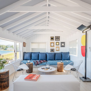
This Atlantic holiday cottage is located in the unique landscape of the creek at Towd Point, in Southampton, one of only 28 Federal Ecological Preserves in the US. Caterina and Bob, a design couple who owns the architecture firm TRA studio in the city, chose the property because of their historic ties to the area and the extraordinary setting and its precise location within it: it is the only house whose site is at the bend of the Towd Point peninsula, right where the views of the protected creek are at the widest and where a little beach naturally occurred.
Although the views are open and vast, the property is minimal, way too small to even consider a small pool or spa: the pristine creek is the house water feature, the recreation expansion of the diminutive back yard. We often joke that at TRA we can make small spaces feel big, which is, exactly what we did.
As often happened with TRA’s renovation projects, as well as with the most recent art pieces by Robert Traboscia, one of the Studio’s founders, the house is an “object trouve’’, originally a modest fishing outpost, that went through many alterations, to finally find a refreshed life as a modern cottage for a New York family. A vintage busted kayak, repurposed as a planter, completes the process.
The cottage is actually a collection of objects: the original Bayman’s cottage now houses two bedrooms, the adjoining deck soon afterwards was enclosed to make space for the kitchen/dining volume and a newer living room addition was later built to complete the compound.’
The compactness of the volumes contributes to the environmental quality of the house, whose
simple natural materials have been carefully restored and insulated, while the simplicity of the volumes, which has been respectfully retained, talks about a nostalgia for the past Long Island seaside retreats. The single level recognizable gabled roof silhouette sits comfortably on the private beach, the greyed cedar deck acting as a platform to connect with the landscape.
The informal weathered materials and the reductive color palette weave effortlessly from the exterior to the interior, creating a serene environment, echoing the coastal landscape, which emphasizes the line where the water meets the sky, the natural beach, tall breezy grasses and the multitude of happy birds who call the creek home.
The restoration process started with the modest goal of cleaning up the walls and replace the worn uneven floor, it soon turned into a forensic research for the original elements, uncovering the historic foam-green siding gabled façade that is now the backdrop of the dining pavilion. The renovation respected the history of the place: everything changed and everything stayed the same.
In an area known for vast, affluent, estates, the house is often the place where friends and family gather: the size of the house, the largeness of the creek, the wild life coexisting in harmony with the visitors, the availability of a swim in the bay or kayak adventure, are all interesting and inviting. We often observed that people do not want to leave our interiors, we love the little house because is a place that you never need to leave, this is definitely a house where there is always something to do. In the Hamptons, the question is often “what you are looking at”, usually the pool or landscaped nature, here it is easy to respond: our private beach and protected nature.
The landscaping simply aims at enhancing the existing: three sculptural and weathered trees were given new life, the natural arch of the Creek, further outlined by the bulkhead, is amplified and repeated, similarly to rock stratifications, to connect to the house and define the different modes of the landscape: native grasses, private beach, gravel lawn, fence and finally Towd Point Road. Towd Point Little Beach is a habitat meant to be shared with birds and animals.
238