
Search results for "Singles connection" in Home Design Ideas

 Zola European Windows
This Boulder, Colorado remodel by fuentesdesign demonstrates the possibility of renewal in American suburbs, and Passive House design principles. Once an inefficient single story 1,000 square-foot ranch house with a forced air furnace, has been transformed into a two-story, solar powered 2500 square-foot three bedroom home ready for the next generation.
The new design for the home is modern with a sustainable theme, incorporating a palette of natural materials including; reclaimed wood finishes, FSC-certified pine Zola windows and doors, and natural earth and lime plasters that soften the interior and crisp contemporary exterior with a flavor of the west. A Ninety-percent efficient energy recovery fresh air ventilation system provides constant filtered fresh air to every room. The existing interior brick was removed and replaced with insulation. The remaining heating and cooling loads are easily met with the highest degree of comfort via a mini-split heat pump, the peak heat load has been cut by a factor of 4, despite the house doubling in size. During the coldest part of the Colorado winter, a wood stove for ambiance and low carbon back up heat creates a special place in both the living and kitchen area, and upstairs loft.
This ultra energy efficient home relies on extremely high levels of insulation, air-tight detailing and construction, and the implementation of high performance, custom made European windows and doors by Zola Windows. Zola’s ThermoPlus Clad line, which boasts R-11 triple glazing and is thermally broken with a layer of patented German Purenit®, was selected for the project. These windows also provide a seamless indoor/outdoor connection, with 9′ wide folding doors from the dining area and a matching 9′ wide custom countertop folding window that opens the kitchen up to a grassy court where mature trees provide shade and extend the living space during the summer months.
With air-tight construction, this home meets the Passive House Retrofit (EnerPHit) air-tightness standard of

 ZeroEnergy Design
OVERVIEW
Set into a mature Boston area neighborhood, this sophisticated 2900SF home offers efficient use of space, expression through form, and myriad of green features.
MULTI-GENERATIONAL LIVING
Designed to accommodate three family generations, paired living spaces on the first and second levels are architecturally expressed on the facade by window systems that wrap the front corners of the house. Included are two kitchens, two living areas, an office for two, and two master suites.
CURB APPEAL
The home includes both modern form and materials, using durable cedar and through-colored fiber cement siding, permeable parking with an electric charging station, and an acrylic overhang to shelter foot traffic from rain.
FEATURE STAIR
An open stair with resin treads and glass rails winds from the basement to the third floor, channeling natural light through all the home’s levels.
LEVEL ONE
The first floor kitchen opens to the living and dining space, offering a grand piano and wall of south facing glass. A master suite and private ‘home office for two’ complete the level.
LEVEL TWO
The second floor includes another open concept living, dining, and kitchen space, with kitchen sink views over the green roof. A full bath, bedroom and reading nook are perfect for the children.
LEVEL THREE
The third floor provides the second master suite, with separate sink and wardrobe area, plus a private roofdeck.
ENERGY
The super insulated home features air-tight construction, continuous exterior insulation, and triple-glazed windows. The walls and basement feature foam-free cavity & exterior insulation. On the rooftop, a solar electric system helps offset energy consumption.
WATER
Cisterns capture stormwater and connect to a drip irrigation system. Inside the home, consumption is limited with high efficiency fixtures and appliances.
TEAM
Architecture & Mechanical Design – ZeroEnergy Design
Contractor – Aedi Construction
Photos – Eric Roth Photography

 Spaces Renewed
More than just a cosmetic remodel, this kitchen and dining room received a dynamic floor plan update. Without having to add square footage, we were able to double the size of the kitchen, add a wine bar, and increase the size of the previously disconnected dining room. Interior walls were removed to accomplish this open concept entertaining area. Harwood flooring throughout the areas connect the kitchen and dining areas, as well as warm up the space and add character. The warm gray accent cabinets coordinate and compliment the white kitchen. The large glass door system brings the outdoors in and allows for seamless entertaining and dining. The landscaping in the backyard was completely redone, including hardscape, walk ways, fire features, and pergola and trellis structures. The upstairs bath is an unexpected surprise with navy blue cabinetry, polished nickel plumbing fixtures, and glass accent tile. The cement look floor tile is both sophisticated and unique.
Find the right local pro for your project

 Orange County Deck Co.
This project was full outdoor living environment, what some would call a “staycation” backyard. A hybrid pool had been installed the previous year but now the living and entertaining spaces needed to be constructed. Consisting of a deck, two patio spaces with walkways connecting all, a couple retaining walls, fencing, landscaping and a new sliding door. The retaining walls were needed to allow for the patio space around to pool. The patio space was divided into two sections, one the wet zone by the pool and the second being the handout zone. This also allowed for a smaller area of fence with a clean transition. The deck constructed using Azek building products provided the style they wanted without having to worry about maintenance. With the elevation being over 8 feet off the ground, the staircase was given careful consideration. It was put on the side that had the grade in its favor to cut down on the size and to not impede on the usable living areas. Traffic flow and usable space should always be considered when designing your space. Now to get a better view of their beautiful backyard we changed their existing single 3 ft. hinged door for a new 6 ft sliding unit. This type of change does involve some structural modification but well worth it. It gave them the sight line they wanted, allows more natural light and has less impact on the living space as the door now slides.
We had a great time constructing this space and love knowing they will be enjoying their home life with family and friends. What could we build in your backyard?

 Klopf Architecture
 and Outer space Landscape Architects designed a new warm, modern, open, indoor-outdoor home in Los Altos, California. Inspired by mid-century modern homes but looking for something completely new and custom, the owners, a couple with two children, bought an older ranch style home with the intention of replacing it.
Created on a grid, the house is designed to be at rest with differentiated spaces for activities; living, playing, cooking, dining and a piano space. The low-sloping gable roof over the great room brings a grand feeling to the space. The clerestory windows at the high sloping roof make the grand space light and airy.
Upon entering the house, an open atrium entry in the middle of the house provides light and nature to the great room. The Heath tile wall at the back of the atrium blocks direct view of the rear yard from the entry door for privacy.
The bedrooms, bathrooms, play room and the sitting room are under flat wing-like roofs that balance on either side of the low sloping gable roof of the main space. Large sliding glass panels and pocketing glass doors foster openness to the front and back yards. In the front there is a fenced-in play space connected to the play room, creating an indoor-outdoor play space that could change in use over the years. The play room can also be closed off from the great room with a large pocketing door. In the rear, everything opens up to a deck overlooking a pool where the family can come together outdoors.
Wood siding travels from exterior to interior, accentuating the indoor-outdoor nature of the house. Where the exterior siding doesn’t come inside, a palette of white oak floors, white walls, walnut cabinetry, and dark window frames ties all the spaces together to create a uniform feeling and flow throughout the house. The custom cabinetry matches the minimal joinery of the rest of the house, a trim-less, minimal appearance. Wood siding was mitered in the corners, including where siding meets the interior drywall. Wall materials were held up off the floor with a minimal reveal. This tight detailing gives a sense of cleanliness to the house.
The garage door of the house is completely flush and of the same material as the garage wall, de-emphasizing the garage door and making the street presentation of the house kinder to the neighborhood.
The house is akin to a custom, modern-day Eichler home in many ways. Inspired by mid-century modern homes with today’s materials, approaches, standards, and technologies. The goals were to create an indoor-outdoor home that was energy-efficient, light and flexible for young children to grow. This 3,000 square foot, 3 bedroom, 2.5 bathroom new house is located in Los Altos in the heart of the Silicon Valley.
Klopf Architecture Project Team: John Klopf, AIA, and Chuang-Ming Liu
Landscape Architect: Outer space Landscape Architects
Structural Engineer: ZFA Structural Engineers
Staging: Da Lusso Design
Photography ©2018 Mariko Reed
Location: Los Altos, CA
Year completed: 2017

 Vetter Architects
The owners requested a Private Resort that catered to their love for entertaining friends and family, a place where 2 people would feel just as comfortable as 42. Located on the western edge of a Wisconsin lake, the site provides a range of natural ecosystems from forest to prairie to water, allowing the building to have a more complex relationship with the lake - not merely creating large unencumbered views in that direction. The gently sloping site to the lake is atypical in many ways to most lakeside lots - as its main trajectory is not directly to the lake views - allowing for focus to be pushed in other directions such as a courtyard and into a nearby forest.
The biggest challenge was accommodating the large scale gathering spaces, while not overwhelming the natural setting with a single massive structure. Our solution was found in breaking down the scale of the project into digestible pieces and organizing them in a Camp-like collection of elements:
- Main Lodge: Providing the proper entry to the Camp and a Mess Hall
- Bunk House: A communal sleeping area and social space.
- Party Barn: An entertainment facility that opens directly on to a swimming pool & outdoor room.
- Guest Cottages: A series of smaller guest quarters.
- Private Quarters: The owners private space that directly links to the Main Lodge.
These elements are joined by a series green roof connectors, that merge with the landscape and allow the out buildings to retain their own identity. This Camp feel was further magnified through the materiality - specifically the use of Doug Fir, creating a modern Northwoods setting that is warm and inviting. The use of local limestone and poured concrete walls ground the buildings to the sloping site and serve as a cradle for the wood volumes that rest gently on them. The connections between these materials provided an opportunity to add a delicate reading to the spaces and re-enforce the camp aesthetic.
The oscillation between large communal spaces and private, intimate zones is explored on the interior and in the outdoor rooms. From the large courtyard to the private balcony - accommodating a variety of opportunities to engage the landscape was at the heart of the concept.
Overview
Chenequa, WI
Size
Total Finished Area: 9,543 sf
Completion Date
May 2013
Services
Architecture, Landscape Architecture, Interior Design

 Cabinet-S-Top
This was a major remodel where the kitchen was completely gutted, flooring and soffits were removed and all the electrical in the kitchen had to be reworked and brought up to code. We used Waypoint Living Spaces for the perimeter cabinets and used a riser and crown molding to connect the cabinets to the ceiling. We chose Medallion Cabinetry for the island because the customer had her heart set on a green painted island. The hardware we used is from the Mulholland collection by Amerock. The customers have large family gathers and it was very important for them to have an island that was moveable. We used casters from Richelieu to create and island that could move easily, as well as having brakes to keep the island in place when they wanted.
Giallo Traversella granite was used on the perimeter countertops to tie together the greens and beige tones of the cabinetry and we used John Boos, walnut butcher block countertop for the island to compliment wood tones from the existing millwork in the home. The customer provided me with an inspiration picture for a backsplash, she knew she wanted a glass patterned backsplash. Ceramic Tiles International had released their Debut Petal mosaic tile and the customer loved it.
Prior to the remodel, the kitchen was very dark and very crowded, it did not function in a way that worked for my customer. We added under cabinet LED lights, one general ceiling fixture and LED Brio Disc lights with dimming capabilities so the customers could adjust the lighting to their specific needs.
Light fixtures were updated in the hallways as well as the kitchen.
My customer didn’t know exactly what they wanted as far as plumbing was concerned. They wanted products that were durable and easy to maintain. I chose the Blanco Performa undermount sink in the Truffle color due to is durability and the color complimented the other materials. We used Moen’s Arbor single handle pull down spray faucet and transitional soap dispenser due to its simplistic design, functionality and warranty. We used a ¾ horsepower Insinkerator disposal and a deluxe Steamball strainer basket.
The customer originally had Parquet flooring and they liked the look of real hardwood. Madeira 5” planks in Dark Gunstock oak was chosen for its color and durability. The flooring brought in warm neutral tones to compliment other materials. My customer wanted a larger window, but they had some safety concerns. We addressed their concerns by providing a larger Awning style window, using tempered glass and double locks.

 Vetter Architects
The owners requested a Private Resort that catered to their love for entertaining friends and family, a place where 2 people would feel just as comfortable as 42. Located on the western edge of a Wisconsin lake, the site provides a range of natural ecosystems from forest to prairie to water, allowing the building to have a more complex relationship with the lake - not merely creating large unencumbered views in that direction. The gently sloping site to the lake is atypical in many ways to most lakeside lots - as its main trajectory is not directly to the lake views - allowing for focus to be pushed in other directions such as a courtyard and into a nearby forest.
The biggest challenge was accommodating the large scale gathering spaces, while not overwhelming the natural setting with a single massive structure. Our solution was found in breaking down the scale of the project into digestible pieces and organizing them in a Camp-like collection of elements:
- Main Lodge: Providing the proper entry to the Camp and a Mess Hall
- Bunk House: A communal sleeping area and social space.
- Party Barn: An entertainment facility that opens directly on to a swimming pool & outdoor room.
- Guest Cottages: A series of smaller guest quarters.
- Private Quarters: The owners private space that directly links to the Main Lodge.
These elements are joined by a series green roof connectors, that merge with the landscape and allow the out buildings to retain their own identity. This Camp feel was further magnified through the materiality - specifically the use of Doug Fir, creating a modern Northwoods setting that is warm and inviting. The use of local limestone and poured concrete walls ground the buildings to the sloping site and serve as a cradle for the wood volumes that rest gently on them. The connections between these materials provided an opportunity to add a delicate reading to the spaces and re-enforce the camp aesthetic.
The oscillation between large communal spaces and private, intimate zones is explored on the interior and in the outdoor rooms. From the large courtyard to the private balcony - accommodating a variety of opportunities to engage the landscape was at the heart of the concept.
Overview
Chenequa, WI
Size
Total Finished Area: 9,543 sf
Completion Date
May 2013
Services
Architecture, Landscape Architecture, Interior Design
 STUDIO TASHIMA
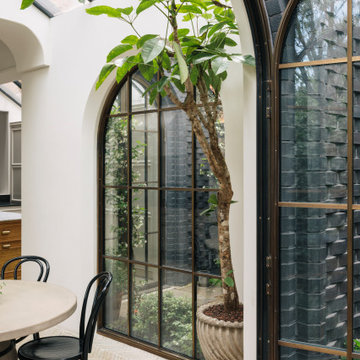
Keyes Road is a two-storey, semi-detached red brick house dating to around 1890-1910. The focus of our work was on the ground floor where we were asked to improve the layout and use of the main living areas of the house, for an active family of four. Important to the design was to maximise the quality and amount of light as well as connection to the garden and flow to the rest of the house.
Our proposal introduces three single storey extensions, comprising a central, large space that extends the main outrigger of the house. To each side are smaller volumes, affording a full width kitchen. While defining a series of discrete volumes, it was important for us to ensure that the kitchen, living, family and dining rooms that are interconnecting and continuous. The result is a big space punctuated by a series of differently sized arches, defining spaces to ensure their intimacy.
It was important for our client to have a sense of warmth and comfort - perhaps not dissimilar to the qualities of a hotel lobby. The colour scheme of the rooms are warm white painted plaster, natural wood flooring with black, bronze and brass accents. Indirect and carefully placed light fittings pulls together the atmosphere of the rooms - particularly in the evenings.
Externally, we felt it important to differentiate the extensions from the main house by using a dark, charcoal grey brick. This sets up a contrasting yet complimentary relationship to the rich red coloured brick house. The facets of the brick play with light and depth as do the graduated brick arches.
During the design process, we grappled with floor levels, the direction of sunlight, and care to not encroach on the neighbouring properties. As the house is in a conservation area, we worked closely with our trusted planning advisor. Throughout, we pursued a sensitive design strategy, using pitched roofs, matching materials and careful detailing. Internally, many of the original details are intact. This has enabled us to create an eclectic ensemble of elements, colours and materials varying in age and period.
 Granit Architects + Interiors
We helped our clients to create a practical, modern and beautiful family home in Putney, South West London.
The Brief
The brief from our clients was to amalgamate an annex and original house building to create one practical family home. It was important the annex did not feel like an add-on, but rather as part of the original property.
The Solution
The design solution is to feature a series of new openings between the two buildings to provide subtle connections and routes between spaces throughout the house.
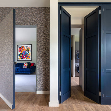
The whole footprint was utilised and spaces were carefully arranged to maximise light and provide a more functional family home. Glass doors with steel frames were used in the hallway to open up sight-lines to the large rear garden and provide flexibility to the use of the space.
The dining room features a hidden door into a secret lounge space that plays on the idea of there previously being a sense of separation. The Kitchen was made bespoke by Higham Furniture, a supplier we have worked with many times before and who are in our supplier directory.
All the original external walls and ground floor construction have been insulated to exceed building regulation standards, creating a highly sustainable building. This is great for our clients carbon footprint and for keeping their running costs low.
Externally, corner glazed full height sliding doors were added to provide a seamless transition between the lounge and garden. At roof level, a series of dormers were added to the master suite that help draw breathtaking views towards the London skyline.
The rear garden was landscaped by Patios, Pots and Pergolas.
The Result
We are delighted with the outcome, which is a sustainable and functional single family home that responds well to our clients brief.

 User
The private home, reminiscent of Maine lodges and family camps, was designed to be a sanctuary for the family and their many relatives. Lassel Architects worked closely with the owners to meet their needs and wishes and collaborated thoroughly with the builder during the construction process to provide a meticulously crafted home.
The open-concept plan, framed by a unique timber frame inspired by Greene & Greene’s designs, provides large open spaces for entertaining with generous views to the lake, along with sleeping lofts that comfortably host a crowd overnight. Each of the family members' bedrooms was configured to provide a view to the lake. The bedroom wings pivot off a staircase which winds around a natural tree trunk up to a tower room with 360-degree views of the surrounding lake and forest. All interiors are framed with natural wood and custom-built furniture and cabinets reinforce daily use and activities.
The family enjoys the home throughout the entire year; therefore careful attention was paid to insulation, air tightness and efficient mechanical systems, including in-floor heating. The house was integrated into the natural topography of the site to connect the interior and exterior spaces and encourage an organic circulation flow. Solar orientation and summer and winter sun angles were studied to shade in the summer and take advantage of passive solar gain in the winter.
Equally important was the use of natural ventilation. The design takes into account cross-ventilation for each bedroom while high and low awning windows to allow cool air to move through the home replacing warm air in the upper floor. The tower functions as a private space with great light and views with the advantage of the Venturi effect on warm summer evenings.
Sandy Agrafiotis
 Vetter Architects
The owners requested a Private Resort that catered to their love for entertaining friends and family, a place where 2 people would feel just as comfortable as 42. Located on the western edge of a Wisconsin lake, the site provides a range of natural ecosystems from forest to prairie to water, allowing the building to have a more complex relationship with the lake - not merely creating large unencumbered views in that direction. The gently sloping site to the lake is atypical in many ways to most lakeside lots - as its main trajectory is not directly to the lake views - allowing for focus to be pushed in other directions such as a courtyard and into a nearby forest.
The biggest challenge was accommodating the large scale gathering spaces, while not overwhelming the natural setting with a single massive structure. Our solution was found in breaking down the scale of the project into digestible pieces and organizing them in a Camp-like collection of elements:
- Main Lodge: Providing the proper entry to the Camp and a Mess Hall
- Bunk House: A communal sleeping area and social space.
- Party Barn: An entertainment facility that opens directly on to a swimming pool & outdoor room.
- Guest Cottages: A series of smaller guest quarters.
- Private Quarters: The owners private space that directly links to the Main Lodge.
These elements are joined by a series green roof connectors, that merge with the landscape and allow the out buildings to retain their own identity. This Camp feel was further magnified through the materiality - specifically the use of Doug Fir, creating a modern Northwoods setting that is warm and inviting. The use of local limestone and poured concrete walls ground the buildings to the sloping site and serve as a cradle for the wood volumes that rest gently on them. The connections between these materials provided an opportunity to add a delicate reading to the spaces and re-enforce the camp aesthetic.
The oscillation between large communal spaces and private, intimate zones is explored on the interior and in the outdoor rooms. From the large courtyard to the private balcony - accommodating a variety of opportunities to engage the landscape was at the heart of the concept.
Overview
Chenequa, WI
Size
Total Finished Area: 9,543 sf
Completion Date
May 2013
Services
Architecture, Landscape Architecture, Interior Design
 kimberly peck architect
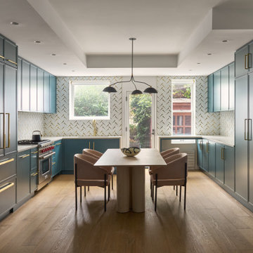
This landmarked brownstone on Prospect Park West already had extraordinary bones—and the rare advantage of windows on three sides. That natural light allowed us to rethink the traditional parlor-floor layout into something more open, connected, and reflective of the way the family lives today, while still honoring the building’s historic character.
The original sequence—a front parlor, a formal dining room in the center, and a closed-off kitchen at the rear—was replaced with a single, flowing main level anchored by a generous slate-blue kitchen. The cabinetry forms a C-shaped configuration that maximizes storage, creates a natural dining zone, and maintains easy circulation to the backyard through the existing glass French door. A full-height marble backsplash with brass inlay adds subtle drama, extending to the ceiling around the windows, and a built-in desk niche creates a casual workspace that feels fully integrated into the design.
Because storage was a priority, the kitchen includes multiple pantry cabinets and deep pull-outs to keep daily life efficient and uncluttered.
The living room now occupies the center of the plan, serving as a shared hub between the kitchen and the front of the home. Just inside the entry, we designed a custom reading nook framed by floor-to-ceiling bookcases with integrated bench seating—an intentional space for the couple and their teenage daughter, who value reading and wanted their books to be both displayed and actively used.
The entry itself was also reimagined. Now separated from the main living space by a wall and door, it functions as a true vestibule with a built-in storage wall for coats and shoes. Tucked beside it is a playful powder room featuring a green vanity, floral wallpaper, and a grey-and-white mosaic tile floor—continued throughout the entry to visually tie the front of the house together and add a moment of personality within the historic shell.
The result is a garden level that remains rooted in its 19th-century architecture but fully supports modern life—light-filled, functional, and thoughtfully layered.


 Stone Standard
The client provided a unique collection of framed images of Napoleon Bonaparte which were collected over several decades. The images are hung on a custom gallery rail system designed. Holes were drilled through the stems of Visual Comfort picture lights to allow the gallery rods to pass through the lights. This allowed centering of the picture lights to each rod. The bookcase lights are from the same series but they were modified to accept a one inch diameter custom rosette. The cabinet hardware, as with all of the metal finishes in the room, is polished nickel and includes Baldwin flush ring pulls, Von Morris mortise butt hinges and Brusso ball catches.
The beveled mirror and frame above the hearth is actually a Seura television mirror with Premier Glass. The television is completely undetectable when it is off and, when it is on, the picture is clear and bright. Undetectable behind the mirror is a Russound IR receiver that transfers IR signals to a cable box, DVD player, and Apple TV receiver located in the lower cabinets. The source components are connected to the television with HDMI cables. Bose wall-mounted speakers, positioned in the lower alcoves of the bookcase, are supplemented with a Sonos subwoofer placed under the sofa.
Surrounding the mantle and mirror is a three inch wide frame, identical to the frame around the gallery wall, that allows the Chesney's Edinburgh Carrara marble mantle and the steel Andover register grate to be set back from the bookcases. The mantle rests securely on a hearth stone of honed black granite which was recessed into the concrete floor. Suspended within the grate is an EcoSmart Bioethonal burner specifically designed for historic register grates. Volcanic stone was placed between the burner and the grate to conceal the front of the burner.
The bookcases, cabinets and wall paneling are fabricated from a combination of solid mahogany and mahogany plywood. Crown and base molding were eliminated from the design to minimize the impact of the library in an otherwise contemporary house. The fascia above the bookcases and mantle, as well as the fascia above the gallery wall, are single pieces of solid mahogany carefully shaved to follow the irregular contours of the drywall ceiling and eliminate the need for caulk or fillers. The same method was employed at the bottom rail of the face frame to allow it to follow the slight undulations of the concrete floor. Eloy Estrada built the wood components and installed them along with all of the other components in the room.
The two adjustable height Galerie des Lamps floor lamps on either side of the mantle are from the Grasshopper series. The Visual Comfort Dorchester Pharmacy floor lamps, on either side of the sofa, plug into a recessed Lew electrical floor box that was recessd into the floor under the sofa. The room originally had a chandelier and recessed lights all of which were all removed. The Lutron light switches, in matte Midnight, allow for independent dimming of the bookcase and picture lights. Within three of the bookcase alcoves are Littlight gooseneck lamps used to highlight various artifacts. The outlets for these lamps, and their transformers, are concealed under a removable wood panel at the back of the alcove. The cords for the display lamps cleanly pass through a Mockett grommet.
The layout of the room and gallery rail system were designed by Leland Stone.
 STUDIO TASHIMA
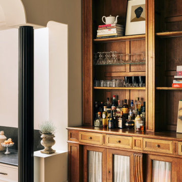
Keyes Road is a two-storey, semi-detached red brick house dating to around 1890-1910. The focus of our work was on the ground floor where we were asked to improve the layout and use of the main living areas of the house, for an active family of four. Important to the design was to maximise the quality and amount of light as well as connection to the garden and flow to the rest of the house.
Our proposal introduces three single storey extensions, comprising a central, large space that extends the main outrigger of the house. To each side are smaller volumes, affording a full width kitchen. While defining a series of discrete volumes, it was important for us to ensure that the kitchen, living, family and dining rooms that are interconnecting and continuous. The result is a big space punctuated by a series of differently sized arches, defining spaces to ensure their intimacy.
It was important for our client to have a sense of warmth and comfort - perhaps not dissimilar to the qualities of a hotel lobby. The colour scheme of the rooms are warm white painted plaster, natural wood flooring with black, bronze and brass accents. Indirect and carefully placed light fittings pulls together the atmosphere of the rooms - particularly in the evenings.
Externally, we felt it important to differentiate the extensions from the main house by using a dark, charcoal grey brick. This sets up a contrasting yet complimentary relationship to the rich red coloured brick house. The facets of the brick play with light and depth as do the graduated brick arches.
During the design process, we grappled with floor levels, the direction of sunlight, and care to not encroach on the neighbouring properties. As the house is in a conservation area, we worked closely with our trusted planning advisor. Throughout, we pursued a sensitive design strategy, using pitched roofs, matching materials and careful detailing. Internally, many of the original details are intact. This has enabled us to create an eclectic ensemble of elements, colours and materials varying in age and period.

 Arbor Illuminations
Driven by a passion for the salt life and a love of the natural beauty of the area, they will leave the Northeast on a trek for the Florida Gulf Coast. The winters there are simply too cold to tolerate for any length of time. And why would they suffer those freezing temperatures when the average temperature on Longboat Key in January is 71 degrees?
However, this is no migration and the subject is not a bird. My clients cannot be referred to as “Snowbirds” either. This is a homecoming. More so, it is a new beginning; a resurrection!
“From the crown of the palm tree, there grew a flame. The flame revealed a nest. As the flames of change kissed the nest, a new being was born. This fantastic creature was born in the image of its predecessor, but it was given a new life. Indeed, it was resurrected. Behold the Phoenix!”
Many years ago, they were pulled from the area in the pursuit of better employment. All the while, they maintained a strong connection with the Gulf Coast. This is where they would spend the best years of their lives. Now is their time of rebirth.
The property they chose is on boating water on the Bay side of Longboat Key. The property is among the few undeveloped lots scattered around the island. Over the years it had been planted with a variety of tropical species including many of the common house varieties such as Ficus, rubber trees, and Areca Palms. Loving the locale, these species quickly outgrew their space. In the shadows, native Sabal Palms stretched their trunks in an effort to survive. A Phoenix Reclinata Palm sat unassumingly beneath the shadow of a large Ficus. We liberated them by removing all of the invasive varieties. We then relocated all ten of the resident Sabal Palms (our State Tree) on site.
The home, designed by celebrated local architect Mark Sultana of DSDG, Inc., is a contemporary flat. The layout is a single living level above parking and grade level outdoor spaces. The architecture is crisp and inspiring and it is sensitive to the smaller scale of the eclectic neighborhood in which it will be constructed. From the elevated balcony, the residents will enjoy watching the many local manatees as they hug the sea wall looking for warmth on chilly mornings. From grade level decks, they will get up close and personal with the abundant schools of mullet in the canal. A northern exposure to the open side of the plan will allow for the amazing breezes offered by passing cool fronts.

 Cascade West Development
This Multi-Level Transitional Craftsman Home Features Blended Indoor/Outdoor Living, a Split-Bedroom Layout for Privacy in The Master Suite and Boasts Both a Master & Guest Suite on The Main Level!
 Cabinet-S-Top
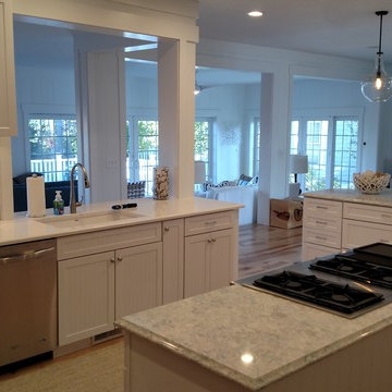
This was a major remodel where the kitchen was completely gutted, flooring and soffits were removed and all the electrical in the kitchen had to be reworked and brought up to code. We used Waypoint Living Spaces for the perimeter cabinets and used a riser and crown molding to connect the cabinets to the ceiling. We chose Medallion Cabinetry for the island because the customer had her heart set on a green painted island. The hardware we used is from the Mulholland collection by Amerock. The customers have large family gathers and it was very important for them to have an island that was moveable. We used casters from Richelieu to create and island that could move easily, as well as having brakes to keep the island in place when they wanted.
Giallo Traversella granite was used on the perimeter countertops to tie together the greens and beige tones of the cabinetry and we used John Boos, walnut butcher block countertop for the island to compliment wood tones from the existing millwork in the home. The customer provided me with an inspiration picture for a backsplash, she knew she wanted a glass patterned backsplash. Ceramic Tiles International had released their Debut Petal mosaic tile and the customer loved it.
Prior to the remodel, the kitchen was very dark and very crowded, it did not function in a way that worked for my customer. We added under cabinet LED lights, one general ceiling fixture and LED Brio Disc lights with dimming capabilities so the customers could adjust the lighting to their specific needs.
Light fixtures were updated in the hallways as well as the kitchen.
My customer didn’t know exactly what they wanted as far as plumbing was concerned. They wanted products that were durable and easy to maintain. I chose the Blanco Performa undermount sink in the Truffle color due to is durability and the color complimented the other materials. We used Moen’s Arbor single handle pull down spray faucet and transitional soap dispenser due to its simplistic design, functionality and warranty. We used a ¾ horsepower Insinkerator disposal and a deluxe Steamball strainer basket.
The customer originally had Parquet flooring and they liked the look of real hardwood. Madeira 5” planks in Dark Gunstock oak was chosen for its color and durability. The flooring brought in warm neutral tones to compliment other materials. My customer wanted a larger window, but they had some safety concerns. We addressed their concerns by providing a larger Awning style window, using tempered glass and double locks.
 Granit Architects + Interiors
We helped our clients to create a practical, modern and beautiful family home in Putney, South West London.
The Brief
The brief from our clients was to amalgamate an annex and original house building to create one practical family home. It was important the annex did not feel like an add-on, but rather as part of the original property.
The Solution
The design solution is to feature a series of new openings between the two buildings to provide subtle connections and routes between spaces throughout the house.
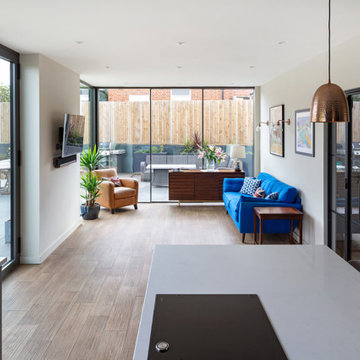
The whole footprint was utilised and spaces were carefully arranged to maximise light and provide a more functional family home. Glass doors with steel frames were used in the hallway to open up sight-lines to the large rear garden and provide flexibility to the use of the space.
The dining room features a hidden door into a secret lounge space that plays on the idea of there previously being a sense of separation. The Kitchen was made bespoke by Higham Furniture, a supplier we have worked with many times before and who are in our supplier directory.
All the original external walls and ground floor construction have been insulated to exceed building regulation standards, creating a highly sustainable building. This is great for our clients carbon footprint and for keeping their running costs low.
Externally, corner glazed full height sliding doors were added to provide a seamless transition between the lounge and garden. At roof level, a series of dormers were added to the master suite that help draw breathtaking views towards the London skyline.
The rear garden was landscaped by Patios, Pots and Pergolas.
The Result
We are delighted with the outcome, which is a sustainable and functional single family home that responds well to our clients brief.

 Victor Mulbauer
New Installation of Red Oak Wood, 3 1/4 in width. White-washed Bona Stain was used, Bona Finish, as well as Bona Traffic HD.
**This photo is of the Red Oak Wood (3 1/4 inch) prior to the application of the white-washed Bona Stain.
234