
Search results for "Sites failed" in Home Design Ideas

 Nautilus Architects
Located on a marsh in the upper reaches of the Lieutenant River in Old Lyme, the existing house was well-sited and well-built, but the design failed to exploit the views and more importantly was a confused combination of contemporary and traditional elements. The new homeowners, a successful businesswoman and an accomplished artist and photographer, were interested in creating a fully-contemporary environment to open up space, connect indoors with outdoors, display artwork and showcase the husband’s distinctive photographs.
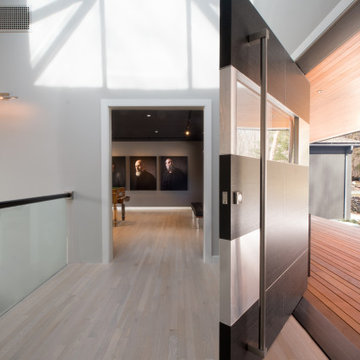
One glaring deficiency was the curb appeal and approach sequence: the grade sloped down and the path to the house followed, but this led to an uncomfortable dip and abrupt rise to the front door. By creating a virtual “moat,” occupied by a grid of raised-bed grasses contained in aluminum-clad boxes, and spanning the moat with an ipe bridge, the approach becomes level and engaging. The façade of the existing house was blank and bland, and with no cover. Adding a deep overhang with a wide porch creates a welcoming, covered condition, accentuated by a 6’ wide pivoting front door that feels more like a moving piece of wall.
Another deficiency was the connection to the outdoors. By adding glass to the front and back of the house, and removing interior walls selectively, the house takes on a diaphanous quality that allows one to see through to the marsh beyond, even when in the driveway. The raised-bed grasses act as abstract, geometric versions of the marsh beyond. A large, pyramidal skylight establishes a spatial hierarchy around which the rooms revolve.
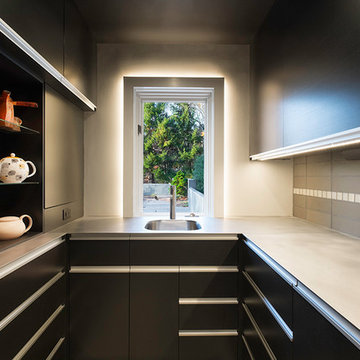
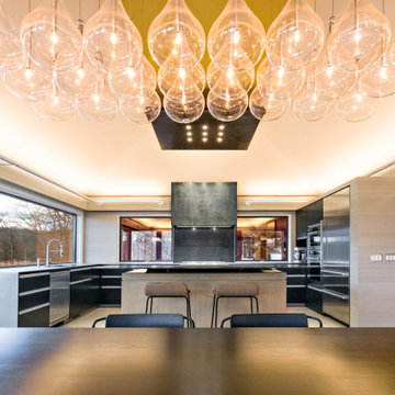
The house featured several tray-ceilinged spaces – living room, kitchen, and master bedroom – that were poorly-proportioned and with panels at the top that resembled inset flat panel doors. The solution was to use a different strategy for each: the bedroom turns the ceiling into an eggshell through the use of a creative trim detail; the living room has an oversized sculptural, backlit lighting element; and the kitchen has a collage of painted rectangular forms that support or include lighting pieces.
A palette of concrete, blackened steel, stainless steel and colors carefully chosen by homeowner and architect create an interior and exterior environment punctuated by moments that are as artistic as the featured works in the black-ceilinged gallery.
 Rocky Tops Granite & Marble LLC
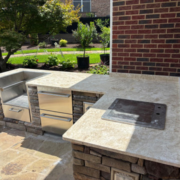
This outdoor kitchen in Lexington is built around 3cm unfilled travertine, and that's a material choice that says a lot about what this space is meant to do. Unfilled travertine keeps its natural pits and texture instead of having them smoothed over with resin, which means the surface reads as raw and organic rather than polished. Out here, under open sky and full sun, that texture works in the stone's favor. It doesn't glare back at you at midday and it doesn't get slick when a hose or a rain shower hits it.
The layout is an L-shaped countertop set over a stacked stone veneer base, with stainless steel drawers and cabinets tucked underneath and a built-in grill anchoring one leg of the L. There's a cutout in the counter for a sink or a cooler, which is the kind of detail that takes real planning at the template stage. You can't cut that opening freehand on site and expect clean lines. We measure twice, dry-fit the appliance or basin, and cut the stone to match before it ever leaves the shop.
Travertine outdoors is a practical call as much as a good-looking one. It handles heat well, which matters right next to a grill, and it won't crack or discolor the way some engineered materials can when they take direct sun for years. Unfilled travertine in particular breathes a little more than the filled version, so it doesn't trap moisture the way a sealed slab might. We finished the edges eased, which keeps the whole thing feeling soft and unfussy, no sharp lines to bang a hip on when you're moving between the grill and the prep space.
Outdoor kitchens take a beating that indoor ones never see: pollen, humidity, the occasional hard freeze here in the Midlands, direct sun for months at a stretch. Travertine's been used outdoors for centuries for exactly that reason, it ages instead of failing. Sealing it now and then keeps water from sitting in the pits, but even bare it holds up. This one in Lexington is set up to be used hard, grilled on, gathered around, and to look better for the wear rather than worse.
 Rocky Tops Granite & Marble LLC
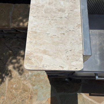
This outdoor kitchen in Lexington is built around 3cm unfilled travertine, and that's a material choice that says a lot about what this space is meant to do. Unfilled travertine keeps its natural pits and texture instead of having them smoothed over with resin, which means the surface reads as raw and organic rather than polished. Out here, under open sky and full sun, that texture works in the stone's favor. It doesn't glare back at you at midday and it doesn't get slick when a hose or a rain shower hits it.
The layout is an L-shaped countertop set over a stacked stone veneer base, with stainless steel drawers and cabinets tucked underneath and a built-in grill anchoring one leg of the L. There's a cutout in the counter for a sink or a cooler, which is the kind of detail that takes real planning at the template stage. You can't cut that opening freehand on site and expect clean lines. We measure twice, dry-fit the appliance or basin, and cut the stone to match before it ever leaves the shop.
Travertine outdoors is a practical call as much as a good-looking one. It handles heat well, which matters right next to a grill, and it won't crack or discolor the way some engineered materials can when they take direct sun for years. Unfilled travertine in particular breathes a little more than the filled version, so it doesn't trap moisture the way a sealed slab might. We finished the edges eased, which keeps the whole thing feeling soft and unfussy, no sharp lines to bang a hip on when you're moving between the grill and the prep space.
Outdoor kitchens take a beating that indoor ones never see: pollen, humidity, the occasional hard freeze here in the Midlands, direct sun for months at a stretch. Travertine's been used outdoors for centuries for exactly that reason, it ages instead of failing. Sealing it now and then keeps water from sitting in the pits, but even bare it holds up. This one in Lexington is set up to be used hard, grilled on, gathered around, and to look better for the wear rather than worse.
Find the right local pro for your project
 Nautilus Architects
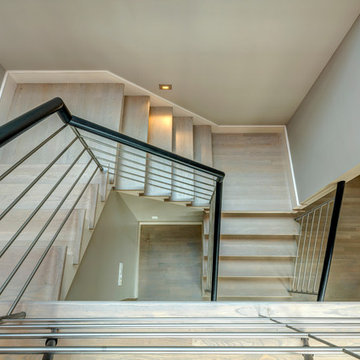
Located on a marsh in the upper reaches of the Lieutenant River in Old Lyme, the existing house was well-sited and well-built, but the design failed to exploit the views and more importantly was a confused combination of contemporary and traditional elements. The new homeowners, a successful businesswoman and an accomplished artist and photographer, were interested in creating a fully-contemporary environment to open up space, connect indoors with outdoors, display artwork and showcase the husband’s distinctive photographs.
One glaring deficiency was the curb appeal and approach sequence: the grade sloped down and the path to the house followed, but this led to an uncomfortable dip and abrupt rise to the front door. By creating a virtual “moat,” occupied by a grid of raised-bed grasses contained in aluminum-clad boxes, and spanning the moat with an ipe bridge, the approach becomes level and engaging. The façade of the existing house was blank and bland, and with no cover. Adding a deep overhang with a wide porch creates a welcoming, covered condition, accentuated by a 6’ wide pivoting front door that feels more like a moving piece of wall.
Another deficiency was the connection to the outdoors. By adding glass to the front and back of the house, and removing interior walls selectively, the house takes on a diaphanous quality that allows one to see through to the marsh beyond, even when in the driveway. The raised-bed grasses act as abstract, geometric versions of the marsh beyond. A large, pyramidal skylight establishes a spatial hierarchy around which the rooms revolve.
The house featured several tray-ceilinged spaces – living room, kitchen, and master bedroom – that were poorly-proportioned and with panels at the top that resembled inset flat panel doors. The solution was to use a different strategy for each: the bedroom turns the ceiling into an eggshell through the use of a creative trim detail; the living room has an oversized sculptural, backlit lighting element; and the kitchen has a collage of painted rectangular forms that support or include lighting pieces.
A palette of concrete, blackened steel, stainless steel and colors carefully chosen by homeowner and architect create an interior and exterior environment punctuated by moments that are as artistic as the featured works in the black-ceilinged gallery.
 Nautilus Architects
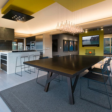
Located on a marsh in the upper reaches of the Lieutenant River in Old Lyme, the existing house was well-sited and well-built, but the design failed to exploit the views and more importantly was a confused combination of contemporary and traditional elements. The new homeowners, a successful businesswoman and an accomplished artist and photographer, were interested in creating a fully-contemporary environment to open up space, connect indoors with outdoors, display artwork and showcase the husband’s distinctive photographs.
One glaring deficiency was the curb appeal and approach sequence: the grade sloped down and the path to the house followed, but this led to an uncomfortable dip and abrupt rise to the front door. By creating a virtual “moat,” occupied by a grid of raised-bed grasses contained in aluminum-clad boxes, and spanning the moat with an ipe bridge, the approach becomes level and engaging. The façade of the existing house was blank and bland, and with no cover. Adding a deep overhang with a wide porch creates a welcoming, covered condition, accentuated by a 6’ wide pivoting front door that feels more like a moving piece of wall.
Another deficiency was the connection to the outdoors. By adding glass to the front and back of the house, and removing interior walls selectively, the house takes on a diaphanous quality that allows one to see through to the marsh beyond, even when in the driveway. The raised-bed grasses act as abstract, geometric versions of the marsh beyond. A large, pyramidal skylight establishes a spatial hierarchy around which the rooms revolve.
The house featured several tray-ceilinged spaces – living room, kitchen, and master bedroom – that were poorly-proportioned and with panels at the top that resembled inset flat panel doors. The solution was to use a different strategy for each: the bedroom turns the ceiling into an eggshell through the use of a creative trim detail; the living room has an oversized sculptural, backlit lighting element; and the kitchen has a collage of painted rectangular forms that support or include lighting pieces.
A palette of concrete, blackened steel, stainless steel and colors carefully chosen by homeowner and architect create an interior and exterior environment punctuated by moments that are as artistic as the featured works in the black-ceilinged gallery.
 Nautilus Architects
Located on a marsh in the upper reaches of the Lieutenant River in Old Lyme, the existing house was well-sited and well-built, but the design failed to exploit the views and more importantly was a confused combination of contemporary and traditional elements. The new homeowners, a successful businesswoman and an accomplished artist and photographer, were interested in creating a fully-contemporary environment to open up space, connect indoors with outdoors, display artwork and showcase the husband’s distinctive photographs.
One glaring deficiency was the curb appeal and approach sequence: the grade sloped down and the path to the house followed, but this led to an uncomfortable dip and abrupt rise to the front door. By creating a virtual “moat,” occupied by a grid of raised-bed grasses contained in aluminum-clad boxes, and spanning the moat with an ipe bridge, the approach becomes level and engaging. The façade of the existing house was blank and bland, and with no cover. Adding a deep overhang with a wide porch creates a welcoming, covered condition, accentuated by a 6’ wide pivoting front door that feels more like a moving piece of wall.
Another deficiency was the connection to the outdoors. By adding glass to the front and back of the house, and removing interior walls selectively, the house takes on a diaphanous quality that allows one to see through to the marsh beyond, even when in the driveway. The raised-bed grasses act as abstract, geometric versions of the marsh beyond. A large, pyramidal skylight establishes a spatial hierarchy around which the rooms revolve.
The house featured several tray-ceilinged spaces – living room, kitchen, and master bedroom – that were poorly-proportioned and with panels at the top that resembled inset flat panel doors. The solution was to use a different strategy for each: the bedroom turns the ceiling into an eggshell through the use of a creative trim detail; the living room has an oversized sculptural, backlit lighting element; and the kitchen has a collage of painted rectangular forms that support or include lighting pieces.
A palette of concrete, blackened steel, stainless steel and colors carefully chosen by homeowner and architect create an interior and exterior environment punctuated by moments that are as artistic as the featured works in the black-ceilinged gallery.
 Nautilus Architects
Located on a marsh in the upper reaches of the Lieutenant River in Old Lyme, the existing house was well-sited and well-built, but the design failed to exploit the views and more importantly was a confused combination of contemporary and traditional elements. The new homeowners, a successful businesswoman and an accomplished artist and photographer, were interested in creating a fully-contemporary environment to open up space, connect indoors with outdoors, display artwork and showcase the husband’s distinctive photographs.
One glaring deficiency was the curb appeal and approach sequence: the grade sloped down and the path to the house followed, but this led to an uncomfortable dip and abrupt rise to the front door. By creating a virtual “moat,” occupied by a grid of raised-bed grasses contained in aluminum-clad boxes, and spanning the moat with an ipe bridge, the approach becomes level and engaging. The façade of the existing house was blank and bland, and with no cover. Adding a deep overhang with a wide porch creates a welcoming, covered condition, accentuated by a 6’ wide pivoting front door that feels more like a moving piece of wall.
Another deficiency was the connection to the outdoors. By adding glass to the front and back of the house, and removing interior walls selectively, the house takes on a diaphanous quality that allows one to see through to the marsh beyond, even when in the driveway. The raised-bed grasses act as abstract, geometric versions of the marsh beyond. A large, pyramidal skylight establishes a spatial hierarchy around which the rooms revolve.
The house featured several tray-ceilinged spaces – living room, kitchen, and master bedroom – that were poorly-proportioned and with panels at the top that resembled inset flat panel doors. The solution was to use a different strategy for each: the bedroom turns the ceiling into an eggshell through the use of a creative trim detail; the living room has an oversized sculptural, backlit lighting element; and the kitchen has a collage of painted rectangular forms that support or include lighting pieces.
A palette of concrete, blackened steel, stainless steel and colors carefully chosen by homeowner and architect create an interior and exterior environment punctuated by moments that are as artistic as the featured works in the black-ceilinged gallery.
 Rocky Tops Granite & Marble LLC
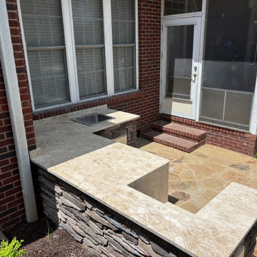
This outdoor kitchen in Lexington is built around 3cm unfilled travertine, and that's a material choice that says a lot about what this space is meant to do. Unfilled travertine keeps its natural pits and texture instead of having them smoothed over with resin, which means the surface reads as raw and organic rather than polished. Out here, under open sky and full sun, that texture works in the stone's favor. It doesn't glare back at you at midday and it doesn't get slick when a hose or a rain shower hits it.
The layout is an L-shaped countertop set over a stacked stone veneer base, with stainless steel drawers and cabinets tucked underneath and a built-in grill anchoring one leg of the L. There's a cutout in the counter for a sink or a cooler, which is the kind of detail that takes real planning at the template stage. You can't cut that opening freehand on site and expect clean lines. We measure twice, dry-fit the appliance or basin, and cut the stone to match before it ever leaves the shop.
Travertine outdoors is a practical call as much as a good-looking one. It handles heat well, which matters right next to a grill, and it won't crack or discolor the way some engineered materials can when they take direct sun for years. Unfilled travertine in particular breathes a little more than the filled version, so it doesn't trap moisture the way a sealed slab might. We finished the edges eased, which keeps the whole thing feeling soft and unfussy, no sharp lines to bang a hip on when you're moving between the grill and the prep space.
Outdoor kitchens take a beating that indoor ones never see: pollen, humidity, the occasional hard freeze here in the Midlands, direct sun for months at a stretch. Travertine's been used outdoors for centuries for exactly that reason, it ages instead of failing. Sealing it now and then keeps water from sitting in the pits, but even bare it holds up. This one in Lexington is set up to be used hard, grilled on, gathered around, and to look better for the wear rather than worse.
 Nautilus Architects
Located on a marsh in the upper reaches of the Lieutenant River in Old Lyme, the existing house was well-sited and well-built, but the design failed to exploit the views and more importantly was a confused combination of contemporary and traditional elements. The new homeowners, a successful businesswoman and an accomplished artist and photographer, were interested in creating a fully-contemporary environment to open up space, connect indoors with outdoors, display artwork and showcase the husband’s distinctive photographs.
One glaring deficiency was the curb appeal and approach sequence: the grade sloped down and the path to the house followed, but this led to an uncomfortable dip and abrupt rise to the front door. By creating a virtual “moat,” occupied by a grid of raised-bed grasses contained in aluminum-clad boxes, and spanning the moat with an ipe bridge, the approach becomes level and engaging. The façade of the existing house was blank and bland, and with no cover. Adding a deep overhang with a wide porch creates a welcoming, covered condition, accentuated by a 6’ wide pivoting front door that feels more like a moving piece of wall.
Another deficiency was the connection to the outdoors. By adding glass to the front and back of the house, and removing interior walls selectively, the house takes on a diaphanous quality that allows one to see through to the marsh beyond, even when in the driveway. The raised-bed grasses act as abstract, geometric versions of the marsh beyond. A large, pyramidal skylight establishes a spatial hierarchy around which the rooms revolve.
The house featured several tray-ceilinged spaces – living room, kitchen, and master bedroom – that were poorly-proportioned and with panels at the top that resembled inset flat panel doors. The solution was to use a different strategy for each: the bedroom turns the ceiling into an eggshell through the use of a creative trim detail; the living room has an oversized sculptural, backlit lighting element; and the kitchen has a collage of painted rectangular forms that support or include lighting pieces.
A palette of concrete, blackened steel, stainless steel and colors carefully chosen by homeowner and architect create an interior and exterior environment punctuated by moments that are as artistic as the featured works in the black-ceilinged gallery.
 Nautilus Architects
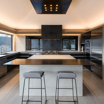
Located on a marsh in the upper reaches of the Lieutenant River in Old Lyme, the existing house was well-sited and well-built, but the design failed to exploit the views and more importantly was a confused combination of contemporary and traditional elements. The new homeowners, a successful businesswoman and an accomplished artist and photographer, were interested in creating a fully-contemporary environment to open up space, connect indoors with outdoors, display artwork and showcase the husband’s distinctive photographs.
One glaring deficiency was the curb appeal and approach sequence: the grade sloped down and the path to the house followed, but this led to an uncomfortable dip and abrupt rise to the front door. By creating a virtual “moat,” occupied by a grid of raised-bed grasses contained in aluminum-clad boxes, and spanning the moat with an ipe bridge, the approach becomes level and engaging. The façade of the existing house was blank and bland, and with no cover. Adding a deep overhang with a wide porch creates a welcoming, covered condition, accentuated by a 6’ wide pivoting front door that feels more like a moving piece of wall.
Another deficiency was the connection to the outdoors. By adding glass to the front and back of the house, and removing interior walls selectively, the house takes on a diaphanous quality that allows one to see through to the marsh beyond, even when in the driveway. The raised-bed grasses act as abstract, geometric versions of the marsh beyond. A large, pyramidal skylight establishes a spatial hierarchy around which the rooms revolve.
The house featured several tray-ceilinged spaces – living room, kitchen, and master bedroom – that were poorly-proportioned and with panels at the top that resembled inset flat panel doors. The solution was to use a different strategy for each: the bedroom turns the ceiling into an eggshell through the use of a creative trim detail; the living room has an oversized sculptural, backlit lighting element; and the kitchen has a collage of painted rectangular forms that support or include lighting pieces.
A palette of concrete, blackened steel, stainless steel and colors carefully chosen by homeowner and architect create an interior and exterior environment punctuated by moments that are as artistic as the featured works in the black-ceilinged gallery.
 Nautilus Architects
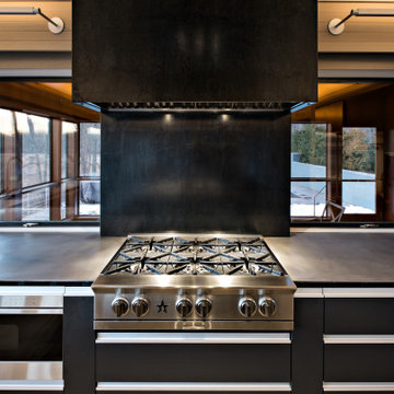
Located on a marsh in the upper reaches of the Lieutenant River in Old Lyme, the existing house was well-sited and well-built, but the design failed to exploit the views and more importantly was a confused combination of contemporary and traditional elements. The new homeowners, a successful businesswoman and an accomplished artist and photographer, were interested in creating a fully-contemporary environment to open up space, connect indoors with outdoors, display artwork and showcase the husband’s distinctive photographs.
One glaring deficiency was the curb appeal and approach sequence: the grade sloped down and the path to the house followed, but this led to an uncomfortable dip and abrupt rise to the front door. By creating a virtual “moat,” occupied by a grid of raised-bed grasses contained in aluminum-clad boxes, and spanning the moat with an ipe bridge, the approach becomes level and engaging. The façade of the existing house was blank and bland, and with no cover. Adding a deep overhang with a wide porch creates a welcoming, covered condition, accentuated by a 6’ wide pivoting front door that feels more like a moving piece of wall.
Another deficiency was the connection to the outdoors. By adding glass to the front and back of the house, and removing interior walls selectively, the house takes on a diaphanous quality that allows one to see through to the marsh beyond, even when in the driveway. The raised-bed grasses act as abstract, geometric versions of the marsh beyond. A large, pyramidal skylight establishes a spatial hierarchy around which the rooms revolve.
The house featured several tray-ceilinged spaces – living room, kitchen, and master bedroom – that were poorly-proportioned and with panels at the top that resembled inset flat panel doors. The solution was to use a different strategy for each: the bedroom turns the ceiling into an eggshell through the use of a creative trim detail; the living room has an oversized sculptural, backlit lighting element; and the kitchen has a collage of painted rectangular forms that support or include lighting pieces.
A palette of concrete, blackened steel, stainless steel and colors carefully chosen by homeowner and architect create an interior and exterior environment punctuated by moments that are as artistic as the featured works in the black-ceilinged gallery.
 Rocky Tops Granite & Marble LLC
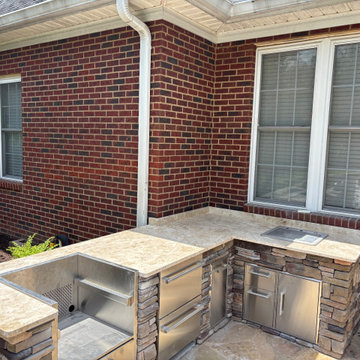
This outdoor kitchen in Lexington is built around 3cm unfilled travertine, and that's a material choice that says a lot about what this space is meant to do. Unfilled travertine keeps its natural pits and texture instead of having them smoothed over with resin, which means the surface reads as raw and organic rather than polished. Out here, under open sky and full sun, that texture works in the stone's favor. It doesn't glare back at you at midday and it doesn't get slick when a hose or a rain shower hits it.
The layout is an L-shaped countertop set over a stacked stone veneer base, with stainless steel drawers and cabinets tucked underneath and a built-in grill anchoring one leg of the L. There's a cutout in the counter for a sink or a cooler, which is the kind of detail that takes real planning at the template stage. You can't cut that opening freehand on site and expect clean lines. We measure twice, dry-fit the appliance or basin, and cut the stone to match before it ever leaves the shop.
Travertine outdoors is a practical call as much as a good-looking one. It handles heat well, which matters right next to a grill, and it won't crack or discolor the way some engineered materials can when they take direct sun for years. Unfilled travertine in particular breathes a little more than the filled version, so it doesn't trap moisture the way a sealed slab might. We finished the edges eased, which keeps the whole thing feeling soft and unfussy, no sharp lines to bang a hip on when you're moving between the grill and the prep space.
Outdoor kitchens take a beating that indoor ones never see: pollen, humidity, the occasional hard freeze here in the Midlands, direct sun for months at a stretch. Travertine's been used outdoors for centuries for exactly that reason, it ages instead of failing. Sealing it now and then keeps water from sitting in the pits, but even bare it holds up. This one in Lexington is set up to be used hard, grilled on, gathered around, and to look better for the wear rather than worse.
 Nautilus Architects
Located on a marsh in the upper reaches of the Lieutenant River in Old Lyme, the existing house was well-sited and well-built, but the design failed to exploit the views and more importantly was a confused combination of contemporary and traditional elements. The new homeowners, a successful businesswoman and an accomplished artist and photographer, were interested in creating a fully-contemporary environment to open up space, connect indoors with outdoors, display artwork and showcase the husband’s distinctive photographs.
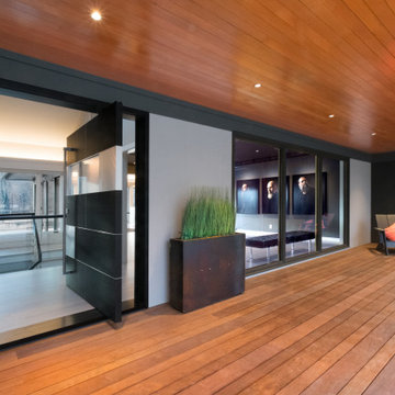
One glaring deficiency was the curb appeal and approach sequence: the grade sloped down and the path to the house followed, but this led to an uncomfortable dip and abrupt rise to the front door. By creating a virtual “moat,” occupied by a grid of raised-bed grasses contained in aluminum-clad boxes, and spanning the moat with an ipe bridge, the approach becomes level and engaging. The façade of the existing house was blank and bland, and with no cover. Adding a deep overhang with a wide porch creates a welcoming, covered condition, accentuated by a 6’ wide pivoting front door that feels more like a moving piece of wall.
Another deficiency was the connection to the outdoors. By adding glass to the front and back of the house, and removing interior walls selectively, the house takes on a diaphanous quality that allows one to see through to the marsh beyond, even when in the driveway. The raised-bed grasses act as abstract, geometric versions of the marsh beyond. A large, pyramidal skylight establishes a spatial hierarchy around which the rooms revolve.
The house featured several tray-ceilinged spaces – living room, kitchen, and master bedroom – that were poorly-proportioned and with panels at the top that resembled inset flat panel doors. The solution was to use a different strategy for each: the bedroom turns the ceiling into an eggshell through the use of a creative trim detail; the living room has an oversized sculptural, backlit lighting element; and the kitchen has a collage of painted rectangular forms that support or include lighting pieces.
A palette of concrete, blackened steel, stainless steel and colors carefully chosen by homeowner and architect create an interior and exterior environment punctuated by moments that are as artistic as the featured works in the black-ceilinged gallery.
 Nautilus Architects
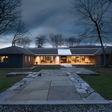
Located on a marsh in the upper reaches of the Lieutenant River in Old Lyme, the existing house was well-sited and well-built, but the design failed to exploit the views and more importantly was a confused combination of contemporary and traditional elements. The new homeowners, a successful businesswoman and an accomplished artist and photographer, were interested in creating a fully-contemporary environment to open up space, connect indoors with outdoors, display artwork and showcase the husband’s distinctive photographs.
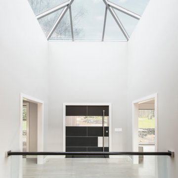
One glaring deficiency was the curb appeal and approach sequence: the grade sloped down and the path to the house followed, but this led to an uncomfortable dip and abrupt rise to the front door. By creating a virtual “moat,” occupied by a grid of raised-bed grasses contained in aluminum-clad boxes, and spanning the moat with an ipe bridge, the approach becomes level and engaging. The façade of the existing house was blank and bland, and with no cover. Adding a deep overhang with a wide porch creates a welcoming, covered condition, accentuated by a 6’ wide pivoting front door that feels more like a moving piece of wall.
Another deficiency was the connection to the outdoors. By adding glass to the front and back of the house, and removing interior walls selectively, the house takes on a diaphanous quality that allows one to see through to the marsh beyond, even when in the driveway. The raised-bed grasses act as abstract, geometric versions of the marsh beyond. A large, pyramidal skylight establishes a spatial hierarchy around which the rooms revolve.
The house featured several tray-ceilinged spaces – living room, kitchen, and master bedroom – that were poorly-proportioned and with panels at the top that resembled inset flat panel doors. The solution was to use a different strategy for each: the bedroom turns the ceiling into an eggshell through the use of a creative trim detail; the living room has an oversized sculptural, backlit lighting element; and the kitchen has a collage of painted rectangular forms that support or include lighting pieces.
A palette of concrete, blackened steel, stainless steel and colors carefully chosen by homeowner and architect create an interior and exterior environment punctuated by moments that are as artistic as the featured works in the black-ceilinged gallery.
 Nautilus Architects
Located on a marsh in the upper reaches of the Lieutenant River in Old Lyme, the existing house was well-sited and well-built, but the design failed to exploit the views and more importantly was a confused combination of contemporary and traditional elements. The new homeowners, a successful businesswoman and an accomplished artist and photographer, were interested in creating a fully-contemporary environment to open up space, connect indoors with outdoors, display artwork and showcase the husband’s distinctive photographs.
One glaring deficiency was the curb appeal and approach sequence: the grade sloped down and the path to the house followed, but this led to an uncomfortable dip and abrupt rise to the front door. By creating a virtual “moat,” occupied by a grid of raised-bed grasses contained in aluminum-clad boxes, and spanning the moat with an ipe bridge, the approach becomes level and engaging. The façade of the existing house was blank and bland, and with no cover. Adding a deep overhang with a wide porch creates a welcoming, covered condition, accentuated by a 6’ wide pivoting front door that feels more like a moving piece of wall.
Another deficiency was the connection to the outdoors. By adding glass to the front and back of the house, and removing interior walls selectively, the house takes on a diaphanous quality that allows one to see through to the marsh beyond, even when in the driveway. The raised-bed grasses act as abstract, geometric versions of the marsh beyond. A large, pyramidal skylight establishes a spatial hierarchy around which the rooms revolve.
The house featured several tray-ceilinged spaces – living room, kitchen, and master bedroom – that were poorly-proportioned and with panels at the top that resembled inset flat panel doors. The solution was to use a different strategy for each: the bedroom turns the ceiling into an eggshell through the use of a creative trim detail; the living room has an oversized sculptural, backlit lighting element; and the kitchen has a collage of painted rectangular forms that support or include lighting pieces.
A palette of concrete, blackened steel, stainless steel and colors carefully chosen by homeowner and architect create an interior and exterior environment punctuated by moments that are as artistic as the featured works in the black-ceilinged gallery.
 Centerbeam Construction
Tommy Hurt
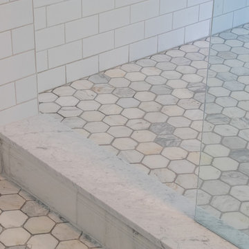
Doorless shower - small coastal gray tile mosaic tile floor doorless shower idea in Jacksonville with shaker cabinets, white cabinets, a one-piece toilet, blue walls, an undermount sink and granite countertops
Doorless shower - small coastal gray tile mosaic tile floor doorless shower idea in Jacksonville with shaker cabinets, white cabinets, a one-piece toilet, blue walls, an undermount sink and granite countertops
 Horn & Co. (Previously JHLA)
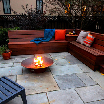
Following an architectural renovation of this Arlington home by McInturff Architects, the owner hired us to design a seating area and terrace in the back yard. The lounge seating is integrated directly into the rear deck and a new bluestone terrace creates an opportunity to lounge around a Corten steel fire pit.
 Zelaya Properties LLC
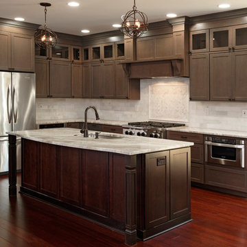
We used: Custom cherry cabinetry in Arts & Crafts Shaker style by Kabinart in Boulder and Espresso stains. Liberty Hardware Venetian bronze 1-1/2" cabinet knobs. KitchenAid Architect II Series 22 CF counter-depth French door refrigerator. KitchenAid Architect Series II 27" convection single wall oven. KitchenAid 36" 6-burner dual fuel freestanding commercial-style range. KitchenAid Architect II Series 24" dishwasher. Sharp Insight Pro Series 24" built-in microwave drawer (Model #KB6524PS). Crystorama Solaris 12" wide pendant lights in English bronze. Granite countertops in Brown Fantasy. 3"x6" polished marble backsplash.
Paint colors:
Walls: Glidden Silver Cloud 30YY 63/024
Ceilings/Trims/Doors: Glidden Swan White GLC23
Robert B. Narod Photography
 Windy City Painters
Iron Fence Painting Wicker Park Homeowners Can Trust: A Windy City Painters Case Study
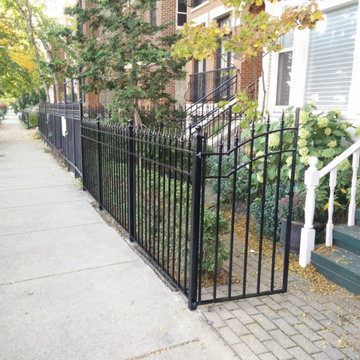
Wicker Park is full of architectural character — ornate 1890s greystone two-flats, vintage brick facades, and wrought iron fencing that has framed these streets for well over a century. However, what iron fence painting Wicker Park properties require is not a simple weekend job. Winters here are brutal on metal, and consequently Windy City Painters has spent years perfecting the restoration process that keeps these fences standing strong. In particular, this case study walks through a recent project completed for a classic Wicker Park property.
Project Overview
The property featured a full wrought iron perimeter fence that had suffered years of freeze-thaw cycling and road salt exposure. Paint had failed across most of the pickets, and oxidation had progressed into active rust at several base rails. Consequently, the homeowners needed more than a fresh coat of paint. They needed a genuine metal restoration, and that is precisely what Windy City Painters delivered.
Materials Used
Windy City Painters selected products specifically rated for Chicago's climate extremes:
Rust-Oleum Professional Rust Inhibitor Primer
Sherwin-Williams DTM Acrylic Enamel (two finish coats)
3M rust converter gel for active oxidation zones
Wire brushes, angle grinders, and detail brushes for precision work
The Process: How Windy City Painters Restores Rusted Iron
Every iron fence painting Wicker Park project follows a disciplined, multi-stage process:
Preparation. Wire brushing and angle grinding remove all loose, flaking, and compromised material. Rust converter gel is applied directly to active oxidation zones, chemically stabilizing the metal underneath.
Repairs. Pitted sections and structurally weak joints are addressed before any coating touches the surface. Notably, skipping this step is the most common reason fence paint fails prematurely.
Priming. A full rust-inhibiting primer coat seals every bare metal surface, preventing moisture from reaching the iron beneath.
Application. Two finish coats of direct-to-metal enamel are applied by hand for even coverage across pickets, finials, and rail joints.
Finishing. A final inspection confirms full coverage, sharp lines, and a smooth, uniform sheen from every angle.
Furthermore, this same process protects the ornate details so common on Wicker Park fencing — decorative finials, scrollwork, and gate hardware — without losing the historic character that makes these properties special.
Advice for Wicker Park Homeowners
Before starting a similar project, homeowners in this neighborhood should keep a few things in mind:
Never paint over active rust. Untreated oxidation will continue spreading beneath the new coating, and the paint will fail within a season or two.
Always prime bare metal before applying a finish coat. Skipping primer is the single fastest path to peeling.
Choose coatings rated for temperature extremes, since Chicago's freeze-thaw cycles are harder on metal than most climates.
Inspect ground-contact areas each spring, as base rails typically rust fastest due to snow melt and road salt runoff.
Budget for prep time. In fact, most of the labor in a quality iron fence painting Wicker Park project happens before a single coat of paint is applied.
Similarly, ask whether the contractor uses rust converter on active oxidation, since skipping this step often shortens the life of the finish considerably.
Moreover, historic greystone properties often have decorative ironwork that requires extra care during grinding and priming so the original detailing is preserved rather than sanded away.
What to Expect: Timeline and Investment
Homeowners often ask how long an iron fence painting Wicker Park project takes from start to finish. In general, prep work — wire brushing, grinding, rust conversion, and repairs — takes up the largest share of the schedule, while primer and enamel application move relatively quickly once the surface is properly stabilized. Cure time between coats also affects the overall timeline, since rushing this stage undermines durability. Consequently, Windy City Painters builds a realistic schedule around weather conditions rather than forcing the job into a tight window. In addition, investment varies based on fence length, the amount of active rust present, and whether ornate detailing requires extra hand-finishing. Homeowners considering this project should request a full on-site walkthrough rather than a rough phone estimate, since rust severity is difficult to judge accurately without seeing the fence in person.
Why Wicker Park Homeowners Choose Windy City Painters
Windy City Painters has become the trusted painting contractor for Chicago's North Side and Near West Side, and iron fence painting Wicker Park residents request most often reflects that reputation directly. In contrast to quick-fix contractors who paint straight over rust, Windy City Painters treats every project as a full restoration. As a result, clients get a finish that holds up through multiple Chicago winters rather than one.
In addition, for related projects, Windy City Painters also offers interior painting, cabinet painting, drywall and plaster repair, and full metal refinishing services for fences, gates, and porches throughout the neighborhood. Ultimately, that range of services is what makes us a true one-stop contractor for Wicker Park homeowners.
See more of our work and request a free estimate at www.windypainters.com.
Ready to transform your Wicker Park home? Contact Windy City Painters for a free estimate — visit www.windypainters.com today. Proudly serving Wicker Park, West Town, Lincoln Park, Roscoe Village, Lakeview, Ukrainian Village, River North, and all of Chicago.
 Mayflower Construction Group
How Planning Leads to Successful Construction
Construction projects, whether small residential jobs or large commercial builds, require more than just skilled labor and high-quality materials. The foundation of a successful project lies in effective planning. Proper planning ensures efficiency, minimizes risks, and keeps the project within budget and on schedule. Here’s how thorough planning leads to successful construction:
1. Clear Project Scope and Objectives
Defining the project scope early on helps prevent scope creep and miscommunication. Establishing clear goals, deliverables, and timelines ensures that everyone involved understands the expectations. This prevents delays and unnecessary changes during construction.
2. Accurate Budgeting and Cost Control
A well-planned project includes a detailed cost estimation. This accounts for labor, materials, permits, and unexpected contingencies. Without proper budgeting, costs can spiral out of control, leading to financial strain and potential project failure.
3. Efficient Resource Management
Proper planning helps allocate resources effectively, including manpower, equipment, and materials. Scheduling workers and ordering materials at the right time avoids delays caused by shortages or logistical issues.
4. Risk Identification and Mitigation
Every construction project comes with risks—weather delays, supply chain issues, safety hazards, or regulatory compliance concerns. Planning ahead allows for risk assessment and the implementation of strategies to mitigate potential problems before they occur.
5. Compliance with Regulations and Permits
Failing to secure the necessary permits or adhere to building codes can halt a project indefinitely. Planning ensures that all legal requirements are met in advance, avoiding costly fines and legal complications.
6. Seamless Communication and Coordination
A structured plan includes clear communication protocols between contractors, architects, engineers, and clients. When everyone is on the same page, mistakes are reduced, and the workflow remains smooth.
7. Improved Project Scheduling
A construction schedule outlines each phase of the project, from site preparation to finishing touches. A well-planned schedule helps keep tasks on track, prevents unnecessary delays, and ensures timely project completion.
8. Higher Quality Workmanship
Planning allows for a structured approach to quality control. By setting benchmarks, conducting inspections, and using the right materials, projects meet industry standards and client expectations.
9. Better Client Satisfaction
When a project is completed on time, within budget, and meets quality expectations, client satisfaction increases. A satisfied client is more likely to recommend your services and return for future projects.
Conclusion
In construction, planning isn’t just a step—it’s the backbone of success. From budgeting and resource management to compliance and scheduling, thorough planning prevents costly errors, improves efficiency, and ensures a high-quality outcome. Whether you're working on a small driveway installation or a large-scale commercial project, investing time in planning will always pay off in the long run.
Do you need expert concrete construction services that prioritize planning and quality? Contact us today!
4