
Search results for "Small entryway storage" in Home Design Ideas
 Everingham Design
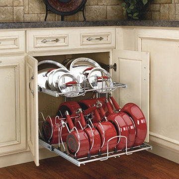
Kitchen - traditional kitchen idea in Columbus with raised-panel cabinets and beige cabinets
 kimberly peck architect
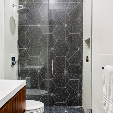
This brownstone, located in Harlem, consists of five stories which had been duplexed to create a two story rental unit and a 3 story home for the owners. The owner hired us to do a modern renovation of their home and rear garden. The garden was under utilized, barely visible from the interior and could only be accessed via a small steel stair at the rear of the second floor. We enlarged the owner’s home to include the rear third of the floor below which had walk out access to the garden. The additional square footage became a new family room connected to the living room and kitchen on the floor above via a double height space and a new sculptural stair. The rear facade was completely restructured to allow us to install a wall to wall two story window and door system within the new double height space creating a connection not only between the two floors but with the outside. The garden itself was terraced into two levels, the bottom level of which is directly accessed from the new family room space, the upper level accessed via a few stone clad steps. The upper level of the garden features a playful interplay of stone pavers with wood decking adjacent to a large seating area and a new planting bed. Wet bar cabinetry at the family room level is mirrored by an outside cabinetry/grill configuration as another way to visually tie inside to out. The second floor features the dining room, kitchen and living room in a large open space. Wall to wall builtins from the front to the rear transition from storage to dining display to kitchen; ending at an open shelf display with a fireplace feature in the base. The third floor serves as the children’s floor with two bedrooms and two ensuite baths. The fourth floor is a master suite with a large bedroom and a large bathroom bridged by a walnut clad hall that conceals a closet system and features a built in desk. The master bath consists of a tiled partition wall dividing the space to create a large walkthrough shower for two on one side and showcasing a free standing tub on the other. The house is full of custom modern details such as the recessed, lit handrail at the house’s main stair, floor to ceiling glass partitions separating the halls from the stairs and a whimsical builtin bench in the entry.

Find the right local pro for your project

 Pamela Sandler Architect
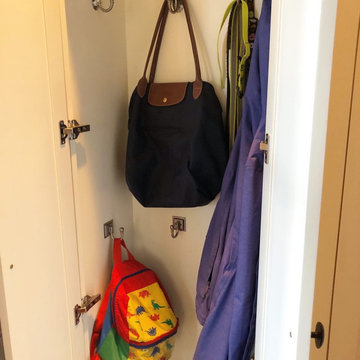
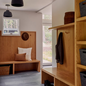
Modern and functional ground-level entryway designed for practicality and warmth. The space features durable slate or bluestone floor tiles, which provide a cool, natural texture and contrast with the dominant light-colored wood of the built-in benches and storage. The entryway is equipped with a custom-built bench and paneling that extends up the wall, complete with hooks for coats and a shelf above.
 In Detail Interiors
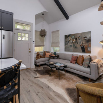
When challenged with the task of turning 500 or so square feet into the most functional residential space one could dream of, the limits of the words “tiny house” did little to falter the creativity and good executed design of this project. From a logistical standpoint, the square footage absolutely had to stay small – but there are so many inventive ways to use that space and end up with something that looks much more finished and comfortable than a camper! Pivoting through each functional item on the list – from the kitchen to the bedroom, and the loft space to the little side yard – all of the “comforts” of easy living were still incorporated for a super stylish end result!
To begin at the beginning – the core needs were to develop a functional cooking and dining space, small gathering area for TV, a bedroom that offered comfortable sleeping quarters, full bathroom with walk in shower and walk-in closet with laundry… of and of course, any extra storage we could muster!
The kitchen design focused on a great “galley” style layout split strategically by a side entry door to a sweet outdoor dining and cocktail space. Capitalizing on a long island that met the side wall, we were able to include more shallow storage on the back of the island beside the pair of counterstools. Mirroring the fridge wall with a built in pantry and storage bench, this half of the main living area provides a comfortable but sweetly styled area for bistro table dining and lots of fun display and closed storage.
Across the room is the living area – with windows perfectly placed for real furniture and a fabulous statement art piece! While the spiral stairs to the loft storage space interject some here, their low profile keeps the visual really clean. As a hub of the home – this area is the main entry / dining / entertaining / storage / kitchen all in one!
Moving to the back side of the house, accenting the smaller bedroom size with a big picture window adds so much beautiful light and a lofty feel to this “master”. Tucking a small vanity/desk area into the corner allowed for really great dedicated storage and work space that meets a multitude of needs (and keeps things sort of tucked away so that when guests come by there isn’t a lot of clutter seen through the doorway! The master bath is 100% style with the cheerful and funky tile that offers a HUGE aesthetic impact for such a small space. Eclectic lighting and a pretty, softly patterned wallpaper layer up the details too. Then the closet houses a stackable washer dryer (that just! fit through the door!) and ample storage for a full wardrobe.
When gazing up – we just love LOVE the view to the pitch of the ceiling and the painted box beams that offer such a perfectly clean visual to collect the feel of the overall home. As a makeshift guest room and storage area, the loft offers ample space for bulkier items and things that need to be tucked away on a daily basis – but as needed offers up a comfy little home-away-from-home for anyone sleeping over. Hidden up here also is the HVAC and water heater so the “side” attic also has some closed off storage that can be used for items that don’t need a temp controlled environment.
Overall – we love the feel of this home space and while “tiny” in size, it really does deliver in so many ways when it comes to style! Like a dollhouse for adults ? We can’t wait to build our next one!!
 Lisa Robazza Design
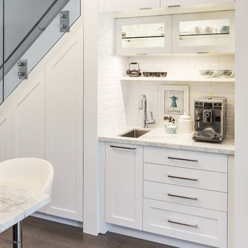
The space under the stairs was made useful as a coffee bar and for overflow storage. Ample lighting and a sink make it useful for entertaining as well.
Photos: Dave Remple

 Klopf Architecture
The Roger Lee designed house from 1962 was purchased by the current homeowners in almost original condition, as the previous owners elected to defer most maintenance projects over the years. The clients were able to see beyond the dated materials and finishes, single-paned glass and uninsulated walls and they approached Klopf Architecture to help them expand and update the entire home, one the family could settle into and enjoy for years to come. It was important that the new designs were aligned with Lee's original intent not only because of the client's appreciation for mid-century modern architecture, but also because the house was deemed historical. The Stanford Real Estate Office requires a stringent design review which safeguards the integrity of the community, which Klopf Architecture was happy to oblige going into their updated designs.
As with many original mid-century modern homes, the house was scaled to the 1960s lifestyle where rooms were smaller and openings to views were limited and tightly framed. The original conditions defined the direction the family of four would take in updating the house and making it comfortable for their modern lifestyle. Klopf designed a full gut remodel and major addition to bring the house into the 21st century and provide the living area needed for the client's family. The newly expanded house added just about 1,100 sf to create an airy, comfortable and family friendly house, taking full advantage of the beautiful southwestern views that extend out to the hills beyond. The enclosed garage created an additional 240 sf of covered space for long-term storage.
A cracked swimming pool created an eyesore taking up a majority of the backyard landscape, so it was one of the first elements to go during the transformation. Working with Outer Space Landscape Architects, the family asked for a mix of relaxing outdoor patio spaces that eventually blend into the native landscaping, extending their views outward toward the natural greenery of the trees beyond their property. Filling in the old pool was a smart way to expand the living spaces outward. The orientation of the house was designed to enjoy the views, but the original architecture provided the first homeowners with mere glimpses of the landscape outside.
Klopf was able to broaden those views, continuing and extending on the original architecture to take full advantage of the unobstructed natural views across the rear facade of the house. Small horizontal openings in the primary bedroom and office were replaced with much taller windows that now follow the angled roof line upward, extending across almost all of the facade. We worked with Western Windows, whose designs included an oblique-shaped, operable casement that allowed our design to rise with the slope. A new corner office added to the primary suite, offers a bright and functional work-from-home solution that looks out at the distant views and added natural light from the expanded window configuration that now wraps around the corner.
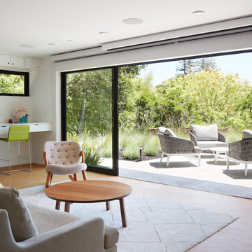
The existing lower level was designed by Lee as a utilitarian space, serving as a wet pool room with a drain in the center of the floor, bathroom, laundry and storage areas. Without the need for a pool room, Klopf was able to convert the area into a much more comfortable and functional living space with a new family room and guest suite. The new spaces enjoy easy access to a new outdoor patio through floor to ceiling, full-width glass sliders.
Continuing along the rear facade, a previously exposed deck extending from the living room and hallway provided access to the backyard through a single set of stairs leading toward the side of the house which made sense when the pool was in place. The new deck was re-envisioned as an extension of the main living room and now serves as a second outdoor living room. A new slatted pergola above provides the homeowners welcome relief from the hot afternoon sun. A second set of stairs now creates a better connection to the redesigned lower level. Klopf was able to reconfigure the spaces, extending the living room outward toward the views, where the family now claims it as the heart of the home, spending a large majority of their time outdoors.
Back inside, the original wood-burning Malm fireplace was beautifully restored and a gas burner installed to comply with California's strict air standards. It now rests in front of a wall of Heath accent tiles where a dated red brick wall used to stand. A new taller window brings more light and views into the refreshed interior living room. The original glass doors opposite the fireplace were replaced by larger sliders that when fully opened, create a seamless transition to the new outdoor living area so the two spaces feel like one connected space. The original utilitarian kitchen was needlessly tucked into the far back corner and closed-off, out of sight from the living room, so the clients asked Klopf to open it up and expand the kitchen forward so it felt more connected. Today the much larger kitchen is connected to the living area where a short wall with a cutout offers a visual glimpse into the kitchen and a handy pass-through counter for serving guests. A new breakfast nook was also added to create another spot where the family can gather for casual meals. Just outside, a new built-in outdoor grill and prep area extends the kitchen outside and connects to a new outdoor dining spot nestled amongst the trees, taking advantage of the views out back.
Klopf was able to expand the other two bedrooms, add a new laundry room and half-bath and convert the carport to an enclosed garage to add more storage areas which was lost when the pool house was converted to the family and guest room.
To maintain a historical connection to the original designs, the exterior siding was repeated on all exterior walls, a full-height stained glass window at the front entryway restored, and an interior slatted screen element repeated outside at the exterior entry courtyard and over the new outdoor living room to create a shade trellis. The new house stands proudly and shines against it's new landscaping features, while respecting and expanding on the original intent of Roger Lee's designs epitomizing the comforts of indoor-outdoor living in Northern California.
Completion year: 2020
Klopf Architecture project team: John Klopf, Klara Kevane, Noel Andrade
Contractor: ORB Construction, Brendan O'Reilly
Structural engineer: Sezen and Moon
Landscape architect: Outer space
Furnishings and decoration: Urbanism Designs
Photographer: Mariko Reed
 Martha Stewart Living
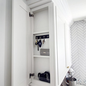
Surprising space savers! This Martha Stewart Living Message Center cabinet is almost like a hidden door! It's the perfect place to hold Kristin's keys or other odds and ends.
 Reverse Architecture
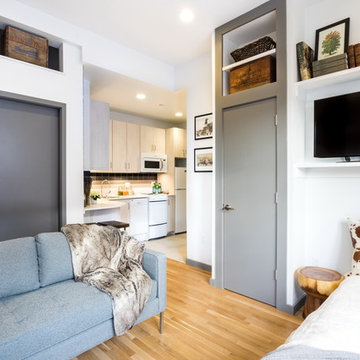
A view across the apartment shows various storage options and the kitchen tucked into its own corner by the front entry.
Photography and styling by Heidi Solander
 Saikley Architects
This house was a very small mid-century bungalow with previous additions that resulted in a large but chaotic layout. The owners wanted to convert the house to a super-efficient, and charming Craftsman-style, 6 bedroom home for their large family and work at home.
We achieved the space needs by moving a few walls for a more efficient, organized layout, setting up spaces for overlapping uses, and making a small upstairs addition. Every bit of square footage was optimized to meet the goals of the project without making the house huge or adding unnecessary cost.
Much thought was given to the entry sequence near the front door. A large flow-through mudroom with storage for each family member, and adjacent laundry, make it easy for children to be taught to keep their things organized and to contribute to household chores. A mail station and central home admin area at the mudroom help keep clutter down at other areas and minimize home management tasks. A garage door near the kitchen gives quick access to bulk items.
The existing house had too much view to the street from the living room through large corner windows, and too little entry transition, to the extent that the family did not feel comfortable using the living room much without shades drawn. We raised the window sills and brought the new windows in from the corner of the house, allowing plenty of light while protecting privacy and a sense of enclosure in the living room. We enlarged the front porch to create a more graceful transition from the public to private space. We located the front door so that the circulation from entry into the house would allow for furnishing the living room with a sitting circle that is not intruded upon by people walking through the room.
Sight lines through the living spaces were an important consideration in the design. The owners wanted discreet spaces for living room, kitchen, dining and family room, but also wanted the living spaces to feel connected and to be able to easily watch their children. Being able to see the children playing in the yard while getting things done inside the house was also important. While largely working with the existing structure, we opened walls and rearranged the use of spaces to make a series of connected living spaces with long views through them.
The character of the remodeled house is a contemporary Craftsman with classic materials and cool, consistent colors. A few arches echo through the house to frame spaces and soften the feeling of the rooms.
Photography: Kurt Manley
https://saikleyarchitects.com/portfolio/bungalow-expansion/
 Croma Design Inc.
Breathing new life into a two-story condo.
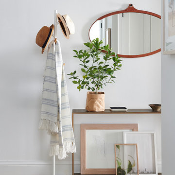
Inspiration for a small contemporary light wood floor and beige floor foyer remodel in Toronto with white walls
Inspiration for a small contemporary light wood floor and beige floor foyer remodel in Toronto with white walls
 Alair Homes Plano
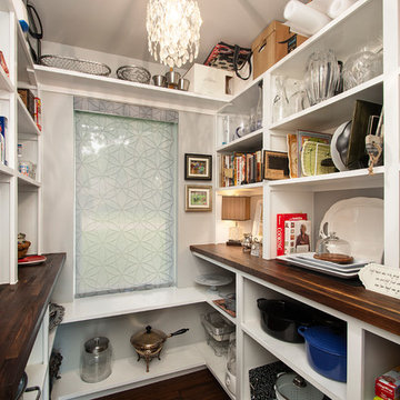
Our clients purchased a 1963 home that had never been updated! They wanted to redesign the central living area, which included the kitchen, formal dining and living room/den. Their original kitchen was small and completely closed off from the rest of the house. They wanted to repurpose the formal living room into the new formal dining room and open up the kitchen to the den and add a large island with seating for casual dining. The original den was now a nice living room, open to the kitchen, but also with a great view to their new pool! They wanted to keep some walls for their fun New Orleans one-of-a-kind artwork. They also did not want to be able to see the kitchen from the entryway. They also wanted a bar area built in somewhere, they just weren’t sure where. Our designers did an amazing job on this project, figuring out where to cut walls, where to keep them, replaced windows with doors, bringing the outdoors in and really brightening up the entire space.
Design/Remodel by Hatfield Builders & Remodelers | Photography by Versatile Imaging


 Habitar Design
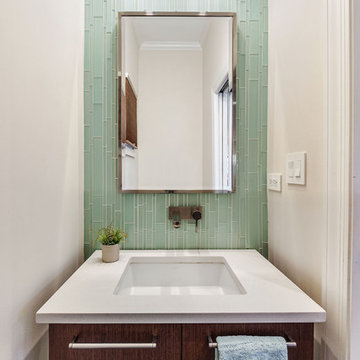
Designer, Kapan Shipman, created two contemporary fireplaces and unique built-in displays in this historic Andersonville home. The living room cleverly uses the unique angled space to house a sleek stone and wood fireplace with built in shelving and wall-mounted tv. We also custom built a vertical built-in closet at the back entryway as a mini mudroom for extra storage at the door. In the open-concept dining room, a gorgeous white stone gas fireplace is the focal point with a built-in credenza buffet for the dining area. At the front entryway, Kapan designed one of our most unique built ins with floor-to-ceiling wood beams anchoring white pedestal boxes for display. Another beauty is the industrial chic stairwell combining steel wire and a dark reclaimed wood bannister.

 Liza Nicole Interiors
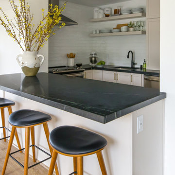
Small kitchen big on storage and luxury finishes.
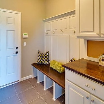
When you’re limited on increasing a small kitchen’s footprint, it’s time to get creative. By lightening the space with bright, neutral colors and removing upper cabinetry — replacing them with open shelves — we created an open, bistro-inspired kitchen packed with prep space.
 Associate Interiors
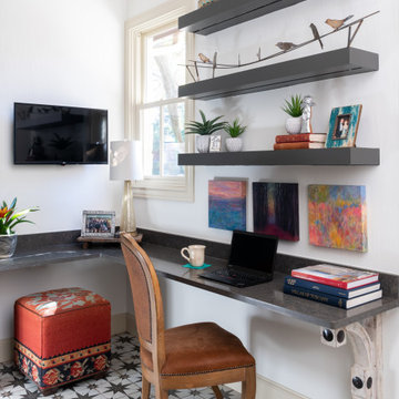
When our client requested a cozy retreat for her study, we re-configured a narrow 6’ x 12’ space off the Master Bedroom hall. By combining 2 separate rooms, a dated wet bar and a stackable washer/dryer area, we captured the square footage needed for the Study. As someone who likes to spread out and have multiple projects going on at the same time, we designed the L-shaped work surface and created the functionality she longed for. A tall storage cabinet just wide enough to house her files and printer, anchors one end while an oversized ‘found’ vintage bracket adorns the other, giving openness to an otherwise tight space. Previously separated by a wall, the 2 windows now bring cheerful natural light into the singular space. Thick floating shelves above the work surface feature LED strip lighting which is especially enticing at night. A sliding metal chalkboard opposite of the worksurface is easily accessible and provides a fun way to keep track of daily activities. The black and cream “star” patterned floor tile adds a bit of whimsy to the Study and compliments the rustic charm of the family’s antique cowhide chair. What is not to love about the compact yet inviting space?

Sponsored
Columbus, OH

Hope Restoration & General Contracting
Columbus Design-Build, Kitchen & Bath Remodeling, Historic Renovations

 Astro Design Inc.
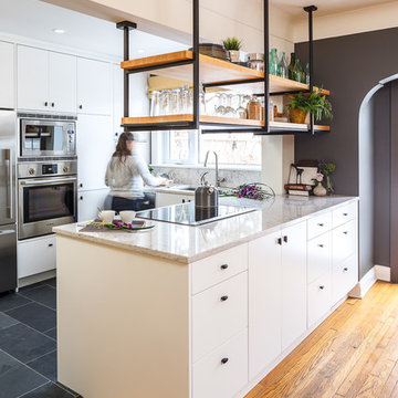
This old tiny kitchen now boasts big space, ideal for a small family or a bigger gathering. It's main feature is the customized black metal frame that hangs from the ceiling providing support for two natural maple butcher block shevles, but also divides the two rooms. A downdraft vent compliments the functionality and aesthetic of this installation.
The kitchen counters encroach into the dining room, providing more under counter storage. The concept of a proportionately larger peninsula allows more working and entertaining surface. The weightiness of the counters was balanced by the wall of tall cabinets. These cabinets provide most of the kitchen storage and boast an appliance garage, deep pantry and a clever lemans system for the corner storage.
Design: Astro Design Centre, Ottawa Canada
Photos: Doublespace Photography
 Dura Supreme Cabinetry
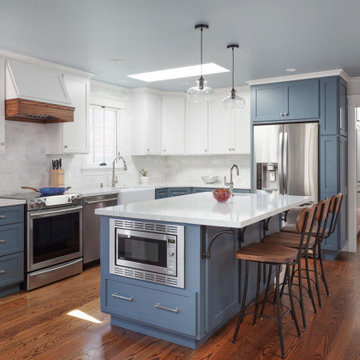
This modern farmhouse kitchen features a beautiful combination of Navy Blue painted and gray stained Hickory cabinets that’s sure to be an eye-catcher. The elegant “Morel” stain blends and harmonizes the natural Hickory wood grain while emphasizing the grain with a subtle gray tone that beautifully coordinated with the cool, deep blue paint.
The “Gale Force” SW 7605 blue paint from Sherwin-Williams is a stunning deep blue paint color that is sophisticated, fun, and creative. It’s a stunning statement-making color that’s sure to be a classic for years to come and represents the latest in color trends. It’s no surprise this beautiful navy blue has been a part of Dura Supreme’s Curated Color Collection for several years, making the top 6 colors for 2017 through 2020.
Beyond the beautiful exterior, there is so much well-thought-out storage and function behind each and every cabinet door. The two beautiful blue countertop towers that frame the modern wood hood and cooktop are two intricately designed larder cabinets built to meet the homeowner’s exact needs.
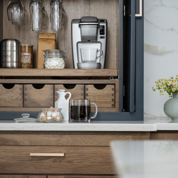
The larder cabinet on the left is designed as a beverage center with apothecary drawers designed for housing beverage stir sticks, sugar packets, creamers, and other misc. coffee and home bar supplies. A wine glass rack and shelves provides optimal storage for a full collection of glassware while a power supply in the back helps power coffee & espresso (machines, blenders, grinders and other small appliances that could be used for daily beverage creations. The roll-out shelf makes it easier to fill clean and operate each appliance while also making it easy to put away. Pocket doors tuck out of the way and into the cabinet so you can easily leave open for your household or guests to access, but easily shut the cabinet doors and conceal when you’re ready to tidy up.
Beneath the beverage center larder is a drawer designed with 2 layers of multi-tasking storage for utensils and additional beverage supplies storage with space for tea packets, and a full drawer of K-Cup storage. The cabinet below uses powered roll-out shelves to create the perfect breakfast center with power for a toaster and divided storage to organize all the daily fixings and pantry items the household needs for their morning routine.
On the right, the second larder is the ultimate hub and center for the homeowner’s baking tasks. A wide roll-out shelf helps store heavy small appliances like a KitchenAid Mixer while making them easy to use, clean, and put away. Shelves and a set of apothecary drawers help house an assortment of baking tools, ingredients, mixing bowls and cookbooks. Beneath the counter a drawer and a set of roll-out shelves in various heights provides more easy access storage for pantry items, misc. baking accessories, rolling pins, mixing bowls, and more.
The kitchen island provides a large worktop, seating for 3-4 guests, and even more storage! The back of the island includes an appliance lift cabinet used for a sewing machine for the homeowner’s beloved hobby, a deep drawer built for organizing a full collection of dishware, a waste recycling bin, and more!
All and all this kitchen is as functional as it is beautiful!
Request a FREE Dura Supreme Brochure Packet:
http://www.durasupreme.com/request-brochure
34