
Search results for "Solutions continue" in Home Design Ideas
 Klopf Architecture
Three Phases, One Family: Inside a Klopf Eichler Remodel
When an executive mom and her two young children moved into their Eichler, she made a deliberate choice: to renovate the home in a way that honored, rather than erased, the qualities that make Eichlers distinctive in the first place. That decision set the tone for what would become a five-year, three-phase collaboration with architecture and interior design firm Klopf Architecture and general contractor Keycon, that touched nearly every room in the house and, along the way, turned a client-architect relationship into something closer.
Living Through the Work
Unlike many remodels where clients decamp to a rental during construction, this family stayed put through all three phases. That meant the Klopf team didn't just design the home, they watched it get lived in room by room in real time. Phase 1 covered the kitchen and living areas; by the time the team moved into later phases, they had already seen how the family actually used the spaces they'd designed earlier.
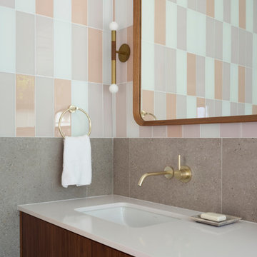
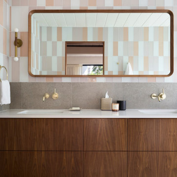
That feedback loop and conversations with the client shaped the rest of the project directly. She said “throughout the various phases as they were completed, each day I noticed a new detail,” and shared her feedback with the design team. For instance, she loved the countertops chosen for the kitchen in Phase 1, so those same countertops appeared in the bathrooms designed in later phases. She loved the playful backsplash tile in the kitchen, so a similar sense of pattern and play carried into her bathroom in Phase 2 and a second bath in Phase 3. The result is a home where each phase speaks to the ones before it, rather than reading as a series of disconnected updates.
Opening Up the Center of the House
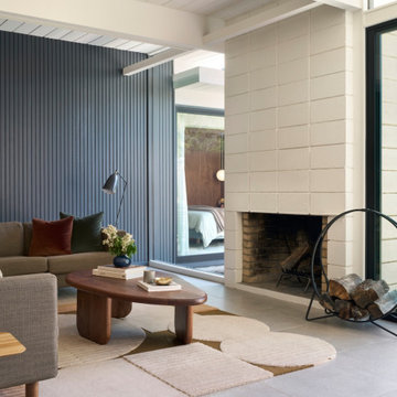
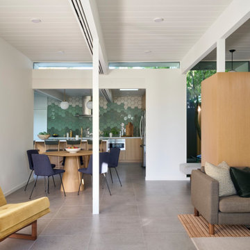
At the heart of the project was a reorganization of the home's most-used spaces. Klopf reclaimed a former dining area off the great room to build a larger kitchen, opening it directly onto the living space and freeing up room for the family to actually gather for reading, games, meals, TV, and the ordinary business of daily life with two kids and a dog.
New floor-to-ceiling glass panels now connect the living space to the home's atrium, pulling light and views in from both directions, doubling down on the indoor-outdoor connection the style is known for. But more glass also meant less privacy, particularly at the entry, where a new wall of glass would otherwise open the courtyard directly to the street. Klopf's solution was a custom-designed slanted wood slat pivot gate at the front of the house: a piece that lets light filter through while blocking sight lines from passersby. It's a small architectural gesture that solves a real problem, creating privacy without sacrificing the light-filled openness the redesign was built around.
Each of the children's bedrooms was custom-tailored to its occupant, a detail that mattered more with each passing year as the "young kids" in Phase 1 grew into the teenagers they became by the project's close.
Five Years and Increased Capabilities
A project of this length rarely survives with the same team intact, and this one didn't. Klopf’s original project leader left the firm part way through, but John Klopf and Elise Webb remained on the project from start to finish for continuity. Instead of shrinking, the Klopf team actually grew when their new interior design department was formed in 2024. The client was excited about Klopf’s new interiors capabilities, and welcomed Justine Alvarez and Ekaterina Nesterova on board to expand what had been an architectural scope into an architecture-plus-interiors effort. In the end Klopf handled the design from exterior envelope and layout down to the materials, colors, furnishings, décor, and finishing touches.
What began as an architectural renovation ended up as something more comprehensive: a complete reimagining of the home's interiors as well as its bones, extending down to details as small as the containers on the bathroom counter.
Carrying the Vision Through to the Furnishings
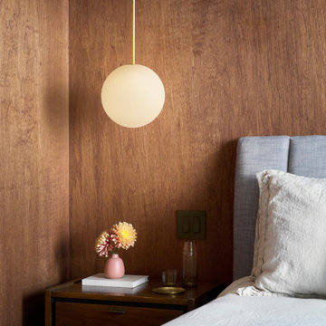
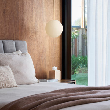
Klopf's interior design department helped turn good architecture into a place a family actually lives. The interiors team worked closely with the client on furniture, fabrics, lighting, and accessories, sourcing and coordinating with makers and vendors in both the U.S. and Europe.
The guiding idea was continuity: every piece needed to feel like it belonged in the house, not added to it. The custom counter stools are a good example. Intended to pick up on the cabinetry materials already in the kitchen, they were designed with carefully selected leather so the seating reads as part of the same architectural language. The sofa, rug, pillows, and other pieces followed the same logic, with material, color, and proportion all considered against the architecture they'd sit inside. Even the playful character of the bathroom tile found its way into the furnishings, translating into fun, playful accents in the textiles and finishes while staying period-appropriate to the Eichler itself.
Benefitting from the feedback loop that shaped the architecture from phase to phase, the interiors team took cues from material and design decisions made in earlier phases when selecting the furnishings, so that the finished home reads as one continuous idea rather than a set of separate decisions layered on top of each other.
That continuity came with its own hardships. A few months after furniture purchasing began, new tariffs took effect, affecting the overall furniture budget and adding complexity to ordering and expediting pieces. Developing custom furniture added a further layer of coordination on top of that: aligning fabric and leather samples and wood finishes with the architecture meant close, ongoing communication with makers throughout fabrication. With some pieces produced internationally, lead times, shipping, and customs all had to be carefully managed; in a few instances, that pushed the timeline out further still. In the end, the extra time was worth it: it's what allowed the team to get the materials and details right and keep the design cohesive throughout the home.
A Relationship, Not Just a Project
Ask the Klopf team what made this project unique, and the answer isn't really about square footage or finishes. It's about time. Over five years, the team got to know the family in a way a shorter project never allows — watching the kids head off to summer camp, meeting the foster kittens that passed through the house, getting to know the dog walker's daily routine. It became a professional relationship that was also a personal one.
That closeness extended into the design process itself once the interiors team came on board. The client made a point of involving her kids in meetings about their own rooms, letting them weigh in on the vision and hopes they had for the spaces. Her daughter, in particular, was thrilled at the chance to work with an interior designer and help build her dream room, a small detail that speaks to how thoroughly this project became a family effort, not just a service delivered to one.
That closeness shows up in the house itself. During Phase 1, the client asked everyone involved to sign the pony wall in the new kitchen. The Klopf team, the client, her kids, and the Keycon crew all left their names there, a permanent record of the people who built the house together. The Client said: “I am filled with joy and gratitude to be able to live in such a beautiful space and to have gotten the chance to work with such a talented team. The mark of true artistry is the attention to detail that allows one to experience the design in different ways. One might be looking at the same view, but because of the way the light moves, it’s a totally different perspective.”
By the time the third phase wrapped, there was a running joke on site: nobody actually wanted the project to end, and the team half-seriously floated the idea of a "Phase 4." It's a fitting note for a project defined less by any single renovation than by five years of a family and their architects growing, quite literally, alongside one another.
Klopf Architecture Team: John Klopf, AIA, Elise Webb, Yegvenia Torres-Zavala, Justine Alvarez, and Ekaterina Nesterova
Interior Design and FF&E: Klopf Architecture
Structural Engineer: BASE Design Inc.
Contractor: Keycon Inc.
Photography: ©2026 Mariko Reed
Year Completed: 2026
Location: Palo Alto, CA
 Klopf Architecture
Three Phases, One Family: Inside a Klopf Eichler Remodel
When an executive mom and her two young children moved into their Eichler, she made a deliberate choice: to renovate the home in a way that honored, rather than erased, the qualities that make Eichlers distinctive in the first place. That decision set the tone for what would become a five-year, three-phase collaboration with architecture and interior design firm Klopf Architecture and general contractor Keycon, that touched nearly every room in the house and, along the way, turned a client-architect relationship into something closer.
Living Through the Work
Unlike many remodels where clients decamp to a rental during construction, this family stayed put through all three phases. That meant the Klopf team didn't just design the home, they watched it get lived in room by room in real time. Phase 1 covered the kitchen and living areas; by the time the team moved into later phases, they had already seen how the family actually used the spaces they'd designed earlier.
That feedback loop and conversations with the client shaped the rest of the project directly. She said “throughout the various phases as they were completed, each day I noticed a new detail,” and shared her feedback with the design team. For instance, she loved the countertops chosen for the kitchen in Phase 1, so those same countertops appeared in the bathrooms designed in later phases. She loved the playful backsplash tile in the kitchen, so a similar sense of pattern and play carried into her bathroom in Phase 2 and a second bath in Phase 3. The result is a home where each phase speaks to the ones before it, rather than reading as a series of disconnected updates.
Opening Up the Center of the House
At the heart of the project was a reorganization of the home's most-used spaces. Klopf reclaimed a former dining area off the great room to build a larger kitchen, opening it directly onto the living space and freeing up room for the family to actually gather for reading, games, meals, TV, and the ordinary business of daily life with two kids and a dog.
New floor-to-ceiling glass panels now connect the living space to the home's atrium, pulling light and views in from both directions, doubling down on the indoor-outdoor connection the style is known for. But more glass also meant less privacy, particularly at the entry, where a new wall of glass would otherwise open the courtyard directly to the street. Klopf's solution was a custom-designed slanted wood slat pivot gate at the front of the house: a piece that lets light filter through while blocking sight lines from passersby. It's a small architectural gesture that solves a real problem, creating privacy without sacrificing the light-filled openness the redesign was built around.
Each of the children's bedrooms was custom-tailored to its occupant, a detail that mattered more with each passing year as the "young kids" in Phase 1 grew into the teenagers they became by the project's close.
Five Years and Increased Capabilities
A project of this length rarely survives with the same team intact, and this one didn't. Klopf’s original project leader left the firm part way through, but John Klopf and Elise Webb remained on the project from start to finish for continuity. Instead of shrinking, the Klopf team actually grew when their new interior design department was formed in 2024. The client was excited about Klopf’s new interiors capabilities, and welcomed Justine Alvarez and Ekaterina Nesterova on board to expand what had been an architectural scope into an architecture-plus-interiors effort. In the end Klopf handled the design from exterior envelope and layout down to the materials, colors, furnishings, décor, and finishing touches.
What began as an architectural renovation ended up as something more comprehensive: a complete reimagining of the home's interiors as well as its bones, extending down to details as small as the containers on the bathroom counter.
Carrying the Vision Through to the Furnishings
Klopf's interior design department helped turn good architecture into a place a family actually lives. The interiors team worked closely with the client on furniture, fabrics, lighting, and accessories, sourcing and coordinating with makers and vendors in both the U.S. and Europe.
The guiding idea was continuity: every piece needed to feel like it belonged in the house, not added to it. The custom counter stools are a good example. Intended to pick up on the cabinetry materials already in the kitchen, they were designed with carefully selected leather so the seating reads as part of the same architectural language. The sofa, rug, pillows, and other pieces followed the same logic, with material, color, and proportion all considered against the architecture they'd sit inside. Even the playful character of the bathroom tile found its way into the furnishings, translating into fun, playful accents in the textiles and finishes while staying period-appropriate to the Eichler itself.
Benefitting from the feedback loop that shaped the architecture from phase to phase, the interiors team took cues from material and design decisions made in earlier phases when selecting the furnishings, so that the finished home reads as one continuous idea rather than a set of separate decisions layered on top of each other.
That continuity came with its own hardships. A few months after furniture purchasing began, new tariffs took effect, affecting the overall furniture budget and adding complexity to ordering and expediting pieces. Developing custom furniture added a further layer of coordination on top of that: aligning fabric and leather samples and wood finishes with the architecture meant close, ongoing communication with makers throughout fabrication. With some pieces produced internationally, lead times, shipping, and customs all had to be carefully managed; in a few instances, that pushed the timeline out further still. In the end, the extra time was worth it: it's what allowed the team to get the materials and details right and keep the design cohesive throughout the home.
A Relationship, Not Just a Project
Ask the Klopf team what made this project unique, and the answer isn't really about square footage or finishes. It's about time. Over five years, the team got to know the family in a way a shorter project never allows — watching the kids head off to summer camp, meeting the foster kittens that passed through the house, getting to know the dog walker's daily routine. It became a professional relationship that was also a personal one.
That closeness extended into the design process itself once the interiors team came on board. The client made a point of involving her kids in meetings about their own rooms, letting them weigh in on the vision and hopes they had for the spaces. Her daughter, in particular, was thrilled at the chance to work with an interior designer and help build her dream room, a small detail that speaks to how thoroughly this project became a family effort, not just a service delivered to one.
That closeness shows up in the house itself. During Phase 1, the client asked everyone involved to sign the pony wall in the new kitchen. The Klopf team, the client, her kids, and the Keycon crew all left their names there, a permanent record of the people who built the house together. The Client said: “I am filled with joy and gratitude to be able to live in such a beautiful space and to have gotten the chance to work with such a talented team. The mark of true artistry is the attention to detail that allows one to experience the design in different ways. One might be looking at the same view, but because of the way the light moves, it’s a totally different perspective.”
By the time the third phase wrapped, there was a running joke on site: nobody actually wanted the project to end, and the team half-seriously floated the idea of a "Phase 4." It's a fitting note for a project defined less by any single renovation than by five years of a family and their architects growing, quite literally, alongside one another.
Klopf Architecture Team: John Klopf, AIA, Elise Webb, Yegvenia Torres-Zavala, Justine Alvarez, and Ekaterina Nesterova
Interior Design and FF&E: Klopf Architecture
Structural Engineer: BASE Design Inc.
Contractor: Keycon Inc.
Photography: ©2026 Mariko Reed
Year Completed: 2026
Location: Palo Alto, CA
 Klopf Architecture
Three Phases, One Family: Inside a Klopf Eichler Remodel
When an executive mom and her two young children moved into their Eichler, she made a deliberate choice: to renovate the home in a way that honored, rather than erased, the qualities that make Eichlers distinctive in the first place. That decision set the tone for what would become a five-year, three-phase collaboration with architecture and interior design firm Klopf Architecture and general contractor Keycon, that touched nearly every room in the house and, along the way, turned a client-architect relationship into something closer.
Living Through the Work
Unlike many remodels where clients decamp to a rental during construction, this family stayed put through all three phases. That meant the Klopf team didn't just design the home, they watched it get lived in room by room in real time. Phase 1 covered the kitchen and living areas; by the time the team moved into later phases, they had already seen how the family actually used the spaces they'd designed earlier.
That feedback loop and conversations with the client shaped the rest of the project directly. She said “throughout the various phases as they were completed, each day I noticed a new detail,” and shared her feedback with the design team. For instance, she loved the countertops chosen for the kitchen in Phase 1, so those same countertops appeared in the bathrooms designed in later phases. She loved the playful backsplash tile in the kitchen, so a similar sense of pattern and play carried into her bathroom in Phase 2 and a second bath in Phase 3. The result is a home where each phase speaks to the ones before it, rather than reading as a series of disconnected updates.
Opening Up the Center of the House
At the heart of the project was a reorganization of the home's most-used spaces. Klopf reclaimed a former dining area off the great room to build a larger kitchen, opening it directly onto the living space and freeing up room for the family to actually gather for reading, games, meals, TV, and the ordinary business of daily life with two kids and a dog.
New floor-to-ceiling glass panels now connect the living space to the home's atrium, pulling light and views in from both directions, doubling down on the indoor-outdoor connection the style is known for. But more glass also meant less privacy, particularly at the entry, where a new wall of glass would otherwise open the courtyard directly to the street. Klopf's solution was a custom-designed slanted wood slat pivot gate at the front of the house: a piece that lets light filter through while blocking sight lines from passersby. It's a small architectural gesture that solves a real problem, creating privacy without sacrificing the light-filled openness the redesign was built around.
Each of the children's bedrooms was custom-tailored to its occupant, a detail that mattered more with each passing year as the "young kids" in Phase 1 grew into the teenagers they became by the project's close.
Five Years and Increased Capabilities
A project of this length rarely survives with the same team intact, and this one didn't. Klopf’s original project leader left the firm part way through, but John Klopf and Elise Webb remained on the project from start to finish for continuity. Instead of shrinking, the Klopf team actually grew when their new interior design department was formed in 2024. The client was excited about Klopf’s new interiors capabilities, and welcomed Justine Alvarez and Ekaterina Nesterova on board to expand what had been an architectural scope into an architecture-plus-interiors effort. In the end Klopf handled the design from exterior envelope and layout down to the materials, colors, furnishings, décor, and finishing touches.
What began as an architectural renovation ended up as something more comprehensive: a complete reimagining of the home's interiors as well as its bones, extending down to details as small as the containers on the bathroom counter.
Carrying the Vision Through to the Furnishings
Klopf's interior design department helped turn good architecture into a place a family actually lives. The interiors team worked closely with the client on furniture, fabrics, lighting, and accessories, sourcing and coordinating with makers and vendors in both the U.S. and Europe.
The guiding idea was continuity: every piece needed to feel like it belonged in the house, not added to it. The custom counter stools are a good example. Intended to pick up on the cabinetry materials already in the kitchen, they were designed with carefully selected leather so the seating reads as part of the same architectural language. The sofa, rug, pillows, and other pieces followed the same logic, with material, color, and proportion all considered against the architecture they'd sit inside. Even the playful character of the bathroom tile found its way into the furnishings, translating into fun, playful accents in the textiles and finishes while staying period-appropriate to the Eichler itself.
Benefitting from the feedback loop that shaped the architecture from phase to phase, the interiors team took cues from material and design decisions made in earlier phases when selecting the furnishings, so that the finished home reads as one continuous idea rather than a set of separate decisions layered on top of each other.
That continuity came with its own hardships. A few months after furniture purchasing began, new tariffs took effect, affecting the overall furniture budget and adding complexity to ordering and expediting pieces. Developing custom furniture added a further layer of coordination on top of that: aligning fabric and leather samples and wood finishes with the architecture meant close, ongoing communication with makers throughout fabrication. With some pieces produced internationally, lead times, shipping, and customs all had to be carefully managed; in a few instances, that pushed the timeline out further still. In the end, the extra time was worth it: it's what allowed the team to get the materials and details right and keep the design cohesive throughout the home.
A Relationship, Not Just a Project
Ask the Klopf team what made this project unique, and the answer isn't really about square footage or finishes. It's about time. Over five years, the team got to know the family in a way a shorter project never allows — watching the kids head off to summer camp, meeting the foster kittens that passed through the house, getting to know the dog walker's daily routine. It became a professional relationship that was also a personal one.
That closeness extended into the design process itself once the interiors team came on board. The client made a point of involving her kids in meetings about their own rooms, letting them weigh in on the vision and hopes they had for the spaces. Her daughter, in particular, was thrilled at the chance to work with an interior designer and help build her dream room, a small detail that speaks to how thoroughly this project became a family effort, not just a service delivered to one.
That closeness shows up in the house itself. During Phase 1, the client asked everyone involved to sign the pony wall in the new kitchen. The Klopf team, the client, her kids, and the Keycon crew all left their names there, a permanent record of the people who built the house together. The Client said: “I am filled with joy and gratitude to be able to live in such a beautiful space and to have gotten the chance to work with such a talented team. The mark of true artistry is the attention to detail that allows one to experience the design in different ways. One might be looking at the same view, but because of the way the light moves, it’s a totally different perspective.”
By the time the third phase wrapped, there was a running joke on site: nobody actually wanted the project to end, and the team half-seriously floated the idea of a "Phase 4." It's a fitting note for a project defined less by any single renovation than by five years of a family and their architects growing, quite literally, alongside one another.
Klopf Architecture Team: John Klopf, AIA, Elise Webb, Yegvenia Torres-Zavala, Justine Alvarez, and Ekaterina Nesterova
Interior Design and FF&E: Klopf Architecture
Structural Engineer: BASE Design Inc.
Contractor: Keycon Inc.
Photography: ©2026 Mariko Reed
Year Completed: 2026
Location: Palo Alto, CA
Find the right local pro for your project
 Klopf Architecture
Three Phases, One Family: Inside a Klopf Eichler Remodel
When an executive mom and her two young children moved into their Eichler, she made a deliberate choice: to renovate the home in a way that honored, rather than erased, the qualities that make Eichlers distinctive in the first place. That decision set the tone for what would become a five-year, three-phase collaboration with architecture and interior design firm Klopf Architecture and general contractor Keycon, that touched nearly every room in the house and, along the way, turned a client-architect relationship into something closer.
Living Through the Work
Unlike many remodels where clients decamp to a rental during construction, this family stayed put through all three phases. That meant the Klopf team didn't just design the home, they watched it get lived in room by room in real time. Phase 1 covered the kitchen and living areas; by the time the team moved into later phases, they had already seen how the family actually used the spaces they'd designed earlier.
That feedback loop and conversations with the client shaped the rest of the project directly. She said “throughout the various phases as they were completed, each day I noticed a new detail,” and shared her feedback with the design team. For instance, she loved the countertops chosen for the kitchen in Phase 1, so those same countertops appeared in the bathrooms designed in later phases. She loved the playful backsplash tile in the kitchen, so a similar sense of pattern and play carried into her bathroom in Phase 2 and a second bath in Phase 3. The result is a home where each phase speaks to the ones before it, rather than reading as a series of disconnected updates.
Opening Up the Center of the House
At the heart of the project was a reorganization of the home's most-used spaces. Klopf reclaimed a former dining area off the great room to build a larger kitchen, opening it directly onto the living space and freeing up room for the family to actually gather for reading, games, meals, TV, and the ordinary business of daily life with two kids and a dog.
New floor-to-ceiling glass panels now connect the living space to the home's atrium, pulling light and views in from both directions, doubling down on the indoor-outdoor connection the style is known for. But more glass also meant less privacy, particularly at the entry, where a new wall of glass would otherwise open the courtyard directly to the street. Klopf's solution was a custom-designed slanted wood slat pivot gate at the front of the house: a piece that lets light filter through while blocking sight lines from passersby. It's a small architectural gesture that solves a real problem, creating privacy without sacrificing the light-filled openness the redesign was built around.
Each of the children's bedrooms was custom-tailored to its occupant, a detail that mattered more with each passing year as the "young kids" in Phase 1 grew into the teenagers they became by the project's close.
Five Years and Increased Capabilities
A project of this length rarely survives with the same team intact, and this one didn't. Klopf’s original project leader left the firm part way through, but John Klopf and Elise Webb remained on the project from start to finish for continuity. Instead of shrinking, the Klopf team actually grew when their new interior design department was formed in 2024. The client was excited about Klopf’s new interiors capabilities, and welcomed Justine Alvarez and Ekaterina Nesterova on board to expand what had been an architectural scope into an architecture-plus-interiors effort. In the end Klopf handled the design from exterior envelope and layout down to the materials, colors, furnishings, décor, and finishing touches.
What began as an architectural renovation ended up as something more comprehensive: a complete reimagining of the home's interiors as well as its bones, extending down to details as small as the containers on the bathroom counter.
Carrying the Vision Through to the Furnishings
Klopf's interior design department helped turn good architecture into a place a family actually lives. The interiors team worked closely with the client on furniture, fabrics, lighting, and accessories, sourcing and coordinating with makers and vendors in both the U.S. and Europe.
The guiding idea was continuity: every piece needed to feel like it belonged in the house, not added to it. The custom counter stools are a good example. Intended to pick up on the cabinetry materials already in the kitchen, they were designed with carefully selected leather so the seating reads as part of the same architectural language. The sofa, rug, pillows, and other pieces followed the same logic, with material, color, and proportion all considered against the architecture they'd sit inside. Even the playful character of the bathroom tile found its way into the furnishings, translating into fun, playful accents in the textiles and finishes while staying period-appropriate to the Eichler itself.
Benefitting from the feedback loop that shaped the architecture from phase to phase, the interiors team took cues from material and design decisions made in earlier phases when selecting the furnishings, so that the finished home reads as one continuous idea rather than a set of separate decisions layered on top of each other.
That continuity came with its own hardships. A few months after furniture purchasing began, new tariffs took effect, affecting the overall furniture budget and adding complexity to ordering and expediting pieces. Developing custom furniture added a further layer of coordination on top of that: aligning fabric and leather samples and wood finishes with the architecture meant close, ongoing communication with makers throughout fabrication. With some pieces produced internationally, lead times, shipping, and customs all had to be carefully managed; in a few instances, that pushed the timeline out further still. In the end, the extra time was worth it: it's what allowed the team to get the materials and details right and keep the design cohesive throughout the home.
A Relationship, Not Just a Project
Ask the Klopf team what made this project unique, and the answer isn't really about square footage or finishes. It's about time. Over five years, the team got to know the family in a way a shorter project never allows — watching the kids head off to summer camp, meeting the foster kittens that passed through the house, getting to know the dog walker's daily routine. It became a professional relationship that was also a personal one.
That closeness extended into the design process itself once the interiors team came on board. The client made a point of involving her kids in meetings about their own rooms, letting them weigh in on the vision and hopes they had for the spaces. Her daughter, in particular, was thrilled at the chance to work with an interior designer and help build her dream room, a small detail that speaks to how thoroughly this project became a family effort, not just a service delivered to one.
That closeness shows up in the house itself. During Phase 1, the client asked everyone involved to sign the pony wall in the new kitchen. The Klopf team, the client, her kids, and the Keycon crew all left their names there, a permanent record of the people who built the house together. The Client said: “I am filled with joy and gratitude to be able to live in such a beautiful space and to have gotten the chance to work with such a talented team. The mark of true artistry is the attention to detail that allows one to experience the design in different ways. One might be looking at the same view, but because of the way the light moves, it’s a totally different perspective.”
By the time the third phase wrapped, there was a running joke on site: nobody actually wanted the project to end, and the team half-seriously floated the idea of a "Phase 4." It's a fitting note for a project defined less by any single renovation than by five years of a family and their architects growing, quite literally, alongside one another.
Klopf Architecture Team: John Klopf, AIA, Elise Webb, Yegvenia Torres-Zavala, Justine Alvarez, and Ekaterina Nesterova
Interior Design and FF&E: Klopf Architecture
Structural Engineer: BASE Design Inc.
Contractor: Keycon Inc.
Photography: ©2026 Mariko Reed
Year Completed: 2026
Location: Palo Alto, CA
 Klopf Architecture
Three Phases, One Family: Inside a Klopf Eichler Remodel
When an executive mom and her two young children moved into their Eichler, she made a deliberate choice: to renovate the home in a way that honored, rather than erased, the qualities that make Eichlers distinctive in the first place. That decision set the tone for what would become a five-year, three-phase collaboration with architecture and interior design firm Klopf Architecture and general contractor Keycon, that touched nearly every room in the house and, along the way, turned a client-architect relationship into something closer.
Living Through the Work
Unlike many remodels where clients decamp to a rental during construction, this family stayed put through all three phases. That meant the Klopf team didn't just design the home, they watched it get lived in room by room in real time. Phase 1 covered the kitchen and living areas; by the time the team moved into later phases, they had already seen how the family actually used the spaces they'd designed earlier.
That feedback loop and conversations with the client shaped the rest of the project directly. She said “throughout the various phases as they were completed, each day I noticed a new detail,” and shared her feedback with the design team. For instance, she loved the countertops chosen for the kitchen in Phase 1, so those same countertops appeared in the bathrooms designed in later phases. She loved the playful backsplash tile in the kitchen, so a similar sense of pattern and play carried into her bathroom in Phase 2 and a second bath in Phase 3. The result is a home where each phase speaks to the ones before it, rather than reading as a series of disconnected updates.
Opening Up the Center of the House
At the heart of the project was a reorganization of the home's most-used spaces. Klopf reclaimed a former dining area off the great room to build a larger kitchen, opening it directly onto the living space and freeing up room for the family to actually gather for reading, games, meals, TV, and the ordinary business of daily life with two kids and a dog.
New floor-to-ceiling glass panels now connect the living space to the home's atrium, pulling light and views in from both directions, doubling down on the indoor-outdoor connection the style is known for. But more glass also meant less privacy, particularly at the entry, where a new wall of glass would otherwise open the courtyard directly to the street. Klopf's solution was a custom-designed slanted wood slat pivot gate at the front of the house: a piece that lets light filter through while blocking sight lines from passersby. It's a small architectural gesture that solves a real problem, creating privacy without sacrificing the light-filled openness the redesign was built around.
Each of the children's bedrooms was custom-tailored to its occupant, a detail that mattered more with each passing year as the "young kids" in Phase 1 grew into the teenagers they became by the project's close.
Five Years and Increased Capabilities
A project of this length rarely survives with the same team intact, and this one didn't. Klopf’s original project leader left the firm part way through, but John Klopf and Elise Webb remained on the project from start to finish for continuity. Instead of shrinking, the Klopf team actually grew when their new interior design department was formed in 2024. The client was excited about Klopf’s new interiors capabilities, and welcomed Justine Alvarez and Ekaterina Nesterova on board to expand what had been an architectural scope into an architecture-plus-interiors effort. In the end Klopf handled the design from exterior envelope and layout down to the materials, colors, furnishings, décor, and finishing touches.
What began as an architectural renovation ended up as something more comprehensive: a complete reimagining of the home's interiors as well as its bones, extending down to details as small as the containers on the bathroom counter.
Carrying the Vision Through to the Furnishings
Klopf's interior design department helped turn good architecture into a place a family actually lives. The interiors team worked closely with the client on furniture, fabrics, lighting, and accessories, sourcing and coordinating with makers and vendors in both the U.S. and Europe.
The guiding idea was continuity: every piece needed to feel like it belonged in the house, not added to it. The custom counter stools are a good example. Intended to pick up on the cabinetry materials already in the kitchen, they were designed with carefully selected leather so the seating reads as part of the same architectural language. The sofa, rug, pillows, and other pieces followed the same logic, with material, color, and proportion all considered against the architecture they'd sit inside. Even the playful character of the bathroom tile found its way into the furnishings, translating into fun, playful accents in the textiles and finishes while staying period-appropriate to the Eichler itself.
Benefitting from the feedback loop that shaped the architecture from phase to phase, the interiors team took cues from material and design decisions made in earlier phases when selecting the furnishings, so that the finished home reads as one continuous idea rather than a set of separate decisions layered on top of each other.
That continuity came with its own hardships. A few months after furniture purchasing began, new tariffs took effect, affecting the overall furniture budget and adding complexity to ordering and expediting pieces. Developing custom furniture added a further layer of coordination on top of that: aligning fabric and leather samples and wood finishes with the architecture meant close, ongoing communication with makers throughout fabrication. With some pieces produced internationally, lead times, shipping, and customs all had to be carefully managed; in a few instances, that pushed the timeline out further still. In the end, the extra time was worth it: it's what allowed the team to get the materials and details right and keep the design cohesive throughout the home.
A Relationship, Not Just a Project
Ask the Klopf team what made this project unique, and the answer isn't really about square footage or finishes. It's about time. Over five years, the team got to know the family in a way a shorter project never allows — watching the kids head off to summer camp, meeting the foster kittens that passed through the house, getting to know the dog walker's daily routine. It became a professional relationship that was also a personal one.
That closeness extended into the design process itself once the interiors team came on board. The client made a point of involving her kids in meetings about their own rooms, letting them weigh in on the vision and hopes they had for the spaces. Her daughter, in particular, was thrilled at the chance to work with an interior designer and help build her dream room, a small detail that speaks to how thoroughly this project became a family effort, not just a service delivered to one.
That closeness shows up in the house itself. During Phase 1, the client asked everyone involved to sign the pony wall in the new kitchen. The Klopf team, the client, her kids, and the Keycon crew all left their names there, a permanent record of the people who built the house together. The Client said: “I am filled with joy and gratitude to be able to live in such a beautiful space and to have gotten the chance to work with such a talented team. The mark of true artistry is the attention to detail that allows one to experience the design in different ways. One might be looking at the same view, but because of the way the light moves, it’s a totally different perspective.”
By the time the third phase wrapped, there was a running joke on site: nobody actually wanted the project to end, and the team half-seriously floated the idea of a "Phase 4." It's a fitting note for a project defined less by any single renovation than by five years of a family and their architects growing, quite literally, alongside one another.
Klopf Architecture Team: John Klopf, AIA, Elise Webb, Yegvenia Torres-Zavala, Justine Alvarez, and Ekaterina Nesterova
Interior Design and FF&E: Klopf Architecture
Structural Engineer: BASE Design Inc.
Contractor: Keycon Inc.
Photography: ©2026 Mariko Reed
Year Completed: 2026
Location: Palo Alto, CA
 Klopf Architecture
Three Phases, One Family: Inside a Klopf Eichler Remodel
When an executive mom and her two young children moved into their Eichler, she made a deliberate choice: to renovate the home in a way that honored, rather than erased, the qualities that make Eichlers distinctive in the first place. That decision set the tone for what would become a five-year, three-phase collaboration with architecture and interior design firm Klopf Architecture and general contractor Keycon, that touched nearly every room in the house and, along the way, turned a client-architect relationship into something closer.
Living Through the Work
Unlike many remodels where clients decamp to a rental during construction, this family stayed put through all three phases. That meant the Klopf team didn't just design the home, they watched it get lived in room by room in real time. Phase 1 covered the kitchen and living areas; by the time the team moved into later phases, they had already seen how the family actually used the spaces they'd designed earlier.
That feedback loop and conversations with the client shaped the rest of the project directly. She said “throughout the various phases as they were completed, each day I noticed a new detail,” and shared her feedback with the design team. For instance, she loved the countertops chosen for the kitchen in Phase 1, so those same countertops appeared in the bathrooms designed in later phases. She loved the playful backsplash tile in the kitchen, so a similar sense of pattern and play carried into her bathroom in Phase 2 and a second bath in Phase 3. The result is a home where each phase speaks to the ones before it, rather than reading as a series of disconnected updates.
Opening Up the Center of the House
At the heart of the project was a reorganization of the home's most-used spaces. Klopf reclaimed a former dining area off the great room to build a larger kitchen, opening it directly onto the living space and freeing up room for the family to actually gather for reading, games, meals, TV, and the ordinary business of daily life with two kids and a dog.
New floor-to-ceiling glass panels now connect the living space to the home's atrium, pulling light and views in from both directions, doubling down on the indoor-outdoor connection the style is known for. But more glass also meant less privacy, particularly at the entry, where a new wall of glass would otherwise open the courtyard directly to the street. Klopf's solution was a custom-designed slanted wood slat pivot gate at the front of the house: a piece that lets light filter through while blocking sight lines from passersby. It's a small architectural gesture that solves a real problem, creating privacy without sacrificing the light-filled openness the redesign was built around.
Each of the children's bedrooms was custom-tailored to its occupant, a detail that mattered more with each passing year as the "young kids" in Phase 1 grew into the teenagers they became by the project's close.
Five Years and Increased Capabilities
A project of this length rarely survives with the same team intact, and this one didn't. Klopf’s original project leader left the firm part way through, but John Klopf and Elise Webb remained on the project from start to finish for continuity. Instead of shrinking, the Klopf team actually grew when their new interior design department was formed in 2024. The client was excited about Klopf’s new interiors capabilities, and welcomed Justine Alvarez and Ekaterina Nesterova on board to expand what had been an architectural scope into an architecture-plus-interiors effort. In the end Klopf handled the design from exterior envelope and layout down to the materials, colors, furnishings, décor, and finishing touches.
What began as an architectural renovation ended up as something more comprehensive: a complete reimagining of the home's interiors as well as its bones, extending down to details as small as the containers on the bathroom counter.
Carrying the Vision Through to the Furnishings
Klopf's interior design department helped turn good architecture into a place a family actually lives. The interiors team worked closely with the client on furniture, fabrics, lighting, and accessories, sourcing and coordinating with makers and vendors in both the U.S. and Europe.
The guiding idea was continuity: every piece needed to feel like it belonged in the house, not added to it. The custom counter stools are a good example. Intended to pick up on the cabinetry materials already in the kitchen, they were designed with carefully selected leather so the seating reads as part of the same architectural language. The sofa, rug, pillows, and other pieces followed the same logic, with material, color, and proportion all considered against the architecture they'd sit inside. Even the playful character of the bathroom tile found its way into the furnishings, translating into fun, playful accents in the textiles and finishes while staying period-appropriate to the Eichler itself.
Benefitting from the feedback loop that shaped the architecture from phase to phase, the interiors team took cues from material and design decisions made in earlier phases when selecting the furnishings, so that the finished home reads as one continuous idea rather than a set of separate decisions layered on top of each other.
That continuity came with its own hardships. A few months after furniture purchasing began, new tariffs took effect, affecting the overall furniture budget and adding complexity to ordering and expediting pieces. Developing custom furniture added a further layer of coordination on top of that: aligning fabric and leather samples and wood finishes with the architecture meant close, ongoing communication with makers throughout fabrication. With some pieces produced internationally, lead times, shipping, and customs all had to be carefully managed; in a few instances, that pushed the timeline out further still. In the end, the extra time was worth it: it's what allowed the team to get the materials and details right and keep the design cohesive throughout the home.
A Relationship, Not Just a Project
Ask the Klopf team what made this project unique, and the answer isn't really about square footage or finishes. It's about time. Over five years, the team got to know the family in a way a shorter project never allows — watching the kids head off to summer camp, meeting the foster kittens that passed through the house, getting to know the dog walker's daily routine. It became a professional relationship that was also a personal one.
That closeness extended into the design process itself once the interiors team came on board. The client made a point of involving her kids in meetings about their own rooms, letting them weigh in on the vision and hopes they had for the spaces. Her daughter, in particular, was thrilled at the chance to work with an interior designer and help build her dream room, a small detail that speaks to how thoroughly this project became a family effort, not just a service delivered to one.
That closeness shows up in the house itself. During Phase 1, the client asked everyone involved to sign the pony wall in the new kitchen. The Klopf team, the client, her kids, and the Keycon crew all left their names there, a permanent record of the people who built the house together. The Client said: “I am filled with joy and gratitude to be able to live in such a beautiful space and to have gotten the chance to work with such a talented team. The mark of true artistry is the attention to detail that allows one to experience the design in different ways. One might be looking at the same view, but because of the way the light moves, it’s a totally different perspective.”
By the time the third phase wrapped, there was a running joke on site: nobody actually wanted the project to end, and the team half-seriously floated the idea of a "Phase 4." It's a fitting note for a project defined less by any single renovation than by five years of a family and their architects growing, quite literally, alongside one another.
Klopf Architecture Team: John Klopf, AIA, Elise Webb, Yegvenia Torres-Zavala, Justine Alvarez, and Ekaterina Nesterova
Interior Design and FF&E: Klopf Architecture
Structural Engineer: BASE Design Inc.
Contractor: Keycon Inc.
Photography: ©2026 Mariko Reed
Year Completed: 2026
Location: Palo Alto, CA

 Accoya Wood
DILLON KYLE ARCHITECTS OFFICE BUILDING GIVES THE WOW FACTOR WITH ACCOYA
PROJECT DETAILS
Building Type: Office Building
Completed: 2018
Architect: Dillon Kyle Architects
Supplier: Universal Forest Products
Millwork Shop: S&S Constructors
Installer: Arista Construction
Over the years, the Houston Museum District located in the Montrose neighborhood has morphed from a residential area into a lively art district, home to art galleries, museums, and aesthetically distinct buildings. When Dillon Kyle Architects set out to design their new office space across the street from the Houston Center for Photography, they needed creative solutions to fit a 5,000 square foot building plus parking on the lot’s small unique space.
The three-story building takes the form of an inverted L, a configuration that allows for maximized parking on the narrow corner lot. The cantilever space was built to shade the cars from the hot Texas sun, while also creating a semi-public place that invites pedestrians to interact with the space and peer inside as they walk through the neighborhood.
The interior design includes open ceilings, concrete walls, wood floors, residential scale furnishings and rugs and warm, neutral colors for a more industrial tone. The exterior has a commercial boxy look, so the team looked for creative cladding finishes to wrap the building and also serve as a rainscreen. After dismissing glass and papier-mâché options, the team settled on wood – Accoya® wood. “The idea was to use a material where you couldn’t tell where the patterns started and stopped, just one big continuous object,” said Peter Klein, architect at DKA.
An abstract leaf-like pattern is carved into 2,500 eight-foot long by eight-inches tall and 11/16-inches in depth, Accoya wood boards wrapping the entire building. The leaf pattern serves as a gentle reference to the live oak trees that line the neighborhood. The rainscreen is made of G80 galvanized steel sheets offset from the building with the Accoya leaf boards attached to it. “We settled on wood, and specifically Accoya wood, because it is easy to mill, and we knew we were going to leave it unsealed,” said Klein.
Because DKA had time, they inadvertantly put Accoya wood to the test by installing a four foot by eight foot sample wall on site. They watched the sample weather to a nice gray patina, which was the desired result. “Even left untreated, it didn’t warp or mildew or mold, and that let us know we were on the right path,” added Klein. The neutral gray tones coupled with its longterm durability, resistance to rot and insects made Accoya wood the ideal material for this project.
The Accoya wood pieces were milled using a CNC machine, which programmed the patterns. Arista Construction and its crew installed the pieces and they “knocked it out of the park,” according to DKA Architects
Sponsored
Columbus, OH

Wannemacher Interiors
Customized Award-Winning Interior Design Solutions in Franklin Cnty OH
 E. F. San Juan
Riad Zasha: Middle Eastern Beauty at the Beach
Private Residence / Alys Beach, Florida
Architect: Khoury & Vogt Architects
Builder: Alys Beach Construction
---
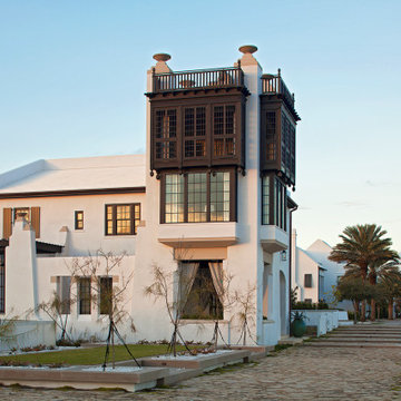
“Riad Zasha resides in Alys Beach, a New Urbanist community along Scenic Highway 30-A in the Florida Panhandle,” says the design team at Khoury & Vogt Architects (KVA), the town architects of Alys Beach. “So named by the homeowner, who came with an explicit preference for something more exotic and Middle Eastern, the house evokes Moroccan and Egyptian influences spatially and decoratively while maintaining continuity with its surrounding architecture, all of which is tightly coded.” E. F. San Juan furnished Weather Shield impact-rated windows and doors, a mahogany impact-rated front door, and all of the custom exterior millwork, including shutters, screens, trim, handrails, and gates. The distinctive tower boasts indoor-outdoor “Florida room” living spaces caged in beautiful wooden mashrabiya grilles created by our team. The execution of this incredible home by the professionals at Alys Beach Construction and KVA resulted in a landmark residence for the town.
Challenges:
“Part of [the Alys Beach] coding, along with the master plan itself, dictated that a tower mark the corner of the lot,” says KVA. “Aligning this with the adjoining park to the south reinforces the axiality of each and locks the house into a greater urban whole.” The sheer amount of custom millwork created for this house made it a challenge, but a welcome one. The unique exterior called for wooden details everywhere, from the shutters to the handrails, mouldings and trim, roof decking, courtyard gates, ceiling panels for the Florida rooms, loggia screen panels, and more—but the tower was the standout element. The homeowners’ desire for Middle Eastern influences was met through the wooden mashrabiya (or moucharaby) oriel-style wooden latticework enclosing the third-story tower living space. Creating this focal point was some of our team’s most unique work to date, requiring the ultimate attention to detail, precision, and planning.
The location close to the Gulf of Mexico also dictated that we partner with our friends at Weather Shield on the impact-rated exterior windows and doors, and their Lifeguard line was perfect for the job. The mahogany impact-rated front door also combines safety and security with beauty and style.
Solution:
Working closely with KVA and Alys Beach Construction on the timeline and planning for our custom wood products, windows, and doors was monumental to the success of this build. The amount of millwork produced meant our team had to carefully manage their time while ensuring we provided the highest quality of detail and work. The location south of Scenic Highway 30-A, steps from the beach, also meant deciding with KVA and Alys Beach Construction what materials should be used for the best possible production quality and looks while adhering to coding and standing the test of time in the harsh Gulfside elements such as high winds, humidity, and salt.
The tower elements alone required the utmost care for building and installation. It was truly a test of skill for our team and Alys Beach Construction to create the corbels and other support pieces that would hold up the wooden oriel windows and latticework screens. We couldn’t be happier with the result and are genuinely honored to have been part of the talented team on such a cornerstone residence in the Alys Beach townscape.
---
Photography courtesy of Alys Beach

 InnovationLand
This Houston kitchen remodel turned an outdated bachelor pad into a contemporary dream fit for newlyweds.
The client wanted a contemporary, somewhat commercial look, but also something homey with a comfy, family feel. And they couldn't go too contemporary, since the style of the home is so traditional.
The clean, contemporary, white-black-and-grey color scheme is just the beginning of this transformation from the previous kitchen,
The revamped 20-by-15-foot kitchen and adjoining dining area also features new stainless steel appliances by Maytag, lighting and furnishings by Restoration Hardware and countertops in white Carrara marble and Absolute Black honed granite.
The paneled oak cabinets are now painted a crisp, bright white and finished off with polished nickel pulls. The center island is now a cool grey a few shades darker than the warm grey on the walls. On top of the grey on the new sheetrock, previously covered in a camel-colored textured paint, is Sherwin Williams' Faux Impressions sparkly "Striae Quartz Stone."
Ho-hum 12-inch ceramic floor tiles with a western motif border have been replaced with grey tile "planks" resembling distressed wood. An oak-paneled flush-mount light fixture has given way to recessed lights and barn pendant lamps in oil rubbed bronze from Restoration Hardware. And the section housing clunky upper and lower banks of cabinets between the kitchen an dining area now has a sleek counter-turned-table with custom-milled legs.
At first, the client wanted to open up that section altogether, but then realized they needed more counter space. The table - a continuation of the granite countertop - was the perfect solution. Plus, it offered space for extra seating.
The black, high-back and low-back bar stools are also from Restoration Hardware - as is the new round chandelier and the dining table over which it hangs.
Outdoor Homescapes of Houston also took out a wall between the kitchen and living room and remodeled the adjoining living room as well. A decorative cedar beam stained Minwax Jacobean now spans the ceiling where the wall once stood.
The oak paneling and stairway railings in the living room, meanwhile, also got a coat of white paint and new window treatments and light fixtures from Restoration Hardware. Staining the top handrailing with the same Jacobean dark stain, however, boosted the new contemporary look even more.
The outdoor living space also got a revamp, with a new patio ceiling also stained Jacobean and new outdoor furniture and outdoor area rug from Restoration Hardware. The furniture is from the Klismos collection, in weathered zinc, with Sunbrella fabric in the color "Smoke."
 Klopf Architecture
The Roger Lee designed house from 1962 was purchased by the current homeowners in almost original condition, as the previous owners elected to defer most maintenance projects over the years. The clients were able to see beyond the dated materials and finishes, single-paned glass and uninsulated walls and they approached Klopf Architecture to help them expand and update the entire home, one the family could settle into and enjoy for years to come. It was important that the new designs were aligned with Lee's original intent not only because of the client's appreciation for mid-century modern architecture, but also because the house was deemed historical. The Stanford Real Estate Office requires a stringent design review which safeguards the integrity of the community, which Klopf Architecture was happy to oblige going into their updated designs.
As with many original mid-century modern homes, the house was scaled to the 1960s lifestyle where rooms were smaller and openings to views were limited and tightly framed. The original conditions defined the direction the family of four would take in updating the house and making it comfortable for their modern lifestyle. Klopf designed a full gut remodel and major addition to bring the house into the 21st century and provide the living area needed for the client's family. The newly expanded house added just about 1,100 sf to create an airy, comfortable and family friendly house, taking full advantage of the beautiful southwestern views that extend out to the hills beyond. The enclosed garage created an additional 240 sf of covered space for long-term storage.
A cracked swimming pool created an eyesore taking up a majority of the backyard landscape, so it was one of the first elements to go during the transformation. Working with Outer Space Landscape Architects, the family asked for a mix of relaxing outdoor patio spaces that eventually blend into the native landscaping, extending their views outward toward the natural greenery of the trees beyond their property. Filling in the old pool was a smart way to expand the living spaces outward. The orientation of the house was designed to enjoy the views, but the original architecture provided the first homeowners with mere glimpses of the landscape outside.
Klopf was able to broaden those views, continuing and extending on the original architecture to take full advantage of the unobstructed natural views across the rear facade of the house. Small horizontal openings in the primary bedroom and office were replaced with much taller windows that now follow the angled roof line upward, extending across almost all of the facade. We worked with Western Windows, whose designs included an oblique-shaped, operable casement that allowed our design to rise with the slope. A new corner office added to the primary suite, offers a bright and functional work-from-home solution that looks out at the distant views and added natural light from the expanded window configuration that now wraps around the corner.
The existing lower level was designed by Lee as a utilitarian space, serving as a wet pool room with a drain in the center of the floor, bathroom, laundry and storage areas. Without the need for a pool room, Klopf was able to convert the area into a much more comfortable and functional living space with a new family room and guest suite. The new spaces enjoy easy access to a new outdoor patio through floor to ceiling, full-width glass sliders.
Continuing along the rear facade, a previously exposed deck extending from the living room and hallway provided access to the backyard through a single set of stairs leading toward the side of the house which made sense when the pool was in place. The new deck was re-envisioned as an extension of the main living room and now serves as a second outdoor living room. A new slatted pergola above provides the homeowners welcome relief from the hot afternoon sun. A second set of stairs now creates a better connection to the redesigned lower level. Klopf was able to reconfigure the spaces, extending the living room outward toward the views, where the family now claims it as the heart of the home, spending a large majority of their time outdoors.
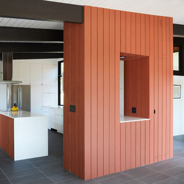
Back inside, the original wood-burning Malm fireplace was beautifully restored and a gas burner installed to comply with California's strict air standards. It now rests in front of a wall of Heath accent tiles where a dated red brick wall used to stand. A new taller window brings more light and views into the refreshed interior living room. The original glass doors opposite the fireplace were replaced by larger sliders that when fully opened, create a seamless transition to the new outdoor living area so the two spaces feel like one connected space. The original utilitarian kitchen was needlessly tucked into the far back corner and closed-off, out of sight from the living room, so the clients asked Klopf to open it up and expand the kitchen forward so it felt more connected. Today the much larger kitchen is connected to the living area where a short wall with a cutout offers a visual glimpse into the kitchen and a handy pass-through counter for serving guests. A new breakfast nook was also added to create another spot where the family can gather for casual meals. Just outside, a new built-in outdoor grill and prep area extends the kitchen outside and connects to a new outdoor dining spot nestled amongst the trees, taking advantage of the views out back.
Klopf was able to expand the other two bedrooms, add a new laundry room and half-bath and convert the carport to an enclosed garage to add more storage areas which was lost when the pool house was converted to the family and guest room.
To maintain a historical connection to the original designs, the exterior siding was repeated on all exterior walls, a full-height stained glass window at the front entryway restored, and an interior slatted screen element repeated outside at the exterior entry courtyard and over the new outdoor living room to create a shade trellis. The new house stands proudly and shines against it's new landscaping features, while respecting and expanding on the original intent of Roger Lee's designs epitomizing the comforts of indoor-outdoor living in Northern California.
Completion year: 2020
Klopf Architecture project team: John Klopf, Klara Kevane, Noel Andrade
Contractor: ORB Construction, Brendan O'Reilly
Structural engineer: Sezen and Moon
Landscape architect: Outer space
Furnishings and decoration: Urbanism Designs
Photographer: Mariko Reed

 TVL Creative Ltd.
Words cannot describe the level of transformation this beautiful 60’s ranch has undergone. The home was blessed with a ton of natural light, however the sectioned rooms made for large awkward spaces without much functionality. By removing the dividing walls and reworking a few key functioning walls, this home is ready to entertain friends and family for all occasions. The large island has dual ovens for serious bake-off competitions accompanied with an inset induction cooktop equipped with a pop-up ventilation system. Plenty of storage surrounds the cooking stations providing large countertop space and seating nook for two. The beautiful natural quartzite is a show stopper throughout with it’s honed finish and serene blue/green hue providing a touch of color. Mother-of-Pearl backsplash tiles compliment the quartzite countertops and soft linen cabinets. The level of functionality has been elevated by moving the washer & dryer to a newly created closet situated behind the refrigerator and keeps hidden by a ceiling mounted barn-door. The new laundry room and storage closet opposite provide a functional solution for maintaining easy access to both areas without door swings restricting the path to the family room. Full height pantry cabinet make up the rest of the wall providing plenty of storage space and a natural division between casual dining to formal dining. Built-in cabinetry with glass doors provides the opportunity to showcase family dishes and heirlooms accented with in-cabinet lighting. With the wall partitions removed, the dining room easily flows into the rest of the home while maintaining its special moment. A large peninsula divides the kitchen space from the seating room providing plentiful storage including countertop cabinets for hidden storage, a charging nook, and a custom doggy station for the beloved dog with an elevated bowl deck and shallow drawer for leashes and treats! Beautiful large format tiles with a touch of modern flair bring all these spaces together providing a texture and color unlike any other with spots of iridescence, brushed concrete, and hues of blue and green. The original master bath and closet was divided into two parts separated by a hallway and door leading to the outside. This created an itty-bitty bathroom and plenty of untapped floor space with potential! By removing the interior walls and bringing the new bathroom space into the bedroom, we created a functional bathroom and walk-in closet space. By reconfiguration the bathroom layout to accommodate a walk-in shower and dual vanity, we took advantage of every square inch and made it functional and beautiful! A pocket door leads into the bathroom suite and a large full-length mirror on a mosaic accent wall greets you upon entering. To the left is a pocket door leading into the walk-in closet, and to the right is the new master bath. A natural marble floor mosaic in a basket weave pattern is warm to the touch thanks to the heating system underneath. Large format white wall tiles with glass mosaic accent in the shower and continues as a wainscot throughout the bathroom providing a modern touch and compliment the classic marble floor. A crisp white double vanity furniture piece completes the space. The journey of the Yosemite project is one we will never forget. Not only were we given the opportunity to transform this beautiful home into a more functional and beautiful space, we were blessed with such amazing clients who were endlessly appreciative of TVL – and for that we are grateful!
 Drury Design
The Setup
After 25+ years in their home, these long-time clients were ready to upgrade their outdated primary bath into something more modern, functional, and reflective of their personal taste. The original space had all the hallmarks of a ’90s builder-grade bathroom — bulky built-in tub, undersized shower, and a layout that wasn’t making the most of the square footage. With the kids grown and a successful kitchen remodel already under their belt, the couple returned to Drury Design for a complete bathroom transformation.
Design objectives:
Create a contemporary, personalized retreat with clean lines and a calming palette
Incorporate the husband’s favorite color (blue) in a bold but tasteful way
Add more efficient storage, including a long-desired linen closet
Improve lighting and ventilation
Make better use of space, especially in the old tub-and-shower zone
Maintain dual sinks and a dedicated makeup area
Add heated floors for extra comfort
The Remodel
Design challenges to be solved:
Reimagine a large but awkward separate shower/tub room to feel more intentional and spa-like
Integrate bold color in a way that felt stylish, not overpowering
Combine two previously separate sinks into one shared vanity without losing the “his and hers” feel
Maintain a sense of flow and cohesion across two adjoining zones of the bathroom
Create a makeup area that feels set apart without breaking design continuity
Maximize comfort in winter without dramatically inflating the project budget
The Renewed Space
Design solutions:
Shifted the location of the tub and expanded the shower to reconfigure the secondary room into a functional spa space; introduced floating shelves and a linen cabinet to tie it all together
Let the rich blue shower tile take center stage as a statement piece while keeping the rest of the palette subdued and modern with layered grays
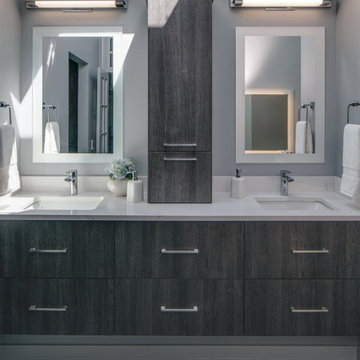
Centered a tall cabinet between the two sinks to provide extra storage and gently divide the shared vanity wall into his-and-hers zones
Chose a freestanding-style tub that installs flush against the wall—preserving the aesthetic while optimizing space and maximizing flow between rooms
Added subtle glam touches — like jewelry-inspired drawer pulls — at the makeup station to give it identity without disrupting the flow
Installed heated floors with programmable settings, offering hotel-level comfort without blowing the budget
Final Thoughts:
The finished space is a stylish blend of utility and serenity. Clean lines, modern finishes, and pops of bold color reflect the homeowners’ taste without overwhelming the design. What was once a dated, underused space is now a calm, contemporary retreat with thoughtful details throughout – from the integrated makeup zone to the just-right splash of color and the luxurious heated floors. Another successful collaboration with Drury Design, this project proves that remodeling isn’t just about resale — it’s about finally getting the space you’ve always wanted, and loving it every day.
 TVL Creative Ltd.
Words cannot describe the level of transformation this beautiful 60’s ranch has undergone. The home was blessed with a ton of natural light, however the sectioned rooms made for large awkward spaces without much functionality. By removing the dividing walls and reworking a few key functioning walls, this home is ready to entertain friends and family for all occasions. The large island has dual ovens for serious bake-off competitions accompanied with an inset induction cooktop equipped with a pop-up ventilation system. Plenty of storage surrounds the cooking stations providing large countertop space and seating nook for two. The beautiful natural quartzite is a show stopper throughout with it’s honed finish and serene blue/green hue providing a touch of color. Mother-of-Pearl backsplash tiles compliment the quartzite countertops and soft linen cabinets. The level of functionality has been elevated by moving the washer & dryer to a newly created closet situated behind the refrigerator and keeps hidden by a ceiling mounted barn-door. The new laundry room and storage closet opposite provide a functional solution for maintaining easy access to both areas without door swings restricting the path to the family room. Full height pantry cabinet make up the rest of the wall providing plenty of storage space and a natural division between casual dining to formal dining. Built-in cabinetry with glass doors provides the opportunity to showcase family dishes and heirlooms accented with in-cabinet lighting. With the wall partitions removed, the dining room easily flows into the rest of the home while maintaining its special moment. A large peninsula divides the kitchen space from the seating room providing plentiful storage including countertop cabinets for hidden storage, a charging nook, and a custom doggy station for the beloved dog with an elevated bowl deck and shallow drawer for leashes and treats! Beautiful large format tiles with a touch of modern flair bring all these spaces together providing a texture and color unlike any other with spots of iridescence, brushed concrete, and hues of blue and green. The original master bath and closet was divided into two parts separated by a hallway and door leading to the outside. This created an itty-bitty bathroom and plenty of untapped floor space with potential! By removing the interior walls and bringing the new bathroom space into the bedroom, we created a functional bathroom and walk-in closet space. By reconfiguration the bathroom layout to accommodate a walk-in shower and dual vanity, we took advantage of every square inch and made it functional and beautiful! A pocket door leads into the bathroom suite and a large full-length mirror on a mosaic accent wall greets you upon entering. To the left is a pocket door leading into the walk-in closet, and to the right is the new master bath. A natural marble floor mosaic in a basket weave pattern is warm to the touch thanks to the heating system underneath. Large format white wall tiles with glass mosaic accent in the shower and continues as a wainscot throughout the bathroom providing a modern touch and compliment the classic marble floor. A crisp white double vanity furniture piece completes the space. The journey of the Yosemite project is one we will never forget. Not only were we given the opportunity to transform this beautiful home into a more functional and beautiful space, we were blessed with such amazing clients who were endlessly appreciative of TVL – and for that we are grateful!
 Tile Doctor Ltd
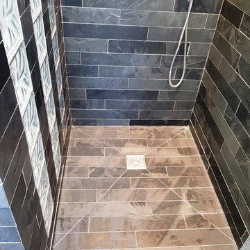
Our client contacted Tile Doctor as they were having problems cleaning their Slate tiled ensuite bathroom. We visited the property in nearby Stevenage, a London commuter town which is between Letchworth Garden City and Welwyn Garden City. The bathroom had been fitted some time ago, but due to the hard water in the area, there had been a large build up of limescale. The dark slate tiles showed this up even more.
My client had tried numerous household products on the tiles, but nothing was shifting the heavy build up. I discussed with them what Tile Doctor could do and completed a small demonstration. They were surprised how easily we were able to improve the tiles. We agreed a price and a timescale and booked the work in for a few weeks’ time.
The ensuite shower required intensive cleaning to the shower walls and floor where excessive limescale was present so we got to work cleaning with Tile Doctor Oxy-Gel, this is a strong alkaline based cleaner and degreaser, it is a gel so it works well on vertical surfaces where a long dwell time is required to break down dirt, grime, soap scum, oil based products. We left the product on the surface for approximately 10 minutes, removing all previous sealers and dirt. The residue was rinsed off and followed this up with a second clean using Tile Doctor Grout Clean-Up.
Grout Clean-Up is an acidic product designed to remove mineral deposits however you need to be careful with some types of stone as it can etch the surface if used incorrectly. To apply the product was diluted with water in a spray bottle and sprayed on to the wall tiles where it was scrubbed in and then rinsed off. The process was then repeated on the floor rinsing down thoroughly afterwards with water.
Once the slate was clean and dry we proceeded to cut out the existing silicone sealant which was equally stained and was beyond cleaning. This is a slow job and care needs to be taken not to scratch the tiles. It is important to ensure all the old silicone is removed so there is a nice clean surface to reapply the new. This also gave the shower area more time to dry out.
We tested with the moisture meter to ensure the shower area was fully dry and then applied the sealer. We chose to apply three coats of Tile Doctor Colour Grow, this is an impregnating sealer that works by occupying the pores in the stone, so dirt can’t become ingrained there, its also a colour enhancing sealer that provides durable protection. We applied the coats then lightly buffed off the excess with a soft cloth and allowed the slate to dry. The following day we returned to re-silicone all the edges and joints.
We recommended to the customer to use a mild solution of Tile Doctor Stone Soap as a maintenance cleaner for the slate. The client was very happy with the result and could see that cleaning with the appropriate product would ensure the ensuite bathroom continued to look good. The whole job took a day and a half to complete.
Robert Voyce
Hertfordshire Tile Doctor
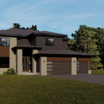
 RWH Architect PLLC
The Whistle Hill Lot 9 Residence is a defining example of RWH Architect’s vision for a new architectural era in Southern New Hampshire. With its bold geometry, refined material palette, and thoughtfully layered rooflines, this home embodies contemporary living while setting a fresh design standard for the region.
From the moment you approach the residence, the interplay of stone accents, vertical elements, and expansive windows establishes a striking yet inviting presence. Inside, a two-story entryway welcomes guests with light and volume, introducing an interior designed for both comfort and sophistication. The open-concept first floor seamlessly integrates the kitchen, great room, and dining/breakfast area, all flowing naturally toward a covered patio that extends the living space outdoors. A walk-in pantry, a private den, and a mudroom with built-in bench and hooks—conveniently located off the two-car attached garage, one bay featuring an oversized door—enhance the home’s functional rhythm. An expansive basement provides room for future recreation or storage, ensuring the home continues to evolve with the family who lives in it.
The second floor hosts four well-proportioned bedrooms, including a master suite designed as a private retreat. The suite features a generous walk-in closet and a luxurious soaking tub, paired with thoughtfully arranged natural light to create a sense of calm and rejuvenation. Two full bathrooms and one half bathroom support the needs of modern family living while maintaining architectural cohesion throughout the home.
Designing this residence presented several challenges that ultimately pushed the architectural expression forward. One key challenge was blending multiple rooflines into a unified modern aesthetic without losing the clarity of the home’s form. RWH resolved this by composing a series of carefully layered planes, each one calibrated to complement the others, resulting in a dynamic yet harmonious silhouette. Another challenge involved balancing the mix of exterior materials—such as stone, horizontal siding, and broad window openings—while maintaining a sense of order and visual stability. This was achieved by aligning materials with structural elements and strengthening vertical features, creating rhythm and cohesion across the façade. A further challenge was delivering an open, light-filled interior despite the structural demands of a two-story entry and several cantilevered forms. RWH overcame this through advanced framing techniques and discreet structural steel placement, allowing for expansive glazing and generous interior spans while preserving the home’s clean, uncluttered aesthetic.
The Whistle Hill Lot 9 Residence stands as a testament to forward-thinking residential design and the evolution of architectural expectations in the area. Through innovative solutions, intentional detailing, and a commitment to elevating everyday living, RWH Architect has created a home that not only meets the needs of modern families but also sets a new benchmark for contemporary architecture in the region.
 Sprig
A bento box is more than just a lunch container—it’s a reflection of Japanese culture, mindful eating, and balanced nutrition. Traditionally used in Japan, bento boxes have gained global popularity due to their practicality, aesthetic appeal, and ability to promote healthy eating habits.
What Is a Bento Box?
A bento box is a single-portion packed meal, neatly arranged in a compartmentalized container. The word “bento” originates from the Chinese term meaning convenient, which perfectly describes its purpose. A typical bento includes rice or noodles, protein like fish, meat, or tofu, and a variety of vegetables or side dishes, all placed in separate sections to maintain flavor and presentation.
Cultural Significance of Bento Boxes
In Japan, bento boxes represent care, effort, and balance. Parents often prepare bento meals for their children as a symbol of love, while office workers rely on them for nutritious meals during busy days. Special versions like ekiben (railway station bento) and character bento (decorated meals shaped like animals or cartoons) highlight the creativity and cultural importance of bento-making.
Health Benefits of Using a Bento Box
One of the biggest advantages of a bento box is its role in portion control and balanced nutrition. Since the box has fixed compartments, it encourages variety without overeating. A well-prepared bento typically follows the principle of:
40–50% carbohydrates
30–40% vegetables
20–30% protein
This balance helps maintain energy levels, supports digestion, and reduces the reliance on unhealthy fast food.
Modern Bento Boxes and Their Uses
Today’s bento boxes are designed to suit modern lifestyles. They are available in microwave-safe, leak-proof, and eco-friendly materials such as stainless steel, BPA-free plastic, and bamboo fiber. Many come with insulated layers, sauce containers, and cutlery, making them ideal for:
Office lunches
School meals
Travel and picnics
Fitness and meal-prep routines
With the rise of sustainable living, reusable bento boxes also help reduce single-use plastic waste.
Bento Boxes in Everyday Life
Bento boxes are no longer limited to Japanese cuisine. People worldwide use them to pack Indian, Western, vegan, or keto meals. From chapati and sabzi to pasta and salads, bento boxes adapt easily to different food preferences while keeping meals fresh and organized.
Why Bento Boxes Are So Popular Today
The popularity of bento boxes is driven by busy schedules, health awareness, and social media trends. Platforms like Instagram and Pinterest showcase beautifully arranged bento meals, inspiring people to eat better and enjoy the process of food preparation. They combine functionality, aesthetics, and mindfulness, making meals more enjoyable.
Conclusion
A bento box is a smart and stylish way to enjoy homemade meals while staying healthy and organized. Whether you’re looking to improve your diet, save money, or reduce environmental impact, a bento box offers a simple yet effective solution. With its deep cultural roots and modern versatility, the bento box continues to be a timeless companion for everyday meals.
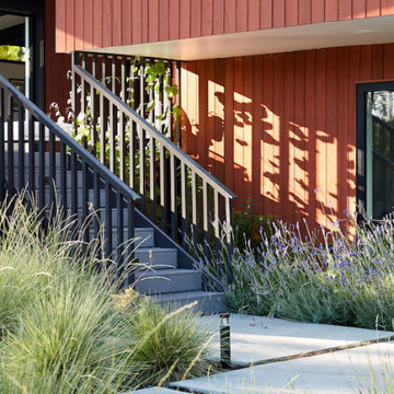 Klopf Architecture
The Roger Lee designed house from 1962 was purchased by the current homeowners in almost original condition, as the previous owners elected to defer most maintenance projects over the years. The clients were able to see beyond the dated materials and finishes, single-paned glass and uninsulated walls and they approached Klopf Architecture to help them expand and update the entire home, one the family could settle into and enjoy for years to come. It was important that the new designs were aligned with Lee's original intent not only because of the client's appreciation for mid-century modern architecture, but also because the house was deemed historical. The Stanford Real Estate Office requires a stringent design review which safeguards the integrity of the community, which Klopf Architecture was happy to oblige going into their updated designs.
As with many original mid-century modern homes, the house was scaled to the 1960s lifestyle where rooms were smaller and openings to views were limited and tightly framed. The original conditions defined the direction the family of four would take in updating the house and making it comfortable for their modern lifestyle. Klopf designed a full gut remodel and major addition to bring the house into the 21st century and provide the living area needed for the client's family. The newly expanded house added just about 1,100 sf to create an airy, comfortable and family friendly house, taking full advantage of the beautiful southwestern views that extend out to the hills beyond. The enclosed garage created an additional 240 sf of covered space for long-term storage.
A cracked swimming pool created an eyesore taking up a majority of the backyard landscape, so it was one of the first elements to go during the transformation. Working with Outer Space Landscape Architects, the family asked for a mix of relaxing outdoor patio spaces that eventually blend into the native landscaping, extending their views outward toward the natural greenery of the trees beyond their property. Filling in the old pool was a smart way to expand the living spaces outward. The orientation of the house was designed to enjoy the views, but the original architecture provided the first homeowners with mere glimpses of the landscape outside.
Klopf was able to broaden those views, continuing and extending on the original architecture to take full advantage of the unobstructed natural views across the rear facade of the house. Small horizontal openings in the primary bedroom and office were replaced with much taller windows that now follow the angled roof line upward, extending across almost all of the facade. We worked with Western Windows, whose designs included an oblique-shaped, operable casement that allowed our design to rise with the slope. A new corner office added to the primary suite, offers a bright and functional work-from-home solution that looks out at the distant views and added natural light from the expanded window configuration that now wraps around the corner.
The existing lower level was designed by Lee as a utilitarian space, serving as a wet pool room with a drain in the center of the floor, bathroom, laundry and storage areas. Without the need for a pool room, Klopf was able to convert the area into a much more comfortable and functional living space with a new family room and guest suite. The new spaces enjoy easy access to a new outdoor patio through floor to ceiling, full-width glass sliders.
Continuing along the rear facade, a previously exposed deck extending from the living room and hallway provided access to the backyard through a single set of stairs leading toward the side of the house which made sense when the pool was in place. The new deck was re-envisioned as an extension of the main living room and now serves as a second outdoor living room. A new slatted pergola above provides the homeowners welcome relief from the hot afternoon sun. A second set of stairs now creates a better connection to the redesigned lower level. Klopf was able to reconfigure the spaces, extending the living room outward toward the views, where the family now claims it as the heart of the home, spending a large majority of their time outdoors.
Back inside, the original wood-burning Malm fireplace was beautifully restored and a gas burner installed to comply with California's strict air standards. It now rests in front of a wall of Heath accent tiles where a dated red brick wall used to stand. A new taller window brings more light and views into the refreshed interior living room. The original glass doors opposite the fireplace were replaced by larger sliders that when fully opened, create a seamless transition to the new outdoor living area so the two spaces feel like one connected space. The original utilitarian kitchen was needlessly tucked into the far back corner and closed-off, out of sight from the living room, so the clients asked Klopf to open it up and expand the kitchen forward so it felt more connected. Today the much larger kitchen is connected to the living area where a short wall with a cutout offers a visual glimpse into the kitchen and a handy pass-through counter for serving guests. A new breakfast nook was also added to create another spot where the family can gather for casual meals. Just outside, a new built-in outdoor grill and prep area extends the kitchen outside and connects to a new outdoor dining spot nestled amongst the trees, taking advantage of the views out back.
Klopf was able to expand the other two bedrooms, add a new laundry room and half-bath and convert the carport to an enclosed garage to add more storage areas which was lost when the pool house was converted to the family and guest room.
To maintain a historical connection to the original designs, the exterior siding was repeated on all exterior walls, a full-height stained glass window at the front entryway restored, and an interior slatted screen element repeated outside at the exterior entry courtyard and over the new outdoor living room to create a shade trellis. The new house stands proudly and shines against it's new landscaping features, while respecting and expanding on the original intent of Roger Lee's designs epitomizing the comforts of indoor-outdoor living in Northern California.
Completion year: 2020
Klopf Architecture project team: John Klopf, Klara Kevane, Noel Andrade
Contractor: ORB Construction, Brendan O'Reilly
Structural engineer: Sezen and Moon
Landscape architect: Outer space
Furnishings and decoration: Urbanism Designs
Photographer: Mariko Reed
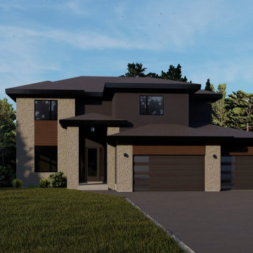 RWH Architect PLLC
The Whistle Hill Lot 9 Residence is a defining example of RWH Architect’s vision for a new architectural era in Southern New Hampshire. With its bold geometry, refined material palette, and thoughtfully layered rooflines, this home embodies contemporary living while setting a fresh design standard for the region.
From the moment you approach the residence, the interplay of stone accents, vertical elements, and expansive windows establishes a striking yet inviting presence. Inside, a two-story entryway welcomes guests with light and volume, introducing an interior designed for both comfort and sophistication. The open-concept first floor seamlessly integrates the kitchen, great room, and dining/breakfast area, all flowing naturally toward a covered patio that extends the living space outdoors. A walk-in pantry, a private den, and a mudroom with built-in bench and hooks—conveniently located off the two-car attached garage, one bay featuring an oversized door—enhance the home’s functional rhythm. An expansive basement provides room for future recreation or storage, ensuring the home continues to evolve with the family who lives in it.
The second floor hosts four well-proportioned bedrooms, including a master suite designed as a private retreat. The suite features a generous walk-in closet and a luxurious soaking tub, paired with thoughtfully arranged natural light to create a sense of calm and rejuvenation. Two full bathrooms and one half bathroom support the needs of modern family living while maintaining architectural cohesion throughout the home.
Designing this residence presented several challenges that ultimately pushed the architectural expression forward. One key challenge was blending multiple rooflines into a unified modern aesthetic without losing the clarity of the home’s form. RWH resolved this by composing a series of carefully layered planes, each one calibrated to complement the others, resulting in a dynamic yet harmonious silhouette. Another challenge involved balancing the mix of exterior materials—such as stone, horizontal siding, and broad window openings—while maintaining a sense of order and visual stability. This was achieved by aligning materials with structural elements and strengthening vertical features, creating rhythm and cohesion across the façade. A further challenge was delivering an open, light-filled interior despite the structural demands of a two-story entry and several cantilevered forms. RWH overcame this through advanced framing techniques and discreet structural steel placement, allowing for expansive glazing and generous interior spans while preserving the home’s clean, uncluttered aesthetic.
The Whistle Hill Lot 9 Residence stands as a testament to forward-thinking residential design and the evolution of architectural expectations in the area. Through innovative solutions, intentional detailing, and a commitment to elevating everyday living, RWH Architect has created a home that not only meets the needs of modern families but also sets a new benchmark for contemporary architecture in the region.
 TVL Creative Ltd.
Words cannot describe the level of transformation this beautiful 60’s ranch has undergone. The home was blessed with a ton of natural light, however the sectioned rooms made for large awkward spaces without much functionality. By removing the dividing walls and reworking a few key functioning walls, this home is ready to entertain friends and family for all occasions. The large island has dual ovens for serious bake-off competitions accompanied with an inset induction cooktop equipped with a pop-up ventilation system. Plenty of storage surrounds the cooking stations providing large countertop space and seating nook for two. The beautiful natural quartzite is a show stopper throughout with it’s honed finish and serene blue/green hue providing a touch of color. Mother-of-Pearl backsplash tiles compliment the quartzite countertops and soft linen cabinets. The level of functionality has been elevated by moving the washer & dryer to a newly created closet situated behind the refrigerator and keeps hidden by a ceiling mounted barn-door. The new laundry room and storage closet opposite provide a functional solution for maintaining easy access to both areas without door swings restricting the path to the family room. Full height pantry cabinet make up the rest of the wall providing plenty of storage space and a natural division between casual dining to formal dining. Built-in cabinetry with glass doors provides the opportunity to showcase family dishes and heirlooms accented with in-cabinet lighting. With the wall partitions removed, the dining room easily flows into the rest of the home while maintaining its special moment. A large peninsula divides the kitchen space from the seating room providing plentiful storage including countertop cabinets for hidden storage, a charging nook, and a custom doggy station for the beloved dog with an elevated bowl deck and shallow drawer for leashes and treats! Beautiful large format tiles with a touch of modern flair bring all these spaces together providing a texture and color unlike any other with spots of iridescence, brushed concrete, and hues of blue and green. The original master bath and closet was divided into two parts separated by a hallway and door leading to the outside. This created an itty-bitty bathroom and plenty of untapped floor space with potential! By removing the interior walls and bringing the new bathroom space into the bedroom, we created a functional bathroom and walk-in closet space. By reconfiguration the bathroom layout to accommodate a walk-in shower and dual vanity, we took advantage of every square inch and made it functional and beautiful! A pocket door leads into the bathroom suite and a large full-length mirror on a mosaic accent wall greets you upon entering. To the left is a pocket door leading into the walk-in closet, and to the right is the new master bath. A natural marble floor mosaic in a basket weave pattern is warm to the touch thanks to the heating system underneath. Large format white wall tiles with glass mosaic accent in the shower and continues as a wainscot throughout the bathroom providing a modern touch and compliment the classic marble floor. A crisp white double vanity furniture piece completes the space. The journey of the Yosemite project is one we will never forget. Not only were we given the opportunity to transform this beautiful home into a more functional and beautiful space, we were blessed with such amazing clients who were endlessly appreciative of TVL – and for that we are grateful!
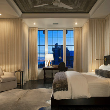 E. F. San Juan
Riad Zasha: Middle Eastern Beauty at the Beach
Private Residence / Alys Beach, Florida
Architect: Khoury & Vogt Architects
Builder: Alys Beach Construction
---
“Riad Zasha resides in Alys Beach, a New Urbanist community along Scenic Highway 30-A in the Florida Panhandle,” says the design team at Khoury & Vogt Architects (KVA), the town architects of Alys Beach. “So named by the homeowner, who came with an explicit preference for something more exotic and Middle Eastern, the house evokes Moroccan and Egyptian influences spatially and decoratively while maintaining continuity with its surrounding architecture, all of which is tightly coded.” E. F. San Juan furnished Weather Shield impact-rated windows and doors, a mahogany impact-rated front door, and all of the custom exterior millwork, including shutters, screens, trim, handrails, and gates. The distinctive tower boasts indoor-outdoor “Florida room” living spaces caged in beautiful wooden mashrabiya grilles created by our team. The execution of this incredible home by the professionals at Alys Beach Construction and KVA resulted in a landmark residence for the town.
Challenges:
“Part of [the Alys Beach] coding, along with the master plan itself, dictated that a tower mark the corner of the lot,” says KVA. “Aligning this with the adjoining park to the south reinforces the axiality of each and locks the house into a greater urban whole.” The sheer amount of custom millwork created for this house made it a challenge, but a welcome one. The unique exterior called for wooden details everywhere, from the shutters to the handrails, mouldings and trim, roof decking, courtyard gates, ceiling panels for the Florida rooms, loggia screen panels, and more—but the tower was the standout element. The homeowners’ desire for Middle Eastern influences was met through the wooden mashrabiya (or moucharaby) oriel-style wooden latticework enclosing the third-story tower living space. Creating this focal point was some of our team’s most unique work to date, requiring the ultimate attention to detail, precision, and planning.
The location close to the Gulf of Mexico also dictated that we partner with our friends at Weather Shield on the impact-rated exterior windows and doors, and their Lifeguard line was perfect for the job. The mahogany impact-rated front door also combines safety and security with beauty and style.
Solution:
Working closely with KVA and Alys Beach Construction on the timeline and planning for our custom wood products, windows, and doors was monumental to the success of this build. The amount of millwork produced meant our team had to carefully manage their time while ensuring we provided the highest quality of detail and work. The location south of Scenic Highway 30-A, steps from the beach, also meant deciding with KVA and Alys Beach Construction what materials should be used for the best possible production quality and looks while adhering to coding and standing the test of time in the harsh Gulfside elements such as high winds, humidity, and salt.
The tower elements alone required the utmost care for building and installation. It was truly a test of skill for our team and Alys Beach Construction to create the corbels and other support pieces that would hold up the wooden oriel windows and latticework screens. We couldn’t be happier with the result and are genuinely honored to have been part of the talented team on such a cornerstone residence in the Alys Beach townscape.
---
Photography courtesy of Alys Beach
143