
Search results for "Solutions play" in Home Design Ideas

 TVL Creative Ltd.
Cramped kitchen be gone! That was the project motto and top priority. The goal was to transform the current layout from multiple smaller spaces into a connected whole that would activate the main level for our clients, a young family of four.
The biggest obstacle was the wall dividing the kitchen and the dining room. Removing this wall was central to opening up and integrating the main living spaces, but the existing ductwork that ran right through the center of the wall posed a design challenge, er design opportunity. The resulting design solution features a central pantry that captures the ductwork and provides valuable storage- especially when compared to the original kitchen's 18" wide pantry cabinet. The pantry also anchors the kitchen island and serves as a visual separation of space between the kitchen and homework area.
Through our design development process, we learned the formal living room was of no service to their lifestyle and therefore space they rarely spent time in. With that in mind, we proposed to eliminate the unused living room and make it the new dining room. Relocating the dining room to this space inherently felt right given the soaring ceiling and ample room for holiday dinners and celebrations. The new dining room was spacious enough for us to incorporate a conversational seating area in the warm, south-facing window alcove.
Now what to do with the old dining room?! To answer that question we took inspiration from our clients' shared profession in education and developed a craft area/homework station for both of their boys. The semi-custom cabinetry of the desk area carries over to the adjacent wall and forms window bench base with storage that we topped with butcher block for a touch of warmth. While the boys are young, the bench drawers are the perfect place for a stash of toys close to the kitchen.
The kitchen begins just beyond the window seat with their refrigerator enclosure. Opposite the refrigerator is the new pantry with twenty linear feet of shelving and space for brooms and a stick vacuum. Extending from the backside of the pantry the kitchen island design incorporates counter seating on the family room side and a cabinetry configuration on the kitchen side with drawer storage, a trashcan center, farmhouse sink, and dishwasher.
We took careful time in design and execution to align the range and sink because while it might seem like a small detail, it plays an important role in supporting the symmetrical configuration of the back wall of the kitchen. The rear wall design utilizes an appliance garage mirrors the visual impact of the refrigerator enclosure and helps keep the now open kitchen tidy. Between the appliance garage and refrigerator enclosure is the cooking zone with 30" of cabinetry and work surface on either side of the range, a chimney style vent hood, and a bold graphic tile backsplash.
The backsplash is just one of many personal touches we added to the space to reflect our client's modern eclectic style and love of color. Swooping lines of the mid-mod style barstools compliment the pendants and backsplash pattern. A pop of vibrant green on the frame of the pantry door adds a fresh wash of color to an otherwise neutral space. The big show stopper is the custom charcoal gray and copper chevron wall installation in the dining room. This was an idea our clients softly suggested, and we excitedly embraced the opportunity. It is also a kickass solution to the head-scratching design dilemma of how to fill a large and lofty wall.
We are so grateful to bring this design to life for our clients and now dear friends.

 Klopf Architecture
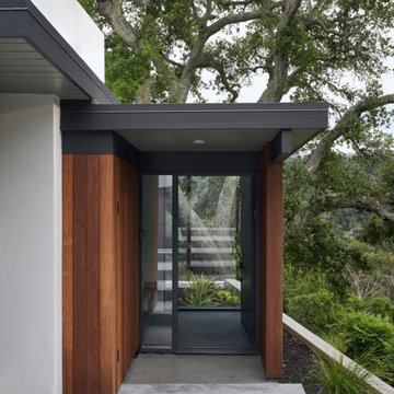
Set in a quiet neighborhood and framed by mature trees, this residence presented a unique opportunity: to thoughtfully evolve a custom mid-century modern home into a space that supports the everyday rhythms of a growing family. With a deep respect for the home’s original architecture, Klopf Architecture reimagined the house to better meet the needs of its owners—introducing functional improvements while preserving the spirit and character of its mid-century roots.
The clients approached Klopf Architecture with a clear vision: refresh their home while seamlessly integrating new programmatic elements. Key goals included clarifying and enhancing the entry sequence; connecting the detached garage to the main house with a practical yet architecturally intentional intervention; adding functional spaces such as a mudroom and laundry room; expanding and remodeling the primary suite’s bathroom and closet; and creating a more engaging outdoor space that capitalized on the site’s impressive views, featuring a fire pit and outdoor kitchen.
As a couple with distinct yet complementary perspectives—one focused on modern functionality and technology, and the other dedicated to preserving the home’s architectural integrity—their collaboration with Klopf Architecture resulted in a solution that harmonized both ideals. Their shared commitment to improving the livability of their home led to a design dialogue rooted in balance. This dynamic partnership shaped the direction of the renovation, ensuring that every decision honored the spirit of the original home while aligning with the practical needs of their growing family.
Designing within the constraints of the sloped site posed one of the project’s central challenges. The detached garage sat at a higher elevation than the main house, requiring a solution that ensured architectural and geometric compatibility between the two structures. Rather than create a purely utilitarian link, Klopf Architecture introduced an intentional connection that contributes to the overall architectural language. A notable pinch point in the plan—where differing geometries converged—was treated as a hinge point, turning a potentially awkward juncture into an architectural feature. This area now functions as both a transition and a moment of design interest that unifies the overall plan.
The design also addressed the underutilized outdoor area, which was located in a shadowed portion of the site with geometrical limitations. A new connection to the rear deck was created in this same area, making the outdoor space more useful and inviting. Klopf Architecture introduced carefully positioned openings and spatial improvements that forged a strong visual and functional connection between indoor and outdoor spaces. The outdoor area now reads as a deliberate extension of the home, embracing natural light and emphasizing the dramatic views.
Working through multiple design iterations, Klopf Architecture crafted a solution that preserved the architectural language of the original home while supporting the functional needs of modern life. The garage-to-house connection became more than a passage—it evolved into an architectural moment of transition. A new mudroom and laundry space enhanced convenience without compromising the clean lines of the design. The primary suite was expanded to create a private, serene retreat. The reimagined backyard, complete with fire pit and kitchen, now plays a vital role in the family’s daily routine and social life.
Outcomes and Lasting Impact
The result is a home that balances heritage with contemporary design, technical precision with design sensibility. The redesign not only met the clients’ initial goals but also exceeded expectations in its ability to seamlessly blend past and present, function and beauty, making the outdoor kitchen a favorite gathering place.
Beyond aesthetics, the renovation has significantly improved daily life for the family. The newly integrated garage connection has streamlined routines, providing a seamless transition between arriving home, storing belongings, and entering the main living spaces. The expanded primary suite offers a retreat-like atmosphere, creating a private space to unwind at the end of the day. The redesigned outdoor areas have also become an extension of their lifestyle—whether it's casual family dinners around the fire pit, entertaining friends in the outdoor kitchen, or simply enjoying the view from the reimagined backyard.
Through a thoughtful and strategic approach, the house has been successfully evolved into a home that remains true to its mid-century modern roots while enhancing livability, functionality, and the overall quality of life for the modern-day owners.
Klopf Architecture Team: Geoffrey Campen, Fernanda Bernardes
Architectural Interior Design: Klopf Architecture
Structural Engineer: Base Design Inc.
Contractor: Golden Snail Builders
Photography: Mariko Reed
Year Completed:2022
 Klopf Architecture
Set in a quiet neighborhood and framed by mature trees, this residence presented a unique opportunity: to thoughtfully evolve a custom mid-century modern home into a space that supports the everyday rhythms of a growing family. With a deep respect for the home’s original architecture, Klopf Architecture reimagined the house to better meet the needs of its owners—introducing functional improvements while preserving the spirit and character of its mid-century roots.
The clients approached Klopf Architecture with a clear vision: refresh their home while seamlessly integrating new programmatic elements. Key goals included clarifying and enhancing the entry sequence; connecting the detached garage to the main house with a practical yet architecturally intentional intervention; adding functional spaces such as a mudroom and laundry room; expanding and remodeling the primary suite’s bathroom and closet; and creating a more engaging outdoor space that capitalized on the site’s impressive views, featuring a fire pit and outdoor kitchen.
As a couple with distinct yet complementary perspectives—one focused on modern functionality and technology, and the other dedicated to preserving the home’s architectural integrity—their collaboration with Klopf Architecture resulted in a solution that harmonized both ideals. Their shared commitment to improving the livability of their home led to a design dialogue rooted in balance. This dynamic partnership shaped the direction of the renovation, ensuring that every decision honored the spirit of the original home while aligning with the practical needs of their growing family.
Designing within the constraints of the sloped site posed one of the project’s central challenges. The detached garage sat at a higher elevation than the main house, requiring a solution that ensured architectural and geometric compatibility between the two structures. Rather than create a purely utilitarian link, Klopf Architecture introduced an intentional connection that contributes to the overall architectural language. A notable pinch point in the plan—where differing geometries converged—was treated as a hinge point, turning a potentially awkward juncture into an architectural feature. This area now functions as both a transition and a moment of design interest that unifies the overall plan.
The design also addressed the underutilized outdoor area, which was located in a shadowed portion of the site with geometrical limitations. A new connection to the rear deck was created in this same area, making the outdoor space more useful and inviting. Klopf Architecture introduced carefully positioned openings and spatial improvements that forged a strong visual and functional connection between indoor and outdoor spaces. The outdoor area now reads as a deliberate extension of the home, embracing natural light and emphasizing the dramatic views.
Working through multiple design iterations, Klopf Architecture crafted a solution that preserved the architectural language of the original home while supporting the functional needs of modern life. The garage-to-house connection became more than a passage—it evolved into an architectural moment of transition. A new mudroom and laundry space enhanced convenience without compromising the clean lines of the design. The primary suite was expanded to create a private, serene retreat. The reimagined backyard, complete with fire pit and kitchen, now plays a vital role in the family’s daily routine and social life.
Outcomes and Lasting Impact
The result is a home that balances heritage with contemporary design, technical precision with design sensibility. The redesign not only met the clients’ initial goals but also exceeded expectations in its ability to seamlessly blend past and present, function and beauty, making the outdoor kitchen a favorite gathering place.
Beyond aesthetics, the renovation has significantly improved daily life for the family. The newly integrated garage connection has streamlined routines, providing a seamless transition between arriving home, storing belongings, and entering the main living spaces. The expanded primary suite offers a retreat-like atmosphere, creating a private space to unwind at the end of the day. The redesigned outdoor areas have also become an extension of their lifestyle—whether it's casual family dinners around the fire pit, entertaining friends in the outdoor kitchen, or simply enjoying the view from the reimagined backyard.
Through a thoughtful and strategic approach, the house has been successfully evolved into a home that remains true to its mid-century modern roots while enhancing livability, functionality, and the overall quality of life for the modern-day owners.
Klopf Architecture Team: Geoffrey Campen, Fernanda Bernardes
Architectural Interior Design: Klopf Architecture
Structural Engineer: Base Design Inc.
Contractor: Golden Snail Builders
Photography: Mariko Reed
Year Completed:2022
Find the right local pro for your project

 Joy Street Design
Printed wallpaper, marble, and high-end finishes abound in these luxurious bathrooms designed by our Oakland studio:
Designed by Oakland interior design studio Joy Street Design. Serving Alameda, Berkeley, Orinda, Walnut Creek, Piedmont, and San Francisco.
For more about Joy Street Design, click here: https://www.joystreetdesign.com/
To learn more about this project, click here:
https://www.joystreetdesign.com/portfolio/high-end-bathroom-houston
 SHELLEY RODNER DESIGN / DDI
DESIGN CHALLENGES ADDRESSED:
To anyone who may be reading this project overview, I do hope you'll have the opportunity to
have a look at the 'before' photo of this space. It's quite a transformation!
Our homeowners purchased their condo at the beach several years ago. As shown in the 'before'
photo, the casual dining area was a dark and dated space with unsightly paneled walls, heavy
faux ceiling beams and odds and ends for furniture. It was cut off from the kitchen and did not
lend itself for entertaining. Everything felt cramped and cluttered throughout the condo,
especially this space. The client's vision was for a relaxed and welcoming dining space that
would allow them to comfortably host friends and family.
DESIGN SOLUTIONS PROVIDED:
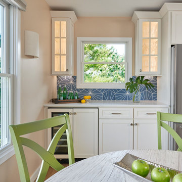
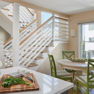
The entire condo was taken down to the stud. The faux beams were edited out and the ceiling
raised. The heavy out-dated paneling was replaced with fresh clean walls that were painted in a
calming creamy sand tone throughout the entire condo. The wall that once separated the kitchen
and dining area was completely removed. This space now felt far more spacious and open.
The existing heavy and out dated furniture was replaced with stylish functional pieces. Great
thought was given to the size, scale and textiles used. A round table with a wonderful archectural
base in a richly textured weathered driftwood finish was selected. With the option of adding an
extension leaf (which converted the table into a generous rectangle) the homeowners now had
the desired space to host a sizable group of guests without feeling crowded as before. Dining
chairs with a 'x' back wood frame in a playful shade of kiwi and crisp striped cushions completed
the look.
Clean line sconces in a rich linen textile were added on either of the window for soft ambient
lighting.
The overall effect of the renovation was quite dramatic and the clients were thrilled with the
results. This casual dining area went from being dark and dated to light and airy and is now a
wonderful space that is both inviting and relaxing along with being a great place to entertain.
RETAIL PROJECT PRICE: $ 5,000.00
Retail price is defined as the total sale you submitted on your sales repor
 SHELLEY RODNER DESIGN / DDI
DESIGN CHALLENGES ADDRESSED:
To anyone who may be reading this project overview, I do hope you'll have the opportunity to
have a look at the 'before' photo of this space. It's quite a transformation!
Our homeowners purchased their condo at the beach several years ago. As shown in the 'before'
photo, the casual dining area was a dark and dated space with unsightly paneled walls, heavy
faux ceiling beams and odds and ends for furniture. It was cut off from the kitchen and did not
lend itself for entertaining. Everything felt cramped and cluttered throughout the condo,
especially this space. The client's vision was for a relaxed and welcoming dining space that
would allow them to comfortably host friends and family.
DESIGN SOLUTIONS PROVIDED:
The entire condo was taken down to the stud. The faux beams were edited out and the ceiling
raised. The heavy out-dated paneling was replaced with fresh clean walls that were painted in a
calming creamy sand tone throughout the entire condo. The wall that once separated the kitchen
and dining area was completely removed. This space now felt far more spacious and open.
The existing heavy and out dated furniture was replaced with stylish functional pieces. Great
thought was given to the size, scale and textiles used. A round table with a wonderful archectural
base in a richly textured weathered driftwood finish was selected. With the option of adding an
extension leaf (which converted the table into a generous rectangle) the homeowners now had
the desired space to host a sizable group of guests without feeling crowded as before. Dining
chairs with a 'x' back wood frame in a playful shade of kiwi and crisp striped cushions completed
the look.
Clean line sconces in a rich linen textile were added on either of the window for soft ambient
lighting.
The overall effect of the renovation was quite dramatic and the clients were thrilled with the
results. This casual dining area went from being dark and dated to light and airy and is now a
wonderful space that is both inviting and relaxing along with being a great place to entertain.
RETAIL PROJECT PRICE: $ 5,000.00
Retail price is defined as the total sale you submitted on your sales repor
 Sosna Inc
TThis young couple, busy raising two young boys (plus a playful cat), had always planned to renovate—it was just a matter of finding the right people for the job.
Their biggest concern? Hiring a contractor they could truly rely on to bring their vision to life without added stress.
The master ensuite simply wasn’t working. A large, unused deck-mount tub dominated the space, while the tiny, dim shower made daily routines uncomfortable. The layout didn’t make sense for how they actually used the room, which ended up being mostly for the toilet and vanity. On top of that, the master bedroom sat in an open loft without proper walls or a door, making privacy nearly impossible.
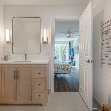
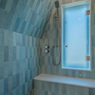
Our solution involved a thoughtful reconfiguration of the ensuite. We removed the oversized tub and replaced it with a spacious walk-in shower. The old, cramped shower space became the perfect spot for a relocated vanity, allowing for better flow and use of the room. Up in the loft, we built a new wall with a door to give the bedroom the privacy it was missing. The stairway was also refreshed with new oak treads and a stained handrail to match the existing flooring.
One challenge during construction was installing the custom shower glass and tile within the sloped ceilings and angled walls—but our team carefully managed every detail to ensure a precise and polished finish.
The new master ensuite now feels like a retreat.
Handmade-style blue subway tiles add a calming pop of colour in the shower, paired with crème porcelain floor tiles. A prefabricated solid wood vanity with quartz countertop, brushed nickel fixtures, and an electric towel warmer complete the space—bringing comfort and functionality together beautifully.
A fun moment during the design phase? We used stools, tables, and even a piano to mock up the future layout—helping the homeowners get a real feel for the spacing between the new vanity and toilet. It was a creative, hands-on way to ensure everyone felt confident moving forward.
Now, the ensuite functions exactly as it should: a fully usable and relaxing 3-piece bathroom, styled just the way they wanted. And with the new loft wall and door, the bedroom finally feels like a true primary suite—private, peaceful, and made for them.

 Sosna Inc
This young couple, busy raising two young boys (plus a playful cat), had always planned to renovate—it was just a matter of finding the right people for the job.
Their biggest concern? Hiring a contractor they could truly rely on to bring their vision to life without added stress.
The master ensuite simply wasn’t working. A large, unused deck-mount tub dominated the space, while the tiny, dim shower made daily routines uncomfortable. The layout didn’t make sense for how they actually used the room, which ended up being mostly for the toilet and vanity. On top of that, the master bedroom sat in an open loft without proper walls or a door, making privacy nearly impossible.
Our solution involved a thoughtful reconfiguration of the ensuite. We removed the oversized tub and replaced it with a spacious walk-in shower. The old, cramped shower space became the perfect spot for a relocated vanity, allowing for better flow and use of the room. Up in the loft, we built a new wall with a door to give the bedroom the privacy it was missing. The stairway was also refreshed with new oak treads and a stained handrail to match the existing flooring.
One challenge during construction was installing the custom shower glass and tile within the sloped ceilings and angled walls—but our team carefully managed every detail to ensure a precise and polished finish.
The new master ensuite now feels like a retreat.
Handmade-style blue subway tiles add a calming pop of colour in the shower, paired with crème porcelain floor tiles. A prefabricated solid wood vanity with quartz countertop, brushed nickel fixtures, and an electric towel warmer complete the space—bringing comfort and functionality together beautifully.
A fun moment during the design phase? We used stools, tables, and even a piano to mock up the future layout—helping the homeowners get a real feel for the spacing between the new vanity and toilet. It was a creative, hands-on way to ensure everyone felt confident moving forward.
Now, the ensuite functions exactly as it should: a fully usable and relaxing 3-piece bathroom, styled just the way they wanted. And with the new loft wall and door, the bedroom finally feels like a true primary suite—private, peaceful, and made for them.
 Talon Construction Inc.
Thinking about a kitchen remodel in the Frederick, MD area? Here’s a closer look at one of our recent projects by Talon Construction Inc. - Q&A style:
Q: What makes this kitchen stand out?
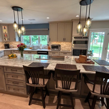
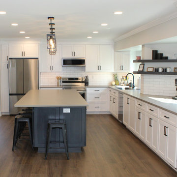
A: The oversized island is the centerpiece designed for cooking, gathering, and entertaining all in one space. It’s both functional and a true focal point.
Q: What materials were used for the countertops and backsplash?
A: Vicostone Moonglade Quartz was selected for both the countertops and full-height backsplash, creating a seamless, high-end look with excellent durability.
Q: How does the cabinetry design enhance the space?
A: The combination of light upper cabinets and contrasting gray base cabinets adds depth while keeping the kitchen bright and open. Clean lines and modern hardware complete the look.
Q: What storage solutions were incorporated?
A: This kitchen is packed with smart storage with deep drawers, pull-out organizers, a custom pantry, and built-in features that keep everything accessible and clutter-free.
Q: Is this kitchen designed for everyday living or entertaining?
A: Both. The layout was intentionally designed to support daily functionality while also making it easy to host family and friends.
Q: What role does lighting play in the design?
A: Layered lighting including pendant lights, recessed lighting, and under-cabinet illumination adds warmth, visibility, and a polished finish.
Q: What’s the overall style of this remodel?
A: A clean, modern look with timeless elements that perfectly balancing style, comfort, and long-term value.
Q: What’s the biggest takeaway from this project?
A: A well-designed kitchen isn’t just about looks it’s about creating a space that works beautifully for how you live.
Thinking about transforming your kitchen? Let’s talk.
 Talon Construction Inc.
An open floor plan kitchen renovation transforms your kitchen from a closed-off space into a sociable and airy heart of the home.
The Walls Come Down: The biggest change is removing walls (or widening doorways) that separate the kitchen from the living room or dining room. This creates a continuous living area bathed in more natural light.
Island Paradise: A kitchen island becomes the centerpiece. It can house your sink, cooktop, offer seating, and provide much-needed prep space. You can choose a large island for entertaining or a smaller one to define the space.
Work Zones Take Shape: Imagine designated areas for specific tasks. A sink area with a dishwasher nearby, a prep zone with ample countertop, and a cooking zone with the oven and cooktop grouped together. This promotes efficiency and a smooth workflow in your kitchen.
Light and Bright: Natural light is key. Large windows or skylights can be incorporated during the renovation to bathe the space in sunshine. Light, reflective surfaces like white cabinets or light-colored countertops also enhance the feeling of openness.
Designing the Flow: Flooring plays a big role in tying the open concept space together. Opt for continuous flooring throughout the kitchen and living area to create a seamless flow. Area rugs can be used later to define separate zones within the open plan.
Don't Forget the Details: Open concept kitchens need clever storage solutions to avoid clutter. Built-in cabinets, pantries, and even hidden storage drawers in the island can keep things organized. To distinguish the kitchen from the living area, consider using a different colored paint scheme on the island or backsplash.
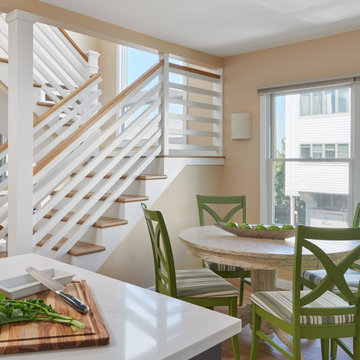 SHELLEY RODNER DESIGN / DDI
DESIGN CHALLENGES ADDRESSED:
To anyone who may be reading this project overview, I do hope you'll have the opportunity to
have a look at the 'before' photo of this space. It's quite a transformation!
Our homeowners purchased their condo at the beach several years ago. As shown in the 'before'
photo, the casual dining area was a dark and dated space with unsightly paneled walls, heavy
faux ceiling beams and odds and ends for furniture. It was cut off from the kitchen and did not
lend itself for entertaining. Everything felt cramped and cluttered throughout the condo,
especially this space. The client's vision was for a relaxed and welcoming dining space that
would allow them to comfortably host friends and family.
DESIGN SOLUTIONS PROVIDED:
The entire condo was taken down to the stud. The faux beams were edited out and the ceiling
raised. The heavy out-dated paneling was replaced with fresh clean walls that were painted in a
calming creamy sand tone throughout the entire condo. The wall that once separated the kitchen
and dining area was completely removed. This space now felt far more spacious and open.
The existing heavy and out dated furniture was replaced with stylish functional pieces. Great
thought was given to the size, scale and textiles used. A round table with a wonderful archectural
base in a richly textured weathered driftwood finish was selected. With the option of adding an
extension leaf (which converted the table into a generous rectangle) the homeowners now had
the desired space to host a sizable group of guests without feeling crowded as before. Dining
chairs with a 'x' back wood frame in a playful shade of kiwi and crisp striped cushions completed
the look.
Clean line sconces in a rich linen textile were added on either of the window for soft ambient
lighting.
The overall effect of the renovation was quite dramatic and the clients were thrilled with the
results. This casual dining area went from being dark and dated to light and airy and is now a
wonderful space that is both inviting and relaxing along with being a great place to entertain.
RETAIL PROJECT PRICE: $ 5,000.00
Retail price is defined as the total sale you submitted on your sales repor
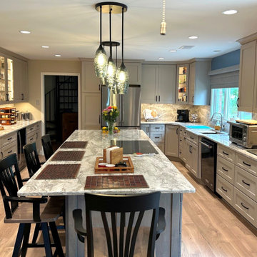 Talon Construction Inc.
Thinking about a kitchen remodel in the Frederick, MD area? Here’s a closer look at one of our recent projects by Talon Construction Inc. - Q&A style:
Q: What makes this kitchen stand out?
A: The oversized island is the centerpiece designed for cooking, gathering, and entertaining all in one space. It’s both functional and a true focal point.
Q: What materials were used for the countertops and backsplash?
A: Vicostone Moonglade Quartz was selected for both the countertops and full-height backsplash, creating a seamless, high-end look with excellent durability.
Q: How does the cabinetry design enhance the space?
A: The combination of light upper cabinets and contrasting gray base cabinets adds depth while keeping the kitchen bright and open. Clean lines and modern hardware complete the look.
Q: What storage solutions were incorporated?
A: This kitchen is packed with smart storage with deep drawers, pull-out organizers, a custom pantry, and built-in features that keep everything accessible and clutter-free.
Q: Is this kitchen designed for everyday living or entertaining?
A: Both. The layout was intentionally designed to support daily functionality while also making it easy to host family and friends.
Q: What role does lighting play in the design?
A: Layered lighting including pendant lights, recessed lighting, and under-cabinet illumination adds warmth, visibility, and a polished finish.
Q: What’s the overall style of this remodel?
A: A clean, modern look with timeless elements that perfectly balancing style, comfort, and long-term value.
Q: What’s the biggest takeaway from this project?
A: A well-designed kitchen isn’t just about looks it’s about creating a space that works beautifully for how you live.
Thinking about transforming your kitchen? Let’s talk.
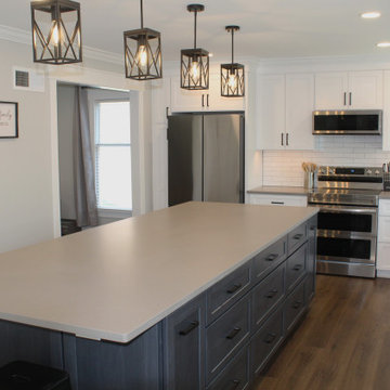 Talon Construction Inc.
An open floor plan kitchen renovation transforms your kitchen from a closed-off space into a sociable and airy heart of the home.
The Walls Come Down: The biggest change is removing walls (or widening doorways) that separate the kitchen from the living room or dining room. This creates a continuous living area bathed in more natural light.
Island Paradise: A kitchen island becomes the centerpiece. It can house your sink, cooktop, offer seating, and provide much-needed prep space. You can choose a large island for entertaining or a smaller one to define the space.
Work Zones Take Shape: Imagine designated areas for specific tasks. A sink area with a dishwasher nearby, a prep zone with ample countertop, and a cooking zone with the oven and cooktop grouped together. This promotes efficiency and a smooth workflow in your kitchen.
Light and Bright: Natural light is key. Large windows or skylights can be incorporated during the renovation to bathe the space in sunshine. Light, reflective surfaces like white cabinets or light-colored countertops also enhance the feeling of openness.
Designing the Flow: Flooring plays a big role in tying the open concept space together. Opt for continuous flooring throughout the kitchen and living area to create a seamless flow. Area rugs can be used later to define separate zones within the open plan.
Don't Forget the Details: Open concept kitchens need clever storage solutions to avoid clutter. Built-in cabinets, pantries, and even hidden storage drawers in the island can keep things organized. To distinguish the kitchen from the living area, consider using a different colored paint scheme on the island or backsplash.
Sponsored
Columbus, OH

Wannemacher Interiors
Customized Award-Winning Interior Design Solutions in Franklin Cnty OH
 Sosna Inc
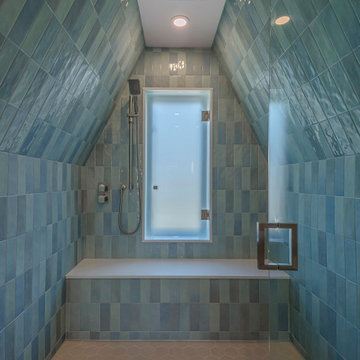
This young couple, busy raising two young boys (plus a playful cat), had always planned to renovate—it was just a matter of finding the right people for the job.
Their biggest concern? Hiring a contractor they could truly rely on to bring their vision to life without added stress.
The master ensuite simply wasn’t working. A large, unused deck-mount tub dominated the space, while the tiny, dim shower made daily routines uncomfortable. The layout didn’t make sense for how they actually used the room, which ended up being mostly for the toilet and vanity. On top of that, the master bedroom sat in an open loft without proper walls or a door, making privacy nearly impossible.
Our solution involved a thoughtful reconfiguration of the ensuite. We removed the oversized tub and replaced it with a spacious walk-in shower. The old, cramped shower space became the perfect spot for a relocated vanity, allowing for better flow and use of the room. Up in the loft, we built a new wall with a door to give the bedroom the privacy it was missing. The stairway was also refreshed with new oak treads and a stained handrail to match the existing flooring.
One challenge during construction was installing the custom shower glass and tile within the sloped ceilings and angled walls—but our team carefully managed every detail to ensure a precise and polished finish.
The new master ensuite now feels like a retreat.
Handmade-style blue subway tiles add a calming pop of colour in the shower, paired with crème porcelain floor tiles. A prefabricated solid wood vanity with quartz countertop, brushed nickel fixtures, and an electric towel warmer complete the space—bringing comfort and functionality together beautifully.
A fun moment during the design phase? We used stools, tables, and even a piano to mock up the future layout—helping the homeowners get a real feel for the spacing between the new vanity and toilet. It was a creative, hands-on way to ensure everyone felt confident moving forward.
Now, the ensuite functions exactly as it should: a fully usable and relaxing 3-piece bathroom, styled just the way they wanted. And with the new loft wall and door, the bedroom finally feels like a true primary suite—private, peaceful, and made for them.
 Sosna Inc
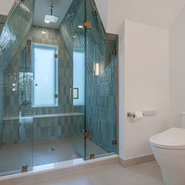
This young couple, busy raising two young boys (plus a playful cat), had always planned to renovate—it was just a matter of finding the right people for the job.
Their biggest concern? Hiring a contractor they could truly rely on to bring their vision to life without added stress.
The master ensuite simply wasn’t working. A large, unused deck-mount tub dominated the space, while the tiny, dim shower made daily routines uncomfortable. The layout didn’t make sense for how they actually used the room, which ended up being mostly for the toilet and vanity. On top of that, the master bedroom sat in an open loft without proper walls or a door, making privacy nearly impossible.
Our solution involved a thoughtful reconfiguration of the ensuite. We removed the oversized tub and replaced it with a spacious walk-in shower. The old, cramped shower space became the perfect spot for a relocated vanity, allowing for better flow and use of the room. Up in the loft, we built a new wall with a door to give the bedroom the privacy it was missing. The stairway was also refreshed with new oak treads and a stained handrail to match the existing flooring.
One challenge during construction was installing the custom shower glass and tile within the sloped ceilings and angled walls—but our team carefully managed every detail to ensure a precise and polished finish.
The new master ensuite now feels like a retreat.
Handmade-style blue subway tiles add a calming pop of colour in the shower, paired with crème porcelain floor tiles. A prefabricated solid wood vanity with quartz countertop, brushed nickel fixtures, and an electric towel warmer complete the space—bringing comfort and functionality together beautifully.
A fun moment during the design phase? We used stools, tables, and even a piano to mock up the future layout—helping the homeowners get a real feel for the spacing between the new vanity and toilet. It was a creative, hands-on way to ensure everyone felt confident moving forward.
Now, the ensuite functions exactly as it should: a fully usable and relaxing 3-piece bathroom, styled just the way they wanted. And with the new loft wall and door, the bedroom finally feels like a true primary suite—private, peaceful, and made for them.
 Sosna Inc
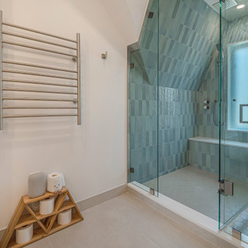
This young couple, busy raising two young boys (plus a playful cat), had always planned to renovate—it was just a matter of finding the right people for the job.
Their biggest concern? Hiring a contractor they could truly rely on to bring their vision to life without added stress.
The master ensuite simply wasn’t working. A large, unused deck-mount tub dominated the space, while the tiny, dim shower made daily routines uncomfortable. The layout didn’t make sense for how they actually used the room, which ended up being mostly for the toilet and vanity. On top of that, the master bedroom sat in an open loft without proper walls or a door, making privacy nearly impossible.
Our solution involved a thoughtful reconfiguration of the ensuite. We removed the oversized tub and replaced it with a spacious walk-in shower. The old, cramped shower space became the perfect spot for a relocated vanity, allowing for better flow and use of the room. Up in the loft, we built a new wall with a door to give the bedroom the privacy it was missing. The stairway was also refreshed with new oak treads and a stained handrail to match the existing flooring.
One challenge during construction was installing the custom shower glass and tile within the sloped ceilings and angled walls—but our team carefully managed every detail to ensure a precise and polished finish.
The new master ensuite now feels like a retreat.
Handmade-style blue subway tiles add a calming pop of colour in the shower, paired with crème porcelain floor tiles. A prefabricated solid wood vanity with quartz countertop, brushed nickel fixtures, and an electric towel warmer complete the space—bringing comfort and functionality together beautifully.
A fun moment during the design phase? We used stools, tables, and even a piano to mock up the future layout—helping the homeowners get a real feel for the spacing between the new vanity and toilet. It was a creative, hands-on way to ensure everyone felt confident moving forward.
Now, the ensuite functions exactly as it should: a fully usable and relaxing 3-piece bathroom, styled just the way they wanted. And with the new loft wall and door, the bedroom finally feels like a true primary suite—private, peaceful, and made for them.
 Talon Construction Inc.
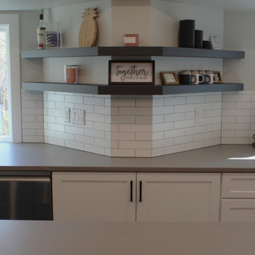
An open floor plan kitchen renovation transforms your kitchen from a closed-off space into a sociable and airy heart of the home.
The Walls Come Down: The biggest change is removing walls (or widening doorways) that separate the kitchen from the living room or dining room. This creates a continuous living area bathed in more natural light.
Island Paradise: A kitchen island becomes the centerpiece. It can house your sink, cooktop, offer seating, and provide much-needed prep space. You can choose a large island for entertaining or a smaller one to define the space.
Work Zones Take Shape: Imagine designated areas for specific tasks. A sink area with a dishwasher nearby, a prep zone with ample countertop, and a cooking zone with the oven and cooktop grouped together. This promotes efficiency and a smooth workflow in your kitchen.
Light and Bright: Natural light is key. Large windows or skylights can be incorporated during the renovation to bathe the space in sunshine. Light, reflective surfaces like white cabinets or light-colored countertops also enhance the feeling of openness.
Designing the Flow: Flooring plays a big role in tying the open concept space together. Opt for continuous flooring throughout the kitchen and living area to create a seamless flow. Area rugs can be used later to define separate zones within the open plan.
Don't Forget the Details: Open concept kitchens need clever storage solutions to avoid clutter. Built-in cabinets, pantries, and even hidden storage drawers in the island can keep things organized. To distinguish the kitchen from the living area, consider using a different colored paint scheme on the island or backsplash.
 Pierre Jean-Baptiste Interiors
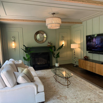
There’s something timeless about a traditional living room—its ability to feel both refined and deeply livable is what makes it such a lasting favorite. In this recent project, we set out to create a space that honored classic design principles while thoughtfully adapting to the realities of modern life—especially in a home shared with two large, beloved dogs.
The foundation of the room begins with color. We selected Sherwin-Williams SW 7741 “Willow Tree” for both the walls and trim, creating a rich, enveloping tone that immediately establishes warmth and cohesion. By carrying the same hue across architectural elements, the space feels grounded and intentional, allowing texture and detail to take center stage rather than contrast alone.
To elevate the architecture, we introduced a series of custom ceiling beams that draw the eye upward and add a sense of structure and craftsmanship. These were complemented by wall and ceiling ogee molding, bringing in a layer of traditional ornamentation that feels both elegant and tailored. The subtle curves of the ogee profiles soften the room while reinforcing its classic character.
Lighting played a key role in enhancing both ambiance and functionality. We incorporated wall sconces to provide a warm, diffused glow in the evenings, creating a cozy and inviting atmosphere. These are balanced by crinkle metal floor lamps, which add a touch of modern texture and visual interest without straying from the overall aesthetic.
At the heart of the room sits a custom-designed sofa—arguably the most important piece in any living space. Given the homeowners’ lifestyle, durability was just as important as beauty. We upholstered the sofa in outdoor-grade Sunbrella fabric, a decision that ensures long-term performance without sacrificing style. The fabric resists wear, stains, and fading, making it an ideal solution for a home with pets while maintaining a polished, tailored look.
Layering was essential in completing the design. A generously sized 9' x 12' area rug anchors the seating arrangement, adding softness underfoot and defining the space. Decorative mirrors were strategically placed to reflect light and create depth, while faux plants introduce greenery without the maintenance—an ideal choice for busy households.
The result is a living room that feels elevated yet approachable, traditional yet practical. It’s a space designed not just to be admired, but to be lived in—where thoughtful material choices and timeless details come together to support both style and everyday life.
 Sosna Inc
This young couple, busy raising two young boys (plus a playful cat), had always planned to renovate—it was just a matter of finding the right people for the job.
Their biggest concern? Hiring a contractor they could truly rely on to bring their vision to life without added stress.
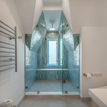
The master ensuite simply wasn’t working. A large, unused deck-mount tub dominated the space, while the tiny, dim shower made daily routines uncomfortable. The layout didn’t make sense for how they actually used the room, which ended up being mostly for the toilet and vanity. On top of that, the master bedroom sat in an open loft without proper walls or a door, making privacy nearly impossible.
Our solution involved a thoughtful reconfiguration of the ensuite. We removed the oversized tub and replaced it with a spacious walk-in shower. The old, cramped shower space became the perfect spot for a relocated vanity, allowing for better flow and use of the room. Up in the loft, we built a new wall with a door to give the bedroom the privacy it was missing. The stairway was also refreshed with new oak treads and a stained handrail to match the existing flooring.
One challenge during construction was installing the custom shower glass and tile within the sloped ceilings and angled walls—but our team carefully managed every detail to ensure a precise and polished finish.
The new master ensuite now feels like a retreat.
Handmade-style blue subway tiles add a calming pop of colour in the shower, paired with crème porcelain floor tiles. A prefabricated solid wood vanity with quartz countertop, brushed nickel fixtures, and an electric towel warmer complete the space—bringing comfort and functionality together beautifully.
A fun moment during the design phase? We used stools, tables, and even a piano to mock up the future layout—helping the homeowners get a real feel for the spacing between the new vanity and toilet. It was a creative, hands-on way to ensure everyone felt confident moving forward.
Now, the ensuite functions exactly as it should: a fully usable and relaxing 3-piece bathroom, styled just the way they wanted. And with the new loft wall and door, the bedroom finally feels like a true primary suite—private, peaceful, and made for them.
 Pierre Jean-Baptiste Interiors
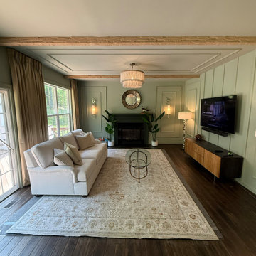
There’s something timeless about a traditional living room—its ability to feel both refined and deeply livable is what makes it such a lasting favorite. In this recent project, we set out to create a space that honored classic design principles while thoughtfully adapting to the realities of modern life—especially in a home shared with two large, beloved dogs.
The foundation of the room begins with color. We selected Sherwin-Williams SW 7741 “Willow Tree” for both the walls and trim, creating a rich, enveloping tone that immediately establishes warmth and cohesion. By carrying the same hue across architectural elements, the space feels grounded and intentional, allowing texture and detail to take center stage rather than contrast alone.
To elevate the architecture, we introduced a series of custom ceiling beams that draw the eye upward and add a sense of structure and craftsmanship. These were complemented by wall and ceiling ogee molding, bringing in a layer of traditional ornamentation that feels both elegant and tailored. The subtle curves of the ogee profiles soften the room while reinforcing its classic character.
Lighting played a key role in enhancing both ambiance and functionality. We incorporated wall sconces to provide a warm, diffused glow in the evenings, creating a cozy and inviting atmosphere. These are balanced by crinkle metal floor lamps, which add a touch of modern texture and visual interest without straying from the overall aesthetic.
At the heart of the room sits a custom-designed sofa—arguably the most important piece in any living space. Given the homeowners’ lifestyle, durability was just as important as beauty. We upholstered the sofa in outdoor-grade Sunbrella fabric, a decision that ensures long-term performance without sacrificing style. The fabric resists wear, stains, and fading, making it an ideal solution for a home with pets while maintaining a polished, tailored look.
Layering was essential in completing the design. A generously sized 9' x 12' area rug anchors the seating arrangement, adding softness underfoot and defining the space. Decorative mirrors were strategically placed to reflect light and create depth, while faux plants introduce greenery without the maintenance—an ideal choice for busy households.
The result is a living room that feels elevated yet approachable, traditional yet practical. It’s a space designed not just to be admired, but to be lived in—where thoughtful material choices and timeless details come together to support both style and everyday life.
139