
Search results for "Someone's" in Home Design Ideas
 Lamont Bros. Design & Construction
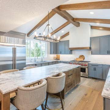
Custom kitchen remodel, involving an addition.
Large u-shaped light wood floor, brown floor and exposed beam open concept kitchen photo in Portland with shaker cabinets, gray cabinets, granite countertops, white backsplash, ceramic backsplash, stainless steel appliances, an island and white countertops
Large u-shaped light wood floor, brown floor and exposed beam open concept kitchen photo in Portland with shaker cabinets, gray cabinets, granite countertops, white backsplash, ceramic backsplash, stainless steel appliances, an island and white countertops

 Home Expressions Interiors by Laura Bloom Inc.
This client came to us wanting to enhance their existing space by using some creative finishes for walls. They hoped to make the home feel more modern with an urban rustic vibe as opposed to the traditional architectural style of the structure but did not know how to accomplish this transition. Upon our arrival it was noted that all walls had been painted white which was determined too harsh and did not achieve the modern feel the homeowner had hoped to evoke. The space was softened by using a subtle and fresh color palette with one accent color for impact. Teal was the color selected to create a continuous thread of pop in varying degrees in each room which included the Entry Hall, Dining Room and Living Room. Touches of black were injected into each space due to the client’s previous purchases of a drum fixture for the living room and black dining table; both gave direction on scale and style.
The Entry Hall was given powerful impact as someone enters the home by taking its cue from the abstract art selected for the Dining Room. A faux concrete wall was created with the use of artistically combined colors. In the Dining Room, the use of classic chairs are successfully made modern by upholstering in teal leather which added both continuity and unexpected interest next to the velvet Greek Key pattern found on host chairs. In the Living Room custom upholstered sofa and chairs are grounded by a rug that brings all colors together. A unique copper rivet finish was applied in the niches that flank the fireplace as a contrast to whimsical amber crystal mini chandeliers hung over modern consoles that display simple yet exciting teal bowls. The final furnishings, art and accessories ultimately brought the entire home together in a rustic, modern way that is warm and inviting reflecting the unique personality of the people who live there.

 Simply Perfect
Advice on interior design is available everywhere—from TV shows and websites to books, magazines and apps.
We love seeing people become engaged in design and educated on the wide range of possibilities. But we hope you’ll proceed with caution.
It’s not that style errors are a matter of life and death. It’s just that it’s easy to choose designs that aren’t necessarily reflective of your own personality and character. And since you’re typically stuck with your interior design decisions for years, styles that don’t quite fit can tend to grate on you.
Interiors that give one person comfort may unleash chaos in someone else. This goes beyond favorite colors or hot trends, right to the heart of interior design, where you find questions of composition, balance, repetition, space and more.
The goal is to find that unique combination of design elements that gives you comfort, support and balance.
In one home, that perfect balance was struck through the use of symmetry. A pair of comfortable swivel chairs sit beneath matching indigo patterned paintings. Matching bookcases below the paintings contain similar, but not identical, arrangements of books, vases and bowls. Woods and bronzes help warm up the simple white bookcase shelving.
Two matching poufs in front of the fireplace provide additional seating. The sofa is accented with a pair of pillows with a blue pattern that echoes the artwork.
The effect of the symmetry is to achieve order and simplicity, which I promote at every opportunity. After all, your home interiors should be the setting or the backdrop of your life—not center stage.
Antique bronze and blue are complementary colors. Together, they offer a rich palette of richness and depth, which brings out the beauty of wood and stone.
In the home office, a unique, whitewash-stained wooden desk rests on metal, Sawhorse-inspired legs for a warm, rustic look. The black leather chair features a contemporary silhouette with an antique brass frame. An adjustable desk lamp has bronze accents.
The bookcase combines a sleek, black metal frame with concrete shelves, for another unusual pairing. It’s kept uncluttered for an orderly, peaceful look. Items on the shelves include a bronze-accented lamp and a pair
of high gloss-finished wooden bookends.
The elegant artwork behind the desk is a simple midnight-blue and bronze with mottled white. Deep blues are again picked up in the rug, which adds a stately vibe with a modern pattern and satisfying texture.
Within the framework of symmetry, the living room repeats the blue-and-bronze color scheme.
A large midcentury brass clock above the fireplace keeps the natural stone visible, rather than hidden behind a painting or television, while its straight lines and color create a beautiful contrast.
The sofa is a soft, neutral blue. The pattern on the round brass side table features echoes the darker blue-patterned rug, as well as the rug in the office, tying the rooms together.
Indigo blue books adjacent to bronze vases on the shelves repeat the color scheme. The soapstone-topped coffee table echoes the shape of the fireplace. A pair of tall, matching floor lamps with long wooden bases, brass pulls and simple linen shades combine both the colors and symmetry found throughout the home.
Find the right local pro for your project


 Action Builders Inc
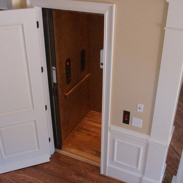
We installed an elevator in this home in the Foyer area. While the master bedroom was on the first floor, their were also bedrooms in the basement and 2nd floor. Having the elevator makes for easy access to the other levels, whether to go to a bedroom or get heavy items to another floor. When/if their parent's ever live with them, having the elevator will make it an easy transition. Home was built by and pictures taken by Mark of Action Builders Inc.
 Simply Perfect
Advice on interior design is available everywhere—from TV shows and websites to books, magazines and apps.
We love seeing people become engaged in design and educated on the wide range of possibilities. But we hope you’ll proceed with caution.
It’s not that style errors are a matter of life and death. It’s just that it’s easy to choose designs that aren’t necessarily reflective of your own personality and character. And since you’re typically stuck with your interior design decisions for years, styles that don’t quite fit can tend to grate on you.
Interiors that give one person comfort may unleash chaos in someone else. This goes beyond favorite colors or hot trends, right to the heart of interior design, where you find questions of composition, balance, repetition, space and more.
The goal is to find that unique combination of design elements that gives you comfort, support and balance.
In one home, that perfect balance was struck through the use of symmetry. A pair of comfortable swivel chairs sit beneath matching indigo patterned paintings. Matching bookcases below the paintings contain similar, but not identical, arrangements of books, vases and bowls. Woods and bronzes help warm up the simple white bookcase shelving.
Two matching poufs in front of the fireplace provide additional seating. The sofa is accented with a pair of pillows with a blue pattern that echoes the artwork.
The effect of the symmetry is to achieve order and simplicity, which I promote at every opportunity. After all, your home interiors should be the setting or the backdrop of your life—not center stage.
Antique bronze and blue are complementary colors. Together, they offer a rich palette of richness and depth, which brings out the beauty of wood and stone.
In the home office, a unique, whitewash-stained wooden desk rests on metal, Sawhorse-inspired legs for a warm, rustic look. The black leather chair features a contemporary silhouette with an antique brass frame. An adjustable desk lamp has bronze accents.
The bookcase combines a sleek, black metal frame with concrete shelves, for another unusual pairing. It’s kept uncluttered for an orderly, peaceful look. Items on the shelves include a bronze-accented lamp and a pair
of high gloss-finished wooden bookends.
The elegant artwork behind the desk is a simple midnight-blue and bronze with mottled white. Deep blues are again picked up in the rug, which adds a stately vibe with a modern pattern and satisfying texture.
Within the framework of symmetry, the living room repeats the blue-and-bronze color scheme.
A large midcentury brass clock above the fireplace keeps the natural stone visible, rather than hidden behind a painting or television, while its straight lines and color create a beautiful contrast.
The sofa is a soft, neutral blue. The pattern on the round brass side table features echoes the darker blue-patterned rug, as well as the rug in the office, tying the rooms together.
Indigo blue books adjacent to bronze vases on the shelves repeat the color scheme. The soapstone-topped coffee table echoes the shape of the fireplace. A pair of tall, matching floor lamps with long wooden bases, brass pulls and simple linen shades combine both the colors and symmetry found throughout the home.

Sponsored
Sunbury, OH

J.Holderby - Renovations
Franklin County's Leading General Contractors - 2X Best of Houzz!

 Kelly Johnson Design
Alise O'brien Photography
Inspiration for a transitional living room remodel in St Louis
Inspiration for a transitional living room remodel in St Louis

 Julie Schuster Design Studio
A warm primary color such as yellow inspires joy, excitement and playfulness... perfect to stage for a children's space! Leaving only a few selected toys to set the scene, but keeping it clean, organized and open for future home buyers to evaluate.
 Simply Perfect
Advice on interior design is available everywhere—from TV shows and websites to books, magazines and apps.
We love seeing people become engaged in design and educated on the wide range of possibilities. But we hope you’ll proceed with caution.
It’s not that style errors are a matter of life and death. It’s just that it’s easy to choose designs that aren’t necessarily reflective of your own personality and character. And since you’re typically stuck with your interior design decisions for years, styles that don’t quite fit can tend to grate on you.
Interiors that give one person comfort may unleash chaos in someone else. This goes beyond favorite colors or hot trends, right to the heart of interior design, where you find questions of composition, balance, repetition, space and more.
The goal is to find that unique combination of design elements that gives you comfort, support and balance.
In one home, that perfect balance was struck through the use of symmetry. A pair of comfortable swivel chairs sit beneath matching indigo patterned paintings. Matching bookcases below the paintings contain similar, but not identical, arrangements of books, vases and bowls. Woods and bronzes help warm up the simple white bookcase shelving.
Two matching poufs in front of the fireplace provide additional seating. The sofa is accented with a pair of pillows with a blue pattern that echoes the artwork.
The effect of the symmetry is to achieve order and simplicity, which I promote at every opportunity. After all, your home interiors should be the setting or the backdrop of your life—not center stage.
Antique bronze and blue are complementary colors. Together, they offer a rich palette of richness and depth, which brings out the beauty of wood and stone.
In the home office, a unique, whitewash-stained wooden desk rests on metal, Sawhorse-inspired legs for a warm, rustic look. The black leather chair features a contemporary silhouette with an antique brass frame. An adjustable desk lamp has bronze accents.
The bookcase combines a sleek, black metal frame with concrete shelves, for another unusual pairing. It’s kept uncluttered for an orderly, peaceful look. Items on the shelves include a bronze-accented lamp and a pair
of high gloss-finished wooden bookends.
The elegant artwork behind the desk is a simple midnight-blue and bronze with mottled white. Deep blues are again picked up in the rug, which adds a stately vibe with a modern pattern and satisfying texture.
Within the framework of symmetry, the living room repeats the blue-and-bronze color scheme.
A large midcentury brass clock above the fireplace keeps the natural stone visible, rather than hidden behind a painting or television, while its straight lines and color create a beautiful contrast.
The sofa is a soft, neutral blue. The pattern on the round brass side table features echoes the darker blue-patterned rug, as well as the rug in the office, tying the rooms together.
Indigo blue books adjacent to bronze vases on the shelves repeat the color scheme. The soapstone-topped coffee table echoes the shape of the fireplace. A pair of tall, matching floor lamps with long wooden bases, brass pulls and simple linen shades combine both the colors and symmetry found throughout the home.

 Dream Kitchens
What had been the family summer “camp” on the lake for many years was to become a summer “home” for the owners in their retirement years. After meeting the requirements for rebuilding at waters edge, the couple focused on their next big requirement: a wonderful kitchen. This kitchen would be part of a single living space that combines the kitchen, dining and sitting areas. They wanted a beautiful, warm, inviting kitchen where they could enjoy their family, a kitchen that would take advantage of views of the lake, a kitchen that would be especially functional for one or more cooks and helpers -- and make it the perfect shade of yellow, please!
While they thought they wanted a kitchen with an island that overlooked the rest of the living space, their designer suggested a U-shaped design. A peninsula would minimize the concern that someone would inadvertently miss the edge of the two steps down to the lower living/dining area. It would also give them a kitchen that would allow for things on their wish list: a mantle style hood, a large window at the back of the house, countertop seating and lots of storage.
Placing the stove and mantle hood in the corner of the room created space for the large window, and opened up space for high quality storage with uninterrupted lengths of countertop. Rather than competing with the windows and the views, the high style of the mantle hood complements and balances the entire space. Glass was added to the upper section of the wall cabinets. They continue the effect of the transom windows and provide for display of pottery that had been collected over the years.
The sink was strategically positioned on the peninsula so that during food preparation or clean up there are views to the lake -- and the opportunity to socialize with people gathered at the countertop or in the living/dining area! Countertop seating was created by angling the extended Shivakashi granite countertop back into the kitchen and away from the steps. A third chair pulls up to the end of the countertop. It’s the favorite seat in the house!
The kitchen in this rebuilt lakeside home is being enjoyed and loved in its perfect shade of yellow – magically named “Full Moon”.
 Simply Perfect
Advice on interior design is available everywhere—from TV shows and websites to books, magazines and apps.
We love seeing people become engaged in design and educated on the wide range of possibilities. But we hope you’ll proceed with caution.
It’s not that style errors are a matter of life and death. It’s just that it’s easy to choose designs that aren’t necessarily reflective of your own personality and character. And since you’re typically stuck with your interior design decisions for years, styles that don’t quite fit can tend to grate on you.
Interiors that give one person comfort may unleash chaos in someone else. This goes beyond favorite colors or hot trends, right to the heart of interior design, where you find questions of composition, balance, repetition, space and more.
The goal is to find that unique combination of design elements that gives you comfort, support and balance.
In one home, that perfect balance was struck through the use of symmetry. A pair of comfortable swivel chairs sit beneath matching indigo patterned paintings. Matching bookcases below the paintings contain similar, but not identical, arrangements of books, vases and bowls. Woods and bronzes help warm up the simple white bookcase shelving.
Two matching poufs in front of the fireplace provide additional seating. The sofa is accented with a pair of pillows with a blue pattern that echoes the artwork.
The effect of the symmetry is to achieve order and simplicity, which I promote at every opportunity. After all, your home interiors should be the setting or the backdrop of your life—not center stage.
Antique bronze and blue are complementary colors. Together, they offer a rich palette of richness and depth, which brings out the beauty of wood and stone.
In the home office, a unique, whitewash-stained wooden desk rests on metal, Sawhorse-inspired legs for a warm, rustic look. The black leather chair features a contemporary silhouette with an antique brass frame. An adjustable desk lamp has bronze accents.
The bookcase combines a sleek, black metal frame with concrete shelves, for another unusual pairing. It’s kept uncluttered for an orderly, peaceful look. Items on the shelves include a bronze-accented lamp and a pair
of high gloss-finished wooden bookends.
The elegant artwork behind the desk is a simple midnight-blue and bronze with mottled white. Deep blues are again picked up in the rug, which adds a stately vibe with a modern pattern and satisfying texture.
Within the framework of symmetry, the living room repeats the blue-and-bronze color scheme.
A large midcentury brass clock above the fireplace keeps the natural stone visible, rather than hidden behind a painting or television, while its straight lines and color create a beautiful contrast.
The sofa is a soft, neutral blue. The pattern on the round brass side table features echoes the darker blue-patterned rug, as well as the rug in the office, tying the rooms together.
Indigo blue books adjacent to bronze vases on the shelves repeat the color scheme. The soapstone-topped coffee table echoes the shape of the fireplace. A pair of tall, matching floor lamps with long wooden bases, brass pulls and simple linen shades combine both the colors and symmetry found throughout the home.


Sponsored
Sunbury, OH
J.Holderby - Renovations
Franklin County's Leading General Contractors - 2X Best of Houzz!

 JSE Interior Design
Plaza 400 is a premiere full-service luxury co-op in Manhattan’s Upper East Side. Built in 1968 by architect Philip Birnbaum and Associates, the well-known building has 40 stories and 627 residences. Amenities include a heated outdoor pool, state of the art fitness center, garage, driveway, bike room, laundry room, party room, playroom and rooftop deck.
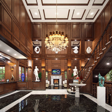
The extensive 2017 renovation included the main lobby, elevator lift hallway and mailroom. Plaza 400’s gut renovation included new 4’x8′ Calacatta floor slabs, custom paneled feature wall with metal reveals, marble slab front desk and mailroom desk, modern ceiling design, hand blown cut mirror on all columns and custom furniture for the two “Living Room” areas.
The new mailroom was completely gutted as well. A new Calacatta Marble desk welcomes residents to new white lacquered mailboxes, Calacatta Marble filing countertop and a Jonathan Adler chandelier, all which come together to make this space the new jewel box of the Lobby.
The hallway’s gut renovation saw the hall outfitted with new etched bronze mirrored glass panels on the walls, 4’x8′ Calacatta floor slabs and a new vaulted/arched pearlized faux finished ceiling with crystal chandeliers and LED cove lighting.

 Kelly Rogers Interiors
Eric Roth Photography
Example of a transitional entryway design in Boston with blue walls
Example of a transitional entryway design in Boston with blue walls


 julianhardacre
Top Tips for Selling a Home in 2016
Want to sell your house in 2016? It’s a great year to sell your home and if you go about it the right way you’ll get what it’s worth and maybe more.
Now I could write this post and do the usual “do this, “do that” type stuff but I wouldn’t be doing you any favors. Because unless you know your numbers and the value of your home, you could wind up leaving money on the table or even losing it.
So here you go.
If you want tips for selling your house in 2016, listen to me - a guy who has bought and sold hundreds of properties as a full-time professional Real Estate Investor. Before you repair anything or call a real estate agent…
...you have to know your numbers.
Tip #1: Know the After Repair Value (ARV) of Your Home
If you’re going to get the right amount of money for your house, you have to know the After Repair Value (ARV). Essentially this means that you should know what your home can sell for after it’s is 100% rehabbed.
If you have a house that you can sell for $120,000, you need to know that. If it will sell for $350,000, you need to know what you need to do to your house to get it there. At the same time, you don’t want to overdo it.
If you have a house that’s currently worth $100,000 as is and it can sell for $115,000 when it’s all fixed up, you may or may not want to put the money into a rehab job. If you put $10,000 in just to make an extra $5,000, it might not be worth the hassle.
So whatever you do, know what it’s worth now (as -is) and know what it’ll sell for afterward. If you want to find out how much your house is worth, there are plenty of agents out there who will give you comps (Comps is a term that is short for “Comparisons” that lets you determine an appraisal value for your home by comparing it to recently sold homes in your area that are similar to yours) or advice for free, so ask them.
So don’t over do it, but don’t be hesitant to put money into your house if it’ll yield a big payoff when you sell it.
TIP #2: Make Your Agent Work For You
After you determine your ARV and enlist a good agent to help you sell your home, It might be worthwhile to hop in their Escalade to drive around town and look at some high end houses in your area to see what kind of upgrades they have. And when you see a common theme, you’ll have a good idea as to what kind of upgrades you might want to do to be able to sell your house.
Granite? Concrete? Tile? Carpet? Wood floors?
It depends.
I don’t know your area or market so you have to do the research, ask your agent questions, and exercise wisdom. Every market is different and you don’t want to put money into an upgrade or rehab if it’s not the type of thing people in your area are looking for.
So talk to a competent agent, and even offer to pay them a bit more in commissions if they can sell your home for a higher price.
This is not a waste of money.
A good agent with a proven track record is worth every penny because they know exactly what needs to be done to sell your home for the most money.
Tip #3: Interior Improvements
So once you have an idea about what your home is worth, have a good agent, and have toured homes in your area to see what kind of upgrades homes in your area typically have, it's time to look at your interior to decide what you should and shouldn’t do to sell your house in 2016.
No matter what you do, you need to be wise about it. Maybe you live in non-traditional or funky house. That’s fine. Just go through 2 or 3 times with a notepad, write down the frustrations you have with it, and do what you need to do to make it functional, warm, beautiful, and inviting.
Interior must-haves:
1. Make sure your kitchen is functional.
2. Always have (or add) a 2nd bathroom: If you don’t have a second bathroom, build one. Sure it could cost you $5-$6k, but it could net you an additional $20k when you sell. No matter what you do, make sure there is a second bathroom. It’s a must.
1. Open floor plans are huge in 2016: If you don’t have one, first- make sure it’s right for your area, and if it is, create one. This might mean building or breaking down a wall, but it’ll pay off in the end.
2. Stage your house: Just do it. Staging your home means that you hire a home stager and/or an interior design consultant (like the lady on Love It or List It) to set up your home in the most inviting way possible and tell you everything you need to do to make it sell. You’ll pay some cash up front but staged homes are shown to sell for 6% to 10% higher according to realtor.org.
Tip #4: Exterior Improvements
Just like the interior, you have to make sure the exterior of your house looks appealing if you want to get the most value of your house in 2016.
Exterior must haves:
1. Add curb appeal: When people pull up to your house, most won’t even want to go inside or look at it unless it looks good from the curb. So make sure it looks gorgeous. Rake the leaves, plant some flowers, mow the lawn - make it inviting.
2. Make sure the picture on the MLS listing matches what your house currently looks like: People don’t want to look at a picture and pull up to your house, only to be disappointed.
3. Hire a professional photographer: This is crucial. It could mean the difference between someone viewing your house, or someone skipping it because the pictures look like a child took them. Hire a pro - it’s worth it. Ask me how I know.
4. Don’t paint your house diarrhea green or brown: This is just common sense. If you’re going to paint, use a neutral color. You don’t want to make your house unsellable because you chose an odd color or made a bad decision elsewhere.
Tip #5: Common Sense, Common Sense, Common Sense
No matter what you do or do not do, don’t make any hasty decisions. Ask your agent questions, look around, be observant, and don't do anything extreme. If you need to fix up your house to see a big profit, do it. If you have a modest budget and improvements won’t raise the value or your house (the ARV) anyways, don’t go crazy.
2016 is a great year to sell your house.
Do it right and do it wisely.
Cheers,
Nate
---
Nate Pyles is a long term Real Estate Investor who made it through the crash in 2008 and spends his week buying and selling houses for profit in the Boise, ID area. He runs House Flip Mentor, has 4 kids, a gorgeous wife, loves to fly, and even built his own Irish pub on his property.

 Dream Kitchens
What had been the family summer “camp” on the lake for many years was to become a summer “home” for the owners in their retirement years. After meeting the requirements for rebuilding at waters edge, the couple focused on their next big requirement: a wonderful kitchen. This kitchen would be part of a single living space that combines the kitchen, dining and sitting areas. They wanted a beautiful, warm, inviting kitchen where they could enjoy their family, a kitchen that would take advantage of views of the lake, a kitchen that would be especially functional for one or more cooks and helpers -- and make it the perfect shade of yellow, please!
While they thought they wanted a kitchen with an island that overlooked the rest of the living space, their designer suggested a U-shaped design. A peninsula would minimize the concern that someone would inadvertently miss the edge of the two steps down to the lower living/dining area. It would also give them a kitchen that would allow for things on their wish list: a mantle style hood, a large window at the back of the house, countertop seating and lots of storage.
Placing the stove and mantle hood in the corner of the room created space for the large window, and opened up space for high quality storage with uninterrupted lengths of countertop. Rather than competing with the windows and the views, the high style of the mantle hood complements and balances the entire space. Glass was added to the upper section of the wall cabinets. They continue the effect of the transom windows and provide for display of pottery that had been collected over the years.
The sink was strategically positioned on the peninsula so that during food preparation or clean up there are views to the lake -- and the opportunity to socialize with people gathered at the countertop or in the living/dining area! Countertop seating was created by angling the extended Shivakashi granite countertop back into the kitchen and away from the steps. A third chair pulls up to the end of the countertop. It’s the favorite seat in the house!
The kitchen in this rebuilt lakeside home is being enjoyed and loved in its perfect shade of yellow – magically named “Full Moon”.
 Dream Kitchens
What had been the family summer “camp” on the lake for many years was to become a summer “home” for the owners in their retirement years. After meeting the requirements for rebuilding at waters edge, the couple focused on their next big requirement: a wonderful kitchen. This kitchen would be part of a single living space that combines the kitchen, dining and sitting areas. They wanted a beautiful, warm, inviting kitchen where they could enjoy their family, a kitchen that would take advantage of views of the lake, a kitchen that would be especially functional for one or more cooks and helpers -- and make it the perfect shade of yellow, please!
While they thought they wanted a kitchen with an island that overlooked the rest of the living space, their designer suggested a U-shaped design. A peninsula would minimize the concern that someone would inadvertently miss the edge of the two steps down to the lower living/dining area. It would also give them a kitchen that would allow for things on their wish list: a mantle style hood, a large window at the back of the house, countertop seating and lots of storage.
Placing the stove and mantle hood in the corner of the room created space for the large window, and opened up space for high quality storage with uninterrupted lengths of countertop. Rather than competing with the windows and the views, the high style of the mantle hood complements and balances the entire space. Glass was added to the upper section of the wall cabinets. They continue the effect of the transom windows and provide for display of pottery that had been collected over the years.
The sink was strategically positioned on the peninsula so that during food preparation or clean up there are views to the lake -- and the opportunity to socialize with people gathered at the countertop or in the living/dining area! Countertop seating was created by angling the extended Shivakashi granite countertop back into the kitchen and away from the steps. A third chair pulls up to the end of the countertop. It’s the favorite seat in the house!
The kitchen in this rebuilt lakeside home is being enjoyed and loved in its perfect shade of yellow – magically named “Full Moon”.

78