
Search results for "Source stage" in Home Design Ideas

 TKSL Construction
Patio - small traditional backyard stamped concrete patio idea in Denver with no cover

 Spire North
Tucked away in the backwoods of Torch Lake, this home marries “rustic” with the sleek elegance of modern. The combination of wood, stone and metal textures embrace the charm of a classic farmhouse. Although this is not your average farmhouse. The home is outfitted with a high performing system that seamlessly works with the design and architecture.
The tall ceilings and windows allow ample natural light into the main room. Spire Integrated Systems installed Lutron QS Wireless motorized shades paired with Hartmann & Forbes windowcovers to offer privacy and block harsh light. The custom 18′ windowcover’s woven natural fabric complements the organic esthetics of the room. The shades are artfully concealed in the millwork when not in use.
Spire installed B&W in-ceiling speakers and Sonance invisible in-wall speakers to deliver ambient music that emanates throughout the space with no visual footprint. Spire also installed a Sonance Landscape Audio System so the homeowner can enjoy music outside.
Each system is easily controlled using Savant. Spire personalized the settings to the homeowner’s preference making controlling the home efficient and convenient.
 Architect
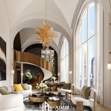
Not all architectural imagery is created equal. Some renderings look obviously computer-generated, with flat lighting and plastic-looking materials that fail to convince viewers. Others are so precise that they are indistinguishable from photographs. That second category, realistic architectural visualization rendering, has become the standard expectation for architects, developers, and marketers who need imagery capable of withstanding close scrutiny from investors, buyers, and planning authorities. As audiences grow more visually literate, the tolerance for obviously artificial, video-game-like imagery in professional presentations continues to shrink.
What Sets Realistic Visualization Apart
Realistic architectural visualization goes beyond simply modeling a building in three dimensions. It requires physically accurate lighting simulation, true-to-life material properties, and careful attention to the small imperfections that make real-world photography convincing, such as subtle reflections, ambient occlusion in corners, and natural depth of field. The goal is an image that a viewer would believe was captured by a camera on-site rather than generated by software. Achieving that level of believability typically means dozens of small adjustments layered on top of one another rather than any single dramatic setting.
Realistic Versus Stylized Rendering Approaches
Stylized or conceptual renderings still have their place, particularly in early design phases when a looser, more artistic representation helps convey mood without locking in every detail. But once a project moves toward marketing, investment, or permitting, stakeholders need to see exactly what they are getting. Realistic visualization removes ambiguity, showing true material colors, accurate proportions, and honest lighting conditions rather than idealized abstractions. Understanding which approach a project actually needs at each stage helps clients avoid paying for a level of polish that a given milestone does not yet require.
Why Realism Builds Client and Buyer Confidence
Buyers and investors are understandably skeptical of overly polished or unrealistic marketing images. When a rendering looks convincingly real, it builds trust rather than raising doubts about what the finished project will actually look like. This is especially important in real estate presales, where buyers are committing significant sums based largely on visual material rather than a finished physical space. A rendering that later turns out to have misrepresented the finished product can also create legal and reputational exposure for developers, making accuracy a genuine business risk rather than just an aesthetic preference.
The Technical Pillars Behind Every Realistic Scene
Achieving true realism depends on several technical disciplines working together: physically based rendering engines that simulate how light actually behaves, high-resolution texture libraries that replicate real materials like stone, wood, and glass, and careful camera work that mimics real photographic lenses and exposure. Post-production adds a final layer of color grading and atmospheric effects that ties everything together into a cohesive, believable image. Each of these pillars depends on the others; even flawless material work can be undermined by lighting that behaves in a physically implausible way.
Applications Across Residential, Commercial, and Institutional Projects
Realistic visualization serves a wide range of building types, from single-family homes and luxury condominiums to office towers, hotels, schools, and healthcare facilities. Each typology has its own material palette and lighting expectations, and an experienced studio adjusts its approach accordingly, whether that means warm, inviting tones for a residential lobby or crisp, professional lighting for a corporate headquarters. Institutional clients such as universities and hospitals often have additional requirements around accessibility signage and wayfinding, which need to be represented accurately alongside the architecture itself.
How AIMIR CG Delivers Photorealistic Accuracy
Our studio specializes in realistic architectural visualization rendering that holds up under close inspection. Every project moves through a disciplined pipeline of modeling, texturing, lighting, and post-production review, with artists cross-checking material references and lighting studies against real-world photography. This attention to detail is why clients consistently describe our end product as impressive and our process as easy to work with. A dedicated quality review stage before delivery catches inconsistencies that might otherwise slip through a faster, less structured pipeline.
Common Challenges in Achieving True Realism
Realistic rendering is technically demanding. Common obstacles include accurately simulating how light bounces between surfaces, matching material reflectivity to real product specifications, and avoiding the uncanny, slightly artificial look that comes from over-processed images. Overcoming these challenges requires experienced artists who understand both the science of light and the craft of photography, not just software proficiency. Rushed production schedules are often the real culprit behind unconvincing renderings, since realism typically requires several iterative passes rather than a single render.
What to Look for in a Realism-Focused Rendering Studio
When evaluating a rendering partner, review their portfolio critically. Do the images include convincing shadow detail and material variation, or do surfaces look uniformly smooth and artificial? Ask about their revision process and how closely they work with architects to source accurate material and lighting references, since realism is ultimately the product of disciplined collaboration, not a single software setting. It also helps to ask for examples of past projects in a similar building type, since a studio's strengths can vary across typologies.
Ready for Renderings That Look Real
If your project deserves imagery that can stand up to the scrutiny of investors, buyers, and planning boards, AIMIR CG is ready to help. Our team combines technical precision with artistic judgment to deliver visualization that looks and feels genuinely real. Contact us to discuss how photorealistic rendering can strengthen your next presentation or marketing campaign, and let us show you examples from projects similar to your own.
Find the right local pro for your project

 Marula Landscape & Design
Design ideas for a mid-sized rustic partial sun hillside stone formal garden in Austin for summer.
 Ferriss - Architectural Renderings
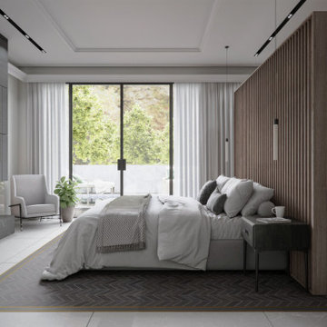
7 mistakes in bedroom design and ways to avoid them.
ERROR # 1 - Incorrect bed size.
This is a problem with any furniture in principle. When, according to the plan and ergonomic calculations, it becomes size to size, but in fact, it looks cumbersome, visually overflowing the space or, on the contrary, turns out to be too small and looks awkward.
How to avoid: Always be guided by the proportions of the size of the furniture in the room. Try to choose as big a bed as possible, but stay realistic. The main thing is that the width of the passageways in the bedroom should not be less than 70cm, and for comfortable movement, it is better to do everything 100cm.
ERROR # 2 - Poor lighting and switches.
Even in a small bedroom, you need multiple light sources. A single chandelier in the center of the ceiling is not enough, because it creates the effect of darkening the corners, and the room seems uncomfortable.
How to avoid: Hang a sconce over your headboard. Don't forget to light up the space next to the mirror and wardrobe. And be sure to place switches close to the bed so that you don't have to go to the other end of the room after an evening with a book in bed.
Do not forget about a sufficient number of outlets, this should be done even at the planning stage.
ERROR # 3 - Few storage locations
The fewer well-thought-out cabinets and shelving, the more things are visible. And the clutter spoils even the most stylish and expensive interior.
How to avoid: In addition to bedside tables, a chest of drawers (for storing small things) and a built-in wardrobe can be placed in a small bedroom: unlike a usual one, it takes up space from floor to ceiling, thereby accommodating more items. In addition, the built-in structure looks more solid and often merges with the walls, making the setting complete.
ERROR # 4 - Carpet of the wrong size.
The carpet in the bedroom is a great addition, and sometimes the final touch of the whole composition. But often people choose the wrong size or do not use it at all.
How to avoid: Choosing the right size can be guided by the unspoken rule, according to which the carpet should be 1 meter larger than the bed, both lengthwise and across. If the room is large, then it is recommended that the indentation of the carpet from the wall is 45-50 cm, if it is small, then 20-30 cm can be dispensed with.
ERROR # 5 Typical design.
If you buy a typical bed, bedside tables, and wardrobe from one manufacturer, then the interior will turn out to be formulaic and impersonal. No accessories and color schemes will help him.
How to avoid: The interior should reflect the character of its owner, and the person living in it will feel comfortable. Explore different collections of furniture and try to assemble a capsule in the same color scheme, but at the same time different in texture and shape.
ERROR # 6 Empty walls.
Even if the bedroom is a room for relaxation, it would be a mistake to make a space out of it that is intended solely for sleeping. Ascetic furnishings, unadorned walls, boring furniture, and bed linen - all this does not improve the mood at all, but, on the contrary, creates a gloomy mood.
How to avoid: The walls in the bedroom are a blank slate that you can transform into something original, beautiful, and unique to your liking. Even if you just paint one of the walls in a contrasting color, and decorate the other with several photos from the Internet, printed and inserted into frames, you can transform the atmosphere of the room as a whole.
ERROR # 7 Too dark interior.
One should not be deceived by the beauty of the thick dark tones of interior paint. It has long been known that dark blue, burgundy, blueberry, chocolate, and black for the bedroom should not be used in large quantities, since such an environment will have a tangible effect and interfere with a vigorous awakening in the morning.
How to avoid: If you like a rich range, try choosing derived shades a few tones lighter, for example, instead of black or graphite, choose gray-brown, dove-gray for the walls, and blue can be replaced with cornflower blue or azure.
Don't forget to combine dark tones with lots of whites, creams, complementing shimmery accessories, and vibrant décor.
https://www.ferriss.co/
#ferriss #We_bring_objects_to_life #3drendering #architecture #San_Francisco

 Harrison and Sons Construction LLC
Farm house themed basement with drift wood finished trim, bathroom, and wet bar
Large country underground vinyl floor and gray floor basement photo in Chicago with gray walls
Large country underground vinyl floor and gray floor basement photo in Chicago with gray walls

 Lands End Development - Designers & Builders
Corner shower - mid-sized rustic 3/4 metal tile ceramic tile and brown floor corner shower idea in Minneapolis with flat-panel cabinets, medium tone wood cabinets, a two-piece toilet, orange walls, a console sink and white countertops

Sponsored
Delaware, OH

Buckeye Basements, Inc.
Central Ohio's Basement Finishing ExpertsBest Of Houzz '13-'21
 Tile Doctor Ltd
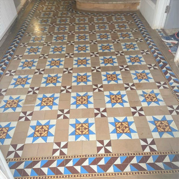
These pictures of a Victorian Tiled Hallway are from a property in Canterbury that was once a nursing home and was now being renovated to become a children’s home. The building was being gutted and extended at the same time and when the carpet was pulled up in the hallway, they were surprised to find a relatively intact Victorian tiled floor underneath.
Whilst they thought it bizarre that anyone would want to cover up such an attractive floor the carpet had protected it over the years. They realized it would make a marvellous feature at the entrance to the property, but professional restoration would be needed to do it justice. After a bit of research, they came across Tile Doctor and got in touch.
Canterbury comes under my North Kent designation, so I went to visit the property and survey the floor and quote for doing the restoration. There were a few missing and loose tiles that would need replacing and refixing also there was a lot of ingrained dirt so a deep clean and application of a new sealer would be required. I gave them a price for the work which they readily accepted, and we arranged a suitable time to carry out the work. Subject to the building schedule I had calculated the floor would take three days to restore.
On the first day I set about replacing and re-fixing the missing, broken, and loose tiles. This is delicate work as you need to extract the old tile without disturbing its neighbours and then clean up the area ready for its replacement. Being a Tile Doctor I keep a selection of stock tiles for repairs, some are reclaimed, and some are replica. Also, there are several companies still making Victorian style tiles so I can usually source what I need.
After the individual missing and broken tiles had been replaced and the adhesive had set, it was then a matter of renovating the floor as a whole. The tiles were covered in a thick layer of carpet adhesive which needed a combination of specialist tools and products to remove. First, a liberal layer of Tile Doctor Remove and Go was applied and left to dwell for thirty minutes. Next, Tile Doctor Pro-Clean was added and scrubbed in with a black pad.
This process softened the adhesive sufficiently in readiness for the next stage which involves using a set of diamond burnishing pads on a weighted buffing machine. Several applications were needed, each time with a successively finer grade of diamond pad and rinsing off the slurry in between. The tiles were first milled using a very coarse 50-grit pad, followed by 100, 200 and finally burnished with a 400-grit burnishing pads. This removed all the adhesive and dirt in the tiles, which was cleaned up using the wet vacuum.
Old Victorian floors like this do not have a damp proof membrane installed under the floor, and with a lot of water being used in the cleaning process I was concerned White efflorescence salts could appear later as the floor dried. To counter this, I gave the floor an acid wash using Tile Doctor Acid Gel to counter and dissolve the salts, it also gives the tiles another clean and will remove any old grout smears further improving the appearance of the tiles. Once done the floor was left to dry overnight.
On my return I tested the floor was dry by taking several moisture readings around the floor with a damp meter. Applying sealer to a damp floor is never advised and can lead to clouding and an unwanted finish.
Happy that the tiles were dry, a single coat of Tile Doctor Colour Grow sealer was applied. This is an impregnating sealer with a colour enhancing component to ‘lift’ the stronger colours of the floor. Colour Grow however does leave a matt appearance and as the client had asked for a shiny finish it was topped up with five coats of Tile Doctor Seal and Go. This is a compatible topical sealer which added a mid to high sheen.
By the end of the third day the Victorian floor looked brand new, and I received the following feedback from the client. Its rare to receive feedback from commercial customers so they were clearly overwhelmed with the transformation.
Did not think this glued covered bad old floor could look sooooo good Fabulous Fantastic job Looks Amazing Thank you
For aftercare I recommend the use of Tile Doctor Neutral Cleaner which isn’t as harsh as many of the products you find in supermarket. Stronger products can actually strip off the sealer over time leaving it vulnerable to dirt and detracting from its appearance.
Graham Davis
North Kent Tile Doctor

 Maher & Greenwald Fine Gardens
This is an example of a large traditional partial sun backyard stone garden path in New York.


 Arbordale Landscaping Ltd
Standing on the balcony off the home owners bedroom, we get a view of the lounging area with the large umbrella. Limestone steppingstones create a nice transition from gravel pathway to limestone lounging patio. Beech hedge separates the spaces, and hides the storage and utility areas.

 David R. Lamb, Landscape Architect
This propery is situated on the south side of Centre Island at the edge of an oak and ash woodlands. orignally, it was three properties having one house and various out buildings. topographically, it more or less continually sloped to the water. Our task was to creat a series of terraces that were to house various functions such as the main house and forecourt, cottage, boat house and utility barns.
The immediate landscape around the main house was largely masonry terraces and flower gardens. The outer landscape was comprised of heavily planted trails and intimate open spaces for the client to preamble through. As the site was largely an oak and ash woods infested with Norway maple and japanese honey suckle we essentially started with tall trees and open ground. Our planting intent was to introduce a variety of understory tree and a heavy shrub and herbaceous layer with an emphisis on planting native material. As a result the feel of the property is one of graciousness with a challenge to explore.

 Klopf Architecture
From Mid-Century Classic to the Present
An iconic design updated with comfort, function, and flow for today.
A Remodel That Balances Past and Present
What started as a desire to update a classic Eichler soon became an exploration of how Mid-Century Modern design can successfully evolve for today. The client, a tech professional with a passion for scuba diving and underwater photography, wanted a home that would both honor its original character and feel tailored to his daily life. A lifelong technology enthusiast, he still owns the very first Mac desktop he saved up for as a teenager working at Radio Shack, a detail that underscores his appreciation for design that melds function and form.
Honoring Separation While Expanding Possibility
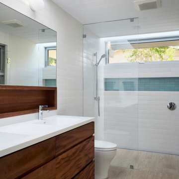
Unlike many contemporary remodels where walls are opened up to create expansive living spaces, this project took a more restrained approach. The client valued the defined rooms of the original plan and wanted to preserve as much wall space as possible for displaying his large-format underwater photography. The emphasis was not on dramatic spatial reinvention, but on thoughtful refinements. Klopf Architecture shaped a gallery-like backdrop while also expanding the primary suite, modernizing materials and fixtures throughout the home, and improving the functionality and layout of the kitchen. The finished home feels at once timeless and renewed, an Eichler that continues to inspire while fully supporting the lifestyle of its present-day owner.
A major turning point came mid-design. The original project brief had not included an addition, but as the reconfiguration of the primary bedroom and bath unfolded, it became clear that an expansion was the best approach to achieve the client’s vision of a more spacious suite. Fortunately, the adjustment came at a stage when revisions were still manageable and was integrated seamlessly, showing how thoughtful course corrections can strengthen a project rather than hinder it.
Navigating Challenges With Precision
The design development included multiple conceptual rounds, balancing preservation with subtle expansion. During construction, an existing post previously thought to be load-bearing turned out not to be. The structural engineer was able to pivot quickly, and both the post and the cross beam that had been intended to replace it could be omitted, allowing the original rhythm of the Eichler beam bays to be preserved.
Sustainability was not just a checklist item, but a way to align the home with the client’s values of simplicity, efficiency, and long-term functionality. R-38 roof insulation reduced energy usage, solar panels with battery storage provided independence and resilience, and passive comfort strategies eliminated the need forenergy-intensive air conditioning. An electric vehicle charger and an on-demand hot water recirculation system (with call buttons as opposed to having constant circulation) add to the home’s long-term efficiency factors. Together, these moves created a home that is quieter, more comfortable, and better equipped for the future, qualities that supported the client’s pragmatic approach to design and living lightly.
Details That Respect the Eichler DNA
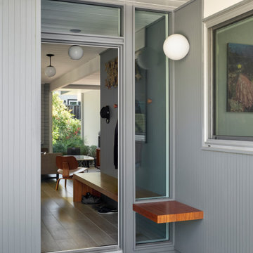
The remodel carries forward the Eichler’s original spirit while introducing new layers of modern livability. Originally, the house was approached along a deep, narrow walk, with the garage on one side and the house on the other, leaving the front door tucked far back within this chasm-like space. By pulling the entry forward, the design reshaped the arrival experience, creating a clearer threshold and a natural drop-off zone for bags, shoes, and keys. This shift also made room for a custom bench at the entry that extends seamlessly through the glass sidelight. The bench and drop-off zone now work together as a single, integrated sequence that supports everyday living while offering a tactile reminder of Eichler’s philosophy of connectedness.
At the client’s request, Klopf reintroduced a classic Eichler gesture by extending the exterior siding into the entry and living room. The detail reinforces a sense of indoor/outdoor continuity while providing a subtle architectural surface that allows the client’s photography to take visual precedence.
The signature concrete masonry wall at the front was reconstructed using blocks sourced to match the originals, now strengthened with rebar for seismic resilience while maintaining a private outdoor courtyard, visually extending the kitchen outward. A decorative trellis element, a detail borrowed from a neighboring Eichler, restores a familiar mid-century modern architectural motif. At the courtyard entry door, a custom etched glass sidelight with an ocean-themed design featuring kelp and jellyfish serves as a subtle homage to the client’s passion for deep-sea diving.
Landscaping became an integral part of the overall transformation. The homeowner engaged landscape architect Randi Johnsen of Third Nature Studio to shape a series of calm, inviting outdoor rooms that read as a natural extension of the interiors. While technically outside of the core construction scope, the landscape design proved central to achieving a sense of completeness and connectedness across the property. Such whole-property considerations often emerge as design ideas take shape, underscoring the importance of flexibility in planning and budgeting, as well as close collaboration among the design team starting early in the process.
The Value of Evolving Scope
As with many custom residential projects, the scope evolved during the design process. What began as a targeted remodel grew to include a new/expanded primary suite, a rebuilt CMU patio wall for strength and longevity, and a solar panel array and battery storage for energy resilience and carbon-reduction. Each thoughtful decision represented a conscious investment in the home’s performance and character, rather than a cost overrun.
The result was a project delivered on schedule, tailored precisely to the client’s lifestyle, and positioned to add long-term value both functionally and aesthetically. By embracing scope evolution as an opportunity rather than a challenge, and relying on good design paired with transparent communication, this remodel demonstrates how Eichler homes can be adapted for contemporary living without erasing their DNA.
Klopf Architecture project team: John Klopf, AIA, and Klara Kevane, Elise Webb and Nicholas LaNasa.
Contractor: Golden Cove Construction
Landscape Design: Third Nature Studio
Structural Engineer: Daniel Bastiao Design
Photography: ©2025 Mariko Reed
Year Completed: 2024
Location: Sunnyvale, CA
 E. F. San Juan
Published in Coastal Lifestyle Magazine, March 2021
www.coastallifestylemagazine.com/alys-beach-home
Photography by Colleen Duffley
When Marianne Temple and Robyn Prince, the principals of Home Design Group of Atlanta and Santa Rosa Beach, were brought in to work their magic on a home in Alys Beach, the design phase and much of the construction was complete. They welcomed the opportunity to get involved in the important final stage and to bring fun and whimsy along with casual elegance to the project. The owners – a young family with children and dogs – knew what they were looking for in a long-term vacation destination. They had engaged the services of Domin Bock Architects of Rosemary Beach and general contractor Hufham Farris Construction of Santa Rosa Beach to design and build a home that is child-friendly and low maintenance, but timeless and welcoming at the same time. When Temple and Prince came aboard, their mission was to make the Alys Beach home a reflection of the owners’ personality and lifestyle. “I like to think we were successful,” says Temple. “We were able to source all the bedding, draperies, and other soft goods, and to assist in selecting lighting, art, and accessories throughout the home.”
The home is located on the south side of 30A and enjoys access to all of the Alys Beach amenities. In addition, it has a pool, which quite literally seems to be the center – and the heart – of the home. The square pool can be accessed directly by steps from the private courtyard patio and is anchored by a stunning water wall and oversize stepping stones along one side. The expansive great room has unobstructed views of the pool through floor-to-ceiling glass panels. The room is furnished with low, plush upholstered pieces with rich blue accents, and an oval dining table with a stunning chandelier above. The bleached pecky cypress ceilings by E.F. San Juan are punctuated with substantial white-painted beams. Set apart by a sleek oversized island with a farmhouse sink, the open kitchen provides plenty of room for gathering or dining and is topped off by three matching gold-trimmed white pendant lights. The restaurant-quality six-burner cooktop in the arched wall opposite is flanked by tall cabinets and topped by four clerestory windows that admit wonderful light to the entire space. There is one guest bedroom on the main level, with a full bath, spacious closet, and a private sitting area.
E. F. San Juan of Youngstown, Florida, supplied all the woodwork details that provide finishing touches to the residence’s crisp white canvas in this quintessential courtyard home. Like many of the community’s buildings, this private residence contains minimal woodwork, maintaining the clean, elegant Alys Beach vision; still, the interior and exterior trim and brackets offer a sleek yet natural feel reflecting the beaches that are steps away from the front door. Their team worked with Weather Shield to provide stunning and functional custom impact-rated windows and Loewen to create custom doors that protect the house from the Gulf Coast elements.
“We have had the privilege of creating wood parts and custom doors, railings, and gates for many of the gorgeous homes in Alys Beach,” says E. F. San Juan president Edward A. San Juan. “This home’s minimal trim makes the other wood elements stand out, like the pecky cypress ceilings. The windows and doors are often-overlooked elements that we love collaborating on with our vendors like Loewen and Weather Shield because they make such good-looking products. They open up this home to the beautiful natural light, the courtyard pool, and the stunning views of the town just outside while also protecting from high winds, rain, and U.V. rays.”
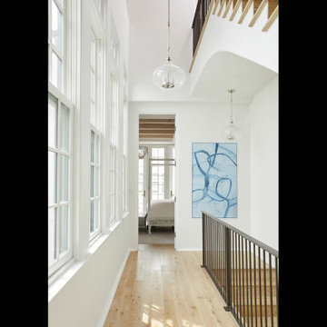
The broad wooden staircase with open metal handrails leads to the sleeping quarters. The second floor houses the master suite with custom barn doors, also by E.F. San Juan, leading into the master bathroom with its luxurious bath and unique freestanding tub. A second guest room with a king-size bed and full bath also occupy the second floor. “The master bath is definitely my favorite feature of the home,” says Temple. “It is beyond all expectation – a true luxury.” The adult bedrooms are serene and sophisticated, with sleek lines and restful blue hues throughout. Cathedral ceilings, arched openings for the beds, sun-drenched sitting areas, plenty of natural light, and luxurious baths contribute to the feeling of peaceful elegance.
The children’s areas are in direct and happy contrast to the adults’ retreats. The bunk room, also on the second level, is just plain fun, with two sets of custom-built marine blue bunks piled high with pillows and whimsical stuffed animals, flanking a tall set of shelves full of toys and books. Oversize baskets provide storage for more toys, and colorful throw rugs provide plenty of sitting space for floor playtime. This kid-friendly space can grow and change with the children who occupy it – it will work well for tweens, teens, and beyond. “We designed the bunk room,” says Prince, “and I think it is a huge success. It may be my favorite feature of the home.”
The top floor is dedicated to the children’s den/playroom/media room and the dramatic rooftop lounge. The children’s space is furnished with beanbag chairs, a low game table, a big-screen television mounted on a custom-fabricated aqua wall, and arched French doors leading to the rooftop lounge area. “This area is, quite literally, the icing on the cake,” says Temple. “It boasts a view of the Gulf and great views down South Charles Street.” This secluded deck features a gas fireplace and comfy furnishings for enjoying beautiful evenings year-round.
HOME DESIGN GROUP
(229) 347-6052
homedesigngrp.com
E.F. SAN JUAN
(850) 722-4830
efsanjuan.com
 Arbordale Landscaping Ltd
Unilocks Roman Pisa walling makes up the wall, step risers, and pillars on this job. We hand chiselled the Limestone steps, wall copings, and pillar caps. Good sized upper patio for outdoor dining and entertaining.
 Neumann & Rudy Architecture
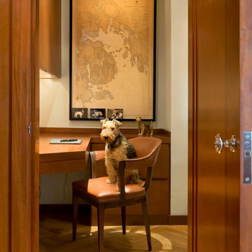
This image performs an act of deliberate spatial framing: we are positioned as intruders in a threshold, the photograph's foreground bracketed by two monumental slabs of mahogany-toned door leaf and jamb that compress the visual field into a portal roughly one-third the width of the frame. The composition is therefore a study in *enfilade* logic — a controlled, telescoping sightline that draws the eye through a narrow aperture into a recessed alcove, a purpose-built writing niche carved from what appears to be a corridor or dressing-room vestibule. The niche itself is architecturally modest in footprint but generous in vertical proportion; the ceiling reads as a plain plastered plane, unadorned save for a surface-mounted linear picture light on a slender drop stem, and the wall is treated as a full-height field for a single dominant object. The joinery is the true architecture here: a continuous run of casework establishes a horizontal datum at desk height, with a cantilevered writing surface returning perpendicular to the left-hand wall and a lower bank of drawers and a shallow ledge running right. That ledge functions as a *cimaise* or picture shelf, resolving the base of the framed nautical chart and giving the composition a plinth. Above, an integrated soffit or upper cabinet with concealed under-lighting terminates the left elevation, reinforcing the sense of an inhabited, tailored recess rather than a room. The herringbone parquet in the foreground introduces a diagonal geometry that runs counter to the orthogonal grid of doors, casework and picture frame, and this friction — chevron against rectilinear — animates what would otherwise be a static, axial composition. The single chair, canted slightly off-axis and pulled away from the desk, is the compositional pivot: it breaks the symmetry, occupies the exact center of the aperture, and converts an architectural vignette into a narrative one.
The palette is a disciplined exercise in the warm end of the spectrum, essentially monochromatic in hue and differentiated almost entirely by value, sheen and grain. The dominant material is timber, deployed in at least three distinct registers: the foreground door and jamb in a deeply saturated, red-brown mahogany or sapele with a high-build lacquer or French-polish sheen that catches light in long vertical highlights; the desk and casework in a lighter, honeyed figured wood — quartered cherry or anigre — finished to a satin rather than gloss, so that the eye reads it as a working surface rather than a ceremonial one; and finally the pale, blond oak of the herringbone floor, cerused or naturally oxidized to a straw tonality that lifts the lower register of the frame. Against this timber triad, the walls provide a chalky, low-saturation ground: a limewashed or flat-emulsion cream with a distinctly yellow-warm undertone that absorbs rather than reflects. The upholstery is the room's chromatic keynote — a saddle-tan or cognac leather, semi-aniline, already developing patina and slight slouch at the seat, its edge articulated by a close-set brass or antique-nickel nailhead trim that reads as a stitched seam of tiny metallic points. Metals are used sparingly and with historical precision: the polished chrome rosette and knob of the door with its heavy escutcheon and mortise strike plate, the slim brushed housing of the picture light. Texturally, the room stages a dialogue between the hard, reflective and the soft, absorbent: lacquer against limewash, taut leather against the friable, foxed paper of the antique chart. That chart — a hydrographic survey rendered in ochre, sepia and faded aqua, its ebonized frame supplying the composition's only true black — is the material anchor, its aged paper introducing a granular, time-worn texture that no new surface in the room could supply. The terrier, coincidentally or not, participates in this material scheme: a wiry tan-and-black coat that reads as a textile in its own right, tonally identical to the leather beneath it.
The lighting design is layered, warm-Kelvin and almost entirely artificial in its narrative effect, though the scene depends on a critical unseen source. A shaft of low, raking daylight enters from the right — presumably a window outside the frame — and lands as a hard-edged parallelogram across the parquet and the chair's front rail, creating the image's strongest contrast and lending the floor a sense of temporal specificity: late afternoon, low sun. Against this, three artificial layers operate. The surface-mounted picture light washes the nautical chart in an even, slightly amber flood, functioning as accent lighting that establishes the chart as the room's hierarchical focus. Concealed strip lighting beneath the upper casework grazes the left-hand desk return, providing task illumination and articulating the millwork's shadow line. Ambient fill is minimal and deliberately so; the corners of the niche fall into soft, unresolved shadow, and the whole tableau is rendered in a narrow tonal band of amber and umber that suppresses cool light almost entirely. The resulting atmosphere is one of burnished interiority — hushed, crepuscular, protective. Stylistically, the room resists easy categorization but sits most comfortably within a contemporary *Warm Traditionalism* or refined **Anglo-American Modern Classic** idiom: the vocabulary is unmistakably tailored-traditional (nailhead-trimmed leather, mortise hardware, framed cartography, a Deco-inflected barrel-back desk chair), yet the detailing is stripped of ornament — no cornice, no panel molding, no applied millwork profile — and the casework is resolved with the flush, planar minimalism of a mid-century yacht interior. It is, in essence, a *cabinet de travail* reimagined through the discipline of modern joinery: a room that borrows the emotional register of the club library while adopting the reductive geometry of contemporary architecture. The dog, unhurried and centrally enthroned, is the final aesthetic argument — evidence that the space is not a set piece but a lived, occupied, and evidently affectionate interior.



 Klopf Architecture
From Mid-Century Classic to the Present
An iconic design updated with comfort, function, and flow for today.
A Remodel That Balances Past and Present
What started as a desire to update a classic Eichler soon became an exploration of how Mid-Century Modern design can successfully evolve for today. The client, a tech professional with a passion for scuba diving and underwater photography, wanted a home that would both honor its original character and feel tailored to his daily life. A lifelong technology enthusiast, he still owns the very first Mac desktop he saved up for as a teenager working at Radio Shack, a detail that underscores his appreciation for design that melds function and form.
Honoring Separation While Expanding Possibility
Unlike many contemporary remodels where walls are opened up to create expansive living spaces, this project took a more restrained approach. The client valued the defined rooms of the original plan and wanted to preserve as much wall space as possible for displaying his large-format underwater photography. The emphasis was not on dramatic spatial reinvention, but on thoughtful refinements. Klopf Architecture shaped a gallery-like backdrop while also expanding the primary suite, modernizing materials and fixtures throughout the home, and improving the functionality and layout of the kitchen. The finished home feels at once timeless and renewed, an Eichler that continues to inspire while fully supporting the lifestyle of its present-day owner.
A major turning point came mid-design. The original project brief had not included an addition, but as the reconfiguration of the primary bedroom and bath unfolded, it became clear that an expansion was the best approach to achieve the client’s vision of a more spacious suite. Fortunately, the adjustment came at a stage when revisions were still manageable and was integrated seamlessly, showing how thoughtful course corrections can strengthen a project rather than hinder it.
Navigating Challenges With Precision
The design development included multiple conceptual rounds, balancing preservation with subtle expansion. During construction, an existing post previously thought to be load-bearing turned out not to be. The structural engineer was able to pivot quickly, and both the post and the cross beam that had been intended to replace it could be omitted, allowing the original rhythm of the Eichler beam bays to be preserved.
Sustainability was not just a checklist item, but a way to align the home with the client’s values of simplicity, efficiency, and long-term functionality. R-38 roof insulation reduced energy usage, solar panels with battery storage provided independence and resilience, and passive comfort strategies eliminated the need forenergy-intensive air conditioning. An electric vehicle charger and an on-demand hot water recirculation system (with call buttons as opposed to having constant circulation) add to the home’s long-term efficiency factors. Together, these moves created a home that is quieter, more comfortable, and better equipped for the future, qualities that supported the client’s pragmatic approach to design and living lightly.
Details That Respect the Eichler DNA
The remodel carries forward the Eichler’s original spirit while introducing new layers of modern livability. Originally, the house was approached along a deep, narrow walk, with the garage on one side and the house on the other, leaving the front door tucked far back within this chasm-like space. By pulling the entry forward, the design reshaped the arrival experience, creating a clearer threshold and a natural drop-off zone for bags, shoes, and keys. This shift also made room for a custom bench at the entry that extends seamlessly through the glass sidelight. The bench and drop-off zone now work together as a single, integrated sequence that supports everyday living while offering a tactile reminder of Eichler’s philosophy of connectedness.
At the client’s request, Klopf reintroduced a classic Eichler gesture by extending the exterior siding into the entry and living room. The detail reinforces a sense of indoor/outdoor continuity while providing a subtle architectural surface that allows the client’s photography to take visual precedence.
The signature concrete masonry wall at the front was reconstructed using blocks sourced to match the originals, now strengthened with rebar for seismic resilience while maintaining a private outdoor courtyard, visually extending the kitchen outward. A decorative trellis element, a detail borrowed from a neighboring Eichler, restores a familiar mid-century modern architectural motif. At the courtyard entry door, a custom etched glass sidelight with an ocean-themed design featuring kelp and jellyfish serves as a subtle homage to the client’s passion for deep-sea diving.
Landscaping became an integral part of the overall transformation. The homeowner engaged landscape architect Randi Johnsen of Third Nature Studio to shape a series of calm, inviting outdoor rooms that read as a natural extension of the interiors. While technically outside of the core construction scope, the landscape design proved central to achieving a sense of completeness and connectedness across the property. Such whole-property considerations often emerge as design ideas take shape, underscoring the importance of flexibility in planning and budgeting, as well as close collaboration among the design team starting early in the process.
The Value of Evolving Scope
As with many custom residential projects, the scope evolved during the design process. What began as a targeted remodel grew to include a new/expanded primary suite, a rebuilt CMU patio wall for strength and longevity, and a solar panel array and battery storage for energy resilience and carbon-reduction. Each thoughtful decision represented a conscious investment in the home’s performance and character, rather than a cost overrun.
The result was a project delivered on schedule, tailored precisely to the client’s lifestyle, and positioned to add long-term value both functionally and aesthetically. By embracing scope evolution as an opportunity rather than a challenge, and relying on good design paired with transparent communication, this remodel demonstrates how Eichler homes can be adapted for contemporary living without erasing their DNA.
Klopf Architecture project team: John Klopf, AIA, and Klara Kevane, Elise Webb and Nicholas LaNasa.
Contractor: Golden Cove Construction
Landscape Design: Third Nature Studio
Structural Engineer: Daniel Bastiao Design
Photography: ©2025 Mariko Reed
Year Completed: 2024
Location: Sunnyvale, CA

 Earth Essence Designs
Inspiration for a mid-sized traditional shade backyard mulch landscaping in DC Metro.
33