
Search results for "Sources generate" in Home Design Ideas

 Good Earth Water Gardens
Granite stream with driftwood waterfall.
This is an example of a mid-sized tropical partial sun backyard gravel water fountain landscape in Kansas City for summer.
This is an example of a mid-sized tropical partial sun backyard gravel water fountain landscape in Kansas City for summer.
 Architect
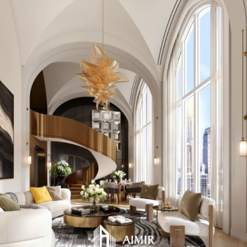
Not all architectural imagery is created equal. Some renderings look obviously computer-generated, with flat lighting and plastic-looking materials that fail to convince viewers. Others are so precise that they are indistinguishable from photographs. That second category, realistic architectural visualization rendering, has become the standard expectation for architects, developers, and marketers who need imagery capable of withstanding close scrutiny from investors, buyers, and planning authorities. As audiences grow more visually literate, the tolerance for obviously artificial, video-game-like imagery in professional presentations continues to shrink.
What Sets Realistic Visualization Apart
Realistic architectural visualization goes beyond simply modeling a building in three dimensions. It requires physically accurate lighting simulation, true-to-life material properties, and careful attention to the small imperfections that make real-world photography convincing, such as subtle reflections, ambient occlusion in corners, and natural depth of field. The goal is an image that a viewer would believe was captured by a camera on-site rather than generated by software. Achieving that level of believability typically means dozens of small adjustments layered on top of one another rather than any single dramatic setting.
Realistic Versus Stylized Rendering Approaches
Stylized or conceptual renderings still have their place, particularly in early design phases when a looser, more artistic representation helps convey mood without locking in every detail. But once a project moves toward marketing, investment, or permitting, stakeholders need to see exactly what they are getting. Realistic visualization removes ambiguity, showing true material colors, accurate proportions, and honest lighting conditions rather than idealized abstractions. Understanding which approach a project actually needs at each stage helps clients avoid paying for a level of polish that a given milestone does not yet require.
Why Realism Builds Client and Buyer Confidence
Buyers and investors are understandably skeptical of overly polished or unrealistic marketing images. When a rendering looks convincingly real, it builds trust rather than raising doubts about what the finished project will actually look like. This is especially important in real estate presales, where buyers are committing significant sums based largely on visual material rather than a finished physical space. A rendering that later turns out to have misrepresented the finished product can also create legal and reputational exposure for developers, making accuracy a genuine business risk rather than just an aesthetic preference.
The Technical Pillars Behind Every Realistic Scene
Achieving true realism depends on several technical disciplines working together: physically based rendering engines that simulate how light actually behaves, high-resolution texture libraries that replicate real materials like stone, wood, and glass, and careful camera work that mimics real photographic lenses and exposure. Post-production adds a final layer of color grading and atmospheric effects that ties everything together into a cohesive, believable image. Each of these pillars depends on the others; even flawless material work can be undermined by lighting that behaves in a physically implausible way.
Applications Across Residential, Commercial, and Institutional Projects
Realistic visualization serves a wide range of building types, from single-family homes and luxury condominiums to office towers, hotels, schools, and healthcare facilities. Each typology has its own material palette and lighting expectations, and an experienced studio adjusts its approach accordingly, whether that means warm, inviting tones for a residential lobby or crisp, professional lighting for a corporate headquarters. Institutional clients such as universities and hospitals often have additional requirements around accessibility signage and wayfinding, which need to be represented accurately alongside the architecture itself.
How AIMIR CG Delivers Photorealistic Accuracy
Our studio specializes in realistic architectural visualization rendering that holds up under close inspection. Every project moves through a disciplined pipeline of modeling, texturing, lighting, and post-production review, with artists cross-checking material references and lighting studies against real-world photography. This attention to detail is why clients consistently describe our end product as impressive and our process as easy to work with. A dedicated quality review stage before delivery catches inconsistencies that might otherwise slip through a faster, less structured pipeline.
Common Challenges in Achieving True Realism
Realistic rendering is technically demanding. Common obstacles include accurately simulating how light bounces between surfaces, matching material reflectivity to real product specifications, and avoiding the uncanny, slightly artificial look that comes from over-processed images. Overcoming these challenges requires experienced artists who understand both the science of light and the craft of photography, not just software proficiency. Rushed production schedules are often the real culprit behind unconvincing renderings, since realism typically requires several iterative passes rather than a single render.
What to Look for in a Realism-Focused Rendering Studio
When evaluating a rendering partner, review their portfolio critically. Do the images include convincing shadow detail and material variation, or do surfaces look uniformly smooth and artificial? Ask about their revision process and how closely they work with architects to source accurate material and lighting references, since realism is ultimately the product of disciplined collaboration, not a single software setting. It also helps to ask for examples of past projects in a similar building type, since a studio's strengths can vary across typologies.
Ready for Renderings That Look Real
If your project deserves imagery that can stand up to the scrutiny of investors, buyers, and planning boards, AIMIR CG is ready to help. Our team combines technical precision with artistic judgment to deliver visualization that looks and feels genuinely real. Contact us to discuss how photorealistic rendering can strengthen your next presentation or marketing campaign, and let us show you examples from projects similar to your own.
 Neumann & Rudy Architecture
## I. Spatial Composition & Architectural Volume
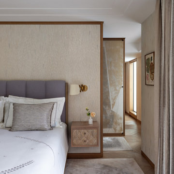
This bedroom operates as an exercise in controlled asymmetry, its plan organized around a freestanding headboard wall that reads less as partition than as inhabited architecture. Framed in a crisp oak reveal that traces its full perimeter, the wall detaches from the ceiling plane and terminates short of the right-hand elevation, generating a threshold that draws the eye into a secondary corridor volume beyond. This device — the *poché* wall as spatial pivot — establishes a layered enfilade: the intimate sleeping zone in the foreground, a transitional dressing passage in the middle distance, and a slot of daylight at the terminus. The ceiling is articulated with a shallow recessed tray and delicate stepped cornice, a restrained gesture toward classical Parisian *moulure* that regulates the room's proportion without ornamental excess. Sightlines are deliberately choreographed: the bed sits low and horizontal, the joinery plinth of the nightstand cantilevers from the wall to preserve floor-plane continuity, and the herringbone parquet visible beyond the threshold introduces a directional pull that animates what would otherwise be a static rectilinear volume. The result is a composition of nested frames — millwork within millwork — that lends considerable depth to a comparatively compact footprint.
## II. Materiality, Color & Texture
The palette is tonal rather than chromatic, calibrated within a narrow band of oatmeal, greige, and pale putty, and enlivened almost entirely through surface incident. The dominant wallcovering — a vertically striated, marquetry-like textile of tessellated ivory and taupe fibers — supplies a subtle warp-and-weft rhythm that shifts under raking light, functioning as texture masquerading as pattern. Against this, rift-sawn white oak framing introduces a honeyed, gently reddish undertone, while the bespoke bedside cabinet deploys a radiating sunburst veneer in a blush-tinged walnut or eucalyptus, its book-matched geometry providing the room's single moment of overt figuration. Textiles carry the tonal counterweight: the channel-tufted headboard in a muted heather-aubergine linen offers the deepest saturation in the frame, cooling the prevailing warmth, while cotton percale with contrast tape borders, a slubbed lumbar cushion, and a hand-stitched matelassé coverlet with tambour scrollwork build a gradient of tactility from crisp to plush. The doorway's parchment-and-verdigris art panel — appearing as a gilded, oxidized *gessoed* screen — supplies a patinated, almost frescoed counterpoint, while unlacquered brass at the sconce introduces the only metallic warmth, deliberately restrained.
## III. Lighting, Atmosphere & Style Profile
Illumination is handled with notable discretion. Natural light enters obliquely from an off-frame source at right, filtered through a floor-to-ceiling striated linen drapery that diffuses rather than admits, producing an even, shadowless wash consistent with northern European daylight. A secondary aperture — the narrow vertical slot glimpsed down the corridor — acts as a luminous punctuation mark, terminating the sightline with a slender bar of brightness that draws the occupant forward. Artificial lighting is intentionally sparse and task-oriented: a brass scissor-arm sconce with an unbleached linen shade, adjustable and near-vernacular in its mechanism, provides articulated reading light while contributing a note of atelier informality against the otherwise refined joinery. The absence of visible downlights or decorative pendants reinforces the room's quietude. Stylistically, the scheme resolves into a sophisticated **Soft Minimalism** inflected with contemporary Parisian classicism — the restraint and tonal discipline of the former, the millwork rigor and proportional literacy of the latter, warmed by a *wabi*-adjacent appreciation for patina and handwork. It is a room that eschews statement in favor of atmosphere, achieving luxury through material intelligence and the calibrated withholding of contrast.
Find the right local pro for your project

 harry schott
Running a small restaurant is a high-wire act - delicious plates on one end, razor-thin margins on the other. With food costs averaging 28-35 percent of revenue and labor at 30 percent, every dollar counts. The good news? Targeted tweaks can shave 10-20 percent off your bottom line without sacrificing quality. From smarter sourcing to streamlined waste handling, these strategies empower independents to thrive. One underrated gem: Efficient waste management via roll-off dumpster rentals, which can slash disposal fees by up to 40 percent. Let's break it down.
Optimize Inventory: Waste Less, Save More
Overstocked pantries are profit killers - U.S. restaurants toss $25 billion in food yearly. Audit weekly. Track sales data to forecast demand, using apps like Toast or MarketMan for real-time insights. Trim your menu to 12-15 core items, focusing on seasonal, high-margin stars like farm-fresh salads over imported proteins. Portion control is key - pre-weighed scoops cut overuse by 15 percent.
Repurpose scraps creatively. Veggie peels into stocks, bread ends for croutons. Donate extras to food banks via apps like Too Good To Go, earning tax deductions up to $5,000 annually. These habits reclaim 5-10 percent of food budgets, freeing cash for upgrades. Additionally, consider using citrus rinds for infused oils or desserts, and coffee grounds for compost to support local gardens. Engaging staff in sustainability efforts also builds morale and can be highlighted in marketing materials to attract eco-conscious diners.
Trim Energy and Utilities: Go Green for Greenbacks
Utilities gobble 4-10 percent of expenses. Swap to LED bulbs and energy-star appliances - upfront costs pay back in 6-12 months via 20-30 percent bill drops. Install low-flow faucets and programmable thermostats; during off-hours, dial down to 55°F to save $200/month on HVAC.
Use induction cooktops for precise heat, reducing gas by 15 percent. Train staff on "last out" protocols - unplugging idle equipment. Solar panels? For rooftops under 1,000 sq ft, incentives cover 30 percent installation, yielding ROI in 5 years.
Master Waste Management: Dumpsters as Cost Commanders
Trash isn't just garbage - it's a budget black hole, with disposal eating 2-5 percent of revenues. Small spots generate 1-2 tons monthly from food scraps, packaging, and grease. Ditch overflowing bins and irregular hauls for roll-off dumpster rentals. A 10-15 yard unit centralizes waste, handling bulk like fryer oil drums or produce crates without daily pickups.
Efficiency Over Headcount
Labor's your biggest line item - cross-train staff for multi-roles, like servers prepping during lulls, trimming overtime 10-15 percent. Shift scheduling software optimizes based on reservations, avoiding idle payroll.
Negotiate bulk buys with local suppliers for 5-10 percent discounts; loyalty programs from Sysco yield free deliveries. Go digital - QR menus cut printing costs, speed table turnover, and allow menu updates in real time without waste. Loyalty apps boost repeat visits without increasing your advertising budget, making it easier to track customer preferences and send targeted promotions. Consider bundling purchases with other area restaurants to unlock deeper discounts and leverage supplier relationships for exclusive seasonal specials. These strategies can reduce overhead, improve customer retention, and keep operations flexible as trends shift.
 Neumann & Rudy Architecture
**I. Spatial Composition & Architectural Volume**
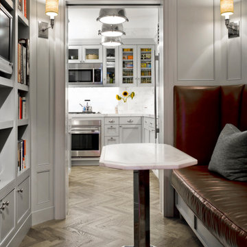
This vignette operates as a masterclass in the choreography of compressed urban space, deploying a classic enfilade strategy to extract depth from a modest footprint. The composition is organized around a cased opening — flanked by heavy, mitered pilaster-style jambs and a substantial crown-capped header — that frames the kitchen beyond like a proscenium, establishing a telescoping sightline from the foreground banquette nook through to the range wall and its marble backsplash. The immediate volume is a canted, faceted room; the angled corner walls and the polygonal ceiling perimeter generate a subtle rotational geometry that is echoed, with deliberate rhyme, in the octagonal tabletop and its faceted plinth base. Architectural discipline is supplied by comprehensive millwork: recessed applied-molding wall panels calibrated to the wall heights, a built-in bibliothèque with adjustable shelving and integrated media niche on the left, and a bench base detailed as cabinetry with a plinth and reveal, so the seating reads as architecture rather than furniture. The crowning gesture is a stone-clad soffit and cove above the multi-part cornice, which visually lifts the ceiling plane and dissolves the corner conditions of the canted plan into a continuous, luminous band.
**II. Materiality, Color & Texture**
The palette is a study in low-chroma tonal layering, structured on a base of dove-grey lacquered joinery whose cool, faintly greige undertone reads as both patrician and contemporary. Against this, book-matched white marble with grey and taupe veining appears in three registers — the ceiling cove, the kitchen backsplash, and the honed tabletop — creating a vertical and horizontal continuity of stone that binds the two rooms into one material narrative. Underfoot, wide-plank white oak laid in a herringbone pattern is finished in a wire-brushed, cerused grey-brown, its open grain supplying essential tactility and directional energy that counteracts the smoothness of the cabinetry. The tonal reserve is punctured by a single decisive chromatic move: the oxblood-to-cognac aniline leather banquette, its capitonné-adjacent piping and channeled seat cushion delivering saturated warmth and a supple, patinating counterpoint to the cool minerals. Metals are deliberately stratified — brushed stainless on the appliance suite, polished nickel on the cabinet hardware and pendant collars, and a high-mirror chromed column and base on the table that pulls reflected fragments of the room into itself. Textile relief arrives through a heather-grey wool bolster and the woven, honeycomb-textured sconce shades, while the sunflowers and pantry provisions behind glazed muntin doors introduce a curated, humanizing note of the quotidian.
**III. Lighting, Atmosphere & Style Profile**
The lighting scheme is layered and hierarchical. Ambient illumination is borrowed rather than direct: the kitchen functions as a light well, its own concealed under-cabinet lighting and cove-washed ceiling projecting a cool, diffuse glow forward through the cased opening, so the brighter volume beyond reads as both destination and light source. In the foreground, symmetrically paired wall sconces with textured drum shades cast a warm, amber-filtered ellipse of light onto the paneling — providing intimate, low-level modeling that emphasizes the millwork's shadow lines and flatters the leather's depth. The kitchen's aligned trio of spun-metal dome pendants, with polished collars and diffused lenses, reinforce the axial perspective and supply task-appropriate downlight, while the marble cove above serves as an indirect reflector, softening any residual harshness. The cumulative atmosphere is hushed, refined, and slightly cinematic — a quiet formality more contemplative than performative. Stylistically, the project synthesizes into a form of Transitional Classicism, or more precisely a tailored American Neoclassicism recalibrated for contemporary living: the vocabulary of paneled millwork, crown profiles, and cased openings is retained, but stripped of ornament, flattened in profile, and rendered in a monochrome envelope, then energized by faceted geometries, mirror-finish metal, and a single confident stroke of leather. It is restraint deployed as luxury.
 The Bodily Works
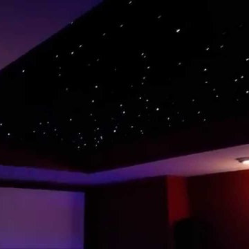
Example of a mid-sized transitional enclosed carpeted and beige floor home theater design in Salt Lake City with gray walls and a wall-mounted tv

 Linda Greenberg Landscape & Design, LLC
Photo of a mid-sized traditional partial sun hillside stone water fountain landscape in Charleston for summer.


 HRP Home Remodel Pro
Home Remodel Pro all rights reserved
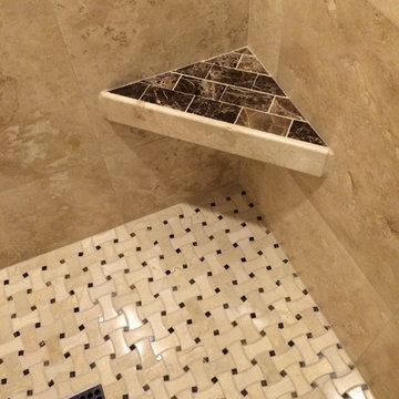
Drop-in bathtub - mid-sized transitional master beige tile and stone tile travertine floor drop-in bathtub idea in Dallas with an undermount sink, white cabinets, granite countertops, a two-piece toilet and beige walls
Drop-in bathtub - mid-sized transitional master beige tile and stone tile travertine floor drop-in bathtub idea in Dallas with an undermount sink, white cabinets, granite countertops, a two-piece toilet and beige walls
 Bay Area Kitchens
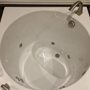
Japanese style soaking tub by Americh with molded seat, whirlpool system and inline heater
Large transitional master beige tile and porcelain tile porcelain tile bathroom photo in Houston with marble countertops, green walls, raised-panel cabinets, dark wood cabinets and an undermount sink
Large transitional master beige tile and porcelain tile porcelain tile bathroom photo in Houston with marble countertops, green walls, raised-panel cabinets, dark wood cabinets and an undermount sink

 Serenity Falls Watergardens LLC
Design ideas for a mid-sized traditional partial sun backyard water fountain landscape in Atlanta for summer.

 FINNE Architects
The master bath features stunning views of Puget Sound.
The glass walls between the bath and hall have a hand-drawn etched glass pattern.
Photo: Benjamin Benschneider
 Stephen Cox-Cox Landscape & Garden Design
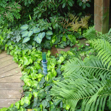
We went for lots of texture and foliage color in this small space. Ferns hold the composition together while the Persian Ivy, Rhododendron, Hosta and Heuchera provide color and leaf variation. This planting is partially under a deck.

 Refined House, LLC
Example of a small transitional kids' gray tile and ceramic tile ceramic tile and white floor alcove shower design with shaker cabinets, blue cabinets, a two-piece toilet, gray walls, an undermount sink, quartz countertops and a hinged shower door



 TreHus Architects+Interior Designers+Builders
Example of a large classic u-shaped dark wood floor eat-in kitchen design in Minneapolis with a double-bowl sink, recessed-panel cabinets, white cabinets, white backsplash, stainless steel appliances, an island and black countertops

 Great Goats Landscaping, Inc.
Photo of a mid-sized rustic partial sun backyard stone pond in Minneapolis for summer.
 LM // PM Productions, LLC
Large trendy gender-neutral light wood floor and beige floor playroom photo in New York with gray walls
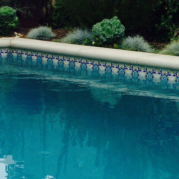
 Decorative Pool Tiles
Decorative Pool Tiles at Waterline, for historic home built in 1920's in Los Angeles.
Pattern: Molino 6" x 6"
Pool - mediterranean pool idea in Los Angeles
Pool - mediterranean pool idea in Los Angeles

Sponsored
Delaware, OH

Buckeye Basements, Inc.
Central Ohio's Basement Finishing ExpertsBest Of Houzz '13-'21


 VIVA TILES INC
Modern Bathroom Design.
By using Carrera Polished White Porcelain Tiles on the floor you will get the most "wow" reaction from any guest.
You also can use another two selections which are Statuario White Polished and Astoria White Polished porcelain tiles.
Designer & Builder #Alireza Ghanbari
Provided by #Dizeh Design Build
Tile Supplier #VIVA TILES INC

 The POOL ARTIST | Brian T. Stratton
Award winning pool designer Brian T. Stratton | The Pool Artist designed this beautiful custom concrete / gunite swimming pool. Luxury pool designer nj, international pool design, new jersey swimming pool designer, pool artist, swimming pool engineer, swimming pool architect nj, water designer, eleuthera Bahamas pool designer, infinity edge pool design, custom spa design, California pool designer, Mississippi pool designer, south Carolina pool designer, new York pool designer, Pennsylvania pool designer
16