
Search results for "Specific source" in Home Design Ideas
 Ernest M. Ferizi
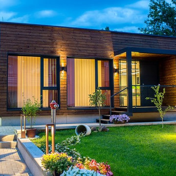
German Embassy in Pristina - Kosovo, contracted the architecture office “Ferizi + Ferizi Architects” to plan and implement an Annex Office building for their purposes. As detached part of this building is designed the waiting area, as alone standing structure.
This Office Building is constructed by assembling of Eight used office containers that were delivered on trucks and set up after only a few hours on the basis of the LEGO principle, according to the planning on strip foundations.
By removing the flexible exterior wall panels, a large room of 115 m² was created, with the counter wall as a room partition between two office spaces, each with seven workstations as well as three counters for agents on one side and a room for visitors on the other side.
With this system, room solutions can be easily implemented in all dimensions.
The container, seen as a geometric shape, is a simple, octagonal, solid box.
The standardized perfection of its dimensions is striking: 2.44 meters wide, 2.59 meters high and 6.06 meters or 12.19 meters long.
Since its introduction in 1956 by the American transport entrepreneur Malcom McLean, the container has become a standardized transport module worldwide, whether on ships, trucks or construction sites.
The shipping containers have additionally revolutionized the transport industry, pushed the globalization noticeably, and thus directly or indirectly influenced all our lives.
But after only a few years, when the first overseas containers wore out, many engineers recognized the positive properties of used shipping containers for building houses, especially since they are robust, flexible, multifunctional and second-hand relatively inexpensive to purchase. The time has long passed by to treat containers exclusively as transport objects.
As a "measure of all things", containers can hardly be ignored in construction.
Their use is no longer limited to temporary use since school containers, information containers, office containers or entire residential buildings are now part of our everyday life in the construction industry.
However, current examples of the container architecture prove that even the most demanding solutions for container building are feasible. For their specific aesthetic and spatial qualities, containers also serve as design parameters for the development of new forms of architecture and urbanity.
The office building as an extension of the visa section, characterized by modern materials and contemporary aesthetics has been designed and built mainly as a low-energy building.
Extensive insulation to achieve a comfortable and sustainable constant temperature in the interior, high window quality and low energy consumption make the building energy-efficient.
The sophisticated lighting technology, networks, heating systems and air-conditioning systems are also components of this equipment.
It creates an overall harmonic picture and guarantees the highest standard in sustainable construction, taking into consideration the fact that environmentally friendly recycling and reutilization have become an increasingly important issue in our society.
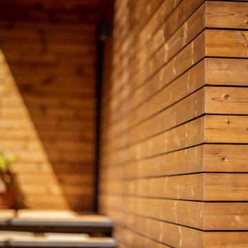
West and East side of the wooden facade is compact and has few openings, while the southern facade is completely open with lot of glass. Its spatial openness ensures a transparent, friendly work environment, which allows a lot of light into the space.
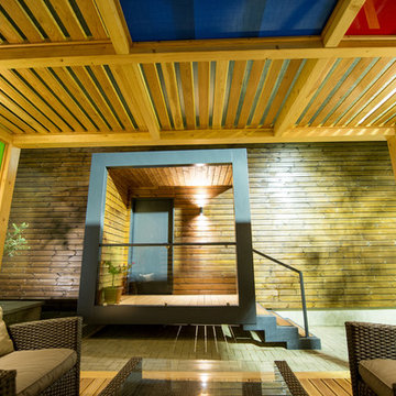
This openness allows an uninterrupted, pleasant and close-to-nature view from interior spaces into the beautiful garden. During the installation of sophisticated light sources in the garden, emphasis was not only put on functionality and security, but also on the beauty of the garden shown through the illumination in the evening.
Large, horizontal white “brisole” serve as external sun protection systems, mounted on the canopies of the entrance areas of the modular construction and the enclosure, adeptly cast shade on these areas and at the same time shape the entire architectural language.
While on one hand, the two quadratic ledges suspended in the air, are docked with steel stairs and match the wooden façade, lead the staff to their office space, the artful modern interior, on the other hand, perfectly unites the functionality, innovative technology, culture and positive effects on the employees' efficiency and wellbeing.
A lot of white, interjected by warm wooden and colored accents, determines the ambience.
In the case of the lighting solution, the mainly linear ceiling lighting is used as the overlapping design element both for the offices of the visa section as well as for the counters and the waiting area for the visitors.
They underline the puristic design in order to create a pleasant light for a desired general illumination and ensure optimal light conditions without causing disturbing reflections on the computer screens.
In addition, precisely positioned pendant luminaires are installed at the workstations, which ensure pleasant room brightness.
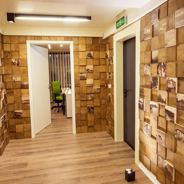
In the entrance area, the harmonic and uniform lighting effect from the ground highlights the integration of photography and architecture.
Photographs of landscapes, people, places, expressing unforgettable, impressive moments and memories have been lovingly engraved on 8 x 8cm square oak blocks.
The idea of an effective, impressive environment that stimulates and inspires the work was the premiss on which the whole design concept was based. Consequently, the modular construction was no longer viewed through its history of utilization and scars, but rather as a structure of work ambiance, art and elegance.
FERIZI + FERIZI Architects
Photo: Arben Llapashtica
 Ernest M. Ferizi
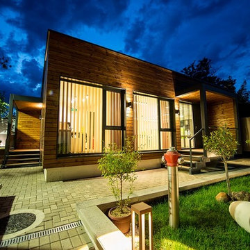
German Embassy in Pristina - Kosovo, contracted the architecture office “Ferizi + Ferizi Architects” to plan and implement an Annex Office building for their purposes. As detached part of this building is designed the waiting area, as alone standing structure.
This Office Building is constructed by assembling of Eight used office containers that were delivered on trucks and set up after only a few hours on the basis of the LEGO principle, according to the planning on strip foundations.
By removing the flexible exterior wall panels, a large room of 115 m² was created, with the counter wall as a room partition between two office spaces, each with seven workstations as well as three counters for agents on one side and a room for visitors on the other side.
With this system, room solutions can be easily implemented in all dimensions.
The container, seen as a geometric shape, is a simple, octagonal, solid box.
The standardized perfection of its dimensions is striking: 2.44 meters wide, 2.59 meters high and 6.06 meters or 12.19 meters long.
Since its introduction in 1956 by the American transport entrepreneur Malcom McLean, the container has become a standardized transport module worldwide, whether on ships, trucks or construction sites.
The shipping containers have additionally revolutionized the transport industry, pushed the globalization noticeably, and thus directly or indirectly influenced all our lives.
But after only a few years, when the first overseas containers wore out, many engineers recognized the positive properties of used shipping containers for building houses, especially since they are robust, flexible, multifunctional and second-hand relatively inexpensive to purchase. The time has long passed by to treat containers exclusively as transport objects.
As a "measure of all things", containers can hardly be ignored in construction.
Their use is no longer limited to temporary use since school containers, information containers, office containers or entire residential buildings are now part of our everyday life in the construction industry.
However, current examples of the container architecture prove that even the most demanding solutions for container building are feasible. For their specific aesthetic and spatial qualities, containers also serve as design parameters for the development of new forms of architecture and urbanity.
The office building as an extension of the visa section, characterized by modern materials and contemporary aesthetics has been designed and built mainly as a low-energy building.
Extensive insulation to achieve a comfortable and sustainable constant temperature in the interior, high window quality and low energy consumption make the building energy-efficient.
The sophisticated lighting technology, networks, heating systems and air-conditioning systems are also components of this equipment.
It creates an overall harmonic picture and guarantees the highest standard in sustainable construction, taking into consideration the fact that environmentally friendly recycling and reutilization have become an increasingly important issue in our society.
West and East side of the wooden facade is compact and has few openings, while the southern facade is completely open with lot of glass. Its spatial openness ensures a transparent, friendly work environment, which allows a lot of light into the space.
This openness allows an uninterrupted, pleasant and close-to-nature view from interior spaces into the beautiful garden. During the installation of sophisticated light sources in the garden, emphasis was not only put on functionality and security, but also on the beauty of the garden shown through the illumination in the evening.
Large, horizontal white “brisole” serve as external sun protection systems, mounted on the canopies of the entrance areas of the modular construction and the enclosure, adeptly cast shade on these areas and at the same time shape the entire architectural language.
While on one hand, the two quadratic ledges suspended in the air, are docked with steel stairs and match the wooden façade, lead the staff to their office space, the artful modern interior, on the other hand, perfectly unites the functionality, innovative technology, culture and positive effects on the employees' efficiency and wellbeing.
A lot of white, interjected by warm wooden and colored accents, determines the ambience.
In the case of the lighting solution, the mainly linear ceiling lighting is used as the overlapping design element both for the offices of the visa section as well as for the counters and the waiting area for the visitors.
They underline the puristic design in order to create a pleasant light for a desired general illumination and ensure optimal light conditions without causing disturbing reflections on the computer screens.
In addition, precisely positioned pendant luminaires are installed at the workstations, which ensure pleasant room brightness.
In the entrance area, the harmonic and uniform lighting effect from the ground highlights the integration of photography and architecture.
Photographs of landscapes, people, places, expressing unforgettable, impressive moments and memories have been lovingly engraved on 8 x 8cm square oak blocks.
The idea of an effective, impressive environment that stimulates and inspires the work was the premiss on which the whole design concept was based. Consequently, the modular construction was no longer viewed through its history of utilization and scars, but rather as a structure of work ambiance, art and elegance.
FERIZI + FERIZI Architects
Photo: Arben Llapashtica
 Combine 9 Design, LLC
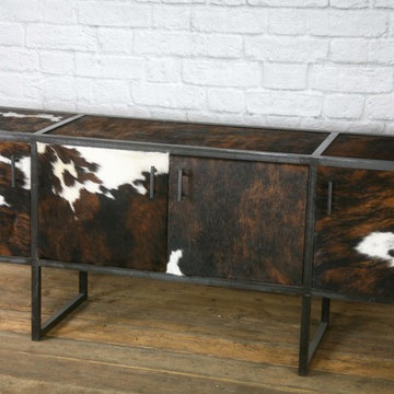
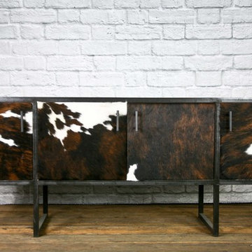
This is one of our latest designs: a leather media console! It would also serve perfectly as a rustic credenza, sideboard or buffet and would look amazing in any eclectic interior or rustic cabin setting.
This rustic media console is handmade with rawhide by us here in our shop located in Texas. It can be made in any size or configuration, but the one in this listing is for one that is 18” deep and 27” high (see listing options for common widths. One shown is 72” wide). Please email for pricing on any custom sizes.
As you can see, it has four doors that are leather (authentic leather), but we can make it with any number of doors. Or, we can make it with mesh doors (like you see on many of our other media consoles) so remote control infrared signals can pass through. The top, sides, and doors are also real leather but can be made with reclaimed wood. Or, for a more industrial look, we can add decorative rivets as you see on many of our other items.
There is one inner shelf that spans the entire width of the unit. There are no inner partitions, so wide AV components can easily fit inside. There is a back with a 2” gap at the bottom for cables to exit.
We can make the legs any height you’d like. So, if you want a more “chunky” looking unit, we can make it with shorter legs. Or, prefer a visually “lighter” looking unit? We can make it with taller legs. We can also all solid steel wheels to give it a bar cart height.
Another popular configuration for this particular piece is to make it with a brown frame as opposed to the black one shown.
We can also make your unit in either of the 3 types of leather shown Select “tan”, “brown-white”, or “suede.”
Model: The Goodnight (named after the famous American west cattle rancher, Charlie Goodnight).
Price as shown: $1,650.00
Please inquire for pricing on any custom configurations.
NOTE: We only source leather from socially responsible providers and they are recycled from the meat industry. So, no animals are killed strictly for their fur – cowhides are a byproduct of the farming/meat industry. Also, be aware that we use real hides. So, expect some variation as all are unique. Some hides might contain some small natural marks due to conditions inherent to natural animal products such as branding. All natural cowhides have small, minor flaws, which adds to their authenticity.
__________________________________________
**EACH PIECE IS HANDMADE. Therefore, no two pieces will be the same. The patina will vary from piece to piece, and the lighter more splotchy pieces will vary greatly.
---
**TURNAROUND IS ABOUT 3 1/2 WEEKS, but varies from time to time so please feel free to contact me for a more accurate time frame.
---
**Shipping will be quoted for "Standard Delivery" If you would like a quote on inside delivery, be sure to indicate that choice when requesting a quote.
____________________________________________
ABOUT US: We create custom, unique furniture unlike anything you will find. Our intention is to give you a piece of furniture that you will admire and enjoy for years to come and that will leave your house-guests envious! Our work is 100% hand crafted in the United States and made to last a lifetime. These unique pieces fit perfectly with any urban/modern, mid-century, or rustic décor. All of our pieces can be made in many configurations and sizes to suit your specific style and needs. There are many options available as each piece is designed just for you, so, if you have any thoughts, please contact us and we would be happy to let you know what your options are.
* All rights reserved; Combine 9 Design, LLC
Find the right local pro for your project
 Goodall Custom Cabinetry
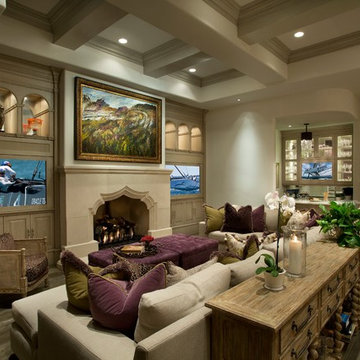
Living room - traditional formal dark wood floor living room idea in Phoenix with beige walls, a standard fireplace and a media wall
 Combine 9 Design, LLC
This is one of our latest designs: a leather media console! It would also serve perfectly as a rustic credenza, sideboard or buffet and would look amazing in any eclectic interior or rustic cabin setting.
This rustic media console is handmade with rawhide by us here in our shop located in Texas. It can be made in any size or configuration, but the one in this listing is for one that is 18” deep and 27” high (see listing options for common widths. One shown is 72” wide). Please email for pricing on any custom sizes.
As you can see, it has four doors that are leather (authentic leather), but we can make it with any number of doors. Or, we can make it with mesh doors (like you see on many of our other media consoles) so remote control infrared signals can pass through. The top, sides, and doors are also real leather but can be made with reclaimed wood. Or, for a more industrial look, we can add decorative rivets as you see on many of our other items.
There is one inner shelf that spans the entire width of the unit. There are no inner partitions, so wide AV components can easily fit inside. There is a back with a 2” gap at the bottom for cables to exit.
We can make the legs any height you’d like. So, if you want a more “chunky” looking unit, we can make it with shorter legs. Or, prefer a visually “lighter” looking unit? We can make it with taller legs. We can also all solid steel wheels to give it a bar cart height.
Another popular configuration for this particular piece is to make it with a brown frame as opposed to the black one shown.
We can also make your unit in either of the 3 types of leather shown Select “tan”, “brown-white”, or “suede.”
Model: The Goodnight (named after the famous American west cattle rancher, Charlie Goodnight).
Price as shown: $1,650.00
Please inquire for pricing on any custom configurations.
NOTE: We only source leather from socially responsible providers and they are recycled from the meat industry. So, no animals are killed strictly for their fur – cowhides are a byproduct of the farming/meat industry. Also, be aware that we use real hides. So, expect some variation as all are unique. Some hides might contain some small natural marks due to conditions inherent to natural animal products such as branding. All natural cowhides have small, minor flaws, which adds to their authenticity.
__________________________________________
**EACH PIECE IS HANDMADE. Therefore, no two pieces will be the same. The patina will vary from piece to piece, and the lighter more splotchy pieces will vary greatly.
---
**TURNAROUND IS ABOUT 3 1/2 WEEKS, but varies from time to time so please feel free to contact me for a more accurate time frame.
---
**Shipping will be quoted for "Standard Delivery" If you would like a quote on inside delivery, be sure to indicate that choice when requesting a quote.
____________________________________________
ABOUT US: We create custom, unique furniture unlike anything you will find. Our intention is to give you a piece of furniture that you will admire and enjoy for years to come and that will leave your house-guests envious! Our work is 100% hand crafted in the United States and made to last a lifetime. These unique pieces fit perfectly with any urban/modern, mid-century, or rustic décor. All of our pieces can be made in many configurations and sizes to suit your specific style and needs. There are many options available as each piece is designed just for you, so, if you have any thoughts, please contact us and we would be happy to let you know what your options are.
* All rights reserved; Combine 9 Design, LLC
 MESA Contracting, LLC
The Challenge: Create a rugged yet warm farmhouse feel in a high rise tower. Start with an entire 9600 gross square foot penthouse floor of raw concrete floor, walls and ceiling. Devise inventive ways to address intractable existing conditions including a plumbing layout inconsistent with our Client program, a relatively low ceiling and a massive elevator core and yet take of advantage of panoramic views of the city from all sides.
For example, rather than make a bulky drywall enclosure for existing pipes that poke thru the kitchen counter, they are wrapped with antique painted galvanized sheet metal to keep sight lines around the corner as open as possible. Or, transform an unattractive and inconveniently located 24” diameter vertical duct in the middle of Samantha’s and Hannah’s (grandchildren’s) guest bedroom into part of a lovely arched top bed nook. Or, disguise a chase for above floor plumbing runs as the base for an open buffet counter. The oppressive elevator lobby was shortened; terminating in handmade glass and steel garden doors at both ends. Custom details include a groined vaulted ceiling and arched openings with stone pilasters (for future trompe-l’oeil images of a Tuscany countryside). To maximize a feeling of height, the ceilings start low and get higher as they progress to the outside walls.
The Program: Create a five bedroom condo for an elderly couple with specific and different needs. Mr. likes his privacy and to stay up late into the night on the internet. He likes order. Mrs. has some physical limits that have been addressed in various ways such as shorter travel distances, a step down shower, raised dishwasher and custom cast (to ensure that they won’t rust) iron grab bars. She prefers more disorder.
Spaces should be visually arresting, full of detail and easy to maintain. Private spaces include separate master bathrooms, his and her offices and a multi screened Media Room. The balance of the floor must link spaces into one continuous open room along the south and east elevations using large elements yet keeping an intimate scale, sound control and privacy. For example, a substantial fireplace made of old barn timber framing, country stone and a hammered iron grill is strategically located at the critical Southeast corner. Above, black iron offset pintel hardware allow custom double doors to hide a large flat screen TV.
High technology is in place for inconspicuous yet easy use. Icon driven key pads operate lighting, window treatments, audio visual systems with multiple sources and access to movie and music databases and five HVAC zones with independent humidity controls.
Outstanding Features: Exterior masonry walls have stone culled from five quarries. Sprinkled throughout are surprises - bricks with words as messages from the past, wood trimmed niches and colored glass. Glass pieces set in window corners offer bursts of color when backlit by the sun. These materials are assembled in a rough irregular fashion to look like the work of a mason from the Italian countryside. Interior ceilings and walls have overlapping layers of two plaster colors. Perimeter ceilings are made of smooth random width cedar. Rough planed cedar beams hide ductwork and allow the maximum ceiling height between them.
Custom details are everywhere-consider the ten foot barn doors on overhead track at the service elevator, cedar benches/storage areas that run below window banks, antique air registers, acid washed piano hinges and transom window operators and existing concrete piers that are featured instead of hidden. The floors are made of random width wide plank old oak with hand planed faces and edges. Overall, the elements were carefully selected or painted/stained to form a soft muted gray palate
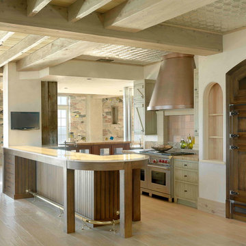
The Country kitchen features an old fashioned style ice box appearance for the refrigerator/freezer, a tin ceiling, a distressed assortment of cabinets in multiple heights, colors and woods such as the cherry wood buffet cabinet with sliding glass doors on both sides. A backlit breakfast counter, a hammered copper hood and chicken wire inserts are part of the effort to make a comfortable, eclectic old fashioned looking Kitchen while containing the latest appliances and storage systems.
Awards:
This project has won several kitchen and bath awards:
Felman Kitchen Awards
2009 St. Louis Homes and Lifestyles Kitchen of the Year – Gold Award
2008-2009 SubZero Wolf Kitchen Design Contest – Regional Winner, Regional Designer’s Choice
2010 NKBA Art of the Industry – Pinnacle of Design Award
2010 NKBA Art of the Industry – First Place Medium Kitchen
2010 NKBA Art of the Industry – Consumer’s Choice Award
2010 K&BB Kitchen of the Year Award
Felman Bath Awards
2010 Ladue News Award—Master Bathroom
 Ernest M. Ferizi
German Embassy in Pristina - Kosovo, contracted the architecture office “Ferizi + Ferizi Architects” to plan and implement an Annex Office building for their purposes. As detached part of this building is designed the waiting area, as alone standing structure.
This Office Building is constructed by assembling of Eight used office containers that were delivered on trucks and set up after only a few hours on the basis of the LEGO principle, according to the planning on strip foundations.
By removing the flexible exterior wall panels, a large room of 115 m² was created, with the counter wall as a room partition between two office spaces, each with seven workstations as well as three counters for agents on one side and a room for visitors on the other side.
With this system, room solutions can be easily implemented in all dimensions.
The container, seen as a geometric shape, is a simple, octagonal, solid box.
The standardized perfection of its dimensions is striking: 2.44 meters wide, 2.59 meters high and 6.06 meters or 12.19 meters long.
Since its introduction in 1956 by the American transport entrepreneur Malcom McLean, the container has become a standardized transport module worldwide, whether on ships, trucks or construction sites.
The shipping containers have additionally revolutionized the transport industry, pushed the globalization noticeably, and thus directly or indirectly influenced all our lives.
But after only a few years, when the first overseas containers wore out, many engineers recognized the positive properties of used shipping containers for building houses, especially since they are robust, flexible, multifunctional and second-hand relatively inexpensive to purchase. The time has long passed by to treat containers exclusively as transport objects.
As a "measure of all things", containers can hardly be ignored in construction.
Their use is no longer limited to temporary use since school containers, information containers, office containers or entire residential buildings are now part of our everyday life in the construction industry.
However, current examples of the container architecture prove that even the most demanding solutions for container building are feasible. For their specific aesthetic and spatial qualities, containers also serve as design parameters for the development of new forms of architecture and urbanity.
The office building as an extension of the visa section, characterized by modern materials and contemporary aesthetics has been designed and built mainly as a low-energy building.
Extensive insulation to achieve a comfortable and sustainable constant temperature in the interior, high window quality and low energy consumption make the building energy-efficient.
The sophisticated lighting technology, networks, heating systems and air-conditioning systems are also components of this equipment.
It creates an overall harmonic picture and guarantees the highest standard in sustainable construction, taking into consideration the fact that environmentally friendly recycling and reutilization have become an increasingly important issue in our society.
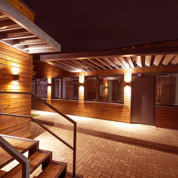
West and East side of the wooden facade is compact and has few openings, while the southern facade is completely open with lot of glass. Its spatial openness ensures a transparent, friendly work environment, which allows a lot of light into the space.
This openness allows an uninterrupted, pleasant and close-to-nature view from interior spaces into the beautiful garden. During the installation of sophisticated light sources in the garden, emphasis was not only put on functionality and security, but also on the beauty of the garden shown through the illumination in the evening.
Large, horizontal white “brisole” serve as external sun protection systems, mounted on the canopies of the entrance areas of the modular construction and the enclosure, adeptly cast shade on these areas and at the same time shape the entire architectural language.
While on one hand, the two quadratic ledges suspended in the air, are docked with steel stairs and match the wooden façade, lead the staff to their office space, the artful modern interior, on the other hand, perfectly unites the functionality, innovative technology, culture and positive effects on the employees' efficiency and wellbeing.
A lot of white, interjected by warm wooden and colored accents, determines the ambience.
In the case of the lighting solution, the mainly linear ceiling lighting is used as the overlapping design element both for the offices of the visa section as well as for the counters and the waiting area for the visitors.
They underline the puristic design in order to create a pleasant light for a desired general illumination and ensure optimal light conditions without causing disturbing reflections on the computer screens.
In addition, precisely positioned pendant luminaires are installed at the workstations, which ensure pleasant room brightness.
In the entrance area, the harmonic and uniform lighting effect from the ground highlights the integration of photography and architecture.
Photographs of landscapes, people, places, expressing unforgettable, impressive moments and memories have been lovingly engraved on 8 x 8cm square oak blocks.
The idea of an effective, impressive environment that stimulates and inspires the work was the premiss on which the whole design concept was based. Consequently, the modular construction was no longer viewed through its history of utilization and scars, but rather as a structure of work ambiance, art and elegance.
FERIZI + FERIZI Architects
Photo: Arben Llapashtica

Sponsored
Delaware, OH

Buckeye Basements, Inc.
Central Ohio's Basement Finishing ExpertsBest Of Houzz '13-'21
 Ernest M. Ferizi
German Embassy in Pristina - Kosovo, contracted the architecture office “Ferizi + Ferizi Architects” to plan and implement an Annex Office building for their purposes. As detached part of this building is designed the waiting area, as alone standing structure.
This Office Building is constructed by assembling of Eight used office containers that were delivered on trucks and set up after only a few hours on the basis of the LEGO principle, according to the planning on strip foundations.
By removing the flexible exterior wall panels, a large room of 115 m² was created, with the counter wall as a room partition between two office spaces, each with seven workstations as well as three counters for agents on one side and a room for visitors on the other side.
With this system, room solutions can be easily implemented in all dimensions.
The container, seen as a geometric shape, is a simple, octagonal, solid box.
The standardized perfection of its dimensions is striking: 2.44 meters wide, 2.59 meters high and 6.06 meters or 12.19 meters long.
Since its introduction in 1956 by the American transport entrepreneur Malcom McLean, the container has become a standardized transport module worldwide, whether on ships, trucks or construction sites.
The shipping containers have additionally revolutionized the transport industry, pushed the globalization noticeably, and thus directly or indirectly influenced all our lives.
But after only a few years, when the first overseas containers wore out, many engineers recognized the positive properties of used shipping containers for building houses, especially since they are robust, flexible, multifunctional and second-hand relatively inexpensive to purchase. The time has long passed by to treat containers exclusively as transport objects.
As a "measure of all things", containers can hardly be ignored in construction.
Their use is no longer limited to temporary use since school containers, information containers, office containers or entire residential buildings are now part of our everyday life in the construction industry.
However, current examples of the container architecture prove that even the most demanding solutions for container building are feasible. For their specific aesthetic and spatial qualities, containers also serve as design parameters for the development of new forms of architecture and urbanity.
The office building as an extension of the visa section, characterized by modern materials and contemporary aesthetics has been designed and built mainly as a low-energy building.
Extensive insulation to achieve a comfortable and sustainable constant temperature in the interior, high window quality and low energy consumption make the building energy-efficient.
The sophisticated lighting technology, networks, heating systems and air-conditioning systems are also components of this equipment.
It creates an overall harmonic picture and guarantees the highest standard in sustainable construction, taking into consideration the fact that environmentally friendly recycling and reutilization have become an increasingly important issue in our society.
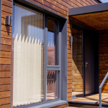
West and East side of the wooden facade is compact and has few openings, while the southern facade is completely open with lot of glass. Its spatial openness ensures a transparent, friendly work environment, which allows a lot of light into the space.
This openness allows an uninterrupted, pleasant and close-to-nature view from interior spaces into the beautiful garden. During the installation of sophisticated light sources in the garden, emphasis was not only put on functionality and security, but also on the beauty of the garden shown through the illumination in the evening.
Large, horizontal white “brisole” serve as external sun protection systems, mounted on the canopies of the entrance areas of the modular construction and the enclosure, adeptly cast shade on these areas and at the same time shape the entire architectural language.
While on one hand, the two quadratic ledges suspended in the air, are docked with steel stairs and match the wooden façade, lead the staff to their office space, the artful modern interior, on the other hand, perfectly unites the functionality, innovative technology, culture and positive effects on the employees' efficiency and wellbeing.
A lot of white, interjected by warm wooden and colored accents, determines the ambience.
In the case of the lighting solution, the mainly linear ceiling lighting is used as the overlapping design element both for the offices of the visa section as well as for the counters and the waiting area for the visitors.
They underline the puristic design in order to create a pleasant light for a desired general illumination and ensure optimal light conditions without causing disturbing reflections on the computer screens.
In addition, precisely positioned pendant luminaires are installed at the workstations, which ensure pleasant room brightness.
In the entrance area, the harmonic and uniform lighting effect from the ground highlights the integration of photography and architecture.
Photographs of landscapes, people, places, expressing unforgettable, impressive moments and memories have been lovingly engraved on 8 x 8cm square oak blocks.
The idea of an effective, impressive environment that stimulates and inspires the work was the premiss on which the whole design concept was based. Consequently, the modular construction was no longer viewed through its history of utilization and scars, but rather as a structure of work ambiance, art and elegance.
FERIZI + FERIZI Architects
Photo: Arben Llapashtica
 Klopf Architecture
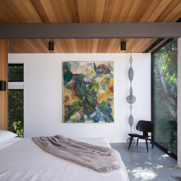
Malibu Glass Box House by Klopf Architecture
Following the devastating Woolsey Fire of 2018, the site in Malibu offered a unique opportunity to rebuild not just a home, but a new architectural composition that highlighted the property’s potential while navigating strict fire-rebuild codes in the area. Designed by Klopf Architecture, this project embraced a set of limitations and translated them into an architectural asset.
The city’s fire-rebuild process required the new structure to remain close to the original footprint, size and bulk, a constraint that ultimately clarified the architectural direction. Perched near the front of a long, narrow lot, the new home frames and overlooks a private, park-like rear expanse, an uncommon luxury especially in this part of Malibu .
Without a fixed program, the design process allowed for a different kind of creative focus allowing Klopf Architecture the opportunity to explore how a modernist home could best respond to this site. The team approached the project not with a list of requirements, but with a question: How might a modernist live here? What spatial qualities would inspire calm, connection, and a sense of wonder in this setting? The process became less about problem-solving and more about architectural storytelling—letting the site, the light, and the principles of modern design guide the form and flow of the home.
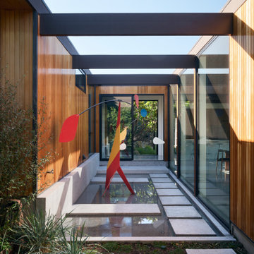
The response emerged in the form of a glass-box pavilion, an open, Mid-Century Modern inspired living, dining, and kitchen space that floats at the edge of the property’s natural descent. Connected to the more enclosed, private areas of the home by a glass-walled hallway, the living pavilion becomes a distinct centerpiece of the design. It opens on all four sides to the landscape with decks and patios on the flanks, an internal garden and water feature to the north, and a dramatic unguarded view of the expansive backyard and ocean horizon to the south.
Because of the mandated footprint, careful planning was required to ensure every space could still engage with light, landscape, or both. Strategic voids in the form of atriums and courtyards allow daylight to filter deep into the home’s core, while offering moments of surprise and retreat. These design gestures allow natural light to filter deep into the interior, creating a sense of brightness and openness throughout the day. At the same time, they expand the perceptual boundaries between inside and out, making the home feel more expansive while anchoring its connection to the surrounding landscape.
The siting of the house is what gives it its unique character. Rather than receding into the backyard like the neighboring homes, the house holds a slight prominence. From the central living pavilion, stepping down into the landscape feels more like entering a secluded park where a separate existing accessory structure, trail, and recreational areas await. The home’s modest street presence gives way to this unfolding drama of space, view, and nature.
Fire-resilient materials and assemblies are integrated seamlessly throughout including triple-pane glazing, under-slab and roof insulation, and locally sourced fire-rated cladding ensure the house not only meets Calfornia’s rigorous wildland-urban interface (WUI) standards, but feels effortlessly aligned with them. While technical decisions like fire-hardening and mechanical systems presented some construction challenges, particularly around the cantilevered glass box, the team found a functional compromise that preserved the integrity of the design.
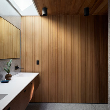
Inside, a restrained palette and exposed post and beam design celebrate the ethos of mid-century modernism. A central circulation spine extends from the entry to the rear glass wall, offering a continuous visual link from street to ocean. Spaces such as the library and office, though more intimate in scale, are never cut off from nature as each opens to its own unique courtyard or garden view.
Though born out of a strict regulatory framework and developed without a specific client, the rebuild design unfolded with remarkable clarity. Grounded in site logic, refined by limitations and an emphasis on timeless spatial relationships – light, proportion, and a strong connection to nature, the resulting design feels both effortless and uplifting. The home lives lightly on the land, opens generously to its surroundings, and strikes a careful balance between privacy, openness, and calm. For Klopf Architecture, it stands as a compelling case study in how site, code, and circumstantial constraints can inspire enduring, modernist architecture. With years of experience reimagining mid-century modern design for how people live today, the firm took the project’s limitations as an opportunity. The result is a home shaped by open, flowing spaces, strong indoor-outdoor connections, and a calm, clear sense of structure. It’s a good reminder that even with strict constraints, there’s still room for architecture to breathe—and for modernism to keep moving forward.
Klopf Architecture project team: Geoff Campen, John Klopf, AIA, and Sherry Tan
Structural Engineer: ZFA
Contractor: Maison D’Artiste
Photography: ©2025 Mariko Reed
Year Completed: 2023
 Ernest M. Ferizi
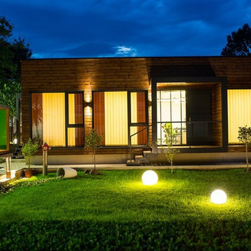
German Embassy in Pristina - Kosovo, contracted the architecture office “Ferizi + Ferizi Architects” to plan and implement an Annex Office building for their purposes. As detached part of this building is designed the waiting area, as alone standing structure.
This Office Building is constructed by assembling of Eight used office containers that were delivered on trucks and set up after only a few hours on the basis of the LEGO principle, according to the planning on strip foundations.
By removing the flexible exterior wall panels, a large room of 115 m² was created, with the counter wall as a room partition between two office spaces, each with seven workstations as well as three counters for agents on one side and a room for visitors on the other side.
With this system, room solutions can be easily implemented in all dimensions.
The container, seen as a geometric shape, is a simple, octagonal, solid box.
The standardized perfection of its dimensions is striking: 2.44 meters wide, 2.59 meters high and 6.06 meters or 12.19 meters long.
Since its introduction in 1956 by the American transport entrepreneur Malcom McLean, the container has become a standardized transport module worldwide, whether on ships, trucks or construction sites.
The shipping containers have additionally revolutionized the transport industry, pushed the globalization noticeably, and thus directly or indirectly influenced all our lives.
But after only a few years, when the first overseas containers wore out, many engineers recognized the positive properties of used shipping containers for building houses, especially since they are robust, flexible, multifunctional and second-hand relatively inexpensive to purchase. The time has long passed by to treat containers exclusively as transport objects.
As a "measure of all things", containers can hardly be ignored in construction.
Their use is no longer limited to temporary use since school containers, information containers, office containers or entire residential buildings are now part of our everyday life in the construction industry.
However, current examples of the container architecture prove that even the most demanding solutions for container building are feasible. For their specific aesthetic and spatial qualities, containers also serve as design parameters for the development of new forms of architecture and urbanity.
The office building as an extension of the visa section, characterized by modern materials and contemporary aesthetics has been designed and built mainly as a low-energy building.
Extensive insulation to achieve a comfortable and sustainable constant temperature in the interior, high window quality and low energy consumption make the building energy-efficient.
The sophisticated lighting technology, networks, heating systems and air-conditioning systems are also components of this equipment.
It creates an overall harmonic picture and guarantees the highest standard in sustainable construction, taking into consideration the fact that environmentally friendly recycling and reutilization have become an increasingly important issue in our society.
West and East side of the wooden facade is compact and has few openings, while the southern facade is completely open with lot of glass. Its spatial openness ensures a transparent, friendly work environment, which allows a lot of light into the space.
This openness allows an uninterrupted, pleasant and close-to-nature view from interior spaces into the beautiful garden. During the installation of sophisticated light sources in the garden, emphasis was not only put on functionality and security, but also on the beauty of the garden shown through the illumination in the evening.
Large, horizontal white “brisole” serve as external sun protection systems, mounted on the canopies of the entrance areas of the modular construction and the enclosure, adeptly cast shade on these areas and at the same time shape the entire architectural language.
While on one hand, the two quadratic ledges suspended in the air, are docked with steel stairs and match the wooden façade, lead the staff to their office space, the artful modern interior, on the other hand, perfectly unites the functionality, innovative technology, culture and positive effects on the employees' efficiency and wellbeing.
A lot of white, interjected by warm wooden and colored accents, determines the ambience.
In the case of the lighting solution, the mainly linear ceiling lighting is used as the overlapping design element both for the offices of the visa section as well as for the counters and the waiting area for the visitors.
They underline the puristic design in order to create a pleasant light for a desired general illumination and ensure optimal light conditions without causing disturbing reflections on the computer screens.
In addition, precisely positioned pendant luminaires are installed at the workstations, which ensure pleasant room brightness.
In the entrance area, the harmonic and uniform lighting effect from the ground highlights the integration of photography and architecture.
Photographs of landscapes, people, places, expressing unforgettable, impressive moments and memories have been lovingly engraved on 8 x 8cm square oak blocks.
The idea of an effective, impressive environment that stimulates and inspires the work was the premiss on which the whole design concept was based. Consequently, the modular construction was no longer viewed through its history of utilization and scars, but rather as a structure of work ambiance, art and elegance.
FERIZI + FERIZI Architects
Photo: Arben Llapashtica
 MESA Contracting, LLC
The Challenge: Create a rugged yet warm farmhouse feel in a high rise tower. Start with an entire 9600 gross square foot penthouse floor of raw concrete floor, walls and ceiling. Devise inventive ways to address intractable existing conditions including a plumbing layout inconsistent with our Client program, a relatively low ceiling and a massive elevator core and yet take of advantage of panoramic views of the city from all sides.
For example, rather than make a bulky drywall enclosure for existing pipes that poke thru the kitchen counter, they are wrapped with antique painted galvanized sheet metal to keep sight lines around the corner as open as possible. Or, transform an unattractive and inconveniently located 24” diameter vertical duct in the middle of Samantha’s and Hannah’s (grandchildren’s) guest bedroom into part of a lovely arched top bed nook. Or, disguise a chase for above floor plumbing runs as the base for an open buffet counter. The oppressive elevator lobby was shortened; terminating in handmade glass and steel garden doors at both ends. Custom details include a groined vaulted ceiling and arched openings with stone pilasters (for future trompe-l’oeil images of a Tuscany countryside). To maximize a feeling of height, the ceilings start low and get higher as they progress to the outside walls.
The Program: Create a five bedroom condo for an elderly couple with specific and different needs. Mr. likes his privacy and to stay up late into the night on the internet. He likes order. Mrs. has some physical limits that have been addressed in various ways such as shorter travel distances, a step down shower, raised dishwasher and custom cast (to ensure that they won’t rust) iron grab bars. She prefers more disorder.
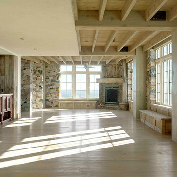
Spaces should be visually arresting, full of detail and easy to maintain. Private spaces include separate master bathrooms, his and her offices and a multi screened Media Room. The balance of the floor must link spaces into one continuous open room along the south and east elevations using large elements yet keeping an intimate scale, sound control and privacy. For example, a substantial fireplace made of old barn timber framing, country stone and a hammered iron grill is strategically located at the critical Southeast corner. Above, black iron offset pintel hardware allow custom double doors to hide a large flat screen TV.
High technology is in place for inconspicuous yet easy use. Icon driven key pads operate lighting, window treatments, audio visual systems with multiple sources and access to movie and music databases and five HVAC zones with independent humidity controls.
Outstanding Features: Exterior masonry walls have stone culled from five quarries. Sprinkled throughout are surprises - bricks with words as messages from the past, wood trimmed niches and colored glass. Glass pieces set in window corners offer bursts of color when backlit by the sun. These materials are assembled in a rough irregular fashion to look like the work of a mason from the Italian countryside. Interior ceilings and walls have overlapping layers of two plaster colors. Perimeter ceilings are made of smooth random width cedar. Rough planed cedar beams hide ductwork and allow the maximum ceiling height between them.
Custom details are everywhere-consider the ten foot barn doors on overhead track at the service elevator, cedar benches/storage areas that run below window banks, antique air registers, acid washed piano hinges and transom window operators and existing concrete piers that are featured instead of hidden. The floors are made of random width wide plank old oak with hand planed faces and edges. Overall, the elements were carefully selected or painted/stained to form a soft muted gray palate
The Country kitchen features an old fashioned style ice box appearance for the refrigerator/freezer, a tin ceiling, a distressed assortment of cabinets in multiple heights, colors and woods such as the cherry wood buffet cabinet with sliding glass doors on both sides. A backlit breakfast counter, a hammered copper hood and chicken wire inserts are part of the effort to make a comfortable, eclectic old fashioned looking Kitchen while containing the latest appliances and storage systems.
Awards:
This project has won several kitchen and bath awards:
Felman Kitchen Awards
2009 St. Louis Homes and Lifestyles Kitchen of the Year – Gold Award
2008-2009 SubZero Wolf Kitchen Design Contest – Regional Winner, Regional Designer’s Choice
2010 NKBA Art of the Industry – Pinnacle of Design Award
2010 NKBA Art of the Industry – First Place Medium Kitchen
2010 NKBA Art of the Industry – Consumer’s Choice Award
2010 K&BB Kitchen of the Year Award
Felman Bath Awards
2010 Ladue News Award—Master Bathroom
 Almesedoors
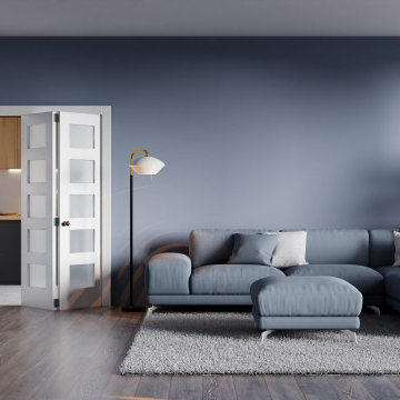
FINISH: PRIMED
The advantages of this approach – of this type of interior door finish – are fairly obvious. Pick a color, any color that suits your projects best. Mix and apply. Re- coat whenever you feel it is necessary to do so. Touch it up. It gives you, the proud owner of these interior doors, complete freedom of choice, and the significant savings, especially where it comes to bulk orders, can be a true source of joy.
As Kurt Vonnegut mentions in one of his novels (Bluebeard, unless I’m mistaken … check it out when you get a chance), the thrill of laying on colors is a large part of the artist’s professional satisfaction. In other words, a keen pleasure.
When back in the remote past visual arts became a field dominated by professionals rather than hobbyists, the main problem of “just laying on paint” became obvious: you can’t.
The medium of choice back then was egg tempera, a permanent, fast-drying substance consisting of colored pigments mixed with a water-soluble binder medium, usually glutinous material such as egg yolk. Portraits and ornaments were executed in this medium, and the wood panel was the surface of choice. One of tempera’s interesting features is that it is not as easily absorbed by wood as other mediums. Some sort of primer was necessary, of course, but pretty much any substance that dried evenly could be used.
The drawbacks of tempera, or pintura al temple, as the Spanish call it, only became obvious with the advent of the Renaissance, when the leading representatives of the trade turned to oil (and interior doors suddenly became a great deal less crude, but that’s a story for another day).
Oil painting is the process of “painting with pigments with a medium of drying oil as the binder.” Commonly used types include linseed (highly preferable in art, though not necessarily in interior doors, mind you), poppy seed, walnut, and safflower.
Today, five hundred years later, it is safe to say that oil is more versatile than pintura al temple – by orders of magnitude. Specifically, the contrasts achieved through the former are much greater, the darks are far deeper, and three- dimensional, highly realistic images are much easier to achieve. Next time you visit a museum, take a closer look at pintura al temple portraits. All of them, without exception, come off as a bit “flat” as opposed to their latter-day counterparts.
Also, where glazing is concerned …
Glazing: a painting technique in which a transparent layer, with just a touch of pigment, is laid over a previously painted surface, allowing light to travel through the glaze and be reflected back off of the opaque layer below. Gentle shadows, subtle changes of color, smooth transitions – all these can be achieved through glazing, which was used by all artists up until the middle of the Nineteenth Century, when artist tubes were invented, revolutionizing the field, and other techniques began to be explored.
Tempera enthusiasts (it takes all kinds to make a world) will assure you that glazing is not just possible in pintura al temple but is actually the basis of the whole enterprise. Well, what are you going to do? They’re enthusiasts.
Anyway, la peinture à l'huile, as the French call it, re-introduced the ancient problem of most surface’s propensity to absorb dipingere, as the Italians call the stuff. Wood or canvas, it is all the same: you’re not going to get very far without a good primer.
Experiments were conducted, and soon rabbit skin glue emerged as the least expensive and most effective solution. It was easy to apply. It dried evenly. It made the application of the l’huile stuff on top of it a walk in the park.
There were drawbacks. Today, rabbit skin glue is considered to be a major cause of cracking by most modern conservators. (Remember, when you visited the Metropolitan Museum of Art – and did you see those interior doors? … some of them are quite something … - most “old masters” pictures are completely covered with a cobweb of cracks? There you go). Because the glue is hygroscopic, it continually absorbs moisture from the atmosphere, causing the glue to swell and shrink as ambient humidity levels change. Over many humidity cycles, this repeated flexing causes the brittle oily layers to crack.
To combat this problem, modern primers are made of acrylic materials which are guaranteed not to cause any damage to the dipingere. No bubbling, no cracks. Your interior doors are safe.
 Ernest M. Ferizi
German Embassy in Pristina - Kosovo, contracted the architecture office “Ferizi + Ferizi Architects” to plan and implement an Annex Office building for their purposes. As detached part of this building is designed the waiting area, as alone standing structure.
This Office Building is constructed by assembling of Eight used office containers that were delivered on trucks and set up after only a few hours on the basis of the LEGO principle, according to the planning on strip foundations.
By removing the flexible exterior wall panels, a large room of 115 m² was created, with the counter wall as a room partition between two office spaces, each with seven workstations as well as three counters for agents on one side and a room for visitors on the other side.
With this system, room solutions can be easily implemented in all dimensions.
The container, seen as a geometric shape, is a simple, octagonal, solid box.
The standardized perfection of its dimensions is striking: 2.44 meters wide, 2.59 meters high and 6.06 meters or 12.19 meters long.
Since its introduction in 1956 by the American transport entrepreneur Malcom McLean, the container has become a standardized transport module worldwide, whether on ships, trucks or construction sites.
The shipping containers have additionally revolutionized the transport industry, pushed the globalization noticeably, and thus directly or indirectly influenced all our lives.
But after only a few years, when the first overseas containers wore out, many engineers recognized the positive properties of used shipping containers for building houses, especially since they are robust, flexible, multifunctional and second-hand relatively inexpensive to purchase. The time has long passed by to treat containers exclusively as transport objects.
As a "measure of all things", containers can hardly be ignored in construction.
Their use is no longer limited to temporary use since school containers, information containers, office containers or entire residential buildings are now part of our everyday life in the construction industry.
However, current examples of the container architecture prove that even the most demanding solutions for container building are feasible. For their specific aesthetic and spatial qualities, containers also serve as design parameters for the development of new forms of architecture and urbanity.
The office building as an extension of the visa section, characterized by modern materials and contemporary aesthetics has been designed and built mainly as a low-energy building.
Extensive insulation to achieve a comfortable and sustainable constant temperature in the interior, high window quality and low energy consumption make the building energy-efficient.
The sophisticated lighting technology, networks, heating systems and air-conditioning systems are also components of this equipment.
It creates an overall harmonic picture and guarantees the highest standard in sustainable construction, taking into consideration the fact that environmentally friendly recycling and reutilization have become an increasingly important issue in our society.
West and East side of the wooden facade is compact and has few openings, while the southern facade is completely open with lot of glass. Its spatial openness ensures a transparent, friendly work environment, which allows a lot of light into the space.
This openness allows an uninterrupted, pleasant and close-to-nature view from interior spaces into the beautiful garden. During the installation of sophisticated light sources in the garden, emphasis was not only put on functionality and security, but also on the beauty of the garden shown through the illumination in the evening.
Large, horizontal white “brisole” serve as external sun protection systems, mounted on the canopies of the entrance areas of the modular construction and the enclosure, adeptly cast shade on these areas and at the same time shape the entire architectural language.
While on one hand, the two quadratic ledges suspended in the air, are docked with steel stairs and match the wooden façade, lead the staff to their office space, the artful modern interior, on the other hand, perfectly unites the functionality, innovative technology, culture and positive effects on the employees' efficiency and wellbeing.
A lot of white, interjected by warm wooden and colored accents, determines the ambience.
In the case of the lighting solution, the mainly linear ceiling lighting is used as the overlapping design element both for the offices of the visa section as well as for the counters and the waiting area for the visitors.
They underline the puristic design in order to create a pleasant light for a desired general illumination and ensure optimal light conditions without causing disturbing reflections on the computer screens.
In addition, precisely positioned pendant luminaires are installed at the workstations, which ensure pleasant room brightness.
In the entrance area, the harmonic and uniform lighting effect from the ground highlights the integration of photography and architecture.
Photographs of landscapes, people, places, expressing unforgettable, impressive moments and memories have been lovingly engraved on 8 x 8cm square oak blocks.
The idea of an effective, impressive environment that stimulates and inspires the work was the premiss on which the whole design concept was based. Consequently, the modular construction was no longer viewed through its history of utilization and scars, but rather as a structure of work ambiance, art and elegance.
FERIZI + FERIZI Architects
Photo: Arben Llapashtica


 Ernest M. Ferizi
German Embassy in Pristina - Kosovo, contracted the architecture office “Ferizi + Ferizi Architects” to plan and implement an Annex Office building for their purposes. As detached part of this building is designed the waiting area, as alone standing structure.
This Office Building is constructed by assembling of Eight used office containers that were delivered on trucks and set up after only a few hours on the basis of the LEGO principle, according to the planning on strip foundations.
By removing the flexible exterior wall panels, a large room of 115 m² was created, with the counter wall as a room partition between two office spaces, each with seven workstations as well as three counters for agents on one side and a room for visitors on the other side.
With this system, room solutions can be easily implemented in all dimensions.
The container, seen as a geometric shape, is a simple, octagonal, solid box.
The standardized perfection of its dimensions is striking: 2.44 meters wide, 2.59 meters high and 6.06 meters or 12.19 meters long.
Since its introduction in 1956 by the American transport entrepreneur Malcom McLean, the container has become a standardized transport module worldwide, whether on ships, trucks or construction sites.
The shipping containers have additionally revolutionized the transport industry, pushed the globalization noticeably, and thus directly or indirectly influenced all our lives.
But after only a few years, when the first overseas containers wore out, many engineers recognized the positive properties of used shipping containers for building houses, especially since they are robust, flexible, multifunctional and second-hand relatively inexpensive to purchase. The time has long passed by to treat containers exclusively as transport objects.
As a "measure of all things", containers can hardly be ignored in construction.
Their use is no longer limited to temporary use since school containers, information containers, office containers or entire residential buildings are now part of our everyday life in the construction industry.
However, current examples of the container architecture prove that even the most demanding solutions for container building are feasible. For their specific aesthetic and spatial qualities, containers also serve as design parameters for the development of new forms of architecture and urbanity.
The office building as an extension of the visa section, characterized by modern materials and contemporary aesthetics has been designed and built mainly as a low-energy building.
Extensive insulation to achieve a comfortable and sustainable constant temperature in the interior, high window quality and low energy consumption make the building energy-efficient.
The sophisticated lighting technology, networks, heating systems and air-conditioning systems are also components of this equipment.
It creates an overall harmonic picture and guarantees the highest standard in sustainable construction, taking into consideration the fact that environmentally friendly recycling and reutilization have become an increasingly important issue in our society.
West and East side of the wooden facade is compact and has few openings, while the southern facade is completely open with lot of glass. Its spatial openness ensures a transparent, friendly work environment, which allows a lot of light into the space.
This openness allows an uninterrupted, pleasant and close-to-nature view from interior spaces into the beautiful garden. During the installation of sophisticated light sources in the garden, emphasis was not only put on functionality and security, but also on the beauty of the garden shown through the illumination in the evening.
Large, horizontal white “brisole” serve as external sun protection systems, mounted on the canopies of the entrance areas of the modular construction and the enclosure, adeptly cast shade on these areas and at the same time shape the entire architectural language.
While on one hand, the two quadratic ledges suspended in the air, are docked with steel stairs and match the wooden façade, lead the staff to their office space, the artful modern interior, on the other hand, perfectly unites the functionality, innovative technology, culture and positive effects on the employees' efficiency and wellbeing.
A lot of white, interjected by warm wooden and colored accents, determines the ambience.
In the case of the lighting solution, the mainly linear ceiling lighting is used as the overlapping design element both for the offices of the visa section as well as for the counters and the waiting area for the visitors.
They underline the puristic design in order to create a pleasant light for a desired general illumination and ensure optimal light conditions without causing disturbing reflections on the computer screens.
In addition, precisely positioned pendant luminaires are installed at the workstations, which ensure pleasant room brightness.
In the entrance area, the harmonic and uniform lighting effect from the ground highlights the integration of photography and architecture.
Photographs of landscapes, people, places, expressing unforgettable, impressive moments and memories have been lovingly engraved on 8 x 8cm square oak blocks.
The idea of an effective, impressive environment that stimulates and inspires the work was the premiss on which the whole design concept was based. Consequently, the modular construction was no longer viewed through its history of utilization and scars, but rather as a structure of work ambiance, art and elegance.
FERIZI + FERIZI Architects
Photo: Arben Llapashtica
 Ernest M. Ferizi
German Embassy in Pristina - Kosovo, contracted the architecture office “Ferizi + Ferizi Architects” to plan and implement an Annex Office building for their purposes. As detached part of this building is designed the waiting area, as alone standing structure.
This Office Building is constructed by assembling of Eight used office containers that were delivered on trucks and set up after only a few hours on the basis of the LEGO principle, according to the planning on strip foundations.
By removing the flexible exterior wall panels, a large room of 115 m² was created, with the counter wall as a room partition between two office spaces, each with seven workstations as well as three counters for agents on one side and a room for visitors on the other side.
With this system, room solutions can be easily implemented in all dimensions.
The container, seen as a geometric shape, is a simple, octagonal, solid box.
The standardized perfection of its dimensions is striking: 2.44 meters wide, 2.59 meters high and 6.06 meters or 12.19 meters long.
Since its introduction in 1956 by the American transport entrepreneur Malcom McLean, the container has become a standardized transport module worldwide, whether on ships, trucks or construction sites.
The shipping containers have additionally revolutionized the transport industry, pushed the globalization noticeably, and thus directly or indirectly influenced all our lives.
But after only a few years, when the first overseas containers wore out, many engineers recognized the positive properties of used shipping containers for building houses, especially since they are robust, flexible, multifunctional and second-hand relatively inexpensive to purchase. The time has long passed by to treat containers exclusively as transport objects.
As a "measure of all things", containers can hardly be ignored in construction.
Their use is no longer limited to temporary use since school containers, information containers, office containers or entire residential buildings are now part of our everyday life in the construction industry.
However, current examples of the container architecture prove that even the most demanding solutions for container building are feasible. For their specific aesthetic and spatial qualities, containers also serve as design parameters for the development of new forms of architecture and urbanity.
The office building as an extension of the visa section, characterized by modern materials and contemporary aesthetics has been designed and built mainly as a low-energy building.
Extensive insulation to achieve a comfortable and sustainable constant temperature in the interior, high window quality and low energy consumption make the building energy-efficient.
The sophisticated lighting technology, networks, heating systems and air-conditioning systems are also components of this equipment.
It creates an overall harmonic picture and guarantees the highest standard in sustainable construction, taking into consideration the fact that environmentally friendly recycling and reutilization have become an increasingly important issue in our society.
West and East side of the wooden facade is compact and has few openings, while the southern facade is completely open with lot of glass. Its spatial openness ensures a transparent, friendly work environment, which allows a lot of light into the space.
This openness allows an uninterrupted, pleasant and close-to-nature view from interior spaces into the beautiful garden. During the installation of sophisticated light sources in the garden, emphasis was not only put on functionality and security, but also on the beauty of the garden shown through the illumination in the evening.
Large, horizontal white “brisole” serve as external sun protection systems, mounted on the canopies of the entrance areas of the modular construction and the enclosure, adeptly cast shade on these areas and at the same time shape the entire architectural language.
While on one hand, the two quadratic ledges suspended in the air, are docked with steel stairs and match the wooden façade, lead the staff to their office space, the artful modern interior, on the other hand, perfectly unites the functionality, innovative technology, culture and positive effects on the employees' efficiency and wellbeing.
A lot of white, interjected by warm wooden and colored accents, determines the ambience.
In the case of the lighting solution, the mainly linear ceiling lighting is used as the overlapping design element both for the offices of the visa section as well as for the counters and the waiting area for the visitors.
They underline the puristic design in order to create a pleasant light for a desired general illumination and ensure optimal light conditions without causing disturbing reflections on the computer screens.
In addition, precisely positioned pendant luminaires are installed at the workstations, which ensure pleasant room brightness.
In the entrance area, the harmonic and uniform lighting effect from the ground highlights the integration of photography and architecture.
Photographs of landscapes, people, places, expressing unforgettable, impressive moments and memories have been lovingly engraved on 8 x 8cm square oak blocks.
The idea of an effective, impressive environment that stimulates and inspires the work was the premiss on which the whole design concept was based. Consequently, the modular construction was no longer viewed through its history of utilization and scars, but rather as a structure of work ambiance, art and elegance.
FERIZI + FERIZI Architects
Photo: Arben Llapashtica
 Klopf Architecture
Malibu Glass Box House by Klopf Architecture
Following the devastating Woolsey Fire of 2018, the site in Malibu offered a unique opportunity to rebuild not just a home, but a new architectural composition that highlighted the property’s potential while navigating strict fire-rebuild codes in the area. Designed by Klopf Architecture, this project embraced a set of limitations and translated them into an architectural asset.
The city’s fire-rebuild process required the new structure to remain close to the original footprint, size and bulk, a constraint that ultimately clarified the architectural direction. Perched near the front of a long, narrow lot, the new home frames and overlooks a private, park-like rear expanse, an uncommon luxury especially in this part of Malibu .
Without a fixed program, the design process allowed for a different kind of creative focus allowing Klopf Architecture the opportunity to explore how a modernist home could best respond to this site. The team approached the project not with a list of requirements, but with a question: How might a modernist live here? What spatial qualities would inspire calm, connection, and a sense of wonder in this setting? The process became less about problem-solving and more about architectural storytelling—letting the site, the light, and the principles of modern design guide the form and flow of the home.
The response emerged in the form of a glass-box pavilion, an open, Mid-Century Modern inspired living, dining, and kitchen space that floats at the edge of the property’s natural descent. Connected to the more enclosed, private areas of the home by a glass-walled hallway, the living pavilion becomes a distinct centerpiece of the design. It opens on all four sides to the landscape with decks and patios on the flanks, an internal garden and water feature to the north, and a dramatic unguarded view of the expansive backyard and ocean horizon to the south.
Because of the mandated footprint, careful planning was required to ensure every space could still engage with light, landscape, or both. Strategic voids in the form of atriums and courtyards allow daylight to filter deep into the home’s core, while offering moments of surprise and retreat. These design gestures allow natural light to filter deep into the interior, creating a sense of brightness and openness throughout the day. At the same time, they expand the perceptual boundaries between inside and out, making the home feel more expansive while anchoring its connection to the surrounding landscape.
The siting of the house is what gives it its unique character. Rather than receding into the backyard like the neighboring homes, the house holds a slight prominence. From the central living pavilion, stepping down into the landscape feels more like entering a secluded park where a separate existing accessory structure, trail, and recreational areas await. The home’s modest street presence gives way to this unfolding drama of space, view, and nature.
Fire-resilient materials and assemblies are integrated seamlessly throughout including triple-pane glazing, under-slab and roof insulation, and locally sourced fire-rated cladding ensure the house not only meets Calfornia’s rigorous wildland-urban interface (WUI) standards, but feels effortlessly aligned with them. While technical decisions like fire-hardening and mechanical systems presented some construction challenges, particularly around the cantilevered glass box, the team found a functional compromise that preserved the integrity of the design.
Inside, a restrained palette and exposed post and beam design celebrate the ethos of mid-century modernism. A central circulation spine extends from the entry to the rear glass wall, offering a continuous visual link from street to ocean. Spaces such as the library and office, though more intimate in scale, are never cut off from nature as each opens to its own unique courtyard or garden view.
Though born out of a strict regulatory framework and developed without a specific client, the rebuild design unfolded with remarkable clarity. Grounded in site logic, refined by limitations and an emphasis on timeless spatial relationships – light, proportion, and a strong connection to nature, the resulting design feels both effortless and uplifting. The home lives lightly on the land, opens generously to its surroundings, and strikes a careful balance between privacy, openness, and calm. For Klopf Architecture, it stands as a compelling case study in how site, code, and circumstantial constraints can inspire enduring, modernist architecture. With years of experience reimagining mid-century modern design for how people live today, the firm took the project’s limitations as an opportunity. The result is a home shaped by open, flowing spaces, strong indoor-outdoor connections, and a calm, clear sense of structure. It’s a good reminder that even with strict constraints, there’s still room for architecture to breathe—and for modernism to keep moving forward.
Klopf Architecture project team: Geoff Campen, John Klopf, AIA, and Sherry Tan
Structural Engineer: ZFA
Contractor: Maison D’Artiste
Photography: ©2025 Mariko Reed
Year Completed: 2023
 Klopf Architecture
Malibu Glass Box House by Klopf Architecture
Following the devastating Woolsey Fire of 2018, the site in Malibu offered a unique opportunity to rebuild not just a home, but a new architectural composition that highlighted the property’s potential while navigating strict fire-rebuild codes in the area. Designed by Klopf Architecture, this project embraced a set of limitations and translated them into an architectural asset.
The city’s fire-rebuild process required the new structure to remain close to the original footprint, size and bulk, a constraint that ultimately clarified the architectural direction. Perched near the front of a long, narrow lot, the new home frames and overlooks a private, park-like rear expanse, an uncommon luxury especially in this part of Malibu .
Without a fixed program, the design process allowed for a different kind of creative focus allowing Klopf Architecture the opportunity to explore how a modernist home could best respond to this site. The team approached the project not with a list of requirements, but with a question: How might a modernist live here? What spatial qualities would inspire calm, connection, and a sense of wonder in this setting? The process became less about problem-solving and more about architectural storytelling—letting the site, the light, and the principles of modern design guide the form and flow of the home.
The response emerged in the form of a glass-box pavilion, an open, Mid-Century Modern inspired living, dining, and kitchen space that floats at the edge of the property’s natural descent. Connected to the more enclosed, private areas of the home by a glass-walled hallway, the living pavilion becomes a distinct centerpiece of the design. It opens on all four sides to the landscape with decks and patios on the flanks, an internal garden and water feature to the north, and a dramatic unguarded view of the expansive backyard and ocean horizon to the south.
Because of the mandated footprint, careful planning was required to ensure every space could still engage with light, landscape, or both. Strategic voids in the form of atriums and courtyards allow daylight to filter deep into the home’s core, while offering moments of surprise and retreat. These design gestures allow natural light to filter deep into the interior, creating a sense of brightness and openness throughout the day. At the same time, they expand the perceptual boundaries between inside and out, making the home feel more expansive while anchoring its connection to the surrounding landscape.
The siting of the house is what gives it its unique character. Rather than receding into the backyard like the neighboring homes, the house holds a slight prominence. From the central living pavilion, stepping down into the landscape feels more like entering a secluded park where a separate existing accessory structure, trail, and recreational areas await. The home’s modest street presence gives way to this unfolding drama of space, view, and nature.
Fire-resilient materials and assemblies are integrated seamlessly throughout including triple-pane glazing, under-slab and roof insulation, and locally sourced fire-rated cladding ensure the house not only meets Calfornia’s rigorous wildland-urban interface (WUI) standards, but feels effortlessly aligned with them. While technical decisions like fire-hardening and mechanical systems presented some construction challenges, particularly around the cantilevered glass box, the team found a functional compromise that preserved the integrity of the design.
Inside, a restrained palette and exposed post and beam design celebrate the ethos of mid-century modernism. A central circulation spine extends from the entry to the rear glass wall, offering a continuous visual link from street to ocean. Spaces such as the library and office, though more intimate in scale, are never cut off from nature as each opens to its own unique courtyard or garden view.
Though born out of a strict regulatory framework and developed without a specific client, the rebuild design unfolded with remarkable clarity. Grounded in site logic, refined by limitations and an emphasis on timeless spatial relationships – light, proportion, and a strong connection to nature, the resulting design feels both effortless and uplifting. The home lives lightly on the land, opens generously to its surroundings, and strikes a careful balance between privacy, openness, and calm. For Klopf Architecture, it stands as a compelling case study in how site, code, and circumstantial constraints can inspire enduring, modernist architecture. With years of experience reimagining mid-century modern design for how people live today, the firm took the project’s limitations as an opportunity. The result is a home shaped by open, flowing spaces, strong indoor-outdoor connections, and a calm, clear sense of structure. It’s a good reminder that even with strict constraints, there’s still room for architecture to breathe—and for modernism to keep moving forward.
Klopf Architecture project team: Geoff Campen, John Klopf, AIA, and Sherry Tan
Structural Engineer: ZFA
Contractor: Maison D’Artiste
Photography: ©2025 Mariko Reed
Year Completed: 2023


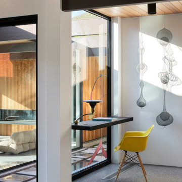 Klopf Architecture
Malibu Glass Box House by Klopf Architecture
Following the devastating Woolsey Fire of 2018, the site in Malibu offered a unique opportunity to rebuild not just a home, but a new architectural composition that highlighted the property’s potential while navigating strict fire-rebuild codes in the area. Designed by Klopf Architecture, this project embraced a set of limitations and translated them into an architectural asset.
The city’s fire-rebuild process required the new structure to remain close to the original footprint, size and bulk, a constraint that ultimately clarified the architectural direction. Perched near the front of a long, narrow lot, the new home frames and overlooks a private, park-like rear expanse, an uncommon luxury especially in this part of Malibu .
Without a fixed program, the design process allowed for a different kind of creative focus allowing Klopf Architecture the opportunity to explore how a modernist home could best respond to this site. The team approached the project not with a list of requirements, but with a question: How might a modernist live here? What spatial qualities would inspire calm, connection, and a sense of wonder in this setting? The process became less about problem-solving and more about architectural storytelling—letting the site, the light, and the principles of modern design guide the form and flow of the home.
The response emerged in the form of a glass-box pavilion, an open, Mid-Century Modern inspired living, dining, and kitchen space that floats at the edge of the property’s natural descent. Connected to the more enclosed, private areas of the home by a glass-walled hallway, the living pavilion becomes a distinct centerpiece of the design. It opens on all four sides to the landscape with decks and patios on the flanks, an internal garden and water feature to the north, and a dramatic unguarded view of the expansive backyard and ocean horizon to the south.
Because of the mandated footprint, careful planning was required to ensure every space could still engage with light, landscape, or both. Strategic voids in the form of atriums and courtyards allow daylight to filter deep into the home’s core, while offering moments of surprise and retreat. These design gestures allow natural light to filter deep into the interior, creating a sense of brightness and openness throughout the day. At the same time, they expand the perceptual boundaries between inside and out, making the home feel more expansive while anchoring its connection to the surrounding landscape.
The siting of the house is what gives it its unique character. Rather than receding into the backyard like the neighboring homes, the house holds a slight prominence. From the central living pavilion, stepping down into the landscape feels more like entering a secluded park where a separate existing accessory structure, trail, and recreational areas await. The home’s modest street presence gives way to this unfolding drama of space, view, and nature.
Fire-resilient materials and assemblies are integrated seamlessly throughout including triple-pane glazing, under-slab and roof insulation, and locally sourced fire-rated cladding ensure the house not only meets Calfornia’s rigorous wildland-urban interface (WUI) standards, but feels effortlessly aligned with them. While technical decisions like fire-hardening and mechanical systems presented some construction challenges, particularly around the cantilevered glass box, the team found a functional compromise that preserved the integrity of the design.
Inside, a restrained palette and exposed post and beam design celebrate the ethos of mid-century modernism. A central circulation spine extends from the entry to the rear glass wall, offering a continuous visual link from street to ocean. Spaces such as the library and office, though more intimate in scale, are never cut off from nature as each opens to its own unique courtyard or garden view.
Though born out of a strict regulatory framework and developed without a specific client, the rebuild design unfolded with remarkable clarity. Grounded in site logic, refined by limitations and an emphasis on timeless spatial relationships – light, proportion, and a strong connection to nature, the resulting design feels both effortless and uplifting. The home lives lightly on the land, opens generously to its surroundings, and strikes a careful balance between privacy, openness, and calm. For Klopf Architecture, it stands as a compelling case study in how site, code, and circumstantial constraints can inspire enduring, modernist architecture. With years of experience reimagining mid-century modern design for how people live today, the firm took the project’s limitations as an opportunity. The result is a home shaped by open, flowing spaces, strong indoor-outdoor connections, and a calm, clear sense of structure. It’s a good reminder that even with strict constraints, there’s still room for architecture to breathe—and for modernism to keep moving forward.
Klopf Architecture project team: Geoff Campen, John Klopf, AIA, and Sherry Tan
Structural Engineer: ZFA
Contractor: Maison D’Artiste
Photography: ©2025 Mariko Reed
Year Completed: 2023
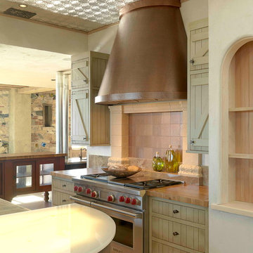 MESA Contracting, LLC
The Challenge: Create a rugged yet warm farmhouse feel in a high rise tower. Start with an entire 9600 gross square foot penthouse floor of raw concrete floor, walls and ceiling. Devise inventive ways to address intractable existing conditions including a plumbing layout inconsistent with our Client program, a relatively low ceiling and a massive elevator core and yet take of advantage of panoramic views of the city from all sides.
For example, rather than make a bulky drywall enclosure for existing pipes that poke thru the kitchen counter, they are wrapped with antique painted galvanized sheet metal to keep sight lines around the corner as open as possible. Or, transform an unattractive and inconveniently located 24” diameter vertical duct in the middle of Samantha’s and Hannah’s (grandchildren’s) guest bedroom into part of a lovely arched top bed nook. Or, disguise a chase for above floor plumbing runs as the base for an open buffet counter. The oppressive elevator lobby was shortened; terminating in handmade glass and steel garden doors at both ends. Custom details include a groined vaulted ceiling and arched openings with stone pilasters (for future trompe-l’oeil images of a Tuscany countryside). To maximize a feeling of height, the ceilings start low and get higher as they progress to the outside walls.
The Program: Create a five bedroom condo for an elderly couple with specific and different needs. Mr. likes his privacy and to stay up late into the night on the internet. He likes order. Mrs. has some physical limits that have been addressed in various ways such as shorter travel distances, a step down shower, raised dishwasher and custom cast (to ensure that they won’t rust) iron grab bars. She prefers more disorder.
Spaces should be visually arresting, full of detail and easy to maintain. Private spaces include separate master bathrooms, his and her offices and a multi screened Media Room. The balance of the floor must link spaces into one continuous open room along the south and east elevations using large elements yet keeping an intimate scale, sound control and privacy. For example, a substantial fireplace made of old barn timber framing, country stone and a hammered iron grill is strategically located at the critical Southeast corner. Above, black iron offset pintel hardware allow custom double doors to hide a large flat screen TV.
High technology is in place for inconspicuous yet easy use. Icon driven key pads operate lighting, window treatments, audio visual systems with multiple sources and access to movie and music databases and five HVAC zones with independent humidity controls.
Outstanding Features: Exterior masonry walls have stone culled from five quarries. Sprinkled throughout are surprises - bricks with words as messages from the past, wood trimmed niches and colored glass. Glass pieces set in window corners offer bursts of color when backlit by the sun. These materials are assembled in a rough irregular fashion to look like the work of a mason from the Italian countryside. Interior ceilings and walls have overlapping layers of two plaster colors. Perimeter ceilings are made of smooth random width cedar. Rough planed cedar beams hide ductwork and allow the maximum ceiling height between them.
Custom details are everywhere-consider the ten foot barn doors on overhead track at the service elevator, cedar benches/storage areas that run below window banks, antique air registers, acid washed piano hinges and transom window operators and existing concrete piers that are featured instead of hidden. The floors are made of random width wide plank old oak with hand planed faces and edges. Overall, the elements were carefully selected or painted/stained to form a soft muted gray palate
The Country kitchen features an old fashioned style ice box appearance for the refrigerator/freezer, a tin ceiling, a distressed assortment of cabinets in multiple heights, colors and woods such as the cherry wood buffet cabinet with sliding glass doors on both sides. A backlit breakfast counter, a hammered copper hood and chicken wire inserts are part of the effort to make a comfortable, eclectic old fashioned looking Kitchen while containing the latest appliances and storage systems.
Awards:
This project has won several kitchen and bath awards:
Felman Kitchen Awards
2009 St. Louis Homes and Lifestyles Kitchen of the Year – Gold Award
2008-2009 SubZero Wolf Kitchen Design Contest – Regional Winner, Regional Designer’s Choice
2010 NKBA Art of the Industry – Pinnacle of Design Award
2010 NKBA Art of the Industry – First Place Medium Kitchen
2010 NKBA Art of the Industry – Consumer’s Choice Award
2010 K&BB Kitchen of the Year Award
Felman Bath Awards
2010 Ladue News Award—Master Bathroom
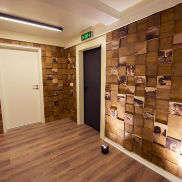 Ernest M. Ferizi
German Embassy in Pristina - Kosovo, contracted the architecture office “Ferizi + Ferizi Architects” to plan and implement an Annex Office building for their purposes. As detached part of this building is designed the waiting area, as alone standing structure.
This Office Building is constructed by assembling of Eight used office containers that were delivered on trucks and set up after only a few hours on the basis of the LEGO principle, according to the planning on strip foundations.
By removing the flexible exterior wall panels, a large room of 115 m² was created, with the counter wall as a room partition between two office spaces, each with seven workstations as well as three counters for agents on one side and a room for visitors on the other side.
With this system, room solutions can be easily implemented in all dimensions.
The container, seen as a geometric shape, is a simple, octagonal, solid box.
The standardized perfection of its dimensions is striking: 2.44 meters wide, 2.59 meters high and 6.06 meters or 12.19 meters long.
Since its introduction in 1956 by the American transport entrepreneur Malcom McLean, the container has become a standardized transport module worldwide, whether on ships, trucks or construction sites.
The shipping containers have additionally revolutionized the transport industry, pushed the globalization noticeably, and thus directly or indirectly influenced all our lives.
But after only a few years, when the first overseas containers wore out, many engineers recognized the positive properties of used shipping containers for building houses, especially since they are robust, flexible, multifunctional and second-hand relatively inexpensive to purchase. The time has long passed by to treat containers exclusively as transport objects.
As a "measure of all things", containers can hardly be ignored in construction.
Their use is no longer limited to temporary use since school containers, information containers, office containers or entire residential buildings are now part of our everyday life in the construction industry.
However, current examples of the container architecture prove that even the most demanding solutions for container building are feasible. For their specific aesthetic and spatial qualities, containers also serve as design parameters for the development of new forms of architecture and urbanity.
The office building as an extension of the visa section, characterized by modern materials and contemporary aesthetics has been designed and built mainly as a low-energy building.
Extensive insulation to achieve a comfortable and sustainable constant temperature in the interior, high window quality and low energy consumption make the building energy-efficient.
The sophisticated lighting technology, networks, heating systems and air-conditioning systems are also components of this equipment.
It creates an overall harmonic picture and guarantees the highest standard in sustainable construction, taking into consideration the fact that environmentally friendly recycling and reutilization have become an increasingly important issue in our society.
West and East side of the wooden facade is compact and has few openings, while the southern facade is completely open with lot of glass. Its spatial openness ensures a transparent, friendly work environment, which allows a lot of light into the space.
This openness allows an uninterrupted, pleasant and close-to-nature view from interior spaces into the beautiful garden. During the installation of sophisticated light sources in the garden, emphasis was not only put on functionality and security, but also on the beauty of the garden shown through the illumination in the evening.
Large, horizontal white “brisole” serve as external sun protection systems, mounted on the canopies of the entrance areas of the modular construction and the enclosure, adeptly cast shade on these areas and at the same time shape the entire architectural language.
While on one hand, the two quadratic ledges suspended in the air, are docked with steel stairs and match the wooden façade, lead the staff to their office space, the artful modern interior, on the other hand, perfectly unites the functionality, innovative technology, culture and positive effects on the employees' efficiency and wellbeing.
A lot of white, interjected by warm wooden and colored accents, determines the ambience.
In the case of the lighting solution, the mainly linear ceiling lighting is used as the overlapping design element both for the offices of the visa section as well as for the counters and the waiting area for the visitors.
They underline the puristic design in order to create a pleasant light for a desired general illumination and ensure optimal light conditions without causing disturbing reflections on the computer screens.
In addition, precisely positioned pendant luminaires are installed at the workstations, which ensure pleasant room brightness.
In the entrance area, the harmonic and uniform lighting effect from the ground highlights the integration of photography and architecture.
Photographs of landscapes, people, places, expressing unforgettable, impressive moments and memories have been lovingly engraved on 8 x 8cm square oak blocks.
The idea of an effective, impressive environment that stimulates and inspires the work was the premiss on which the whole design concept was based. Consequently, the modular construction was no longer viewed through its history of utilization and scars, but rather as a structure of work ambiance, art and elegance.
FERIZI + FERIZI Architects
Photo: Arben Llapashtica
49