
Search results for "Start thinking" in Home Design Ideas
 OakWood Designers & Builders
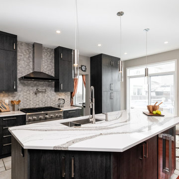
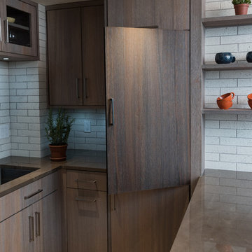
Cabinets that were starting to peel. Finishes that looked tired and dated. An overall style that wasn’t working anymore. This and more got our client thinking it was finally time to give their kitchen a contemporary makeover.
We love the use of darker cabinets for this design as they stand out beautifully when contrasted with the lighter countertop and backsplash. The combination also helps create a cozy and inviting atmosphere and helps pull the room together by giving a strong presence with their bold tones. The overall result is a bold and contemporary design that creates a modern and sophisticated atmosphere.
 Cabinet Plant
See what our client say about working with us:
I started my search for a contractor about a year before I hired Paul to do a kitchen and bathroom renovation. This was my first time at the bat, and I really had no idea what to expect. I had many contractor proposals that swung wildly in price but for some reason I never felt inclined to hire any of the guys I met with. I happened to be looking at Houzz one day and came across Paul’s company and he had very good reviews. I gave him a call and he came to my apartment quickly. I liked him immediately when we met. I thought it was strange that he asked me for my budget and how much I wanted to spend but in hindsight, providing that information allowed Paul to come back to me with a very detailed proposal based on my budget. I soon realized that the lower proposals I had did not include many of the budget items that would be necessary to complete the job. Paul laid out the pricing and provided a very reasonable “allowance” based on your measurements for tile, toilet, sinks, etc. It is up to you to stay within that allowance.
Another reason I hired Paul was because of his design skills. Paul met me in the at tile stores several times and helped guide me in choosing tile and a style for the bathroom that really looks beautiful. I fought him a little but in the end, was glad I went with his recommendations. He also uses a kitchen cabinet maker so all the cabinets are custom to what you want. Paul also has a great customer website that allows you to see all the expenses, make choices, and easily communicate with him.
If you are planning to do a renovation, I think it helps to plan for the worst and hope for the best. I live in a co-op and we had a couple of little glitches and Paul was always quick to resolve issues as they arose. He was extremely responsive and really cared about the work and doing a good job. I would definitely hire Paul again if I needed a contractor.
 San Luis Kitchen Co.
Surrounded by vineyards, horse ranches, and open land, the home is in a great location that is reasonably close to town while retaining a secluded air.
Our homeowners have enjoyed their country retreat for many years. They are blessed with a large extended family and love to host gatherings and entertain weekend guests. The only drawback to their gracious home was the drab and malfunctioning kitchen. First off, the cabinets were an out-dated whitewashed oak. Uggh! High ceilings were a plus feature that was negated by bizarrely stacked wall cabinets – making you think that maybe the original “designer” forgot about the 9 foot ceiling height. More likely, the original cabinets were stock items that didn’t come in the right size for the house. You can also see the lovely fluorescent light box tacked to the middle of the ceiling over the island. Why? Was there no thought to the style shown in the rest of the house?
Secondly, the homeowners were fighting with a poor kitchen layout. The large built-in refrigerator and separate freezer were placed right in the main traffic flow from the hall, there was not enough counter space to the right of the sink, the dishwasher was crammed right next to the fridge, and a broom closet took up prime real estate next to the cook-top. Now, remember, guests are frequent in this home and often several people were trying to use the kitchen at one time. Cross traffic and outright pile-ups were inevitable as some folks gathered veggies from the fridge to sauté at the cook-top while others were rinsing used dishes for the dishwasher and still others were taking frozen items to the prep sink and then the microwave. Don’t get me started about the trash and recycling receptacles – complete inconvenience to all!
So, our homeowners – the poor, benighted souls – were desperate for a remodel when they found San Luis Kitchen. On their first visit to our showroom, the couple fell in love with our French Country display. The display features soft white cabinets in a distressed cottage finish with a contrasting dark island and armoire; our homeowners were smitten. We knew everyone was up to the challenge and so we got right down to work.
We visited their home and measured their kitchen. While we were there, we took stock of the house’s overall style and the homeowner’s décor. We asked what they liked best about their home, what worked well and what didn’t. We found that they loved their arched passageways, the trim details on their mantle and the soft curves of the posts at their stair rail. They also showed us many photos of kitchens that they liked – both from magazines and on-line. Using this information, we went back to the office and pulled together a design.
We suggested swinging the refrigerator and freezer 90 degrees and setting them in place of the existing oven and hutch area. This brings them out of the traffic flow and into a comfortable relationship to the island counter. The fridge and freezer the homeowners chose were mismatched in width – we disguised the difference using custom detailing on the decorative panels. Deep storage cabinets above fill out the space.
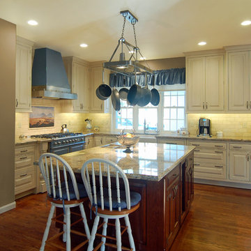
Moving the fridge/freezer gained lots of luxurious counter space to the right of the new farmhouse sink. We placed the broom closet near the hall and tucked the microwave behind closed cabinet doors (which tuck away when open) to the left of it. The beautiful existing wood floor insisted that the island remain in the same location, however we replaced it with luscious cherry cabinets in an antique burnished finish. The island retained its prep sink and gained a wine refrigerator and both a trash compactor and double bin recycling cabinet. A decorative pot rack now hangs in place of the ugly old fluorescent lights.
The highlight of the new kitchen is the La Cornue range in a bright and bold blue! The homeowners traveled to a Bay area appliance showroom to see the ranges in person before purchasing to make sure that the ovens were of suitable size and that blue was truly the right color. The range was perfect, so it was purchased. The matching blue hood was created on site using a standard stainless hood as the base and painting a tapered drywall cover. To either side of the range we placed pullout base cabinets for oils and spices and such, each fronted with a turned post chosen to echo their stairway balusters. We also chose cabinet trim (crown, light rail and toe base) to harmonize with the homes existing details.
We knew for sure that the completed kitchen was a success when the happy homeowners reported to us that over Thanksgiving they had five cooks working in the space with no conflict whatsoever. That’s a true complement to our design – Thank You!
Find the right local pro for your project
 Solar Tech Elec LLC
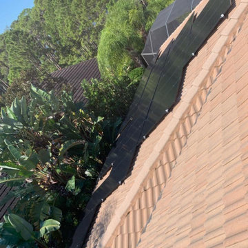
Planning to install solar panels at home and thinking about the cost of solar panels. Then you don’t have to worry, the cost of solar installations has taken a downward spin, the lowest in recent years. This cost depends on the size of your solar system among other factors. Whatever the case, we can get you started for as low as $0 down payment! Moreover, monthly repayments are less than what you’ll pay your utility company. Install solar panels with any worry, call us today @ (727) 488-8634 OR visit us for more information.
https://solartechelec.com/solar-costs/
 Paulina Perrault Interiors
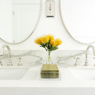
Our clients came to us with a dream to create a home that was beautiful, filled with classic details yet embody a Modern French aesthetic. We started with the foundation, selecting materials that would be the building blocks for our design. One of the joys of this project was the client's love of color, primarily in hues of blue. A special moment in the kitchen with its jewel-like Azul Macauba Quartzite countertop, brass hardware, and sailor’s coat blue island. As we are designing for a family, practical touches along with luxury elements were a must. Creative thinking was used to reimagine the entry closet into a multi-purpose space including the laundry, drop zone, and pantry. The master bath was filled with a classic design from the scones, wallcoverings to crystal hardware...all to transport you to a french apartment overlooking the streets of Paris. A modern twist inserted was the approach for the family room fireplace. The clean lines of stacked stone were the perfect touch. Our clients' dream home became reality in our Modern French Project and will be loved for years to come.
 Sosna Inc
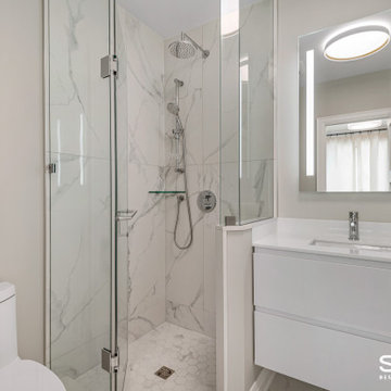
After serving as a rental for some time, this home was ready to be reclaimed by its owner and her son.
Gutting “back to the studs” was an understatement for this one. This transformation involved replanning everything; including the roof, the HVAC system, the entire plumbing system, and relocating the side entrance and staircase to the back of the house. Only the subfloors, the exterior framing structure, and the brick remains from this original 1940’s-built bungalow.
When we’re renovating an old structure, we’re bound to find some surprises. This renovation did not disappoint! From basement to roof, we found more than a few, shall we say, potentially catastrophic surprises along the way.
Let’s start with the basement. The homeowner wanted to update the basement and make it a usable living space for her adult son as well as a spa with a sauna for her. This required bringing the 6 foot ceiling height up to code at 7 feet. To do this, we had to re-think the HVAC system that was in the basement ceiling. When we opened up the basement ceiling to remove the HVAC supply and return trunks, we discovered asbestos! The asbestos had to be removed before we could dismantle and remove the HVAC system.
For the main floor, when we were replanning the existing 2-bedroom layout to create two master bedrooms each with their own ensuites, we looked at the possibility of removing the main load-bearing wall. But our investigations led to the discovery that the load bearing wall was not lined up with the roof or the basement load points, so the load of the house was not continuous throughout. This was a disaster waiting to happen. And as we found out, this lack of alignment was causing major issues with the roof when we went to replace the shingles. We discovered portions of the roof truss in very poor condition, literally moments away from giving out. These were replaced and other truss components were fortified before we went on to re-shingle the roof and replace all the soffits and eavestroughs.
Once the structural and space planning elements were sorted out, we could turn our focus to helping this homeowner select the finishes she and her son wanted for their new spaces. She wanted white all the way, and he wanted bold colours. You will see these color choices reflected in their private bathrooms as well as in the upper kitchen and living area that she will mostly use, and the basement entertainment area that he will mostly use.
To round out the personalization of this made-new-again home, we converted the basement into an entertainment center with a bar for her son, and a sauna and third full bathroom with a jacuzzi tub for a spa-like feel for her.
Without having to build from scratch, this homeowner got the custom home of her dreams.
While you “can’t teach an old dog new tricks”, the sky’s the limit on how you can transform an old home into the home of your dreams. When your “old dog” needs some new tricks, we are the Renovator You Can Count On.
 Revival by Design
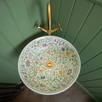
We just love it when a client comes to us and says “I’ve come to you because I want something different, I don’t want a standard bathroom companies design and layout.” For us this is brilliant, because it means we have some creative freedom to design something special.
Having worked with this client before, we knew she liked pattern and colour, specifically William Morris. Keen not to overdo it on William Morris print we considered other designs that might be of a similar look and feel, so we used Lewis and Wood for the powder room and Christopher Farr for the family bathroom, both wonderful wallpapers that offer more of a mural feel.
With the powder room we considered the adjoining rooms, the rural location and also the size of the space. When it comes to small spaces I think more really is more, so we went for it, we know our client loved green and also the London Basin Company, so those were our starting points.
The family bathroom, located in a completely different part of the house, has a more serene feel, although still embraces pattern and colour. The Christopher Farr wallpaper was finished in decorators varnish to ensure a good moisture barrier and the baked tile company tiles continue the muted colour palette.
Our client tells us that they have received lots of complements already :)

 Cabinet Plant
See what our client say about working with us:
I started my search for a contractor about a year before I hired Paul to do a kitchen and bathroom renovation. This was my first time at the bat, and I really had no idea what to expect. I had many contractor proposals that swung wildly in price but for some reason I never felt inclined to hire any of the guys I met with. I happened to be looking at Houzz one day and came across Paul’s company and he had very good reviews. I gave him a call and he came to my apartment quickly. I liked him immediately when we met. I thought it was strange that he asked me for my budget and how much I wanted to spend but in hindsight, providing that information allowed Paul to come back to me with a very detailed proposal based on my budget. I soon realized that the lower proposals I had did not include many of the budget items that would be necessary to complete the job. Paul laid out the pricing and provided a very reasonable “allowance” based on your measurements for tile, toilet, sinks, etc. It is up to you to stay within that allowance.
Another reason I hired Paul was because of his design skills. Paul met me in the at tile stores several times and helped guide me in choosing tile and a style for the bathroom that really looks beautiful. I fought him a little but in the end, was glad I went with his recommendations. He also uses a kitchen cabinet maker so all the cabinets are custom to what you want. Paul also has a great customer website that allows you to see all the expenses, make choices, and easily communicate with him.
If you are planning to do a renovation, I think it helps to plan for the worst and hope for the best. I live in a co-op and we had a couple of little glitches and Paul was always quick to resolve issues as they arose. He was extremely responsive and really cared about the work and doing a good job. I would definitely hire Paul again if I needed a contractor.
 Revival by Design
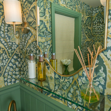
We just love it when a client comes to us and says “I’ve come to you because I want something different, I don’t want a standard bathroom companies design and layout.” For us this is brilliant, because it means we have some creative freedom to design something special.
Having worked with this client before, we knew she liked pattern and colour, specifically William Morris. Keen not to overdo it on William Morris print we considered other designs that might be of a similar look and feel, so we used Lewis and Wood for the powder room and Christopher Farr for the family bathroom, both wonderful wallpapers that offer more of a mural feel.
With the powder room we considered the adjoining rooms, the rural location and also the size of the space. When it comes to small spaces I think more really is more, so we went for it, we know our client loved green and also the London Basin Company, so those were our starting points.
The family bathroom, located in a completely different part of the house, has a more serene feel, although still embraces pattern and colour. The Christopher Farr wallpaper was finished in decorators varnish to ensure a good moisture barrier and the baked tile company tiles continue the muted colour palette.
Our client tells us that they have received lots of complements already :)
 Baker Patios
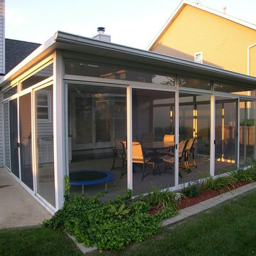
We are a reliable and professional patio and decks contractor, offering the much needed patio enclosure design and construction services in Cudahy and neighboring cities. If you are thinking about the next patio project, let Baker Patios offer the excellent construction services that you need. We start by creating a custom plan for your dream residential patio and work with you to the very end!
Patio Enclosure Design and Construction in Cudahy, CA - http://www.bakerpatios.com/
 Massiano
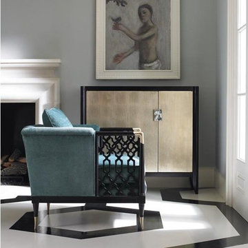
Elegant embroidered fabric was the starting point for this exposed wood frame, influencing the open fretwork design on each arm panel. The Tuxedo Black finish is further set off by matte brass plated metal accents and a lush textured fabric. Float this chair in a room in which you are able to take in all the sides – we think it’s stunning from every angle.
Dimensions: 28.5W x 34.75D x 29.25H
Seat Height: 20 Arm Height: 27.5
Features:
Carved Wood in a Lattice Design on Arms, Brass-Plated Knuckles and Ferrules, Loose Seat Cushion
Construction:
Ultra Plush Down Cushion, 8-Way Hand Tied Seat, Feather Down Pillow
 American Home & Stone Inc
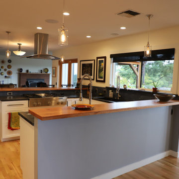
This project included new Huntwood Cabinets cabinetry with shaker style doors in colonial white, EleMar Oregon Granite & Marble sourced Negresco Leathered granite counter-tops, and new Blanco America sinks! Thinking of starting a remodel? Call or stop by the showroom! (541) 929-3100
 Amy Troute Inspired Interior Design
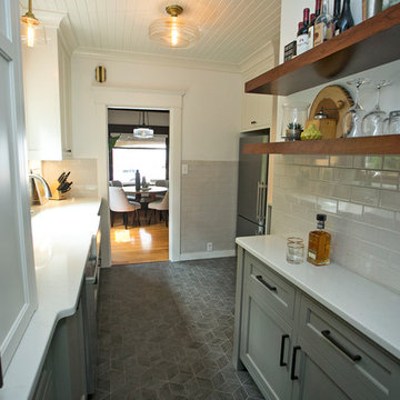
There’s nothing quite like a cozy cottage to call home. Especially when you can get creative, renovating key spaces to balance modern convenience and vintage charm. We collaborated with the talented homeowners to bring their vision to life an the results speak for themselves. A gourmet kitchen fits seamlessly in the original home’s footprint and not one, but two thoughtfully re-designed bathrooms bring a slice of luxury and function to this sweet little home. The modern-meets-classic kitchen tiles started it all, setting the tone for the entire renovation. Gourmet appliances and custom cabinetry maximized function and storage and new lighting was a perfect finishing touch. We completely re-worked the home’s “master” bath (you should see the “before!”), adding a spacious frameless glass shower. In the basement, the new bathroom is every bit the retreat the homeowner dreamed of, with the freestanding composite tub, an enormous vanity and a hidden stackable washer and dryer. The decommissioned fireplace is oh-so decorative, showing off with new Ann Sacks marble mosaic tile. The transformation is impressive, and it’s so rewarding to see this lovely couple and sweet pup happy in their adorable home! Furniture staging for photography provided by Crush Staging, Portland. Photography by Cody Wheeler.
Sponsored
Sunbury, OH

J.Holderby - Renovations
Franklin County's Leading General Contractors - 2X Best of Houzz!
 DesignFix LLC
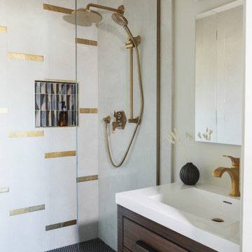
This organic modern whole-home renovation is anchored by rich walnut throughout — slatted wood walls define spaces, a custom wood-paneled ceiling floats over the living area, and seamless cabinetry wraps the kitchen — all unified by a dramatic black-veined marble island and sculptural rattan cloud pendants. A serene palette of sage, warm cream, and cognac flows from room to room, with standout moments including a hidden door camouflaged in the living room's custom wall mural, a bold powder room with embroidered black-and-white wallpaper and brass fixtures, and a primary bedroom featuring a luminous gold-leaf mural. Every detail reflects a confident, nature-forward aesthetic that feels both luxurious and effortlessly livable.
 August Grace Interiors
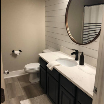
The client contacted August Grace Interiors after starting the remodel. They wanted help selecting paint colors and finish materials. The outcome is a clean modern farmhouse look. This project was done on a limited budget and included laying vinyl plank flooring over existing ceramic tile to reduce expense and to minimize disruption to the family's main bathroom.
 Rain Garden Nursery LandscapeMakeoverDesignStaging
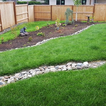
Scott & Catherine Buley, HTT&T, High Tech Turf & Trees, LandscapeMakeover.biz, Rain Garden Nursery
Inspiration for an eclectic landscaping in Portland.
Inspiration for an eclectic landscaping in Portland.
 Rethink Contracting
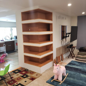
Corner shelves that started with a small image client found somewhere
Photo Credit: ReThink Contracting
Example of a trendy living room design in Santa Barbara
Example of a trendy living room design in Santa Barbara


 Jarrett Design
These clients win the award for ‘Most Jarrett Design Projects in One Home’! We consider ourselves extremely fortunate to have been able to work with these kind folks so consistently over the years.
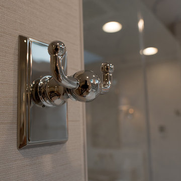
The most recent project features their master bath, a room they have been wanting to tackle for many years. We think it was well worth the wait! It started off as an outdated space with an enormous platform tub open to the bedroom featuring a large round column. The open concept was inspired by island homes long ago, but it was time for some privacy. The water closet, shower and linen closet served the clients well, but the tub and vanities had to be updated with storage improvements desired. The clients also wanted to add organized spaces for clothing, shoes and handbags. Swapping the large tub for a dainty freestanding tub centered on the new window, cleared space for gorgeous his and hers vanities and armoires flanking the tub. The area where the old double vanity existed was transformed into personalized storage closets boasting beautiful custom mirrored doors. The bathroom floors and shower surround were replaced with classic white and grey materials. Handmade vessel sinks and faucets add a rich touch. Soft brass wire doors are the highlight of a freestanding custom armoire created to house handbags adding more convenient storage and beauty to the bedroom. Star sconces, bell jar fixture, wallpaper and window treatments selected by the homeowner with the help of the talented Lisa Abdalla Interiors provide the finishing traditional touches for this sanctuary.
Jacqueline Powell Photography
 Robin's Nest Interiors
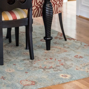
This long time client of ours recently moved to a new home and wanted to incorporate some of her favorite furnishings into a fresher look. She had this lovely dining table and upholstered chairs; however, the fabrics were red, golds and greens. The key to making these colors work with a more updated color palette is to find a fabric, rug and artwork that have those colors as well as other colors in them. We were able to find all three things, and now the reds and golds are an accent in the space. The walls above the wainscoting are painted Sherwin Williams’ Escape Gray (SW6185) which is a lovely gray/green color. We added a sleek sideboard in the recessed area that coordinated perfectly with the table and chairs. We reused the homeowner’s mirror and lamps and added accessories to complete the vignette. We flanked the recessed area with artwork in reds and the green/gray colors as well as a large landscape on the adjacent wall. We dressed the window with drapery panels in a vibrant floral fabric which incorporated all of our colors. Our muted rug also supports our updated color palette. And last but not least, the gold chandelier is truly a focal point in the room.
This is one gorgeous Dining Room, and I do not think we could have done any better if we had started from scratch. Red and golds have been overdone in the past, but I love red and I love incorporating it as an accent in a space. This is definitely “red done right!” Enjoy!
 ⚜️Josue_JR_Ramos_NExSystems⚜️
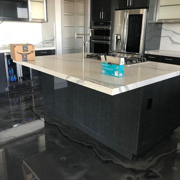
High End Metallic Epoxy Flooring System with Pearl White Primer, Whale and Emerald Metallic Body Coat, and a Clear Slip Resistant Polyurethane Top Coat.
121