
Search results for "Stopper" in Home Design Ideas
 TVL Creative Ltd.
Cramped kitchen be gone! That was the project motto and top priority. The goal was to transform the current layout from multiple smaller spaces into a connected whole that would activate the main level for our clients, a young family of four.
The biggest obstacle was the wall dividing the kitchen and the dining room. Removing this wall was central to opening up and integrating the main living spaces, but the existing ductwork that ran right through the center of the wall posed a design challenge, er design opportunity. The resulting design solution features a central pantry that captures the ductwork and provides valuable storage- especially when compared to the original kitchen's 18" wide pantry cabinet. The pantry also anchors the kitchen island and serves as a visual separation of space between the kitchen and homework area.
Through our design development process, we learned the formal living room was of no service to their lifestyle and therefore space they rarely spent time in. With that in mind, we proposed to eliminate the unused living room and make it the new dining room. Relocating the dining room to this space inherently felt right given the soaring ceiling and ample room for holiday dinners and celebrations. The new dining room was spacious enough for us to incorporate a conversational seating area in the warm, south-facing window alcove.
Now what to do with the old dining room?! To answer that question we took inspiration from our clients' shared profession in education and developed a craft area/homework station for both of their boys. The semi-custom cabinetry of the desk area carries over to the adjacent wall and forms window bench base with storage that we topped with butcher block for a touch of warmth. While the boys are young, the bench drawers are the perfect place for a stash of toys close to the kitchen.
The kitchen begins just beyond the window seat with their refrigerator enclosure. Opposite the refrigerator is the new pantry with twenty linear feet of shelving and space for brooms and a stick vacuum. Extending from the backside of the pantry the kitchen island design incorporates counter seating on the family room side and a cabinetry configuration on the kitchen side with drawer storage, a trashcan center, farmhouse sink, and dishwasher.
We took careful time in design and execution to align the range and sink because while it might seem like a small detail, it plays an important role in supporting the symmetrical configuration of the back wall of the kitchen. The rear wall design utilizes an appliance garage mirrors the visual impact of the refrigerator enclosure and helps keep the now open kitchen tidy. Between the appliance garage and refrigerator enclosure is the cooking zone with 30" of cabinetry and work surface on either side of the range, a chimney style vent hood, and a bold graphic tile backsplash.
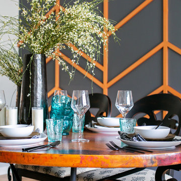
The backsplash is just one of many personal touches we added to the space to reflect our client's modern eclectic style and love of color. Swooping lines of the mid-mod style barstools compliment the pendants and backsplash pattern. A pop of vibrant green on the frame of the pantry door adds a fresh wash of color to an otherwise neutral space. The big show stopper is the custom charcoal gray and copper chevron wall installation in the dining room. This was an idea our clients softly suggested, and we excitedly embraced the opportunity. It is also a kickass solution to the head-scratching design dilemma of how to fill a large and lofty wall.
We are so grateful to bring this design to life for our clients and now dear friends.
 Tell Projects
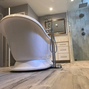
This show stopper, Houston Heights, impressive master bath proves just how much you can do when your space is limited. Universal Gray Sherwin Williams was used throughout the house. White shaker cabinetry with 10" chrome cabinet handles. Venatino Quartz was used to give a bit of warmth. Vintage and chrome 3 piece faucets with square undermount sinks and crystal lighting to give this place a bit of shimmer.
 SCM Design Group
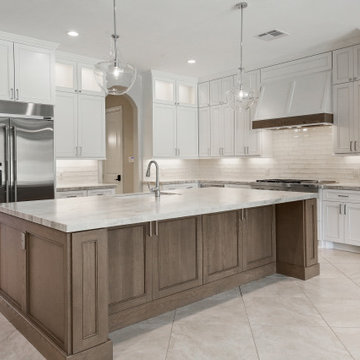
Welcome to the height of open concept living! We designed this luxury kitchen with entertaining in mind. Our streamlined design and top of the line appliances, including two Viking dishwashers, will make creating those memorable moments with friends and family a breeze. And let's not forget our show-stopper backsplash that breaths life into this family kitchen! Designer: Blythe Strait, Pablo Arguello
Find the right local pro for your project
 JM Kitchen & Bath Design
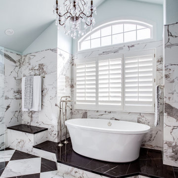
This gorgeous Main Bathroom starts with a sensational entryway a chandelier and black & white statement-making flooring. The first room is an expansive dressing room with a huge mirror that leads into the expansive main bath. The soaking tub is on a raised platform below shuttered windows allowing a ton of natural light as well as privacy. The giant shower is a show stopper with a seat and walk-in entry.
 Lori Manning Designs
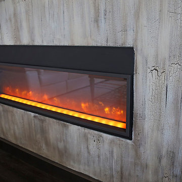
This vibrant, abstract living room is sure to be a show stopper! The use of not so common colors such as the vibrant orange, makes this a very unique space! The faux finish on the walls, built in fire place, and beautiful high end furniture make this a gorgeous and not so typical space!
 Qualita Renovations
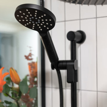
This small bathroom was completely transformed into a show stopper! Black and white colours. Terrazzo floor tile with a tileable drain. White subway installed vertically gives a more contemporary look and young look to the room. Black fixtures, vanity and framed shower door completes this bold but yet timeless renovation project.
 Cabinets 4U, Inc.
A Light and Bright Classic
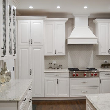
There are no windows in this kitchen, so the homeowner wanted to keep it light, airy, and open. The beautiful tones of white and taupe keep the space fresh and classic.
Kemper ‘Echo’ cabinetry was used, in the Eksten door style. The Eksten offers great style and detail, while the clean lines keep it feeling modern. The Alabaster painted finish is a great mid-tone white, which blends flawlessly with the Arabesque tile, River White granite, fabrics and wall color.
Details: The room’s focal point features stunning leaded glass inserts and updated lantern style wall tile. The sleek hood keeps the range area from feeling heavy, while still featuring detailed moldings. The detailed pulls in oil rubbed bronze pick up on the wood tones. Final touches include the show-stopper island legs, and the sparkle of the light fixtures and faucet.
 Attleboro Kitchen and Bath
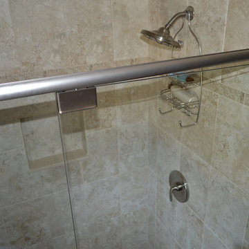
Two bathrooms updated at the same time? Yep! The kids' hall bath received a fresh look with a white painted vanity and yellow river granite top. The master took on classic styling with a oversized Wolf Classic Hudson vanity and a expanded walk in tile shower. The show stopper is the custom clear semi-frameless glass shower door that make the space feel expansive.
 Simply Stunning Spaces
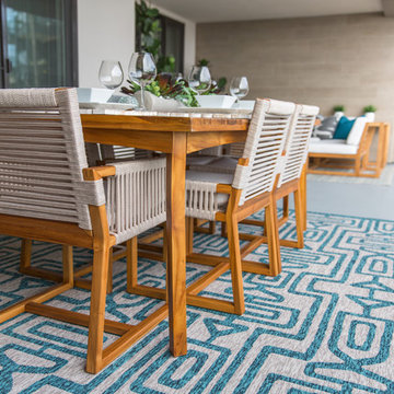
This La Jolla condo went from plain jane to super stylish in a flash! Custom local artists and photographers paired with a custom Simply Stunning Spaces sectional, shag wool rug, exquisite modern light fixtures with a trendy fun edge. The outdoor living space was made to feel like an extension of the interior. Nestled on the busy oceanfront walk of Wind n Sea, this patio is a show stopper! Clean, modern, coastal with a pop of feminine & trendy.
 Savvy Spaces Design LLC
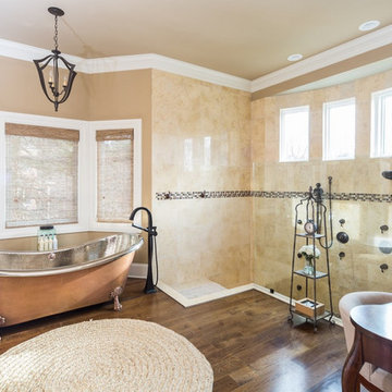
Marble and hardwood combine to make this elegant Master Bathroom a show stopper! The open glass-fronted step down shower with multiple jets is simply a bonus
 TVL Creative Ltd.
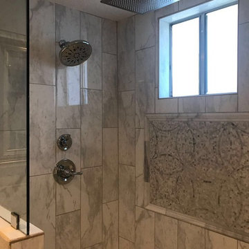
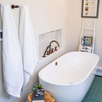
Our clients, two NYC transplants, were excited to have a large yard and ample square footage, but their 1959 ranch featured an en-suite bathroom that was more big-apple-tiny and certainly not fit for two. The original goal was to build a master suite addition on to the south side of the house, but the combination of contractor availability and Denver building costs made the project cost prohibitive. So we turned our attention to how we could maximize the existing square footage to create a true master with walk-in closet, soaking tub, commode room, and large vanity with lots of storage. The south side of the house was converted from two bedrooms, one with the small en-suite bathroom, to a master suite fit for our client’s lifestyle. We used the existing bathroom footprint to place a large shower which hidden niches, a window, and a built-in bench. The commode room took the place of the old shower. The original ‘master’ bedroom was divided in half to provide space for the walk-in closet and their new master bathroom. The clients have, what we dubbed, a classy eclectic aesthetic and we wanted to embrace that with the materials. The 3 x 12 ceramic tile is Fireclay’s Tidewater glaze. The soft variation of a handmade tile plus the herringbone pattern installation makes for a real show stopper. We chose a 3 x 6 marble subway with blue and green veining to compliment the feature tile. The chrome and oil-rubbed bronze metal mix was carefully planned based on where we wanted to add brightness and where we wanted contrast. Chrome was a no-brainer for the shower because we wanted to let the Fireclay tile shine. Over at the vanity, we wanted the fixtures to pop so we opted for oil-rubbed bronze. Final details include a series of robe hook- which is a real option with our dry climate in Colorado. No smelly, damp towels!- a magazine rack ladder and a few pops of wood for warmth and texture.
 Tell Projects
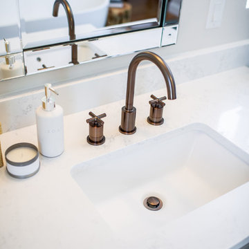
This show stopper, Houston Heights, impressive master bath proves just how much you can do when your space is limited. Universal Gray Sherwin Williams was used throughout the house. White shaker cabinetry with 10" chrome cabinet handles. Venatino Quartz was used to give a bit of warmth. Vintage and chrome 3 piece faucets with square undermount sinks and crystal lighting to give this place a bit of shimmer.
 TVL Creative Ltd.
Our clients, two NYC transplants, were excited to have a large yard and ample square footage, but their 1959 ranch featured an en-suite bathroom that was more big-apple-tiny and certainly not fit for two. The original goal was to build a master suite addition on to the south side of the house, but the combination of contractor availability and Denver building costs made the project cost prohibitive. So we turned our attention to how we could maximize the existing square footage to create a true master with walk-in closet, soaking tub, commode room, and large vanity with lots of storage. The south side of the house was converted from two bedrooms, one with the small en-suite bathroom, to a master suite fit for our client’s lifestyle. We used the existing bathroom footprint to place a large shower which hidden niches, a window, and a built-in bench. The commode room took the place of the old shower. The original ‘master’ bedroom was divided in half to provide space for the walk-in closet and their new master bathroom. The clients have, what we dubbed, a classy eclectic aesthetic and we wanted to embrace that with the materials. The 3 x 12 ceramic tile is Fireclay’s Tidewater glaze. The soft variation of a handmade tile plus the herringbone pattern installation makes for a real show stopper. We chose a 3 x 6 marble subway with blue and green veining to compliment the feature tile. The chrome and oil-rubbed bronze metal mix was carefully planned based on where we wanted to add brightness and where we wanted contrast. Chrome was a no-brainer for the shower because we wanted to let the Fireclay tile shine. Over at the vanity, we wanted the fixtures to pop so we opted for oil-rubbed bronze. Final details include a series of robe hook- which is a real option with our dry climate in Colorado. No smelly, damp towels!- a magazine rack ladder and a few pops of wood for warmth and texture.
 French Creek Designs Kitchen & Bath Design Center
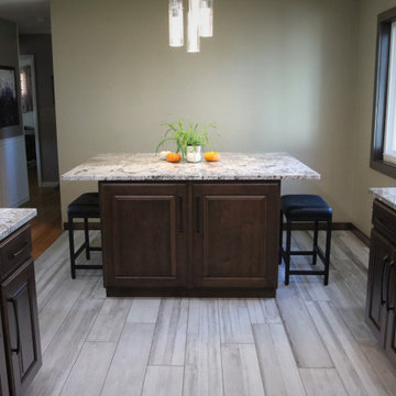
Client Kitchen Remodel 123 is a show stopper! Delightfully rich in tones with Cherry stained cabinets. This full galley kitchen renovation is stunning. Clients goal was to enlarge the galley kitchen and create a more useful space. Therefore, with the addition of moving the back wall and the fridge wall. This provided an additional 30″ of space for even more cabinetry. As well as allowed the doorway to not be overtaken by cabinets. In addition, cabinets are added to both existing walls and moved into the dining area, providing much needed storage.
 Masterpiece Design Group
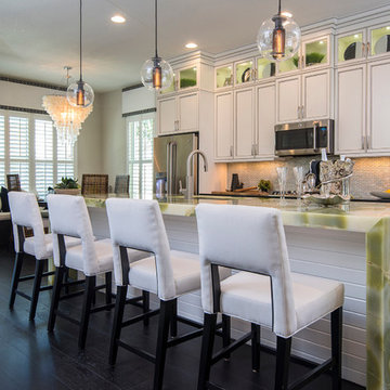
Even a simple white kitchen can become a show-stopper, by introducing an onyx water-fall edge island.
Inspiration for a kitchen remodel in Orlando
Inspiration for a kitchen remodel in Orlando
 Ken Nash & Chloe Nash
SOLD - Modern Craftsman Show-Stopper Home in the East of Market Neighborhood of Downtown Kirkland. The East of Market Neighborhood is a short commute to major employers like Google, Microsoft, and Boeing. From the East of Market Neighborhood, it is mere minutes to cultural attractions, to resort-like recreation areas, and to world-class shopping in downtown Seattle and Bellevue.
 Charleene's Houses, LLC
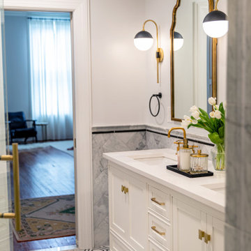
Carrera marble in all its glory is the big show stopper in this Bolton Hill rowhome master bath renovation. What started as a cramped, chopped up room was opened into a sparkling, luxurious space evocative of timeless Old World mansion baths. The result demonstrates what’s possible when mixing multiple marble tile shapes, colors and patterns. To visually frame the bathroom, we installed 6” x 12” honed Carrera marble tiles laid in a herringbone pattern for wainscotting, and carried the same marble pattern into the shower stall in order to create depth and dimension. The wainscotting is set off by beautifully-detailed Carrera marble chair rail and black tile pencil moulding. Carrera hex shower tiles, marble sills and bench, and intricate Carrera and black mosaic flooring complete the marble details. The crisp white double vanity and inconspicuous builtins tastefully compliment the marble, and the brass cabinet hardware, mirrors and plumbing and lighting fixtures add a burst of color to the room.
 Simply Stunning Spaces
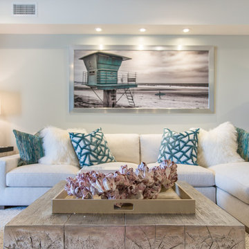
This La Jolla condo went from plain jane to super stylish in a flash! Custom local artists and photographers paired with a custom Simply Stunning Spaces sectional, shag wool rug, exquisite modern light fixtures with a trendy fun edge. The outdoor living space was made to feel like an extension of the interior. Nestled on the busy oceanfront walk of Wind n Sea, this patio is a show stopper! Clean, modern, coastal with a pop of feminine & trendy.
 Pittenger Builders
New Home Build at the Jersey Shore
This complex modern style is a show stopper in this neighborhood.
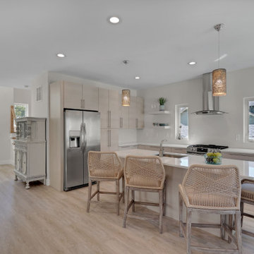
Example of a mid-sized minimalist kitchen design in Other
Example of a mid-sized minimalist kitchen design in Other
 TVL Creative Ltd.
Cramped kitchen be gone! That was the project motto and top priority. The goal was to transform the current layout from multiple smaller spaces into a connected whole that would activate the main level for our clients, a young family of four.
The biggest obstacle was the wall dividing the kitchen and the dining room. Removing this wall was central to opening up and integrating the main living spaces, but the existing ductwork that ran right through the center of the wall posed a design challenge, er design opportunity. The resulting design solution features a central pantry that captures the ductwork and provides valuable storage- especially when compared to the original kitchen's 18" wide pantry cabinet. The pantry also anchors the kitchen island and serves as a visual separation of space between the kitchen and homework area.
Through our design development process, we learned the formal living room was of no service to their lifestyle and therefore space they rarely spent time in. With that in mind, we proposed to eliminate the unused living room and make it the new dining room. Relocating the dining room to this space inherently felt right given the soaring ceiling and ample room for holiday dinners and celebrations. The new dining room was spacious enough for us to incorporate a conversational seating area in the warm, south-facing window alcove.
Now what to do with the old dining room?! To answer that question we took inspiration from our clients' shared profession in education and developed a craft area/homework station for both of their boys. The semi-custom cabinetry of the desk area carries over to the adjacent wall and forms window bench base with storage that we topped with butcher block for a touch of warmth. While the boys are young, the bench drawers are the perfect place for a stash of toys close to the kitchen.
The kitchen begins just beyond the window seat with their refrigerator enclosure. Opposite the refrigerator is the new pantry with twenty linear feet of shelving and space for brooms and a stick vacuum. Extending from the backside of the pantry the kitchen island design incorporates counter seating on the family room side and a cabinetry configuration on the kitchen side with drawer storage, a trashcan center, farmhouse sink, and dishwasher.
We took careful time in design and execution to align the range and sink because while it might seem like a small detail, it plays an important role in supporting the symmetrical configuration of the back wall of the kitchen. The rear wall design utilizes an appliance garage mirrors the visual impact of the refrigerator enclosure and helps keep the now open kitchen tidy. Between the appliance garage and refrigerator enclosure is the cooking zone with 30" of cabinetry and work surface on either side of the range, a chimney style vent hood, and a bold graphic tile backsplash.
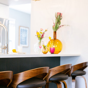
The backsplash is just one of many personal touches we added to the space to reflect our client's modern eclectic style and love of color. Swooping lines of the mid-mod style barstools compliment the pendants and backsplash pattern. A pop of vibrant green on the frame of the pantry door adds a fresh wash of color to an otherwise neutral space. The big show stopper is the custom charcoal gray and copper chevron wall installation in the dining room. This was an idea our clients softly suggested, and we excitedly embraced the opportunity. It is also a kickass solution to the head-scratching design dilemma of how to fill a large and lofty wall.
We are so grateful to bring this design to life for our clients and now dear friends.
37