
Search results for "Straddle" in Home Design Ideas
 Lloyd Architects
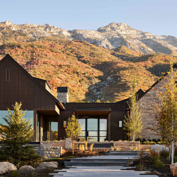
The Three Falls home is located in Alpine City, a quiet residential community tucked into the foothills of Lone Peak in the Wasatch Mountain Range of Northern Utah. The site straddles Three Falls Creek and is largely wooded with native oak and other deciduous trees with an open meadow and views to the North of the house and views of Utah Lake and Valley to the south. The linked pavilions are expressed as simple vernacular gabled forms which recall the mountain peaks beyond and define the three living areas of the house while being separated by daylit connector ‘bridges’ that create a floating transparency from mountain to valley. The master bedroom and children bedrooms access are separated from the gathering pavilion through the bridge and open stair.
Materials for the house center on natural traditional building materials including Indiana Limestone, stained Accoya siding, copper gutters and trim along with a discrete integrated Tesla solar roof tile system that generates 24 kW of sustainable energy to the house. Interior finishes are sophisticated, yet relaxed with Walnut millwork, textural stone, and touches of brass repeated throughout the home.
 HU-235072162
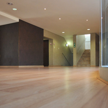
The Dental Studio is a highly intricate building that uniquely links two separate stands of two neighbourhoods and straddling a four metre broad municipal
servitude. The western part of the neighbourhood is an office precinct consisting of low scaled office buildings set around a communal access street and
parking. It was designed for a leading dental practice with state of the art equipment and progressive philosophy of service.
It presents itself as an uncomplicated rectangular structural mass that elegantly characterise an intersection of a major neighbourhood boulevard and is
notable along the eastern end with an upright circulation tower. The western end on the other hand, is characterised with vertical solar control screens
which serve a dual purpose, that is, sifting low down western sun rays as well as giving a serene appeal to the mass. The daring spotless form of the
building is a truthful reflection of the nature of the sterile dental environment that is housed within. This houses the central vestibule and reception with a
visual interface as well as pedestrian movements along the edge of the building.
Healing and healthcare is a paradox that requires architectural intervention. It is this same paradox that informed measures taken towards developing this
project as a revised prototype. Exacerbated by the need to research a building type that can promote healing environment, the Dental Studio attempts
to create a closer harmony with nature through views, landscape and daylight.
 Jordan Design Build Group
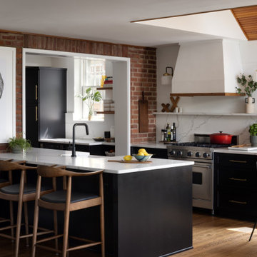
Expanding and updating the kitchen was our top priority – the new layout was designed to straddle the original house and the addition, creating work zones rather than the traditional work triangle. The modified galley layout more than doubled their countertop area and storage space. Extending the kitchen into the addition took full advantage of the vaulted ceilings and light-filled space. To improve flow and connectivity, we opened up a wall between the old kitchen and the front entry hall providing a straight path from front door to the new mudroom/drop zone and kitchen beyond. A door from the dining room into the kitchen was shifted to allow for a more generous kitchen.
The beautifully veined Calacatta Eiffel quartz counters and backsplash provide visual contrast with the black cabinetry and keep the space from feeling too heavy. A continuous ledge and floating shelves replace traditional uppers for a more open and modern feel. Stained wood is used throughout, from the bench top, to shelving, trim and custom millwork; it brings in a natural element and helps unite all of the spaces. A hood with a custom Venetian plaster finish is flanked by vintage inspired sconces and provides a stunning focal point in the room. A deep nook is home to a ‘bubble box’ that dispenses cold sparkling or still water on demand – the marble tile backsplash further differentiates this beverage zone. The brushed brass hardware stands out against the dark cabinets and adds a touch of warmth. With seating for three at the counter and the inclusion of a breakfast area banquette (with drawers), the home is ideal for family time and relaxed gatherings with friends.
Find the right local pro for your project
 Studio InSitu Architects
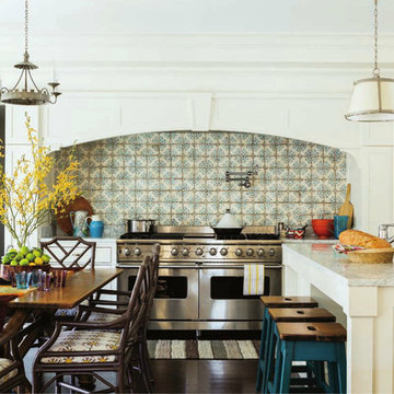
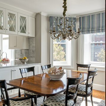
This project updated an elegant house from the firm of Royal Berry Wills. The house sits on a gracious and deep double-lot straddling the Weston/Wellesley line. Handsome proportions and simple details outside conceal more refinement inside. The entry facade was modest while the rear dining room bay added personality.
The clients, active during the week and prolific entertainers during the weekend needed a home that enables graceful entertaining while being comfortable and manageable.
Our renovation made the home comfortable and easy to manage while supporting and preserving the large rooms of the original house that are well suited for large gatherings.
At the front facade, our addition subordinates itself to the main house. At the garden facade, the grand scale of the new whole takes cues from the original Royal Berry Wills house to address the grandeur and depth of the back garden.
builder: The Hartwright Company
design team: Tim Hess, Chip Dewing, Matt Emond
all for DSA Architects
Interior Decorator: Mally Skok
photographs: Michael J.Lee, Tim Hess

 building Lab, inc.
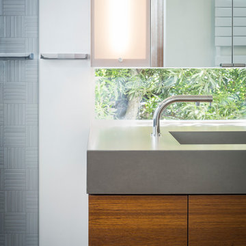
While the existing upstairs sitting room was spacious and welcoming, with a panoramic view of Golden Gate Bridge, Ghirardelli Square and Alcatraz, the sole bathroom on the floor and an adjacent dressing room, situated in the center, were dark and claustrophobic, with no view. We proposed enclosing a small deck to create a bright 90 sq. ft. en-suite master bath, a new dressing area, and a powder room accessible from the hallway.
The challenge was to make a room feel big without the benefit of a view. We saw this project as nestling a master bath in the trees, playing with the variegated light in the foliage and creating an indoor/outdoor shower experience.
Blue sky and lush trees are visible from the shower through a large picture window, while light filtered by the greenery splashes over the counter through a long, low view window. A new skylight straddles the master bath and the powder room. Transom glass around the perimeter of the powder room allows glimpses of light bouncing through both the bath and the powder room as well as the new dressing area.
 Wanda Ely Architect Inc.
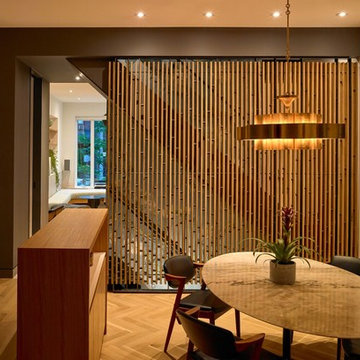
The dining room is sunken one step to create a sense of comforting enclosure, bounded by a modern interpretation of a traditional shoji screen. A change in wood flooring pattern marks the room as distinct, the herringbone texture reminiscent of customary woven tatami mats.
 HU-235072162
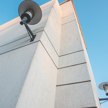
The Dental Studio is a highly intricate building that uniquely links two separate stands of two neighbourhoods and straddling a four metre broad municipal
servitude. The western part of the neighbourhood is an office precinct consisting of low scaled office buildings set around a communal access street and
parking. It was designed for a leading dental practice with state of the art equipment and progressive philosophy of service.
It presents itself as an uncomplicated rectangular structural mass that elegantly characterise an intersection of a major neighbourhood boulevard and is
notable along the eastern end with an upright circulation tower. The western end on the other hand, is characterised with vertical solar control screens
which serve a dual purpose, that is, sifting low down western sun rays as well as giving a serene appeal to the mass. The daring spotless form of the
building is a truthful reflection of the nature of the sterile dental environment that is housed within. This houses the central vestibule and reception with a
visual interface as well as pedestrian movements along the edge of the building.
Healing and healthcare is a paradox that requires architectural intervention. It is this same paradox that informed measures taken towards developing this
project as a revised prototype. Exacerbated by the need to research a building type that can promote healing environment, the Dental Studio attempts
to create a closer harmony with nature through views, landscape and daylight.
 HU-235072162
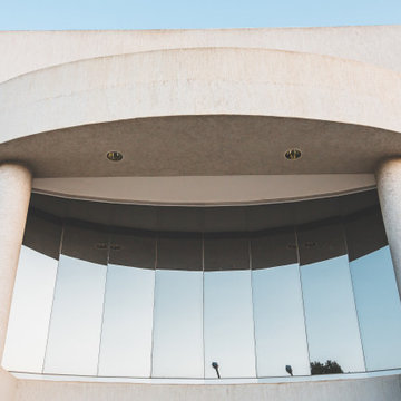
The Dental Studio is a highly intricate building that uniquely links two separate stands of two neighbourhoods and straddling a four metre broad municipal
servitude. The western part of the neighbourhood is an office precinct consisting of low scaled office buildings set around a communal access street and
parking. It was designed for a leading dental practice with state of the art equipment and progressive philosophy of service.
It presents itself as an uncomplicated rectangular structural mass that elegantly characterise an intersection of a major neighbourhood boulevard and is
notable along the eastern end with an upright circulation tower. The western end on the other hand, is characterised with vertical solar control screens
which serve a dual purpose, that is, sifting low down western sun rays as well as giving a serene appeal to the mass. The daring spotless form of the
building is a truthful reflection of the nature of the sterile dental environment that is housed within. This houses the central vestibule and reception with a
visual interface as well as pedestrian movements along the edge of the building.
Healing and healthcare is a paradox that requires architectural intervention. It is this same paradox that informed measures taken towards developing this
project as a revised prototype. Exacerbated by the need to research a building type that can promote healing environment, the Dental Studio attempts
to create a closer harmony with nature through views, landscape and daylight.
 Mark Brand Architecture
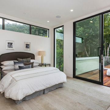
We were approached by a San Francisco firefighter to design a place for him and his girlfriend to live while also creating additional units he could sell to finance the project. He grew up in the house that was built on this site in approximately 1886. It had been remodeled repeatedly since it was first built so that there was only one window remaining that showed any sign of its Victorian heritage. The house had become so dilapidated over the years that it was a legitimate candidate for demolition. Furthermore, the house straddled two legal parcels, so there was an opportunity to build several new units in its place. At our client’s suggestion, we developed the left building as a duplex of which they could occupy the larger, upper unit and the right building as a large single-family residence. In addition to design, we handled permitting, including gathering support by reaching out to the surrounding neighbors and shepherding the project through the Planning Commission Discretionary Review process. The Planning Department insisted that we develop the two buildings so they had different characters and could not be mistaken for an apartment complex. The duplex design was inspired by Albert Frey’s Palm Springs modernism but clad in fibre cement panels and the house design was to be clad in wood. Because the site was steeply upsloping, the design required tall, thick retaining walls that we incorporated into the design creating sunken patios in the rear yards. All floors feature generous 10 foot ceilings and large windows with the upper, bedroom floors featuring 11 and 12 foot ceilings. Open plans are complemented by sleek, modern finishes throughout.
 Gail Green
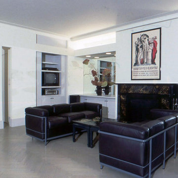
At one end, the original marble fireplace is framed by cabinetry and light emanating soffits which give it a lively new context. At the opposite end of the room, a rhythmically organized green wall defines the entry to the dining room. The lighting in these spaces reinforces the overall design concept: modern recessed down lights and indirect lighting are combined with more transitional wall sconces and Viennese chandeliers to create a synthesis of old and new. Modern classics by Le Corbusier in black leather site across from one another while the Hill House chair by Charles Rennie Mackintosh straddle the windows. An original Art Deco poster sits atop the marble fireplace.

 David Estreich Architects
Beyond the rotunda, one passes through an austere palladian portal to enter the living room. At one end, the original marble fireplace is framed by cabinetry and light emanating soffits which give it a lively new context. At the opposite end of the room, a rhythmically organized green wall defines the entry to the dining room. The lighting in these spaces reinforces the overall design concept: modern recessed down lights and indirect lighting are combined with more transitional wall sconces and Viennese chandeliers to create a synthesis of old and new. Modern classics by Le Corbusier in black leather site across from one another while the Hill House chair by Charles Rennie Mackintosh straddle the windows. An original Art Deco poster sits atop the marble fireplace.
 Howells Architecture + Design
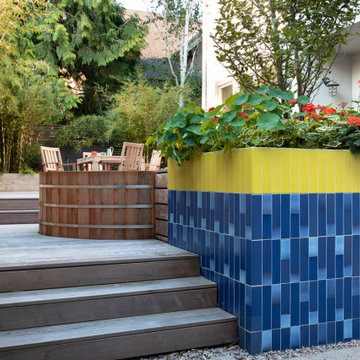
We converted an underused back yard into a modern outdoor living space. A bright tiled planter anchors an otherwise neutral space. The decking is ipe hardwood, the fence is stained cedar, and cast concrete with gravel adds texture at the fire pit. Photos copyright Laurie Black Photography.
 Mark Brand Architecture
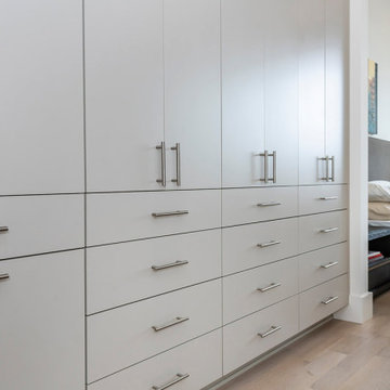
We were approached by a San Francisco firefighter to design a place for him and his girlfriend to live while also creating additional units he could sell to finance the project. He grew up in the house that was built on this site in approximately 1886. It had been remodeled repeatedly since it was first built so that there was only one window remaining that showed any sign of its Victorian heritage. The house had become so dilapidated over the years that it was a legitimate candidate for demolition. Furthermore, the house straddled two legal parcels, so there was an opportunity to build several new units in its place. At our client’s suggestion, we developed the left building as a duplex of which they could occupy the larger, upper unit and the right building as a large single-family residence. In addition to design, we handled permitting, including gathering support by reaching out to the surrounding neighbors and shepherding the project through the Planning Commission Discretionary Review process. The Planning Department insisted that we develop the two buildings so they had different characters and could not be mistaken for an apartment complex. The duplex design was inspired by Albert Frey’s Palm Springs modernism but clad in fibre cement panels and the house design was to be clad in wood. Because the site was steeply upsloping, the design required tall, thick retaining walls that we incorporated into the design creating sunken patios in the rear yards. All floors feature generous 10 foot ceilings and large windows with the upper, bedroom floors featuring 11 and 12 foot ceilings. Open plans are complemented by sleek, modern finishes throughout.
 Mark Brand Architecture
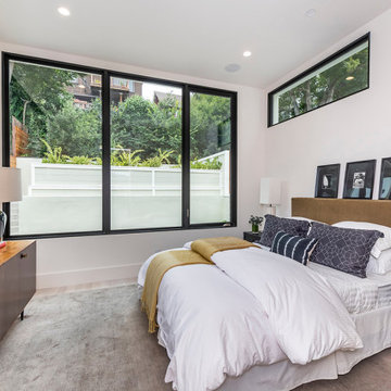
We were approached by a San Francisco firefighter to design a place for him and his girlfriend to live while also creating additional units he could sell to finance the project. He grew up in the house that was built on this site in approximately 1886. It had been remodeled repeatedly since it was first built so that there was only one window remaining that showed any sign of its Victorian heritage. The house had become so dilapidated over the years that it was a legitimate candidate for demolition. Furthermore, the house straddled two legal parcels, so there was an opportunity to build several new units in its place. At our client’s suggestion, we developed the left building as a duplex of which they could occupy the larger, upper unit and the right building as a large single-family residence. In addition to design, we handled permitting, including gathering support by reaching out to the surrounding neighbors and shepherding the project through the Planning Commission Discretionary Review process. The Planning Department insisted that we develop the two buildings so they had different characters and could not be mistaken for an apartment complex. The duplex design was inspired by Albert Frey’s Palm Springs modernism but clad in fibre cement panels and the house design was to be clad in wood. Because the site was steeply upsloping, the design required tall, thick retaining walls that we incorporated into the design creating sunken patios in the rear yards. All floors feature generous 10 foot ceilings and large windows with the upper, bedroom floors featuring 11 and 12 foot ceilings. Open plans are complemented by sleek, modern finishes throughout.
 Mark Brand Architecture
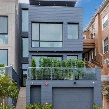
We were approached by a San Francisco firefighter to design a place for him and his girlfriend to live while also creating additional units he could sell to finance the project. He grew up in the house that was built on this site in approximately 1886. It had been remodeled repeatedly since it was first built so that there was only one window remaining that showed any sign of its Victorian heritage. The house had become so dilapidated over the years that it was a legitimate candidate for demolition. Furthermore, the house straddled two legal parcels, so there was an opportunity to build several new units in its place. At our client’s suggestion, we developed the left building as a duplex of which they could occupy the larger, upper unit and the right building as a large single-family residence. In addition to design, we handled permitting, including gathering support by reaching out to the surrounding neighbors and shepherding the project through the Planning Commission Discretionary Review process. The Planning Department insisted that we develop the two buildings so they had different characters and could not be mistaken for an apartment complex. The duplex design was inspired by Albert Frey’s Palm Springs modernism but clad in fibre cement panels and the house design was to be clad in wood. Because the site was steeply upsloping, the design required tall, thick retaining walls that we incorporated into the design creating sunken patios in the rear yards. All floors feature generous 10 foot ceilings and large windows with the upper, bedroom floors featuring 11 and 12 foot ceilings. Open plans are complemented by sleek, modern finishes throughout.
 Mark Brand Architecture
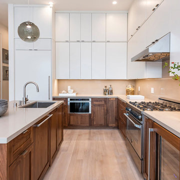
We were approached by a San Francisco firefighter to design a place for him and his girlfriend to live while also creating additional units he could sell to finance the project. He grew up in the house that was built on this site in approximately 1886. It had been remodeled repeatedly since it was first built so that there was only one window remaining that showed any sign of its Victorian heritage. The house had become so dilapidated over the years that it was a legitimate candidate for demolition. Furthermore, the house straddled two legal parcels, so there was an opportunity to build several new units in its place. At our client’s suggestion, we developed the left building as a duplex of which they could occupy the larger, upper unit and the right building as a large single-family residence. In addition to design, we handled permitting, including gathering support by reaching out to the surrounding neighbors and shepherding the project through the Planning Commission Discretionary Review process. The Planning Department insisted that we develop the two buildings so they had different characters and could not be mistaken for an apartment complex. The duplex design was inspired by Albert Frey’s Palm Springs modernism but clad in fibre cement panels and the house design was to be clad in wood. Because the site was steeply upsloping, the design required tall, thick retaining walls that we incorporated into the design creating sunken patios in the rear yards. All floors feature generous 10 foot ceilings and large windows with the upper, bedroom floors featuring 11 and 12 foot ceilings. Open plans are complemented by sleek, modern finishes throughout.
 Murphy Bros. Design | Build | Remodel
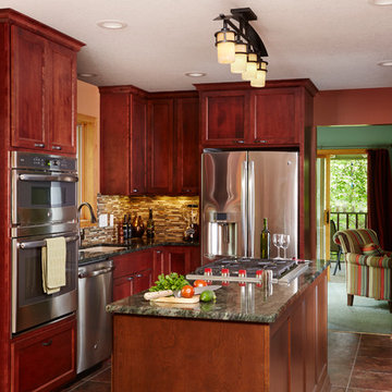
The homeowners of this Roseville 2-story had a very small kitchen footprint with big ideas. For starters they wanted a more open feel to their kitchen and at the same time they wanted an island. The existing “U” shaped kitchen had to go. But, the challenge was how to fit in an island and a dining room table in the same footprint? The solution? Eliminate the “U” and go to a floor to ceiling galley layout and create a narrow island that extends into the space where the casual dining table used to be and craft a custom dining table for two that straddled the kitchen and living rooms. We also painted the Kitchen and Sunken Dining Room in Suntan Bronze color in satin finish. To keep the eclectic style intact we replaced the current light fixtures with Quoizel Kyle 4-Light Imperial Bronze & over dining table with Four Light Distressed Amber Etched Glass Oil Rubbed Bronze Candle Chandelier. We were able to keep the budget in line by opting for a different grade of granite and a luxury vinyl tile floor.
Photo—Alyssa Lee
 Mark Brand Architecture
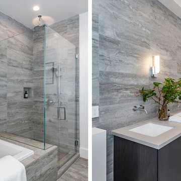
We were approached by a San Francisco firefighter to design a place for him and his girlfriend to live while also creating additional units he could sell to finance the project. He grew up in the house that was built on this site in approximately 1886. It had been remodeled repeatedly since it was first built so that there was only one window remaining that showed any sign of its Victorian heritage. The house had become so dilapidated over the years that it was a legitimate candidate for demolition. Furthermore, the house straddled two legal parcels, so there was an opportunity to build several new units in its place. At our client’s suggestion, we developed the left building as a duplex of which they could occupy the larger, upper unit and the right building as a large single-family residence. In addition to design, we handled permitting, including gathering support by reaching out to the surrounding neighbors and shepherding the project through the Planning Commission Discretionary Review process. The Planning Department insisted that we develop the two buildings so they had different characters and could not be mistaken for an apartment complex. The duplex design was inspired by Albert Frey’s Palm Springs modernism but clad in fibre cement panels and the house design was to be clad in wood. Because the site was steeply upsloping, the design required tall, thick retaining walls that we incorporated into the design creating sunken patios in the rear yards. All floors feature generous 10 foot ceilings and large windows with the upper, bedroom floors featuring 11 and 12 foot ceilings. Open plans are complemented by sleek, modern finishes throughout.
 Mark Brand Architecture
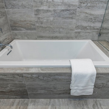
We were approached by a San Francisco firefighter to design a place for him and his girlfriend to live while also creating additional units he could sell to finance the project. He grew up in the house that was built on this site in approximately 1886. It had been remodeled repeatedly since it was first built so that there was only one window remaining that showed any sign of its Victorian heritage. The house had become so dilapidated over the years that it was a legitimate candidate for demolition. Furthermore, the house straddled two legal parcels, so there was an opportunity to build several new units in its place. At our client’s suggestion, we developed the left building as a duplex of which they could occupy the larger, upper unit and the right building as a large single-family residence. In addition to design, we handled permitting, including gathering support by reaching out to the surrounding neighbors and shepherding the project through the Planning Commission Discretionary Review process. The Planning Department insisted that we develop the two buildings so they had different characters and could not be mistaken for an apartment complex. The duplex design was inspired by Albert Frey’s Palm Springs modernism but clad in fibre cement panels and the house design was to be clad in wood. Because the site was steeply upsloping, the design required tall, thick retaining walls that we incorporated into the design creating sunken patios in the rear yards. All floors feature generous 10 foot ceilings and large windows with the upper, bedroom floors featuring 11 and 12 foot ceilings. Open plans are complemented by sleek, modern finishes throughout.
20