
Search results for "Struggle" in Home Design Ideas
 Drury Design
THE SETUP
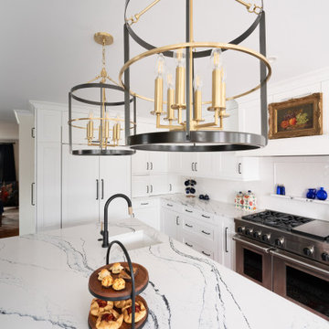
“You have to figure out how to rebuild a life worth living,” Basia Kozub’s client says. Her husband passed away suddenly three years ago. Holidays with family became more important, and she found herself struggling with a 37-year old kitchen that was falling apart. “I made a decision to move forward,” she says. “I went, ‘You know what? I’m redoing the kitchen.'”
The big task of getting started was as easy as having a conversation – literally. Basia was on the job, helping the client sort through priorities, wishes and ideas. Basia’s client is 5′ 4″, likes keeping an eye on the kiddoes in the backyard and wanted certain things to have their own place.
THE REMODEL
The objectives were:
Enlarge and open the space
Find a classic look that incorporates blues
Upgrade to easy-to-use appliances
Hide an office space within the space
Ample storage for dishes
Design challenges:
Uneven window alignment on the back wall
Original kitchen smaller than desired, stuctural concerns if walls to be moved
Keep folks close – figure out seating for entertaining
Main sink in corner is ideal, but windows are hard to reach
Lots of storage needed for dishes, glass collection, pantry items, bar bottles and office supplies
Specific storage needs for oft-used spices and utensils
THE RENEWED SPACE
Design solutions:
Replace back wall windows, establish window size continuity
Take out two walls to open up the space, tall shallow cabinet and a tall filler added to conceal a new header
Large island that seats six easily
Custom corner sink cabinet with recessed edge allows vertically challenged homeowner to reach the windows
Mindful storage planning features: plenty of cabinets, pull-out bar bottle storage, file drawers & cubbies with pocket doors for office appliances, magic corner pullouts, and appliance garages with pocket doors
Shelf behind range for easy access to daily-use spices and oils. Also: spice and utensil pullouts on either side of range
The clients says every priority and wish box got checked. The highly functional design absorbed everything that used to be in that area of the house, but now those things are out of the way.
“In the past, we were all spread out when we gathered for the holidays, because we had to spread out. Now, we’re all in here together, including my 92-year old mother. We’re visiting, cooking, laughing… everyone is here. And I’m really learning how to use these appliances. This kitchen has given me a whole new life.”
 Forward Design Build Remodel
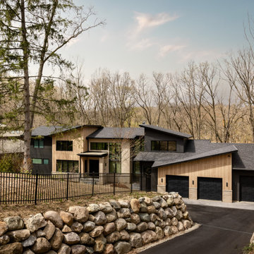
Our clients relocated to Ann Arbor and struggled to find an open layout home that was fully functional for their family. We worked to create a modern inspired home with convenient features and beautiful finishes.
This 4,500 square foot home includes 6 bedrooms, and 5.5 baths. In addition to that, there is a 2,000 square feet beautifully finished basement. It has a semi-open layout with clean lines to adjacent spaces, and provides optimum entertaining for both adults and kids.
The interior and exterior of the home has a combination of modern and transitional styles with contrasting finishes mixed with warm wood tones and geometric patterns.
 DK Studio
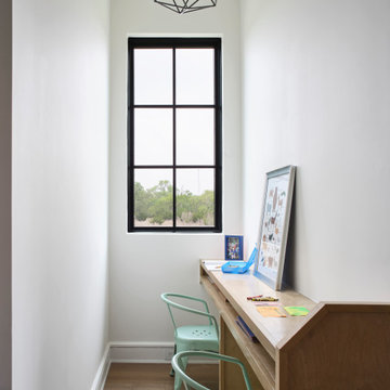
Craft room - small coastal built-in desk light wood floor craft room idea in Other with white walls
Find the right local pro for your project

 Jay Sifford
The back garden was conceived as a spiritual meditation garden. It's laid out as three interlocking ellipses, each raised 6" from the previous. The links speak to life struggles, and ascent to a higher spiritual plateau. Perennials with warmer colors are sited around the first link, with flowers eventually turned to a pure white and royal purples and blues in the last and highest link. There's also a walking path around the perimeter of this garden.
 User
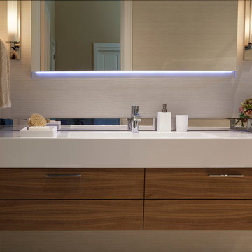
UserThis residence had been recently remodeled, with the exception of two of the bathrooms. Michael Merrill Design Studio enlarged the downstairs bathroom, which now has a spa-like atmosphere. It serves pool guests as well as house guests. Over-scaled tile floors and architectural glass tiled walls impart a dramatic modernity to the space. Note the polished stainless steel ledge in the shower niche. A German lacquered vanity and a Jack Lenor Larsen roman shade complete the space.
Upstairs, the bathroom has a much more organic feel, using a shaved pebble floor, linen textured vinyl wall covering, and a watery green wall tile. Here the vanity is veneered in a rich walnut. The residence, nestled on 20 acres of heavily wooded land, has been meticulously detailed throughout, with new millwork, hardware, and finishes. (2012-2013);
Photos © Paul Dyer Photography
 The Cabinet Corner, Inc.
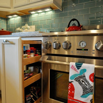
Eat-in kitchen - transitional u-shaped ceramic tile eat-in kitchen idea in Nashville with an undermount sink, recessed-panel cabinets, white cabinets, granite countertops, blue backsplash, subway tile backsplash, stainless steel appliances and a peninsula
 Mottram Architecture
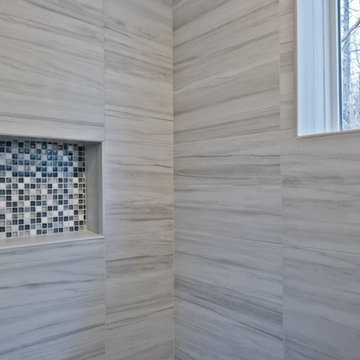
Timber frame homes offer unique challenges during a remodel. What often makes them beautiful and attractive to most homeowners, also makes them challenging for space requirements.
Context: The lovely couple that owned this home were struggling with some interesting floor plan challenges that just didn't work for their family. The loved the beautiful timbers and woodwork of their home, but the dramatically sloping ceilings on the second floor, particularly in the bathroom, just didn't work for this 1 1/2 bath home. Needing to use the skylight to approach the toilet was a less then ideal scenario. Although the bathroom footprint was more then adequate, the sloped ceiling only made half of the space useable. Check out the Before/After post on our blog to see the photos of the house pre-renovation. As much as they loved all the wood features in their home, another challenge they had was light. The wood ceiling made everything inside the house darker, even with a fantastic array of south facing windows, there were spaces in the home that felt dark and small. When they contacted us they wanted to know how could they make their brighter and more inviting, were there solutions to the 2nd floor sloped ceiling issues, and if they were going to do all of this work, how could they make their home more comfortable and efficient. A nagging water leak in the upstairs bathroom spurred them into action and here is how we solved their dilemma.
Conclusion: First, we added a little dormer to the rear of the house so we could get full headroom in nearly all of the upstairs bathroom! Then we decided to extend that dormer one more timber bay over to create a walk in closet with natural light and plenty of space. Since we were contemplating energy efficiency, we resolved a nagging issue that is present in a lot of timber frame construction, air tightness. Commonly found in timber frame construction, fiberglass insulation is installed in the rafter bays and board ceilings are installed over top. Unfortunately, board ceilings are anything but air tight, and fiberglass insulation needs to be in an airtight cavity for maximum effectiveness. So we were able to solve two issues at the same time for this homeowner. We removed the board ceiling and fiberglass insulation, we dense packed the rafter bays with cellulose insulation, and installed sheetrock in place of the boards. The boards were salvaged for re-use by the homeowner, and the space and light quality was dramatically improved. Some may think that losing the board ceiling took something away from the space, but what you'll see in the pictures is that it highly accentuates the heavy timbers and really makes them stand out in a beautiful way. Now with this added airtightness, better insulation, and brighter space, the homeowner hardly runs their wood stove, and it's so quiet in the space, an added bonus from changing the insulation. It became necessary to also add a sheetrock ceiling to the living room to hide the plumbing from the new bathroom layout above. Changing this ceiling gave the homeowner some real quality lighting that was lacking in the living room before. The brighter ceiling and new lighting layout completely transforms the living room into a space you want to hang out, even though the layout didn't change at all. When the homeowner saw the finished spaces she said "I can't believe this is my house, I want to live in this house"
Energy Efficiency: I touched a little on the efficiency above, but like all projects done with Mottram Architecture, we always want to leave you with a little extra. Timber frame construction with board ceilings and fiberglass insulation are notoriously leaky! If you want to know what we think about fiberglass insulation, check our our blog post on Why Fiberglass Insulation Sucks. By installing cellulose insulation and covering it with sheetrock we were able to greatly reduce the heat flowing out of this home. It not only improves cashflow it improves the comfort level in the space. Who wants to sit in their living room and feel a draft? Let us remind you, we are not saying cellulose insulation is an air barrier, we use the sheetrock to help with that, but it does significantly reduce the air flow over fiberglass insulation. And when we reduce the airflow, we reduce the heat flow. And when we reduce the heat flow, we reduce the need to re-heat that drafty air from outside. When it comes to energy efficiency the first and best place to start is air infiltration. We greatly reduced the air infiltration with the new insulation, but we also added a hat and warm boots. What I mean by that is, we improved the insulation in the roof, and we installed insulation in the basement. Maybe it's a silly analogy, but when you think about keeping warm, we always start with the hat and boots! With sustainability in mind, the next project will be to add a deck to the front of this house with rain catchment barrels from the metal roof. They are planning to plant a garden in the spring and the rain catchment system will help to irrigate the new garden.
Builder: East Shore Builders
Photographer: Michael Eric Berube


 Marco Closets
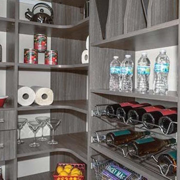
An organized pantry helps speed meal preparation. Open shelves make it easy to find what you need quickly. No more struggling to pull out large pots - they are easily accessible on a shelf. Pull out racks for spices and wine racks add convenience and are attractive as well.
 Neil Kelly Company
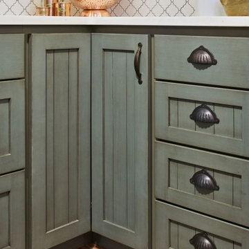
The decision to keep the original cabinet boxes meant simply replacing the cabinet drawers and drawer fronts for a refreshing transformation. The porcelain tile floor has the unmistakable look of brick without the struggle to keep it clean. New appliances, stylish range hood, and a new cabinet box for the refrigerator. A custom island located in the original dining nook satisfies the client's number one request, providing a place to drink wine and make cookies.
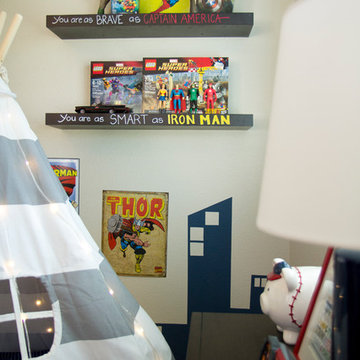
 Savvy Giving by Design
From our Go Fund me Page Feb. 2016
Princess Kaylee is only two and a half years old and was recently diagnosed with cancer. We need your generosity so that we can give her the enchanted room of her dreams as she endures 2.5 years of treatments. We're breaking out our magic wands and designing a gorgeous room for this sweet little girl. With your assistance, we can create a fairy tale space for Kaylee and her family to rest and recover.
Kaylee's story hits especially close to home in our tight-knit community. Her mother, Kelly, is an oncology nurse at Rady Children's Hospital. Yes, you read that correctly - her mother has spent the last 8 years compassionately caring after children who have been diagnosed with cancer. In fact, she was one of the dedicated nurses who so wonderfully cared for Savvy Giving by Design's very first recipient, Kasey Harvey.
And Kelly is not the only hero in this family. Kaylee's father, Jared, is a local CHP officer who keeps our streets safe and not long ago rescued multiple children after a lengthy stand-off with their abductor.
http://www.10news.com/news/chp-officers-relive-moments-in-highway-standoff-121214
Jared and Kelly have two beautiful children. Their son Drew is 5 years-old and daughter Kaylee will turn 3 in August. Kaylee's diagnosis, Acute Lymphoblastic Leukemia, turned this family's world upside down. While her prognosis is, thankfully, very good (with a 93% cure rate), the treatment will be incredibly arduous. Kaylee is facing 2.5 years of ongoing treatment with periods of intense chemotherapy followed by "maintenance" chemo. As hard as it is to believe, Kaylee's treatment will not be complete until she is 5 years-old and preparing to enter kindergarten.
Given the ongoing and onerous treatment regimen that Kaylee faces, Savvy Giving by Design knows that she will need a beautiful and comfortable room where she can rest and be visited by family and friends. Kaylee is currently transitioning out of her crib and we have big intentions for this princess-loving little girl. Our plan is to combine fun and functionality with details and personal touches that will show Kaylee that there is an entire community rallying behind her. We will incorporate Kaylee's favorite colors (pink and purple) and turn her fantasies into reality by installing a built-in castle bed that makes her room feel magical and shows this little girl that anything is possible.
This room will have some very personal special touches incorporated into it to pay tribute to Kaylee's fairy godmother. When Kelly was 13, she lost her very best friend, Jessica, to cancer. Kelly paid tribute to her dear friend by naming her daughter Kaylee Jessica and she wholeheartedly believes that Jessica will be watching over her little girl as she travels this difficult road.
With sufficient funding, we will also be able to do a little makeover for Kaylee's knight in shining armor, her big brother Drew. We recognize and appreciate that Drew faces a struggle all his own as his little sister battles this disease.
Savvy Giving by Design is a the philanthropic arm of Savvy Interiors, Inc. We are registered with the state of California as a nonprofit and awaiting our "formal" 501(c)(3) designation by the IRS. Your donations are tax-deductible. All monies collected will go directly to this space! Any excess funds will be distributed directly to the family. Since late 2014, Savvy Giving by Design has transformed 8 spaces and our ultimate goal is to have sufficient funding to take on one project each month.
As stated in our founding documents, "Our mission is to provide comfort, support, and healing to families with a child facing a medical crisis by transforming the interior spaces of their homes at no cost to them".
We hope you will support our mission to makeover these two rooms for this very deserving family and give Kaylee and Drew's loving parents the gift of knowing that their children are happy, safe, and ready to take on the battle of a lifetime. If you would like to join and follow Kaylee's team page, "Tutu's and Chemo drips," you can do so here: https://www.facebook.com/groups/158667784506286/
To join our ongoing grass roots efforts, please join our Savvy Giving closed group page. https://www.facebook.com/groups/SavvyGivingbyDesign/
 Michael Nash Design, Build & Homes
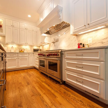
This growing family of six was struggling with a dysfunctional kitchen design. The center island had been installed at an odd angle that limited accessibility and traffic flow. Additionally, storage space was limited by poor cabinet design. Finally, doorways in and out of the kitchen were narrow and poorly located, especially for children dashing in and out.
Other design challenges included how to better use a 10’ x 12’ room for children’s jackets and toys and how to add a professional-quality gas range in a neighborhood were natural gas wasn’t available. The new design would address all of these issues.
DESIGN SOLUTIONS
The new kitchen design revolves around a more proportional island. Carefully placed in the center of the new space with seating for four, it includes a prep sink, a second dishwasher and a beverage center.
The distressed ebony-stained island and hutch provides a brilliant contrast between the white color cabinetry. White Carrera marble countertops and backsplash top both island and perimeter cabinets.
Tall, double stacked cabinetry lines two walls to maximize storage space. Across the room there was an unused wall that now contains a 36” tower fridge and freezer, both covered with matching panels, and a tall cabinet that contains a microwave, steam unit and warming drawer.
A propane tank was buried in the back yard to provide gas to a new 60” professional range and cooktop. A custom-made wood mantel hood blends perfectly with the cabinet style.
The old laundry room was reconfigured to have lots of locker space for all kids and added cabinetry for storage. A double entry door separated the new mudroom from the rest of the back hall. In the back hall the back windows were replaced with a set of French door and added decking to create a direct access to deck and backyard.
The end result is an open floor plan, high-end appliances, great traffic flow and pleasing colors. The homeowner calls it the “kitchen of her dreams.”
 User
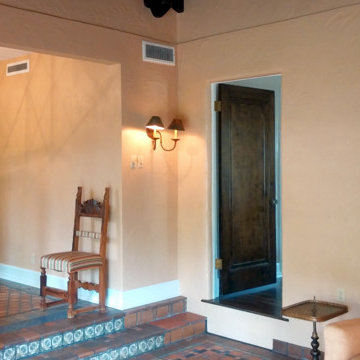
UserThis photo was taken from inside the chapel, looking towards the new master bedroom doorway. The old entrance was located right between the two highback chairs in the hallway. We struggled with just how to finish the opening around the bedroom door because we wanted to highlight the very unusual wall finish in the chapel. Architect Martina Lorey came up with the brilliant solution of reducing the door jamb to half its width, then creating a bullnose effect in the plaster that would wrap around the door opening. It was difficult to match the existing finish, but it was a fantastic addition to the project...the proverbial "icing on the cake" if you will. This photo was taken prior to installation of the new step up into the doorway. Crew: Richard Solis, Josh Johnson, Dez Arnold and Tom Ruth. Photo by ProBilt Construction LLC.
 Wired By Design LTD.
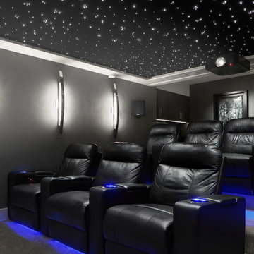
EpicSky fiber optic panles installed on the wall and ceiling with 120" Perforated ZeroEdge Screen with LED backlight. Aside from looking really cool, LED backlighting option on Zero Edge can actually improve your viewing experience. On large screens transitions from dark to bright scenes can cause eye strain as your iris struggles to quickly open and close. Backlighting helps to ease these transitions by providing a more consistent viewing experience.
 Concept Renovations, Inc.
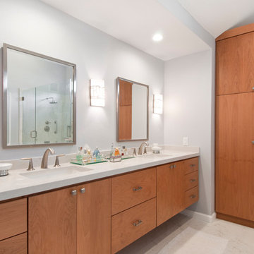
Remodeling your master bathroom in Calabasas offers the perfect opportunity to optimize both functionality and style. Custom features, such as built-in cabinetry and spacious shower designs, can transform an ordinary bathroom into a highly organized, luxurious retreat. I recently worked with a homeowner in Calabasas who struggled with limited storage and a dated design. By integrating custom storage cabinets and a sleek walk-in shower, we were able to create a space that not only looked great but solved their storage woes. The built-in cabinetry, combined with the shower’s marble finishes, added much-needed storage for linens, toiletries, and more, all while maintaining a clean, open layout. The result was a bathroom that was both practical for daily use and aesthetically aligned with the homeowner’s vision.

 Robin's Nest Interiors
This project was for a long time client of mine who lives in a wonderful patio home with a finished basement. There were several challenges with which to contend. First, as you enter the Foyer, all of the spaces are open to each other so we had to make sure everything worked together. Second, furniture arrangement had always been a struggle for the large living area with the fireplace on an angled corner wall and large built-in. Last, although the homeowner loves color – especially blue/greens – we had to convince her to bring it into her home as an accent and make it work with the other spaces.
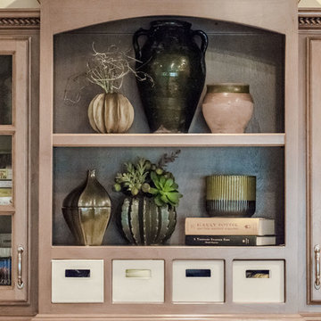
We started with a neutral sofa positioned across from the built-ins and paired it with a settee in a blue/green fabric. The settee does not block the fireplace and reinforces our color scheme. The homeowner upgraded her husband’s chair and ottoman with a contemporary leather one, and we added a perfectly scaled swivel chair to the corner next to the built-ins. We finished off the space with a mixture of unique accent tables including a beautiful coffee table with wood inlay, a small metal french drink table, a two-tiered egg shaped table, and a pedestal table with marble top. We added lighting, artwork and accessories to the built-ins and tables to complete the space. We also added blue/green accessories to the breakfast area to make the spaces flow seamlessly.
We love how these spaces in the Open Concept Redesign turned out. It is a very pleasing palette that does not overwhelm the spaces, but adds interest. Enjoy!
 Drury Design
THE SETUP
“You have to figure out how to rebuild a life worth living,” Basia Kozub’s client says. Her husband passed away suddenly three years ago. Holidays with family became more important, and she found herself struggling with a 37-year old kitchen that was falling apart. “I made a decision to move forward,” she says. “I went, ‘You know what? I’m redoing the kitchen.'”
The big task of getting started was as easy as having a conversation – literally. Basia was on the job, helping the client sort through priorities, wishes and ideas. Basia’s client is 5′ 4″, likes keeping an eye on the kiddoes in the backyard and wanted certain things to have their own place.
THE REMODEL
The objectives were:
Enlarge and open the space
Find a classic look that incorporates blues
Upgrade to easy-to-use appliances
Hide an office space within the space
Ample storage for dishes
Design challenges:
Uneven window alignment on the back wall
Original kitchen smaller than desired, stuctural concerns if walls to be moved
Keep folks close – figure out seating for entertaining
Main sink in corner is ideal, but windows are hard to reach
Lots of storage needed for dishes, glass collection, pantry items, bar bottles and office supplies
Specific storage needs for oft-used spices and utensils
THE RENEWED SPACE
Design solutions:
Replace back wall windows, establish window size continuity
Take out two walls to open up the space, tall shallow cabinet and a tall filler added to conceal a new header
Large island that seats six easily
Custom corner sink cabinet with recessed edge allows vertically challenged homeowner to reach the windows
Mindful storage planning features: plenty of cabinets, pull-out bar bottle storage, file drawers & cubbies with pocket doors for office appliances, magic corner pullouts, and appliance garages with pocket doors
Shelf behind range for easy access to daily-use spices and oils. Also: spice and utensil pullouts on either side of range
The clients says every priority and wish box got checked. The highly functional design absorbed everything that used to be in that area of the house, but now those things are out of the way.
“In the past, we were all spread out when we gathered for the holidays, because we had to spread out. Now, we’re all in here together, including my 92-year old mother. We’re visiting, cooking, laughing… everyone is here. And I’m really learning how to use these appliances. This kitchen has given me a whole new life.”
 Sosna Inc
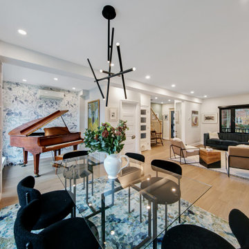
For years, this family felt like their main floor was working against them. The kitchen was a tight galley where only one person could comfortably stand at a time. An old addition felt disconnected and awkward, making everyday life a struggle.
Rethinking the Space
They thought the only solution was a big, expensive addition. But after walking through the home and completing a feasibility study, we found that the square footage was already there. It just needed a smarter plan.
Designing a Floor That Works
We reimagined how the home works day to day. The kitchen became a bright, open hub with a generous island perfect for cooking, homework, and family time. Awkward corners were given clear and useful purposes. A long steel span replaced an exterior wall that could not carry the load, opening the space safely and effectively.
Personal Touches
We made sure the house reflected the family. A custom basement door with a built-in cat door adds charm and function, and cat-shaped handles in the laundry room bring personality throughout the home. Even the piano room feels warm, inviting, and easy to live in.
A Home That Flows
Now, multiple people can cook together comfortably. The rooms feel connected and welcoming. The previously awkward addition feels fully integrated. Daily life flows naturally, and the house finally supports the family instead of working against them.
Discover the Potential in Your Home
If your kitchen does not work or a space feels off, there may be more potential than you realize. Sometimes the right solution is already within your walls. Reach out to us, and see what your home could become!
Sosna Incorporated
7250 Keele Street, Unit 372
Vaughan, ON L4K 1Z8
Phone: 416-888-7366 extension 1
Email: contact@sosna.ca
 Bellwether Windows, Siding & Doors
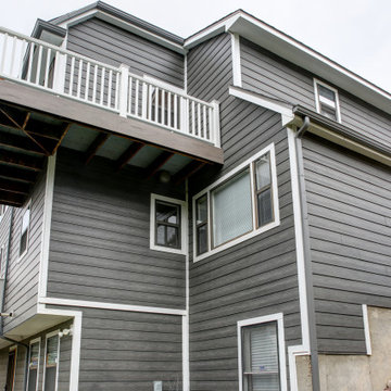
This Louisville home in the Boulder Area had old, cracked and warping cedar siding on it. The homeowners were struggling to maintain it and had a persistent problem with woodpeckers. They like the look of natural wood but wanted something that would outlast their time in the home and would allow for minimal upkeep. We suggested a unique product that we love, which happens to meet both of these requirements: James Hardie siding from WoodTone RusticSeries. This product is a James Hardie lap siding product that has a factory finish from a third-party finishing company, WoodTone. The base product, James Hardie HardiePlank lap siding, has a 30-year warranty. WoodTone's process for finishing this product gives it the look of stained wood with the benefit of a 15-year finish warranty. The homeowner selected the color Costal Gray for the body and James Hardie's Arctic White for the trim. We also installed James Hardie ColorPlus fascia and vented soffits in the color Arctic White. How do you think it turned out?
 Sosna Inc
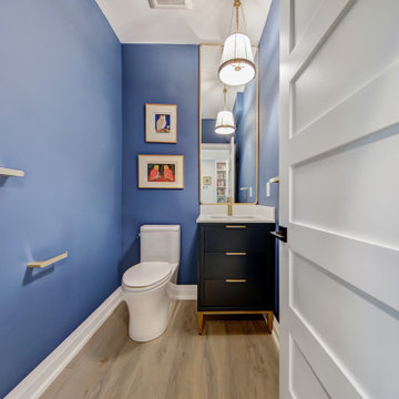
For years, this family felt like their main floor was working against them. The kitchen was a tight galley where only one person could comfortably stand at a time. An old addition felt disconnected and awkward, making everyday life a struggle.
Rethinking the Space
They thought the only solution was a big, expensive addition. But after walking through the home and completing a feasibility study, we found that the square footage was already there. It just needed a smarter plan.
Designing a Floor That Works
We reimagined how the home works day to day. The kitchen became a bright, open hub with a generous island perfect for cooking, homework, and family time. Awkward corners were given clear and useful purposes. A long steel span replaced an exterior wall that could not carry the load, opening the space safely and effectively.
Personal Touches
We made sure the house reflected the family. A custom basement door with a built-in cat door adds charm and function, and cat-shaped handles in the laundry room bring personality throughout the home. Even the piano room feels warm, inviting, and easy to live in.
A Home That Flows
Now, multiple people can cook together comfortably. The rooms feel connected and welcoming. The previously awkward addition feels fully integrated. Daily life flows naturally, and the house finally supports the family instead of working against them.
Discover the Potential in Your Home
If your kitchen does not work or a space feels off, there may be more potential than you realize. Sometimes the right solution is already within your walls. Reach out to us, and see what your home could become!
Sosna Incorporated
7250 Keele Street, Unit 372
Vaughan, ON L4K 1Z8
Phone: 416-888-7366 extension 1
Email: contact@sosna.ca
55