
Search results for "Study effectively" in Home Design Ideas
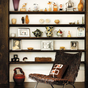
 Studio 1200
While most people in town considered this building a "tear-down", the new homeowners wanted to revive the property with an ambitions renovation and addition project. Two major challenges needed to be overcome on this project: the first was preserving the integrity of the original 200 year old barn; the second was designing a complementary structure that would co-exist on the site without looking like a 21st century addition.
In order to achieve these goals, our team studied how farm buildings evolve on a site over time. Additions are usually constructed based on need and function. With this protocol in mind, a grain silo was designed to act as our entry tower and buffer the intersection of the two buildings. The silo acts as our focal point and allowed us to construct very simple buildings to house the balance of the owner’s program. The team paid very close attention to scale, use of materials (many of which were recycled) and developed a vocabulary of modern interior detailing that would complement the original house.
Specific program requirements for the project included: large entertainment spaces, gourmet kitchen with adjacent family room, a squash court, multiple bedrooms and bathrooms, master suite, and plenty of storage space. In addition, since both adults work from home and receive clients in their offices, two offices needed to be created and it was critical to separate the work areas for the more private family spaces. The new silo, with central stair, became the element that allowed these different program needs to coexist effectively.

 User
The private home, reminiscent of Maine lodges and family camps, was designed to be a sanctuary for the family and their many relatives. Lassel Architects worked closely with the owners to meet their needs and wishes and collaborated thoroughly with the builder during the construction process to provide a meticulously crafted home.
The open-concept plan, framed by a unique timber frame inspired by Greene & Greene’s designs, provides large open spaces for entertaining with generous views to the lake, along with sleeping lofts that comfortably host a crowd overnight. Each of the family members' bedrooms was configured to provide a view to the lake. The bedroom wings pivot off a staircase which winds around a natural tree trunk up to a tower room with 360-degree views of the surrounding lake and forest. All interiors are framed with natural wood and custom-built furniture and cabinets reinforce daily use and activities.
The family enjoys the home throughout the entire year; therefore careful attention was paid to insulation, air tightness and efficient mechanical systems, including in-floor heating. The house was integrated into the natural topography of the site to connect the interior and exterior spaces and encourage an organic circulation flow. Solar orientation and summer and winter sun angles were studied to shade in the summer and take advantage of passive solar gain in the winter.
Equally important was the use of natural ventilation. The design takes into account cross-ventilation for each bedroom while high and low awning windows to allow cool air to move through the home replacing warm air in the upper floor. The tower functions as a private space with great light and views with the advantage of the Venturi effect on warm summer evenings.
Sandy Agrafiotis
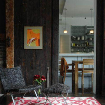 Studio 1200
While most people in town considered this building a "tear-down", the new homeowners wanted to revive the property with an ambitions renovation and addition project. Two major challenges needed to be overcome on this project: the first was preserving the integrity of the original 200 year old barn; the second was designing a complementary structure that would co-exist on the site without looking like a 21st century addition.
In order to achieve these goals, our team studied how farm buildings evolve on a site over time. Additions are usually constructed based on need and function. With this protocol in mind, a grain silo was designed to act as our entry tower and buffer the intersection of the two buildings. The silo acts as our focal point and allowed us to construct very simple buildings to house the balance of the owner’s program. The team paid very close attention to scale, use of materials (many of which were recycled) and developed a vocabulary of modern interior detailing that would complement the original house.
Specific program requirements for the project included: large entertainment spaces, gourmet kitchen with adjacent family room, a squash court, multiple bedrooms and bathrooms, master suite, and plenty of storage space. In addition, since both adults work from home and receive clients in their offices, two offices needed to be created and it was critical to separate the work areas for the more private family spaces. The new silo, with central stair, became the element that allowed these different program needs to coexist effectively.
Find the right local pro for your project
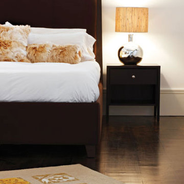 Studio 1200
While most people in town considered this building a "tear-down", the new homeowners wanted to revive the property with an ambitions renovation and addition project. Two major challenges needed to be overcome on this project: the first was preserving the integrity of the original 200 year old barn; the second was designing a complementary structure that would co-exist on the site without looking like a 21st century addition.
In order to achieve these goals, our team studied how farm buildings evolve on a site over time. Additions are usually constructed based on need and function. With this protocol in mind, a grain silo was designed to act as our entry tower and buffer the intersection of the two buildings. The silo acts as our focal point and allowed us to construct very simple buildings to house the balance of the owner’s program. The team paid very close attention to scale, use of materials (many of which were recycled) and developed a vocabulary of modern interior detailing that would complement the original house.
Specific program requirements for the project included: large entertainment spaces, gourmet kitchen with adjacent family room, a squash court, multiple bedrooms and bathrooms, master suite, and plenty of storage space. In addition, since both adults work from home and receive clients in their offices, two offices needed to be created and it was critical to separate the work areas for the more private family spaces. The new silo, with central stair, became the element that allowed these different program needs to coexist effectively.
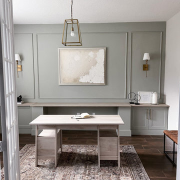


 MANDARINA STUDIO interior design
Summary of Scope: gut renovation/reconfiguration of kitchen, coffee bar, mudroom, powder room, 2 kids baths, guest bath, master bath and dressing room, kids study and playroom, study/office, laundry room, restoration of windows, adding wallpapers and window treatments
Background/description: The house was built in 1908, my clients are only the 3rd owners of the house. The prior owner lived there from 1940s until she died at age of 98! The old home had loads of character and charm but was in pretty bad condition and desperately needed updates. The clients purchased the home a few years ago and did some work before they moved in (roof, HVAC, electrical) but decided to live in the house for a 6 months or so before embarking on the next renovation phase. I had worked with the clients previously on the wife's office space and a few projects in a previous home including the nursery design for their first child so they reached out when they were ready to start thinking about the interior renovations. The goal was to respect and enhance the historic architecture of the home but make the spaces more functional for this couple with two small kids. Clients were open to color and some more bold/unexpected design choices. The design style is updated traditional with some eclectic elements. An early design decision was to incorporate a dark colored french range which would be the focal point of the kitchen and to do dark high gloss lacquered cabinets in the adjacent coffee bar, and we ultimately went with dark green.

 Paradise City
I am proud to present New, Stylish, Practical, and just Awesome ) design for your new kid's room. Ta -da...
The space in this room is minimal, and it's tough to have two beds there and have a useful and pretty design. This design was built on the idea to have a bed that transforms from king to two tweens and back with ease.
I do think most of the time better to keep it as a single bed and, when needed, slide bed over and have two beds. The single bed will give you more space and air in the room.
You will have easy access to the closet and a much more comfortable bed to sleep on it.
On the left side, we are going to build costume wardrobe style closet
On the right side is a column. We install some exposed shelving to bring this architectural element to proportions with the room.
Behind the bed, we use accent wallpaper. This particular mural wallpaper looks like fabric has those waves that will softener this room. Also, it brings that three-dimension effect that makes the room look larger without using mirrors.
Led lighting over that wall will make shadows look alive. There are some Miami vibes it this picture. Without dominating overall room design, these art graphics are producing luxury filing of living in a tropical paradise. ( Miami Style)
On the front is console/table cabinetry. In this combination, it is in line with bed design and the overall geometrical proportions of the room. It is a multi-function. It will be used as a console for a TV/play station and a small table for computer activities.
In the end wall in the hallway is a costume made a mirror with Led lights. Girls need mirrors )
Our concept is timeless. We design this room to be the best for any age. We look into the future ) Your girl will grow very fast. And you do not have to change a thing in this room. This room will be comfortable and stylish for the next 20 years. I do guarantee that )
Your daughter will love it!
Sponsored
Columbus, OH

Hope Restoration & General Contracting
Columbus Design-Build, Kitchen & Bath Remodeling, Historic Renovations
 Studio 1200
While most people in town considered this building a "tear-down", the new homeowners wanted to revive the property with an ambitions renovation and addition project. Two major challenges needed to be overcome on this project: the first was preserving the integrity of the original 200 year old barn; the second was designing a complementary structure that would co-exist on the site without looking like a 21st century addition.
In order to achieve these goals, our team studied how farm buildings evolve on a site over time. Additions are usually constructed based on need and function. With this protocol in mind, a grain silo was designed to act as our entry tower and buffer the intersection of the two buildings. The silo acts as our focal point and allowed us to construct very simple buildings to house the balance of the owner’s program. The team paid very close attention to scale, use of materials (many of which were recycled) and developed a vocabulary of modern interior detailing that would complement the original house.
Specific program requirements for the project included: large entertainment spaces, gourmet kitchen with adjacent family room, a squash court, multiple bedrooms and bathrooms, master suite, and plenty of storage space. In addition, since both adults work from home and receive clients in their offices, two offices needed to be created and it was critical to separate the work areas for the more private family spaces. The new silo, with central stair, became the element that allowed these different program needs to coexist effectively.
 Studio 1200
While most people in town considered this building a "tear-down", the new homeowners wanted to revive the property with an ambitions renovation and addition project. Two major challenges needed to be overcome on this project: the first was preserving the integrity of the original 200 year old barn; the second was designing a complementary structure that would co-exist on the site without looking like a 21st century addition.
In order to achieve these goals, our team studied how farm buildings evolve on a site over time. Additions are usually constructed based on need and function. With this protocol in mind, a grain silo was designed to act as our entry tower and buffer the intersection of the two buildings. The silo acts as our focal point and allowed us to construct very simple buildings to house the balance of the owner’s program. The team paid very close attention to scale, use of materials (many of which were recycled) and developed a vocabulary of modern interior detailing that would complement the original house.
Specific program requirements for the project included: large entertainment spaces, gourmet kitchen with adjacent family room, a squash court, multiple bedrooms and bathrooms, master suite, and plenty of storage space. In addition, since both adults work from home and receive clients in their offices, two offices needed to be created and it was critical to separate the work areas for the more private family spaces. The new silo, with central stair, became the element that allowed these different program needs to coexist effectively.
 Studio 1200
While most people in town considered this building a "tear-down", the new homeowners wanted to revive the property with an ambitions renovation and addition project. Two major challenges needed to be overcome on this project: the first was preserving the integrity of the original 200 year old barn; the second was designing a complementary structure that would co-exist on the site without looking like a 21st century addition.
In order to achieve these goals, our team studied how farm buildings evolve on a site over time. Additions are usually constructed based on need and function. With this protocol in mind, a grain silo was designed to act as our entry tower and buffer the intersection of the two buildings. The silo acts as our focal point and allowed us to construct very simple buildings to house the balance of the owner’s program. The team paid very close attention to scale, use of materials (many of which were recycled) and developed a vocabulary of modern interior detailing that would complement the original house.
Specific program requirements for the project included: large entertainment spaces, gourmet kitchen with adjacent family room, a squash court, multiple bedrooms and bathrooms, master suite, and plenty of storage space. In addition, since both adults work from home and receive clients in their offices, two offices needed to be created and it was critical to separate the work areas for the more private family spaces. The new silo, with central stair, became the element that allowed these different program needs to coexist effectively.

 Rachel Oliver Design, LLC
The client wanted a very large island for storage and entertaining. Putting the table at the end of the island let's everyone be in on the fun. The table can seat up to 4 people. Custom walnut island countertop brings warmth to the space. Photo: Melodie Hayes

 Hold It Contemporary Home
A table combining the tactile nature of wood with the transparency of a glass top, revealing a touch of color through two aluminum guides. The table is fitted with two side extension leaves to seat several guests. Many combinations of finishes are available, for a timeless mix that can be easily matched to several chairs in the Calligaris collection. Meet with a Design Consultant today to customize a unique look for your dining room.
The Levante is paired with the Aida Plus Dining Chair, Nadira Area Rug, Pom Pom Suspension and Table Lamps, and Sipario Sideboard.

 ALVAREZ-DIAZ & VILLALON
Photography by Carlos Esteva.
When this private client, a married couple, first approached Álvarez-Díaz & Villalón to build ‘the house of their dreams’ on the grounds of their sprawling family estate, the first challenge was to identify the exact location that would maximize the positive aspects of the topography while affording the most gracious views. Propped up on scaffolding, juggling digital cameras and folding ladders, the design team photographed the property from hundreds of angles before the ideal site was selected.
Once the site was selected, construction could begin.
The building’s foundation was raised slightly off the ground to disperse geothermal heat. In addition, the designers studied daily sunlight patterns and positioned the structure accordingly in order to warm the swimming pool during the cooler morning hours and illuminate the principal living quarters during the late afternoon. Finally, the main house was designed with functional balconies on all sides: each balcony meticulously planned ~ and precisely positioned ~ to
both optimize wind flow and frame the property’s most breath-taking views.
Stylistically, the goal was to create an authentic Spanish hacienda. Following Old World tradition, the house was anchored around a centralized interior patio
in the Moorish style: enclosed on three sides ~ yet
open on the fourth (similar to the Alcázar of Seville) ~ to reveal a reflecting pool ~ and mirror the water motif of the home’s magnificent marble fountain. A bell tower, horseshoe arches, a colonnaded,vineyard-style patio, and
ornamental Moorish mosaic tilework (“azulejos”) completed this picturesque portrait of a faraway fantasy world of castles, chivalry, and swordsplay, reminiscent of Medieval Spain.
Shortly after completion, this showcase home was showcased on the TVE Spanish television series Spaniards Around The World (Españoles Alrededor
Del Mundo) as a prime example of authentic Spanish architecture designed outside the peninsula. Not surprising. After all, the story of a fairy-tale retreat as
magical as this one deserves a happy ending.

Sponsored
Sunbury, OH

J.Holderby - Renovations
Franklin County's Leading General Contractors - 2X Best of Houzz!

 Robert Miller FAIA Architects
Located on a wooded site, a single-story 1950s house with an awkward floor plan was strategically remodeled to provide living spaces that connect to the outdoors and respond to the needs of a young family.
This home had undergone successive alterations over the years, resulting in a fragmented, confusing layout. With only minor changes to the footprint, the architects redesigned this midcentury home to blur the boundary between indoor living and the landscape beyond. The new design effects a dramatic change by reorganizing the space into linear zones, raising the roof in key places, and making two small additions.
A concrete wall links a new music studio and detached garage to the main house, forming an entry court that welcomes visitors and screens the private bedroom spaces nearby. The entry is marked by a series of round skylights, while the living room has been opened up with taller ceilings, a new fireplace and walls of glass. A series of long colored boxes provides storage and utility spaces, while planar elements draw the eye through the house to the landscape beyond. Teak cabinets, blackened steel and Douglas fir contrast with more modest materials such as painted MDF panels, fiber-cement siding and painted gypsum wallboard. These spaces are designed to accommodate both intimate family gatherings and large parties.
Select Furnishings provided by INForm
Images by Nic LeHoux Photography
 Tile Club
Made in Spain
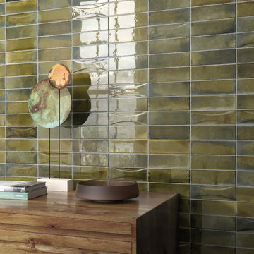
Luna Olive tile is the perfect wall finish to create timelessly sophisticated residential and commercial spaces with a sense of intimacy and comfort. Inspired by handcrafted tile, its high-level color variation instantly uplifts any interior setting with a sumptuous room ambiance.
This living room tile holds enormous design potential—leading itself flawlessly to eye-grabbing accent walls, fireplace and bar surrounds, study alcoves, and more. The tile shines on its own but can be paired with the Luna Arc collection for a cohesive yet distinctive point of view. To create a more vibrant space, consider pairing with furnishings that have a greater degree of contrast: think olive accent wall and mustard couch or olive fireplace surround and dark wooden floors.
For a bathroom that you use every day, this breathtaking tile delivers a nurturing effect that feels fresh in the morning and cozy at night. A shower wall, bathtub surround, or vanity backdrop covered with olive green tiles is the epitome of understated elegance. Works brilliantly with wooden fittings, brass accessories, and an industrial-style light fixture to conjure a well-appointed space brimming with decadence.
Our Luna Olive glazed ceramic tile elevates any kitchen design aesthetic. Show creativity by giving the backsplash a vibrant and characterful touch. Whether you’re looking to add pizzazz to a traditional or modern setting, these glossy tiles will ensure your design project is one of a kind. To keep clean, Tile Club recommends wiping the tiles with a soft cloth and water or ceramic tile cleaner.

 ZeroEnergy Design
This modern green home offers both a vacation destination on Cape Cod near local family members and an opportunity for rental income.
FAMILY ROOTS. A West Coast couple living in the San Francisco Bay Area sought a permanent East Coast vacation home near family members living on Cape Cod. As academic professionals focused on sustainability, they sought a green, energy efficient home that was well-aligned with their values. With no green homes available for sale on Cape Cod, they decided to purchase land near their family and build their own.
SLOPED SITE. Comprised of a 3/4 acre lot nestled in the pines, the steeply sloping terrain called for a plan that embraced and took advantage of the slope. Of equal priority was optimizing solar exposure, preserving privacy from abutters, and creating outdoor living space. The design accomplished these goals with a simple, rectilinear form, offering living space on the both entry and lower/basement levels. The stepped foundation allows for a walk-out basement level with light-filled living space on the down-hill side of the home. The traditional basement on the eastern, up-hill side houses mechanical equipment and a home gym. The house welcomes natural light throughout, captures views of the forest, and delivers entertainment space that connects indoor living space to outdoor deck and dining patio.
MODERN VISION. The clean building form and uncomplicated finishes pay homage to the modern architectural legacy on the outer Cape. Durable and economical fiber cement panels, fixed with aluminum channels, clad the primary form. Cedar clapboards provide a visual accent at the south-facing living room, which extends a single roof plane to cover the entry porch.
SMART USE OF SPACE. On the entry level, the “L”-shaped living, dining, and kitchen space connects to the exterior living, dining, and grilling spaces to effectively double the home’s summertime entertainment area. Placed at the western end of the entry level (where it can retain privacy but still claim expansive downhill views) is the master suite with a built-in study. The lower level has two guest bedrooms, a second full bathroom, and laundry. The flexibility of the space—crucial in a house with a modest footprint—emerges in one of the guest bedrooms, which doubles as home office by opening the barn-style double doors to connect it to the bright, airy open stair leading up to the entry level. Thoughtful design, generous ceiling heights and large windows transform the modest 1,100 sf* footprint into a well-lit, spacious home. *(total finished space is 1800 sf)
RENTAL INCOME. The property works for its owners by netting rental income when the owners are home in San Francisco. The house especially caters to vacationers bound for nearby Mayo Beach and includes an outdoor shower adjacent to the lower level entry door. In contrast to the bare bones cottages that are typically available on the Cape, this home offers prospective tenants a modern aesthetic, paired with luxurious and green features. Durable finishes inside and out will ensure longevity with the heavier use that comes with a rental property.
COMFORT YEAR-ROUND. The home is super-insulated and air-tight, with mechanical ventilation to provide continuous fresh air from the outside. High performance triple-paned windows complement the building enclosure and maximize passive solar gain while ensuring a warm, draft-free winter, even when sitting close to the glass. A properly sized air source heat pump offers efficient heating & cooling, and includes a carefully designed the duct distribution system to provide even comfort throughout the house. The super-insulated envelope allows us to significantly reduce the equipment capacity, duct size, and airflow quantities, while maintaining unparalleled thermal comfort.
ENERGY EFFICIENT. The building’s shell and mechanical systems play instrumental roles in the home’s exceptional performance. The building enclosure reduces the most significant energy glutton: heating. Continuous super-insulation, thorough air sealing, triple-pane windows, and passive solar gain work together to yield a miniscule heating load. All active energy consumers are extremely efficient: an air source heat pump for heating and cooling, a heat pump hot water heater, LED lighting, energy recovery ventilation (ERV), and high efficiency appliances. The result is a home that uses 70% less energy than a similar new home built to code requirements.
OVERALL. The home embodies the owners’ goals and values while comprehensively enabling thermal comfort, energy efficiency, a vacation respite, and supplementary income.
PROJECT TEAM
ZeroEnergy Design - Architect & Mechanical Designer
A.F. Hultin & Co. - Contractor
Pamet Valley Landscape Design - Landscape & Masonry
Lisa Finch - Original Artwork
European Architectural Supply - Windows
Eric Roth Photography - Photography
 Paradise City
I am proud to present New, Stylish, Practical, and just Awesome ) design for your new kid's room. Ta -da...
The space in this room is minimal, and it's tough to have two beds there and have a useful and pretty design. This design was built on the idea to have a bed that transforms from king to two tweens and back with ease.
I do think most of the time better to keep it as a single bed and, when needed, slide bed over and have two beds. The single bed will give you more space and air in the room.
You will have easy access to the closet and a much more comfortable bed to sleep on it.
On the left side, we are going to build costume wardrobe style closet
On the right side is a column. We install some exposed shelving to bring this architectural element to proportions with the room.
Behind the bed, we use accent wallpaper. This particular mural wallpaper looks like fabric has those waves that will softener this room. Also, it brings that three-dimension effect that makes the room look larger without using mirrors.
Led lighting over that wall will make shadows look alive. There are some Miami vibes it this picture. Without dominating overall room design, these art graphics are producing luxury filing of living in a tropical paradise. ( Miami Style)
On the front is console/table cabinetry. In this combination, it is in line with bed design and the overall geometrical proportions of the room. It is a multi-function. It will be used as a console for a TV/play station and a small table for computer activities.
In the end wall in the hallway is a costume made a mirror with Led lights. Girls need mirrors )
Our concept is timeless. We design this room to be the best for any age. We look into the future ) Your girl will grow very fast. And you do not have to change a thing in this room. This room will be comfortable and stylish for the next 20 years. I do guarantee that )
Your daughter will love it!
Sponsored
Sunbury, OH
J.Holderby - Renovations
Franklin County's Leading General Contractors - 2X Best of Houzz!

 HomeStory Doors of Orange County
The Bermuda glass door’s exquisite pattern offers a custom look to any room. Giving the image of hundreds of raindrops falling on water, this door beautifully reflects the light. Simple and elegant, the door offers a balance between beauty, light and obscurity. The Bermuda glass door is offered in a variety of 9 wood species to compliment any interior including: primed white, pine, oak, knotty pine, fir, maple, knotty alder, cherry and African mahogany. Optional 8-foot tall doors are available in primed white and pine species only.

 Hamilburg Interiors
We met the design challenge of creating one large family-friendly space from the original front and back parlors of this 18th century Federal farmhouse, while still achieving a multi-purpose library/music room.
The Farrow and Ball color Stiff key blue helped to unite the 2 spaces. Painting walls and woodwork alike in the space gave it optimum unity. The Old World Weaver's blue cotton damask , fabricated on both sofa and love seat, was positioned in a way that gave additional harmony to the room.
Red and camel accents were picked up as a contrast to the blue. The Lawrence and Scott red garden seat became a convenient place to set drinks on in the piano area.
Somewhat unexpected in this traditional home was the use of the caramel colored wilton area rug as well as the custom wrapped linen coffee table. The playful Brunschwig & Fils chinoiserie animal print also gave the club chair next to the book cases a less formal look.
Photography by Eric Roth. In collaboration with Home Glow Design.

 Leader Cinema Systems, Inc
 (C) All World Rights Reserved
Home theater - huge modern open concept limestone floor home theater idea in Hawaii with a projector screen
Home theater - huge modern open concept limestone floor home theater idea in Hawaii with a projector screen
48