
Search results for "Style lessons" in Home Design Ideas
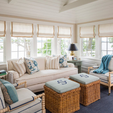
 The Sitting Room
Inspiration for a coastal dark wood floor sunroom remodel in Minneapolis with a standard ceiling
 Jordan Design Build Group
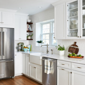
One small window, faux woodgrain cabinets and lots of doors made this closed-off Arlington kitchen feel dark and drab, the total opposite of the vibrant young family of four that lives here. To brighten and open up the small kitchen, we removed the wall separating the dining room, expanded the window above the sink and installed a French door to let even more light in from an adjoining sun room. Light now pours into the kitchen, making it feel welcoming, airy and bright. To accommodate the expanded kitchen, we removed a hulking set of built-ins from the dining room which provided two extra feet to work with. The larger footprint allowed us to relocate major appliances and provide a generous amount of storage and prep space including a food safe butcher block to the right of the range. Natural wood elements such as the chopping block, reclaimed shelves and beautiful new floors add character and warmth to the all-white kitchen.
One of the must-haves in this renovation was a farmhouse sink which is a great way to maximize function when a smaller sink base is used. We opted to take the tile backsplash all the way to the ceiling along the window wall, creating a more polished look with the added bonus of making the ceiling feel taller. The subway tiles’ subtle texture adds depth to the simple white-on-white motif and the change to a herringbone pattern behind the range adds visual interest without feeling too busy. A crisp white backdrop is perfect for adding pops of color with dishware, accessories and the family’s vintage stand mixer. The newly renovated kitchen-dining area is much better suited for this family’s active lifestyle and the updated design now complements the rest of their stylish home.
Photos by Stacy Zarin Goldberg
 Mark Hickman Homes
Cynthia Lynn Photography
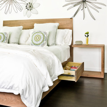
Bedroom - contemporary dark wood floor bedroom idea in Chicago with white walls
Bedroom - contemporary dark wood floor bedroom idea in Chicago with white walls
Find the right local pro for your project
 Visbeen Architects
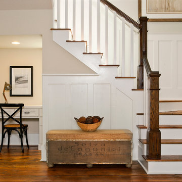
The Laurel was a project that required a rigorous lesson in southern architectural vernacular. The site being located in the hot climate of the Carolina shoreline, the client was eager to capture cross breezes and utilize outdoor entertainment spaces. The home was designed with three covered porches, one partially covered courtyard, and one screened porch, all accessed by way of French doors and extra tall double-hung windows. The open main level floor plan centers on common livings spaces, while still leaving room for a luxurious master suite. The upstairs loft includes two individual bed and bath suites, providing ample room for guests. Native materials were used in construction, including a metal roof and local timber.
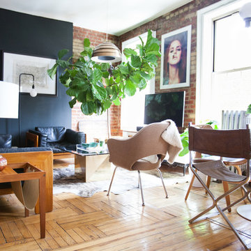

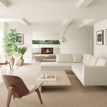
 Gabellini Sheppard Associates
Danish formal light wood floor living room photo in New York with white walls, a standard fireplace and no tv
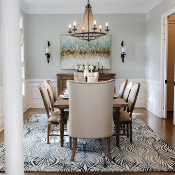
 Interior Vision Design Studio
This stylish Coastal Farmhouse-inspired renovation features a brand new Foyer & Dining Room! Southern Hospitality meets divine entertainment in this vibrant space for guests to enjoy.
Pay close attention to the details, textures, and playful prints woven throughout each space... this design showcases new architectural lighting fixtures, custom window treatments, and brand new furniture & decor creating the ultimate space to entertain.

 JMA INTERIOR DESIGN
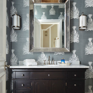
Powder room - tropical powder room idea in Miami with furniture-like cabinets, dark wood cabinets, multicolored walls and white countertops
 User
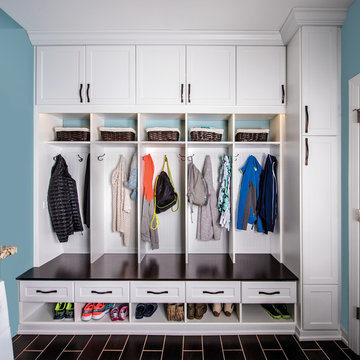
UserKeeping track of all the coats, shoes, backpacks and specialty gear for several small children can be an organizational challenge all by itself. Combine that with busy schedules and various activities like ballet lessons, little league, art classes, swim team, soccer and music, and the benefits of a great mud room organization system like this one becomes invaluable. Rather than an enclosed closet, separate cubbies for each family member ensures that everyone has a place to store their coats and backpacks. The look is neat and tidy, but easier than a traditional closet with doors, making it more likely to be used by everyone — including children. Hooks rather than hangers are easier for children and help prevent jackets from being to left on the floor. A shoe shelf beneath each cubby keeps all the footwear in order so that no one ever ends up searching for a missing shoe when they're in a hurry. a drawer above the shoe shelf keeps mittens, gloves and small items handy. A shelf with basket above each coat cubby is great for keys, wallets and small items that might otherwise become lost. The cabinets above hold gear that is out-of-season or infrequently used. An additional shoe cupboard that spans from floor to ceiling offers a place to keep boots and extra shoes.
White shaker style cabinet doors with oil rubbed bronze hardware presents a simple, clean appearance to organize the clutter, while bead board panels at the back of the coat cubbies adds a casual, country charm.
Designer - Gerry Ayala
Photo - Cathy Rabeler

 Marty Paoletta Photography
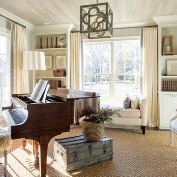
Music room; Photography by Marty Paoletta
Example of a large classic enclosed dark wood floor and brown floor living room design in Nashville with gray walls, a music area, no fireplace and no tv
Example of a large classic enclosed dark wood floor and brown floor living room design in Nashville with gray walls, a music area, no fireplace and no tv
 Amarant Design and Build Center
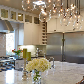
Example of a mid-sized minimalist l-shaped dark wood floor eat-in kitchen design in San Francisco with an island, glass-front cabinets, white cabinets, granite countertops, white backsplash, subway tile backsplash, stainless steel appliances and a drop-in sink
Sponsored
Columbus, OH

Hope Restoration & General Contracting
Columbus Design-Build, Kitchen & Bath Remodeling, Historic Renovations
 Koch Architects
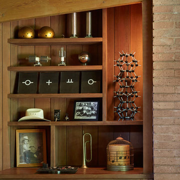
Mid-Century Modern Renovation & Addition - Photo by Bruce Damonte.
Small 1960s living room photo in San Francisco
Small 1960s living room photo in San Francisco
 User
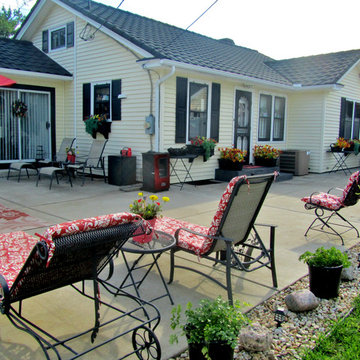
UserEvery home improvement project can feel like going into battle, but the sweet taste of victory is enough to make it worthwhile. If you ever feel intimidated by homes and gardens in magazines, don’t fret – you can turn your home into a beautiful beacon with easy curb appeal updates! Kevin and Annette Klingel are some of our favorite weekend warriors, and their latest project proves that anything is possible when it comes to dressing up your front garden. The Klingels recently gave their home and front garden a major renovation and entered their photos in the Window Box Contest. When we saw the gorgeous before and after pictures, we knew we had to get the inside scoop on their process and uncover their best curb appeal ideas.
Curb Appeal – Before and After
Before the renovation, the Klingels had a charming South Bend, Indiana rambler that was tidy and traditional, if a little unassuming. Deciding it was time for a much-needed update, the Klingels replaced their old green roof with a black barrel roof to match the style of their home. They also made a needed replacement and changed out the sidewalk and front stoop to a new version in classic black.
After those dramatic changes, the Klingels just couldn’t stop! Loving the contrast between the new black roof and stoop and their cream house, they painted their shutters black. And here’s where we come in – Annette wanted to incorporate her love of flowers into the new home design and found the perfect planters and window boxes to match the shutters. They purchased ten black window boxes in a classic and chic design to put around their outside windows. The Klingels also used tall black planters around the entrance to the house. The window boxes and planters each received the same plant treatment – red, yellow, and orange impatiens with flowing ferns for a bright punch of color. Paired with hanging baskets and a few other accents, the Klingels house is now a masterpiece.
From Drab to Fab
The Klingels love their warm and inviting new front entrance, and the neighbors do too. Instead of getting overlooked, their house now stands out and is the star of their busy street, where it is seen by lots of people everyday. They have received tons of compliments about their new look – a crisp and clean front garden that stays true to the style of the home and neighborhood.
The Klingels’ curb appeal update wasn’t without its challenges, but the end product is amazing, and as Annette says, definitely worth the time. The Klingels recommend starting with the necessary replacements and finding beautiful matching pieces to add curb appeal. With a little patience, elbow grease, and the help of a great garden supply store like Hooks & Lattice, you too can have the home of your dreams.
Photos: Kevin & Annette Klingel
 Kate Jackson Design
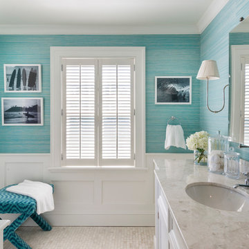
Inspiration for a coastal mosaic tile floor bathroom remodel in Providence with an undermount sink, recessed-panel cabinets, white cabinets and blue walls


Sponsored
Columbus, OH

Trish Takacs Design
Award Winning & Highly Skilled Kitchen & Bath Designer in Columbus
 Interiors by J. Curry
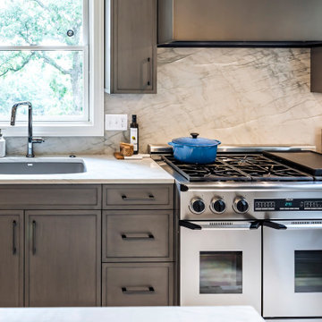
The River Bluff Beauty is one of our favorite remodels from 2024 as this is a space that stayed with in the original footprint yet was a very dramatic change from before to after. Its always a good lesson to remember how the right design along with color, a mixture of materials, and creativity can amply elevate a space with out a major addition or structural changes. A number one ask of the homeowner: no white painted cabinets!! So we proposed a more moody theme and used a unique palette of finishes with Dusk Stain over walnut in a thin shaker door, complimented with natural walnut accents & warm walnut interiors. Dusk is an artisan finish in an opaque stain creating a rich gray tone, with underlying warmth of the wood peaking through. We used natural quartzite counter tops in a soft matte finish for both counters and the full height backsplash, creating a clean flow there helped the space seem more connected and less busy to the eye. A special feature just off the kitchen was a small wine bar and liquor storage cabinet wrapped in walnut waterfall counters, what once was a lose furniture piece now is a beautiful and coordinated extension of the room. Another gorgeous detail was the remodeling of the two-sided fireplace area, this was a fairly major change that did open up the view between kitchen dining and living as well as the view of their great wooded property. We worked with a furniture maker to create a one of a kind modern wood surround made of white oak and walnut and paired with a pressed somewhat rustic concrete that has a blend of gray and taupe’s to blend with the rest of the new color scheme.
 Susan Yeley Homes
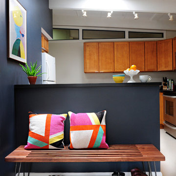
Our poster project for The Three P's, this small midcentury home south of campus has great bones but lacked vibrancy - a je ne sais quoi that the clients were searching to savoir once and for all. SYI worked with them to nail down a design direction and furniture plan, and they decided to invest in the big-impact items first: built-ins and lighting and a fresh paint job that included a beautiful deep blue-green line around the windows. The vintage rug was an Etsy score at an awesome price, but only after the client spent months scouring options and sources online that matched the vision and dimensions of the plan. A good year later, the West Elm sofa went on sale, so the client took advantage; some time after that, they painted the kitchen, created the drop zone / bench area, and rounded out the room with occasional tables and accessories. Their lesson: in patience, and details, there is beauty.
Photography by Gina Rogers Photography
2