
Search results for "Subsequent" in Home Design Ideas

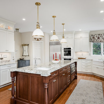
 Chris Rossetti at Main Line Kitchen Design
Main Line Kitchen Design's unique business model allows our customers to work with the most experienced designers and get the most competitive kitchen cabinet pricing.
How does Main Line Kitchen Design offer the best designs along with the most competitive kitchen cabinet pricing? We are a more modern and cost effective business model. We are a kitchen cabinet dealer and design team that carries the highest quality kitchen cabinetry, is experienced, convenient, and reasonable priced. Our five award winning designers work by appointment only, with pre-qualified customers, and only on complete kitchen renovations.
Our designers are some of the most experienced and award winning kitchen designers in the Delaware Valley. We design with and sell 8 nationally distributed cabinet lines. Cabinet pricing is slightly less than major home centers for semi-custom cabinet lines, and significantly less than traditional showrooms for custom cabinet lines.
After discussing your kitchen on the phone, first appointments always take place in your home, where we discuss and measure your kitchen. Subsequent appointments usually take place in one of our offices and selection centers where our customers consider and modify 3D designs on flat screen TV's. We can also bring sample doors and finishes to your home and make design changes on our laptops in 20-20 CAD with you, in your own kitchen.
Call today! We can estimate your kitchen project from soup to nuts in a 15 minute phone call and you can find out why we get the best reviews on the internet. We look forward to working with you.
As our company tag line says:
"The world of kitchen design is changing..."
 Outwater Industries Inc
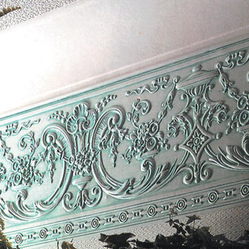
Outwater’s Anaglypta and Lincrusta Wallcoverings and Borders
Home design - traditional home design idea in New York
Home design - traditional home design idea in New York
Find the right local pro for your project
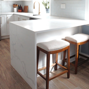
 Main Line Kitchen Design
Main Line Kitchen Design designers are some of the most experienced and award winning kitchen designers in the Delaware Valley. We design with and sell 8 nationally distributed cabinet lines. Cabinet pricing is slightly less than at major home centers for semi-custom cabinet lines, and significantly less than traditional showrooms for custom cabinet lines.
After discussing your kitchen on the phone, first appointments always take place in your home, where we discuss and measure your kitchen. Subsequent appointments usually take place in one of our offices and selection centers where our customers consider and modify 3D kitchen designs on flat screen TV’s or via Zoom. We can also bring sample cabinet doors and finishes to your home and make design changes on our laptops in 20-20 CAD with you, in your own kitchen.
Call today! We can estimate your kitchen renovation from soup to nuts in a 15 minute phone call and you can find out why we get the best reviews on the internet. We look forward to working with you. As our company tag line says: “The world of kitchen design is changing…”
 CITYDESKSTUDIO, Inc.
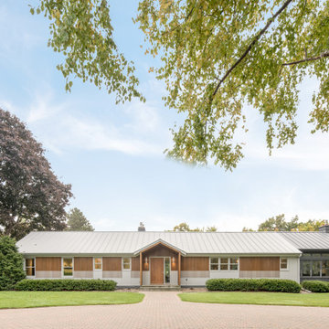
Built in 1949, this Edina home had a strong horizontal presence on the site, but through subsequent renovations the overall massing was lacking clarity and refinement and the entry was diminutive and uninviting. The roof and siding materials were aging, and important interior spaces were cramped and closed in. The house needed better light, better connection internally and out, and exterior updates to clarify and enhance the strengths of the home.
The primary design evolved out of a celebration of the existing horizontality of the home and a recognition that a bigger home was not needed. By layering materiality and color, a new identity was created. A new cedar entry canopy slips out from under the previous roof line, extending further towards the street. This added warmth at the entry is echoed along the facade, creating a graceful rhythm and texture. The previous additions were re-clad with a darker material palette in order to anchor and unify the ends of the home. As the grade slopes down towards the back yard, horizontal bands are exposed, revealing the layering top to bottom. Combined, these few shifts in color and materiality allowed for a complete transformation of the home.
The interior is reflective of the material and color palette used outside. The main living spaces are opened up and connected while strengthening the original symmetry of the more formal linear alignment of rooms. A whole new kitchen relocates the center of the home and makes more fluid the daily life of this young family. The house is fully transformed inside and out, all without adding more square feet.
Project Team:
Ben Awes, AIA, Principal-in-Charge
Nate Dodge
 Bry Pavlov
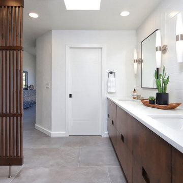
Walk-in shower - mid-sized 1950s master gray tile and porcelain tile porcelain tile, gray floor, double-sink and wood wall walk-in shower idea in Phoenix with flat-panel cabinets, medium tone wood cabinets, a one-piece toilet, white walls, an undermount sink, quartz countertops, white countertops, a niche and a built-in vanity
 JUMA architects
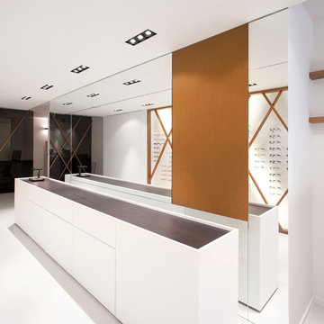
Optiek Herpol wanted to move to a better, more central location with plenty of parking space. A property that complied with these conditions was found on the Market in Deinze, and JUMA architects were subsequently asked to design a new interior for the store.
The property in question is very deep and narrow with little natural light entry. JUMA set to work despite these constraints in an attempt to transform these challenges into qualities.
The architects positioned the sales counter right behind the shop window, so as to make optimum use of the available natural light. This also makes store activities visible from the outside, adding an extra element of attraction. At the narrowest section of the store, a large wall mirror was put in to visually double the space. The wall onto which the eyeglasses are displayed is located opposite the mirror and is literally the eye catcher in the store. A wooden lattice makes for an interesting play of diagonal lines behind which the glasses are presented. This unique concept animates the entire store without detracting from the fact that the glasses should remain the main focal point in the store. The workshop is located in the back, separated from the store by a wall in smoked grey glass. In this way, the optician can keep an eye on the store at all times.
The colour palette is predominantly white, to keep the interior as light as possible. As a counterpoint, warm wood accents are added. The chairs at the counter are upholstered in a colour that harmonizes perfectly with the wood.
Pictures © Thomas De Bruyne
 CITYDESKSTUDIO, Inc.
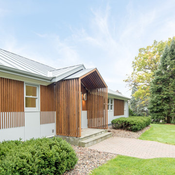
Built in 1949, this Edina home had a strong horizontal presence on the site, but through subsequent renovations the overall massing was lacking clarity and refinement and the entry was diminutive and uninviting. The roof and siding materials were aging, and important interior spaces were cramped and closed in. The house needed better light, better connection internally and out, and exterior updates to clarify and enhance the strengths of the home.
The primary design evolved out of a celebration of the existing horizontality of the home and a recognition that a bigger home was not needed. By layering materiality and color, a new identity was created. A new cedar entry canopy slips out from under the previous roof line, extending further towards the street. This added warmth at the entry is echoed along the facade, creating a graceful rhythm and texture. The previous additions were re-clad with a darker material palette in order to anchor and unify the ends of the home. As the grade slopes down towards the back yard, horizontal bands are exposed, revealing the layering top to bottom. Combined, these few shifts in color and materiality allowed for a complete transformation of the home.
The interior is reflective of the material and color palette used outside. The main living spaces are opened up and connected while strengthening the original symmetry of the more formal linear alignment of rooms. A whole new kitchen relocates the center of the home and makes more fluid the daily life of this young family. The house is fully transformed inside and out, all without adding more square feet.
Project Team:
Ben Awes, AIA, Principal-in-Charge
Nate Dodge
 Main Line Kitchen Design
Main Line Kitchen Design designers are some of the most experienced and award winning kitchen designers in the Delaware Valley. We design with and sell 8 nationally distributed cabinet lines. Cabinet pricing is slightly less than at major home centers for semi-custom cabinet lines, and significantly less than traditional showrooms for custom cabinet lines.
After discussing your kitchen on the phone, first appointments always take place in your home, where we discuss and measure your kitchen. Subsequent appointments usually take place in one of our offices and selection centers where our customers consider and modify 3D kitchen designs on flat screen TV’s or via Zoom. We can also bring sample cabinet doors and finishes to your home and make design changes on our laptops in 20-20 CAD with you, in your own kitchen.
Call today! We can estimate your kitchen renovation from soup to nuts in a 15 minute phone call and you can find out why we get the best reviews on the internet. We look forward to working with you. As our company tag line says: “The world of kitchen design is changing…”
 Amanda Martocchio Architecture
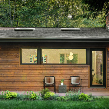
Time had stood still at this 1970s ranch in Armonk when the owners invited us to collaborate with them to transform it into a modern, light-filled home for their young family. The budget was lean, so economy was a primary consideration for every design decision. The challenge was to identify the modest home’s virtues – vaulted ceilings and a lovely backyard – and accentuate them by strategically optimizing available funds.
We were tasked with rectifying a dysfunctional interior stair, connecting to the outdoors with new large windows, and updating the exterior. We focused our attention on a finite set of architectural moves which would have the biggest impact and improve our clients’ daily experience of the home. Detailing was kept simple, using common grade materials and standard components. All exterior walls were revamped with new windows and siding. Although these materials were not particularly costly, thoughtful layout of boards, battens, and openings produced a cohesive, rigorous composition at each facade.
Since the budget would not cover the homeowners’ complete wish list, some items were bracketed for subsequent phases. The challenge was to establish a framework that would allow future work – including a new roof and kitchen renovation – to proceed smoothly.
The homeowners, both scientists, were enthusiastic collaborators, contributing their outstanding design sensibilities to selection of fixtures and finishes. Construction ended just in time for the arrival of their baby – and with that, the transformation of their family home was complete.
 CITYDESKSTUDIO, Inc.
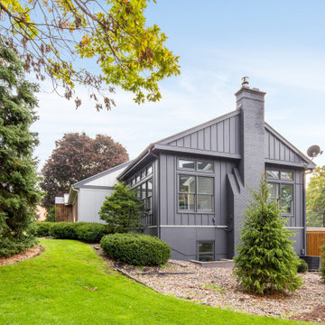
Built in 1949, this Edina home had a strong horizontal presence on the site, but through subsequent renovations the overall massing was lacking clarity and refinement and the entry was diminutive and uninviting. The roof and siding materials were aging, and important interior spaces were cramped and closed in. The house needed better light, better connection internally and out, and exterior updates to clarify and enhance the strengths of the home.
The primary design evolved out of a celebration of the existing horizontality of the home and a recognition that a bigger home was not needed. By layering materiality and color, a new identity was created. A new cedar entry canopy slips out from under the previous roof line, extending further towards the street. This added warmth at the entry is echoed along the facade, creating a graceful rhythm and texture. The previous additions were re-clad with a darker material palette in order to anchor and unify the ends of the home. As the grade slopes down towards the back yard, horizontal bands are exposed, revealing the layering top to bottom. Combined, these few shifts in color and materiality allowed for a complete transformation of the home.
The interior is reflective of the material and color palette used outside. The main living spaces are opened up and connected while strengthening the original symmetry of the more formal linear alignment of rooms. A whole new kitchen relocates the center of the home and makes more fluid the daily life of this young family. The house is fully transformed inside and out, all without adding more square feet.
Project Team:
Ben Awes, AIA, Principal-in-Charge
Nate Dodge
 Chris Rossetti at Main Line Kitchen Design
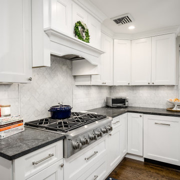
Main Line Kitchen Design’s unique business model allows our customers to work with the most experienced designers and get the most competitive kitchen cabinet pricing.
How does Main Line Kitchen Design offer the best designs along with the most competitive kitchen cabinet pricing? We are a more modern and cost effective business model. We are a kitchen cabinet dealer and design team that carries the highest quality kitchen cabinetry, is experienced, convenient, and reasonable priced. Our five award winning designers work by appointment only, with pre-qualified customers, and only on complete kitchen renovations.
Our designers are some of the most experienced and award winning kitchen designers in the Delaware Valley. We design with and sell 8 nationally distributed cabinet lines. Cabinet pricing is slightly less than major home centers for semi-custom cabinet lines, and significantly less than traditional showrooms for custom cabinet lines.
After discussing your kitchen on the phone, first appointments always take place in your home, where we discuss and measure your kitchen. Subsequent appointments usually take place in one of our offices and selection centers where our customers consider and modify 3D designs on flat screen TV’s. We can also bring sample doors and finishes to your home and make design changes on our laptops in 20-20 CAD with you, in your own kitchen.
Call today! We can estimate your kitchen project from soup to nuts in a 15 minute phone call and you can find out why we get the best reviews on the internet. We look forward to working with you.
As our company tag line says:
“The world of kitchen design is changing…”
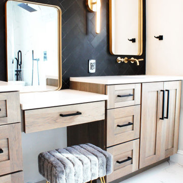 Main Line Kitchen Design
Main Line Kitchen Design designers are some of the most experienced and award winning kitchen designers in the Delaware Valley. We design with and sell 8 nationally distributed cabinet lines. Cabinet pricing is slightly less than at major home centers for semi-custom cabinet lines, and significantly less than traditional showrooms for custom cabinet lines.
After discussing your kitchen on the phone, first appointments always take place in your home, where we discuss and measure your kitchen. Subsequent appointments usually take place in one of our offices and selection centers where our customers consider and modify 3D kitchen designs on flat screen TV’s or via Zoom. We can also bring sample cabinet doors and finishes to your home and make design changes on our laptops in 20-20 CAD with you, in your own kitchen.
Call today! We can estimate your kitchen renovation from soup to nuts in a 15 minute phone call and you can find out why we get the best reviews on the internet. We look forward to working with you. As our company tag line says: “The world of kitchen design is changing…”
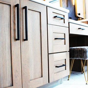 Main Line Kitchen Design
Main Line Kitchen Design designers are some of the most experienced and award winning kitchen designers in the Delaware Valley. We design with and sell 8 nationally distributed cabinet lines. Cabinet pricing is slightly less than at major home centers for semi-custom cabinet lines, and significantly less than traditional showrooms for custom cabinet lines.
After discussing your kitchen on the phone, first appointments always take place in your home, where we discuss and measure your kitchen. Subsequent appointments usually take place in one of our offices and selection centers where our customers consider and modify 3D kitchen designs on flat screen TV’s or via Zoom. We can also bring sample cabinet doors and finishes to your home and make design changes on our laptops in 20-20 CAD with you, in your own kitchen.
Call today! We can estimate your kitchen renovation from soup to nuts in a 15 minute phone call and you can find out why we get the best reviews on the internet. We look forward to working with you. As our company tag line says: “The world of kitchen design is changing…”
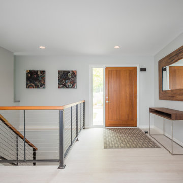 CITYDESKSTUDIO, Inc.
Built in 1949, this Edina home had a strong horizontal presence on the site, but through subsequent renovations the overall massing was lacking clarity and refinement and the entry was diminutive and uninviting. The roof and siding materials were aging, and important interior spaces were cramped and closed in. The house needed better light, better connection internally and out, and exterior updates to clarify and enhance the strengths of the home.
The primary design evolved out of a celebration of the existing horizontality of the home and a recognition that a bigger home was not needed. By layering materiality and color, a new identity was created. A new cedar entry canopy slips out from under the previous roof line, extending further towards the street. This added warmth at the entry is echoed along the facade, creating a graceful rhythm and texture. The previous additions were re-clad with a darker material palette in order to anchor and unify the ends of the home. As the grade slopes down towards the back yard, horizontal bands are exposed, revealing the layering top to bottom. Combined, these few shifts in color and materiality allowed for a complete transformation of the home.
The interior is reflective of the material and color palette used outside. The main living spaces are opened up and connected while strengthening the original symmetry of the more formal linear alignment of rooms. A whole new kitchen relocates the center of the home and makes more fluid the daily life of this young family. The house is fully transformed inside and out, all without adding more square feet.
Project Team:
Ben Awes, AIA, Principal-in-Charge
Nate Dodge
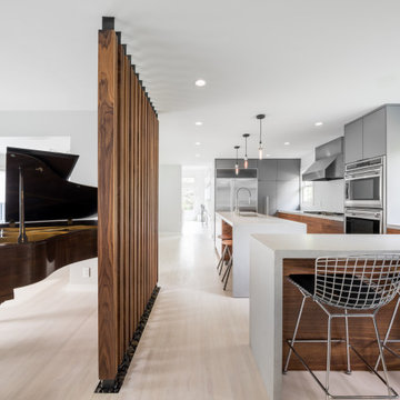 CITYDESKSTUDIO, Inc.
Built in 1949, this Edina home had a strong horizontal presence on the site, but through subsequent renovations the overall massing was lacking clarity and refinement and the entry was diminutive and uninviting. The roof and siding materials were aging, and important interior spaces were cramped and closed in. The house needed better light, better connection internally and out, and exterior updates to clarify and enhance the strengths of the home.
The primary design evolved out of a celebration of the existing horizontality of the home and a recognition that a bigger home was not needed. By layering materiality and color, a new identity was created. A new cedar entry canopy slips out from under the previous roof line, extending further towards the street. This added warmth at the entry is echoed along the facade, creating a graceful rhythm and texture. The previous additions were re-clad with a darker material palette in order to anchor and unify the ends of the home. As the grade slopes down towards the back yard, horizontal bands are exposed, revealing the layering top to bottom. Combined, these few shifts in color and materiality allowed for a complete transformation of the home.
The interior is reflective of the material and color palette used outside. The main living spaces are opened up and connected while strengthening the original symmetry of the more formal linear alignment of rooms. A whole new kitchen relocates the center of the home and makes more fluid the daily life of this young family. The house is fully transformed inside and out, all without adding more square feet.
Project Team:
Ben Awes, AIA, Principal-in-Charge
Nate Dodge
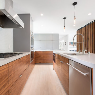 CITYDESKSTUDIO, Inc.
Built in 1949, this Edina home had a strong horizontal presence on the site, but through subsequent renovations the overall massing was lacking clarity and refinement and the entry was diminutive and uninviting. The roof and siding materials were aging, and important interior spaces were cramped and closed in. The house needed better light, better connection internally and out, and exterior updates to clarify and enhance the strengths of the home.
The primary design evolved out of a celebration of the existing horizontality of the home and a recognition that a bigger home was not needed. By layering materiality and color, a new identity was created. A new cedar entry canopy slips out from under the previous roof line, extending further towards the street. This added warmth at the entry is echoed along the facade, creating a graceful rhythm and texture. The previous additions were re-clad with a darker material palette in order to anchor and unify the ends of the home. As the grade slopes down towards the back yard, horizontal bands are exposed, revealing the layering top to bottom. Combined, these few shifts in color and materiality allowed for a complete transformation of the home.
The interior is reflective of the material and color palette used outside. The main living spaces are opened up and connected while strengthening the original symmetry of the more formal linear alignment of rooms. A whole new kitchen relocates the center of the home and makes more fluid the daily life of this young family. The house is fully transformed inside and out, all without adding more square feet.
Project Team:
Ben Awes, AIA, Principal-in-Charge
Nate Dodge
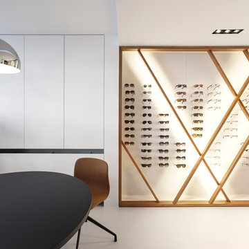 JUMA architects
Optiek Herpol wanted to move to a better, more central location with plenty of parking space. A property that complied with these conditions was found on the Market in Deinze, and JUMA architects were subsequently asked to design a new interior for the store.
The property in question is very deep and narrow with little natural light entry. JUMA set to work despite these constraints in an attempt to transform these challenges into qualities.
The architects positioned the sales counter right behind the shop window, so as to make optimum use of the available natural light. This also makes store activities visible from the outside, adding an extra element of attraction. At the narrowest section of the store, a large wall mirror was put in to visually double the space. The wall onto which the eyeglasses are displayed is located opposite the mirror and is literally the eye catcher in the store. A wooden lattice makes for an interesting play of diagonal lines behind which the glasses are presented. This unique concept animates the entire store without detracting from the fact that the glasses should remain the main focal point in the store. The workshop is located in the back, separated from the store by a wall in smoked grey glass. In this way, the optician can keep an eye on the store at all times.
The colour palette is predominantly white, to keep the interior as light as possible. As a counterpoint, warm wood accents are added. The chairs at the counter are upholstered in a colour that harmonizes perfectly with the wood.
Pictures © Thomas De Bruyne
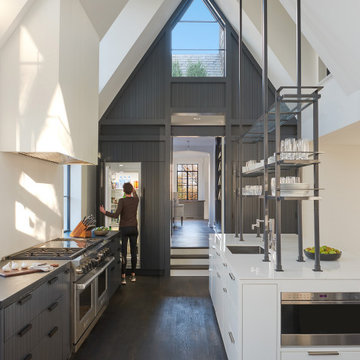
 Donald Lococo Architects
Subsequent additions are covered with living green walls to deemphasize stylistic conflicts imposed on a 1940’s Tudor and become backdrop surrounding a kitchen addition. On the interior, further added architectural inconsistencies are edited away, and the language of the Tudor’s original reclaimed integrity is referenced for the addition. Sympathetic to the home, windows and doors remain untrimmed and stark plaster walls contrast the original black metal windows. Sharp black elements contrast fields of white. With a ceiling pitch matching the existing and chiseled dormers, a stark ceiling hovers over the kitchen space referencing the existing homes plaster walls. Grid members in windows and on saw scored paneled walls and cabinetry mirror the machine age windows as do exposed steel beams. The exaggerated white field is pierced by an equally exaggerated 13 foot black steel tower that references the existing homes steel door and window members. Glass shelves in the tower further the window parallel. Even though it held enough dinner and glassware for eight, its thin members and transparent shelves defy its massive nature, allow light to flow through it and afford the kitchen open views and the feeling of continuous space. The full glass at the end of the kitchen reveres a grouping of 50 year old Hemlocks. At the opposite end, a window close to the peak looks up to a green roof.
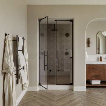
 JRP Design & Remodel
Welcome to Mediterranean Marvel, a testament to the transformative journey guided by our client’s dreams and our dedication at JRP Design & Remodel. This project exemplifies our commitment to creating homes that reflect personal style and enhance everyday living.
In the initial phase, we focused on revitalizing the family room and kitchen, spaces that felt confined and dim. By replacing traditional windows with a sweeping bi-folding door, we seamlessly integrated indoor and outdoor living, flooding the space with natural light and inviting California’s beauty inside. This redesign not only expanded the living area but also redefined how our clients experience their home, fostering a connection to the outdoors that enriches daily life.
Simultaneously, the kitchen underwent a remarkable transformation into a bright, inviting culinary hub. With spacious countertops and an open layout, the new kitchen became a gathering place for family and friends, where culinary creativity and cherished memories converge.
In the subsequent phase, our attention turned to crafting a luxurious upstairs primary suite. Here, we aimed to create a haven of tranquility and sophistication, blending modern comforts with timeless elegance. The result is a sanctuary where our clients can retreat, unwind, and recharge amidst surroundings tailored to their desires.
At JRP Design & Remodel, our approach is rooted in understanding our clients’ aspirations and translating them into spaces that exceed expectations. Mediterranean Marvel is more than a renovation; it’s a narrative of collaboration and craftsmanship, where each decision is guided by our clients’ vision for their ideal home.
Photographer: Public 311
13