
Search results for "Subsequently adding" in Home Design Ideas
 Donald Lococo Architects
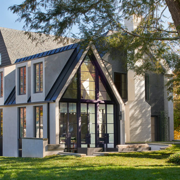
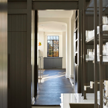
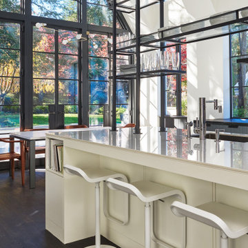
Subsequent additions are covered with living green walls to deemphasize stylistic conflicts imposed on a 1940’s Tudor and become backdrop surrounding a kitchen addition. On the interior, further added architectural inconsistencies are edited away, and the language of the Tudor’s original reclaimed integrity is referenced for the addition. Sympathetic to the home, windows and doors remain untrimmed and stark plaster walls contrast the original black metal windows. Sharp black elements contrast fields of white. With a ceiling pitch matching the existing and chiseled dormers, a stark ceiling hovers over the kitchen space referencing the existing homes plaster walls. Grid members in windows and on saw scored paneled walls and cabinetry mirror the machine age windows as do exposed steel beams. The exaggerated white field is pierced by an equally exaggerated 13 foot black steel tower that references the existing homes steel door and window members. Glass shelves in the tower further the window parallel. Even though it held enough dinner and glassware for eight, its thin members and transparent shelves defy its massive nature, allow light to flow through it and afford the kitchen open views and the feeling of continuous space. The full glass at the end of the kitchen reveres a grouping of 50 year old Hemlocks. At the opposite end, a window close to the peak looks up to a green roof.
 David Stumpf Architecture LLC
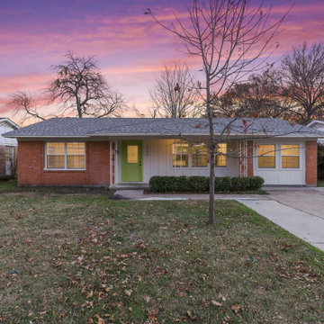
The Chatsworth Residence was a complete renovation of a 1950's suburban Dallas ranch home. From the offset of this project, the owner intended for this to be a real estate investment property, and subsequently contracted David to develop a design design that would appeal to a broad rental market and to lead the renovation project.
The scope of the renovation to this residence included a semi-gut down to the studs, new roof, new HVAC system, new kitchen, new laundry area, and a full rehabilitation of the property. Maintaining a tight budget for the project, David worked with the owner to maintain a high level of craftsmanship and quality of work throughout the project.
 CITYDESKSTUDIO, Inc.
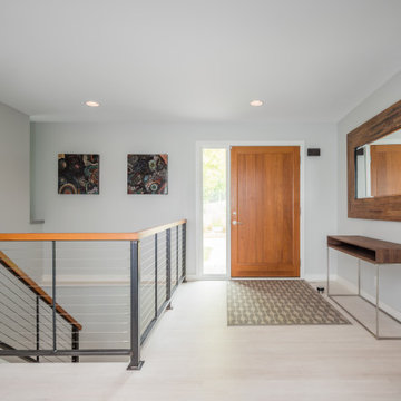
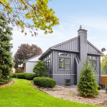
Built in 1949, this Edina home had a strong horizontal presence on the site, but through subsequent renovations the overall massing was lacking clarity and refinement and the entry was diminutive and uninviting. The roof and siding materials were aging, and important interior spaces were cramped and closed in. The house needed better light, better connection internally and out, and exterior updates to clarify and enhance the strengths of the home.
The primary design evolved out of a celebration of the existing horizontality of the home and a recognition that a bigger home was not needed. By layering materiality and color, a new identity was created. A new cedar entry canopy slips out from under the previous roof line, extending further towards the street. This added warmth at the entry is echoed along the facade, creating a graceful rhythm and texture. The previous additions were re-clad with a darker material palette in order to anchor and unify the ends of the home. As the grade slopes down towards the back yard, horizontal bands are exposed, revealing the layering top to bottom. Combined, these few shifts in color and materiality allowed for a complete transformation of the home.
The interior is reflective of the material and color palette used outside. The main living spaces are opened up and connected while strengthening the original symmetry of the more formal linear alignment of rooms. A whole new kitchen relocates the center of the home and makes more fluid the daily life of this young family. The house is fully transformed inside and out, all without adding more square feet.
Project Team:
Ben Awes, AIA, Principal-in-Charge
Nate Dodge
Find the right local pro for your project
 CITYDESKSTUDIO, Inc.
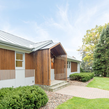
Built in 1949, this Edina home had a strong horizontal presence on the site, but through subsequent renovations the overall massing was lacking clarity and refinement and the entry was diminutive and uninviting. The roof and siding materials were aging, and important interior spaces were cramped and closed in. The house needed better light, better connection internally and out, and exterior updates to clarify and enhance the strengths of the home.
The primary design evolved out of a celebration of the existing horizontality of the home and a recognition that a bigger home was not needed. By layering materiality and color, a new identity was created. A new cedar entry canopy slips out from under the previous roof line, extending further towards the street. This added warmth at the entry is echoed along the facade, creating a graceful rhythm and texture. The previous additions were re-clad with a darker material palette in order to anchor and unify the ends of the home. As the grade slopes down towards the back yard, horizontal bands are exposed, revealing the layering top to bottom. Combined, these few shifts in color and materiality allowed for a complete transformation of the home.
The interior is reflective of the material and color palette used outside. The main living spaces are opened up and connected while strengthening the original symmetry of the more formal linear alignment of rooms. A whole new kitchen relocates the center of the home and makes more fluid the daily life of this young family. The house is fully transformed inside and out, all without adding more square feet.
Project Team:
Ben Awes, AIA, Principal-in-Charge
Nate Dodge
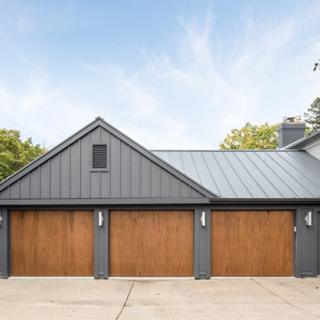 CITYDESKSTUDIO, Inc.
Built in 1949, this Edina home had a strong horizontal presence on the site, but through subsequent renovations the overall massing was lacking clarity and refinement and the entry was diminutive and uninviting. The roof and siding materials were aging, and important interior spaces were cramped and closed in. The house needed better light, better connection internally and out, and exterior updates to clarify and enhance the strengths of the home.
The primary design evolved out of a celebration of the existing horizontality of the home and a recognition that a bigger home was not needed. By layering materiality and color, a new identity was created. A new cedar entry canopy slips out from under the previous roof line, extending further towards the street. This added warmth at the entry is echoed along the facade, creating a graceful rhythm and texture. The previous additions were re-clad with a darker material palette in order to anchor and unify the ends of the home. As the grade slopes down towards the back yard, horizontal bands are exposed, revealing the layering top to bottom. Combined, these few shifts in color and materiality allowed for a complete transformation of the home.
The interior is reflective of the material and color palette used outside. The main living spaces are opened up and connected while strengthening the original symmetry of the more formal linear alignment of rooms. A whole new kitchen relocates the center of the home and makes more fluid the daily life of this young family. The house is fully transformed inside and out, all without adding more square feet.
Project Team:
Ben Awes, AIA, Principal-in-Charge
Nate Dodge
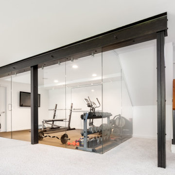 CITYDESKSTUDIO, Inc.
Built in 1949, this Edina home had a strong horizontal presence on the site, but through subsequent renovations the overall massing was lacking clarity and refinement and the entry was diminutive and uninviting. The roof and siding materials were aging, and important interior spaces were cramped and closed in. The house needed better light, better connection internally and out, and exterior updates to clarify and enhance the strengths of the home.
The primary design evolved out of a celebration of the existing horizontality of the home and a recognition that a bigger home was not needed. By layering materiality and color, a new identity was created. A new cedar entry canopy slips out from under the previous roof line, extending further towards the street. This added warmth at the entry is echoed along the facade, creating a graceful rhythm and texture. The previous additions were re-clad with a darker material palette in order to anchor and unify the ends of the home. As the grade slopes down towards the back yard, horizontal bands are exposed, revealing the layering top to bottom. Combined, these few shifts in color and materiality allowed for a complete transformation of the home.
The interior is reflective of the material and color palette used outside. The main living spaces are opened up and connected while strengthening the original symmetry of the more formal linear alignment of rooms. A whole new kitchen relocates the center of the home and makes more fluid the daily life of this young family. The house is fully transformed inside and out, all without adding more square feet.
Project Team:
Ben Awes, AIA, Principal-in-Charge
Nate Dodge
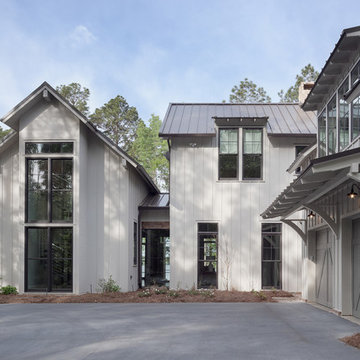
 Farmer Payne Architects - Sun Valley
www.farmerpaynearchitects.com
Country exterior home photo in New Orleans
Country exterior home photo in New Orleans

Sponsored
Columbus, OH

Hope Restoration & General Contracting
Columbus Design-Build, Kitchen & Bath Remodeling, Historic Renovations
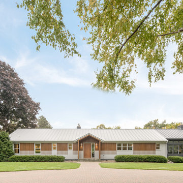 CITYDESKSTUDIO, Inc.
Built in 1949, this Edina home had a strong horizontal presence on the site, but through subsequent renovations the overall massing was lacking clarity and refinement and the entry was diminutive and uninviting. The roof and siding materials were aging, and important interior spaces were cramped and closed in. The house needed better light, better connection internally and out, and exterior updates to clarify and enhance the strengths of the home.
The primary design evolved out of a celebration of the existing horizontality of the home and a recognition that a bigger home was not needed. By layering materiality and color, a new identity was created. A new cedar entry canopy slips out from under the previous roof line, extending further towards the street. This added warmth at the entry is echoed along the facade, creating a graceful rhythm and texture. The previous additions were re-clad with a darker material palette in order to anchor and unify the ends of the home. As the grade slopes down towards the back yard, horizontal bands are exposed, revealing the layering top to bottom. Combined, these few shifts in color and materiality allowed for a complete transformation of the home.
The interior is reflective of the material and color palette used outside. The main living spaces are opened up and connected while strengthening the original symmetry of the more formal linear alignment of rooms. A whole new kitchen relocates the center of the home and makes more fluid the daily life of this young family. The house is fully transformed inside and out, all without adding more square feet.
Project Team:
Ben Awes, AIA, Principal-in-Charge
Nate Dodge
 FullerHouse Remodeling
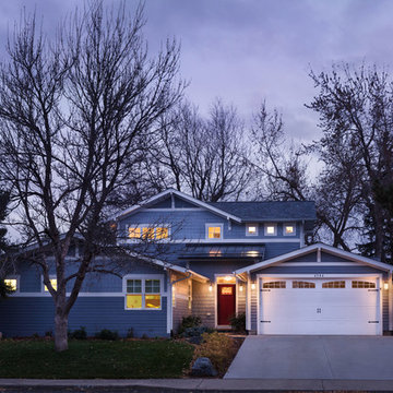
FullerHouse Construction Project: Arapahoe Ridge, Boulder CO whole house remodel
Our clients’ modest, 2,100 SF 1960’s Ranch had received only a few minor cosmetic upgrades since its original construction. And given a need for more space and a desire to stay in their neighborhood – the prime Arapahoe Ridge neighborhood of Boulder – our clients knew their home was due for a major renovation.
By the time DAJ Designs of Louisville had completed drawings, it was clear that very little of the original house was going to remain the same.
To create the space and configuration they desired, the first goal was to add a 2nd story, allocated solely for the new Master Suite, with its own private Balcony. But to create additional space needed for the Kitchen and walk-in pantry, we also pushed out into the original Garage footprint, subsequently extending the Garage to create room for 3+ vehicles. We also reworked nearly every other interior partition wall on the main floor to accommodate a spacious Great Room, 2 kids’ bedrooms, an Office, 2 bathrooms, and a dedicated Laundry room.
With clean white Craftsman details for the Exterior and interior trim and doors, natural granite counters, glass tiles, and creamy white Shaker-style cabinetry, our clients’ good taste added a timeless warmth to their now larger (3,000 SF) and more functional home.
 Donald Lococo Architects
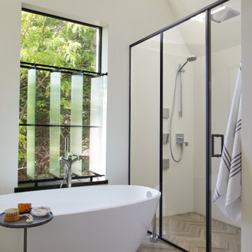
Subsequent additions are covered with living green walls to deemphasize stylistic conflicts imposed on a 1940’s Tudor and become backdrop surrounding a kitchen addition. On the interior, further added architectural inconsistencies are edited away, and the language of the Tudor’s original reclaimed integrity is referenced for the addition. Sympathetic to the home, windows and doors remain untrimmed and stark plaster walls contrast the original black metal windows. Sharp black elements contrast fields of white. With a ceiling pitch matching the existing and chiseled dormers, a stark ceiling hovers over the kitchen space referencing the existing homes plaster walls. Grid members in windows and on saw scored paneled walls and cabinetry mirror the machine age windows as do exposed steel beams. The exaggerated white field is pierced by an equally exaggerated 13 foot black steel tower that references the existing homes steel door and window members. Glass shelves in the tower further the window parallel. Even though it held enough dinner and glassware for eight, its thin members and transparent shelves defy its massive nature, allow light to flow through it and afford the kitchen open views and the feeling of continuous space. The full glass at the end of the kitchen reveres a grouping of 50 year old Hemlocks. At the opposite end, a window close to the peak looks up to a green roof.
 CITYDESKSTUDIO, Inc.
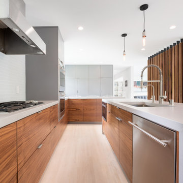
Built in 1949, this Edina home had a strong horizontal presence on the site, but through subsequent renovations the overall massing was lacking clarity and refinement and the entry was diminutive and uninviting. The roof and siding materials were aging, and important interior spaces were cramped and closed in. The house needed better light, better connection internally and out, and exterior updates to clarify and enhance the strengths of the home.
The primary design evolved out of a celebration of the existing horizontality of the home and a recognition that a bigger home was not needed. By layering materiality and color, a new identity was created. A new cedar entry canopy slips out from under the previous roof line, extending further towards the street. This added warmth at the entry is echoed along the facade, creating a graceful rhythm and texture. The previous additions were re-clad with a darker material palette in order to anchor and unify the ends of the home. As the grade slopes down towards the back yard, horizontal bands are exposed, revealing the layering top to bottom. Combined, these few shifts in color and materiality allowed for a complete transformation of the home.
The interior is reflective of the material and color palette used outside. The main living spaces are opened up and connected while strengthening the original symmetry of the more formal linear alignment of rooms. A whole new kitchen relocates the center of the home and makes more fluid the daily life of this young family. The house is fully transformed inside and out, all without adding more square feet.
Project Team:
Ben Awes, AIA, Principal-in-Charge
Nate Dodge
 CITYDESKSTUDIO, Inc.
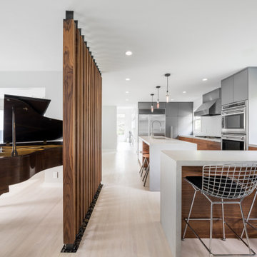
Built in 1949, this Edina home had a strong horizontal presence on the site, but through subsequent renovations the overall massing was lacking clarity and refinement and the entry was diminutive and uninviting. The roof and siding materials were aging, and important interior spaces were cramped and closed in. The house needed better light, better connection internally and out, and exterior updates to clarify and enhance the strengths of the home.
The primary design evolved out of a celebration of the existing horizontality of the home and a recognition that a bigger home was not needed. By layering materiality and color, a new identity was created. A new cedar entry canopy slips out from under the previous roof line, extending further towards the street. This added warmth at the entry is echoed along the facade, creating a graceful rhythm and texture. The previous additions were re-clad with a darker material palette in order to anchor and unify the ends of the home. As the grade slopes down towards the back yard, horizontal bands are exposed, revealing the layering top to bottom. Combined, these few shifts in color and materiality allowed for a complete transformation of the home.
The interior is reflective of the material and color palette used outside. The main living spaces are opened up and connected while strengthening the original symmetry of the more formal linear alignment of rooms. A whole new kitchen relocates the center of the home and makes more fluid the daily life of this young family. The house is fully transformed inside and out, all without adding more square feet.
Project Team:
Ben Awes, AIA, Principal-in-Charge
Nate Dodge
 Donald Lococo Architects
Subsequent additions are covered with living green walls to deemphasize stylistic conflicts imposed on a 1940’s Tudor and become backdrop surrounding a kitchen addition. On the interior, further added architectural inconsistencies are edited away, and the language of the Tudor’s original reclaimed integrity is referenced for the addition. Sympathetic to the home, windows and doors remain untrimmed and stark plaster walls contrast the original black metal windows. Sharp black elements contrast fields of white. With a ceiling pitch matching the existing and chiseled dormers, a stark ceiling hovers over the kitchen space referencing the existing homes plaster walls. Grid members in windows and on saw scored paneled walls and cabinetry mirror the machine age windows as do exposed steel beams. The exaggerated white field is pierced by an equally exaggerated 13 foot black steel tower that references the existing homes steel door and window members. Glass shelves in the tower further the window parallel. Even though it held enough dinner and glassware for eight, its thin members and transparent shelves defy its massive nature, allow light to flow through it and afford the kitchen open views and the feeling of continuous space. The full glass at the end of the kitchen reveres a grouping of 50 year old Hemlocks. At the opposite end, a window close to the peak looks up to a green roof.
Sponsored
Columbus, OH
Hope Restoration & General Contracting
Columbus Design-Build, Kitchen & Bath Remodeling, Historic Renovations
 Donald Lococo Architects
Subsequent additions are covered with living green walls to deemphasize stylistic conflicts imposed on a 1940’s Tudor and become backdrop surrounding a kitchen addition. On the interior, further added architectural inconsistencies are edited away, and the language of the Tudor’s original reclaimed integrity is referenced for the addition. Sympathetic to the home, windows and doors remain untrimmed and stark plaster walls contrast the original black metal windows. Sharp black elements contrast fields of white. With a ceiling pitch matching the existing and chiseled dormers, a stark ceiling hovers over the kitchen space referencing the existing homes plaster walls. Grid members in windows and on saw scored paneled walls and cabinetry mirror the machine age windows as do exposed steel beams. The exaggerated white field is pierced by an equally exaggerated 13 foot black steel tower that references the existing homes steel door and window members. Glass shelves in the tower further the window parallel. Even though it held enough dinner and glassware for eight, its thin members and transparent shelves defy its massive nature, allow light to flow through it and afford the kitchen open views and the feeling of continuous space. The full glass at the end of the kitchen reveres a grouping of 50 year old Hemlocks. At the opposite end, a window close to the peak looks up to a green roof.
 Flourish Interiors by Vanessa C Smith
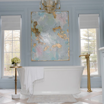
A current interior design trend is the use of floor-to-ceiling color saturation, where paint colors envelop an entire space. When designing the primary en-suite bathroom for my personal residence, "The French Chateau," I wanted to explore this trend. Selecting Sherwin Williams' "Sleepy Blue" as the paint color, we adorned the bathroom from base to crown, creating a spa-like ambiance.
⠀⠀⠀⠀⠀⠀⠀⠀⠀
As I embarked on the journey of selecting art and accentuating the space, I found it challenging to source art that would infuse the ideal color scheme and fit the space perfectly. I decided that commissioning a custom piece would be the best solution. Eventually I realized that I, myself, was the ideal artist. Being an art major in college and passionate about all forms of creativity, the notion of crafting such an intimate piece for a personal space felt right.
⠀⠀⠀⠀⠀⠀⠀⠀⠀
I began painting this piece, drawing inspiration from my own story. The artwork encompasses multiple layers, mirroring the chapters of my journey. The initial layer exudes sweetness and simplicity, reflecting the innocence of childhood. Subsequent layers illustrate warm and joyful tones, symbolizing adolescence and falling in love. As the story unfolds, layers of hurt and pain emerge, portraying challenging times, lost friendships, infertility, the closure of my cherished boutique in 2016, and other profound moments in my life. Each stroke captures both gentleness and intensity, blending seamlessly or resonating with emotional fervor.
⠀⠀⠀⠀⠀⠀⠀⠀⠀
Finally, I adorned the painting with gold leaf, not only adding beauty but also symbolizing my own refinement through the fires of life. Every time I step into my bathroom, I am greeted by my own creation, which serves as a reminder of the beauty, both sweet and painful, that weaves through my story. It fills me with anticipation for the future too.
 CITYDESKSTUDIO, Inc.
Built in 1949, this Edina home had a strong horizontal presence on the site, but through subsequent renovations the overall massing was lacking clarity and refinement and the entry was diminutive and uninviting. The roof and siding materials were aging, and important interior spaces were cramped and closed in. The house needed better light, better connection internally and out, and exterior updates to clarify and enhance the strengths of the home.
The primary design evolved out of a celebration of the existing horizontality of the home and a recognition that a bigger home was not needed. By layering materiality and color, a new identity was created. A new cedar entry canopy slips out from under the previous roof line, extending further towards the street. This added warmth at the entry is echoed along the facade, creating a graceful rhythm and texture. The previous additions were re-clad with a darker material palette in order to anchor and unify the ends of the home. As the grade slopes down towards the back yard, horizontal bands are exposed, revealing the layering top to bottom. Combined, these few shifts in color and materiality allowed for a complete transformation of the home.
The interior is reflective of the material and color palette used outside. The main living spaces are opened up and connected while strengthening the original symmetry of the more formal linear alignment of rooms. A whole new kitchen relocates the center of the home and makes more fluid the daily life of this young family. The house is fully transformed inside and out, all without adding more square feet.
Project Team:
Ben Awes, AIA, Principal-in-Charge
Nate Dodge
 Kalmia Design
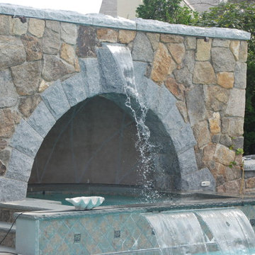
This Gloucester, MA ocean front pool incorporates a spa with a granite arch. Subsequently a half dome was added over the spa for privacy from neighbors. Water features spill from spa to pool. Blue stone decking. Pool has automatic cover for safety and heat retention.

Sponsored
Columbus, OH

Structural Remodeling
Franklin County's Heavy Timber Specialists | Best of Houzz 2020!
 Donald Lococo Architects
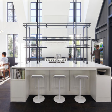
Subsequent additions are covered with living green walls to deemphasize stylistic conflicts imposed on a 1940’s Tudor and become backdrop surrounding a kitchen addition. On the interior, further added architectural inconsistencies are edited away, and the language of the Tudor’s original reclaimed integrity is referenced for the addition. Sympathetic to the home, windows and doors remain untrimmed and stark plaster walls contrast the original black metal windows. Sharp black elements contrast fields of white. With a ceiling pitch matching the existing and chiseled dormers, a stark ceiling hovers over the kitchen space referencing the existing homes plaster walls. Grid members in windows and on saw scored paneled walls and cabinetry mirror the machine age windows as do exposed steel beams. The exaggerated white field is pierced by an equally exaggerated 13 foot black steel tower that references the existing homes steel door and window members. Glass shelves in the tower further the window parallel. Even though it held enough dinner and glassware for eight, its thin members and transparent shelves defy its massive nature, allow light to flow through it and afford the kitchen open views and the feeling of continuous space. The full glass at the end of the kitchen reveres a grouping of 50 year old Hemlocks. At the opposite end, a window close to the peak looks up to a green roof.
 Kalmia Design
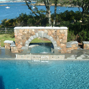
This Gloucester, MA ocean front pool incorporates a spa with a granite arch. Subsequently a half dome was added over the spa for privacy from neighbors. Water features spill from spa to pool. Blue stone decking. Pool has automatic cover for safety and heat retention.
 Go Home Builders Inc
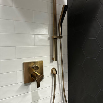
Enter a ‘Modern Chic’ serene and luxurious oasis, where every detail has been thoughtfully designed to create a captivating bathroom experience. The walls are covered with classic white subway tiles, adding a timeless charm to the space. At your feet, a mesmerizing black hexagon charcoal floor starts from the entrance all the way to the back, nicely climbing up the shower wall. Furthermore, it’s a striking and modern touch that immediately catches your eye.
Relaxation Starts Here
Approaching the shower area, you can’t help but feel a sense of excitement. A sleek glass sliding door begs you to step inside and enjoy a refreshing shower. Easily gliding open, it offers both privacy and a spacious open feel to the room.
Take a moment to appreciate the elegant fixtures and faucets in a warm bronze finish. Their subtle glow beautifully complements the white tiles, adding a touch of sophistication and style. In addition, each tap and handle reflects meticulous attention to detail, showcasing the careful craftsmanship that went into creating this exquisite bathroom.
Attention on You
Turn your attention to the vanity area, where a mirror has built-in lighting. The soft glow creates a flattering ambiance, casting a warm and inviting light across the entire bathroom. It should be noted, the mirror not only serves its practical purpose but also adds a touch of glamour and elegance to the space, enhancing your daily morning routine.
Now, focus on the custom-made vanity cabinet, expertly crafted from dark walnut. The rich, luxurious wood exudes timeless beauty and sophistication. Additionally, it offers ample storage and space, cleverly designed to keep all your essentials organized and within easy reach. Sitting atop the cabinet is a stunning white slab counter with delicate grey veins across its surface.
Elegant Lighting
To enhance the overall atmosphere, recessed LED lights have been strategically placed throughout the bathroom. Casting a soft glow, highlighting the textures, colors, and architectural features. Clearly, the combination of light and shadow creates a captivating visual effect, adding depth and dimension to the space.
This detailed designed bathroom harmoniously blends style and functionality, creating a haven of beauty and relaxation. It invites you to unwind and escape from the outside world. Subsequently, immerse yourself in this captivating bathroom experience, where every element has been carefully curated to provide a serene and rejuvenating environment.
2